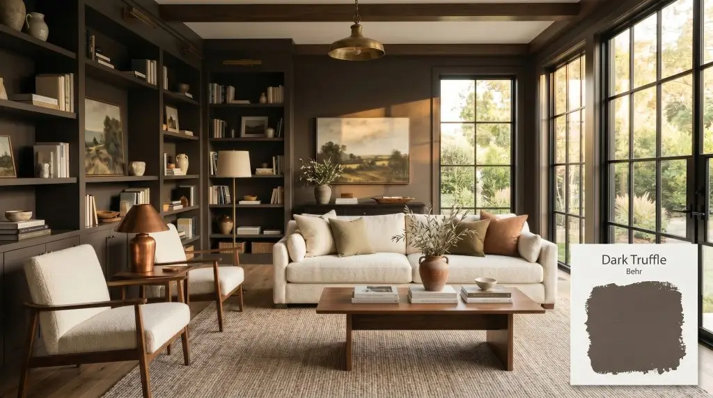
Dark Truffle PPU5-19
BehrBehr Dark Truffle (PPU5-19) is a deep, luxurious brown with subtle gray and mocha undertones. With a low LRV of 8, it absorbs significant light, making it an excellent choice for moody libraries, sophisticated cabinetry, or rich exterior accents where a grounded, earthy neutral is desired.
Paint Technical Profile
| Color ID / SKU | PPU5-19 |
| HEX Code | #594D46 |
| Light Reflectance (LRV) | 8 |
| Use | Interior, Exterior |
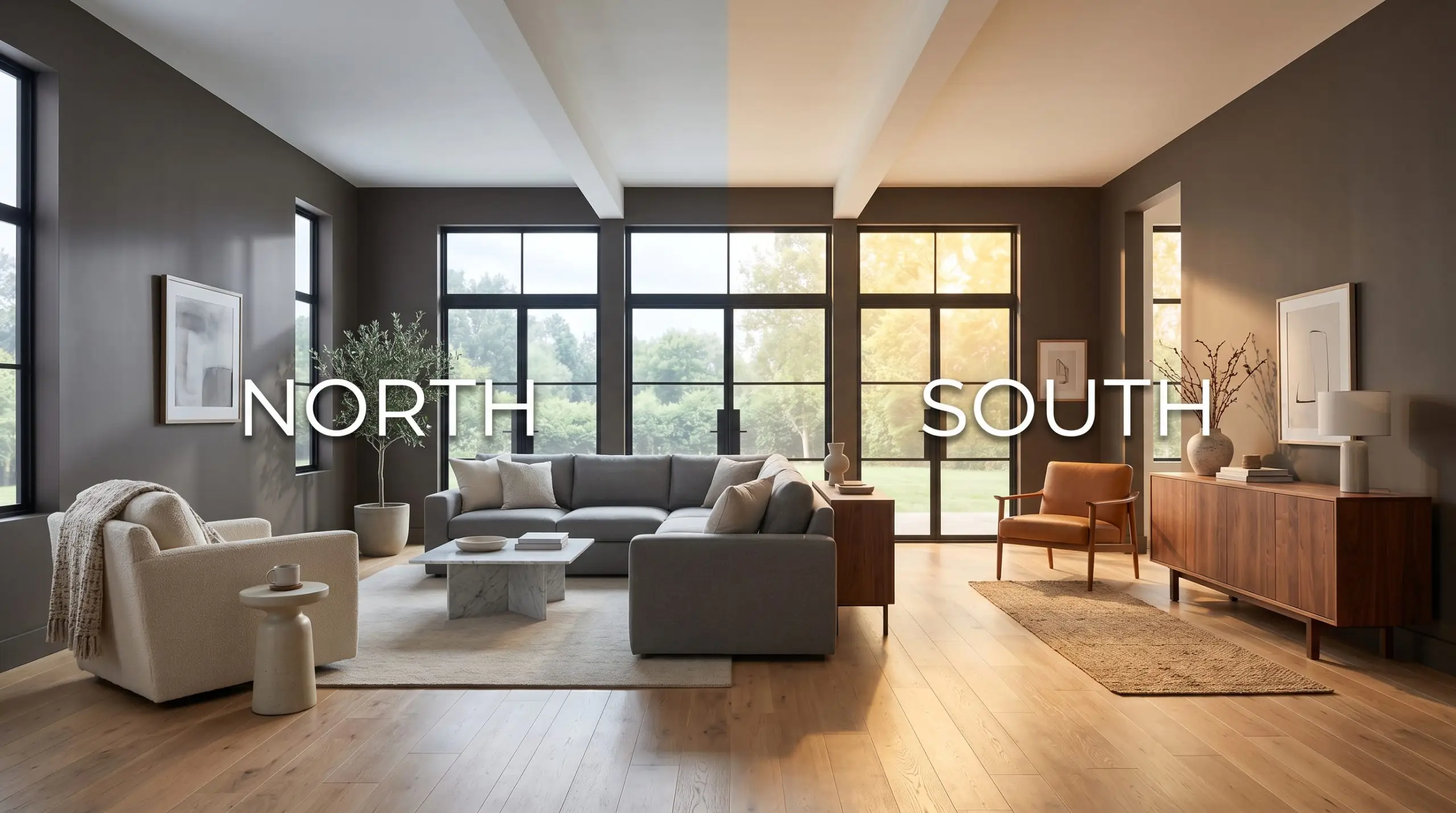
| Best Exposures | South-Facing, West-Facing |
| Best For | Moody libraries, dining rooms, kitchen cabinetry, exterior trim |
Behr Dark Truffle: The Ultimate Moody Brown for Modern Homes
Brown paint carries a lot of baggage in the design world. Many homeowners actively avoid it, terrified their living room will end up looking like a melted 1990s chocolate bar or a flat, muddy mistake. Behr Dark Truffle PPU5-19 completely shatters that misconception. This is not the heavy, lifeless brown of decades past. Instead, it acts as a deeply sophisticated, low-chroma shade that brings premium architectural drama to everyday homes on a realistic budget.
Undertones & LRV of Behr Dark Truffle
When deciding if a room needs a warm wrap or a cool anchor, you have to look at the foundational temperature. Dark Truffle leans warm, but it is heavily neutralized by a shadowy cool undercurrent that keeps it feeling incredibly modern.
Sitting at an LRV of 8, Behr PPU5-19 absorbs a massive 92% of the light that hits it. This creates immense visual weight and means the paint will not bounce ambient light around the room. You must rely on strategic artificial fixtures or abundant natural sunlight to prevent this earthy neutral from reading as a flat black on your walls.
Lighting Effects & The Chameleon Factor
Because of that incredibly low light reflection, this paint is highly reactive to its environment. If you are worried about the color turning into a muddy mess, mastering your lighting is the ultimate solution.
Popular Room Applications
This deep brown demands to be used with intention, anchoring a room’s energy rather than simply fading into the background. Let’s explore how to leverage its light absorption to create premium, high-impact transformations throughout your home.
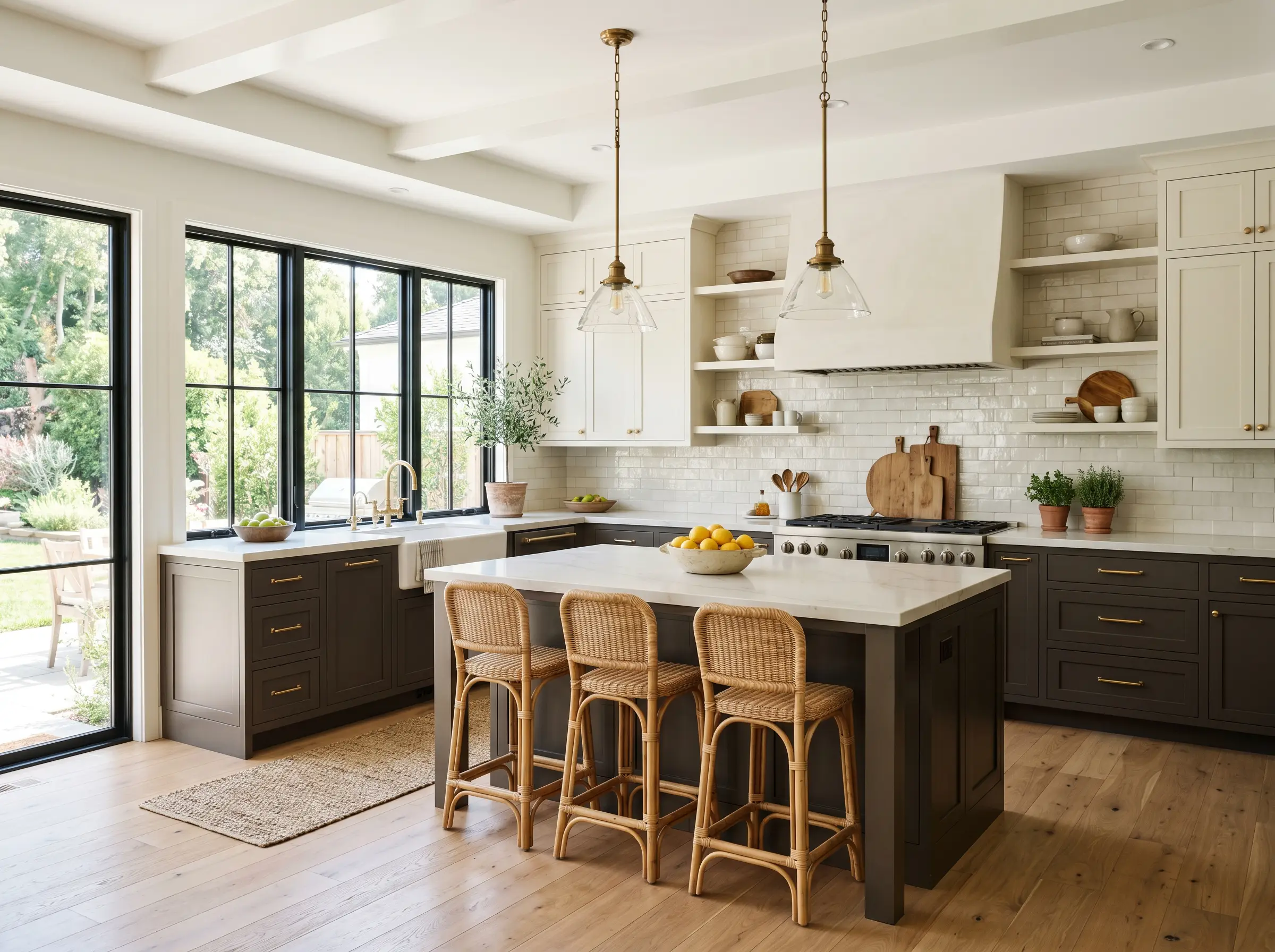
Kitchens
Dark cabinetry is a brilliant way to achieve a custom look without a massive renovation budget. Behr PPU5-19 works beautifully on lower cabinets or a standalone island to ground the room. Pair it with creamy white uppers and warm brass hardware to keep the kitchen feeling open and inviting. If you want to know how to paint kitchen cabinets dark colors properly, the key is balancing the heavy lower visual weight with plenty of reflective surfaces above.
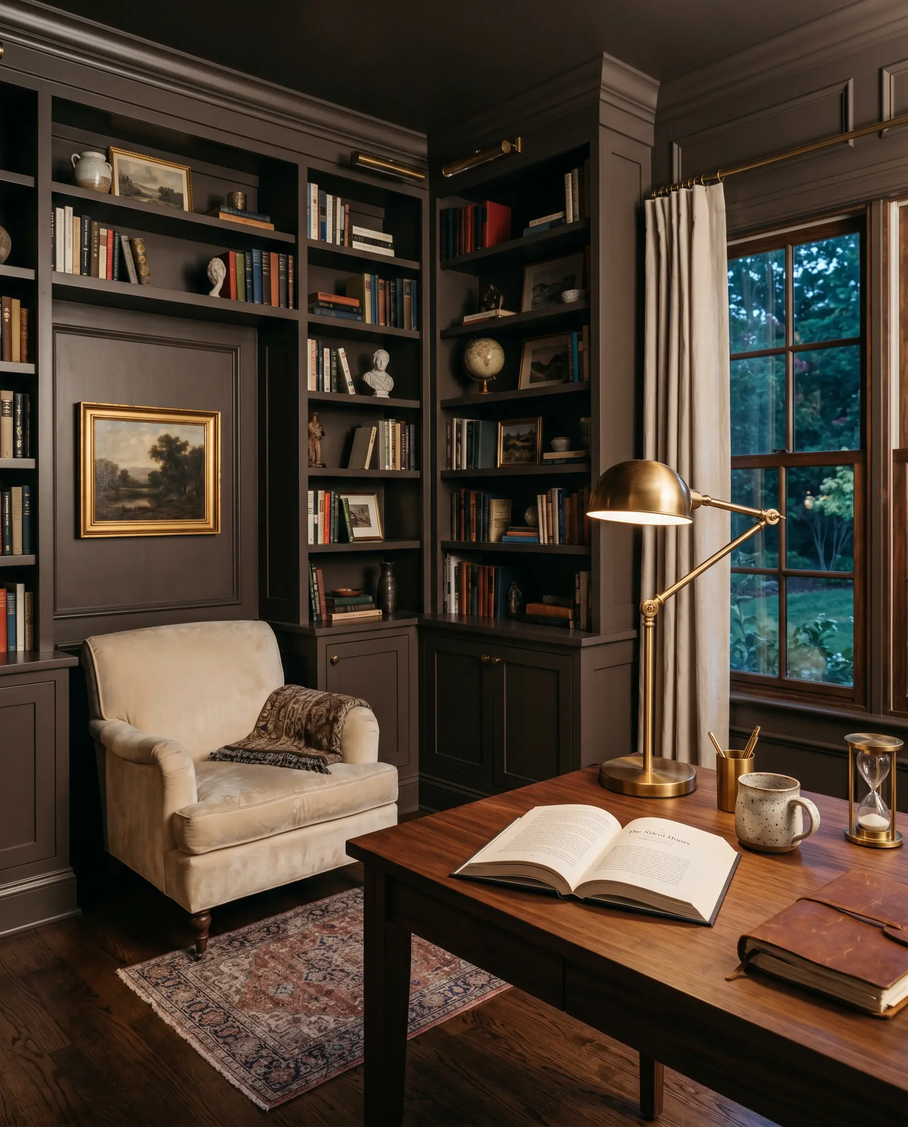
Libraries & Studies
This is where a low-chroma brown truly shines. Wrapping an entire study in this deep shade creates an instantly sophisticated, enveloping retreat. You can easily build the best moody brown paints for libraries around a color with this specific Hue Angle of 22.1°, as it provides a grounded, historic feel. Contrast the dark walls with plush velvet seating, vintage rugs, and brass reading lamps to complete the high-end illusion.
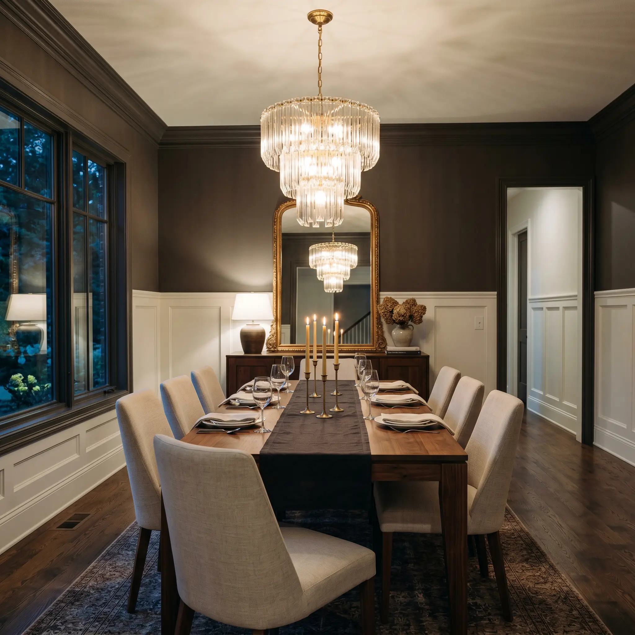
Dining Rooms
For a formal dining space that feels curated and expensive, use this paint above crisp, traditional wainscoting. The dark upper walls will recede, making the ceiling feel taller while creating an intimate atmosphere for evening meals. Use a large, reflective mirror or a glass-tiered chandelier to bounce candlelight against the shadowy walls.
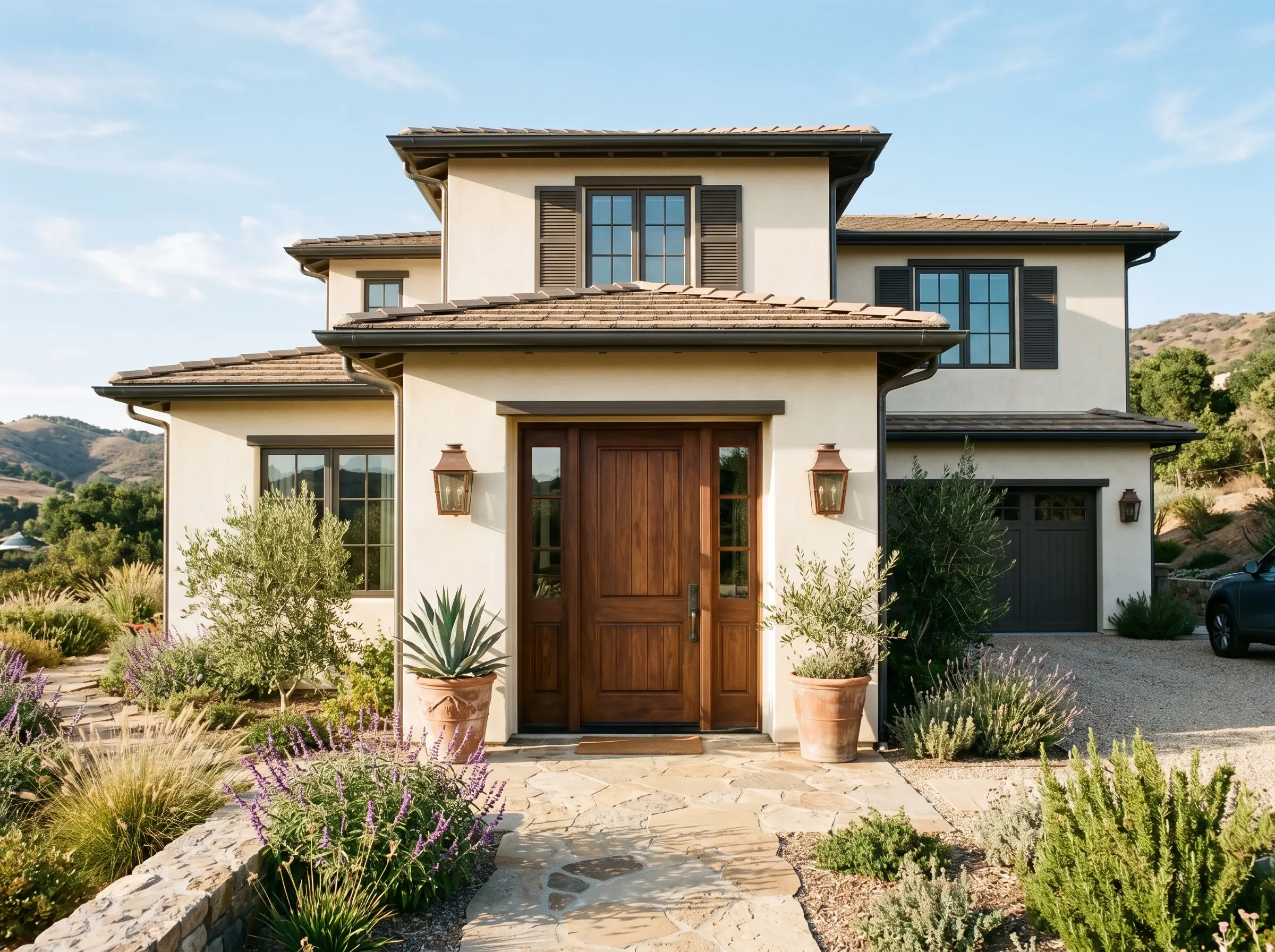
Exteriors
On an exterior facade, natural sunlight will wash out some of the paint’s depth, revealing more of its mocha warmth. It makes an exceptional choice for architectural accents, trim, and shutters against a warm off-white stucco body. Just remember that dark colors absorb heat, so ensure you use high-quality exterior paint with excellent color fade protection.
Creative Ways to Use This Desaturated Umber
Beyond the standard rooms, this paint’s unique DNA offers incredible opportunities for high-impact, weekend DIY projects. Here are a few distinctive ways to elevate your home’s architecture.
The Color-Blocked Hallway Arch
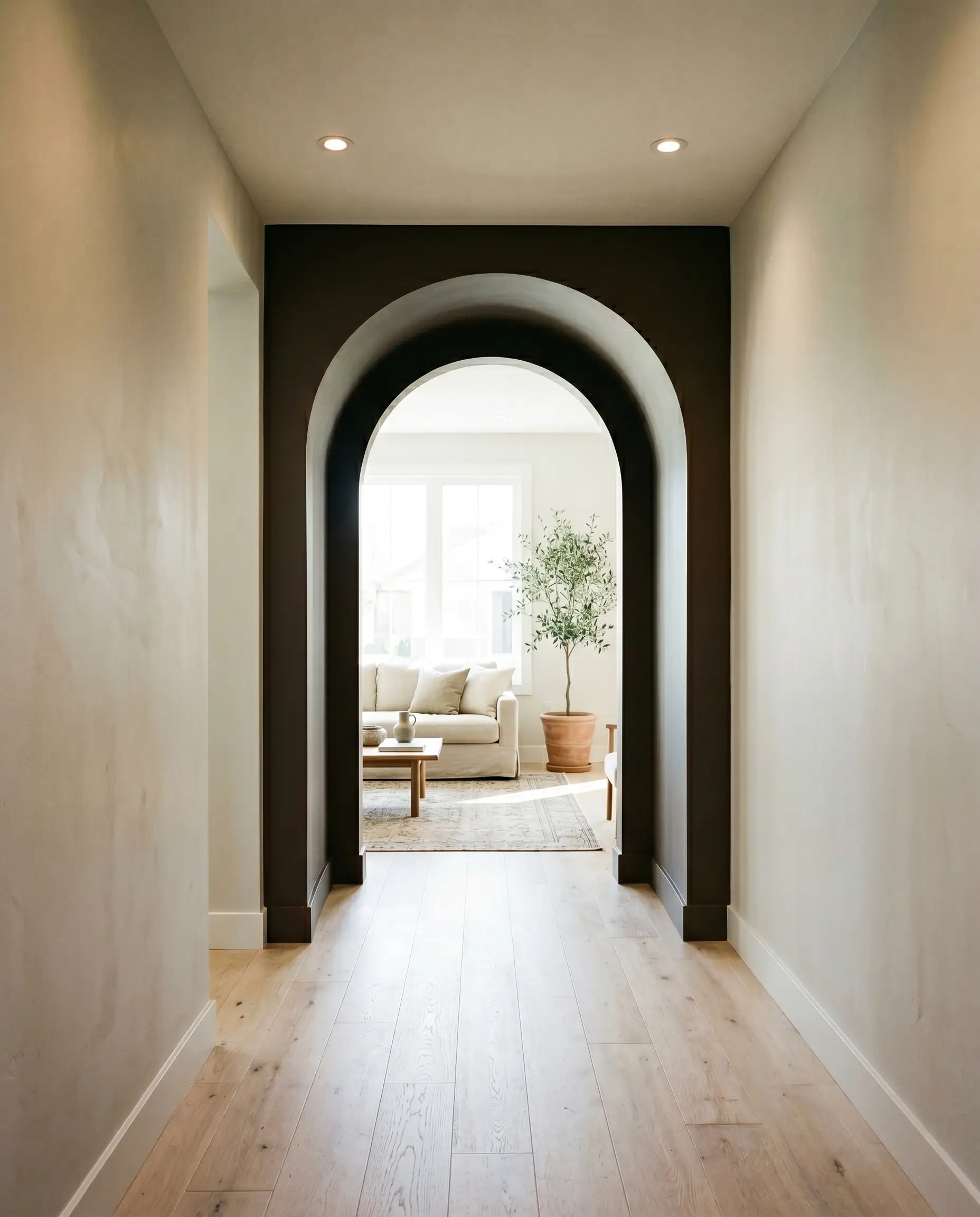
If your home has standard builder-grade archways, you can instantly modernize them by painting the interior curve and the immediate surrounding wall block in this deep brown. This technique creates a striking visual threshold that separates two lighter rooms. The dark boundary frames the view into the next space, making your standard hallway look like a custom architectural feature.
A Boutique-Style Powder Room
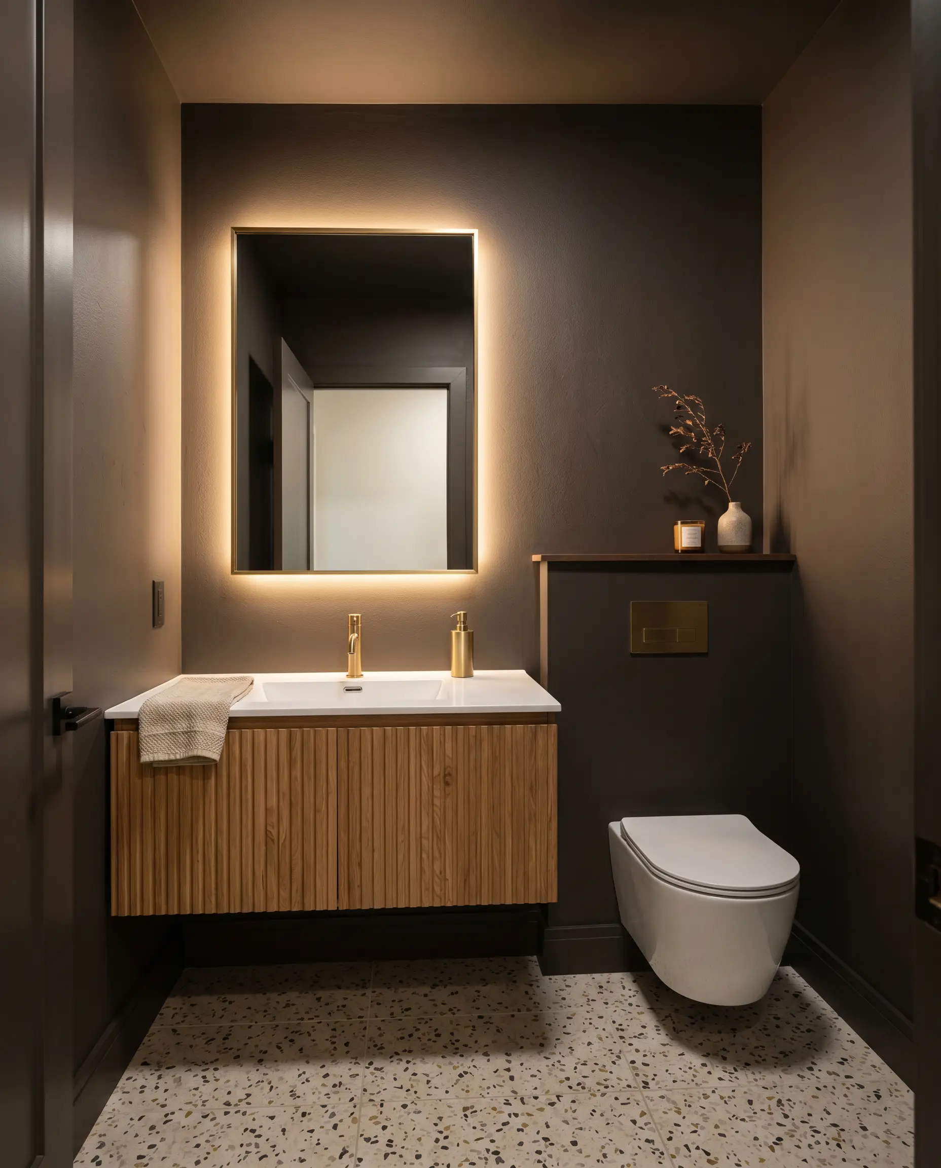
Small, windowless powder rooms are the perfect place to lean into light absorption rather than fighting it. Paint the walls, ceiling, and trim entirely in Dark Truffle to create a seamless, jewel-box effect. Add a floating vanity in a lighter, natural wood tone and install a backlit mirror to give the illusion that the walls are endlessly deep.
The Grounded Ceiling Treatment
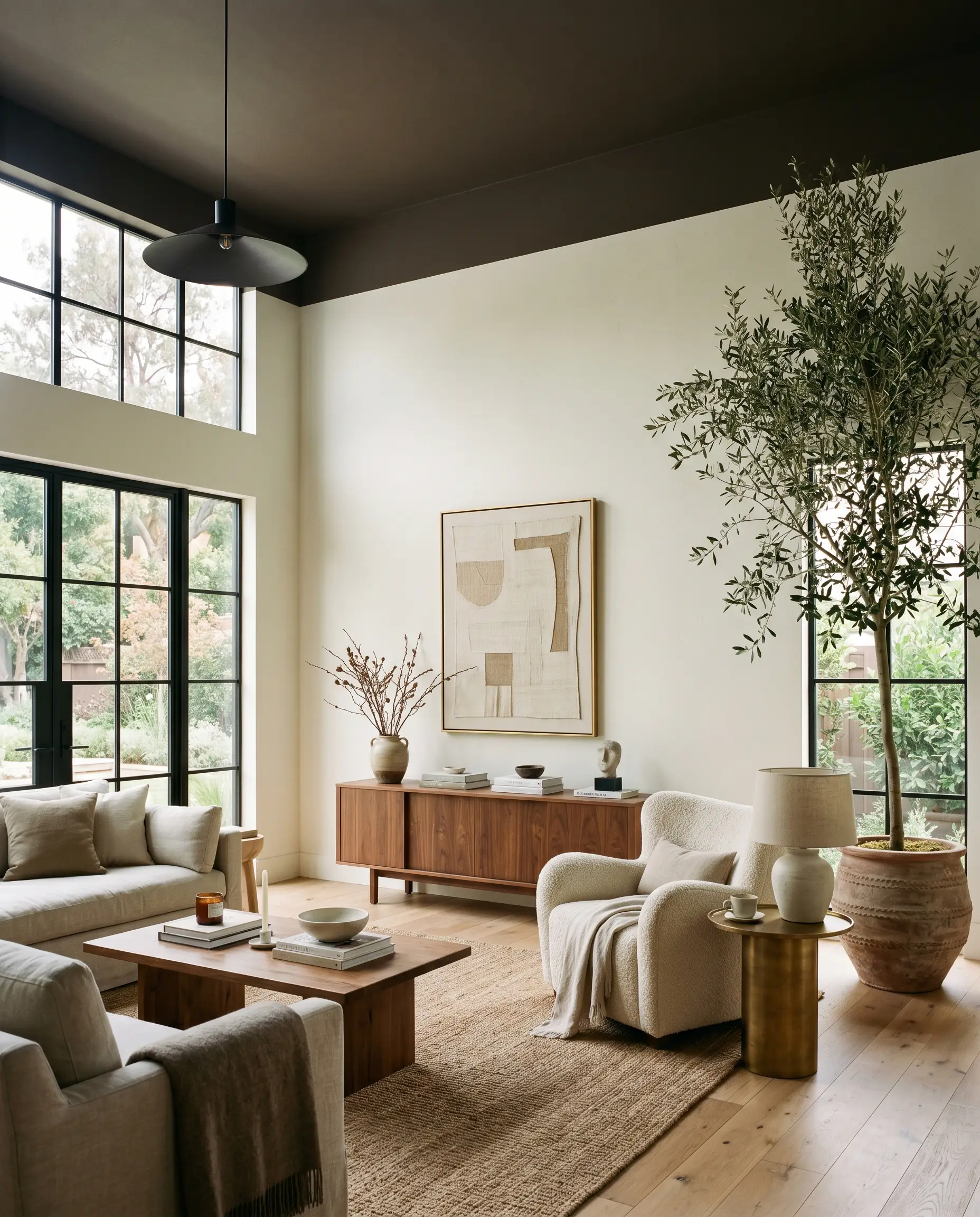
Instead of defaulting to a white ceiling in a room with tall, stark walls, flip the script. Painting the “fifth wall” in this moody brown visually lowers the ceiling, making an overly cavernous living room feel intimate and anchored. Carry the color down onto the top six inches of the wall to create a custom, tailored border that mimics high-end crown molding.
Coordinating Colors & Best Pairings
This heavily neutralized brown thrives on intentional contrast. It needs crisp boundaries or soft, tonal transitions to feel like a deliberate design choice rather than a random dark wall.
Trim & Baseboards
Hardware & Material Pairings
Pairing the right tactile elements is crucial for elevating an approachable paint job into a curated space.
Coordinating Colors
Designer Mood Boards
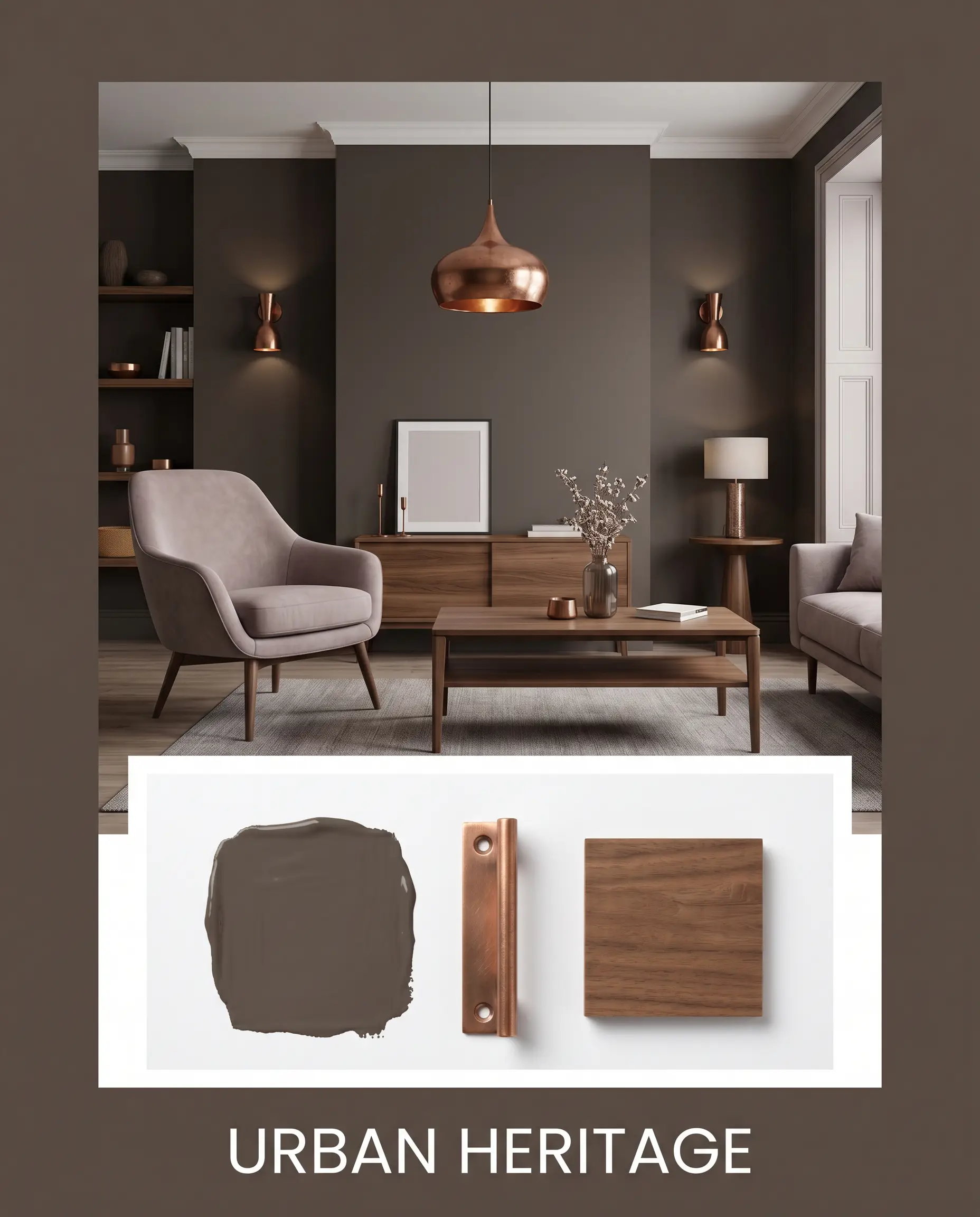
Urban Heritage: This palette relies on the tension between historic depth and modern lines. Imagine the grounding presence of Behr PPU5-19 paired with the dusty elegance of Farrow & Ball Peignoir 286. Introduce aged copper light fixtures and sleek walnut wood tones to bridge the eras. The energy is deeply curated, refined, and effortlessly timeless.
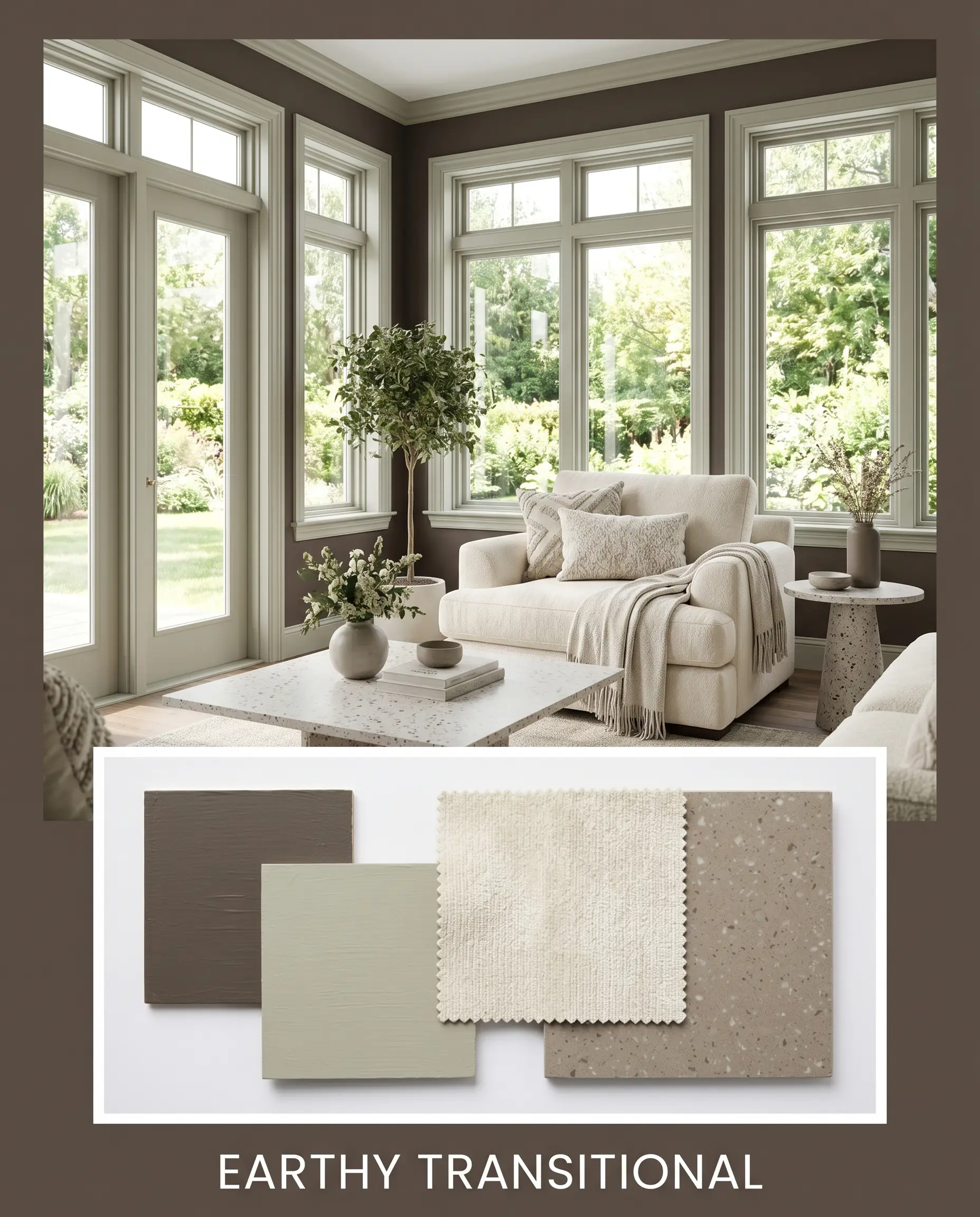
Earthy Transitional: Focusing on natural warmth, this combination uses Benjamin Moore October Mist 1495 to lift the heavy brown base. Layer in plush cream chenille textiles and matte terrazzo surfaces to bounce soft light around the space. It feels incredibly grounded, serene, and deeply connected to the outdoors.
Behr Dark Truffle Head-to-Head Comparisons
Choosing the right dark neutral often comes down to the subtle differences in undertone behavior. Here is how this shade stacks up against its closest rivals to help you make a confident final decision.
Behr Dark Truffle PPU5-19 vs. Sherwin-Williams Black Fox SW 7020
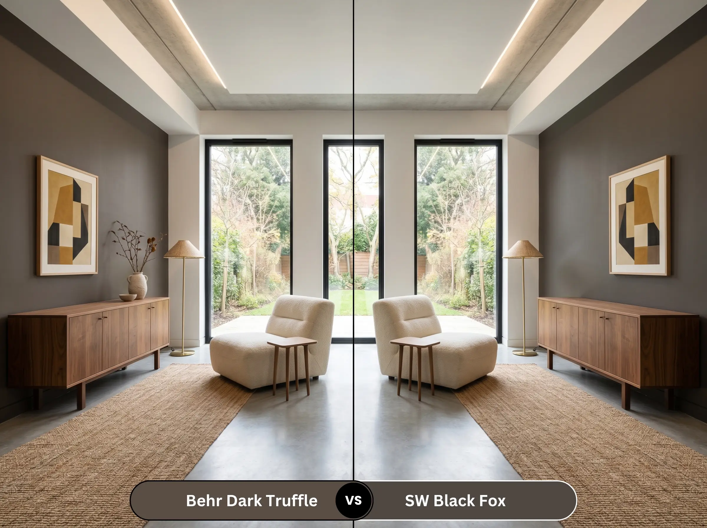
If you are dealing with a room that gets intensely warm western light, Sherwin-Williams Black Fox (SW 7020) might be the better candidate. It leans noticeably more gray and lacks the violet-mocha undertones, making it a safer bet if you want to avoid any hint of purple. However, Behr PPU5-19 offers a richer, more layered depth that feels slightly more traditional.
Behr Dark Truffle PPU5-19 vs. Benjamin Moore Van Buren Brown HC-70
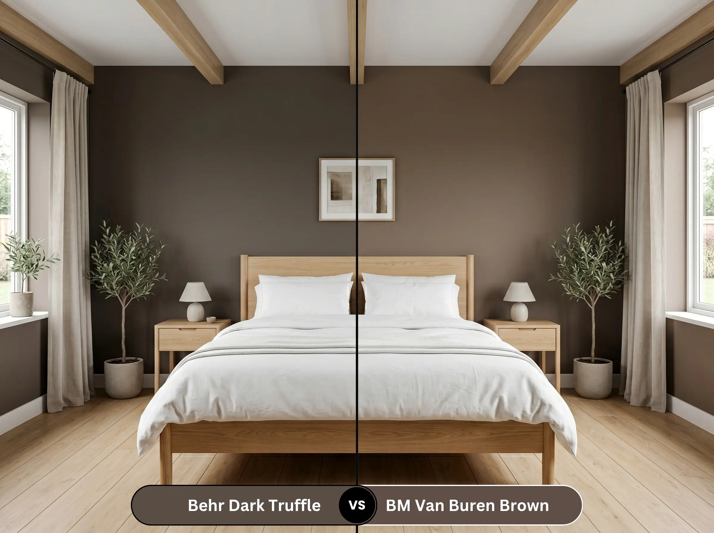
Benjamin Moore Van Buren Brown (HC-70) is a much warmer, more classic chocolate brown. If your goal is a highly historic, library-style warmth, Benjamin Moore provides that traditional feel. Dark Truffle, with its shadowy cool undertones, is the superior choice for a modern, updated aesthetic that actively avoids looking like a 1990s throwback.
Behr Dark Truffle PPU5-19 vs. Behr Espresso Beans PPU5-01
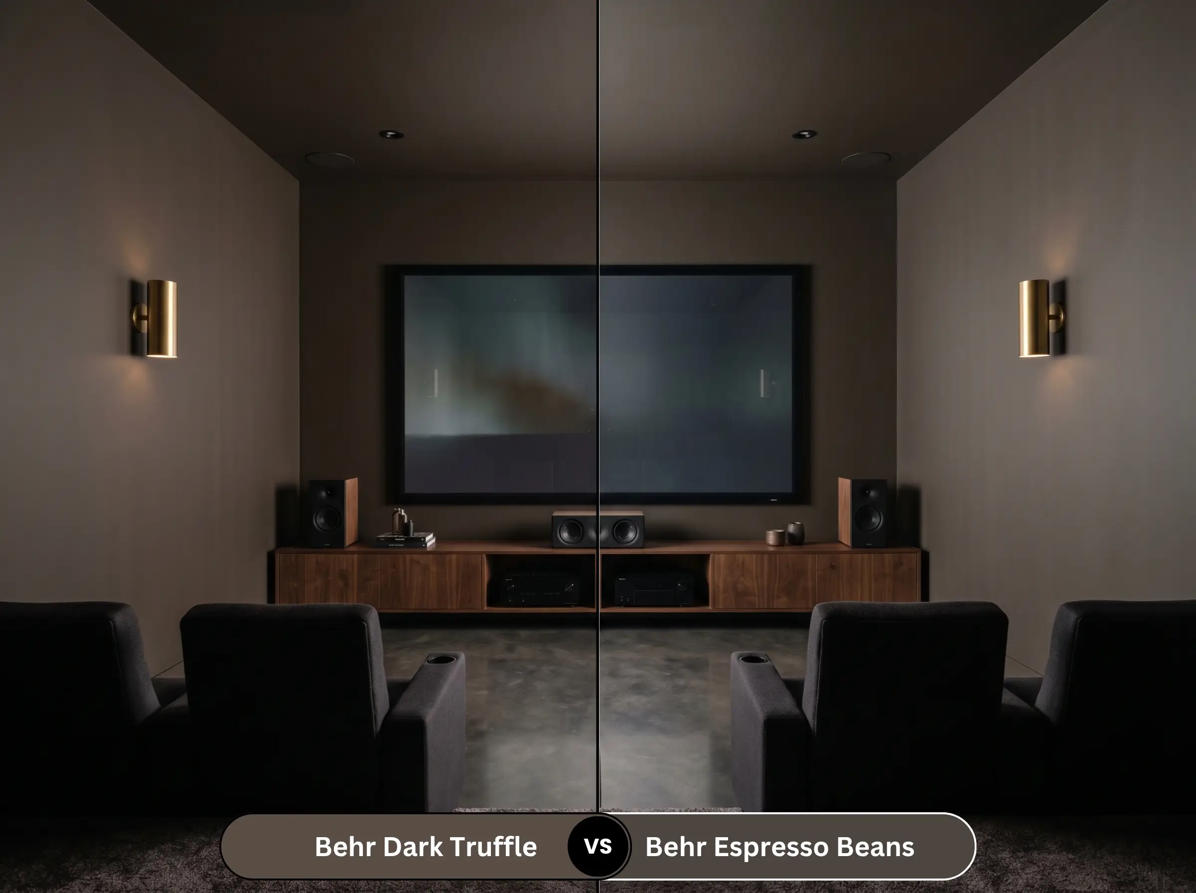
These two are incredibly close, but Behr Espresso Beans (PPU5-01) drops even lower in light reflection, pushing closer to a true black-brown. If you want maximum light absorption for a theater room or ultra-moody accent, Espresso Beans delivers. Dark Truffle retains just enough chroma to read clearly as a dark brown rather than a soft black.
Similar Colors & Brand Equivalents
Whether you need a slightly different light reflectance value for a shadowy hallway or you are shopping across different brands, these alternatives offer a similar aesthetic profile.
Same-Brand Alternatives
Cross-Brand Matches
Practical Application & DIY Advice
Executing a dark paint job requires careful planning to ensure a flawless, high-end result. Let’s break down the practical steps for getting this desaturated umber onto your surfaces smoothly.
The Dynamic Sheen Guide
Primer Strategy
A standard white primer will sabotage this color, requiring endless coats to achieve true opacity. You must use a high-quality primer tinted to a deep gray. This establishes a dark foundational layer, allowing the rich mocha and violet undertones to develop fully without looking streaky or washed out.
Coverage & Success Tips
Even with a tinted primer, expect to apply at least two generous coats to achieve a professional, solid finish. Dark colors are notorious for “flashing,” where uneven roller pressure leaves visible, shiny streaks once dry. Maintain a wet edge while rolling, work in small sections, and avoid the temptation to touch up partially dried spots, which will inevitably dry as a different texture.
Always use a high-quality, shed-free microfiber roller cover when applying dark colors. Cheaper rollers will leave behind tiny fibers that become glaringly obvious against the deep brown backdrop, ruining your smooth finish.
Hackrea Pro-Tip (The Roller Rule)
Frequently Asked Questions
Because the cooler northern light pulls the shadowy cool undertones forward, you will definitely see a hint of violet-gray emerge. It will not look like a bright purple, but rather a sophisticated, muted plum-brown. If you want to suppress this effect, ensure your artificial lighting leans heavily warm (around 2700K).
Direct exterior sunlight will significantly lighten the perceived color, making the mocha undertones much more prominent. Because it absorbs so much heat and UV radiation, it is prone to faster fading than lighter shades. Always use a premium exterior paint line formulated specifically for UV resistance to protect your investment.
Absolutely, provided you balance the visual weight strategically. The trick is to keep the dark color restricted to the lower cabinets or the island to ground the space. Pair it with highly reflective elements like glossy subway tile, light quartz countertops, and bright upper walls to keep the room feeling expansive.
If you go entirely flat, the low chroma can sometimes make the walls look a bit dusty or chalky in rooms with poor natural light. Stepping up to an Eggshell finish provides just enough subtle sheen to keep the color looking rich and hydrated, without turning your walls into a reflective mirror.
Final Verdict & Expert Warnings
Behr Dark Truffle PPU5-19 is a brilliantly executed, highly sophisticated neutral that brings premium architectural depth to everyday homes. It is the perfect choice for DIY renovators who want to create an enveloping, moody atmosphere in a library, or ground a modern kitchen with striking dark cabinetry. By utilizing its low chroma and shadowy undertones, you can easily achieve a curated, expensive look on a realistic budget.
This paint requires careful curation to succeed, and pairing it with the wrong elements will quickly drag your room down. Avoid pairing this deep umber with cherry wood floors or aggressively red-toned mahogany furniture, as the clashing warm reds will fight the shadowy cool undertones, making the paint look muddy and unintentional. Similarly, steer clear of cool, icy white textiles and stark chrome fixtures; these harsh, sterile elements will strip away the mocha warmth, leaving the room feeling severe and unwelcoming rather than cozy and curated.
Expert Warning (Clash Tip)
Closest Cross-Brand Equivalents
The absolute closest scientific color matches for Dark Truffle across top paint brands.