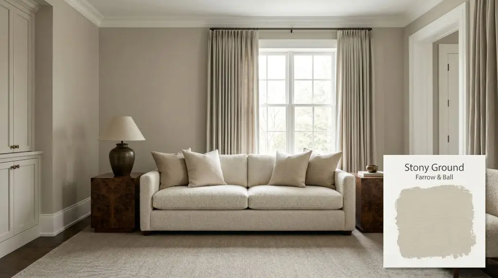
Stony Ground No. 211
Farrow & BallFarrow & Ball Stony Ground No. 211 is a classic, warm stone beige with a subtle underlying red cast. This sophisticated neutral bridges the gap between traditional taupe and modern greige, offering a grounded, earthy foundation that adds quiet warmth to any interior or exterior space.
Paint Technical Profile
| Color ID / SKU | No. 211 |
| HEX Code | #c9bfab |
| Light Reflectance (LRV) | 54.9 |
| Use | Interior, Exterior |
| Best Exposures | North, South, East |
| Best For | Living Rooms, Kitchen Cabinetry, Hallways, Historic Exteriors |
Farrow & Ball Stony Ground: The Architect’s Approach to a Warm, Earthy Neutral
Farrow & Ball Stony Ground No. 211 is the visual equivalent of sun-warmed limestone.
When you are trying to design a room that feels established but not visually dated, finding the right foundational color is often the most challenging part of the process. This specific chromatic profile offers a rich, earthy cast that instantly makes a space feel intentional, layered, and beautifully lived-in.
It completely bypasses the sterile energy of modern grays, offering a sophisticated warmth that pairs effortlessly with natural materials.
Farrow & Ball Stony Ground: Undertones & LRV
If you are wondering whether this paint is warm or cool, Farrow & Ball Stony Ground is definitively warm. It relies on a deeply rooted, earthy base that radiates a soft, inviting energy without ever feeling overwhelmingly yellow.
Understanding the anatomy of this color structure is essential before you pick up a brush:
With a light reflectance value of 54.9, this shade sits beautifully right in the middle of the spectrum. It has enough visual density to contrast sharply against crisp white architectural finishes, yet it bounces enough light around the room to keep the atmosphere feeling open. You get the profound, enveloping mood of a darker color without sacrificing the airy quality of a lighter neutral.
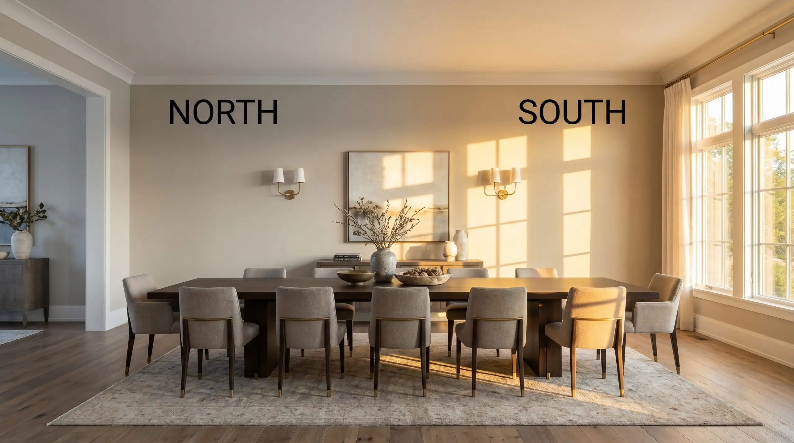
The Chameleon Factor: Lighting Farrow & Ball’s Warm Stone
Because of its complex pigment blend, this color responds dramatically to the shifting temperature of your light sources. Understanding this directional lighting behavior is the key to predicting how the paint will actually look throughout the day.
Popular Applications for a Bespoke Palette
Once you understand the underlying warmth of this shade, the fun part begins: deciding exactly how to deploy it. This earthy neutral is remarkably adaptable, shifting its personality based entirely on the materials, textiles, and architectural features you pair it with.
Rethinking Kitchen Cabinetry
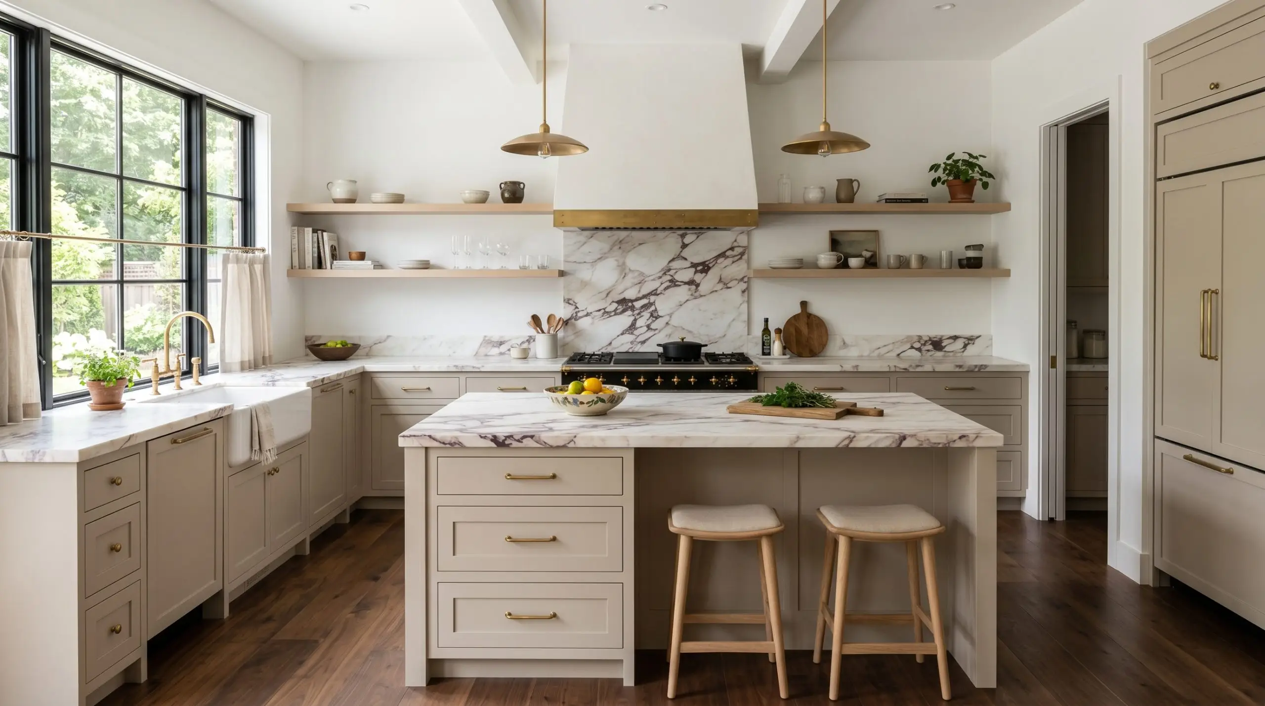
Instead of defaulting to stark white or trendy forest green, using this mid-tone on your lower cabinets or a central island establishes a beautifully organic foundation for the avid home chef.
Pair it with honed marble countertops, unlacquered brass hardware, and bleached oak floating shelves for a kitchen that feels effortlessly high-end. If you have abundant natural light, taking the color all the way up to the ceiling on your upper cabinets creates a seamless, built-in look that feels incredibly custom.
When applying a mid-tone like this to heavily used surfaces, always opt for a highly durable, washable finish like a modern eggshell or satin. The slight sheen will naturally catch the light, highlighting the subtle red undertones and adding dimension to flat cabinet doors.
Hackrea Pro-Tip (The Finish Matters)
Elevating the Entryway and Corridors
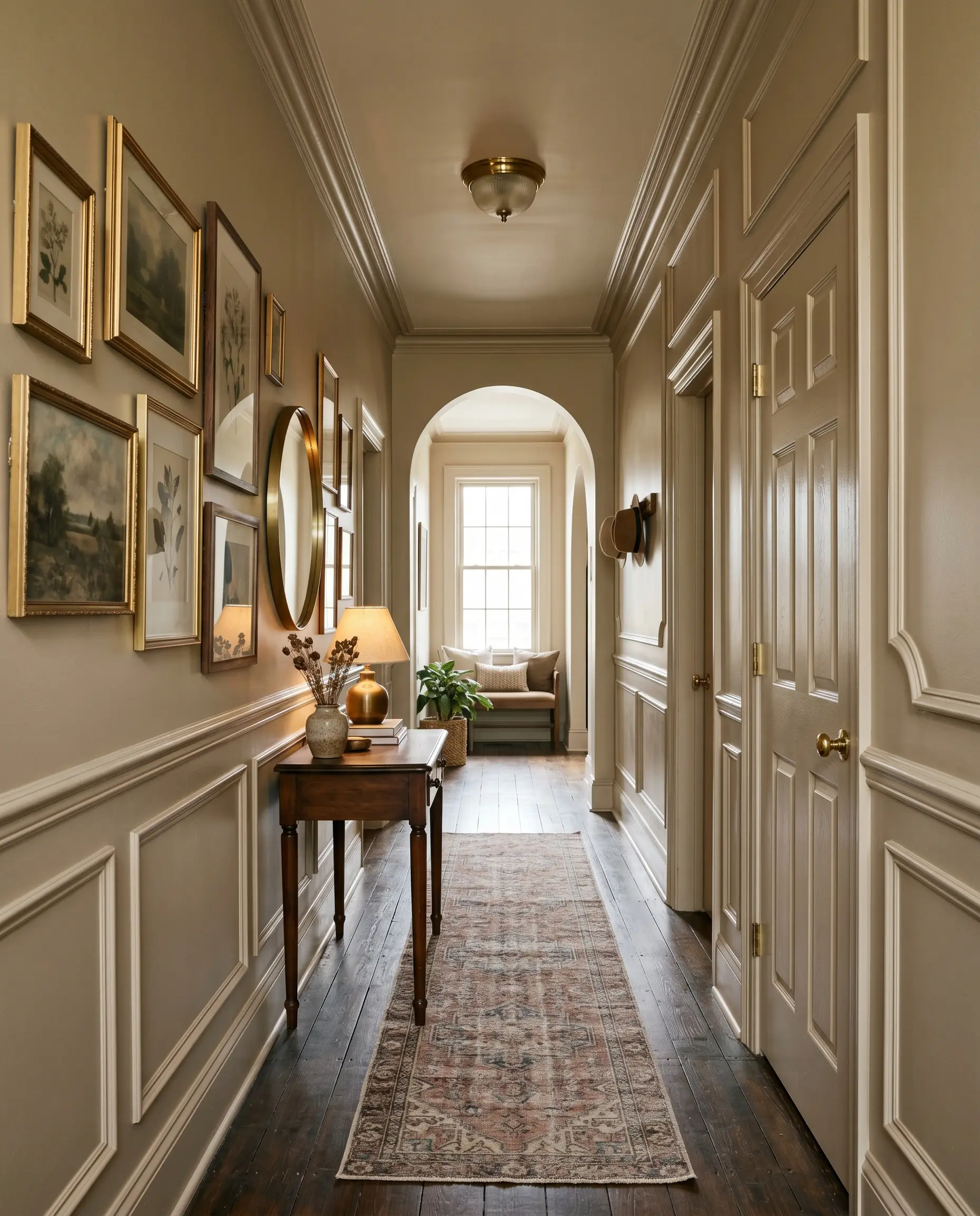
Hallways are often treated as architectural afterthoughts, but they are the crucial connective tissue of your home.
While this shade thrives in historic homes with original wainscoting and crown molding, you can easily modernize the application by color-drenching the entire space. Painting the walls, interior doors, and trim in the exact same finish blurs the physical boundaries of narrow corridors, making them feel wider. It provides a stunning, muted backdrop for an asymmetrical gallery wall or a faded vintage runner.
Crafting an Enveloping Living Space
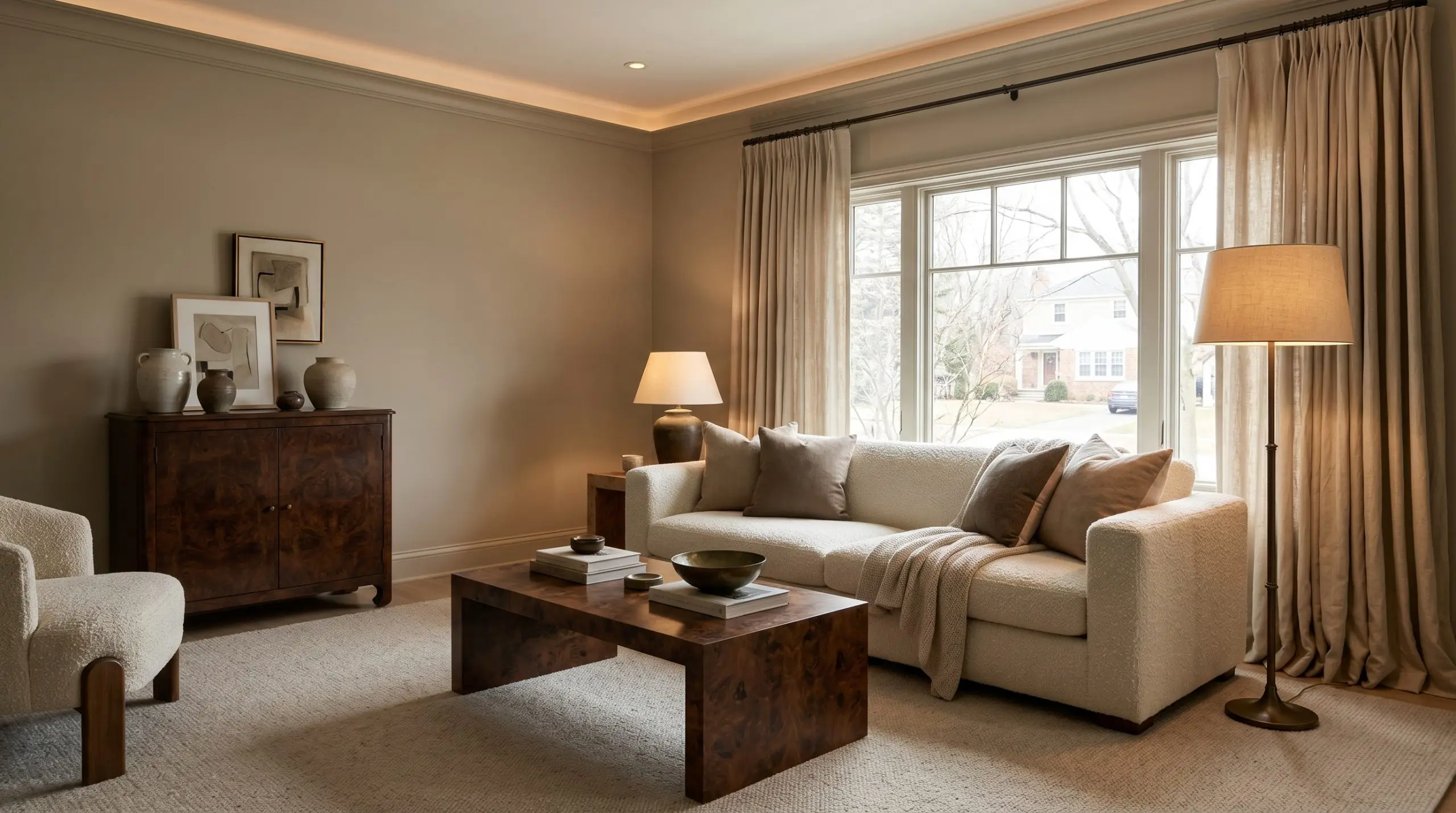
In a main gathering space, this warm stone base truly shines when layered with an abundance of tactile materials.
To maximize the inviting atmosphere, surround the paint with heavy linen drapery, a textured bouclé sofa, and accents of patinated bronze or dark burl wood. The red-based neutral structure ensures the room never feels cold or sterile, even on overcast winter afternoons.
Be incredibly careful when pairing this shade with overly yellow or honey-toned wood floors. The strong yellow hues in the wood can pull the subtle red undertones in the paint out of balance, making the walls look unintentionally pink or muddy. Root the seating area with a large, neutral worsted wool rug to create a necessary visual break.
Clash Warning (Avoiding the Yellow Trap)
Timeless Exterior Facades
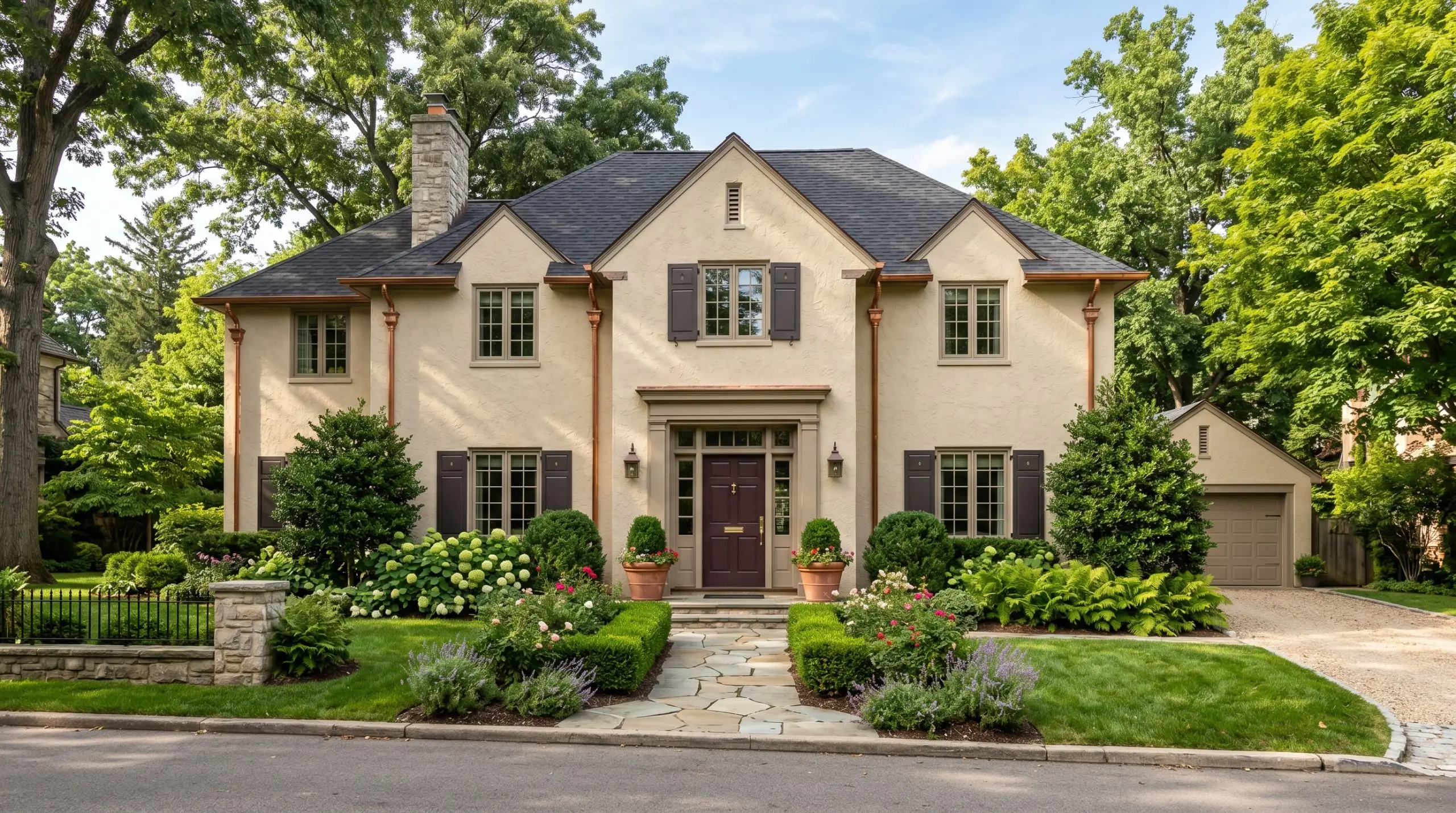
Taking this color outside is a brilliant way to give a home a sense of permanence, especially on textured surfaces like traditional render or stucco.
Keep in mind that in full, direct exterior sunlight, the color will wash out slightly, losing some of its interior depth and reading as a soft, sun-baked limestone. Complement the earthy cast with a dark oxblood or charcoal black front door, copper gutters that will beautifully patinate over time, and lush, structured landscaping to create a striking street presence.
Designing with Stony Ground: Materials & Complementary Palettes
This specific pigment demands surrounding materials that either sharply contrast its muted warmth or softly bleed into its earthy cast. Rather than forcing a rigid color scheme, you must look at how the paint’s underlying structure reacts to the textures placed directly against it.
Framing with the Right Whites
Your choice of trim color dictates whether this mid-tone feels like a modern, tailored architectural feature or a soft, historical backdrop.
Tactile Elements & Hardware
The most successful spaces treat this paint as a foundational layer, building upon it with highly tactile finishes. Because this shade absorbs light beautifully, you want to introduce materials that offer a rich, sensory dialogue.
Complementary Paint Combinations
Curated Room Concepts
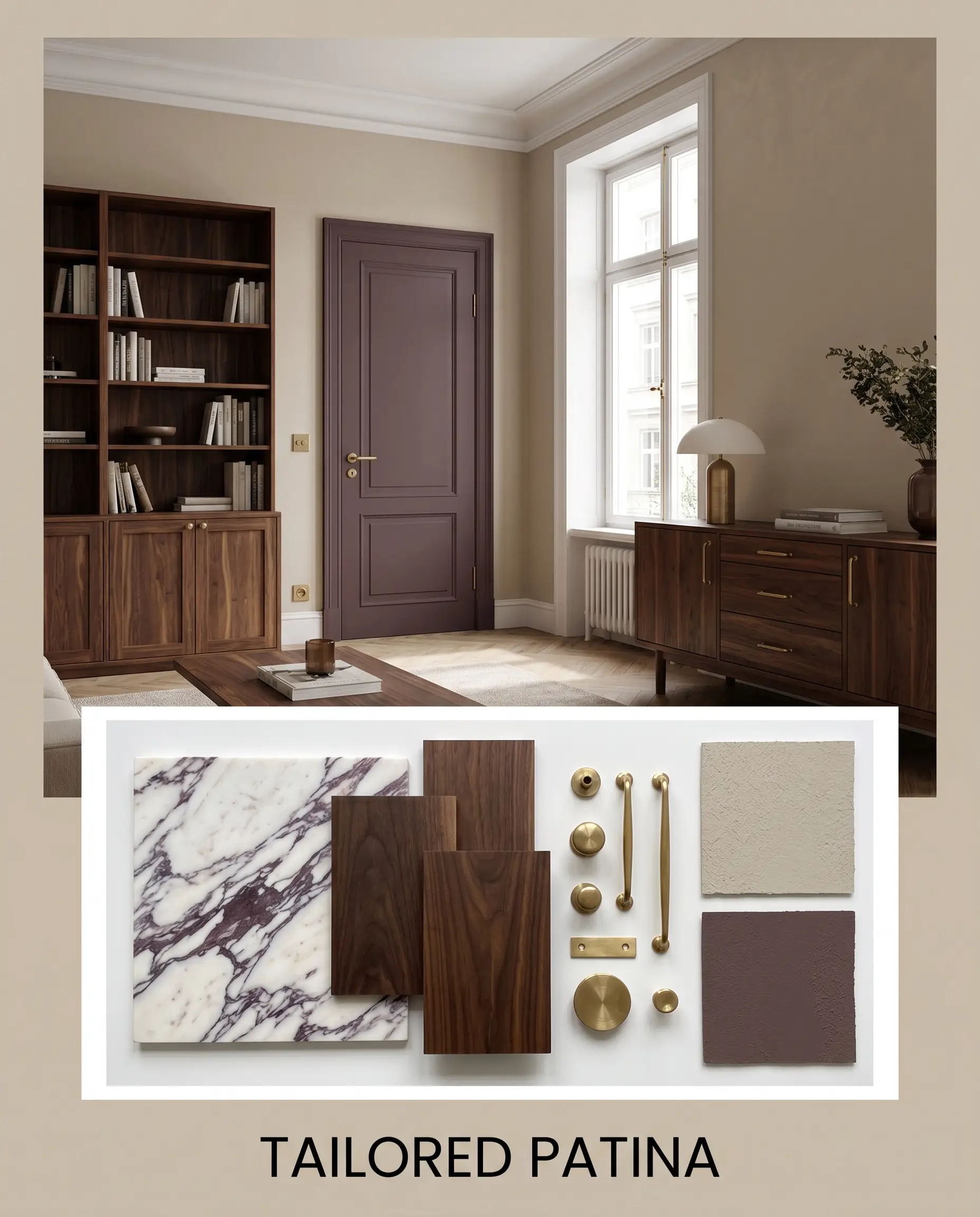
Tailored Patina This aesthetic leans into the moody, layered sophistication of a classic European apartment. Anchor the space with deep walnut furniture silhouettes and heavily veined Calacatta Viola marble surfaces. By introducing interior doors painted in Farrow & Ball Brinjal No. 222 and finishing the space with unlacquered brass hardware, you create an environment that feels historically rich yet undeniably modern. The warm stone walls act as the perfect, quiet backdrop for this high-contrast drama.
The Tactile Retreat If you crave a serene, organic atmosphere, focus entirely on texture rather than sharp color contrasts. Pair the walls with crisp Benjamin Moore White Dove OC-17 trim to create a soft, glowing boundary. Layer the room with slubby linen upholstery, textural jute rugs, and accents of Sherwin-Williams Rosemary SW 6187 to bring the outdoors in. The resulting mood is incredibly grounded, offering a quiet, restorative energy that wraps around you the moment you walk in.

Head-to-Head: Stony Ground vs. Farrow & Ball Rivals
Sometimes your specific architectural lighting or exterior exposures will make a color fall flat, requiring a slight shift in pigment weight. If your room lacks natural light or pulls the undertones in an unwanted direction, comparing similar shades is the best way to pivot your strategy.
Farrow & Ball Stony Ground No. 211 vs. Farrow & Ball Drop Cloth No. 283
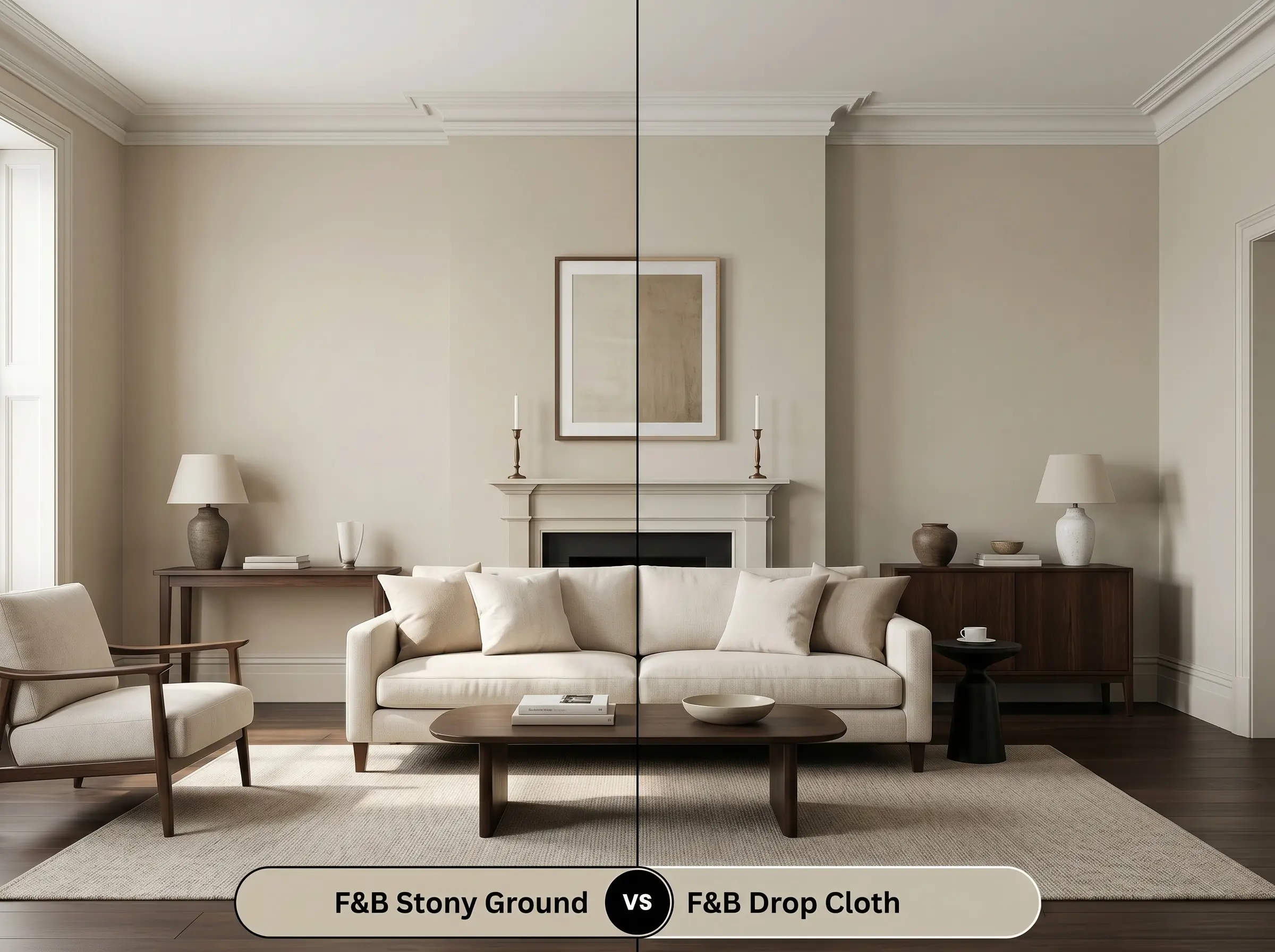
Drop Cloth No. 283 is slightly lighter and noticeably less red in its underlying structure. If your room faces south and the intense afternoon sunlight makes Stony Ground No. 211 read a bit too pink or muddy for your taste, then Drop Cloth is the perfect pivot. It offers a safer, more traditional beige aesthetic while maintaining that coveted, high-end depth.
Farrow & Ball Stony Ground No. 211 vs. Farrow & Ball Hardwick White No. 5
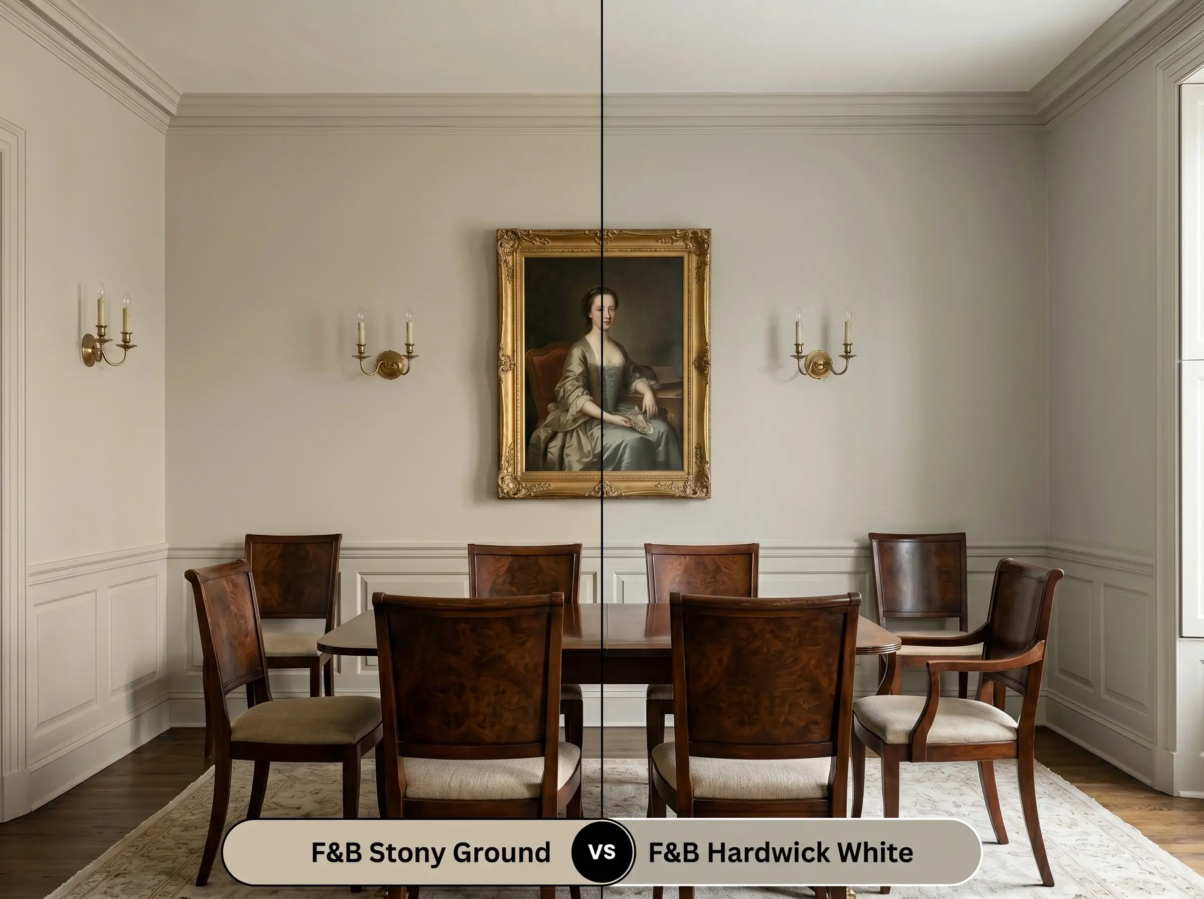
Hardwick White No. 5 carries a distinct green-gray undertone, completely abandoning the earthy, red-based warmth of its rival. If you are designing a space that requires a truly historic, shadowy gray rather than a warm stone feel, then Hardwick White is the superior choice. Always test these two side-by-side; the green notes in Hardwick White will immediately make the opposing sample look significantly warmer and softer.
Exploring Alternatives to This Historic Greige
Minor adjustments to depth and warmth are completely normal during the testing phase. Whether you need a slightly higher light reflectance value for a dark hallway or are looking for a comparable shade from another manufacturer, these alternatives provide excellent starting points.
Farrow & Ball Alternatives
Cross-Brand Color Matches
Mastering the Application of Stony Ground
Translating this historic greige from a sample card to your actual walls requires a specific finishing strategy. The sheen you choose will fundamentally alter how the pigment interacts with the light in your room.
To ensure the complex red base develops properly, you must use the brand’s recommended Mid Tones primer. Skipping this step or using a stark white generic primer will wash out the final color, leaving it looking thin and lacking its signature depth.
Hackrea Design Secret (The Primer Rule)
When rolling this shade, expect to apply two full coats for absolute opacity and a professional result. Be highly mindful of flashing; you must maintain a wet edge and roll consistently from ceiling to floor to avoid visible overlap marks. Mid-tones are notoriously unforgiving to spot touch-ups, so take your time during the final coat to ensure a flawless, even finish.
Expert Answers to Your Color Questions
Because it lacks direct sunlight in a wooded lot, the warm red base will naturally recede. The stucco will appear surprisingly gray and shadowy, creating a deeply historical, grounded look rather than a bright, sun-baked facade.
This mid-tone is uniquely equipped for this exact scenario. The innate warmth of the paint beautifully softens the aggressive yellow of the oak, while its gray-leaning structure harmonizes with the icy veining of the marble, making the entire kitchen feel cohesive.
It actually creates a seamless, highly complementary relationship. The underlying red notes in the paint speak directly to the fired clay tones of the brick, resulting in an incredibly warm, industrial-meets-traditional aesthetic.
Without natural daylight to wash it out, the color transforms into a deeply enveloping, cozy shade. It creates an intimate, intentional atmosphere that feels relaxing and sophisticated, rather than feeling like an oppressive or forgotten basement.
The Final Verdict on Farrow & Ball Stony Ground
Farrow & Ball Stony Ground No. 211 is the ultimate foundational color for homeowners who want their spaces to feel established, warm, and highly curated. It thrives in transitional and organic modern homes, effortlessly bridging the gap between historical architectural details and contemporary furnishings. If you are looking for a sophisticated neutral that changes beautifully throughout the day and pairs flawlessly with tactile, natural materials, this is an exceptional choice.
However, this paint requires intentional styling to succeed. Do not pair this warm stone hue with stark, cool-toned minimalist elements like polished chrome hardware, glass block accents, or bright white LED lighting. These icy, clinical finishes will drastically clash with the earthy cast of the paint, instantly making the walls look muddy and causing your expensive hardware to feel entirely out of place. Instead, lean into its inherent warmth by surrounding it with rich woods, patinated metals, and soft, natural textiles for a truly elevated home.
Closest Cross-Brand Equivalents
The absolute closest scientific color matches for Stony Ground across top paint brands.