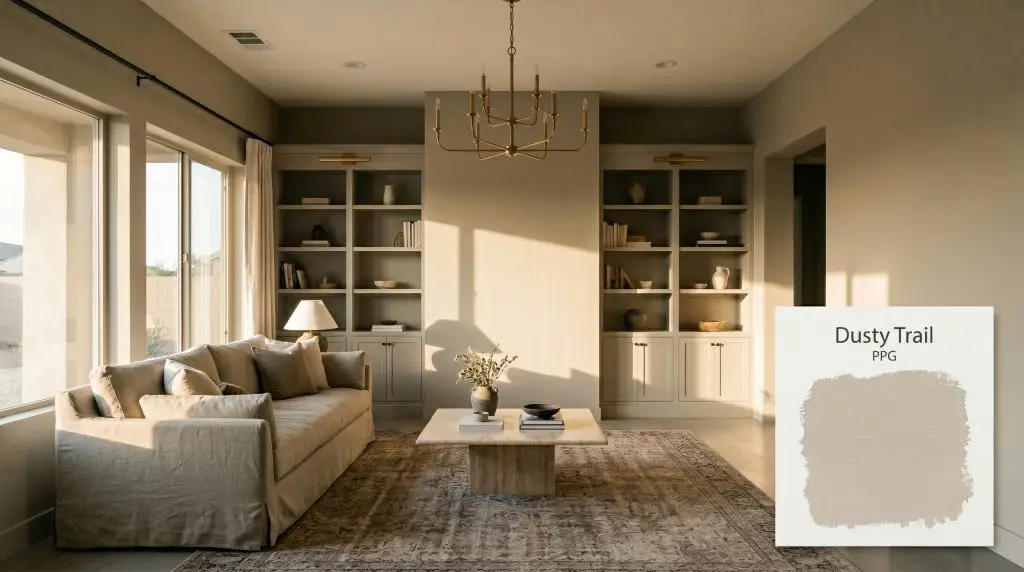
Dusty Trail PPG1097-4
PPGPPG Dusty Trail (PPG1097-4) is a mid-tone, neutral golden beige with a distinct almond undertone. Boasting an LRV of 50, it acts as a stabilizing earthy neutral that brings warmth to interior spaces without leaning too yellow or orange.
Paint Technical Profile
| Color ID / SKU | PPG1097-4 |
| HEX Code | #c9bba3 |
| Light Reflectance (LRV) | 50 |
| Use | Interior, Exterior |
| Best Exposures | North, East |
| Best For | Living rooms, home offices, cozy bedrooms, exterior siding |
PPG Dusty Trail: How This Earthy Golden Beige Transforms the Mood of Your Home
True interior warmth rarely comes from stark white walls or starkly cool grays. It comes from intentional, sun-baked shades that wrap a room in a quiet, tactile energy.
PPG Dusty Trail steps into this role beautifully.
As part of the PPG color family, this specific shade operates as a foundational layer that completely redefines how your furniture and textiles feel within a space. It possesses a substantial visual weight that secures a room, making standard architectural features feel incredibly custom.
By leaning away from flat, predictable tans, PPG1097-4 introduces a nuanced, earthy character to your home.
The Color DNA: Undertones & LRV of PPG Dusty Trail
When evaluating this shade for your next project, the most immediate question is always about its temperature: PPG Dusty Trail is a definitively warm hue.
This warmth is what gives the paint its welcoming, lived-in personality, but the secret to its success lies in how that warmth is structurally built.
This specific chromatic profile is paired with a Light Reflectance Value (LRV) of 50.
Sitting exactly at the equator of the light reflectance value spectrum, this architectural finish is a master of balance. It absorbs and reflects light in equal measure. This means it establishes a rich, cozy presence without plunging your room into darkness.
Sunlight and Shadows: The Chameleon Factor
Because of that hidden khaki nuance, this golden beige is highly responsive to the shifting temperature of your lighting.
Understanding this color transition is the key to ensuring the paint behaves exactly how you want it to in your specific environment.
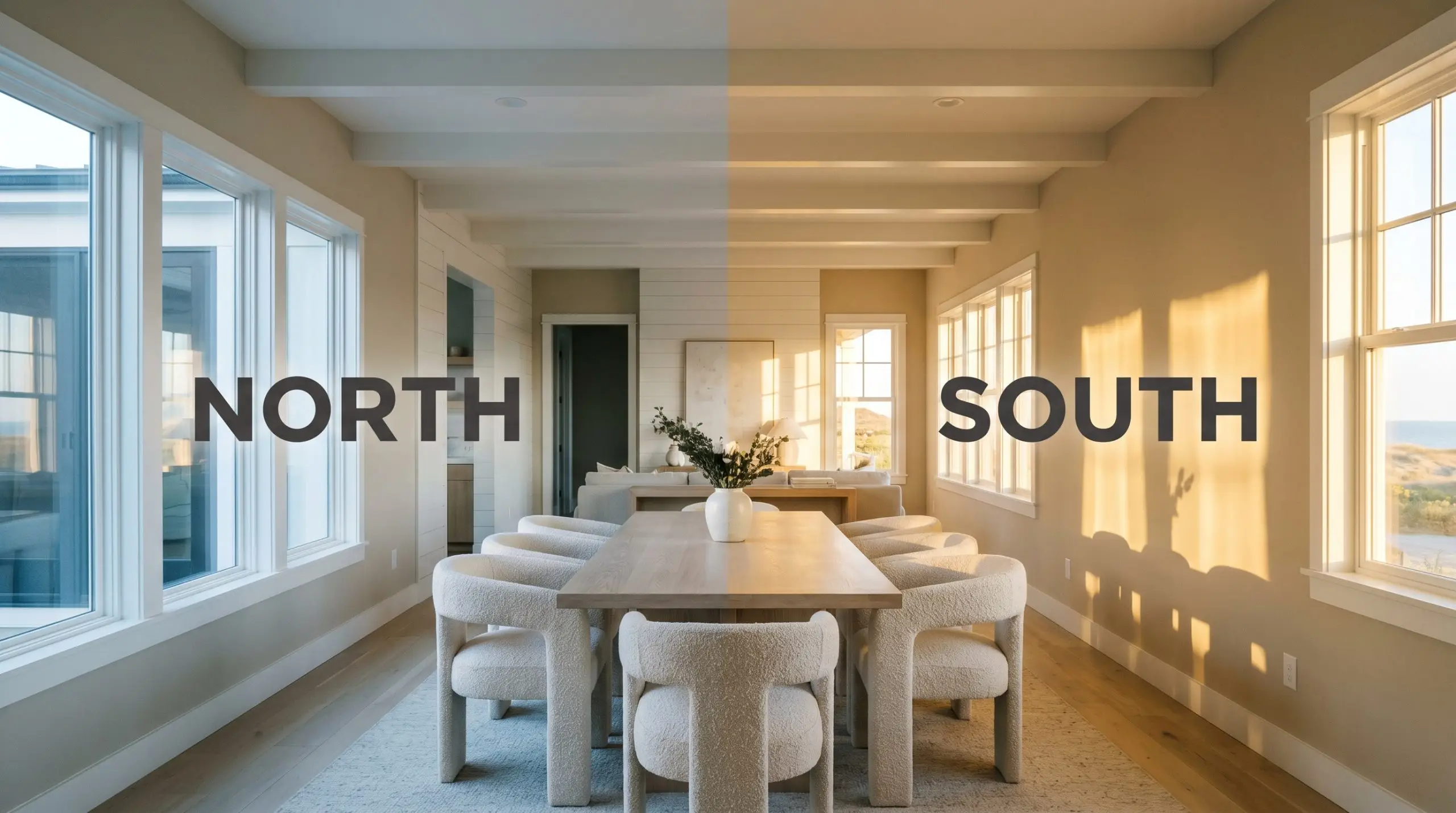
If your room lacks natural sunlight and you want to maintain the rich, earthy neutral vibe of Dusty Trail at night, strictly avoid daylight bulbs. Stick to 2700K or 3000K soft white LEDs to keep the golden base active and inviting.
Hackrea Pro-Tip (The Bulb Strategy)
Popular Architectural Applications
Understanding how this shade reacts to light is only half the battle; the real magic happens when you apply it to your home’s unique architecture.
Because of its balanced mid-tone weight, this paint adapts beautifully to a variety of lifestyles and design aesthetics.
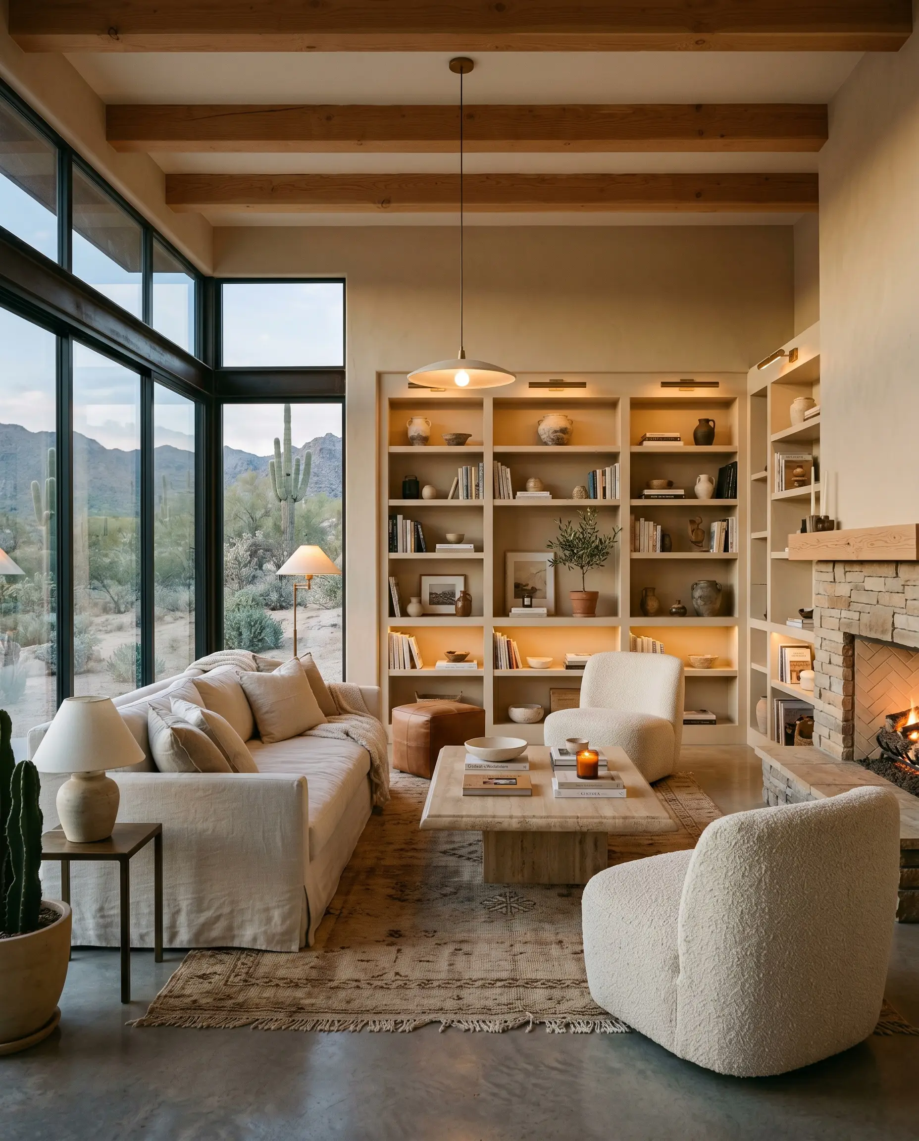
Securing the Gathering Space in Living Rooms
For a busy household that needs a durable, forgiving, yet highly curated gathering space, this warm beige is incredibly effective. Instead of defaulting to a predictable traditional aesthetic, push this color toward a Desert Modern or Casual Coastal vibe.
Pair it with highly tactile, accessible textiles like slipcovered washed linen sofas and chunky boucle accent chairs.
To elevate the everyday furnishings, introduce one premium focal point, such as a honed travertine coffee table or a statement chandelier in unlacquered brass. The brass hardware will beautifully pull out the golden notes of the paint, while the natural stone roots the room’s earthy qualities. If you have built-in bookcases, painting them in the exact same finish as the walls creates a seamless, high-end look that makes standard cabinetry feel custom-built.
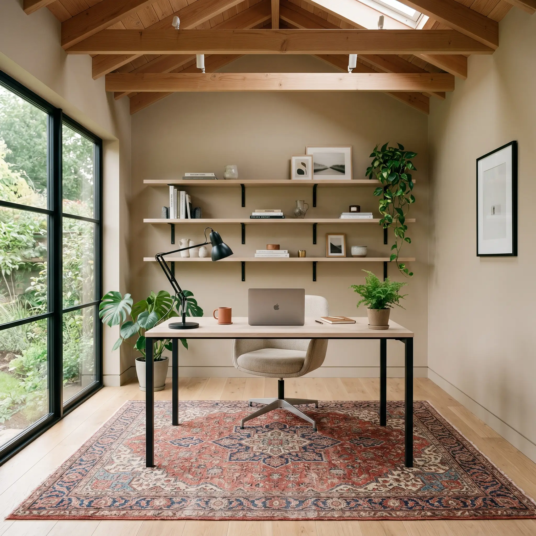
The Contemporary Creative Home Office
A freelance designer or remote worker needs a workspace that feels inspiring but doesn’t cause eye strain during long hours of screen time. Because this shade sits perfectly in the middle of the light spectrum, it provides a warm, glare-free backdrop that looks fantastic on video calls.
Lean into a contemporary studio aesthetic by contrasting the soft walls with sharp, modern lines.
Bring in a sleek bleached oak desk and floating shelves supported by matte black iron brackets. The stark black metal cuts through the warmth of the beige, providing a necessary visual crispness. To soften the acoustics and add texture, incorporate a large, layered vintage rug and perhaps a few oversized branches in a simple ceramic vase.
Be highly intentional with your wood pairings in a home office. Avoid cherry or heavily red-stained woods, which will fiercely clash with the subtle khaki-green nuance of the paint. Stick to white oak, walnut, or matte black finishes for a seamless aesthetic.
Clash Warning (The Wood Tone Rule)
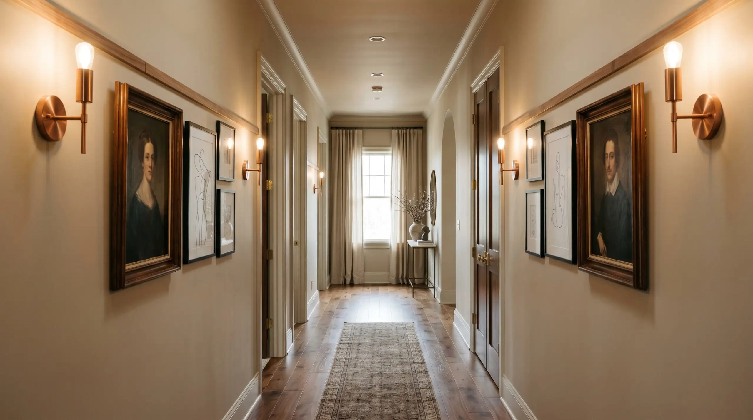
Curating Transitional Hallways
Hallways are often treated as mere pass-throughs, but they offer a brilliant opportunity to create a moody, intentional color transition between your main living areas.
Transform a standard suburban hallway into a curated gallery space.
Install simple, accessible picture rails along the length of the corridor to display a mix of vintage oil portraits and minimalist line art. To make the space feel intentionally designed, flank the artwork with brushed copper or polished nickel wall sconces. The metallic finishes will catch the ambient light, adding a layer of premium polish to an otherwise ordinary architectural feature.
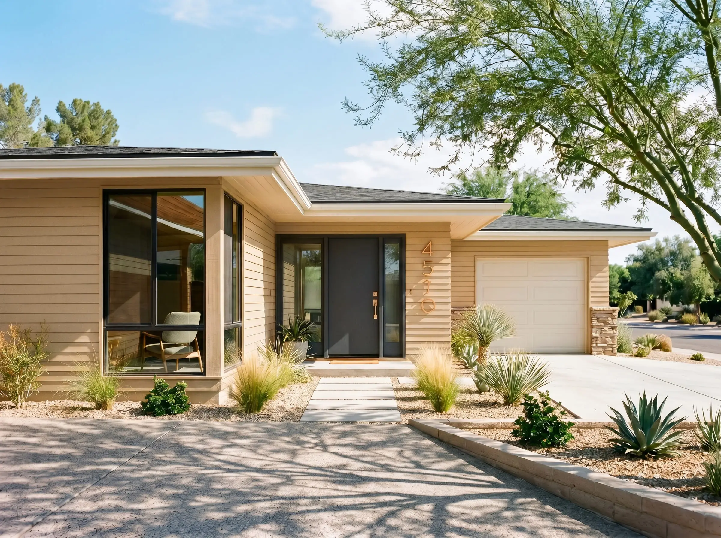
Revitalizing Exterior Siding
When taking this shade outside, the rules of light change dramatically. Direct exterior sunlight will always wash out lighter colors, but this specific chromatic profile holds its shape beautifully against the elements.
It is a phenomenal choice for updating a mid-century ranch or a contemporary craftsman home.
The sun will amplify the golden-orange base, turning your facade into a welcoming, sun-baked retreat. To maximize your curb appeal, pair the siding with high-contrast trim pairings. A crisp white on the eaves combined with a bold charcoal gray or muted plum on the front door will instantly modernize the home’s exterior profile. Finish the look with oversized, modern brushed copper house numbers for that final touch of accessible luxury.
Designing with PPG Dusty Trail: Material & Color Pairings
This golden beige relies entirely on the materials surrounding it to dictate its final energy. It craves rich, tactile surfaces that either pull forward its sun-baked warmth or provide a crisp boundary to keep its earthy undertones in check.
Selecting the Right Trim & Baseboards
To create a seamless, atmospheric glow that blurs the lines between wall and trim, pair this mid-tone with Benjamin Moore White Dove OC-17. This soft, warm white shares a similarly muted quality, allowing the golden foundation of the walls to breathe without feeling boxed in.
For a slightly more tailored boundary, Sherwin-Williams Alabaster SW 7008 is an exceptional choice. Because Alabaster carries a faint beige undertone, it speaks directly to the earthy notes of the paint, providing a clean frame that never jars the eye with stark contrast.
Hardware, Wood & Material Pairings
Curating the Palette
Designer Mood Boards
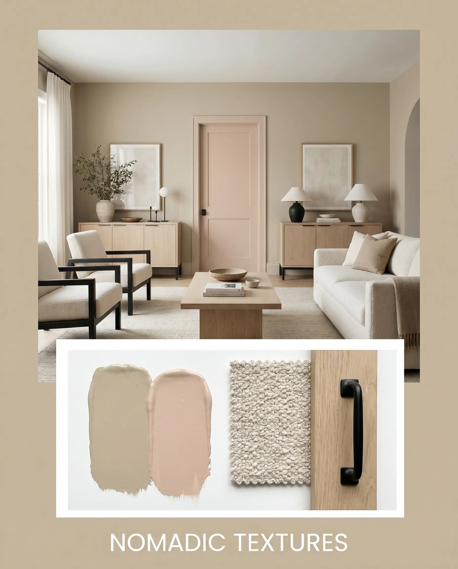
Nomadic Textures This palette leans heavily into a relaxed, earthy energy by contrasting the golden beige walls with stark matte black iron accents. Ground the room with bleached oak furniture and layer the space with chunky boucle loops and woven baskets for a highly tactile experience. Introducing Farrow & Ball Setting Plaster on an accent door or ceiling adds a tonal softness, while dried pampas grass in ceramic vases completes the organic, sun-baked vibe.
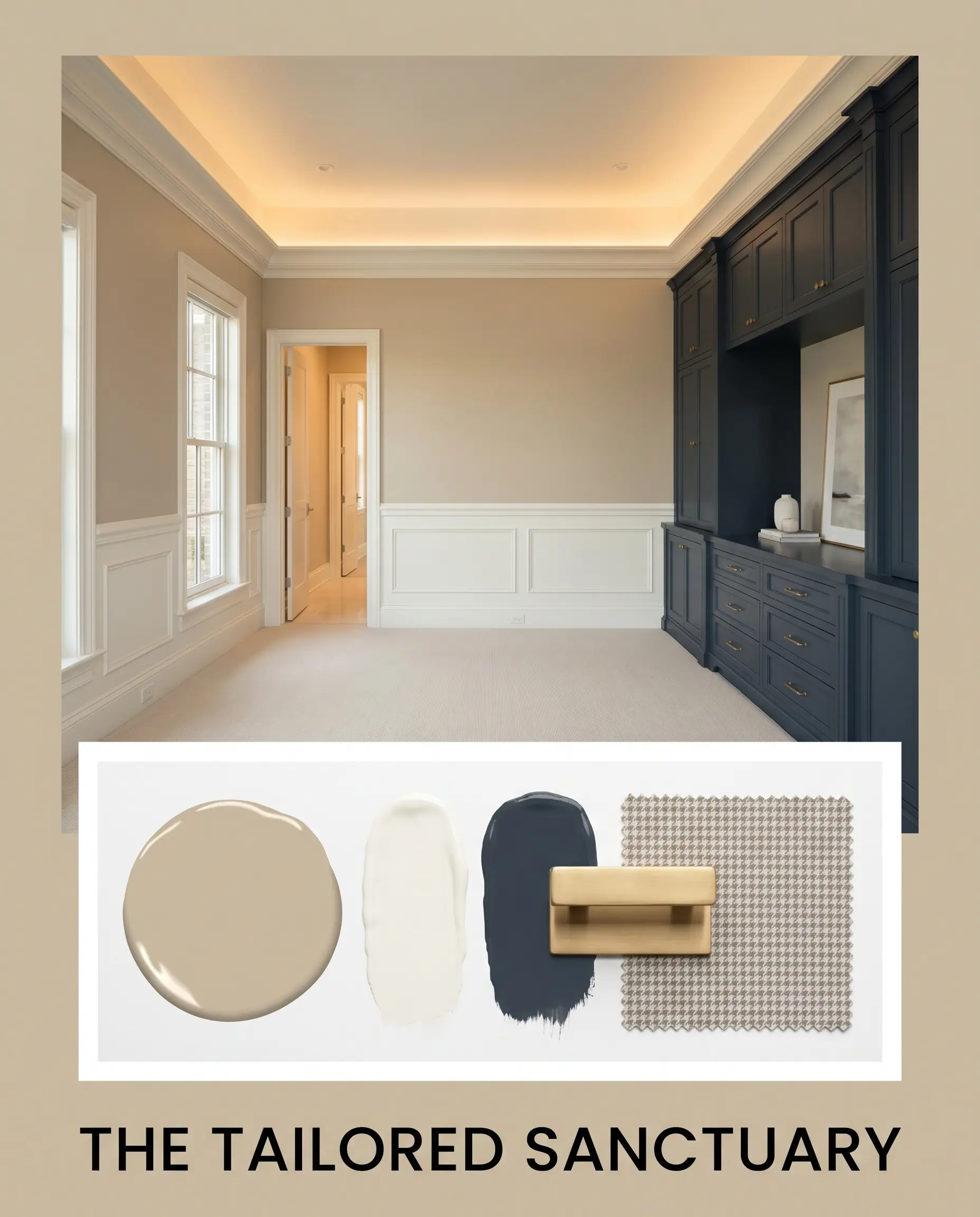
The Tailored Sanctuary Shifting toward a more polished, transitional mood, this combination uses the crisp boundary of White Dove trim to frame the mid-tone walls. Elevate the everyday furnishings by incorporating unlacquered brass hardware, which beautifully echoes the golden notes of the paint. To introduce a sophisticated tension, style the room with vintage oil portraits and subtle houndstooth textiles, allowing a pop of Sherwin-Williams Naval on built-in cabinetry to provide a sharp, modern edge.
Head-to-Head Paint Comparisons
Choosing the perfect mid-tone often comes down to the specific lighting conditions or exterior exposures of your home. If your space lacks natural light or features cool-toned fixed elements, this specific PPG shade might pull too yellow, signaling a need to pivot toward a different undertone structure.
PPG Dusty Trail vs. Sherwin-Williams Accessible Beige SW 7036
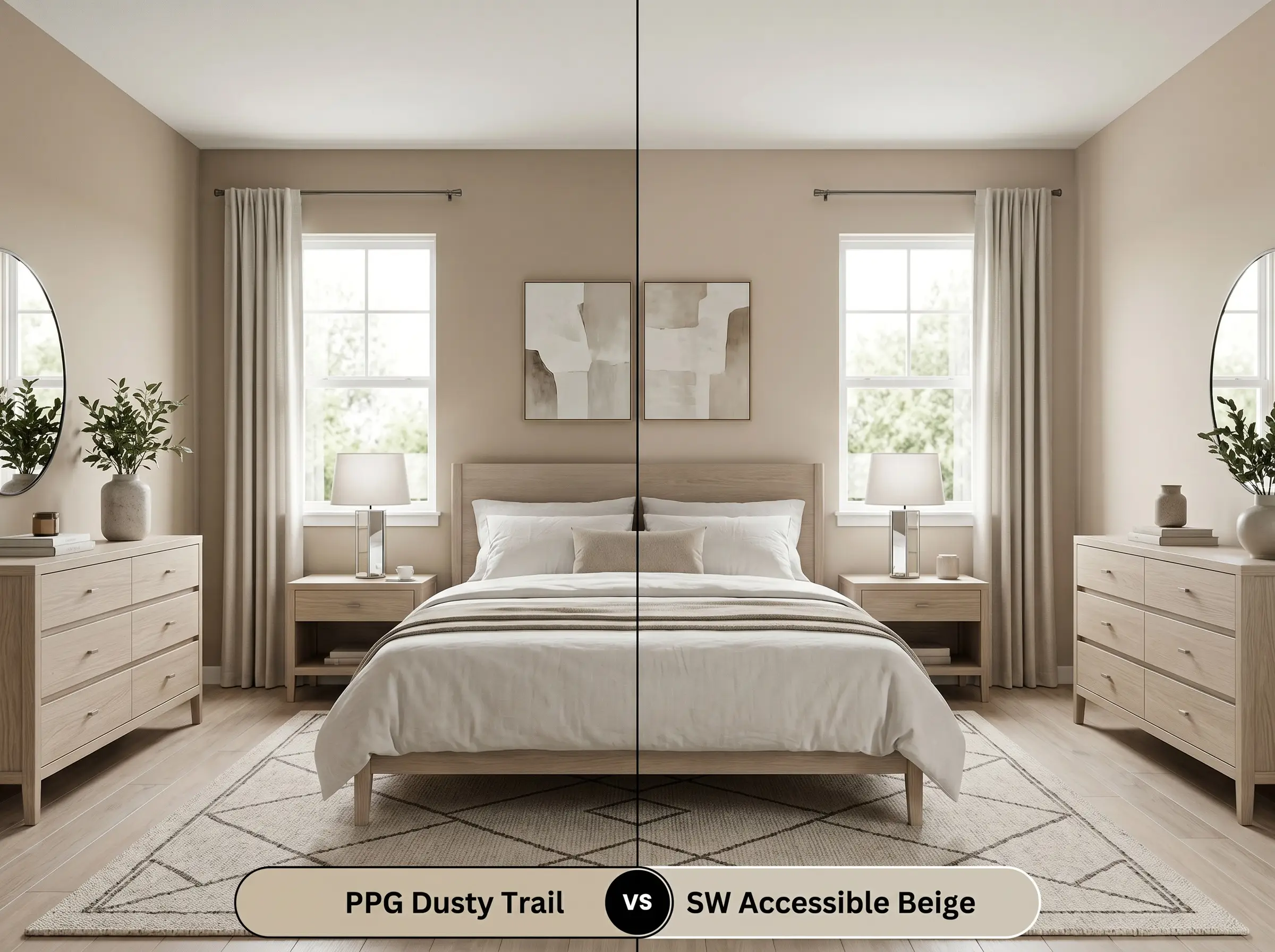
Accessible Beige strips away the golden warmth, relying instead on a greige foundation with a subtle gray influence. If your room features cool northern light, the Sherwin-Williams option will feel much more neutralized and calm. However, if you want a room to feel genuinely sun-baked and cozy, the PPG hue offers significantly more life and vibrancy.
PPG Dusty Trail vs. Benjamin Moore Shaker Beige HC-45
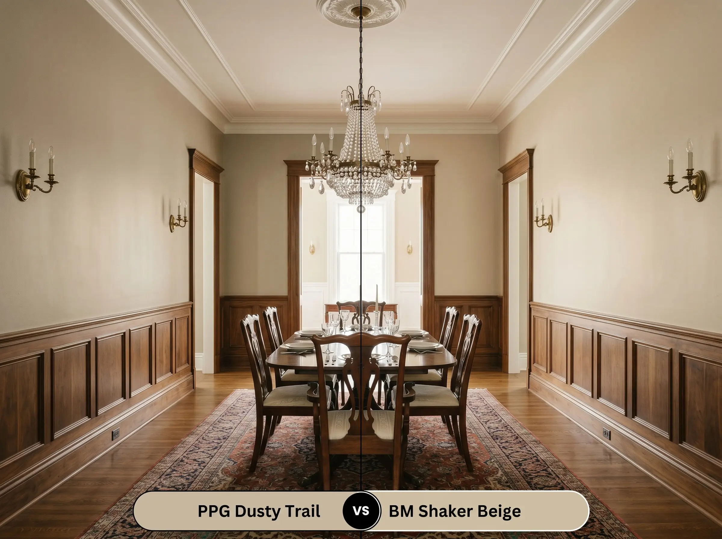
Shaker Beige carries a slightly more prominent orange-tan base compared to the khaki-influenced almond notes of its rival. If you are working with rich, warm woods and want a traditional, heritage feel, the Benjamin Moore color is incredibly reliable. Choose the PPG alternative when you want that same mid-tone depth but prefer an earthier, slightly greener finish.
Exploring Alternatives: Similar Golden Beiges
Sometimes a room demands just a fraction more light reflectance, or perhaps you need a slightly deeper tone to secure a soaring ceiling.
Staying Within the Brand
Cross-Brand Color Matches
Getting PPG Dusty Trail on the Wall: Application Tips
Transitioning this earthy color from a digital swatch to your actual walls requires a strategic approach to finish and preparation.
Because of its solid mid-tone weight, this color structure covers standard builder-white walls quite easily. A high-quality, bright white acrylic primer is recommended to ensure the khaki and almond nuances render true to the swatch.
Hackrea Design Secret (The Primer Rule)
Expect to apply two full coats for a professional, opaque finish. Be mindful of your roller technique, as mid-tone beiges can occasionally show flashing if the second coat is applied unevenly. Maintain a wet edge while painting to ensure the final result is perfectly smooth and seamless.
Frequently Asked Questions
Because of its hidden khaki tone, it can occasionally flash a subtle green under cool, overcast skies. However, under direct, warm sunlight, the golden-orange base takes over, rendering it as a rich, sun-baked beige.
Without natural sunlight to activate its golden base, the paint will rely entirely on your artificial lighting. To prevent it from looking flat or overly muted, use warm 3000K LED bulbs to pull forward its cozy, inviting energy.
This combination presents a significant design challenge, as the red tones in cherry wood actively fight the khaki-green nuances of the paint. For a more harmonious aesthetic, pair this color with bleached oak, walnut, or painted cabinetry instead.
The earthy, green-leaning almond notes actually provide a complementary contrast to the red tones in standard brick. This pairing works beautifully to highlight the architectural texture of the fireplace while keeping the room grounded.
Final Verdict: Is This Earthy Neutral Right for You?
PPG1097-4 is the ultimate foundational layer for homeowners who crave genuine warmth and highly curated, tactile spaces. It excels in rooms flooded with natural light, where its golden-khaki profile can truly bloom into a welcoming retreat. This shade is perfect for those embracing transitional or desert modern aesthetics, effortlessly elevating everyday furnishings into something that feels highly intentional and beautifully resolved.
Yet, this specific chromatic profile requires a thoughtful approach to surrounding materials. If your home features prominent cool-toned gray flooring, stark white marble with blue veining, or heavily red-stained cherry cabinets, this paint will actively fight those elements. The golden-almond base clashes uncomfortably with cool grays and vibrant reds, creating a disjointed, chaotic energy in the room. Instead of forcing a combination that visually competes, pivot to a cooler greige to maintain harmony in those specific environments.
Closest Cross-Brand Equivalents
The absolute closest scientific color matches for Dusty Trail across top paint brands.