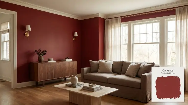
Caliente AF-290
Benjamin MooreBenjamin Moore Caliente AF-290 is a radiant, charismatic shade of red with deep, warm undertones. Boasting an LRV of 8.82, this vibrant hue avoids harsh orange or stark blue casts, making it an incredibly versatile, sophisticated choice for dramatic interiors and striking exterior accents.
Benjamin Moore Caliente AF-290: Styling a Confident, High-Impact Crimson
Red paint often terrifies homeowners, instantly conjuring memories of frantic, overly bright dining rooms from the early 2000s. Benjamin Moore Caliente AF-290 completely shatters that association, behaving less like a primary color and more like a rich, tactile architectural material. This specific shade carries an undeniable chromatic intensity that demands attention, yet it completely avoids feeling harsh or overstimulating.
As a standout in the Affinity Collection, this warm red hue is engineered to interact seamlessly with natural materials and organic textures. It wraps a room in a mature, sophisticated warmth that feels incredibly intentional. When applied thoughtfully, it acts as a stabilizing force, pulling disjointed design elements together into a cohesive visual narrative.
Whether you are brushing it across an exterior facade or wrapping a cozy interior space, this crimson requires strategic styling. We are going to break down exactly how its underlying color structure behaves under shifting sunlight and outline practical ways to integrate it into your home.
Unlocking the Temperature, Undertones & LRV of Caliente
To understand if this paint is warm or cool, you only need to look at its earthy foundation—this is an undeniably warm, full-bodied crimson.
With an LRV of 8.82, this shade absorbs a massive amount of light. This low reflectance means the paint carries significant visual weight, pulling the walls inward to create an enveloping, intimate atmosphere rather than a bright, airy one.
You can apply wallpapers, paints, etc. on walls and see how they look in various interiors.

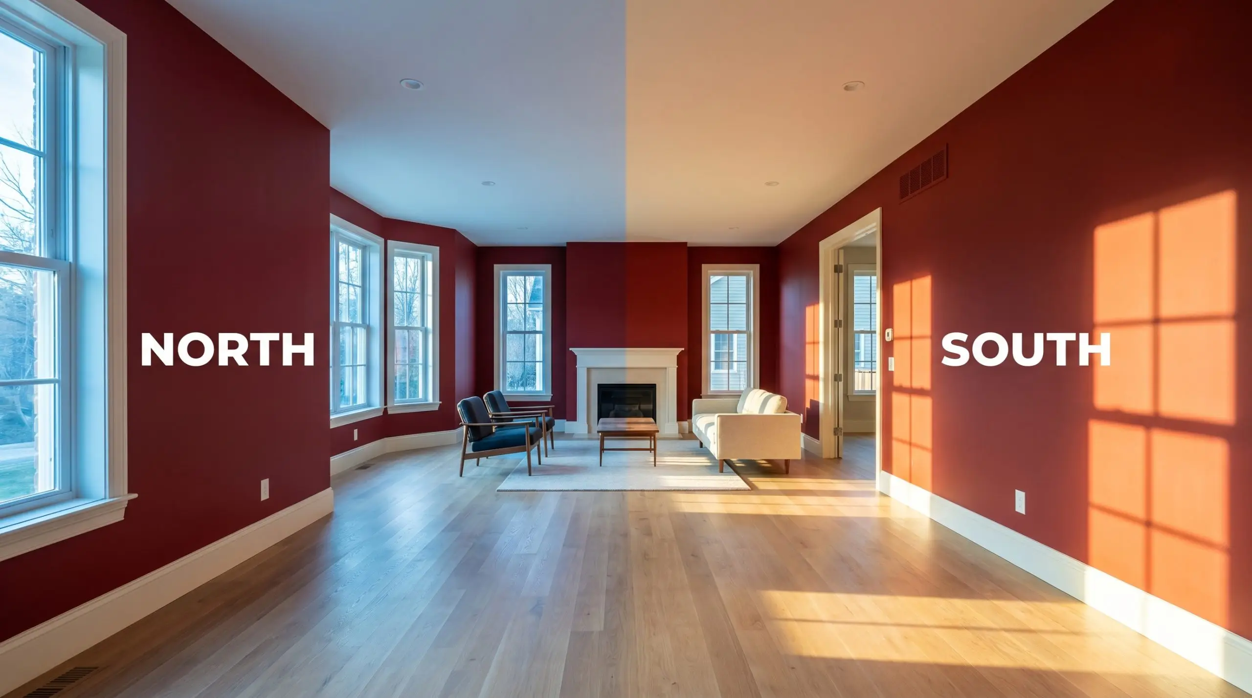
How Shifting Light Manipulates Benjamin Moore AF-290
Because of its immense light absorption and earthy undertones, this saturated red shifts its visual temperature dramatically depending on the sun’s direction and your chosen bulbs.
Popular Architectural Placements for This Saturated Red
A paint with this level of chromatic intensity requires deliberate placement to avoid overwhelming your daily routine. Here is how to strategically deploy this crimson across different functional zones and aesthetic styles.
Dining Rooms
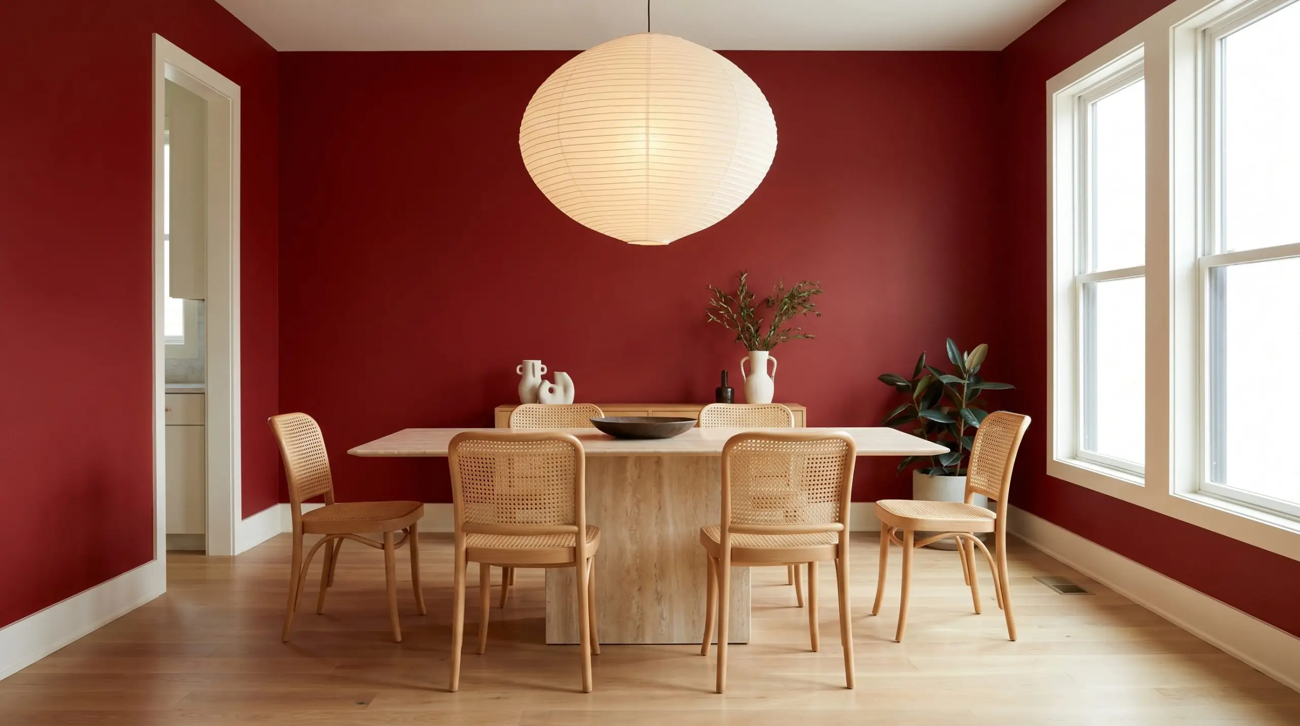
Instead of defaulting to a predictable, historic aesthetic, use this red to build a striking Modern Eclectic dining space. Coat the walls in a flat finish to soften the intensity, and introduce natural cane dining chairs around a sleek travertine pedestal table. Suspend an oversized, asymmetrical paper lantern above the table to diffuse the light and keep the room feeling distinctly contemporary.
Striking Front Doors
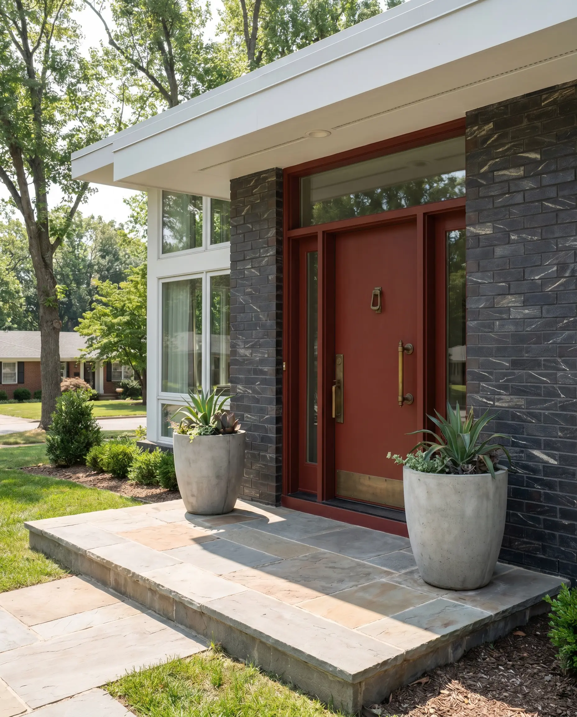
Applying this hue to your front door creates an immediate architectural focal point against neutral exterior siding or dramatically veined charcoal brick. Outfit the entryway with substantial, unlacquered brass hardware that will beautifully patina over time, echoing the paint’s earthy base. Flank the door with oversized concrete planters to ground the vibrant red in a modern, industrial context.
High-Impact Powder Rooms
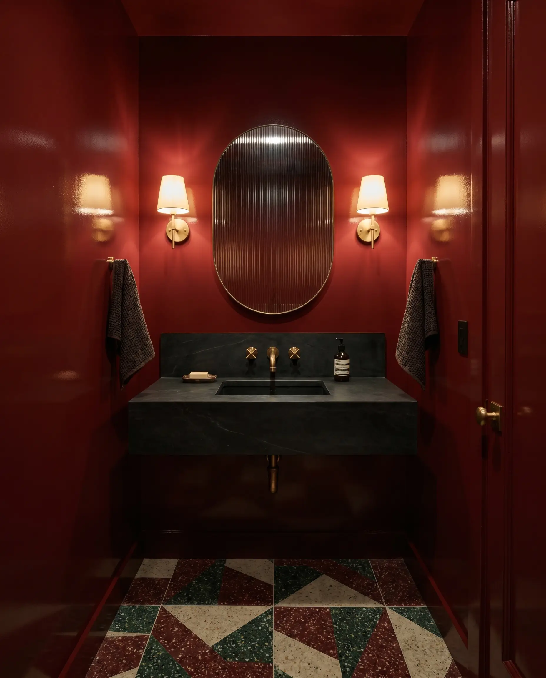
Windowless powder rooms are the ideal testing ground for a high-gloss lacquer application of this rich crimson. Lean into a Moody Maximalist vibe by pairing the glossy walls with a dark soapstone vanity and unlacquered brass sconces. To break up the solid color block, install fluted glass mirrors and boldly patterned terrazzo flooring.
High-gloss finishes are incredibly unforgiving on textured or damaged drywall. If your powder room walls are not perfectly smooth, opt for an eggshell or satin finish to hide imperfections while still capturing a slight, reflective sheen.
Hackrea Pro-Tip (The Gloss Warning)
Kitchen Islands and Lower Cabinetry
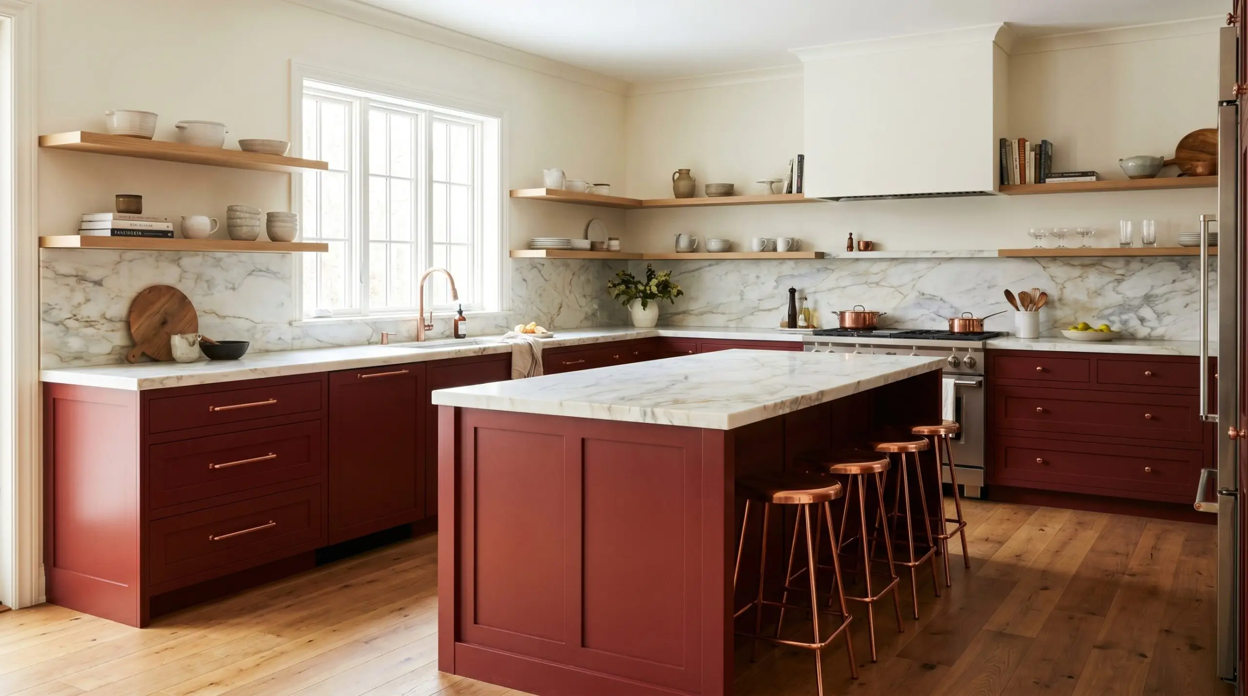
Centering a bright, neutral kitchen with a saturated island or lower cabinet run instantly adds custom character to standard builder layouts. For a Transitional aesthetic, pair these crimson lower cabinets with warm, white oak upper shelving and honed marble countertops. Swap standard chrome pulls for brushed copper hardware to pull out the subtle warmth hidden within the paint’s color structure.
Libraries and Studies
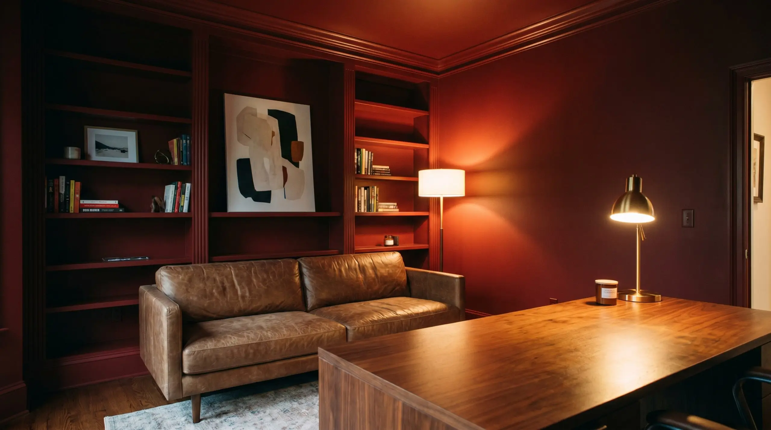
For the work-from-home professional who needs a focused, intimate retreat, this shade is built for complete color drenching. Paint the baseboards, crown molding, built-in bookcases, and walls in the exact same crimson to erase the visual boundaries of the room. Furnish the space with a low-slung, distressed leather sofa and abstract canvas art to keep the aesthetic sharp, intentionally avoiding the stuffy, traditional library stereotype.
Coordinating Colors & Best Pairings
This intensely saturated red requires surrounding materials to either match its visual strength or provide a soft, creamy landing pad. If you surround it with uncalibrated, stark neutrals, the crimson will feel jagged and disconnected from the architecture.
Defining Boundaries with Millwork
Tactile Elements that Complement the Crimson Base
Secondary Hues for Balance and Contrast
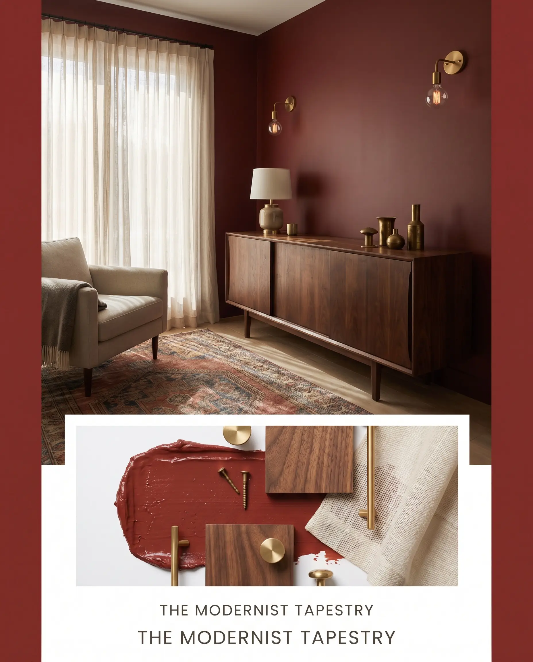
Curated Stylings for this Saturated Red
The Modernist Tapestry This palette blends the intense crimson with rich walnut credenzas and unlacquered brass lighting fixtures to create a deeply layered, transitional energy. Introducing sheer linen drapery softens the hard architectural lines, allowing the saturated walls to feel inviting rather than stark. A vintage, block-print rug ties the earthy undertones together, creating a collected, highly sophisticated atmosphere.
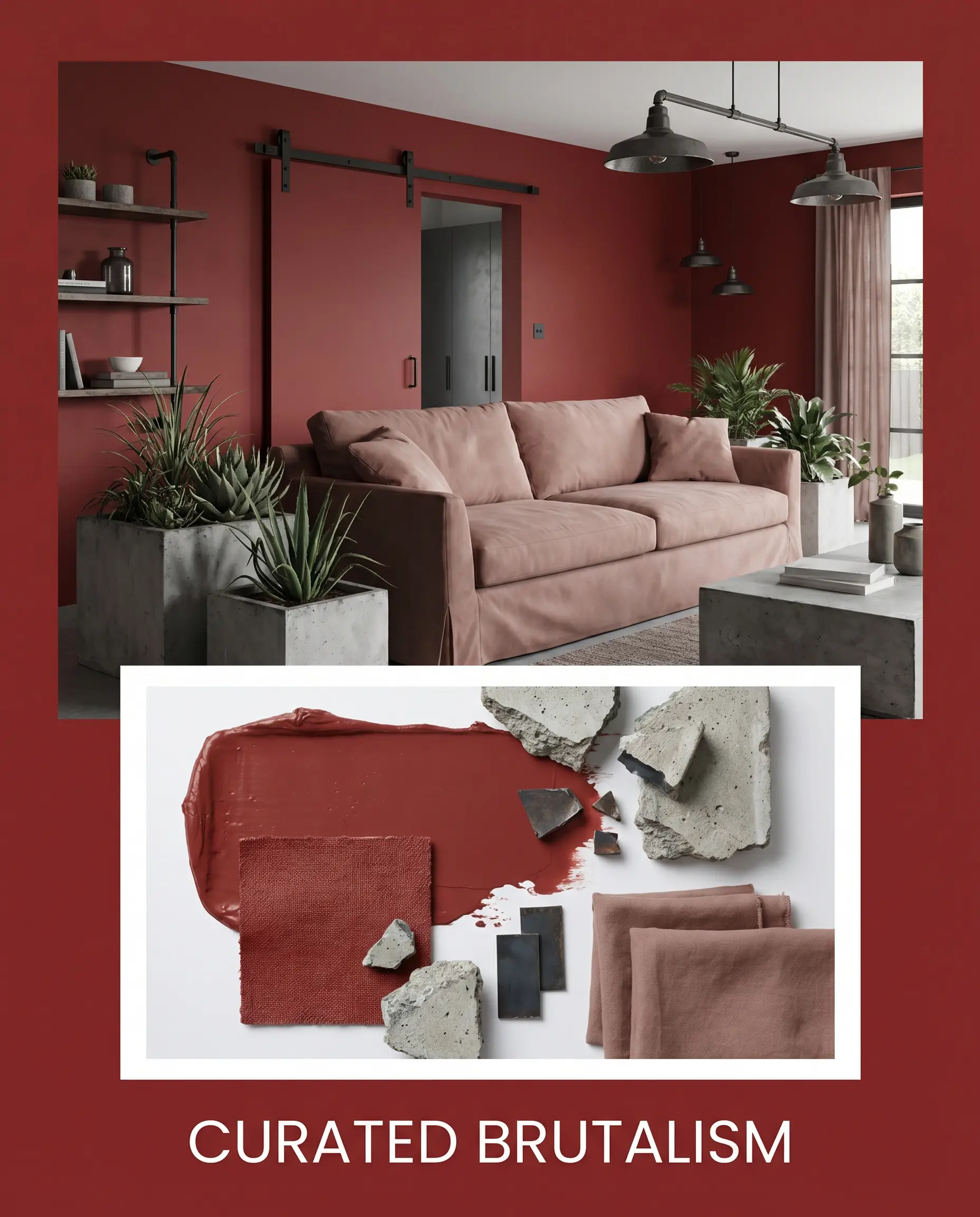
Curated Brutalism We strip back the traditional expectations of red by pairing it directly with blackened steel hardware and raw concrete planters. The sharp contrast between the warm, enveloping wall color and the cold, industrial textures builds an intentional design tension. To prevent the aesthetic from feeling entirely rigid, incorporate a slipcovered sofa in a soft, muted clay fabric to introduce a necessary tactile softness.
Benjamin Moore Caliente vs. The Competition
While this Affinity Collection staple is incredibly versatile, certain lighting conditions or specific design goals require a slightly different chromatic approach. If your room lacks natural light entirely, or if you need a purer pigment to match a specific textile, you might need to pivot to a rival shade to achieve the exact mood you want.
Benjamin Moore Caliente vs. Benjamin Moore Heritage Red HC-181
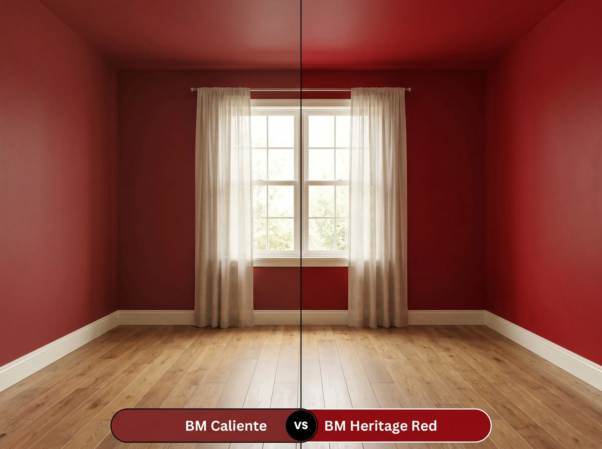
If you are trying to achieve a crisp, historic aesthetic, Heritage Red delivers a much brighter, purer primary tone. Heritage Red lacks the brown undertones of Caliente AF-290, making it significantly more vibrant but slightly harder to balance in a relaxed, modern living space.
Benjamin Moore Caliente vs. Sherwin-Williams Poinsettia SW 6594
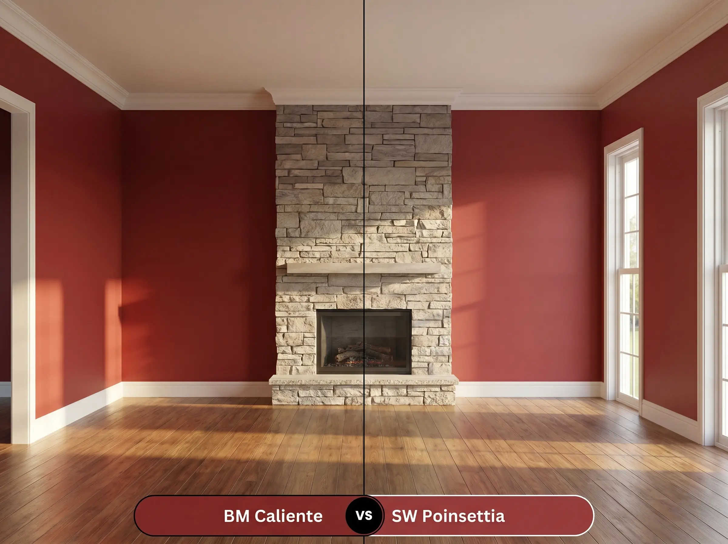
Sherwin-Williams Poinsettia reads noticeably cooler and slightly more pink when placed side-by-side with the Benjamin Moore option. If your room receives intense, warm western sunlight that might push a warm red into orange territory, Poinsettia offers a safer, cooler foundation.
Benjamin Moore Caliente vs. Benjamin Moore Dinner Party AF-300
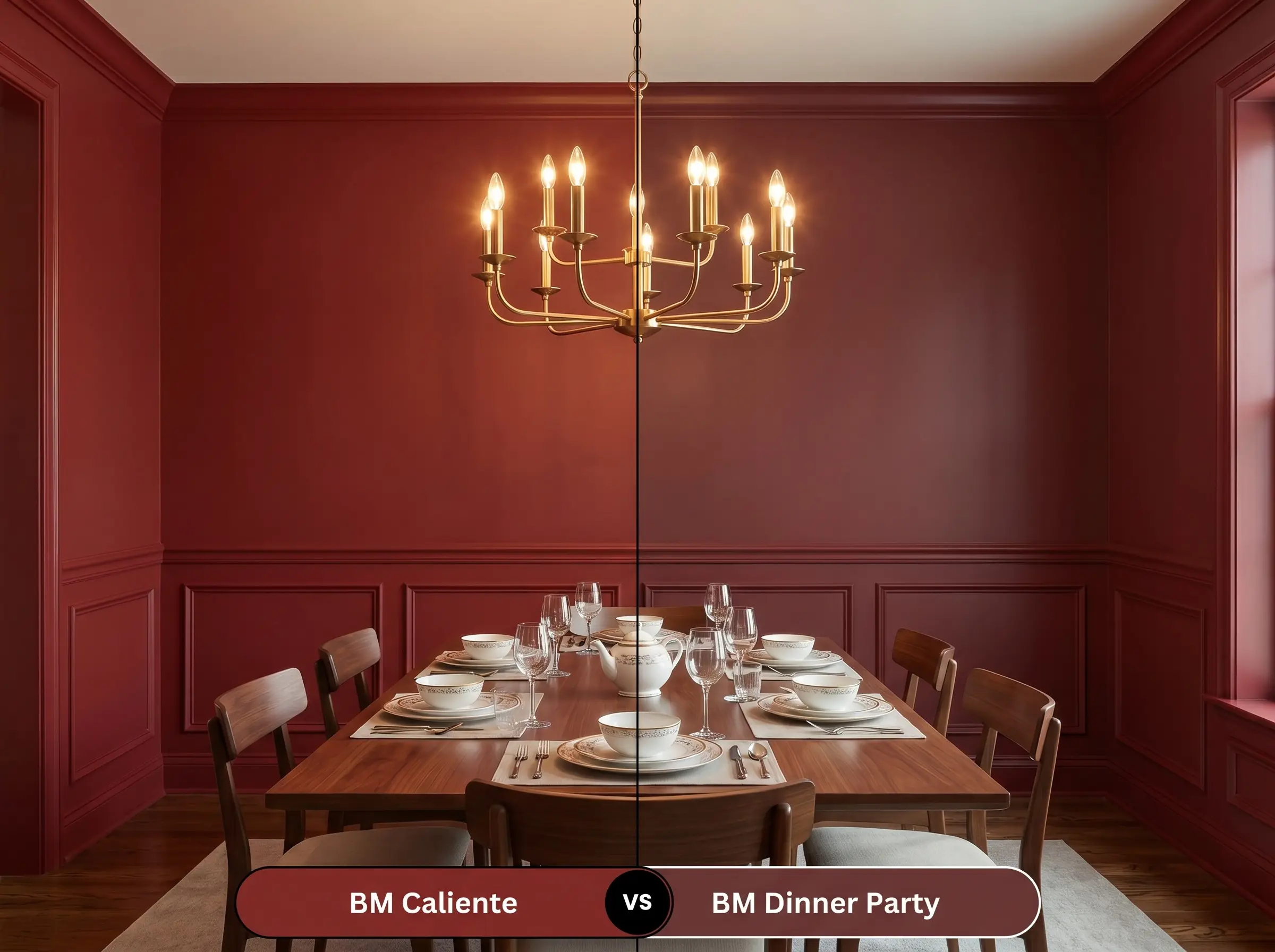
Dinner Party drops deeper into a sophisticated, black-cherry profile with pronounced purple undertones. If you want a moody, enveloping dining experience that feels more like a glass of merlot than a vibrant chili pepper, Dinner Party is the superior choice.
Exploring Alternative Crimson Options
Sometimes a homeowner loves the structural concept of a color but needs a microscopic shift in its execution. Whether you need a slightly higher light reflectance for a dark hallway or a touch more brown for a mid-century scheme, these alternatives deliver similar energy with nuanced tweaks.
Benjamin Moore Variations
Competitor Matches for Local Availability
Executing a Flawless Finish with Caliente AF-290
Transitioning this bold pigment from a tiny paper swatch to a massive architectural surface requires precise execution. Dark, saturated colors highlight drywall flaws instantly, making your preparation and finish choices just as critical as the hue itself.
Selecting the Right Gloss Level
Prepping the Surface for Dark Pigments
Deep reds are notoriously difficult to touch up later without the new paint flashing (appearing shinier or darker than the surrounding area). Paint corner-to-corner if a wall gets damaged, rather than trying to spot-treat a small scratch.
Hackrea Pro-Tip (The Touch-Up Warning)
Common Concerns When Painting with Caliente
Because of its earthy brown undertones, this shade handles southern exposure beautifully. The intense sunlight will amplify its warmth and make it appear more vibrant, but the brown base prevents it from turning into a glaring, artificial orange.
Applying this directly next to traditional red brick often creates a muddy, clashing exterior because the undertones of the brick and the paint will likely fight. It performs much better as an accent against charcoal brick, painted white brick, or neutral siding where it can stand alone as a crisp focal point.
Absolutely, provided you lean into the moodiness rather than fighting it. Wrapping a small, windowless room in a high-gloss or satin finish allows the artificial lighting to bounce around the space, creating an enveloping, jewel-box effect rather than a shrinking one.
To get the most dynamic read of this color, apply a flat finish on the upper drywall to absorb light and a satin finish on the wainscoting. This subtle shift in sheen creates a beautiful, tactile contrast that highlights the architectural details without needing a second color.
The Hackrea Ruling on Benjamin Moore’s Boldest Red
Benjamin Moore Caliente AF-290 is a masterful architectural tool for homeowners who want to inject undeniable confidence into their spaces. It is perfect for modern dining rooms, striking front doors, and dramatically color-drenched studies where you want the walls to actively participate in the design. By grounding its vibrancy with a stabilizing brown undertone, Benjamin Moore has engineered a red that feels mature, intentional, and profoundly warm.
However, this paint requires strict curatorial discipline to succeed. If you pair this crimson with stark, blue-based whites or flimsy synthetic fabrics, the contrast becomes visually jarring and the room will immediately feel chaotic. It actively fights against cool-toned grays and icy lighting, which strip away its sophisticated warmth and leave it looking flat and confused. To make this color thrive, you must commit to pairing it with rich, organic textures—like walnut, brass, and natural stone—allowing the paint to act as the beating heart of a highly curated, tactile home.