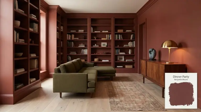
Dinner Party AF-300
Benjamin MooreBenjamin Moore Dinner Party (AF-300) is a sophisticated, deep oxblood red with subtle black and violet-brown undertones. Boasting an LRV of 6.36, this dramatic, earthy crimson absorbs significant light, creating an enveloping, moody atmosphere perfect for elegant dining spaces and striking front doors.
Benjamin Moore Dinner Party AF-300: The Architectural Power of Earthy Crimson
Red paint is rarely a passive background player. When you commit to an oxblood shade like Benjamin Moore Dinner Party AF-300, you are fundamentally altering the perceived boundaries of your room. This earthy crimson from the Affinity Color Collection doesn’t just coat drywall; it actively absorbs light and pulls the walls inward to create a highly intentional, moody atmosphere.
It requires a strategic hand to execute correctly. We are moving past the glossy, formal dining rooms of the 1990s and treating this burgundy cast as a rich, tactile canvas for contemporary living.
By understanding its underlying color structure, you can wield this intense pigment alongside everything from honed soapstone to bleached oak.
Benjamin Moore Dinner Party: Temperature, Undertones & LRV
Is Dinner Party warm or cool? It is definitively warm, though it is stabilized by a subtle coolness lurking in its lowest registers. This tension keeps the paint from feeling overly aggressive or fiery.
Registering a staggeringly low LRV of 6.36, this shade is an intense light-absorber. It creates a substantial architectural finish that relies entirely on ambient lighting or direct sunshine to reveal its red core. Without adequate illumination, it rapidly recedes into a near-black, shadowy plum.
You can apply wallpapers, paints, etc. on walls and see how they look in various interiors.

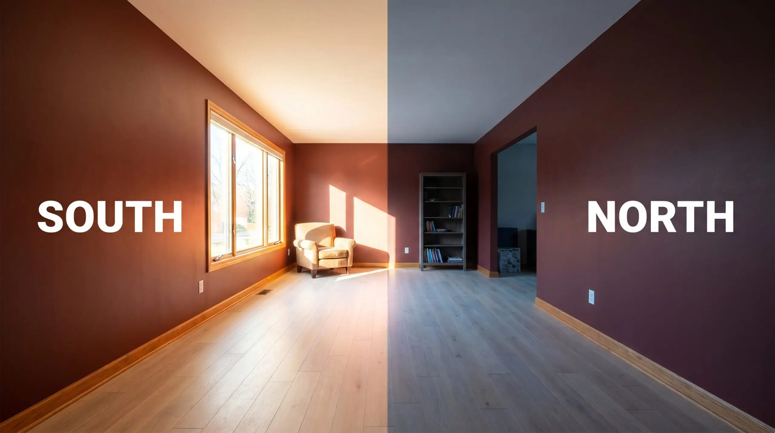
Lighting Effects & The Chameleon Factor of Dinner Party
Because of its low light reflectance and complex chromatic profile, this red is highly reactive to its environment. The shifting sun dictates whether you experience a vibrant merlot or a muted shadow.
Popular Room Applications for Benjamin Moore Dinner Party
This pigment is no longer confined to historic estates or outdated accent walls. By manipulating the surrounding materials and lighting, this intense oxblood adapts seamlessly to modern, transitional, and eclectic environments.
Formal Dining Spaces
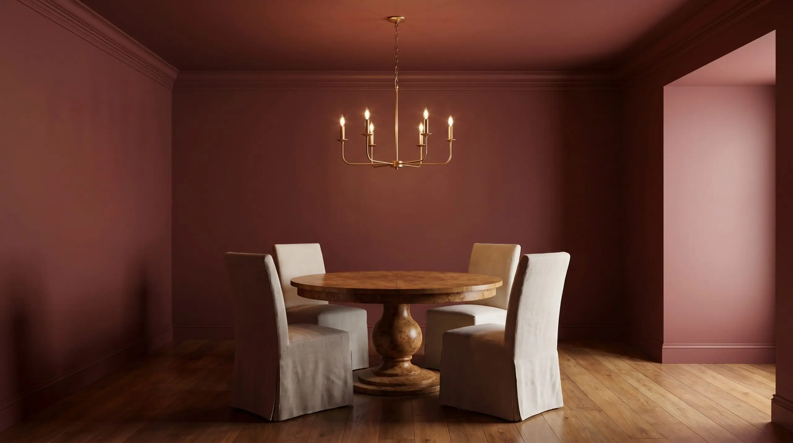
Move away from the predictable white chair rails of decades past. Color-drench the entire space—walls, trim, and ceiling—to eliminate visual breaks and create a seamless, enveloping dining experience for your guests. Pair this saturated backdrop with a vintage burl wood pedestal table and slipcovered faded linen chairs to soften the intensity of the room.
When color-drenching with an LRV this low, use a dead-flat finish on the ceiling to minimize glare and a subtle satin on the trim. This creates a tactile, tone-on-tone contrast without relying on harsh white molding.
Hackrea Design Secret (The Ceiling Strategy)
High-Impact Powder Rooms
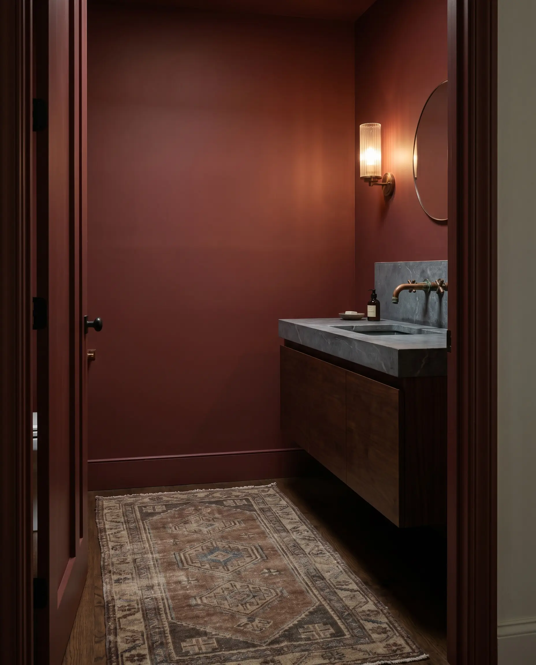
Windowless bathrooms are the perfect canvas for leaning into those near-black violet undertones. Instead of fighting the lack of natural light, embrace the spatial collapse to create a dramatic, jewel-box effect. Install a floating soapstone vanity and unlacquered copper fixtures that will develop a living patina against the earthy crimson walls.
A vintage, faded wool runner on the floor adds a crucial layer of texture.
Front Doors & Exterior Facades
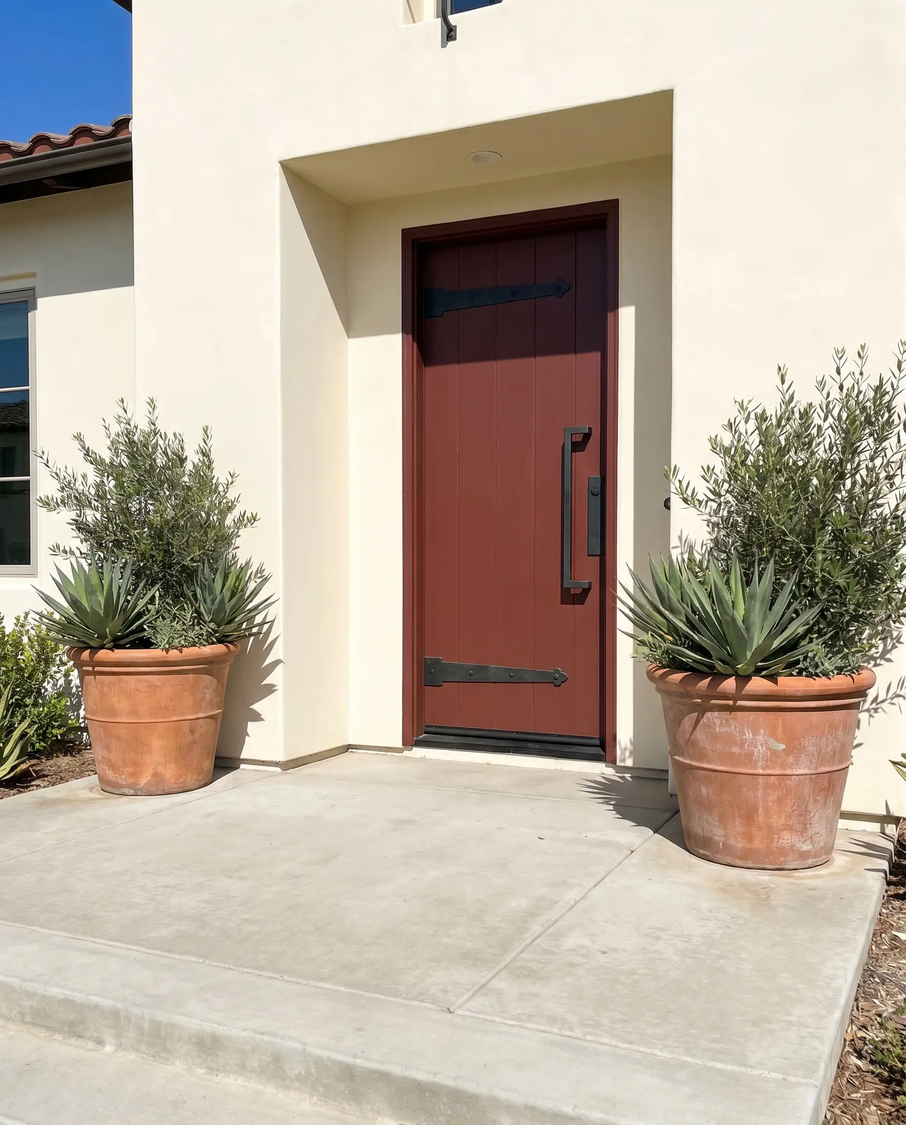
On an exterior, the intense UV sunlight strips away the shadowy black undertones, revealing a much brighter, prominent red. To keep the facade feeling current and intentional, avoid generic brass house numbers. Instead, pair the painted door with blackened steel hardware and oversized terracotta planters on a poured concrete porch.
Red pigments are notoriously susceptible to UV weathering. Invest in Benjamin Moore’s premium exterior lines featuring Gennex Color Technology to lock in the chromatic profile and prevent the oxblood from fading into a chalky pink over time.
Hackrea Pro-Tip (Exterior Fading)
Modern Libraries & Studies
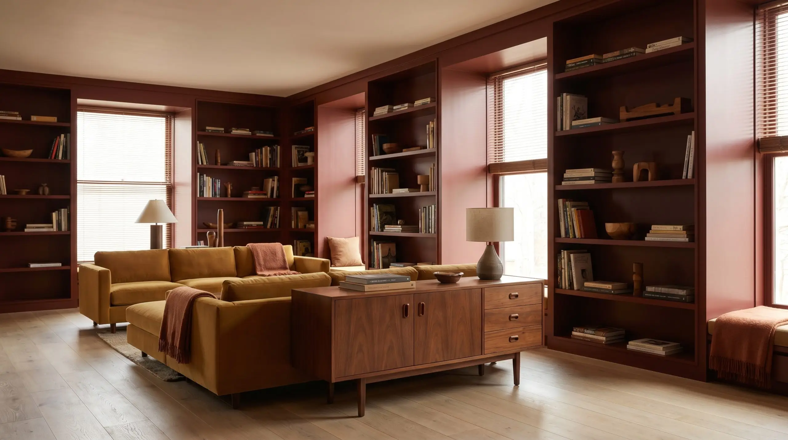
For the remote worker who needs a focused, insulated environment, this hue provides serious architectural weight. Paint floor-to-ceiling built-in bookcases in a durable satin finish to reflect just enough ambient light to keep the room legible. Contrast the traditional feel of the red with a low-profile, track-arm sectional upholstered in mustard mohair or olive worsted wool.
Add a mid-century walnut credenza to introduce warm, organic wood grains that bridge the transition between the dark walls and a lighter bleached oak floor.
Kitchen Islands & Lower Cabinetry
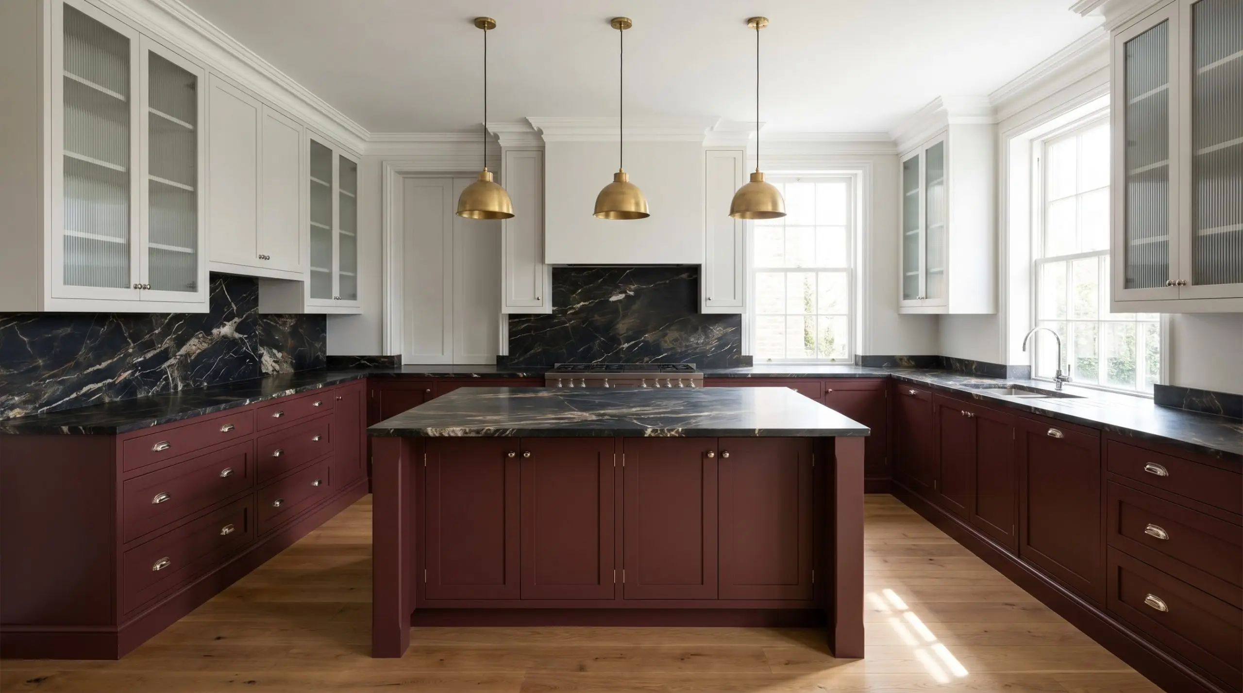
Rooting a kitchen with dark lower cabinets allows you to keep the upper sightlines airy and open. This specific burgundy cast looks incredibly sophisticated against dramatically veined, honed marble countertops. Introduce fluted glass upper cabinets and polished nickel hardware to bounce light around the room, ensuring the dark cabinetry feels intentional rather than restrictive.
Curating the Palette: Pairing Benjamin Moore Dinner Party
This intense pigment demands highly intentional companions to keep it from feeling overwhelming. It thrives on clear, tailored boundaries to hold its shape, rather than soft tonal bleeds that can muddy its rich base.
Architectural Boundaries & Trim
Tactile Finishes & Hard Materials
Secondary Palette Selections
Curated Aesthetic Concepts
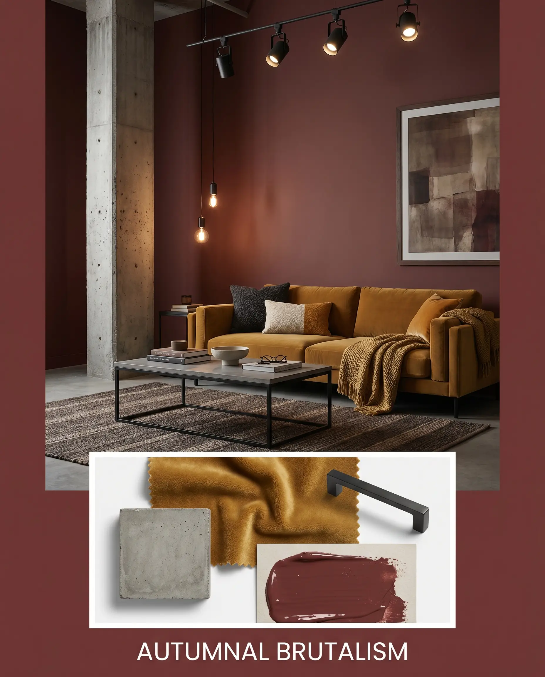
Autumnal Brutalism This aesthetic leverages the intense light absorption of the paint by pairing it with raw, unrefined textures. Introduce poured concrete surfaces and blackened steel fixtures to strip away any traditional formality. A low-slung track-arm sofa upholstered in mustard mohair injects an unexpected pulse of energy against the dark walls, resulting in a vibe that is grounded, fiercely edited, and entirely unapologetic.
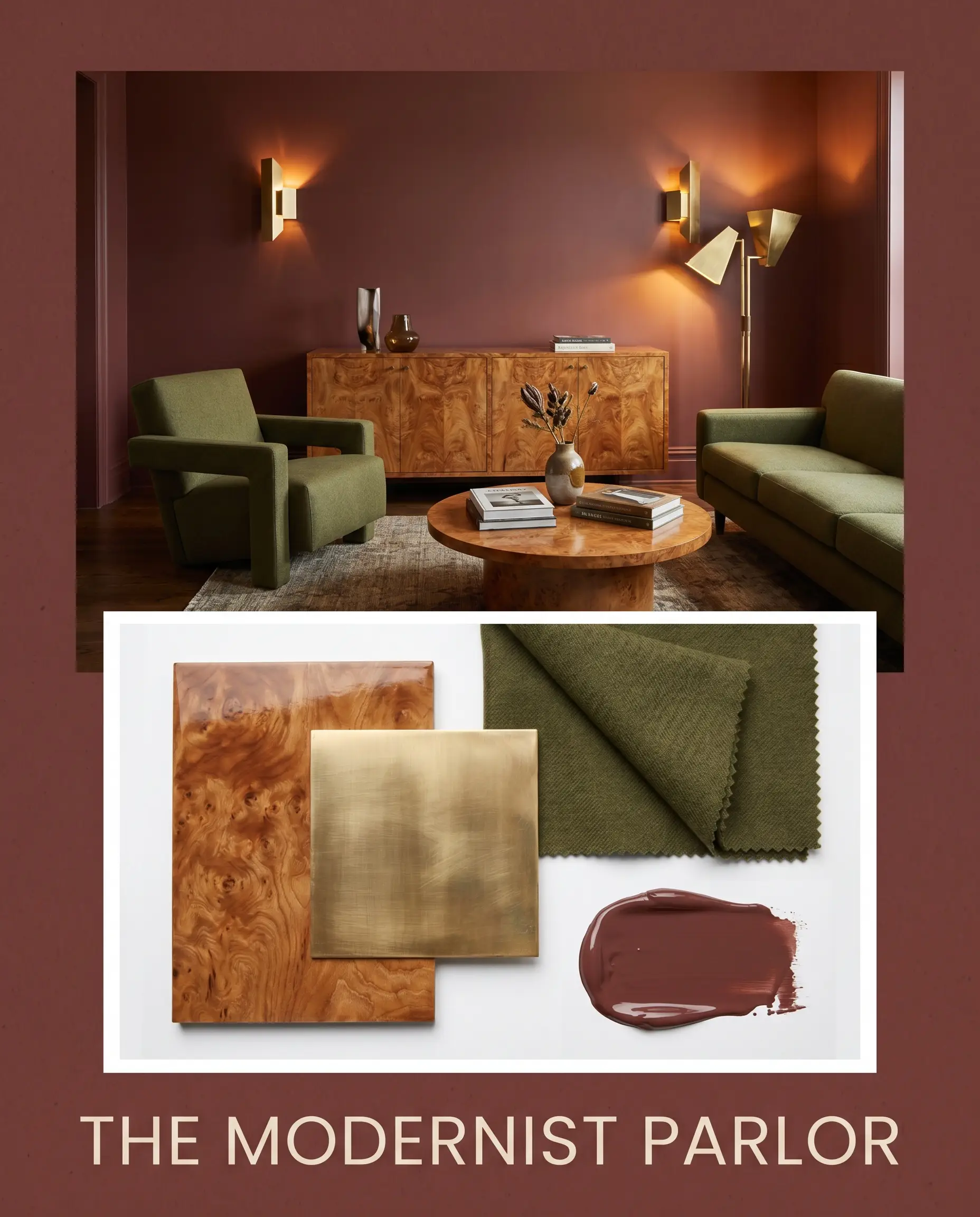
The Modernist Parlor Here, the earthy crimson acts as a highly saturated backdrop for sleek, mid-century silhouettes. Anchor the palette with a vintage burl wood credenza and sharp, unlacquered brass lighting to bounce light across the room. Layering in olive worsted wool textiles softens the hard edges while maintaining a distinctly tailored, sophisticated energy.
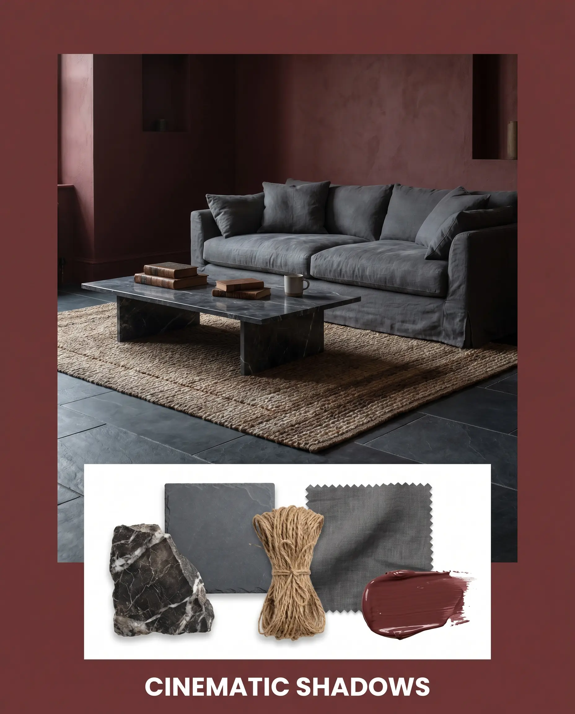
Cinematic Shadows This concept embraces the moody atmosphere by intentionally minimizing contrast. Pair the dark walls with honed slate flooring and deeply veined, dark marble surfaces to create a continuous, enveloping shell. Soften the intense architectural finish with layered jute rugs and slipcovered seating in faded charcoal linen, producing a space that feels secretive and incredibly calm.
Technical Color Battles: Dinner Party vs. The Competition
There are specific architectural exposures where this intense pigment will fail to perform, pulling too cool or losing its depth entirely. If your room lacks the right natural light to support its violet-brown shadow, you must pivot to a rival hue with a different structural core.
Benjamin Moore Dinner Party AF-300 vs. Benjamin Moore Caliente AF-290
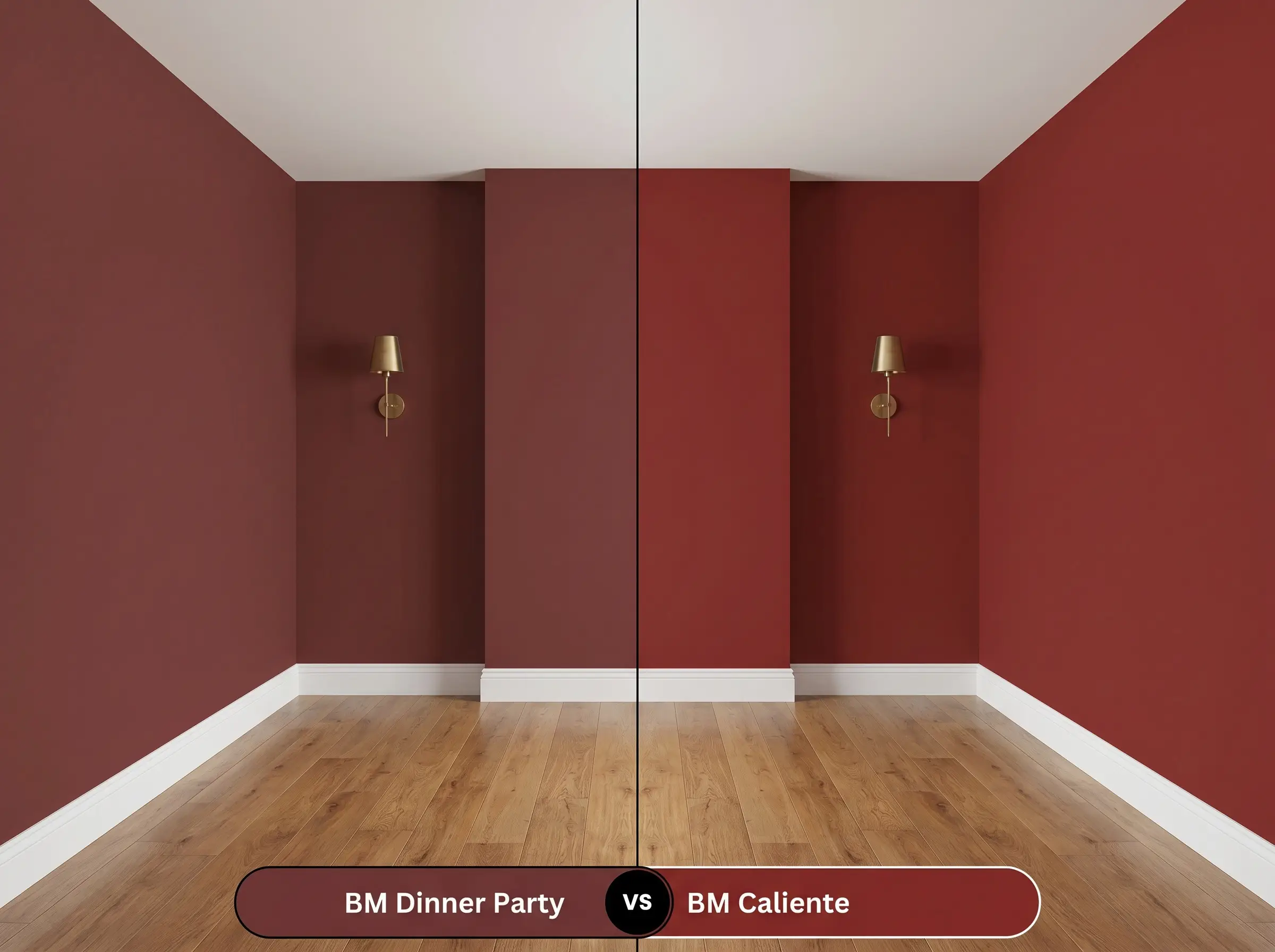
If your room faces north and this oxblood reads too much like a muddy plum, then Benjamin Moore Caliente AF-290 is the necessary correction. Caliente strips away the dense black undertones, offering a much brighter, energetic red that refuses to turn purple in cool light. However, Caliente lacks the baked-clay warmth that makes the darker shade feel so historically rooted.
Benjamin Moore Dinner Party AF-300 vs. Sherwin-Williams Borscht SW 7578
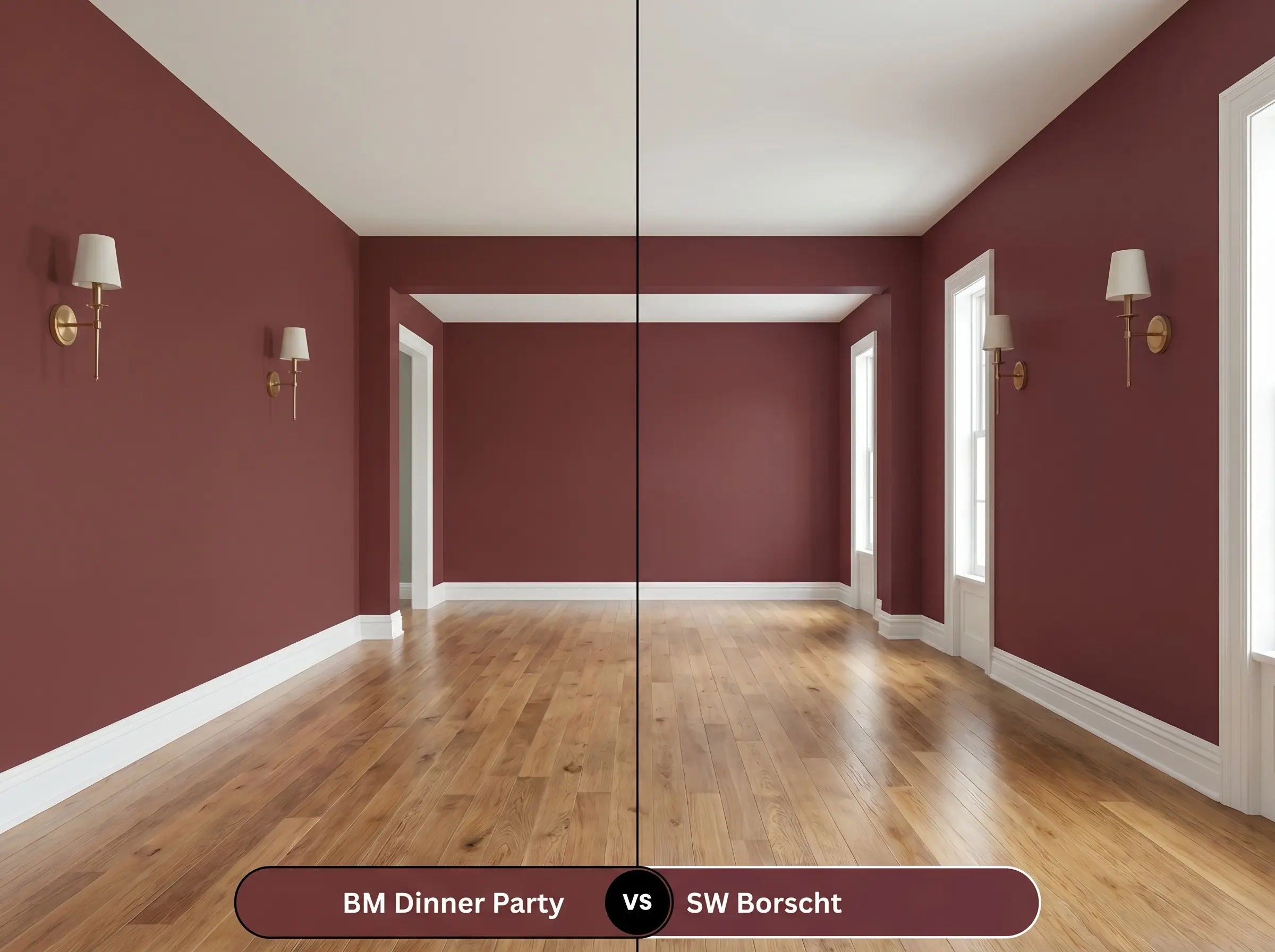
When you need the color to lean distinctly into a purple-berry cast rather than an earthy red, Sherwin-Williams Borscht SW 7578 is the superior choice. Borscht contains a much stronger violet influence, making it feel slightly cooler and more jewel-toned. Choose the Benjamin Moore option if you want to maintain that classic, warm crimson structure.
Benjamin Moore Dinner Party AF-300 vs. Farrow & Ball Preference Red No. 297
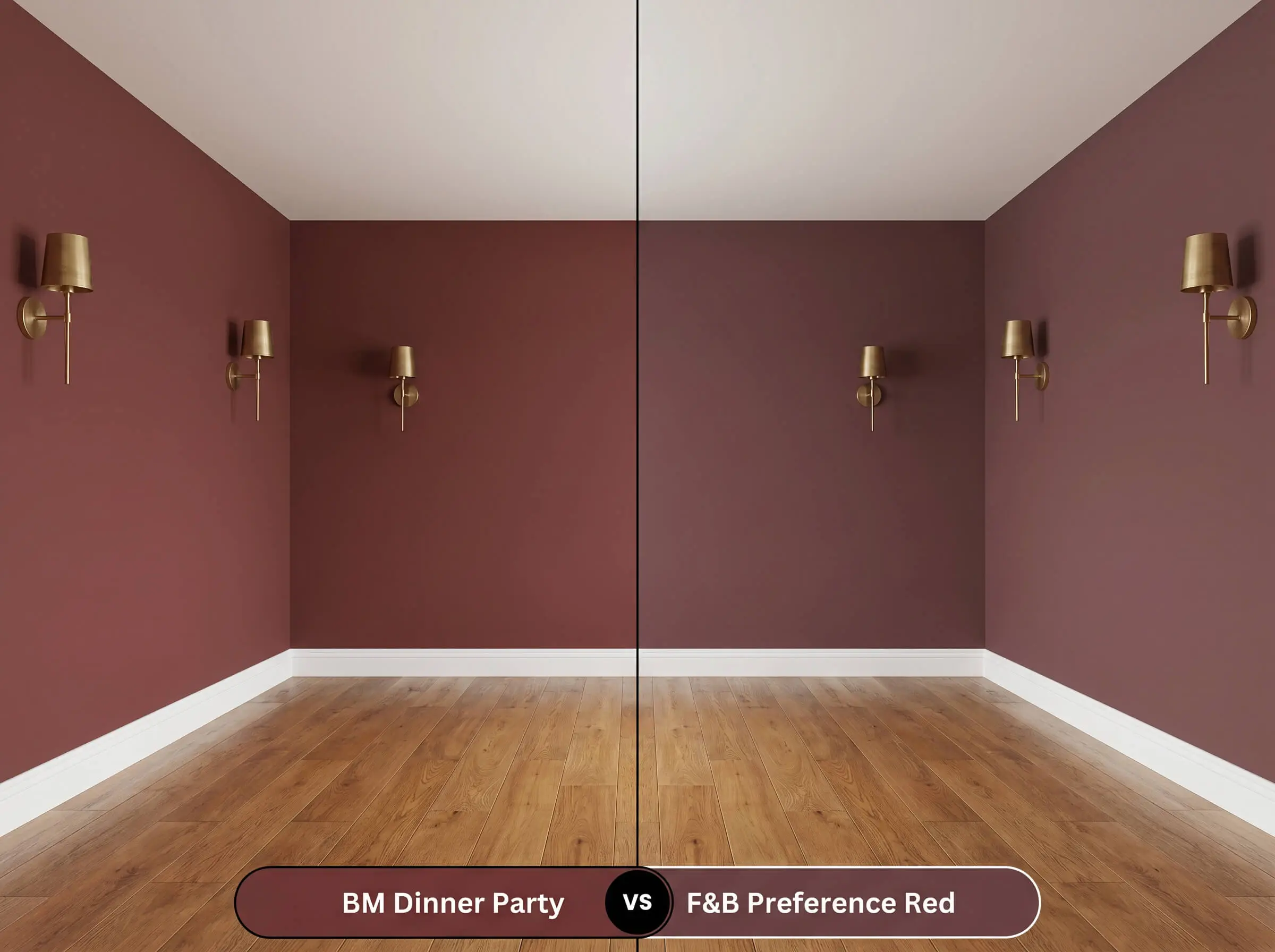
If you are working with a highly textured surface and want a red that feels truly baked and time-worn, Farrow & Ball Preference Red No. 297 excels. Preference Red has a slightly higher LRV and lacks the cooler violet shadow, resulting in a more straightforward, fiery terracotta. The Affinity Color Collection hue, by contrast, feels significantly more formal and tailored.
Alternative Selections for This Earthy Crimson
When the foundational color structure is almost perfect but you need a minor adjustment in light reflectance or warmth, staying within the same brand is the safest strategy.
Same-Brand Variations
Cross-Brand Matches
Application Guide: Maximizing Benjamin Moore Dinner Party
Translating this intense chromatic profile from a swatch to a finished wall requires strict adherence to proper application techniques.
Optimal Sheen Levels
Priming & Coverage Strategy
- This specific depth of red inherently struggles with opacity and will require a tinted gray primer to establish a neutral base.
- Expect to apply a minimum of two to three full coats to achieve the true, saturated oxblood color without any patchy undertones showing through.
Dark colors with a low LRV are highly prone to flashing, where roller marks become visibly shiny. You must maintain a wet edge while rolling and avoid going back over semi-dry sections to ensure a flawless, uniform cure.
Hackrea Pro-Tip (Avoiding Flashing)
Expert Q&A
Because of its intense pigment load, this shade is susceptible to fading under harsh sunlight. Utilizing a premium exterior line with Gennex Color Technology is critical to locking in the red core and preventing it from chalking into a dull pink.
Yes, provided you carry the exact same color down the walls. Color-drenching eliminates the contrasting ceiling line, which actually blurs the room’s boundaries and makes the low ceiling feel like an expansive, receding night sky.
A premium matte or very low-lustre eggshell is ideal for textured surfaces. This finish absorbs enough light to hide the plaster’s imperfections while retaining the rich, velvety depth of the crimson.
Warm reds naturally stimulate energy and conversation, while the dense black undertones in this specific shade keep the mood grounded and intimate. It creates an enveloping environment that encourages guests to linger long after the meal is over.
The Final Verdict on This Moody Atmosphere
Benjamin Moore Dinner Party AF-300 is an exceptional tool for creating highly intentional, enveloping environments. Its true strength lies in its ability to root transitional and modern eclectic spaces with profound architectural warmth. This earthy crimson is perfect for the design enthusiast who wants to move beyond safe neutrals and embrace a rich, tactile aesthetic. It excels in intimate, light-controlled spaces where its complex violet-brown shadow can be manipulated by layered lighting and premium materials.
Clash Warning (The Open-Concept Failure): You must avoid using this color as a disjointed accent wall in a bright, open-concept home dominated by cool, stark white finishes. When placed immediately next to icy grays or brilliant blue-whites, the red’s warm core aggressively clashes with the cool surroundings, making the paint look incredibly dated and out of place. It requires the surrounding architecture to support its visual weight, meaning it will completely overpower delicate, airy coastal furnishings or minimalist, pale wood interiors.