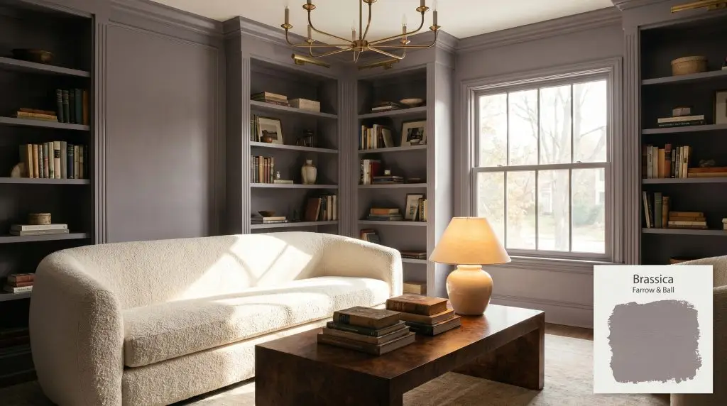
Brassica 271
Farrow & BallFarrow & Ball's Brassica No. 271 is a sophisticated, warm purple-gray with deep mauve undertones. Acting as a moody chameleon, it reads as a charming lilac in bright, south-facing light and shifts into a deep, muted aubergine-gray in cooler, north-facing spaces.
Paint Technical Profile
| Color ID / SKU | 271 |
| HEX Code | #8d838c |
| Light Reflectance (LRV) | 23.6 |
| Use | Interior, Exterior |
| Best Exposures | South, East, West |
| Best For | Cabinetry, Bedrooms, Living Rooms, Front Doors |
Farrow & Ball Brassica: A Velvety, Color-Shifting Anchor for Enveloping Spaces
Farrow & Ball Brassica is not just another dark neutral; it is a brilliant exercise in atmospheric depth. When applied to expansive walls, this moody interior shade immediately reigns in sprawling layouts, pulling the architecture closer to create a profound sense of intimacy.
It is a phenomenal gray-lilac that shifts seamlessly from morning to night. Whether you are grounding a bright, sun-drenched reading room or wrapping a shadowy study in rich pigment, this paint adapts beautifully to the environment around it.
Farrow & Ball Brassica: Undertones & LRV
When homeowners ask if this historical purple reads warm or cool, the answer leans decidedly warm. The hidden brown and red pigments within its structure ensure it never feels icy, even when the light drops. Let’s look at exactly how this color is built:
With an LRV of 23.6, this shade falls firmly into the mid-to-dark category. It absorbs a tremendous amount of light, meaning it will wrap a room in a cocooning shadow rather than bouncing illumination around the space.
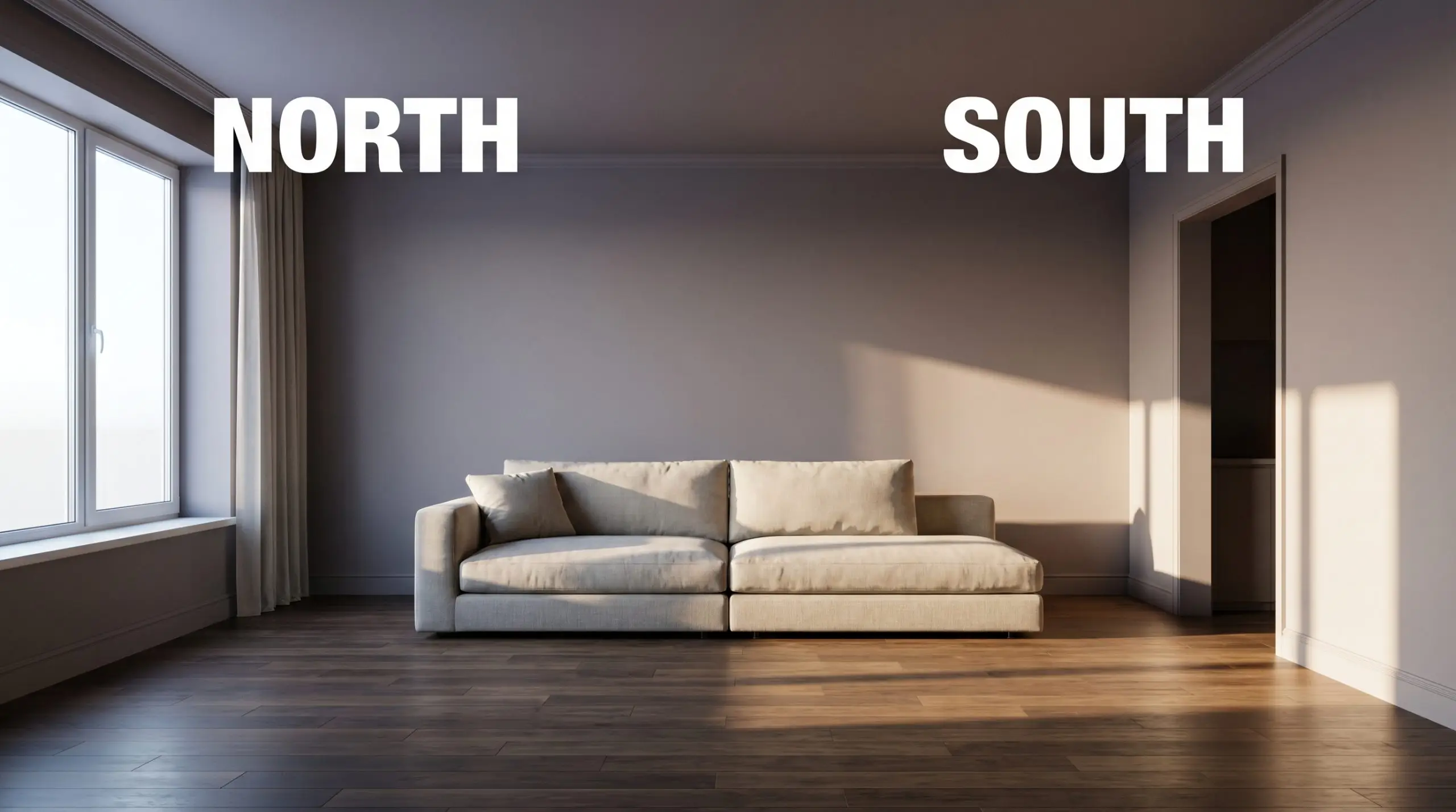
Lighting Effects & The Chameleon Factor
Because it relies so heavily on its brown and red micro-nuances to stay warm, starving this paint of light can turn it into a flat, lifeless slate. This chameleon color reacts dramatically to the sun’s path and your chosen bulbs, making it essential to test it on multiple walls to see how the environmental light manipulates its depth.
Architectural Applications for Brassica
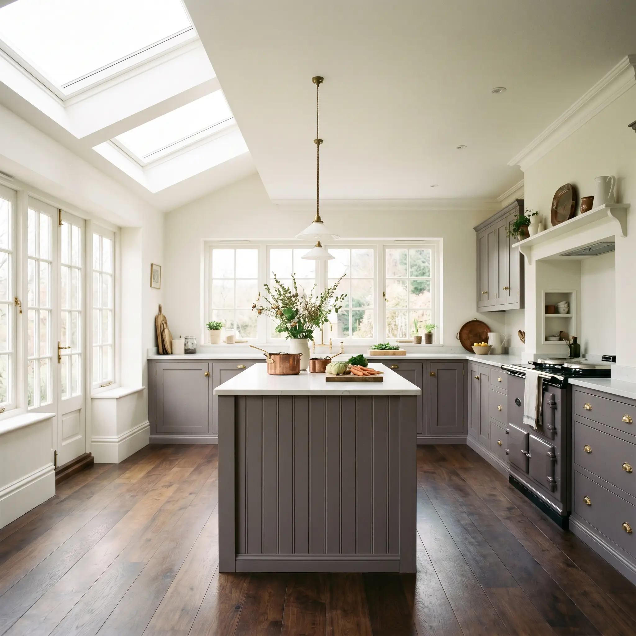
Kitchen Cabinetry & Islands
When applied to millwork, this shade transforms standard kitchens into highly curated culinary spaces. It anchors a sleek, contemporary aesthetic beautifully when paired with heavily veined marble countertops and minimalist slab doors. Conversely, if you are designing a classic English countryside kitchen, using this tone on beadboard islands or traditional shaker doors adds an instant sense of heritage.
Always ensure your kitchen receives ample natural light, or the cabinetry will read as a heavy charcoal.
Hackrea Warning (Light Requirement)
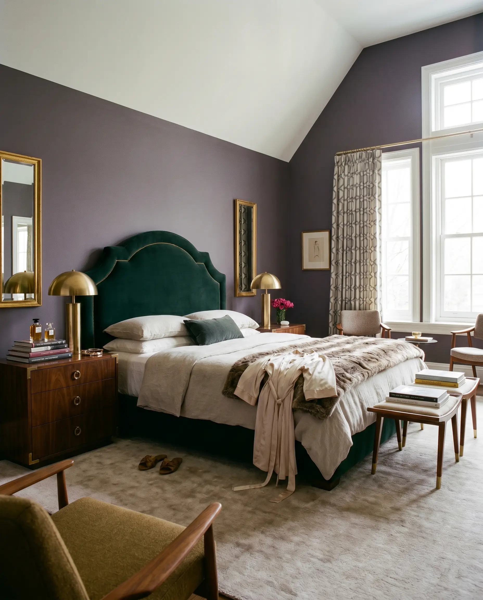
Cozy Primary Bedrooms
This depth of color is incredibly successful in private quarters, where a cocooning atmosphere is the ultimate goal. It serves as a stunning, moody backdrop for a plush, velvet upholstered headboard in a glamorous Hollywood Regency inspired room. For a more relaxed, modern-rustic approach, it pairs effortlessly with raw, reclaimed wood nightstands and rumpled linen bedding.
Dining Rooms
Dining spaces are the perfect canvas for color drenching, a technique that wraps the walls, trim, and ceiling in a single, unbroken hue. This application creates a profoundly intimate dining experience, blurring the architectural boundaries of the room. It sets a magnificent stage for a glittering crystal chandelier in a traditional setting, or a sculptural, woven rattan pendant in a bohemian-leaning space.
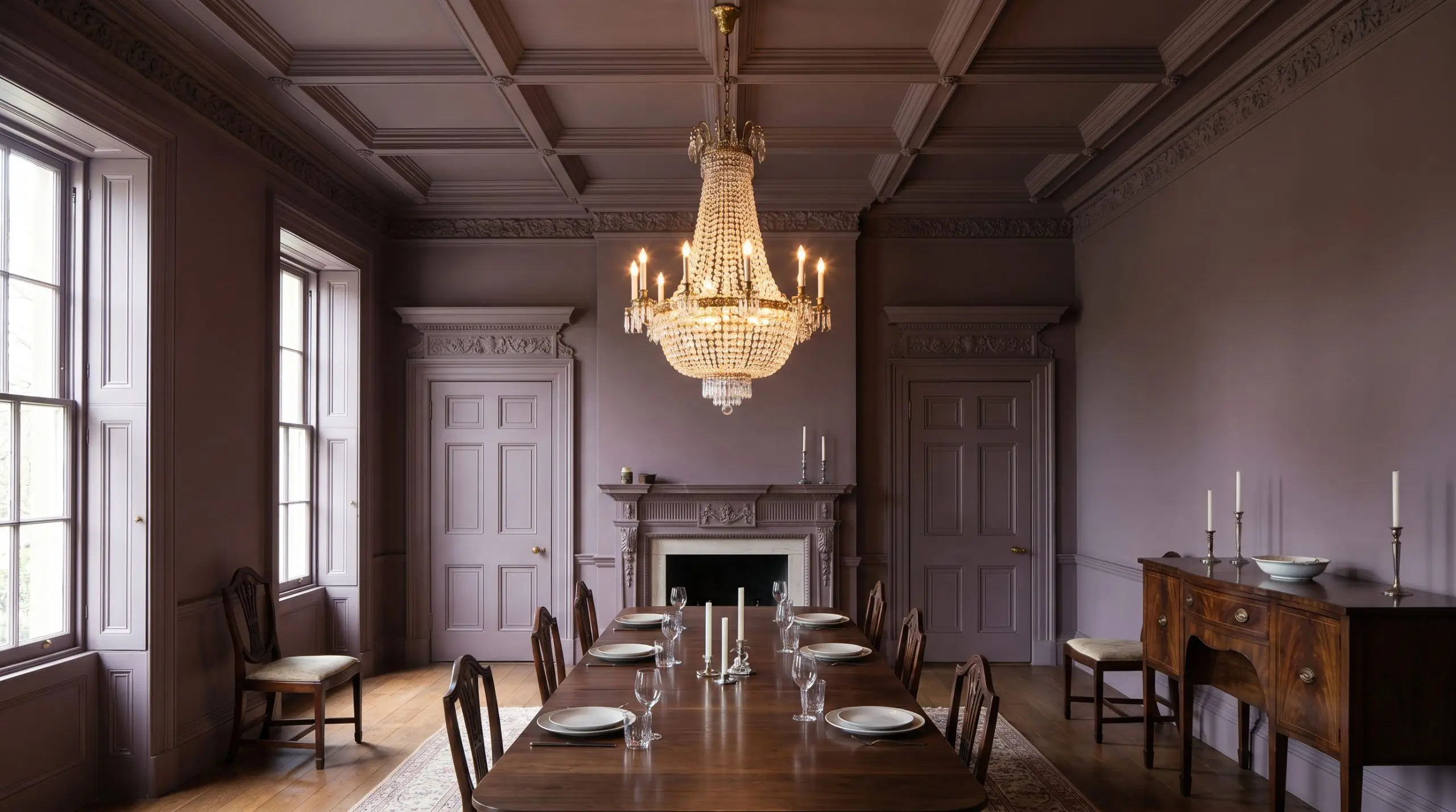
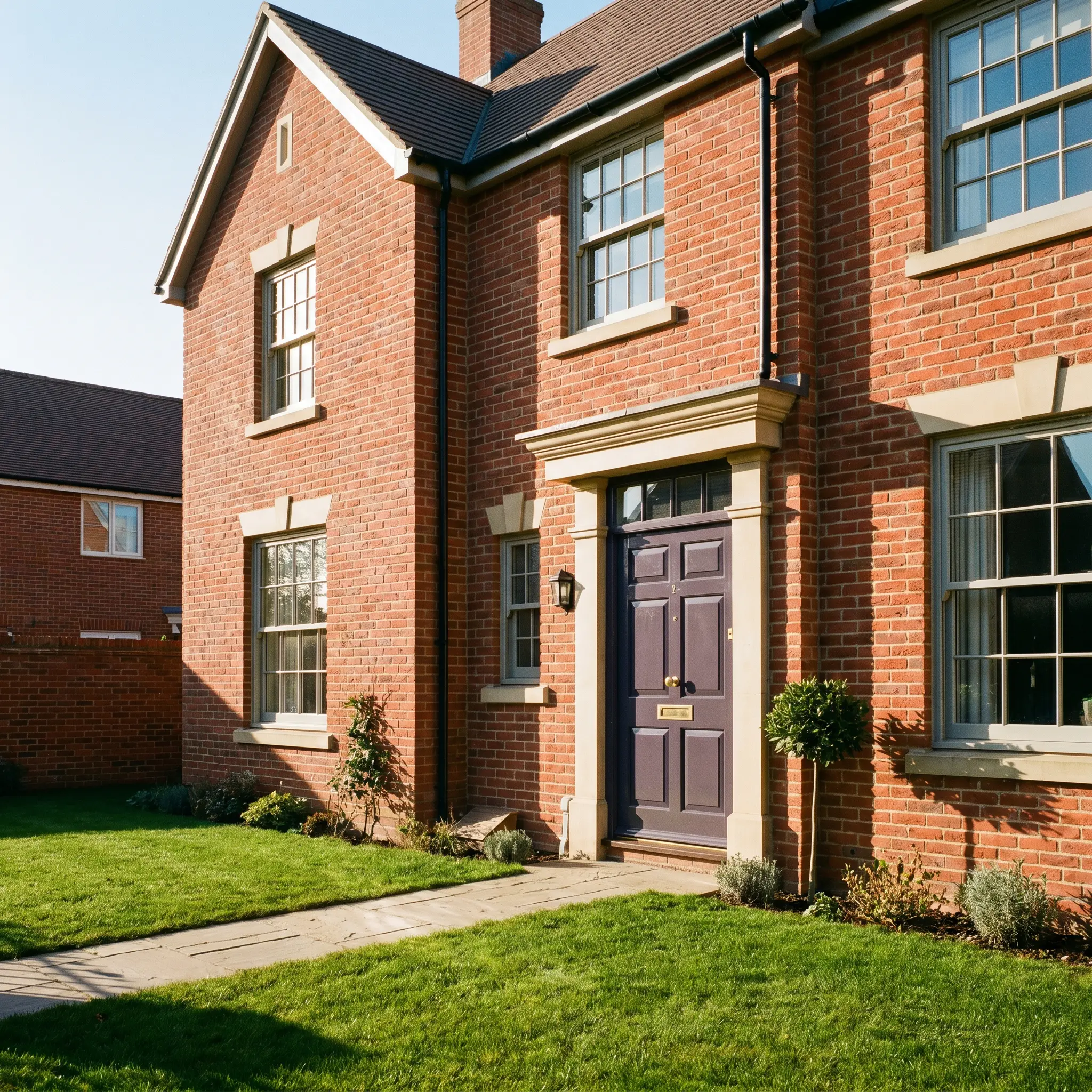
Front Doors (Exterior)
On an exterior facade, the intense outdoor sunlight will significantly wash out the color, making it appear much lighter and grayer than it does indoors. It provides a beautifully unexpected pop of color against classic red brick or crisp white siding.
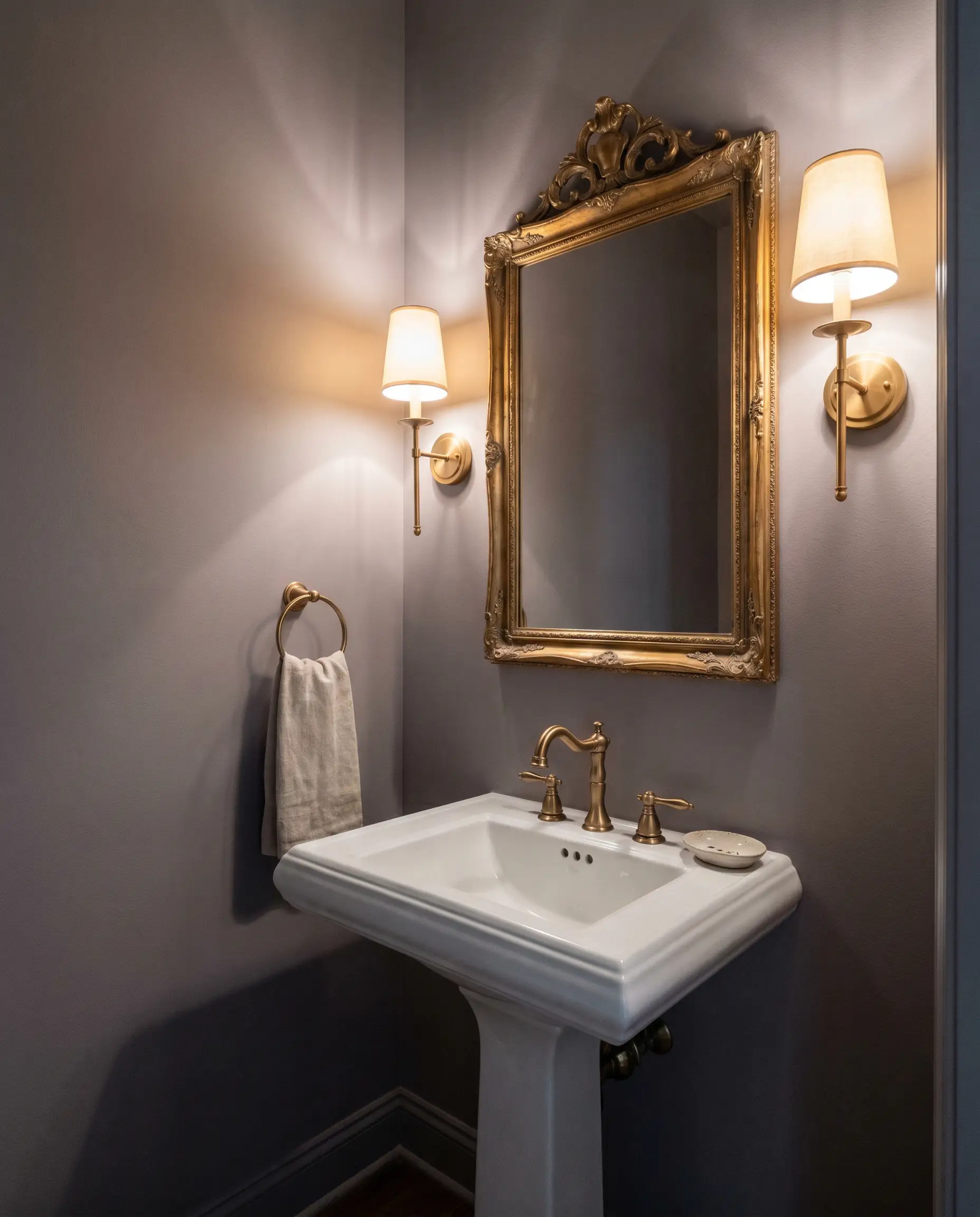
Powder Rooms
Small, windowless spaces actually benefit from dark, enveloping colors rather than fighting their lack of light with stark whites. Wrapping a half-bath in this rich tone creates a jewel-box effect that feels incredibly intentional. It provides a stunning contrast against a classic pedestal sink or an ornate, gilt mirror.
Creative Ways to Use This Muted Purple
The Gentleman’s Library
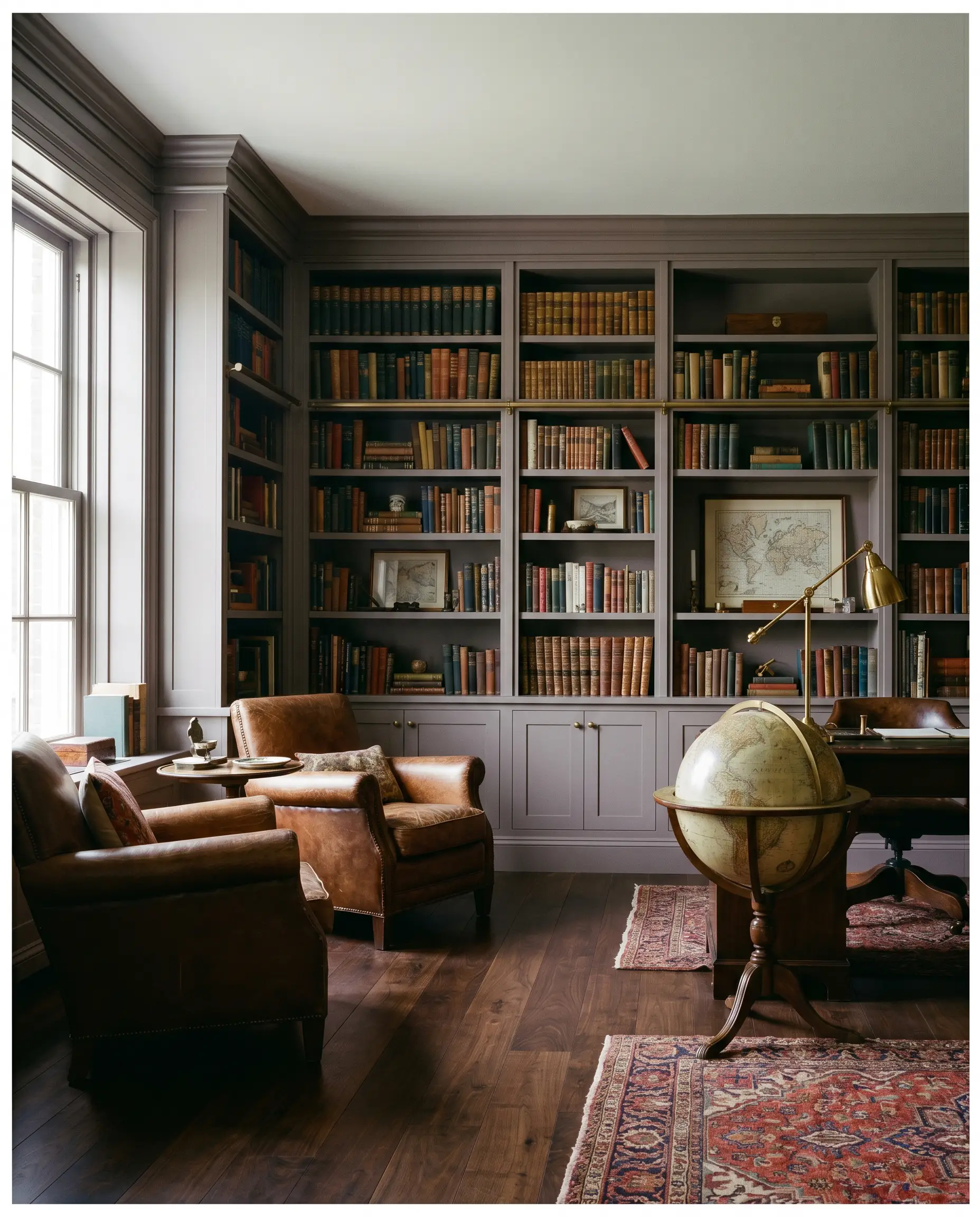
Transform an ordinary home office into a distinguished, moody retreat by painting floor-to-ceiling built-in bookcases in this shade. The rich, brown-based undertones provide a magnificent backdrop for aged leather armchairs, antique globes, and rows of vintage books. The color recedes just enough to let the curated objects shine while maintaining a strong, grounding presence.
A Parisian-Inspired Entryway
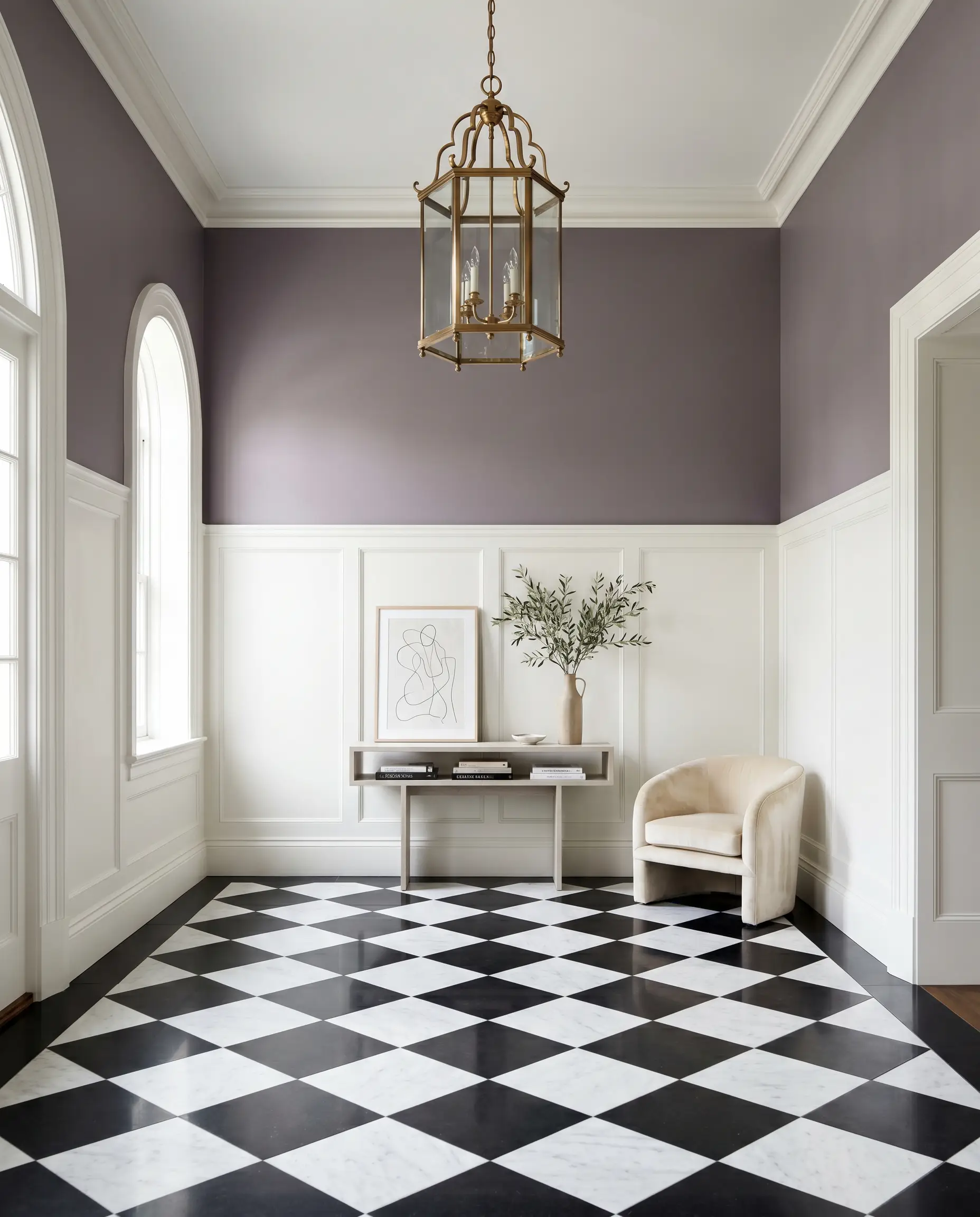
Use this elegant shade above crisp, bright white wainscoting to create a striking, high-contrast foyer. This application immediately signals a sophisticated, European-inspired aesthetic to anyone walking through the door. It pairs beautifully with a classic black-and-white checkerboard marble floor and a delicate, unlacquered brass lantern.
The Vintage Clawfoot Tub Revival
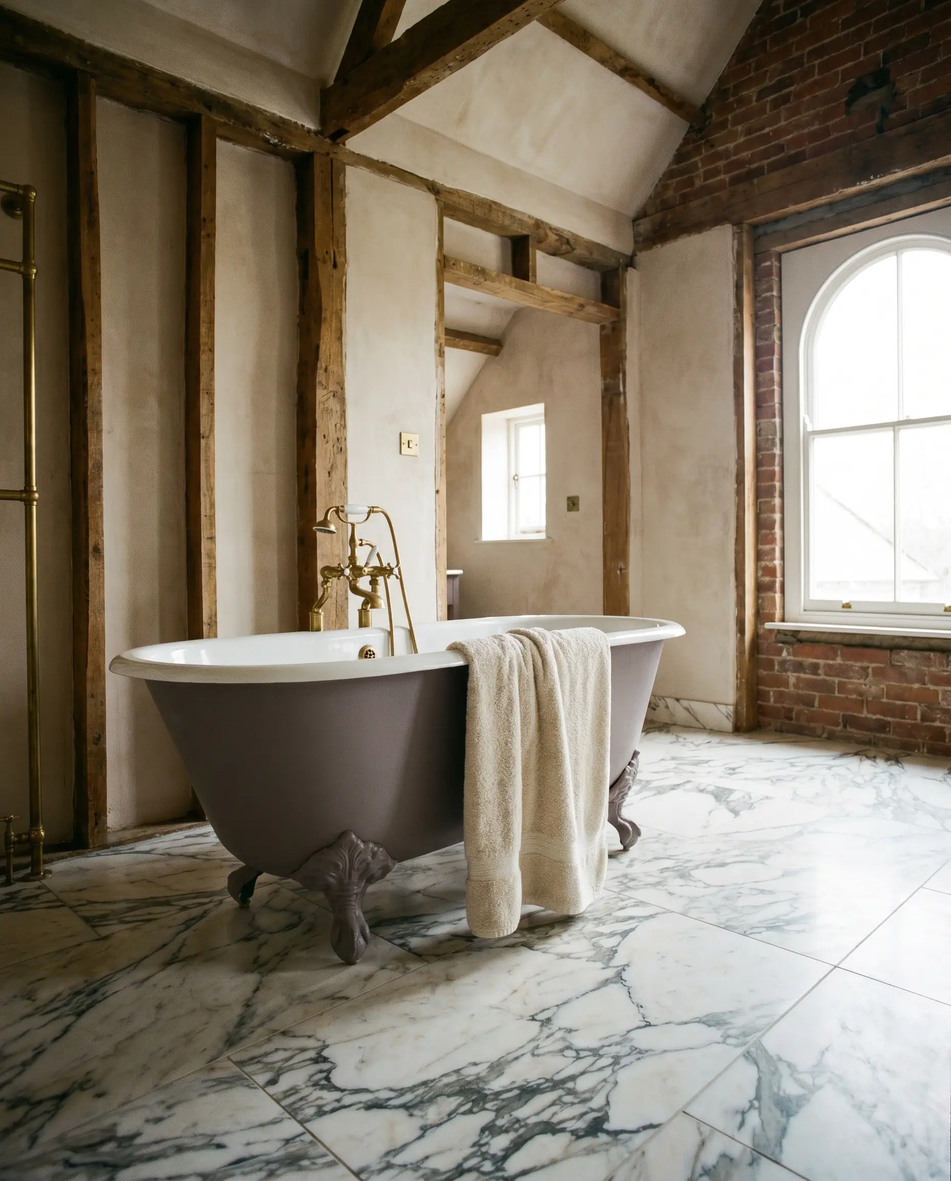
Upcycling an antique cast-iron bathtub by painting its exterior in this muted aubergine breathes new life into a bathroom renovation. The color strikes a perfect balance between historic reverence and modern chic. When set against a backdrop of heavily veined Calacatta marble floor tiles, the tub becomes a breathtaking, sculptural focal point.
A Moody Botanical Conservatory
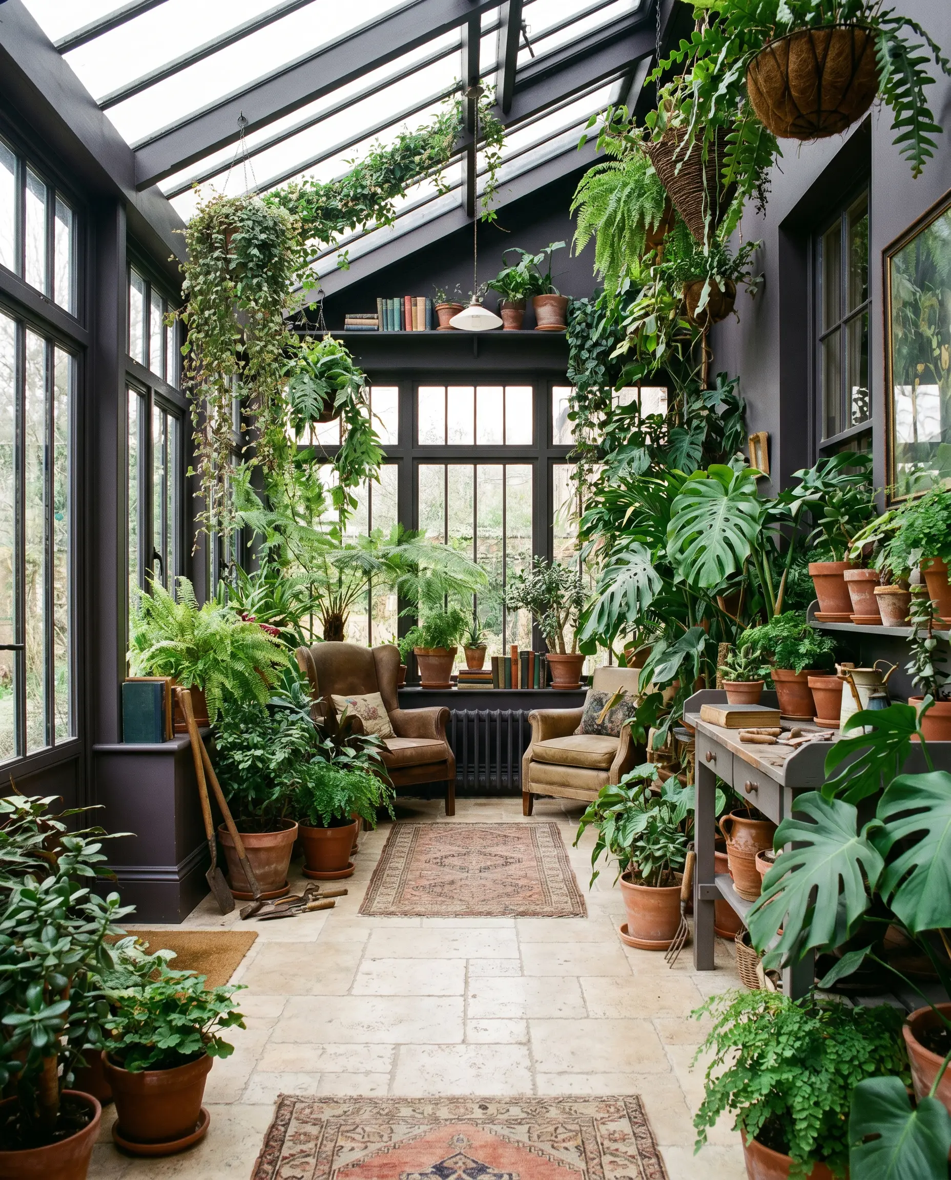
If you have a sunroom or enclosed porch filled with lush, trailing plants, this shade offers a brilliant, earthy contrast to the vibrant greens. The deep, charcoal-purple acts as a natural shadow, making the bright foliage pop dramatically. It grounds the airy space, transforming it from a simple porch into a curated, Victorian-style plant sanctuary.
Hardware, Textiles & Best Pairings
Trim & Baseboards
For a clean, classic boundary, Farrow & Ball Wimborne White No. 239 provides a soft, warm contrast that respects the aubergine’s brown base. Benjamin Moore White Dove (OC-17) offers a slightly more muted, shaded transition that prevents the trim from looking stark. If you prefer a highly tailored, crisp edge, Sherwin-Williams Alabaster (SW 7008) delivers a creamy luminosity that beautifully frames the darker walls.
Metals, Woods & Tactile Elements
Coordinating Colors
Designer Mood Boards
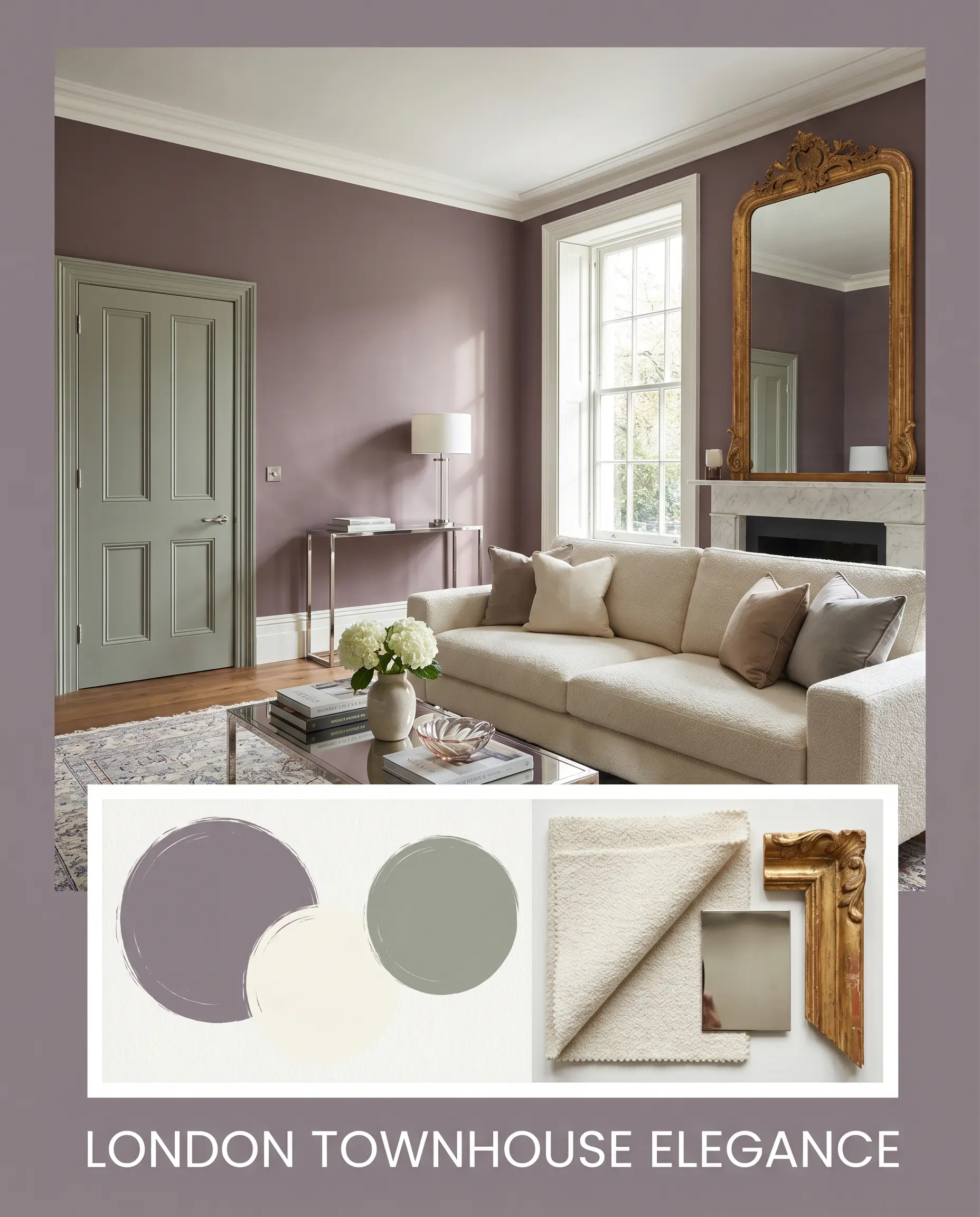
London Townhouse Elegance
This sophisticated palette leans into a refined, metropolitan aesthetic by pairing the deep aubergine walls with crisp white trim and Farrow & Ball Pigeon No. 25 on adjacent accent doors. The addition of polished nickel hardware and a plush, cream-colored bouclé sofa creates a striking balance of light and shadow. A large, gilded antique mirror reflects light back into the space, ensuring the room feels expansive rather than enclosed.
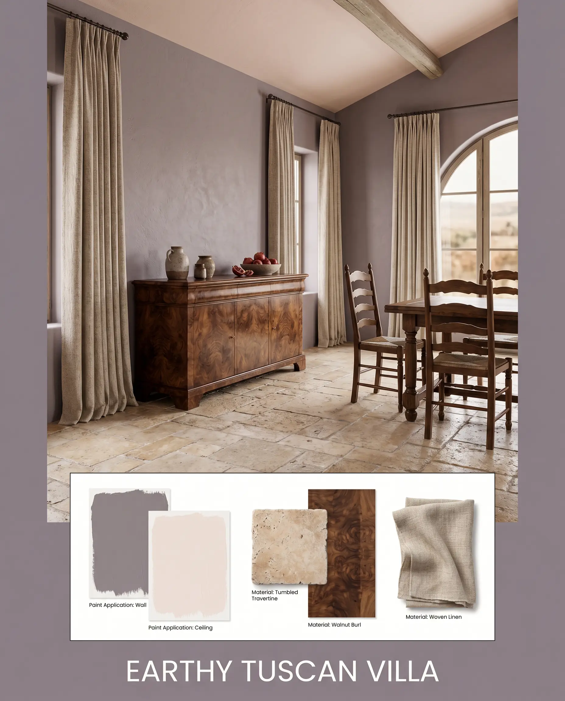
Earthy Tuscan Villa
By drawing out the warm brown micro-nuances, this combination feels ancient and deeply grounded. Tumbled travertine floors set a raw, textural foundation, while Benjamin Moore Early Sunset on the ceiling casts a warm, rosy glow over the space. Rich walnut burl side tables and heavy, woven linen drapery complete this highly tactile, enveloping atmosphere.
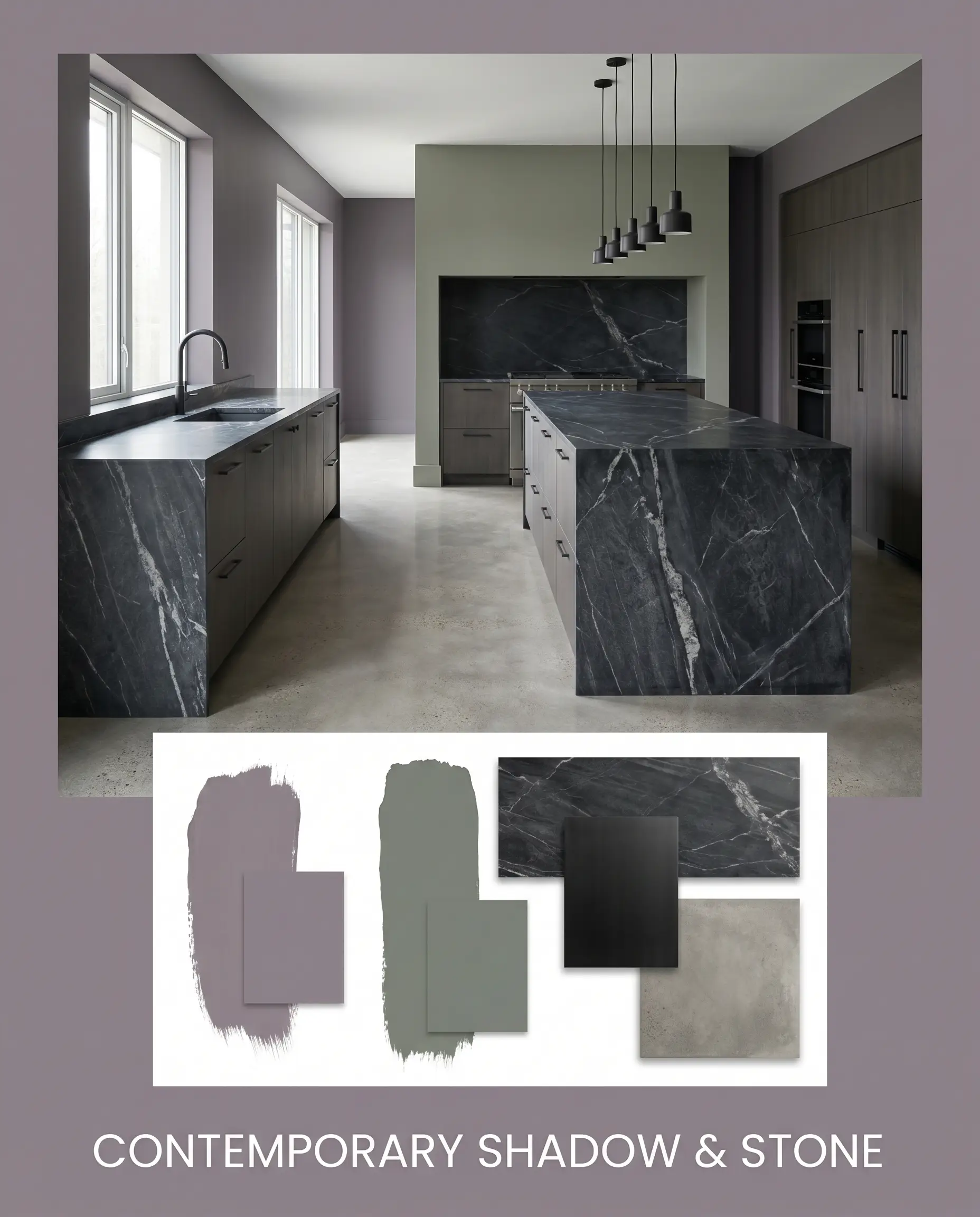
Contemporary Shadow & Stone
This scheme sharpens the cool, charcoal edge of the paint for a sleek, modern environment. Sherwin-Williams Retreat SW 6207 introduces a moody, blue-green contrast, while heavily veined, dark soapstone surfaces provide a monolithic, architectural weight. Minimalist, matte black fixtures and smooth, concrete-look floors strip away any historic fussiness, leaving a fiercely tailored, high-contrast aesthetic.
Head-to-Head Comparisons
Choosing the right dark neutral often comes down to analyzing the specific lighting exposure of your home. If your space lacks the warm light necessary to support a heavy purple, you may need to pivot to a cooler or lighter alternative.
Farrow & Ball Brassica vs. Farrow & Ball Elephant’s Breath
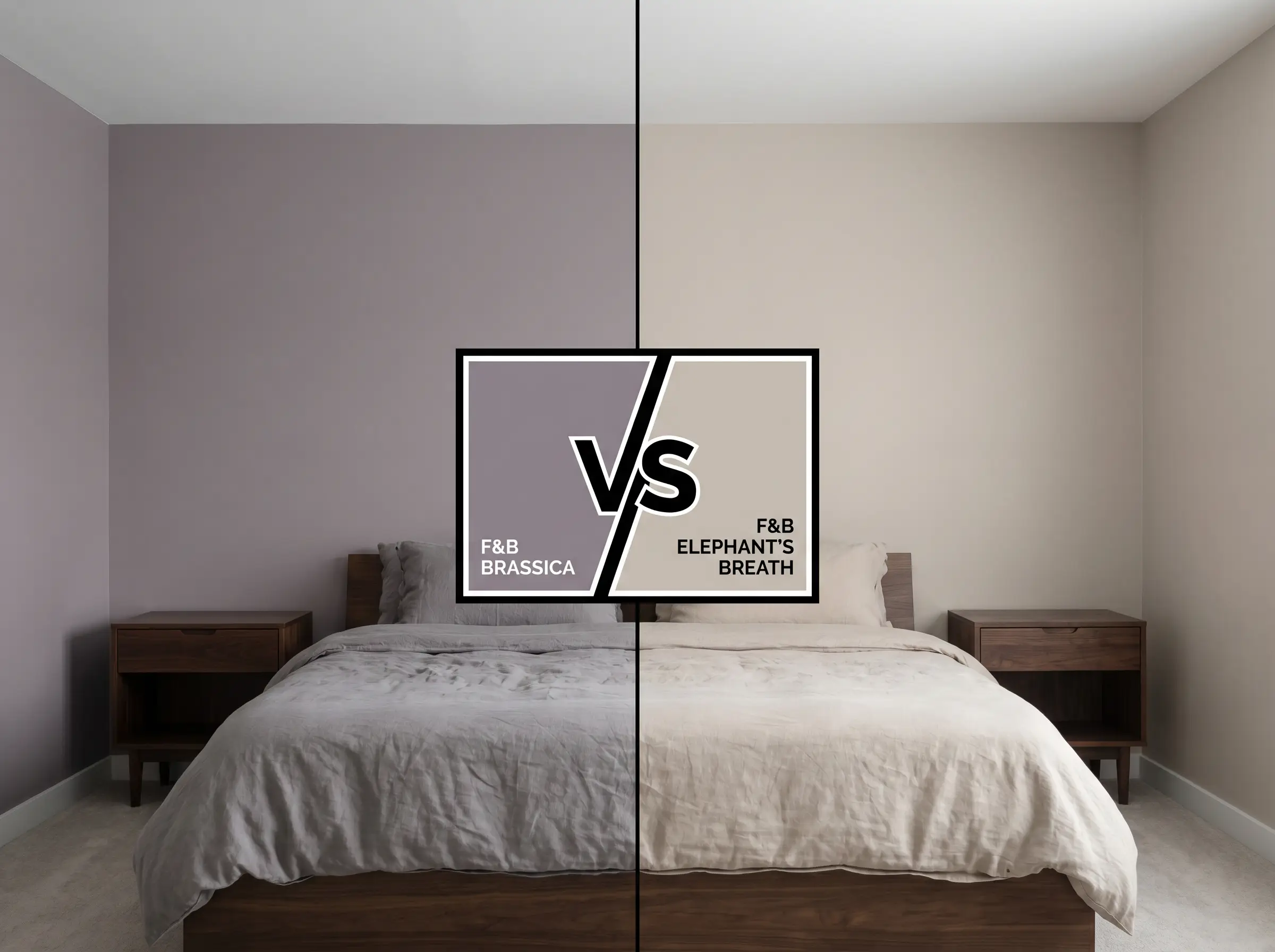
If you are designing a room with limited natural light, Elephant’s Breath offers a much higher LRV, acting as a mid-toned gray with a subtle magenta lift rather than a dark, enveloping shadow. Elephant’s Breath is significantly lighter and reads more like a warm greige, whereas the primary aubergine shade is a definitive, dark statement color. Choose the lighter option if you want a breezy, open feel, but stick with the darker hue for a truly intimate, moody interior.
Farrow & Ball Brassica vs. Farrow & Ball Pelt
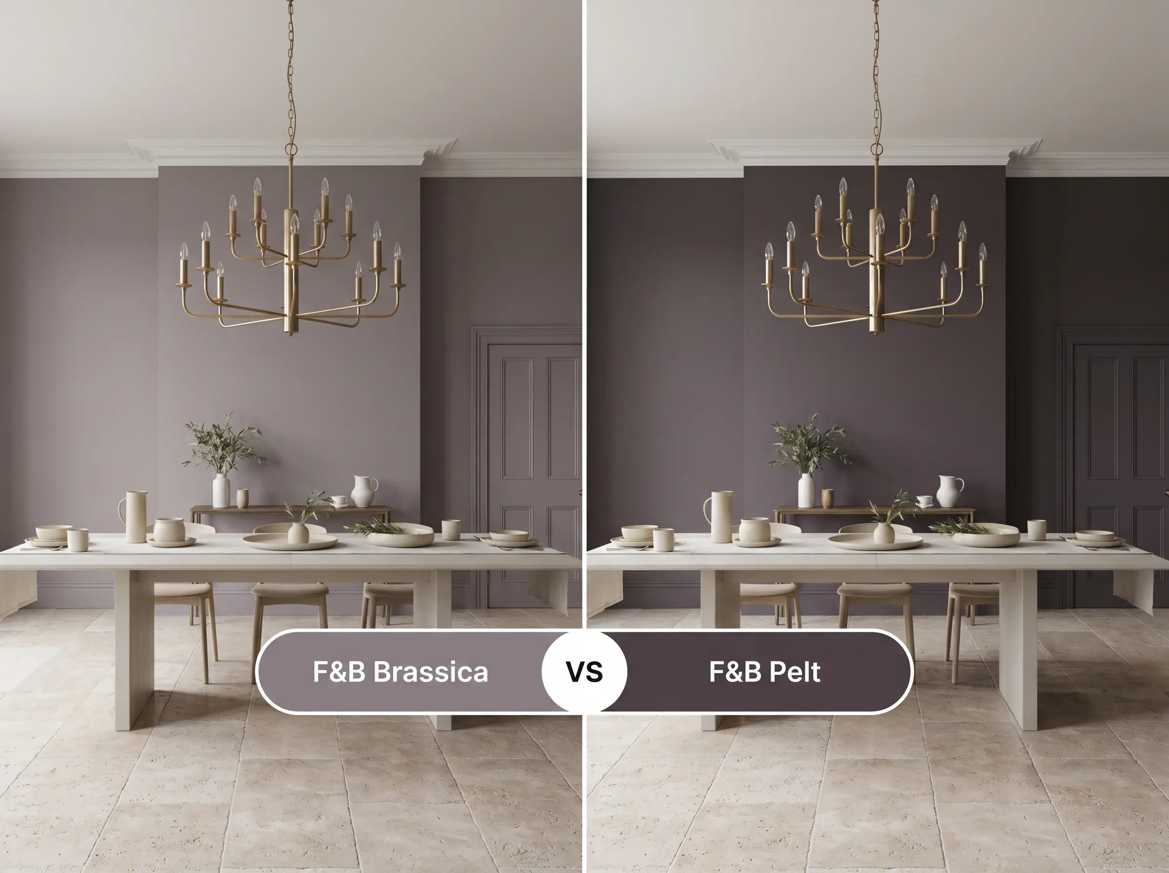
When you require a truly dramatic, theatrical purple, Pelt delivers a much deeper, richer plum experience with significantly less gray in its base. Pelt lacks the heavy charcoal muting, making it far more vibrant and intense on the wall. Opt for the muted gray-lilac if you want a subtle, shifting neutral, but pivot to Pelt for a bold, unapologetic burst of color.
Farrow & Ball Brassica vs. Benjamin Moore Shadow
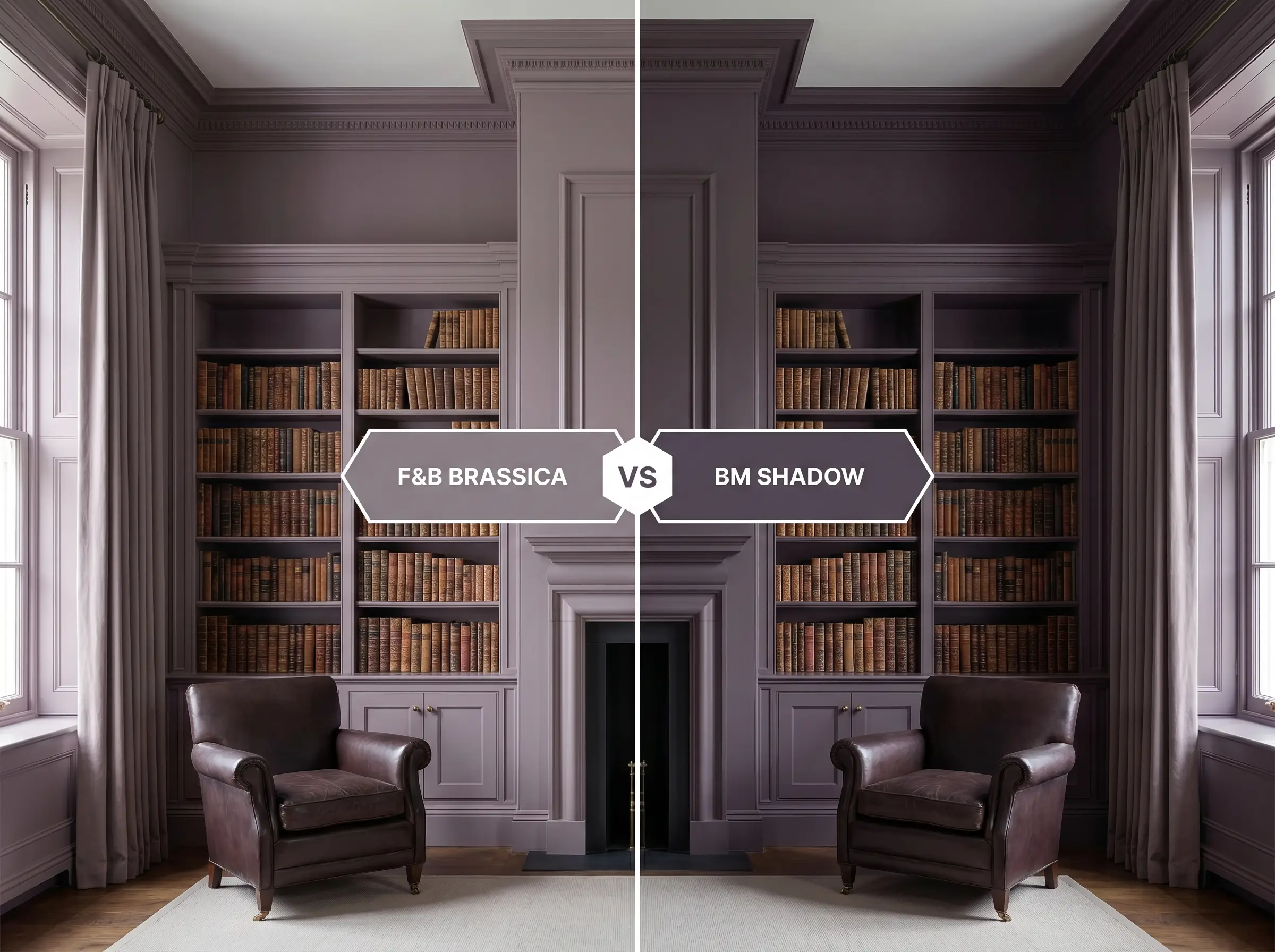
Benjamin Moore Shadow (2117-30) is a celebrated, deep amethyst that leans much cooler and more saturated than its Farrow & Ball rival. Shadow pulls heavily toward a true, royal purple, whereas the F&B option remains firmly grounded by its earthy, brown-gray dirtiness. If your room features cool northern light, Shadow will amplify that chill, while the F&B alternative will use its brown base to maintain a crucial touch of warmth.
Similar Colors & Brand Equivalents
Whether you are seeking a slightly different depth for a tricky hallway or require a color match from a different manufacturer, these alternatives offer similar atmospheric qualities.
Same-Brand Alternatives
Cross-Brand Matches
Practical Application & Estate Emulsion Tips
Translating a beautiful color swatch into a flawless architectural finish requires strict attention to application technique. Because of its heavy pigmentation, this specific formula demands a careful, methodical approach.
The Dynamic Sheen Guide
Primer Strategy
To achieve the true, rich depth of this aubergine, you must use a dark, tinted primer. Applying this heavily pigmented shade over a stark white base will result in a streaky, uneven finish that requires endless coats. A deep gray undercoat provides the necessary foundation for the color to build its signature, moody weight.
Coverage & Success Tips
Expect to apply a minimum of two generous coats to achieve full opacity and true color representation. Be incredibly mindful of “flashing,” which occurs when you press too hard on the roller or touch up a dry wall, leaving visible, shiny streaks in the matte finish. To avoid this, maintain a wet edge while rolling and always paint a full wall from corner to corner rather than attempting isolated spot touch-ups.
When working with highly pigmented, dark matte finishes, invest in a premium microfiber roller sleeve. Cheap synthetic covers will leave a stippled, orange-peel texture that catches the light and ruins the seamless, velvety illusion of the dark paint.
Hackrea Pro-Tip (The Roller Rule)
Frequently Asked Questions
Because of its heavy charcoal base, it rarely reads as a vibrant, overwhelming purple. Instead, it acts as a sophisticated, warm gray with a distinct aubergine glow. However, if your kitchen is flooded with warm, south-facing light, the purple tones will become much more pronounced.
Like all dark, heavily pigmented colors, it is susceptible to UV fading when exposed to relentless, direct sunlight. To preserve its rich depth, you must use a premium exterior gloss or satin finish with built-in UV protectants. If your door faces harsh southern or western sun, expect to perform a maintenance topcoat every few years to keep the color from washing out into a pale slate.
Yes, and the resulting effect is incredibly chic. By painting the walls, trim, and ceiling in the same dark hue, you eliminate the contrasting lines that tell your eye how small the space is. To prevent the hallway from feeling oppressive, you must incorporate strategic, warm artificial lighting, such as brass wall sconces, to illuminate the rich undertones.
Unlacquered, aged brass is the absolute perfect pairing for this specific DNA. The warm, slightly tarnished patina of the metal speaks directly to the brown and red micro-nuances hidden in the paint. Avoid overly shiny, cheap yellow brass, which will clash harshly with the muted, historic elegance of the color.
Final Verdict & Expert Warnings
Farrow & Ball Brassica is a triumphant, highly sophisticated anchor for homeowners who want to embrace dark, enveloping design without defaulting to standard charcoal or navy. It is perfect for creating intimate, curated spaces, from glamorous primary bedrooms to heritage-inspired tailored cabinetry. When illuminated correctly, its shifting, gray-lilac nature delivers an unmatched, velvety elegance.
Flooring with strong yellow or orange undertones, such as natural hickory or golden oak, will violently clash with the purple base, making the wood look chaotic and the paint look bruised. Similarly, pairing it with icy, blue-toned LED lighting or stark, brilliant white trim will strip away its essential warmth, leaving you with a flat, depressing slate rather than a rich, historical aubergine.
Expert Warning (Clash Avoidance)