Calluna 270
Farrow & BallFarrow & Ball Calluna No. 270 is a sophisticated, tranquil lilac with a touch of black that prevents it from feeling too sweet or pink. This heather-inspired shade acts as a soft, moody neutral, bringing a calming yet refined presence to bedrooms, living spaces, and cabinetry.
| Temperature | Cool |
|---|---|
| Primary Undertone | Lilac |
| Hidden Undertones | Gray, black, subtle pink |
| Best Exposures | South-facing or West-facing |
| Best For | Primary Bedroom Walls, Formal Living Areas, Bathroom Vanities, Nursery Walls, Kitchen Cabinetry |
Hackrea Review
Calluna is a masterstroke by Farrow & Ball for those who want color without the commitment of a vibrant pastel. Its dose of black grounds the lilac, making it incredibly elegant. While it might read slightly cold in north-facing rooms, in well-lit spaces, it provides a beautifully complex, grown-up purple that feels completely timeless.Architectural Applications for Farrow & Ball Calluna
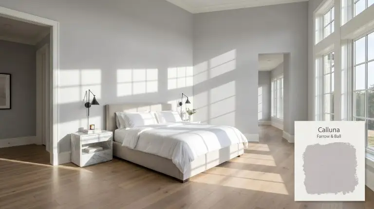
Primary Bedroom Walls
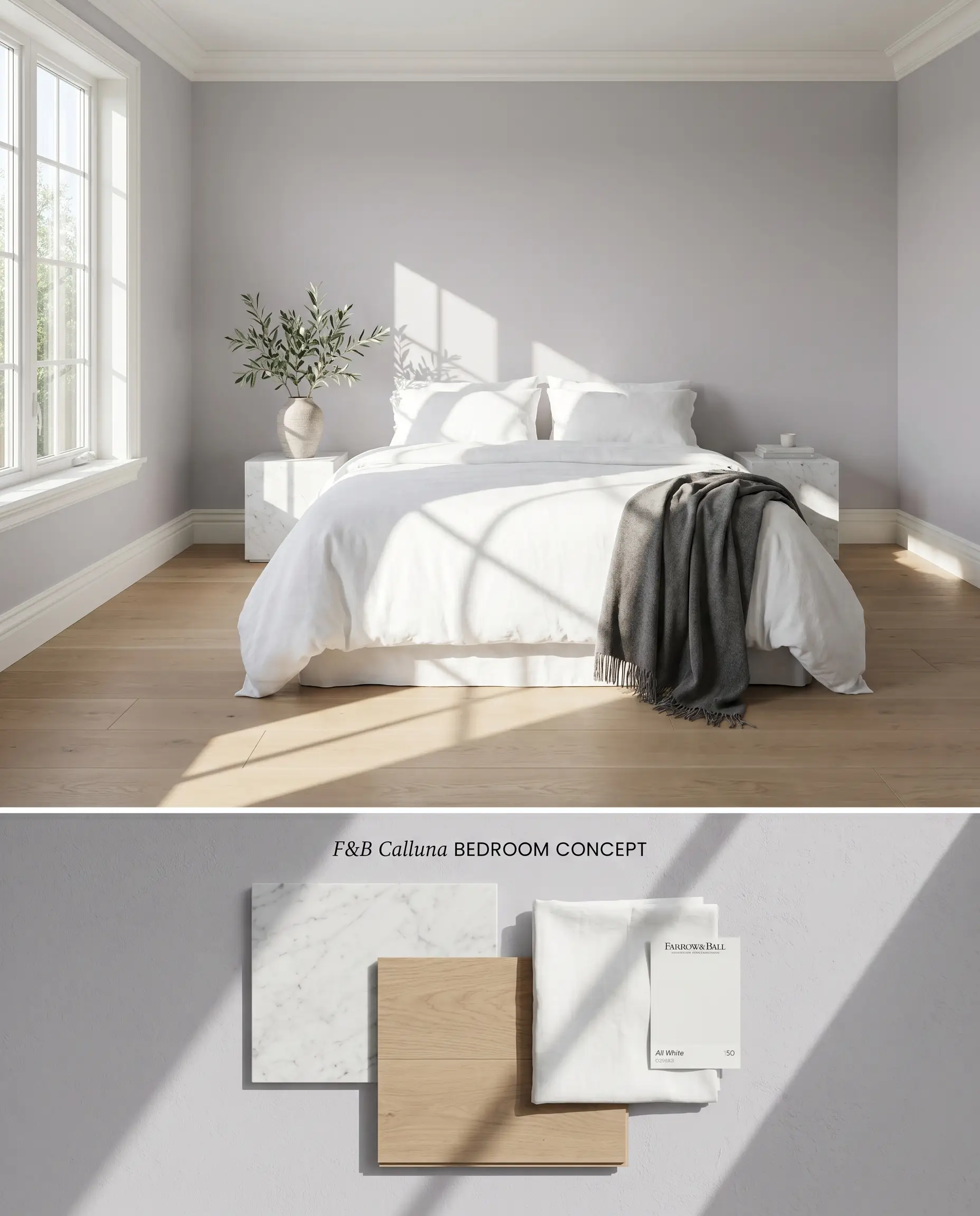
The black base anchors the heathered lilac, preventing the space from reading juvenile or overly sweet. Pairing this muted purple with crisp white linens and honed marble nightstands creates a grounding physical contrast. The color structure visually recedes against stark ceilings, expanding the perceived footprint of the room.
Formal Living Areas
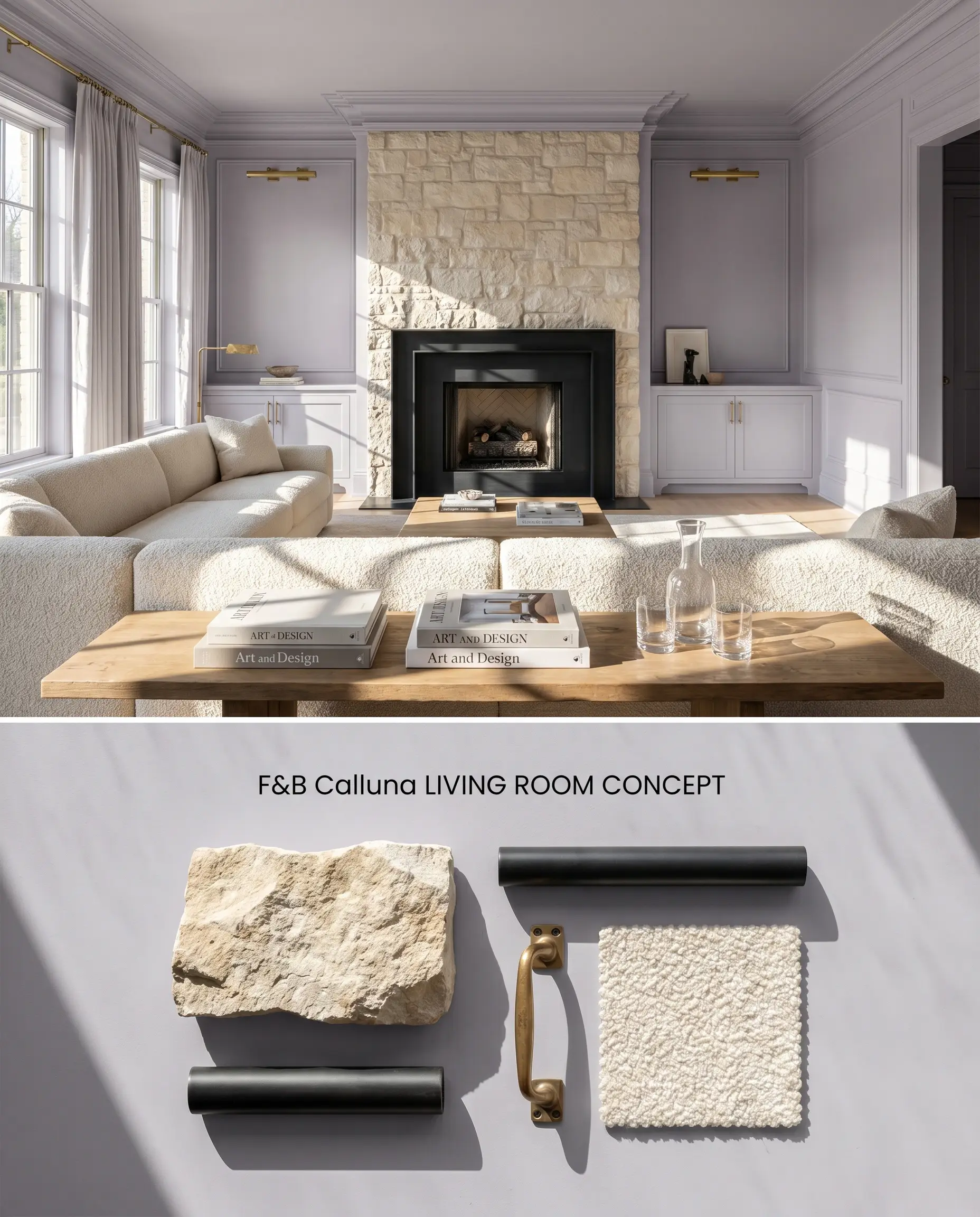
Applied across expansive walls, this moody neutral absorbs natural light, softening rigid architectural angles. Integrating matte black steel framing and boucle upholstery grounds the dusty mauve, emphasizing its shadowed undertones. The inherent black base limits light reflection, preventing the hue from bouncing neon and maintaining a tailored profile even under intense afternoon glare.
Bathroom Vanities
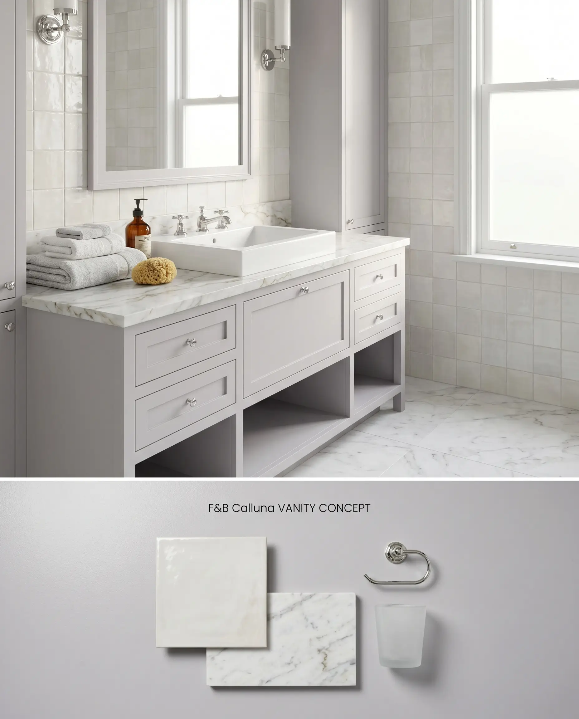
Utilizing this architectural finish on millwork introduces an organic element against the hard, reflective surfaces of glazed ceramic tile and polished chrome plumbing. The color acts as a cool-toned anchor that bridges the gap between stark white porcelain and natural stone countertops. It must be isolated in well-lit environments, as windowless bathrooms trap the hue into a flat, bruised shadow.
Nursery Walls
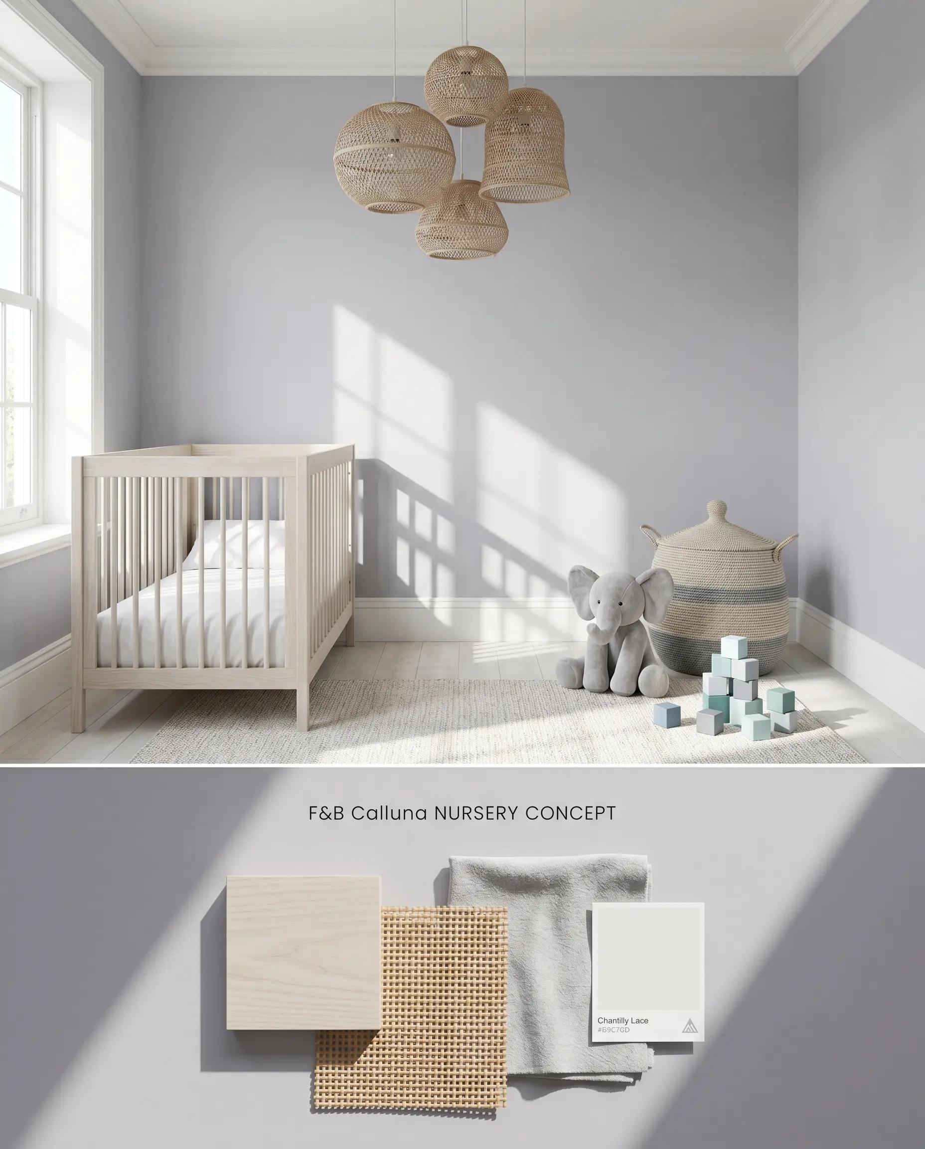
This complex hue provides a tranquil backdrop that matures alongside the child, relying on underlying gray notes to neutralize the purple. It pairs seamlessly with bleached ash cribs and woven rattan fixtures, provided the space receives adequate sunlight. Because chalky finishes flash upon touch-up, applying a high-durability product is mandatory to combat daily scuffs.
Kitchen Cabinetry
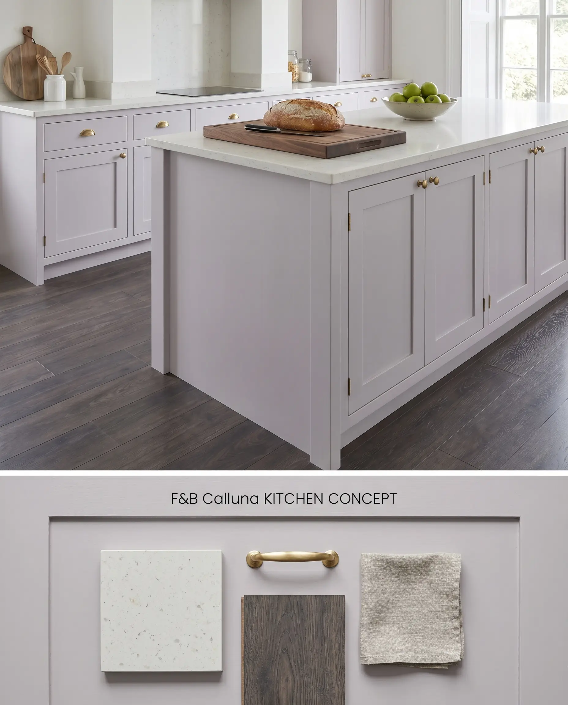
Deployed on lower cabinets or a central island, the muted purple functions as a striking alternative to standard navy. The dense color structure anchors the kitchen’s visual weight, especially when contrasted against pale quartz perimeters. The shade maintains its tailored elegance without overwhelming the culinary workspace.
You can apply wallpapers, paints, etc. on walls and see how they look in various interiors.

Evaluating the Chromatic Profile: Head-to-Head Comparisons
Farrow & Ball Calluna No. 270 vs. Farrow & Ball Peignoir No. 286
Calluna (LRV 58.47) leans cooler with its black base, presenting a true heathered lilac that shifts toward muddy gray in North-facing light. Peignoir (LRV 54) contains a distinct dose of pink and brown, making it a warmer, dustier blush-gray. Specify Calluna for South-facing rooms requiring a cool, tailored lilac, and deploy Peignoir in cooler, Northern exposures where its underlying warmth can counteract blue-tinted light.
Farrow & Ball Calluna No. 270 vs. Benjamin Moore Touch of Gray 2116-60
Touch of Gray (LRV 62.15) is noticeably lighter and operates as a purplish-gray rather than a distinct lilac, lacking the dense black grounding of the Farrow & Ball formula. Calluna absorbs light to maintain a moody profile, while Touch of Gray reflects more ambient light, making it slightly more forgiving in moderately lit spaces. Reserve Calluna for sun-drenched rooms where its complex depth can bloom, and use Touch of Gray when you need a safer, higher-LRV neutral that won’t turn into a bruised shadow in corners.
Farrow & Ball Calluna No. 270 vs. Sherwin Williams Sensitive Tint SW 6267
Sensitive Tint (LRV 58) shares an almost identical light reflectance value but features a cleaner, more straightforward violet undertone without the muddying black base. This causes Sensitive Tint to read as a sweeter purple under artificial lighting, whereas Calluna retains its grayed-out, architectural edge. Select Sensitive Tint for spaces where a clear pastel is desired, but mandate Calluna when the architecture requires a sophisticated, muted purple that resists bouncing neon hues.
Technical Troubleshooting for this Moody Neutral
In north-facing rooms, the cool, indirect light amplifies Calluna’s black base, causing the color to read as a cool, muddy gray rather than a distinct purple.
Yes, Calluna clashes intensely with strong yellow-orange woods like honey oak or natural pine, as these warm tones make the cool purple undertones appear jarring.
The Estate Emulsion finish absorbs light, enhancing the underlying black base to create a dense, moody neutral, though it is notoriously difficult to touch up without flashing.
With an LRV of 58.47, it is light enough for continuous use, but its tendency to turn into a flat, bruised shadow in windowless or low-light areas makes it unsuitable for dark hallways or basements.
Similar Paint Colors
Same Brand
Cross-Brand Equivalents