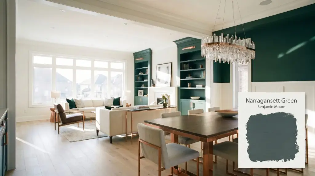
Narragansett Green HC-157
Benjamin MooreBenjamin Moore Narragansett Green (HC-157) is a deeply saturated, blackened teal. With a low LRV of 9.14, it acts as a moody, sophisticated chameleon that shifts between a rich navy-green in bright light and a grounded slate-black in shadows.
Paint Technical Profile
| Color ID / SKU | HC-157 |
| HEX Code | #435155 |
| Light Reflectance (LRV) | 9.14 |
| Use | Interior, Exterior |
| Best Exposures | South-Facing, West-Facing |
| Best For | Powder Rooms, Kitchen Cabinets, Exterior Accents, Studies |
Benjamin Moore Narragansett Green: A Deeply Grounded, Color-Shifting Teal
When you coat standard living room built-ins in a shade that absorbs over ninety percent of the light, the entire architecture of the room instantly feels heavier, more deliberate, and undeniably premium. Benjamin Moore Narragansett Green (HC-157) is exactly that kind of transformative material. It is a blackened teal from the Historical Collection that behaves less like a standard wall color and more like a structured architectural shadow.
This saturated hue thrives on the tension between its moody atmosphere and the everyday materials surrounding it. Whether you are aiming for a classic colonial revival aesthetic or a sharp, contemporary loft vibe, this deep pigment acts as a brilliant stabilizing force. Let’s explore exactly how this complex shade manipulates light and texture to elevate your home.
Undertones & LRV of Narragansett Green
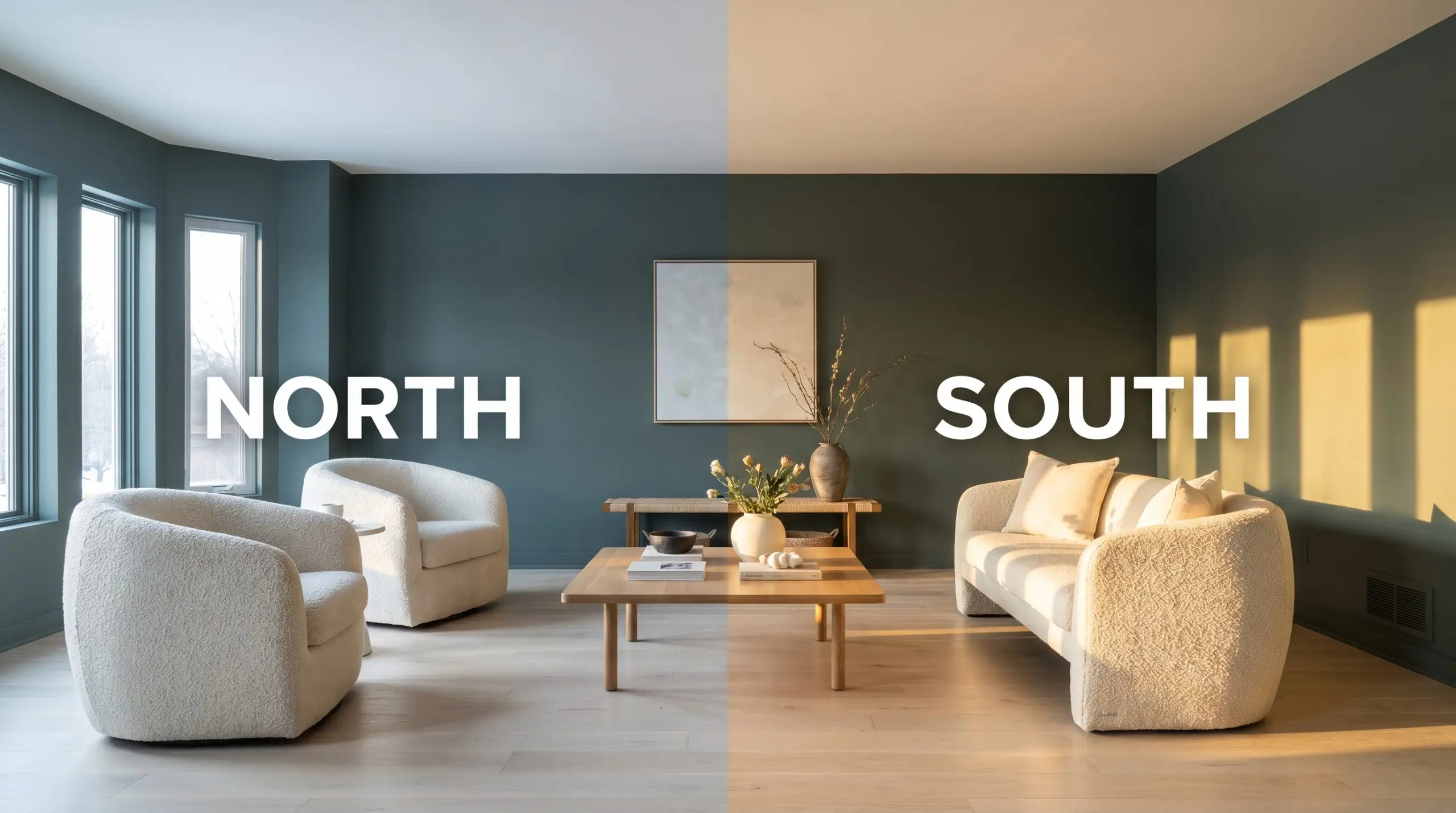
If you are wondering whether this historic shade leans warm or cool, the answer is definitively cool, yet it remains deeply grounded. The temperature is strictly controlled by a heavy foundation of black and slate gray, preventing the color from ever feeling like a vibrant, tropical jewel tone.
If you are planning an outdoor project, understanding LRV in dark exterior paints is crucial because this depth of color absorbs almost all ambient light it receives. With an LRV of 9.14, instead of illuminating a space, this heavy pigment creates intentional intimacy and striking, high-contrast boundaries.
Lighting Effects & The Chameleon Factor
The biggest environmental risk for this blackened teal is placing it in a dimly lit, north-facing room with absolutely no contrasting bright white trim or warm lighting. Without intentional contrast, the beautiful blue-green notes vanish, and the walls will simply look like a flat, muddy charcoal.
Because it is so heavily muted, this shade shifts dramatically depending on the angle and temperature of the light hitting it. You must observe how the color behaves throughout the day to ensure it delivers the exact energy you want.
Popular Room Applications
A heavily saturated hue like this demands intentional placement to balance its visual weight. It excels at anchoring a room, providing a solid, grounding energy that allows lighter furnishings and metallic accents to shine brilliantly against it.
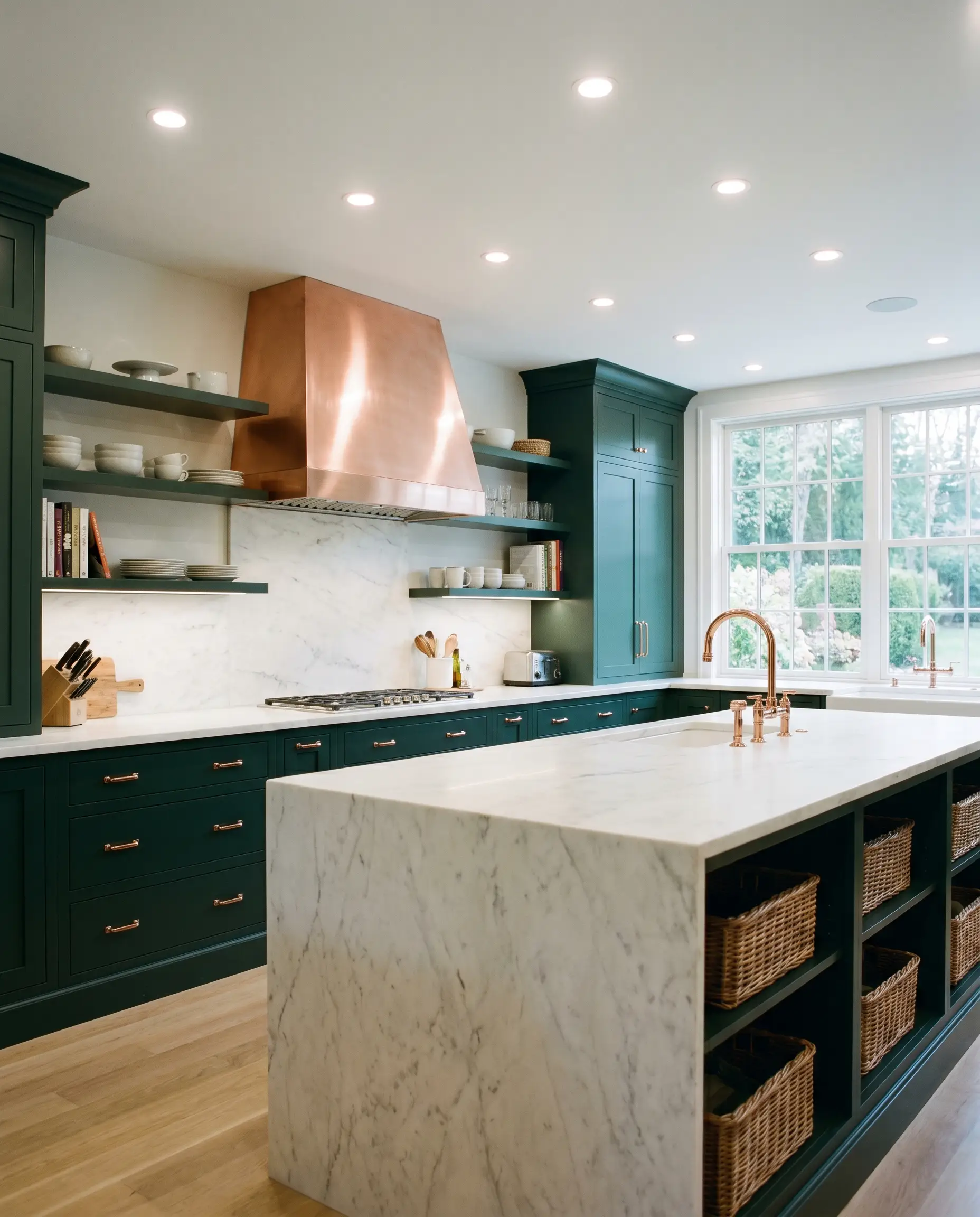
Kitchen Cabinetry & Islands
This shade is an incredibly popular cabinetry finish because it immediately elevates standard kitchen layouts into highly curated, custom-feeling spaces. It provides a stunning backdrop for crisp white marble counters in a classic transitional kitchen, but also grounds rugged butcher block perfectly in a rustic farmhouse setting. Always pair it with brilliant metallic hardware to bounce light and break up the heavy color absorption. If you are researching how to paint kitchen cabinets dark green, remember that this specific shade requires excellent lighting to showcase its teal notes.
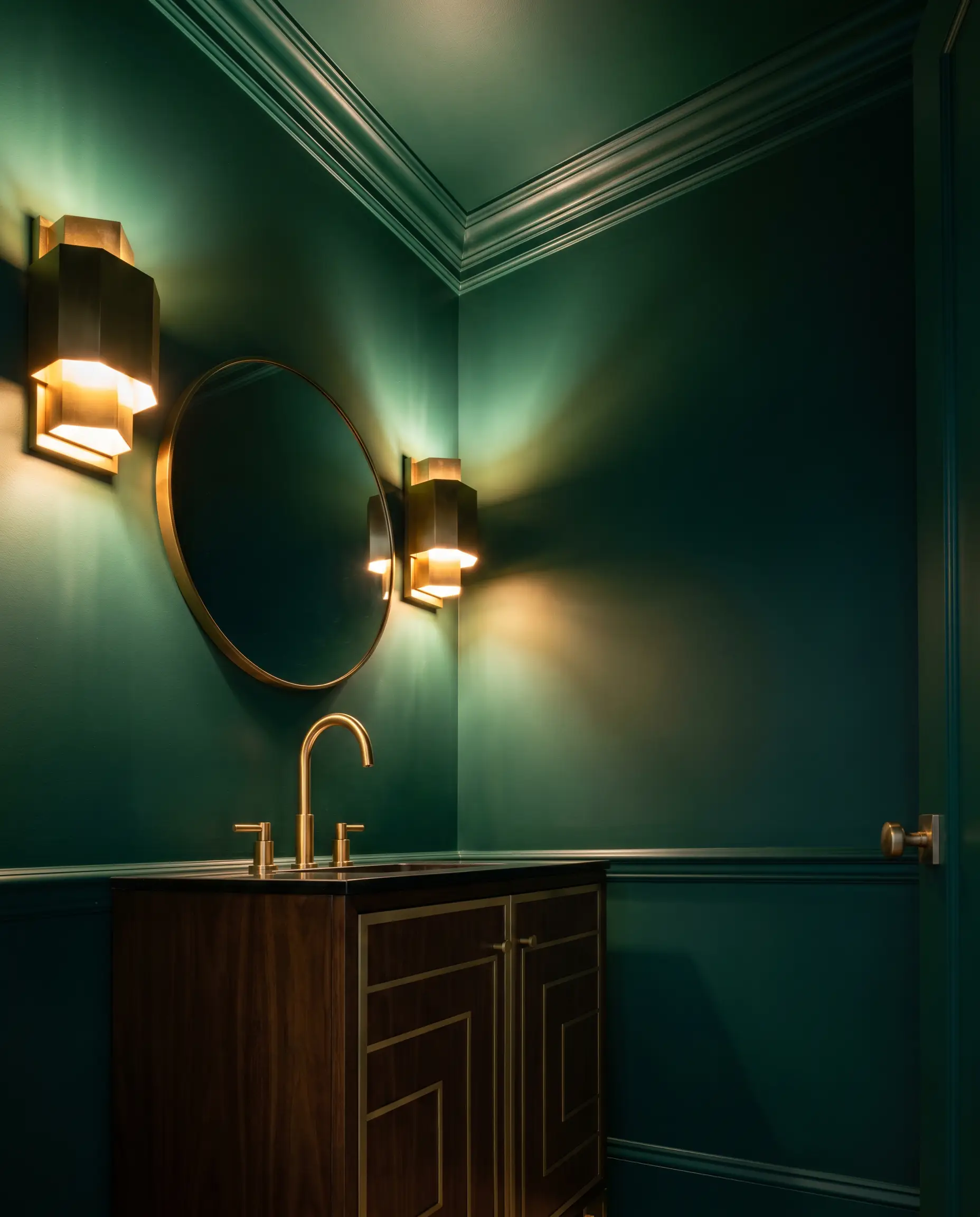
Windowless Powder Rooms
Instead of fighting the lack of natural light, use this deep shade to embrace the shadows and create a dramatic, jewel-box effect. Wrapping the entire room—including the ceiling and trim—in this blackened teal blurs the architectural boundaries. You can lean into a glamorous Art Deco vibe with polished brass fixtures, or keep it earthy and organic with a textured stone sink.
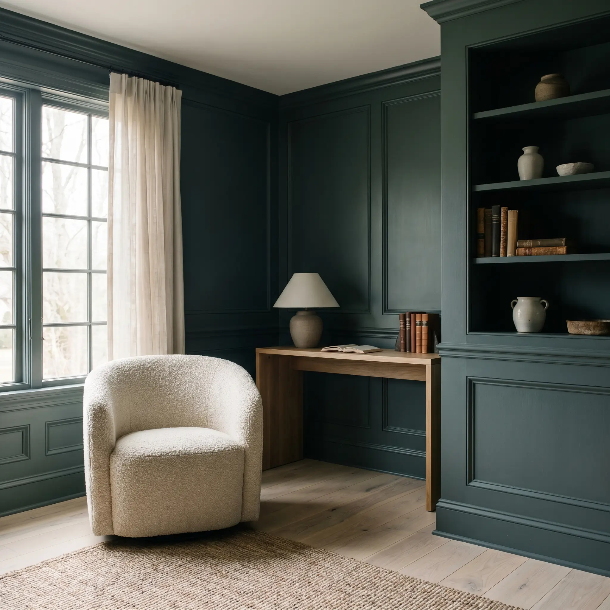
Home Libraries & Studies
This color was practically engineered for quiet, focused environments where a moody atmosphere is the ultimate goal. It completely transforms standard drywall into what feels like rich, historic paneling. When reviewing the best dark moody paint colors for studies, this shade consistently stands out because its slate-gray base prevents it from feeling overly energizing.
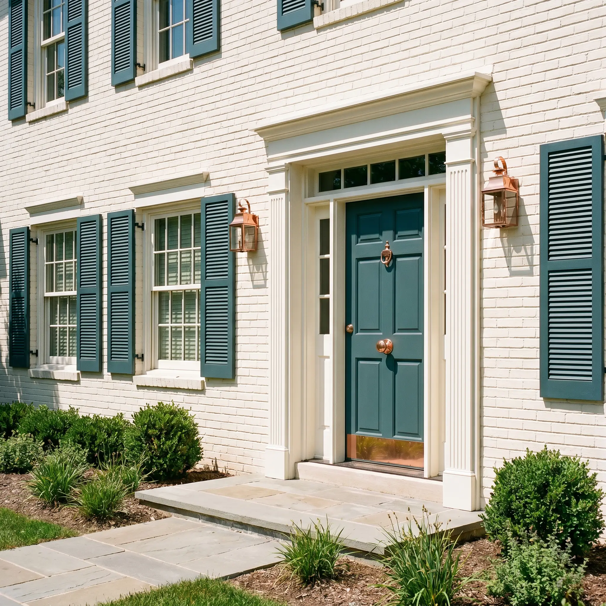
Exterior Front Doors & Shutters
On an exterior facade, direct sunlight will wash out some of the color’s depth, allowing the rich blue-green to step forward beautifully. It acts as a brilliant, welcoming focal point against warm white brick, or provides a handsome, tailored contrast against natural cedar shingles.
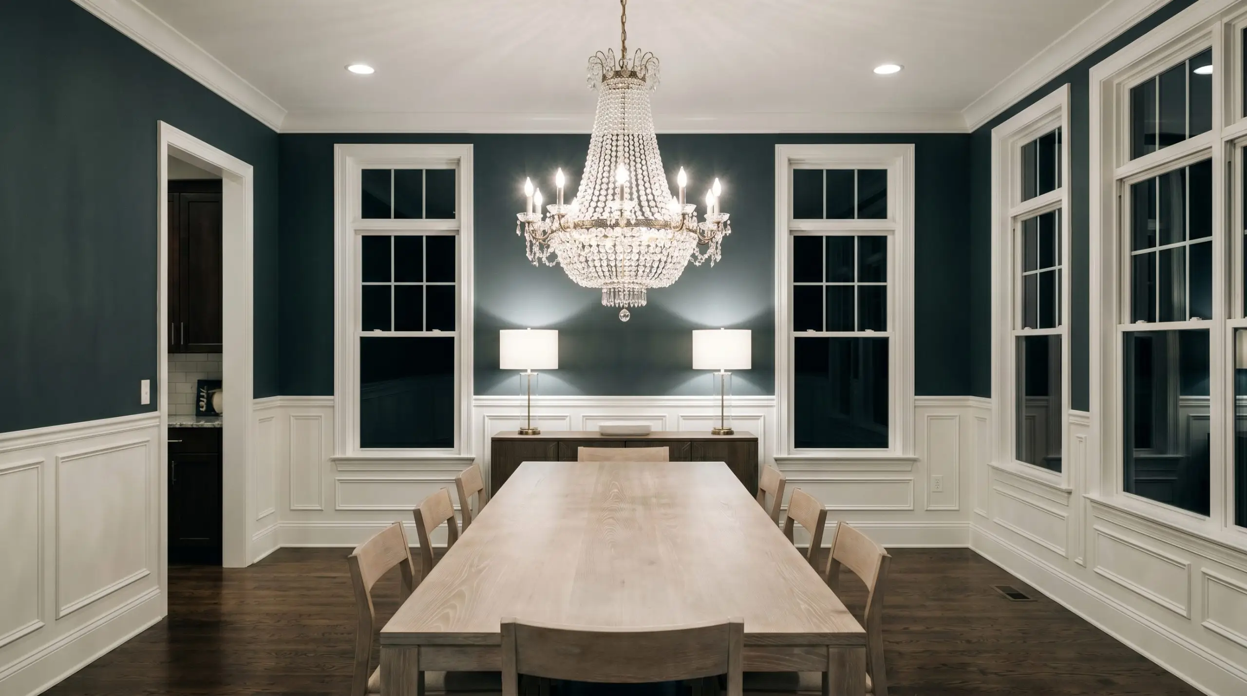
Dining Rooms
Applying this deep shade above crisp white wainscoting is a timeless strategy that balances formal elegance with striking contrast. The dark upper walls recede slightly in the evening light, allowing a sparkling chandelier or a collection of framed art to command the room’s attention.
Creative Ways to Use Narragansett Green
Beyond standard wall applications, this deeply grounded pigment is an incredible tool for highly specific, transformative design projects. Its dense coverage makes it perfect for breathing new life into forgotten architectural elements and tired furniture.
The Fluted Media Console
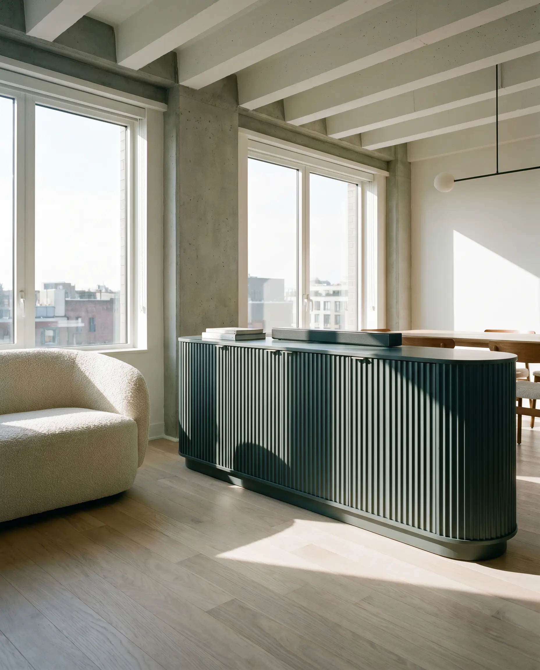
Transform a basic, unfinished wooden media console by applying this rich shade to fluted or reeded drawer fronts. The deep slate-gray shadows will settle into the grooves, exaggerating the texture and turning a standard piece of furniture into a custom-looking anchor for a modern living room.
A Maximalist Collector’s Corridor
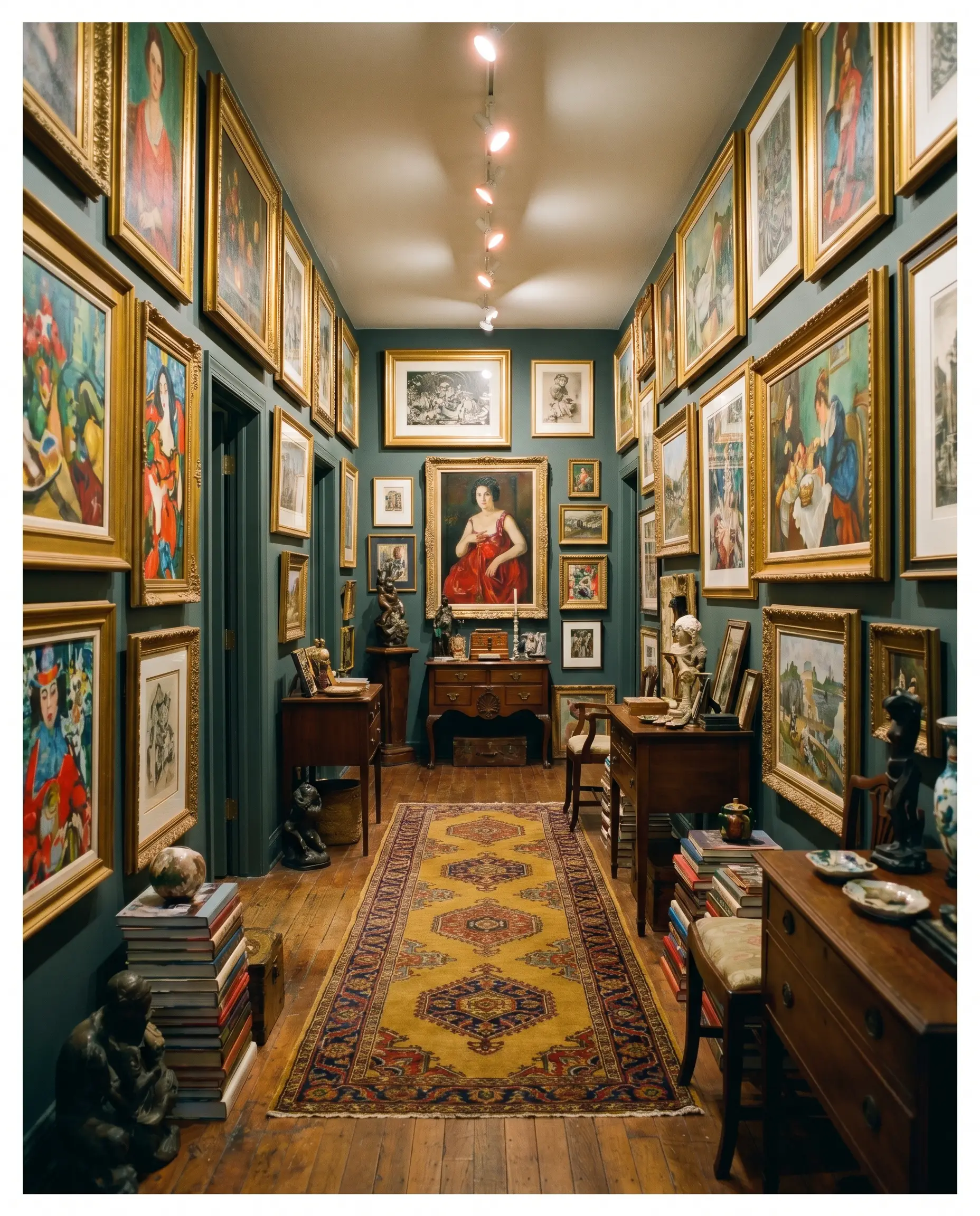
Use this shade as the ultimate high-contrast canvas in a narrow hallway dedicated to eclectic art and vintage rugs. The dark, receding walls allow vibrant reds, mustard yellows, and gilded frames to visually pop off the surface.
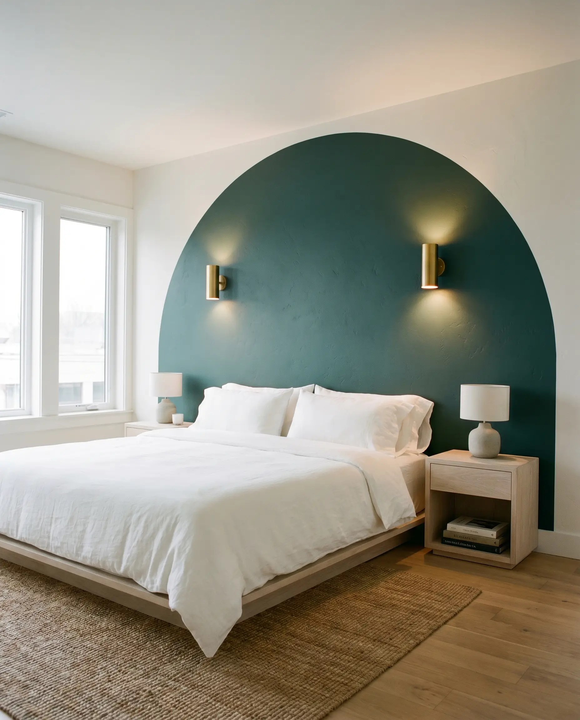
A Moody Boutique Hotel Headboard Wall
Create the illusion of a luxury suite by painting an oversized, color-blocked arch directly behind a low-profile bed. The heavy, light-absorbing teal acts as a visual headboard, grounding the sleeping area and setting a serene, sophisticated tone for the rest of the bedroom.
When using this deeply saturated hue on a feature wall, install wall sconces that cast a soft, grazing light downwards. The light will catch the subtle blue-green notes, preventing the wall from looking like a flat, dark void in the evening.
Hackrea Design Secret (Lighting)
Coordinating Colors & Best Pairings
This complex teal requires highly intentional pairings to dictate its final vibe. You must decide whether to frame it with sharp, high-contrast borders or soften it with warm, tonal companions.
Trim & Baseboards
To create a clean, tailored boundary that emphasizes the depth of HC-157, you need a trim color with enough warmth to prevent the transition from feeling sterile.
Hardware, Wood & Material Pairings
Coordinating Colors
Designer Mood Boards
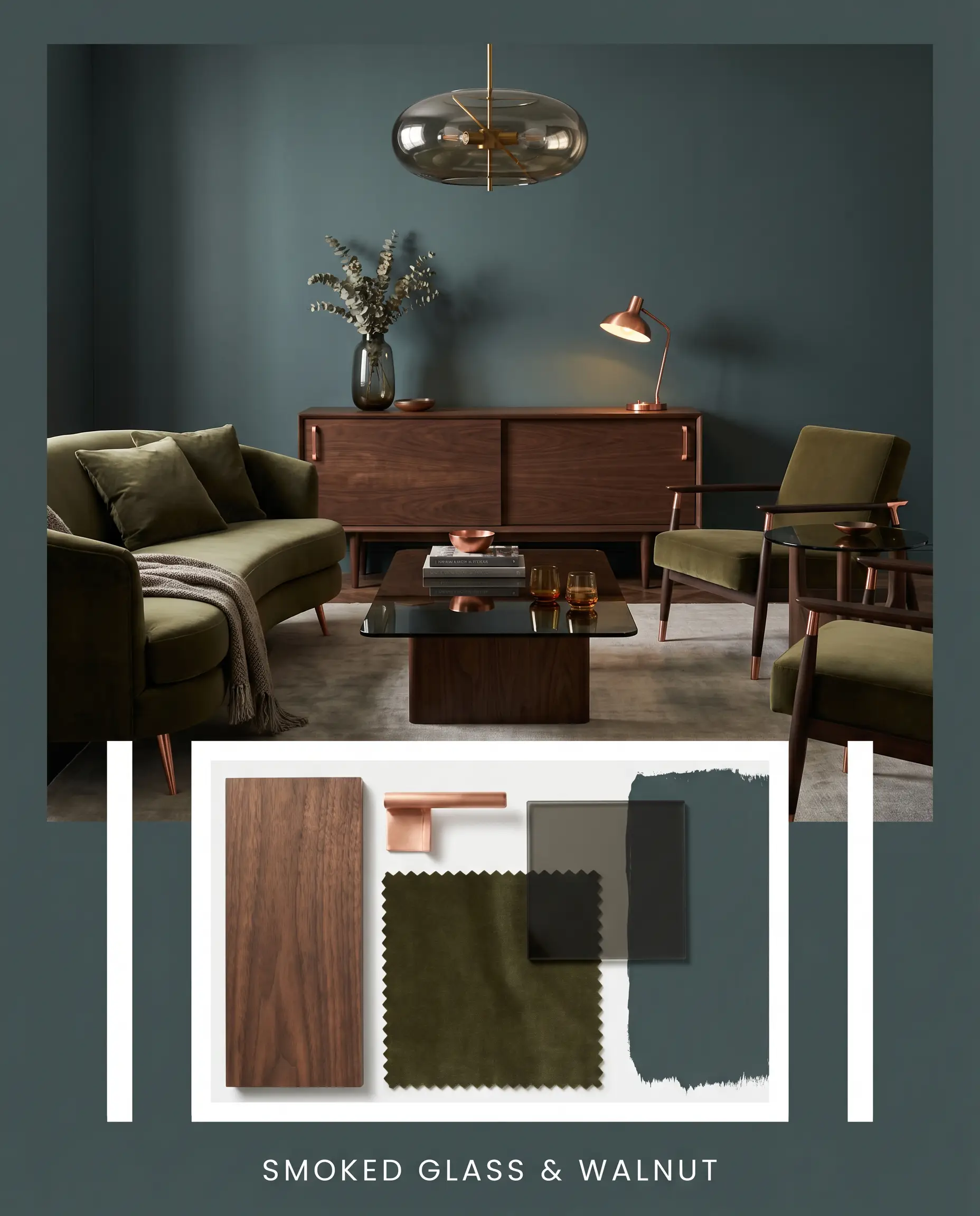
Smoked Glass & Walnut: This palette leans into a moody, mid-century lounge aesthetic by pairing the dark teal with rich, dark walnut furniture and sleek smoked glass accents. The fiery warmth of polished unlacquered copper hardware cuts through the shadows, while deep olive velvet seating adds a layer of tonal luxury.
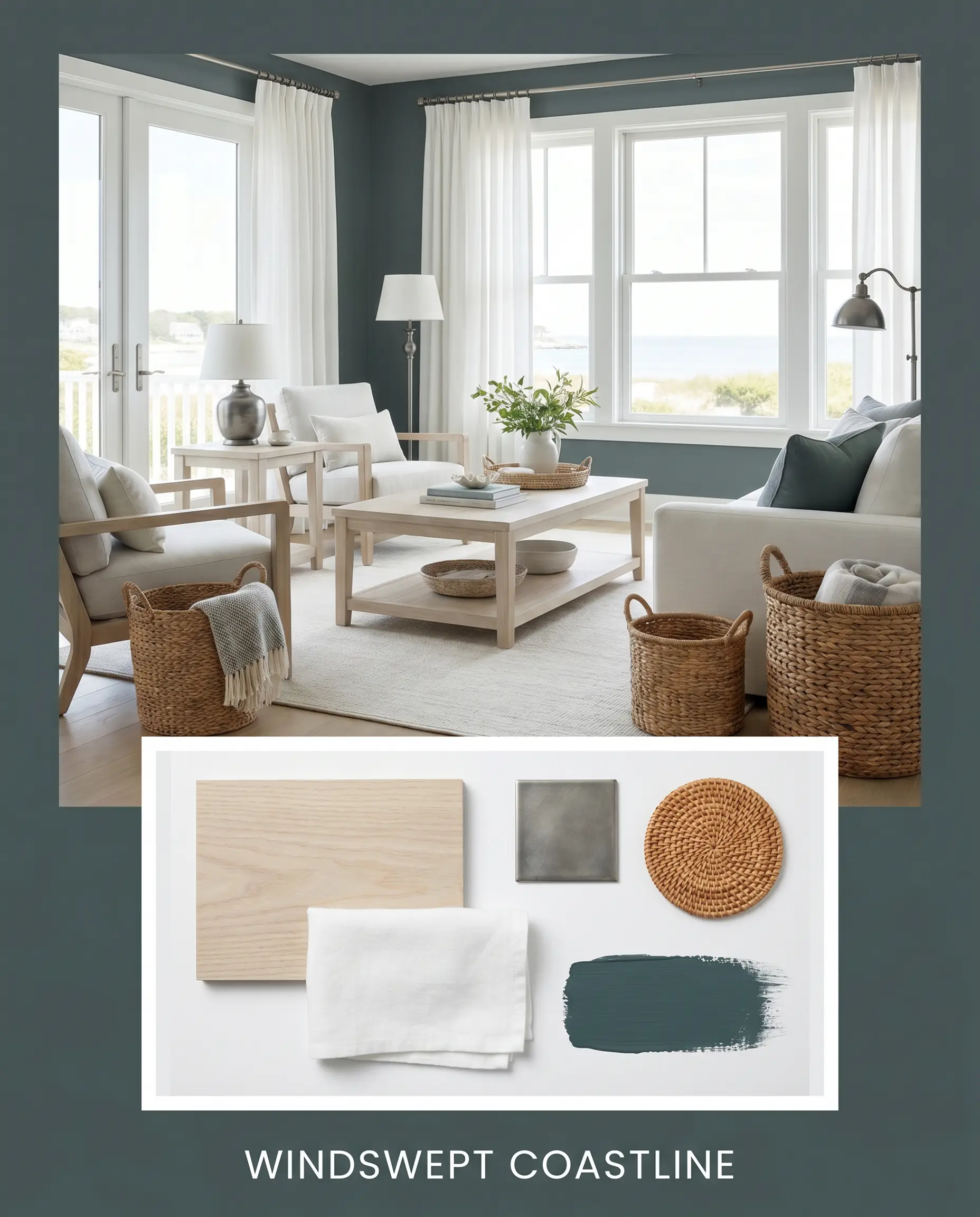
Windswept Coastline: A fresh, transitional approach that balances the heavy pigment with light, bleached ash wood and crisp white linen drapery. Antiqued pewter fixtures maintain a subtle historic charm, while woven rattan baskets introduce an earthy, approachable texture.
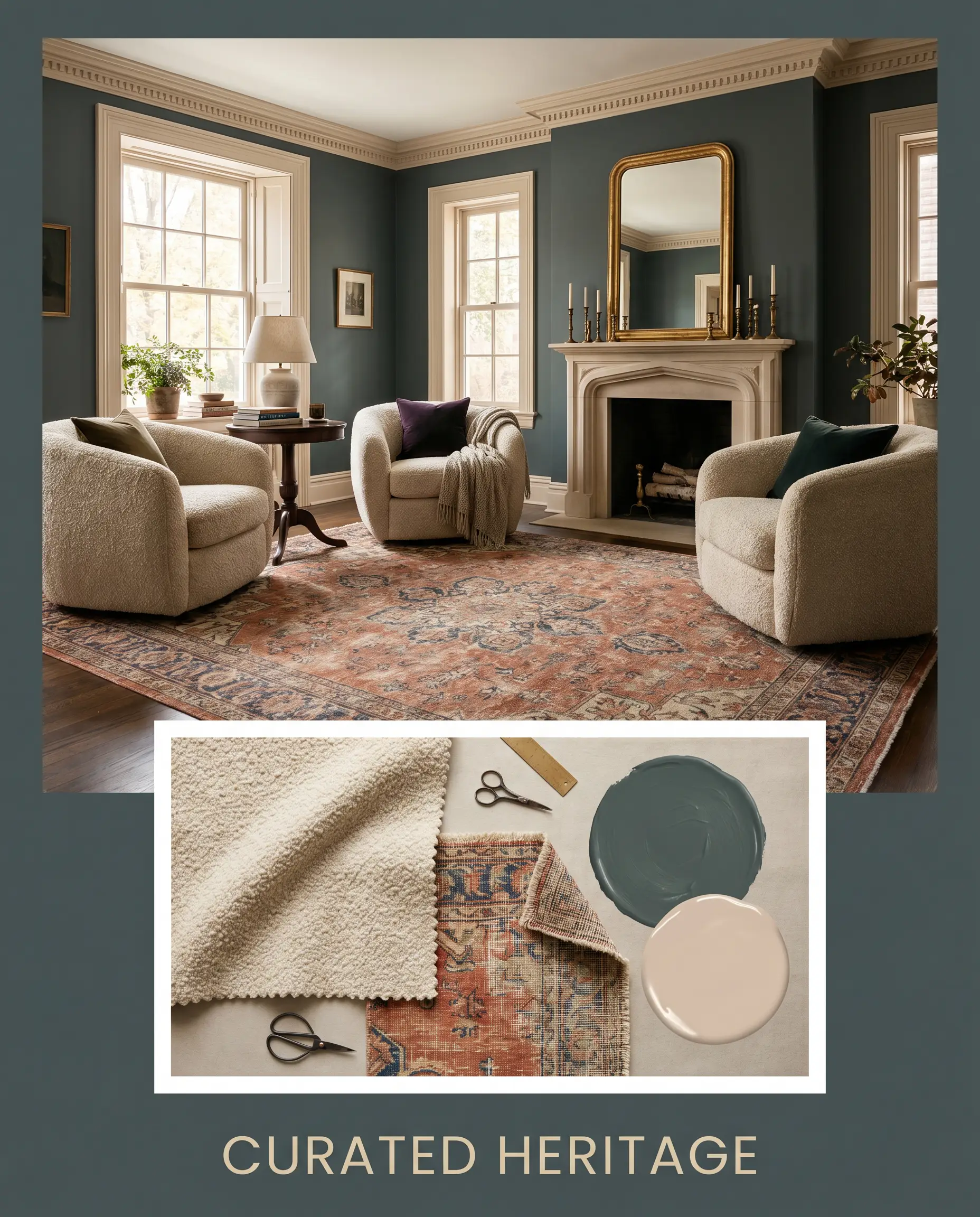
Curated Heritage: This highly traditional, collected vibe surrounds the blackened teal with the dusty pink softness of Setting Plaster. Classic Persian-style rugs with faded terracotta motifs pull the room together, anchored by heavily textured bouclé armchairs that invite you to linger in the space.
Benjamin Moore Narragansett Green vs. Top Rivals
When evaluating deep, moody teals, the final decision usually comes down to how much blue you want to see and how the paint reacts to your specific lighting. If your room lacks natural light, you might need to pivot to a shade that holds its color more aggressively.
Benjamin Moore Narragansett Green vs. Benjamin Moore Newburg Green
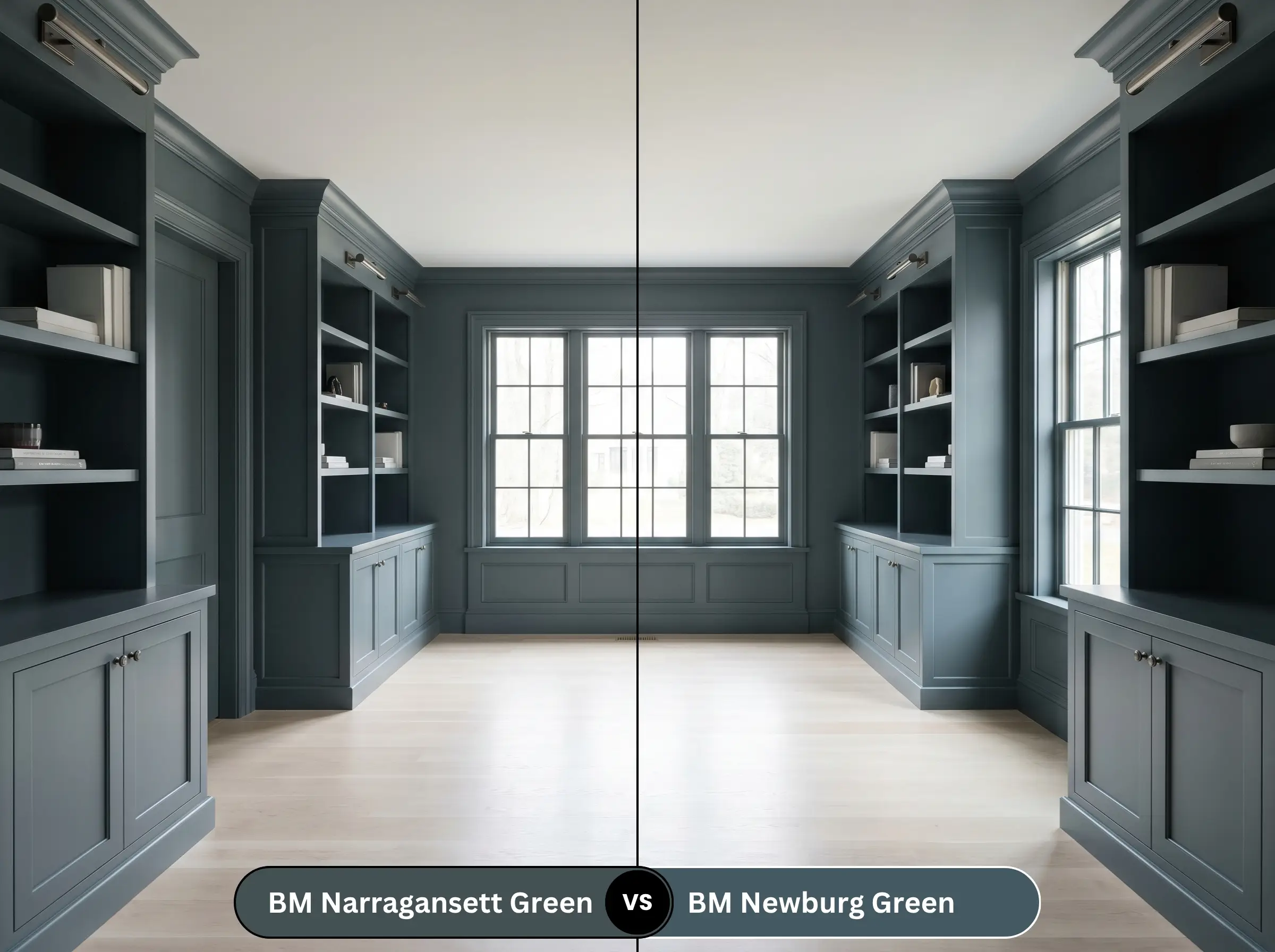
Newburg Green (HC-158) shares a very similar historical pedigree but carries significantly more blue and less black than HC-157. If you want a color that clearly reads as a rich, maritime blue-green even in dim lighting, Newburg Green is the better choice. However, if you prefer a stealthy, almost-charcoal shadow effect, stick with Narragansett Green.
Benjamin Moore Narragansett Green vs. Sherwin-Williams Mount Etna
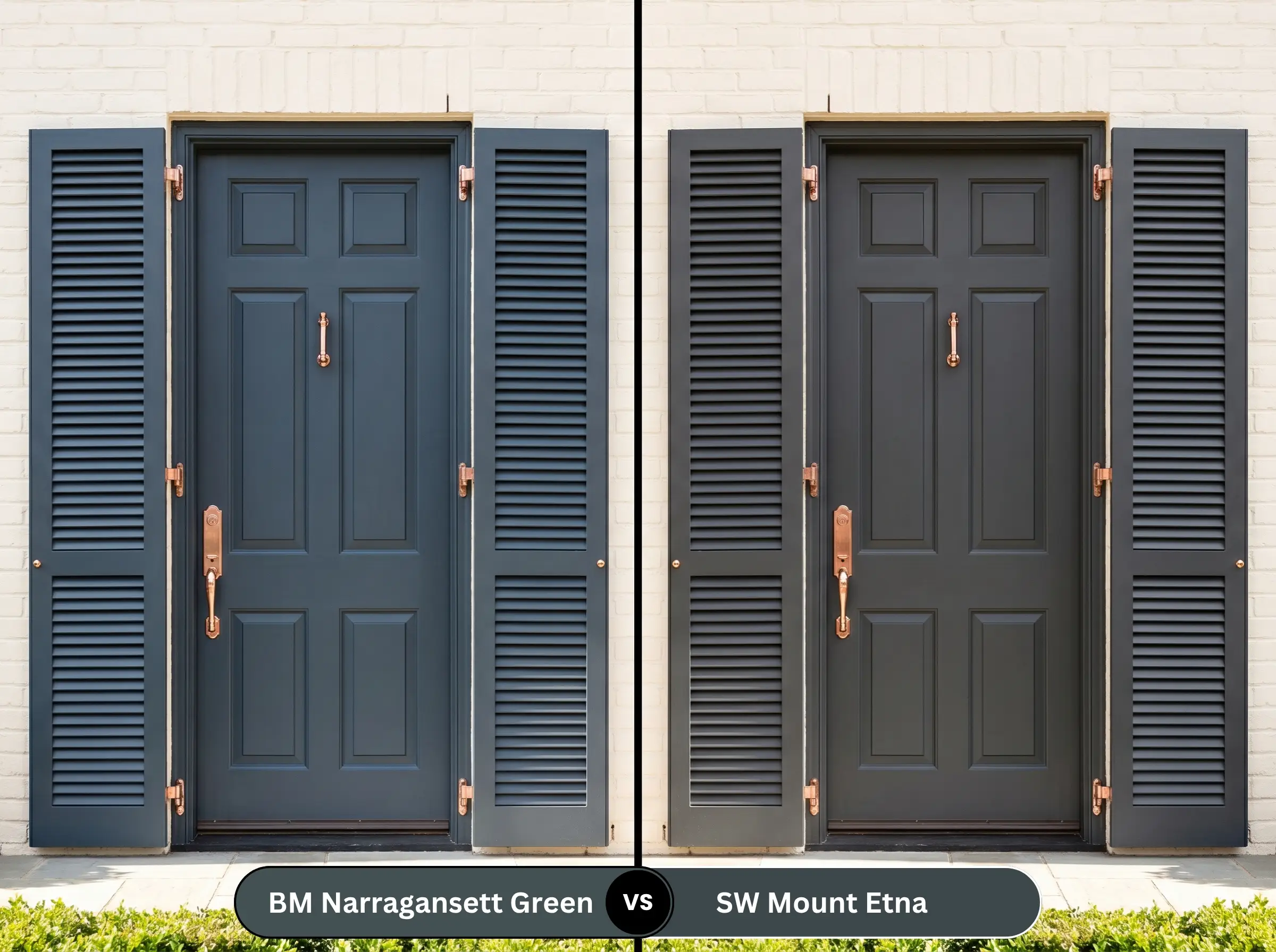
Sherwin-Williams Mount Etna (SW 7625) is noticeably softer and slightly warmer, leaning closer to a muted slate-blue. If your room features a lot of stark white light that might make HC-157 look too severe, Mount Etna provides a gentler, more approachable depth.
Benjamin Moore Narragansett Green vs. Farrow & Ball Hague Blue
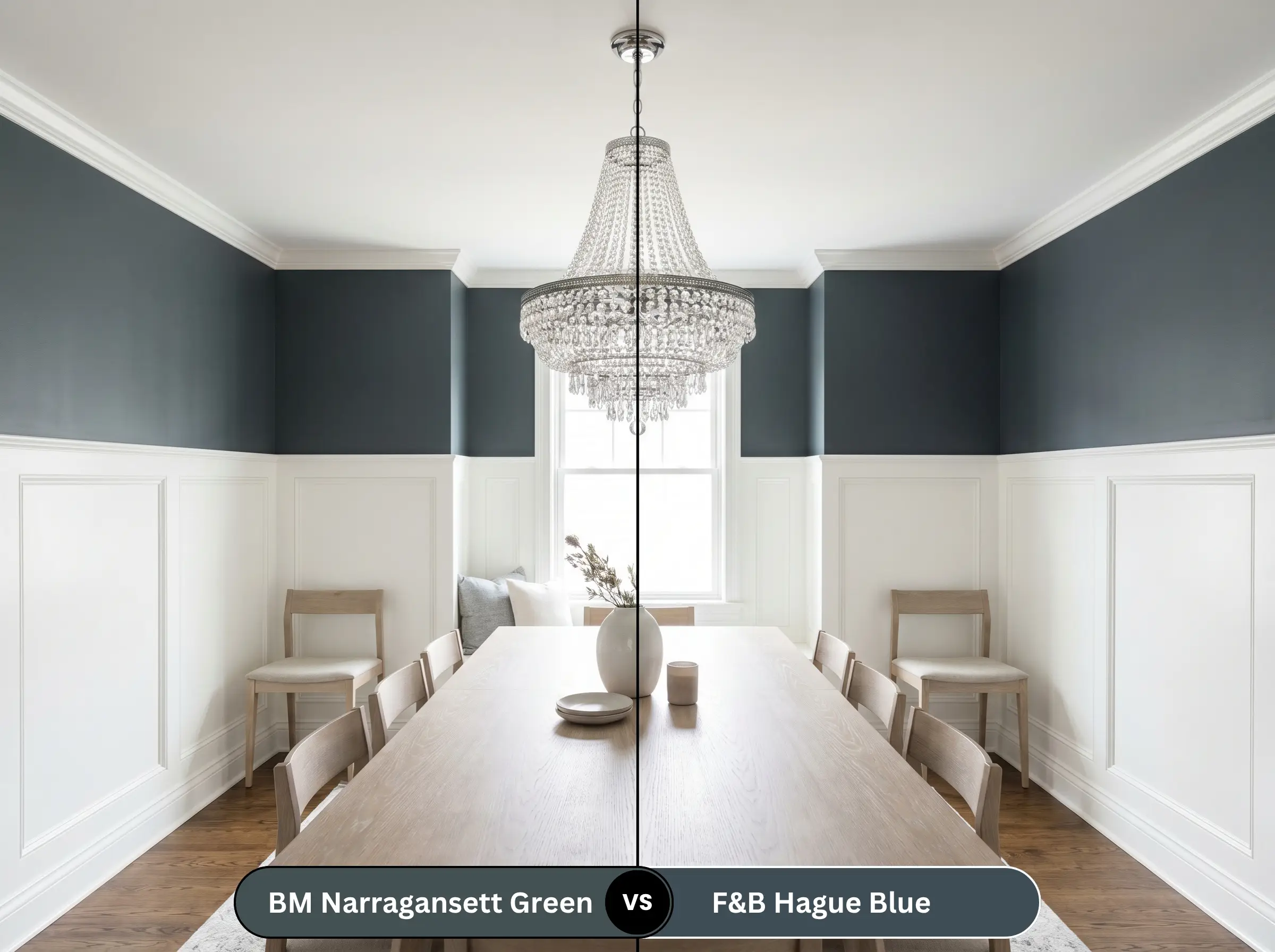
Farrow & Ball Hague Blue (No. 30) is a legendary, highly saturated deep blue with a distinct green undertone, but it lacks the heavy slate-gray muting of the Benjamin Moore option. If you are willing to invest in a premium, highly reactive color that changes dramatically throughout the day, Hague Blue is spectacular, but HC-157 offers a more predictable, consistent grounding effect.
Similar Colors & Brand Equivalents
Sometimes a specific shade is just one degree too dark or too green for your home’s unique lighting. Here are the closest alternatives to help you dial in the exact atmosphere you need.
Same-Brand Alternatives
Cross-Brand Matches
Practical Application & DIY Advice
Transitioning this heavy, saturated pigment from the can to your walls requires a strategic approach. Dark colors are notoriously unforgiving of sloppy application, so preparation is non-negotiable.
The Dynamic Sheen Guide
Primer Strategy
You absolutely must use a high-quality, deep gray tinted primer before applying this shade. Painting a near-black teal directly over standard white drywall will result in a streaky, uneven finish that requires four or more coats to achieve true opacity.
Coverage & Success Tips
Even with Gennex Color Technology providing excellent hide, expect to apply two generous coats for a flawless, professional finish. Be extremely careful with your roller technique. Dark, flat paints are highly prone to “flashing”—where overlapping roller marks dry unevenly and catch the light—so you must maintain a wet edge and avoid overworking the paint once it starts to tack up.
Frequently Asked Questions
Instead of making the space feel tight, this dark shade blurs the corners and edges of the room, creating an illusion of endless depth. By embracing the lack of light rather than fighting it, you create a deeply intimate, jewel-box atmosphere that feels incredibly intentional.
Because it absorbs so much UV energy, this dark pigment will naturally fade faster than a lighter neutral when exposed to relentless, direct sun. To protect the rich blue-green hue, you must use a premium exterior formula with high UV resistance and expect to maintain it slightly more often.
While you can pair them, the heavy slate-gray base of the paint combined with the solid black stone can quickly make the kitchen feel excessively dark and visually heavy. If you proceed with this pairing, you must introduce brilliant metallic hardware and abundant under-cabinet lighting to break up the shadows.
The subtle green notes actually provide a beautiful, complementary contrast to the warm, reddish-orange tones found in traditional oak flooring. The cool, blackened teal grounds the room, allowing the natural warmth of the wood to shine without feeling dated.
Final Verdict & Expert Warnings
Benjamin Moore Narragansett Green (HC-157) is a spectacular, architecturally grounding shade designed for homeowners who want to make a confident, moody statement. It is the perfect choice for anchoring sleek cabinetry, wrapping a quiet study in historic charm, or creating a dramatic exterior focal point.
However, this heavy pigment requires careful curation to avoid making a space feel oppressive. You must be extremely cautious when pairing it with large expanses of dark, espresso-stained wood or heavy, dark brown leather furniture, as these elements will swallow all available light and turn the room into a gloomy cave. Additionally, avoid cool, icy gray flooring, which will clash aggressively with the rich, historic depth of the teal, leaving the space feeling disjointed and unwelcoming.
Expert Warnings (Clash Tips)