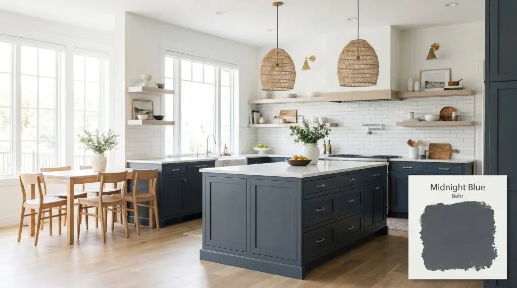
Behr Midnight Blue (N480-7) is a deep, sophisticated navy blue with prominent charcoal gray and black undertones. With an LRV of 9, it is a dark, moody hue that brings dramatic elegance to kitchen cabinets, bathroom vanities, and home exteriors.
Will Midnight Blue clash with your room?
Paint Technical Profile
| Color ID / SKU | N480-7 |
| HEX Code | #4c565e |
| Light Reflectance (LRV) | 9 |
| Use | Interior, Exterior |
| Best Exposures | South-facing, West-facing, Well-lit spaces |
| Best For | Kitchen cabinets, accent walls, exteriors, bathroom vanities |
Behr Midnight Blue: A Sophisticated Foundation for High-Impact Spaces
Standard living areas often lack structural depth, feeling somewhat flat despite beautiful furniture arrangements. By absorbing light rather than bouncing it, Behr Midnight Blue N480-7 acts as a brilliant styling tool that instantly builds character into everyday, builder-grade rooms. This deep, cool-toned navy creates a dramatic focal point that elevates standard materials and finishes.
Whether you are updating a subdivision kitchen or reinventing a basic hallway, mastering this moody aesthetic comes down to intentional lighting and thoughtful pairings. Let’s explore exactly how this heavyweight pigment transforms a home’s atmosphere.
Undertones & LRV of Behr Midnight Blue
When evaluating Behr’s N480-7 on the wall, the immediate read is decidedly cool. It is not a vibrant, tropical shade, but rather an incredibly grounded, stormy color that feels highly intentional.
With a Light Reflectance Value of 9, this color absorbs a massive 91 percent of the light that hits it. This creates a dense, velvety finish on the wall, meaning you must introduce intentional contrast to keep the room feeling alive and dynamic.
Lighting Effects & The Chameleon Factor
The biggest risk with a shade this dark is allowing it to collapse into a flat, lifeless void in poorly lit corners. Because of its heavy charcoal base, Behr Midnight Blue demands strategic illumination to maintain its rich identity. If left entirely in the shadows, the beautiful blue pigment becomes indistinguishable from standard black.
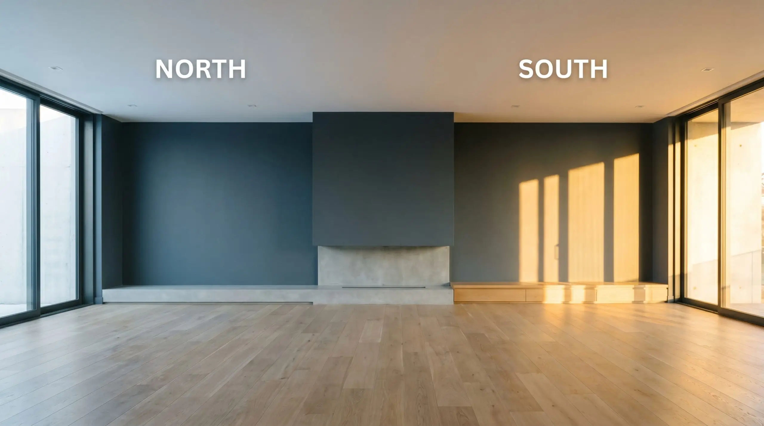
When using a low-LRV shade in a room with limited windows, always layer your lighting. Relying solely on a single overhead fixture will cast harsh shadows, so incorporate wall sconces or floor lamps to wash the dark walls in an even, intentional glow.
Hackrea Pro-Tip (Layered Lighting)
Where to Apply Behr Midnight Blue
This deep shade brings an immediate sense of permanence and architectural contrast to any home. It commands attention, requiring thoughtful placement to maximize its impact without overwhelming the floor plan.
Culinary Spaces
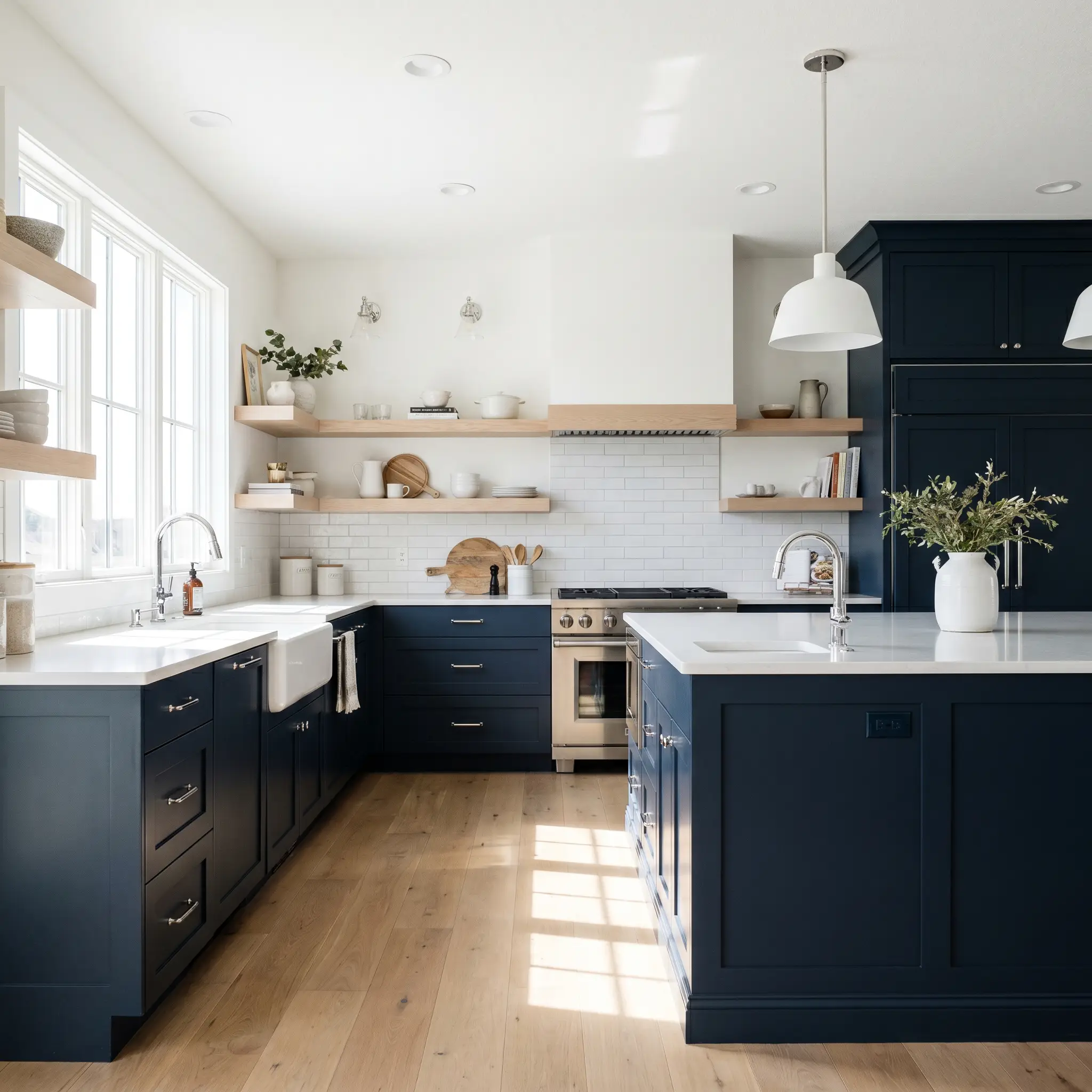
Painting lower cabinetry or a central island in this rich navy is a phenomenal way to root a standard kitchen layout. It pairs effortlessly with everyday white subway tile while making basic quartz countertops feel highly customized. For a more transitional look, pair the dark base with light ash floating shelves to break up the visual weight.
Formal Dining
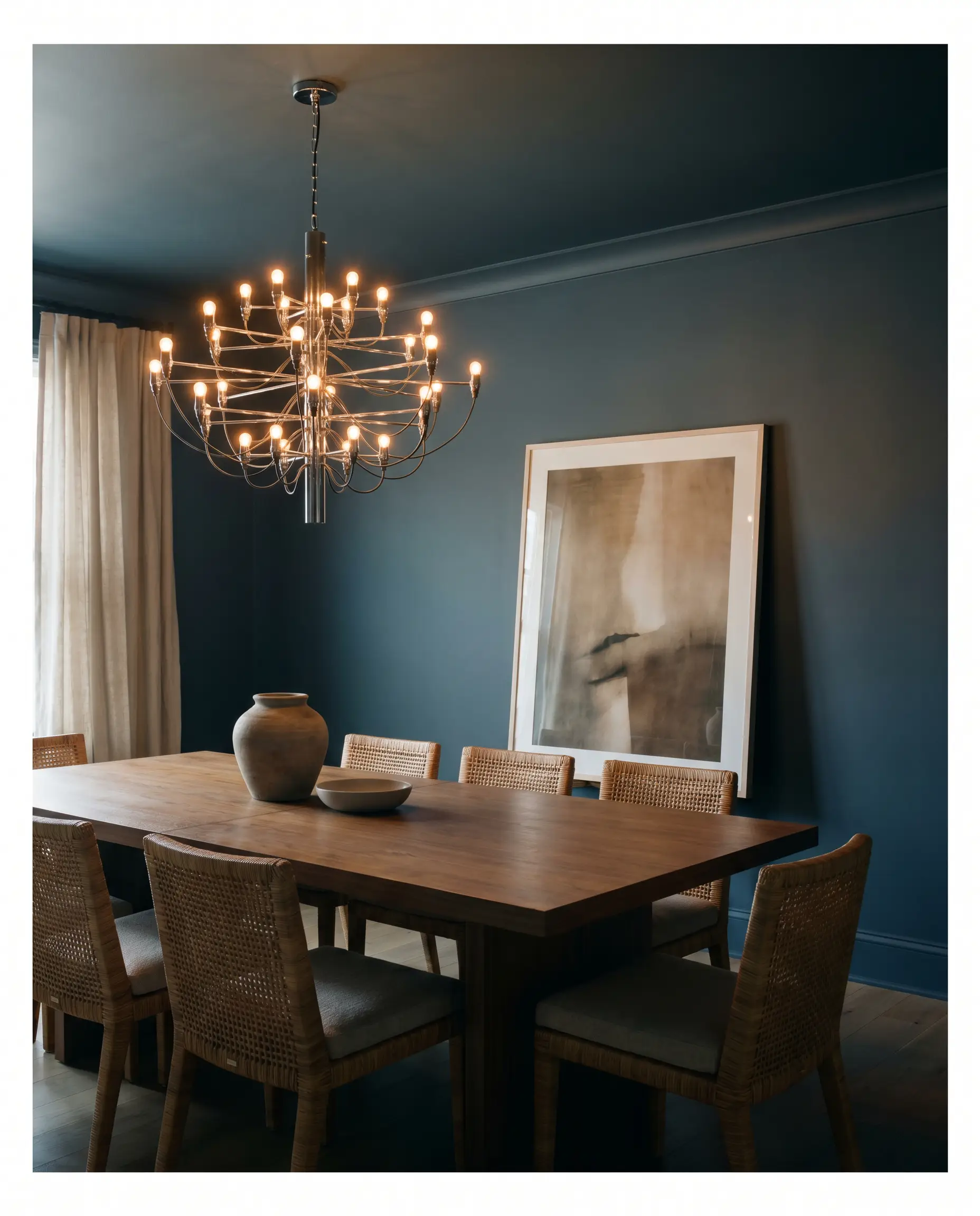
In a dining area, wrapping the entire room—including the baseboards—creates an enveloping, intimate atmosphere perfect for evening entertaining. This technique blurs the room’s boundaries, making a standard-sized space feel surprisingly expansive. Introduce a polished chandelier to bounce light around the moody backdrop.
Will Midnight Blue work with your specific lighting, floor, or furniture?
Workspaces
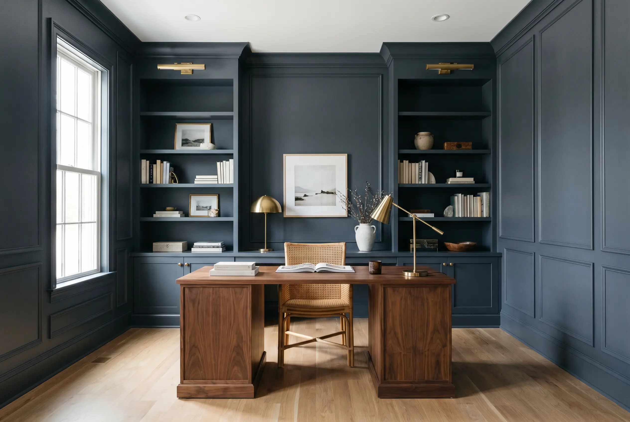
A home office benefits greatly from the focus and gravitas of a dark, cool-toned navy. Applying it to built-in bookcases instantly elevates standard MDF shelving, turning a basic storage wall into a sophisticated library feature.
Exteriors
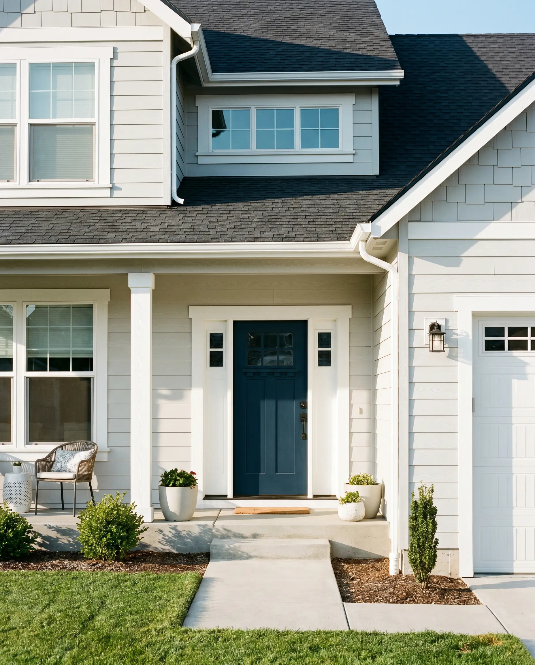
On exterior siding, the abundant natural sunlight washes out the darkness, allowing the true blue to shine brilliantly. It serves as a striking, classic choice for front doors, especially when framed by crisp white molding.
Will Midnight Blue work with your specific lighting, floor, or furniture?
Washrooms
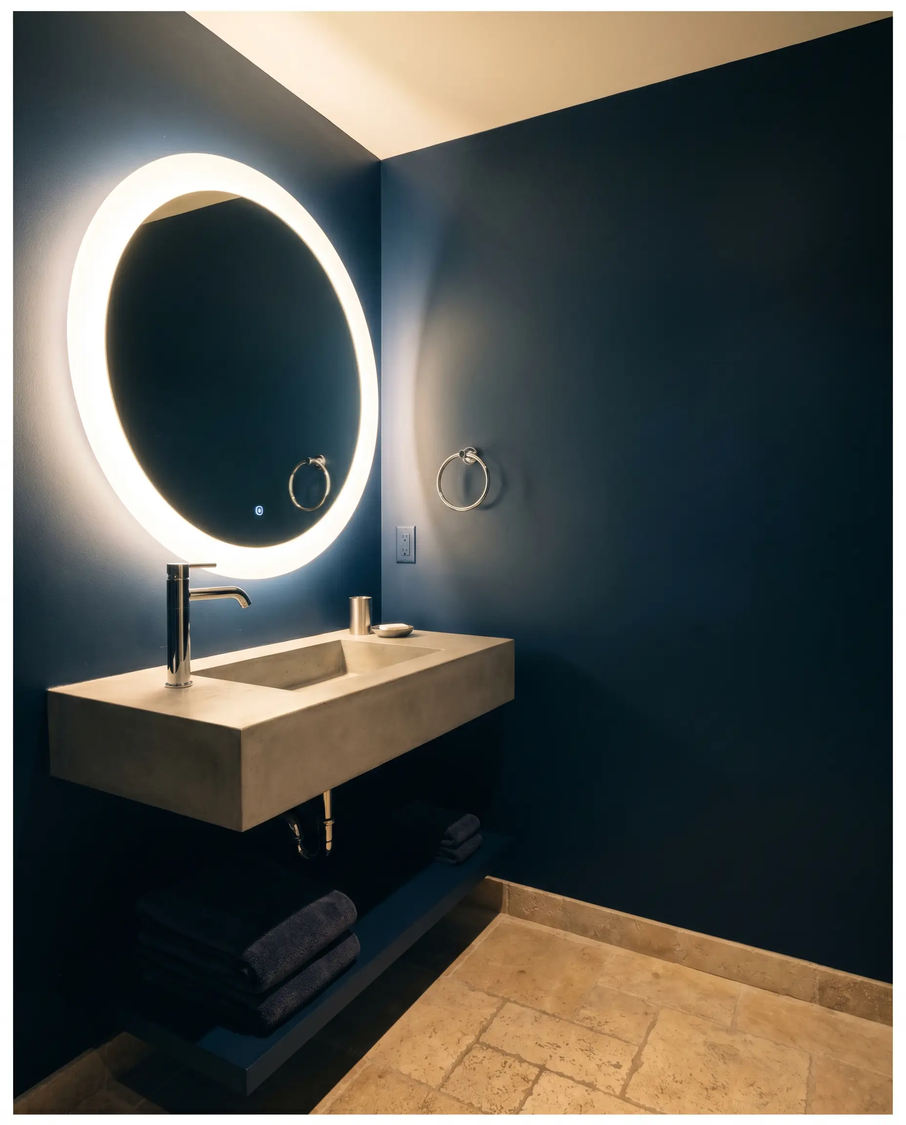
Powder rooms are the perfect canvas for high-impact color since they are transitional zones. Coating the walls in this dense shade creates a jewel-box effect, providing a stunning backdrop for a glowing vanity mirror and polished hardware.
Inventive Styling for This Moody Navy
Beyond standard walls and cabinets, this versatile pigment excels in highly targeted DIY transformations. Here are a few creative ways to deploy this heavy navy to build character.
The Entryway Wainscoting
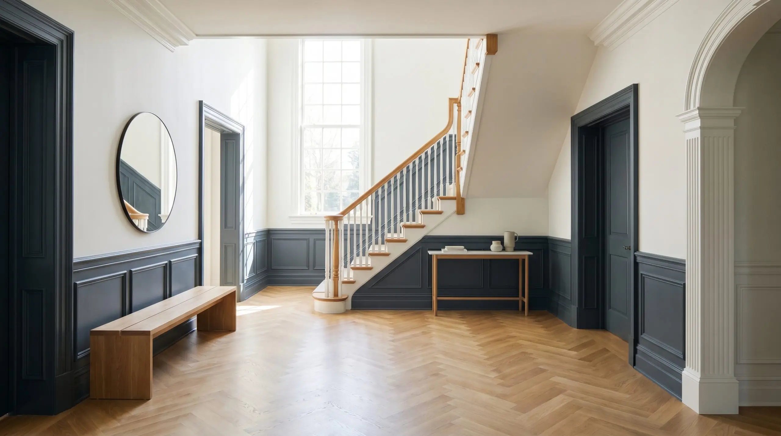
Applying this dark shade to lower wall molding in a foyer instantly conceals everyday scuffs while establishing a grand entrance. It anchors the lower half of the wall, allowing you to use a bright, airy white above the chair rail for beautiful architectural contrast.
Upcycling a Dining Room Buffet
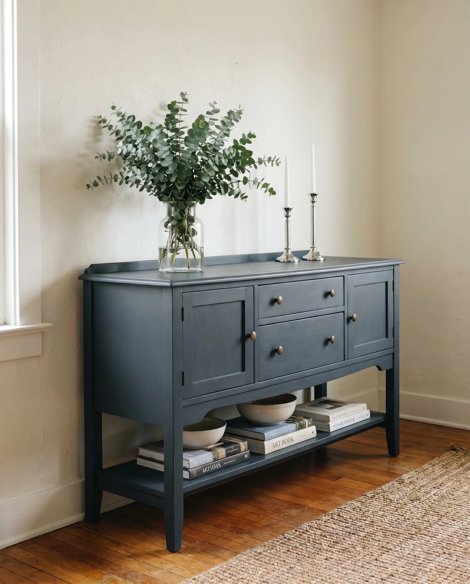
Transforming a worn-out dining room sideboard with a fresh coat of N480-7 breathes new life into the piece. The deep charcoal undertones give the furniture a sophisticated, modern edge that looks incredible against a neutral wall.
A Dramatic Ceiling Treatment
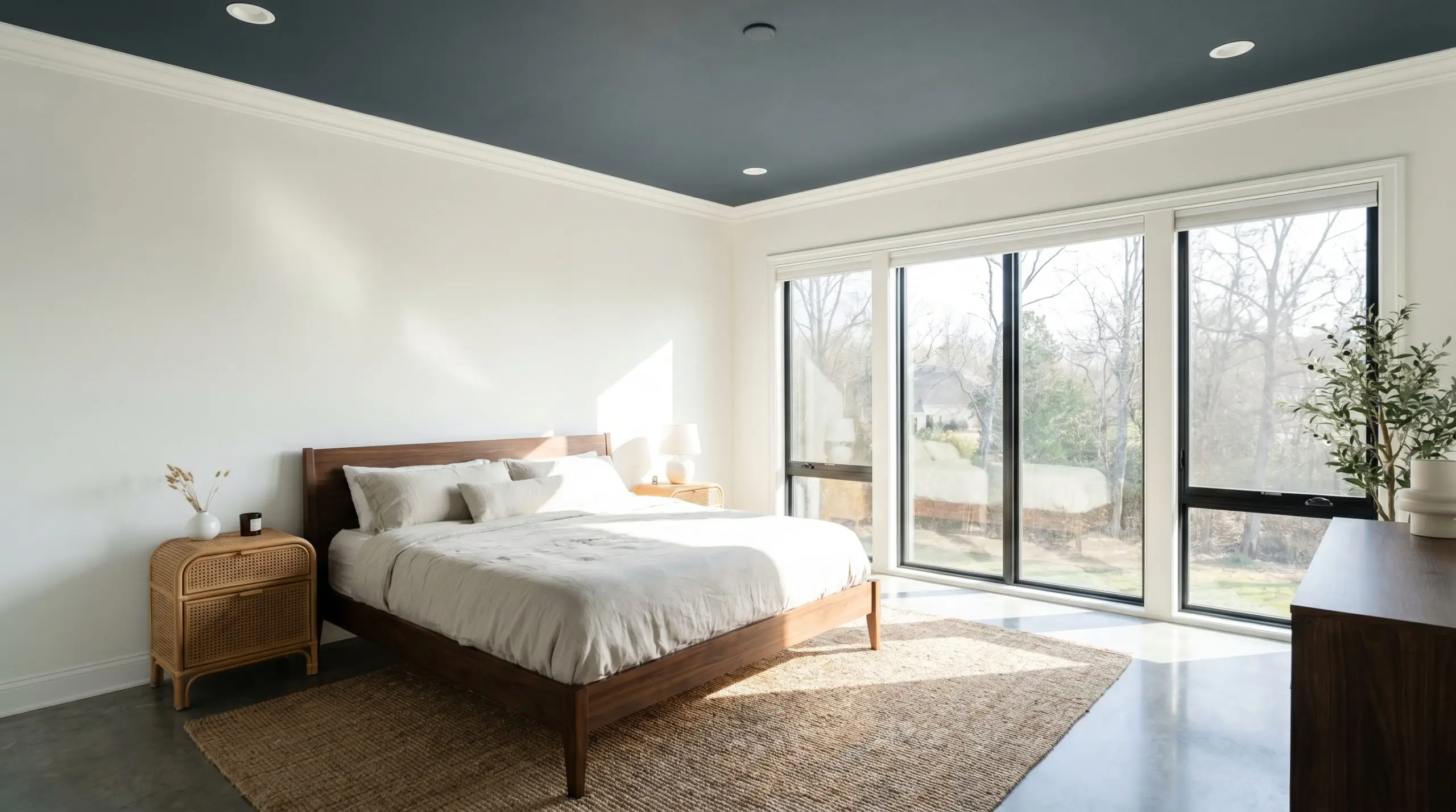
Will Midnight Blue work with your specific lighting, floor, or furniture?
In a room with crown molding and ample natural light, painting the ceiling this rich navy draws the eye upward. It creates a canopy effect that feels both cozy and luxurious, particularly in a primary bedroom with crisp white walls.
Coordinating Palettes for Behr Midnight Blue
To prevent this weighty blue from overwhelming a space, it requires a deliberate supporting cast. The key is balancing its density with lighter, complementary elements that spark visual interest.
Trim & Baseboards
For a sharp, tailored boundary, pair this deep navy with Benjamin Moore Chantilly Lace OC-65. Its absolute lack of undertones provides a stark, brilliant contrast that makes the blue pop immediately. Alternatively, Sherwin-Williams Pure White SW 7005 offers a slightly softer transition, using its drop of warmth to take the edge off the high-contrast look.
Hardware, Wood & Material Pairings
To build a rich, tactile environment, contrast the cool, dark walls with warming materials and reflective surfaces.
Coordinating Colors
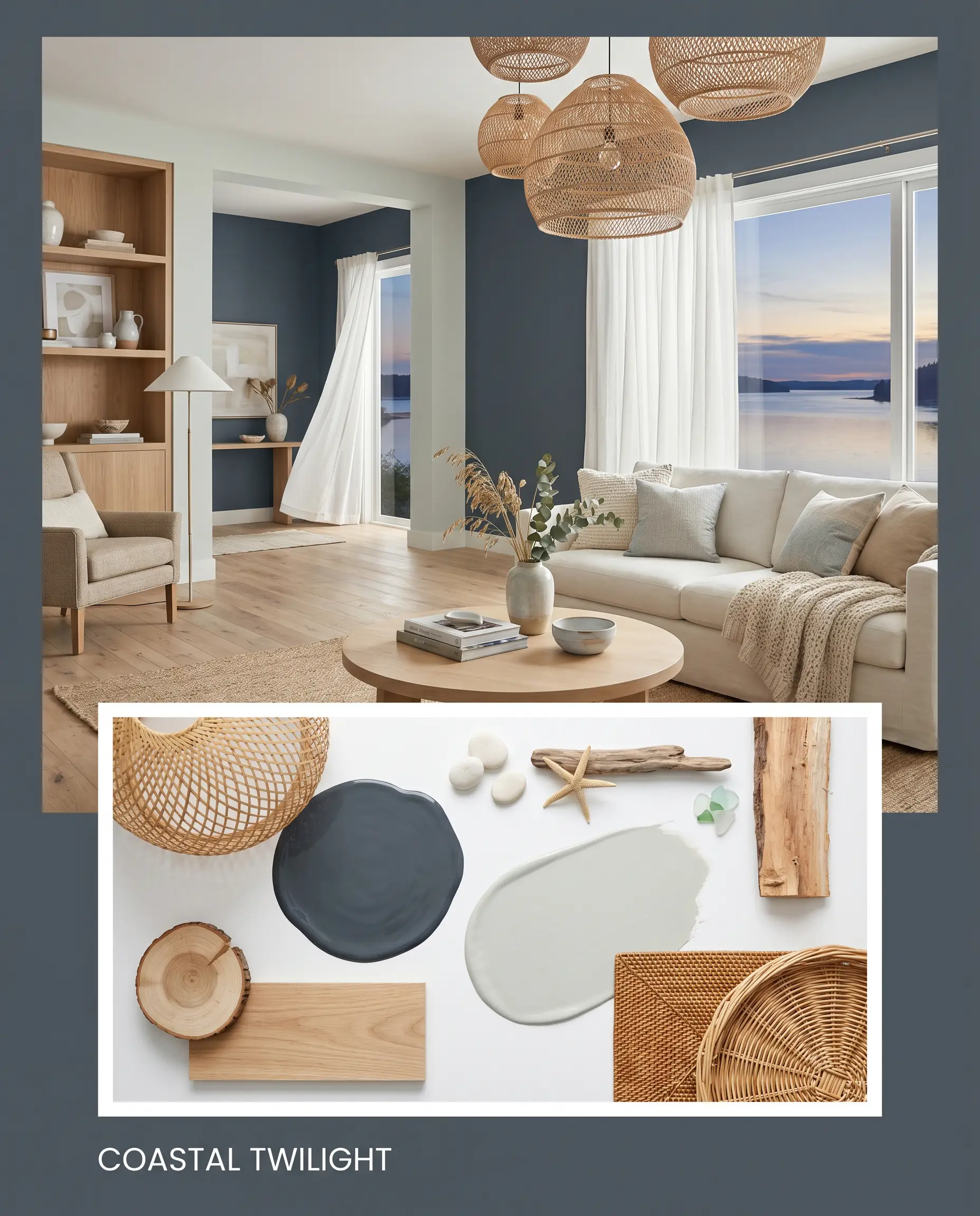
Designer Mood Boards
Coastal Twilight This palette leans into a relaxed, waterfront energy without feeling literal. Imagine the deep navy walls contrasting with woven rattan pendants, light oak flooring, and the soft, sea-glass hue of Sherwin-Williams Sea Salt SW 6204 on adjacent walls.
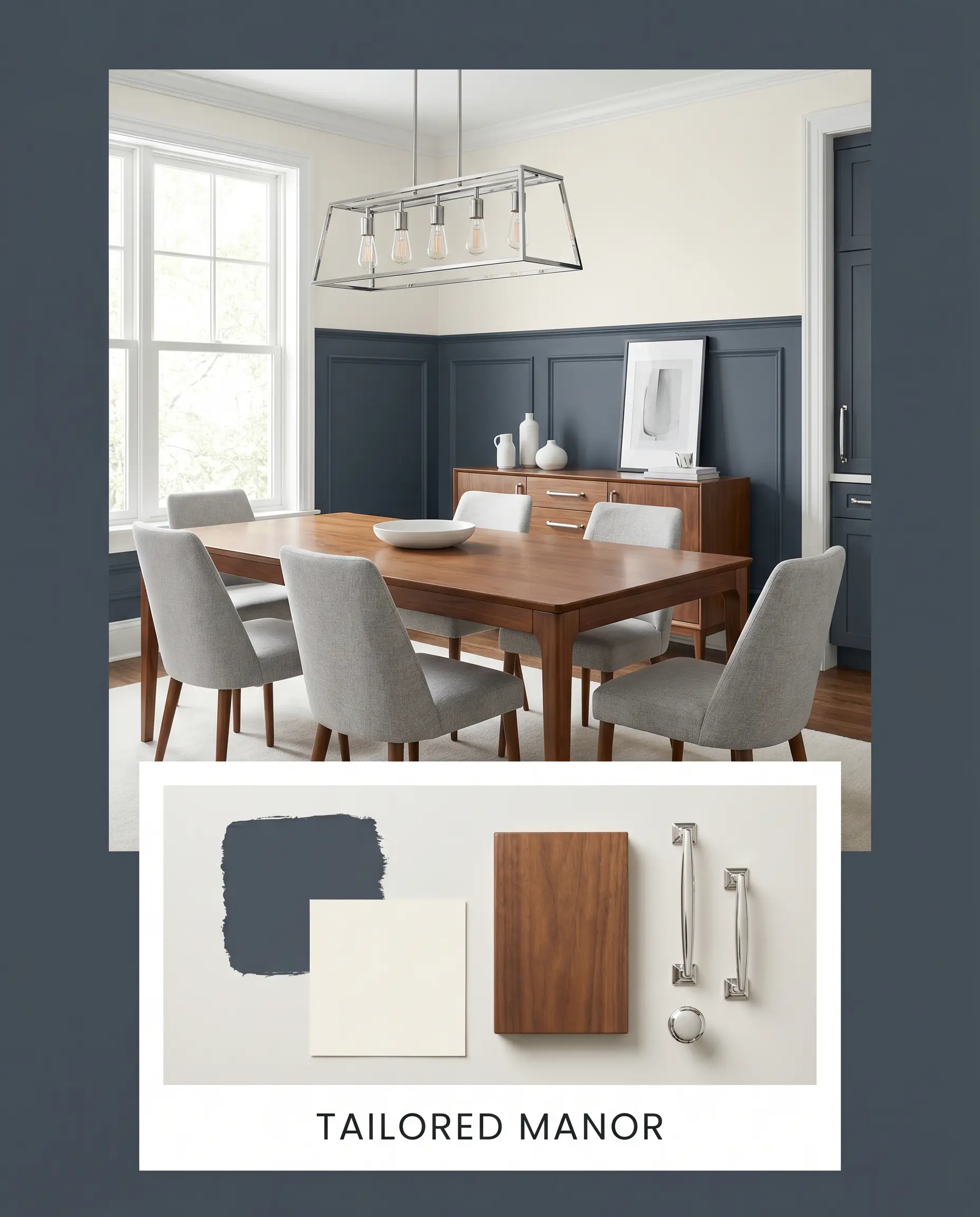
Tailored Manor A highly structured, classic aesthetic built on rich contrasts. Picture the dark blue grounding a space filled with polished chrome fixtures, warm walnut furniture, and the creamy softness of Behr Swiss Coffee 12 softening the upper walls.
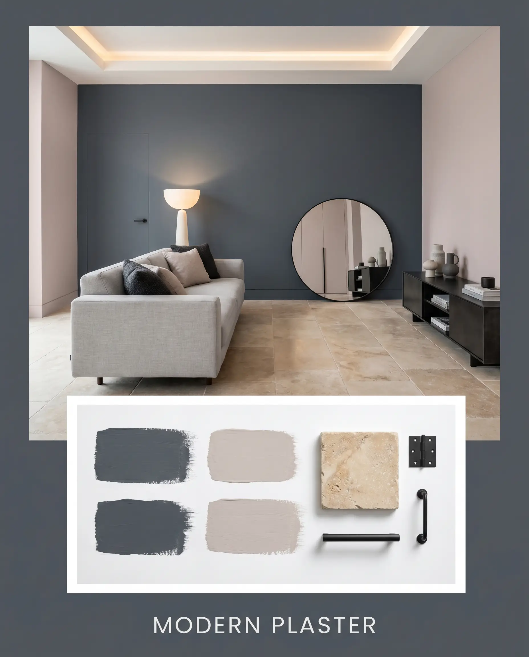
Modern Plaster A tactile, contemporary approach that balances heavy color with earthy textures. The dense navy serves as a striking accent alongside tumbled limestone, matte black hardware, and the subtle, dusty warmth of Farrow & Ball Peignoir No.286.
Will Midnight Blue work with your specific lighting, floor, or furniture?
Head-to-Head Comparisons
Selecting the perfect dark blue often comes down to the subtle differences in their hidden pigments. Here is how N480-7 stacks up against its most famous rivals.
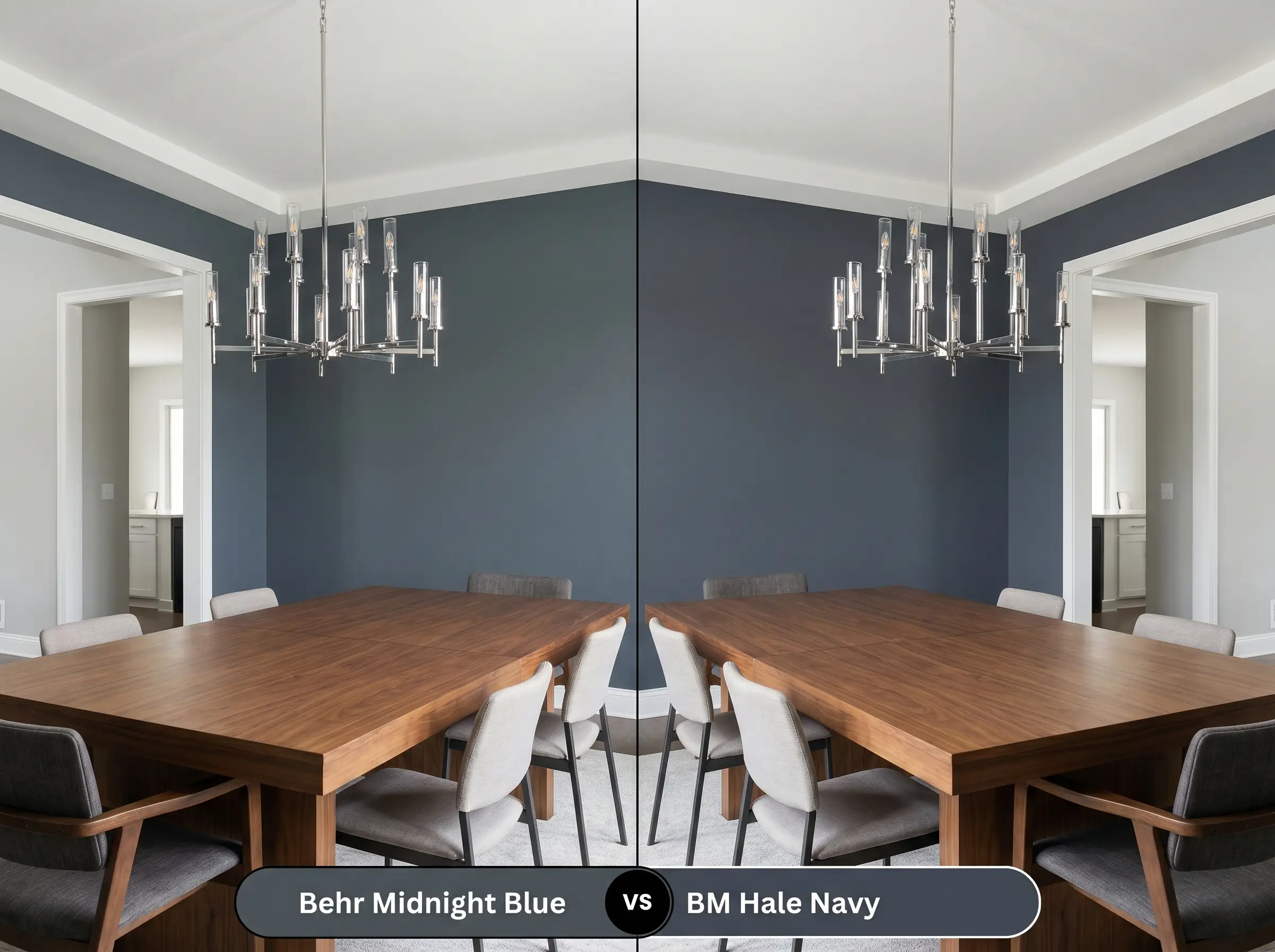
Behr Midnight Blue vs. Benjamin Moore Hale Navy HC-154
Will Midnight Blue work with your specific lighting, floor, or furniture?
While both are iconic, dark blues, Hale Navy carries a slightly more pronounced gray undertone, making it incredibly muted and universally adaptable. If your room receives intense Southern light, Hale Navy might hold its neutral shape better, whereas Behr’s version will flash a bit more of its true indigo hint.
Behr Midnight Blue vs. Sherwin-Williams Naval SW 6244
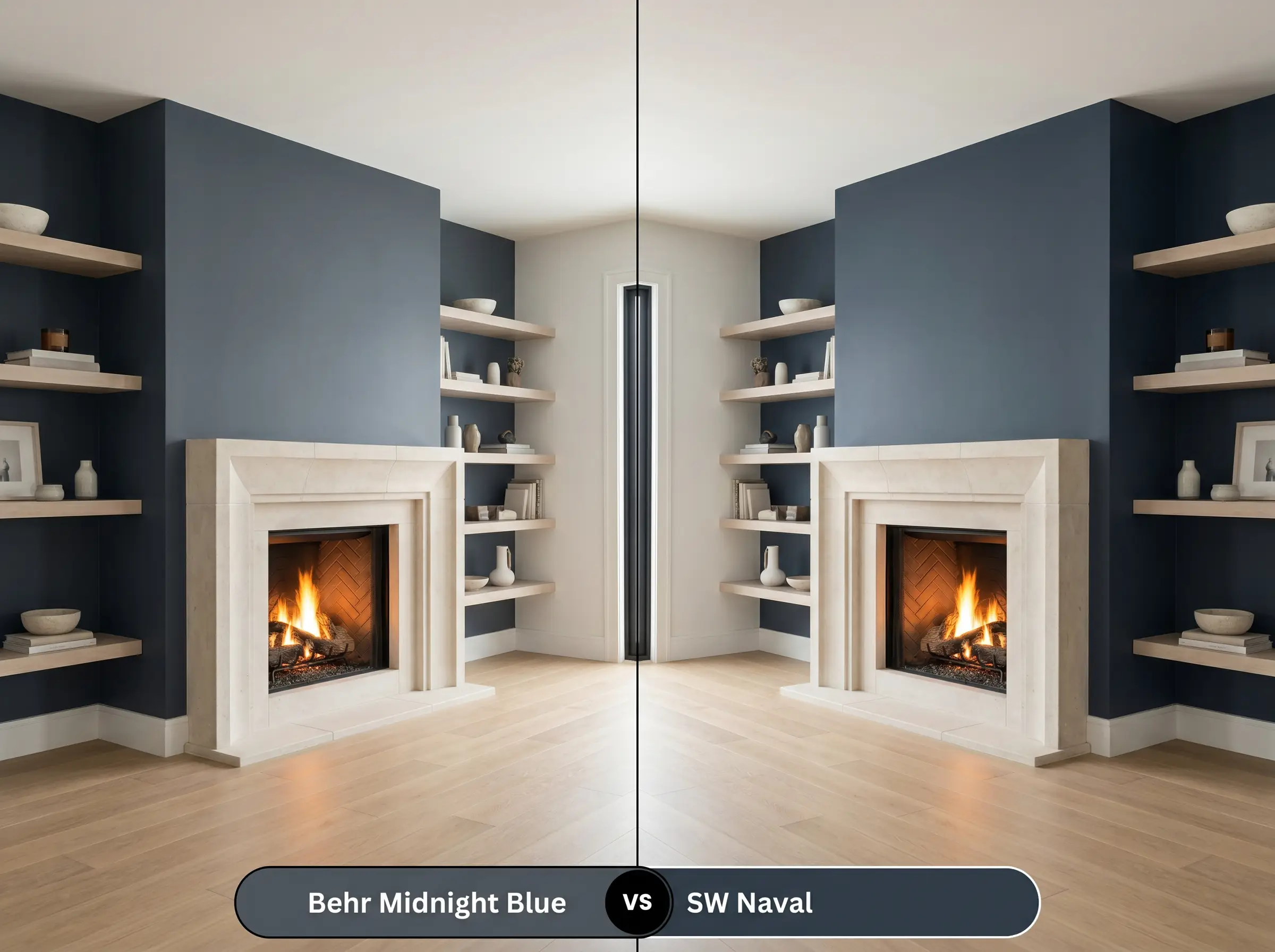
Naval is a purer, more vibrant navy with less charcoal interference. If you want a crisp, nautical energy, Naval is the superior choice. However, if you prefer a stormy, moody aesthetic that feels a bit more modern and grounded, the Behr option is the clear winner.
Alternatives to Behr Midnight Blue
Sometimes a subtle shift in depth or a change in brand availability requires an alternative. Here are the closest matches to explore.
Similar Colors Within the Brand
Cross-Brand Matches
Painting with Behr Midnight Blue
Executing a flawless finish with such a dark color requires precise technique. Let’s cover the practical steps to ensure this heavyweight shade looks professional.
The Dynamic Sheen Guide
Primer Strategy
A standard white primer makes achieving full opacity incredibly frustrating with dark colors. You must use a high-quality primer tinted to a deep gray. This foundational layer bridges the visual gap, allowing the rich navy to develop its true depth quickly.
Coverage & Success Tips
Expect to apply at least two generous coats over your tinted primer. The biggest hurdle with this depth of color is “flashing,” where overlapping roller marks dry unevenly and catch the light. To prevent this, maintain a wet edge while rolling and avoid pressing too hard on the final passes.
Dark, matte paints are notorious for scuffing. Instead of trying to spot-paint a tiny scratch—which will almost always flash and ruin the finish—lightly dab the mark with a damp microfiber cloth first. If you must touch up, thin the paint slightly and feather it out with a dry brush.
Hackrea Design Secret (Touch-Ups)
Frequently Asked Questions
Because of its incredibly low LRV and heavy charcoal undertones, it will definitely lose its blue identity in heavy shade. To keep the navy legible on a shaded facade, consider stepping up to a slightly lighter, more saturated blue.
The heavy texture of stucco creates tiny shadows that will make this dark color appear even deeper and closer to black. On smooth HardiePlank, the light reflects more evenly, allowing the true navy and subtle indigo hints to remain visible.
Rather than feeling restrictive, wrapping a small, windowless space in a low-LRV shade actually blurs the corners and creates a sense of infinite depth. It transforms a basic utility room into an intimate, luxurious retreat.
A high-gloss finish bounces a significant amount of light, which actually highlights the true blue pigment and the indigo hints. The reflective sheen cuts through the charcoal muting, making the color appear slightly more vibrant than it does in a flat finish.
The Final Verdict on Behr Midnight Blue
Behr Midnight Blue N480-7 is a phenomenally grounding color for homeowners who want to introduce rich, architectural depth into their spaces. It is perfect for grounding open-concept kitchens, creating intimate dining rooms, or adding sophisticated curb appeal to a sun-drenched exterior. Its heavy charcoal base keeps it feeling modern and intentional, ensuring it never leans into a bright, primary blue.
However, this color will struggle in rooms dominated by warm, yellow-toned woods like knotty pine or cherry. The crisp, cool base of the navy clashes directly with orange and yellow wood stains, creating an uncomfortable visual tension that makes the paint look muddy. Similarly, pairing it with dark, heavy brown carpets or deeply beige tiles will drain the energy from the room. To succeed with this shade, you must surround it with crisp contrasts, reflective metals, and intentional lighting to let its true sophistication shine.
Room Compatibility & Clashes Diagnoses
Hackrea's reports evaluating the compatibility of Midnight Blue in real rooms.No compatibility tests for Midnight Blue yet.
Be the first to see how this color reacts to your space. Run a free architectural diagnostic now.