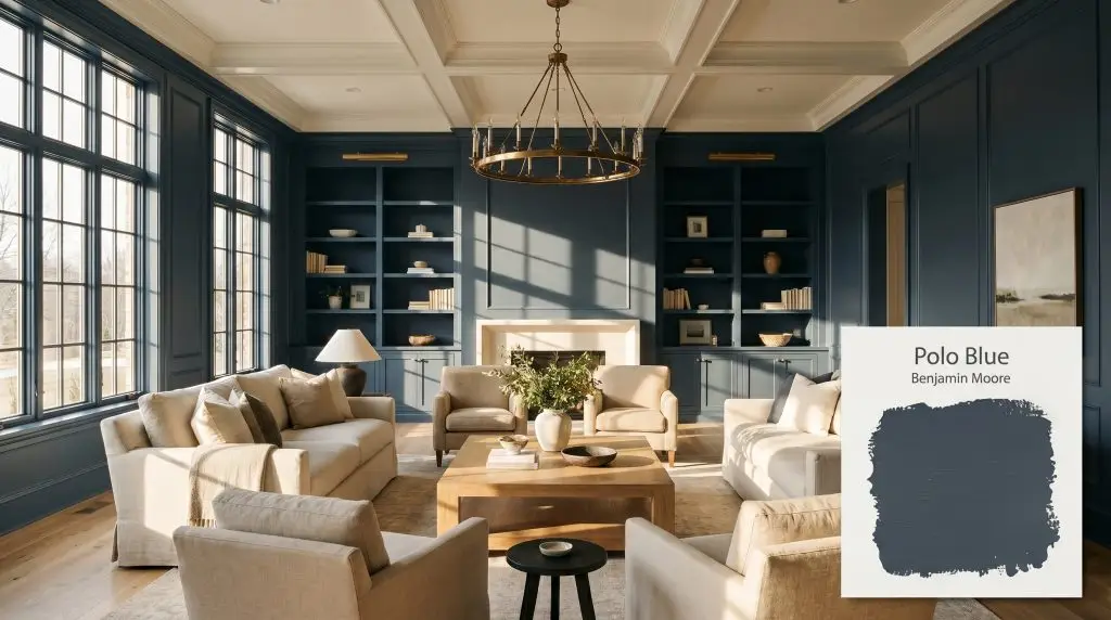
Benjamin Moore Polo Blue (2062-10) is a deeply saturated, almost-black navy blue. With an extremely low LRV of 3.61, it acts as a dramatic, moody neutral that shifts between rich charcoal-blue and true dark navy depending on the lighting.
Will Polo Blue clash with your room?
Paint Technical Profile
| Color ID / SKU | 2062-10 |
| HEX Code | #333b44 |
| Light Reflectance (LRV) | 3.61 |
| Use | Interior, Exterior |
| Best Exposures | South, West, or well-lit spaces |
| Best For | Cabinetry, libraries, dining rooms, moody bedrooms, exterior siding |
Benjamin Moore Polo Blue: The Secret to a Tailored Atmosphere
When tasked with grounding a cavernous, echo-heavy living area or a sterile, featureless hallway, a deeply saturated pigment becomes your strongest architectural tool. Benjamin Moore Polo Blue 2062-10 achieves this visual anchoring beautifully. It wraps a room in a rich, sophisticated shadow that feels incredibly intentional rather than heavy or imposing.
This color fundamentally changes how you experience a room’s physical boundaries. By leaning heavily into its dark, moody navy profile, it creates an enveloping energy that instantly elevates everyday furnishings.
Whether you are updating a classic colonial or bringing warmth to an industrial loft, this specific shade offers a tailored, highly curated aesthetic. It is a brilliant choice for homeowners who want to make a dramatic statement without relying on overwhelming primary colors.
Undertones & LRV of Benjamin Moore Polo Blue
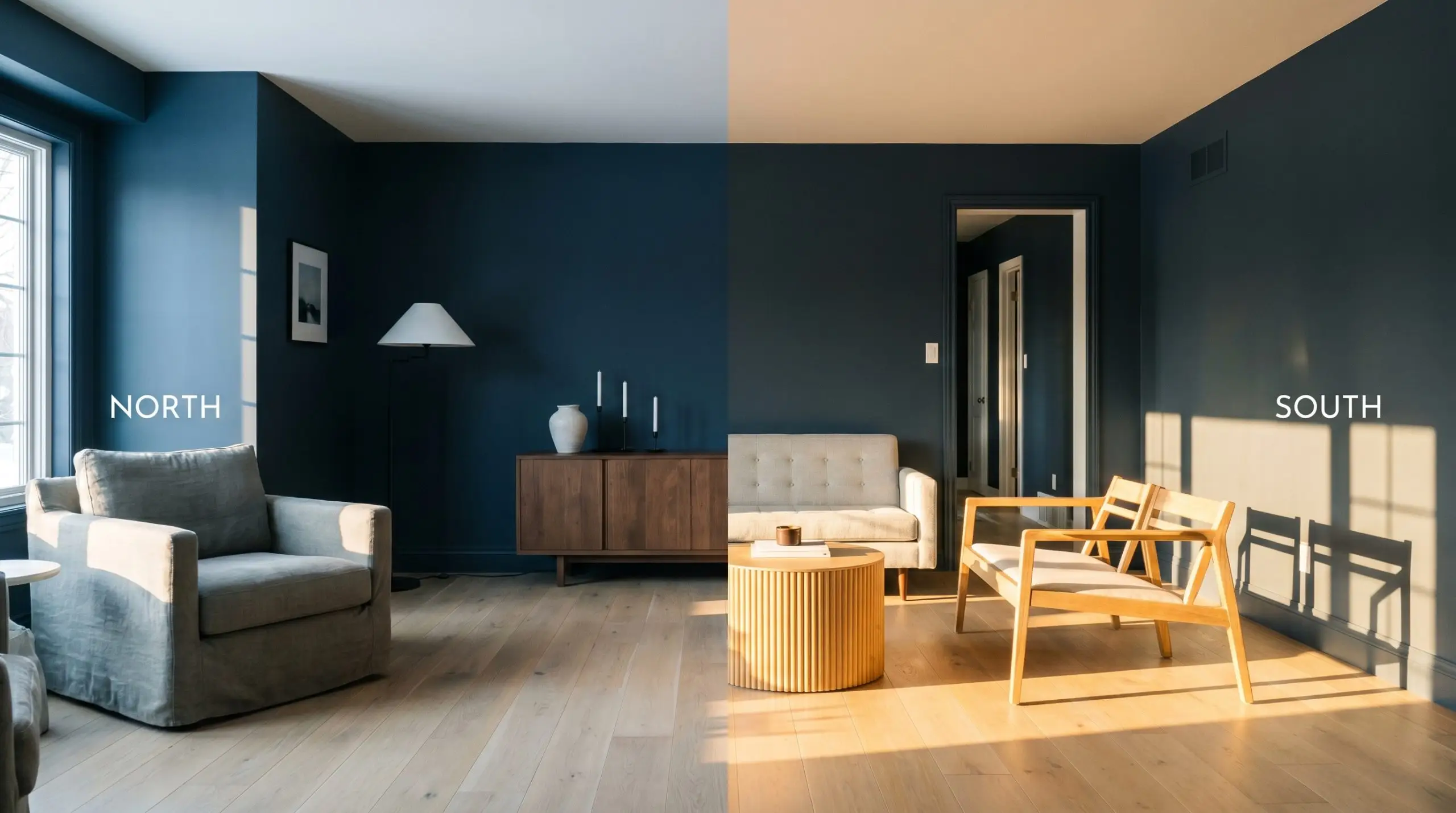
Is this paint warm or cool? Polo Blue 2062-10 is an unequivocally cool-toned neutral that reads as a deeply saturated, almost-black slate blue on the wall. To fully grasp its impact, understanding low LRV color psychology & spatial perception is essential for a successful transformation.
At a staggering LRV of 3.61, this is a true low LRV paint. It possesses virtually zero reflective bounce, meaning it absorbs almost all the light that hits it. This light absorption pulls the walls inward, creating a profound sense of intimacy, weight, and striking architectural contrast.
Lighting Effects & The Chameleon Factor
This deep pigment relies entirely on your light source to dictate its final identity. You must test this color on multiple walls, as its heavy base can quickly shift the vibe from tailored elegance to stark, imposing darkness.
Because it sits so close to black, relying on this color in a room with heavy green foliage right outside the window can push the hidden cyan nuance into a murky, bruised tone.
Clash Warning (Environmental Shadow)
Popular Room Applications
This level of color saturation demands spaces where you want to foster focus, conversation, or sheer dramatic impact. It anchors a home by providing a gorgeous visual resting place for the eye.
Libraries & Studies
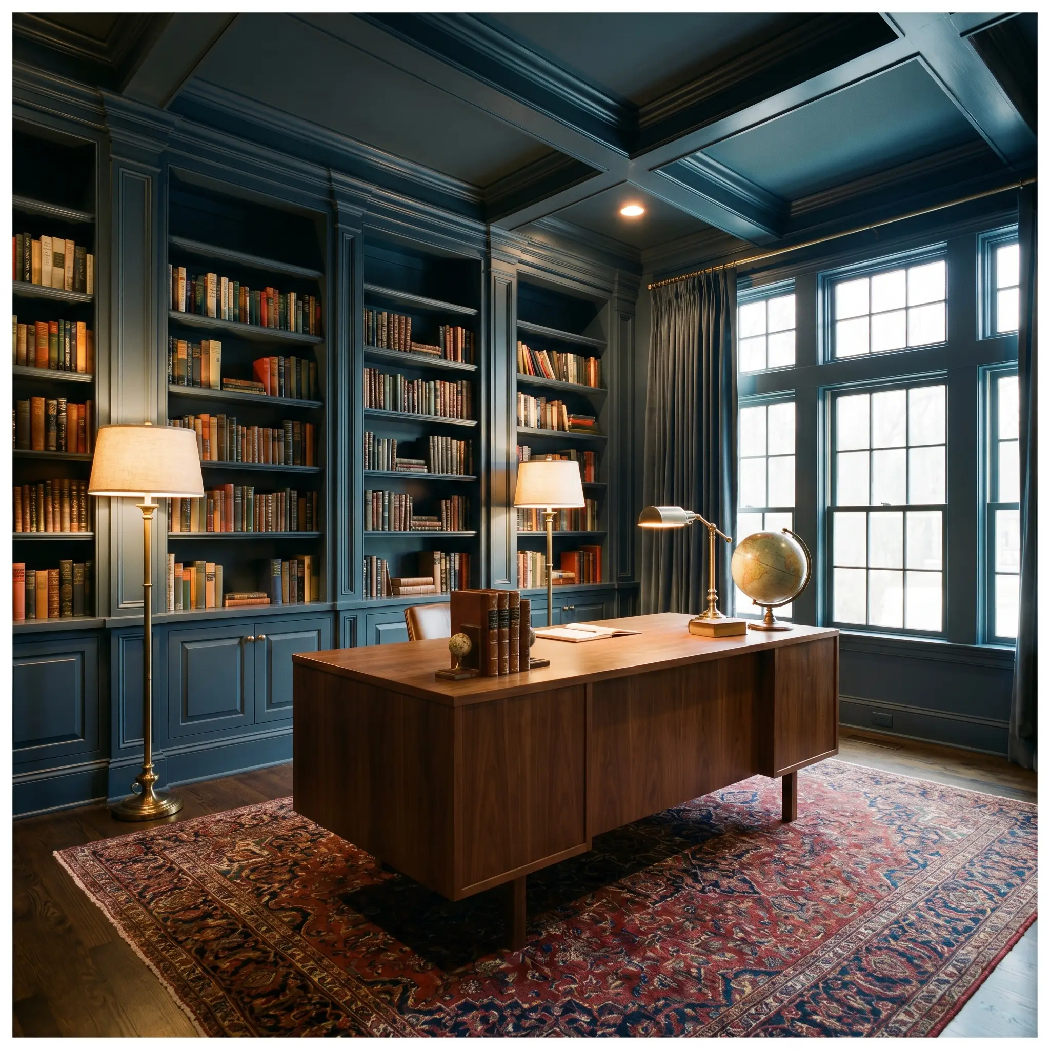
Wrapping an entire room—walls, trim, and ceiling—in this dark shade is a brilliant way to lean into a dark academia aesthetic. It provides a stunning backdrop for warm walnut desks, classic Persian rugs, and burnished antique brass reading lamps. The heavy shadow minimizes visual distractions, making the space feel like a dedicated, quiet retreat.
Formal Dining Rooms
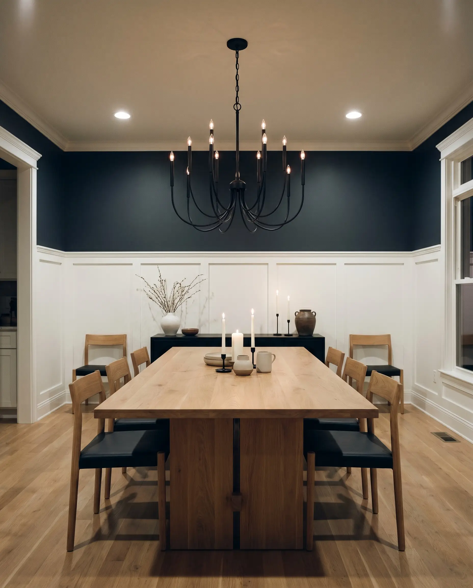
This hue elevates evening entertaining by creating a beautifully dramatic dining room. It looks incredible when painted on the upper half of the wall above crisp white wainscoting, allowing candlelight to gently bounce off the deep blue surface. Pair it with a sculptural blackened steel chandelier to modernize the traditional setting.
Will Polo Blue work with your specific lighting, floor, or furniture?
Kitchens & Cabinetry
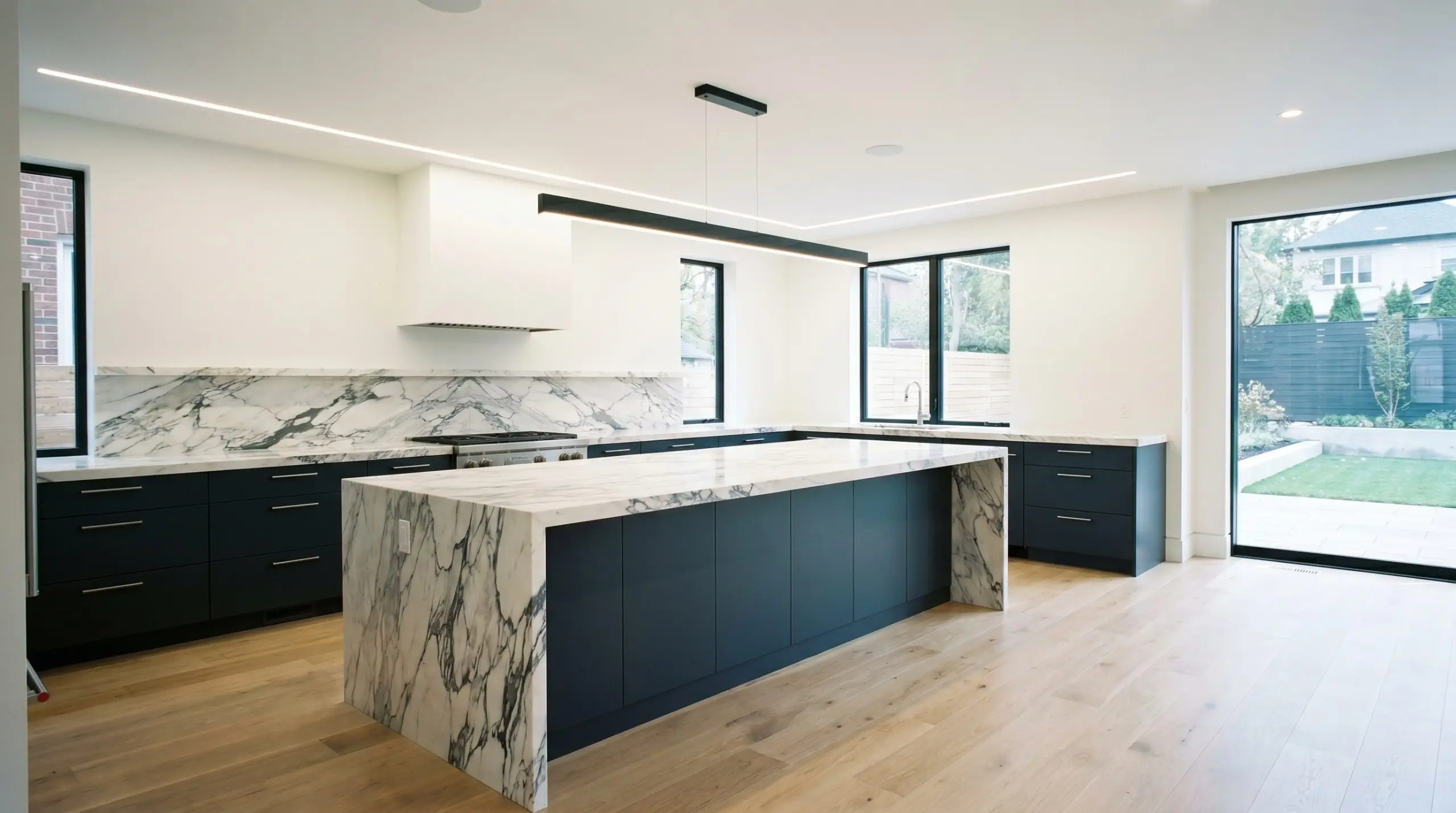
As one of the best dark cabinetry paints for kitchens, it anchors the lower half of the room effortlessly. Using it on base cabinets or a massive central island grounds a sleek, transitional kitchen layout. It pairs exceptionally well with heavily veined calacatta viola marble and natural white oak flooring.
Powder Rooms
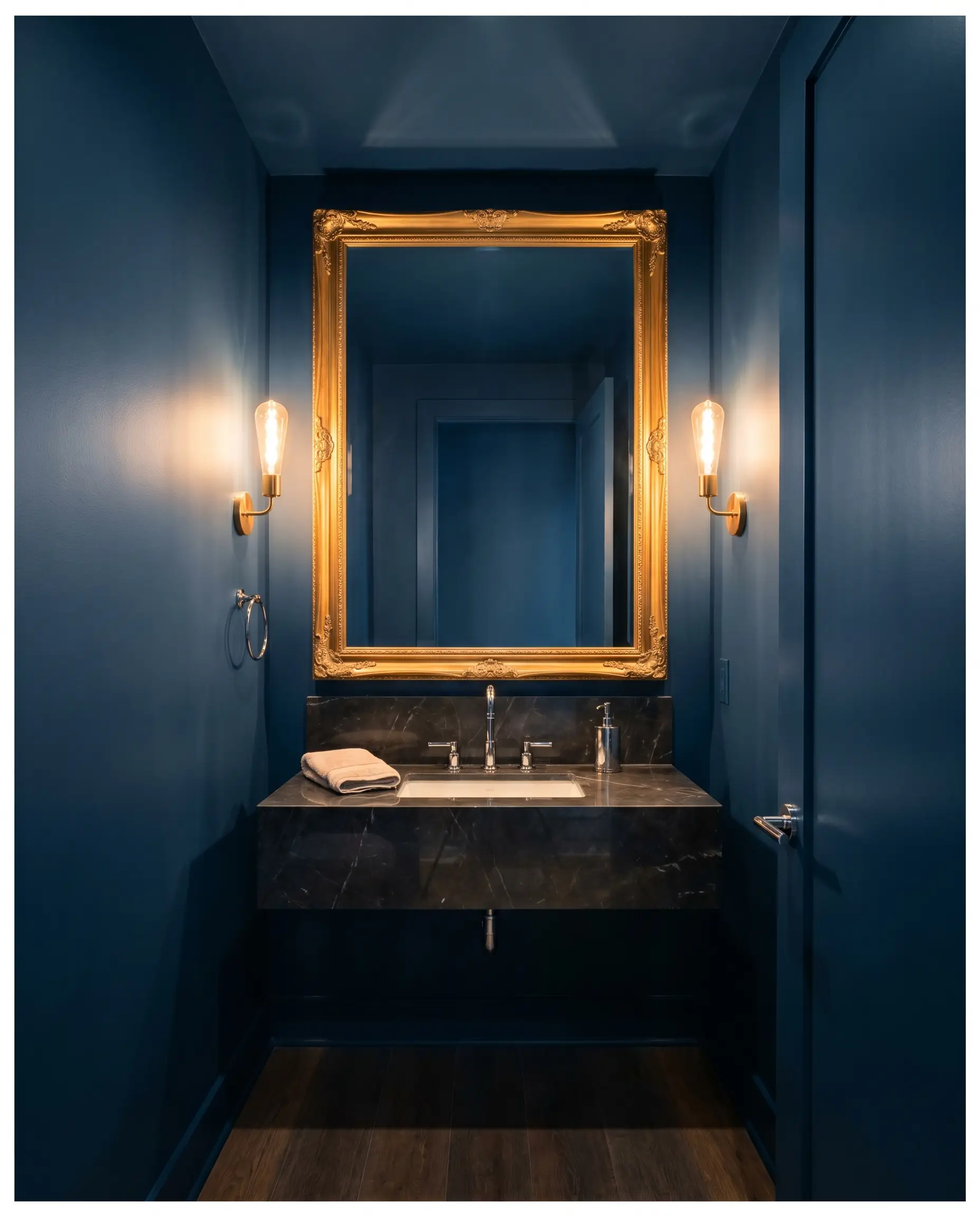
Small, windowless spaces are ideal candidates for this light-absorbing shade. Do not fight the lack of square footage; embrace it by drenching the entire space in color. Adding an oversized, ornate mirror and polished chrome fixtures will bounce just enough light to keep the room feeling luxurious rather than cramped.
Will Polo Blue work with your specific lighting, floor, or furniture?
Exteriors
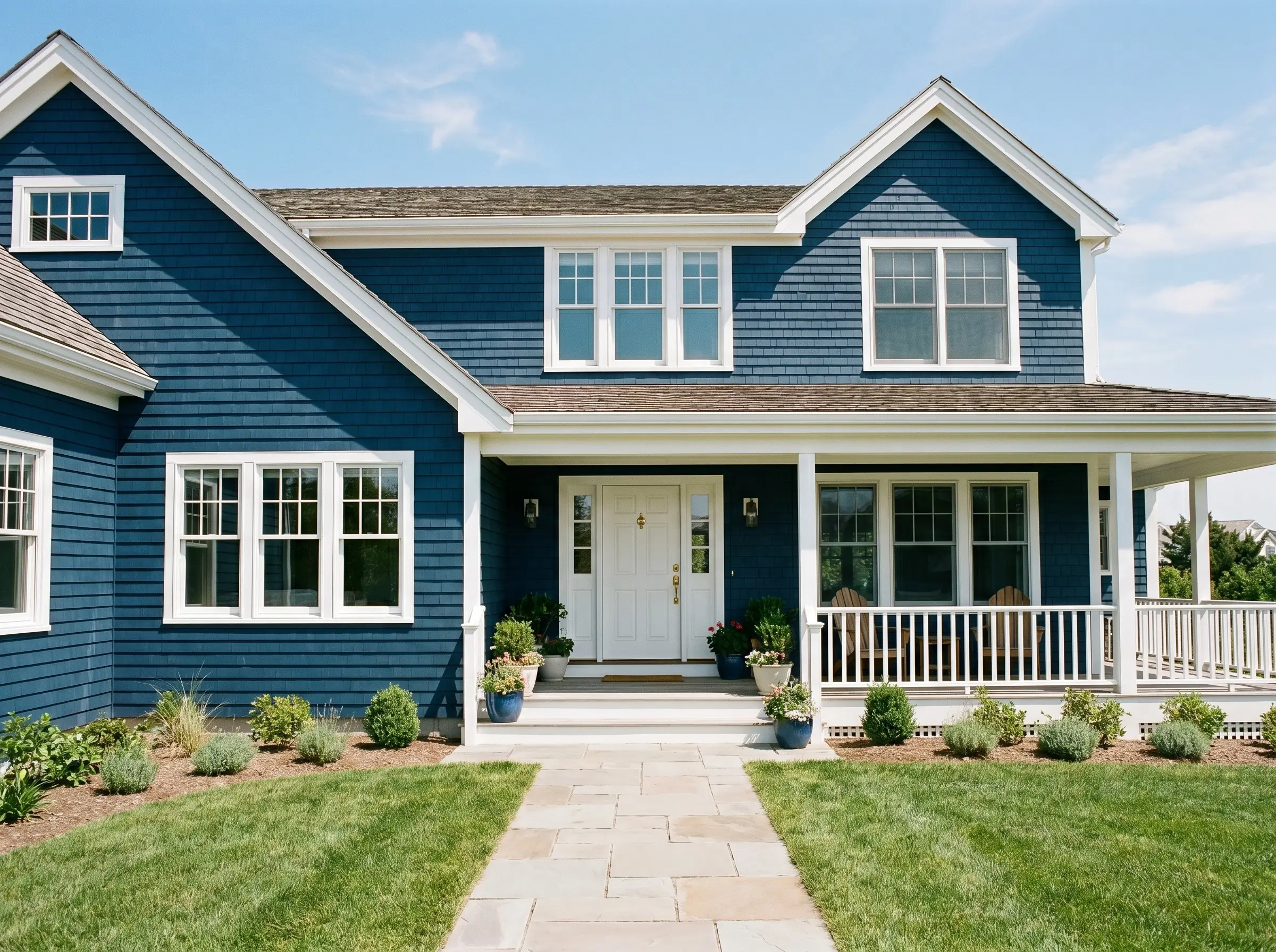
On the outside of a home, direct sunlight washes out a significant portion of the color’s depth. When used on exterior siding or shutters, it reads as a classic, nautical navy rather than a near-black. It provides massive curb appeal when contrasted against crisp white exterior trim and natural stone pathways.
Unique Design Ideas for Polo Blue
Beyond standard walls, this deep pigment is a brilliant tool for highly specific, curated transformations. When manipulated creatively, it turns easily overlooked architectural moments into premium focal points.
The Beadboard Mudroom Drop Zone
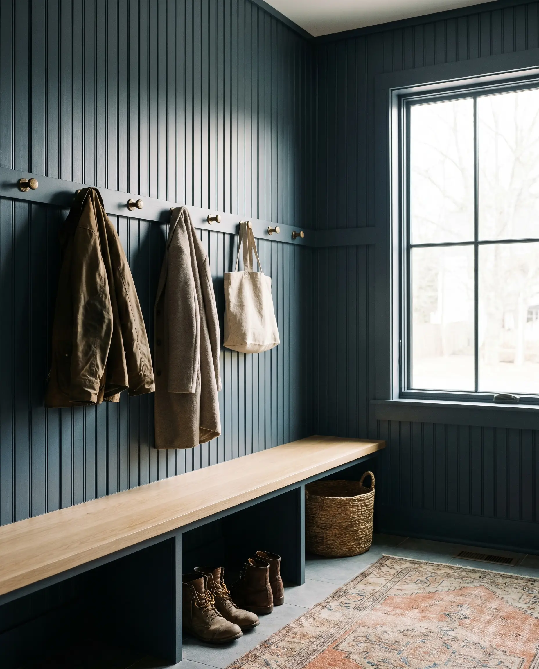
Transform a chaotic entryway by coating floor-to-ceiling beadboard in this rich shade. The dark color brilliantly hides everyday scuffs and dirt while making standard coats and bags look like part of a curated display. The deep charcoal base emphasizes the vertical shadows in the millwork, adding instant custom character.
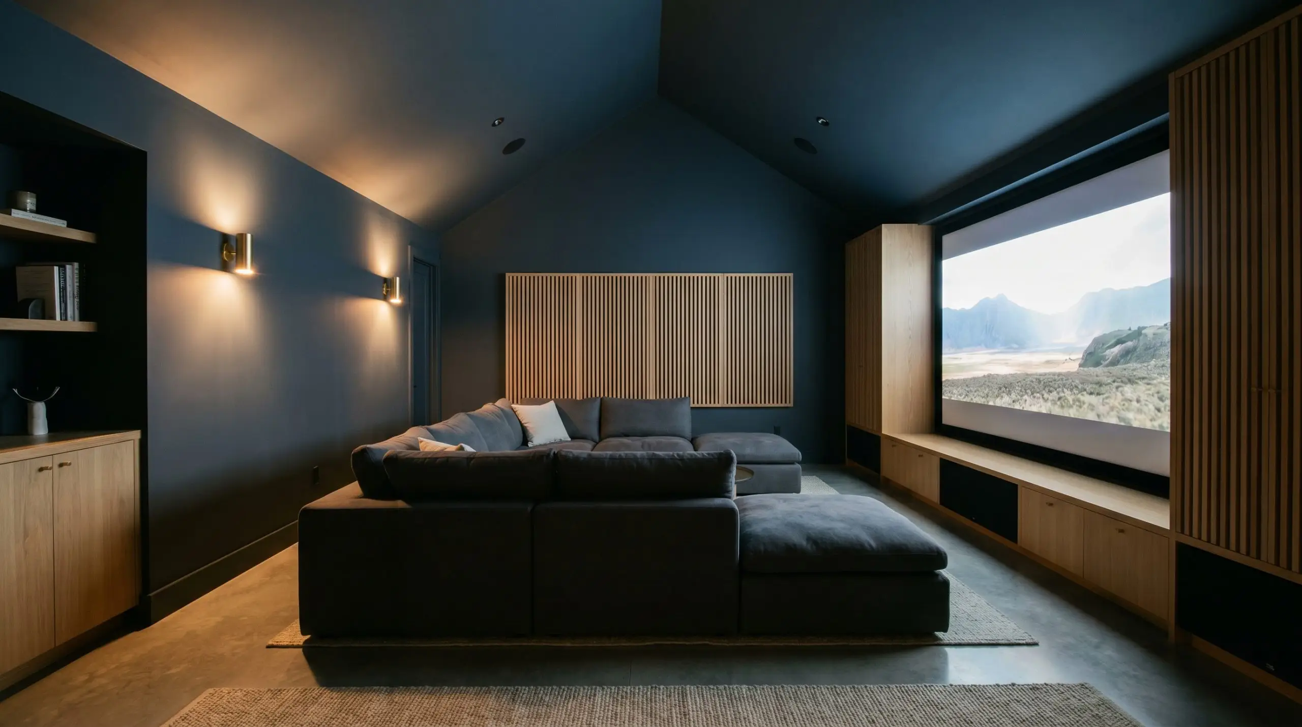
The Immersive Home Theater
Will Polo Blue work with your specific lighting, floor, or furniture?
For a dedicated media room, this paint is functionally superior to a standard flat black. Coating the walls and ceiling in this slate blue eliminates screen glare while keeping the room from feeling like a sterile cave. It provides just enough color saturation to feel stylish when the lights are on.
The Two-Tone Staircase
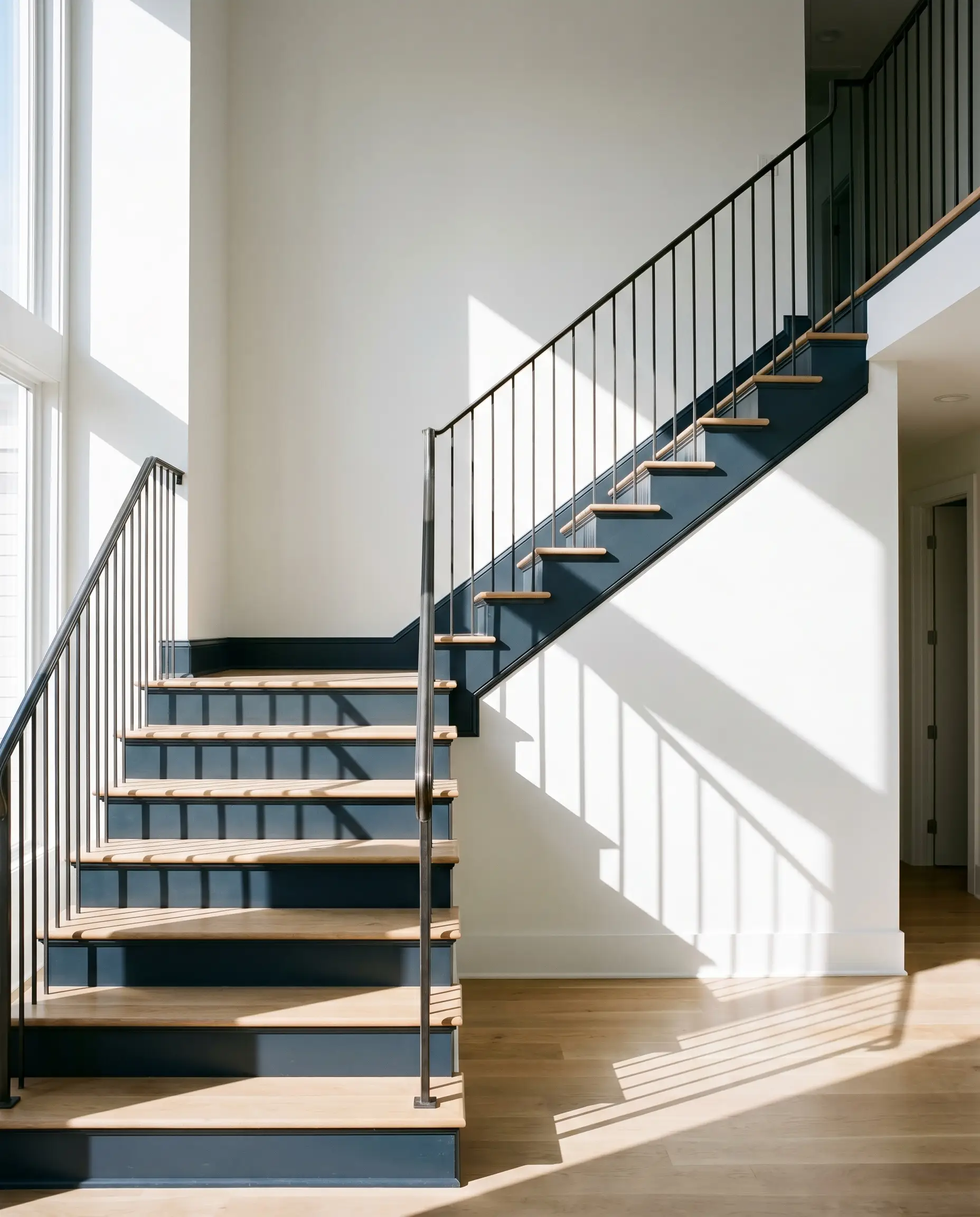
Update a traditional wooden staircase by painting the risers and the surrounding stringers in this moody navy, leaving the treads in a natural wood finish. This high-contrast approach modernizes the architecture immediately. It draws the eye upward and turns a basic transitional zone into a striking design feature.
The Repurposed Apothecary Cabinet
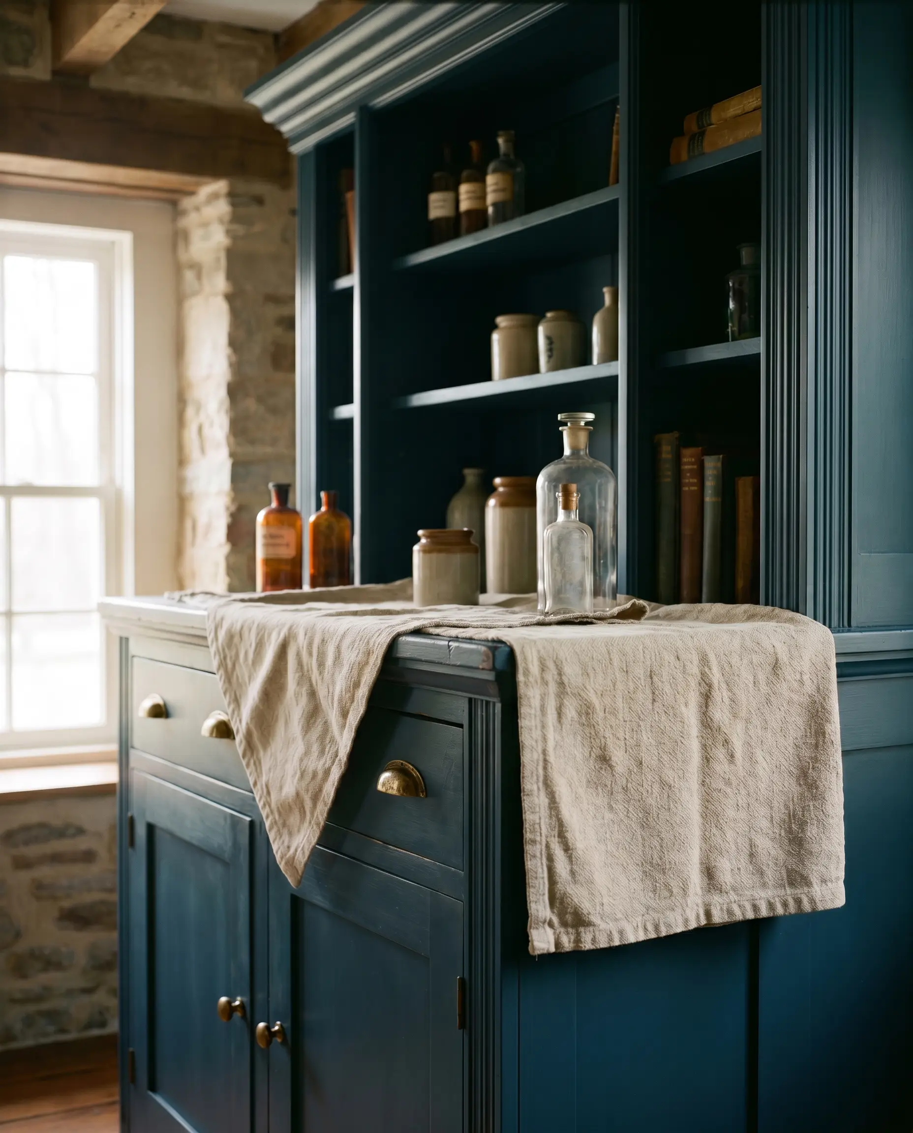
Breathe new life into a beat-up vintage storage piece by spraying it in a satin finish of this dark hue. The sophisticated color elevates the silhouette, making an everyday thrifted find look like a high-end designer piece. Swap out the old hardware for heavy, knurled brass pulls to complete the transformation.
Coordinating Colors & Best Pairings
To make this deep shade feel intentional, you must surround it with elements that either provide sharp relief or enhance its enveloping warmth.
Trim & Baseboards
The right trim color will dictate whether the room feels crisp and modern or soft and atmospheric.
Hardware & Material Pairings
Tactile elements bring out the hidden nuances in the paint’s DNA. Mix everyday foundational materials with one or two elevated accents to strike the perfect balance.
Coordinating Colors
Building a cohesive palette requires secondary colors that manage the temperature and weight of the room.
Designer Mood Boards
These curated palettes demonstrate how to blend the paint with specific materials to achieve distinct atmospheric energies.
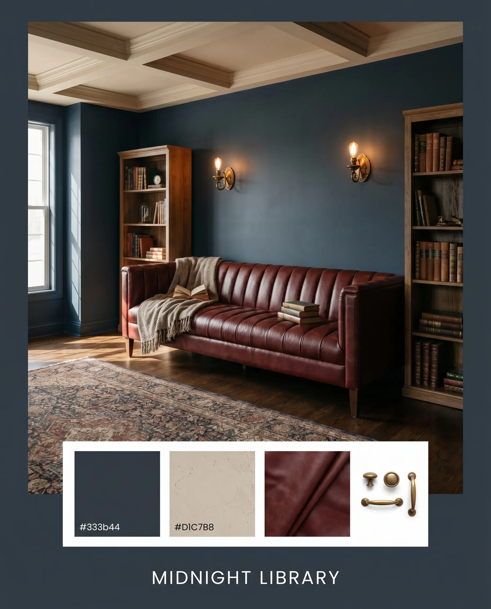
Midnight Library: Pair the moody navy walls with a channel-tufted oxblood sofa, burnished antique brass sconces, and Sherwin-Williams Accessible Beige SW 7036 on the ceiling. The resulting vibe is deeply intellectual, grounded, and incredibly cozy.
Coastal Shadow: Combine the dark paint with natural white oak flooring, heavy linen drapery, and Benjamin Moore Edgecomb Gray HC-173 on the trim. This creates a beautifully relaxed, high-contrast environment that feels breezy yet anchored.
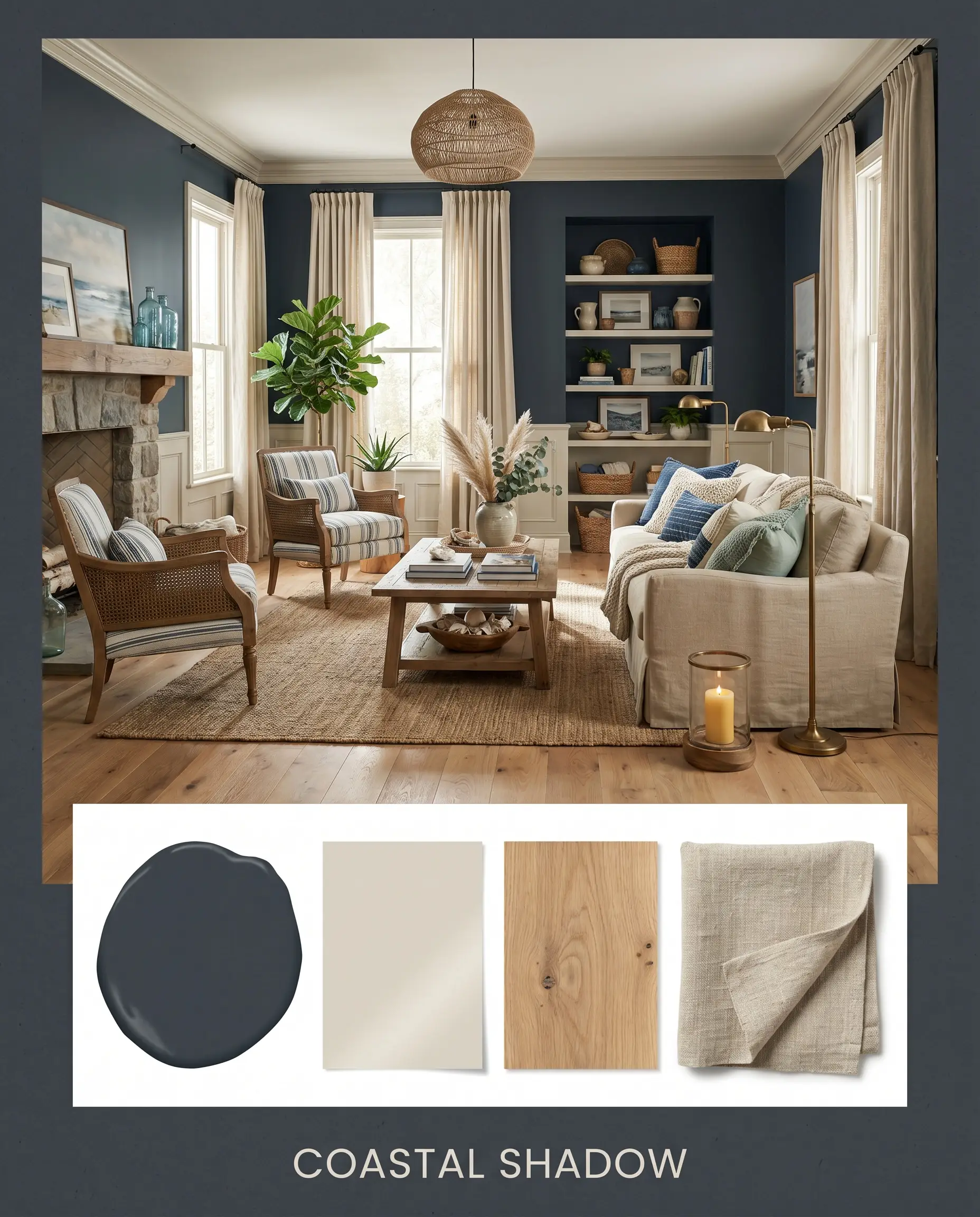
Will Polo Blue work with your specific lighting, floor, or furniture?
Tailored Hearth: Use the slate blue as a backdrop for Farrow & Ball Red Earth 64 accents, polished chrome hardware, and fresh eucalyptus branches. The mix of cool metal, warm terracotta, and organic greenery feels effortlessly sophisticated and modern.
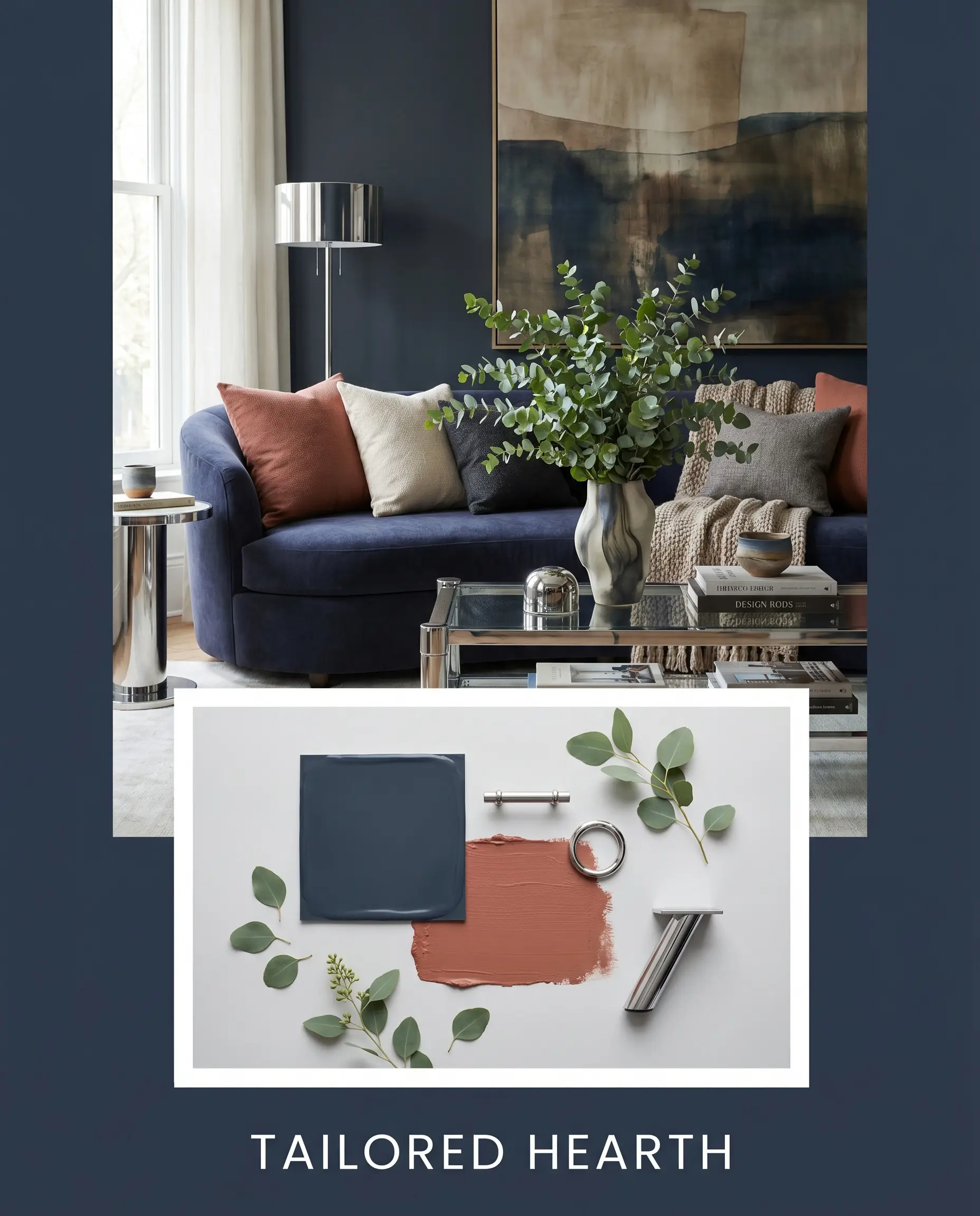
Head-to-Head Comparisons
When evaluating options within the broader spectrum of deep moody blues & navys, the specific lighting conditions of your home will dictate the winner.
Benjamin Moore Polo Blue vs. Benjamin Moore Hale Navy HC-154
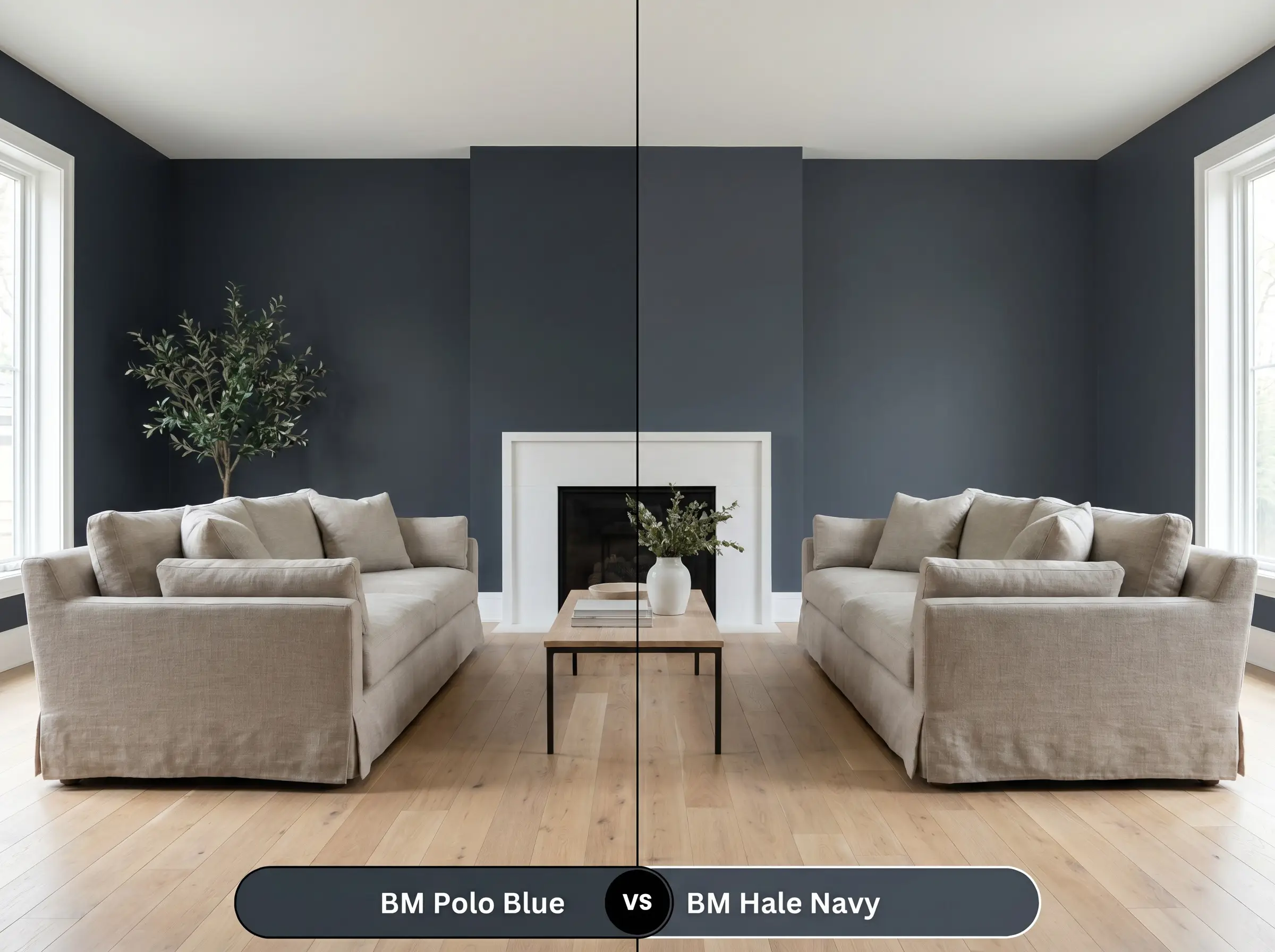
Will Polo Blue work with your specific lighting, floor, or furniture?
If you want a classic, universally recognized navy, Hale Navy HC-154 is the safer choice due to its slightly higher LRV and balanced gray undertones. However, if you are designing a space that demands true dramatic shadow, Polo Blue is significantly darker and leans much further into a near-black charcoal.
Benjamin Moore Polo Blue vs. Sherwin-Williams Naval SW 6244
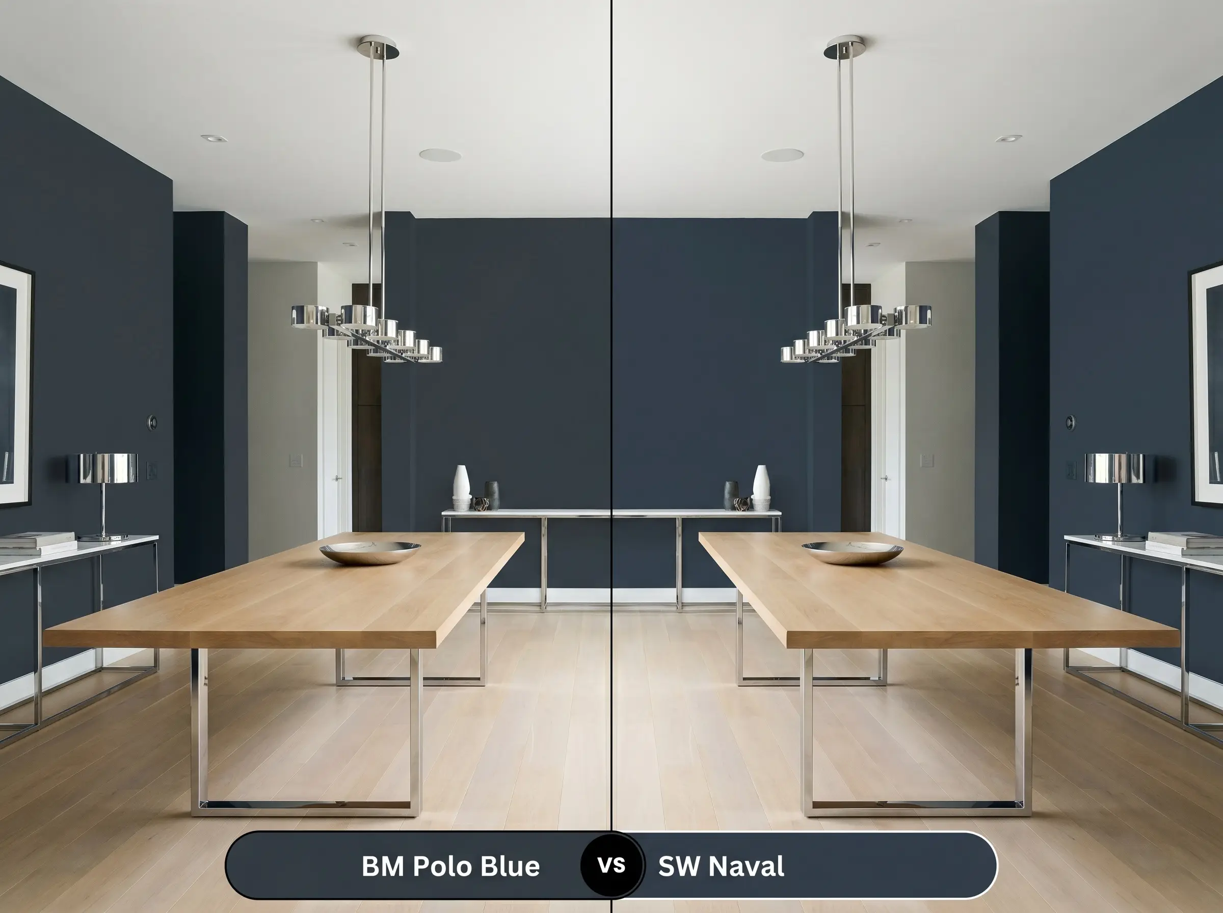
Sherwin-Williams Naval SW 6244 is a purer, more vibrant blue that holds its color even in dim lighting. Polo Blue, by contrast, is much more muted and will quickly shift into a charcoal-black when the sun goes down, making it better suited for moody, atmospheric environments.
Benjamin Moore Polo Blue vs. Farrow & Ball Hague Blue 30
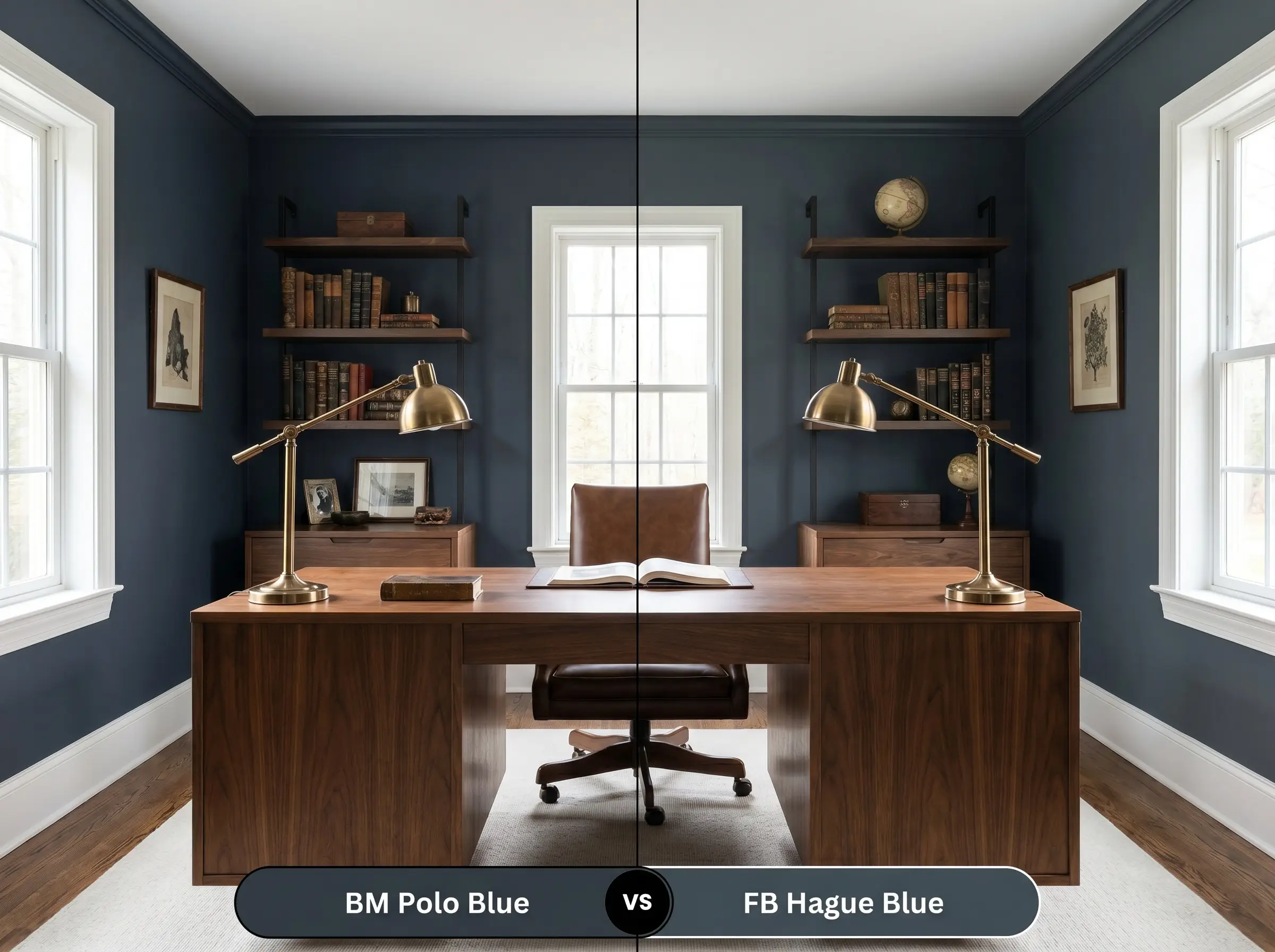
Will Polo Blue work with your specific lighting, floor, or furniture?
Hague Blue 30 carries a massive, undeniable green undertone that gives it a rich, jewel-box quality. If you want to avoid green entirely and prefer a cooler, more tailored slate aesthetic, Polo Blue is the far superior option.
Similar Colors & Brand Equivalents
If this specific shade feels slightly too heavy, or you need a match from a different manufacturer, these alternatives provide a similar atmospheric weight.
Benjamin Moore Alternatives
Cross-Brand Matches
Practical Application & DIY Advice
Executing a flawless finish with a pigment this dark requires strategic planning. The wrong sheen or a skipped prep step will instantly cheapen the final aesthetic.
The Dynamic Sheen Guide
Primer Strategy
You absolutely must use a deep-tinted gray primer before applying this color. Rolling a near-black navy over a standard white primer will result in a streaky, uneven finish that lacks true depth and requires endless topcoats.
Coverage & Success Tips
Even with premium paint lines, expect to roll at least two generous coats to achieve full color saturation.
Dark colors are notorious for “flashing”—those visible, shiny roller marks that appear when you touch up a dry wall. Always maintain a wet edge while rolling, and if you find a missed spot later, you often have to repaint the entire wall corner-to-corner to ensure a seamless look.
Hackrea Pro-Tip (Application)
Frequently Asked Questions
Because direct sunlight washes out dark pigments, this color will read much lighter and bluer on an exterior facade than it does indoors. It performs beautifully on brick, giving the home a crisp, tailored nautical feel, though you should expect the charcoal undertones to recede significantly in full sun.
Absolutely. By utilizing a flat finish on the ceiling of a windowless space, the extreme light absorption of this paint erases the hard visual boundary above you. It creates a stunning, infinite shadow effect that makes the ceiling feel taller than it actually is.
The extreme contrast between the cool slate base and heavily red-toned woods can create unwanted visual tension. To bridge this gap, you must introduce transitional elements like a neutral, earthy rug or warm brass lighting to soften the harsh intersection of cool and warm tones.
Pairing this low LRV paint with matte, heavy textiles creates a deeply enveloping, monochromatic sensory experience. However, to prevent the room from feeling like a black hole, you must introduce highly reflective accents—like polished metals, glass, or glossy ceramics—to bounce light back into the space.
Final Verdict & Expert Warnings
Benjamin Moore Polo Blue 2062-10 is an architectural powerhouse designed for spaces that demand sophisticated intimacy. It shines brightest when used to anchor expansive, light-filled rooms or to intentionally envelop smaller, cozy retreats with its tailored, moody navy energy. It is the perfect choice for homeowners who want to introduce dramatic, grounding color without the visual noise of brighter jewel tones.
However, you must be strategic with your surrounding elements. Avoid pairing this deeply cool, charcoal-heavy hue with stark, icy white LED lighting or overly red-toned woods like untreated mahogany, as the resulting visual tension feels accidental and disjointed. Furthermore, placing it alongside overly bright, primary-colored plastics or high-gloss synthetic fabrics will instantly strip away its premium, tailored elegance.
Room Compatibility & Clashes Diagnoses
Hackrea's reports evaluating the compatibility of Polo Blue in real rooms.West-Facing Primary Bedroom with Tray Ceiling
"The extremely low reflectance of this near-black navy risks swallowing the dark cherry furniture silhouette while emphasizing yellow tones in the honey oak floor."
Multi-Exposure Cottage Living Room
"The extremely low reflectance of the paint risks overpowering the room's low timber ceilings and creates severe visual contrast against the pale oatmeal carpet."