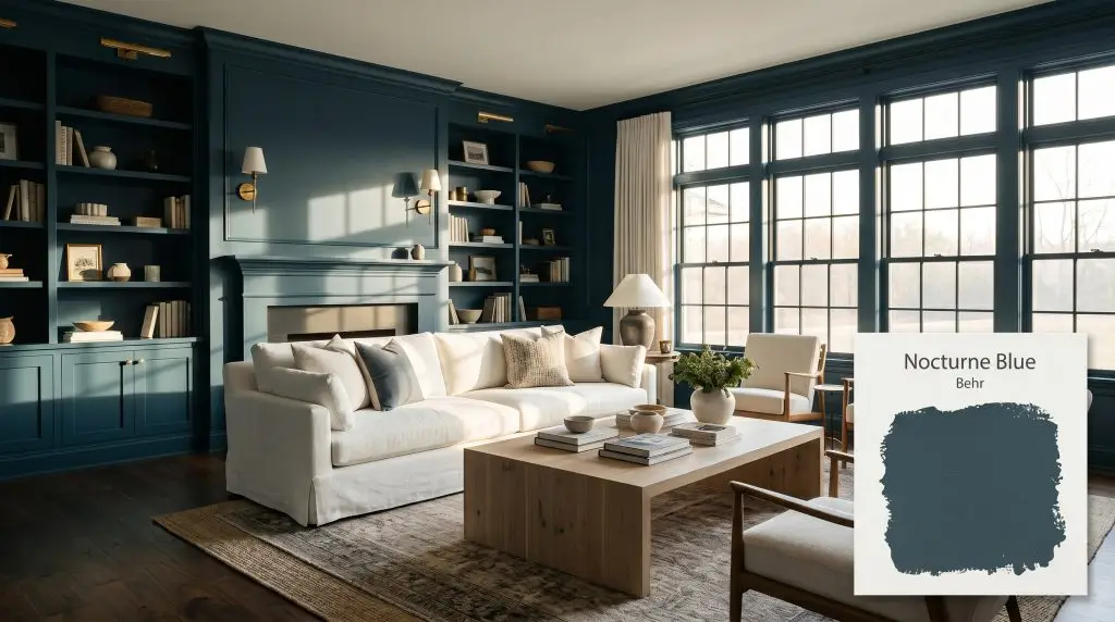
Nocturne Blue HDC-CL-28
BehrBehr Nocturne Blue (HDC-CL-28) is a deep, blackened teal-blue with an LRV of 7. It serves as a moody, sophisticated alternative to traditional navy, featuring subtle green undertones that prevent it from feeling overly cold in well-lit spaces.
Paint Technical Profile
| Color ID / SKU | HDC-CL-28 |
| HEX Code | #344d58 |
| Light Reflectance (LRV) | 7 |
| Use | Interior, Exterior |
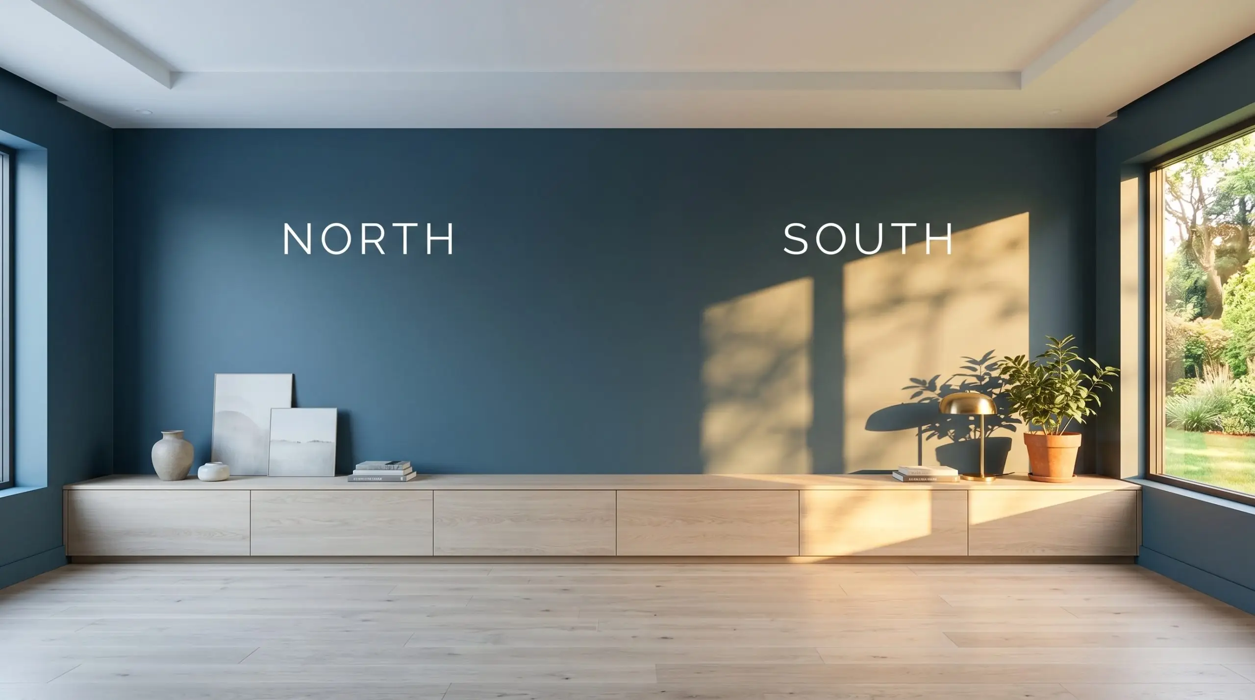
| Best Exposures | South, West |
| Best For | Accent walls, moody bedrooms, home offices, kitchen islands, exterior siding, cabinetry |
Behr Nocturne Blue: The Architectural Secret to High-Impact Contrast
Dark paint is an architectural tool, and Behr Nocturne Blue proves exactly why. This rich, blackened teal does not just sit passively on drywall; it actively reshapes the boundaries of a room by absorbing light and blurring sharp corners. It offers a profound sense of intimacy and sophistication that a standard, flat navy simply cannot replicate.
The DNA of Behr Nocturne Blue: Undertones & LRV
When homeowners ask if this moody bedroom accent is warm or cool, the answer leans definitively cool. However, because of its complex internal structure, it never feels icy or unapproachable.
With a Light Reflectance Value (LRV) of exactly 7, this color embraces massive light absorption. This low reflectance value means it will act as a near-black in shadowy corners, requiring intentional lighting or ample windows to reveal its rich chromatic profile.
Lighting Effects: How This Saturated Teal Shifts
Because of its complex green base, this blackened teal is highly reactive to its environment. The way sunlight or artificial fixtures hit the surface completely dictates whether the room feels like a crisp charcoal or a vibrant, moody oasis.
Popular Applications for Nocturne Blue
Dark colors often intimidate, but they are the fastest route to an intentional, custom-built look. By applying this shade strategically, you can completely redefine the architecture and energy of a standard room.
Crafting a Moody Master Retreat
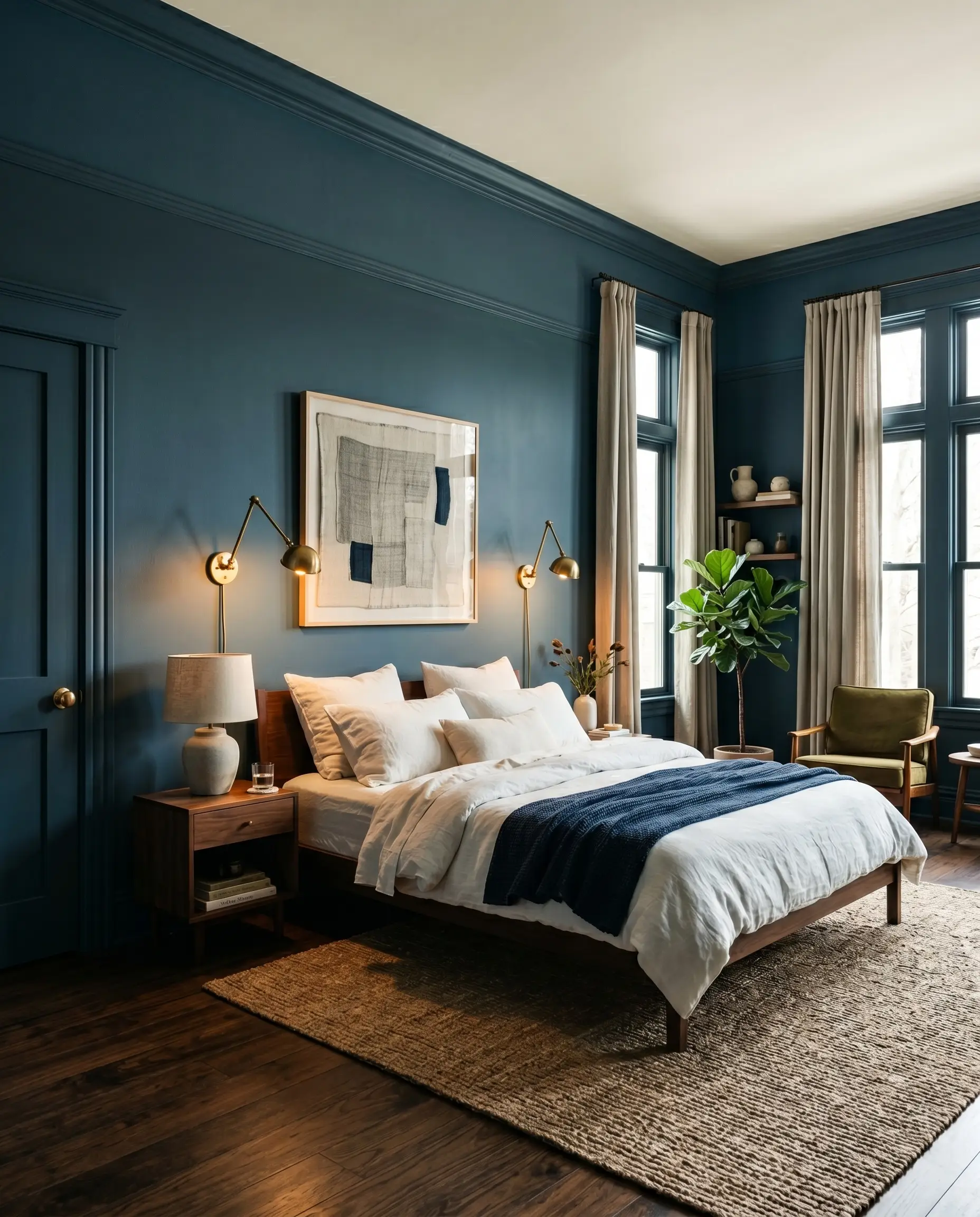
Color drenching is highly effective in a bedroom setting. Painting the walls, trim, and doors immerses the space in a continuous, deep sky hue that instantly promotes rest.
Contrast is key to keeping the room from feeling cave-like. Introduce washed linen bedding in crisp white, unlacquered brass sconces, and a vintage landscape painting to break up the visual weight.
If painting the ceiling feels too intense, carry the dark teal up the walls and finish with a picture rail, leaving the top foot and ceiling a soft, warm cream to maintain visual height.
Hackrea Design Secret (The Ceiling Trick)
Elevating Home Office Built-Ins
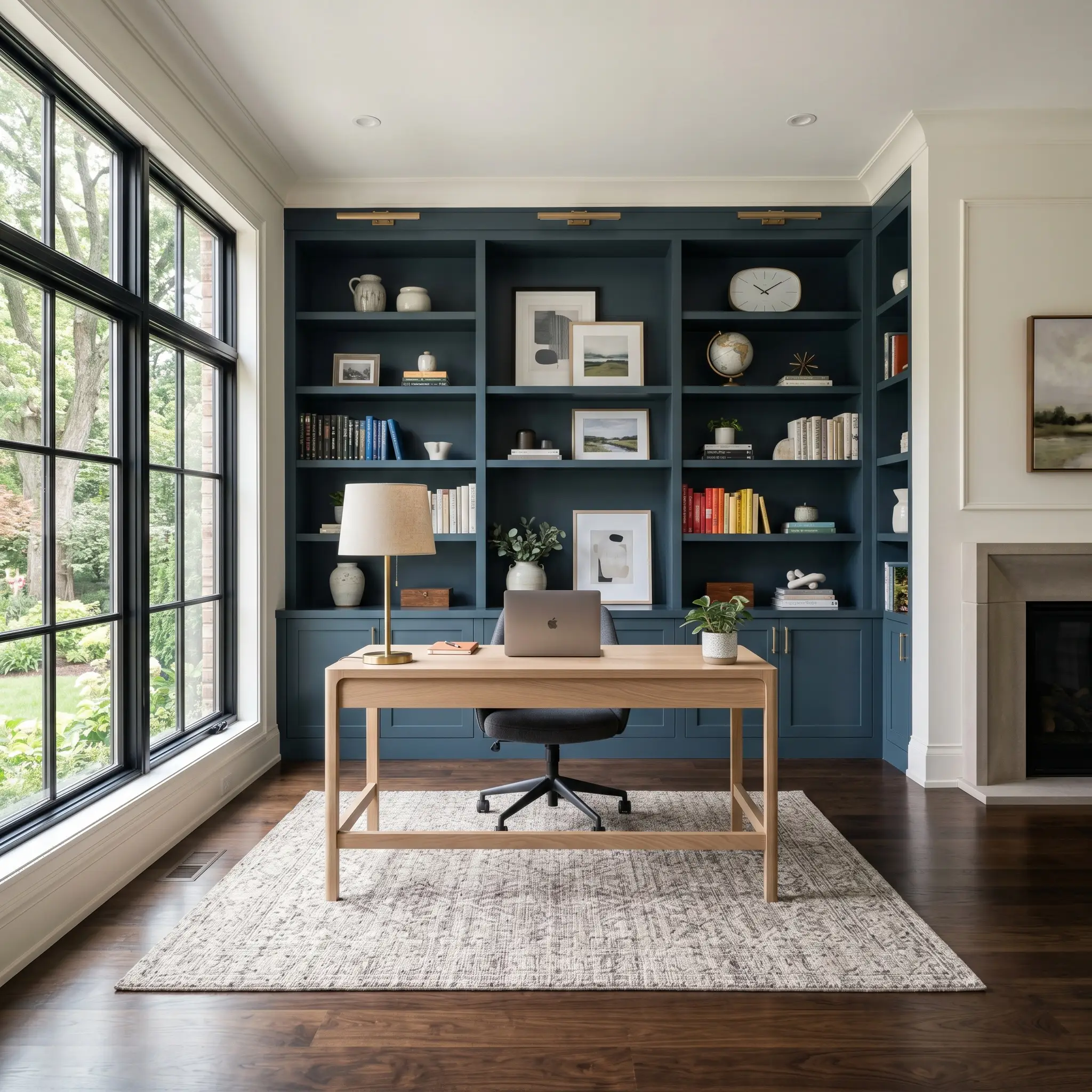
Standard MDF shelving instantly reads as custom cabinetry enamel when coated in a low-LRV shade. This creates a brilliant, sophisticated backdrop for a creative studio or a modern transitional workspace.
Style the shelves with stacked art books, sculptural ceramics, and trailing pothos to pop brilliantly against the dark background. Always opt for a satin or semi-gloss finish on shelving to ensure durability and to bounce a tiny bit of light back into the room.
Rooting Kitchen Islands and Lower Cabinetry
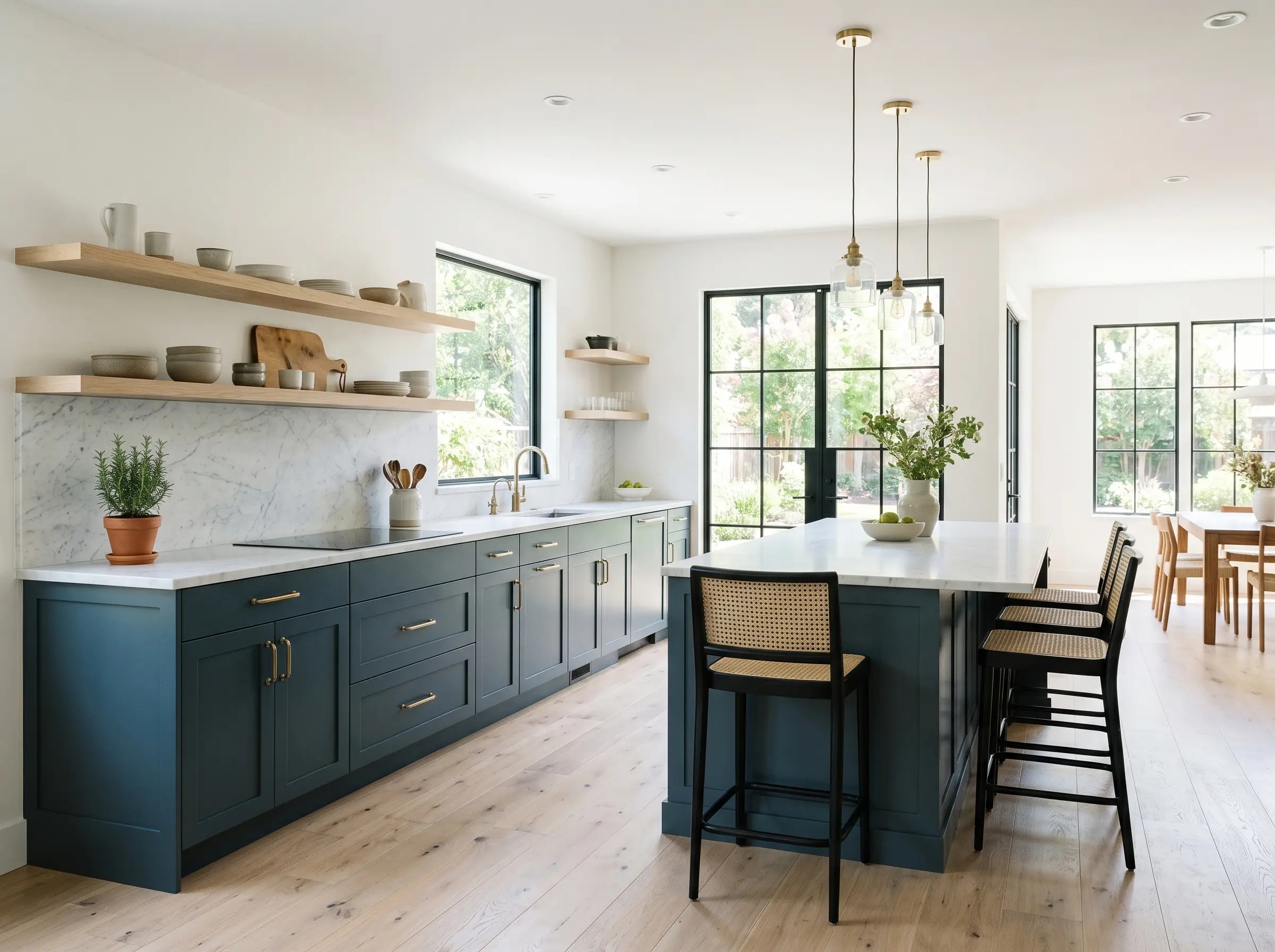
Using this rich color on lower cabinets stabilizes a two-toned kitchen beautifully. It pairs flawlessly with bleached oak open shelving and honed marble countertops for a balanced, organic modern aesthetic.
The dark base naturally hides scuffs in high-traffic family homes while maintaining a highly premium look. Polished nickel or unlacquered brass hardware will pop dramatically against this cool-toned neutral background.
Striking Exterior Siding and Front Doors
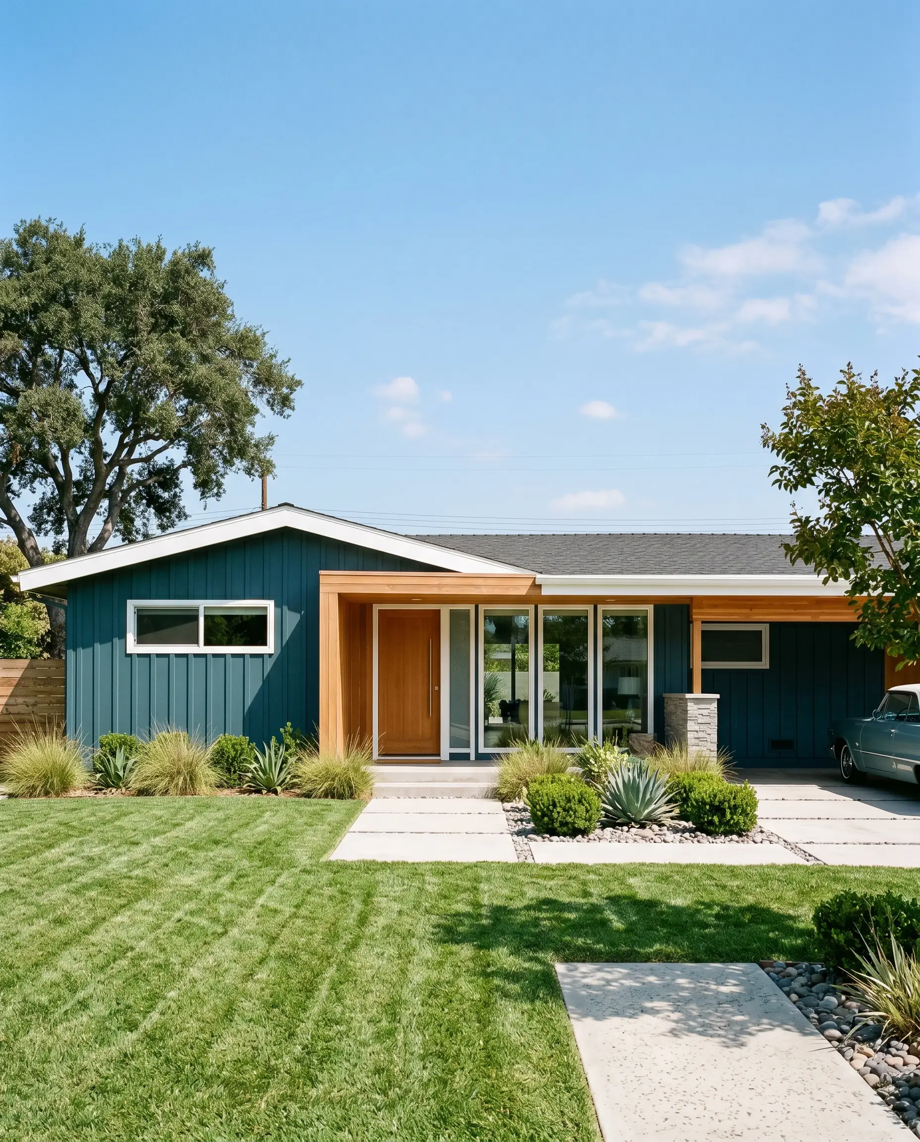
Exterior sunlight naturally washes out dark colors, so Behr Nocturne Blue will actually read slightly lighter and bluer outside. It is a fantastic choice for updating a mid-century ranch or modernizing a traditional suburban facade.
Pair it with natural cedar architectural accents and matte black iron light fixtures for sharp, contemporary curb appeal.
Always test your swatches on the south-facing side of your home. The intense midday sun will expose the green undertones, ensuring you love the color at its absolute brightest before committing to the whole house.
Hackrea Pro-Tip (Exterior Testing)
Textural Contrast in Windowless Powder Rooms
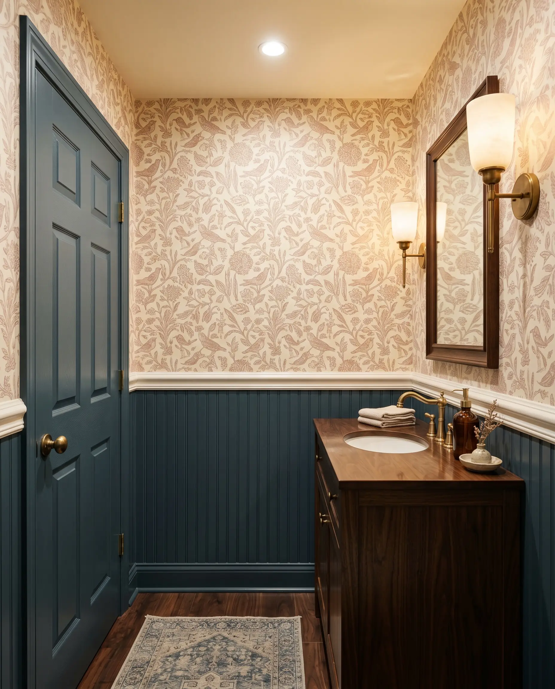
Windowless spaces are the perfect canvas for leaning into light absorption rather than fighting it. Install classic beadboard halfway up the wall and coat it in this deep hue, leaving the upper half for a whimsical, block-print wallpaper.
Add an oversized leaning mirror and a sleek alabaster sconce to bounce the artificial light beautifully around the small footprint.
Harmonizing Behr Nocturne Blue: Best Pairings & Palettes
Because this blackened teal absorbs so much light, it requires highly intentional material pairings to hold its shape. Without crisp boundaries or warming textures, the room risks feeling completely engulfed by the shadows.
Selecting the Right White for Millwork
Pairing a dark wall with the right trim dictates the entire posture of the room. The undertone of your chosen white will either sharpen the architecture or soften the overall mood.
Tactile Elements & Hardware Finishes
To elevate this deep sky hue, you must introduce materials that actively interact with its cool-toned neutral base.
Building the Room’s Color Palette
Curated Mood Boards for Every Aesthetic
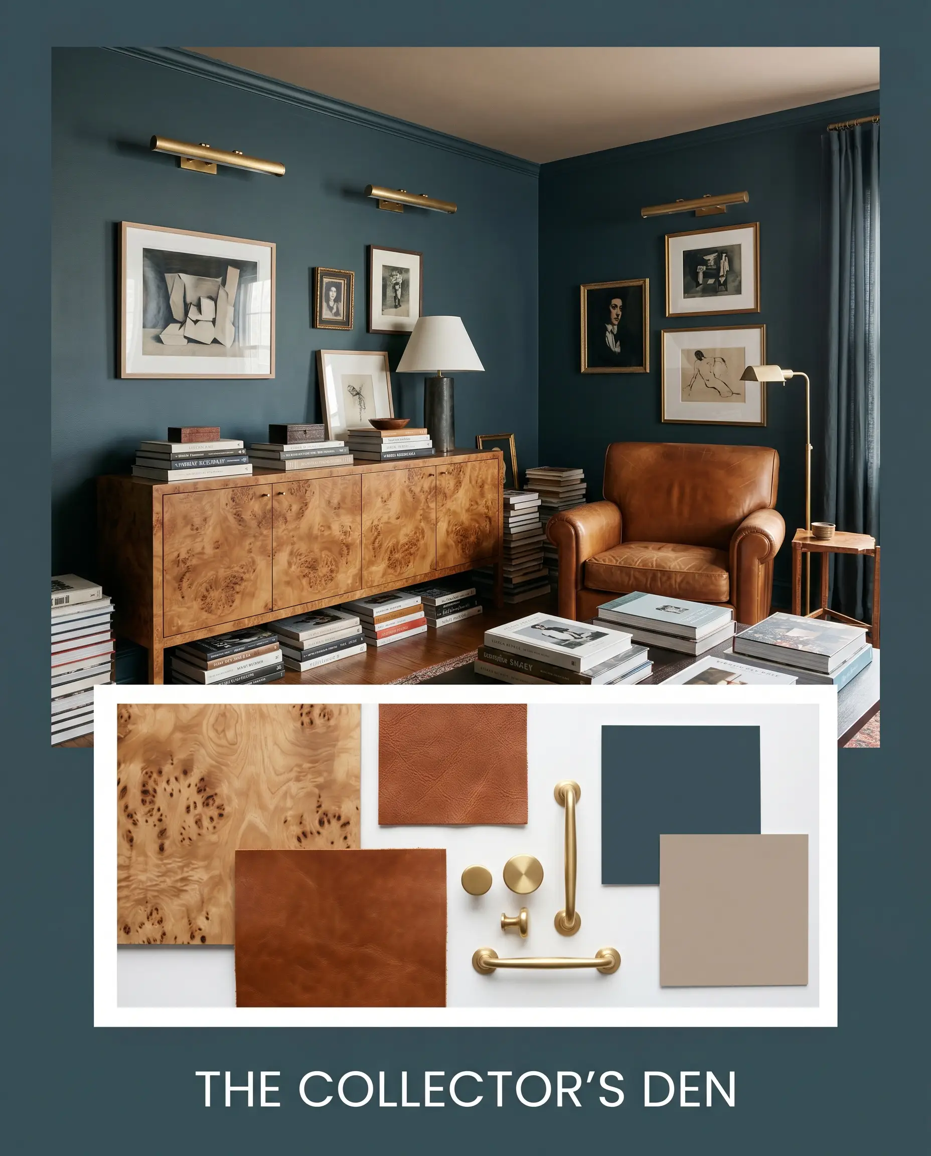
The Collector’s Den Anchor the space with a burl wood credenza and a saddle leather armchair to bring immediate warmth to the shadows. Layer in Farrow & Ball Dead Salmon on the ceiling to create an enveloping, eclectic retreat. Finish the styling with stacked art books and unlacquered brass picture lights to illuminate the dark walls with a golden glow.
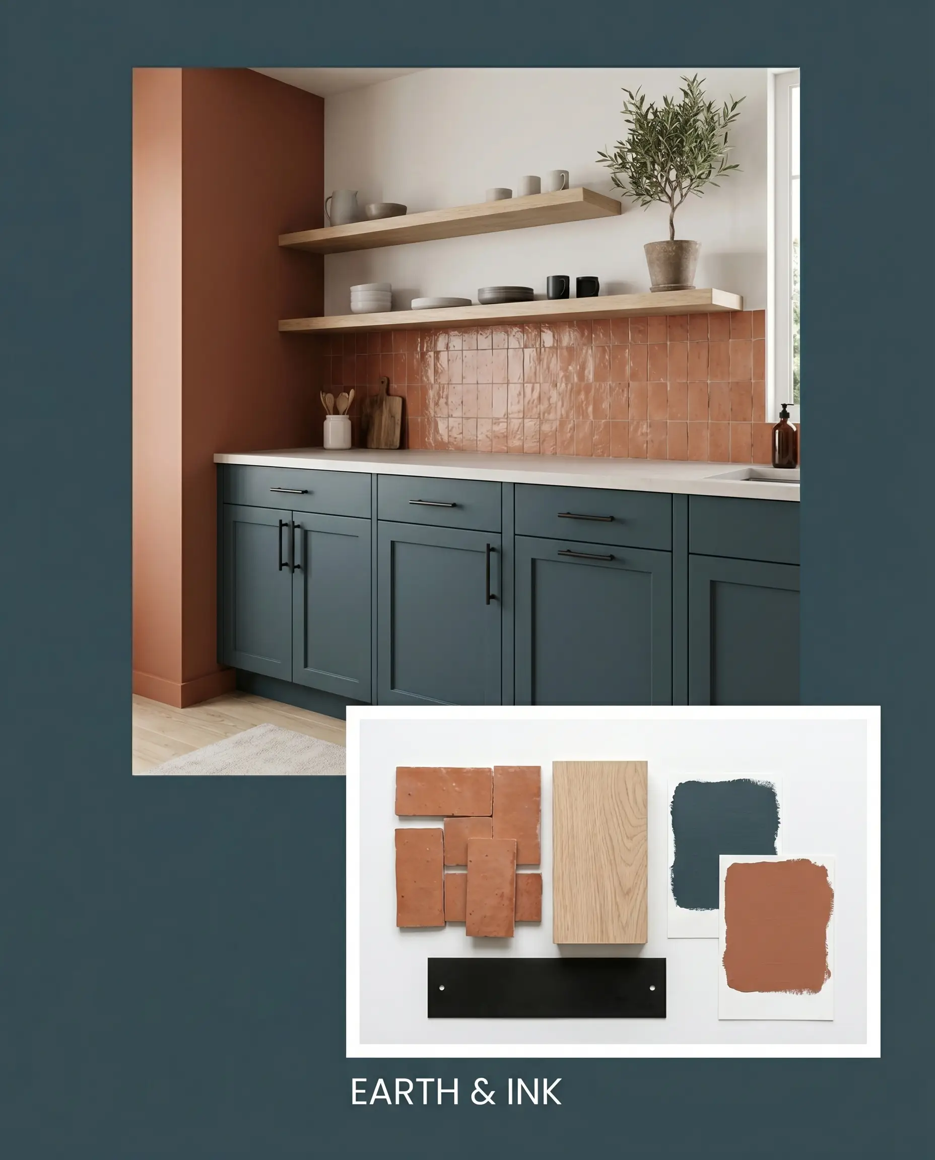
Earth & Ink Pair Behr Nocturne Blue lower cabinets with a backsplash of terracotta zellige tile to bridge the gap between sleek and organic. Introduce Sherwin-Williams Cavern Clay as an adjoining wall color to amplify the earthy energy of the space. Bleached oak floating shelves and matte black iron hardware will keep the modern silhouette incredibly crisp and intentional.
Comparing This Blackened Teal to Rival Dark Paints
There are specific architectural scenarios where a heavy teal undertone will fail your design vision. If you are working in a heavily shaded, north-facing room, you might find that the green base drops out entirely, leaving you with a muddled gray. In these cases, pivoting to a different foundational blue is the safest strategy.
Benjamin Moore Hale Navy HC-154 vs. Behr Nocturne Blue
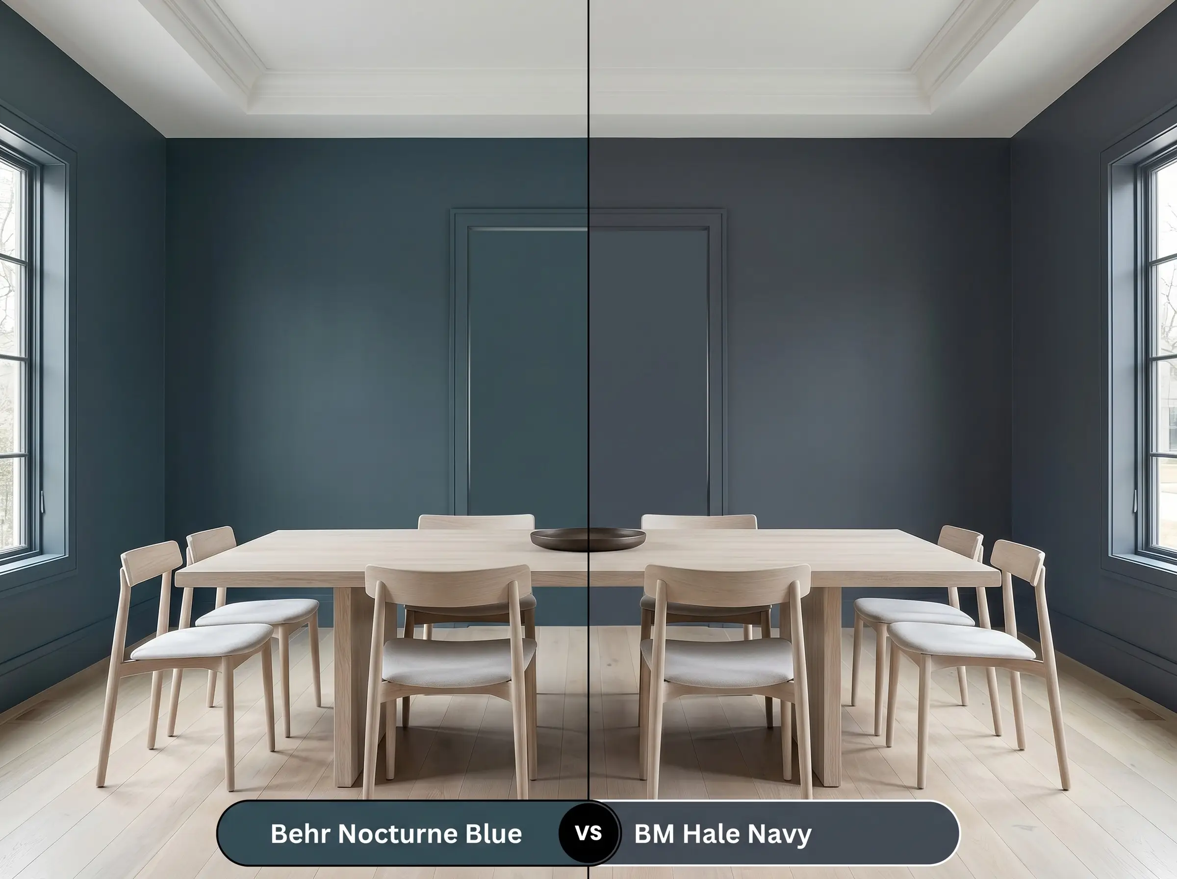
Hale Navy is a true, traditional charcoal-backed blue. If you want a classic nautical feel without any green interference, Benjamin Moore is the clear winner. Behr leans much further into teal, making it feel slightly more modern and daring.
Sherwin-Williams Naval SW 6244 vs. Behr Nocturne Blue
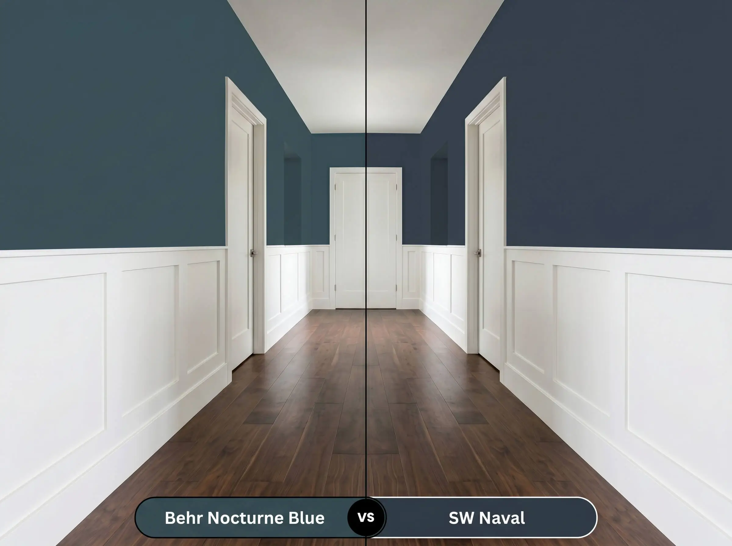
Naval is a vibrant, crisp blue that holds its color beautifully even in dim lighting. Choose Sherwin-Williams when you need a sharper, more energetic backdrop for crisp white wainscoting. Behr is significantly moodier and relies on its green base to create a nightfall aesthetic.
Farrow & Ball Hague Blue No. 30 vs. Behr Nocturne Blue
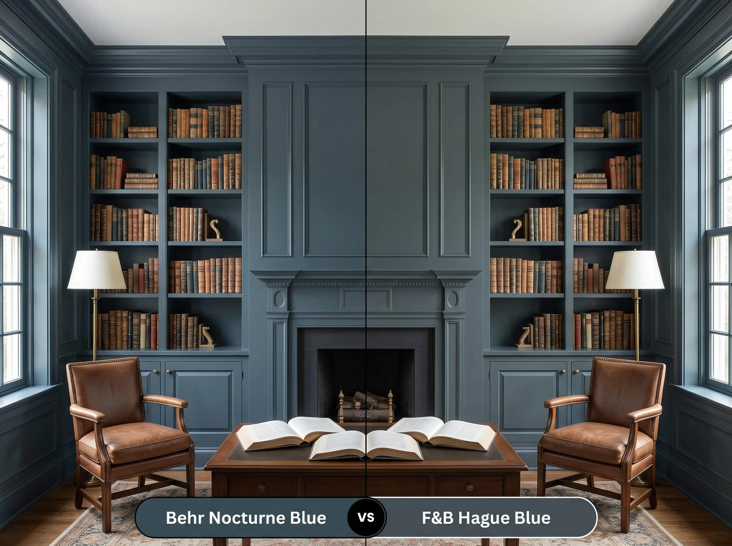
Hague Blue shares a very similar green undertone but carries a slightly more muted, historic finish. Opt for Farrow & Ball if you want a softer, more aged aesthetic that feels naturally worn over time. Behr offers a slightly more saturated, immediate punch of color.
Alternative Shades & Brand Matches
Sometimes a color is almost perfect, but you need a slightly different light bounce or a subtle shift in undertone to nail the final look.
Exploring Options Within the Same Brand
Matching Across Different Manufacturers
Execution Strategy for Behr Nocturne Blue
Moving from a paint chip to a fully coated room requires a flawless practical strategy. Dark, light-absorbing colors are notoriously unforgiving of sloppy roller work.
Selecting the Perfect Finish
Prepping the Canvas
You must start with a high-quality, tinted gray primer. Rolling dark teal directly over a standard white primer will force you into painting four or five coats to achieve true opacity.
Avoiding Common Application Pitfalls
Expect to apply at least two generous coats for a professional, seamless result. If you let the roller dry out mid-wall, you will experience “flashing,” which leaves highly visible, uneven streaks across the surface.
Always keep your roller fully loaded and maintain a wet edge as you work across the wall. Touching up a dry, dark wall later will almost always leave a noticeable, shiny patch that ruins the smooth finish.
Hackrea Pro-Tip (The Wet Edge Strategy)
Frequently Asked Questions
Because of its intense light absorption, dark colors on exteriors will naturally fade faster than light neutrals. However, applying a premium satin exterior finish will protect the pigment from UV rays while allowing the intense south-facing sun to beautifully highlight the hidden teal notes.
Its low reflectance value actually makes it a brilliant choice for a home theater. By painting the walls and the low ceiling in this continuous dark shade, you blur the sharp corners of the room, which visually pushes the ceiling higher and creates an immersive viewing experience.
Instead of making the small space feel cramped, wrapping a windowless room in this deep hue creates a profound sense of intimacy and jewel-box sophistication. The lack of natural light allows the color to act as a dramatic, moody backdrop for glowing wall sconces and reflective mirrors.
It can be a challenging pairing. The green undertone in the paint sits opposite the orange-red tones of the oak on the color wheel, which highlights the redness in the wood. To bridge this gap, lay down a textured, neutral rug in jute or cream to separate the two surfaces visually.
The Final Verdict on This Saturated Hue
Behr Nocturne Blue is a brilliant, transformative tool for homeowners who want to inject profound depth into standard spaces. It performs exceptionally well when used to ground custom built-ins, wrap a moody bedroom, or modernize a suburban exterior. This color rewards those who embrace intentional contrast and premium tactile styling, proving that dark paint is the ultimate architectural upgrade.
However, this blackened teal is not a universal solution for every home. If you have extensive cherry wood cabinetry or floors with a strong orange-red stain, this paint will actively compete with those warm tones. The red in the wood and the green in the paint sit opposite each other on the color wheel, which creates an uncomfortable visual tension that muddies the room’s energy. Stick to bleached woods, crisp whites, or dark walnut to ensure this sophisticated color retains its high-end integrity.