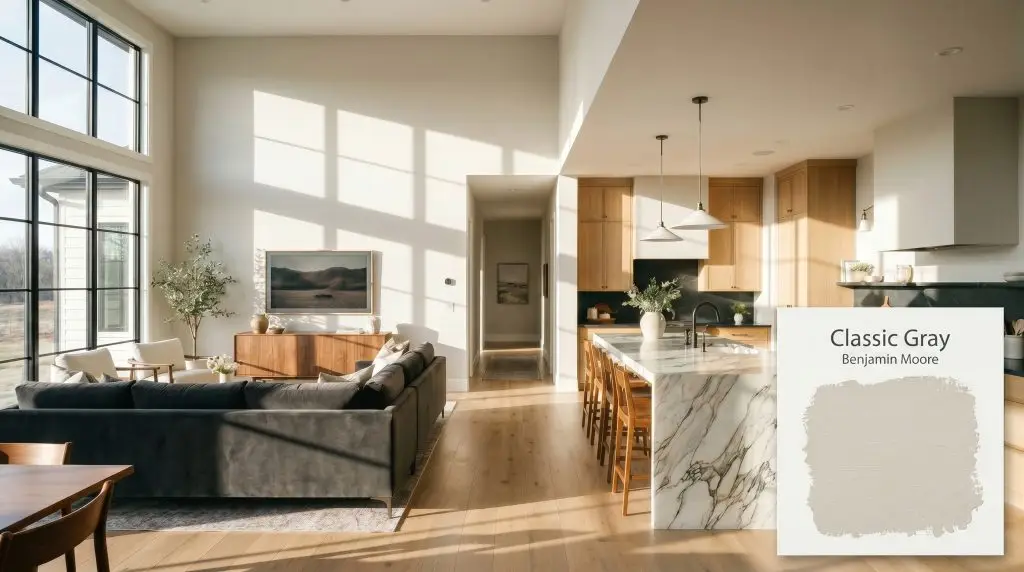
Benjamin Moore Classic Gray (OC-23) is a highly versatile, warm light gray that straddles the line between off-white and greige. With an LRV of 73.67, it reflects ample light, providing a soft, sophisticated neutral backdrop without feeling cold or stark.
Will Classic Gray clash with your room?
Paint Technical Profile
| Color ID / SKU | OC-23 |
| HEX Code | #E3E0D7 |
| Light Reflectance (LRV) | 73.67 |
| Use | Interior, Exterior |
| Best Exposures | South, West, East |
| Best For | Open-concept living areas, primary bedrooms, hallways, whole-house neutral |
Benjamin Moore Classic Gray: A Luminous, Color-Shifting Foundation
When you are trying to unify a sprawling, multi-room floor plan, finding a neutral that doesn’t feel overly heavy or starkly cold is a massive design challenge. Benjamin Moore Classic Gray OC-23 steps in as the perfect architectural bridge for these wide-open spaces.
This beloved shade from the off-white collection offers just enough pigment to anchor your walls while bouncing incredible light throughout the home. We rely on this warm gray to create a beautifully tailored envelope that allows your furnishings and daily life to take center stage.
Benjamin Moore Classic Gray: Undertones & LRV
If you are struggling to choose between warm and cool grays, Classic Gray OC-23 lands definitively on the warm side. It establishes a comforting, subtle warmth that prevents large rooms from feeling icy or clinical.
With a light reflectance value of 73.67, this shade sits right on the edge between a true light gray and a creamy off-white. This specific depth means it absorbs very little light, visually expanding tight corners while still providing enough contrast to make stark white trim pop.
Lighting Effects & The Chameleon Factor
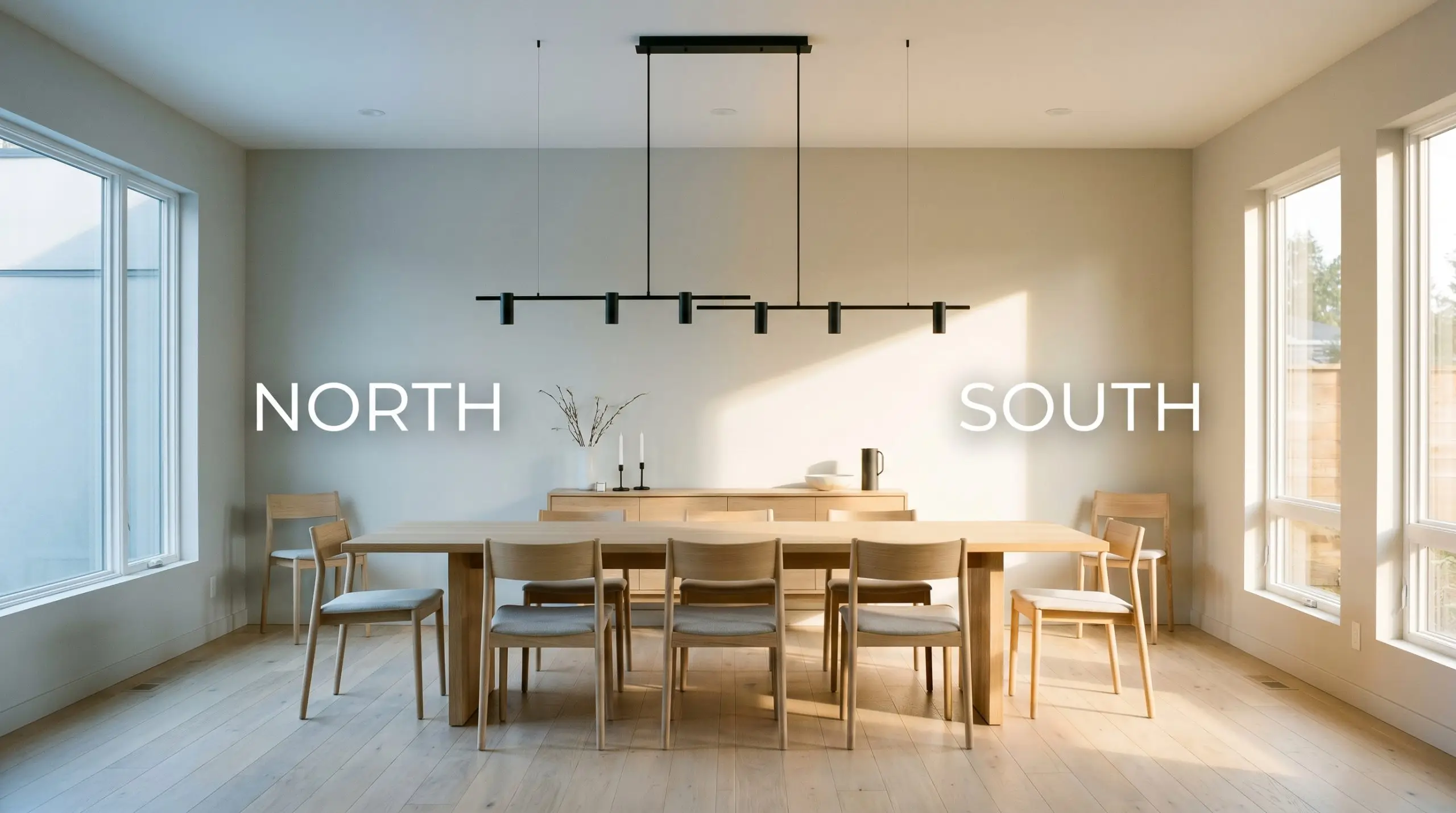
Because this shade occupies such a delicate space on the color wheel, its final appearance is heavily dictated by the sun. The biggest risk with this hue is placing it in a deeply shaded, northern exposure where the lack of light can pull forward a flat, unintended violet cast. Always test large swatches on multiple walls to see how it shifts throughout the day.
Transforming Everyday Spaces
This versatile neutral possesses an innate ability to bring cohesive energy to an entire home. Its subtle pigmentation demands environments where it can breathe, acting as a grounding force that adapts effortlessly to both bustling family hubs and restful retreats.
Open-Concept Living Areas
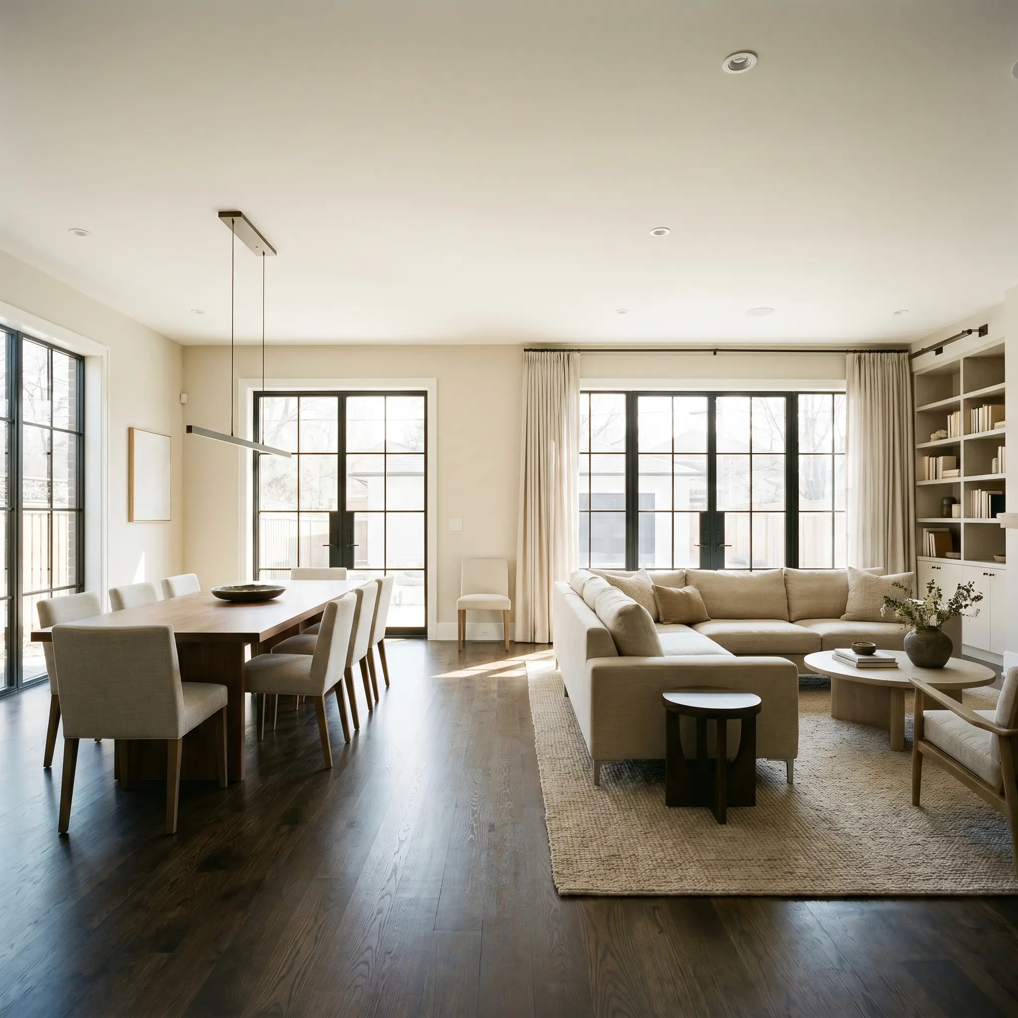
When dealing with sweeping floor plans, this shade acts as the ultimate unifier. It is consistently ranked among the best greige paint colors for expansive layouts because it prevents the architecture from feeling cavernous. It provides a stunning backdrop for a plush charcoal velvet sofa, but also grounds warm walnut media consoles beautifully. You can easily transition from a sleek, minimalist aesthetic in the dining zone to a cozy, layered transitional vibe in the seating area without ever changing the wall color.
Will Classic Gray work with your specific lighting, floor, or furniture?
Primary Bedrooms
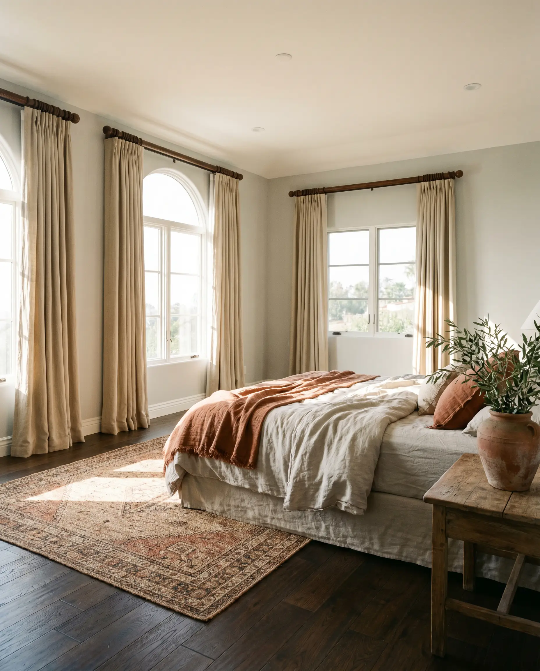
In personal retreats, this soft hue wraps the space in a calming, restorative energy. It pairs exceptionally well with heavy, textured linen drapery and rich, dark-stained hardwood floors. Whether you are aiming for a breezy Mediterranean villa feel with terracotta accents or a tailored, classic American aesthetic with crisp white wainscoting, the walls will quietly support your vision.
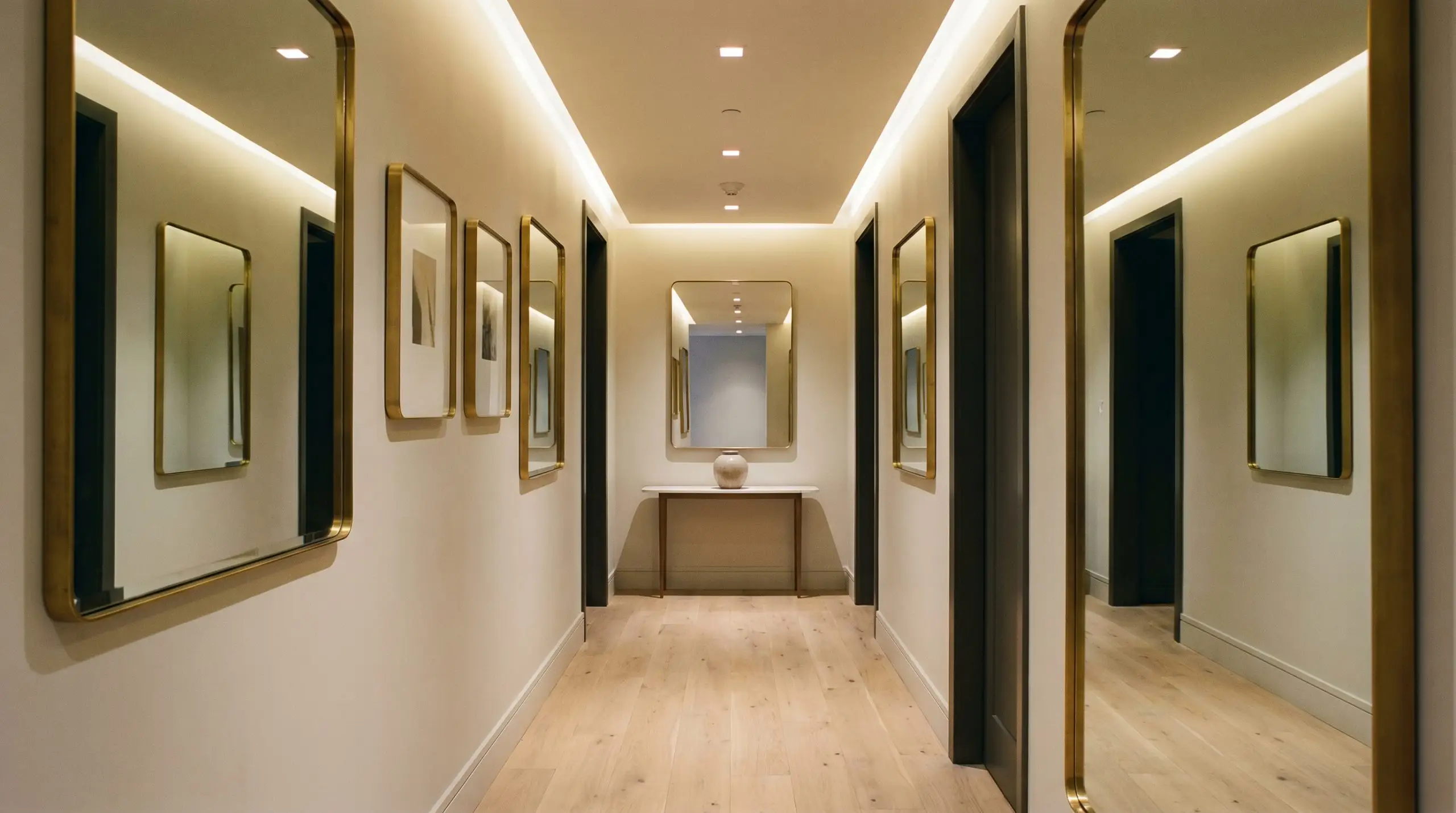
Hallways and Windowless Corridors
Narrow transitional spaces often suffer from a lack of natural illumination, making heavy colors feel oppressive. This high-LRV neutral illuminates these tight passages, bouncing whatever ambient light is available to widen the visual footprint.
To maximize the brightening effect of this neutral in a windowless corridor, hang generously sized, brass-framed mirrors opposite your light sources to bounce the illumination artificially.
Hackrea Design Secret (Lighting Manipulation):
Kitchen Walls
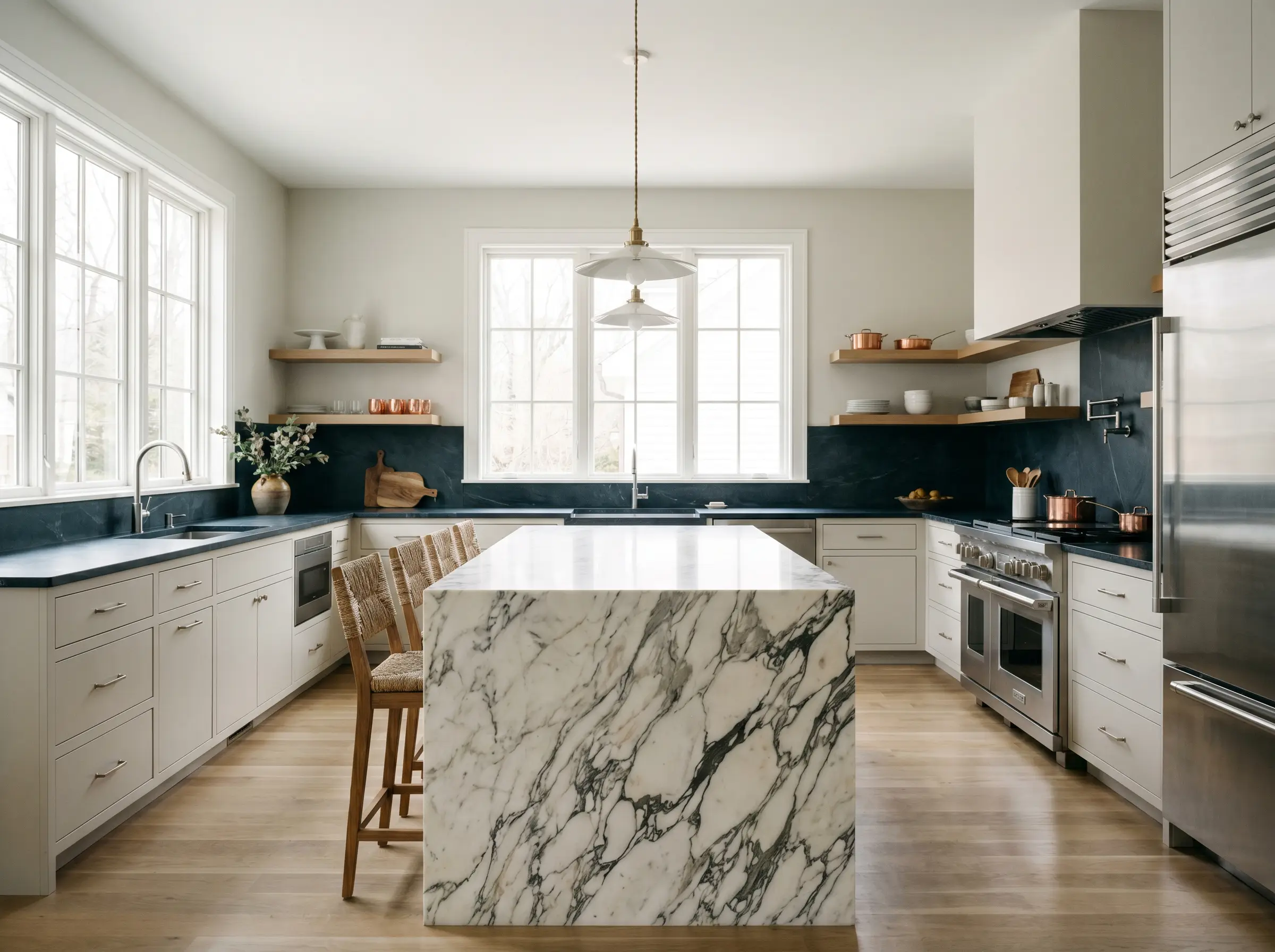
As a wall color in culinary spaces, it offers a sophisticated alternative to clinical whites. It beautifully complements dark, moody soapstone counters or heavily veined marble islands. The gentle warmth of the walls bridges the gap between sleek stainless steel appliances and rustic, floating timber shelves, allowing you to blend modern and traditional elements seamlessly.
Unique Design Ideas for Classic Gray OC-23
Beyond standard whole-house color applications, this chameleon-like neutral offers incredible potential for highly curated, unexpected design moments.
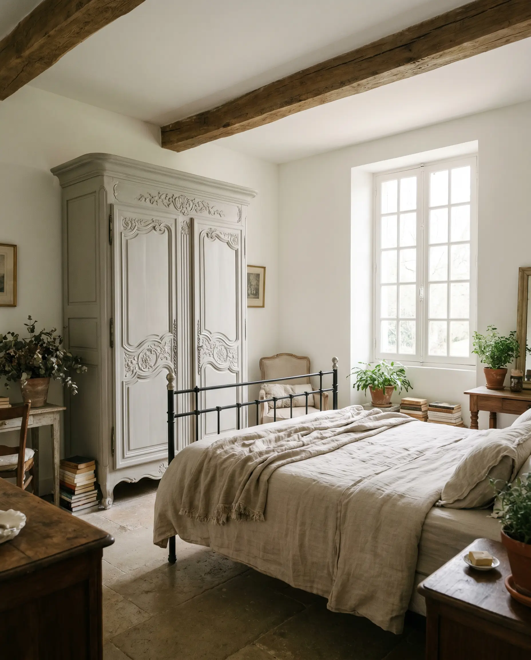
The Two-Tone Vintage Armoire
Will Classic Gray work with your specific lighting, floor, or furniture?
Upcycling heavy, outdated furniture requires a color that feels intentional and fresh. Coating a massive, ornate wooden armoire in this glowing greige instantly modernizes its heavy silhouette. The soft undertones highlight intricate carvings without feeling stark, creating a stunning focal point for a relaxed, French country-inspired guest suite.
A Serene Yoga Retreat
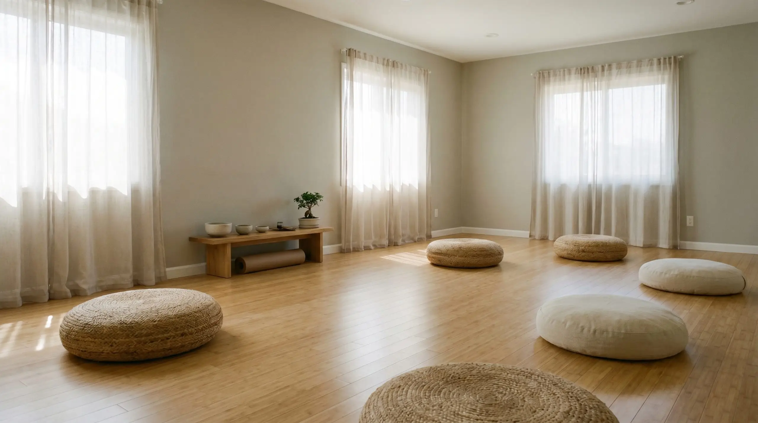
For a dedicated wellness room or home studio, the walls need to promote focus and tranquility. This shade provides a soft, non-distracting envelope that feels incredibly grounding. Paired with light bamboo flooring, oversized woven floor cushions, and sheer cotton panels, the room transforms into a deeply restorative sanctuary.
The Elegant Mudroom Drop Zone
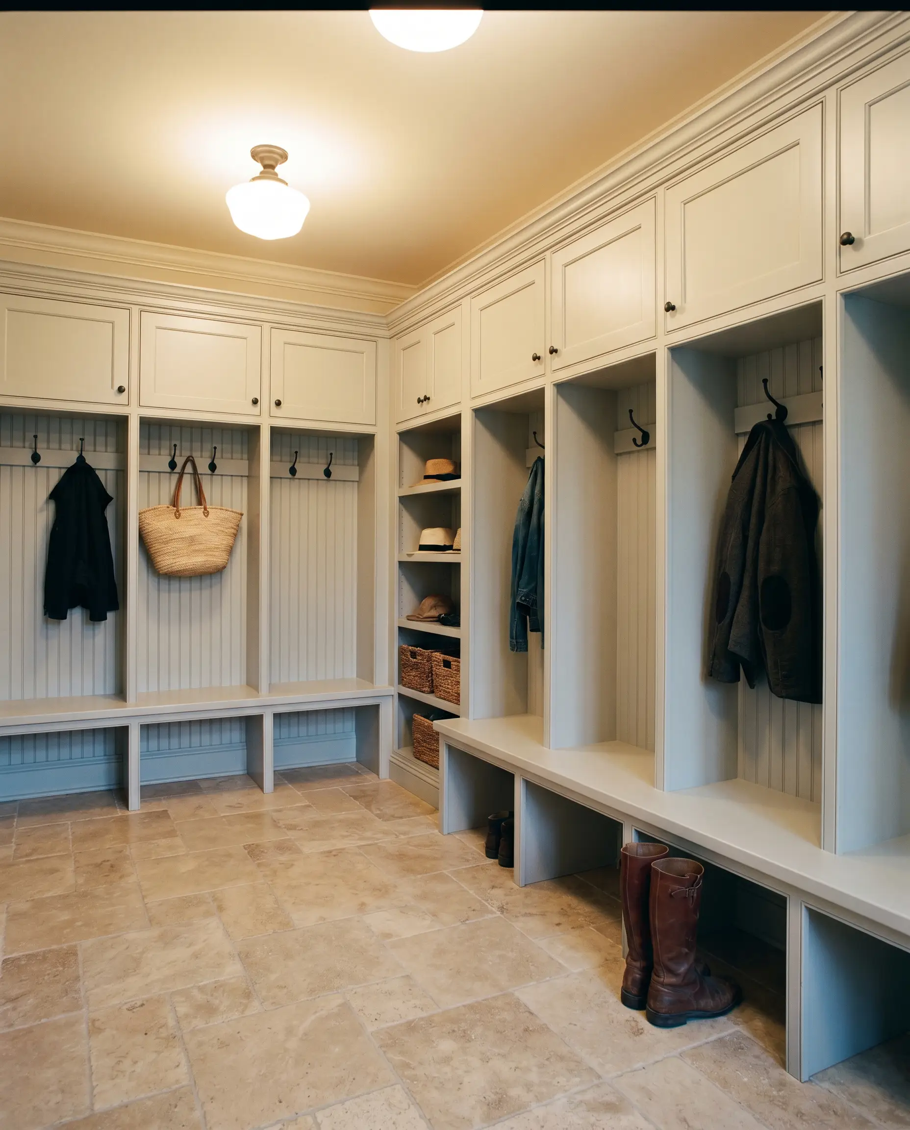
Utilitarian spaces do not have to sacrifice premium aesthetics. Using this durable neutral on custom mudroom lockers and beadboard paneling elevates a high-traffic drop zone. If your mudroom lacks natural light, ensure your overhead fixtures use warm 3000K bulbs to prevent the cabinetry from looking dingy and cold.
If your mudroom lacks natural light, ensure your overhead fixtures use warm 3000K bulbs to prevent the cabinetry from looking dingy and cold.
Hackrea Pro-Tip (Lighting Strategy)
Coordinating Colors & Best Pairings
To make this subtle neutral truly sing, it requires highly intentional styling. It thrives when bordered by crisp, high-contrast boundaries that frame its gentle warmth.
Trim & Baseboards
To amplify the subtle pigmentation of the walls, you need a trim color that provides a clean, tailored boundary.
Hardware, Wood & Material Pairings
Coordinating Colors
Designer Mood Boards
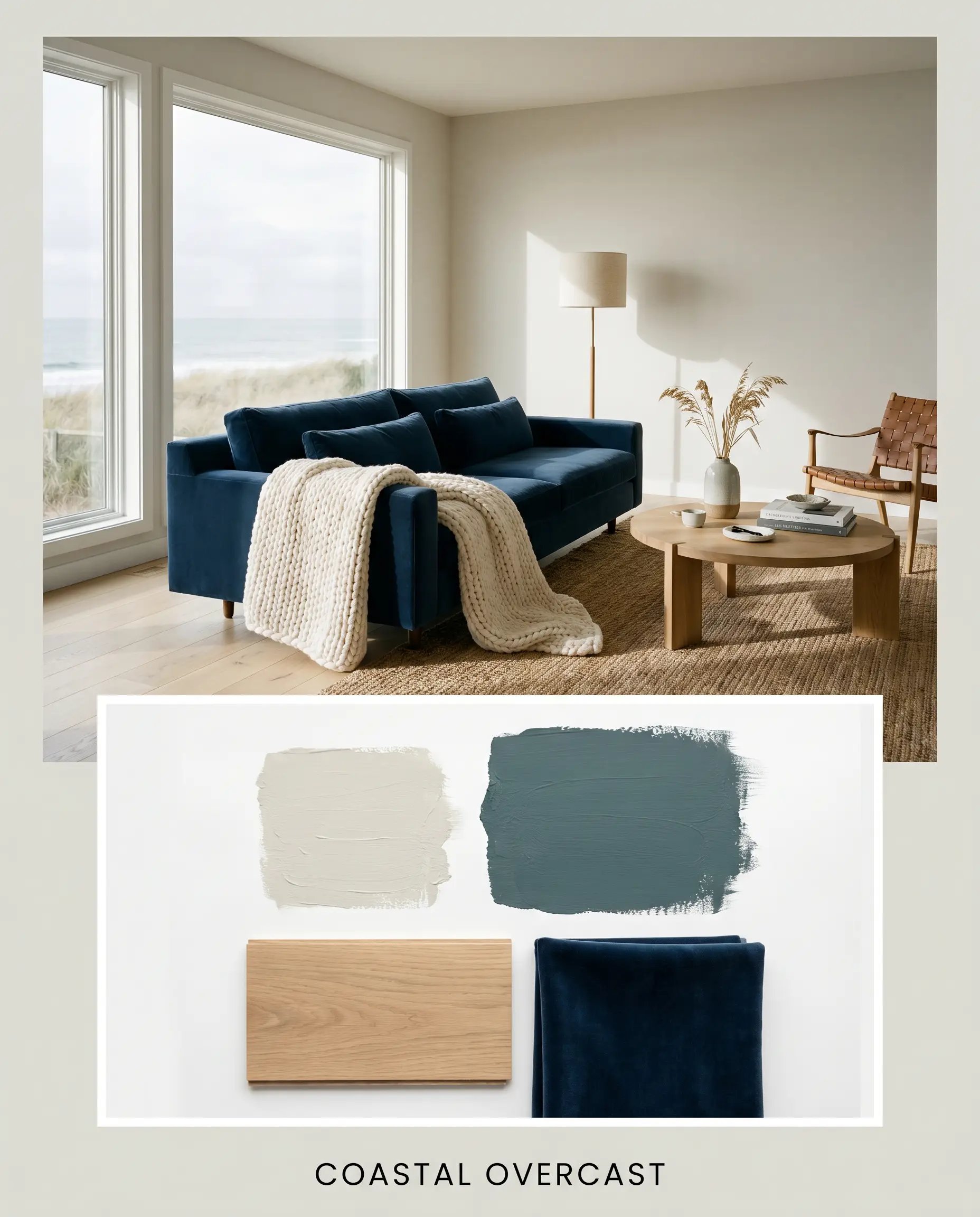
Coastal Overcast: This palette relies on the tension between the luminous walls and the deep, stormy weight of Inchyra Blue No. 289. Imagine the light greige walls framing a plush navy velvet sofa, grounded by a faded, vintage-inspired blue rug. The addition of wide-plank white oak floors and a chunky, hand-knit ivory throw creates a relaxed, breezy atmosphere that feels effortlessly upscale.
Will Classic Gray work with your specific lighting, floor, or furniture?
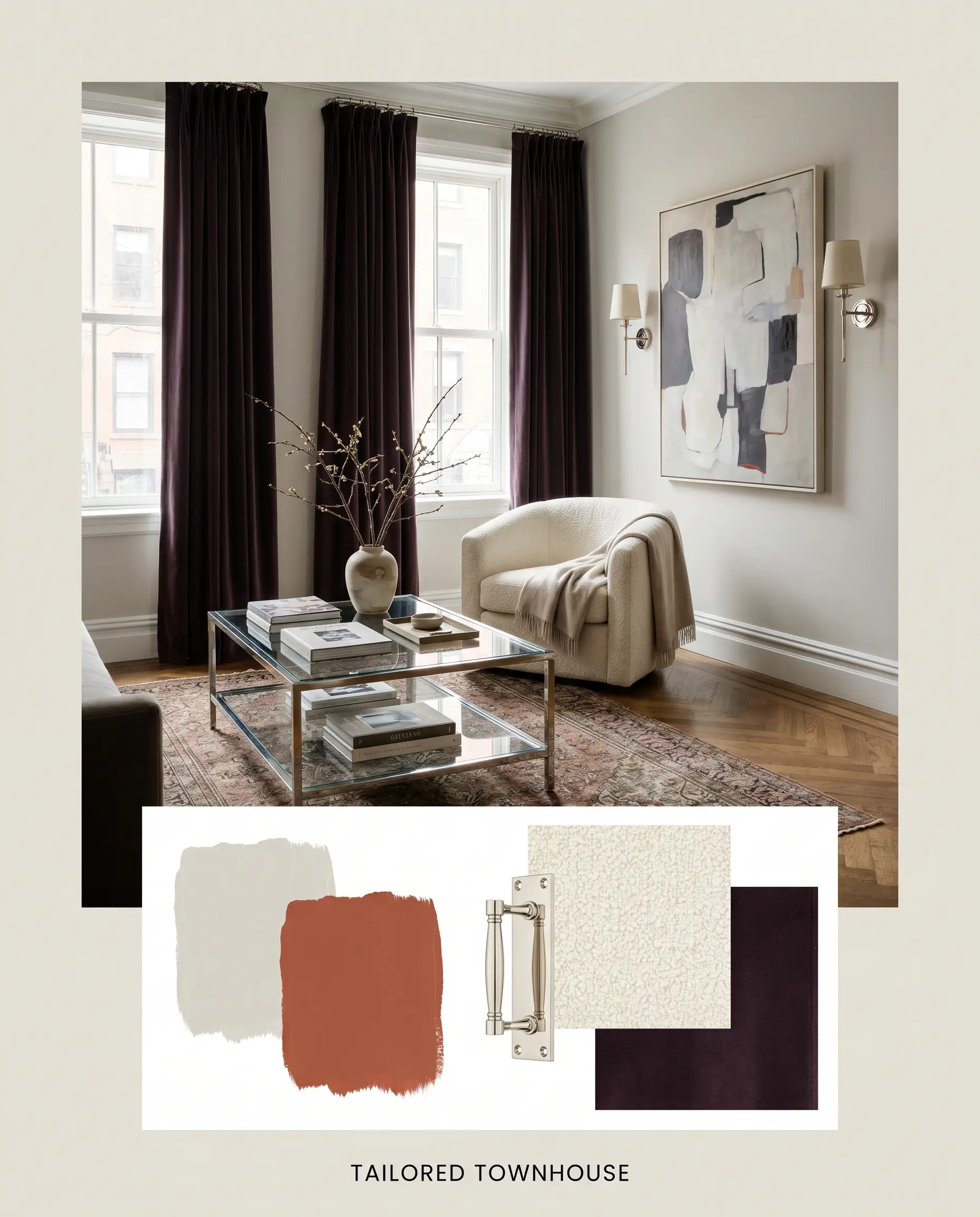
Tailored Townhouse: A study in sophisticated contrast, this board pairs the main wall color with the rich, dramatic depth of Carnelian SW 7580. Imagine heavy, dark plum drapery framing tall windows, accented by gleaming polished nickel sconces that bounce warm light across the room. A sleek, glass-topped coffee table and a structured cream bouclé armchair complete this highly curated, cosmopolitan energy.
Will Classic Gray work with your specific lighting, floor, or furniture?
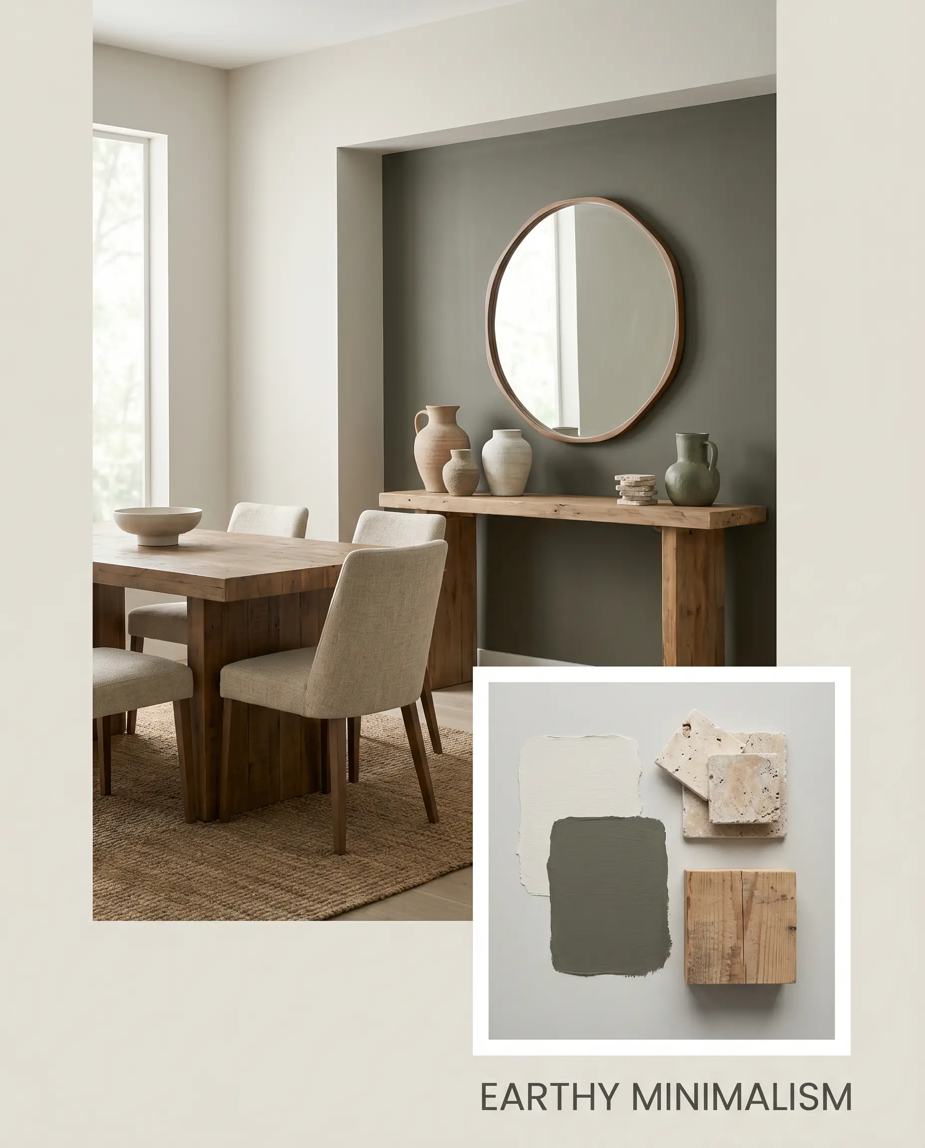
Earthy Minimalism: Grounded by the organic depth of Dark Olive 2140-30, this vibe feels incredibly serene and connected to nature. The soft walls provide a quiet backdrop for a deep olive-green accent wall or painted cabinetry. Styled with tumbled travertine coasters, a raw timber console table, and a cluster of handmade ceramic vases, the space feels deeply tactile and restorative.
Head-to-Head Paint Comparisons
Choosing the perfect whole-house color often comes down to microscopic differences in pigment. If your specific lighting conditions or existing architectural elements are clashing with our featured shade, one of these rivals might be the superior choice.
Benjamin Moore Classic Gray OC-23 vs. Benjamin Moore Pale Oak OC-20
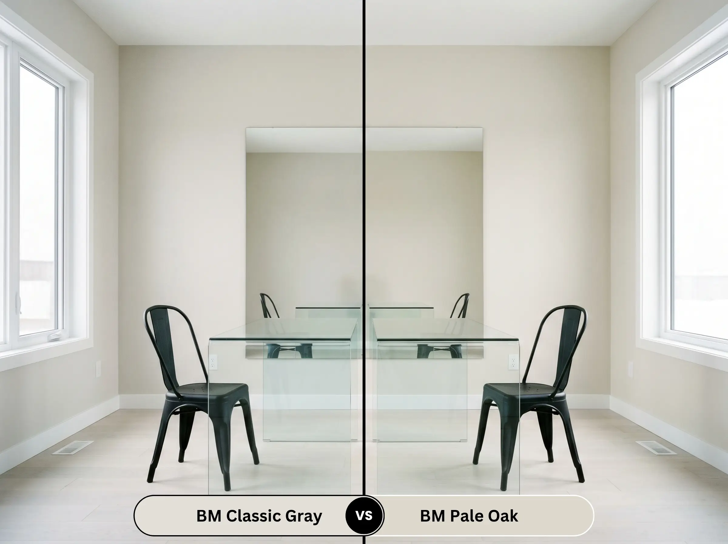
If your room receives an abundance of cool, northern light, Pale Oak OC-20 might be the better candidate. It carries slightly more depth and a more pronounced taupe undertone, which prevents it from washing out or looking icy in shadowy spaces.
Benjamin Moore Classic Gray OC-23 vs. Benjamin Moore Balboa Mist OC-27
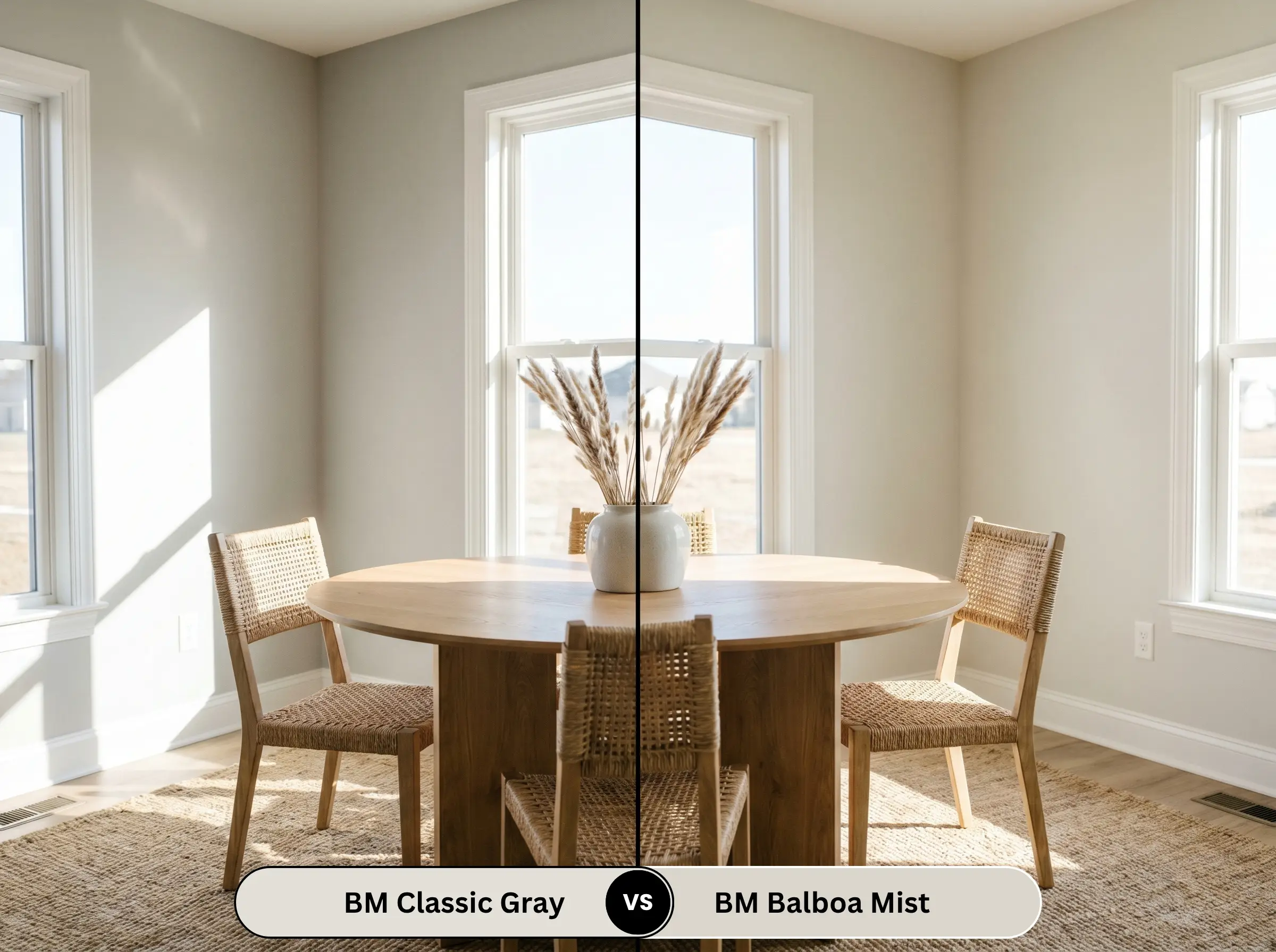
Will Classic Gray work with your specific lighting, floor, or furniture?
Balboa Mist OC-27 leans distinctly more into a true gray profile with a slightly lower light reflectance. If you are worried about your walls looking too beige or creamy in direct southern sunlight, Balboa Mist provides a cooler, more shaded alternative that resists turning yellow.
Benjamin Moore Classic Gray OC-23 vs. Benjamin Moore Edgecomb Gray HC-173
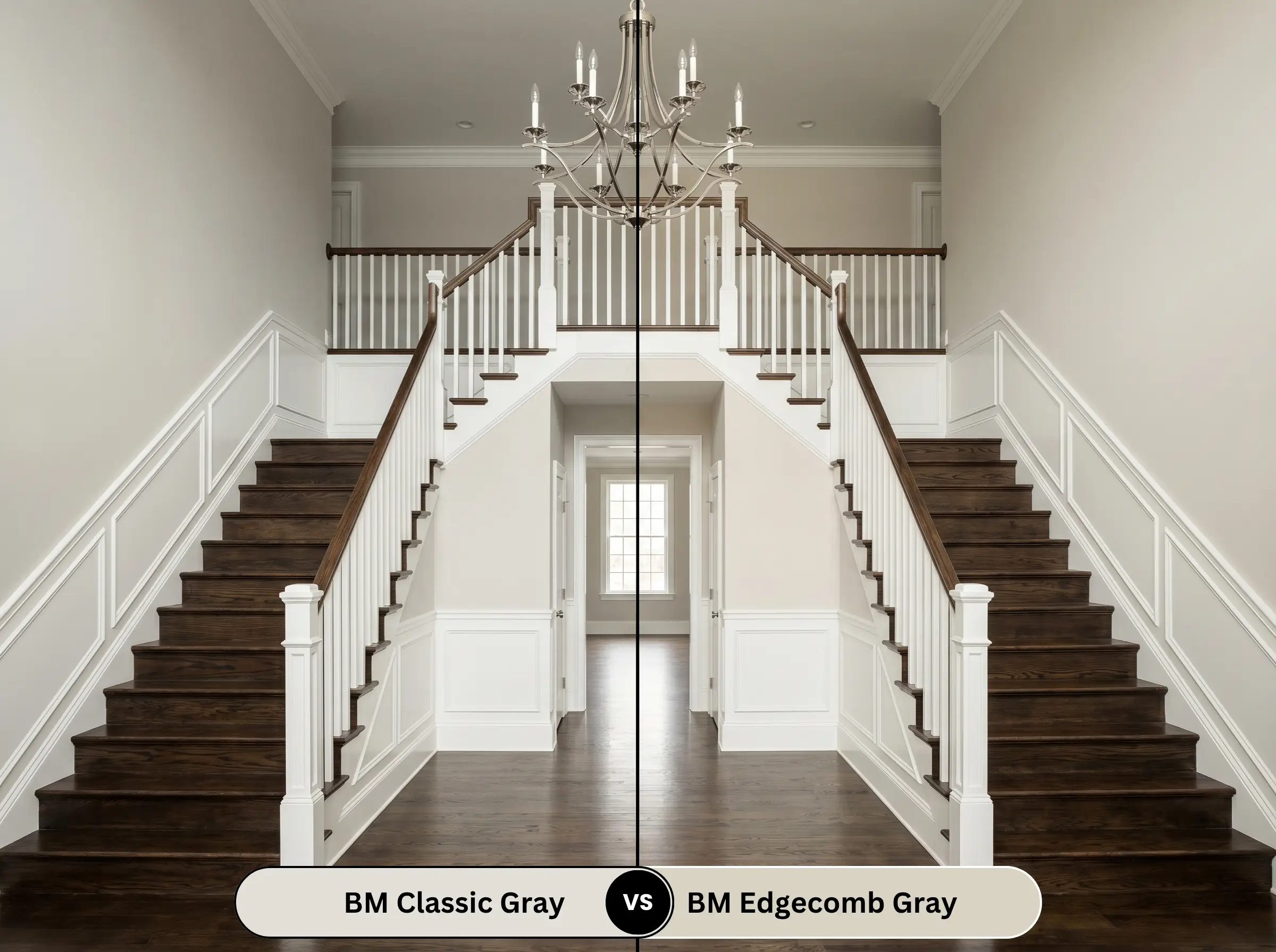
Edgecomb Gray HC-173 is significantly deeper and much warmer, acting as a true, undeniable greige. If your massive open-concept layout feels too stark and you need a color with enough visual weight to visually pull the walls inward for a cozier feel, Edgecomb Gray is the stronger option.
Benjamin Moore Classic Gray OC-23 vs. Sherwin-Williams Agreeable Gray SW 7029
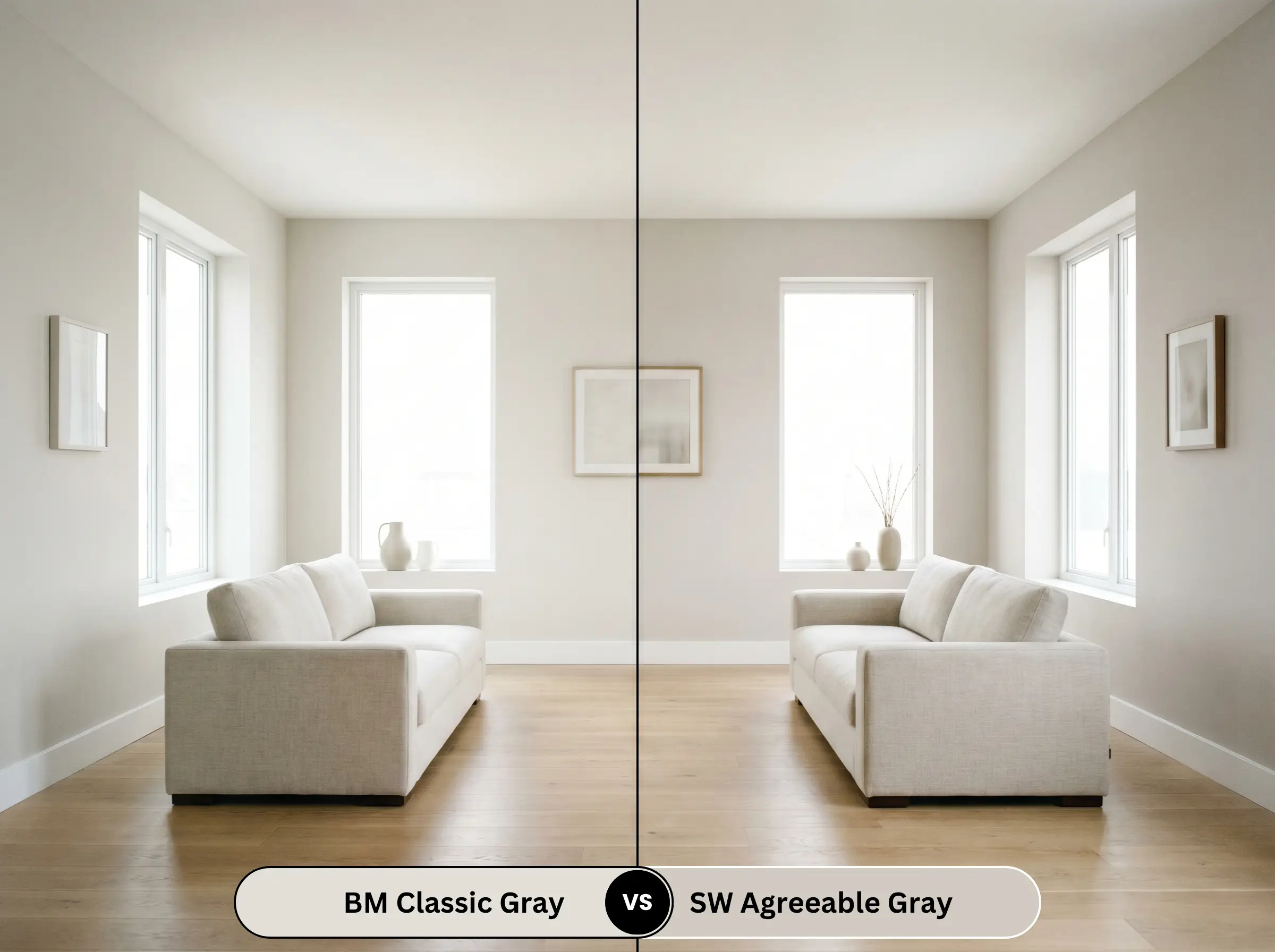
Agreeable Gray SW 7029 is a powerhouse neutral with a notably lower light reflectance and a firmer taupe-gray presence. If you have very bright, unmitigated natural light that washes out lighter off-whites, Agreeable Gray holds its ground and maintains a definitive contrast against white trim.
Exploring Similar Colors & Matches
Whether you need a shade with just a fraction more visual weight or you are shopping across different manufacturers for local availability, these alternatives offer a similar atmospheric energy.
Same-Brand Alternatives
Cross-Brand Matches
Practical Application & DIY Advice
The Dynamic Sheen Guide
Primer Strategy
Because this is a very light, highly reflective off-white, a high-quality white primer is mandatory if you are transitioning from a dark or heavily saturated wall color. If you are painting over raw wood paneling, you must use a premium stain-blocking primer to prevent yellow tannins from bleeding through and ruining the paint’s delicate undertones.
Coverage & Success Tips
Achieving a truly professional finish with a high-LRV color typically requires two full, generous coats over a properly primed surface. You must maintain a “wet edge” while rolling to avoid visible lap marks and flashing.
Because light off-whites are notorious for showing touch-ups, always paint corner-to-corner rather than trying to patch a small scuff later in the center of the wall.
Hackrea Pro-Tip (The Touch-Up Rule):
Frequently Asked Questions
Because of its yellow-orange base, this shade actually pairs quite elegantly with warm, red-toned woods like cherry. The subtle warmth of the walls bridges the gap, preventing the floors from looking aggressively red while maintaining a cohesive, traditional flow.
The deep shadows created by heavy knockdown textures will dramatically alter how this light color is perceived. The peaks of the texture will catch the light and look creamy, while the recessed valleys will pull out the cooler, shadowy gray tones, creating a highly mottled, dimensional effect.
Under crisp 3500K artificial light with zero natural sunlight, the cozy greige qualities are largely stripped away. The color will flatten out and read as a very clean, straightforward light gray, losing much of its glowing, off-white charm.
This is precisely where this chameleon shade excels. Its gray identity speaks directly to the cool veining in the Carrara marble, while its hidden warmth perfectly complements the glowing brass hardware, making it an ideal unifier for mixed-metal spaces.
Benjamin Moore Classic Gray: Final Verdict & Expert Warnings
Benjamin Moore Classic Gray 1548 is the ultimate architectural chameleon for homeowners who crave a luminous, elegant foundation. It is perfectly suited for expansive open-concept layouts and transitional homes where you want the visual breathing room of an off-white without sacrificing the tailored sophistication of a true gray.
You must exercise extreme caution if your home features heavily yellowed, outdated oak cabinetry or bossy, pink-toned beige carpets. The crisp, subtle nature of this paint will immediately clash with aggressively yellow woods, making the walls look dingy and lifeless by comparison. Furthermore, pairing it with strong pink or fleshy taupe fixed elements will pull out its shadowy violet tones, creating an uncomfortable, disjointed energy that disrupts the cohesive aesthetic you are trying to achieve.
Hackrea Clash Warning:
Room Compatibility & Clashes Diagnoses
Hackrea's reports evaluating the compatibility of Classic Gray in real rooms.North-Facing Kitchen
"Cool northern daylight combined with crisp white subway tile causes this delicate greige to read as shadowy and unintentionally discolored on perimeter cabinetry."
Closest Cross-Brand Equivalents
The absolute closest scientific color matches for Classic Gray across top paint brands.