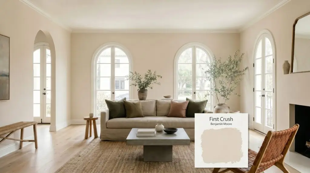
First Crush CSP-310
Benjamin MooreBenjamin Moore First Crush (CSP-310) is a warm, sophisticated off-white neutral with a delicate blush undertone. With an LRV of 71.99, it reflects ample light while providing enough depth to avoid washing out. As a full-spectrum color, it reacts beautifully to changing light throughout the day.
Paint Technical Profile
| Color ID / SKU | CSP-310 |
| HEX Code | #E8DECF |
| Light Reflectance (LRV) | 71.99 |
| Use | Interior |
| Best Exposures | North-Facing, South-Facing |
| Best For | Primary Bedrooms, Windowless Hallways, Living Rooms, Nurseries |
Benjamin Moore First Crush: A Luminous Off-White for Light-Starved Rooms
When you are trying to breathe life into a shadowy, windowless layout, finding a shade that glows without turning overly yellow is a constant challenge. Benjamin Moore First Crush (CSP-310) solves this exact lighting hurdle by bringing an inherent, gentle warmth to the walls. Because it acts as a highly responsive canvas, this interior paint adapts effortlessly to the shifting shadows of an everyday home.
This shade is a premium offering from the Aura Color Stories collection, which means it is crafted entirely without black or gray colorants. This unique formulation allows the color to reflect ambient lighting with incredible clarity, giving your walls a remarkably vibrant, shifting personality throughout the day.
Whether you are anchoring a relaxed, Mediterranean-inspired living room or softening a crisp, contemporary hallway, this dynamic off-white offers a sophisticated foundation. It proves that you do not need stark white walls to achieve a bright, elevated interior.
Undertones & LRV of Benjamin Moore First Crush
Benjamin Moore First Crush is a definitively warm off-white that leans gracefully into a soft, peachy territory. Instead of relying on a standard yellow base, this color is built on a much more complex pigment profile, making it a brilliant option for decorating with blush neutrals without the room feeling juvenile.
With an LRV 71.99, this shade sits comfortably in the light neutral category. It reflects enough light to keep a space feeling open and airy, but it carries just enough depth to clearly stand out against pure white trim. This specific light reflectance value ensures the color maintains its body, preventing it from washing out into a sterile white when hit with overhead lighting.
Ambient Lighting & The Chameleon Effect
Because this is a full-spectrum color, it lacks the grounding presence of black pigment, meaning its chromatic shift is highly sensitive to its environment. The biggest risk with this specific shade is placing it in a room flooded with intense, late-afternoon western sun, which can amplify the red-oxide notes and turn the room intensely pink.
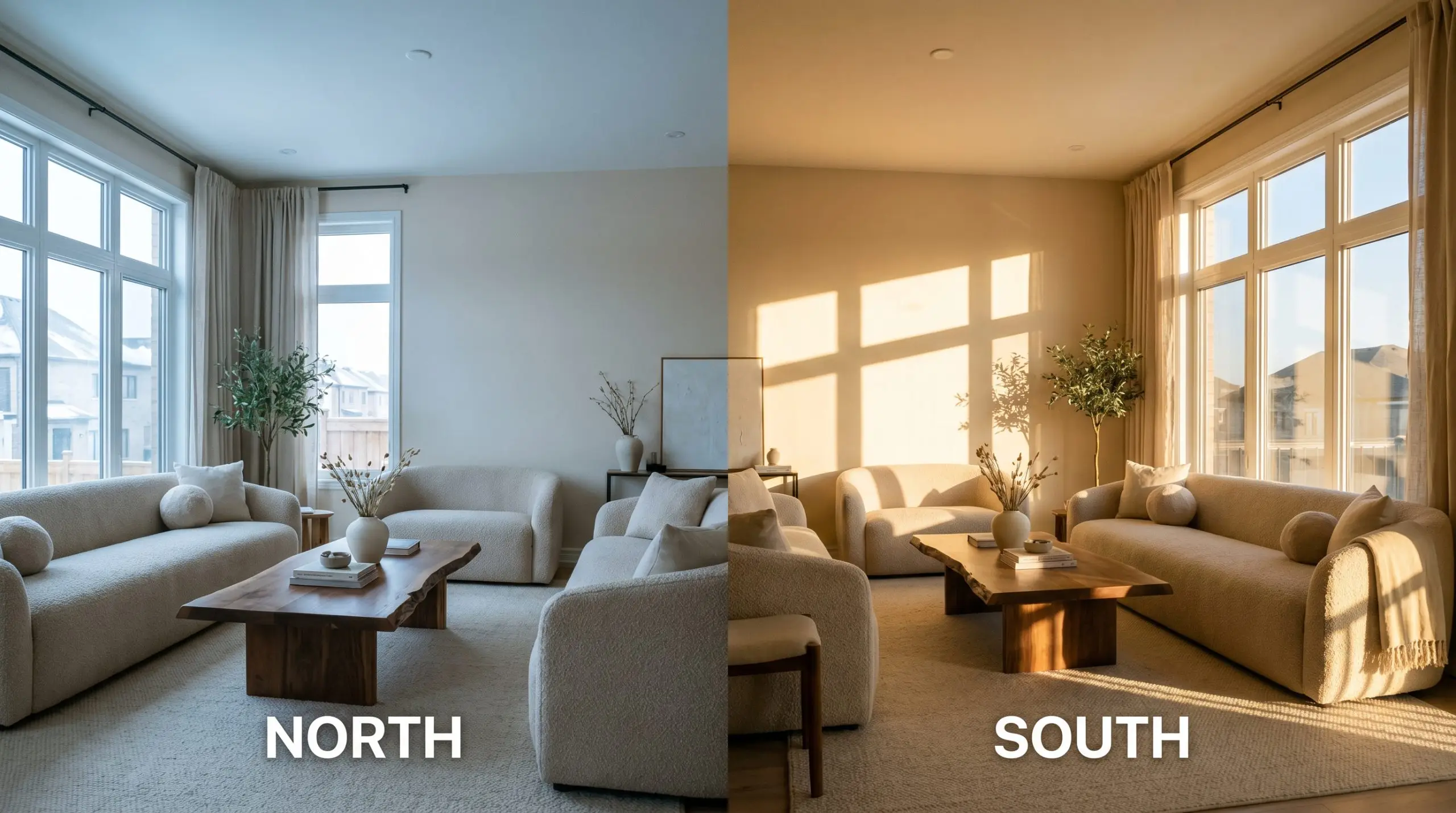
When understanding full-spectrum paint, remember that these colors are essentially mirrors for their environment. Always test your swatches on multiple walls and observe them at 9:00 AM, 2:00 PM, and 8:00 PM to see the true range of the shift.
Hackrea Pro-Tip (The Full-Spectrum Rule)
Where to Use This Luminous Warm Neutral
The inherent energy of this warm neutral brings a sense of quiet joy and tailored softness to a home. It demands an environment where its subtle glow can be appreciated, making it the perfect backdrop for spaces meant to feel restful, intimate, or gently uplifting.
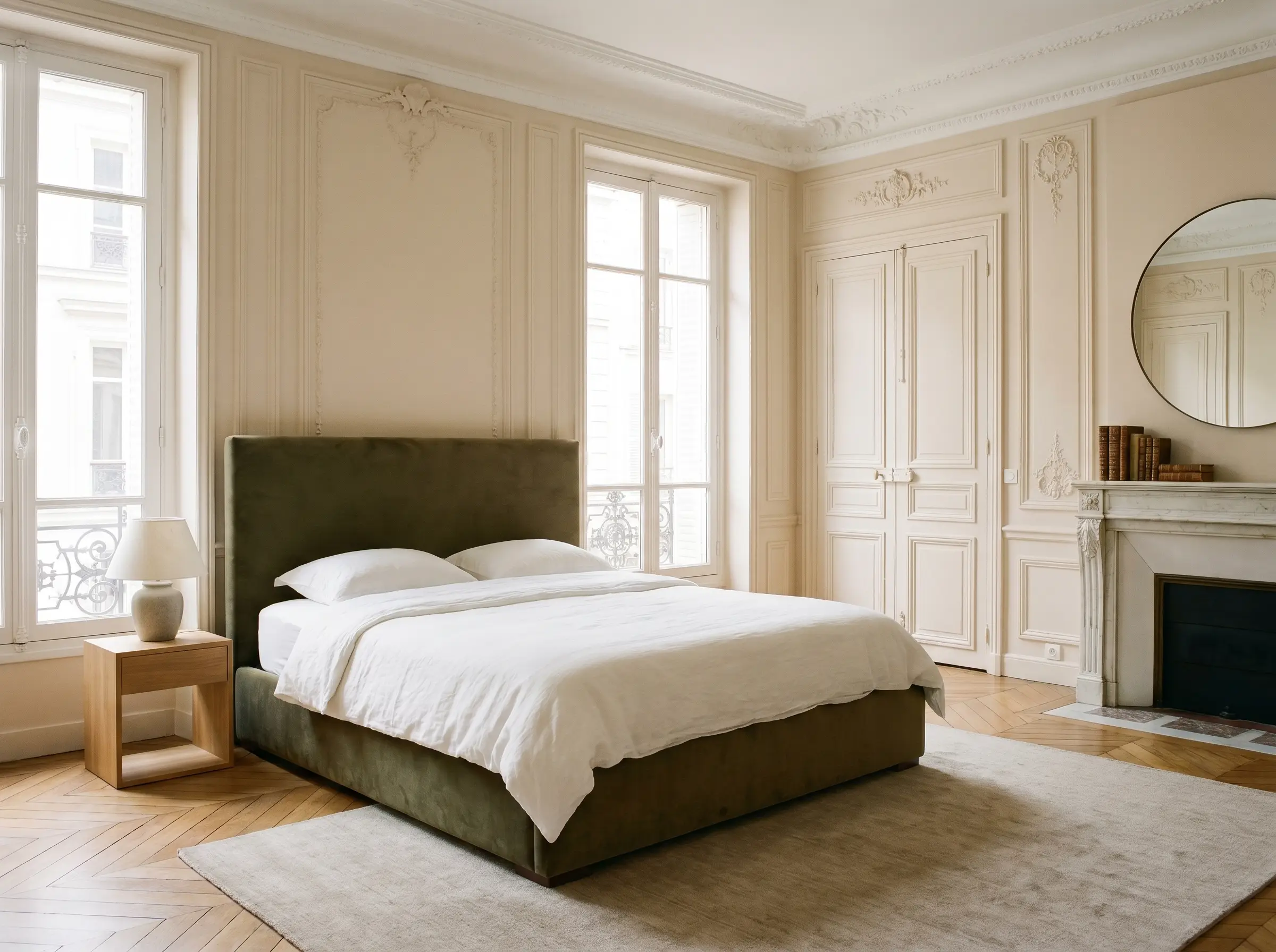
Primary Bedrooms
This shade is brilliant for creating a serene, Parisian-inspired retreat. Its soft warmth pairs effortlessly with ornate wall moldings, providing a gentle contrast that highlights architectural details without feeling heavy. To ground the space, introduce a mix of crisp white linen bedding and a statement headboard in a deep, muted olive green to balance the blushing walls.
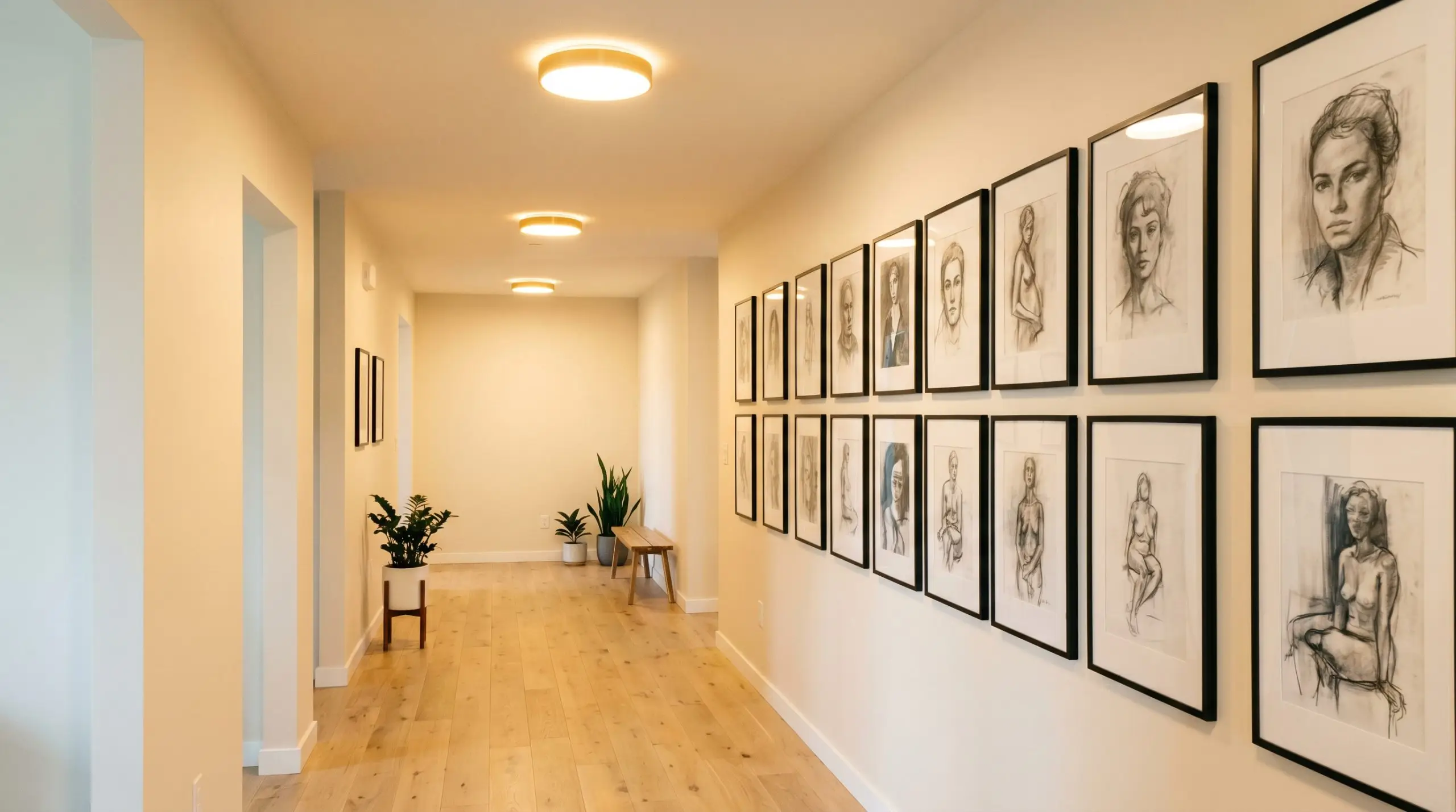
Windowless Hallways
Dark corridors are where this color truly shines. Because it lacks muddy colorants, it bounces whatever ambient light is available down the hall, instantly making the passage feel wider and more inviting. You can easily lean into a transitional aesthetic here by hanging a gallery wall of monochromatic charcoal sketches in simple, modern black frames to add necessary visual weight.
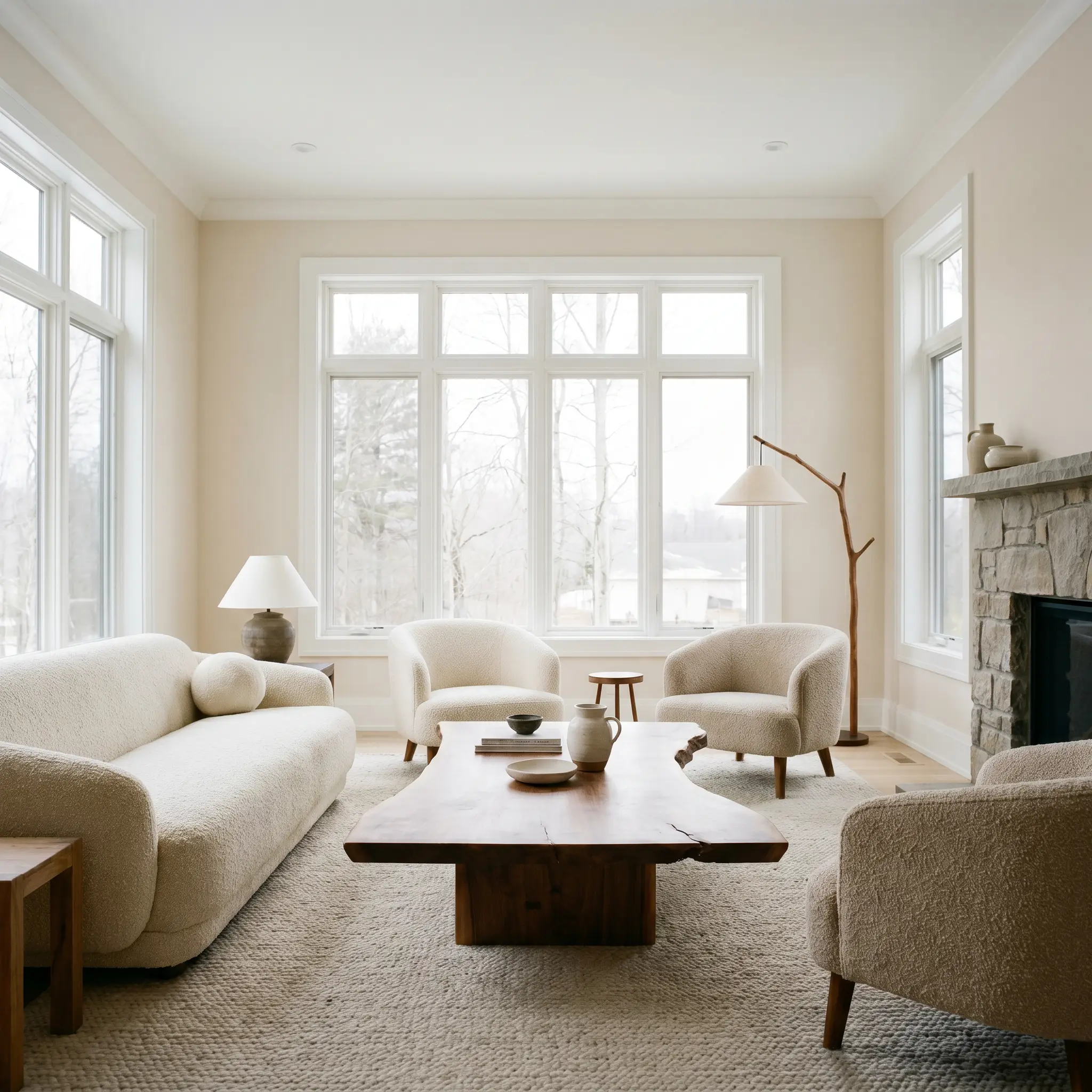
Living Rooms
In a north-facing living space that tends to feel chilly, this paint acts as a subtle thermal layer, warming up the room’s energy. It serves as a beautiful foundation for a Wabi-Sabi aesthetic, where the focus is on natural imperfections and organic shapes. Pair the walls with low-profile, nubby bouclé seating and an oversized, raw-edge walnut coffee table to create a deeply relaxing environment.
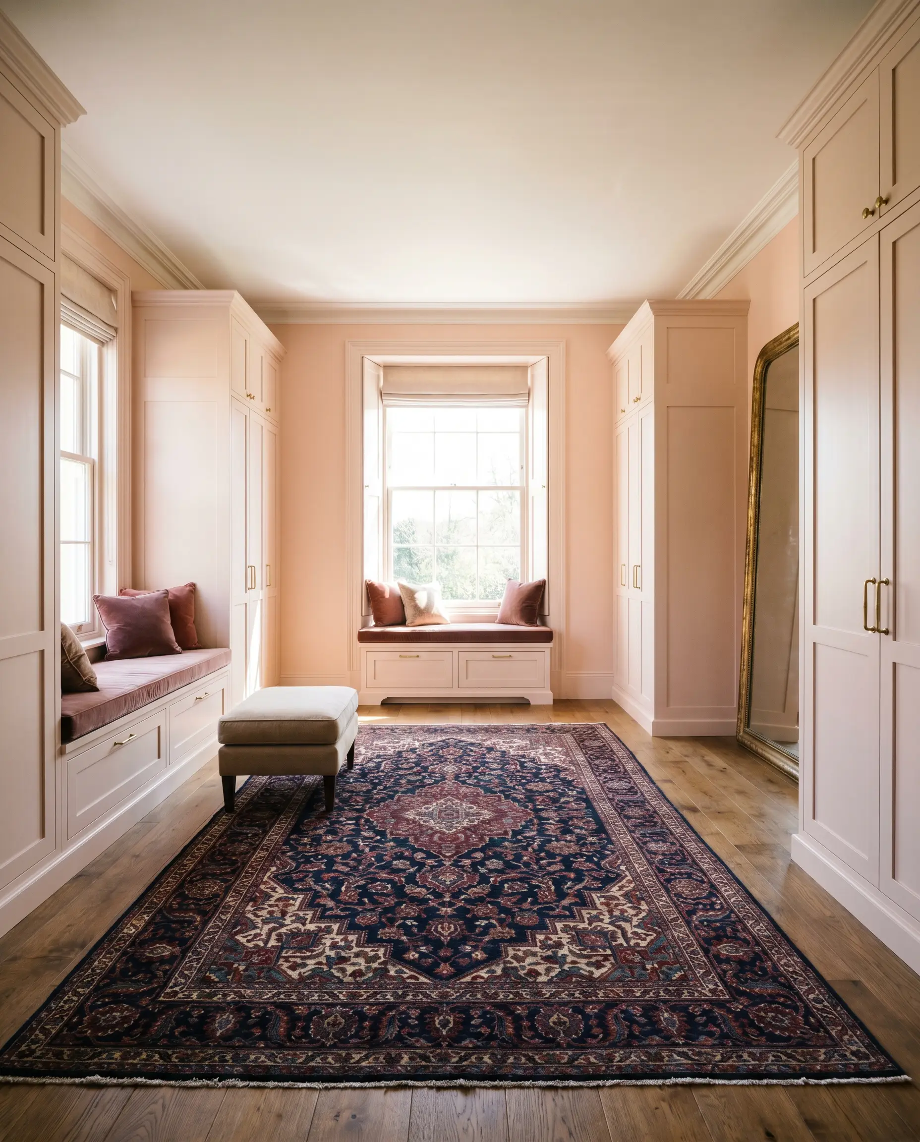
Nurseries and Dressing Rooms
The flattering, peachy-pink undertone makes this an incredibly popular choice for dressing areas and sophisticated nurseries. It casts a beautiful, healthy glow on the skin. For a high-end, classic English Country feel, pair the soft walls with a traditional Persian rug featuring deep navy and subtle burgundy accents, bridging the gap between sweet and stately.
Creative Styling with First Crush CSP-310
Beyond standard wall applications, the unique composition of this paint makes it an incredible tool for highly specific, curated design moments.
The Upcycled Vintage Armoire
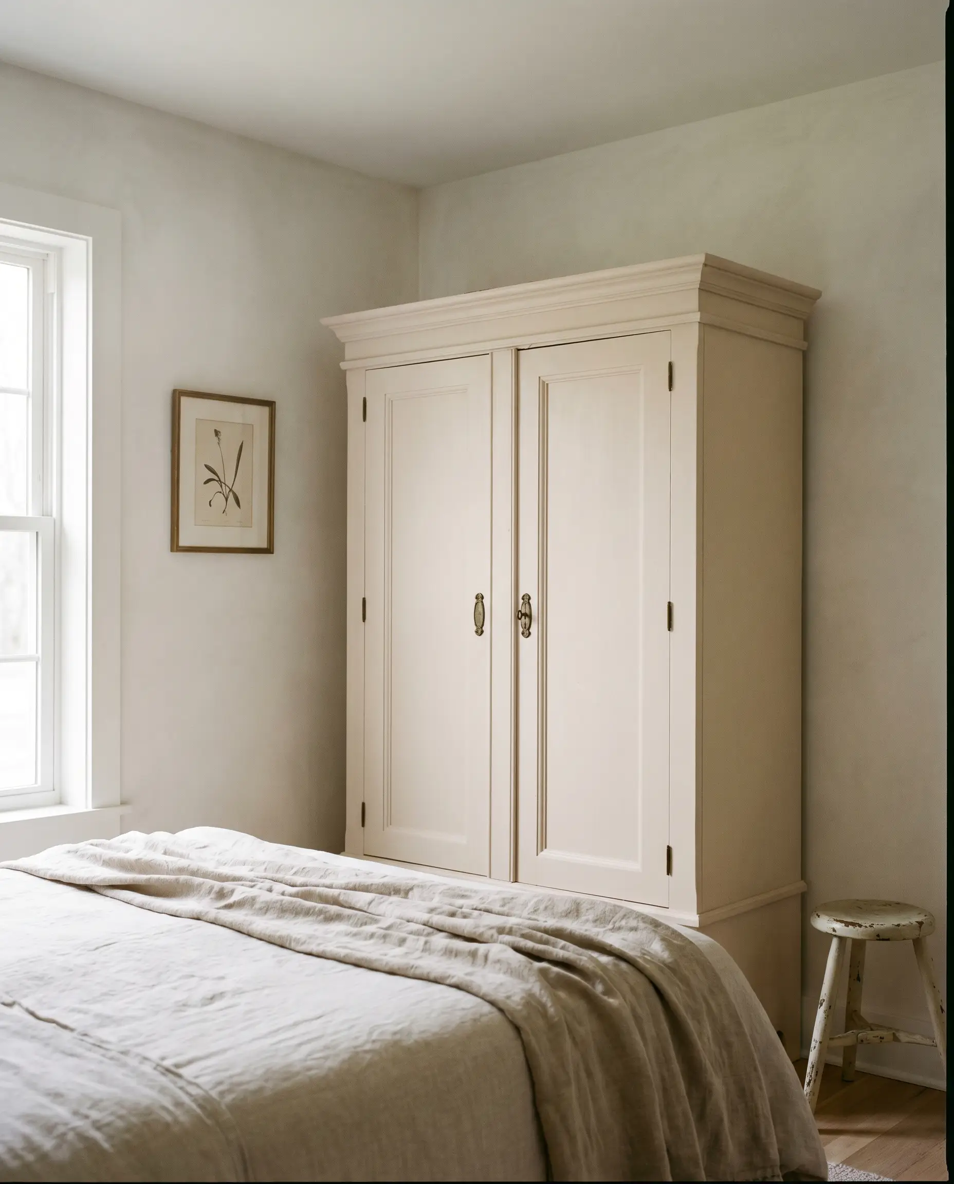
Transform a heavy, thrifted pine armoire by coating it in this luminous shade. The blushing warmth modernizes the bulky piece, allowing it to act as a soft, romantic focal point in a guest bedroom. Pair it with aged bronze hardware to give the newly painted piece a sense of history and permanence.
A High-End Boutique Fitting Room
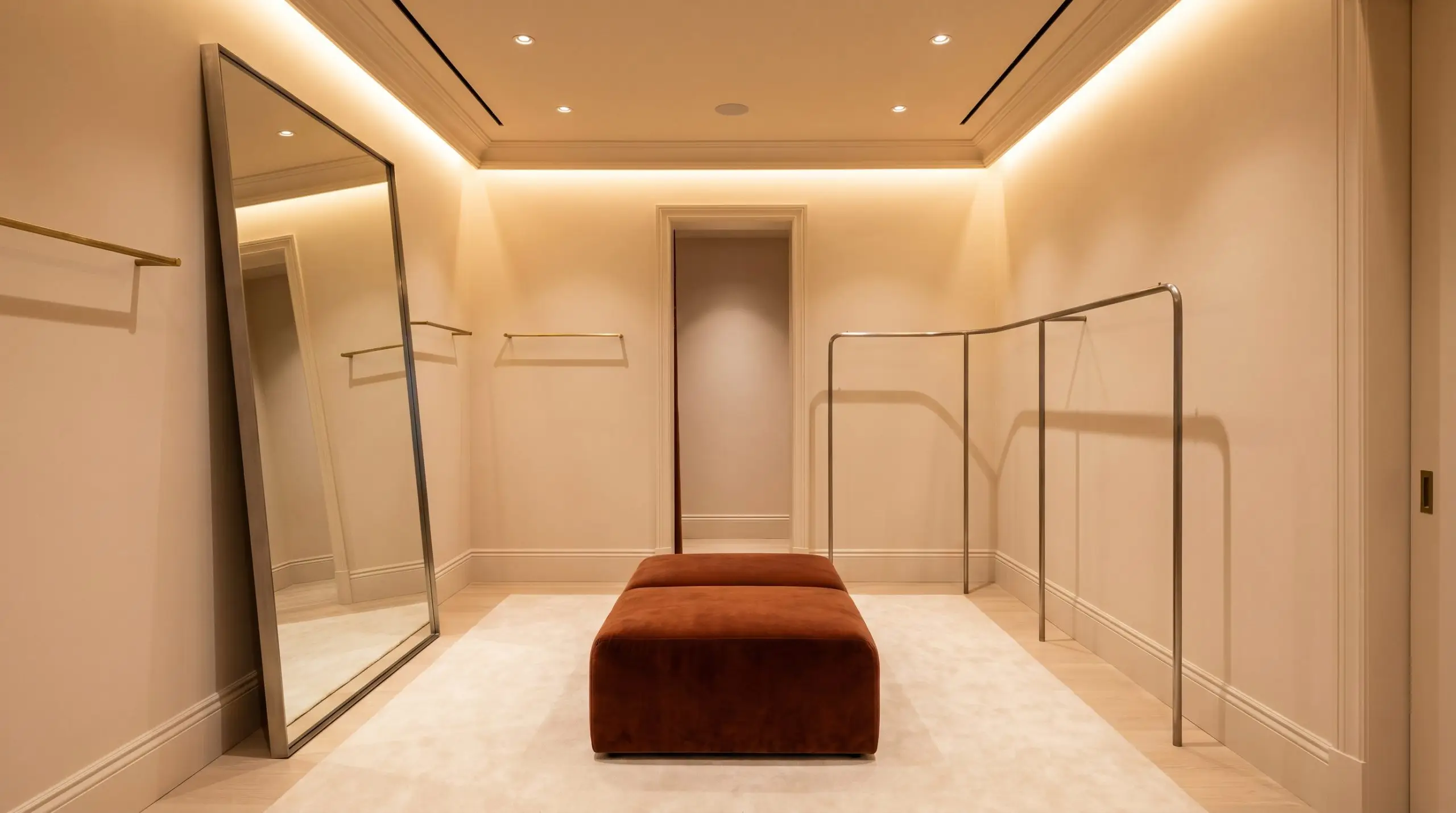
If you are designing a small commercial space or a luxurious walk-in closet, wrapping the entire room—walls, ceiling, and trim—in this color creates an immersive, jewelry-box effect. The continuous wash of peachy off-white feels incredibly premium, especially when accented with an oversized, floor-to-ceiling mirror and a plush, deep rust-colored ottoman.
The Two-Tone Dining Room
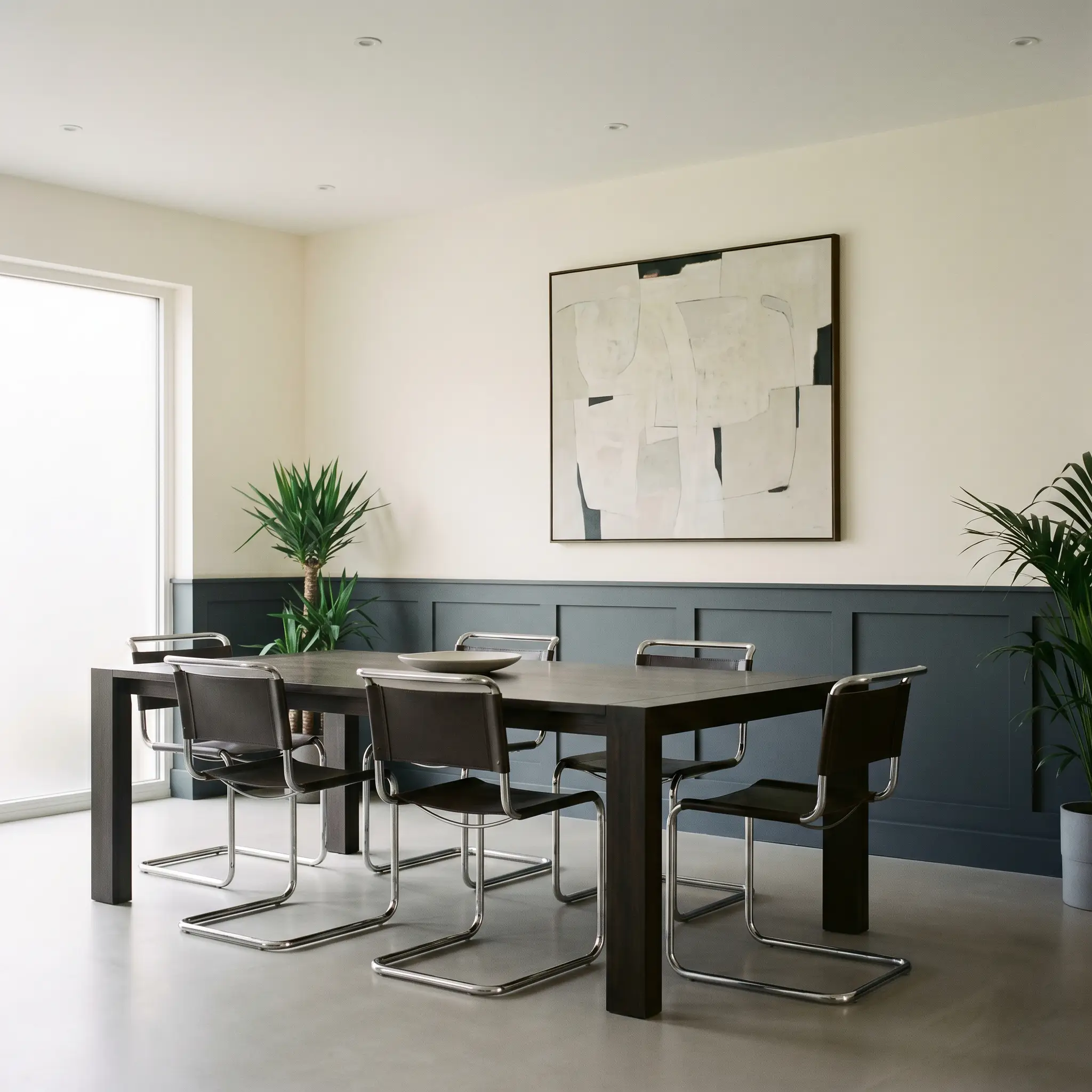
For a modern take on traditional wainscoting, use this warm neutral on the upper two-thirds of a dining room wall, and anchor the lower third with a dramatic, moody charcoal. This sharp contrast modernizes the blush tones, creating an edgy, tailored atmosphere perfect for hosting dinner parties.
Material Pairings & Coordinating Colors
This color thrives when it is given clear boundaries. Because its undertones are so delicate, it requires crisp, high-contrast trim to feel intentional, or deep, earthy secondary colors to keep it grounded.
Trim & Baseboard Boundaries
Hardware, Wood & Tactile Finishes
Complementary Palette
Designer Mood Boards
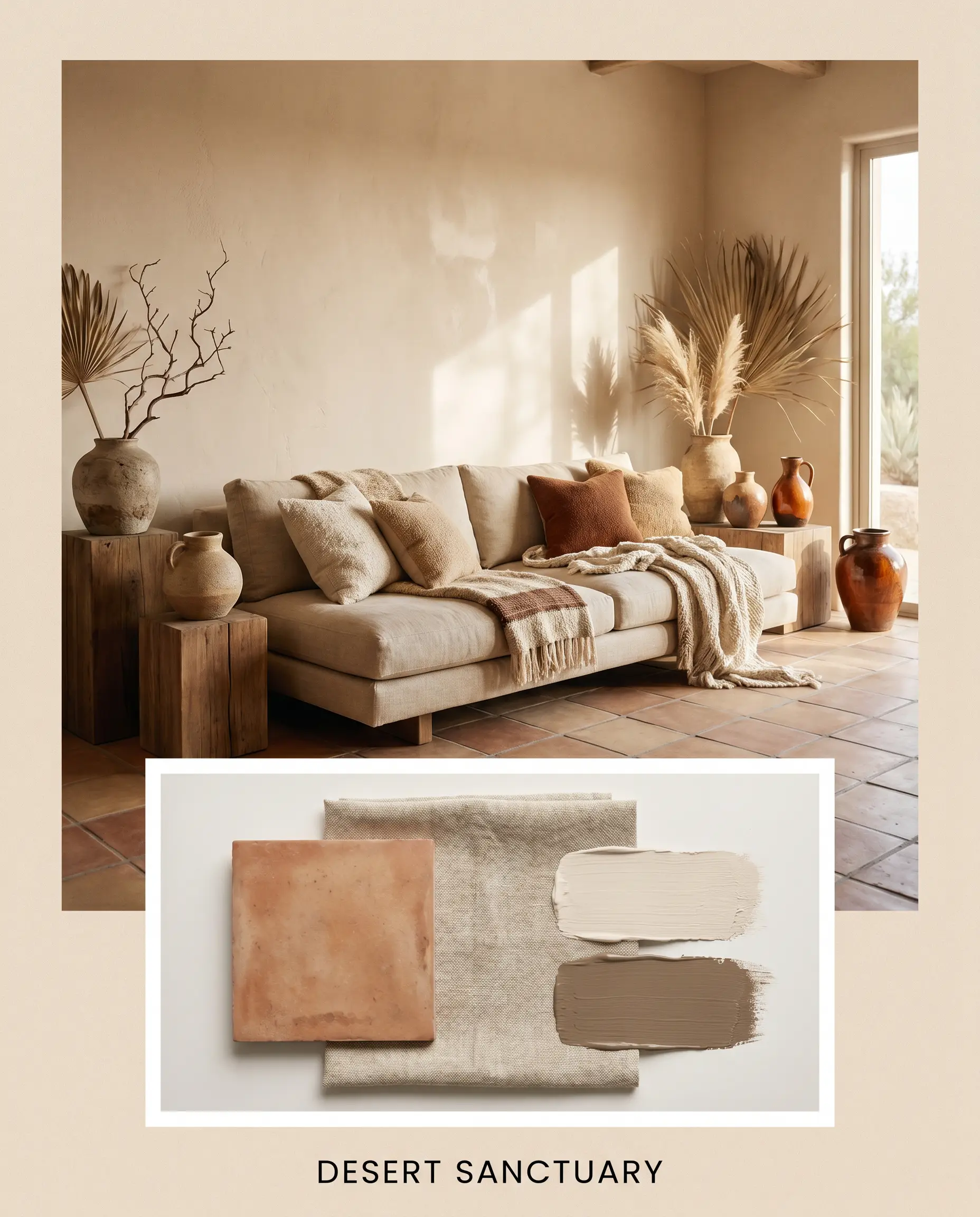
Desert Sanctuary This palette leans into a relaxed, sun-baked aesthetic. By pairing the soft walls with Matte Terracotta Tile floors and accents of Benjamin Moore Spanish Brown 1028, the room immediately feels grounded and earthy. To complete the look, introduce a low-slung linen sofa, a collection of handmade ceramic vases, and sheer, breezy window treatments that let the natural light filter in softly.
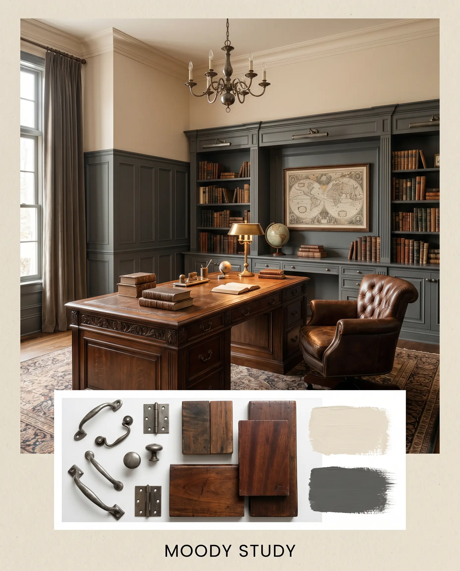
Moody Study To create a space that feels deeply intellectual and tailored, use the blushing off-white as a bright ceiling and upper-wall contrast to lower wainscoting painted in Farrow & Ball Down Pipe No. 26. The introduction of Aged Pewter hardware and a heavy, vintage mahogany desk adds a layer of historic charm, resulting in a room that feels both bright and intensely cozy.
Comparing First Crush to Rival Neutrals
When selecting a warm off-white, the subtle shifts in undertone dictate the entire mood of the room. Here is how this shade stacks up against its closest competitors.
Benjamin Moore First Crush CSP-310 vs. Benjamin Moore Ionic Column 1016
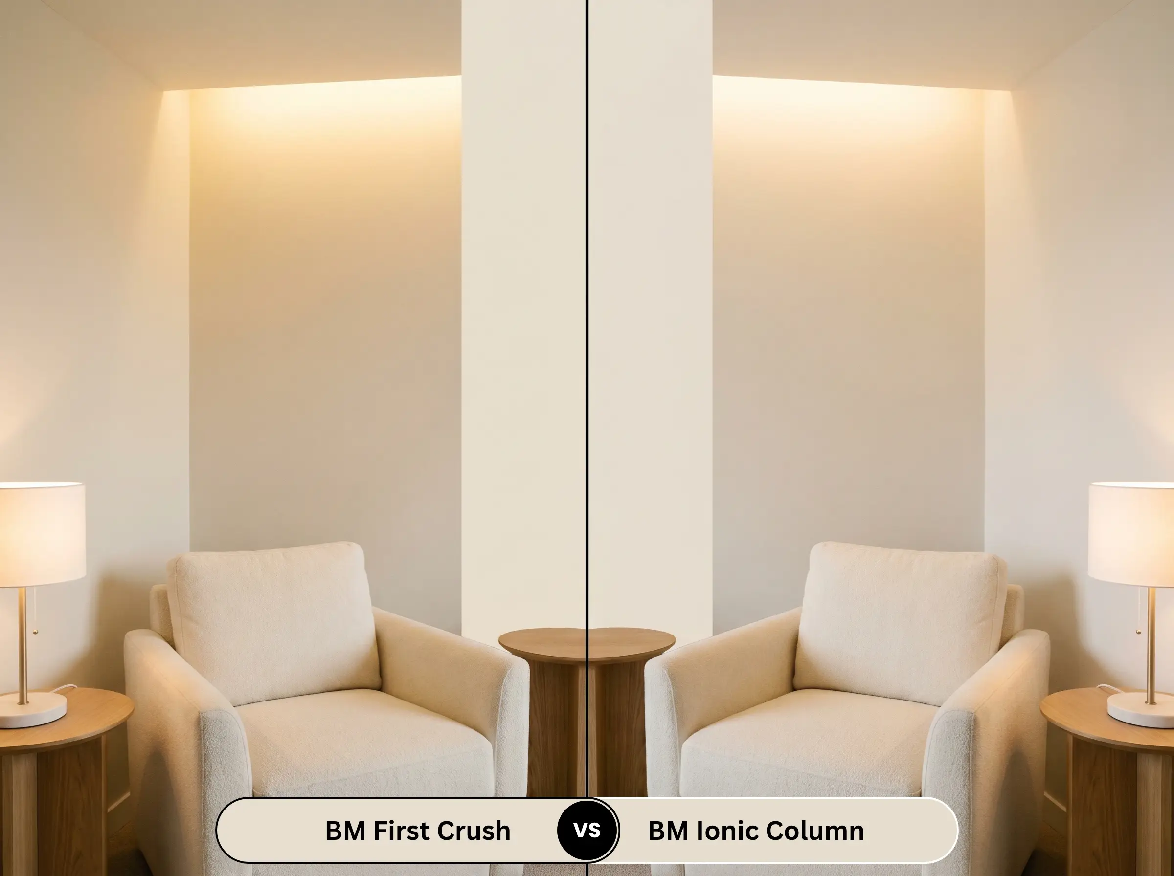
If your room lacks natural light and feels incredibly cold, Ionic Column 1016 pushes much further into a traditional cream, utilizing yellow undertones rather than pink. First Crush remains lighter and more delicate, making it the better choice if you want to avoid walls that look overtly yellow under artificial bulbs.
Benjamin Moore First Crush CSP-310 vs. Sherwin-Williams Malted Milk SW 6057
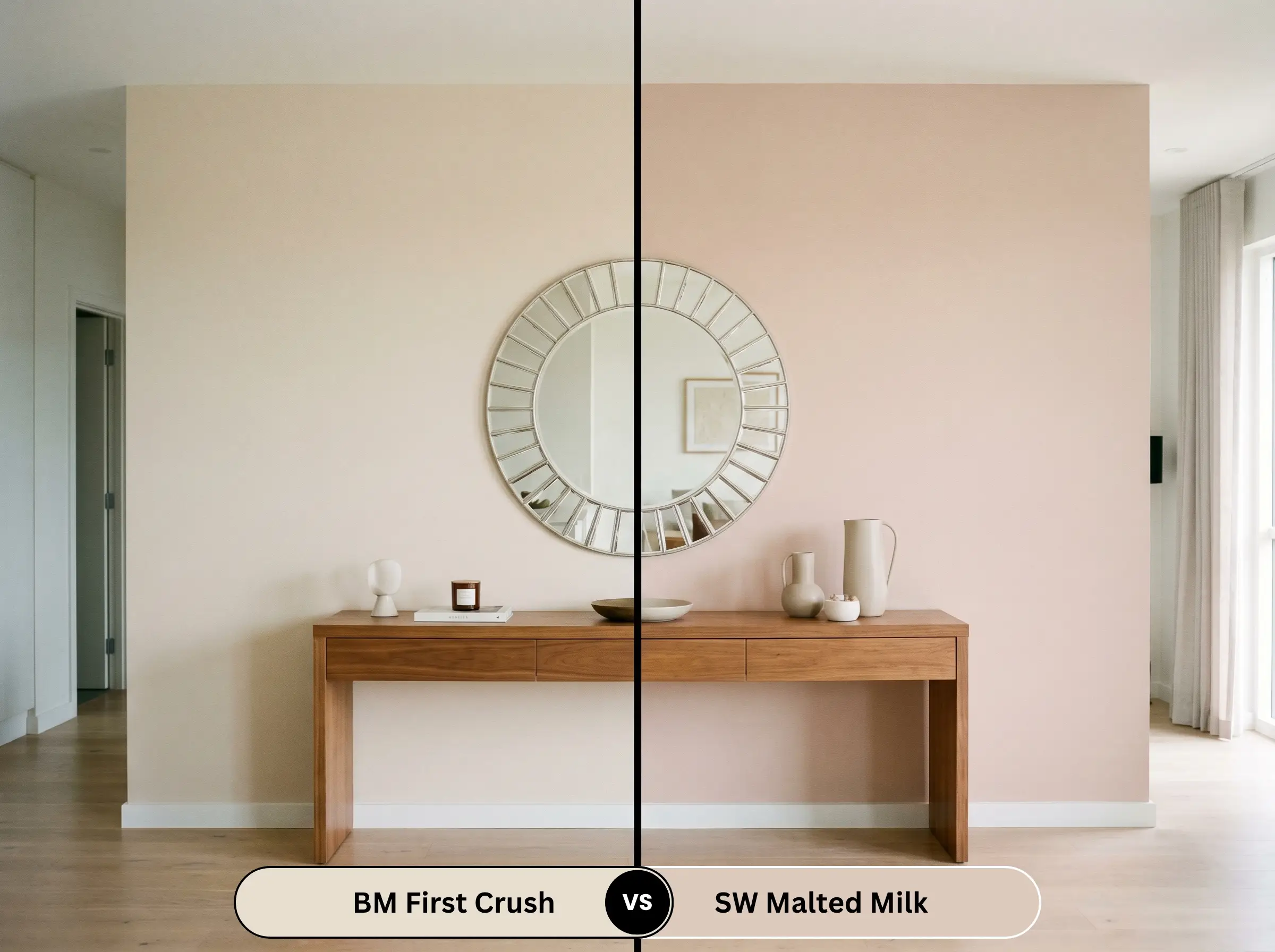
Malted Milk SW 6057 is a significantly deeper, more saturated mauve-pink. If you are looking for a true, undeniable pink for a bold accent wall, Malted Milk is the stronger candidate. However, if you want a subtle, chameleon-like neutral that only hints at blush, the lighter LRV of the CSP-310 shade is much more versatile for whole-room applications.
Benjamin Moore First Crush CSP-310 vs. Benjamin Moore Cream Soda 1082
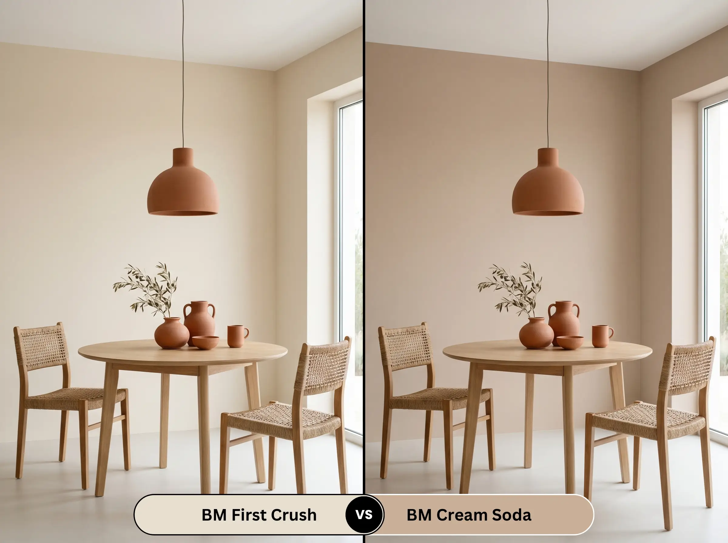
Cream Soda 1082 sits very close in lightness but carries a distinctly peachy-orange base. If you are styling a space with heavy terracotta or rust accents, Cream Soda will harmonize beautifully. First Crush, with its red-oxide base, feels slightly more refined and traditional, making it easier to pair with cool grays and crisp whites.
Brand Equivalents & Similar Shades
Whether you need a slight adjustment in depth or are shopping across different manufacturers, these alternatives offer a similar atmospheric warmth.
Same-Brand Alternatives
Cross-Brand Matches
Application Strategy for Full-Spectrum Paint
Moving from the color swatch to the physical wall requires a specific approach, especially when dealing with specialized formulations.
The Dynamic Sheen Guide
Primer Strategy
Because this color is part of the Aura line and lacks standard black or gray bases, it requires a pristine, uniform foundation. You must use a high-quality, pure white primer, especially if you are painting over a dark or vibrant existing wall. Any underlying color will easily bleed through and distort the delicate blush undertones.
Coverage & Success Tips
Expect to apply a strict minimum of two coats to achieve the true depth of the red-oxide pigments. The color lock technology in this premium line is exceptional, but it dries incredibly fast. To avoid visible roller marks, maintain a wet edge while painting and resist the urge to touch up semi-dry spots, which will cause the finish to flash and look uneven once fully cured.
Frequently Asked Questions
Because this specific formulation is built entirely without black or gray colorants, its delicate pigments are highly susceptible to harsh UV rays. If applied to a facade or front door, the intense exterior sunlight will rapidly fade the red-oxide notes, causing the color to degrade and wash out much faster than a standard exterior paint.
Without black to absorb light, this shade acts as a highly efficient reflector. In a windowless room, it maximizes whatever artificial light is present, ensuring the space feels luminous and airy rather than heavy or enclosed.
Actually, it creates a beautiful, harmonious connection. The red-oxide base in the paint speaks directly to the warm, reddish tones in the oak, creating a seamless, tonal foundation that feels incredibly cohesive and intentional.
Yes, it strictly requires a pure white, high-hiding primer. Because the paint’s final appearance relies entirely on light passing through its pigments and bouncing off the surface beneath, a tinted or gray primer will muddy the final color and destroy its signature glow.
The Final Verdict & Expert Warnings
Benjamin Moore First Crush (CSP-310) is a masterful, highly sophisticated off-white that excels in light-starved spaces. It is the perfect choice for homeowners looking to inject a subtle, uplifting warmth into north-facing living rooms, dark hallways, or intimate bedrooms without committing to a heavy, saturated color. Its delicate blush undertone provides a premium, tailored backdrop that effortlessly bridges the gap between classic elegance and modern softness.
However, this color requires careful curation to succeed. You must avoid pairing it with stark, cool-toned cherry wood furniture or aggressively yellow-green fabrics, as these elements will instantly highlight the pink undertones in a way that feels accidental and clashing. Furthermore, if your space features heavy, blue-gray slate flooring, the delicate warmth of this paint will fight against the cool stone, leaving the room feeling disjointed. When supported by rich browns, crisp whites, and warm metals, this shade transforms standard walls into a beautifully radiant canvas.
Closest Cross-Brand Equivalents
The absolute closest scientific color matches for First Crush across top paint brands.