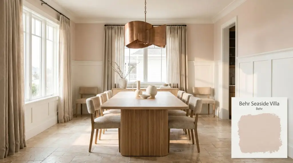
Seaside Villa S190-1
BehrBehr Seaside Villa is a warm, light peachy-pink neutral with a soft terracotta influence. Boasting an LRV of 69, it reflects a generous amount of light while providing a comforting, earthy blush tone that shifts beautifully between daylight and artificial lighting.
Paint Technical Profile
| Color ID / SKU | S190-1 |
| HEX Code | #e9d5c9 |
| Light Reflectance (LRV) | 69 |
| Use | Interior, Exterior |
| Best Exposures | North, East |
| Best For | Bedrooms, Bathrooms, Nurseries, Accent Walls |
Behr Seaside Villa (S190-1): The Earthy Pastel Redefining Modern Warmth
Pastels often carry a reputation for feeling overly sweet or lacking architectural gravity, but the right pigment structure completely shatters that expectation. When you strip away the bright, synthetic edge of a traditional pink and ground it with earthy, shadowed pigments, the result is a highly sophisticated foundational color.
Behr Seaside Villa (S190-1) captures this exact balance, behaving less like a conventional pastel and more like a sun-faded plaster. It wraps a room in a soft, tactile glow while maintaining enough visual weight to anchor significant architectural features, proving that light tones can still command a space with quiet authority.
Undertones & LRV of Behr Seaside Villa
Is this paint warm or cool? Behr Seaside Villa is undeniably warm, driven by a rich color temperature that immediately softens harsh architectural lines and brings a welcoming flush to interior spaces.
To understand how this color physically alters the mood of a room, we must look at its core structural DNA:
With an LRV 69, this light reflectance value places the paint squarely in the light-medium category. It is highly reflective, meaning it will actively bounce ambient lighting around the room, yet it retains enough pigment density to hold its shape and contrast beautifully against crisp, white architectural accents.
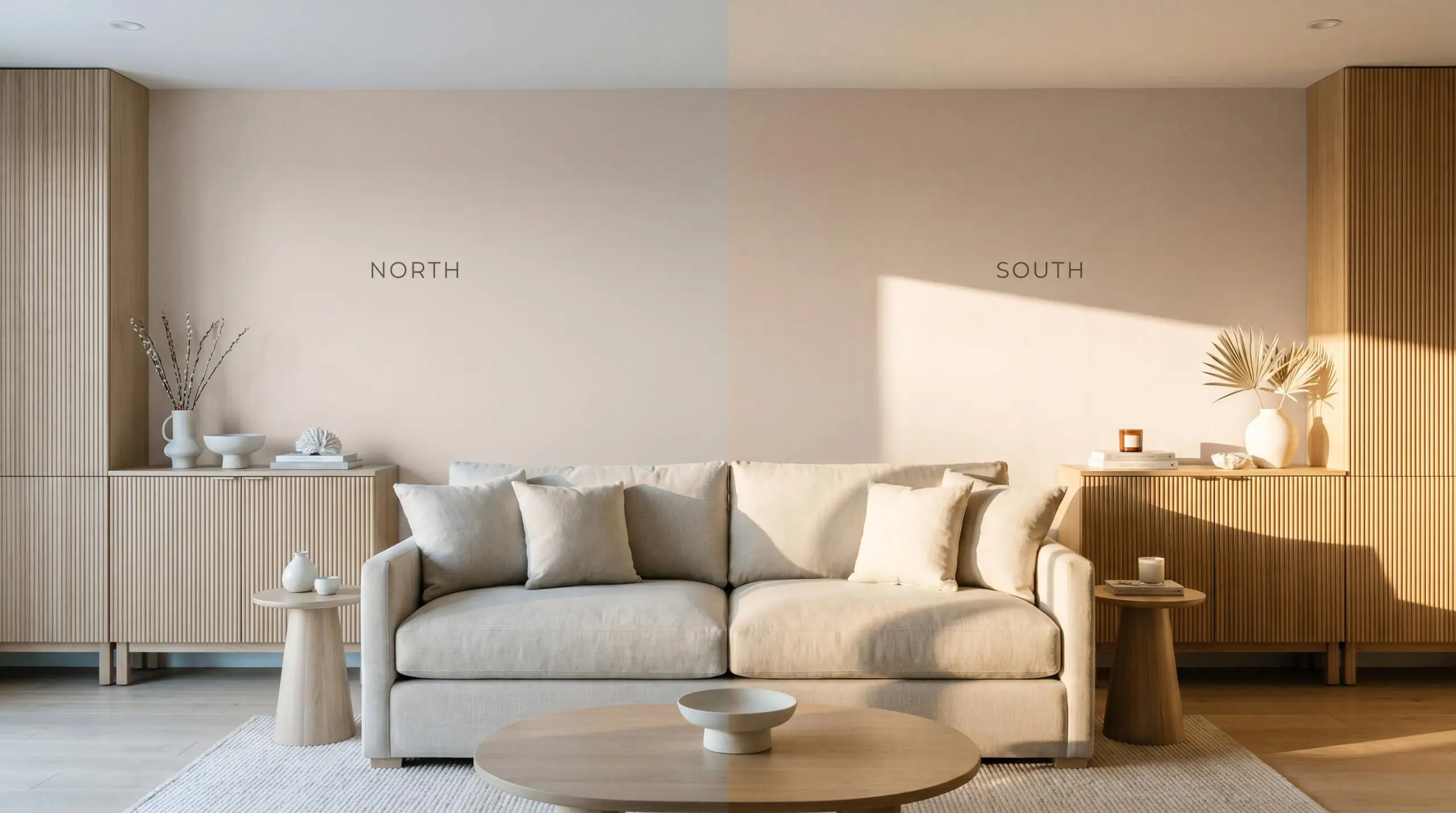
Ambient Lighting & The Chameleon Factor
The biggest environmental risk with this specific terracotta blush is its behavior in heavily shadowed, starkly lit corners. Without adequate light to activate its warm peach undertones, the gray base can suddenly dominate, causing the color to look unexpectedly muddy rather than luminous. Always test this shade on multiple walls to observe how your home’s specific shadows pull at its pigment profile.
The shifting angle of the sun and the temperature of your bulbs will dramatically alter how this color is perceived:
Behr Seaside Villa in Daily Living Spaces
This muted peach brings an inherent, organic softness to residential architecture, replacing the rigid, sterile feel of basic white drywall with a gentle, enveloping warmth.
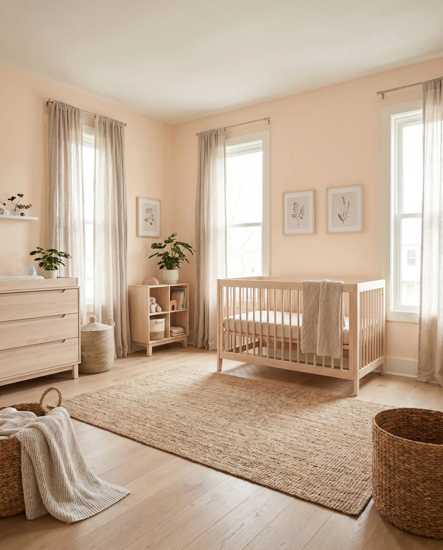
Nurseries and Children’s Rooms
Instead of relying on high-voltage, traditional pinks that a child will quickly outgrow, this shade offers incredible longevity. It provides a soft, comforting backdrop that feels playful in the early years but easily transitions into a sophisticated teen retreat. Pair it with woven natural fibers, simple flat-pack furniture, and soft linen drapery to create a serene, grounded environment.
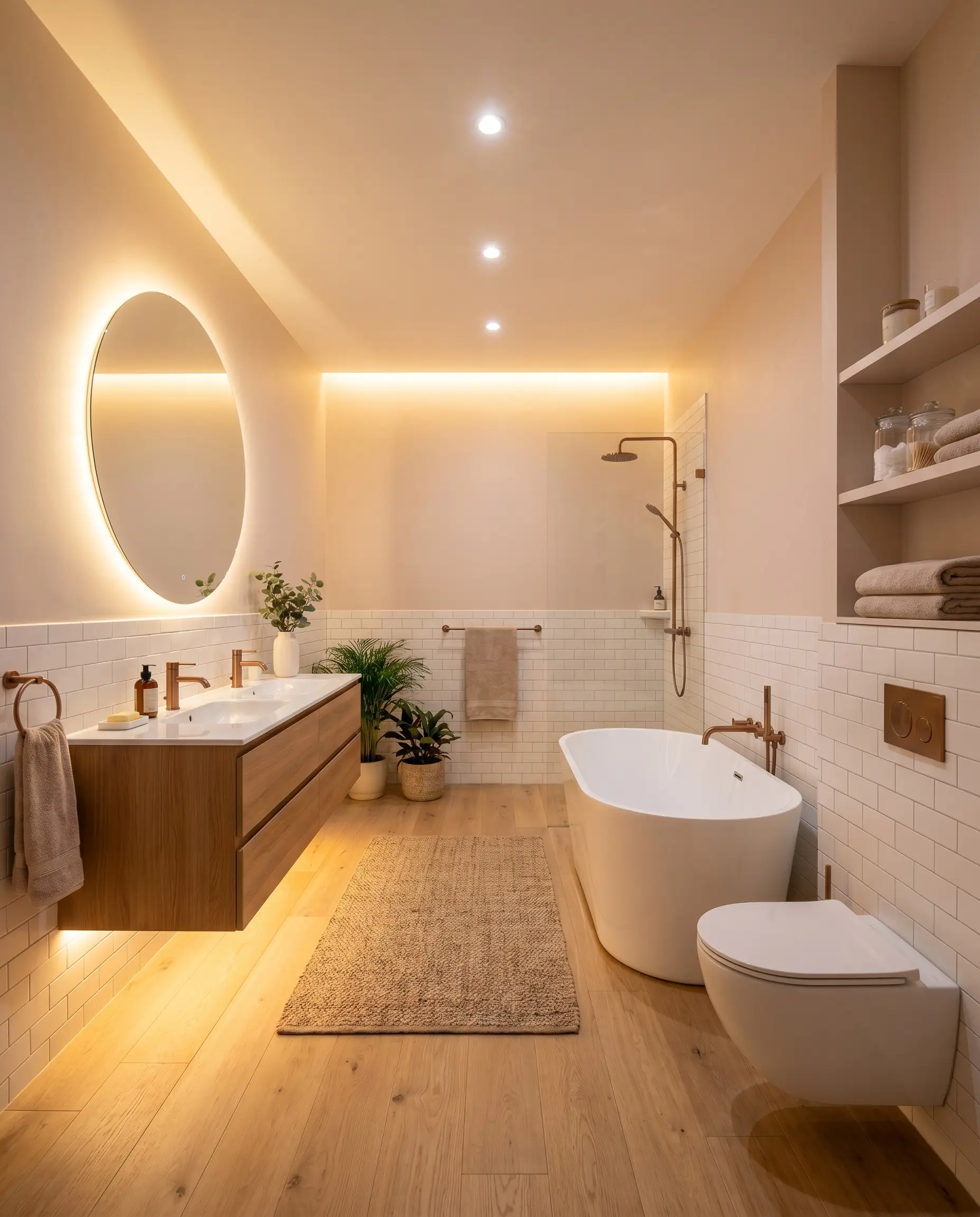
Windowless Bathrooms
In spaces lacking natural sunlight, rigid whites can often feel clinical and harsh. This earthy pastel acts as a visual substitute for sunshine, bouncing a flattering, warm glow around the room. It beautifully softens the sharp geometry of basic subway tile and standard porcelain fixtures, making an everyday utilitarian space feel like a curated retreat.
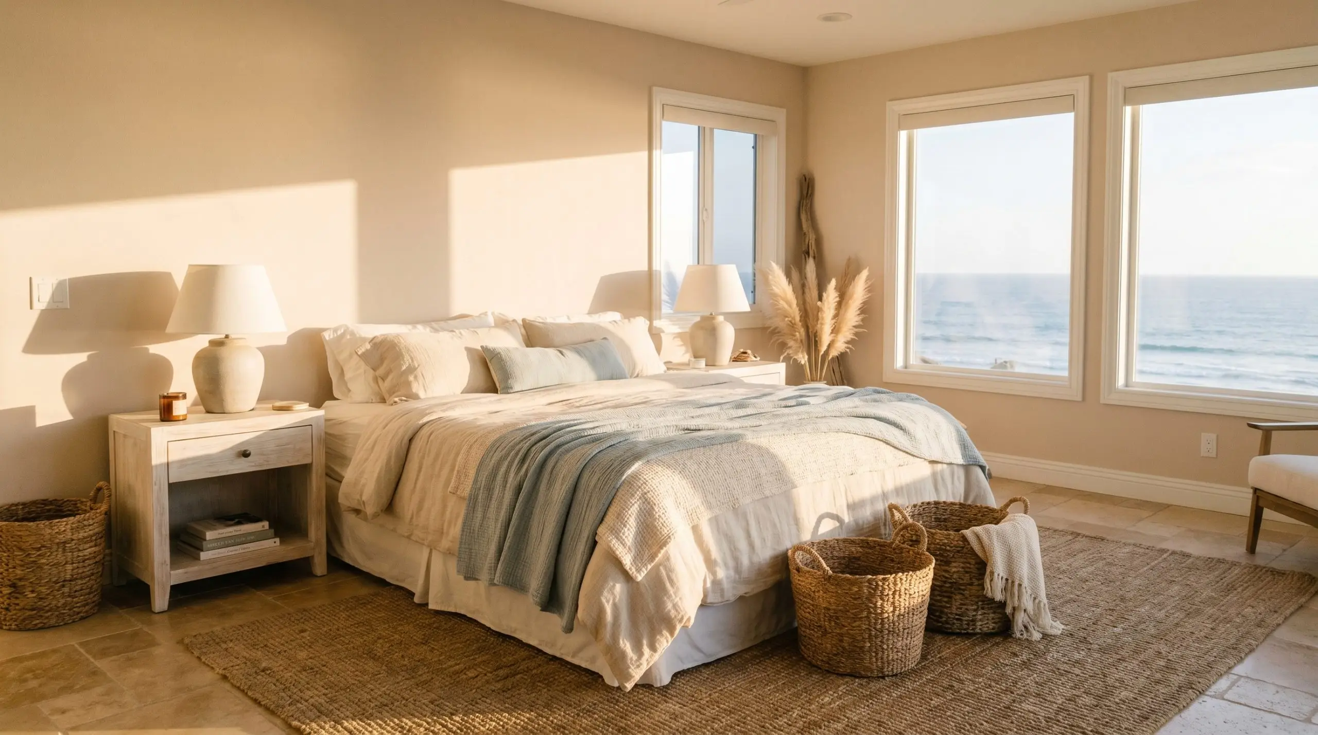
Bohemian or Coastal Bedrooms
The dusty, faded quality of S190-1 makes it a brilliant foundation for relaxed, layered bedroom styling. It acts as a tonal bridge, connecting varied textures like whitewashed woods, heavy cotton throws, and woven grass baskets. The color recedes just enough to let these tactile elements take center stage while maintaining a continuous, warm hum in the background.
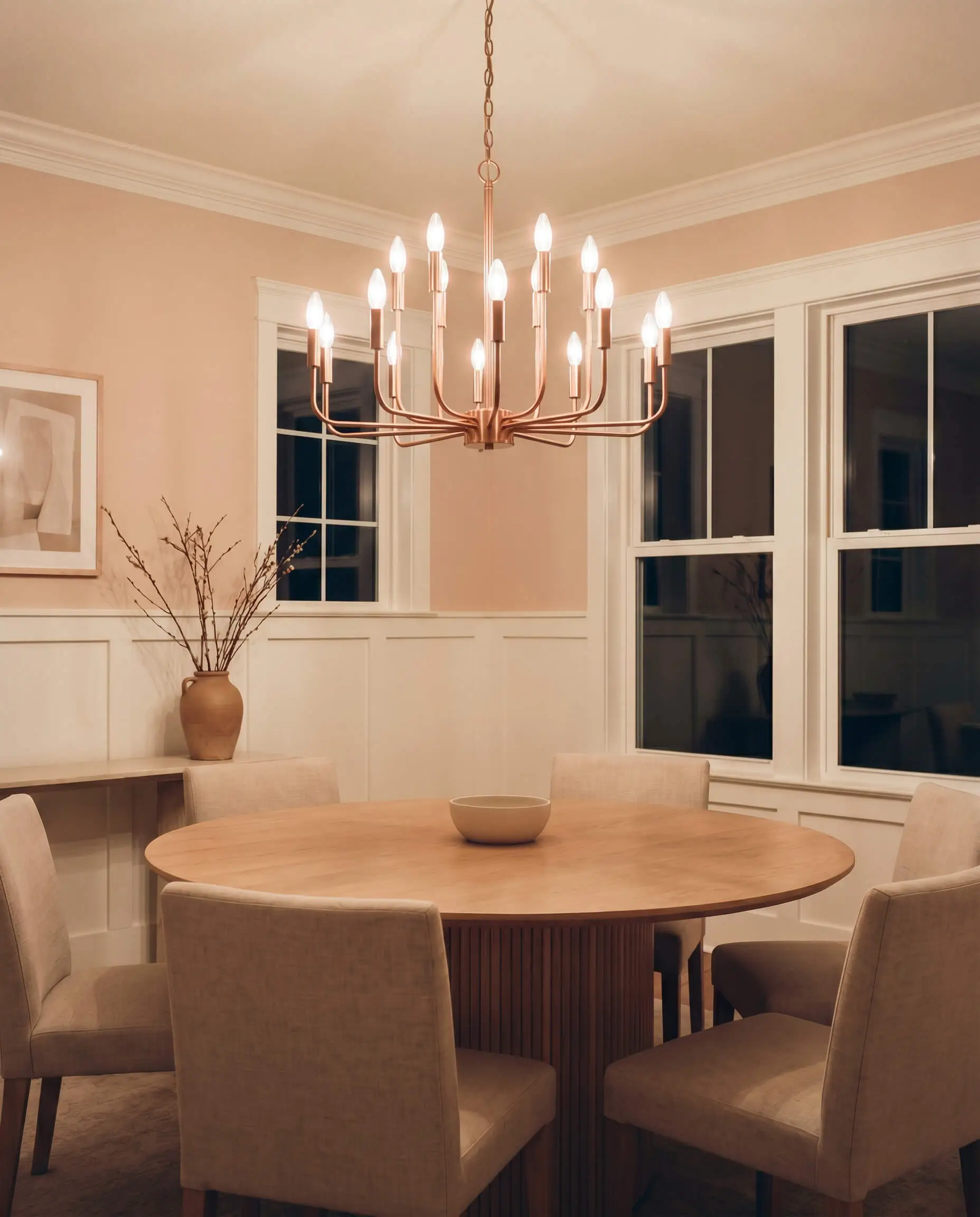
Dining Rooms
Applying this shade above crisp, white wainscoting instantly changes the dining experience. The high contrast between the bright trim and the muted peach draws the eye upward, while the warm pigment structure creates an intimate, inviting atmosphere perfect for evening meals under a soft chandelier.
When using this color above wainscoting or paneling, ensure your ceiling white matches the undertone of your trim. A stark, blue-toned ceiling white will clash aggressively with the earthy warmth radiating from the walls.
Hackrea Pro-Tip
Creative Architectural Expressions
When you stop treating this pastel as just a background color, it becomes a highly structural design tool capable of defining unique zones within your home.
The Enveloping Canopy
Take the paint off the walls entirely and apply it strictly to the ceiling of a primary bedroom or a cozy reading den. By keeping the walls a soft, creamy white and introducing this warm peach overhead, you visually lower the ceiling height just a fraction, creating an intimate, tent-like atmosphere that encourages deep relaxation.
The Textural Display Nook
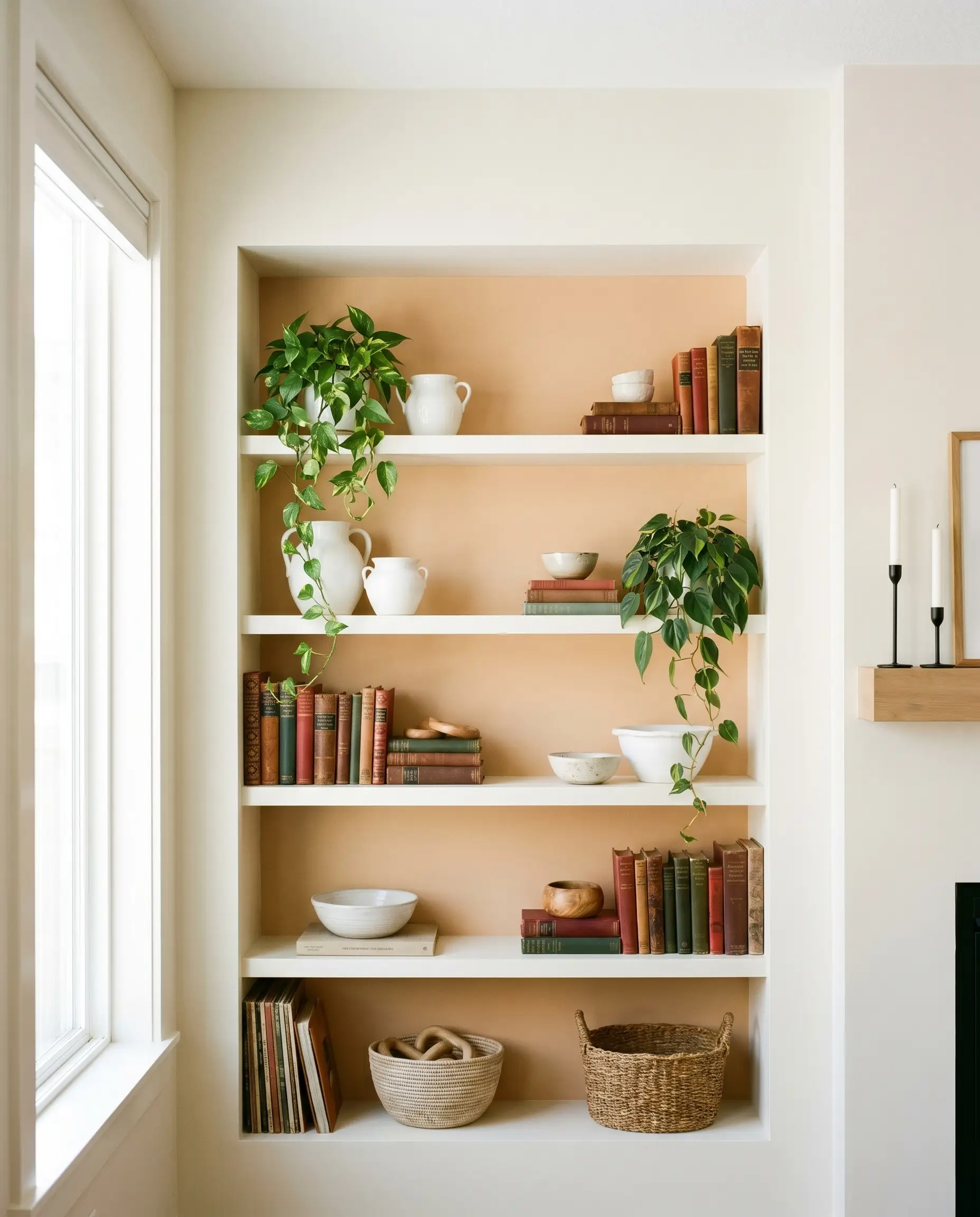
Transform basic built-in shelving or a simple alcove by painting the interior backing with this grayed-out terracotta. The warm backdrop instantly highlights whatever is placed in front of it. It serves as a brilliant, contrasting canvas for displaying stark white ironstone pottery, trailing green houseplants, or the rich spines of vintage books, making a standard architectural feature feel entirely custom.
The Luminous Threshold
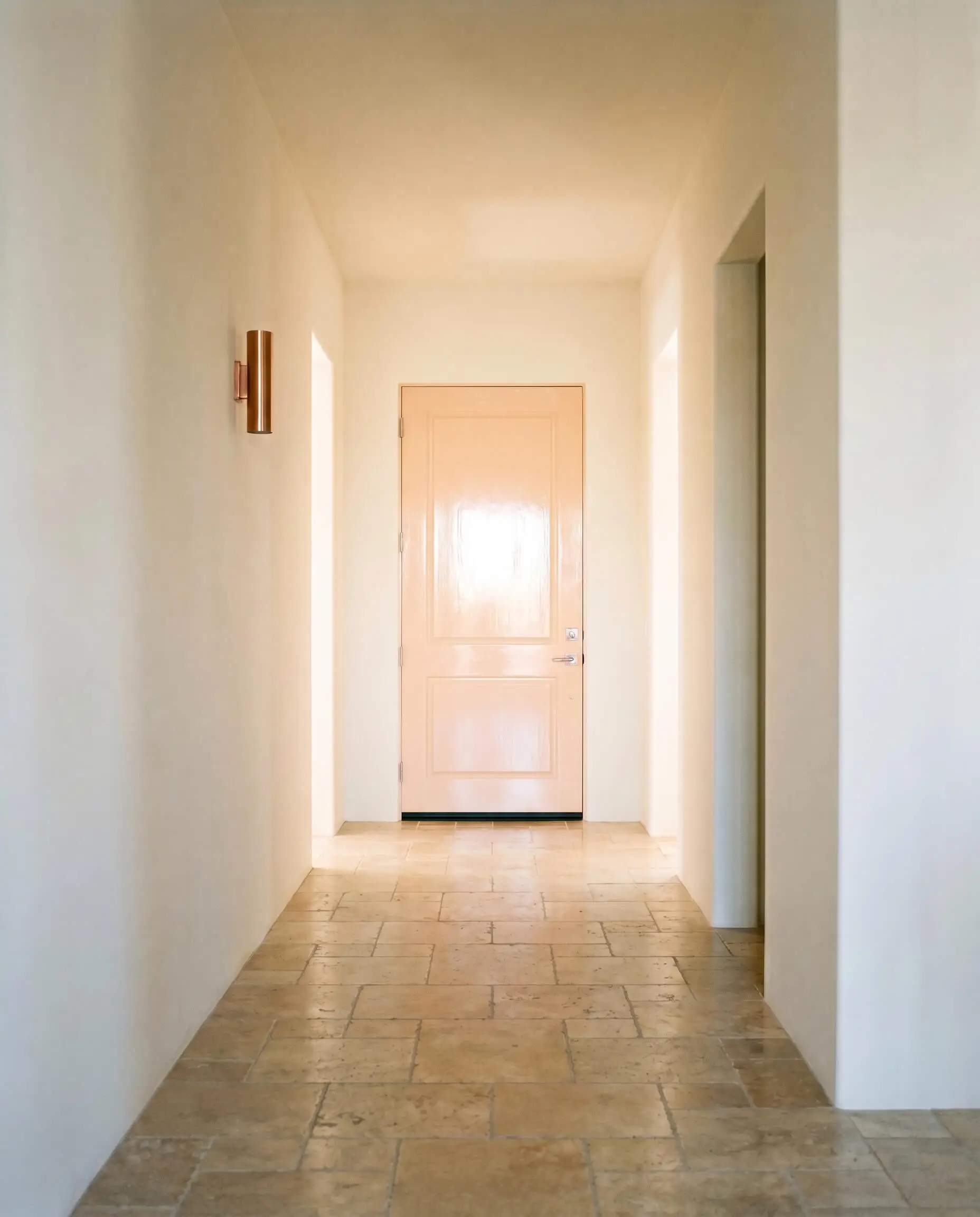
Interior doors are rarely utilized for color, but coating a heavy wooden door at the end of a long, dark hallway in this shade creates a brilliant focal point. The highly reflective nature of the paint catches whatever ambient light spills down the hall, turning a purely functional transition zone into a welcoming, sunlit destination.
Hardware, Wood & Material Pairings
The way this paint interacts with surrounding materials dictates its final aesthetic. It requires tactile companions that either ground its lightness or enhance its earthy nature.
Coordinating Trim
To frame this color successfully, you need coordinating trim that provides a crisp boundary without leaning too sterile or blue.
Tactile Material Pairings
Coordinating Colors
Designer Mood Boards
Sun-Baked Serenity
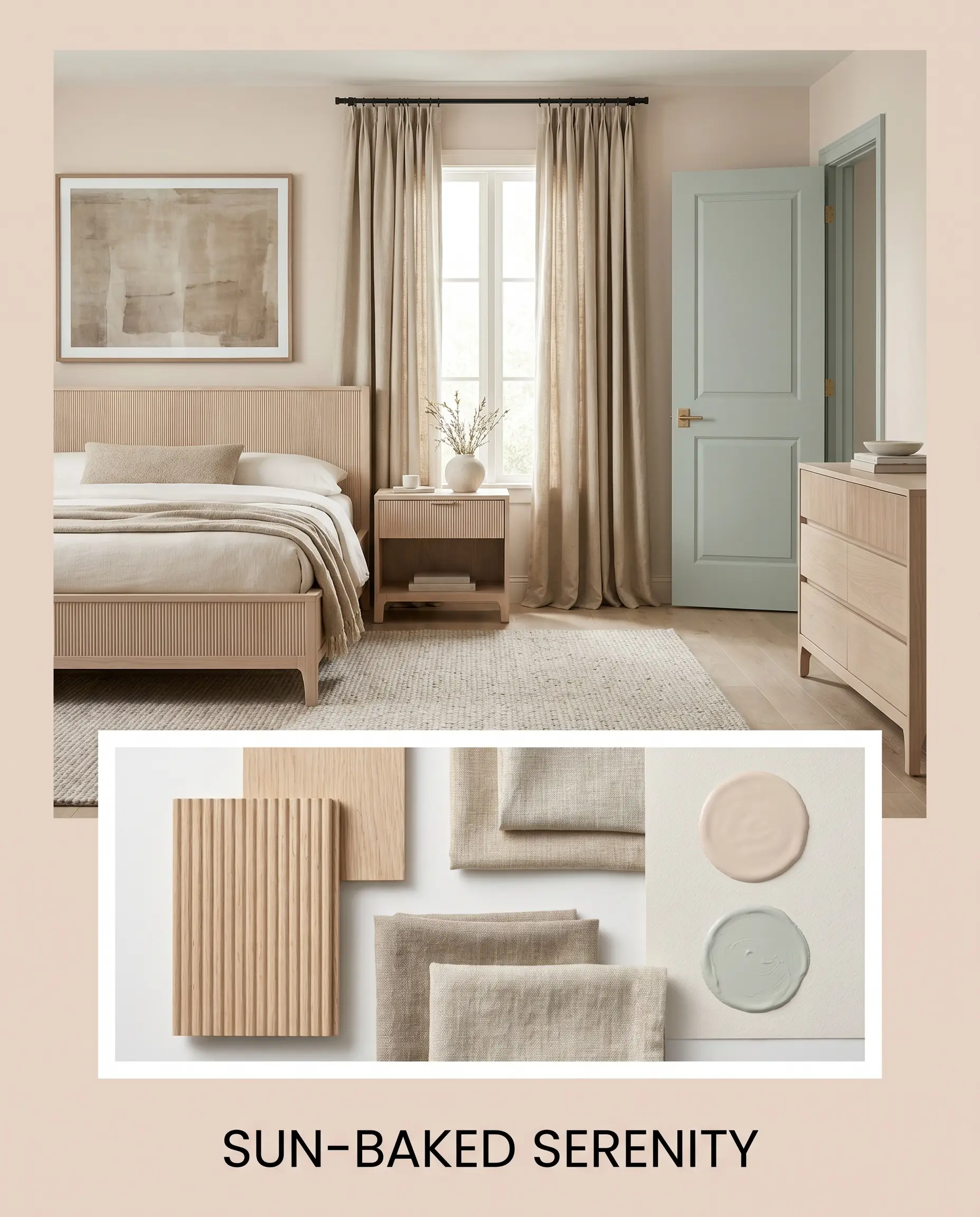
This palette is incredibly restorative and tactile, focusing on the raw beauty of natural materials. The walls provide a soft, glowing backdrop for heavy, raw linen drapery and pale, fluted white oak furniture. Accents of Sherwin-Williams Sea Salt on interior doors or textiles introduce a cooling breeze to the warm environment, resulting in a space that feels effortlessly organic and deeply calming.
Botanical Contrast
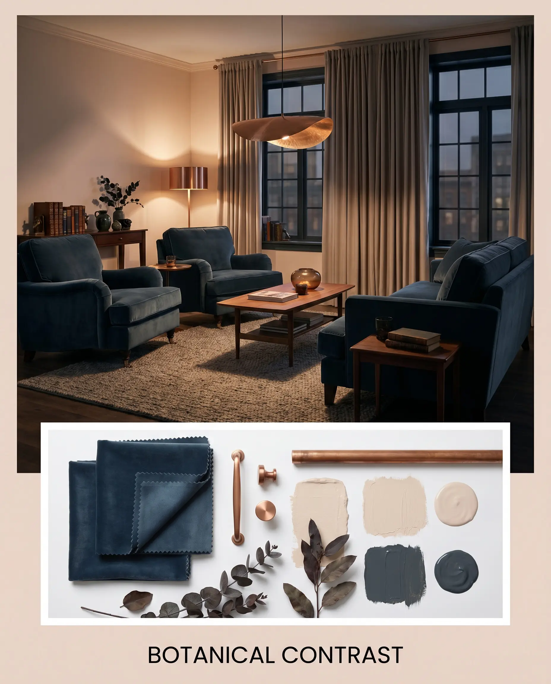
A moody, highly intentional curation that plays with deep shadows and soft light. The dusty peach walls are sharply contrasted by heavy velvet seating in Farrow & Ball Hague Blue. Brushed copper lighting fixtures bounce warm light around the room, highlighting the red-orange spectrum of the paint, creating an atmosphere that feels rich, layered, and quietly dramatic.
Soft Earth & Stone
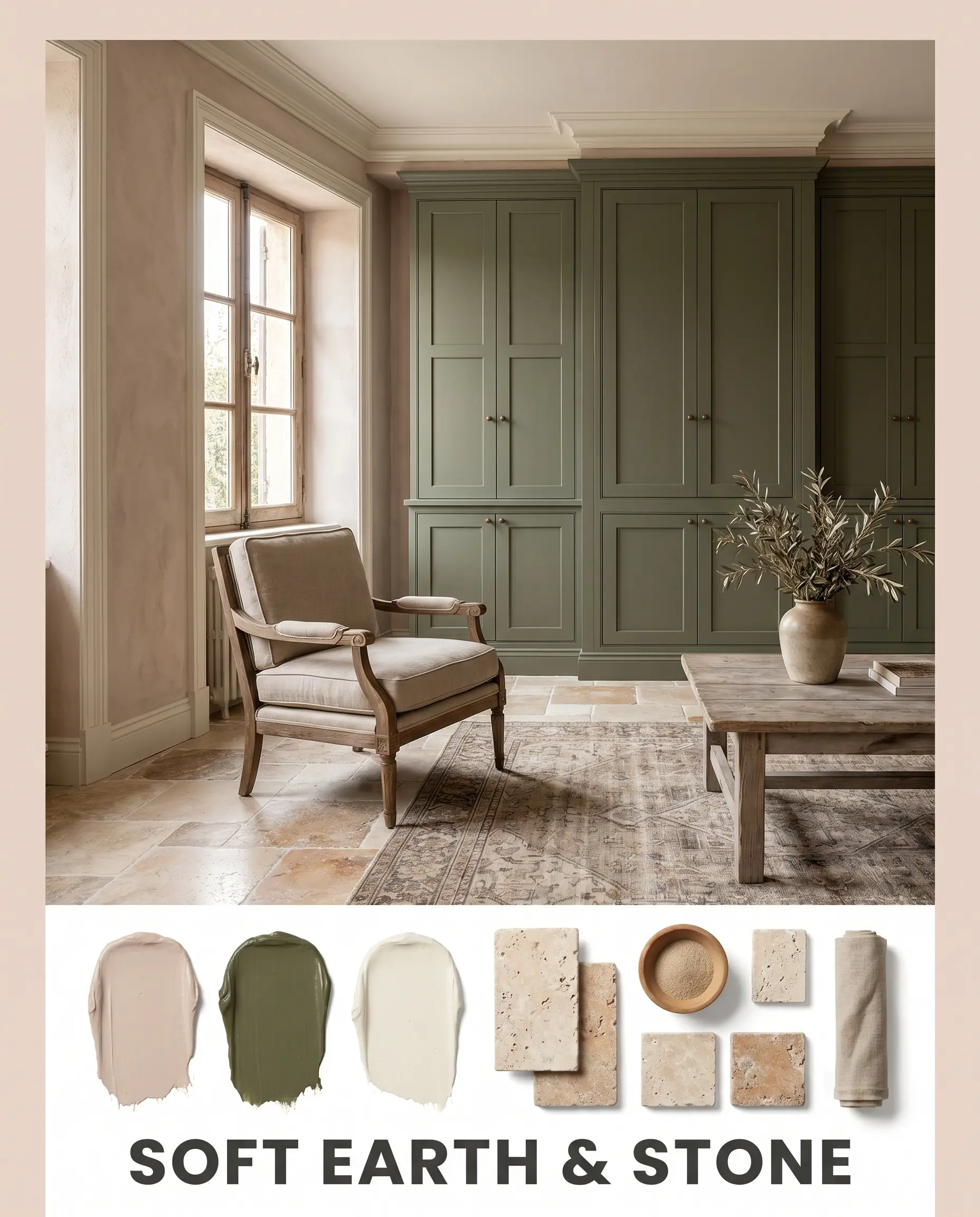
This combination relies on tonal harmony and rugged textures. The muted terracotta blush is paired with the deep, grounding presence of Benjamin Moore Caldwell Green on custom millwork or cabinetry. Tumbled travertine flooring absorbs the light, while creamy Alabaster trim provides just enough definition to keep the boundaries crisp. The resulting mood is grounded, historic, and incredibly welcoming.
When mixing pastels with deep, heavy colors like Hague Blue or Caldwell Green, ensure your lighting plan is robust. The dark accents will absorb significant light, so you must rely on the high LRV of the peach walls to keep the space from feeling heavy.
Hackrea Design Secret
Head-to-Head Comparisons
When selecting the best blush pink paint colors for modern homes, understanding how rival shades shift in specific lighting is critical.
Behr Seaside Villa vs. Benjamin Moore First Light 2102-70
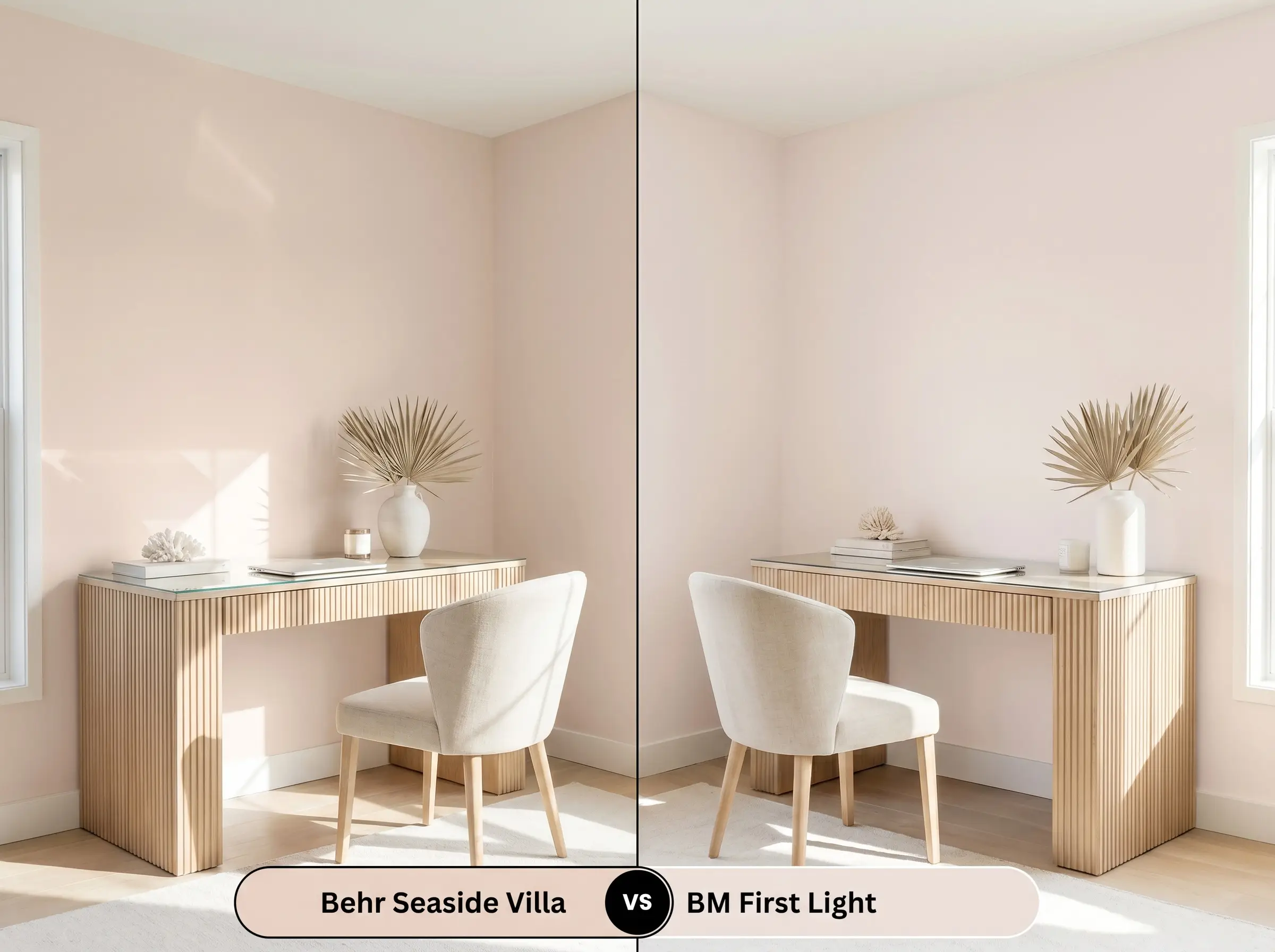
If you are looking for a true, fresh pastel, First Light is the crisper option. It lacks the heavy gray and terracotta undertones found in the Behr shade, making it feel much more delicate and airy. However, if your room receives intense, direct southern light, First Light can sometimes read a bit too sweet or bubblegum, whereas the Behr option will hold its earthy, sun-baked shape beautifully under harsh glare.
Behr Seaside Villa vs. Sherwin-Williams Romance SW 6323
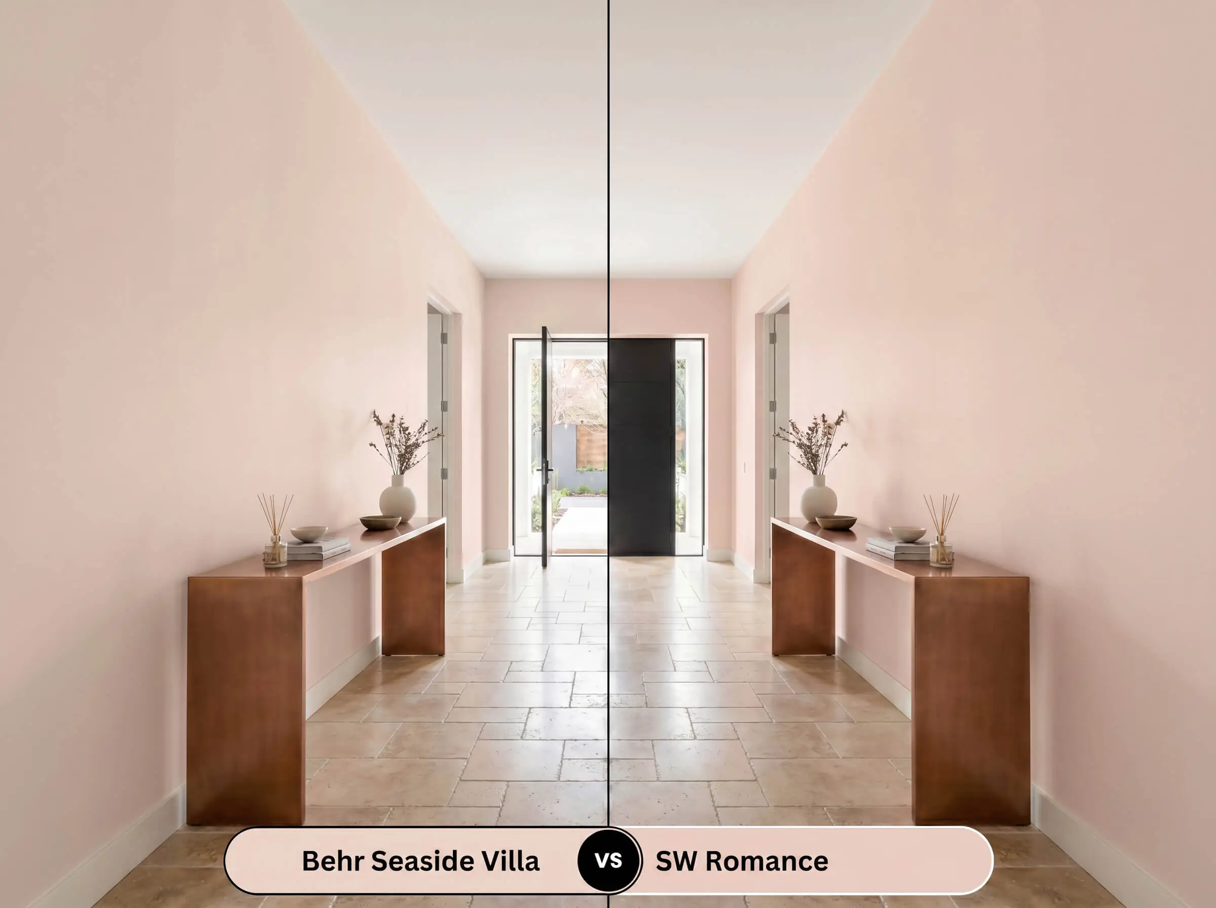
Romance carries a noticeably heavier color saturation and leans slightly more toward a traditional, warm pink. It is a fantastic choice if you want a distinctly romantic, enveloping feel. If, however, you prefer a color that acts more like a neutral plaster and recedes gently into the background, the muted, dusty quality of Seaside Villa makes it the far more versatile architectural choice.
Brand Equivalents & Similar Colors
If you need to adjust the depth of your color or require a match from a different manufacturer, these alternatives provide excellent starting points.
Similar Colors (Same Brand)
Cross-Brand Equivalents
Practical Application & DIY Advice
Executing a flawless finish requires understanding how this specific pigment structure interacts with different sheens and primers.
The Dynamic Sheen Guide
Primer Strategy
Because this color contains a delicate balance of peach and gray, a high-quality, pure white primer is essential. Applying this paint over existing dark walls or raw, unprimed drywall without a white base coat will severely distort the hue angle, muddying the color and destroying its luminous quality.
Coverage & Success Tips
With an LRV of 69, this paint generally covers well, but achieving true color depth requires two full, even coats. Be highly mindful of “flashing”—visible, uneven roller marks that occur when you press too hard or fail to maintain a wet edge. Roll the paint generously and methodically. If you need to touch up a spot later, use the exact same tool (a mini roller, not a brush) to ensure the texture matches the surrounding wall.
Frequently Asked Questions
Because direct exterior sunlight washes out subtle undertones and amplifies chroma, the red-orange spectrum in this paint will become highly pronounced outdoors. On textured stucco, the heavy shadows created by the rough surface will emphasize the terracotta notes, making it look significantly more orange-clay than a soft interior peach.
Low-E windows often cast a subtle green or blue tint into the room. Because green and blue sit opposite orange on the color wheel, this filtered light can neutralize the warm peach undertones, causing the paint to look flat, gray, or unexpectedly muddy during the day.
Absolutely. Painting the ceiling this earthy pastel is a brilliant way to visually lower the room’s height and cast a flattering, warm glow downward, instantly neutralizing the chill of stark white or cool gray walls.
It requires careful testing. Red oak floors naturally project heavy orange and pink tones. Because this paint shares a similar red-orange hue angle, placing them together can sometimes overwhelm the space with too much fleshy warmth, causing the room to lose its visual contrast and feel entirely monochromatic.
Final Verdict & Expert Warnings
Behr Seaside Villa (S190-1) is a masterful, highly versatile shade for homeowners who want to introduce warmth and color without committing to the overwhelming saturation of a traditional pink. Its absolute best application is in spaces that require a soft, organic touch—acting as a luminous, sun-baked backdrop in relaxed coastal bedrooms, welcoming dining spaces, or serene nurseries. It bridges the gap between a neutral beige and a vibrant pastel, providing a sophisticated, dusty plaster effect that elevates everyday architecture.
However, this color requires strict curatorial boundaries to succeed. You must be incredibly cautious when pairing this muted peach with yellow-toned woods like golden oak or heavily lacquered pine, as the competing warm undertones will clash, making the wood look dated and the paint look unpleasantly fleshy. Furthermore, avoid pairing it with stark, cool-toned gray flooring or icy blue-gray upholstery; the severe temperature difference will strip the paint of its earthy charm, leaving the space feeling disjointed and visually confused. When grounded with natural stone, crisp whites, and deep, organic greens or blues, this shade transforms a house into a beautifully curated, welcoming home.
Closest Cross-Brand Equivalents
The absolute closest scientific color matches for Seaside Villa across top paint brands.