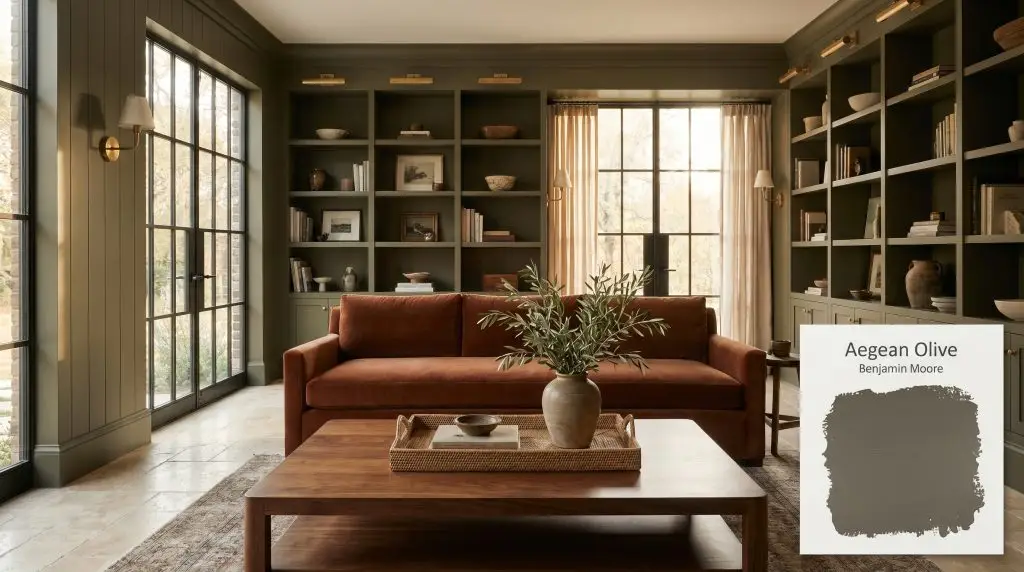
Aegean Olive 1491
Benjamin MooreBenjamin Moore Aegean Olive 1491 is a deep, earthy olive green heavily warmed by rich brown and bronze undertones. With a low LRV of 11.54, this moody, grounding hue excels in studies, on cabinetry, and as a striking exterior accent.
Paint Technical Profile
| Color ID / SKU | 1491 |
| HEX Code | #5D594C |
| Light Reflectance (LRV) | 11.54 |
| Use | Interior, Exterior |
| Best Exposures | North, East, South |
| Best For | Cabinets, accent walls, exteriors, moody studies, dining rooms |
Benjamin Moore Aegean Olive: Crafting Shadow and Warmth with the Ultimate Earthy Green
Benjamin Moore Aegean Olive 1491 is a brilliant exercise in restraint, offering a deeply grounded pigment that forces surrounding materials to take center stage. Instead of shouting for attention, this moody olive acts as a sophisticated shadow-catcher, absorbing harsh glare and wrapping a room in an incredibly warm, historic glow. It completely alters the energy of a floor plan, turning standard drywall into a rich, tactile surface.
This architectural color thrives on contrast, begging to be paired with raw, organic textures and highly polished metals. It is the ultimate foundational layer for homeowners who want to weave biophilic design into their spaces without relying on predictable, vibrant leaf greens.
Whether you are coating a traditional study or modernizing basic kitchen cabinetry, understanding how this color’s hidden bronze cast reacts to the environment is the key to unlocking its full potential. When deployed with intention, it creates an atmosphere that feels both curated and effortlessly lived-in.
Benjamin Moore Aegean Olive: Undertones & LRV
Is Benjamin Moore Aegean Olive warm or cool? This paint is definitively warm. It sits firmly in the deep yellow-bronze spectrum, relying on a complex blend of earthy pigments to achieve its signature depth.
To truly understand how this color behaves on the wall, you have to look at its underlying structure:
At an LRV (Light Reflectance Value) of 11.54, Aegean Olive absorbs a massive amount of light. This low LRV means the paint commands immediate visual authority, pulling the walls inward to create an enveloping, moody atmosphere. Because it reflects so little illumination back into the room, it requires a highly intentional lighting strategy to prevent the color from falling flat.
Lighting Effects & The Chameleon Factor
If you ignore the lighting requirements of this low LRV paint, you risk turning your room into a heavy, oppressive brown-black shadow. Aegean Olive requires active illumination to keep its green identity alive. Because of its strong yellow-bronze base, the paint is highly reactive to the temperature of the light hitting it, shifting its personality throughout the day.
Never rely on a single overhead fixture with this paint. To keep the green active, you must layer ambient, task, and accent lighting at different heights across the room, washing the walls with a warm, even glow.
Hackrea Pro-Tip (The Illumination Strategy)
Here is exactly how this earthy green shifts across different lighting scenarios:
Popular Room Applications
Aegean Olive acts as a visual anchor, pulling scattered floor plans into a grounded, cohesive retreat. It brings a profound sense of quiet luxury to a home, adapting seamlessly to the materials and architectural details it encounters.
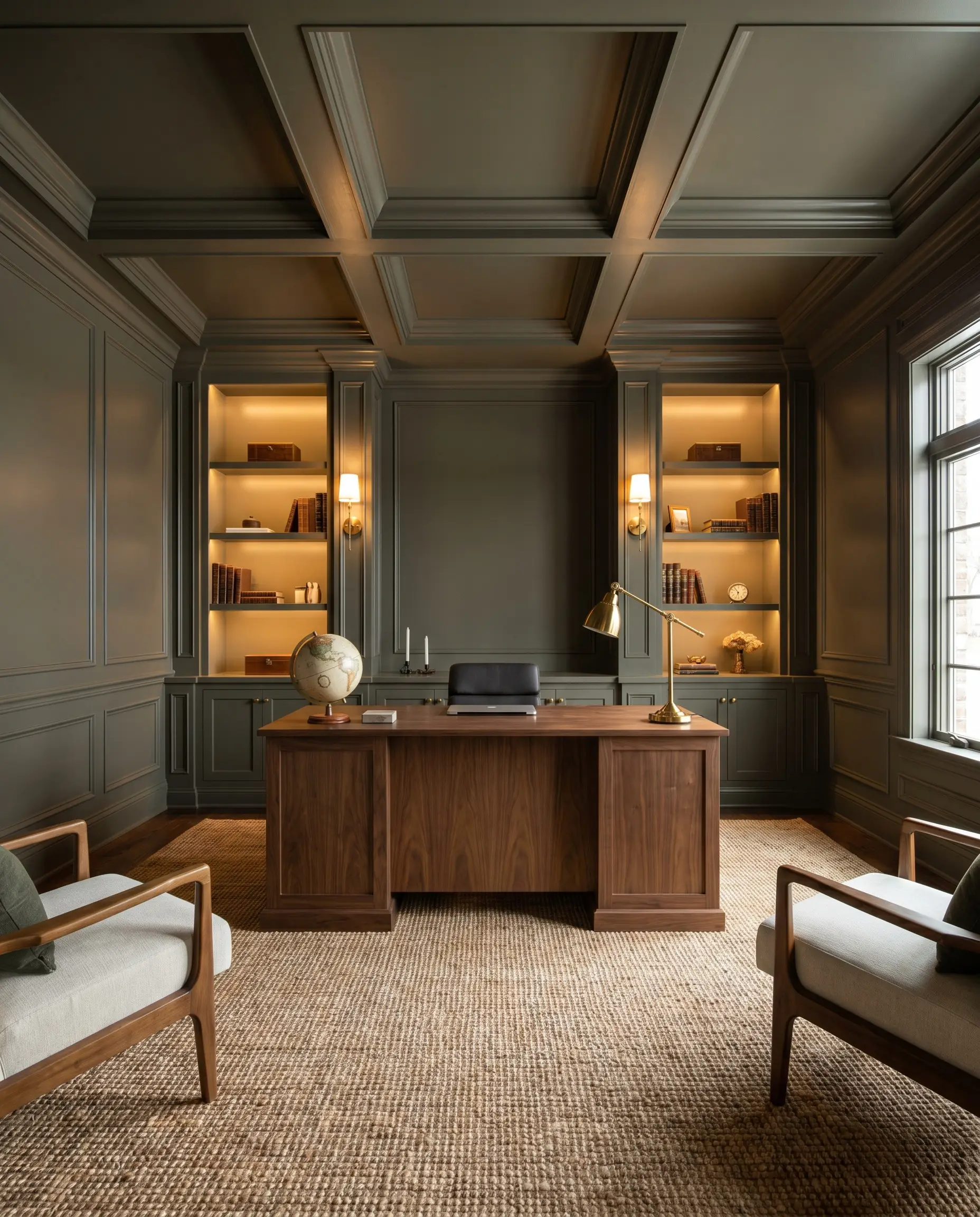
Home Offices & Studies
This shade was practically engineered for focused, intimate workspaces. When wrapped across the walls, trim, and ceiling, it creates a distraction-free zone that feels like a classic library. Pair it with rich walnut desks, woven jute rugs, and burnished brass desk lamps to lean into a traditional academic aesthetic. If you prefer a modern organic vibe, use this deep olive as an accent wall behind floating light-oak shelving, letting the green recede while the wood tones pop forward.
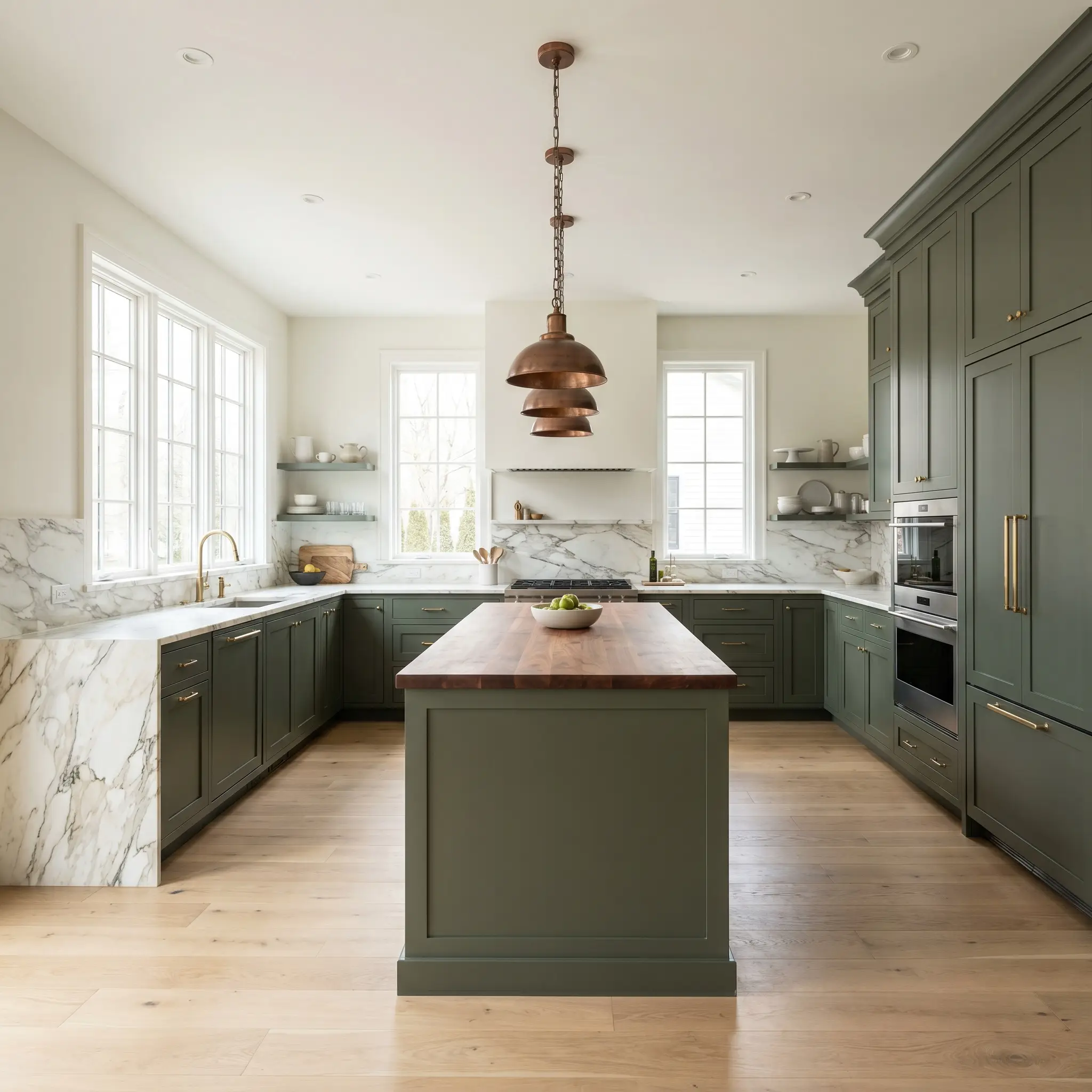
Kitchen Cabinetry & Islands
Dark green cabinets are a staple of premium kitchen design, and this specific shade offers a warmer, more inviting alternative to stark blacks or cool navy blues. It grounds a kitchen layout beautifully when applied to lower cabinets or a central island, especially when topped with heavily veined marble or warm butcher block counters. To keep the room feeling expansive, balance the dark base with creamy white upper walls and simple ceramic subway tile.
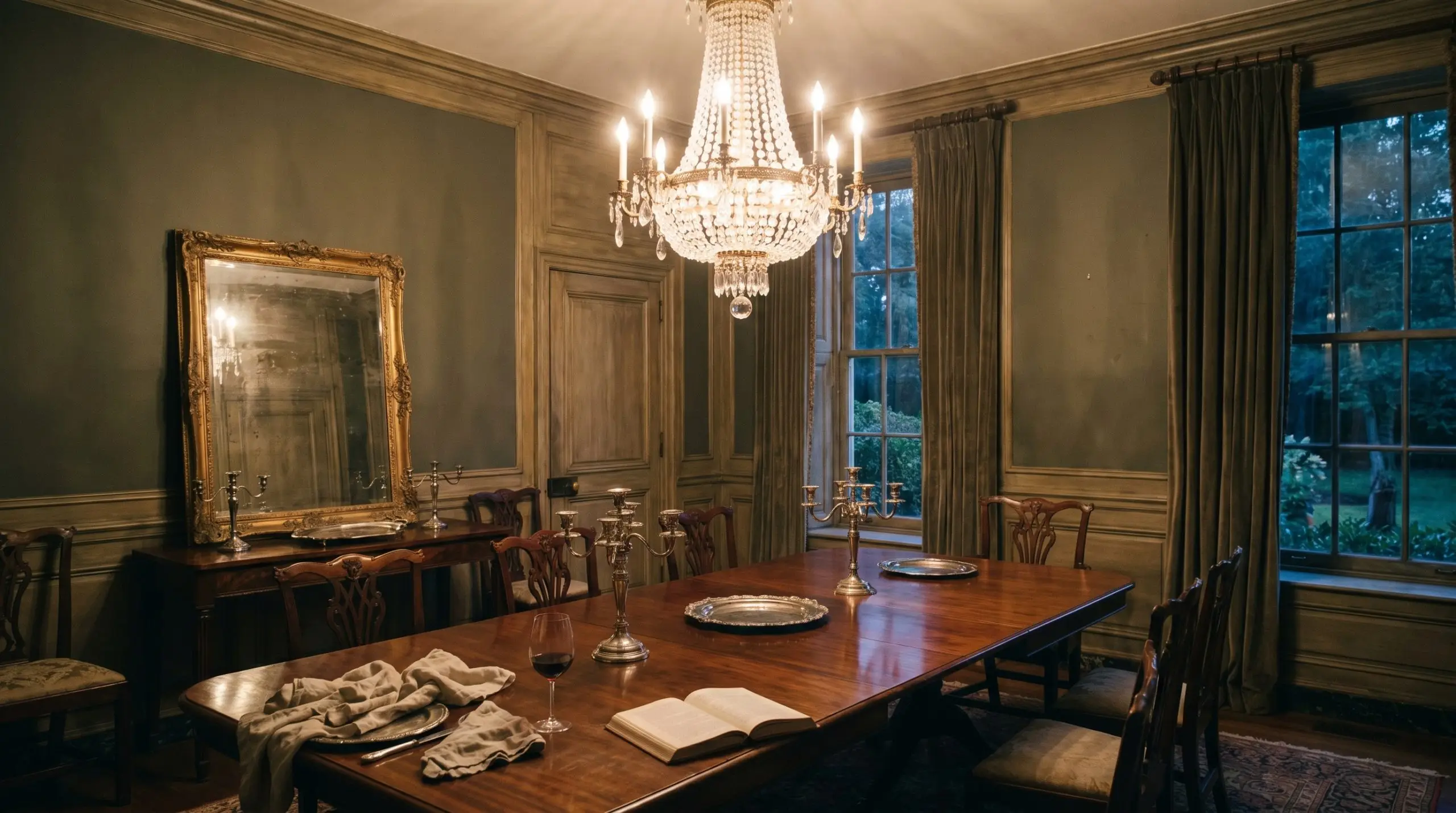
Formal Dining Rooms
In a dining room, this paint sets the stage for long, atmospheric evening meals. Use it above traditional wainscoting to create a striking contrast, or take it floor-to-ceiling for a fully immersive dining experience. It serves as a brilliant backdrop for reflective surfaces, allowing crystal chandeliers, silver table settings, and mirrored accents to bounce light around the room, preventing the deep pigment from feeling heavy.
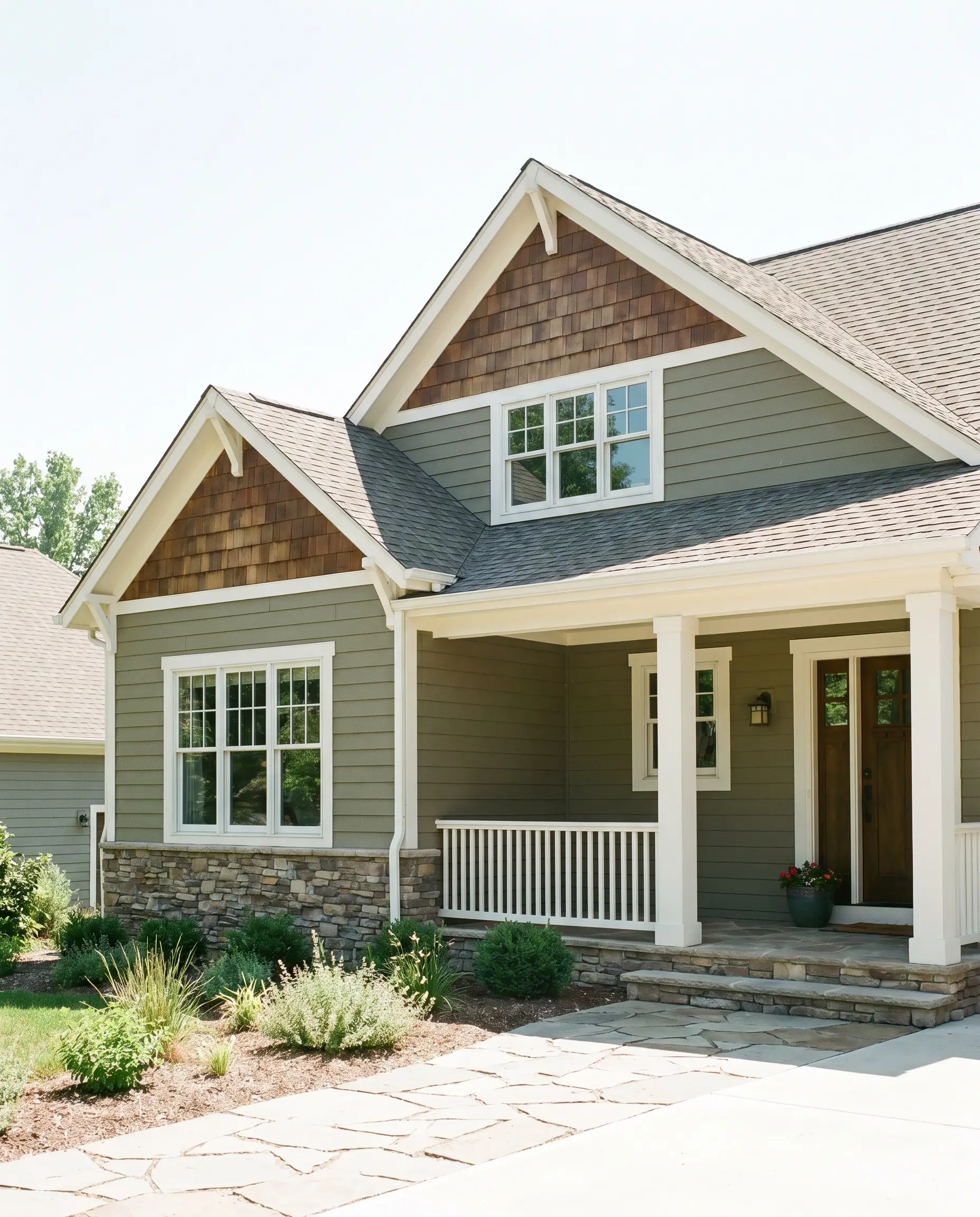
Exterior Siding & Trim
As an exterior color, this warm neutral blends a home seamlessly into its surrounding landscape. Full sunlight washes out the intensity of the green, making it read as a soft, historic khaki-bronze on siding. It works exceptionally well on traditional craftsman homes, rustic cabins, or as a striking trim color against creamy stucco facades. Pair it with natural stone foundations and stained cedar shingles for a flawless exterior palette.
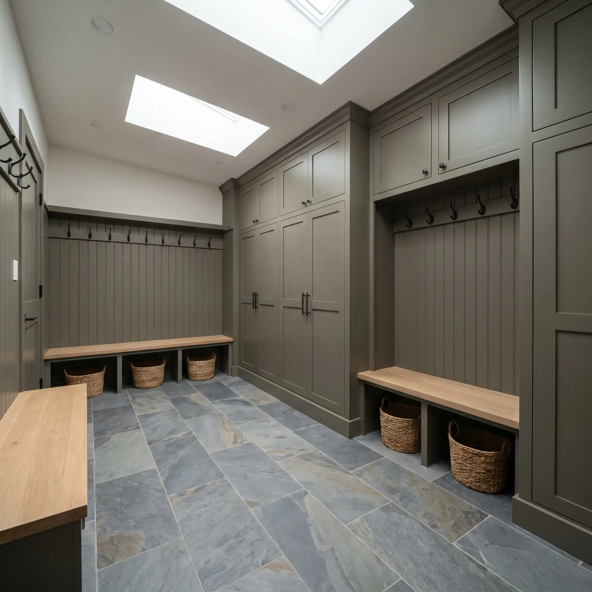
Mudrooms & Utility Spaces
Utility spaces benefit immensely from dark, forgiving colors. Applying this moody olive to stock beadboard, built-in lockers, or utility cabinetry instantly upgrades the functional zone into a curated entryway. The deep pigment easily hides daily scuffs and dirt, while pairing beautifully with durable, practical flooring like slate tile or classic brick herringbone.
Creative Ways to Use Aegean Olive
This Benjamin Moore Classics shade inspires highly custom, out-of-the-box thinking, proving that paint is the most powerful architectural tool in your arsenal.
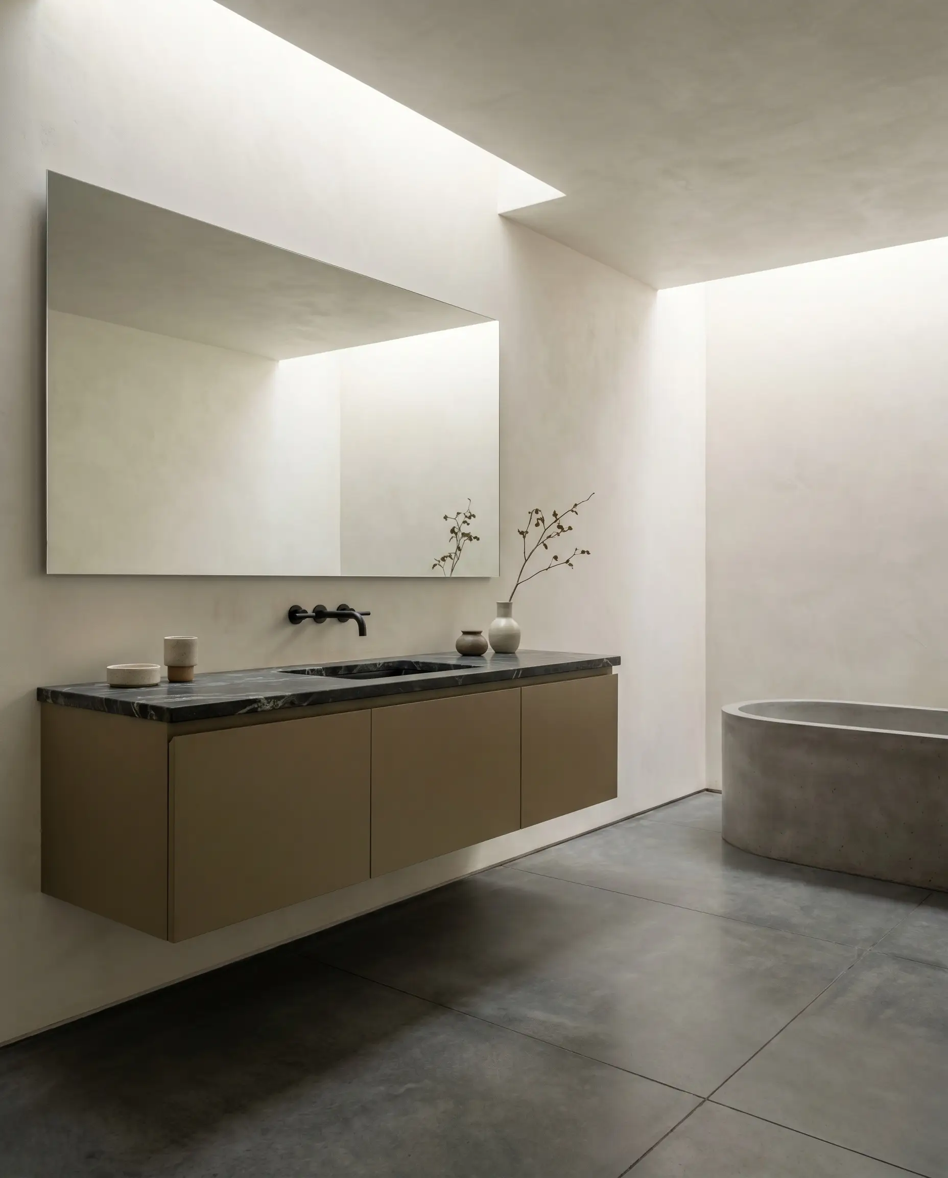
The Restored Terracotta Bathroom
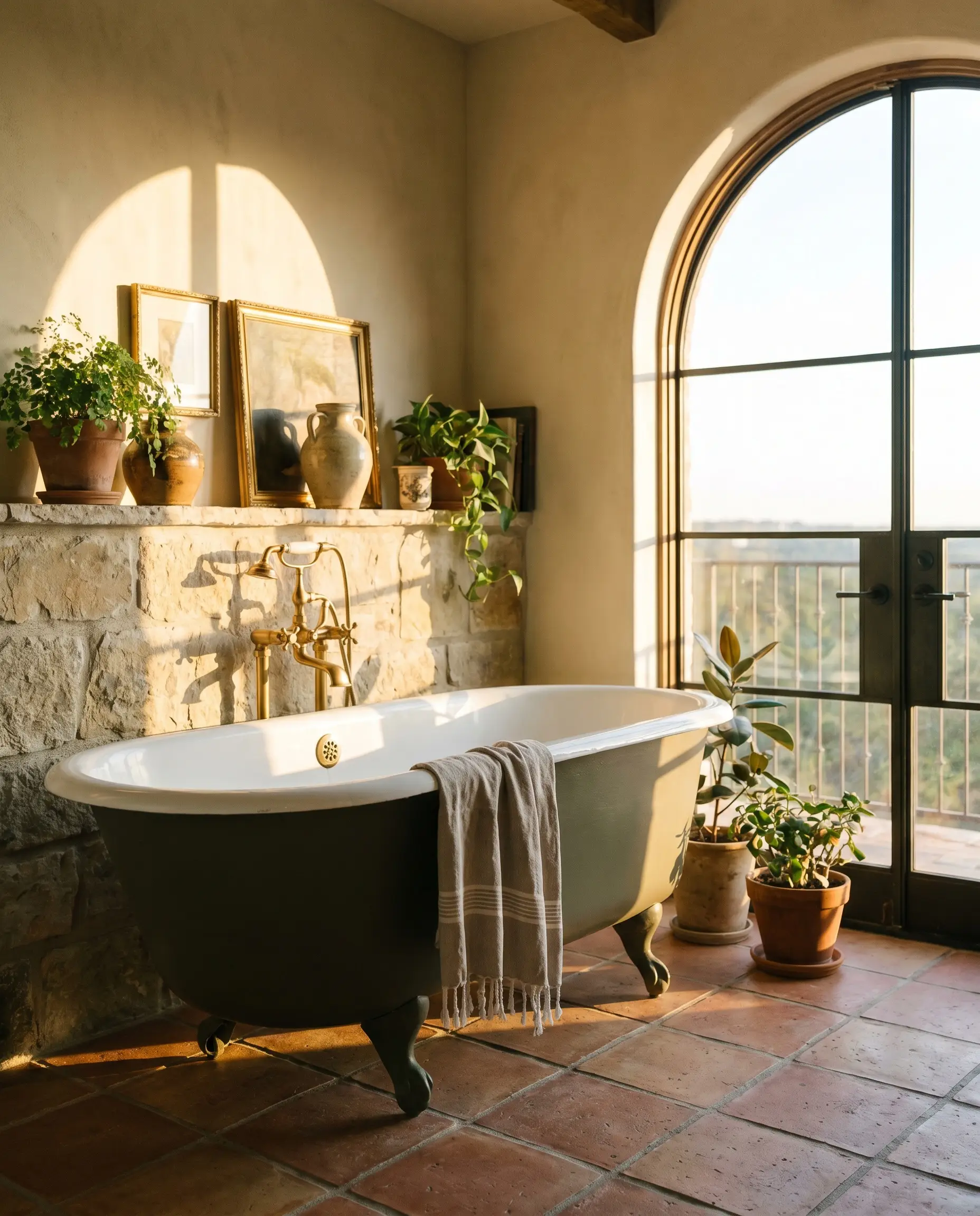
For the historic home restorer, this paint breathes new life into salvaged fixtures. Coating the exterior of a vintage clawfoot tub in Aegean Olive instantly modernizes the piece while respecting its age. When this dark, earthy green tub is placed directly onto reclaimed terracotta floor tiles, the collision of the warm bronze undertones and the baked clay creates a breathtaking, sun-drenched Mediterranean energy that feels entirely custom.
The Continuous Soapstone Vanity
A minimalist architect understands the power of uninterrupted visual weight. Designing a sleek, flat-panel bathroom vanity painted entirely in Aegean Olive and topping it with dark, heavily veined soapstone creates a seamless, grounded focal point. The subtle gray cast in the paint speaks directly to the charcoal tones of the soapstone, resulting in a highly tailored, quiet luxury aesthetic that anchors the entire bathroom.
The Reflective High-Gloss Threshold
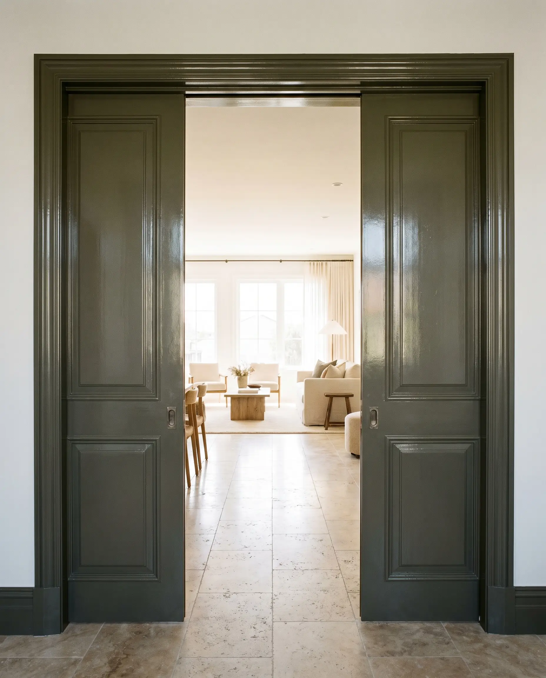
Boutique hotel designers frequently use finish variations to manipulate spatial flow. Applying this deeply muted olive in a high-gloss finish to a set of traditional pocket doors transforms a standard transition into a dramatic threshold. The glossy sheen bounces ambient light down the hallway, while the dark pigment creates a visual pause, signaling a transition from a bright, active living space into a moody, intimate suite.
The Unlacquered Brass Butler’s Pantry
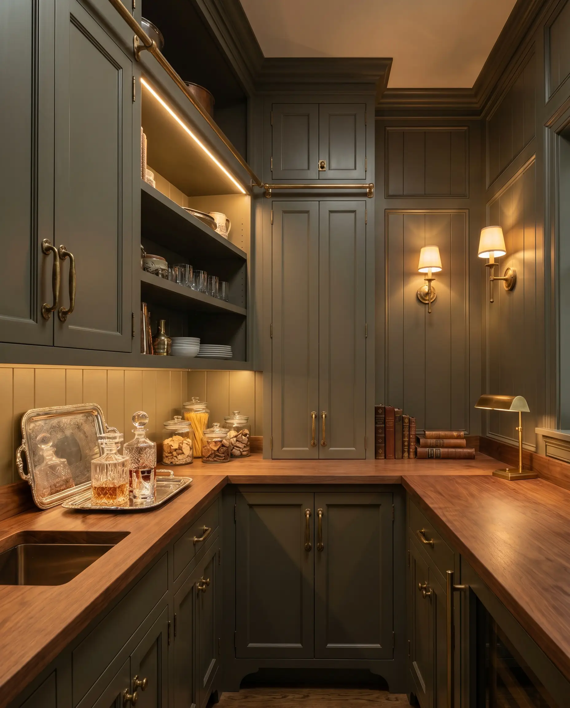
For the high-end culinary enthusiast, a butler’s pantry should feel like a jewel box. Wrapping the cabinetry, walls, and shelving in this deep olive canvas provides the ultimate backdrop for living finishes. Installing heavy, unlacquered brass pulls and hinges against the dark green creates a striking, high-contrast pop. As the brass patinas over time, its deepening warmth perfectly mirrors the bronze undertones hidden within the paint.
The Period-Accurate Exterior Facade
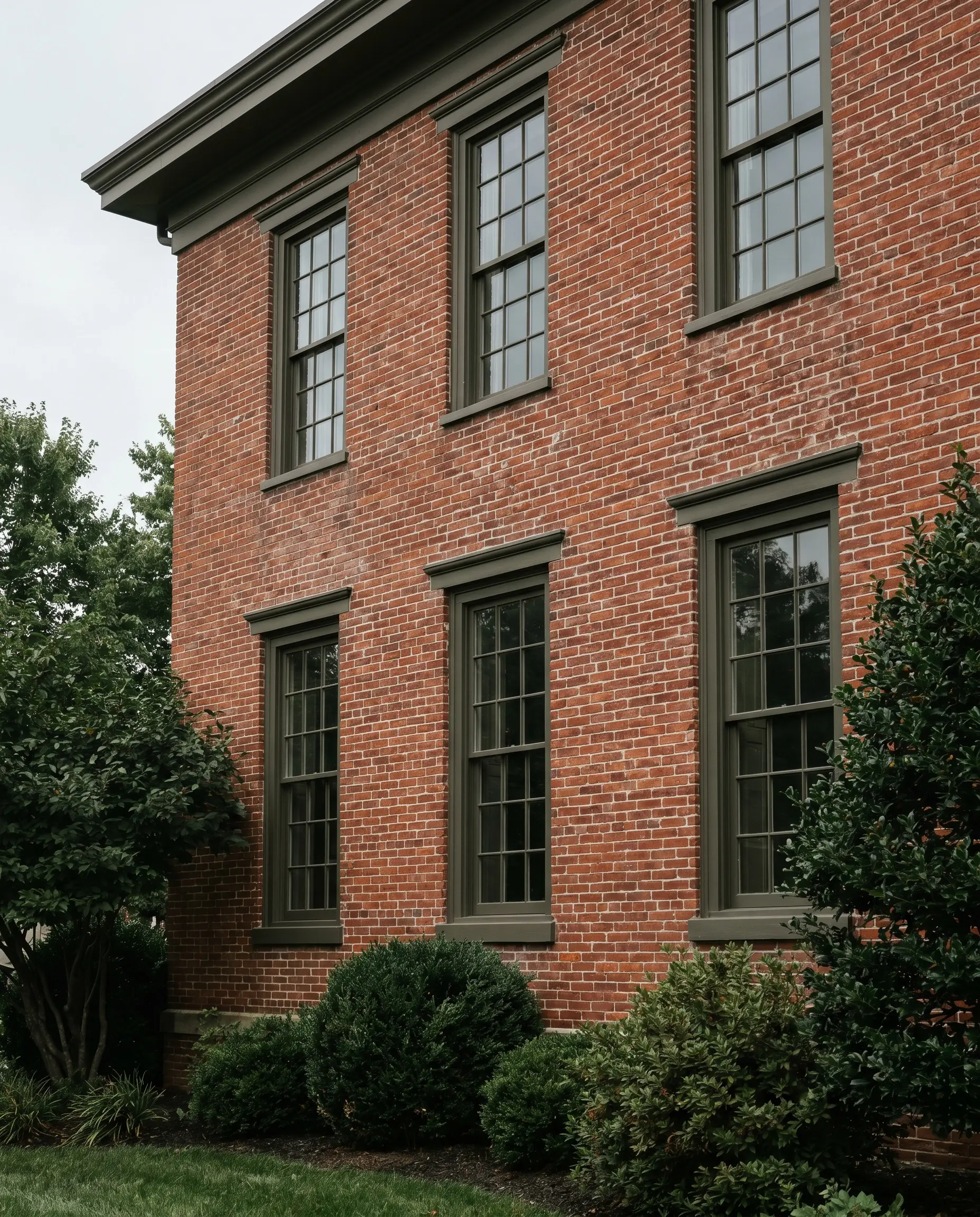
Historic preservation requires a delicate touch when selecting exterior accents. Painting period-accurate exterior window sashes in this deep olive anchors a traditional, weathered brick facade beautifully. The khaki-brown undertones in the paint connect the red clay of the brick and the surrounding landscaping, creating a cohesive, historically respectful exterior that feels deeply rooted in its environment.
Coordinating Colors & Best Pairings
This moody olive relies on strategic contrast to hold its shape, thriving when placed next to crisp neutrals or warm, tactile materials.
Trim & Baseboards
To frame this dark green effectively, you need trim colors that offer clean boundaries without feeling icy or stark.
Hardware, Wood & Material Pairings
The secret to styling this paint is leaning into its organic DNA, selecting materials that either share its earthy warmth or provide a sharp, reflective contrast.
Coordinating Colors
Designer Mood Boards
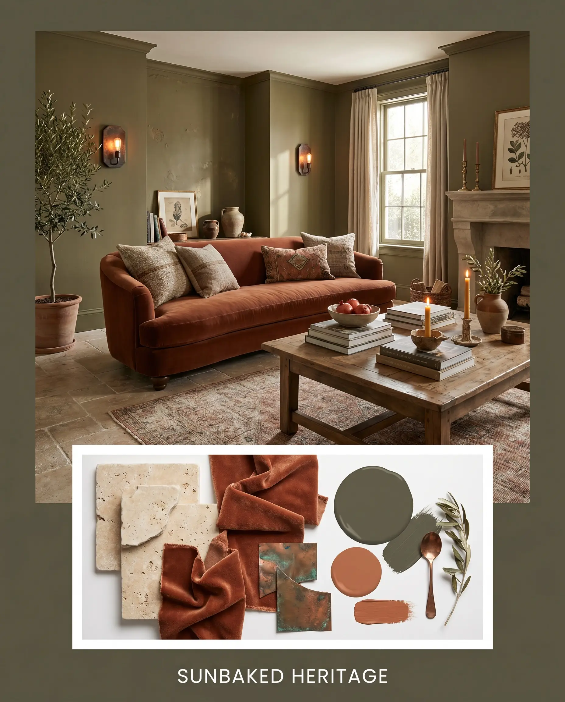
Sunbaked Heritage This palette captures the essence of a warm, historic retreat. The walls are wrapped in the deep olive, grounded by heavily textured Tumbled Travertine floors. A plush rust-toned velvet sofa echoes the energy of Cavern Clay, while Aged Copper wall sconces cast a warm, fiery glow against the dark green. Terracotta planters and vintage Persian rugs complete the deeply organic, lived-in atmosphere.
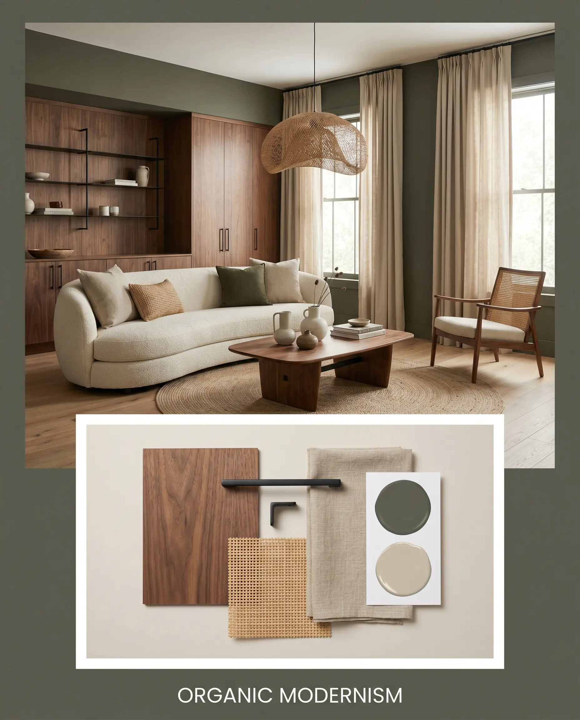
Organic Modernism A masterclass in sleek, tactile restraint. The moody olive anchors the space, while extensive Walnut Veneer paneling brings a smooth, mid-century warmth. Matte Black Iron hardware provides crisp, architectural lines, cutting through the earthy tones. A woven rattan armchair and soft Bleeker Beige linen drapery soften the edges, resulting in a highly tailored, serene environment.
Head-to-Head Comparisons
When selecting a dark green, the specific undertones dictate how the color will behave in your home’s unique lighting. Here is how Aegean Olive stacks up against its closest rivals.
Benjamin Moore Aegean Olive vs. Sherwin-Williams Rosemary SW 6187
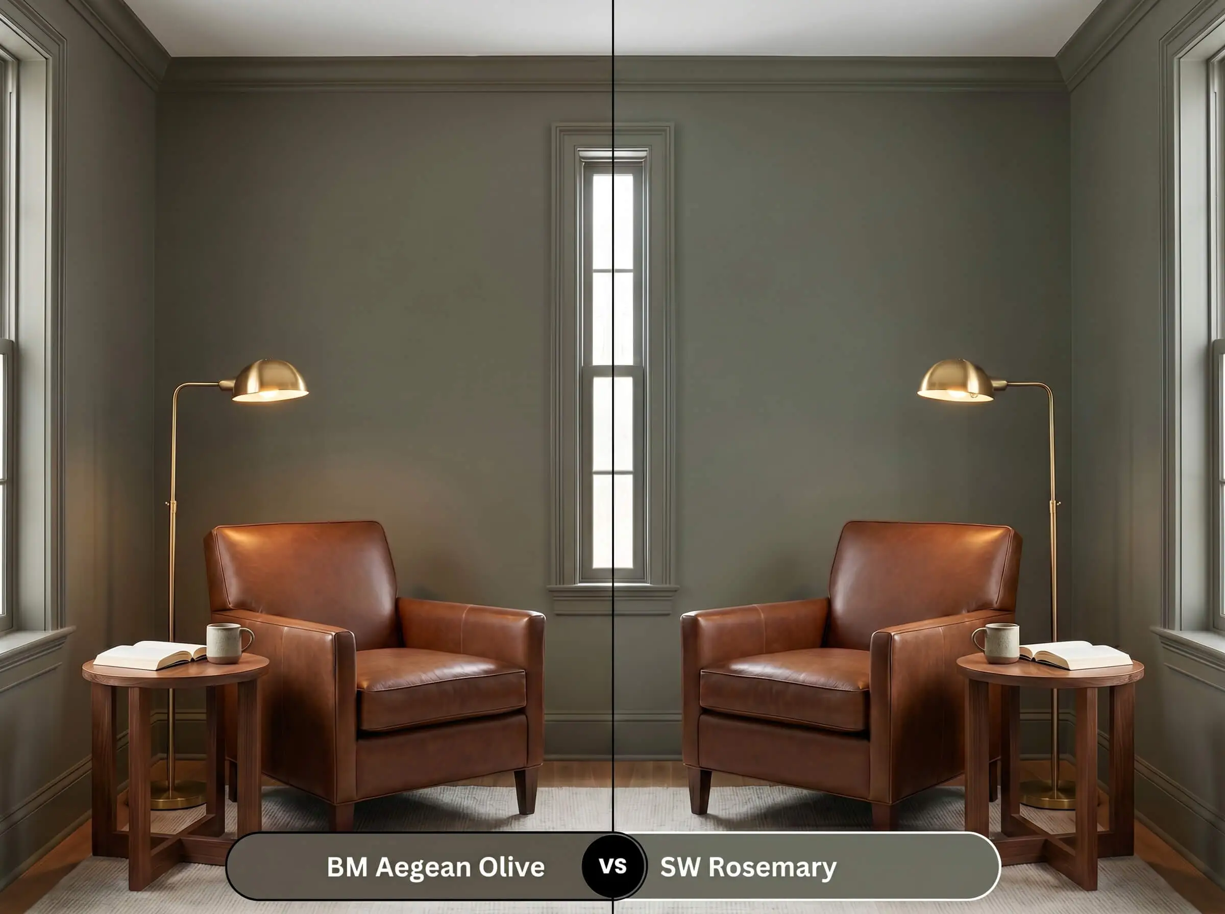
If your room lacks natural light, Rosemary might be the safer choice. While both are deep, earthy greens, Rosemary has a slightly higher LRV and leans a bit cooler, retaining its green identity more easily in shadows. Aegean Olive is significantly warmer and browner, requiring ample light to prevent it from reading as a dark khaki-bronze.
Benjamin Moore Aegean Olive vs. Benjamin Moore Dark Olive 2140-30
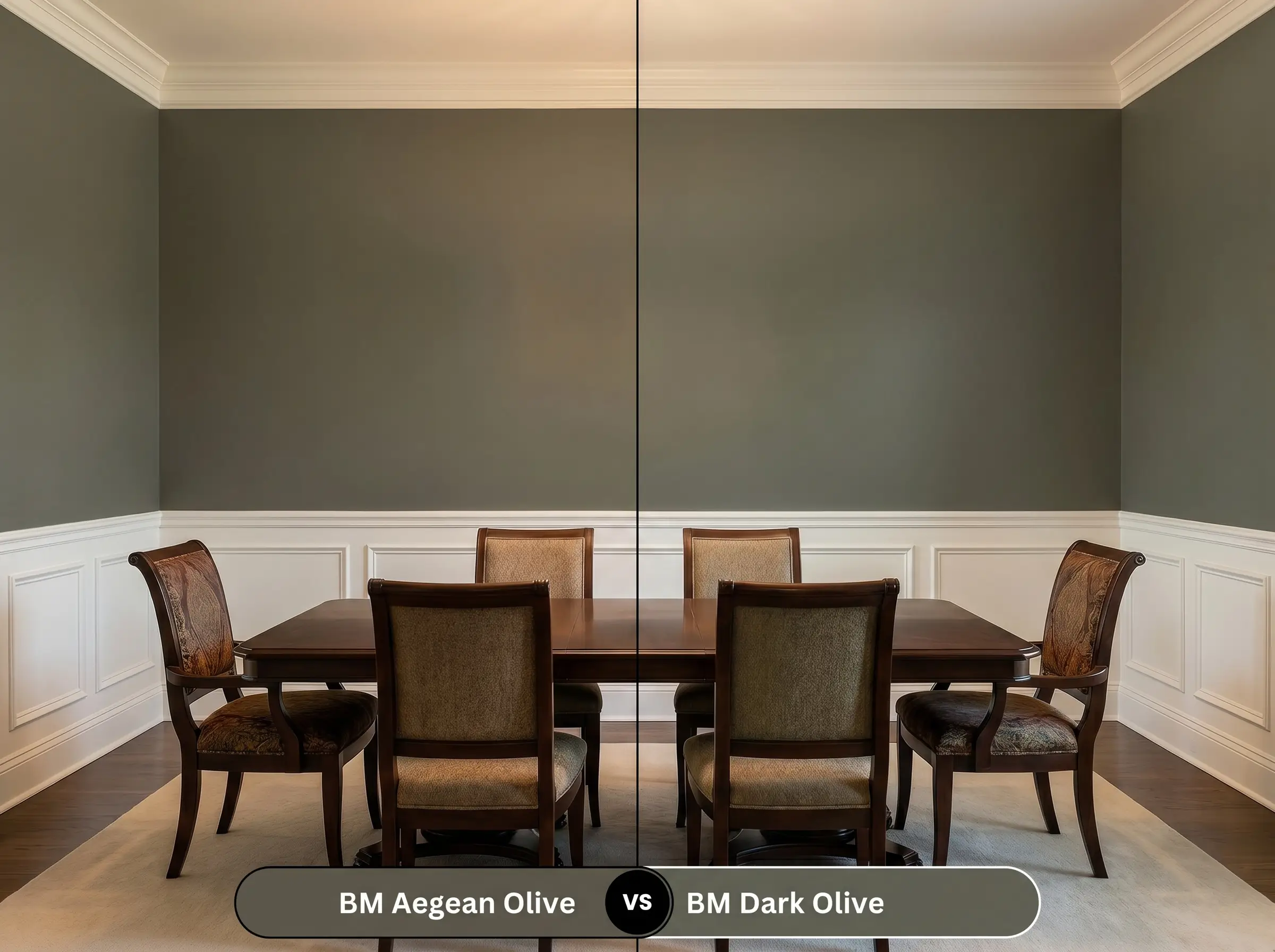
If you want a true, undeniable green, Dark Olive is the winner. Dark Olive possesses a purer green with less brown interference, making it feel slightly more traditional and vibrant. Aegean Olive leans heavily into its bronze and brown undertones, making it the better option for homeowners who want a highly muted, almost camouflage-like aesthetic.
Benjamin Moore Aegean Olive vs. Farrow & Ball Treron No. 292
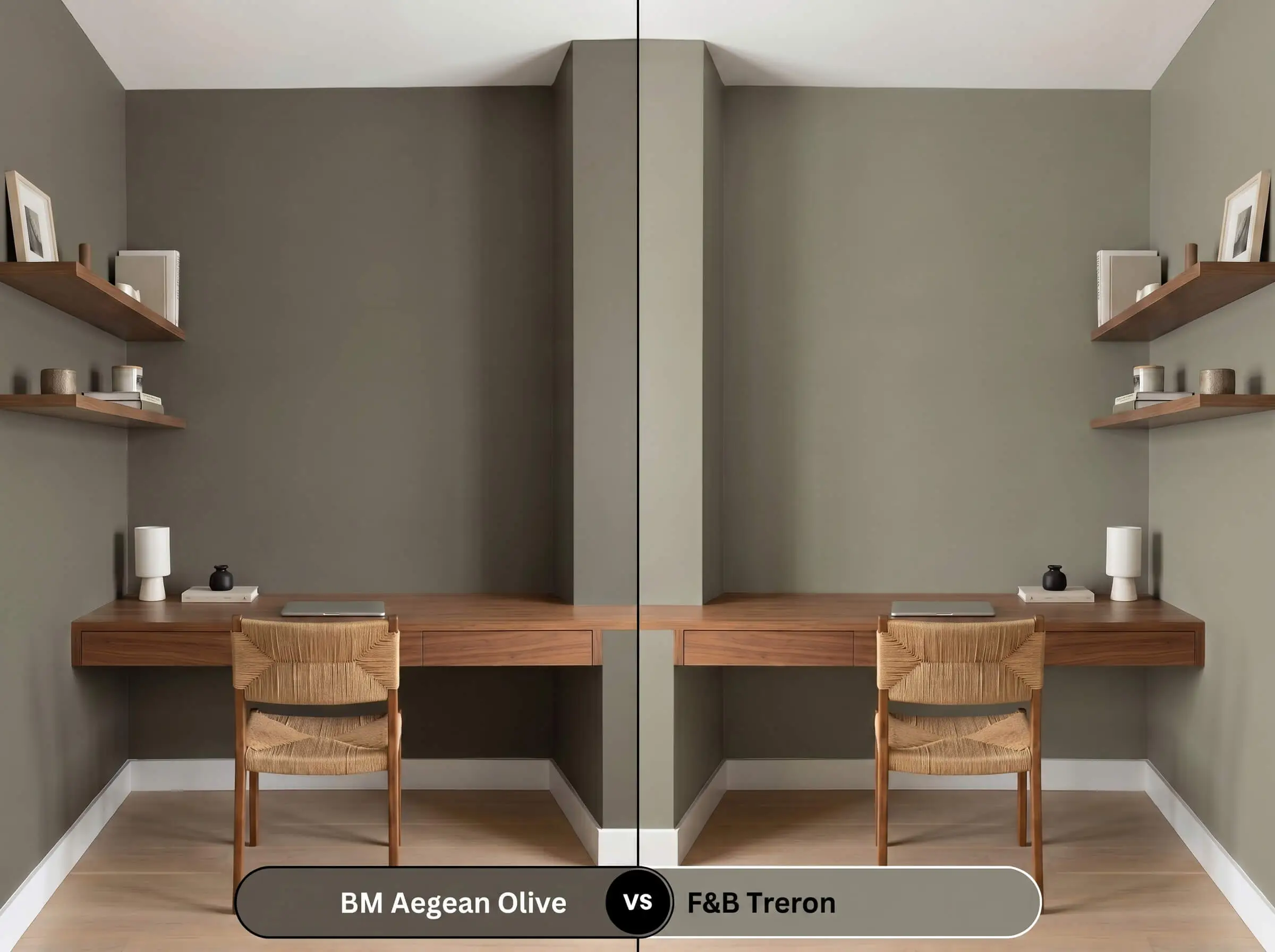
If you are designing a space with intense, direct southern light, Treron offers a softer approach. Treron is a lighter, chalkier green-gray that feels more delicate and historic on the wall. Aegean Olive is much darker and carries a heavier visual weight, making it the superior choice for high-drama spaces like moody dining rooms or enveloping studies.
Similar Colors to Benjamin Moore Aegean Olive
Sometimes a homeowner loves the DNA of a paint but needs a slight adjustment in depth or a match from a different manufacturer.
Similar Colors
Cross-Brand Equivalents
Practical Application & DIY Advice
Transitioning this complex color from a swatch to your walls requires careful planning, as low LRV paints come with specific physical demands.
The Dynamic Sheen Guide
Primer Strategy
You cannot skip the primer with a color this deep. A standard white primer will struggle to support the heavy green-brown pigments, often resulting in a streaky finish. You must use a high-quality, gray-tinted primer. The gray base provides the necessary opacity, allowing the true depth of the olive to develop fully in just two coats.
Coverage & Success Tips
Dark, muted colors are notorious for “flashing”—a visual failure where uneven roller pressure leaves visible, shiny streaks across the wall once the paint dries. To avoid this, you must maintain a wet edge while rolling and avoid the temptation to touch up partially dried spots. Apply two generous, even coats, letting the first dry completely. If you miss a spot, wait until the wall is fully cured before attempting a delicate fix.
Frequently Asked Questions
Yes, without adequate layered lighting, the low LRV and heavy bronze undertones will dominate, causing the green to recede and the cabinetry to read as a flat, heavy brown-black.
Mid-tone to dark woods like walnut and white oak highlight its earthy nature, while unlacquered brass and aged copper provide a stunning, warm contrast that speaks directly to the paint’s hidden bronze cast.
Because it absorbs so much light and heat, this dark pigment is more susceptible to UV fading over time. Using a premium exterior paint formulated for UV resistance is crucial to maintaining its depth.
Absolutely. Applying this dark, enveloping shade to the ceiling absorbs light and pulls the visual boundary downward, making cavernous or overly tall rooms feel instantly intimate and cozy.
Final Verdict & Expert Warnings
Benjamin Moore Aegean Olive is the ultimate grounding paint for homeowners who want to introduce deep, historic color without the vibrancy of a traditional jewel tone. It is perfect for wrapping home offices in a distraction-free shadow, anchoring modern organic kitchens, or grounding historic exteriors. Its heavy brown and bronze undertones make it an incredibly sophisticated, warm neutral that thrives alongside natural stone, rich woods, and living metal finishes.
However, this earthy green is not universally adaptable. You must carefully evaluate your existing fixed elements before committing to this shade. If your home features cool-toned gray luxury vinyl plank flooring, the warm bronze cast of the paint will clash harshly, making the floors look dirty and the walls look muddy. Similarly, stark blue-white LED lighting will strip away all the inviting warmth, leaving the paint looking flat and institutional. Finally, avoid pairing it with heavily red-toned cherry wood cabinetry; the intense red will aggressively pull the green forward, creating an accidental, highly unappealing holiday color scheme rather than the curated, organic retreat you intended.
Closest Cross-Brand Equivalents
The absolute closest scientific color matches for Aegean Olive across top paint brands.