Expert Ideas for Pairing Paint Colors with Red Brick Walls
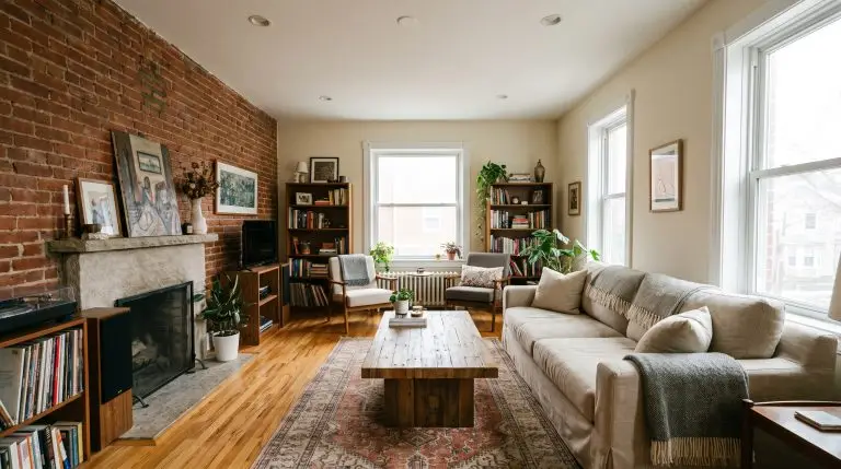
Red brick carries massive visual weight. It is a stunning architectural feature, but it commands absolute attention, making the surrounding surfaces feel like a high-stakes gamble. Homeowners often freeze up when selecting paint colors that go with red brick walls, terrified of choosing a shade that accidentally creates a festive, year-round holiday look or a disjointed, dated space. The fear is completely valid: generic cool whites can look painfully sterile against the earthy warmth of masonry, while the wrong saturated hue will aggressively clash.
To build a cohesive, intentional palette, we have to stop looking at the brick as just “red.” A masonry wall is a complex collection of undertones—ranging from plum and charcoal to bright orange—held together by mortar joints. These gray, sandy, or cream lines between the bricks are your built-in bridge colors. By aligning your wall pigments with the specific color temperature of the mortar and the Light Reflectance Value (LRV) necessary to balance the brick’s heavy visual weight, you guarantee a flawless transition. For broader context on current palette shifts, you can explore our analysis of Interior Paint Color Trends and Living Room Design Ideas.
In this architectural guide, we are bypassing generic advice and using exact, professional-grade paint formulations. If you are ready to make your red brick look like an expensive, custom-designed feature, here are the exact shades that get it right.
Creamy Whites and Warm Neutrals for High Contrast
Stark, hospital whites violently clash with the earthy imperfection and warmth of red brick. To achieve high contrast without feeling harsh, you need warm, creamy whites with yellow or subtle beige undertones that seamlessly bridge the gap between crisp millwork and raw masonry.
- The Mortar Match Method: Hold your white paint swatch directly up to the mortar joint, completely ignoring the red brick face.
- Check the Temperature: Ensure the undertone of the white paint mirrors the sandy, gray, or cream tones found in the cement.
- Assess the Contrast: If the white is vastly brighter than the mortar, it will look stark; drop down a shade for a softer wash.
Soften Industrial Brick with Benjamin Moore Swiss Coffee Walls
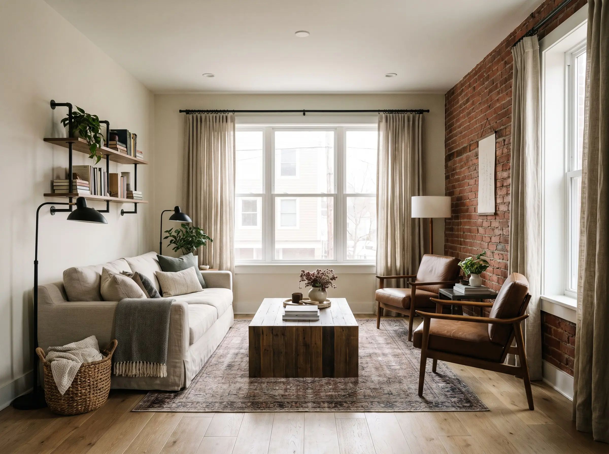
Paint Spec: Brand: Benjamin Moore | LRV: 81.91 | Undertone: Warm Gray/Yellow
This highly popular warm white prevents an exposed brick loft from feeling cold and cavernous. The subtle warmth pairs beautifully with natural wood floors and flawlessly grounds the intense visual weight of the masonry.
- Vibe: Soft Industrial, Organic Modern
- Key Materials: Matte oak flooring, blackened steel hardware
- Styling Pro-Tip: Layer with heavily textured linen curtains to enhance the organic softness.
Match Chalky Mortar Joints with Sherwin-Williams Alabaster Siding
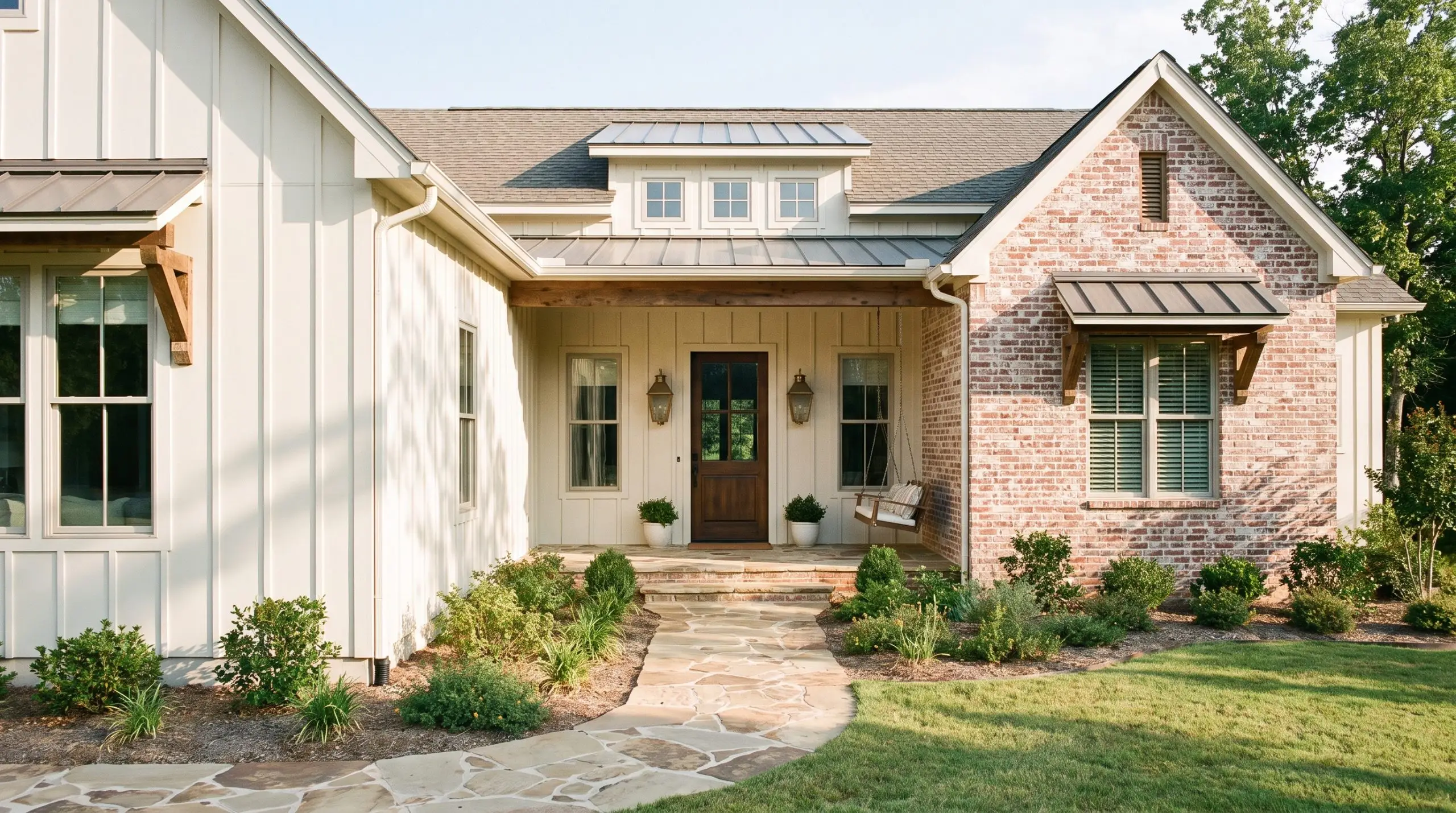
Paint Spec: Brand: Sherwin-Williams | LRV: 82 | Undertone: Beige
For exterior facades or massive living rooms, this shade perfectly mimics the look of aged, chalky mortar. It provides enough beige pigment to harmonize with the exterior brick without losing its identity as a crisp, architectural white.
- Vibe: Transitional, Modern Farmhouse
- Key Materials: Aged brass sconces, natural stone pathways
- Best Application: Exterior siding or large-scale architectural walls.
Create Gallery Walls with Farrow & Ball Pointing
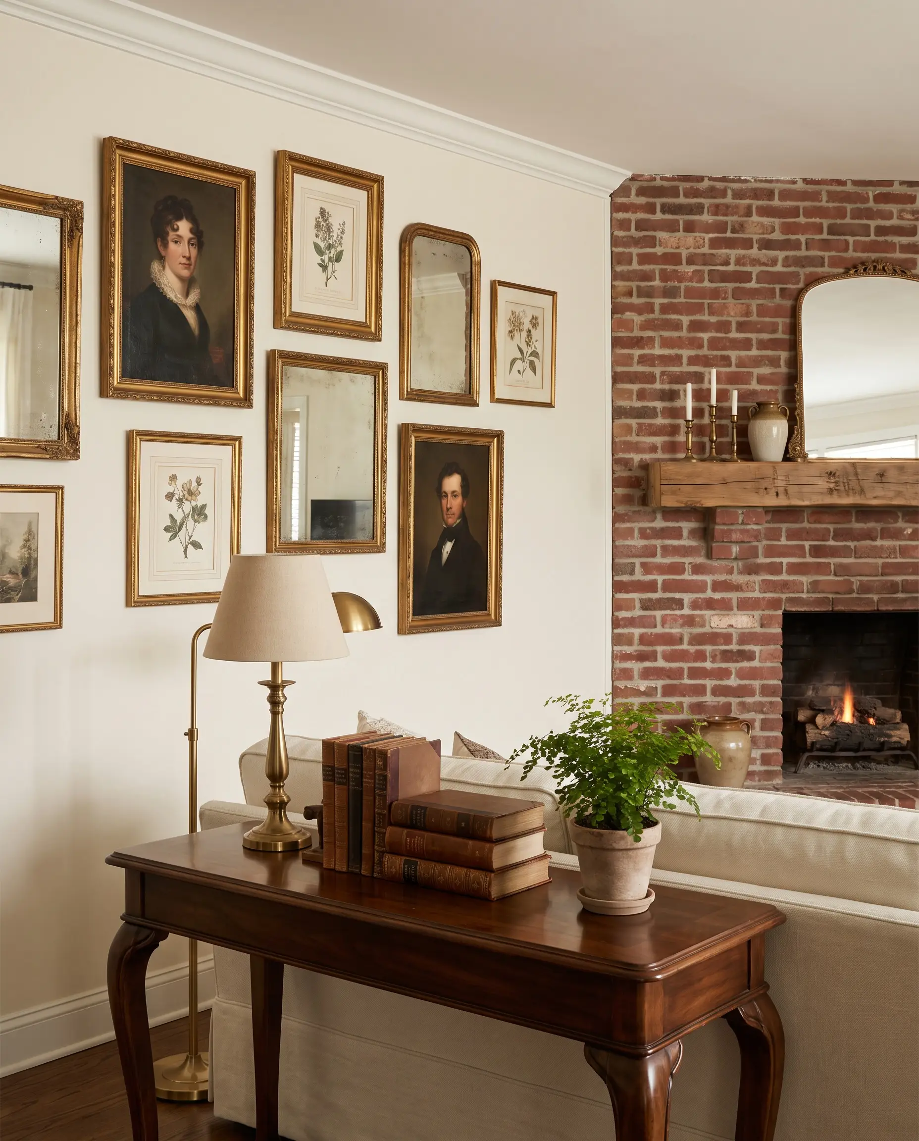
Paint Spec: Brand: Farrow & Ball | LRV: 80.5 | Undertone: Red
By incorporating a subtle red-based undertone, this warm white softens the high-contrast transition next to a brick fireplace. It creates a luminous backdrop for hanging art without competing with the masonry.
- Vibe: Refined Traditional, Curated Eclectic
- Key Materials: Gilded vintage frames, rich walnut furniture
- Styling Pro-Tip: Use Fireplace Mantel Styling Ideas to bridge the white walls and red brick with transitional art pieces.
Warm Up Dark Brick with Behr Creamy Mushroom
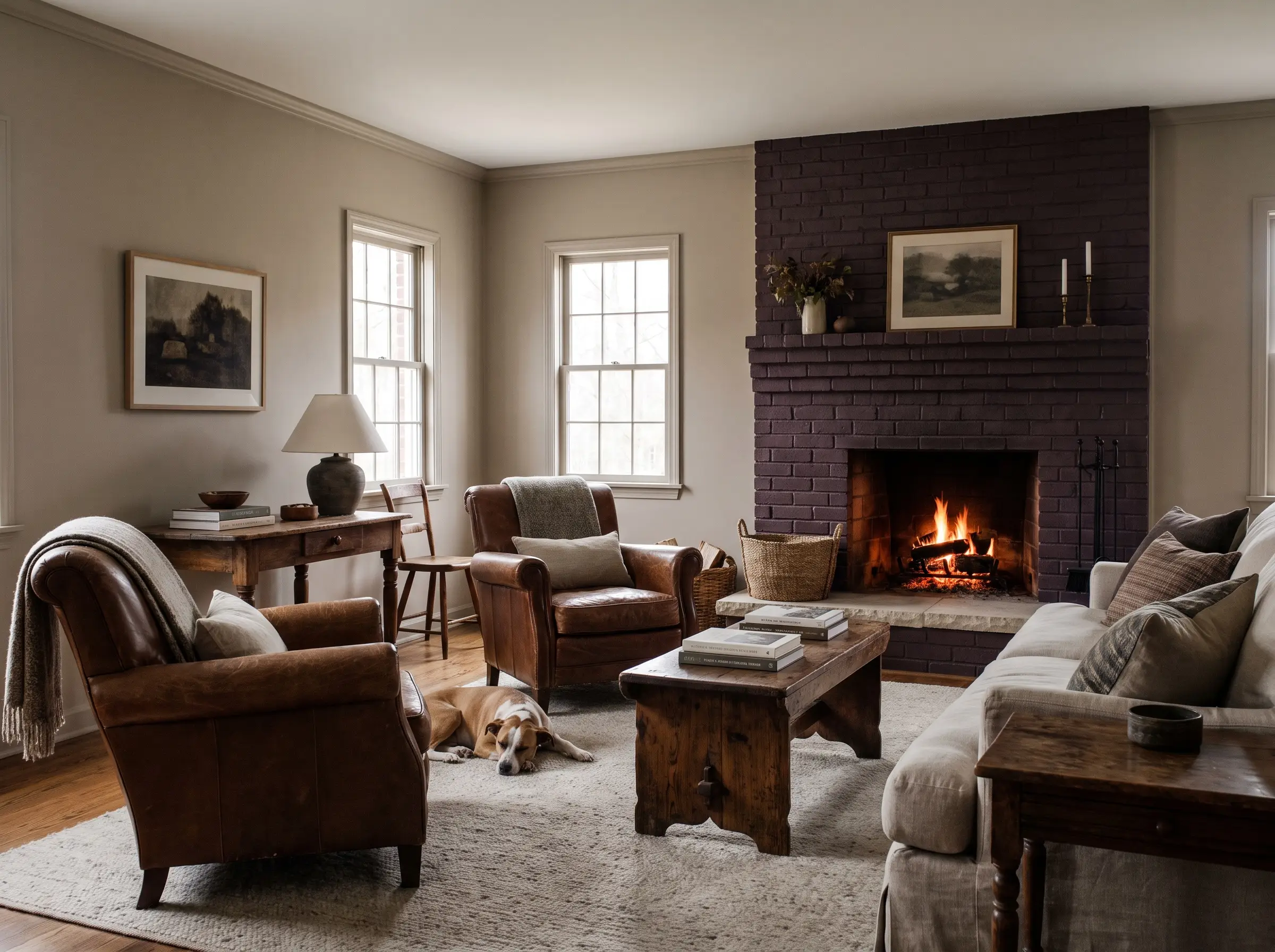
Paint Spec: Brand: Behr | LRV: 71 | Undertone: Earthy Beige
When dealing with darker, plum-toned red bricks, stark whites will look highly disjointed. This slightly deeper cream bridges the gap, neutralizing the aggressive tones while providing a sophisticated, enveloping warmth.
- Vibe: Cozy Traditional, European Cottage
- Key Materials: Tumbled limestone, heavily grained woods
- Best Application: Interior rooms with low natural light.
Earthy Greens to Complement Red Tones Naturally
Because red and green are complementary colors on the color wheel, they naturally make each other pop, which often leads to the dreaded “holiday effect.” To avoid a room that looks festive year-round, you must drop the saturation and choose muddy greens heavily diluted with gray or brown.
The key to using green next to red brick is extreme desaturation. If the green looks bright or vibrant on the swatch, it will look neon next to the brick. Always choose a green that looks almost gray or muddy brown in the can.
Hackrea Designer Secret
Anchor a Red Brick Fireplace with Sherwin-Williams Pewter Green Built-Ins
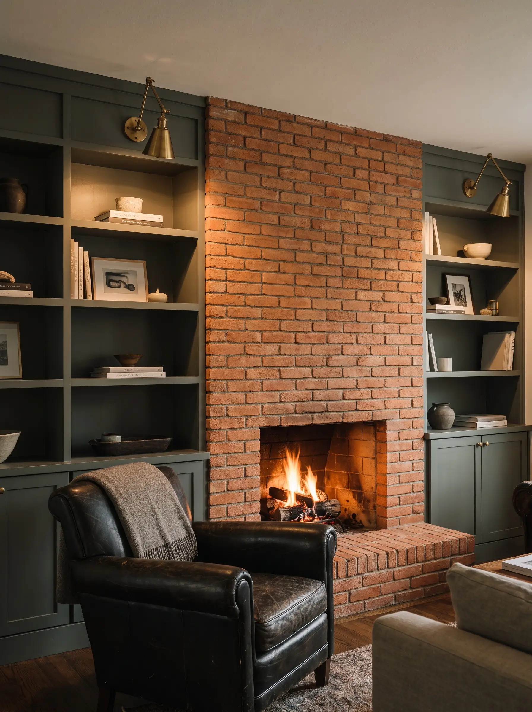
Paint Spec: Brand: Sherwin-Williams | LRV: 12 | Undertone: Cool Gray
This cool, dark gray-green expertly grounds bright orange-red brick by absorbing light rather than reflecting it. It is the premier choice for painting custom millwork or bookshelves flanking a heavy masonry fireplace.
- Vibe: Moody Craftsman, Historic Modern
- Key Materials: Antique brass library sconces, dark leather
- Styling Pro-Tip: Keep the shelving decor minimal to let the rich green and textured brick command the space.
Add Organic Softness with Benjamin Moore October Mist Walls
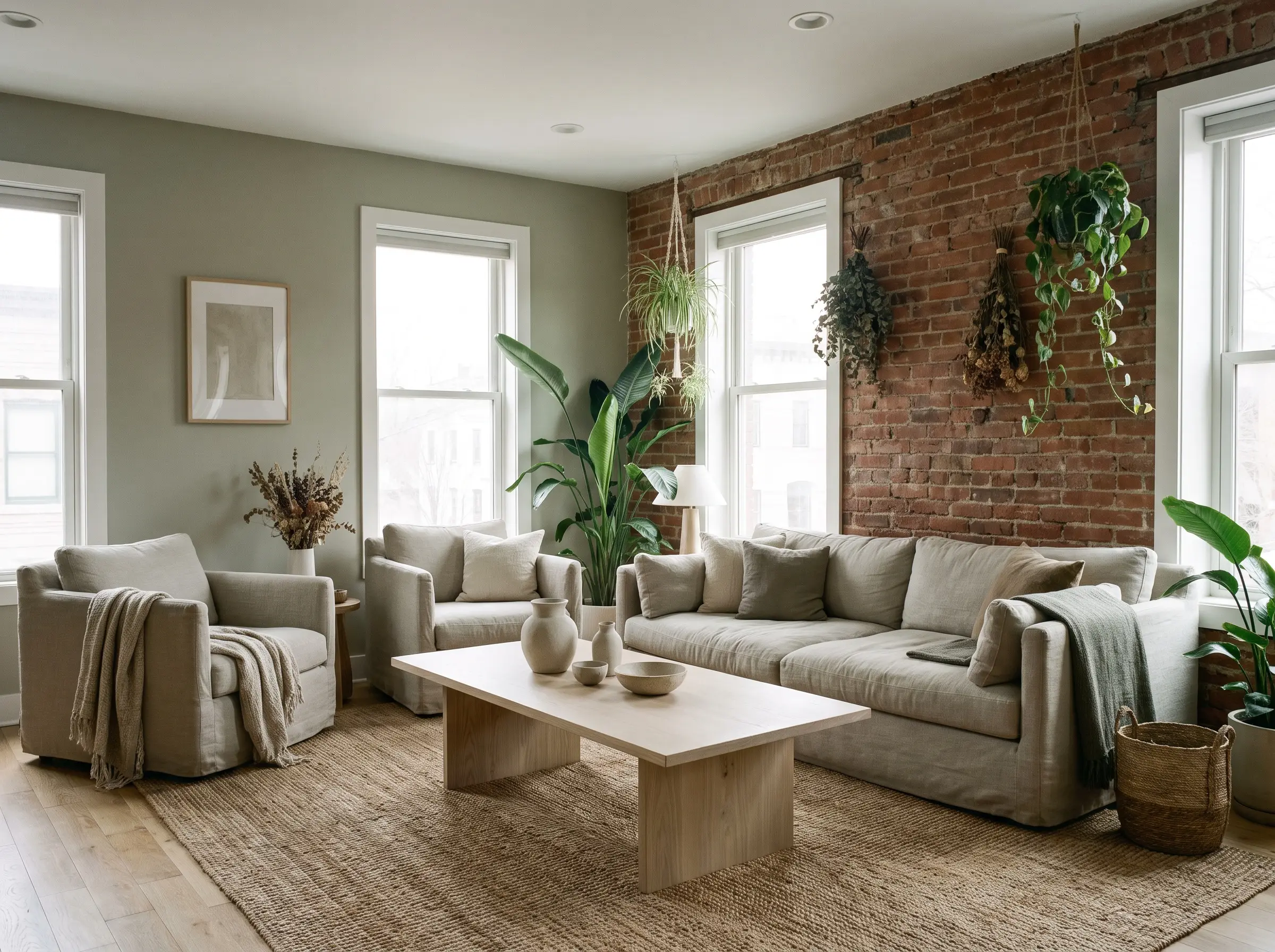
Paint Spec: Brand: Benjamin Moore | LRV: 46.33 | Undertone: Silvery Gray
This silvery sage green acts as an organic neutralizer for aggressive red tones in the brick. The heavy gray undertones create a soft, grounding wash that feels deeply tied to nature.
- Vibe: Organic Modern, Biophilic
- Key Materials: Light ash wood, raw ceramics
- Styling Pro-Tip: Check out our Organic Modern Living Room Ideas to see how sage tones pair effortlessly with natural textiles.
Embrace Historic Charm with Farrow & Ball Card Room Green
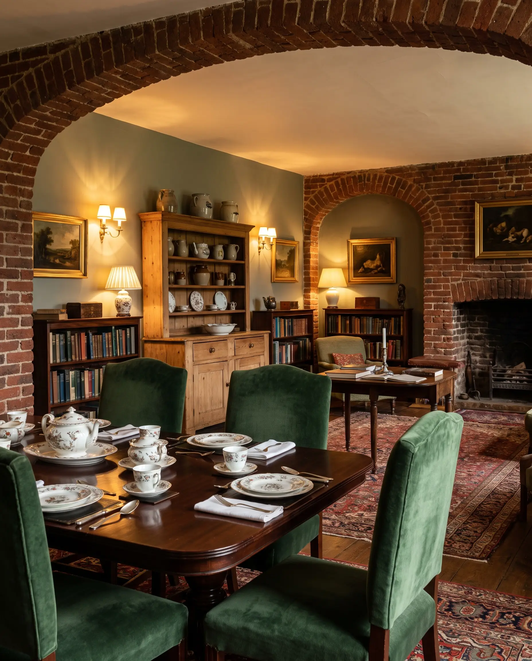
Paint Spec: Brand: Farrow & Ball | LRV: 20 | Undertone: Blue/Gray
For traditional spaces, libraries, or dining rooms featuring deep red brick accents, this moody, Victorian-inspired green is historically accurate and incredibly grounding. The heavy desaturation prevents any visual clashing.
- Vibe: Dark Academia, Historic Traditional
- Key Materials: Mahogany furniture, velvet upholstery
- Lighting Note: Requires warm 2700K bulbs to bring out its richness at night.
Balance Plum-Red Brick with Behr Laurel Tree
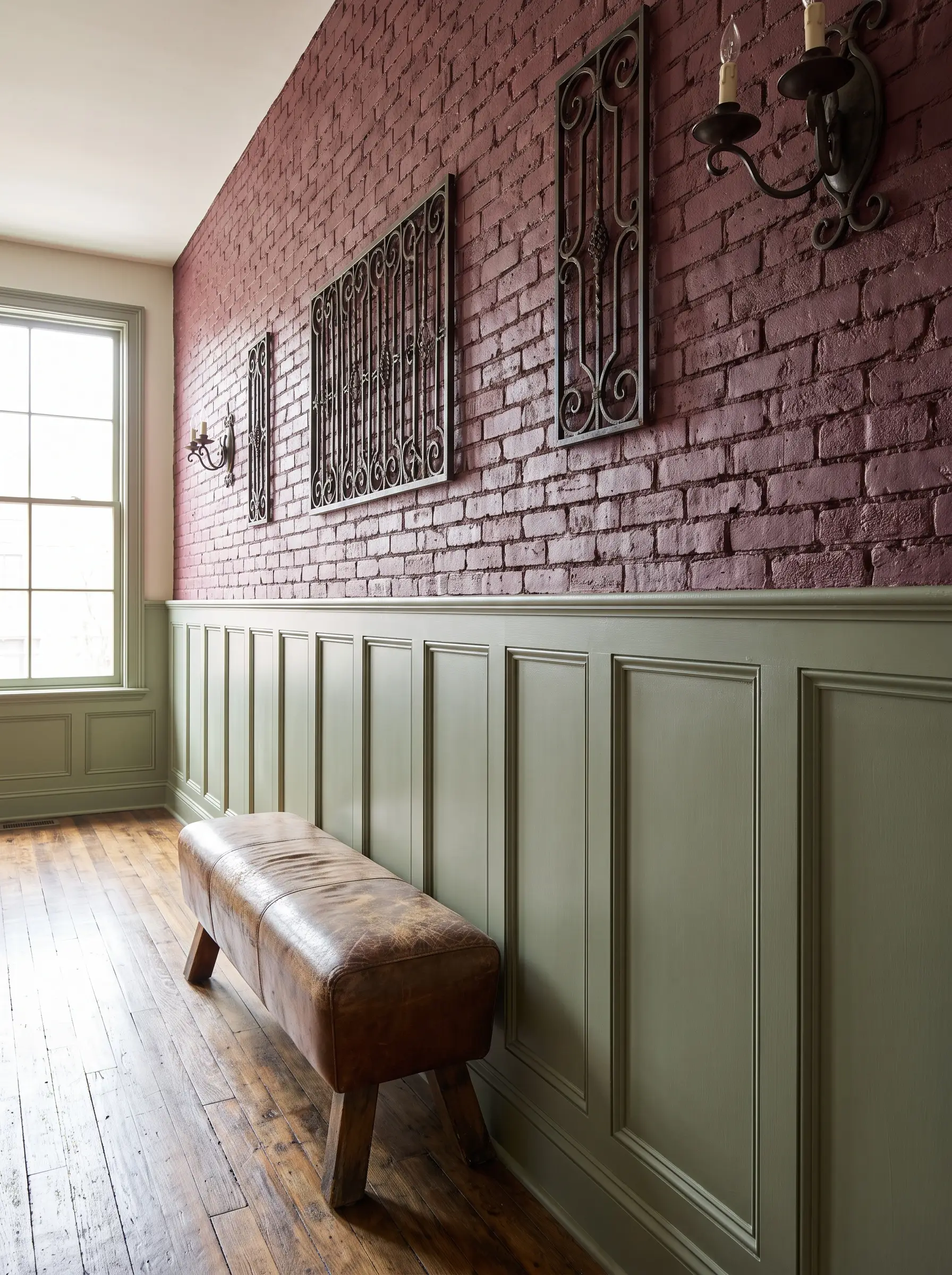
Paint Spec: Brand: Behr | LRV: 35 | Undertone: Yellow/Brown
Older, historic homes often feature red brick with distinct purple or plum undertones that clash with cool colors. This yellow-based earthy green perfectly balances those cooler purples, pulling the room together seamlessly.
- Vibe: Rustic, Heritage
- Key Materials: Wrought iron accents, distressed leather
- Best Application: Wainscoting or lower half-walls beneath exposed brick.
Moody Darks for a Modern, Dramatic Backdrop
Dark colors absorb light, which allows the natural texture and varied undertones of the red brick to become the primary focal point of the room. This approach is perfect for Dark Academia aesthetics or moody modern spaces where you want the masonry to feel highly architectural.
Deepen the Contrast with Sherwin-Williams Iron Ore
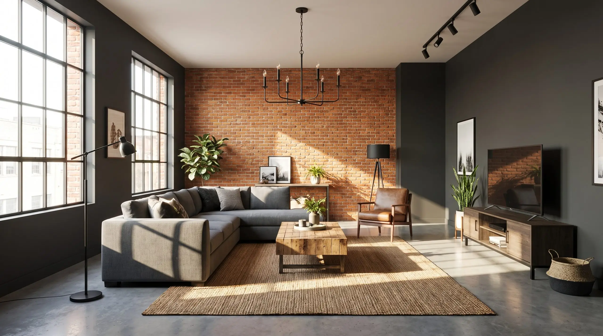
Paint Spec: Brand: Sherwin-Williams | LRV: 6 | Undertone: Soft Brown
True, jet black can look incredibly harsh next to earthy brick. This soft, charcoal black acts as a modern framing device for orange and red brick, providing intense drama without the stark, clinical edge.
- Vibe: Industrial Modern, Minimalist
- Key Materials: Concrete floors, matte black fixtures
- Lighting Note: Requires abundant natural light or highly strategic recessed lighting to prevent the room from feeling like a cave.
Highlight Red Textures with Benjamin Moore Hale Navy
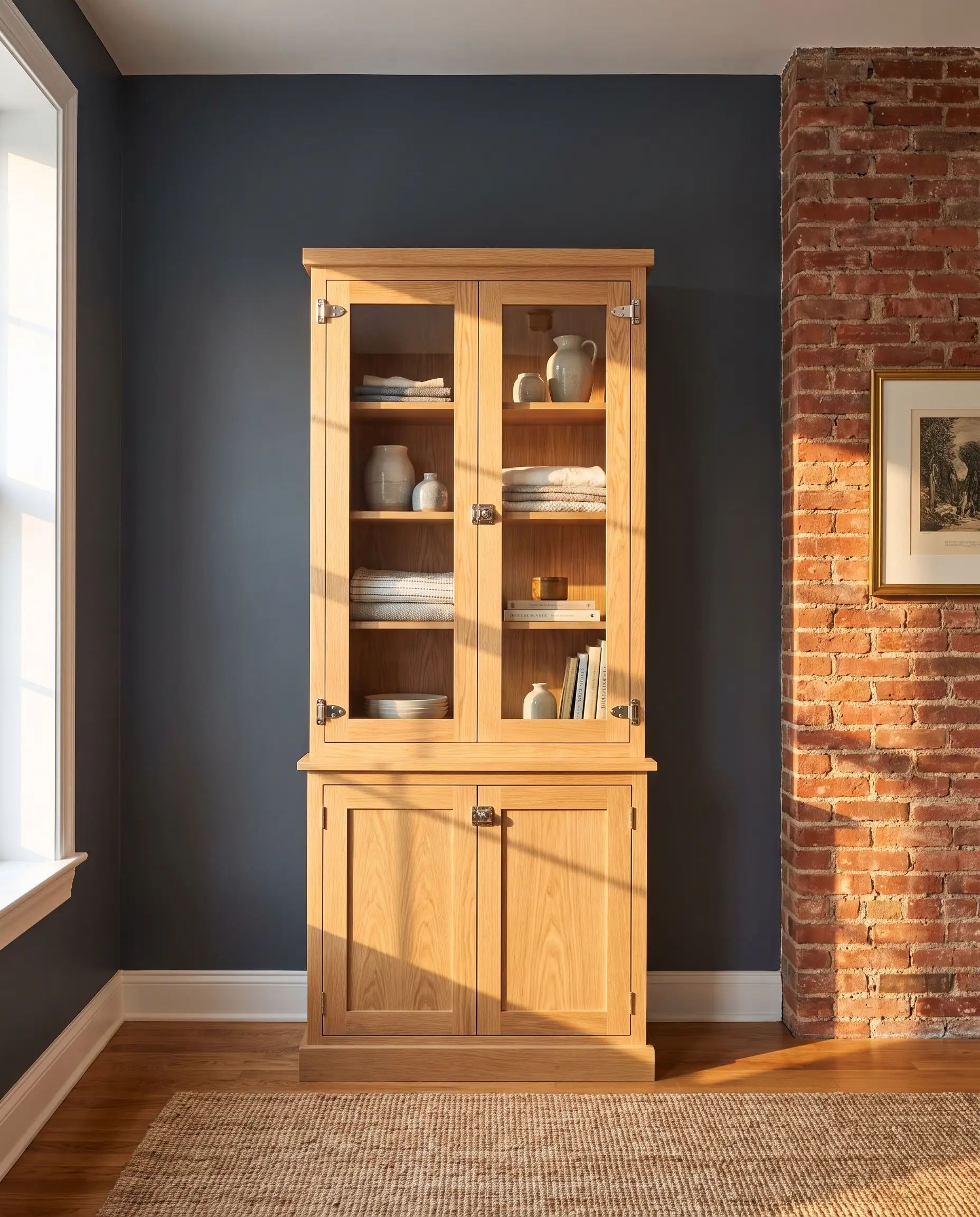
Paint Spec: Brand: Benjamin Moore | LRV: 8.36 | Undertone: Cool Gray
The cool tones in this deeply saturated maritime blue push the warm reds forward visually, making the brick look richer and more vibrant. It is a classic pairing that instantly refines rough masonry.
- Vibe: Classic Transitional, Preppy
- Key Materials: Polished nickel hardware, crisp white oak
- Lighting Note: Looks best in rooms with Southern exposure, where the warm sunlight balances the cool navy.
Create Depth with Farrow & Ball Hague Blue
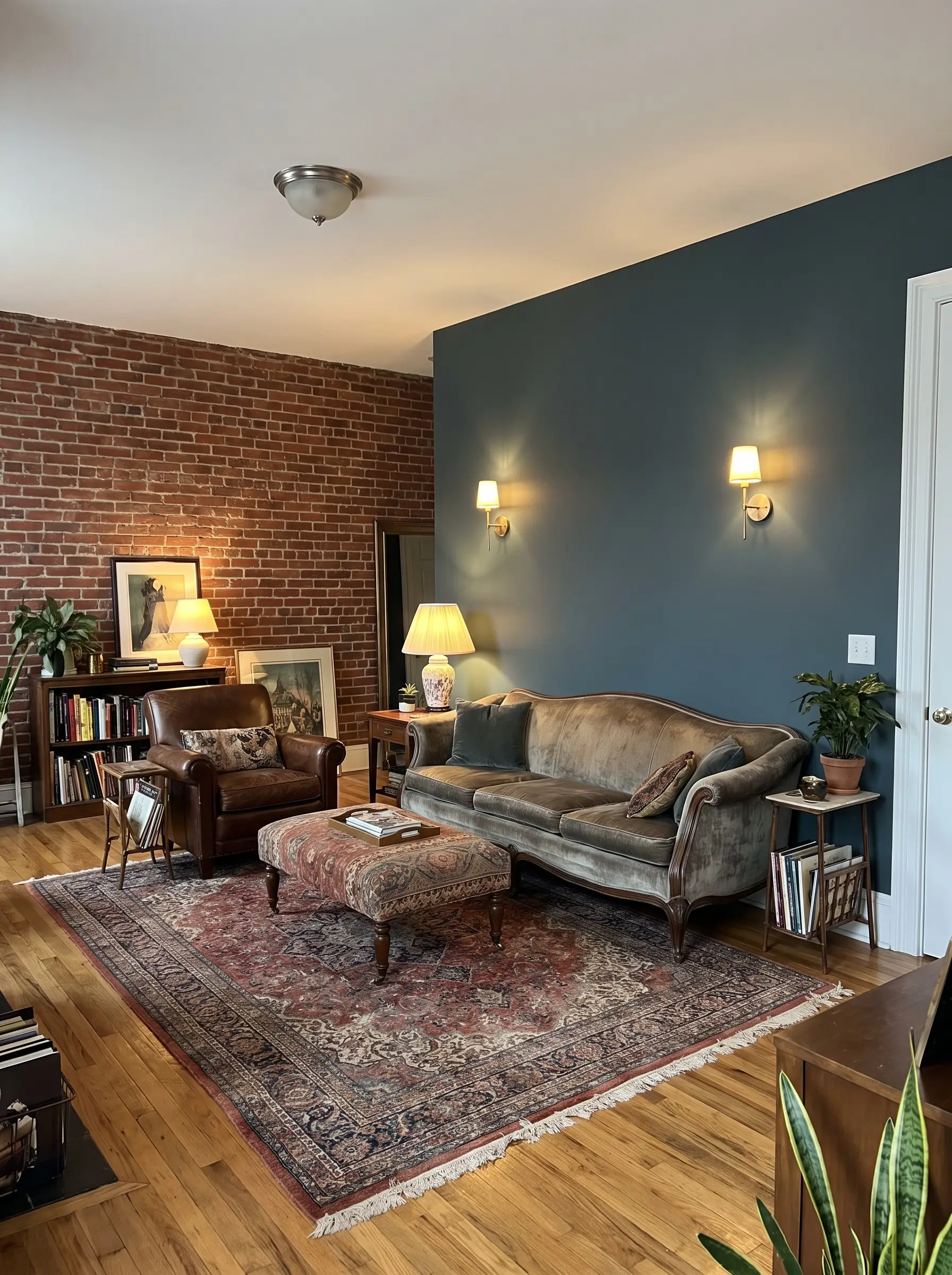
Paint Spec: Brand: Farrow & Ball | LRV: 7 | Undertone: Green
Featuring strong green undertones, this color is excellent for exterior trim against red brick facades or interior accent walls. The subtle green pigment connects beautifully with the red brick while modernizing the overall aesthetic.
- Vibe: Eclectic, High-End European
- Key Materials: Unlacquered brass, Persian rugs
- Lighting Note: Use layered ambient lighting to highlight the shifting green and blue tones throughout the day.
Ground a Room with Sherwin-Williams Greenblack
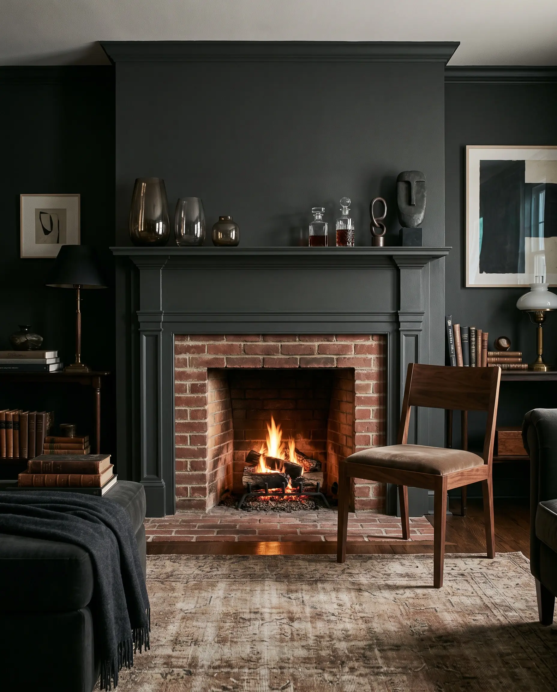
Paint Spec: Brand: Sherwin-Williams | LRV: 4 | Undertone: Green
This near-black shade with a subtle green pigment is an industry-standard choice for making red brick fireplaces look incredibly expensive. The green undertone silently neutralizes the red while providing a massive dose of sophistication.
- Vibe: Dark Academia, Moody Modern
- Key Materials: Smoked glass, rich walnut
- Styling Pro-Tip: Paint the entire fireplace surround and mantel this shade to let the firebox and brick pop.
Greiges and Taupes to Bridge Warm and Cool Tones
Greige (the perfect blend of gray and beige) is the perfect failsafe for red brick. True, cool grays clash horribly with warm brick, making the room look disjointed and dated; taupes and greiges provide enough brown to speak to the masonry’s warmth while offering enough gray to modernize the space.
If you are unsure of your brick’s specific undertone, default to a mid-tone taupe. The brown pigment acts as a universal translator for red brick, ensuring the wall color never looks icy or blue by accident. Read our guide on How to Identify Undertones in Your Home for a detailed breakdown.
Hackrea Designer Secret
Balance Cool Northern Light with Benjamin Moore Revere Pewter
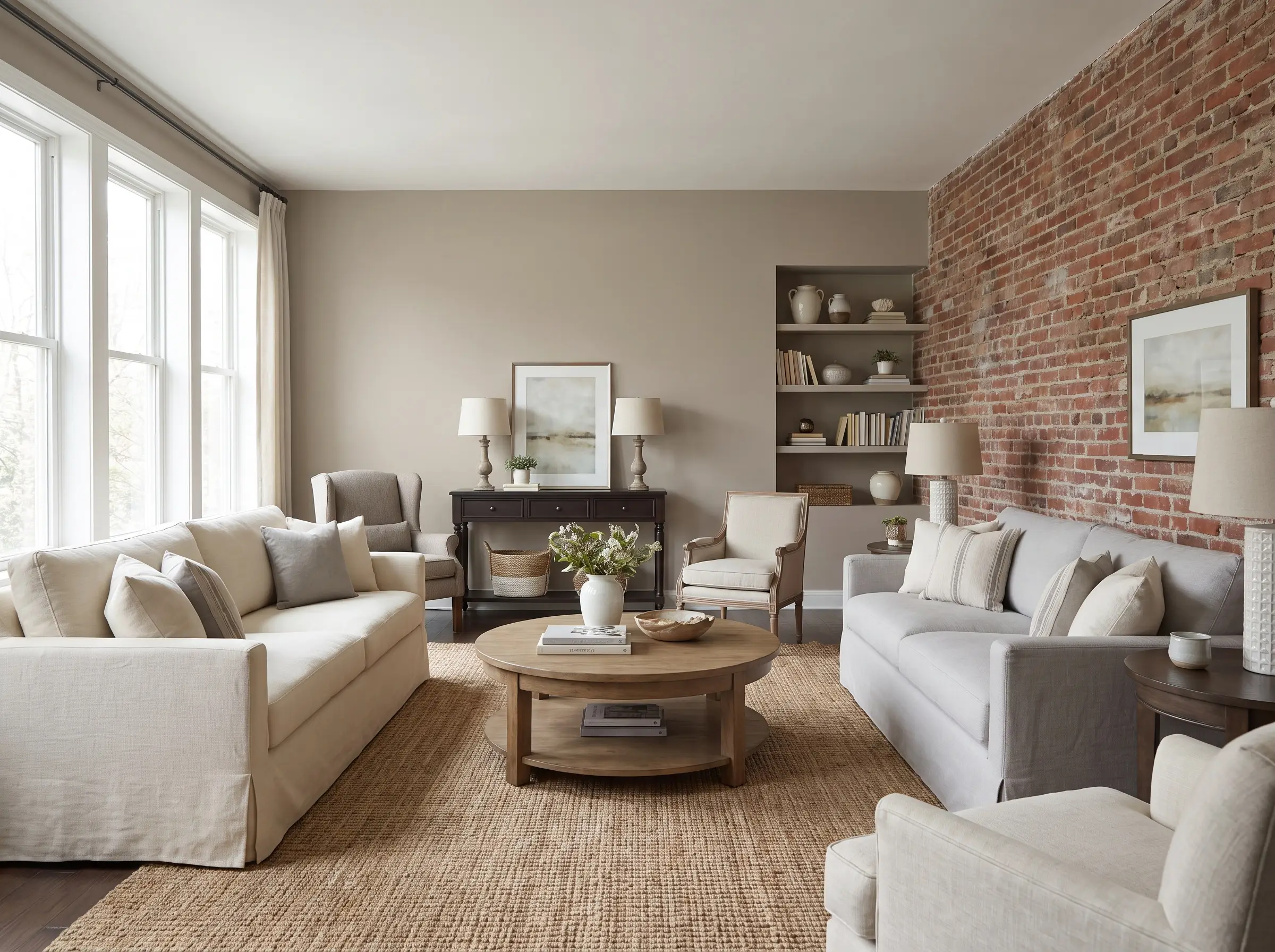
Paint Spec: Brand: Benjamin Moore | LRV: 55.51 | Undertone: Warm Muddy Green
As the industry standard greige, this shade responds beautifully to the light temperature in the room. It softens bright red brick without washing out, making it an incredibly versatile choice for large, open-concept spaces.
- Vibe: Transitional, Soft Traditional
- Key Materials: Slipcovered linen sofas, woven jute
- Temperature Note: Warms up in southern light and leans slightly greener in cool northern light.
Pull Brown Undertones with Sherwin-Williams Accessible Beige
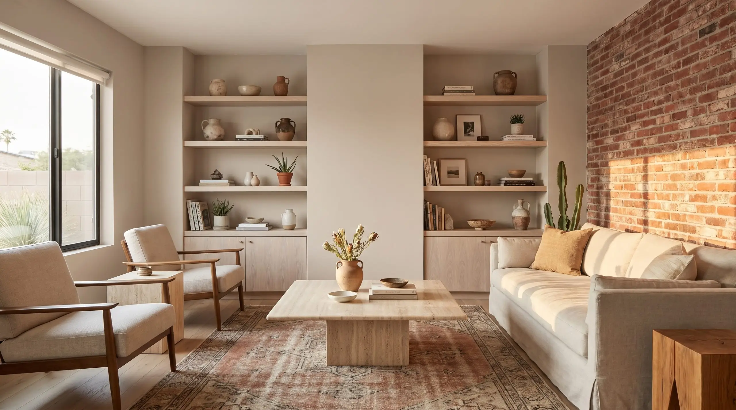
Paint Spec: Brand: Sherwin-Williams | LRV: 58 | Undertone: Gray/Taupe
Rather than highlighting the intense red, this warmer, taupe-leaning neutral pulls out the subtle brown flecks hidden within the masonry. It creates a harmonious, low-contrast transition that feels incredibly relaxing.
- Vibe: Warm Minimalist, Desert Modern
- Key Materials: Travertine, bleached woods
- Temperature Note: Keeps the room feeling warm without leaning yellow.
Neutralize Bright Reds with Farrow & Ball Elephant’s Breath
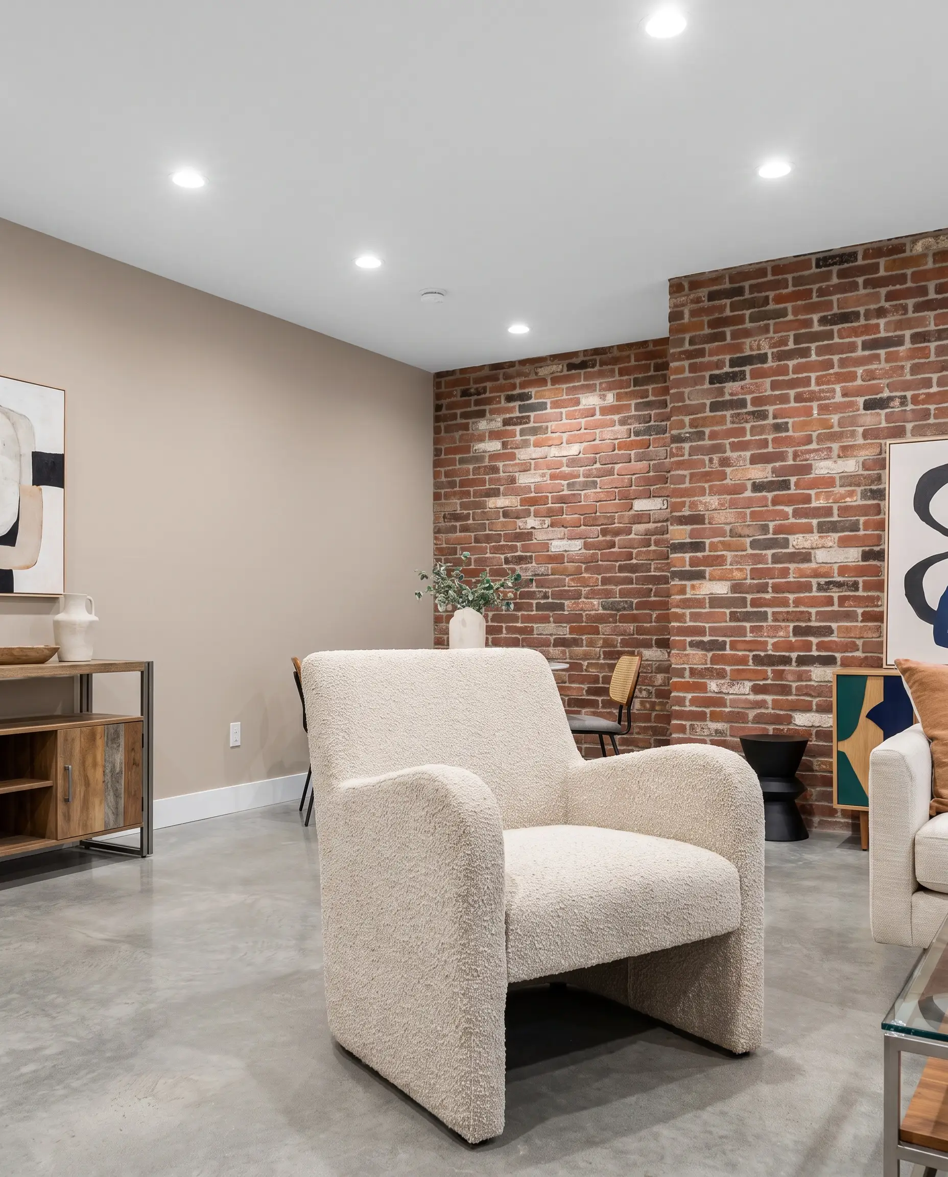
Paint Spec: Brand: Farrow & Ball | LRV: 46 | Undertone: Magenta
This contemporary mid-tone gray features a highly specific hint of magenta. This unique undertone connects beautifully with plum-toned red bricks, neutralizing the room’s color temperature while adding a sophisticated, architectural edge.
- Vibe: Contemporary, Elevated Eclectic
- Key Materials: Polished concrete, bouclé fabrics
- Best Application: Perfect for pairing with reclaimed, multi-colored brick walls.
Modernize a Traditional Facade with Behr Campfire Ash
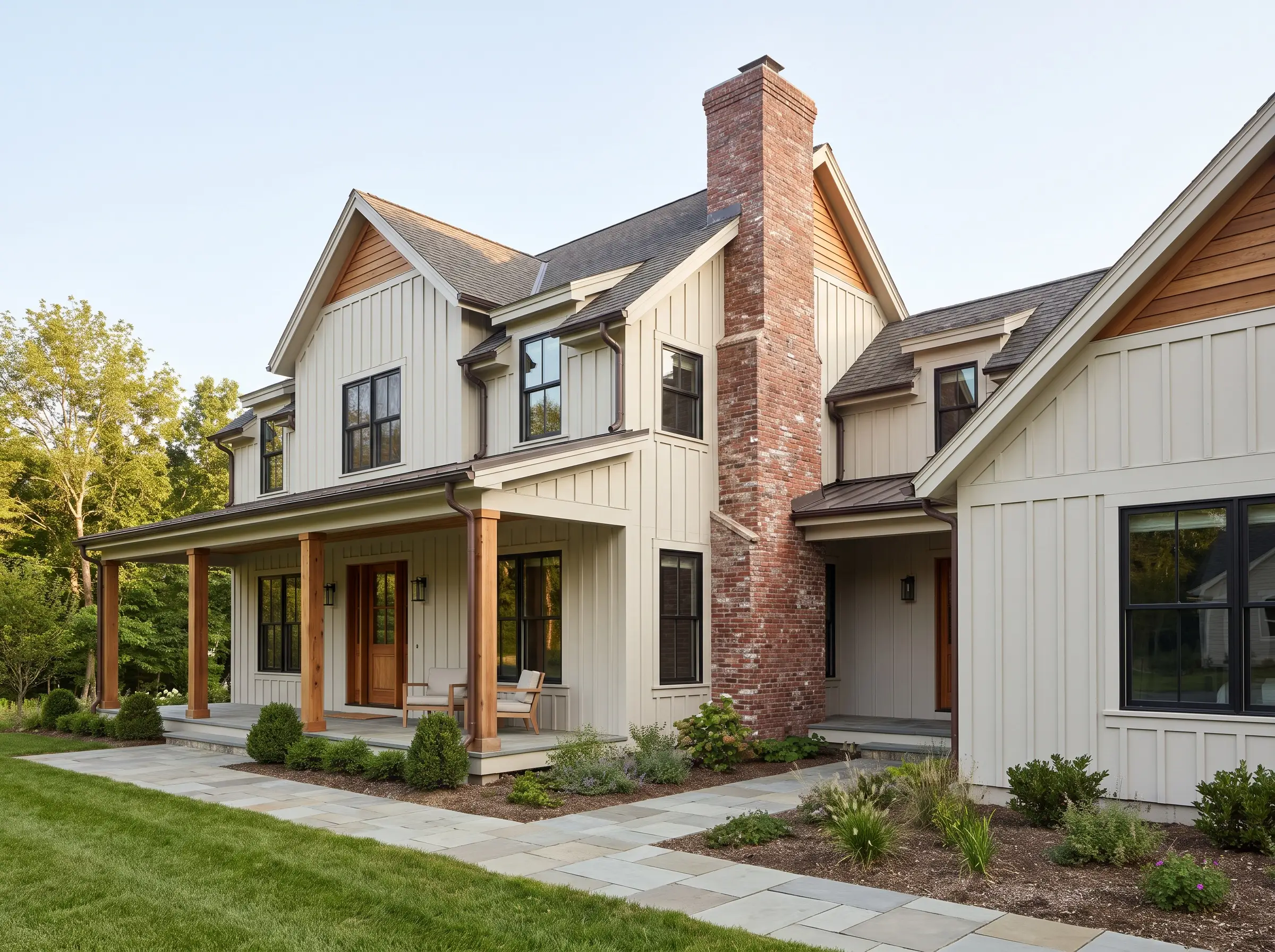
Paint Spec: Brand: Behr | LRV: 69 | Undertone: Warm Gray
When dealing with massive exterior brick chimneys or large facades, you need a light, airy greige that doesn’t read as stark white. This shade updates traditional exteriors while remaining completely respectful of the masonry’s warmth.
- Vibe: Modern Farmhouse, Updated Traditional
- Key Materials: Black architectural windows, cedar accents
- Best Application: Exterior siding, fascia, and large trim panels.
Bold Hues for Maximalist and Eclectic Spaces
For spaces that demand high-impact, eclectic, or maximalist design, safe neutrals simply won’t suffice. You can pair bold colors with red brick without causing visual chaos by carefully managing the saturation and leaning into monochromatic or deeply earthy palettes.
Contrast Yellow-Reds with Benjamin Moore Aegean Teal
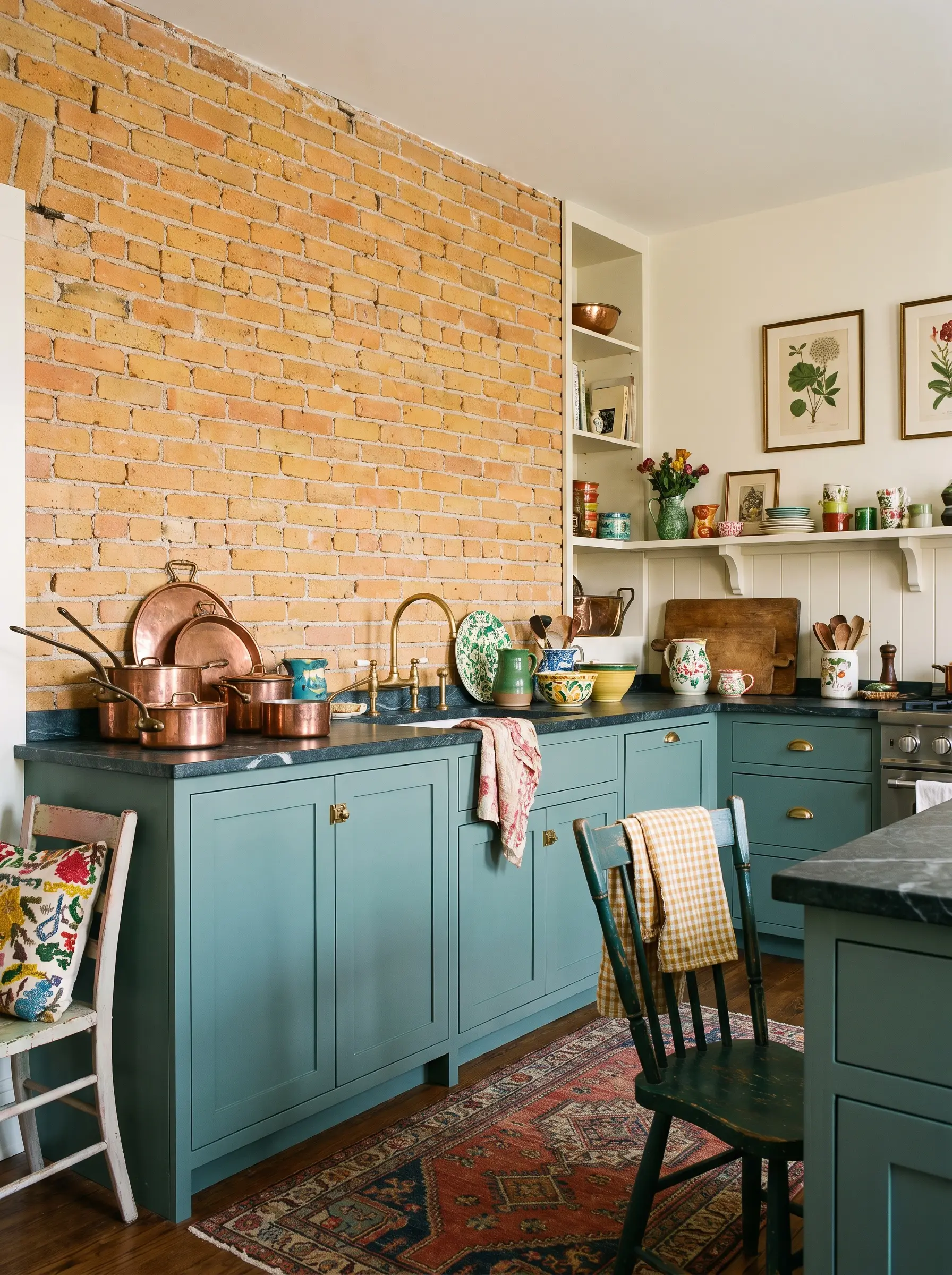
Paint Spec: Brand: Benjamin Moore | LRV: 23.96 | Undertone: Gray/Blue
This muted blend of blue-green and gray provides a stunning, high-contrast pop against orange or yellow-leaning bricks. It is an exceptionally beautiful choice for wainscoting or lower cabinets beneath an exposed brick kitchen wall.
- Vibe: Eclectic Heritage, Colorful Kitchens
- Key Materials: Soapstone counters, unlacquered brass
- Styling Pro-Tip: Keep upper walls light to let the teal and brick anchor the room.
Soften Harsh Brick with Farrow & Ball Setting Plaster
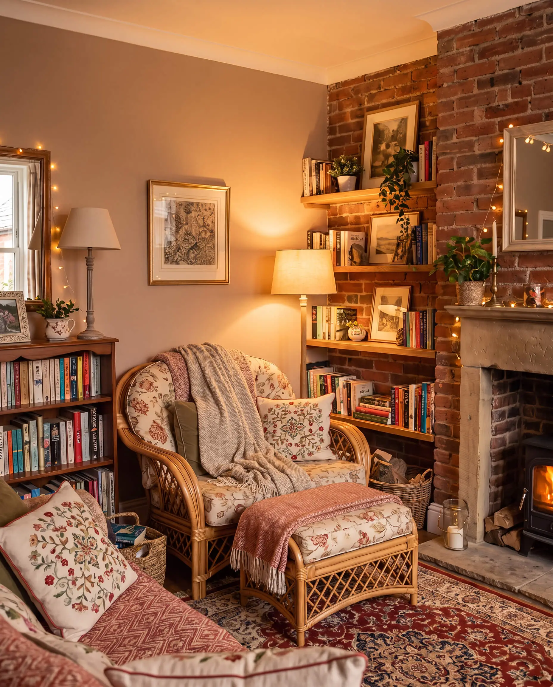
Paint Spec: Brand: Farrow & Ball | LRV: 43 | Undertone: Yellow/Pink
Using this dusty, historical pink creates a tone-on-tone effect with the masonry. This monochromatic approach results in a highly sophisticated, enveloping warmth that completely softens the harsh edges of industrial brick.
- Vibe: English Cottage, Soft Maximalism
- Key Materials: Rattan, vintage floral textiles
- Best Application: Bedrooms or cozy reading rooms with brick accents.
Energize a Room with Benjamin Moore Mustard Seed
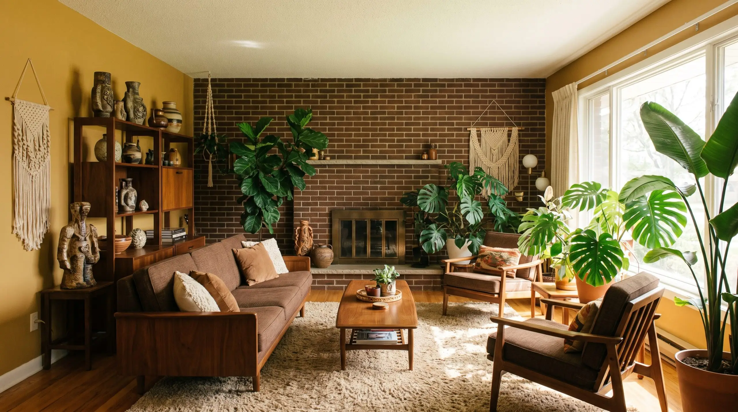
Paint Spec: Brand: Benjamin Moore | LRV: 48.94 | Undertone: Earthy Gold
This earthy, golden yellow is best used alongside brown-leaning brick to create a warm, 1970s-inspired aesthetic. It energizes the space while remaining deeply rooted in natural, organic tones.
- Vibe: 1970s Revival, Organic Modern
- Key Materials: Walnut mid-century furniture, heavy ceramics
- Styling Pro-Tip: Pair with massive indoor plants to break up the warm tones.
Create Monochromatic Warmth with Sherwin-Williams Redend Point
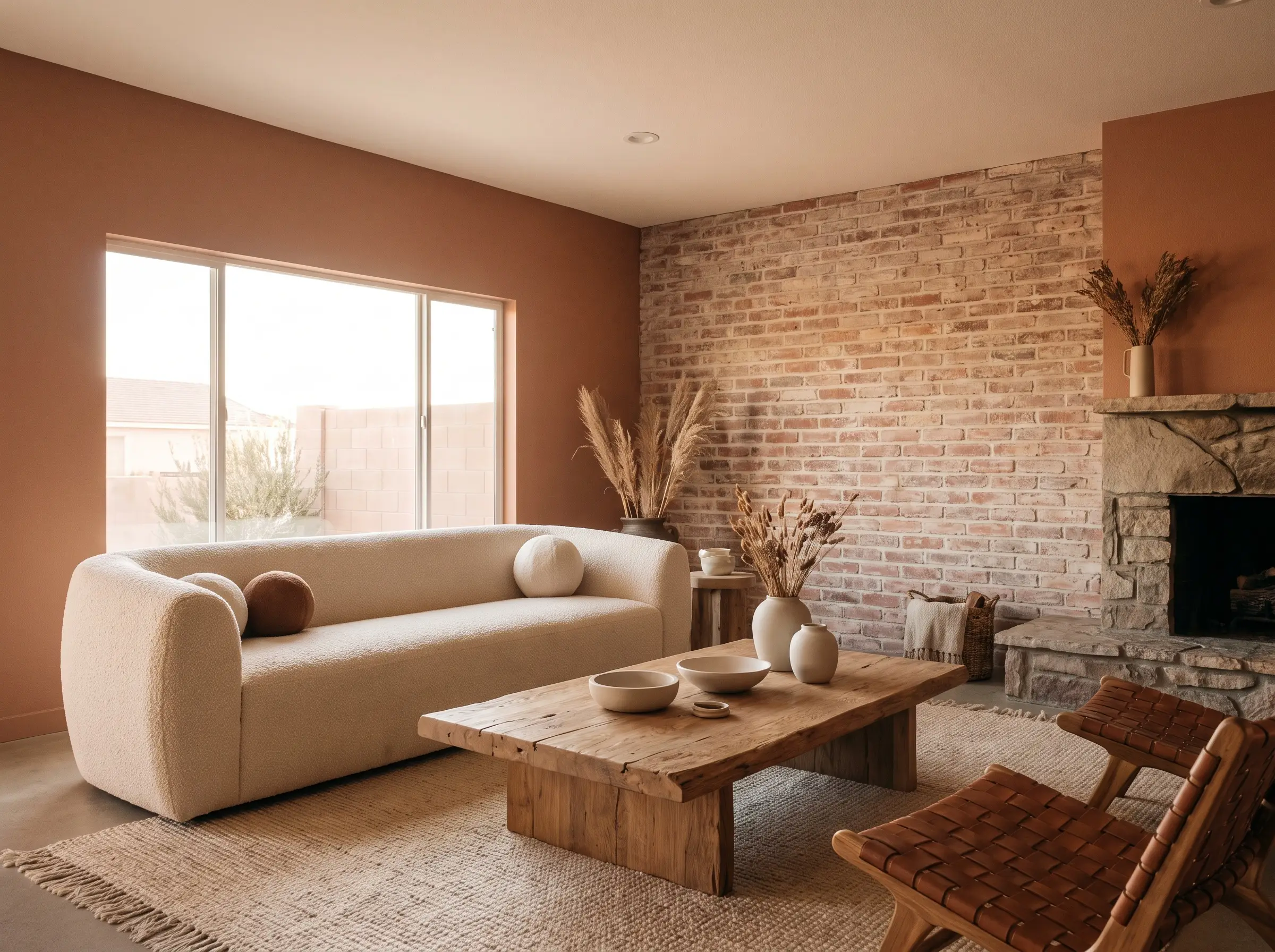
Paint Spec: Brand: Sherwin-Williams | LRV: 30 | Undertone: Earthy Blush
This warm, earthy blush-beige blends directly into the lighter tones of a weathered brick wall. It erases sharp visual boundaries, making the entire room feel like a cohesive, plaster-and-stone retreat.
- Vibe: Desert Modern, Monochromatic
- Key Materials: Matte ceramics, bouclé, raw oak
- Best Application: Open living spaces where you want the brick to fade into the background.
Push Boundaries with Farrow & Ball Inchyra Blue
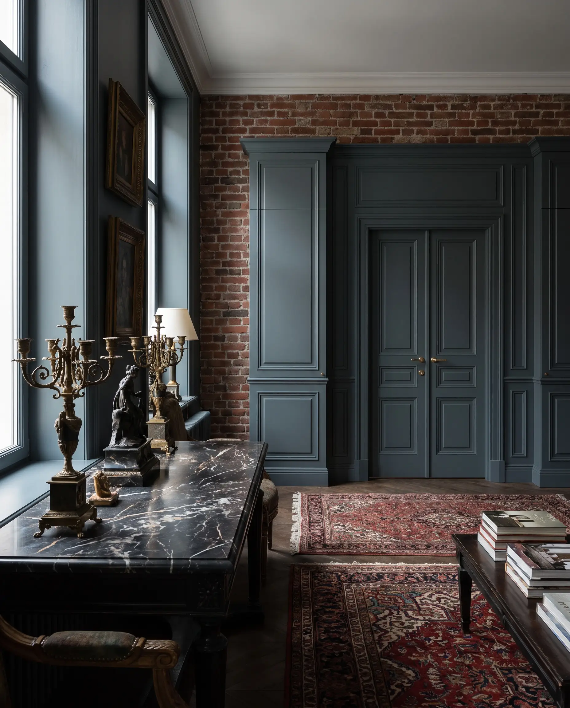
Paint Spec: Brand: Farrow & Ball | LRV: 13 | Undertone: Gray/Green
A wildly moody, dark blue-gray-green that shifts dramatically depending on the light. Painting interior doors or heavy millwork this shade in a room with a brick accent wall creates a luxurious, high-end European aesthetic.
- Vibe: Moody Maximalist, Bespoke European
- Key Materials: Heavily veined marble, aged brass
- Lighting Note: Shifts from charcoal to green to blue throughout the day.
The Millwork and Trim Pairing
Once the primary wall color is locked in, white trim is not always the answer when dealing with heavy red brick. Color-drenching your millwork and baseboards reduces visual clutter and prevents the room from feeling chopped up next to the highly textured masonry.
| Wall Color Family | Recommended Trim Color | Designer Reasoning |
|---|---|---|
| Warm Whites | Same as walls but in a Satin finish | Reduces visual chop and maintains a seamless transition against the busy brick texture. |
| Earthy Greens | Color-drench (Match the wall color) | Enhances the enveloping, moody atmosphere without adding a harsh white line that distracts from the masonry. See our guide on Best Trim Colors for Dark Walls. |
| Moody Darks | Darker charcoal or true black | Grounds the dark walls and creates a highly architectural, custom-built look around the fireplace or brick wall. |
| Greiges & Taupes | A shade lighter on the same color swatch | Provides subtle contrast that highlights the millwork without introducing stark, clashing whites. |
Final Execution: Sheens, Lighting, and Testing
Executing a flawless palette requires more than just picking a pigment; it requires rigorous in-room testing. You must paint large swatches on poster board and place them directly next to the brick, observing how the color temperature shifts at 10 AM, 2 PM, and 8 PM under both natural and artificial light. Furthermore, the finish you choose will dictate how the paint interacts with the rough masonry.
- Wall Sheen: Always use a Matte or Eggshell finish for walls directly adjacent to brick. A glossy wall will actively compete with the brick’s beautiful, matte texture and highlight drywall imperfections.
- Trim Sheen: Use Satin or Semi-Gloss for millwork to provide a subtle, elegant contrast to the flat masonry.
- Ceiling Sheen: Stick to Flat paint to absorb light and hide ceiling flaws.
Stop staring at tiny paint chips under fluorescent store lighting. Order your samples, hold them up to your mortar joints, and start testing.