Choosing a neutral paint color is notoriously anxiety-inducing. Most homeowners have experienced the visceral panic of painting an entire living room, only to realize the walls look baby blue, fleshy pink, or muddy green the second the afternoon sun hits them. This persistent “color shifting” happens because greige is an absolute chameleon. It reacts violently to natural light, the directional angle of the sun, and the fixed elements in your space, such as flooring and countertops.
Our curatorial approach at Hackrea treats paint as a dynamic architectural material, not just a static decoration. We do not select colors based on fleeting trends. Instead, our analysis maps exact shades by their Light Reflectance Value (LRV), specific undertones, and directional sunlight compatibility to ensure the color holds its structural integrity from morning until night.
The secret to mastering greige isn’t the color itself, but how its precise undertone reacts to the specific geometry and lighting exposure of your room.
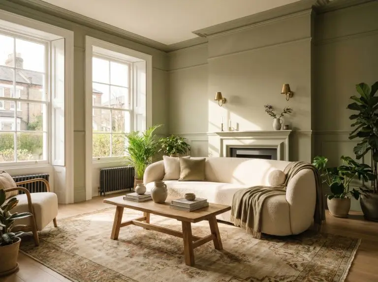
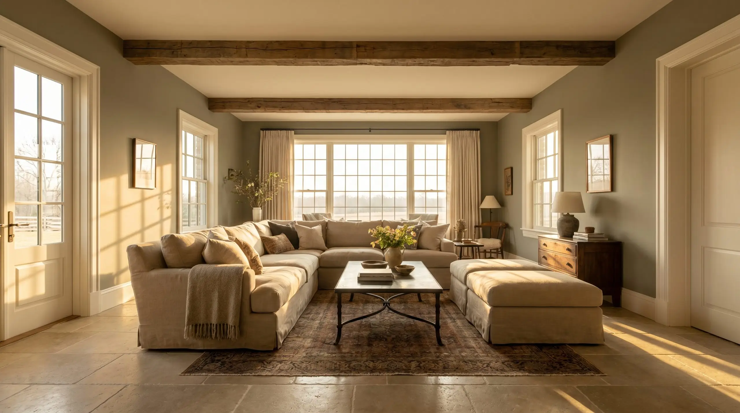
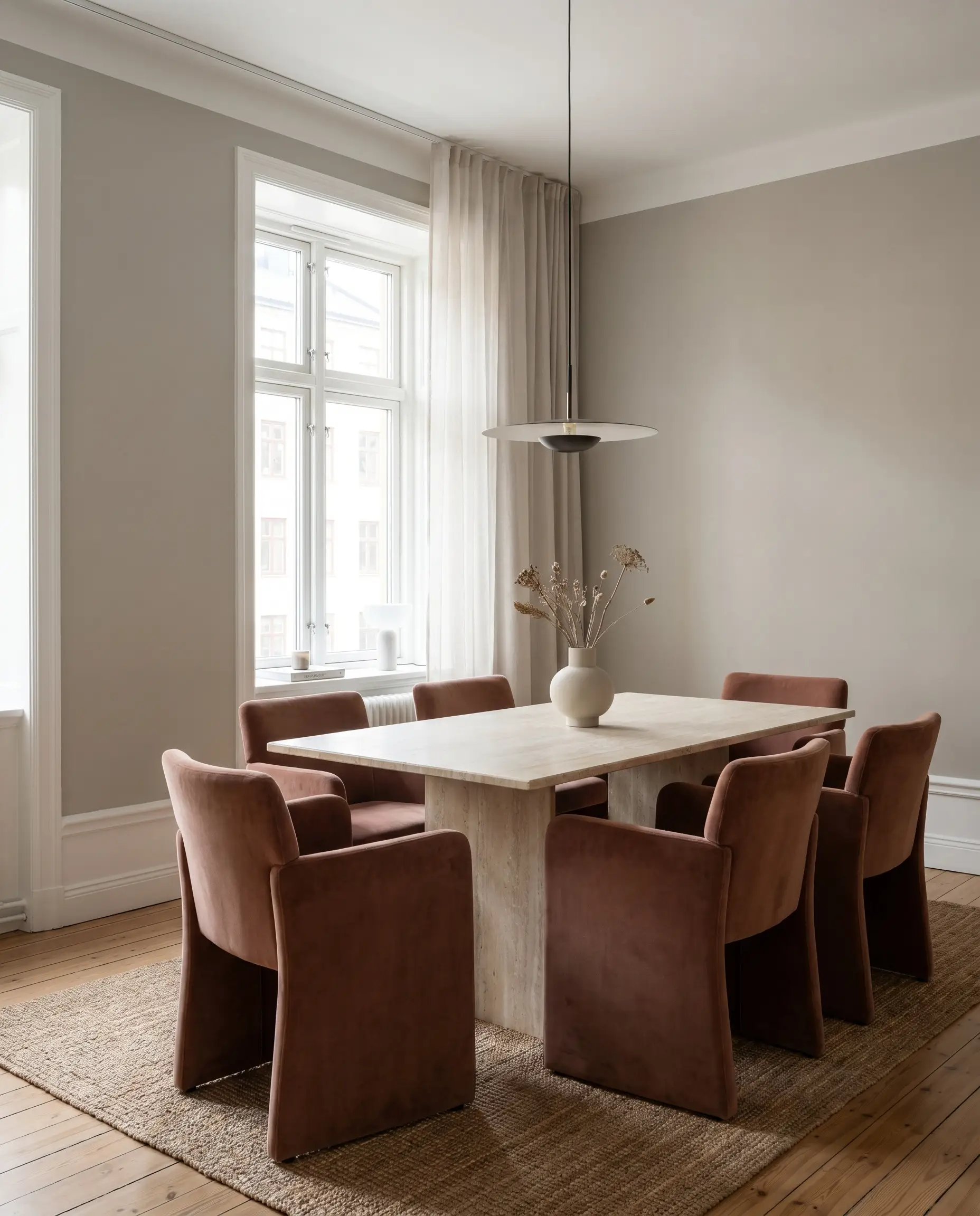
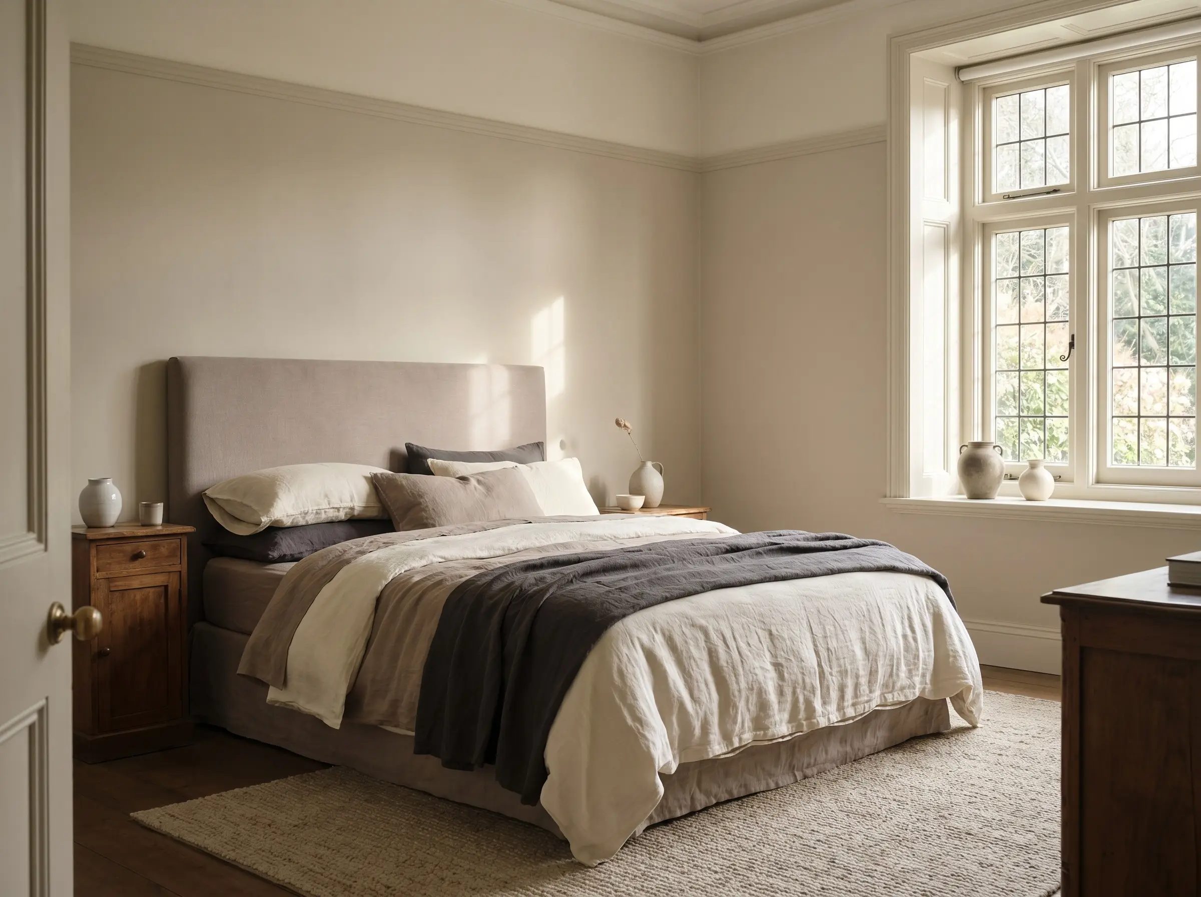
Warm Greiges (Yellow and Beige Undertones) to Thaw Cold, North-Facing Rooms
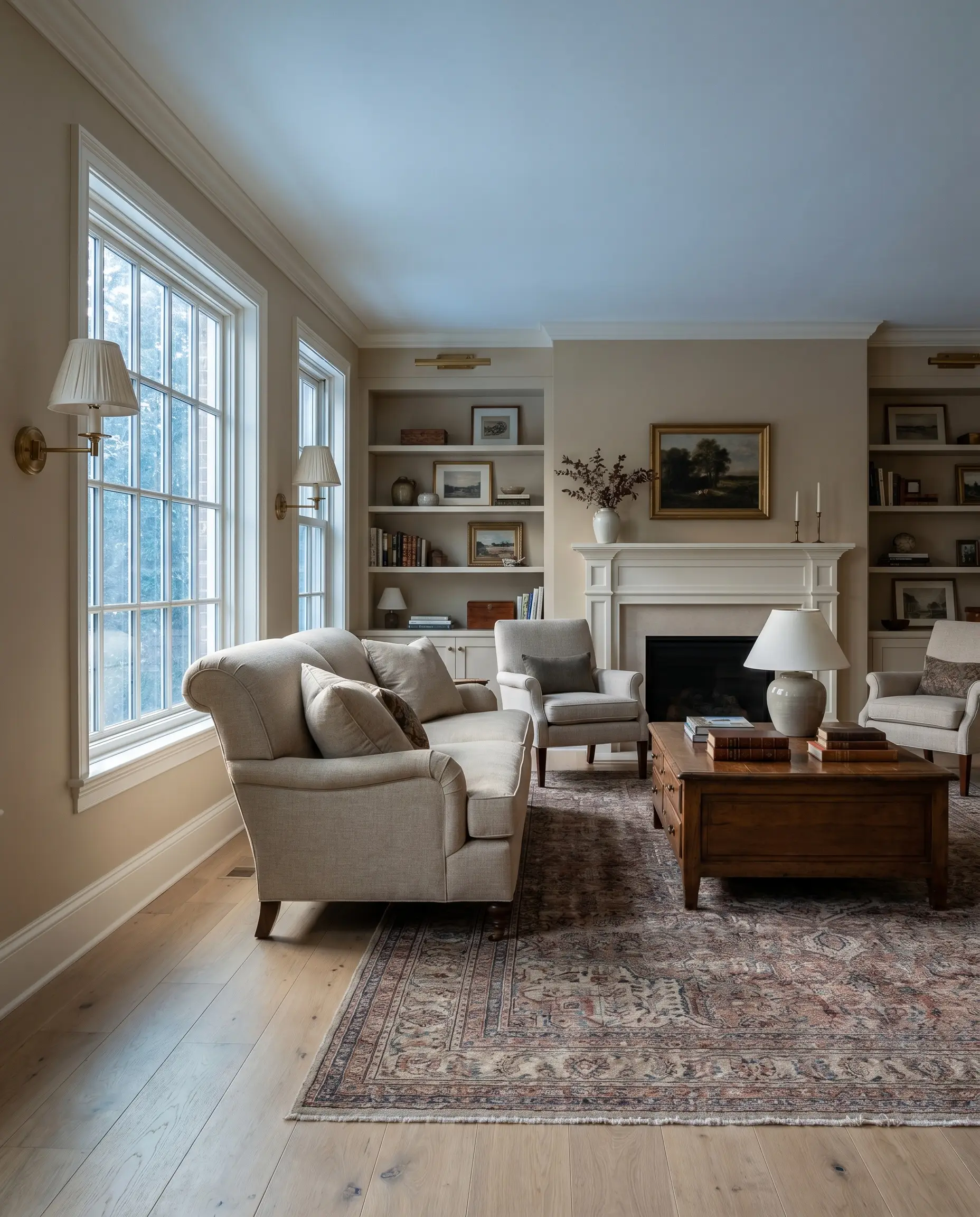
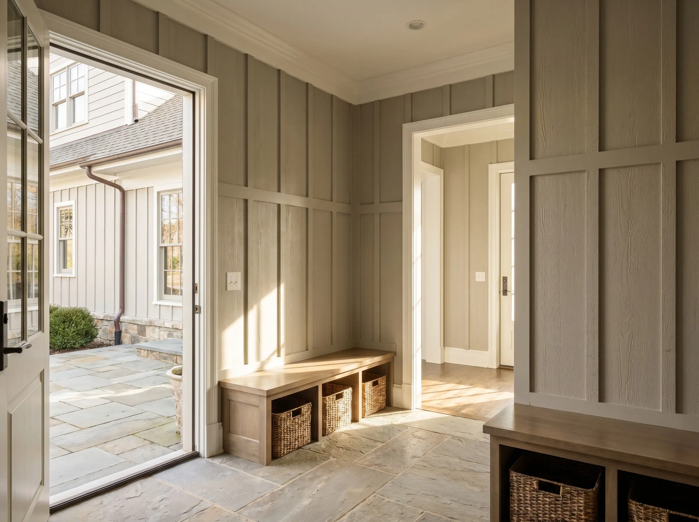
North-facing rooms receive cool, indirect, bluish-gray ambient light throughout the day. This specific lighting condition is ruthless; it can make true grays look like flat, lifeless cement. To counteract this icy cast, industry standards dictate using a greige with strong beige or subtle yellow and pink undertones to artificially inject warmth back into the architecture.
When testing colors in a North-facing room, always place your swatches directly next to your trim and flooring. The cool ambient light will instantly amplify any hidden cool undertones, so you must verify that the warm beige base is strong enough to hold its ground against your fixed elements.
Hackrea Styling Tip
Sherwin-Williams Accessible Beige (SW 7036)
- Brand & Number: Sherwin-Williams SW 7036
- LRV: 58
- Dominant Undertone: Warm taupe with a soft yellow base
- Flashing Risk: Can flash slightly fleshy or pink in heavily filtered evening light
- Best Trim Pairing: Sherwin-Williams Alabaster (SW 7008)
This industry standard acts as a flawless architectural backdrop for Traditional and Transitional spaces, relying on its golden-taupe base to inject warmth into frigid rooms. When paired with fixed elements like wide-plank white oak floors or unlacquered brass hardware, its structural integrity holds beautifully without reading as a flat, muddy brown.
Benjamin Moore Pale Oak (OC-20)
- Brand & Number: Benjamin Moore OC-20
- LRV: 68.64
- Dominant Undertone: Light warm taupe
- Flashing Risk: Flashes a distinct pink or purple in late afternoon light
- Best Trim Pairing: Benjamin Moore Chantilly Lace (OC-65)
Pale Oak is highly reflective and airy, bouncing ambient light beautifully around open-concept spaces. However, you must carefully monitor its purple cast; it pairs magnificently with honed marble countertops but will violently clash with cherry or mahogany wood floors.
Sherwin-Williams Shiitake (SW 9173)
- Brand & Number: Sherwin-Williams SW 9173
- LRV: 51
- Dominant Undertone: Mushroom beige with subtle green and red bases
- Flashing Risk: Can flash slightly pink in certain artificial LED lighting
- Best Trim Pairing: Sherwin-Williams Pure White (SW 7005)
A deeply grounding, stone-like beige, Shiitake serves as a highly effective anchor for Organic Modern interiors filled with heavily textured bouclé fabrics and raw woods. Its mid-tone reflectance absorbs harsh glares, creating a serene, earthy atmosphere that feels highly intentional rather than builder-grade.
Benjamin Moore Edgecomb Gray (HC-173)
- Brand & Number: Benjamin Moore HC-173
- LRV: 63.09
- Dominant Undertone: Warm beige-tan
- Flashing Risk: Can read as a flat, cold gray in rooms with zero natural light
- Best Trim Pairing: Benjamin Moore White Dove (OC-17)
This slightly muddy, warm greige perfectly bridges the gap between warm walnut woods and cool polished nickel metals in Transitional homes. By maintaining a delicate balance between gray and beige, it prevents North-facing rooms from feeling icy while still offering enough saturation to contrast beautifully against crisp millwork.
Behr Campfire Ash (N320-1)

- Brand & Number: Behr N320-1
- LRV: 69
- Dominant Undertone: Soft warm gray
- Flashing Risk: Can wash out entirely and look like primer in heavily sunlit rooms
- Best Trim Pairing: Behr Ultra Pure White (1850)
For large, open-concept living spaces, this highly accessible, budget-friendly greige provides a soft, luminous cast without overwhelming the architecture. Its high LRV bounces light aggressively, making it a brilliant neutralizing backdrop for vibrant terracotta tiles or heavy, dark leather upholstery.
You can apply wallpapers, paints, etc. on walls and see how they look in various interiors.

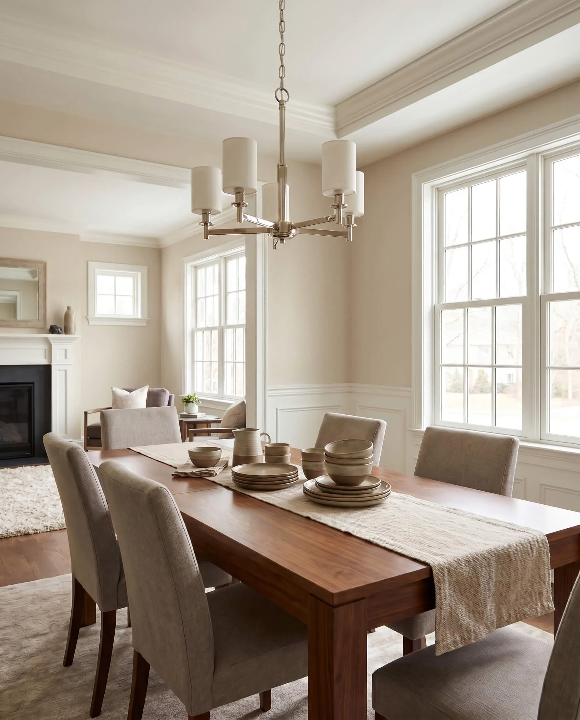
True Greiges (Green Undertones) to Neutralize Warm, South-Facing Light
South-facing rooms get blasted with warm, golden sunlight for the majority of the day. If you apply a warm, yellow-based greige here, the walls will amplify the sun and turn an aggressive yellow or fleshy tone. Master tradespeople generally recommend greiges with a subtle green or blue undertone for these spaces; these cooler bases actively neutralize the golden sun and hold the color’s sophisticated structural integrity.
South-facing light is intensely revealing. Colors with high LRVs will often lose their pigment entirely during peak afternoon hours. If your room features massive, unshaded Southern windows, step down one shade darker on the paint strip to ensure the walls maintain their visual weight.
Hackrea Flashing Warning
Benjamin Moore Revere Pewter (HC-172)
- Brand & Number: Benjamin Moore HC-172
- LRV: 55.51
- Dominant Undertone: Earthy gray with a distinct green base
- Flashing Risk: Can read as a muddy cement block if not balanced with adequate ambient lighting
- Best Trim Pairing: Benjamin Moore White Dove (OC-17)
As the undisputed heavyweight of true greiges, Revere Pewter relies on its strong green undertone to neutralize the heavy, golden blast of South-facing sunlight. This neutralizing effect prevents the room from turning a sickly yellow, allowing the paint to maintain its structural integrity alongside rustic ceiling beams and tumbled limestone floors.
Sherwin-Williams Agreeable Gray (SW 7029)
- Brand & Number: Sherwin-Williams SW 7029
- LRV: 60
- Dominant Undertone: Warm taupe with a hint of green
- Flashing Risk: Can flash slightly violet in rooms with heavy Northern exposure
- Best Trim Pairing: Sherwin-Williams Pure White (SW 7005)
Widely considered the safest whole-house neutral, this shade leans slightly cooler than a standard beige but retains a vital taupe warmth that grounds a space. It acts as a flawless, unifying anchor in homes with open floor plans, seamlessly connecting spaces with competing fixed elements like warm brick fireplaces and cool quartz countertops.
Benjamin Moore Classic Gray (OC-23)
- Brand & Number: Benjamin Moore OC-23
- LRV: 74.78
- Dominant Undertone: Ultra-light gray with a whisper of purple
- Flashing Risk: Will flash pale violet in late afternoon sunlight
- Best Trim Pairing: Benjamin Moore Chantilly Lace (OC-65)
Because of its extremely light reflectance, this shade often reads as a sophisticated off-white in bright Southern light, making it an impeccable choice for minimalist, gallery-like aesthetics. The subtle warmth prevents it from feeling sterile, allowing it to frame modern art and sculptural furniture with quiet, decisive nuance.
Sherwin-Williams Repose Gray (SW 7015)
- Brand & Number: Sherwin-Williams SW 7015
- LRV: 58
- Dominant Undertone: Gray with a blue/purple base
- Flashing Risk: Flashes a distinct purple if paired with overly warm incandescent lighting
- Best Trim Pairing: Sherwin-Williams Alabaster (SW 7008)
Carrying a distinct blue-purple undertone, this cooler greige is an absolute necessity for cooling down extremely hot, sun-drenched rooms that otherwise feel oppressive. It creates a crisp, architectural contrast when paired with dark charcoal slate floors or black steel-framed windows.
Clare Penthouse
- Brand & Number: Clare (Direct-to-Consumer)
- LRV: 70
- Dominant Undertone: Airy, warm greige
- Flashing Risk: Can read slightly flat if not layered with varied room textures
- Best Trim Pairing: Clare Fresh Kicks
This modern, direct-to-consumer option delivers a highly sophisticated, airy greige that perfectly suits contemporary apartments craving a refined aesthetic. Its perfectly balanced saturation absorbs natural light gracefully, creating a chic, understated envelope that flatters everything from velvet upholstery to sleek travertine dining tables.
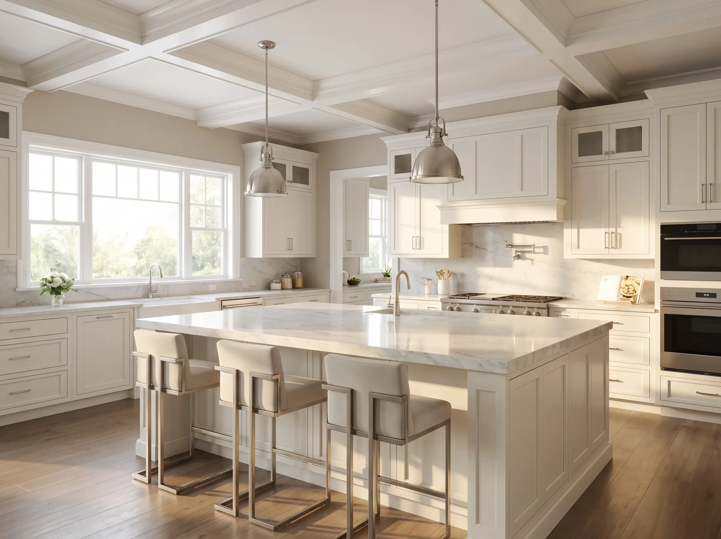
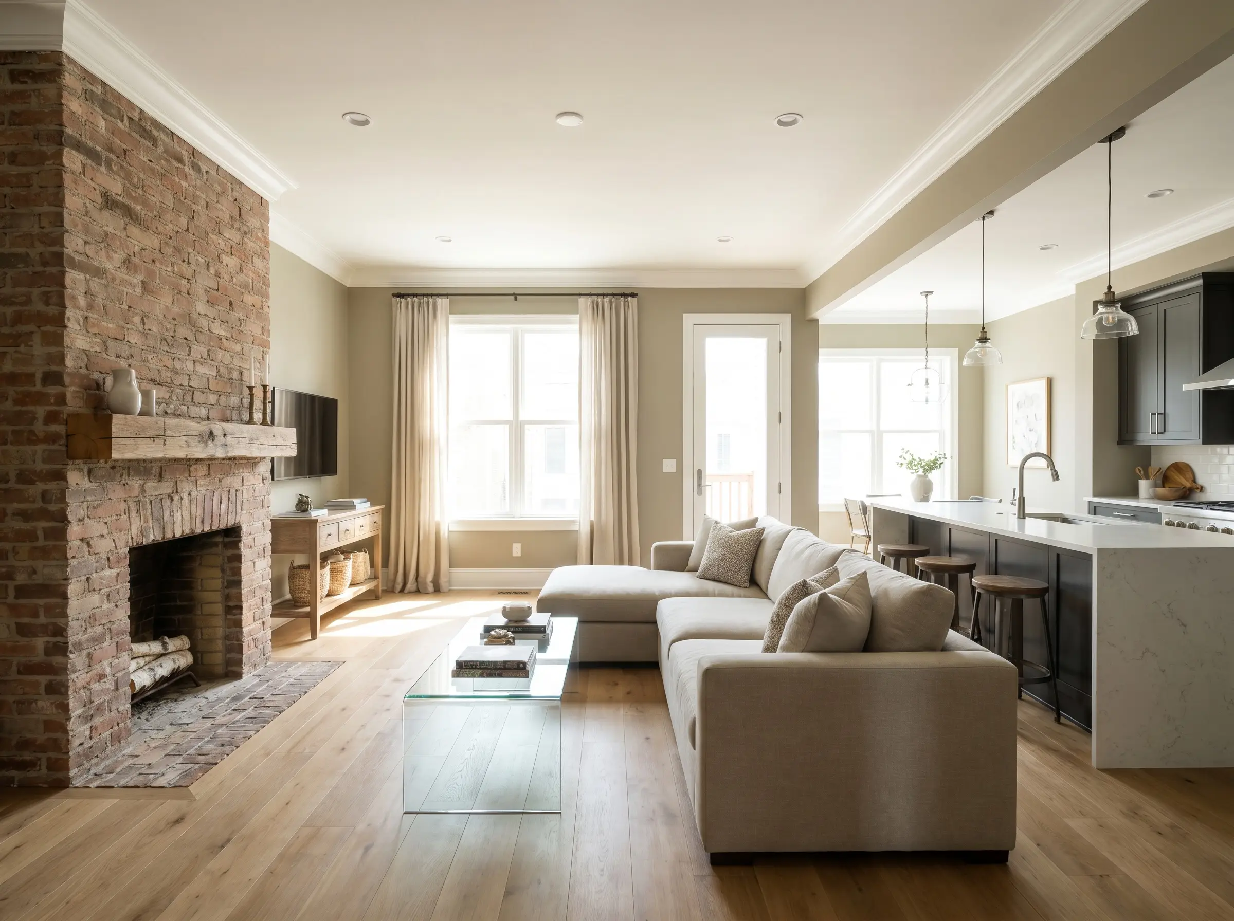
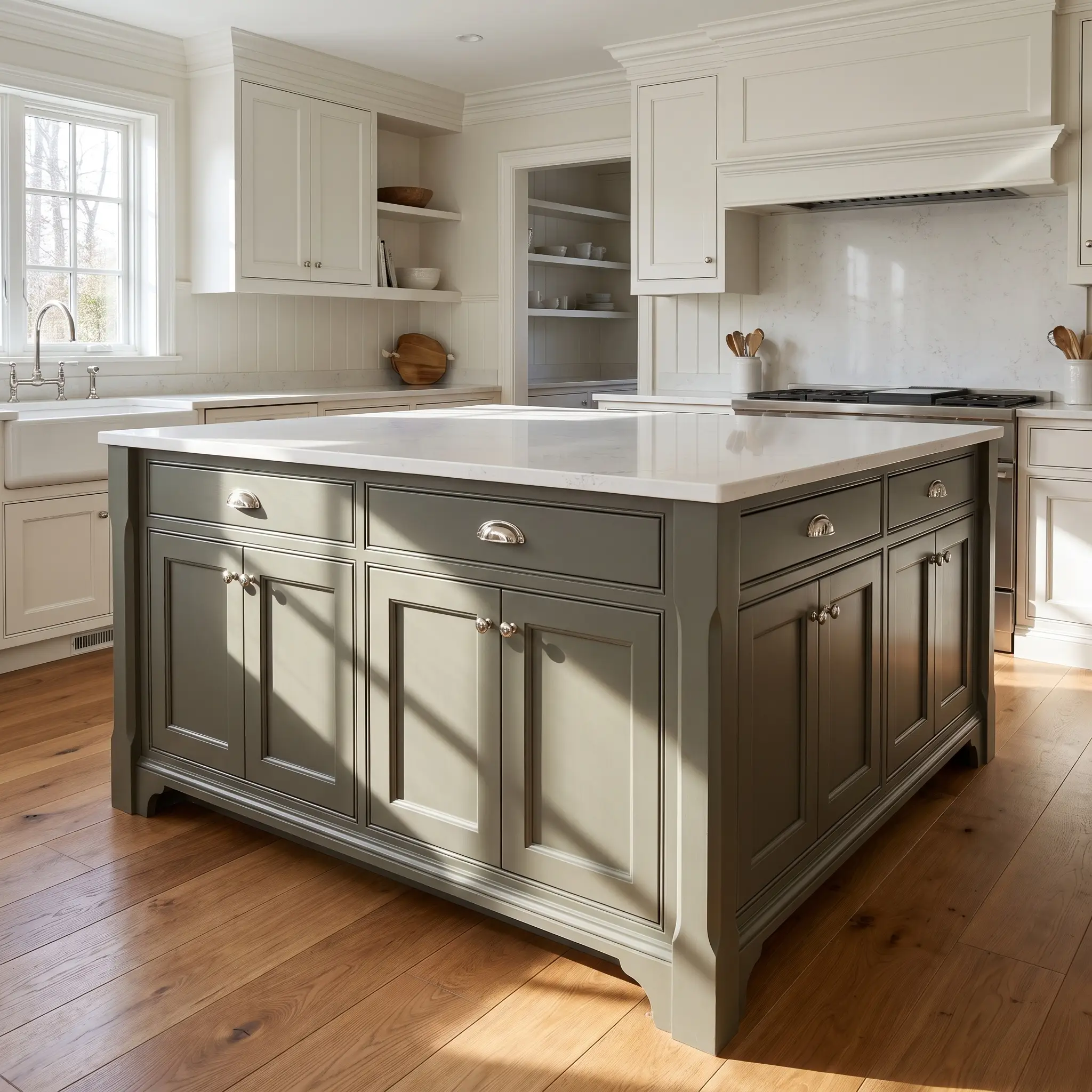
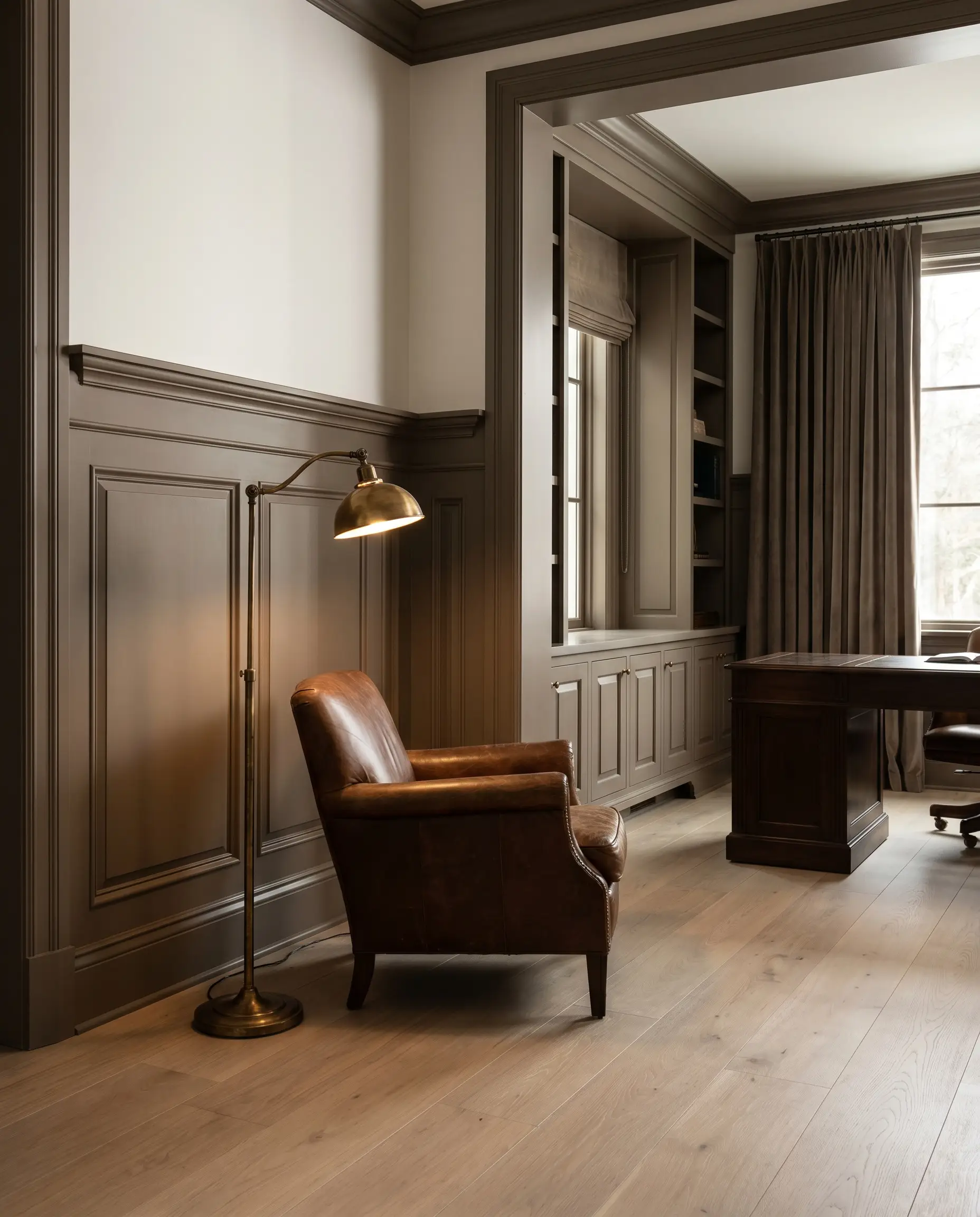
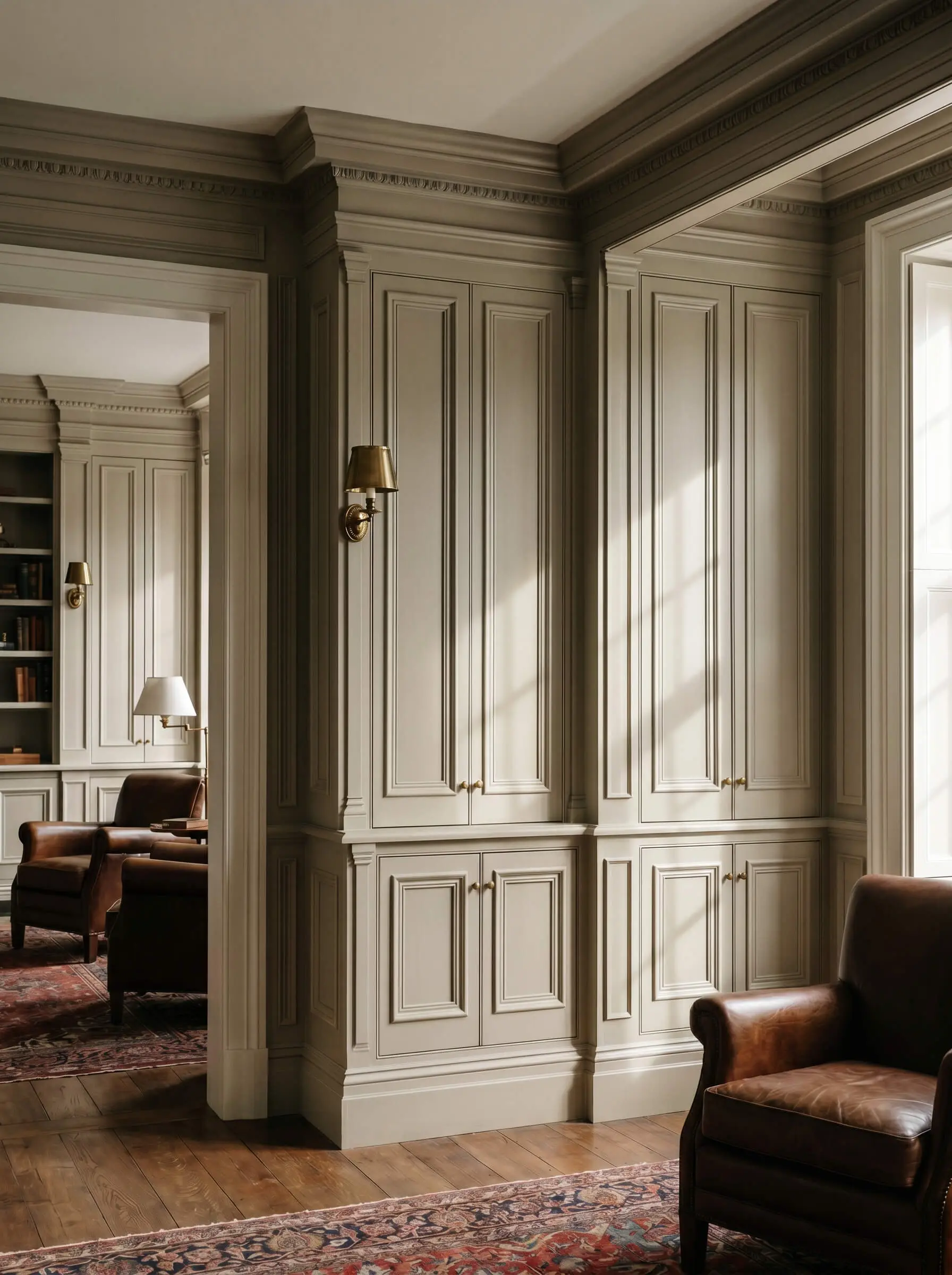
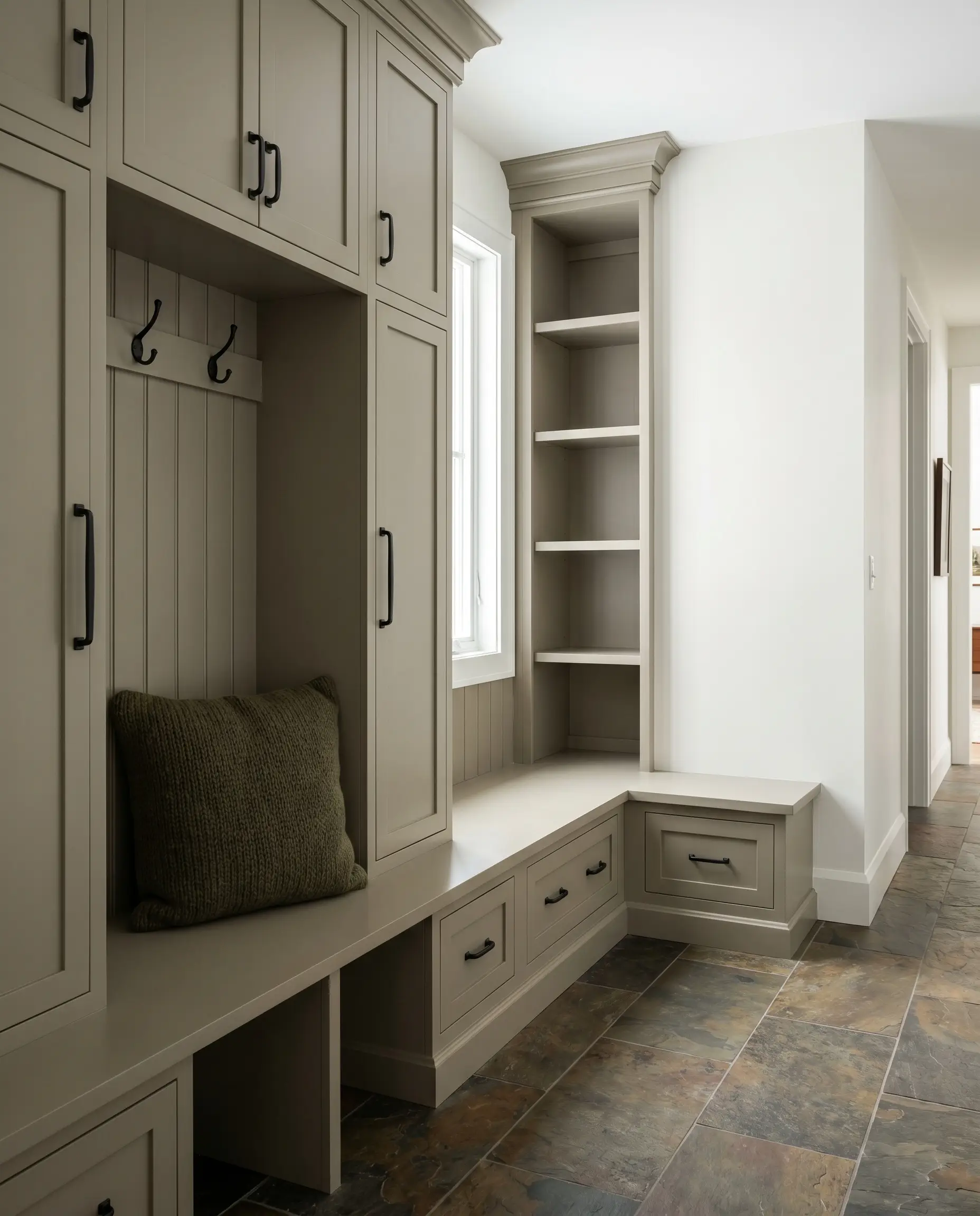
Medium-Depth Greiges (Low LRV) for Millwork, Cabinetry, and Exteriors
When painting architectural elements like custom cabinets, wainscoting, or exterior siding, high-LRV colors quickly wash out and lose their definition. To provide necessary visual weight and ground the space, current design principles favor a “medium-depth” greige featuring an LRV between 25 and 45. These heavily saturated tones cast distinct shadows, highlighting the craftsmanship of the millwork.
Benjamin Moore Rockport Gray (HC-105)
- Brand & Number: Benjamin Moore HC-105
- LRV: 36.61
- Dominant Undertone: Deep, warm gray with green undertones
- Flashing Risk: Can look exceptionally dark and muddy in poorly lit corners
- Best Trim Pairing: Benjamin Moore White Dove (OC-17)
When standard wall colors wash out on architectural elements, this deep, historic greige steps in to provide immediate visual weight and gravity. It looks incredibly bespoke on traditional kitchen islands or library built-ins, especially when paired with polished nickel hardware that pops against the green-gray cast.
Sherwin-Williams Keystone Gray (SW 7504)
- Brand & Number: Sherwin-Williams SW 7504
- LRV: 29
- Dominant Undertone: Moody, warm taupe
- Flashing Risk: Flashes a heavy brown in rooms heavily shaded by exterior foliage
- Best Trim Pairing: Sherwin-Williams Snowbound (SW 7004)
This deeply saturated, moody finish is masterfully deployed on wainscoting and heavy millwork to create a striking, high-end contrast against light white oak flooring. Its low light reflectance absorbs the room’s energy, creating a grounding, masculine architectural feature that commands attention without overwhelming the space.
Farrow & Ball Hardwick White (No. 5)
- Brand & Number: Farrow & Ball No. 5
- LRV: Approx. 33
- Dominant Undertone: Traditional grey with a chalky green base
- Flashing Risk: Can read unexpectedly green if placed near vast expanses of lawn
- Best Trim Pairing: Farrow & Ball School House White (No. 291)
Despite the name, this is a deep, rich greige that relies on Farrow & Ball’s legendary high-pigment formula to create unmatched, velvety depth on cabinetry. As the directional light shifts throughout the day, the color actively responds, casting dynamic, architectural shadows across paneled doors and intricate trim profiles.
Sherwin-Williams Anew Gray (SW 7030)
- Brand & Number: Sherwin-Williams SW 7030
- LRV: 47
- Dominant Undertone: Rich, warm stone
- Flashing Risk: Flashes slightly purple/taupe under heavy cloud cover
- Best Trim Pairing: Sherwin-Williams Pure White (SW 7005)
Serving as a darker, richer evolution of Agreeable Gray, this medium-depth greige possesses the exact structural integrity required for exterior siding and heavy board-and-batten applications. It holds its warmth beautifully outdoors, resisting the tendency of natural sunlight to wash out lighter shades into blinding, stark whites.
Benjamin Moore Pashmina (AF-100)
- Brand & Number: Benjamin Moore AF-100
- LRV: 43.62
- Dominant Undertone: Muddy taupe with a green-gray base
- Flashing Risk: Can feel heavily brown if paired with yellow-toned oak cabinetry
- Best Trim Pairing: Benjamin Moore Chantilly Lace (OC-65)
Part of the elite Affinity collection, this highly saturated, muddy greige looks incredibly bespoke when applied to mudroom millwork or custom wardrobe cabinetry. It acts as a phenomenal bridge color, seamlessly connecting stark white walls with the earthy, rugged textures of slate or brick flooring.
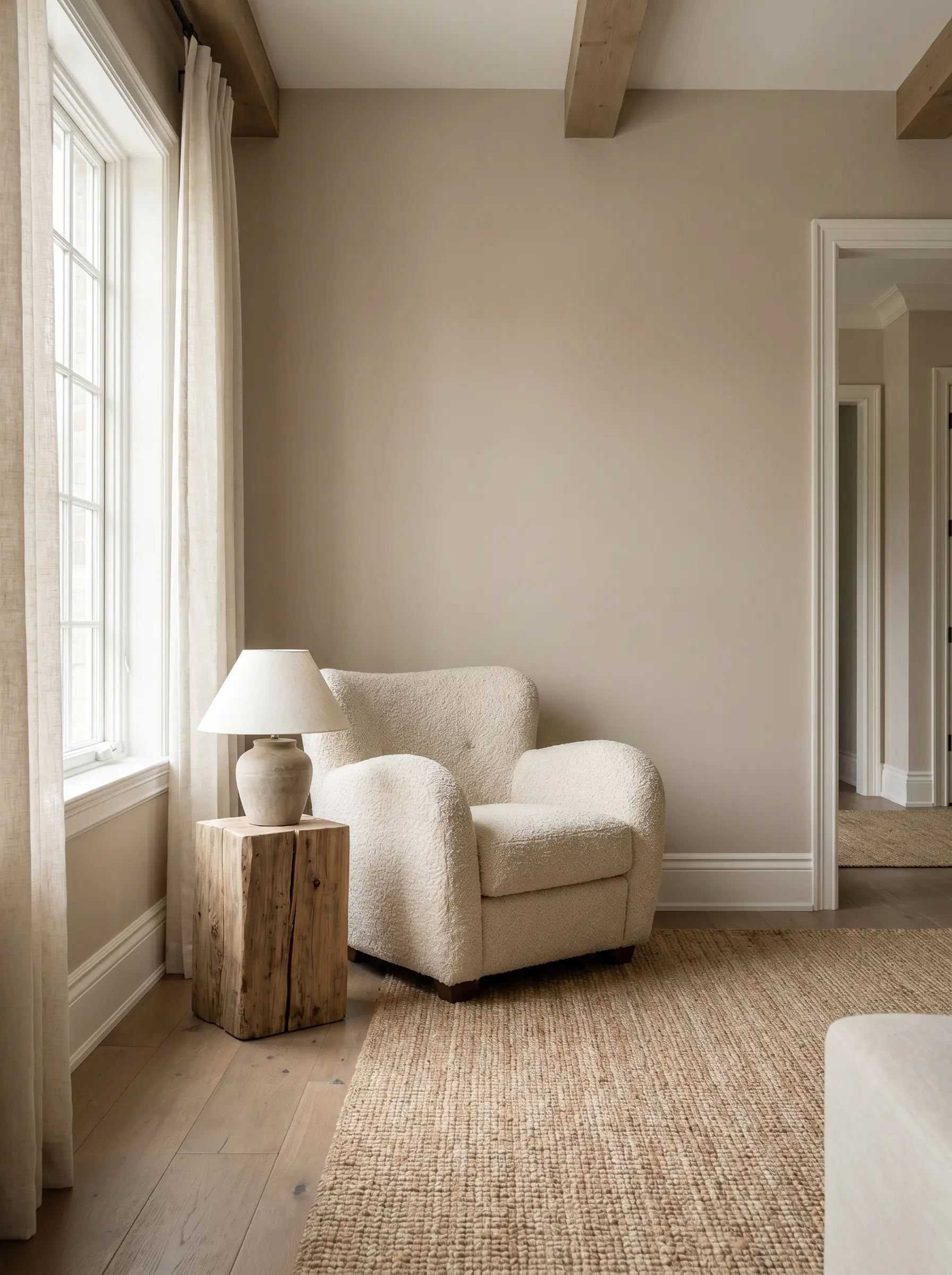
The Boutique and Bespoke Greiges for High-End Architectural Finishes
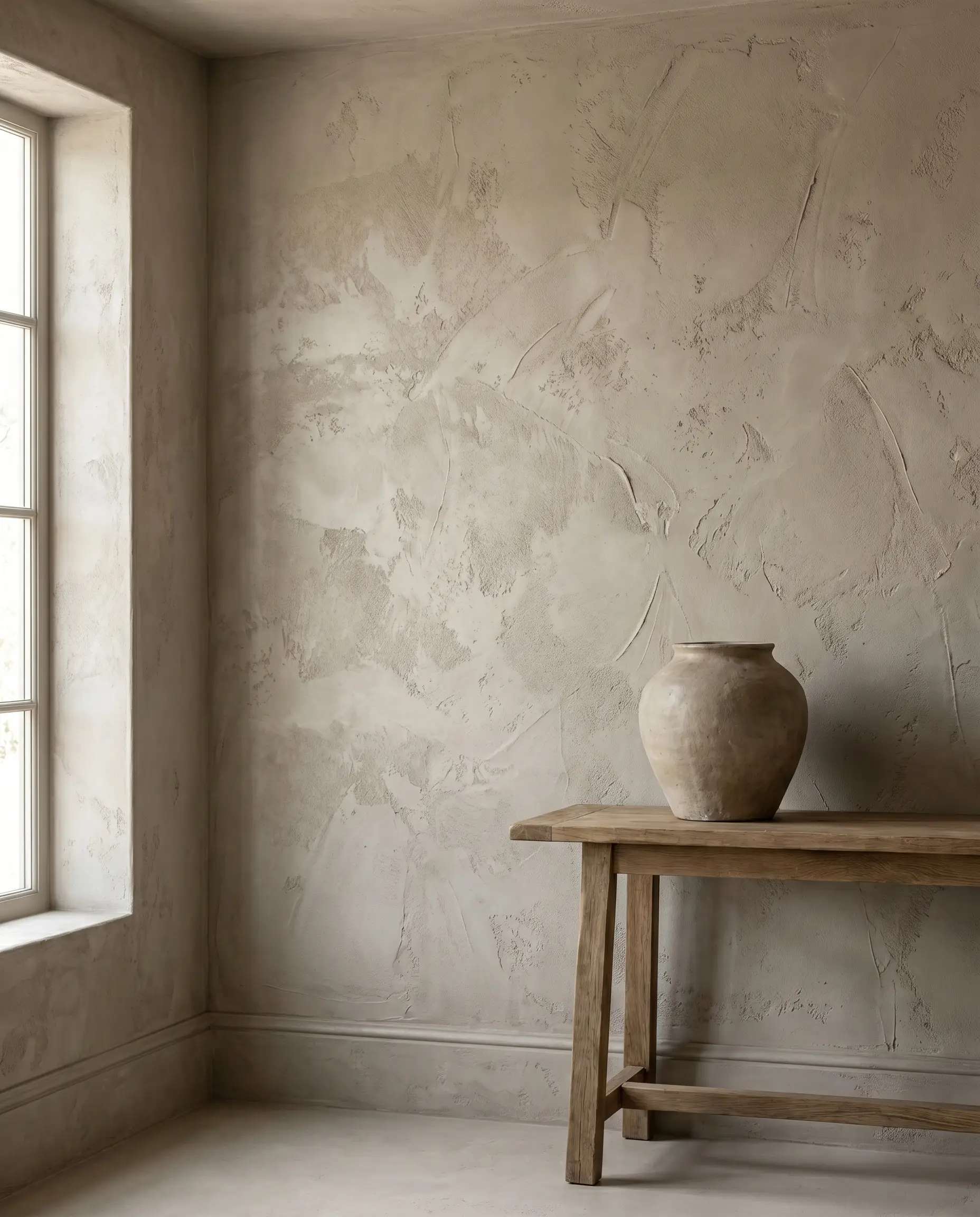
Standard latex paint sits passively on top of the drywall. Boutique paints, limewashes, and Roman clays interact with light dynamically, penetrating the surface to create dramatic shadows, sensory texture, and a highly sought-after Wabi-Sabi aesthetic. These bespoke formulas absorb light differently than standard acrylics, offering a tactile depth that transforms a basic wall into a piece of architecture.
Farrow & Ball Drop Cloth (No. 283)
- Brand & Number: Farrow & Ball No. 283
- LRV: Approx. 48
- Dominant Undertone: Muted, yellow-based beige
- Flashing Risk: Can read slightly dingy if not flooded with adequate natural light
- Best Trim Pairing: Farrow & Ball Shadow White (No. 282)
This mid-tone greige reads exactly like a piece of aged linen, making it the premier choice for historic renovations requiring a sympathetic, lived-in palette. The complex pigment structure interacts dynamically with sunlight, casting a warm, enveloping shadow that feels inherently tactile and luxuriously understated.
Portola Paints Figueroa (Roman Clay)
- Brand & Number: Portola Paints (Roman Clay Finish)
- LRV: N/A (Varies by trowel application)
- Dominant Undertone: Earthy, sun-baked greige
- Flashing Risk: The mottled finish inherently flashes darker and lighter depending on the trowel direction
- Best Trim Pairing: Color-drenched with matching Roman Clay trim
Leaving behind the flat, acrylic nature of standard paint, this textured, plaster-like finish brings an essential organic, tactile element to high-end bespoke interiors. The Roman clay application actively absorbs and refracts light, creating a Wabi-Sabi aesthetic that celebrates the raw, architectural imperfections of the wall itself.
Farrow & Ball Shaded White (No. 201)
- Brand & Number: Farrow & Ball No. 201
- LRV: Approx. 53
- Dominant Undertone: Gentle greige with no cool grey tones
- Flashing Risk: Can flash slightly green in heavily shaded, North-facing rooms
- Best Trim Pairing: Farrow & Ball Pointing (No. 2003)
Masterfully balancing warm and cool without surrendering to stark, icy grey tones, this boutique finish thrives in spaces where natural light is wildly inconsistent. Its powdery, highly pigmented surface softens the hard architectural edges of a room, casting a serene, luminous glow that feels deeply historic yet thoroughly modern.
Portola Paints El Mirage (Limewash)
- Brand & Number: Portola Paints (Limewash Finish)
- LRV: N/A (Varies by brush application)
- Dominant Undertone: Cloudy, ethereal warm gray
- Flashing Risk: Will dry significantly lighter than it appears in the bucket, occasionally flashing a cool blue in Northern light
- Best Trim Pairing: Unpainted, natural white oak millwork
This cloudy, ethereal greige limewash is highly recommended for Japandi or minimalist luxury spaces that demand texture without visual clutter. The limewash formula bonds directly with the drywall, creating a breathtaking, mottled depth that changes personality entirely as the directional angle of the sun shifts throughout the afternoon.
Farrow & Ball Skimming Stone (No. 241)
- Brand & Number: Farrow & Ball No. 241
- LRV: Approx. 60
- Dominant Undertone: Stony greige with a subtle lilac base
- Flashing Risk: The lilac undertone will flash violently purple if paired with yellow-toned lighting
- Best Trim Pairing: Farrow & Ball Strong White (No. 2001)
Operating as a stony, contemporary greige, this elite finish utilizes a highly sophisticated lilac undertone to create upscale, enveloping bedrooms. It absorbs evening light with a soft, romantic cast, providing a deeply reassuring architectural backdrop for luxurious silk drapery and plush, low-profile furniture.
Selecting the Perfect Crisp White Trim to Frame Greige Walls
A greige wall is only as successful as the trim that frames it. If your white trim carries a harsh yellow undertone, it will immediately make your greige walls look dirty and aged. You must match the undertones flawlessly; high-contrast whites frame the greige like a crisp photograph, while tonal whites blur the architectural lines for a softer transition.
Benjamin Moore Chantilly Lace (OC-65) for High Contrast
- Do: Pair this pure, clean white with Classic Gray or Pashmina when you want the greige walls to pop aggressively against the millwork.
- Don’t: Pair this stark white with warm, yellow-based greiges like Accessible Beige, as the purity of Chantilly Lace will make the warm greige look muddy.
Sherwin-Williams Alabaster (SW 7008) for Tonal Softness
- Do: Pair this creamy, warm white with Accessible Beige or Shiitake to create a soft, monochromatic, transitional flow without stark lines.
- Don’t: Pair this yellow-based white with cool, green-based greiges like Revere Pewter, as the competing undertones will violently clash.
Finalizing Your Palette Before the Roller Hits the Wall
Skipping the physical testing phase is a critical failure in interior design. Because greige is highly reactive to both directional light and the fixed elements in your room, relying entirely on a tiny paper swatch will guarantee a flashing risk. You must control your environment by following industry standards for color testing.
- Paint Large Swatches on Foam Boards: Do not paint directly on your current wall color, as the existing paint will visually distort the new swatch. Apply two coats of your chosen greige to a large, pure white foam board.
- Track the Directional Light: Move the foam board around the room, testing it on walls directly facing the windows, and walls adjacent to the windows.
- Audit the Flashing Risk at Three Intervals: Check the exact same foam board at 10 AM (crisp morning light), 2 PM (heavy afternoon sun), and 8 PM (with your artificial room lighting turned on).
If the undertone holds its structural integrity across all three lighting scenarios, you have successfully anchored your space. To further control how your architectural paint choices react to your environment, explore our Hackrea guide on interior lighting mechanics.