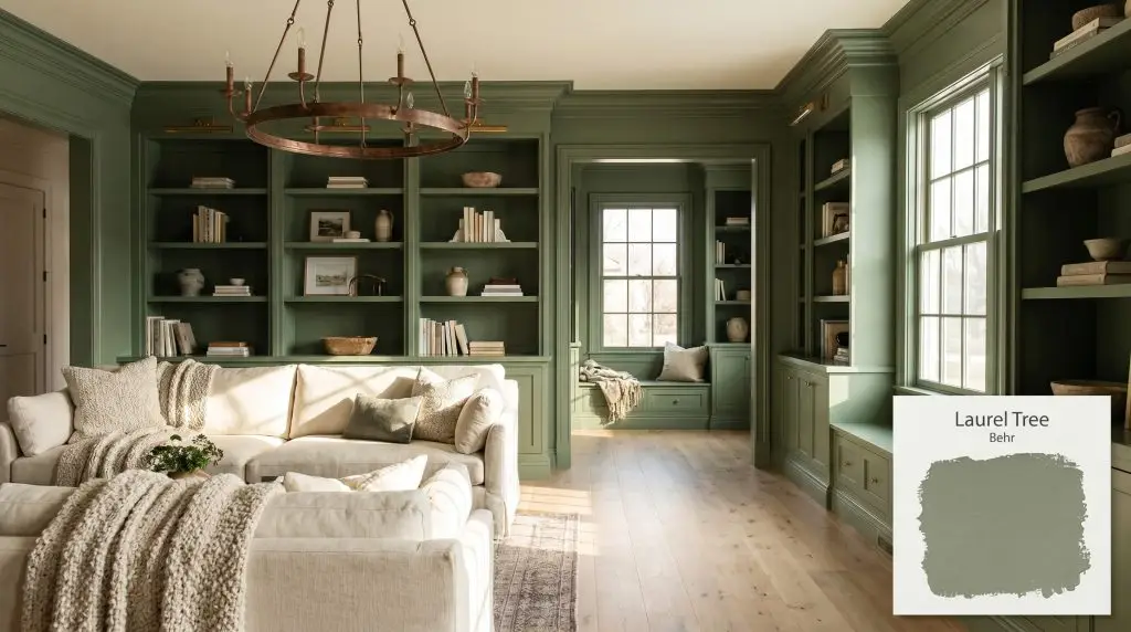
Behr Laurel Tree (S390-5) is a mid-tone, warm herbal green with distinct olive and gray undertones. Boasting an LRV of 29, it acts as a grounding, earthy neutral that brings a serene, biophilic energy to both interior spaces and exterior facades.
Will Laurel Tree clash with your room?
Paint Technical Profile
| Color ID / SKU | S390-5 |
| HEX Code | #889779 |
| Light Reflectance (LRV) | 29 |
| Use | Interior, Exterior |
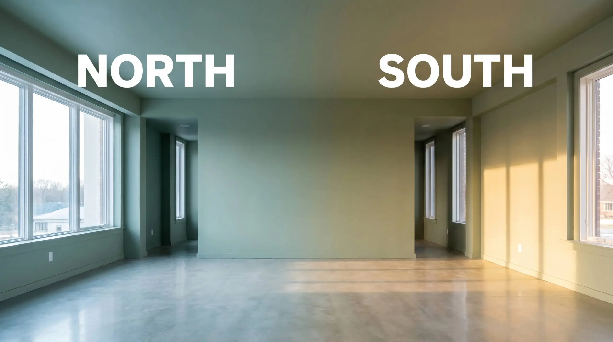
| Best Exposures | South, West |
| Best For | Kitchen Cabinets, Home Offices, Bedrooms, Exteriors |
Behr Laurel Tree: Grounding Light-Starved Architecture with Earthy Warmth
There is a profound shift that happens when a room transitions from a stark, predictable neutral to a deeply rooted, botanical shade. Behr Laurel Tree (S390-5) captures that exact transformation, offering a sophisticated, earthy palette that feels both grounded and incredibly intentional.
This mid-tone green completely alters the energy of a house, bringing a quiet, shaded refuge to overly bright layouts. By absorbing excess glare and wrapping the walls in a rich, herbal warmth, it turns standard architectural features into highly curated focal points.
Undertones & LRV of Laurel Tree
When homeowners ask if this shade leans warm or cool, the answer is definitively warm. Behr Laurel Tree is a complex, sun-baked green that relies on a very specific pigment profile to maintain its inviting temperature.
With an LRV of 29, this specific color absorption rate means it pulls in over 70% of the light it receives. It visually advances the walls toward you, creating an intimate, enveloping atmosphere rather than pushing the boundaries outward.
Lighting Effects & The Chameleon Factor
Because of its heavy chromatic graying, Behr S390-5 is highly reactive to the shifting sun. If placed in a chronically dim hallway without proper illumination, this botanical green risks losing its vitality, collapsing into a flat, shadowy impression of itself. Testing it against your specific windows is absolutely essential to ensure it retains its warmth.
Popular Room Applications for Behr’s Botanical Green
This mid-tone sage doesn’t just coat a wall; it actively redefines the boundaries and mood of the home. It brings a grounded, historic gravity to contemporary builds and adds a fresh, organic vitality to older, compartmentalized floor plans.
Kitchens
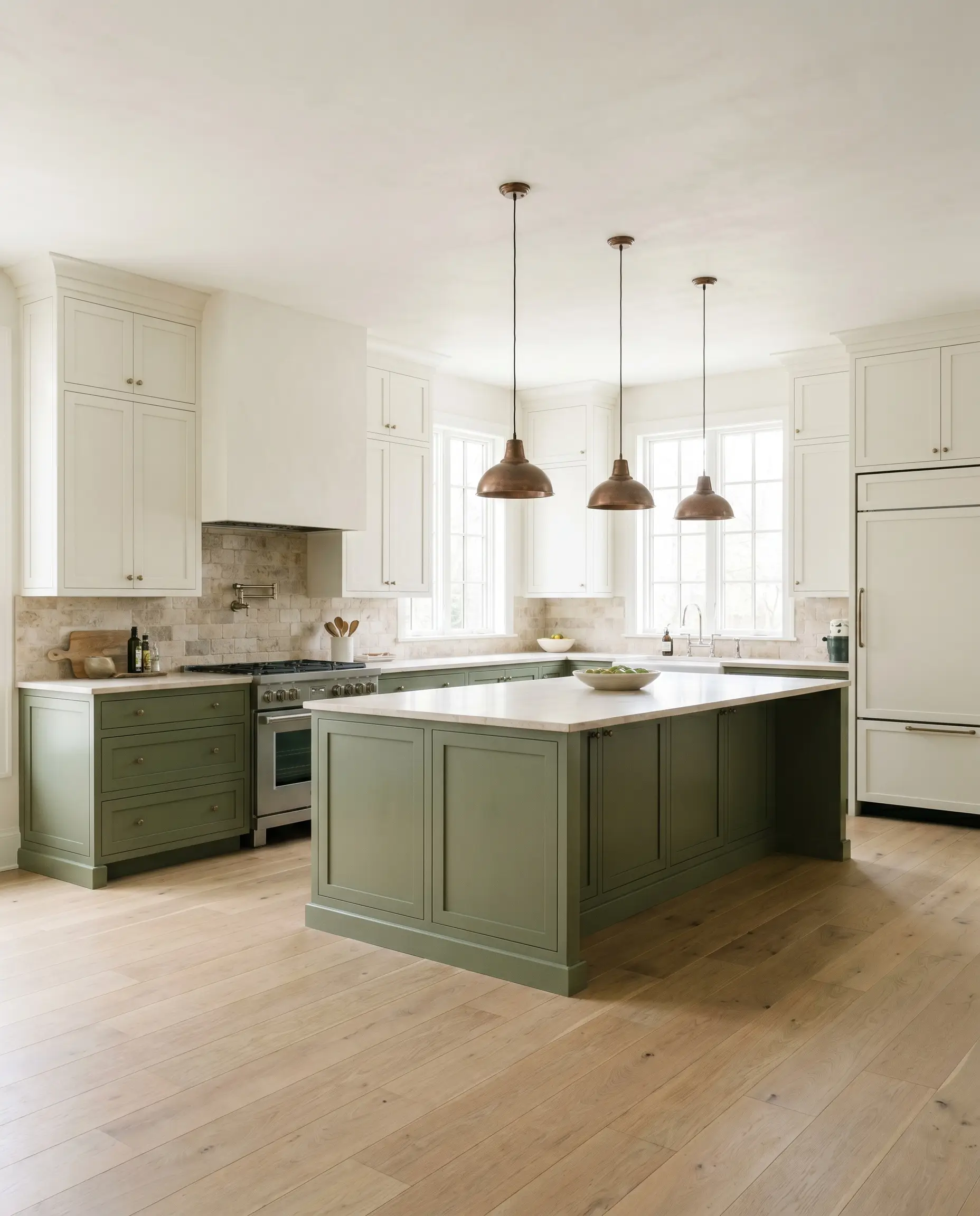
Applying this shade as a cabinetry lacquer completely revitalizes a tired culinary space. It acts as a stunning anchor for lower cabinets or expansive kitchen islands, especially when paired with creamy white uppers to keep the room feeling airy. If you are exploring kitchen cabinet color trends, this olive hue provides a timeless alternative to standard navy or gray, bringing a sense of the outdoors directly into the heart of the home.
Home Offices
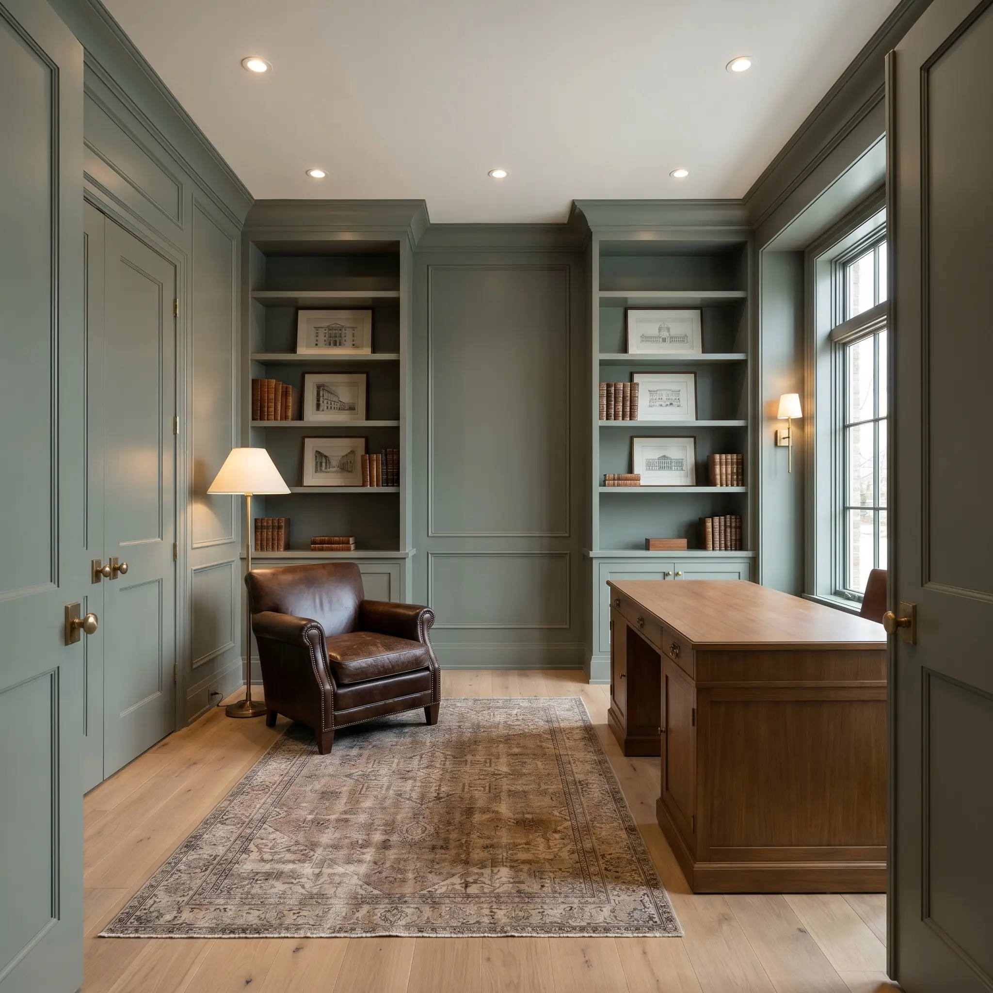
In a workspace, this color fosters a sense of quiet focus and deep concentration. Wrapping the entire room—including the baseboards and doors—in this earthy green reduces visual clutter and minimizes eye strain from computer screens. It creates a distinguished, library-like atmosphere that pairs beautifully with rich leather seating and vintage rugs.
Will Laurel Tree work with your specific lighting, floor, or furniture?
Bedrooms
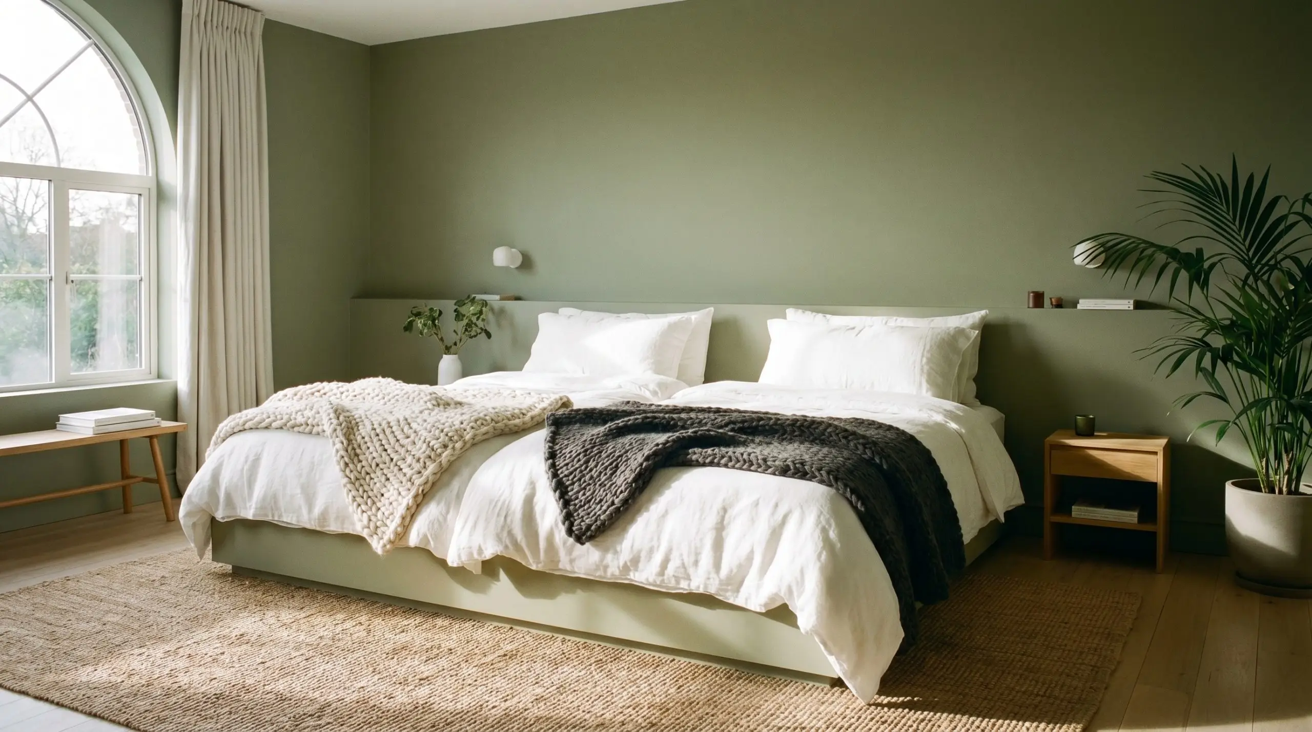
Because of its specific light absorption, this shade is brilliant for cultivating a restful, cocooning sleeping environment. It softens the harsh morning light and deepens beautifully into a moody, shadowed olive as the sun sets.
To keep a green bedroom from feeling too heavy, introduce layers of crisp, white linen bedding and textured wool throws. The high-contrast textiles will lift the visual weight of the walls and keep the room feeling fresh.
Hackrea Pro-Tip (The Woven Contrast)
Exteriors
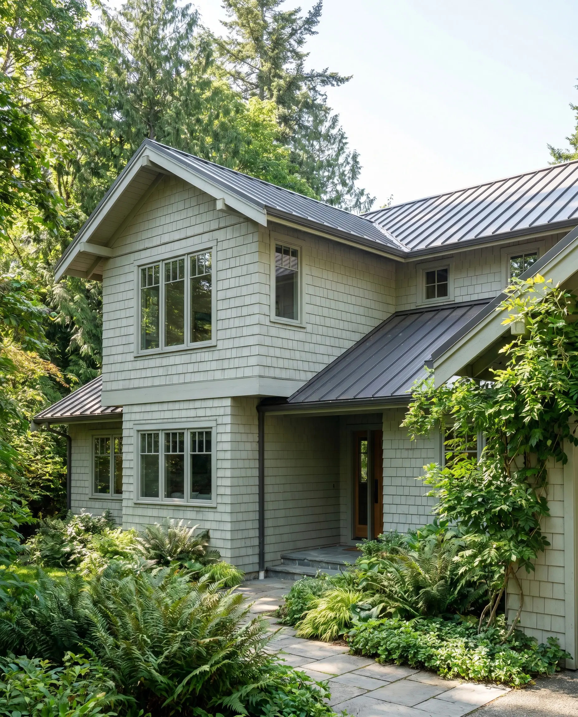
When taken outside, natural sunlight significantly washes out the depth of the pigment. On exterior siding or front doors, it will read much lighter and slightly more gray than it does on an interior swatch. It is a fantastic choice for homes surrounded by heavy foliage, allowing the architecture to seamlessly blend into its natural environment.
Will Laurel Tree work with your specific lighting, floor, or furniture?
Bathrooms
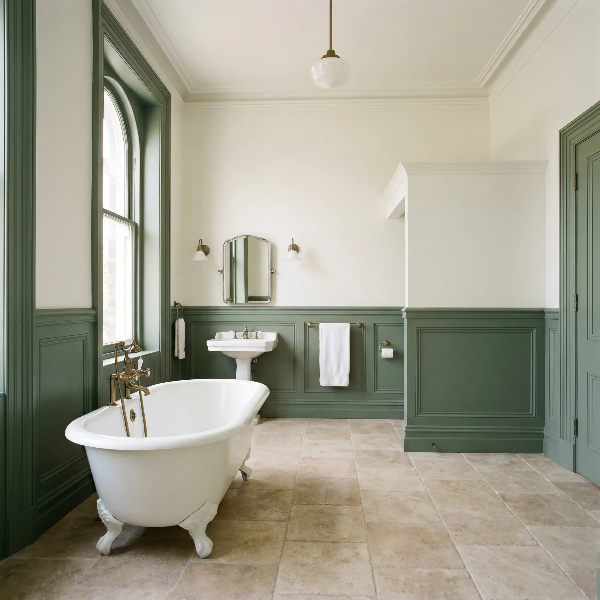
Using this green for wainscoting contrast against a crisp white upper wall is a brilliant way to introduce color into a bathroom without overwhelming the vanity lighting. It grounds the lower half of the room, providing a rich backdrop for freestanding tubs or classic subway tile installations.
Creative Ways to Use Behr S390-5
This pigment begs for creative, highly customized applications beyond a standard four-wall paint job. Its specific olive-gray structure inspires projects that turn overlooked architectural moments into striking design features.
The Monochromatic Library Nook
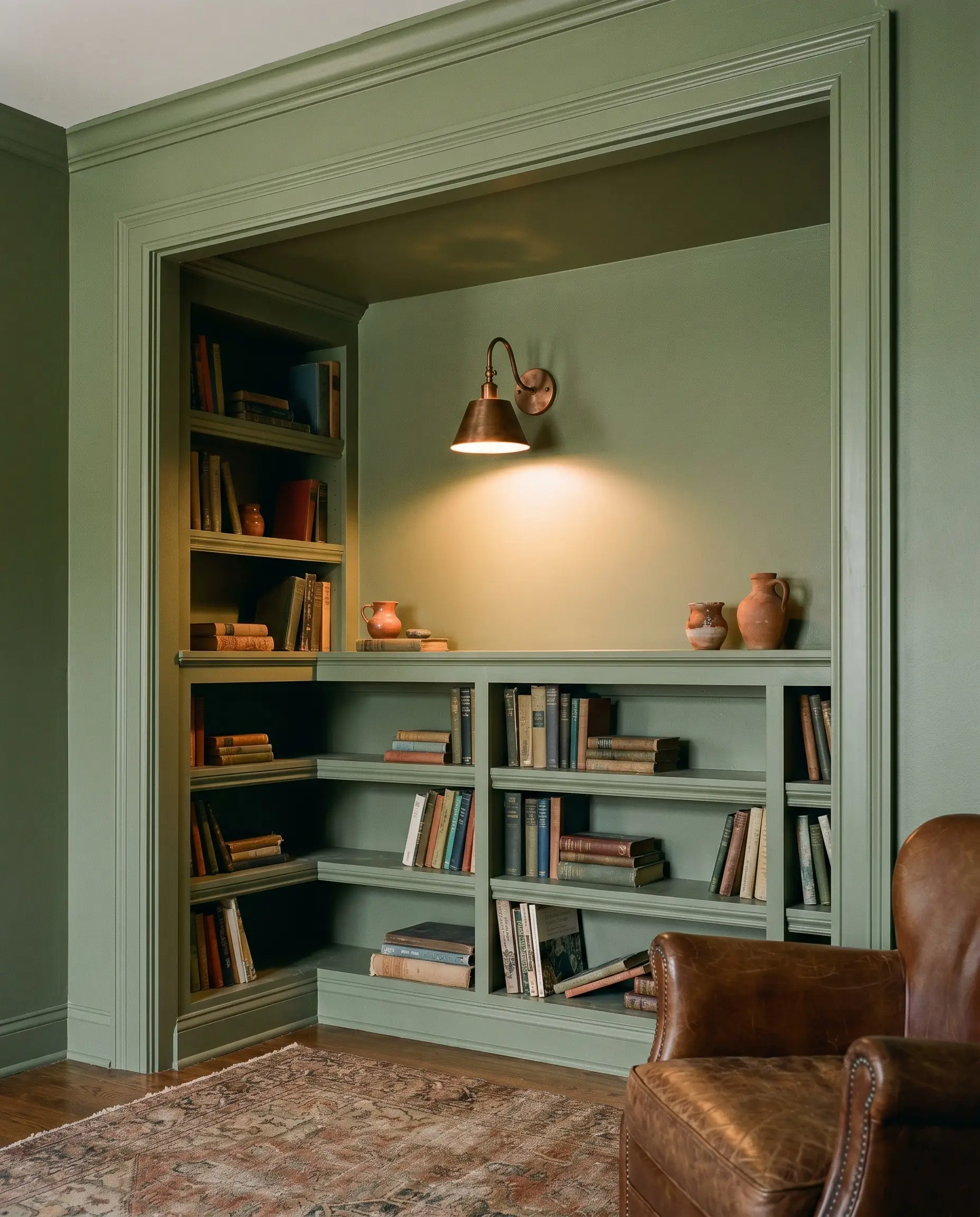
Transform a recessed alcove or an underutilized hallway corner by painting the shelving, walls, and trim entirely in this shade. The seamless wash of color erases the sharp visual boundaries of the carpentry, making the small space feel like a deliberate, custom-built reading retreat. Pair it with an aged copper wall sconce to cast a warm, localized glow that highlights the green’s olive depth.
The Sun-Washed Mudroom
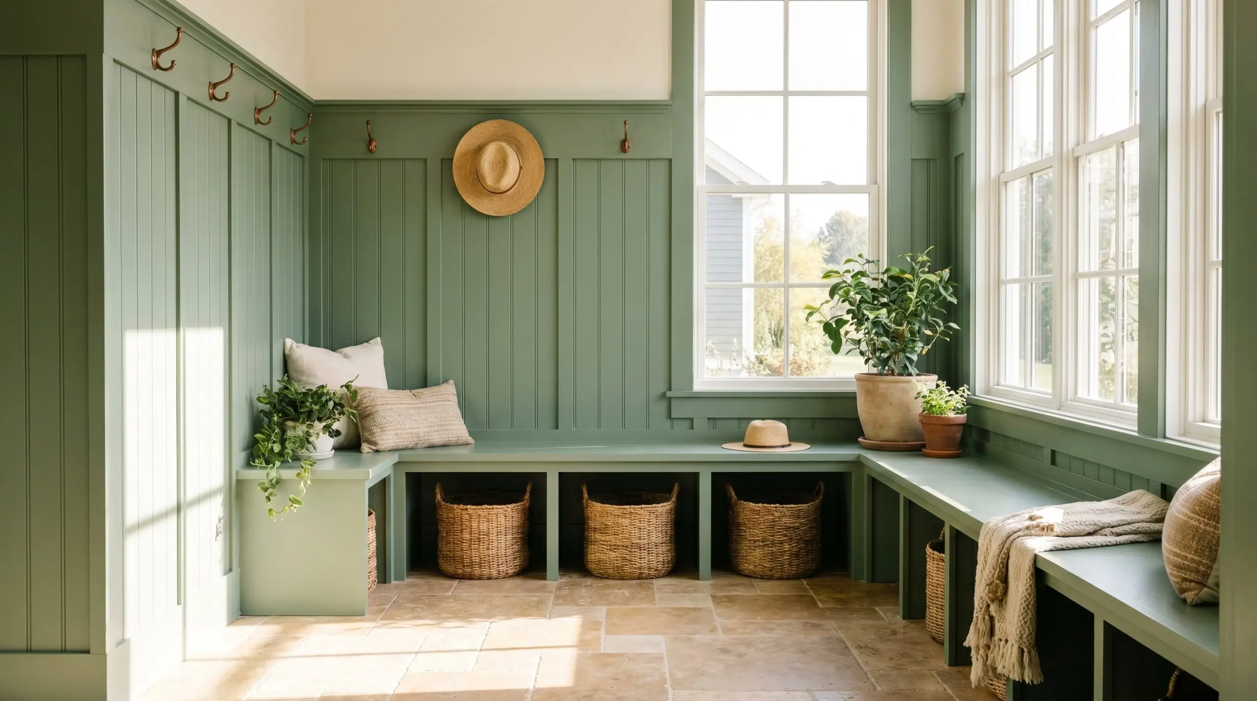
Will Laurel Tree work with your specific lighting, floor, or furniture?
Entry transition zones take a lot of abuse, but they also offer a canvas for bold, welcoming color. Using this earthy green on the wainscoting and built-in benches hides everyday scuffs while greeting guests with a sophisticated biophilic design. It looks exceptionally tailored when paired with tumbled travertine flooring, which echoes the warm, natural energy of the paint.
The Grounded Ceiling Canopy
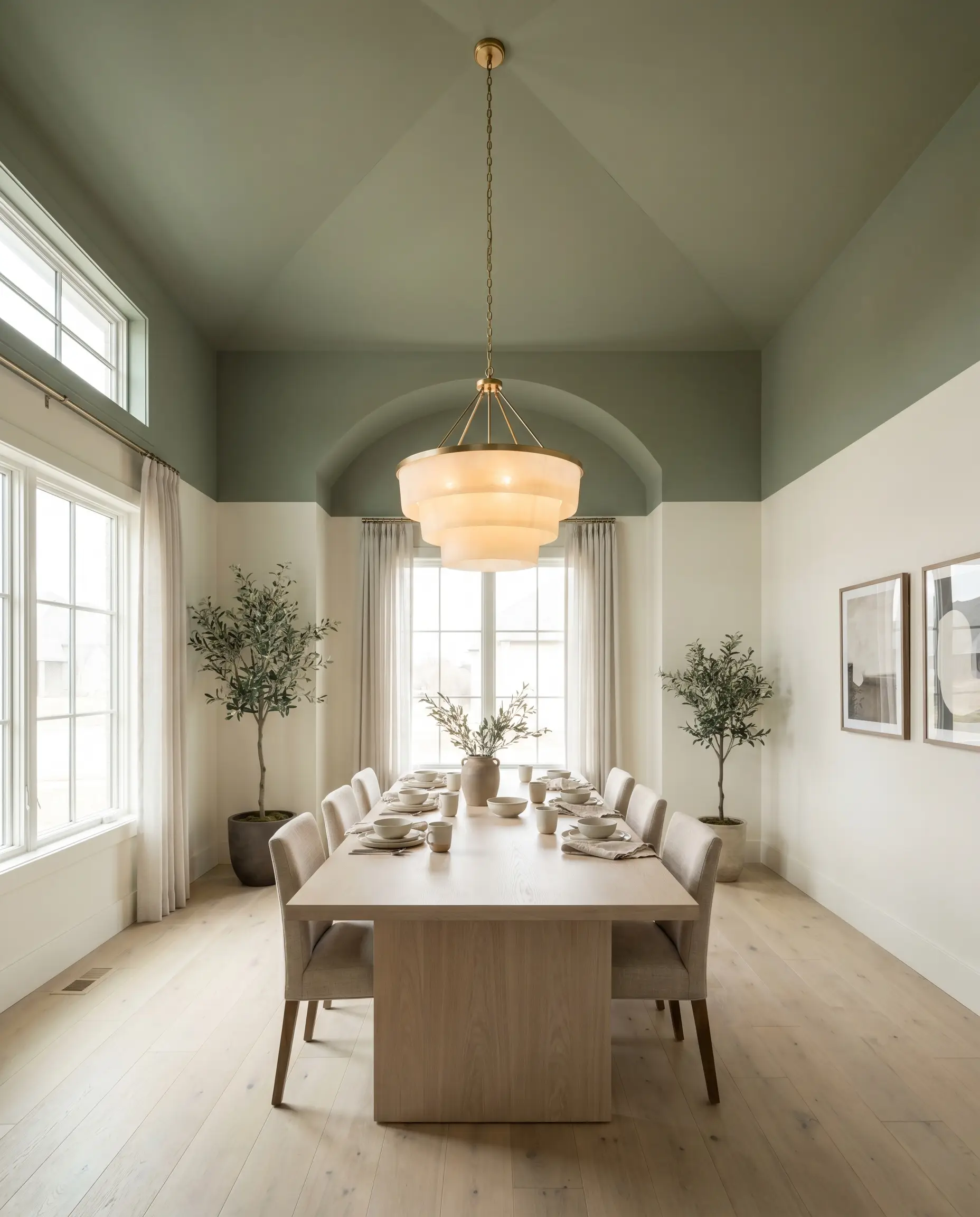
In dining rooms with unusually high ceilings that feel cold or uninviting, painting the ceiling and the top quarter of the wall in this mid-tone green visually lowers the room’s height. This technique creates a cozy, tented effect that encourages guests to linger around the table, especially when illuminated by a warm, frosted-glass chandelier.
Coordinating Colors & Best Pairings
The relational behavior of this green is entirely dependent on contrast. It requires crisp, deliberate boundaries to maintain its herbal clarity, otherwise, the olive undertones can quickly muddy into the background.
Trim & Baseboards
Hardware, Wood & Material Pairings
Coordinating Colors
Designer Mood Boards
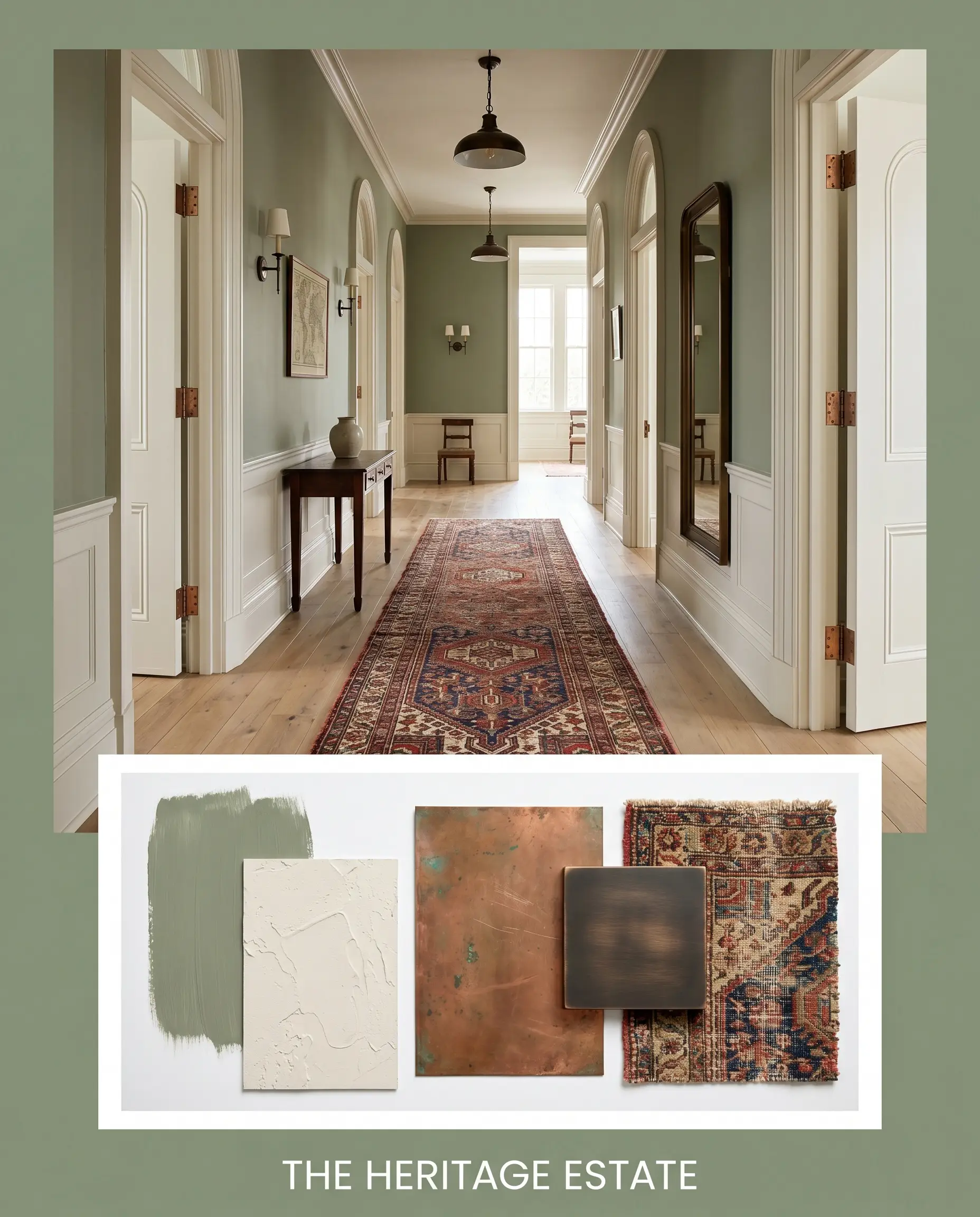
The Heritage Estate This palette leans heavily into the historic gravity of the paint. By combining the green walls with Farrow & Ball Slipper Satin trim, aged copper hardware, and a rich, Persian-style runner, the atmosphere feels instantly timeless. The addition of subtle, oil-rubbed bronze fixtures grounds the space in classic, enduring design.
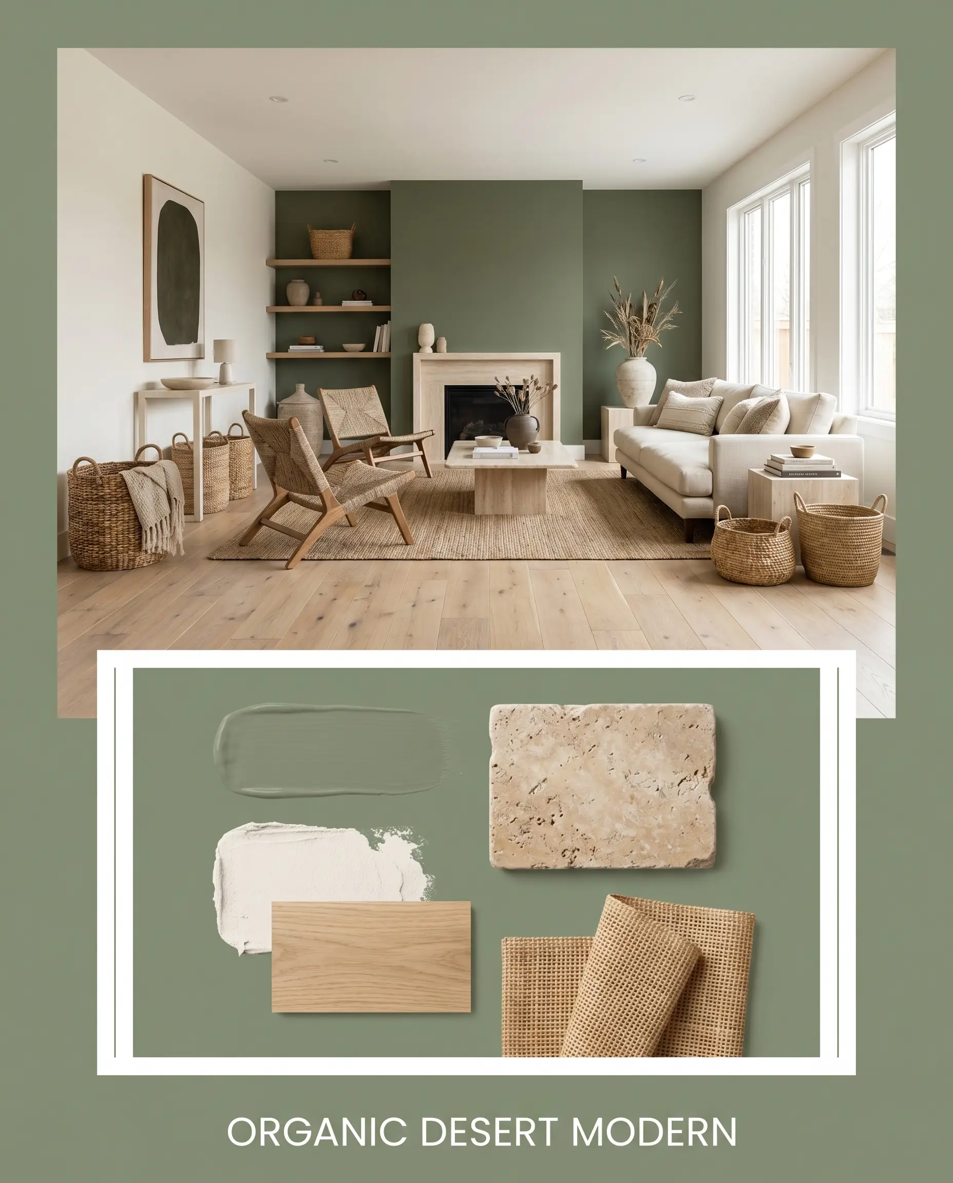
Organic Desert Modern Focusing on warmth and texture, this combination uses Behr Blank Canvas on the surrounding walls, allowing the olive green to act as a striking focal point. Paired with wide-plank white oak flooring, tumbled travertine accents, and woven rattan baskets, the vibe is relaxed, sun-baked, and effortlessly stylish.
Will Laurel Tree work with your specific lighting, floor, or furniture?
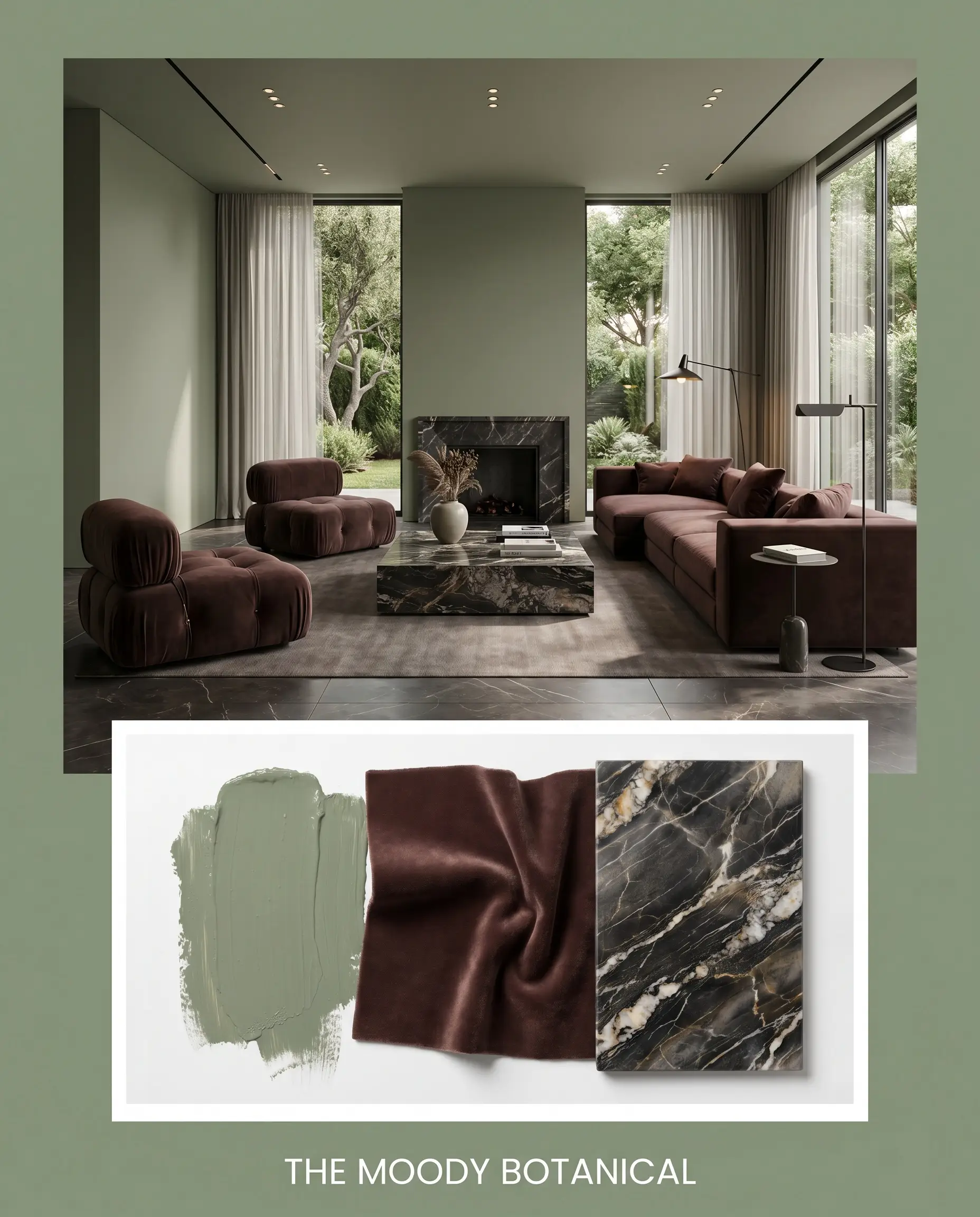
The Moody Botanical Designed for maximum emotional impact, this palette embraces the deep color absorption of the paint. By layering the green alongside accents of Sherwin-Williams Carnelian, plush velvet upholstery, and heavily veined dark marble surfaces, the environment transforms into a rich, cinematic retreat that feels incredibly luxurious.
Head-to-Head Comparisons
Homeowners often narrow their choices down to a few popular greens, but subtle shifts in light reflectance completely change the final installation. If your room lacks natural sunlight, a rival shade might offer the necessary brightness to keep the walls from feeling too heavy.
Behr Laurel Tree vs. Sherwin-Williams Evergreen Fog SW 9130
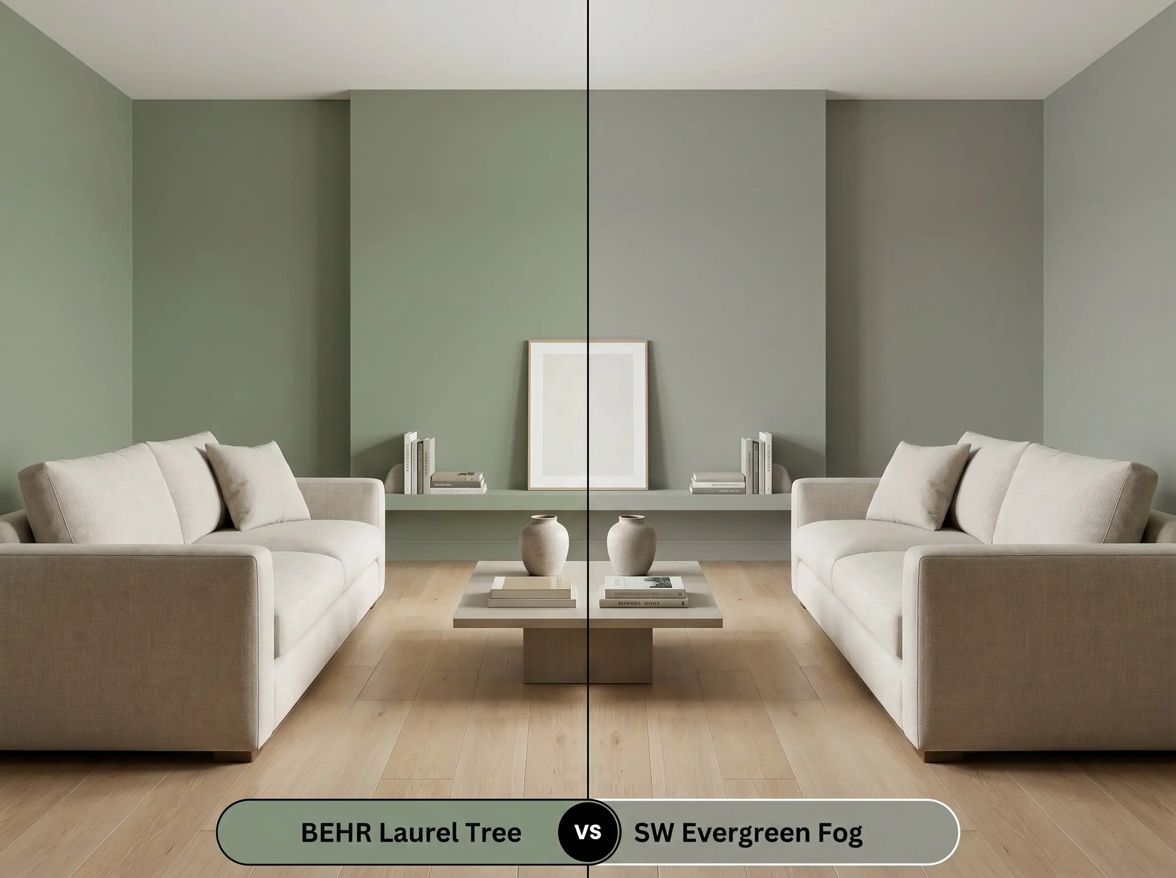
Evergreen Fog carries significantly more gray and a slightly higher LRV, making it a safer, more neutral choice for rooms with unpredictable lighting. If you want a pronounced, earthy olive presence, the Behr option is much richer; if you prefer a subtle, misty backdrop that recedes easily into the background, Sherwin-Williams is the better candidate.
Behr Laurel Tree vs. Benjamin Moore October Mist 1495

October Mist is noticeably lighter and leans heavily into a silvery-sage profile, lacking the deep yellow-olive warmth of the Behr shade. If you are painting a small, north-facing room and fear the walls will feel too dark, October Mist will reflect more light and keep the space feeling airy.
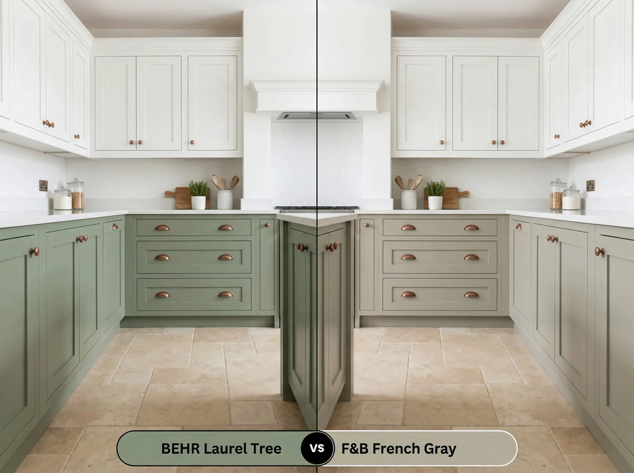
Behr Laurel Tree vs. Farrow & Ball French Gray No. 18
Will Laurel Tree work with your specific lighting, floor, or furniture?
French Gray is a legendary chameleon that shifts dramatically between green and gray depending on the time of day. While Behr holds its green identity much more firmly, the Farrow & Ball option offers a softer, more historic wash of color that feels slightly more weathered and relaxed.
Similar Colors & Brand Equivalents
Whether you are looking for a slightly crisper finish or need to color-match across different manufacturers for local availability, there are several excellent alternatives to Behr S390-5.
Similar Colors
Cross-Brand Equivalents
Practical Application & DIY Advice
Translating this earthy hue from a digital swatch to a flawless physical finish requires a deliberate approach to materials.
The Dynamic Sheen Guide
Primer Strategy
Because of its medium-dark depth, applying a high-quality, tinted gray primer is highly recommended. A tinted base reduces the number of topcoats required and ensures the rich olive undertones develop fully without the old wall color bleeding through and muddying the finish.
Coverage & Success Tips
Expect to apply at least two generous coats for complete, opaque coverage.
Mid-tone greens are notorious for “flashing”—showing visible, uneven roller marks when light hits the wall at an angle. To avoid this, always maintain a wet edge while rolling, do not stretch the paint too thin, and let each coat dry completely before evaluating the finish.
Hackrea Pro-Tip (The Flashing Risk)
Frequently Asked Questions
Without natural light to activate its yellow undertones, this color relies entirely on your bulbs. If you use warm 2700K lighting, it will heavily emphasize the gray-olive base and can feel muddy; however, switching to crisp 3500K or 4000K LED bulbs will beautifully illuminate its herbal qualities.
Direct, intense sunlight will significantly wash out the depth of this green, making it appear several shades lighter and slightly more gray. If you live in a high-UV area, you may want to test a shade one step darker on the color card to achieve the mid-tone look you desire.
Yes, its LRV of 29 means it absorbs a significant amount of light, which visually pulls the ceiling downward. This is an excellent architectural trick for making cavernous, overly tall rooms feel intimate and grounded.
Because of its warm olive base, it pairs exceptionally well with aged copper, unlacquered brass, or warm bronze finishes. If you want a more modern, high-contrast look, polished nickel provides a sharp, crisp boundary against the earthy green.
Final Verdict & Expert Warnings
Behr Laurel Tree is a highly versatile, deeply grounding paint that excels at bringing a sense of organic tranquility to standard residential spaces. It is the perfect choice for homeowners looking to introduce the best olive greens into their home without committing to an overwhelmingly dark or overly vibrant shade. Its sweet spot lies in spaces with ample afternoon sunlight, where its golden-olive undertones can truly glow, making it an exceptional candidate for custom cabinetry, immersive home offices, and cozy, layered bedrooms.
However, this earthy green is highly reactive to its surrounding elements, and placing it next to the wrong fixed finishes will cause the color to fall flat. You must be incredibly cautious when pairing this shade with cool, blue-toned gray luxury vinyl flooring or icy, blue-white quartz countertops, as the stark temperature clash will make the green look dirty and aged rather than intentional. Additionally, avoid pairing it with heavily red-toned woods like cherry or mahogany, which can inadvertently create an unwanted, permanent holiday aesthetic. Keep your surrounding materials warm, earthy, and natural, and this botanical shade will reward you with a beautifully curated, high-end atmosphere.
Room Compatibility & Clashes Diagnoses
Hackrea's reports evaluating the compatibility of Laurel Tree in real rooms.West-Facing Living Room
"The warm honey-toned flooring and neutral taupe seating provide an organic anchor for the herbal green paint, while the western exposure enlivens its olive undertones in the afternoon."
Track-Lit Living Room with Brick Fireplace
"The muted olive paint establishes an organic complementary pairing with the amber oak floors and brickwork, but its low LRV risks creating shadowy corners beneath the drop-ceiling track lights."