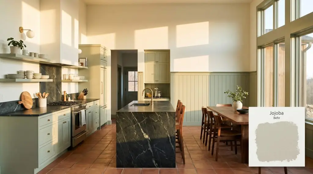
Behr Jojoba (N390-3) is a warm, mid-tone sage green with distinct gray and subtle yellow-olive undertones. With an LRV of 47, it acts as a balanced, earthy neutral that brings organic warmth to interior and exterior spaces without feeling overly vibrant.
Will Jojoba clash with your room?
Paint Technical Profile
| Color ID / SKU | N390-3 |
| HEX Code | #b0b9a6 |
| Light Reflectance (LRV) | 47 |
| Use | Interior, Exterior |
| Best Exposures | South-facing, North-facing |
| Best For | Bedrooms, Kitchen Cabinets, Home Offices, Living Rooms |
Behr Jojoba Review: Cultivating Calm With a Shape-Shifting Sage Green
Finding a green paint that feels genuinely rooted in nature without veering into a playful, artificial mint is a notorious design challenge. We constantly search for paints that bring the quiet energy of the outdoors inside, softening rigid drywall and stark layouts. Behr Jojoba answers that call with remarkable ease.
This muted sage acts as a foundational neutral, wrapping a room in a sophisticated, earthy warmth that feels incredibly intentional. Whether you are modernizing a disjointed suburban floor plan or adding historic weight to a newly built townhouse, this color adapts beautifully.
Behr Jojoba: Undertones & LRV
Behr Jojoba is definitively a warm paint color, but its brilliance lies in its restraint. It avoids the intense heat of a yellow-heavy olive by relying on a complex, shadowy structure.
Clocking in with a Light Reflectance Value of 47, this shade sits perfectly in the mid-tone range. It absorbs just enough light to feel rich and grounding, yet retains enough bounce to keep a space from feeling heavy. You will need adequate lighting to keep the gray from taking over, but the payoff is a beautifully tailored depth.
Lighting Dynamics & The Chameleon Factor
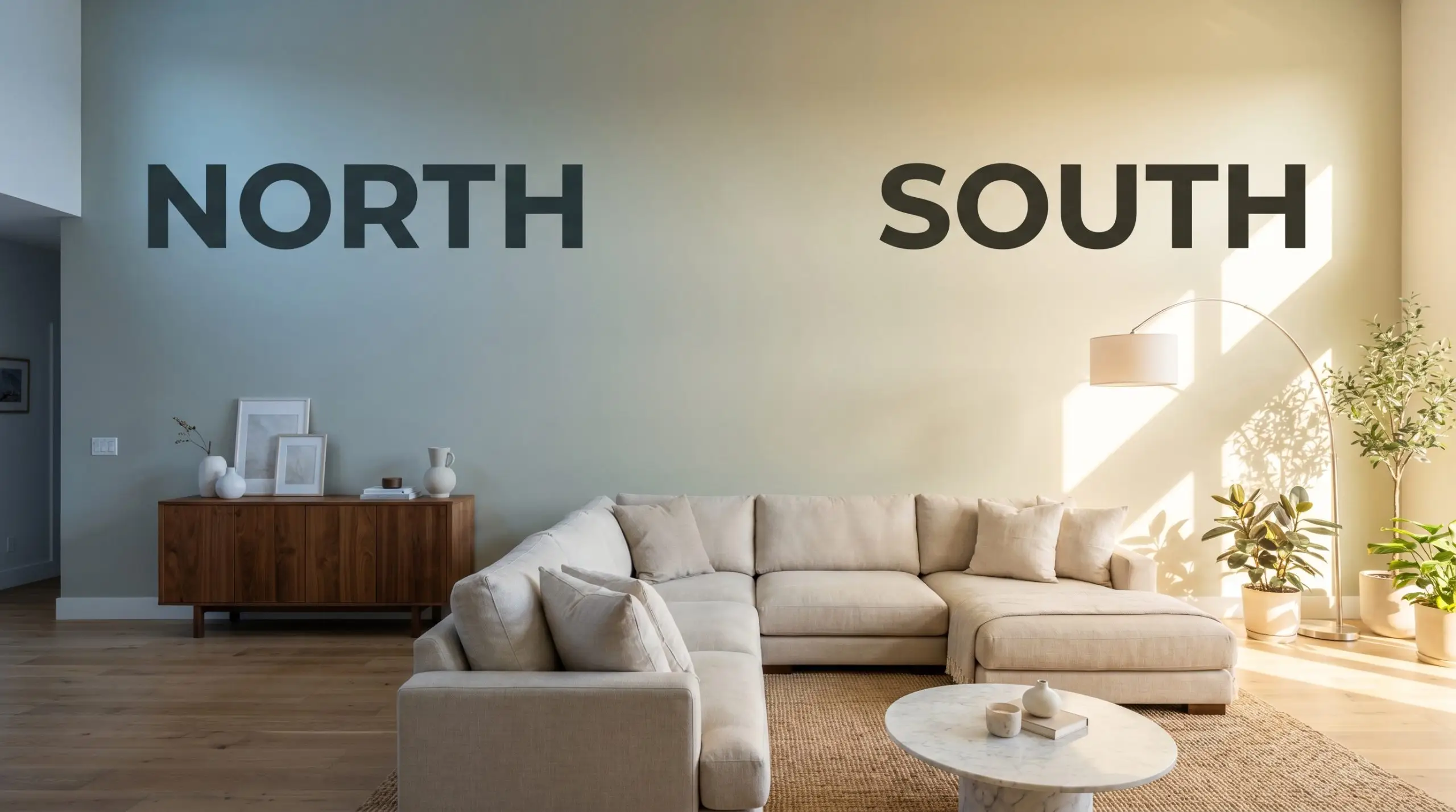
Because of its heavy neutral base, this gray-green shifts dramatically depending on the sun’s trajectory. If your room is heavily shaded by dense exterior trees, the color can lose its vitality and read as a flat, murky shadow. Always test a swatch on multiple walls to see how the environmental light interacts with the pigment throughout the day.
Everyday Applications for Behr Jojoba
This mid-tone neutral brings a quiet, organic rhythm to residential architecture, replacing stark white walls with a sense of rooted history. It softens harsh angles and provides a gorgeous backdrop for everyday life.
Kitchen Cabinetry
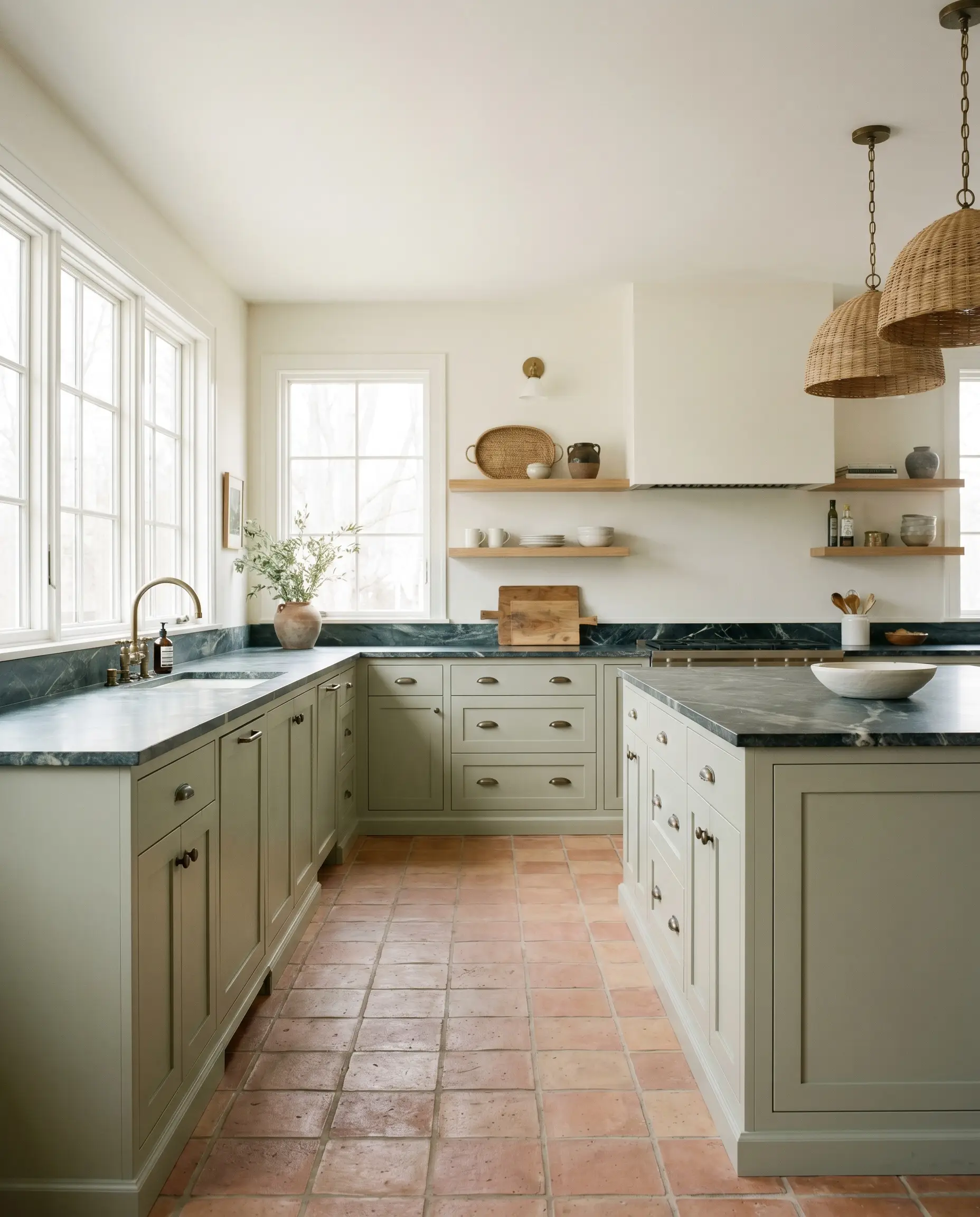
Using this botanical green on lower cabinets or a central island immediately grounds a cooking space with an organic modern touch. It pairs effortlessly with raw, unglazed terracotta tiles or heavily veined soapstone counters. For those planning a full renovation, designing around sage green kitchen cabinets offers a timeless alternative to the classic all-white aesthetic. Keep the upper walls bright to maintain a sense of lift, especially if your kitchen lacks massive windows.
Will Jojoba work with your specific lighting, floor, or furniture?
Bedrooms
The light absorption of this shade makes it a brilliant candidate for a restorative sleeping space. Wrap the entire room—including the baseboards—in this muted sage to create a continuous, soothing envelope. Pair it with crisp linen sheets and warm walnut nightstands to enhance the biophilic design energy.

Home Offices & Studies
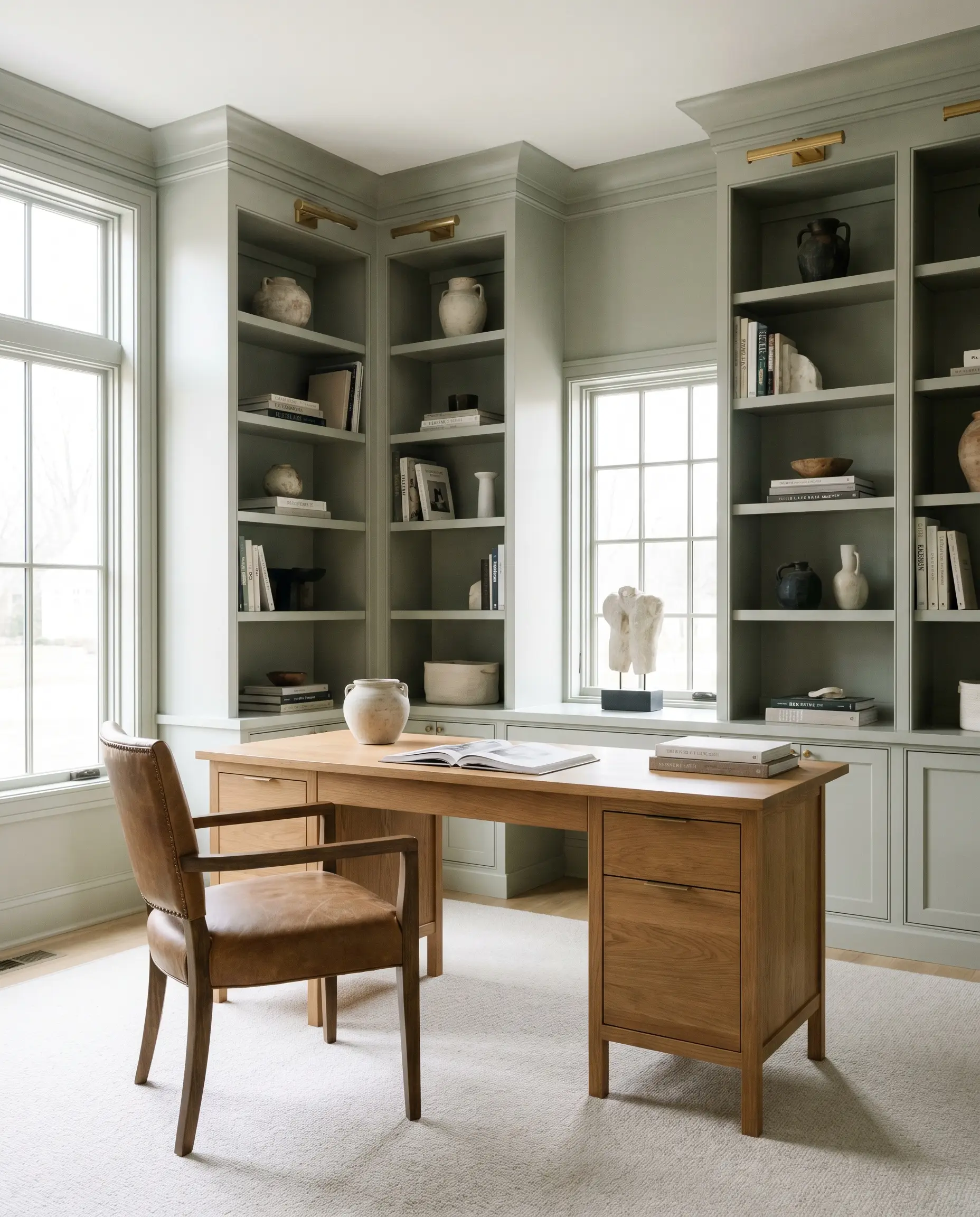
When you need a space that fosters focus without feeling clinical, this color delivers a sophisticated, library-like atmosphere. It looks incredibly handsome behind open shelving filled with books and ceramics.
Will Jojoba work with your specific lighting, floor, or furniture?
Living Rooms
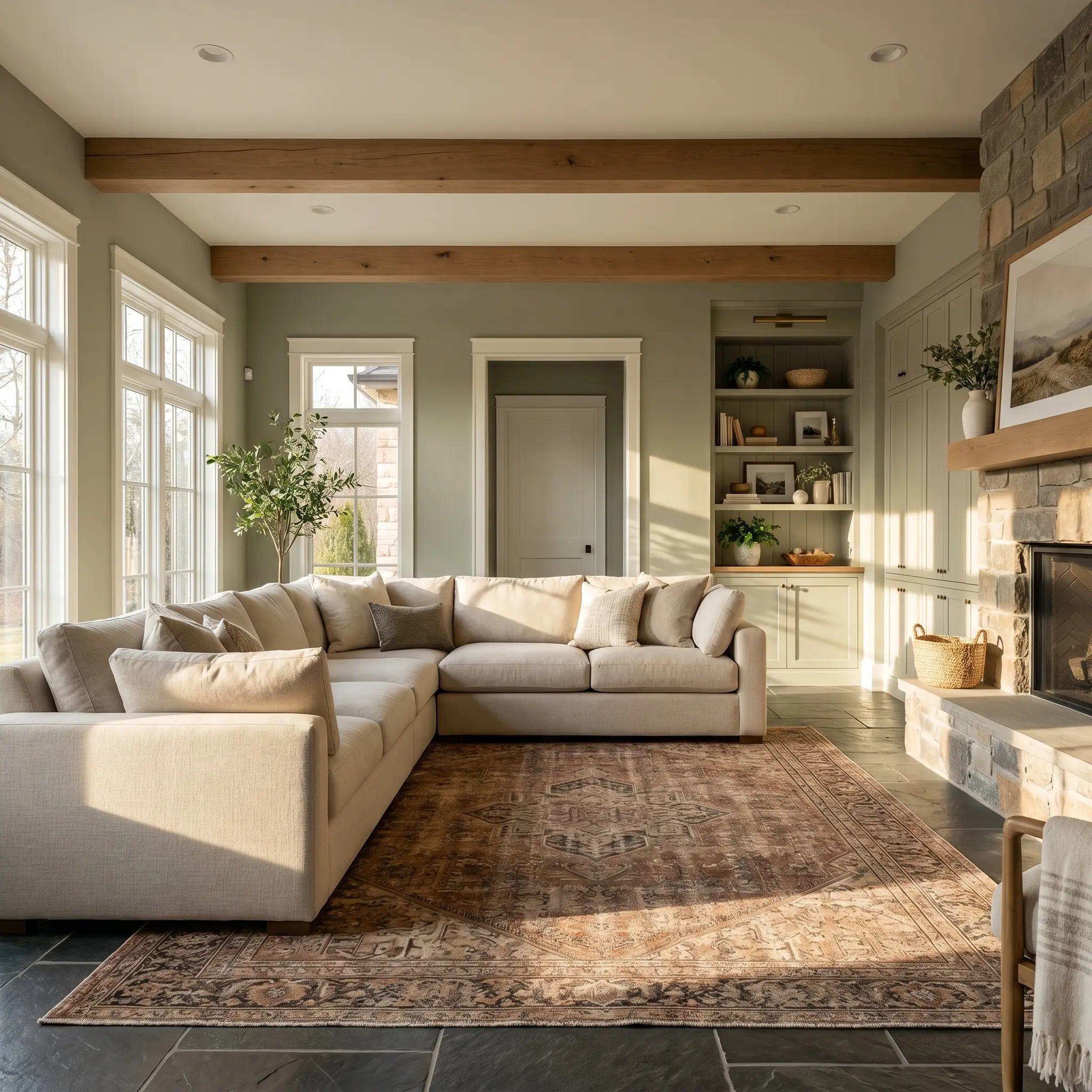
In a main gathering space, this hue acts as a versatile anchor that bridges the gap between casual comfort and tailored elegance. It provides enough visual weight to balance a large, plush sectional while allowing warm-toned vintage rugs to truly pop.
Exterior Siding & Shutters
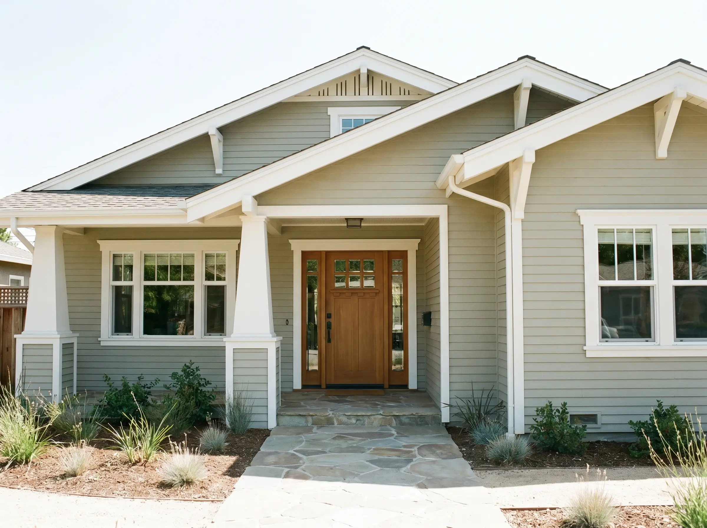
Outdoors, the sun will significantly wash out the depth of the color, making it appear much lighter and slightly warmer. It serves as a beautiful, earthy main body color for a siding update, especially when framed by crisp, creamy white trim.
Natural sunlight is incredibly harsh on mid-tone greens. If you want the exterior to actually look like the swatch you see indoors, you often need to choose a color one or two shades darker on the same paint chip.
Hackrea Pro-Tip (The Exterior Washout)
Creative Architectural Concepts
Moving beyond standard four-wall applications, this paint shines when used to solve specific architectural challenges or highlight custom millwork. Here are a few curated ways to maximize its impact.
The Tonal Arched Bookcase
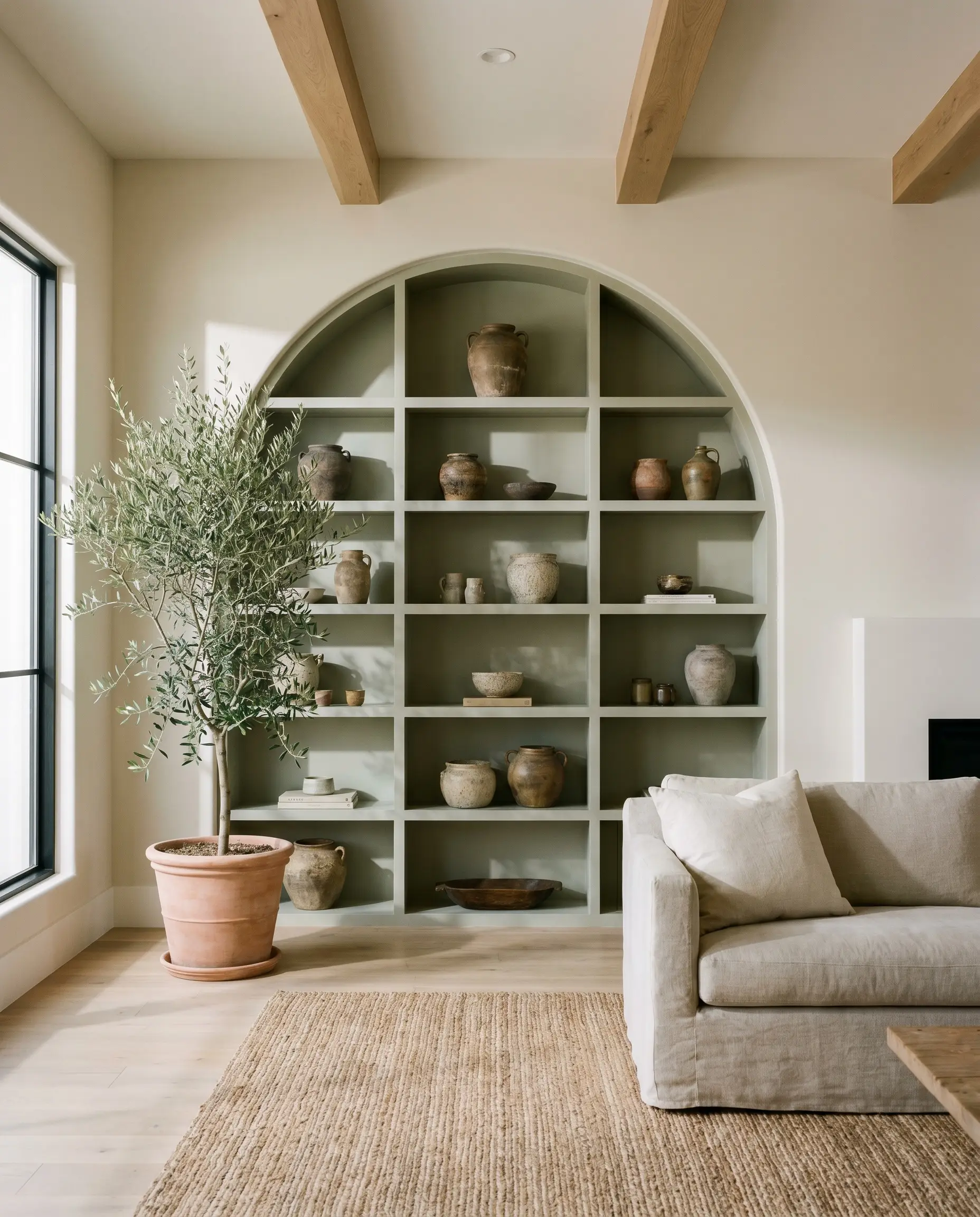
Transform basic built-in shelving by painting the interior backing with this earthy hue to highlight a collection of textured stoneware or vintage pottery. The shadow play inside the shelves deepens the gray base, creating a striking contrast against lighter decorative objects. This technique instantly injects a relaxed, Mediterranean-inspired warmth into a standard living area.
Sun-Drenched Interior Doors
Will Jojoba work with your specific lighting, floor, or furniture?
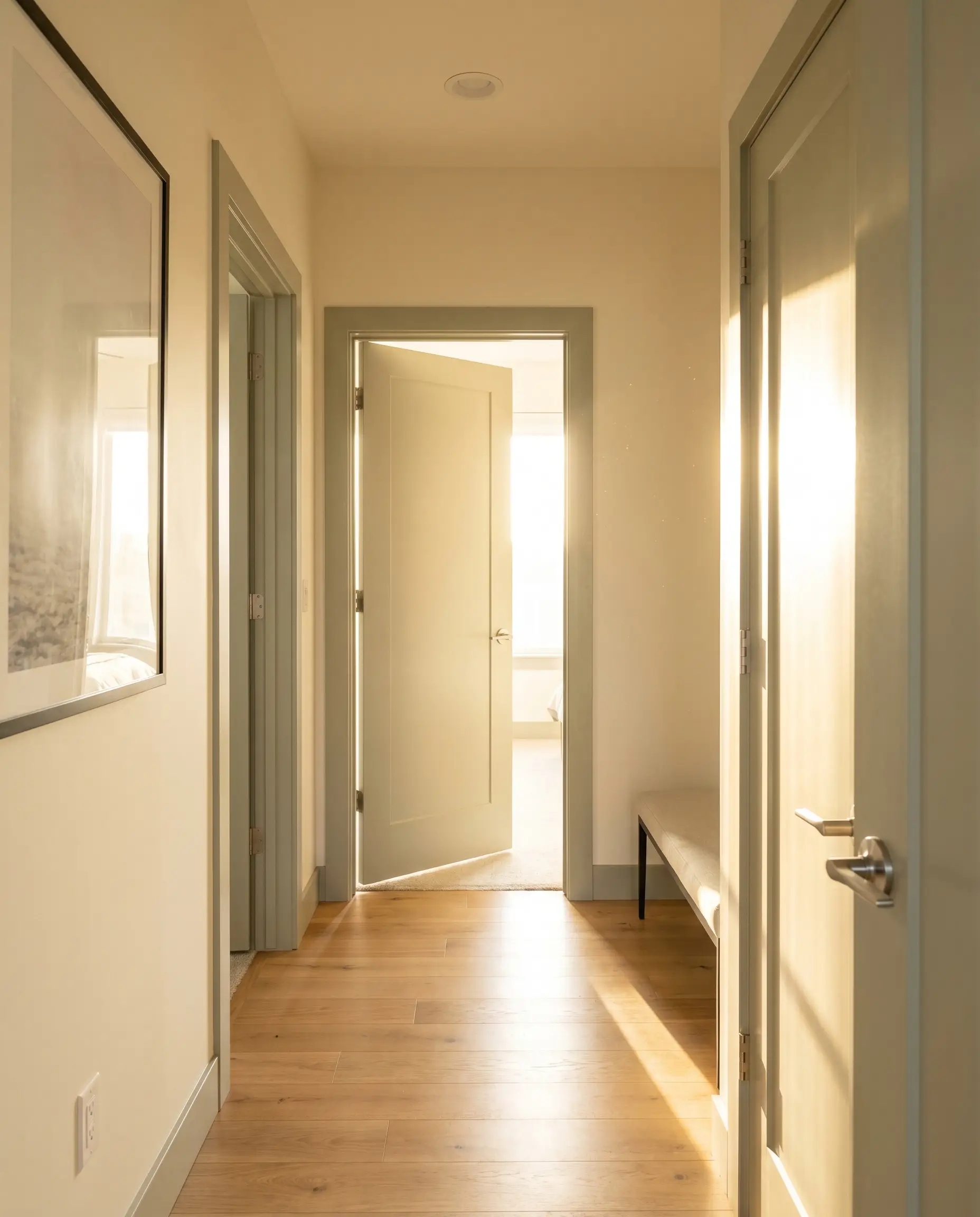
If you have a hallway that receives intense, blinding afternoon sunlight, standard white doors can become visually overwhelming. Coating your interior doors and their casings in this mid-tone neutral absorbs that harsh western glare. It turns a blinding corridor into a soft, welcoming transition zone.
The Intimate Dining Wainscoting
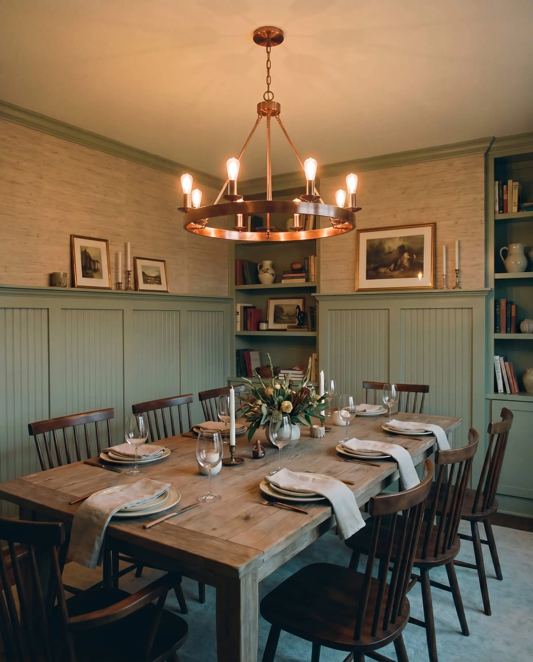
For a dining space that feels too expansive or undefined, applying this color to lower wainscoting or beadboard anchors the room immediately. The green grounds the lower half of the walls, fostering a cozy, grounded atmosphere perfect for lingering dinner parties. Pair it with a highly textural grasscloth wallpaper above the chair rail to complete the tailored look.
Material Pairings & Color Coordination
This shape-shifting sage requires intentional companions to truly sing. It thrives when paired with elements that either contrast its muted nature with crisp brightness or lean into its earthy, organic warmth.
Hardware & Metal Pairings
Coordinating Paint Colors
Trim & Baseboards
To keep the green feeling intentional rather than murky, crisp boundaries are essential. Benjamin Moore Chantilly Lace (OC-65) offers a brilliantly clean, stark contrast that modernizes the wall color instantly. For a softer, more traditional transition, Sherwin-Williams Alabaster (SW 7008) or Behr Swiss Coffee (12) provide a creamy, gentle boundary that respects the paint’s inherent warmth.
Designer Mood Boards
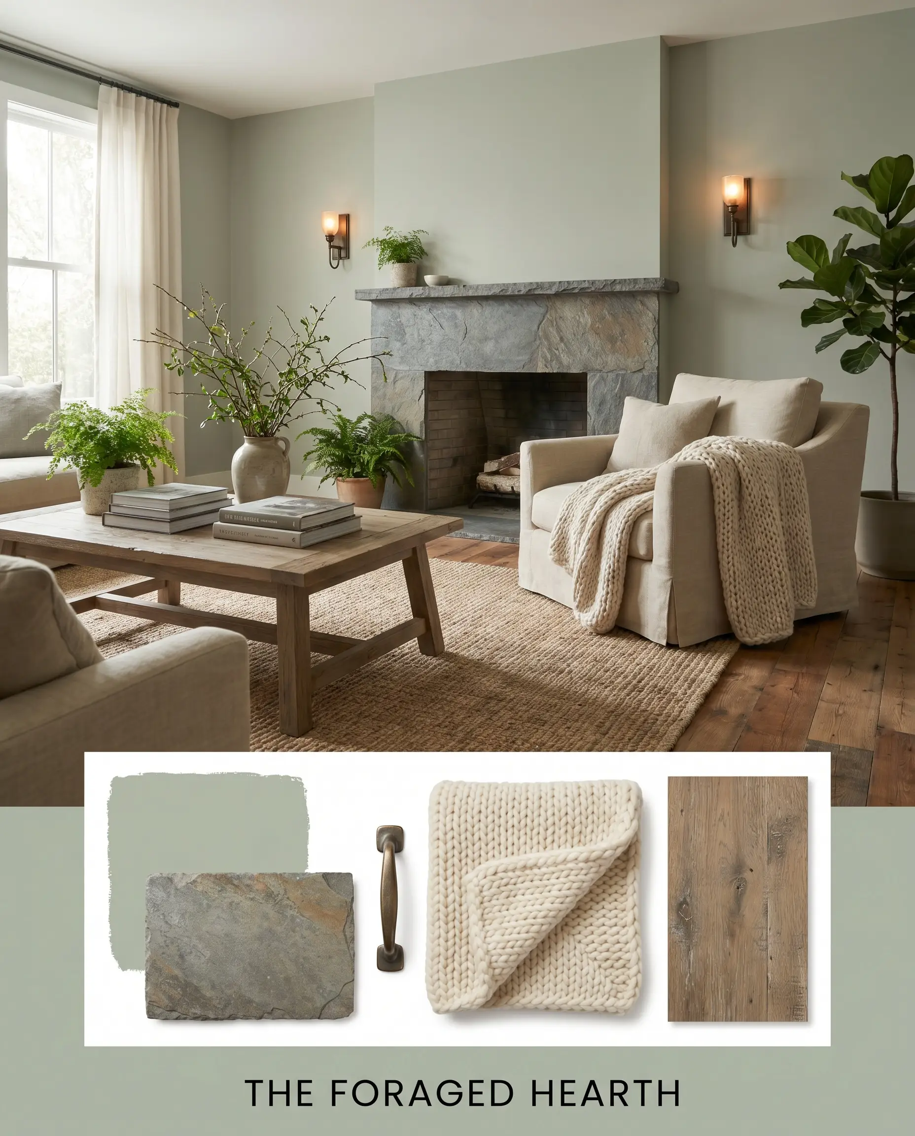
The Foraged Hearth: This palette leans heavily into biophilic design, blending the muted sage walls with a rugged honed slate fireplace surround and antiqued bronze sconces. We style the space with chunky, hand-knit wool throws and a weathered oak coffee table. The result is a deeply comforting, grounded energy that feels like a quiet retreat.
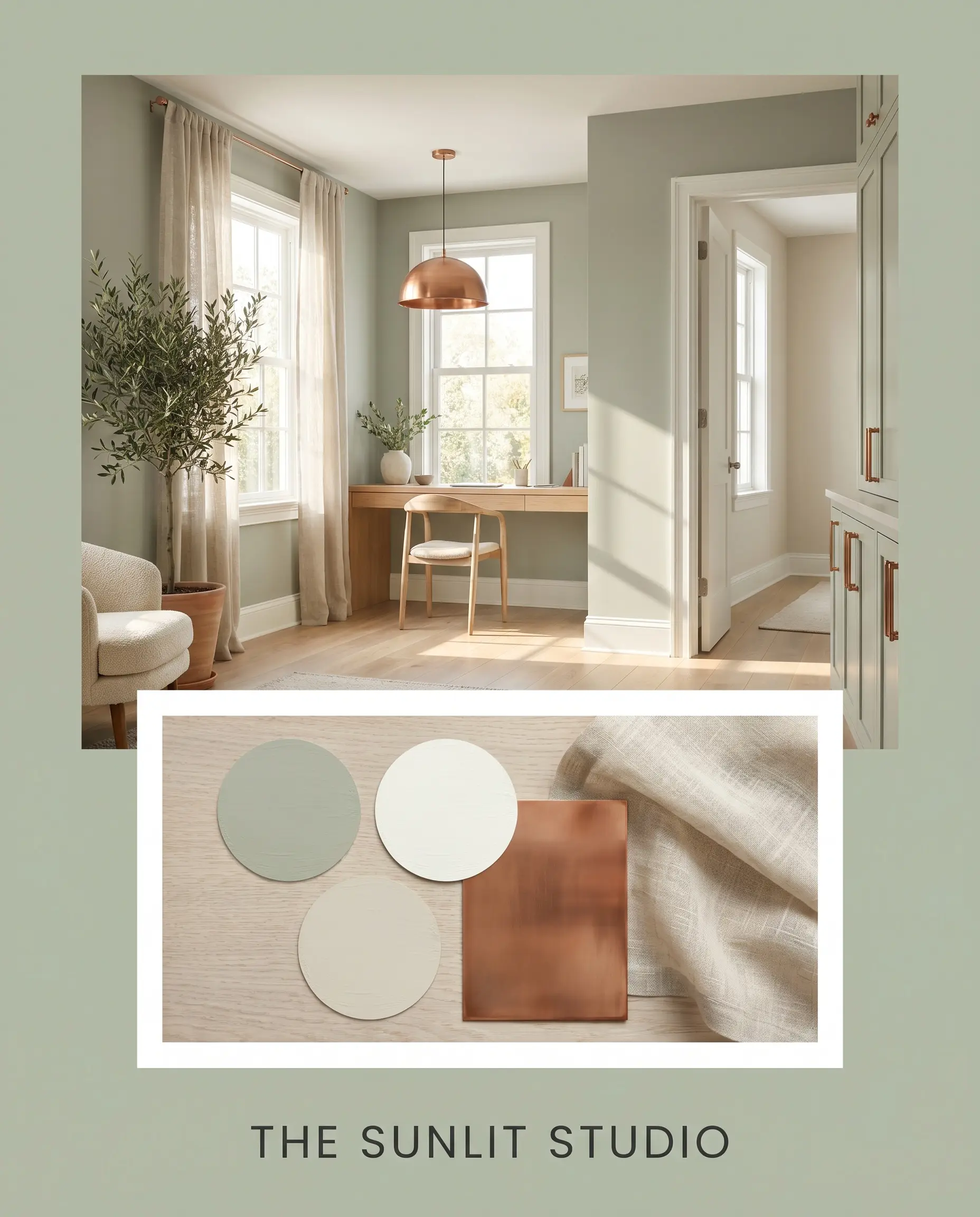
The Sunlit Studio: Here, we lift the green by pairing it with the crispness of Chantilly Lace trim and the airy warmth of Benjamin Moore Pale Oak in the adjoining spaces. Adding burnished copper hardware and sheer, oatmeal-colored linen drapery allows the light to bounce beautifully. This combination creates an optimistic, incredibly fresh atmosphere.
Will Jojoba work with your specific lighting, floor, or furniture?
Behr Jojoba vs. The Competition
Choosing the right green often comes down to analyzing the microscopic differences in how they handle light and shadow. If you are actively comparing the best warm greens on the market, analyzing how these rivals perform in your specific room exposure is crucial.
Behr Jojoba vs. Sherwin-Williams Contented SW 6191
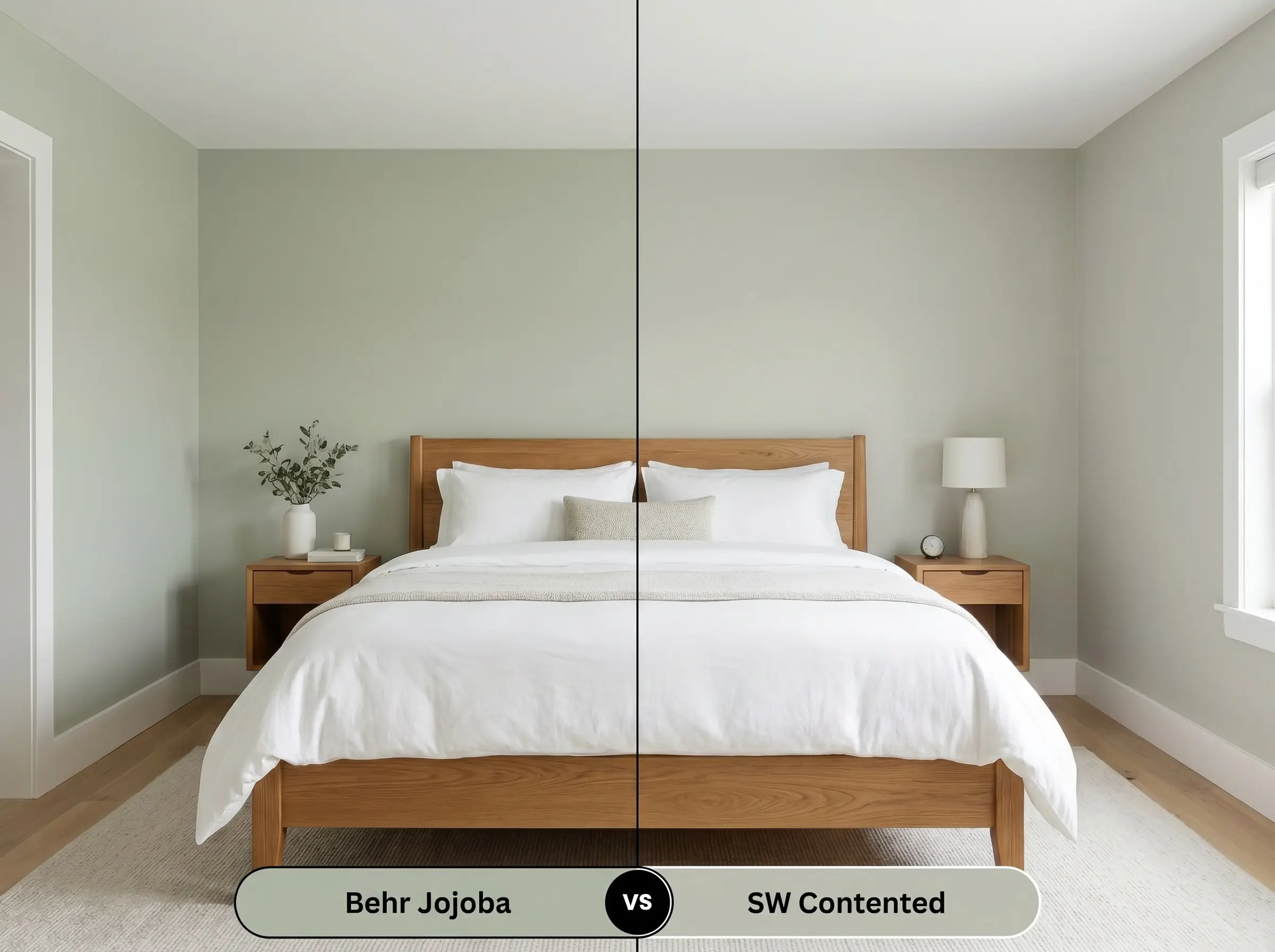
Sherwin-Williams Contented (SW 6191) sits at a slightly higher light reflectance level, making it noticeably more buoyant. If your space lacks natural light and you fear the Behr option will feel too heavy, Contented offers a breezier, more silvery finish that feels a touch cooler on the wall.
Behr Jojoba vs. Benjamin Moore Salisbury Green HC-139
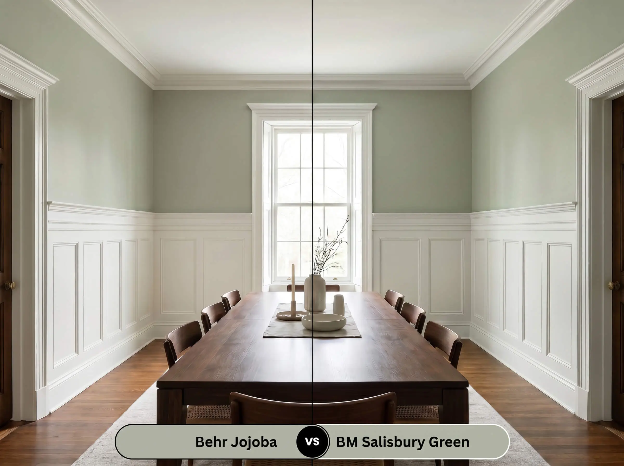
Benjamin Moore Salisbury Green (HC-139) leans much further into a traditional, historic green with less gray suppression. If you are looking for a truer, slightly more vibrant botanical presence that doesn’t shift as dramatically into shadow, the Benjamin Moore formulation is the stronger candidate.
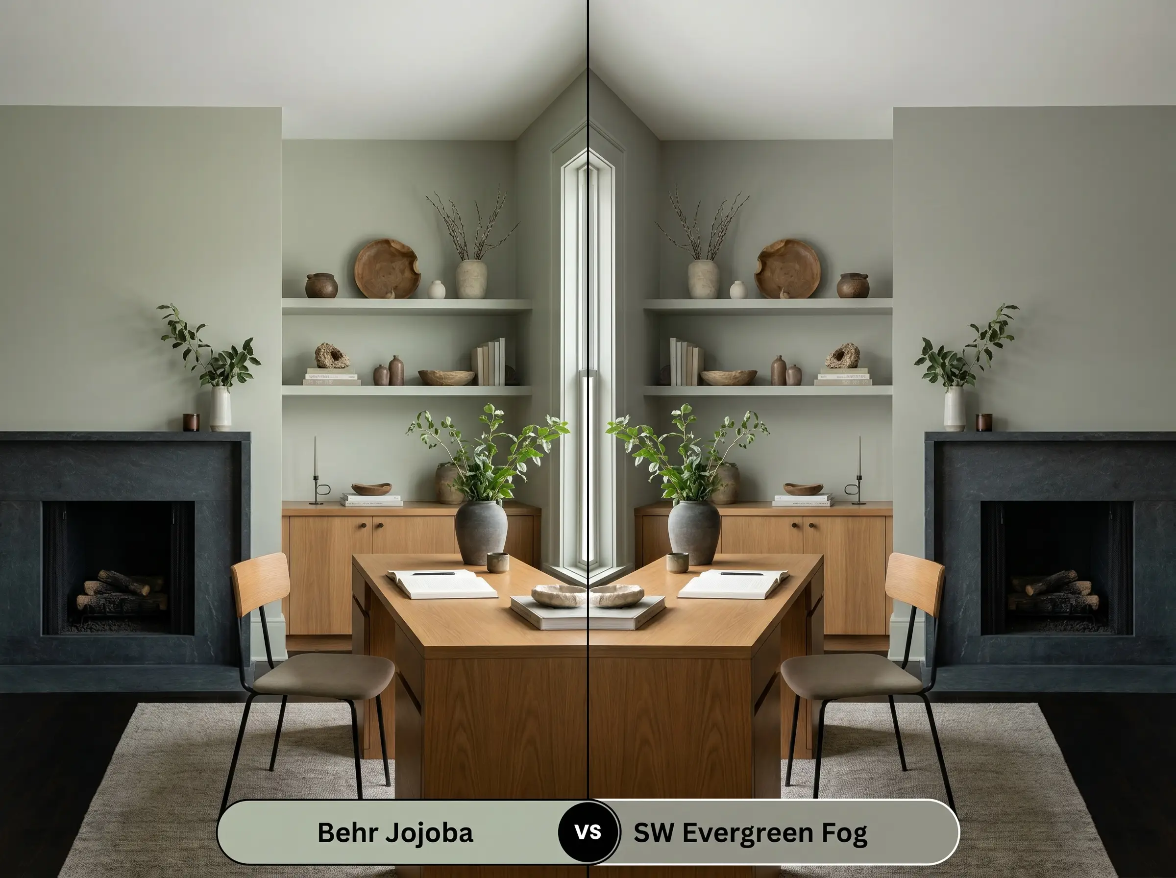
Behr Jojoba vs. Sherwin-Williams Evergreen Fog SW 9130
Will Jojoba work with your specific lighting, floor, or furniture?
Sherwin-Williams Evergreen Fog (SW 9130) is significantly darker and carries a heavier visual weight. If you are designing a moody, enveloping space and have abundant south-facing windows to handle the light absorption, Evergreen Fog delivers a more dramatic, saturated impact.
Alternative Matches & Brand Equivalents
Whether you need a subtle shift in depth to accommodate a tricky lighting situation or you simply need to color-match at a different hardware store, these alternatives offer excellent pathways.
Same-Brand Alternatives
Cross-Brand Matches
Execution Strategy & Application Tips
Translating a beautiful color from a tiny paper swatch to a massive wall requires practical planning. The way you prep and seal this specific pigment will dictate the final aesthetic success of the room.
The Ideal Sheen Selection
Priming Requirements
Because this is a mid-tone shade with a heavy neutral base, a high-quality white primer is usually sufficient over standard drywall. However, if you are painting over a dark, saturated color like navy or burgundy, utilizing a slightly tinted gray primer will help this muted sage achieve full opacity much faster.
If you are painting over a stubborn, warm-toned wall like terracotta or deep red, always use a gray-tinted primer. It neutralizes the underlying heat far better than standard white primer, ensuring the true green shines through.
Hackrea Design Secret (The Red Eraser)
Coverage Expectations
Expect to apply two full coats for a truly professional, uniform finish. Be highly cautious of “flashing” when touching up spots later. If you try to fix a small scuff with a dry roller weeks later, the new paint will often catch the light differently, leaving a visible patch. Always keep a “wet edge” while rolling to ensure a seamless blend.
Frequently Asked Questions
Because red oak carries heavy, fiery undertones, it can actually amplify the green in this paint, making it look much more vibrant than the swatch. To soften this effect, anchor the room with a large, neutral-toned area rug to create a visual break between the floor and the walls.
In deeply shaded exterior environments, the lack of direct sunlight will pull the heavy gray base forward. The paint will read as a very moody, muted gray-green rather than a lively botanical shade, which beautifully complements natural woodland surroundings.
This color pairs wonderfully with warm-toned stone because of its hidden yellow-olive micro-nuance. The earthy qualities of the paint harmonize with the flecks of gold and brown in the granite, creating a cohesive, organic modern kitchen.
Cool 4000K lighting strips away the paint’s underlying warmth entirely. In a windowless space, this lighting temperature will force the color to look like a stark, silvery gray with only a faint hint of green.
The Final Verdict & Design Warnings
Behr Jojoba (N390-3) is a brilliantly balanced foundational color for anyone looking to introduce organic warmth without committing to an overwhelming, vibrant green. It excels in spaces that crave a touch of nature, anchoring a room with a sophisticated, earthy calm. Whether applied to custom cabinetry or sweeping living room walls, this shade delivers a premium, curated energy that feels both historic and remarkably fresh.
However, this specific color profile does demand careful coordination. Because of its inherent yellow-olive notes, pairing this paint with cool-toned, icy gray luxury vinyl plank flooring creates a jarring, uncomfortable visual friction. The floor will pull the warmth out of the paint, making the walls look sickly and the flooring look stark. Similarly, avoid placing it directly against cherry wood furniture with heavy red stains; the intense red will aggressively amplify the green, resulting in an unintentional, holiday-themed clash. Stick to warm oaks, neutral walnuts, or dark stones to let the color’s natural beauty shine.
Room Compatibility & Clashes Diagnoses
Hackrea's reports evaluating the compatibility of Jojoba in real rooms.South-Facing Primary Bedroom
"The paint's herbal sage character pairs naturally with the honey oak baseboards under warm southern daylight, though aged beige carpeting introduces slight undertone tension."
Closest Cross-Brand Equivalents
The absolute closest scientific color matches for Jojoba across top paint brands.