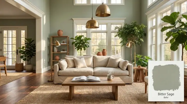
Behr Bitter Sage (N390-4) is a muted, mid-tone sage green with a warm yellow-green base and a subtle gray cast. This earthy architectural finish strikes a perfect balance between organic warmth and sophisticated neutrality, making it an incredibly versatile choice for living spaces and cabinetry.
| Temperature | Warm to Neutral |
|---|---|
| Primary Undertone | Yellow-Green |
| Hidden Undertones | Gray |
| Best Exposures | South-facing, East-facing |
| Best For | Living Rooms, Dining Rooms, Kitchen Cabinets, Bathrooms, Bedrooms |
Hackrea Review
Bitter Sage by Behr is an exceptionally grounded botanical hue. It avoids the neon trap that plagues many greens, offering a subdued, sophisticated cast that feels both historic and modern. It's a reliable choice for anyone looking to introduce biophilic elements without overwhelming a space.Architectural Applications for Behr Bitter Sage N390-4
Living Rooms
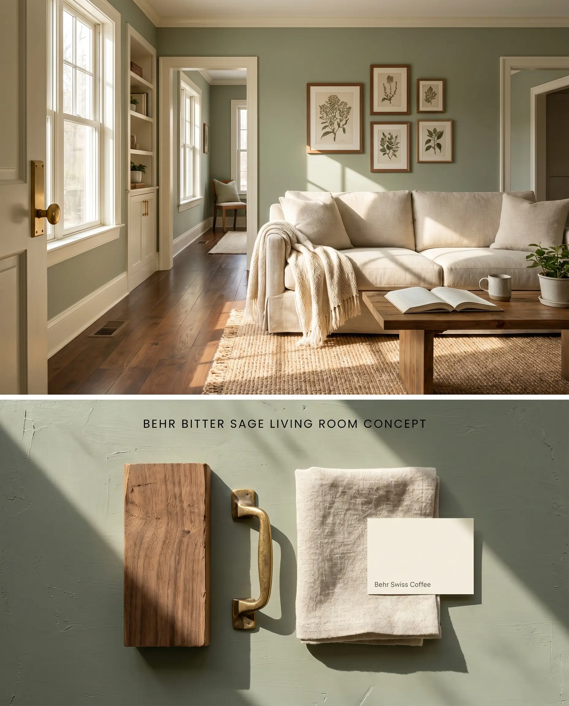
Grounding an expansive living room requires an earthy neutral that holds its own against large-scale furnishings. Behr Bitter Sage N390-4 provides a muted sage backdrop that bridges the gap between interior upholstery and exterior foliage, anchoring a true biophilic design. The inherent gray cast prevents the walls from reading overly vibrant, maintaining a sophisticated architectural finish.
Dining Rooms
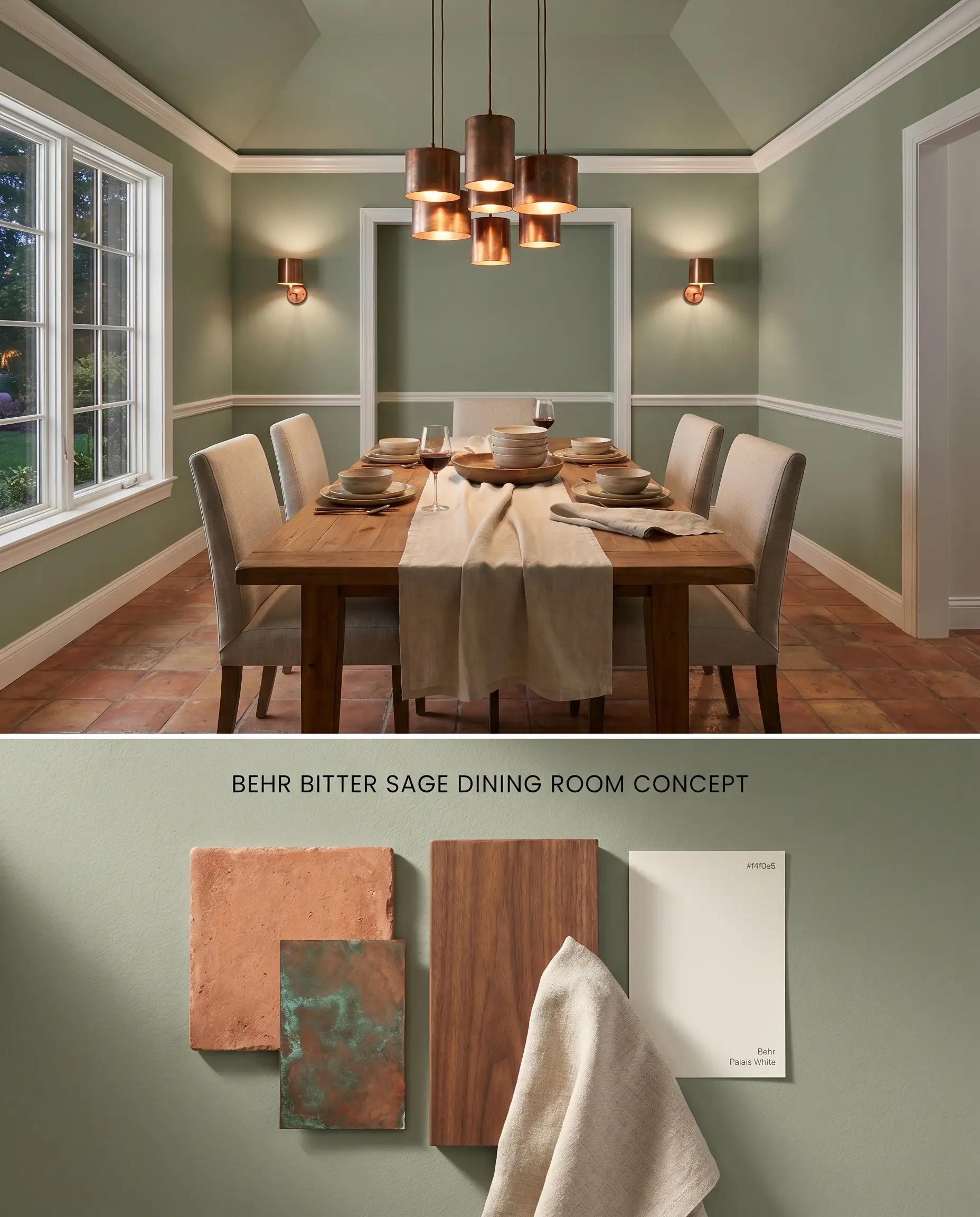
A mid-tone green establishes an intimate atmosphere for evening dining when paired with specific color temperatures. The color’s moderate depth absorbs harsh reflections, allowing metallic accents and warm wood dining tables to project forward in the visual field.
Kitchen Cabinets
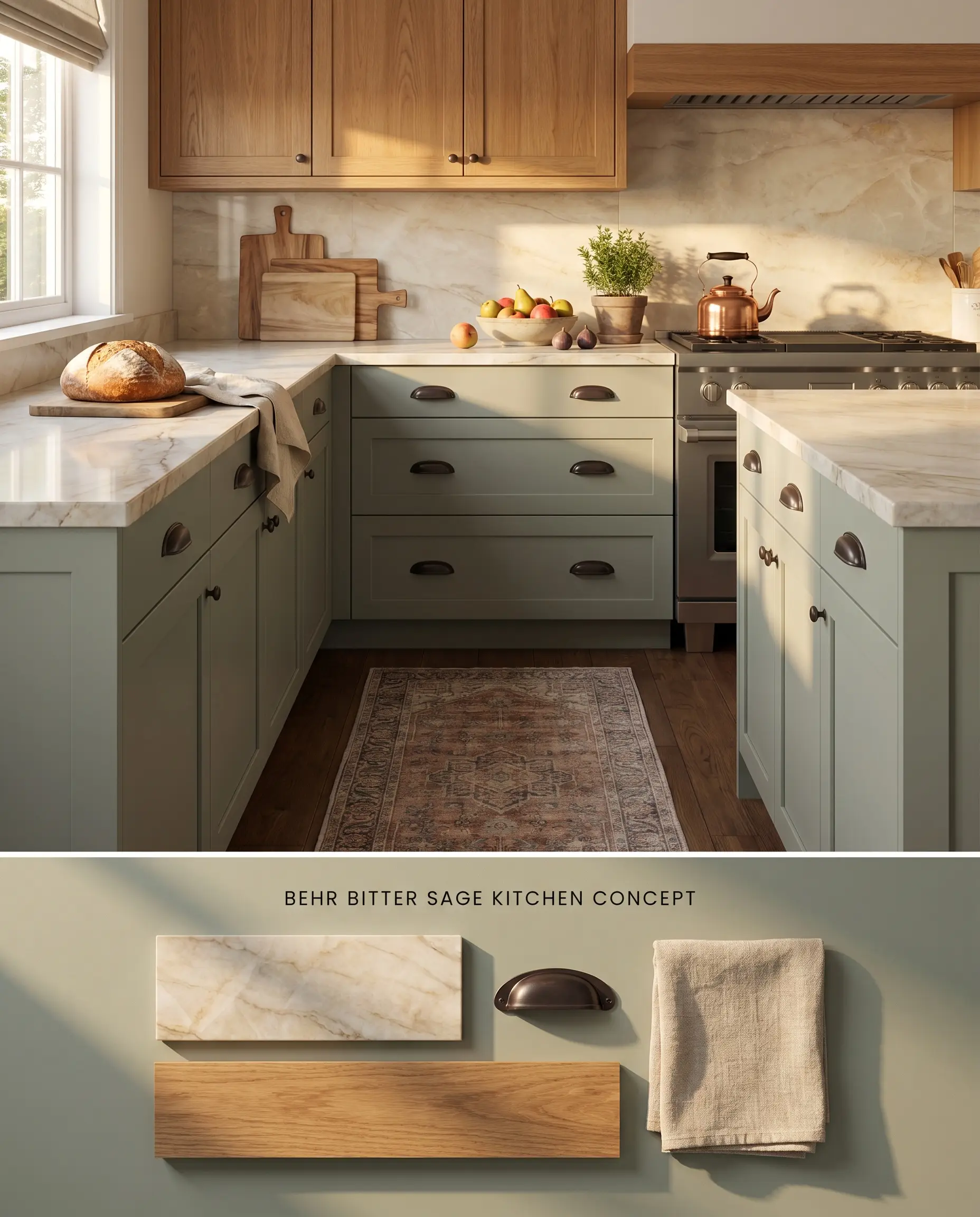
Applying a botanical hue to lower cabinetry anchors the kitchen’s visual weight while masking daily smudges. Because this color inherently clashes with stark cool whites, the surrounding countertops and upper cabinets must transition into creamy, warm-veined stones or natural timbers.
Bathrooms
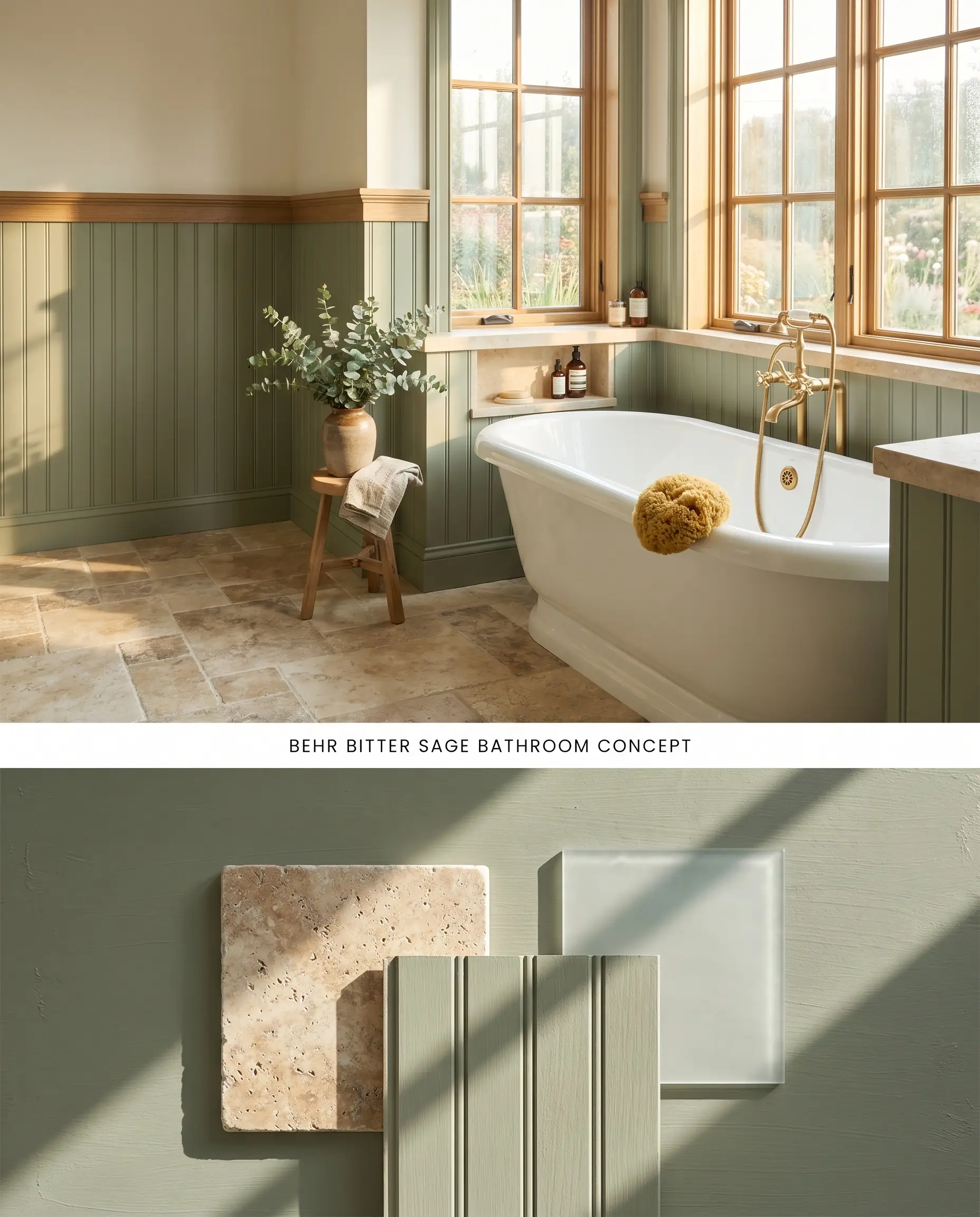
Using this green in a small, highly reflective washroom creates a hazardous bounce effect that casts an unflattering green tint directly onto the skin. To safely deploy this color, restrict it to wainscoting or vanity bases in large, sun-drenched spaces with abundant natural ventilation, completely avoiding windowless powder rooms.
Bedrooms
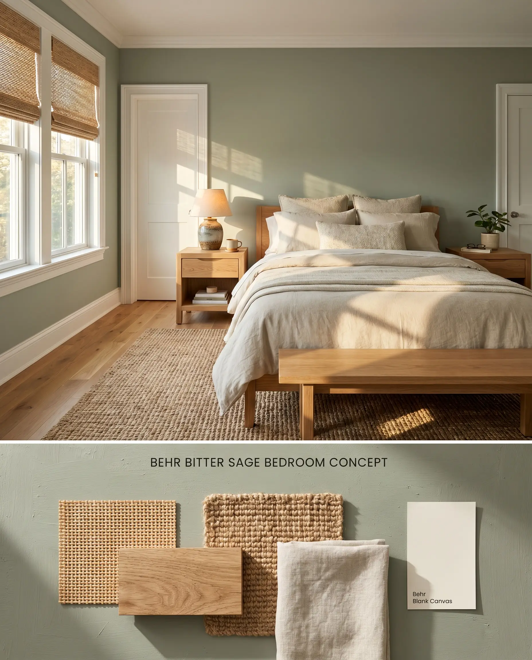
This warm sage tone envelops a sleeping space without absorbing all the available ambient light. The yellow-green base harmonizes with natural linen textiles and woven rattan window treatments to establish a restorative, organic environment.
You can apply wallpapers, paints, etc. on walls and see how they look in various interiors.

Mid-Tone Green and Chromatic Profile Comparisons
Behr Bitter Sage N390-4 vs. Benjamin Moore Greenwich Village 445
Behr Bitter Sage N390-4 relies on a distinct yellow-green base that thrives alongside warm woods and creamy trims. Benjamin Moore Greenwich Village 445 carries a cooler, more pronounced blue-gray undertone that aligns precisely with crisp whites and Carrara marble. Select Behr’s formulation when warming up a south-facing room with terracotta floors, but pivot to Greenwich Village if your hard finishes feature cool slate or icy blue-gray tiles.
Behr Bitter Sage N390-4 vs. Farrow & Ball Breakfast Room Green No.81
Farrow & Ball Breakfast Room Green No.81 is noticeably more vibrant and active, reflecting significantly more light than the earthy neutral profile of Behr Bitter Sage N390-4. Behr’s inherent gray cast grounds the color, making it the correct architectural choice for expansive walls in open-concept spaces where a subtle botanical hue is required. Reserve Breakfast Room Green for poorly lit dining nooks that require a highly energetic, pure green to combat dense shadows.
Technical FAQs
Yes, the cool, indirect light of north-facing rooms amplifies the color’s gray cast, muting its vibrancy. To counter this, introduce warm artificial lighting at 3000K or reserve the paint for south-facing spaces where its yellow-green base can emerge.
Yes, the warm, earthy base of this green creates a harsh visual friction when placed against stark, cool whites or icy blue-grays. It requires creamy whites, warm beige, or natural wood tones to maintain a cohesive architectural palette.
It falls into a low-light trap, appearing flat and muddy without adequate sunlight. Additionally, the green tone bounces off small, highly reflective surfaces, casting an unflattering color onto skin.
The color’s temperature depends entirely on the bulb’s Kelvin rating. Standard warm white bulbs (2700K-3000K) enhance the yellow-green base, while daylight bulbs (4000K+) will pull forward its cooler gray undertones.
Similar Paint Colors
Same Brand
Cross-Brand Equivalents