If there is one headline for kitchen design in 2026, it is this: The sterile, laboratory-white kitchen is officially behind us.
For years, we chased the “clean” aesthetic so hard that many homes started to feel a bit like showrooms—beautiful, but afraid to be touched. As we move deeper into 2026, the trends have shifted dramatically toward “lived-in luxury.” We are seeing a massive return to warmth, organic depth, and kitchens that feel like the heart of the home rather than a sterile workspace.
Updating your cabinetry is the single most high-impact way to embrace this shift without a full renovation. And when it comes to accessible, high-quality paint, Behr remains a top contender for DIYers and pros alike.
In this guide, we’re breaking down the best Behr cabinet paint colors for 2026, analyzing the undertones, and—most importantly—telling you exactly how to pair them with hardware and countertops to get that high-end designer look.
Quick Summary: The Top 5 Behr Colors for 2026
In a rush? Here is the cheat sheet for the trending colors dominating 2026 renovations.
| Color Name | Trend Category | Best Application |
| Hidden Gem (N430-6A) | 2026 Color of the Year | Full Drench / Statement Islands |
| Blank Canvas (DC-003) | The New Neutral | Upper Cabinets / Small Kitchens |
| Cracked Pepper (PPU18-01) | Moody & Modern | Lower Cabinets / Bar Areas |
| Swiss Coffee (12) | Timeless Warmth | Farmhouse / Traditional Kitchens |
| Rumors (MQ1-15) | The “Unexpected Red” | Butler’s Pantry / Standalone Hutch |
You can apply wallpapers, paints, etc. on walls and see how they look in various interiors.

The Headliner: Behr’s 2026 Color of the Year
Every year, the industry holds its breath for the “Color of the Year” announcement, and for 2026, Behr did not disappoint. They have moved away from the safety of simple neutrals and offered us something that feels both historic and incredibly modern.
Hidden Gem (N430-6A)
The Vibe: Sophisticated, Organic, Grounded.
Hidden Gem is the defining shade of 2026. Behr describes it as a “smoky jade,” but on cabinetry, it acts as a chameleon. In bright natural light, it reads as a lush, botanical green that brings the outdoors in. In the evening, or in kitchens with lower light, it settles into a deep, moody charcoal-green that feels incredibly expensive.
It perfectly encapsulates the “biophilic design” trend that isn’t going anywhere. We are craving connection to nature, but we also want our spaces to feel polished. Hidden Gem bridges that gap effortlessly.
Best Paired With:
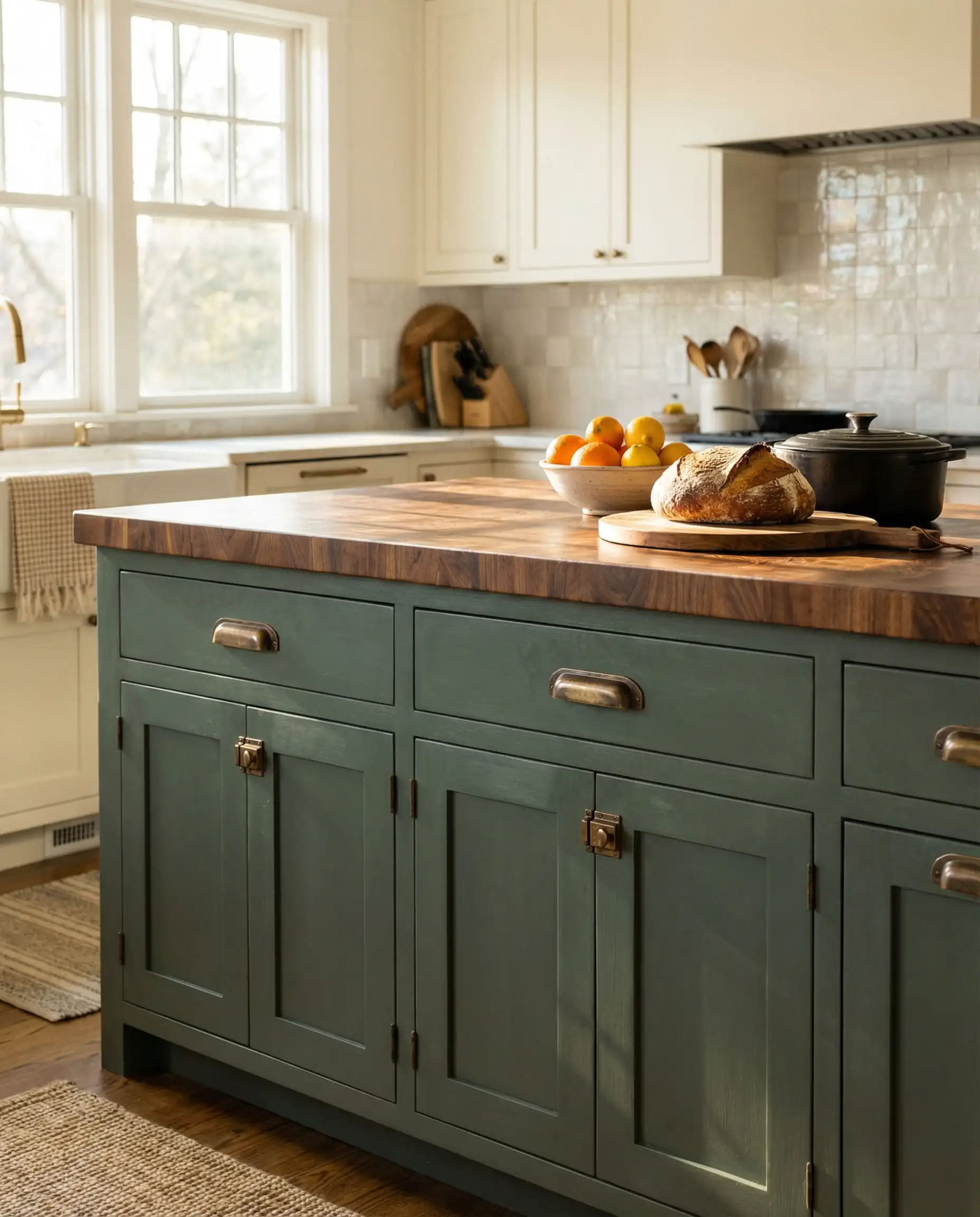
Don’t be afraid to color-drench! In a powder room or a butler’s pantry, paint the cabinets, the trim, and even the ceiling in Hidden Gem. Pair it with unlacquered brass hardware for a look that feels like a boutique hotel. 🏨
🎨 Designer Styling Tip
The “New Neutrals”: Warm Whites & Greiges
If you aren’t ready to commit to a bold color, you can still update your kitchen to meet 2026 standards by tweaking the temperature of your neutral. The cool, blue-based grays of the early 2020s are out. This year is all about “baking spices”—think vanilla, oatmeal, and putty.
Blank Canvas (DC-003)
The Vibe: Airy, Welcoming, Clean (but not cold).
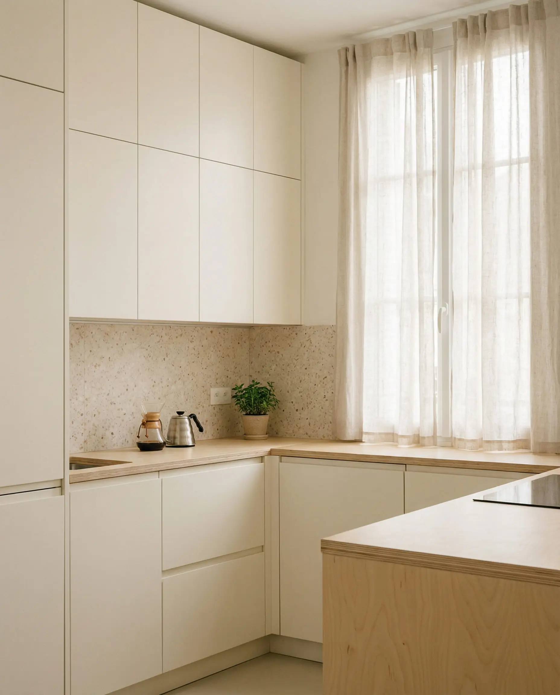
While it was the star of 2023, Blank Canvas remains a powerhouse in 2026 because it solves a specific problem: it is a white paint that actually feels warm. It has creamy undertones that prevent it from looking stark or clinical. If you have a small kitchen and need to reflect light to make the space feel bigger, this is your safest, most stylish bet.
It serves as the perfect backdrop for colorful decor, allowing your backsplash or vintage runners to take center stage.
Swiss Coffee (12)
The Vibe: Classic, Soft, Proven.
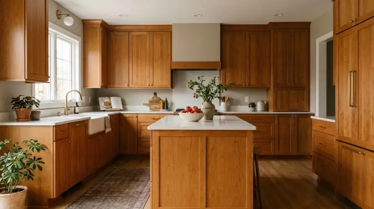
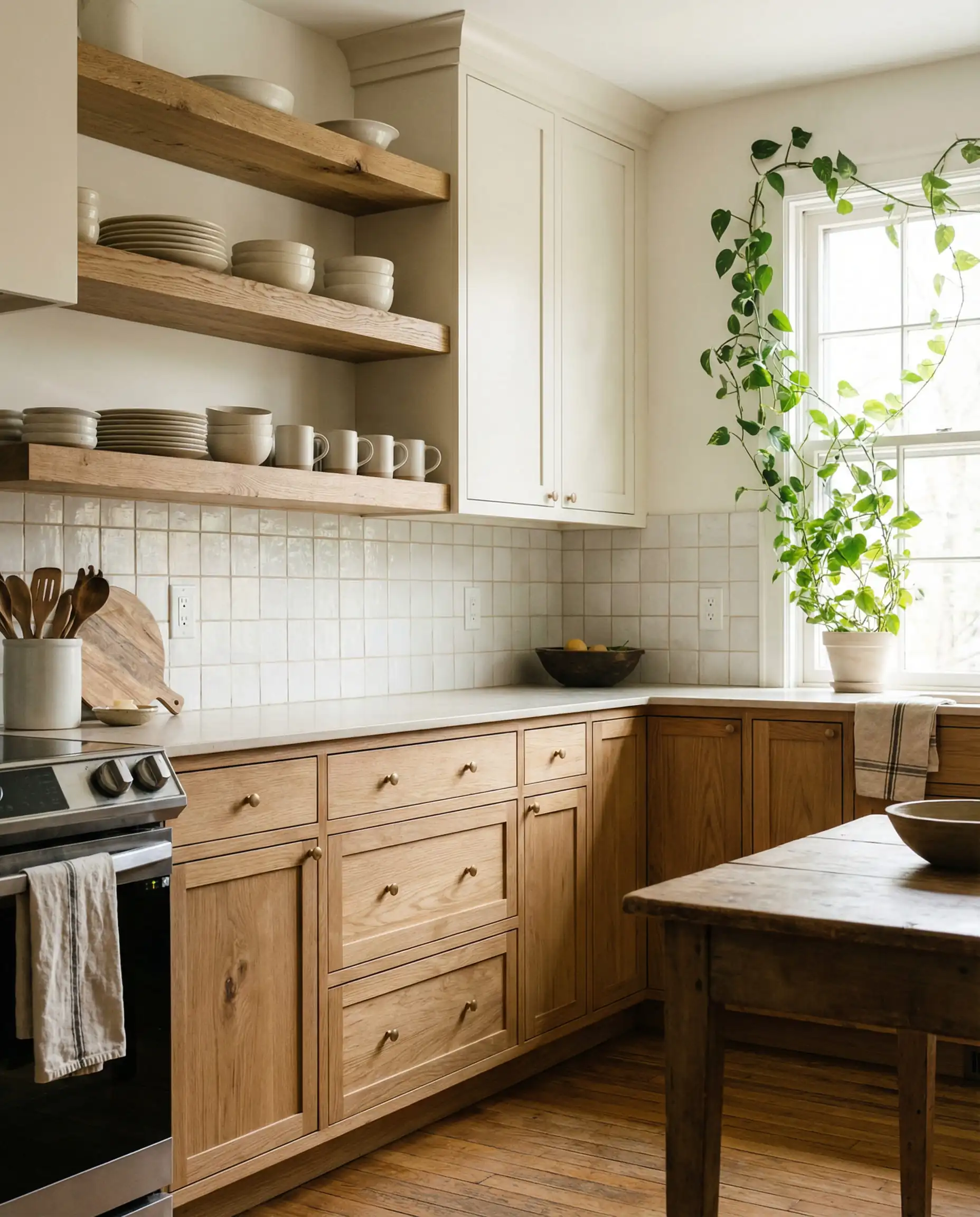
There is a reason Swiss Coffee appears in almost every designer’s portfolio. It is the quintessential creamy white. Unlike stark bright whites, Swiss Coffee has a slight yellow/brown undertone that makes cabinetry look established and high-end, rather than factory-made.
It pairs exceptionally well with natural wood accents, such as open oak shelving or exposed beams, making it a top pick for the “Modern Organic” aesthetic currently sweeping through interior design.
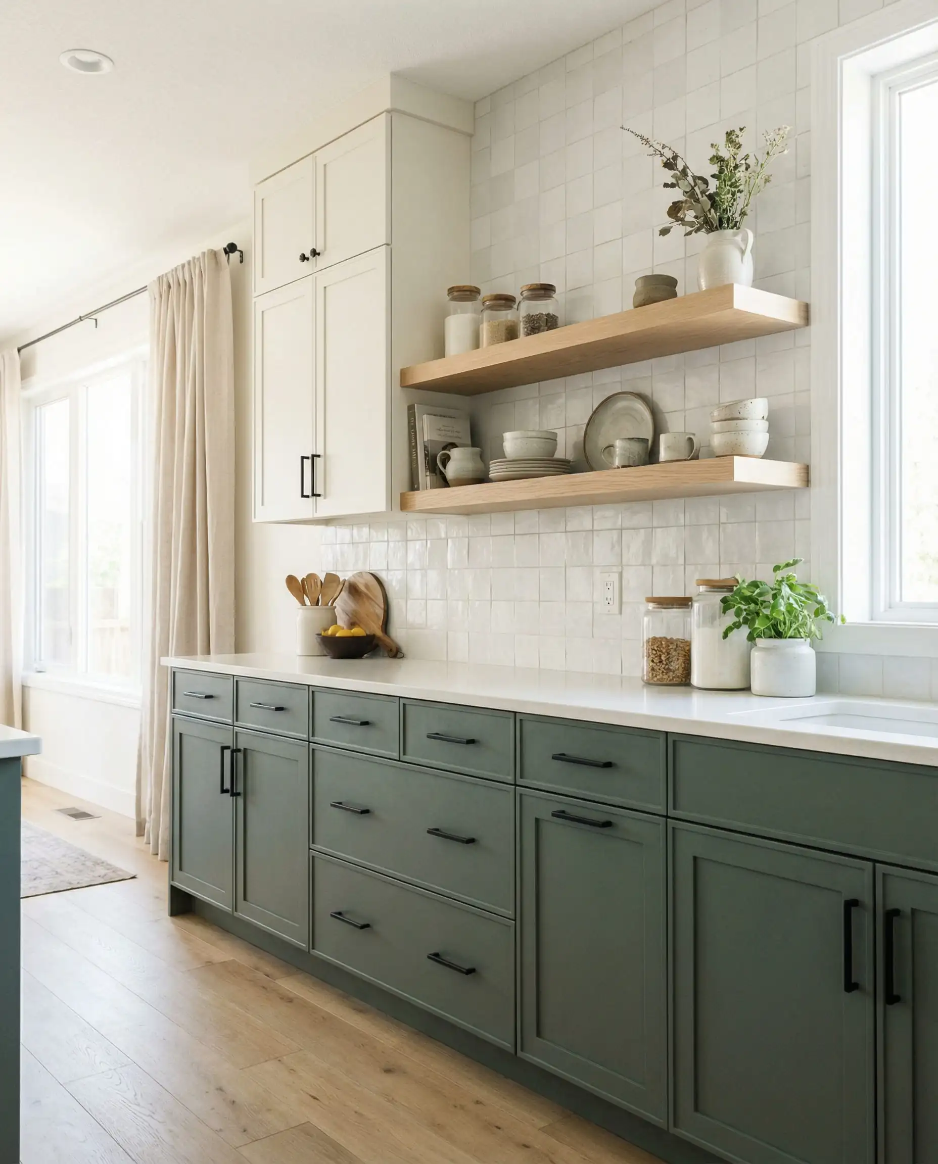
Wheat Bread (720C-3)
The Vibe: Earthy, Bridging, Versatile.
Gray is not dead; it has just evolved. Wheat Bread is what we call a “greige”—a perfect hybrid of gray and beige. It is an excellent choice for homeowners who find white too boring but are afraid that dark colors will make their kitchen feel cave-like.
This color works particularly well on Shaker-style cabinets where the shadows of the recessed panels can play with the gray tones, while the flat surfaces catch the warmer beige notes.
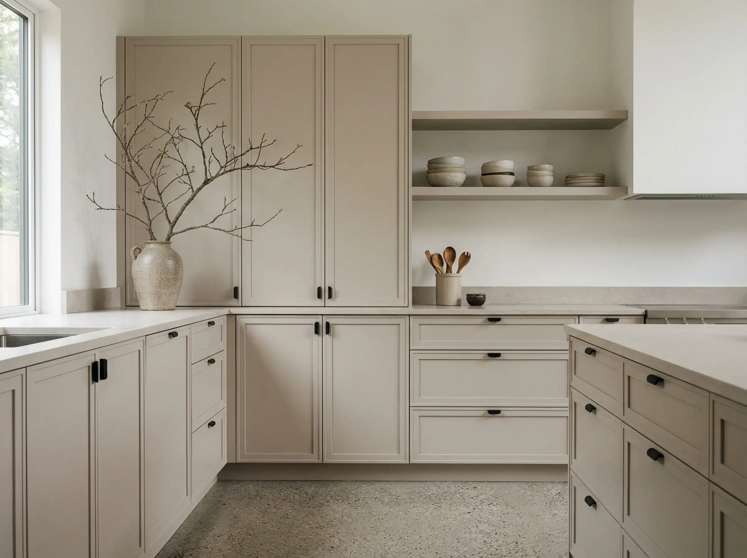
Even Better Beige (DC-010)
The Vibe: Grounded, Natural, “Putty.”
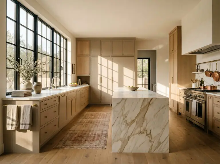
The “Putty Kitchen” trend is massive in Europe and is taking over US renovations in 2026. Even Better Beige delivers that exact look. It is darker than an off-white but lighter than a true tan. It feels like natural stone or clay.
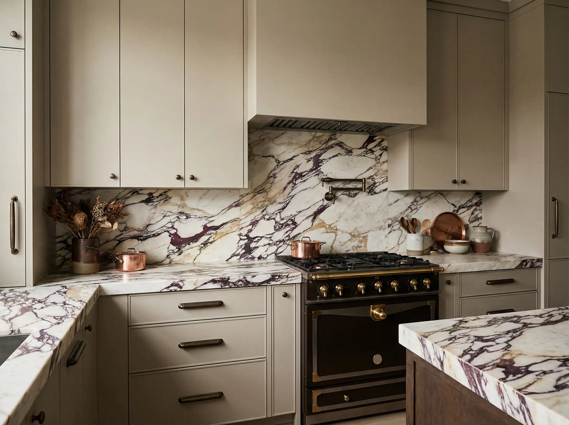
Pair Even Better Beige cabinets with a slab backsplash in a dramatic marble. The simple, earthy tone of the paint quiets the room, allowing the natural stone to be the star of the show. ✨
🎨 Designer Styling Tip
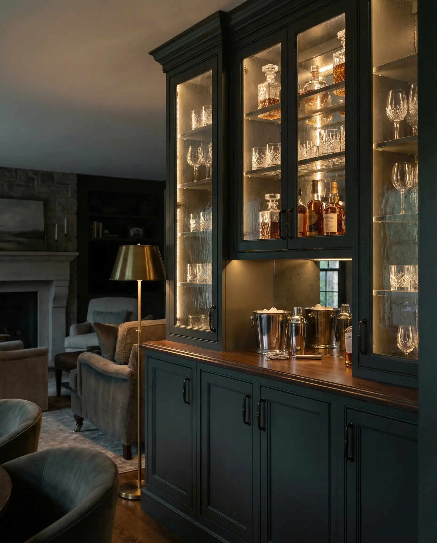
Moody & Dramatic: The “Jewel Box” Kitchen
For those looking to make a statement, 2026 is the year of the “Jewel Box” kitchen. This trend treats cabinetry like furniture—rich, saturated, and finish-focused.
Cracked Pepper (PPU18-01)
The Vibe: Luxurious, Soft, Infinite.
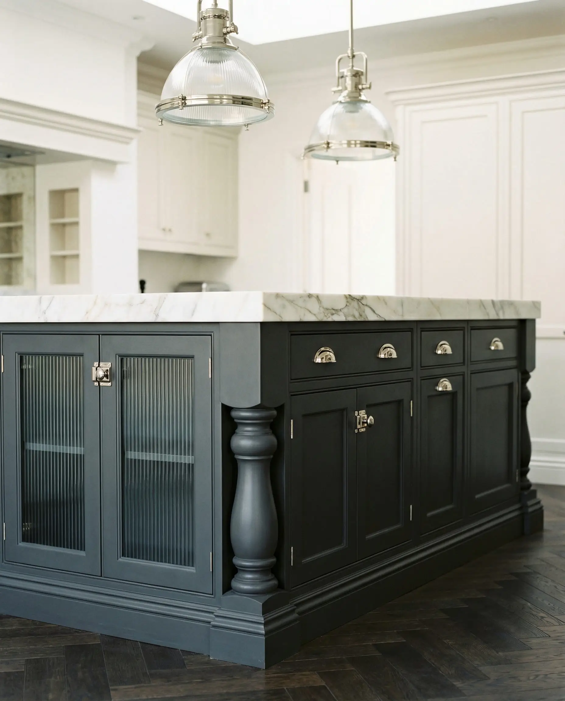
As a former Color of the Year, Cracked Pepper has solidified its place as the “new navy.” It is a soft black—meaning it is not as harsh or jarring as a pure jet black. It has charcoal undertones that give it a velvety appearance.
Why choose this over black? Pure black can sometimes look flat and show every spec of dust. Cracked Pepper has enough depth and variation to hide fingerprints better while still delivering that high-contrast drama. It is stunning on a large kitchen island paired with white perimeter cabinets.
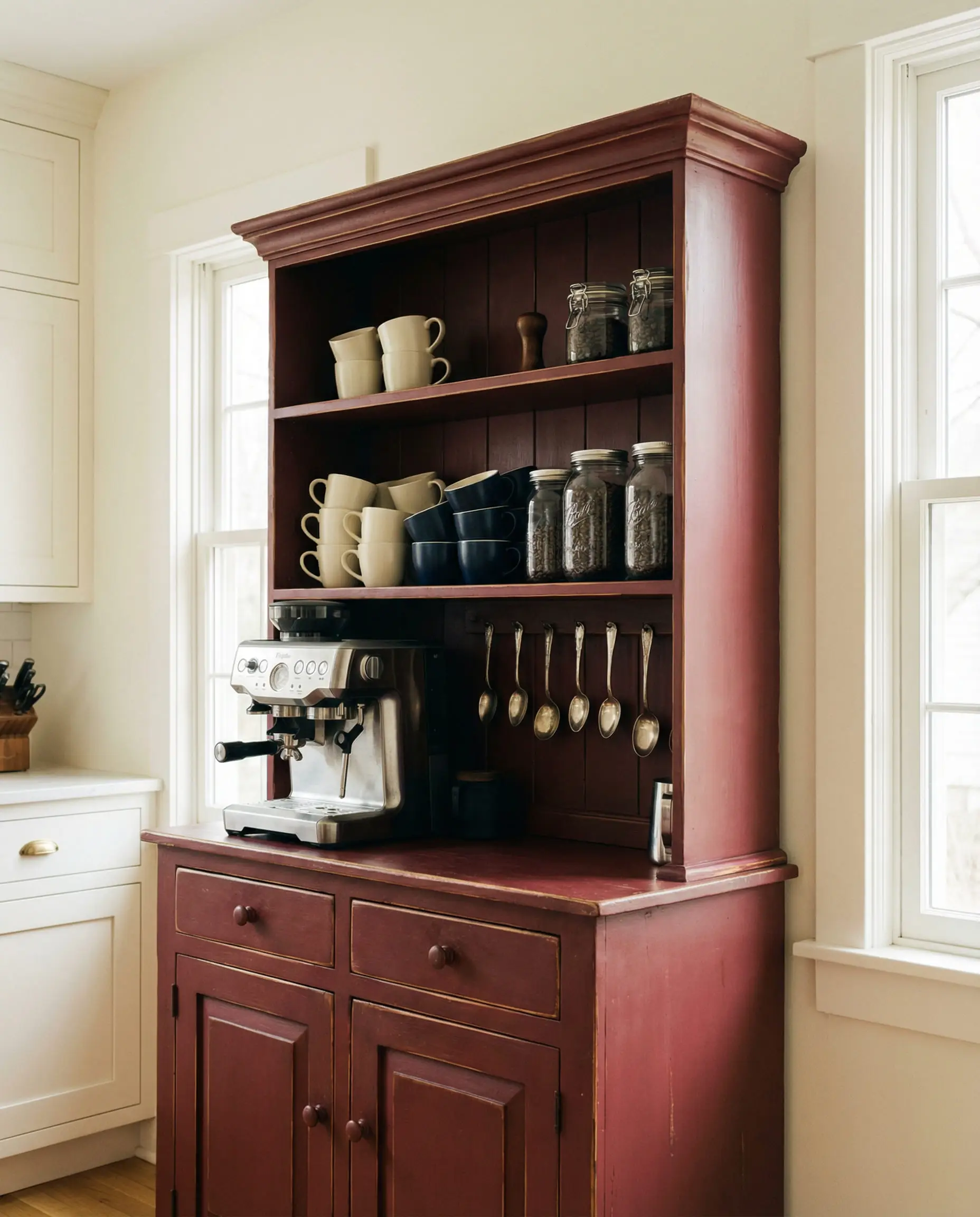
Rumors (MQ1-15)
The Vibe: Bold, Passionate, Unexpected.
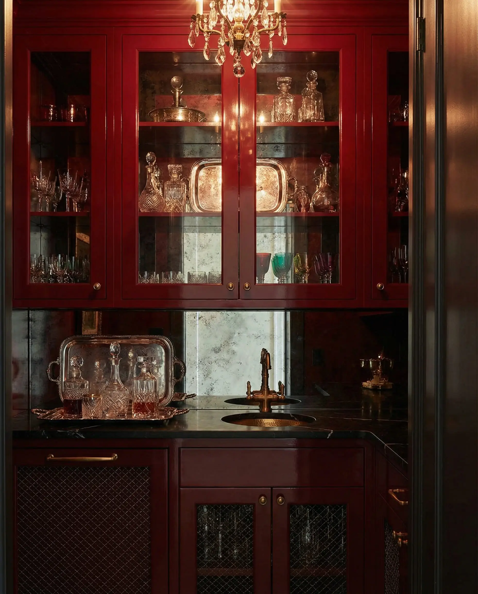
Have you heard of the “Unexpected Red” theory? It suggests that adding a splash of red to a room instantly makes it look more designed. Rumors is Behr’s answer to this trend. It is a deep ruby red with burgundy undertones—think fine wine or dark cherries.
We are seeing this used heavily in 2026 for standalone pieces. Painting a coffee station, a hutch, or a small bathroom vanity in Rumors adds a layer of history and charm that neutrals just can’t achieve.
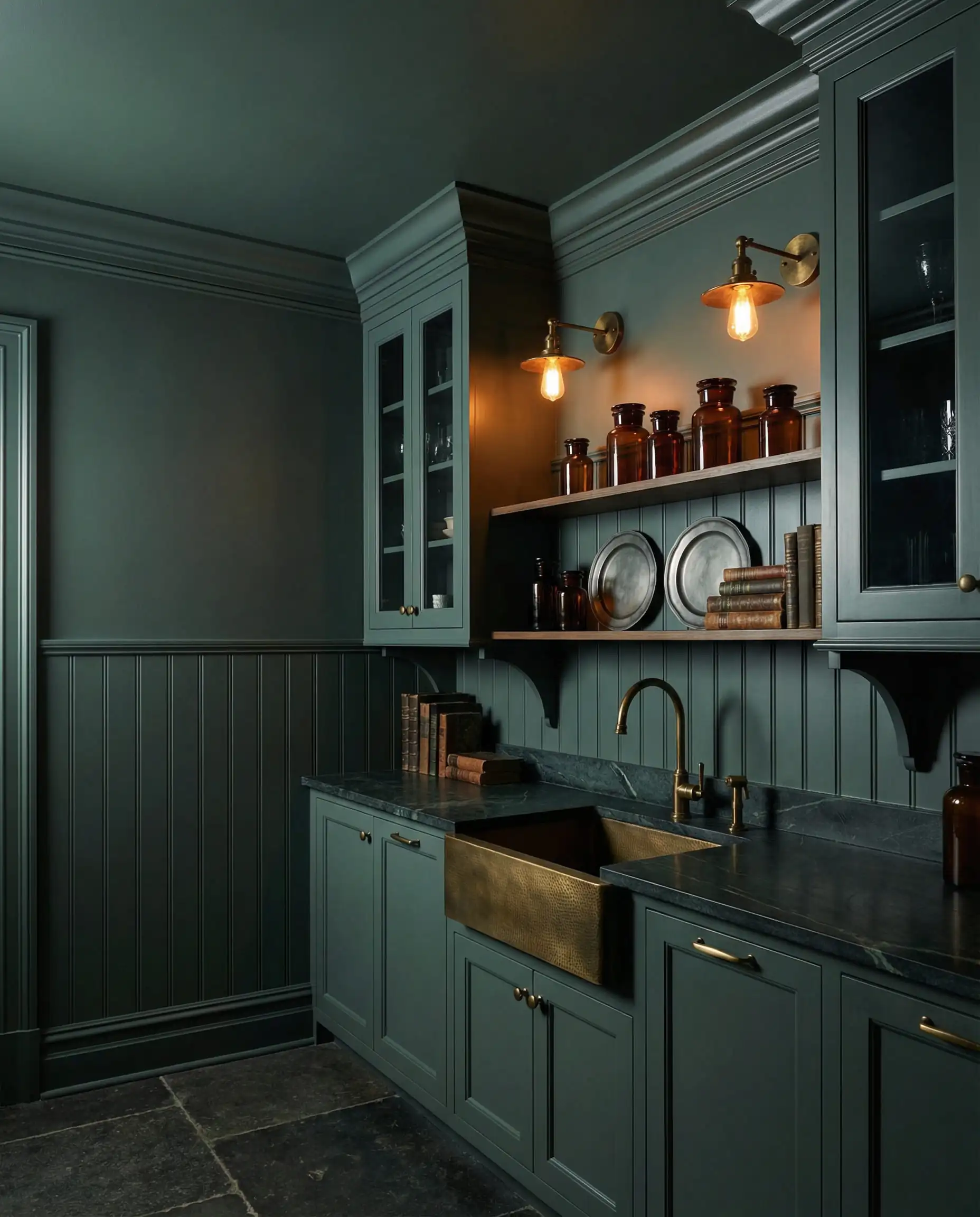
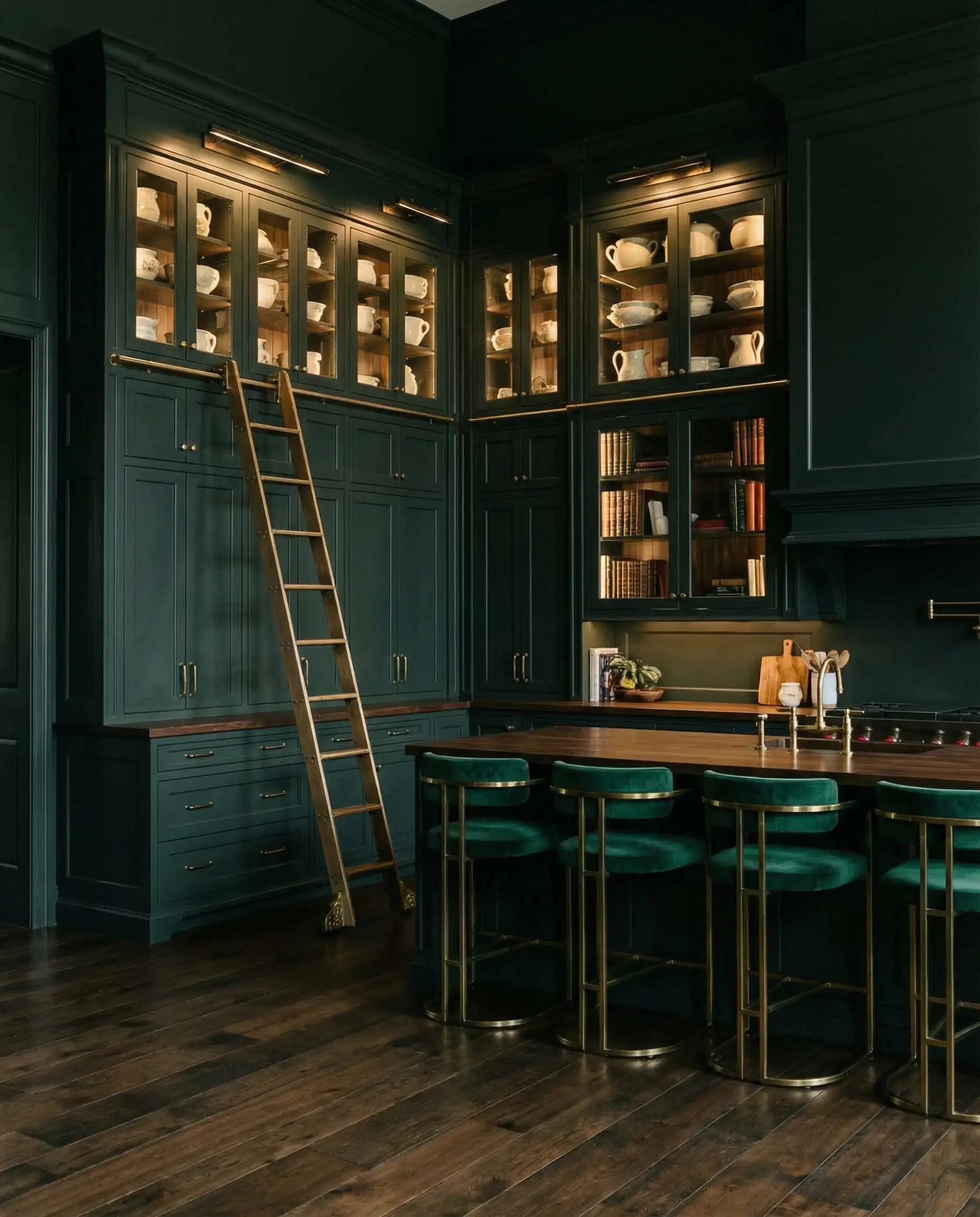
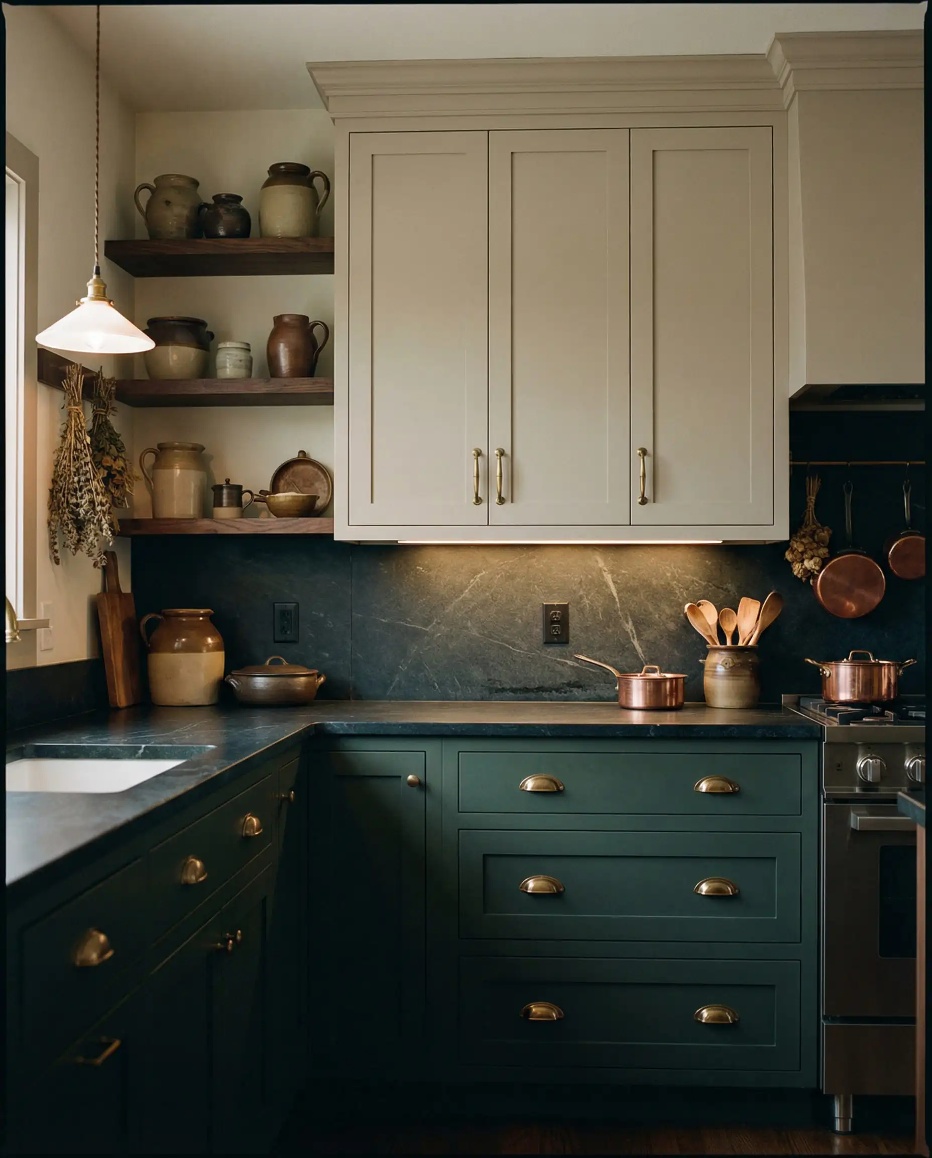
Dark Everglade (MQ6-37)
The Vibe: Forest, Shadowy, Regal.
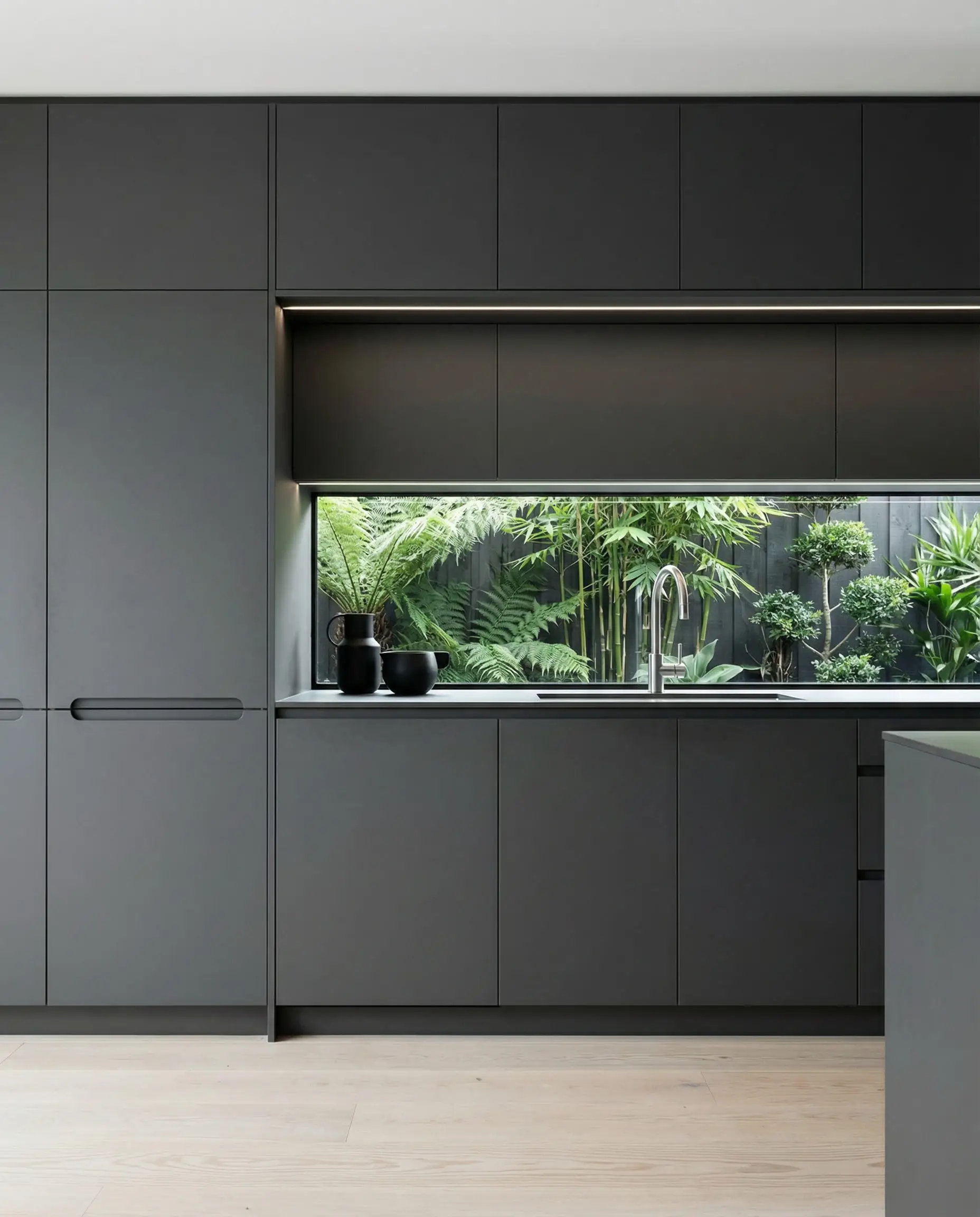
If Hidden Gem is the accessible green, Dark Everglade is its mysterious older sibling. This is a very deep, near-black green. In a dimly lit room, it might pass for black, but when the sunlight hits it, the rich forest green shines through.
This color is exceptional for library-style kitchens or open-concept spaces where you want the cabinetry to recede visually, allowing the architecture of the home to stand out.
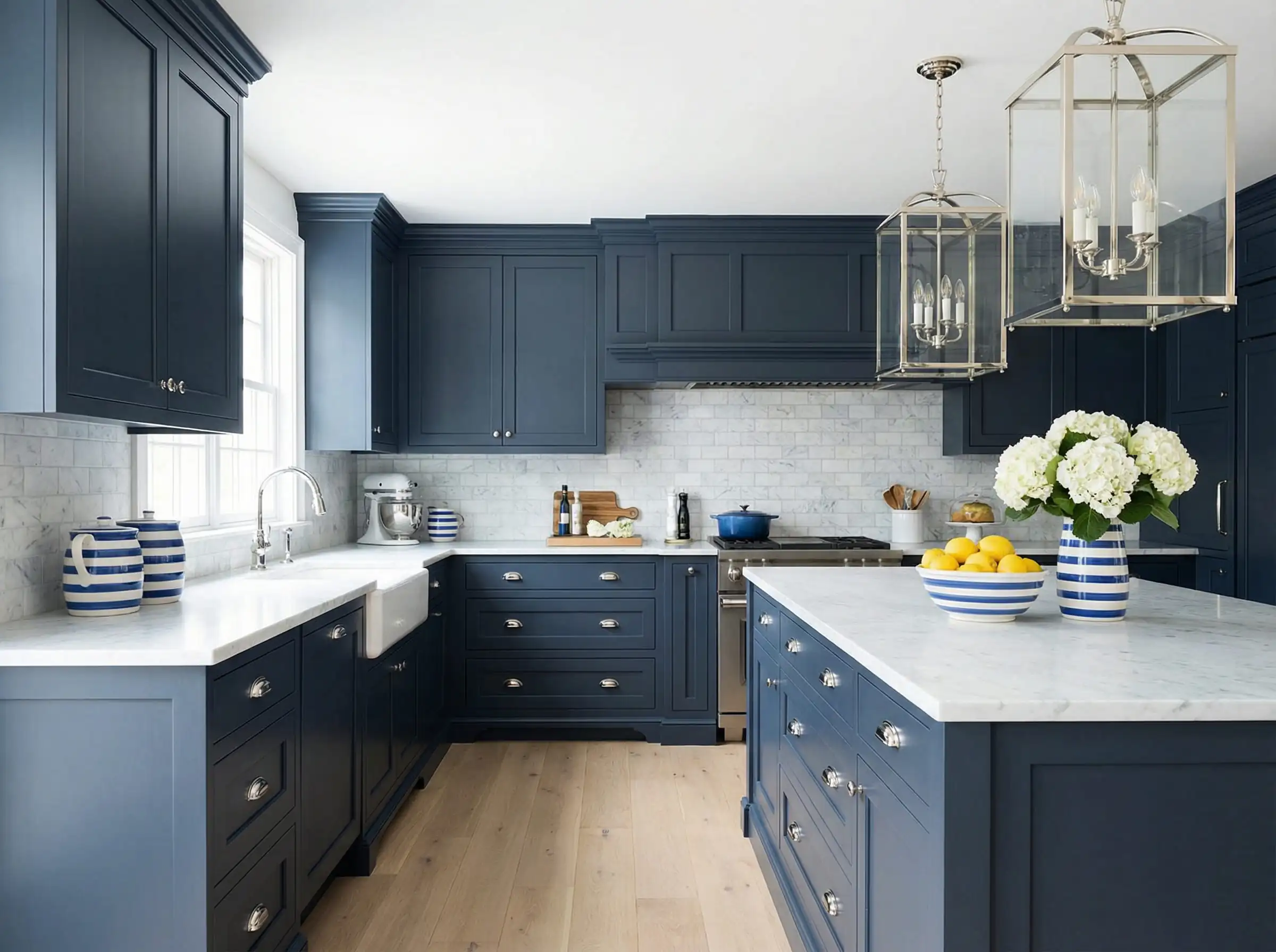
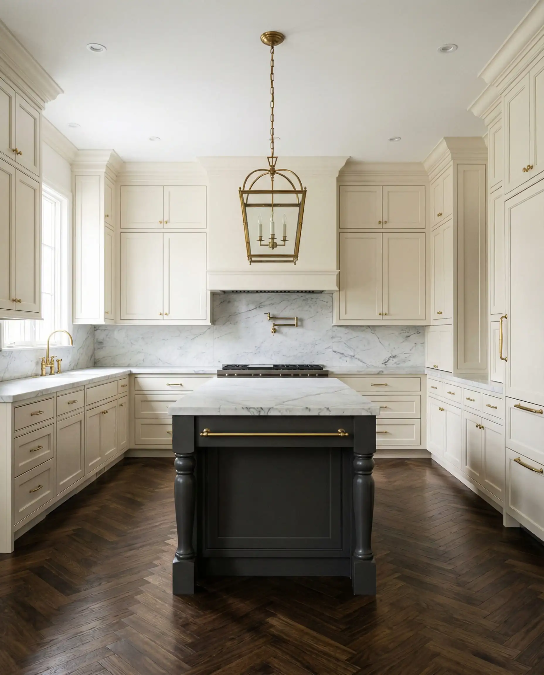
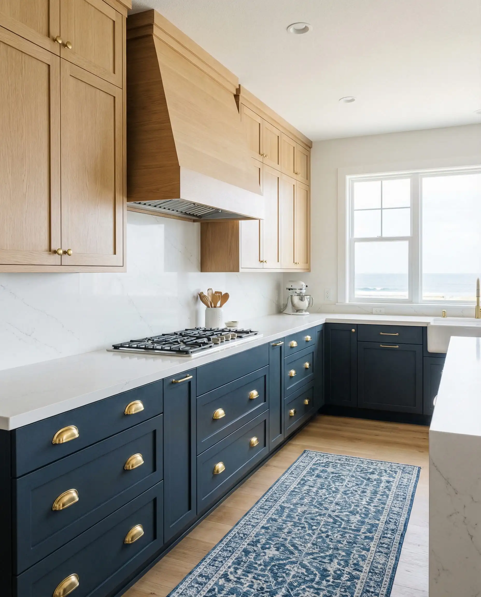
Midnight Blue (N480-7)
The Vibe: Nautical, Anchoring, Prep.
Navy blue is the denim of interior design—it goes with everything. Midnight Blue is a classic choice that anchors a kitchen. It pairs beautifully with crisp white marble countertops and polished nickel hardware. If you are renovating a coastal home or a traditional colonial, this color ensures your kitchen will look current in 2026 but won’t look dated in 2036.
Nature-Inspired & Calming Accents
Not every colorful kitchen needs to be dark and moody. 2026 also welcomes soft, hazier colors that promote tranquility.
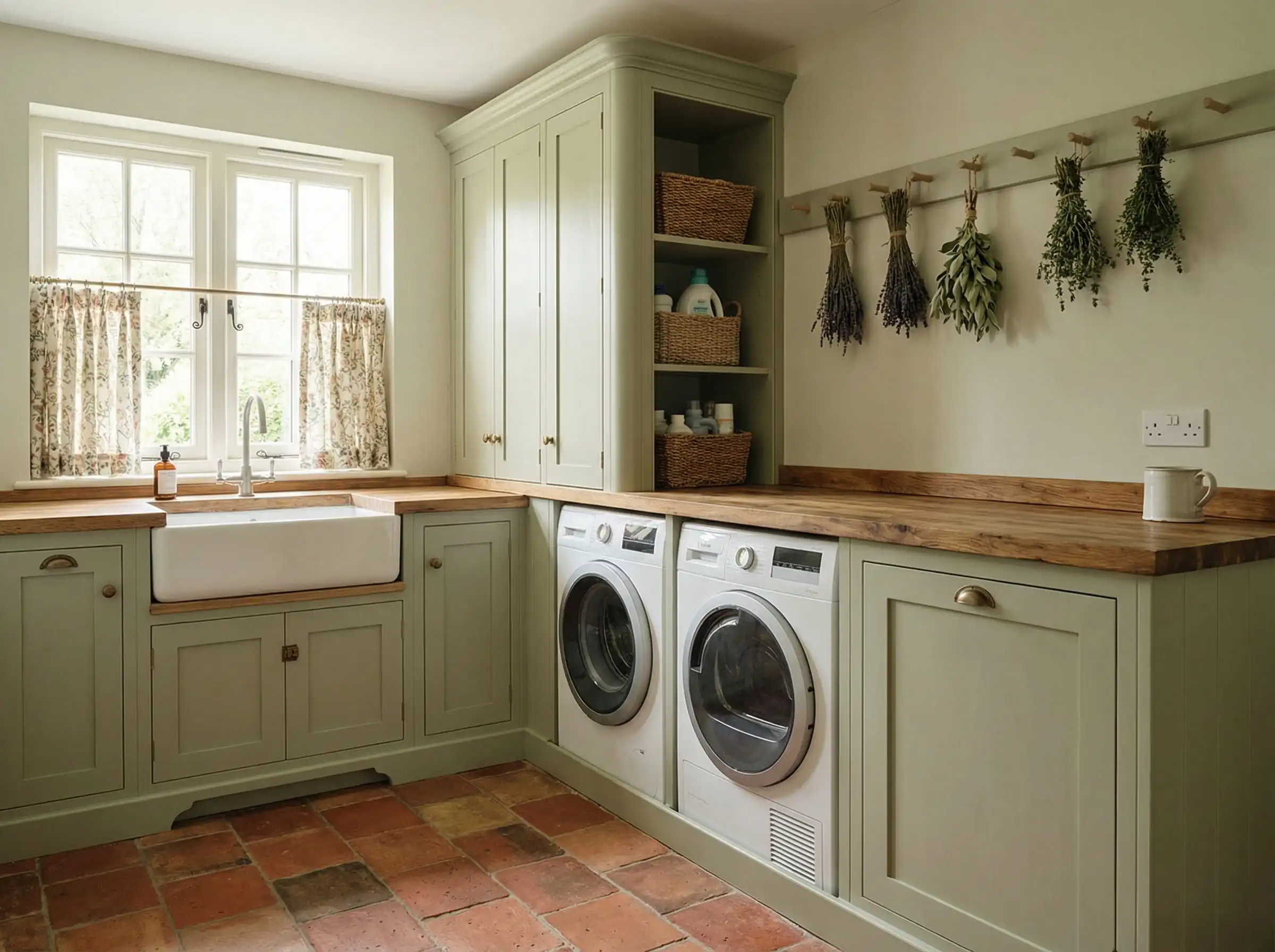
Jojoba (N390-3)
The Vibe: Sage, Spa-like, Gentle.
Jojoba is a warm, approachable green that feels like dried herbs. It is much lighter than the jewel tones mentioned above. This is the perfect color for a laundry room or a cottage kitchen. It pairs beautifully with terracotta floors and butcher block counters for a rustic, European farmhouse feel.
Adirondack Blue (N480-5)
The Vibe: Slate, Weathered, Cool.
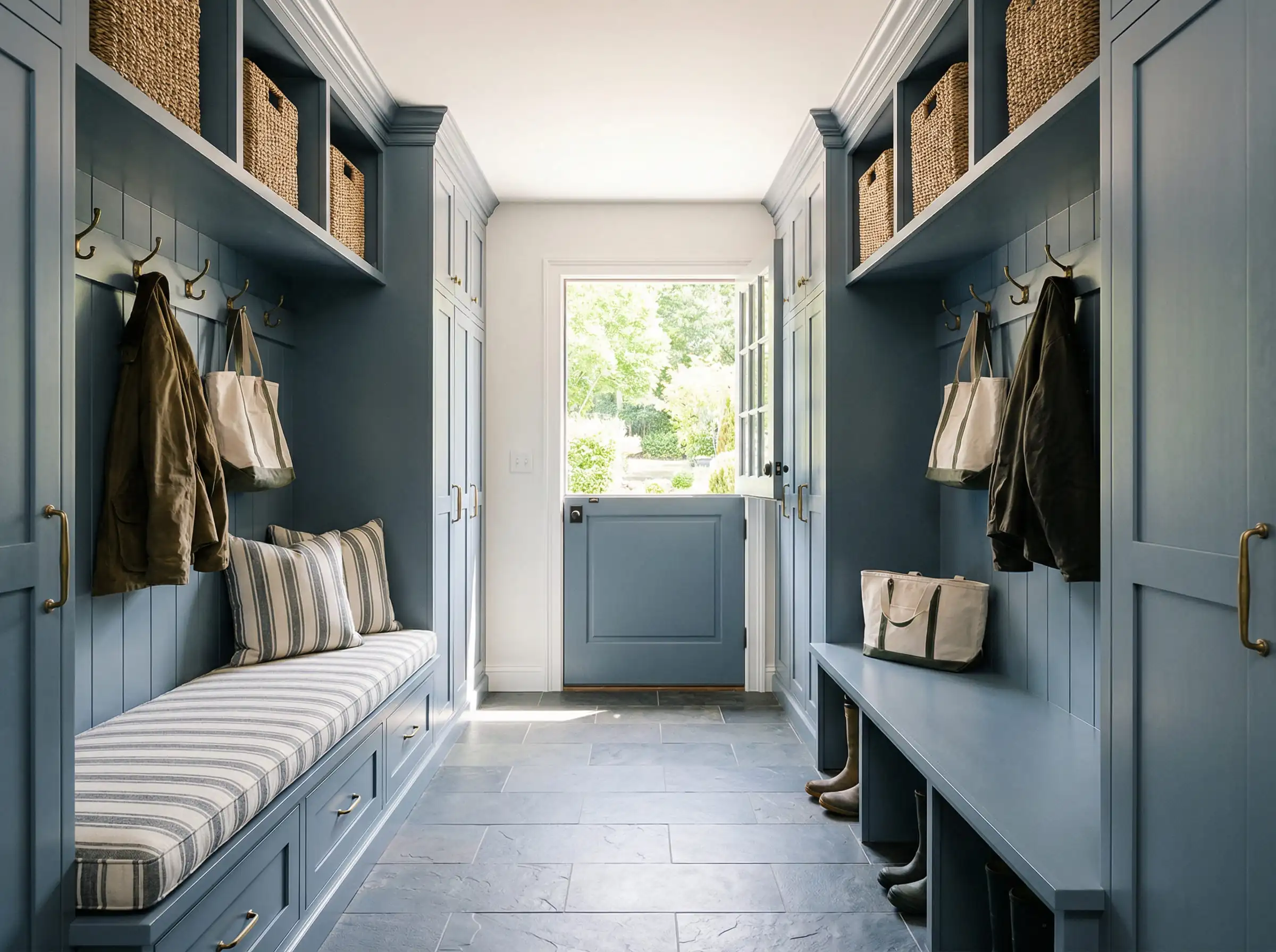
This is a slate blue with heavy gray undertones. It evokes the feeling of a cloudy day at the lake. Adirondack Blue is superb for mudroom cabinetry—it’s dark enough to hide the scuffs of daily life but light enough to keep the entry area feeling open.
Two-Tone Combinations: How to Mix & Match
One of the biggest questions we get at Hackrea is, “How do I mix colors without it looking messy?” The two-tone trend is thriving in 2026, but the rules have changed. It is no longer just “dark bottom, light top.” It is about creating zones.
Here are three fail-safe Behr palettes for 2026:
1. The “Organic Modern” Combo
2. The “High Contrast” Combo
3. The “Earthy” Combo
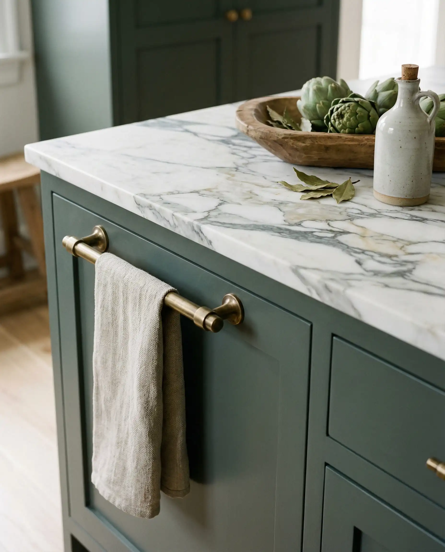
Design Guide: Hardware & Finishes
You can pick the perfect paint color, but if you choose the wrong finish or hardware, the look can fall flat.
Choosing the Right Sheen
For cabinetry, we almost always recommend a Satin or Semi-Gloss enamel finish.
Hardware Pairings for 2026
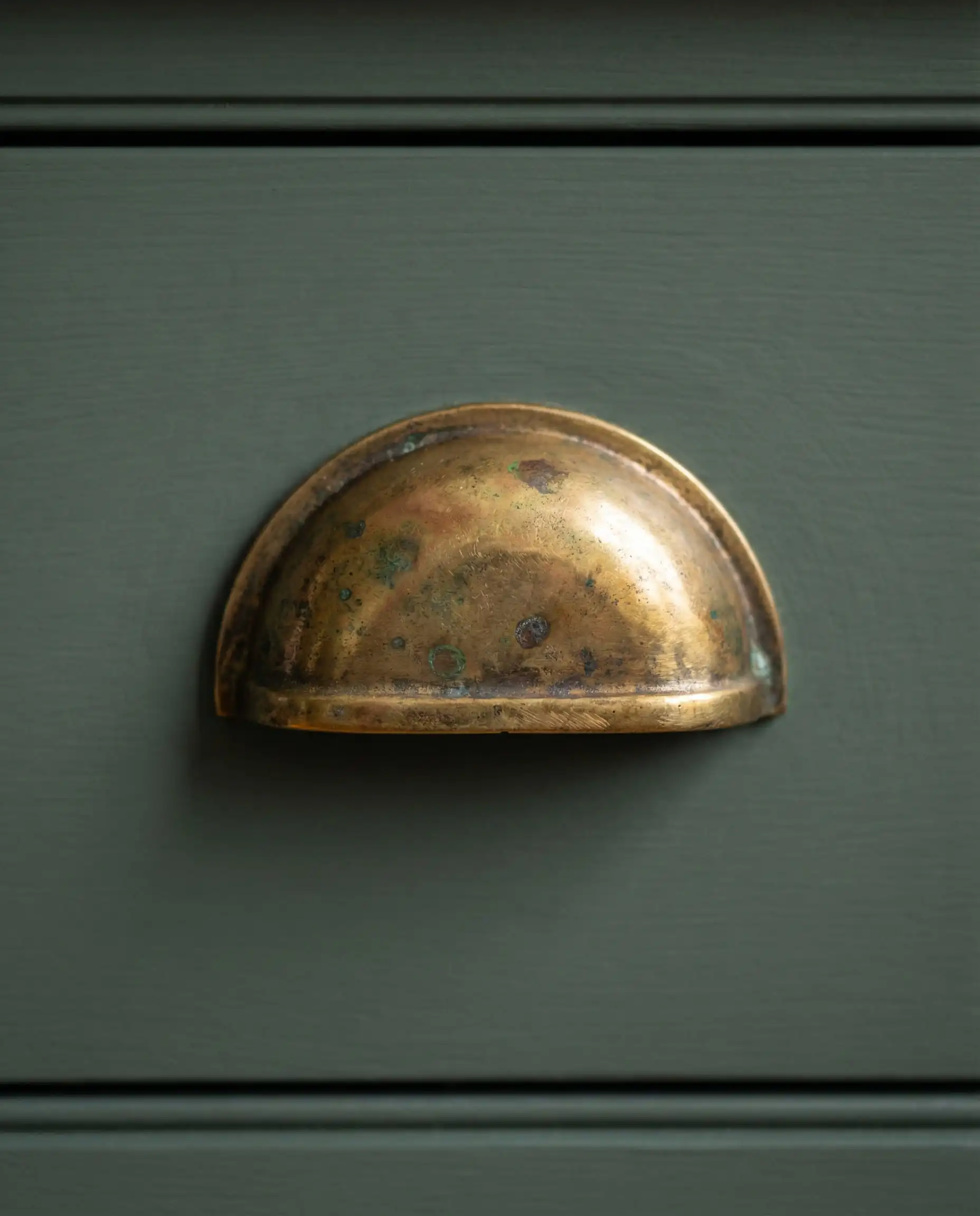
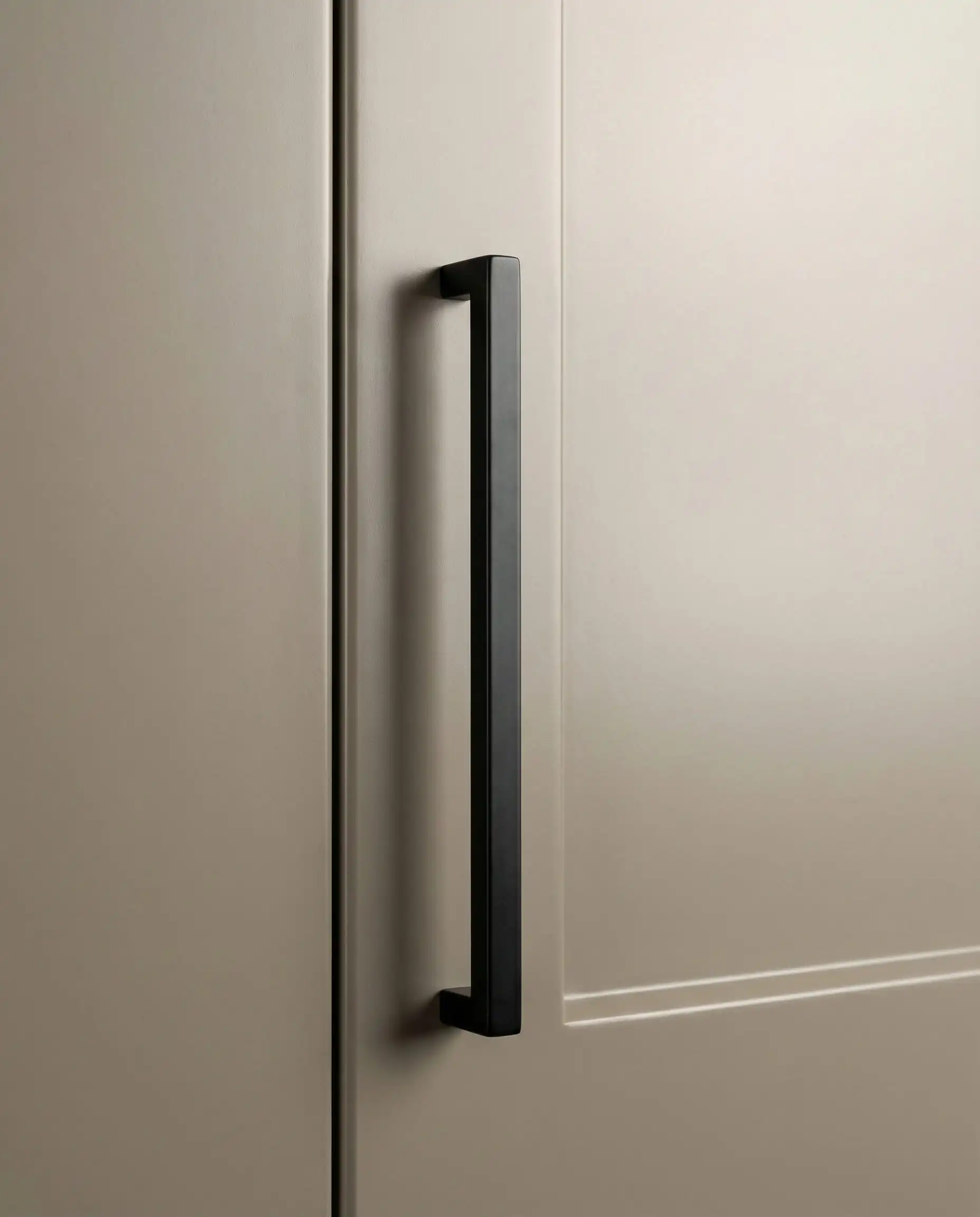
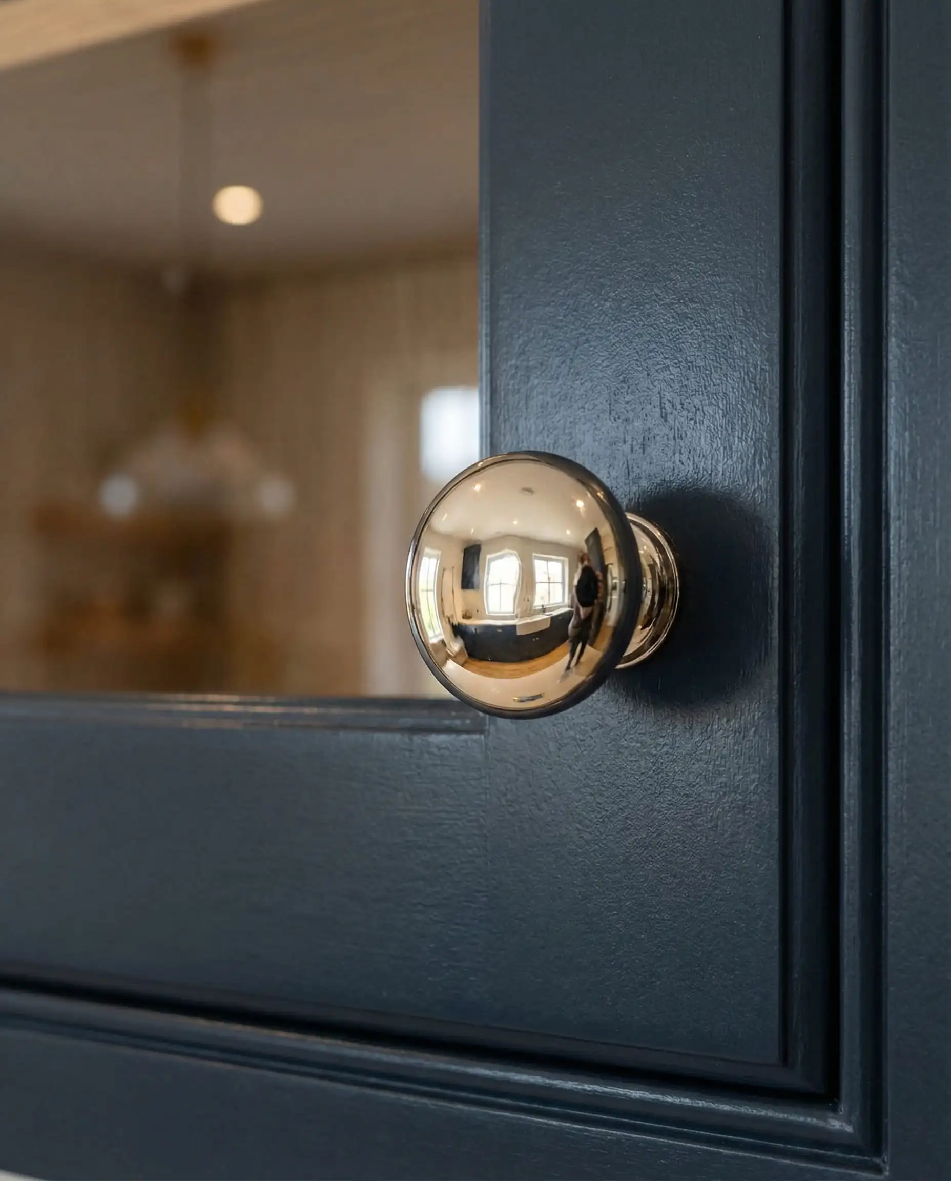
Mixing metals is encouraged! Try using brass knobs on your upper cabinets and matte black pulls on your lower drawers. Just make sure the style of the hardware matches (e.g., both modern or both vintage). 🛠️
🎨 Designer Styling Tip
Expert Tips for Painting Cabinets with Behr
We love Behr paint, but standard wall paint won’t cut it on cabinets that get opened and closed 20 times a day.
- Use the Right Product: You must use the Behr Cabinet, Door & Trim Enamel. It is formulated to dry harder than wall paint, preventing “blocking” (when doors stick to the frame) and resisting scratches.
- Prep is 80% of the Job: No paint sticks to grease. You must clean your cabinets with a degreaser (like TSP substitute) and lightly sand them before priming.
- Don’t Skip Primer: Even if the paint says “Paint & Primer in One,” use a dedicated bonding primer if you are painting over old glossy varnish or laminate.
Frequently Asked Questions
A: Cool, icy grays are declining in popularity. However, warm grays (greiges) like Behr’s Wheat Bread or taupe tones are very much in style. The trend is moving away from “sterile gray” to “earthy gray.”
A: Hidden Gem is primarily a green, but it has significant blue and charcoal undertones. In north-facing rooms (cool light), it may pull more teal/slate. In south-facing rooms (warm light), the lush green notes will dominate. Always test a sample in your specific lighting!
A: If your kitchen lacks natural light, avoid cool whites, which can look shadowy and gray. Go for Blank Canvas or Swiss Coffee. Their warm undertones help mimic the feeling of sunlight.
A: Absolutely. Behr’s enamel line is designed to be user-friendly. It levels out well (meaning brush strokes disappear as it dries). Just be patient with drying times between coats.
Final Thoughts
2026 is an exciting year for kitchen design because the rules are loosening. You can embrace dark, moody “Jewel Box” tones like Rumors and Cracked Pepper, or stick to the comforting warmth of Swiss Coffee and Blank Canvas.
The most important takeaway? Your kitchen should feel like you. Whether you choose the trendy Hidden Gem or a classic navy, the right coat of paint can transform your kitchen from a utility space into the favorite room in your house.
Did you use one of these colors in your renovation? We’d love to see it! Tag us on Instagram @hackrea_en so we can feature your transformation.