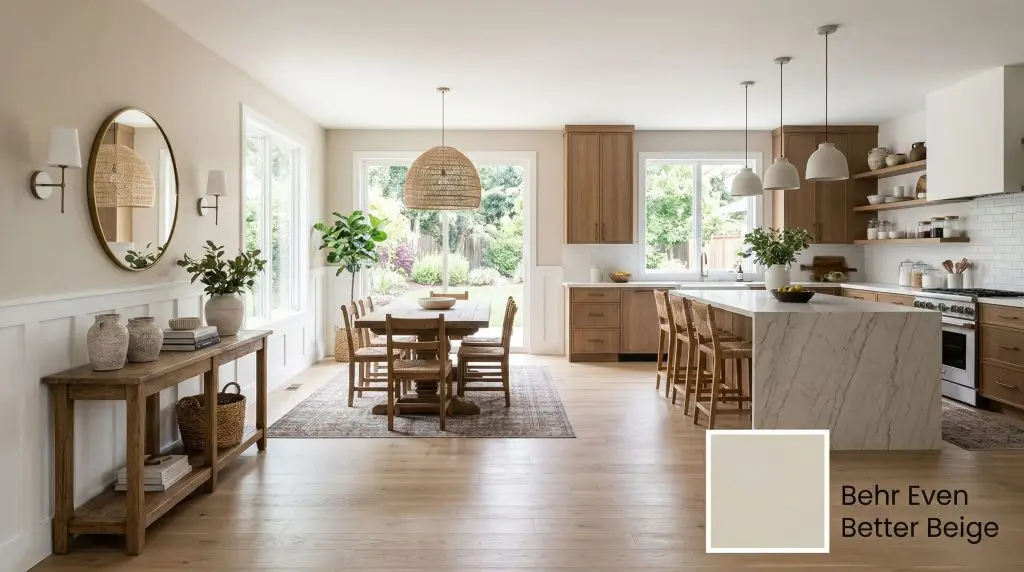
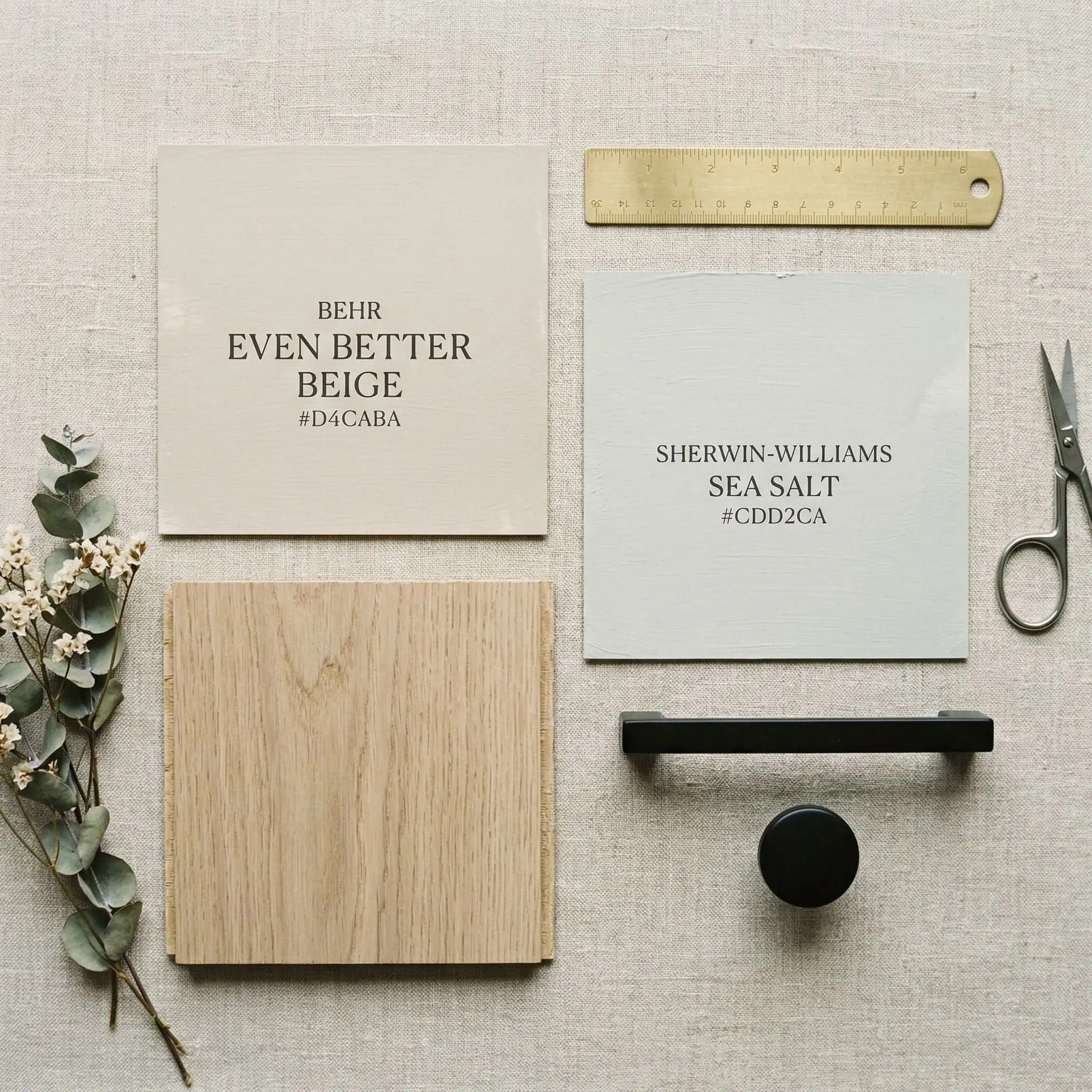
Even Better Beige DC-010
BehrBehr Even Better Beige (DC-010) is a modern, elevated warm neutral paint color with an LRV of 60. It features a perfect balance of tan, gray, and subtle yellow undertones, allowing it to act as a versatile greige in cooler light or a true cozy beige in sunlit rooms.
Paint Technical Profile
| Color ID / SKU | DC-010 |
| HEX Code | #d4caba |
| Light Reflectance (LRV) | 60 |
| Use | Interior, Exterior |
| Best Exposures | South-facing for true beige warmth; North-facing for a muted greige shift. |
| Best For | Living rooms, kitchen cabinetry, primary bedrooms, whole-house neutral walls |
Behr Even Better Beige Review: The Ultimate Modern Warm Neutral
We know exactly what you are terrified of. You hear the word “beige” and your brain instantly flashes to fleshy, 1990s builder-grade walls that look like muddy oatmeal.
You want a space that feels warm, inviting, and modern, but you are desperately trying to escape the sterile, cool grays that dominated the 2010s. Behr Even Better Beige (DC-010) is the antidote to both of those design eras.
This specific formulation is anchored by just enough gray to keep it fiercely grounded and modern, completely distinguishing it from the heavy, yellow-based tans of the past. If you are searching for the best warm neutrals for 2026, this shade is an absolute frontrunner.
It is a safe, updated color that feels incredibly fresh, provided you understand the math behind how it behaves.
The Color DNA: Undertones & LRV
A paint’s success on your walls is never magic. It is strictly dictated by color science and mathematical formulations.
Behr’s modern neutral is built on an RGB framework of 212, 202, 186. This positions it firmly in the warm neutral category, but its true power lies in its hidden chemical makeup.
Because of its specific Light Reflectance Value of 60, this color falls directly into the designer “sweet spot” for interior applications.
At 60, it absorbs enough light to provide a crisp, noticeable contrast against stark white trim. Simultaneously, it reflects enough ambient light to keep a room feeling airy and expansive, ensuring your walls will never wash out, even in brightly lit spaces.
Lighting Effects & The Chameleon Factor
Most mainstream color reviews label DC-010 strictly as a standard beige. We strongly disagree.
This paint is a chameleon. Depending on your home’s natural light exposure, Even Better Beige can completely lose its namesake and flash heavily into greige territory. You must test this color in your specific environment if you are strictly hunting for a warm tan.
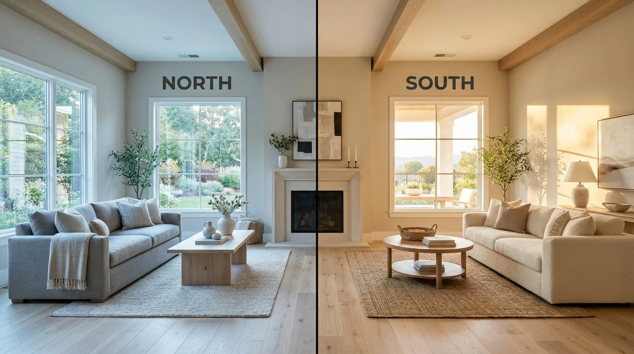
Never evaluate this color by laying the swatch flat on a table. Tape it vertically to the wall facing your primary light source to see its true undertone shift.
Hackrea Pro-Tip
Popular Room Applications
While this color is highly adaptable, it demands lighting awareness. If your home has wildly inconsistent natural light from room to room, be prepared for this shade to look like three entirely different paints.
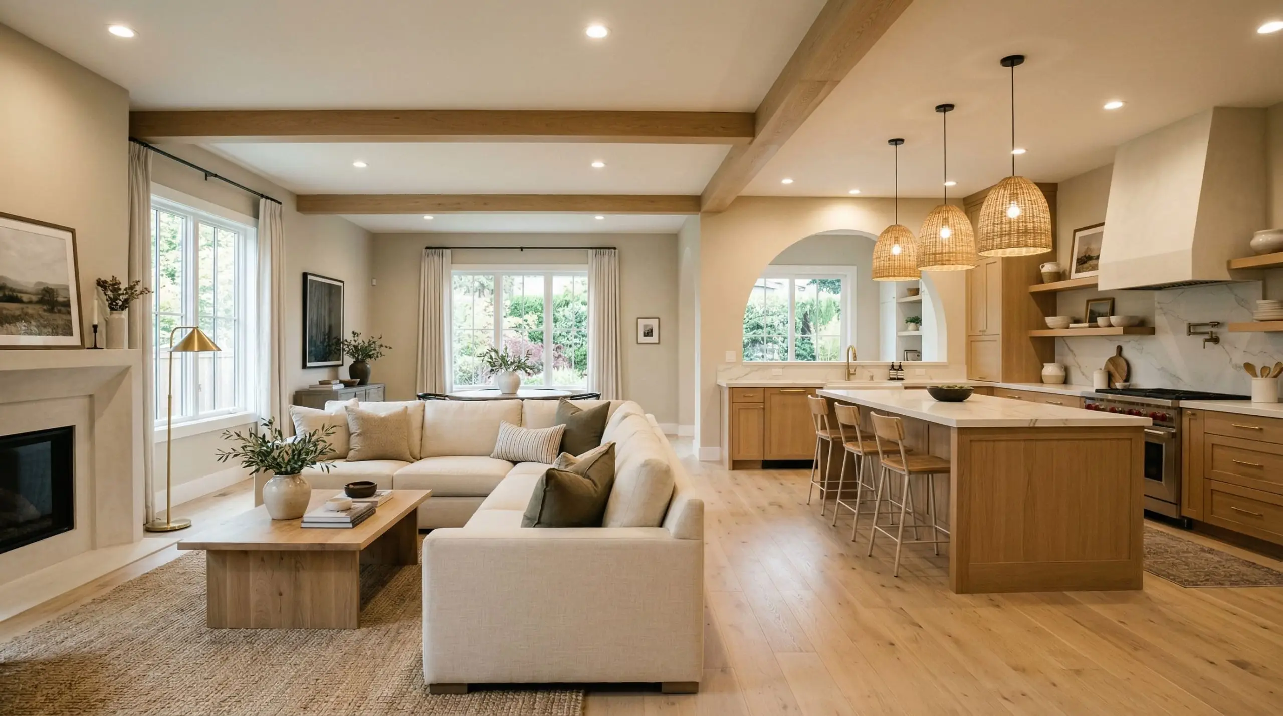
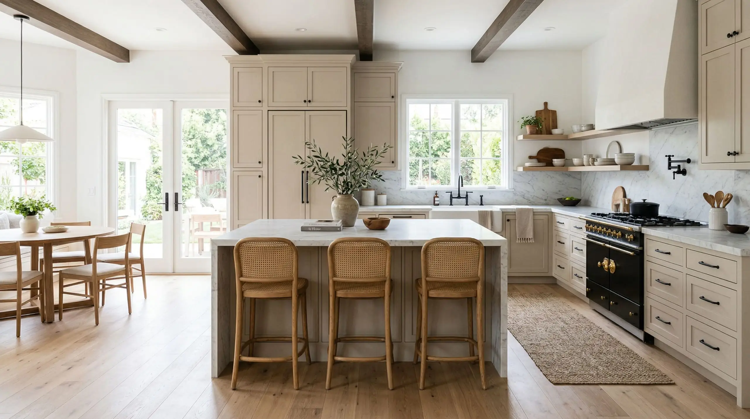
Seamless Whole-House Main Walls
Using this exact shade across an open-concept floor plan requires a strategic approach to lighting. It works beautifully to unify disjointed rooms, but you must ensure your artificial lighting temperature remains consistent throughout the house. Do not mix 2700K and 4000K bulbs in an open space painted with DC-010. The color will visually fracture, looking muddy in one corner and sterile in the next.
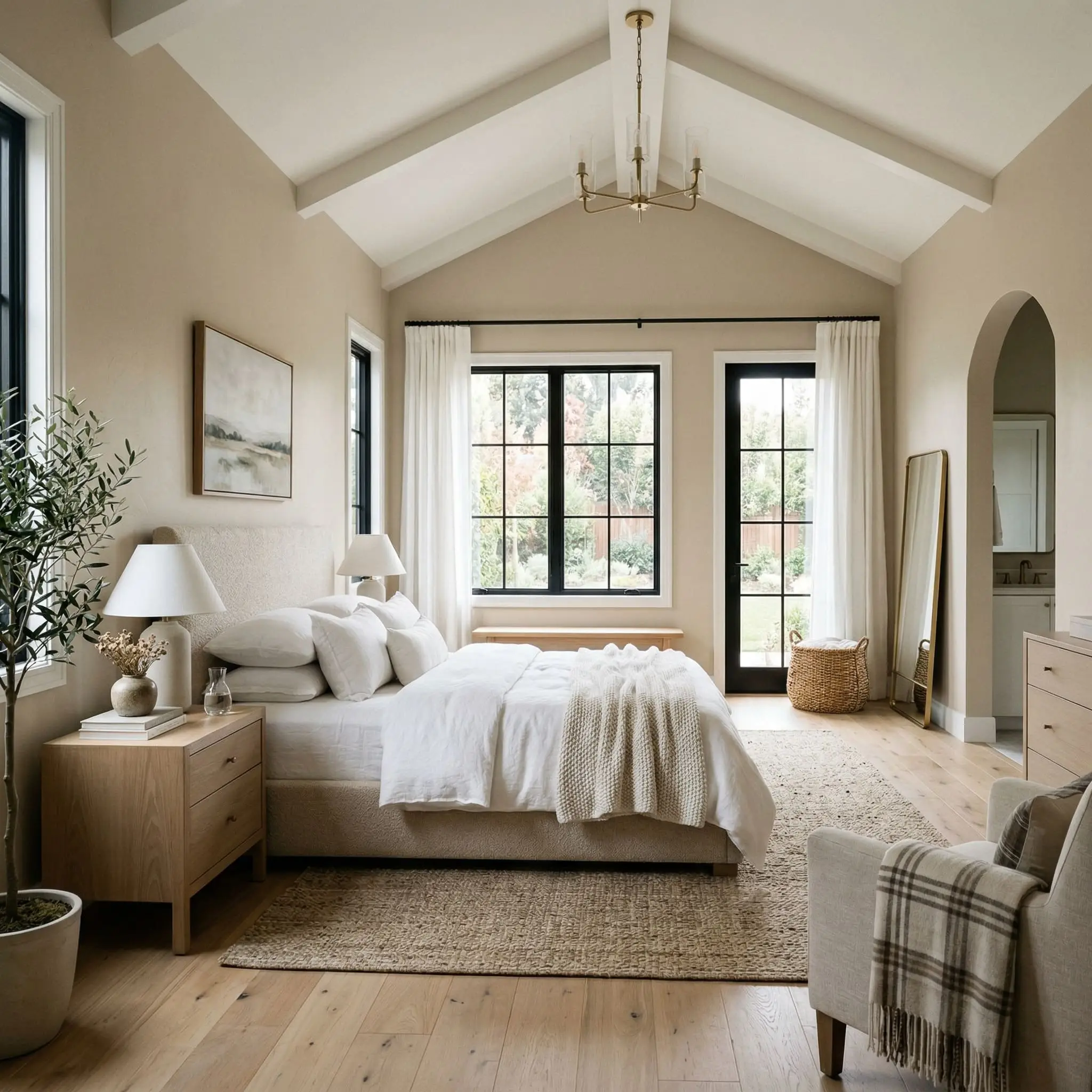
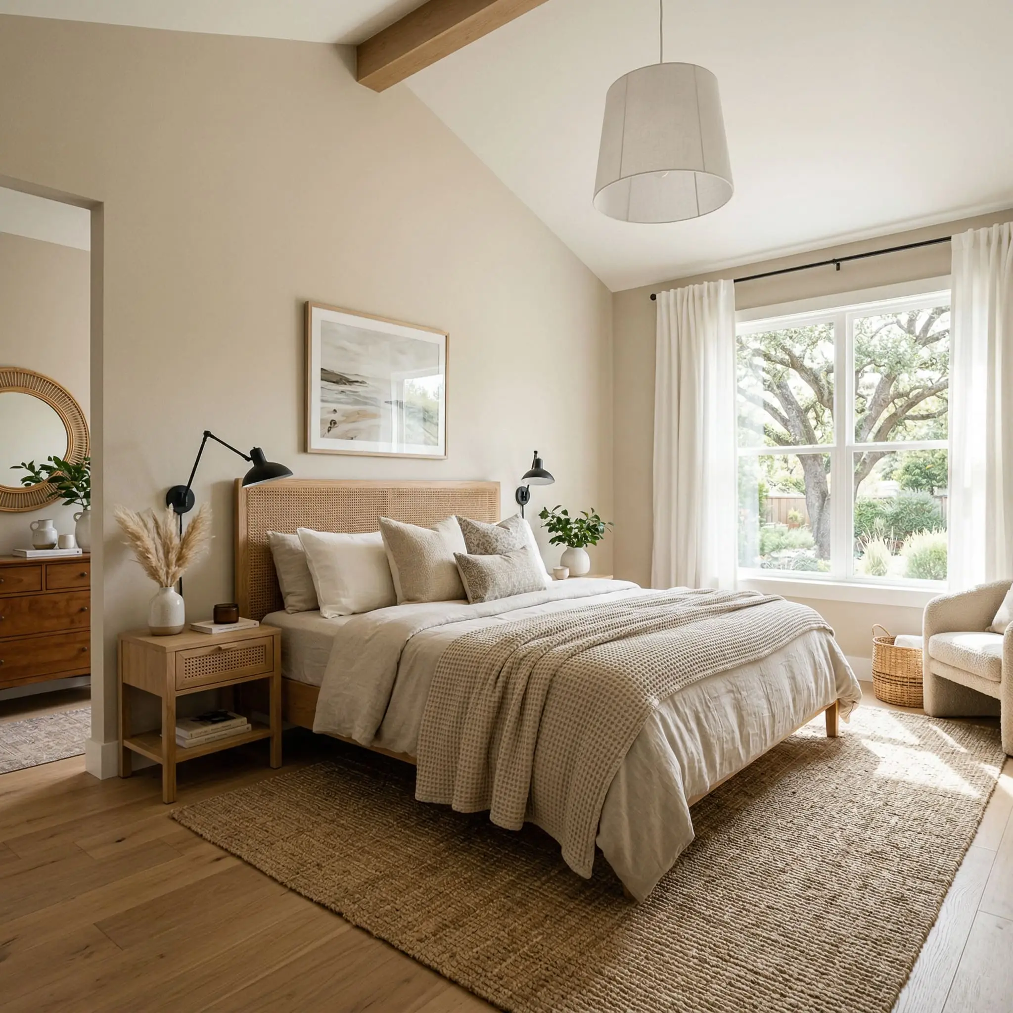
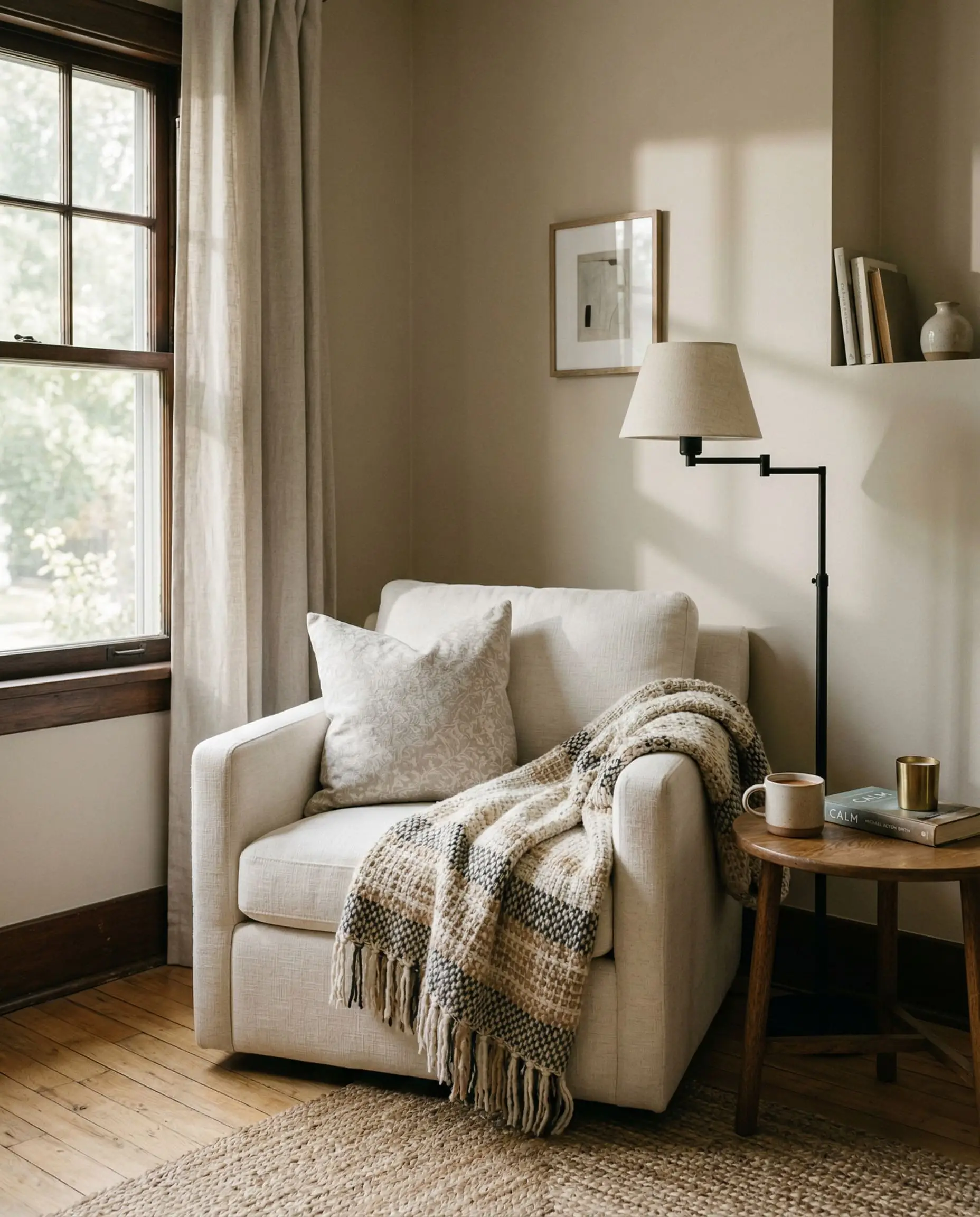
Restful Primary Bedrooms
This is where the color’s inherent warmth truly excels. By applying Even Better Beige to all four walls in a bedroom, you create a deeply inviting, cocoon-like atmosphere. It softens the harsh edges of modern furniture and provides a neutral, calming backdrop that allows layered textiles and plush bedding to take center stage.
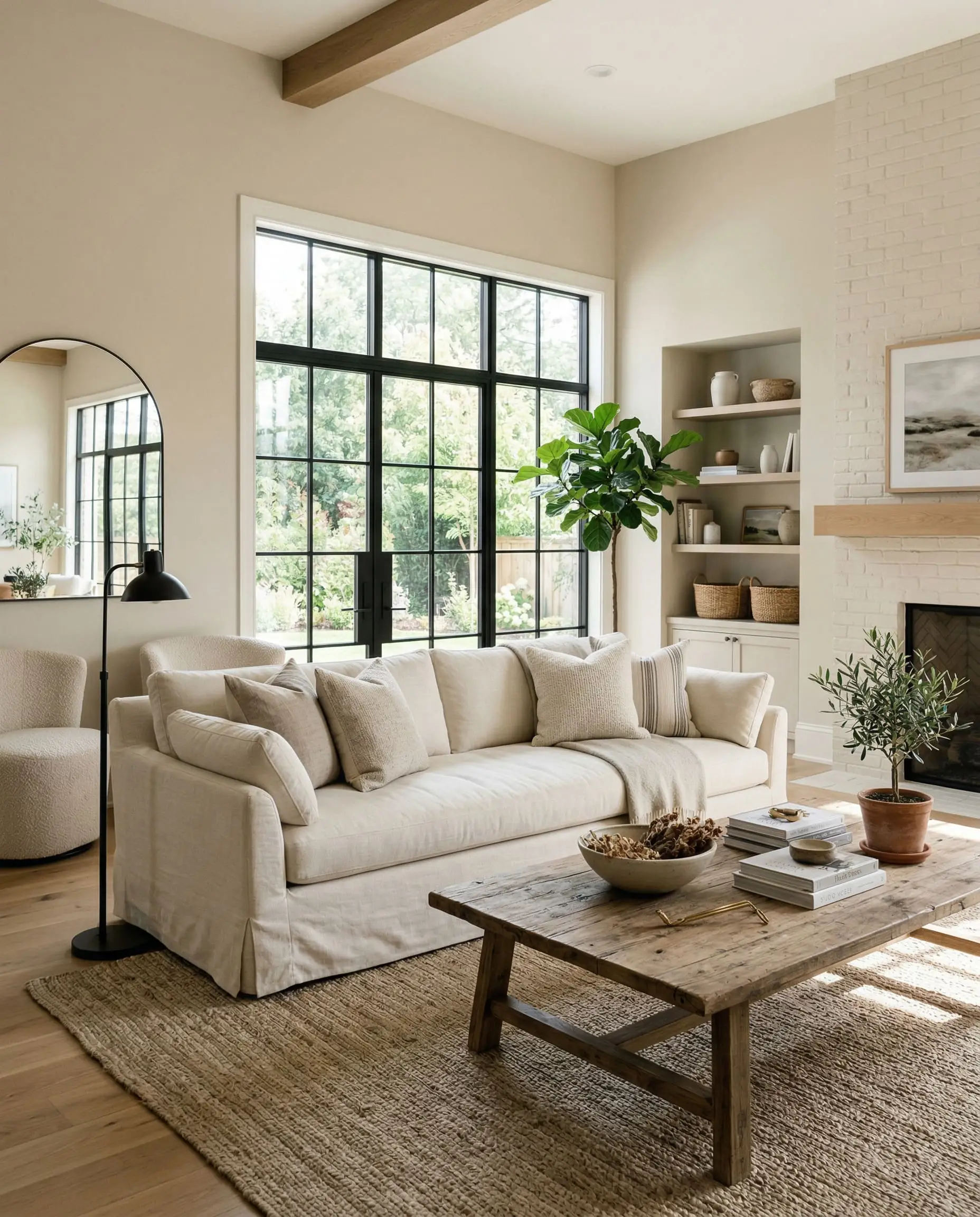
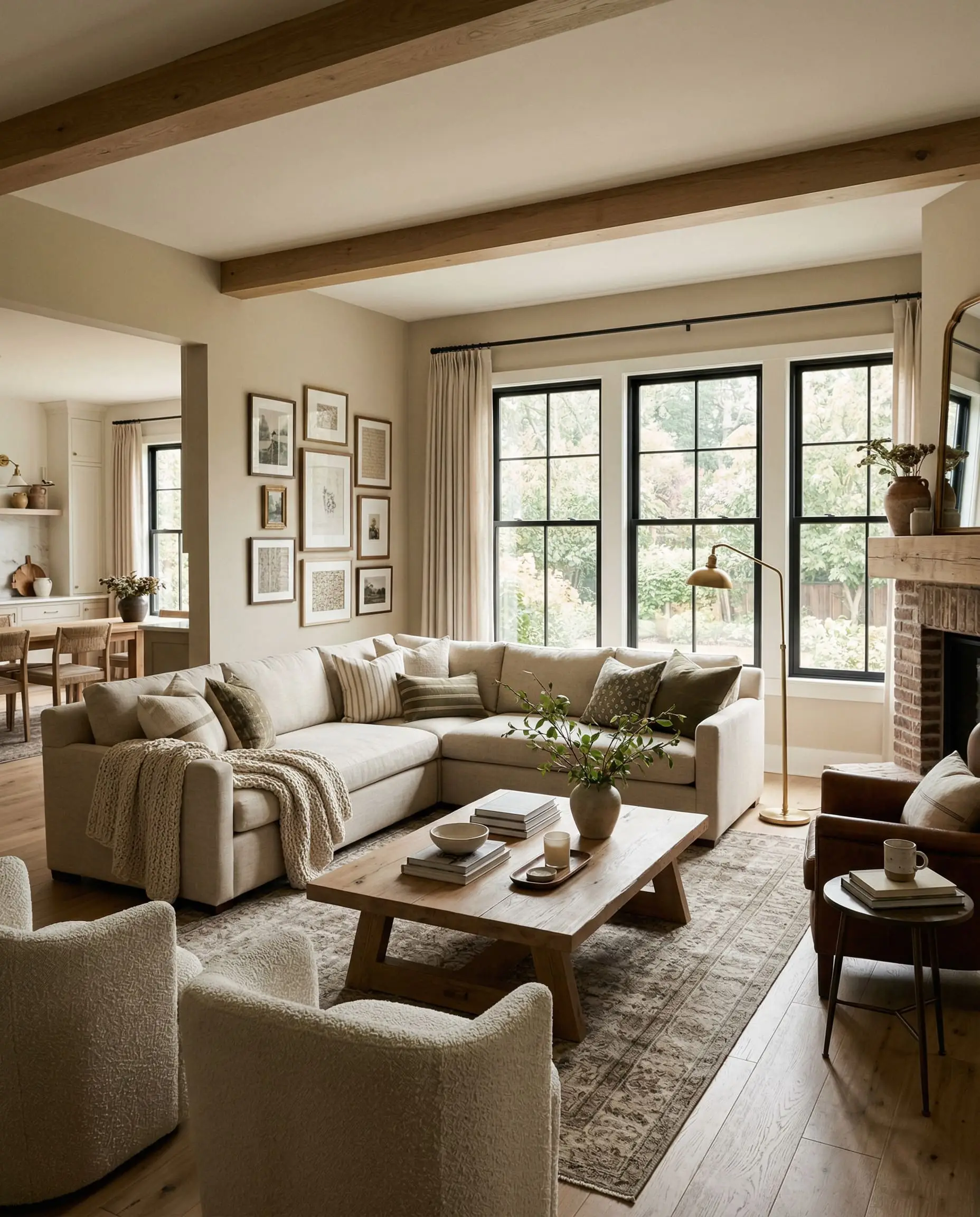
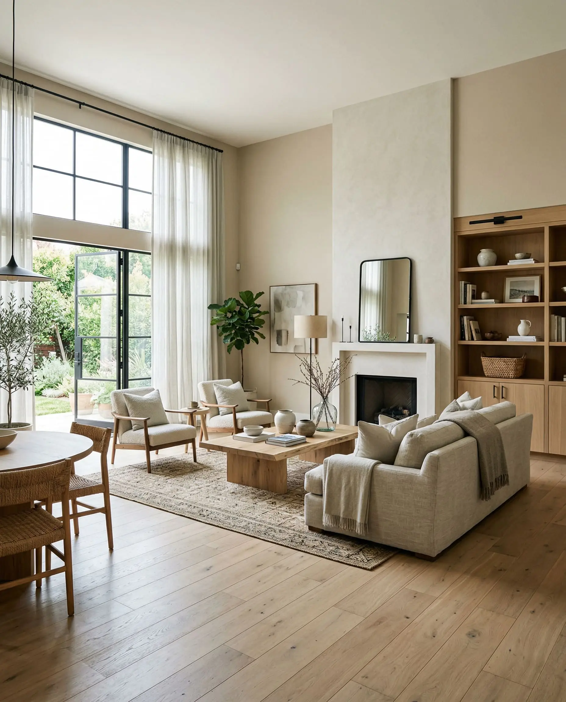
Grounded Living & Family Rooms
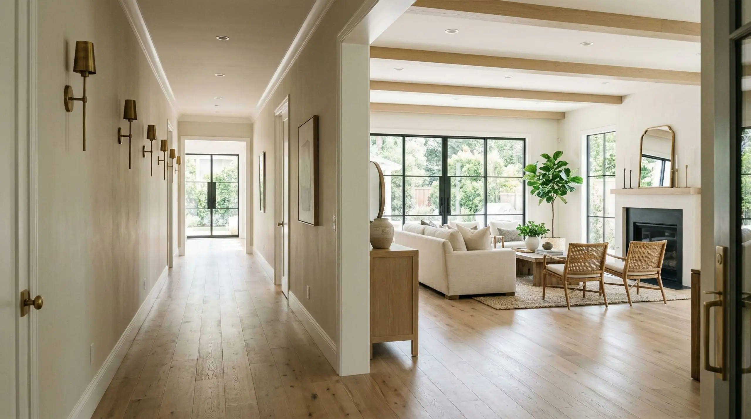
In a living room, this shade bridges the gap between formal and relaxed. It carries enough visual weight to anchor large, bulky upholstery pieces without making the room feel heavy. It is the perfect foundational color for spaces that feature large windows, as the shifting daylight will give the walls a dynamic, living quality from morning to dusk.
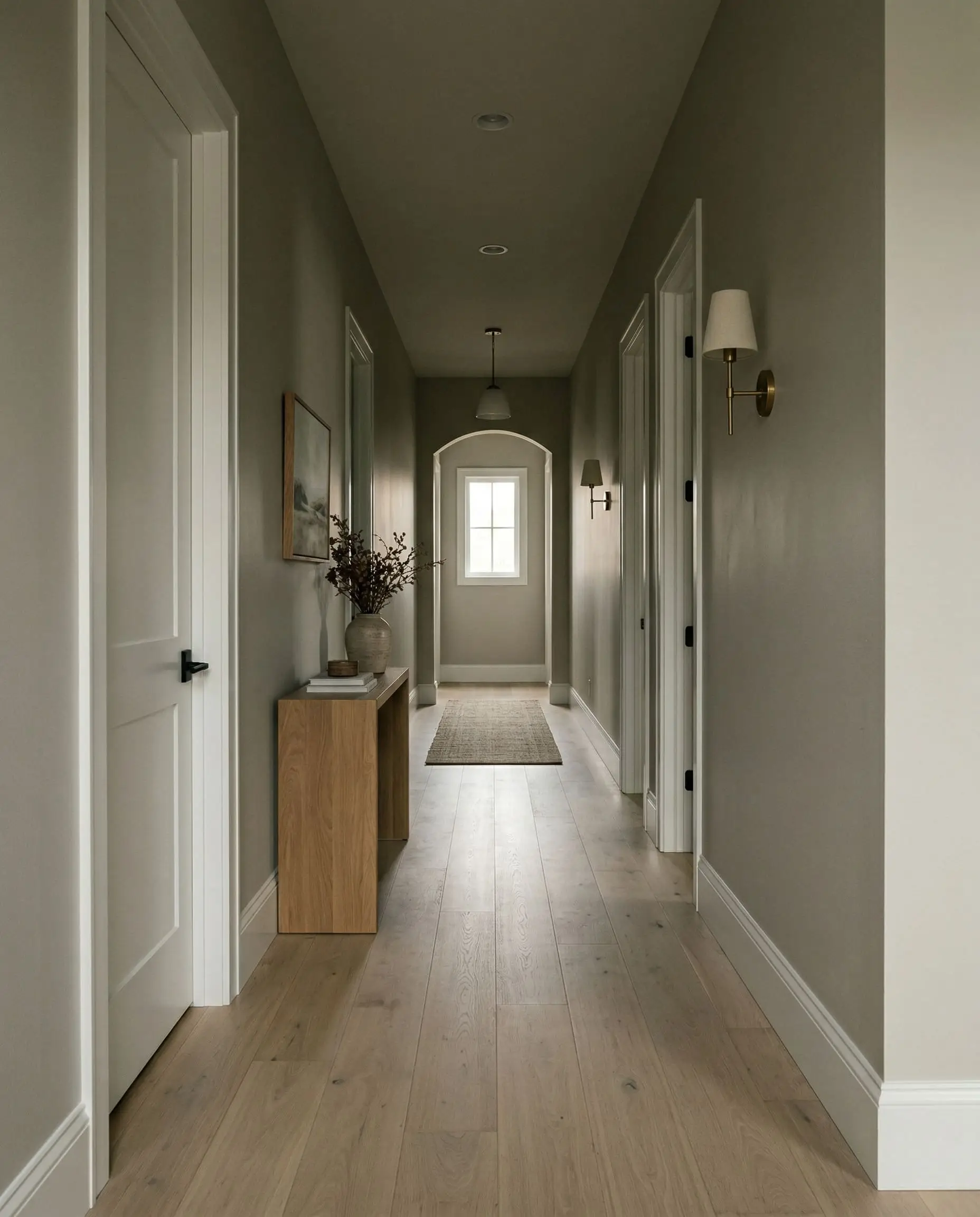
Transitional Hallways & Entryways
Hallways are notoriously starved for natural light. Because this paint sits at an LRV of 60, it is light enough to prevent narrow corridors from feeling like a cave. However, without natural sunlight to activate the yellow undertones, expect the color to lean heavily into its gray DNA in these transitional zones.
Signature Design Ideas & Inspiration
Beyond broad wall applications, Even Better Beige truly flexes its architectural muscle when applied to specific focal points. These are the high-end applications where its color DNA absolutely shines.
Reviving Vintage Bathroom Vanities
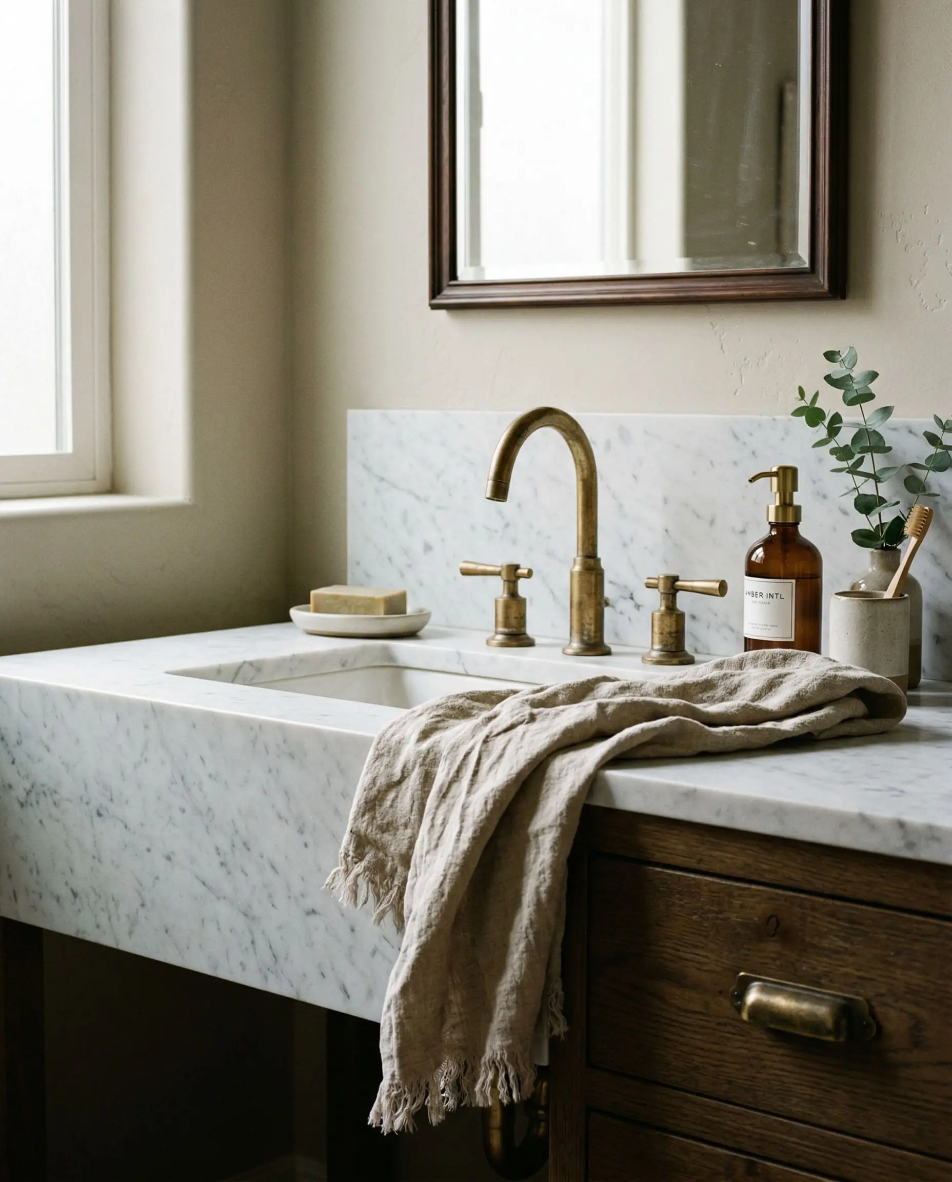
When applied to old oak cabinetry, this muted tan completely reinvents the physical architecture of a bathroom. The warmth of the paint directly interacts with the cool, veined surface of honed Carrara marble countertops, creating a striking visual tension. The beige softens the rigid stone, resulting in a vanity that feels custom, grounded, and highly bespoke.
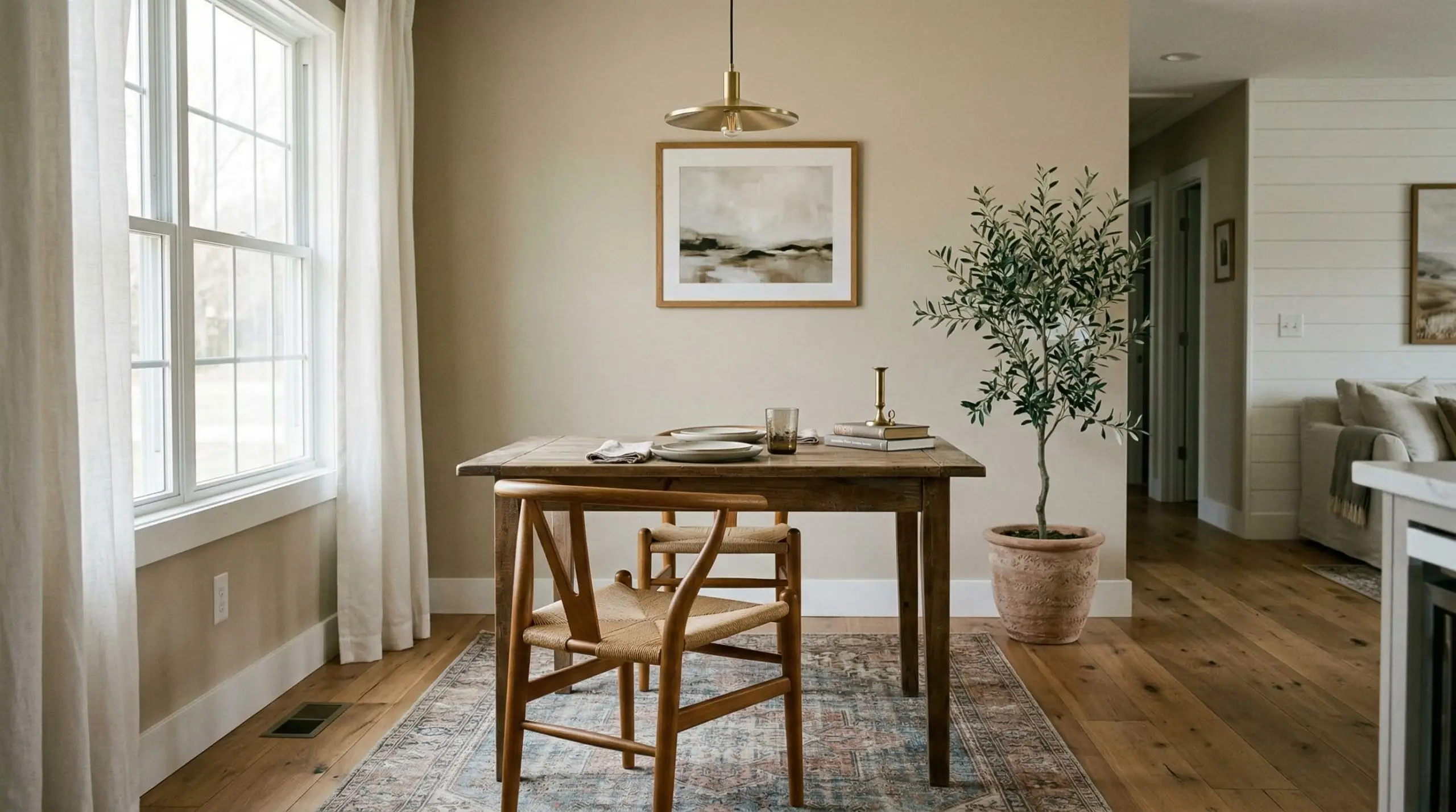
High-Contrast Two-Toned Dining Rooms
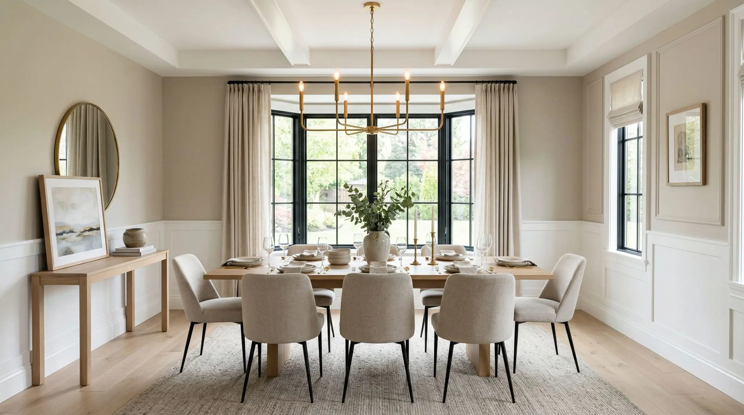
Tying this color to classic architectural features creates an instant sense of pedigree. When used strictly on the upper walls above crisp, stark white board-and-batten or wainscoting, the contrast is razor-sharp. The stark white forcefully pushes the beige to look richer and more saturated, nodding to traditional historical design while maintaining a clean, modern edge.
Modern Organic Kitchen Cabinetry
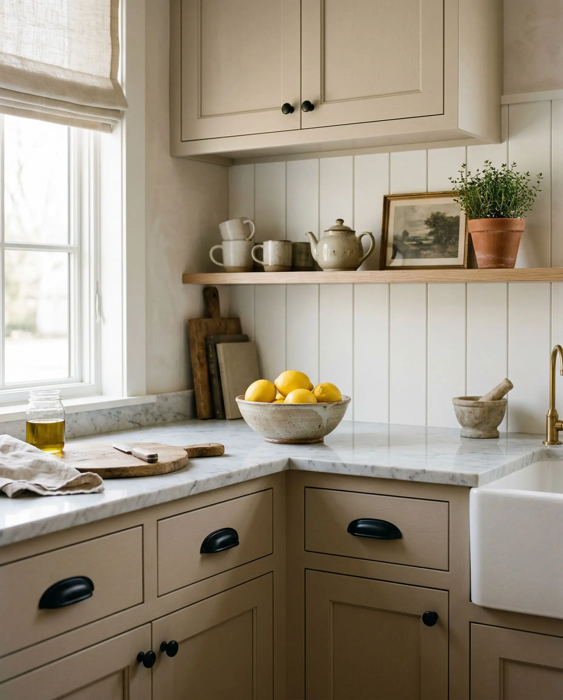
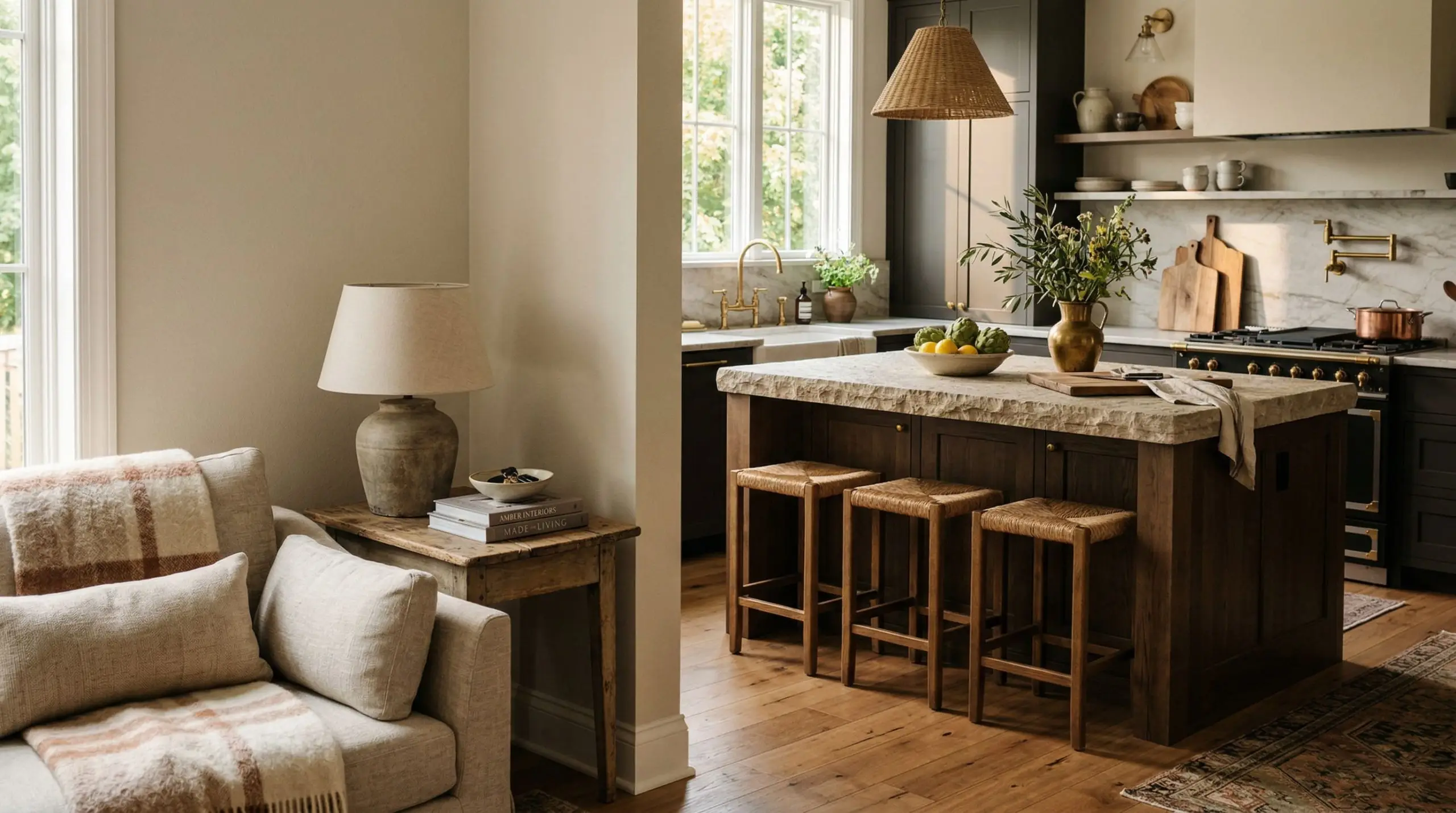
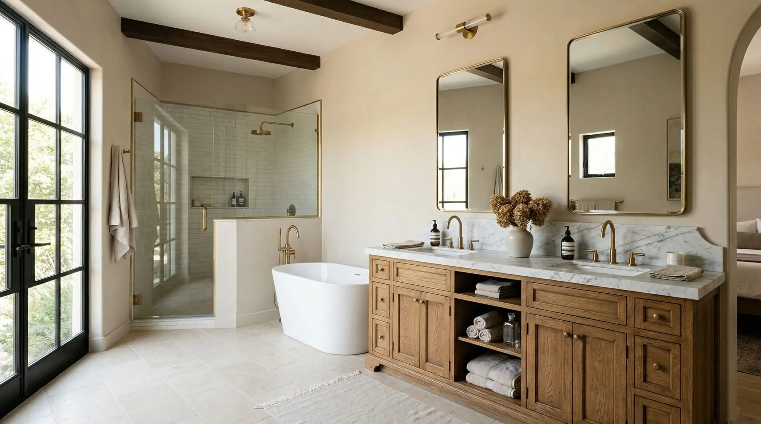
If you want to understand how to paint kitchen cabinets for a softer, organic aesthetic, this is your target hue. The tactile warmth of the beige creates a deeply sensorial mood, acting as the perfect alternative to a sterile, all-white kitchen. When paired with the raw, matte texture of white oak flooring, the entire room radiates a grounded, earthy warmth that feels incredibly inviting.
The Pairings & Accents Guide
A paint color is only as successful as the materials and shades placed directly next to it.
Flawless Trim Pairings for Even Better Beige
To maximize the impact of this neutral, you need a trim color that provides deliberate contrast without introducing conflicting undertones.
Architectural Materials That Work
The fixed materials in your room will fundamentally alter how this paint reads.
The Coordinating Color Palette
When building a whole-room palette, lean into muted, nature-inspired tones that share a similar muted saturation.
Curated Mood Boards
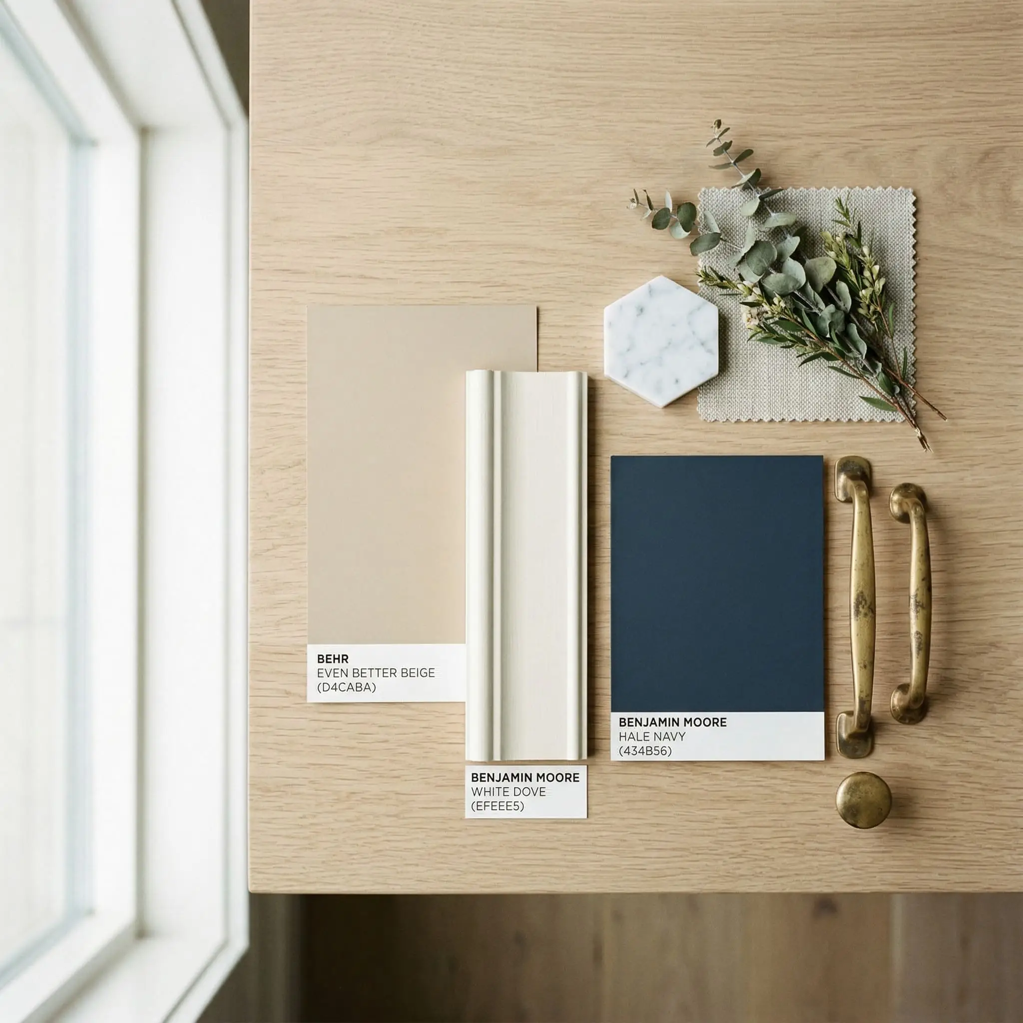
The Organic Modern Palette: Combine Even Better Beige walls with white oak flooring, matte black hardware, and accents of Sherwin-Williams Sea Salt. This creates a highly textural, nature-inspired space that feels breathable and incredibly current.
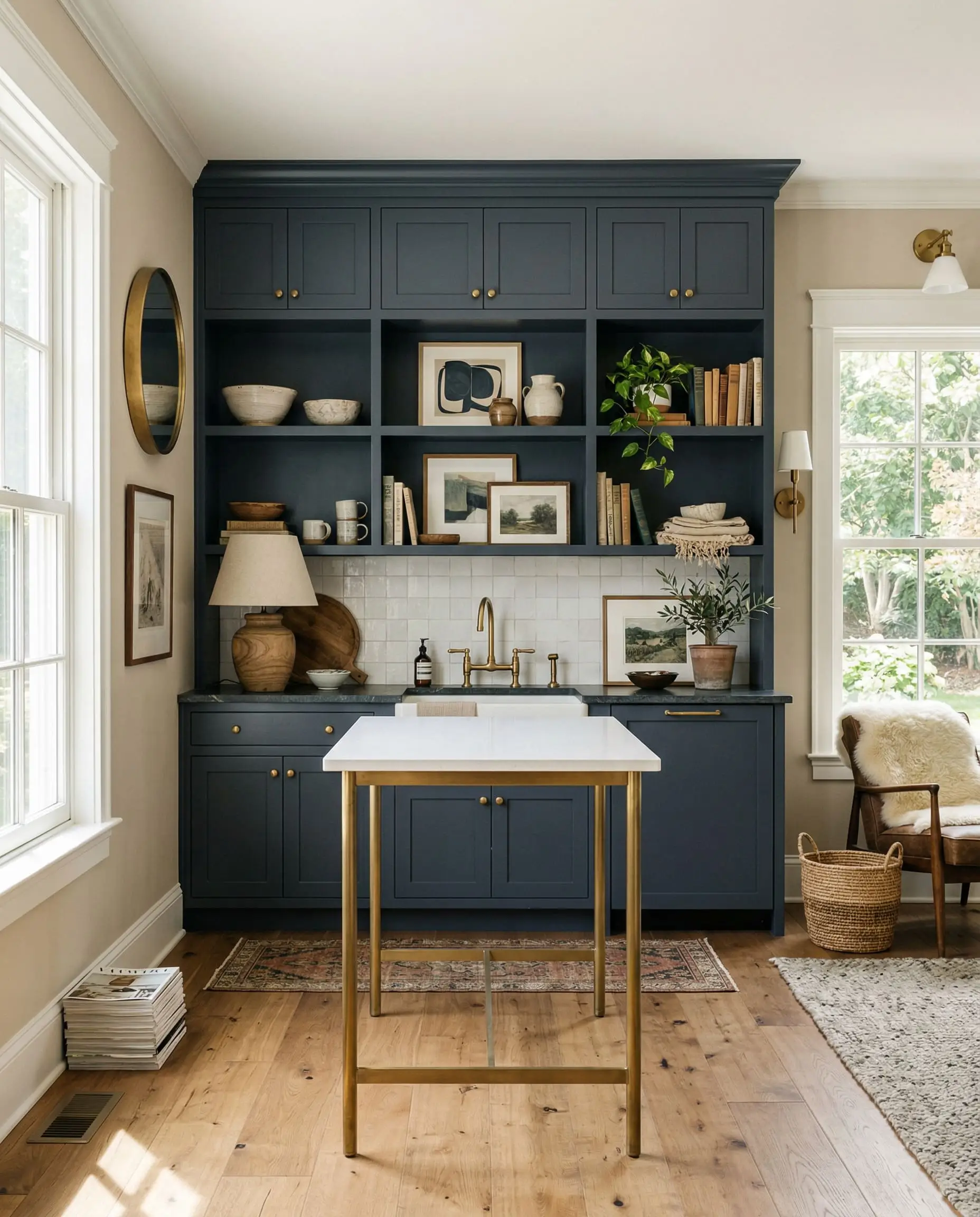
The Classic Transitional Palette: Pair the beige with Benjamin Moore White Dove trim, unlacquered brass fixtures, and Benjamin Moore Hale Navy cabinetry. This combination relies on high-contrast, traditional anchors to deliver a timeless, sophisticated aesthetic.
Head-to-Head Comparisons
Choosing the right neutral often comes down to microscopically analyzing direct rivals. Here is how DC-010 stacks up against the heavyweights.
Behr Even Better Beige vs. Sherwin-Williams Agreeable Gray
Agreeable Gray is the undisputed king of the greige category. When placed side-by-side, Agreeable Gray is noticeably cooler and leans much heavier into its gray base. If your room faces North and you want to retain any semblance of warmth, Behr Even Better Beige is the safer, warmer choice.
Behr Even Better Beige vs. Benjamin Moore Edgecomb Gray
These two are incredibly similar in their intent, but Edgecomb Gray carries a distinct, microscopic green undertone. Behr’s version is slightly warmer and relies on a yellow/tan base rather than green. Choose Behr if you want a creamier finish, and Benjamin Moore if you are pairing with earthy, olive greens.
Behr Even Better Beige vs. Behr Swiss Coffee
This is a battle of depth. Swiss Coffee is significantly lighter and functions as a creamy off-white rather than a true beige. If you want a soft, bright backdrop with minimal saturation, go with Swiss Coffee. If you want actual color depth and contrast against your white trim, Even Better Beige is the definitive winner.
Similar Colors & Brand Equivalents
If you love the DNA of this color but need slight adjustments in depth or brand availability, consider these alternatives.
Behr Alternatives to Consider
Cross-Brand Color Matches
If your contractor strictly uses a different manufacturer, these are your closest color-matching equivalents.
Practical Application & DIY Advice
Executing a flawless paint job requires more than just picking the right color. You must respect the chemistry of the application.
The Dynamic Sheen Matrix
Choosing the wrong sheen will ruin the color’s visual depth.
Primer Strategy for DC-010
Because this paint sits at a comfortable 60 LRV, a standard, high-quality white primer is perfectly sufficient for drywall applications. However, if you are painting over heavy, dark 1990s colors, a tinted gray primer will reduce the number of topcoats required. If applying this to raw wood or old oak cabinets, a premium stain-blocking primer is mandatory to prevent tannins from bleeding through and turning the beige yellow.
Coverage Expectations & Touch-Ups
Expect to apply two full coats for true color accuracy. Because of its medium depth, “flashing” (visible, shiny roller marks) can occur if you stretch the paint too thin. Maintain a wet edge while rolling. Fortunately, touch-ups with an eggshell finish in this specific LRV range are generally forgiving and blend well after curing.
Frequently Asked Questions
Is Behr Even Better Beige warm or cool?
It is definitively a warm paint color. However, its hidden gray undertones prevent it from feeling hot or overly radiant, keeping it perfectly balanced and modern.
Does Even Better Beige look yellow?
Under standard lighting, no. It contains a micro-drop of yellow to maintain its warmth, but the heavy gray grounding prevents it from ever looking like a glaring, dated yellow-tan.
What is the LRV of Behr Even Better Beige?
It has an LRV (Light Reflectance Value) of 60. This makes it a mid-tone neutral that reflects a moderate amount of light while holding its color depth beautifully.
What colors go well with Even Better Beige?
It pairs flawlessly with stark whites (like Behr Ultra Pure White), muted blues (Adirondack Blue), pale green-grays (Sea Salt), and deep, grounding navies (Hale Navy).
Is Even Better Beige considered a greige?
Technically, it is a beige. However, if you are understanding greige paint undertones, you will recognize that in cool, North-facing light, its gray base pushes it heavily into greige territory.
Final Verdict & Expert Warnings
Behr Even Better Beige (DC-010) absolutely lives up to its name. It is a masterful, highly versatile neutral that successfully bridges the gap between the cozy warmth of a traditional beige and the sleek, grounded sophistication of a modern gray.
Its absolute best application is in open-concept living spaces featuring white oak floors and abundant natural light, where its chameleon-like qualities can truly breathe life into the architecture. It is perfect for homeowners who want a soft, inviting atmosphere without committing to stark whites or sterile grays.
Clash Warning: We strongly advise against using this paint if your home features heavy cherry wood floors or cabinetry. The intense red undertones of the cherry wood will force the beige to look muddy, fleshy, and slightly green by contrast. Additionally, avoid pairing it with stark, cool blue-grays, as the competing color temperatures will violently clash.
Closest Cross-Brand Equivalents
The absolute closest scientific color matches for Even Better Beige across top paint brands.