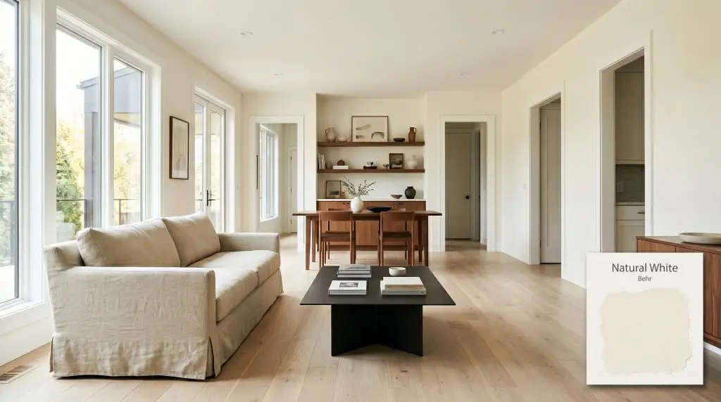
Natural White DC-005
BehrBehr Natural White (DC-005) is a highly reflective, warm off-white paint color with an LRV of 90. It features subtle creamy yellow undertones that prevent it from feeling stark, making it an elegant, inviting choice for both interior walls and exteriors.
Paint Technical Profile
| Color ID / SKU | DC-005 |
| HEX Code | #f7f4e8 |
| Light Reflectance (LRV) | 90 |
| Use | Interior, Exterior |
| Best Exposures | North-Facing, East-Facing |
| Best For | Living Rooms, Kitchen Cabinets, Whole-House Neutral |
Behr Natural White: The Ultimate Warm Off-White for Sunlit Homes
Finding a white paint that feels alive rather than clinical is one of the most common hurdles in home renovation. As a standout in the Behr Designer Collection, this warm off-white acts as a highly reliable, luminous backdrop that softens a room without turning yellow. We rely on this shade when a space needs to feel expansive but inviting.
Instead of sitting flat on the drywall, this color interacts beautifully with the natural shadows of a room. It provides the clean slate of a traditional white, but carries enough pigment to feel intentional and curated.
The Core Color Structure of Behr Natural White
Is Behr Natural White warm or cool? It is definitively warm. This architectural finish leans away from icy tones, offering a soft radiance that sets a welcoming baseline for the rest of your interior styling.
Understanding how a paint is built helps you predict how it will behave on your walls. Here is the exact breakdown of this shade:
With a Light Reflectance Value (LRV) of 90, this chromatic profile bounces an immense amount of light. It visually expands tight floor plans and aggressively brightens shadowed hallways.
How Ambient Lighting Shifts the Finish
Because it is so highly reflective, this shade acts as a mirror for the light around it. You must anticipate how your home’s daily sun exposure will alter its final look.
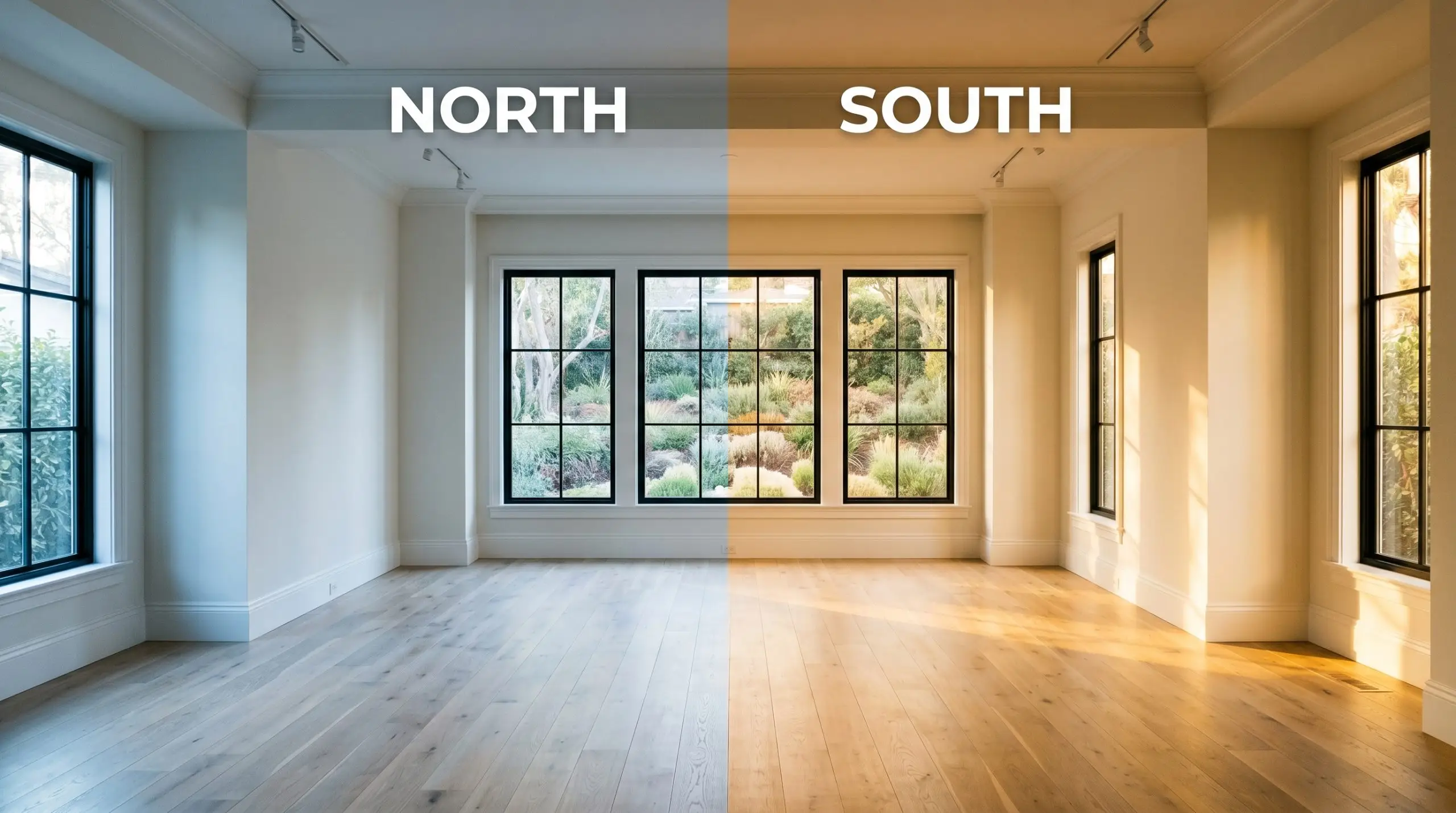
If your freshly painted room looks slightly too yellow at night, do not repaint immediately. Simply swap your warm 2700K lightbulbs for crisp 3000K LEDs to instantly pull the color back to a cleaner, neutral white.
Hackrea Lighting Secret (The Bulb Shift)
Real-World Applications for This Warm Off-White
A highly reflective white is the ultimate design tool for reshaping how a room feels. Instead of treating it as a default builder-grade choice, use it strategically to highlight your best architectural features and unify your materials.
Expanding Open-Concept Living Areas
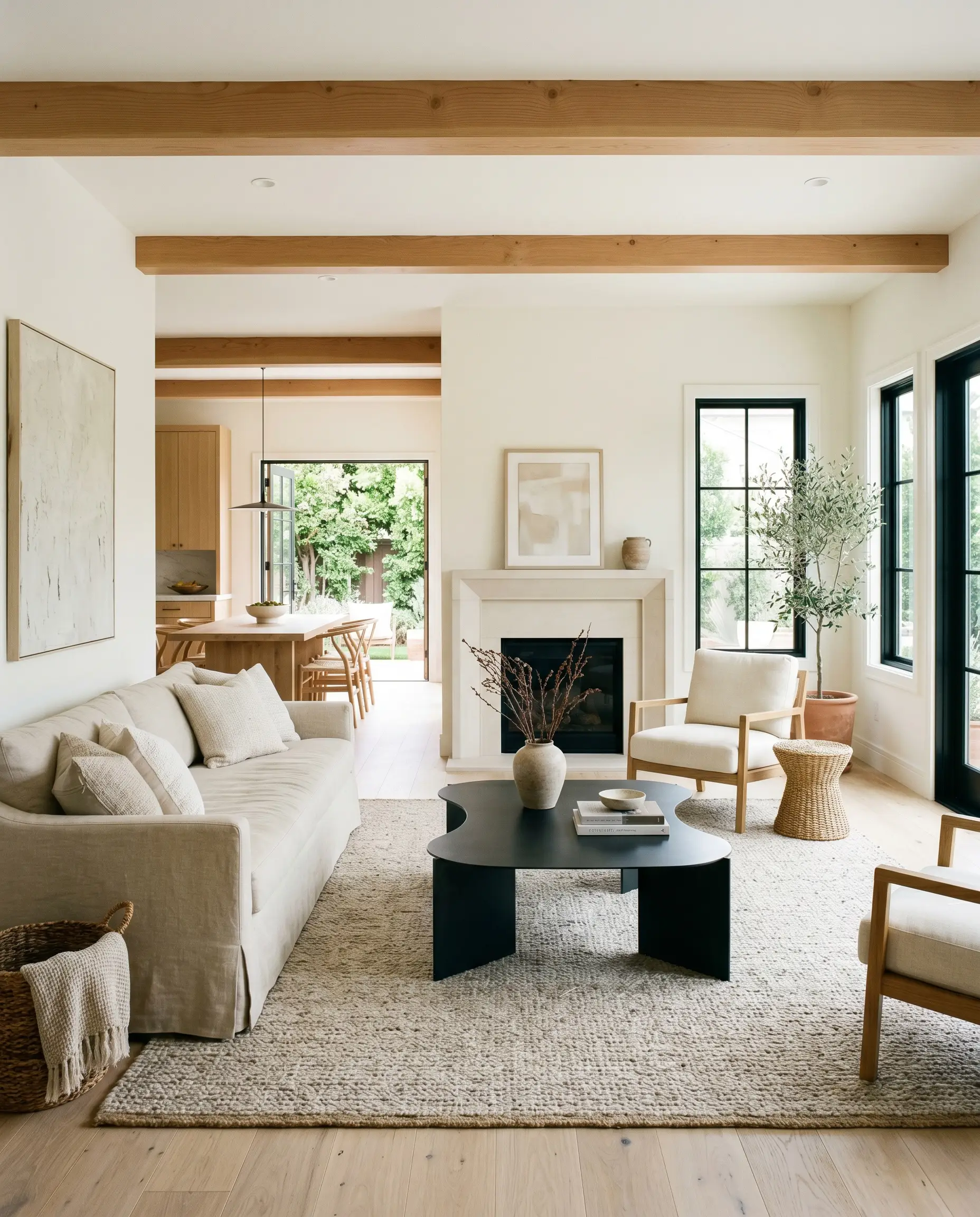
When wrapping an entire main floor, this shade establishes a cohesive, luminous flow. It prevents large, continuous walls from feeling empty or cold, making it perfect for busy households that need a durable but beautiful living space.
Pair it with bleached oak flooring and slipcovered washed linen sofas for a relaxed, transitional vibe. To introduce necessary visual tension, bring in matte black steel accents or a sculptural plinth coffee table.
Paint both the walls and the baseboards in the exact same color, but shift the finish. Use a flat or matte sheen for the walls and a satin for the trim. This creates a subtle, custom-built look that feels incredibly high-end.
Hackrea Pro-Tip (The Trim Trick)
Refreshing Kitchen Cabinetry
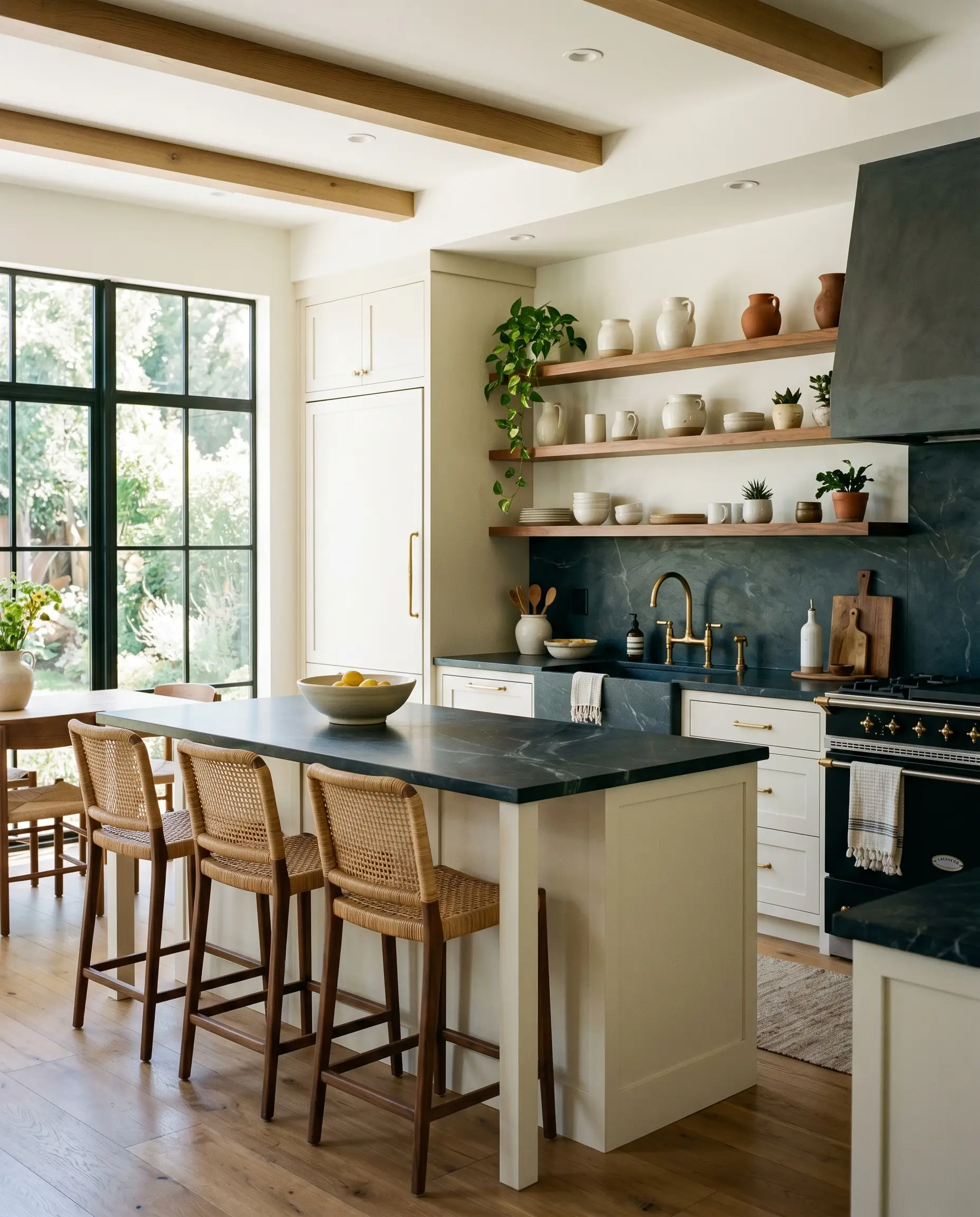
Applying this creamy tone to upper and lower cabinets instantly brightens a kitchen without making it feel like a commercial prep zone. It acts as a brilliant, soft counterpoint to hard, utilitarian surfaces.
Contrast the soft cabinets with dark soapstone counters and unlacquered brass hardware for an organic modern aesthetic. If you want a more layered look, install floating shelves in warm walnut to break up the cabinetry and display your favorite ceramic vessels.
Layering Texture in Bedrooms
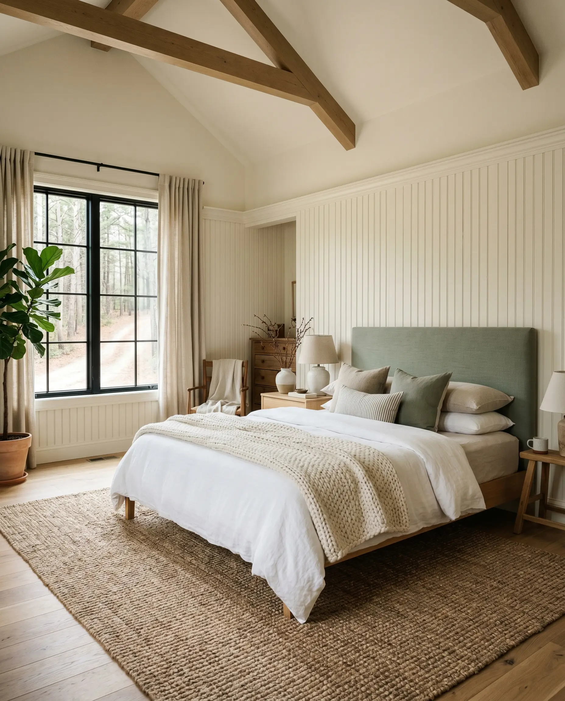
In a bedroom, the goal is restfulness, and this shade provides a gentle, soothing canvas for rich textiles. It allows your furnishings and fabrics to take center stage without competing for attention.
Introduce a chunky jute rug, heavy canvas curtains, and a muted sage upholstered headboard to build a Scandinavian-inspired retreat. If you are tackling a weekend project and installing picture molding or beadboard, color-drench the entire wall to modernize the traditional millwork.
Modernizing Exterior Siding and Trim
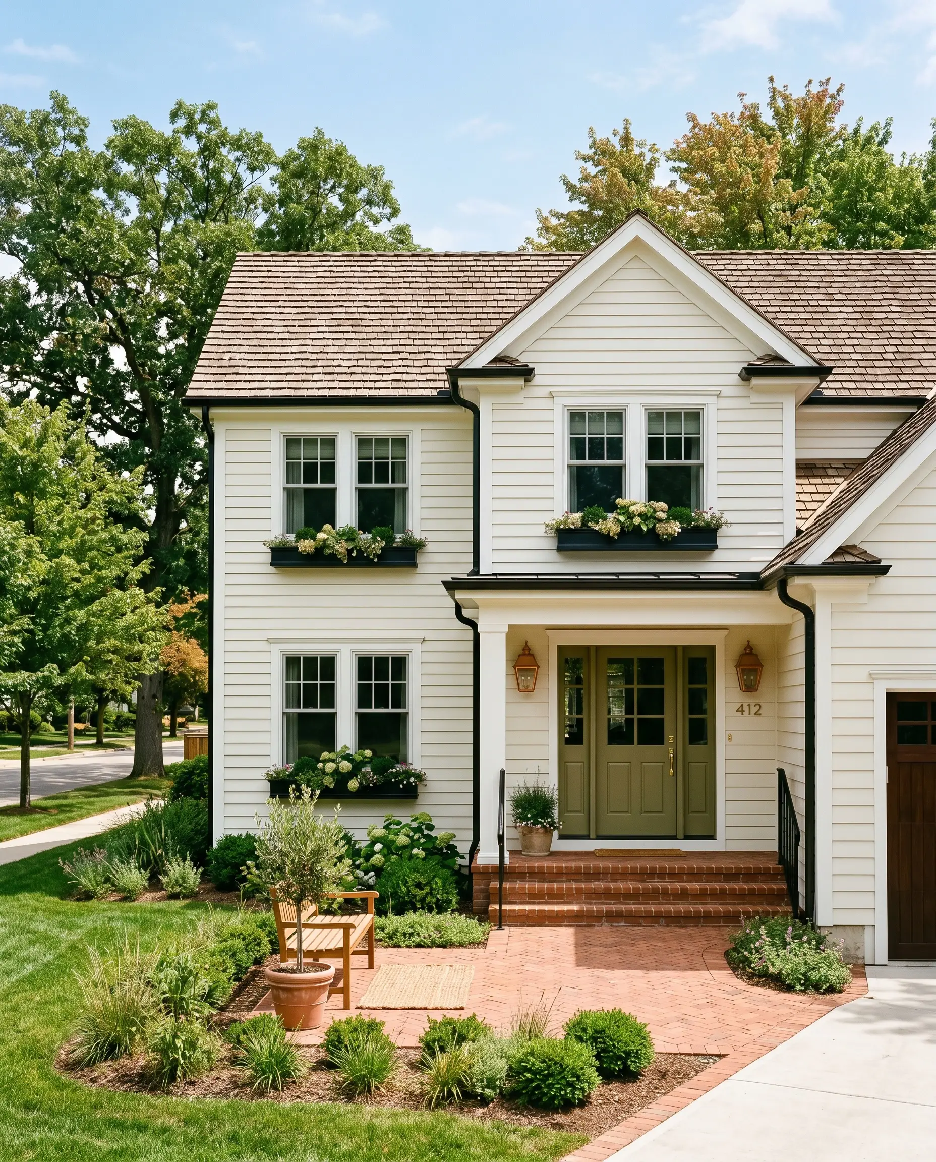
Using a high-LRV color on an exterior requires careful consideration because direct sunlight washes out subtle nuances. On a facade, this paint will read noticeably brighter and crisper than it does indoors.
It works brilliantly on classic clapboard or when painting over dated brick, offering a fresh, updated suburban aesthetic. Pair it with an olive green front door and copper exterior sconces for immediate, undeniable curb appeal.
Always check your roof color before committing to a warm white exterior. If your shingles have distinct cool gray or blue undertones, the creamy base of the siding can suddenly look dingy or yellowed by comparison. Ensure your hardscaping and roof lean toward warm or neutral tones.
Clash Warning (The Roofline Rule)
Building a Palette Around Behr Natural White
Because this shade carries a noticeable creamy undertone, its relational behavior depends entirely on the contrast you provide. It requires crisp, deliberate boundaries to hold its shape and prevent the room from feeling washed out. When placed next to highly saturated colors or crisp whites, it reveals a beautiful, soft radiance.
Selecting the Perfect Trim Finish
To maximize the impact of this warm off-white, you must frame it with a trim color that strips away any lingering dinginess. The right trim creates a structural boundary that makes the wall color feel intentional.
Tactile Materials and Hardware
The secret to elevating a standard room lies in how your paint interacts with physical textures. This specific off-white acts as a luminous canvas, meaning it desperately needs tactile materials to ground its brightness.
Secondary Palette Additions
When introducing secondary colors, you must select shades that balance the inherent warmth of your primary walls.
Curated Styling Concepts
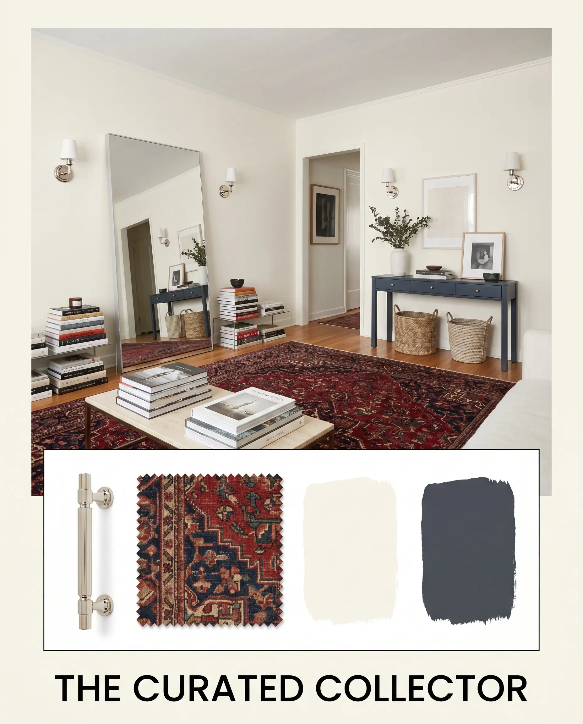
The Curated Collector This aesthetic thrives on the tension between crisp modernism and vintage soul. The off-white walls provide a gallery-like backdrop for a leaning floor mirror and stacked art books, allowing the decor to command attention. Introduce polished nickel wall sconces and a vintage portrait to establish a sophisticated, collected energy. Ground the brightness with deep, rich accents like a Benjamin Moore Hale Navy console table or a deeply saturated vintage rug.
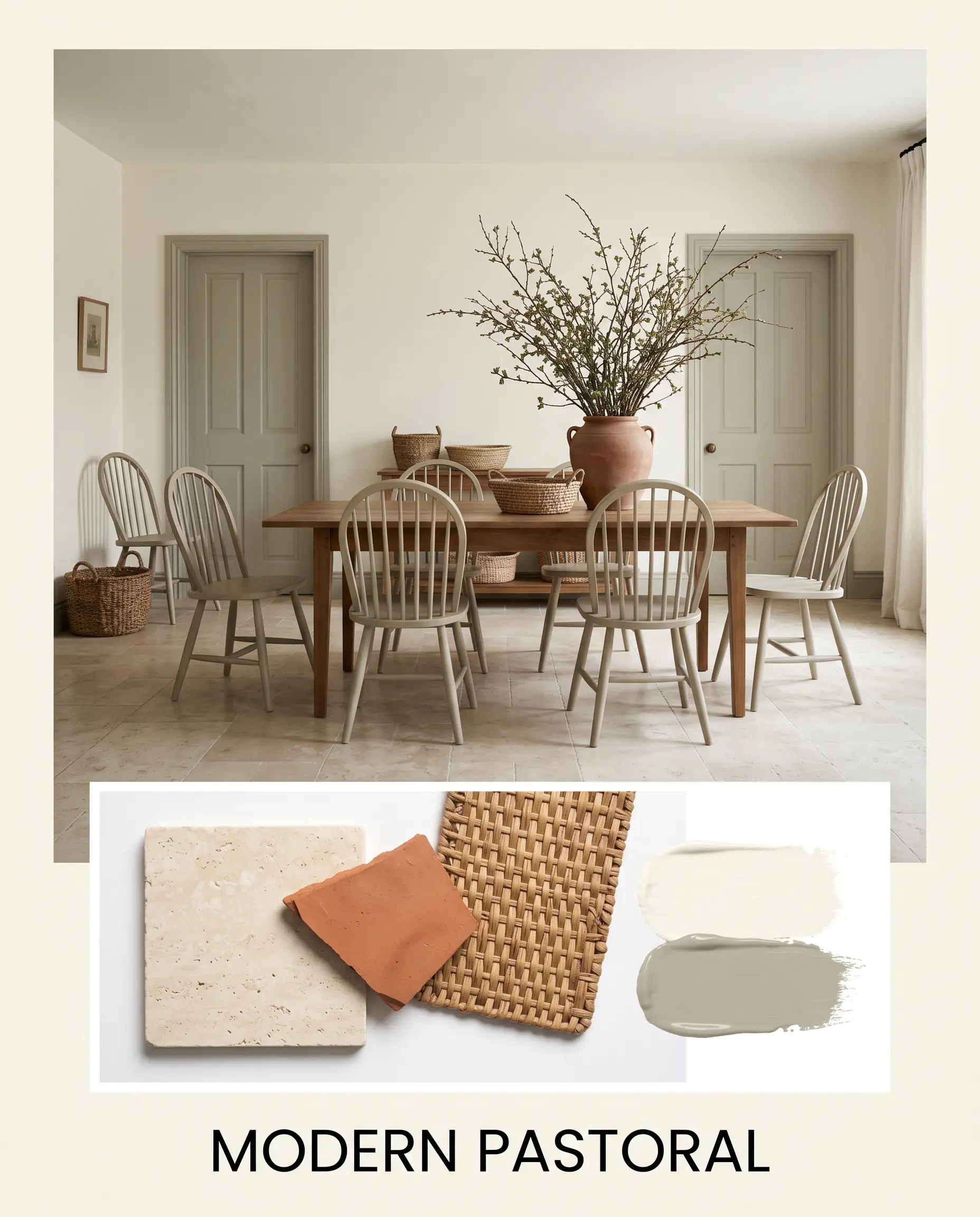
Modern Pastoral This palette feels incredibly grounded, organic, and effortlessly welcoming. The luminous walls soften the rustic edge of honed travertine floors and spindle-back chairs. Layer in woven baskets and oversized branches in terracotta pots to emphasize the natural, earthy vibe. To keep the styling from feeling dated, paint the interior doors in Farrow & Ball French Gray for a touch of muted, muddy contrast.
Head-to-Head Color Comparisons
Choosing the right white often comes down to analyzing the subtle differences in their foundational structure. If your space receives intense, direct southern light, or if your fixed finishes lean noticeably cool, you may need to pivot to a rival shade to achieve the right balance.
Behr Natural White vs. Benjamin Moore Simply White
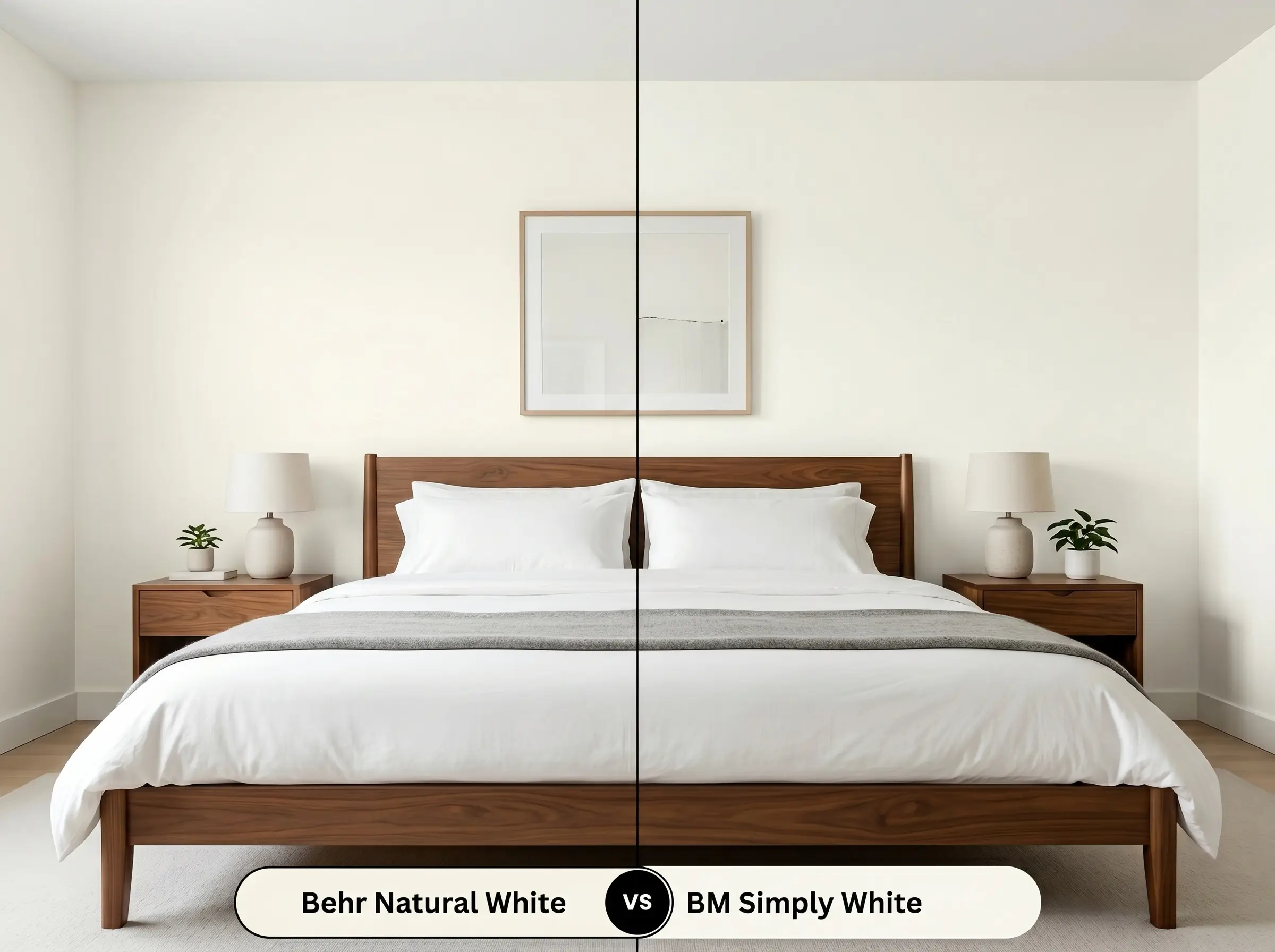
Simply White carries a much more pronounced, almost sunny yellow undertone compared to the Behr option. If your room is north-facing and feels inherently chilly, Simply White will inject more artificial sunshine into the space. However, if you want a softer, more restrained cream that feels slightly more muted, Behr Natural White is the safer choice.
Behr Natural White vs. Behr Swiss Coffee
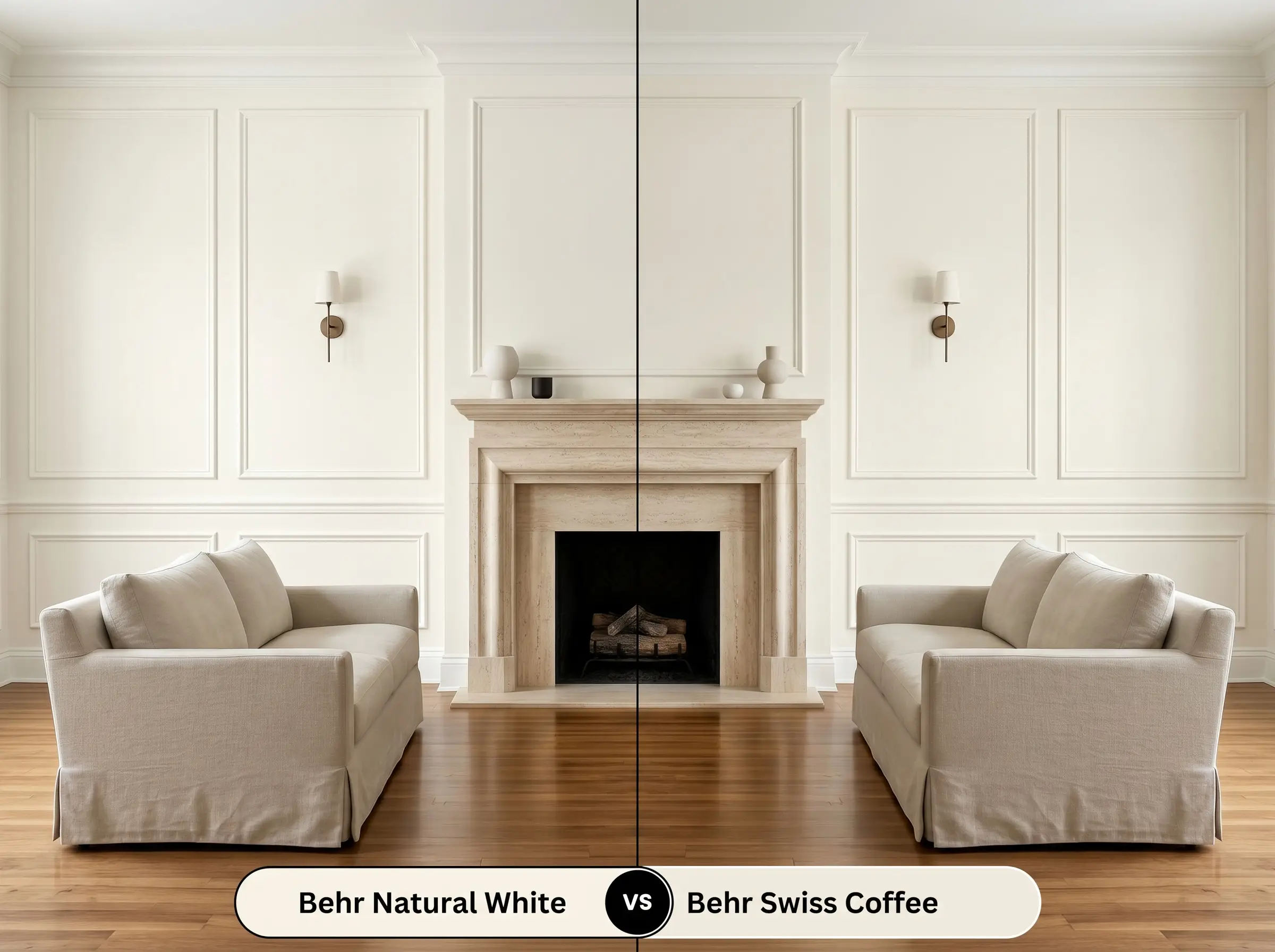
Swiss Coffee is noticeably deeper, earthier, and carries a subtle green-gray nuance that makes it feel older and more historic. If you are trying to modernize a space with crisp contrast, Natural White provides a much cleaner, brighter finish. Choose Swiss Coffee only if you want a visibly shaded, moodier off-white that acts more like a soft neutral than a true white.
Behr Natural White vs. Sherwin-Williams Alabaster
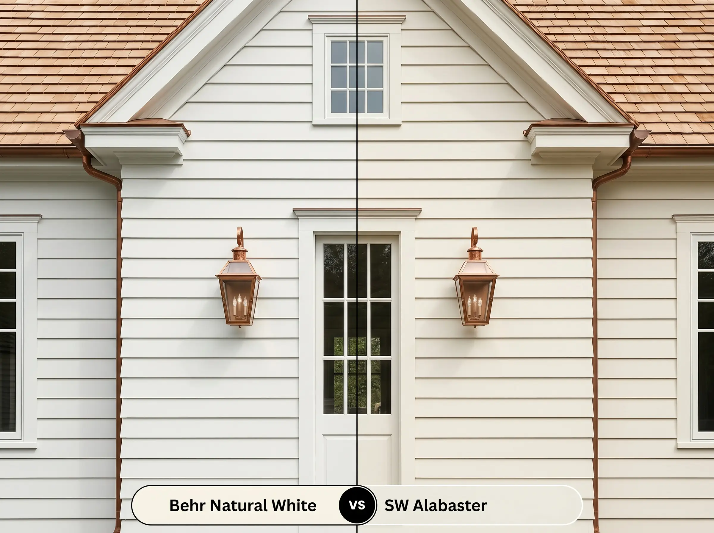
Alabaster is a legendary warm white, but it possesses a slightly lower LRV and a greige undertone that grounds it firmly on the wall. If you are painting exterior siding and fear the sun will wash out your color completely, Alabaster holds its pigment better in direct light. Indoors, Natural White will feel slightly more luminous and airy, making it better for expanding tight hallways.
Alternative Options to This Luminous Base
Sometimes a color looks perfect on a digital screen but reacts poorly to the specific lighting in your home. If this shade feels slightly off during your swatch testing, consider these highly reliable alternatives.
Same-Brand Variations
Matching Rivals
Professional Application of Behr Natural White
Moving from color theory to the physical reality of painting requires strategic planning. The way this paint cures and reflects light is heavily influenced by the sheen you select and the quality of your preparation.
Selecting the Right Sheen
Primer Strategy and Coat Requirements
Because this shade boasts a high LRV of 90, it does not possess the intense hiding power of a darker, heavily pigmented color. You must use a high-quality, bright white stain-blocking primer, especially if you are transitioning from a dark wall color or painting over raw wood. Skipping the primer will allow the old color to alter the final creamy undertone.
Expect to roll at least two generous coats to achieve a solid, opaque finish. When working with high-LRV whites, amateur painters often stretch the paint too thin on the roller, resulting in “flashing”—visible, uneven streaks where the sheen looks patchy. Keep a wet edge, apply the paint generously, and let it dry completely between coats for a flawless, professional result.
Frequently Asked Questions
Because direct sunlight intensifies warm undertones, this shade will absolutely lean into its creamy base outdoors. It will look like a soft, welcoming off-white rather than a blinding, stark white, making it a beautiful choice for traditional or coastal exteriors.
It performs remarkably well as long as you control the bulb temperature. Pair it with crisp 3000K to 3500K LED bulbs to maintain a clean, spa-like brightness, as overly warm 2700K bulbs will make the windowless space feel dingy and yellow.
Yes, color-drenching both surfaces in this shade creates a beautiful, expansive envelope. Just remember to use a flat finish on the ceiling to hide drywall flaws and an eggshell finish on the walls for everyday durability.
Its creamy base actually harmonizes beautifully with the golden tones of honey oak, softening the contrast rather than fighting it. If you use a stark, icy white, the oak will look aggressively orange, but this warm off-white creates a cohesive, intentional transition.
The Final Verdict on This Designer Collection Favorite
Behr Natural White is a masterful tool for homeowners who crave the expansive, clean feeling of a white room but refuse to live in a sterile environment. Its absolute best application is acting as a luminous, unifying canvas in open-concept living areas or reviving dated cabinetry with a soft, organic glow. It thrives in homes that lean into Transitional, Soft Modern, or Elevate Cottage aesthetics, effortlessly bridging the gap between crisp modern lines and warm, tactile materials.
This paint is not a universal solution for every home, and it will actively fight against cool-toned fixed elements. If your home features icy gray luxury vinyl plank flooring, blue-gray glass backsplashes, or Carrara marble with stark charcoal veining, the creamy base of this paint will immediately look yellowed and aged by comparison. You must pair this shade with earthy stones, warm woods, or richly saturated accent colors to ensure the palette feels intentional and cohesive.
Hackrea Design Secret (The Undertone Clash)
Closest Cross-Brand Equivalents
The absolute closest scientific color matches for Natural White across top paint brands.