Kitchen Wall Paint Color Trends 2026: The Year of Comfort & “New” Neutrals
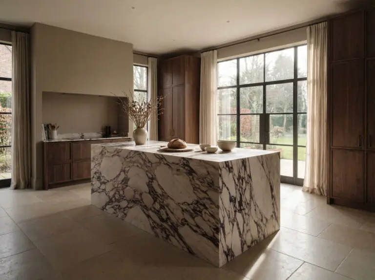
The era of the sterile, clinical kitchen is officially behind us. For years, we leaned on “safety” colors—stark bright whites and cool, detached grays—to keep our kitchens looking clean and resale-ready. But as we move into 2026, the script has flipped. The kitchen is no longer just a showroom for cooking; it is the emotional anchor of the home, a place that needs to feel as comfortable as a living room and as personal as a bedroom.
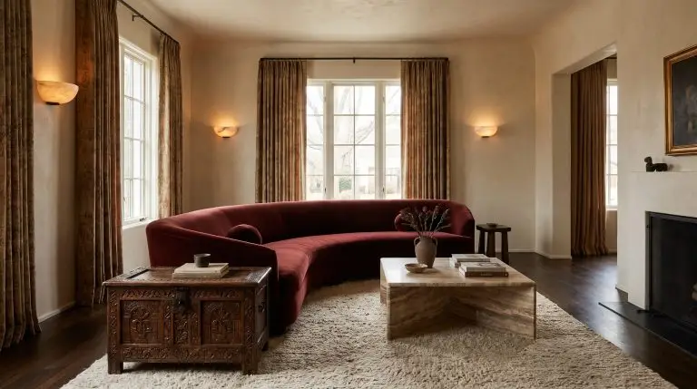
The headline for 2026 is “Cocooning.” We are seeing a massive shift toward colors that wrap you in warmth. We’re talking about “new” neutrals that feel like cashmere, greens that feel like a walk in a dense forest, and unexpected earthy tones that bring a sun-baked vitality to the heart of the home.
Whether you are planning a full renovation or just a weekend paint refresh, this guide will walk you through the exact shades, specific paint names, and professional styling secrets defining the paint color trends for 2026.
📋 At a Glance: 2026 Kitchen Color Cheat Sheet
(In a hurry? Here is the quick summary of what is trending this year.)
The “New” Neutrals: Warmth Without Yellow
If you take one thing away from the 2026 forecast, let it be this: Cool Gray is out. It had a long reign, but it often leaves a kitchen feeling cold and industrial. In its place, we are welcoming the “New Neutrals”—complex, layered shades that bridge the gap between beige and gray, offering warmth without veering into the buttery yellows of the early 2000s.
Mushroom & Taupe: The Top Trend
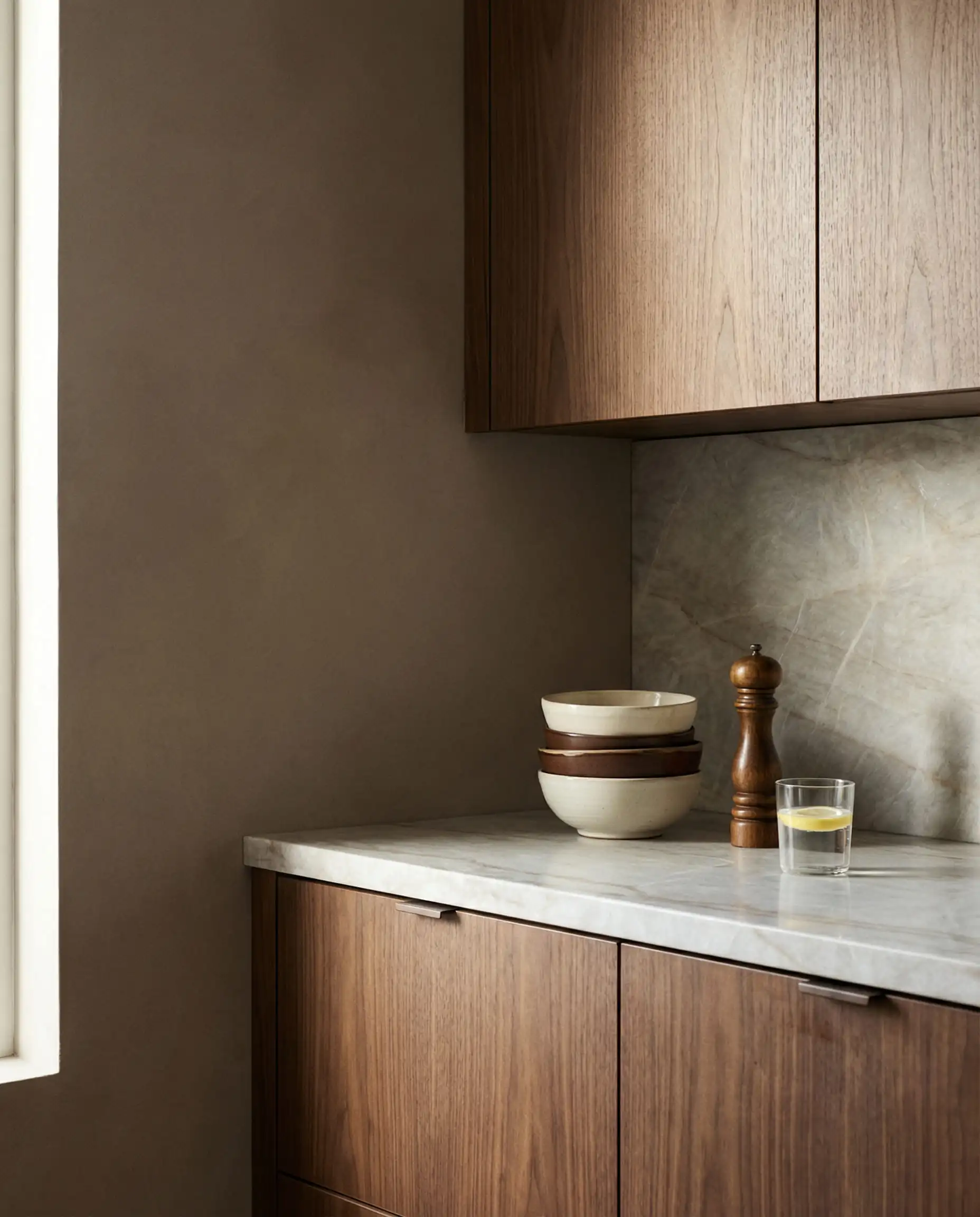
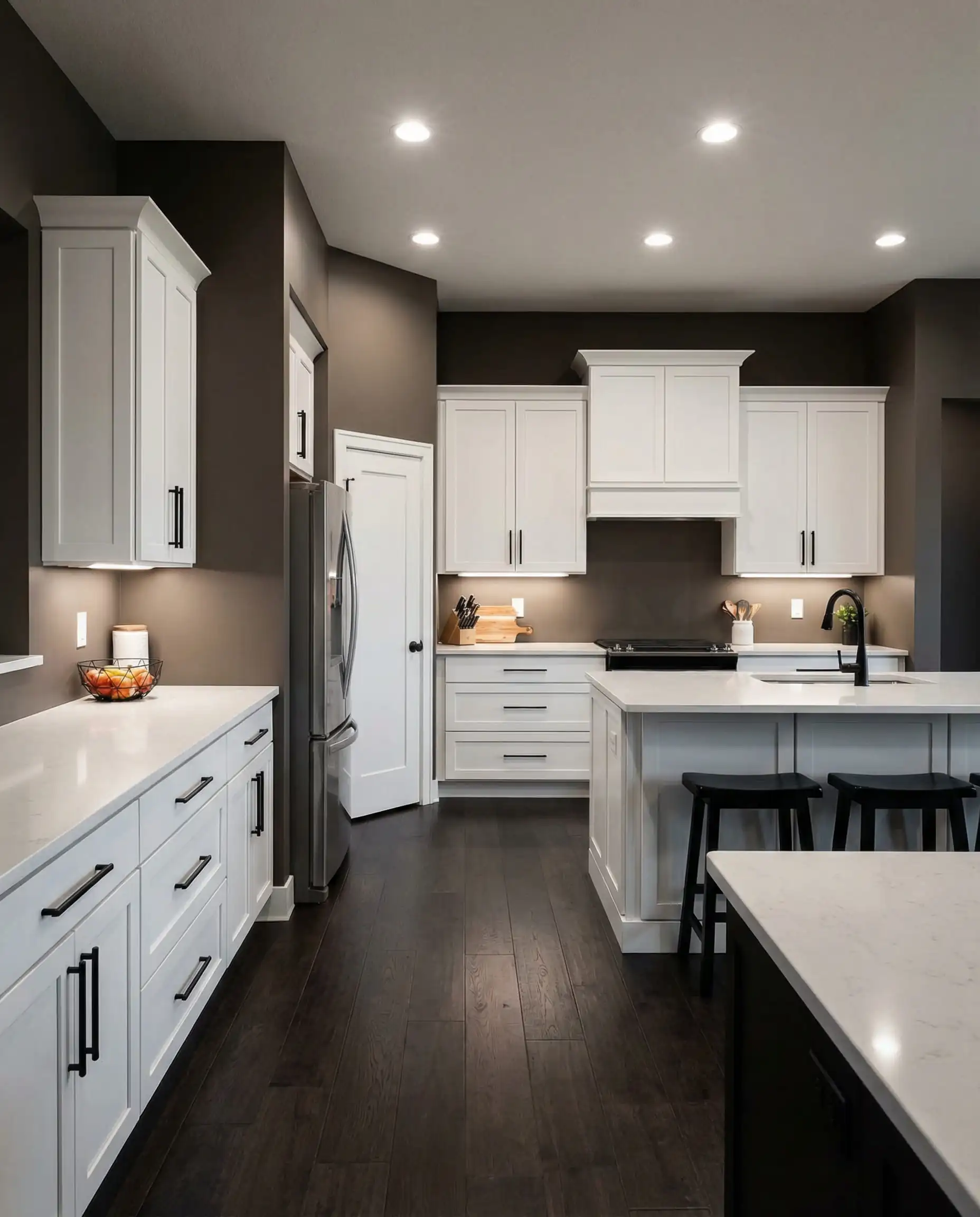
Mushroom is arguably the most important color of the year. It is an earthy, gray-brown (taupe) that changes beautifully with the light. Unlike a flat gray, mushroom has a red or violet undertone that makes it feel instantly cozy. It is the perfect middle ground for homeowners who find beige too traditional but gray too modern.
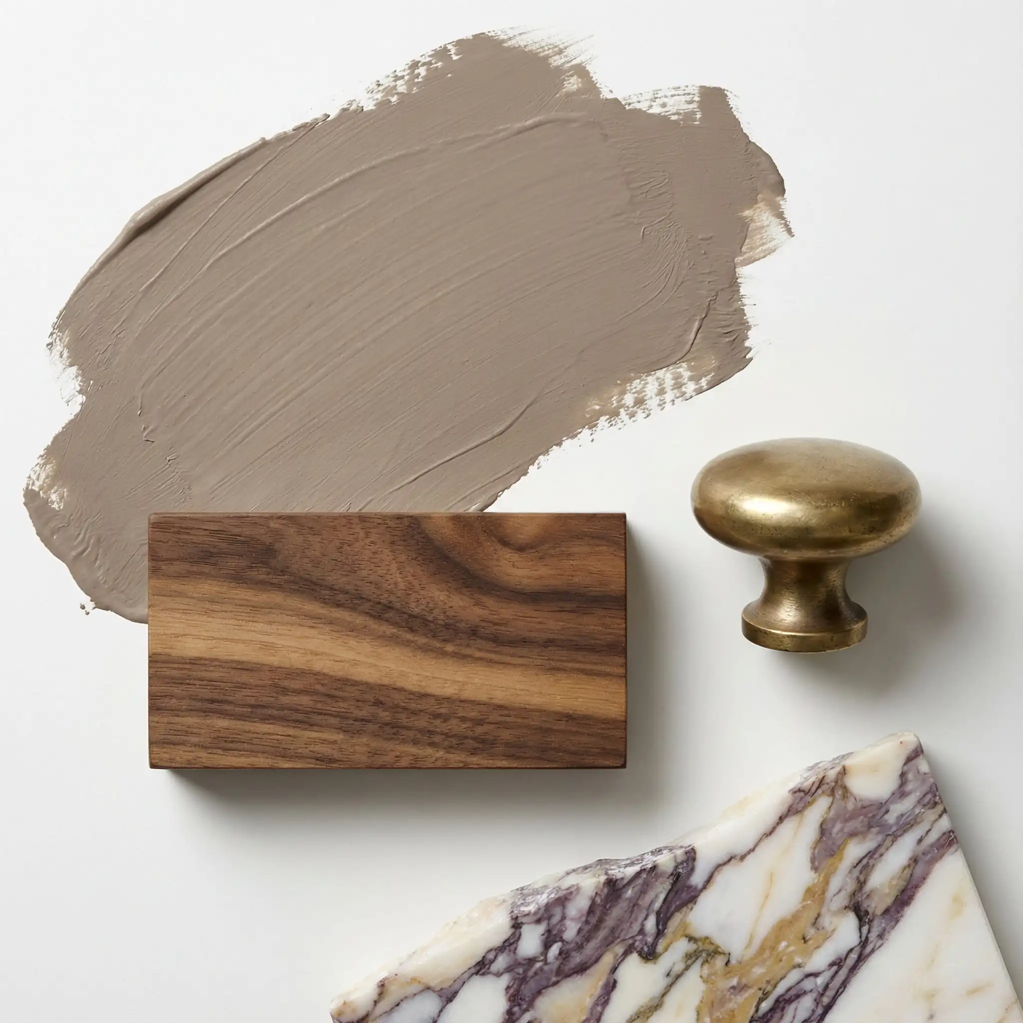
Why it works: Mushroom walls act as a bridge. They pair spectacularly with natural stone (like marble or quartzite) and are the absolute best friend of wood cabinetry. If you have walnut or white oak cabinets, a mushroom wall color will highlight the wood’s grain rather than fighting against it.
Top Paint Picks for 2026:
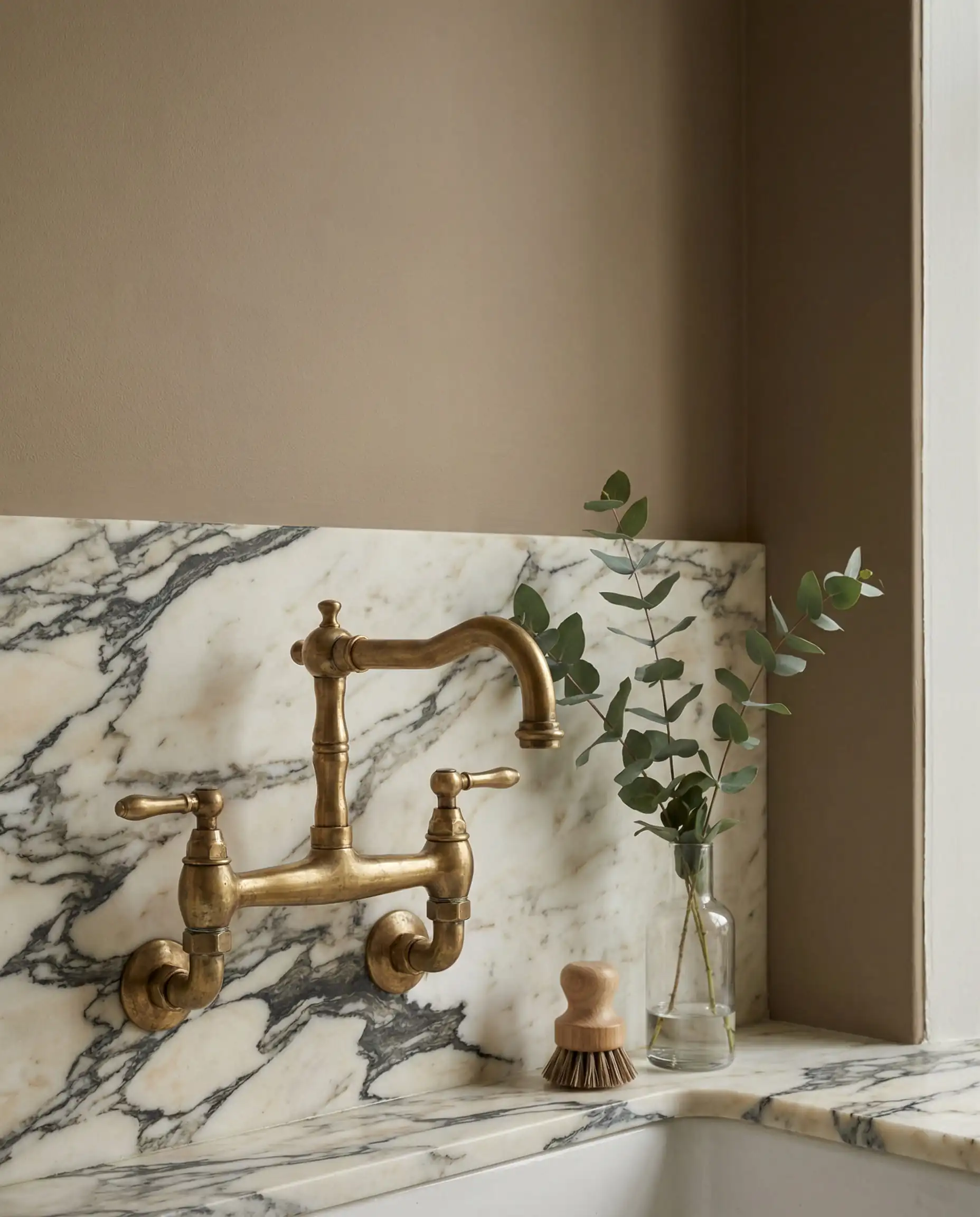
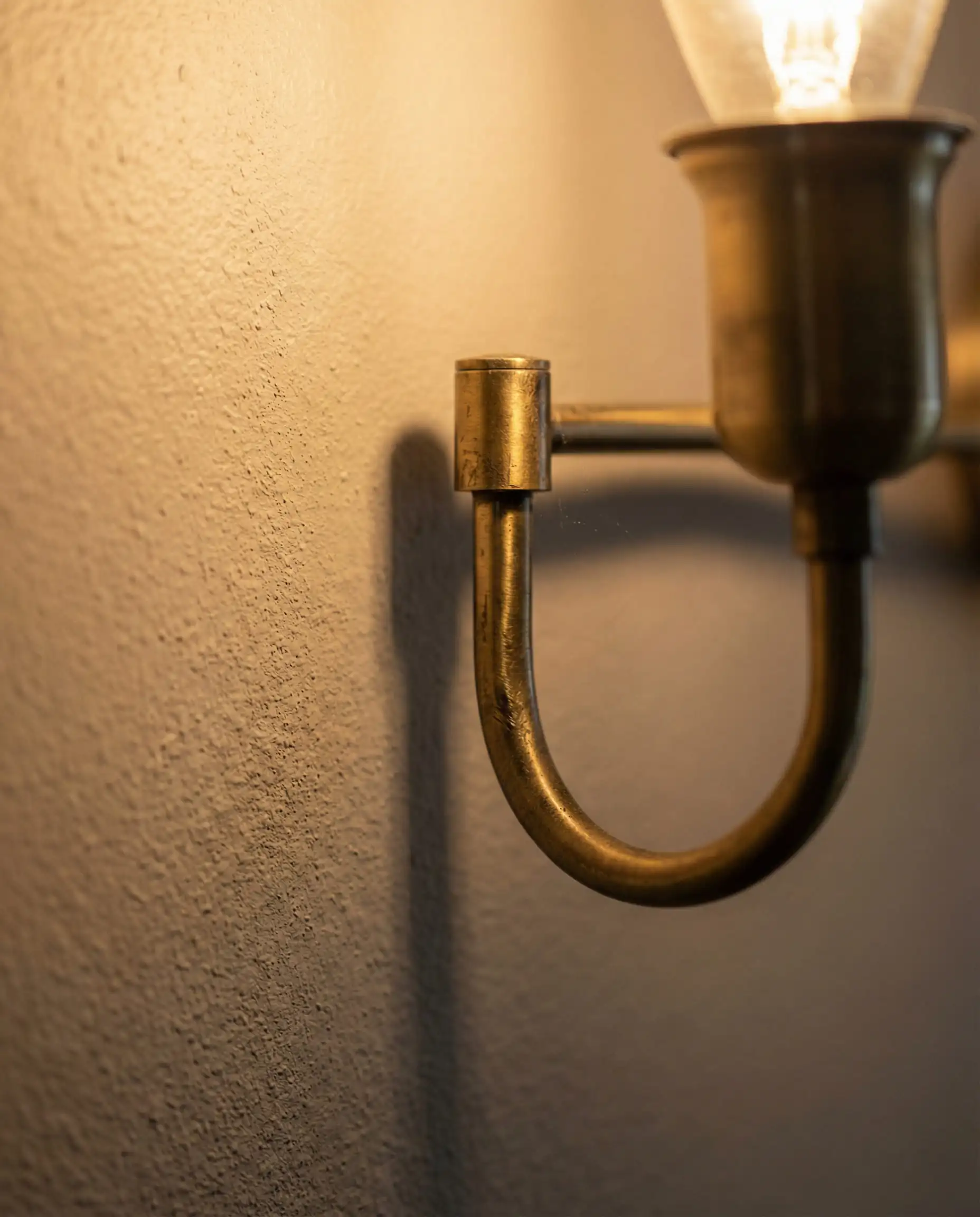
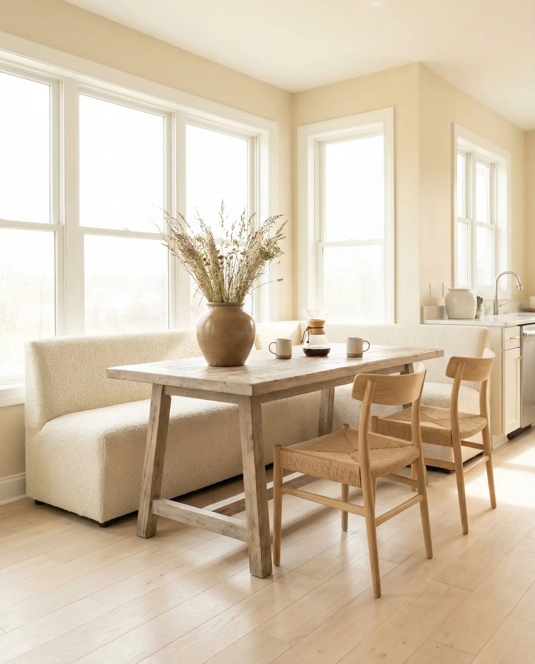
When using matte Mushroom paint, pair it with glossy elements—like a zellige tile backsplash or polished quartz—to prevent the room from feeling “dusty” or flat. The contrast in texture brings the neutral color to life. ✨
💡 Designer Tip
Sandstone & Stony Creams
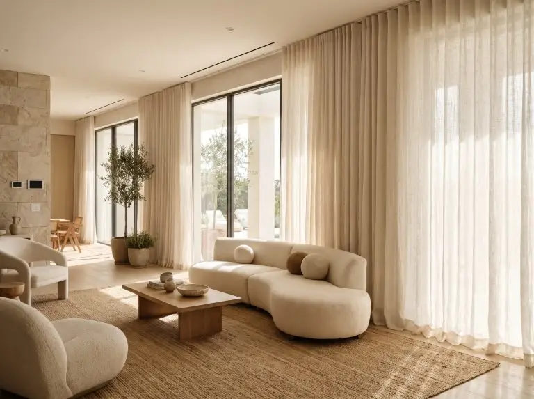
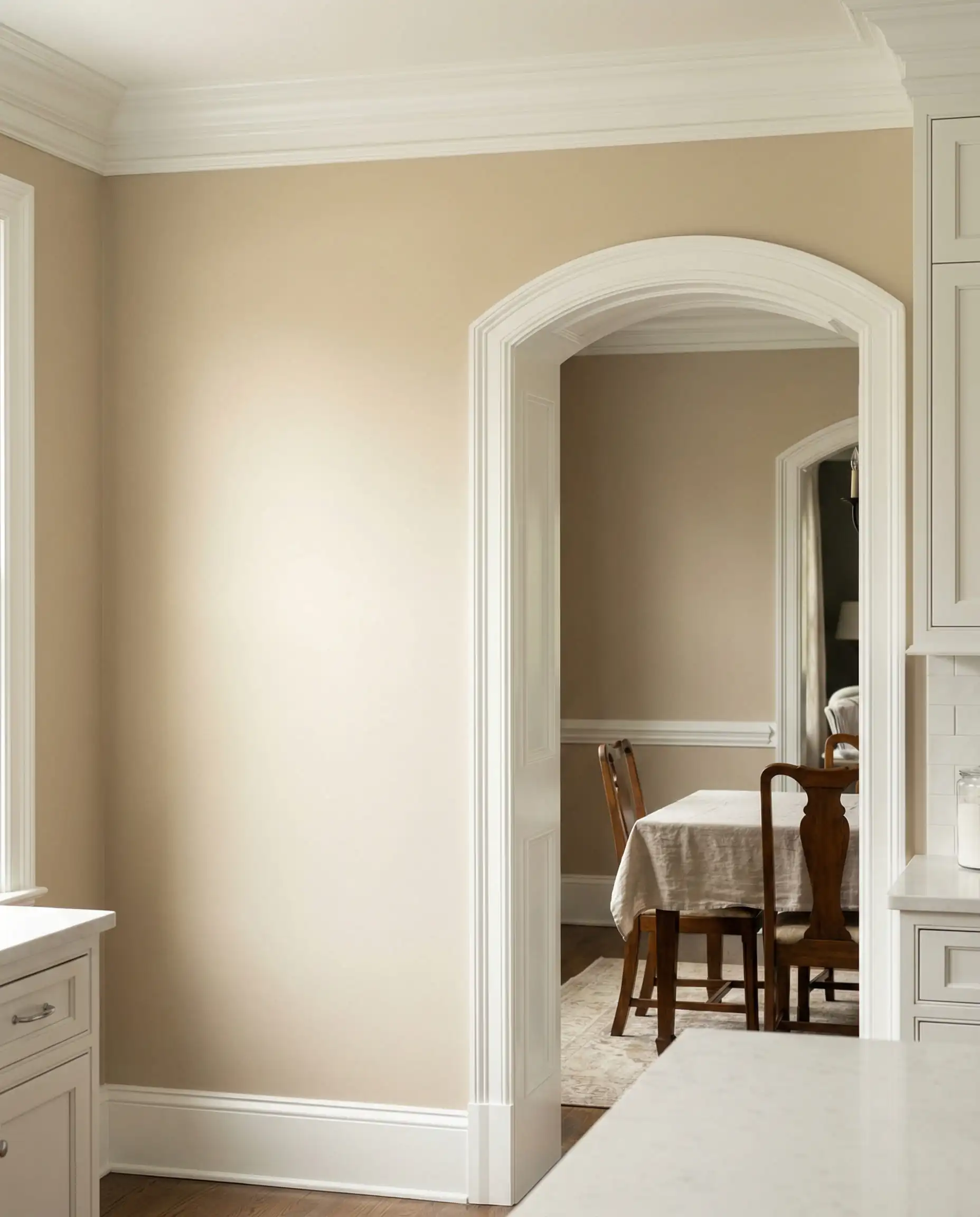
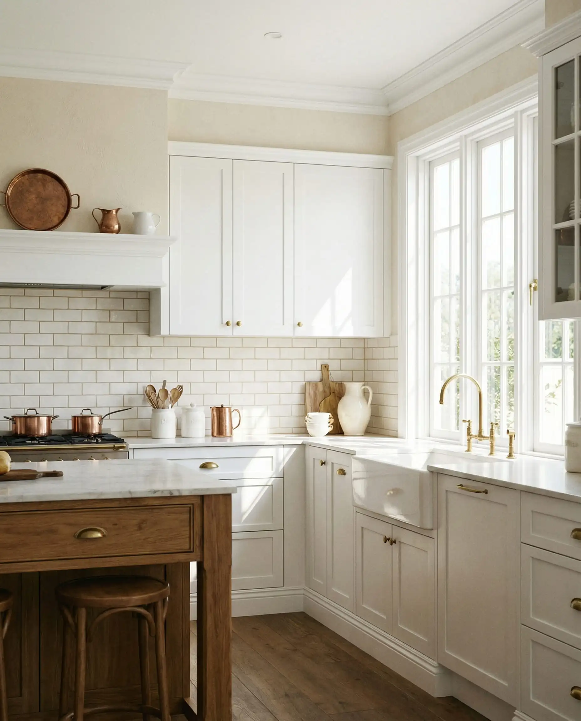
Move over, bright white. The “gallery white” look is softening into something more tactile. Think of the color of limestone, sandstone, or unbleached linen. These colors add depth and texture to the walls, preventing the room from feeling flat. They are incredibly forgiving, hiding scuffs and fingerprints better than pure white, and they make a kitchen feel established and timeless.
How to style it: These shades shine in kitchens with mixed metals. Pair sandstone walls with unlacquered brass hardware or matte black fixtures to create a look that feels curated, not catalog-bought.
Top Paint Picks for 2026:
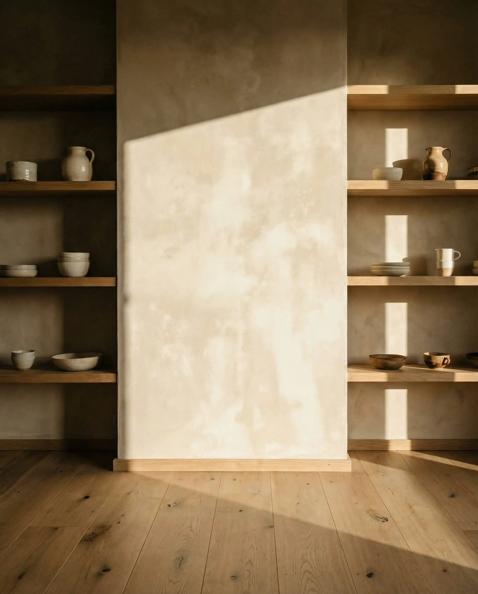
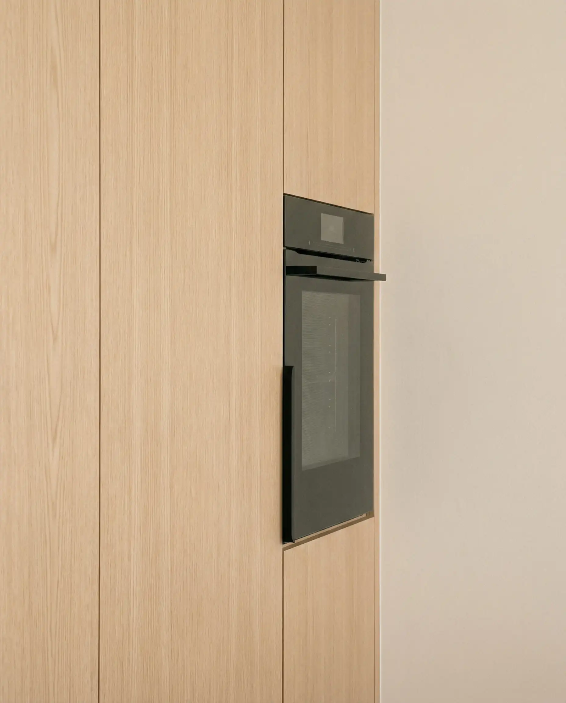
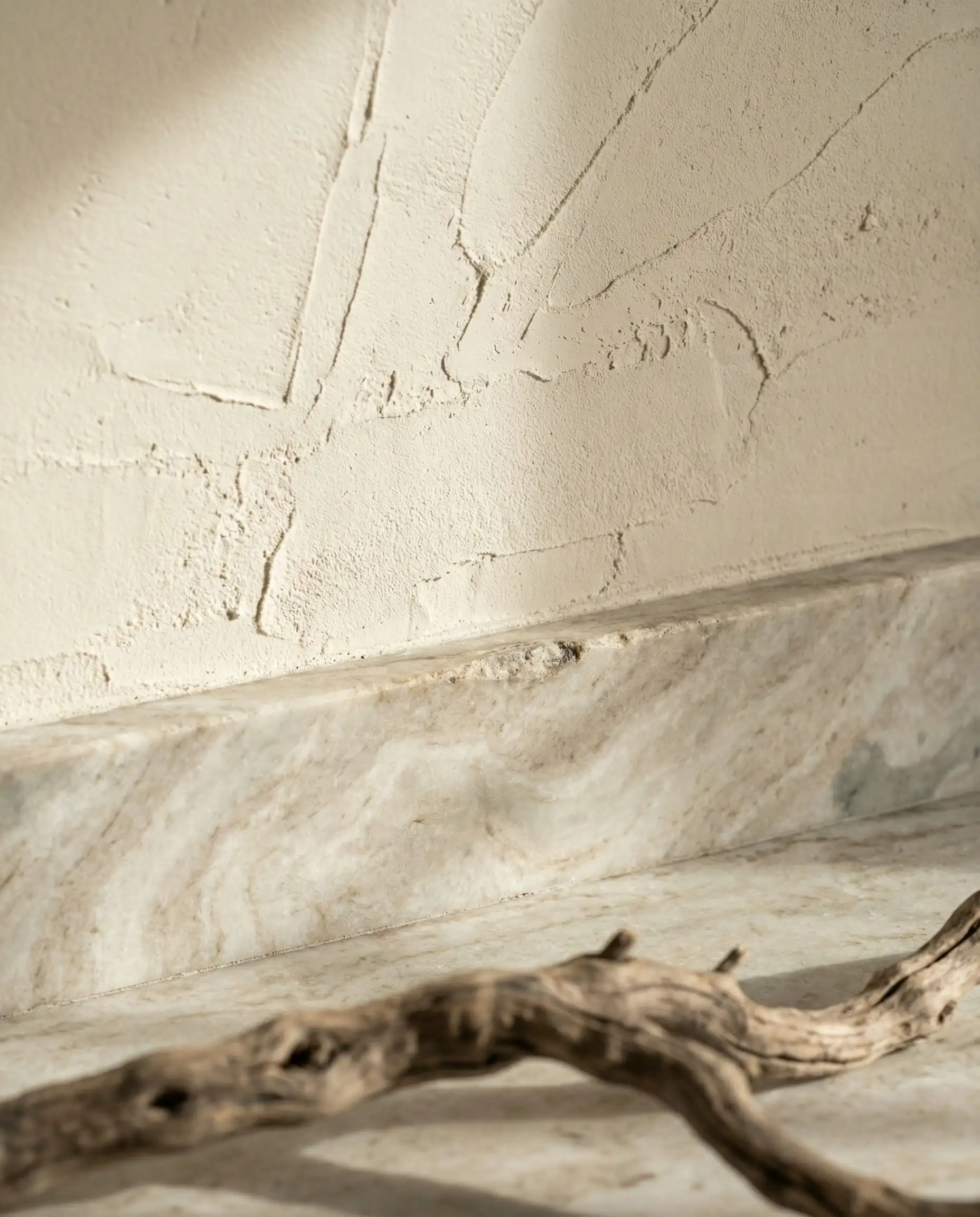
If you are updating your walls, consider how they interact with your storage. For a cohesive look, check out our guide on kitchen cabinet color trends to ensure your new wall color complements your joinery.
🖼️ Styling Insight
Nature-Inspired Greens: Darker & Muddier
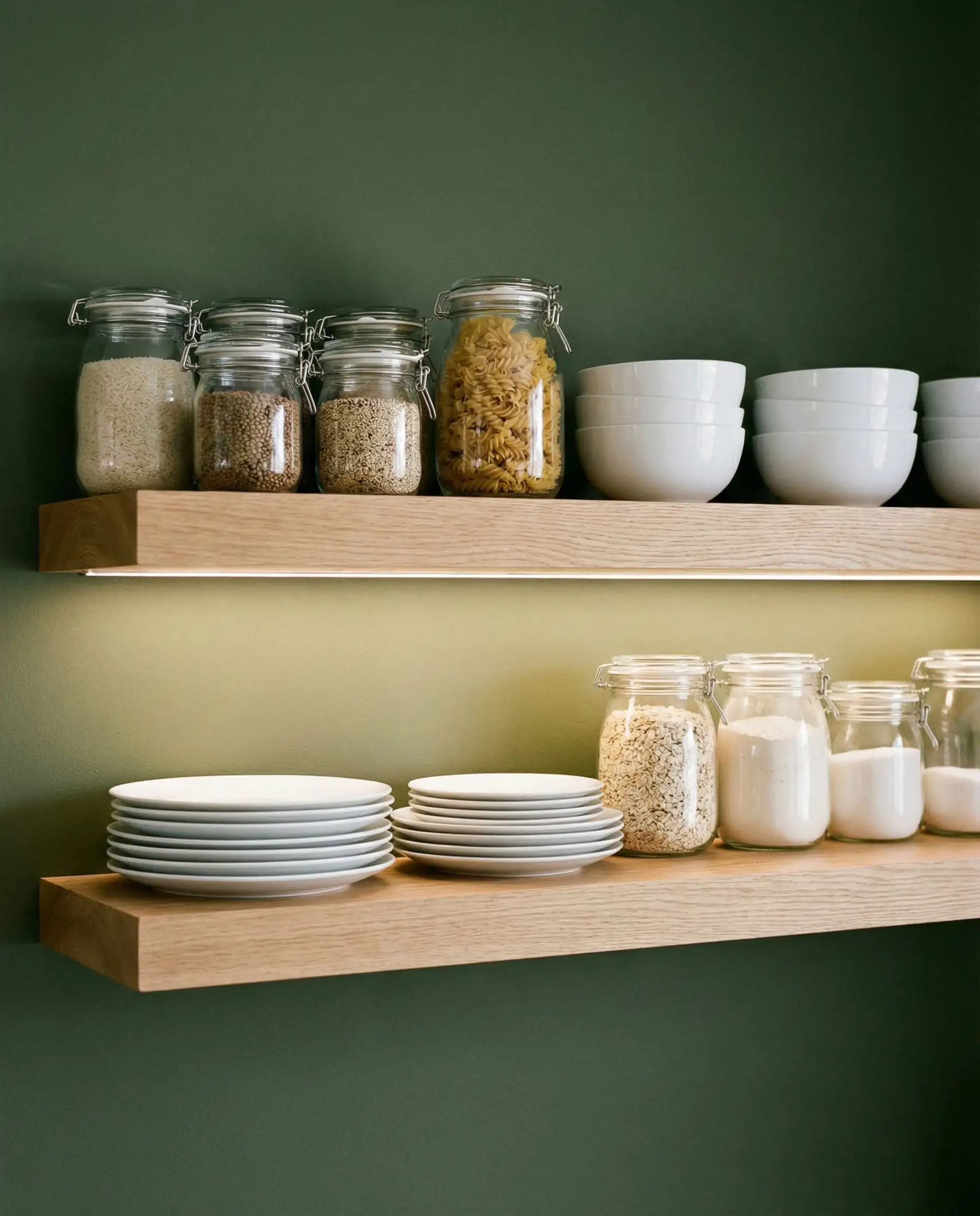
Green has been a kitchen staple for a few years, but the 2026 evolution is distinct. We are moving away from the bright, herbal “spring” greens and settling into deeper, “muddier” tones. These colors feel rooted in the earth—less like a fresh leaf and more like the moss on an ancient oak tree.
Earthy Olive
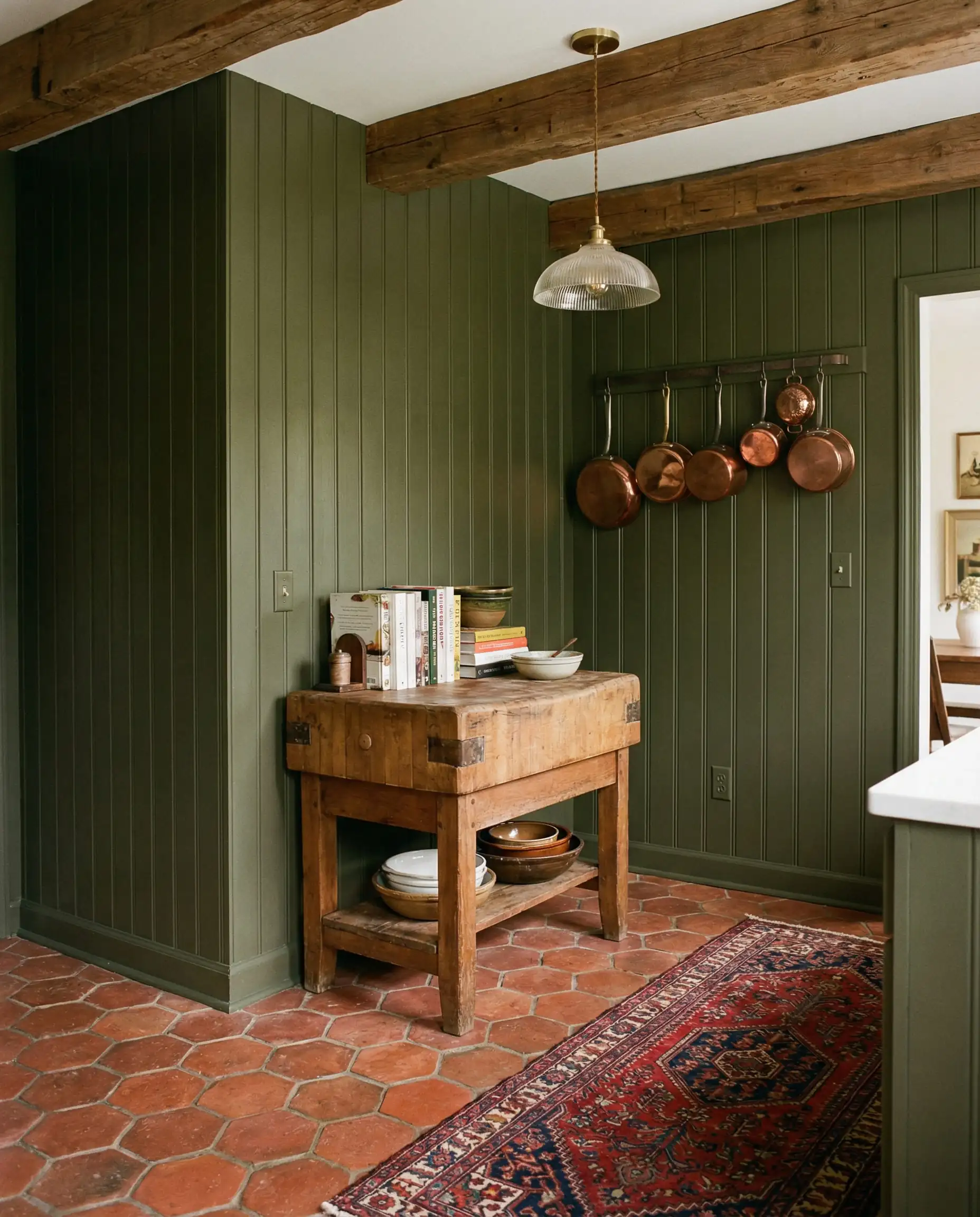
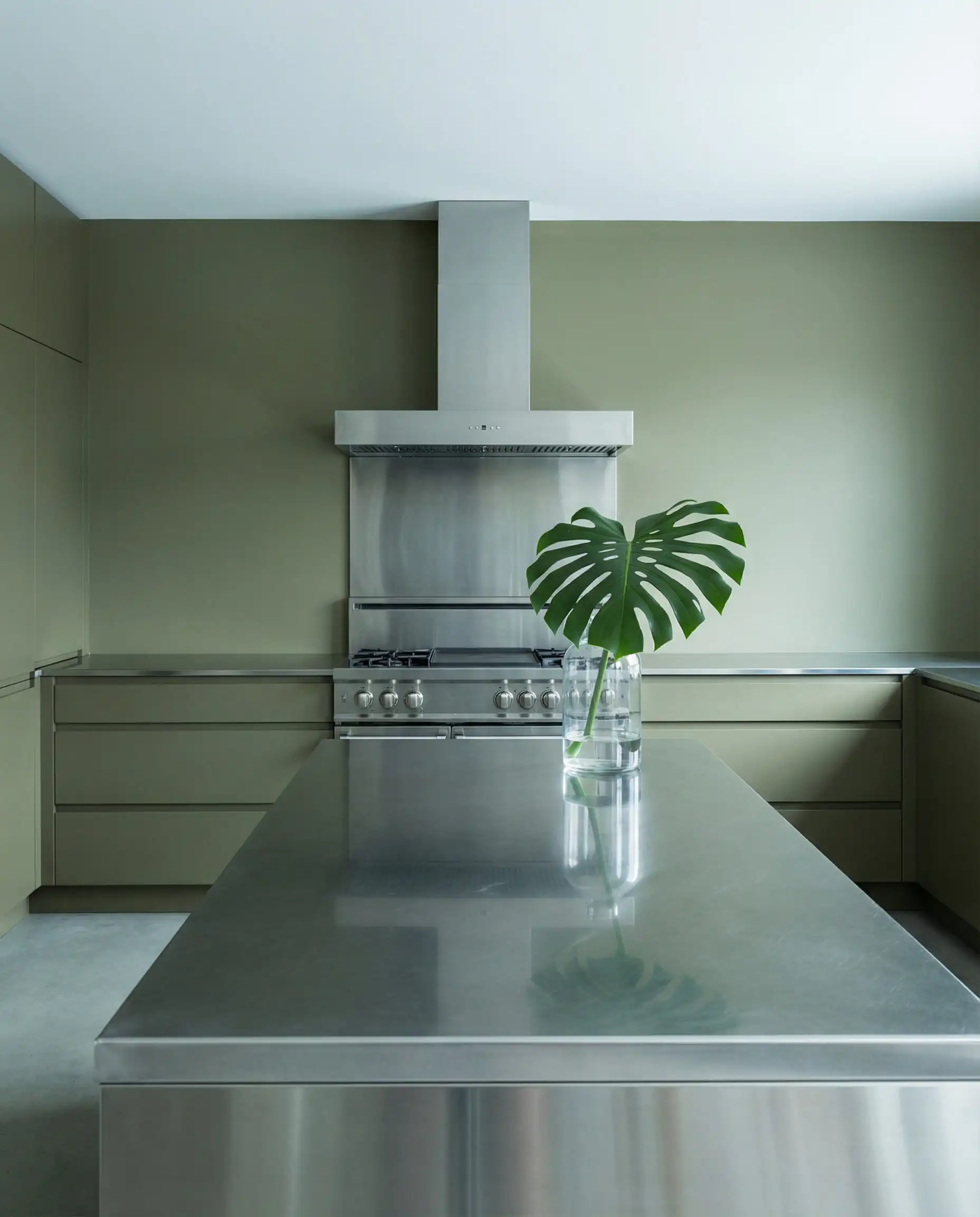
Olive green is becoming the new navy blue—a color so versatile it acts as a neutral. In 2026, olive tones are getting browner and more muted. This “muddying” effect makes the color easier to live with; it’s soothing rather than stimulating.
This shade works wonders in historic homes or farmhouses, but it also adds a necessary touch of organic softness to sleek, modern apartments. It pairs beautifully with terracotta floor tiles and warm wood countertops.
Top Paint Picks for 2026:
Midnight & Blackened Teal
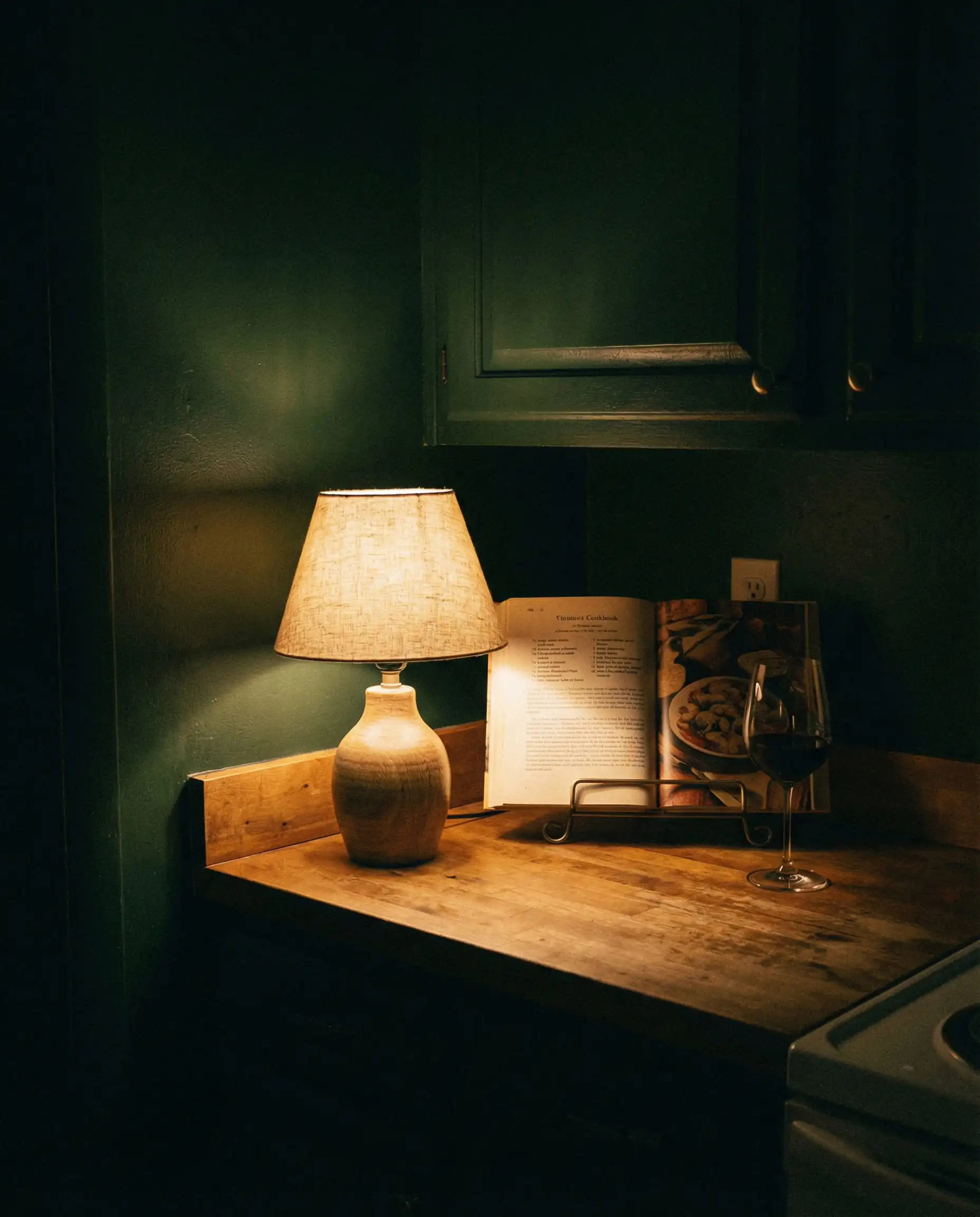
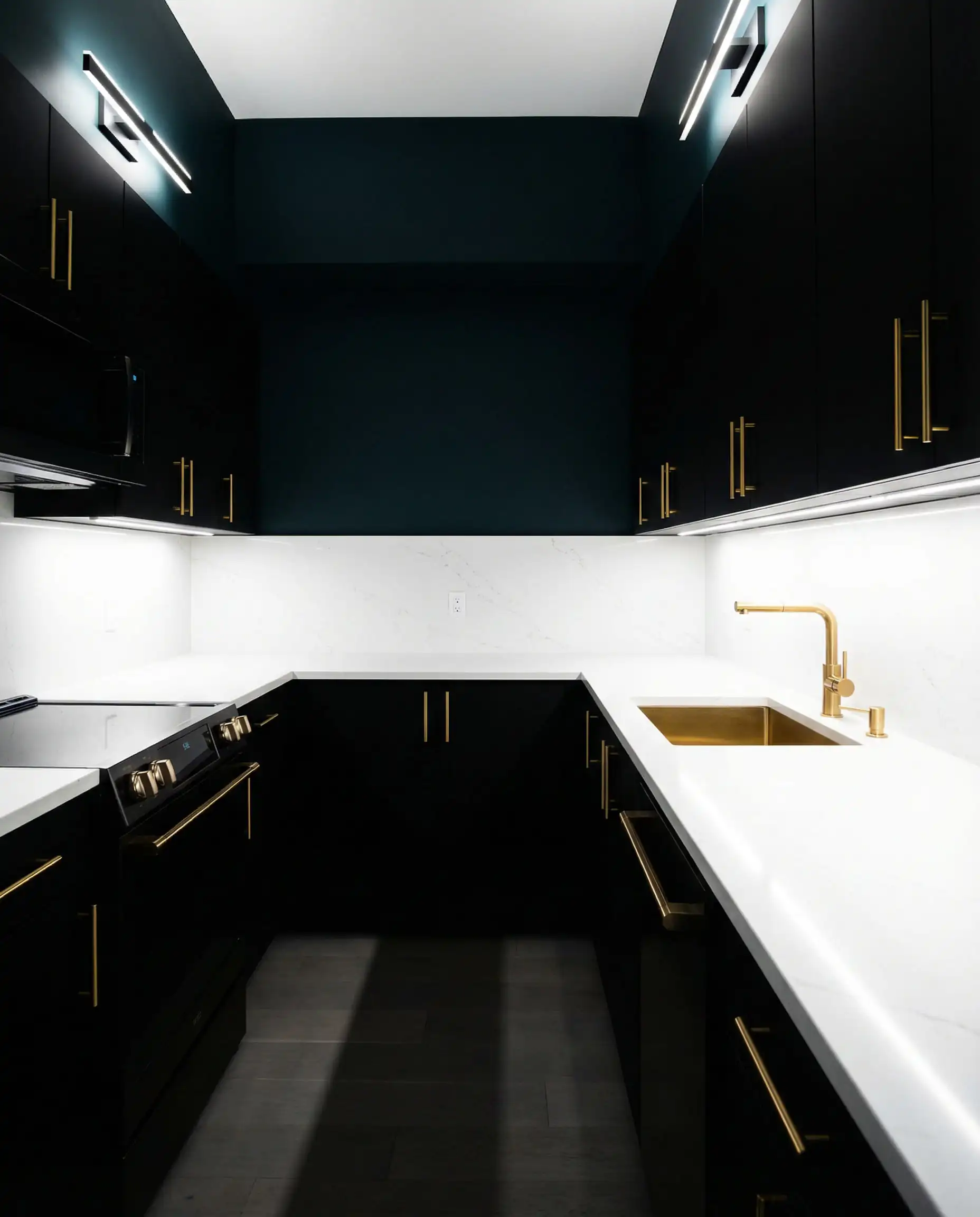
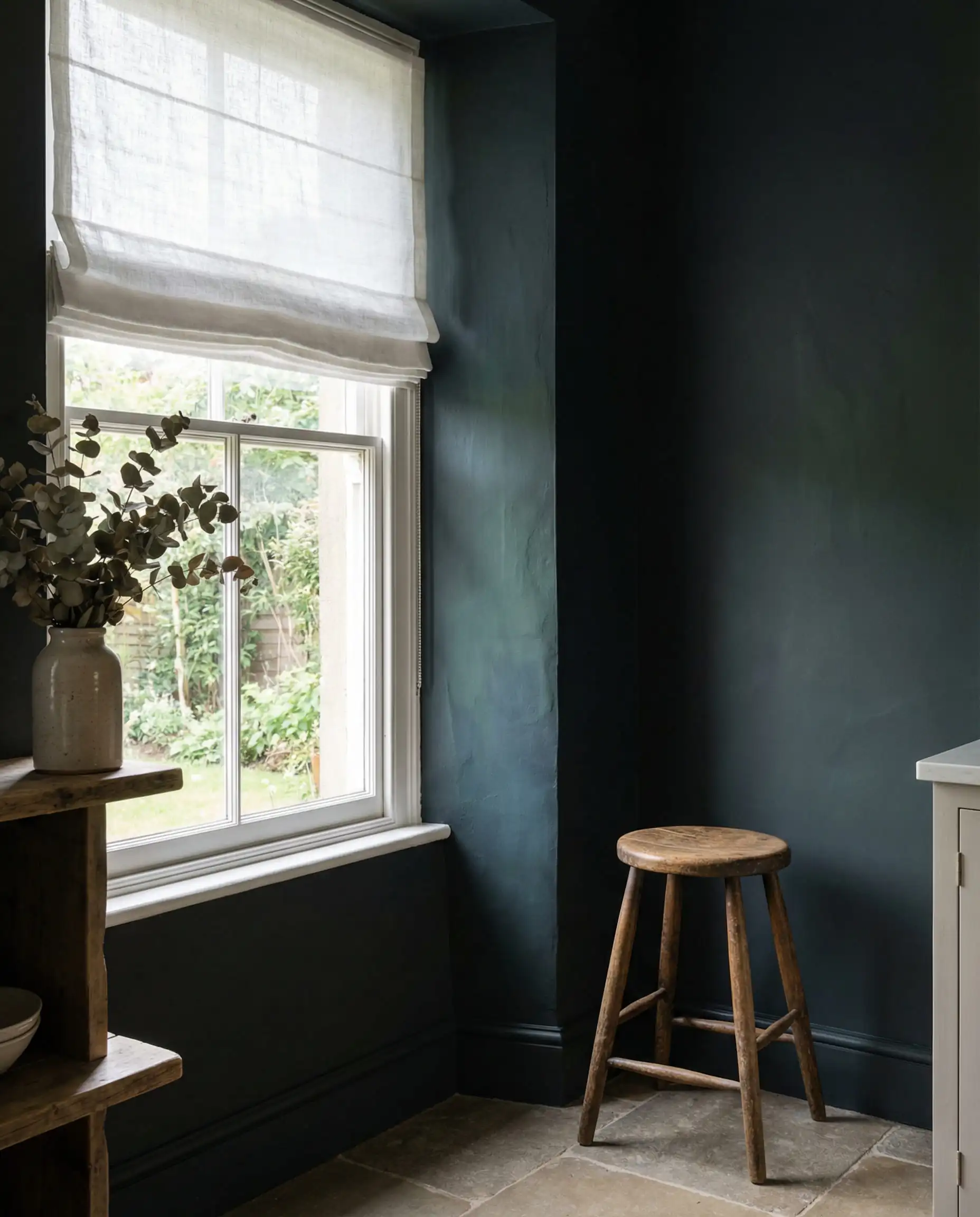
For those craving drama, the “Tuxedo Kitchen” (black and white) is evolving into something richer. Instead of harsh black, designers are turning to “Blackened Teal” or “Midnight Green.” These are colors that look black in low light but reveal a stunning, deep jewel tone when the sun hits them.
This trend is perfect for “Color Drenching” (more on that later) or for creating a moody, intimate atmosphere in a kitchen that is used more for evening entertaining than morning cereal.
Top Paint Picks for 2026:
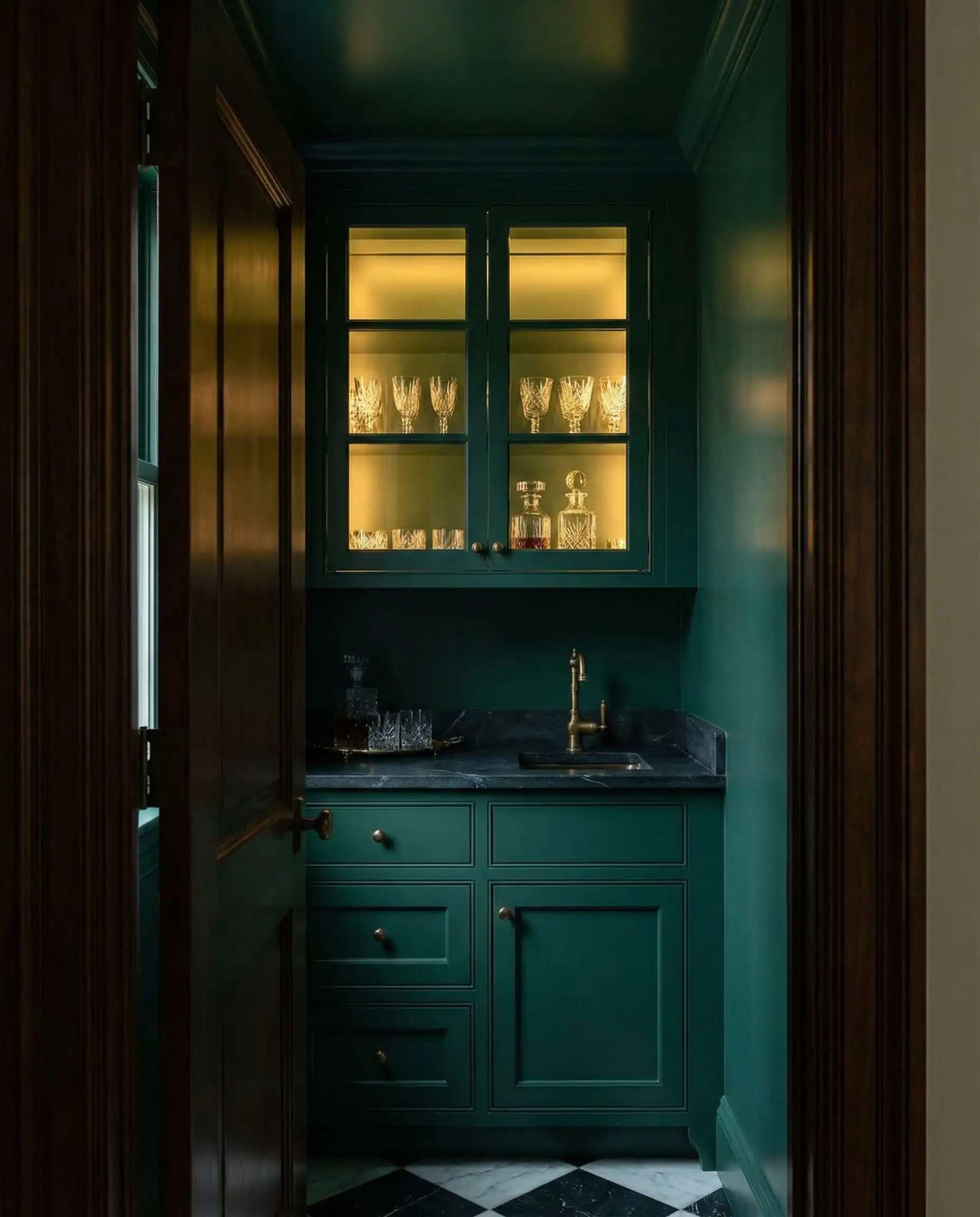
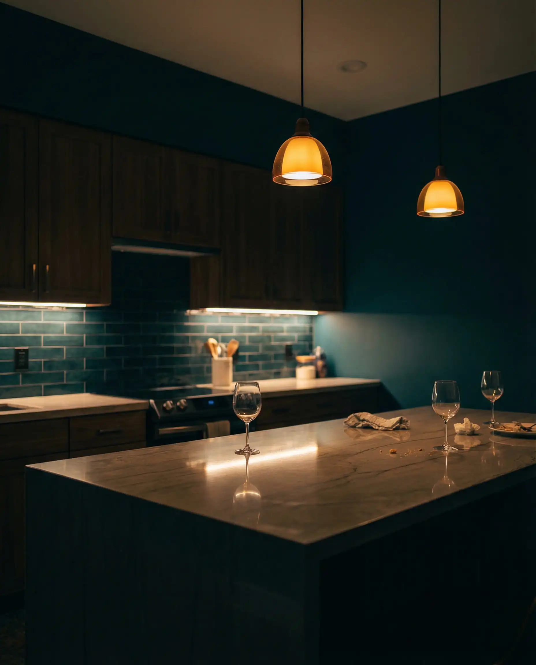
Dark greens love warm metals. Swap out chrome or nickel hardware for Aged Brass or Copper. The warmth of the metal pops against the cool, dark paint, creating a luxurious “jewelry box” effect. 🕰️
🗝️ Designer Tip
The Warmth Revival: Reds, Browns & Yellows
Perhaps the most surprising shift in 2026 is the return of warm, sun-baked hues. After a decade of cool tones, our eyes are craving the vitamin D of interior design. This isn’t about neon brights; it’s about colors that feel “cooked” or baked in the sun.
Bronze Ochre & “Old Gold”
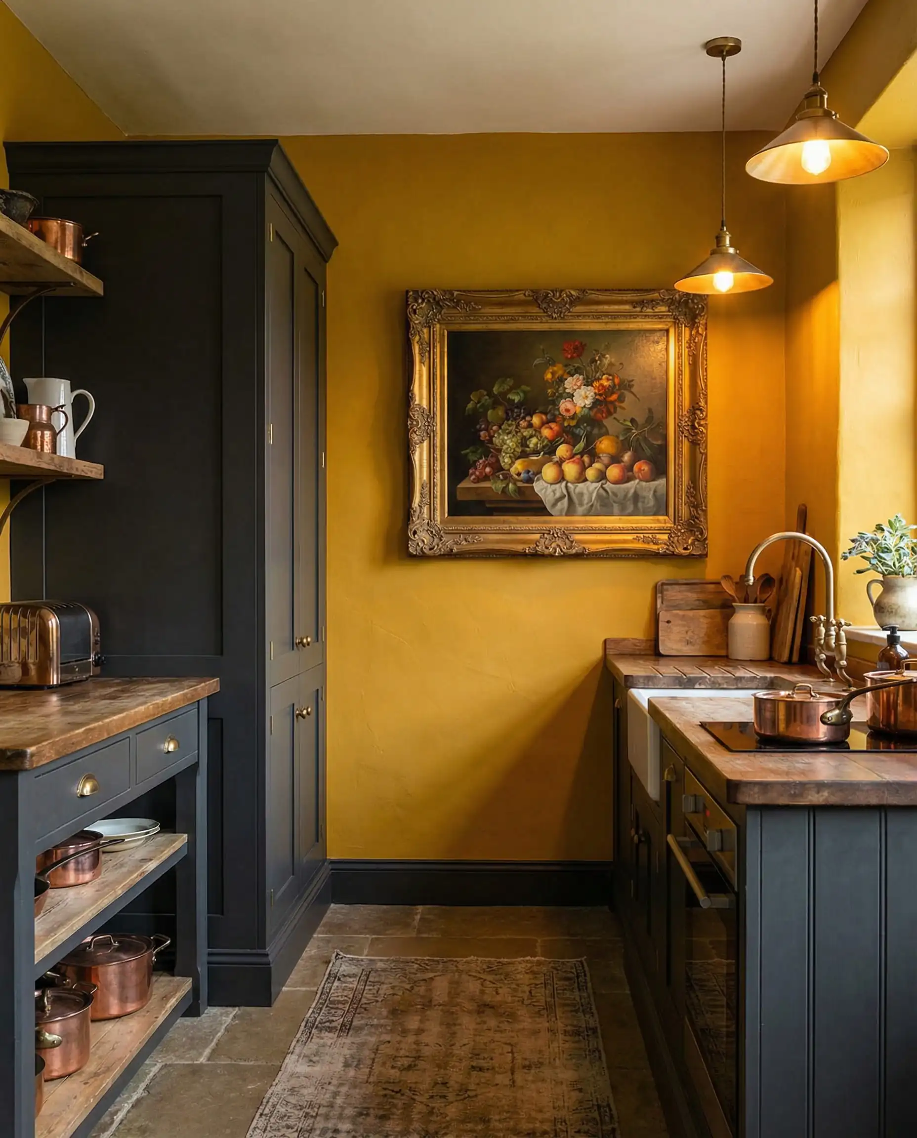
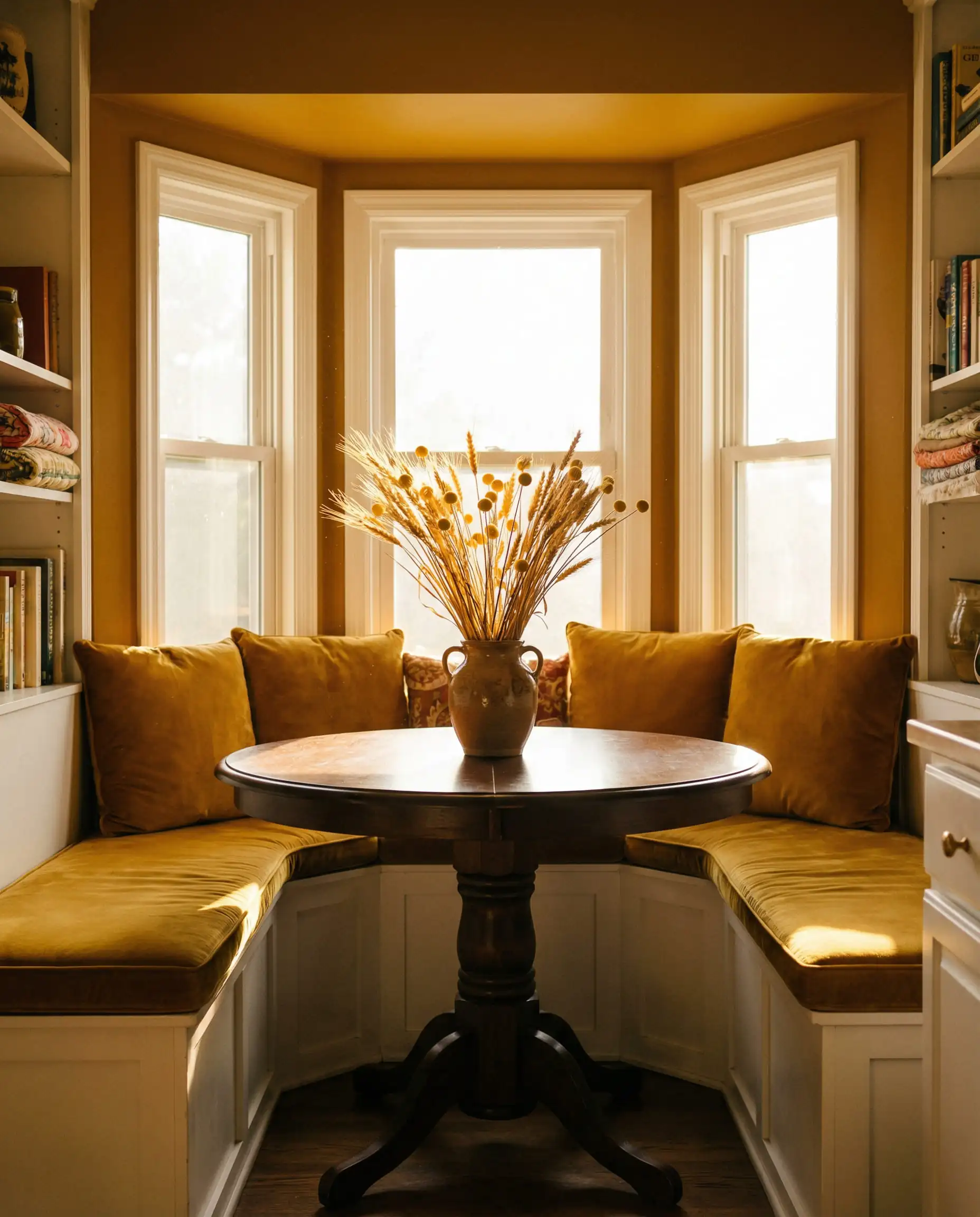
Yellow can be scary for homeowners, but the 2026 version is incredibly livable. We are seeing “Bronze Ochre”—a deep, golden mustard tone that feels historical and grounded. It’s not a “smiley face” yellow; it’s the color of old gold jewelry or dried wheat.
Used on walls, it creates a kitchen that feels constantly bathed in the “golden hour” of sunset. It pairs unexpectedly well with dark blue or charcoal cabinetry.
Top Paint Picks for 2026:
Terracotta & Dusty Pink
We are seeing a revival of Mediterranean influences. Terracotta and “baked clay” colors are fantastic for kitchen walls because they stimulate the appetite and make the space feel convivial and welcoming.
If a full terracotta wall feels too intense, look at “Dusty Pink” or “Plaster” shades. These act as a warm neutral, casting a flattering glow on everyone in the room (literally—it makes skin tones look great!).
Top Paint Picks for 2026:
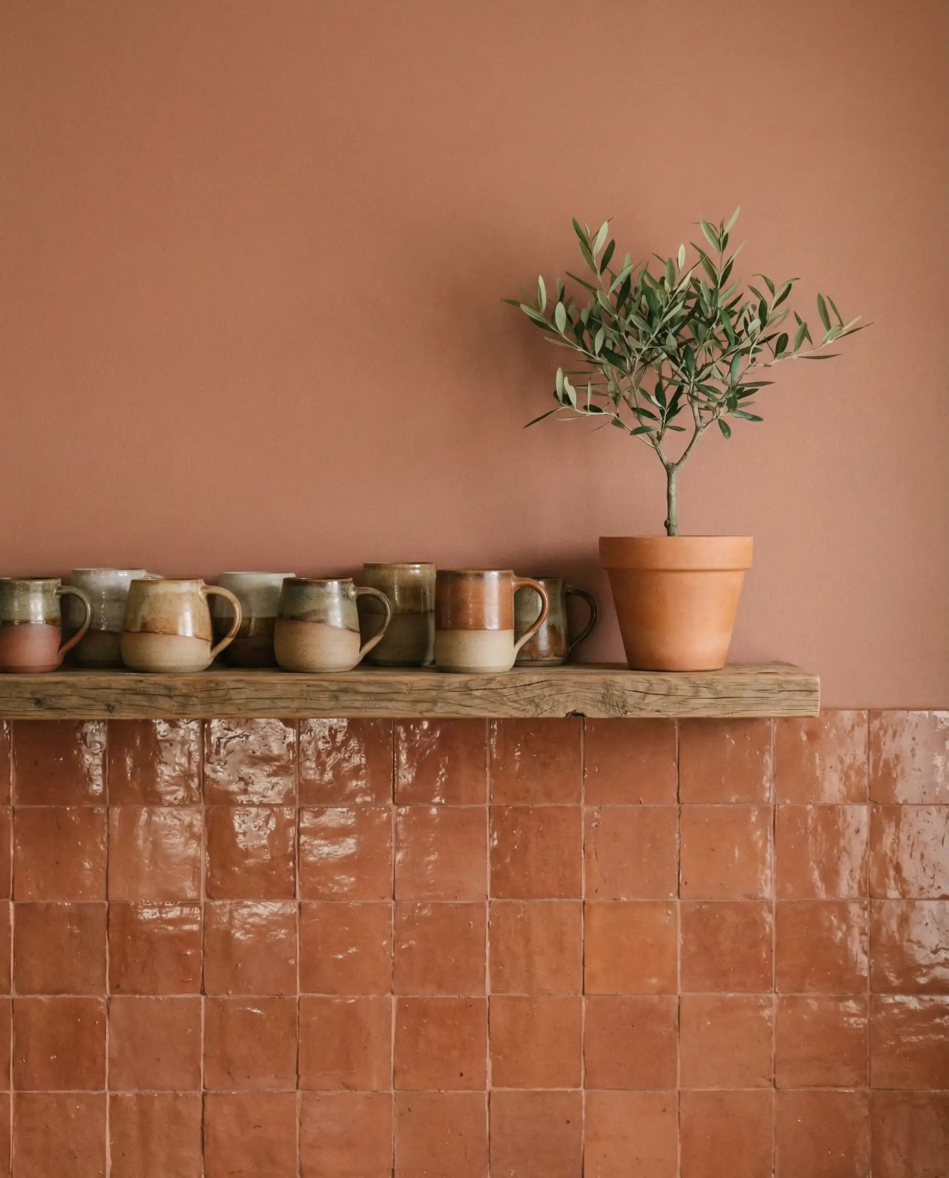
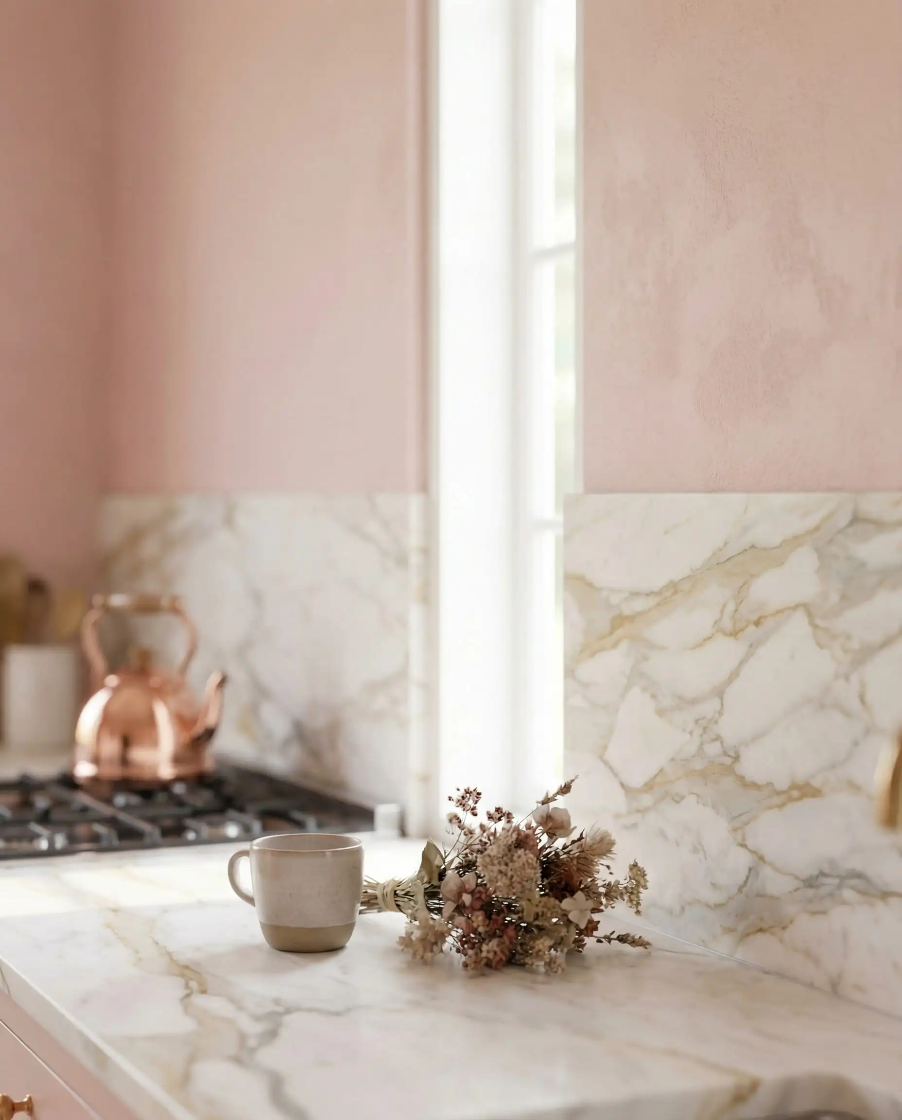
The key to Terracotta is to avoid a “theme park” look. Don’t go full Tuscan farmhouse. Keep the rest of the kitchen modern with clean lines, thin countertops, and minimal styling to balance the rustic wall color. 🌿
🏺 Styling Insight
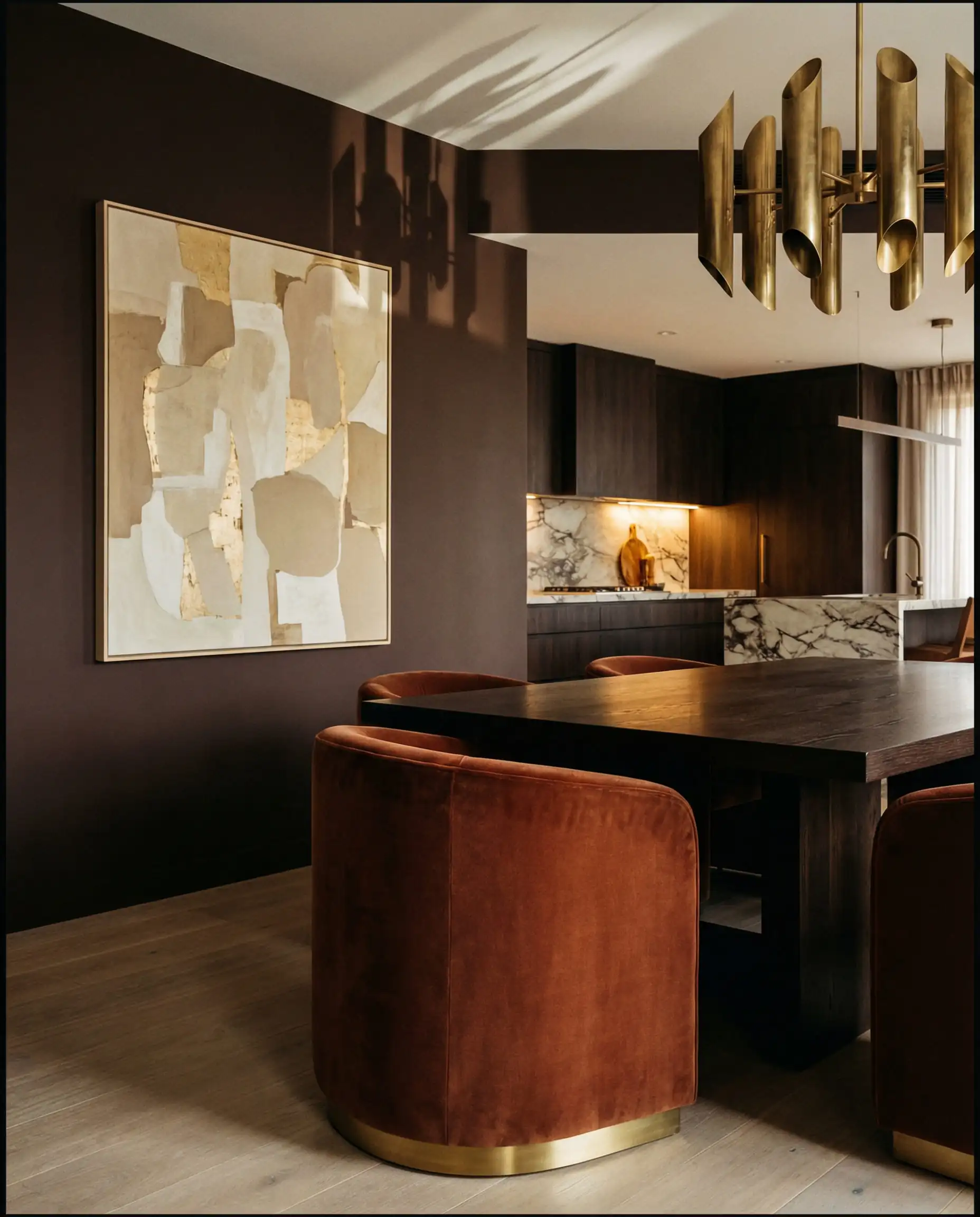
Rich Mahogany & Chocolate
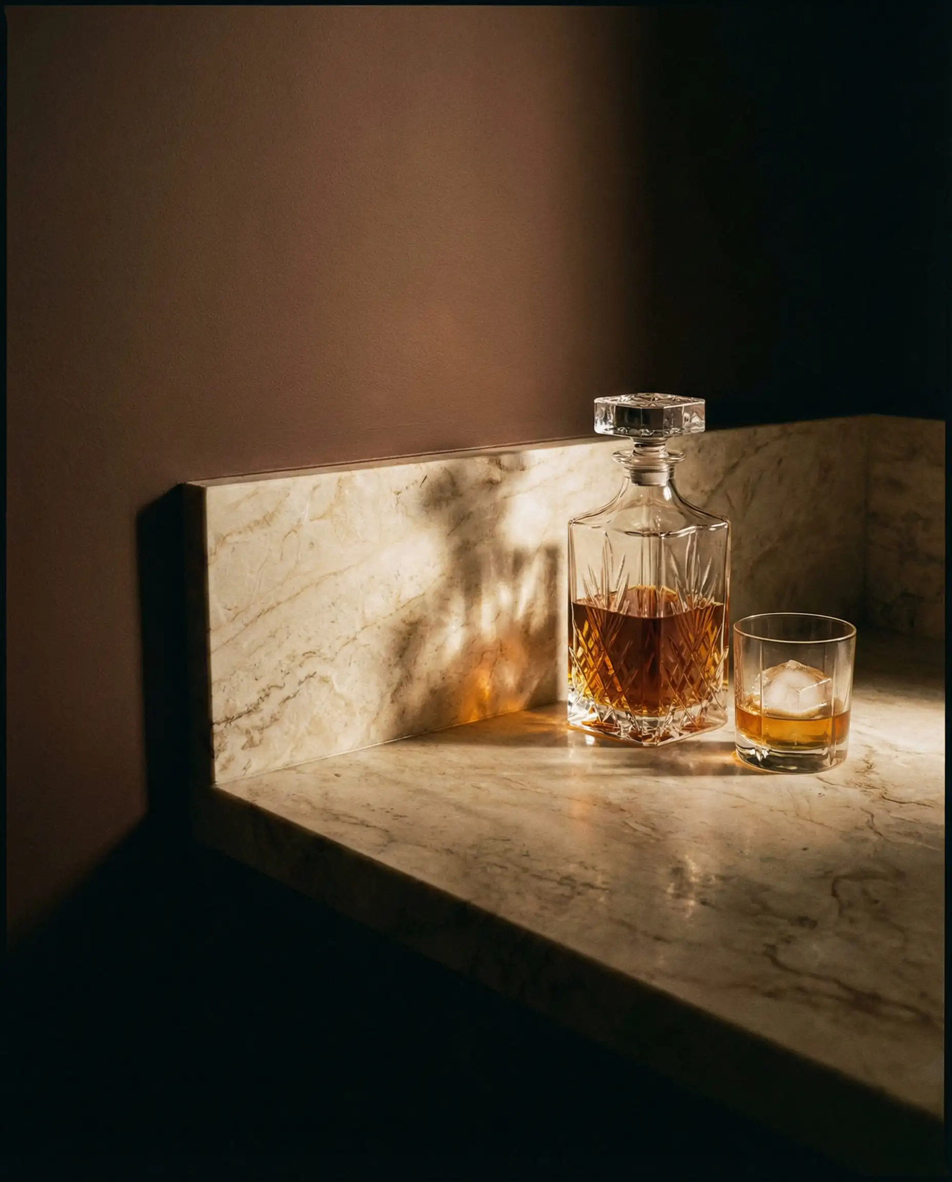
Brown is back. Rich, chocolatey brown walls are replacing black for high-contrast accents. It feels softer, more organic, and far more luxurious. A chocolate brown wall in a dining nook or pantry creates a “jewelry box” effect that is incredibly high-end.
While these colors are trending, avoid combining them with outdated finishes. Check our guide on kitchen trends to avoid to see what pairings to skip.
🚫 Avoid the Mistake
Application Trend: The Rise of “Color Drenching”
In 2026, how you paint is just as important as what you paint. The biggest application trend is Color Drenching.
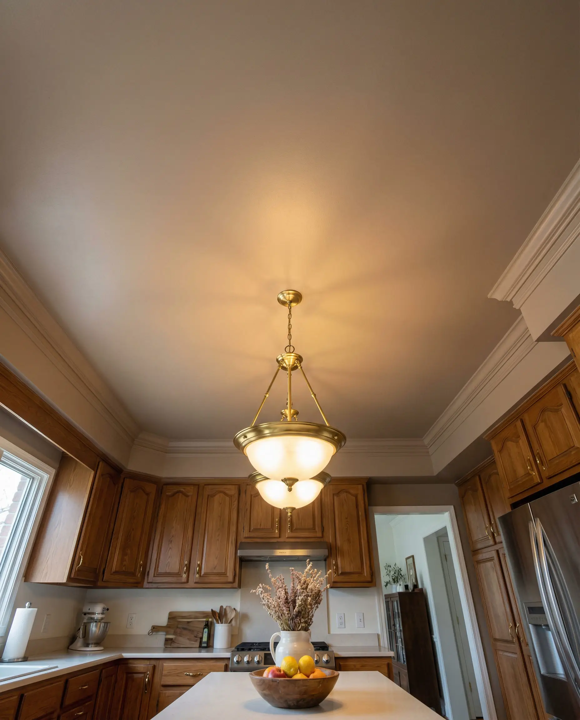
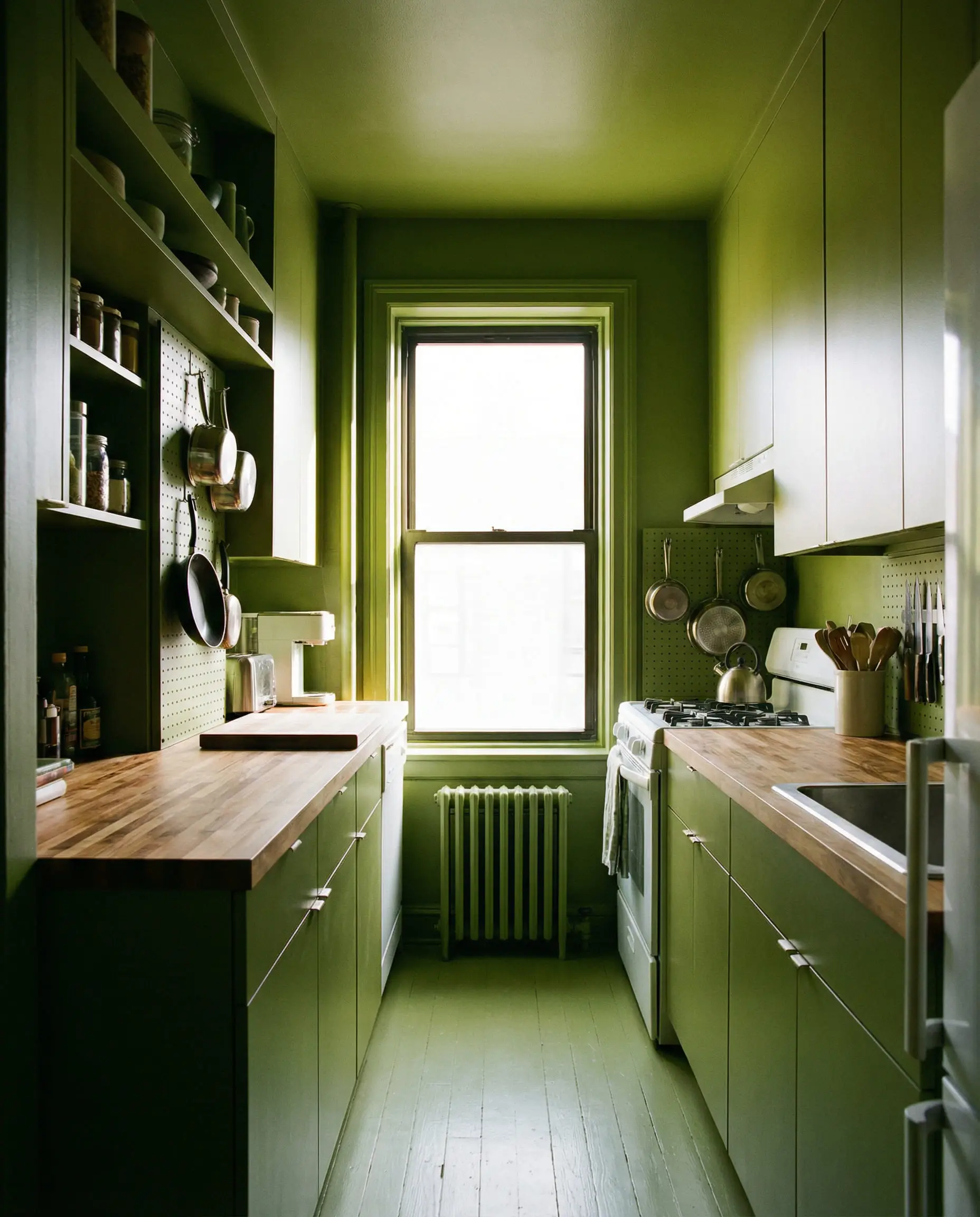
Traditionally, you paint the walls a color and the trim/ceiling bright white. Color Drenching involves painting everything—baseboards, door frames, crown molding, and sometimes even the ceiling—in the same color.
Why do this in a kitchen?
- It expands the space: When there are no contrasting white lines to break up the eye, the boundaries of the room blur, making small kitchens feel significantly larger.
- It hides clutter: Kitchens are visually busy places (cabinets, appliances, vents). A single color unifies the chaos.
- It looks expensive: It’s a design trick often used in boutique hotels to create a custom, enveloping feel.
Best colors for drenching:
This works best with mid-tone to dark colors like the Midnight Teals, Mushrooms, or Olives mentioned above.
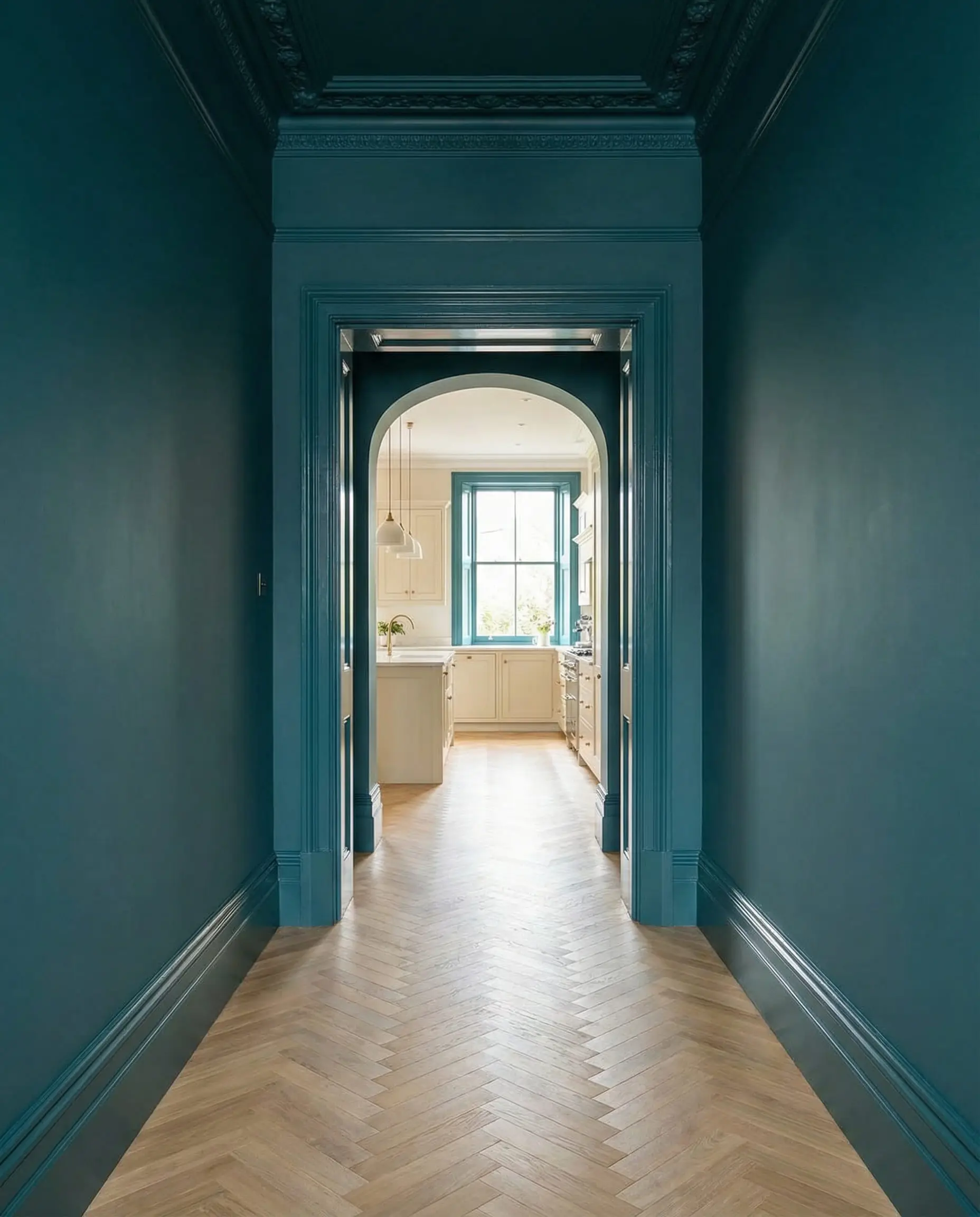
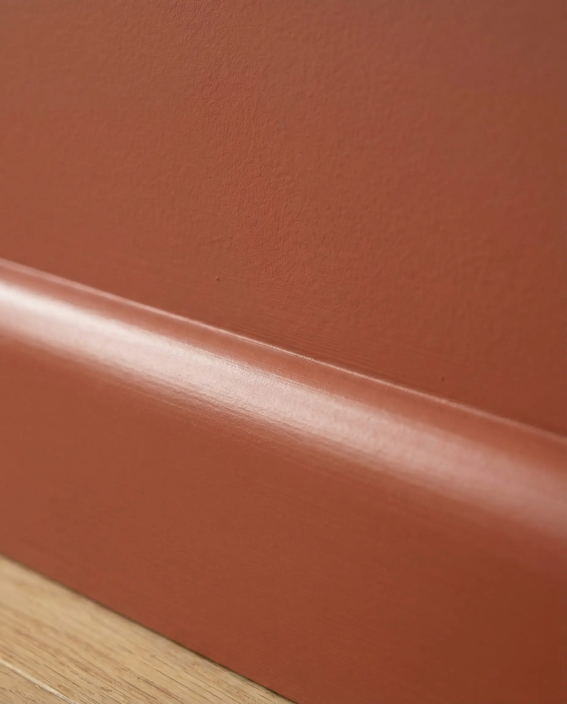
To pull this off like a pro, change the sheen, not the color. Use a Flat or Matte finish for the ceiling and walls, but switch to a Satin or Semi-Gloss in the exact same color for the trim and baseboards. This adds subtle dimension without breaking the visual flow.
🧑🎨 Pro Tip
How to Coordinate Wall Paint with Cabinetry
Choosing a wall color in a vacuum is a recipe for disaster. Your paint must converse nicely with your cabinets. Here is a cheat sheet for 2026’s most common combinations.
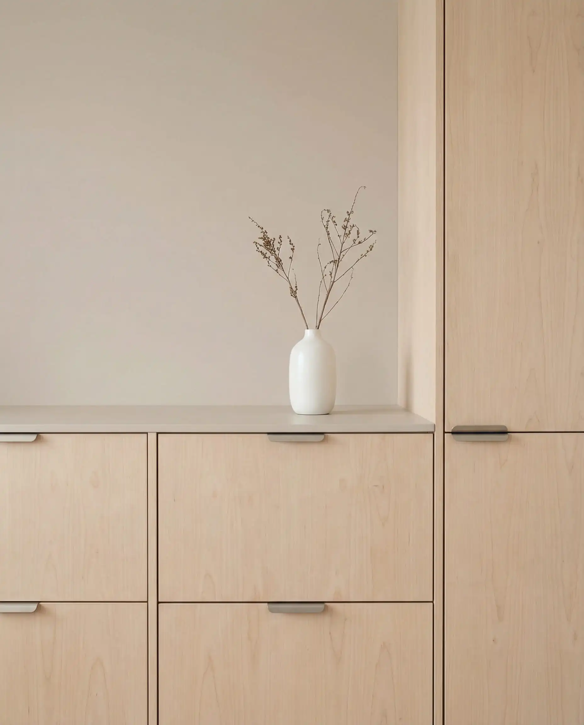
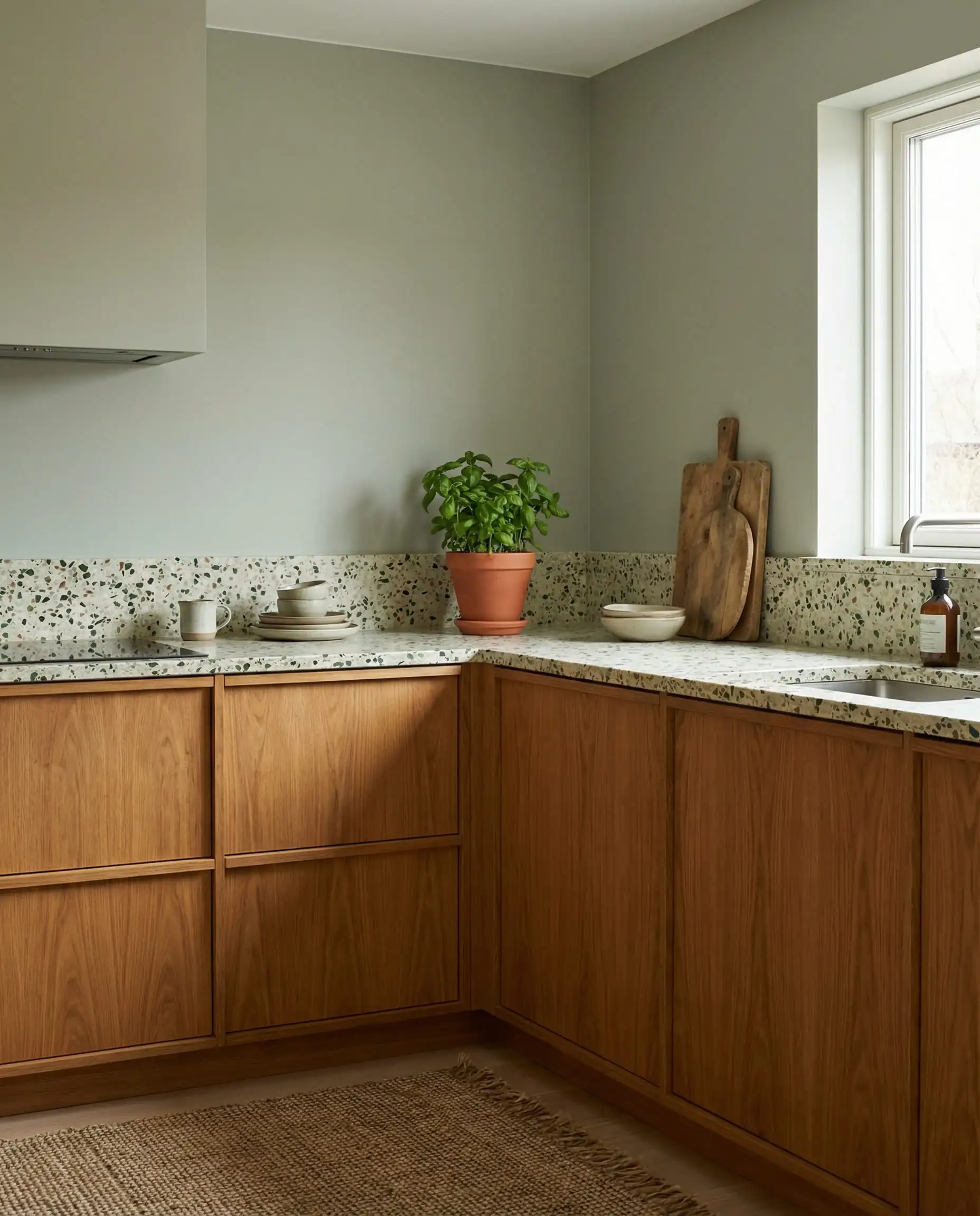
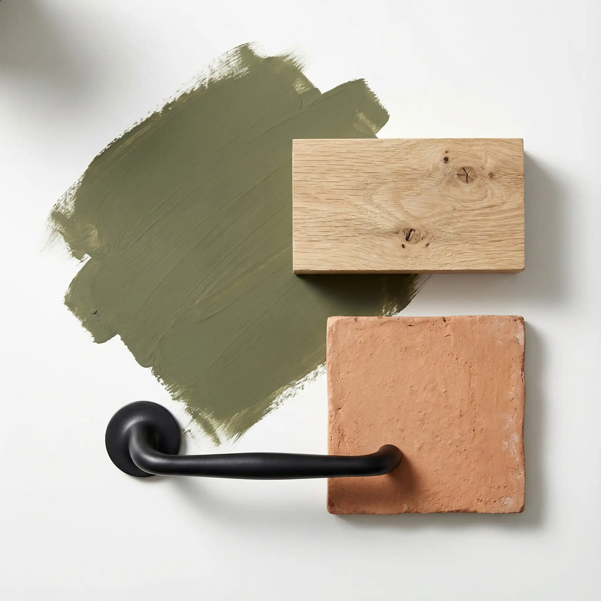
1. For Natural Wood Cabinets (Walnut, Oak, Maple)
Wood cabinets are a huge trend, but they have strong yellow/orange/red undertones.
2. For White or Off-White Cabinets
3. For Blue or Gray Cabinets
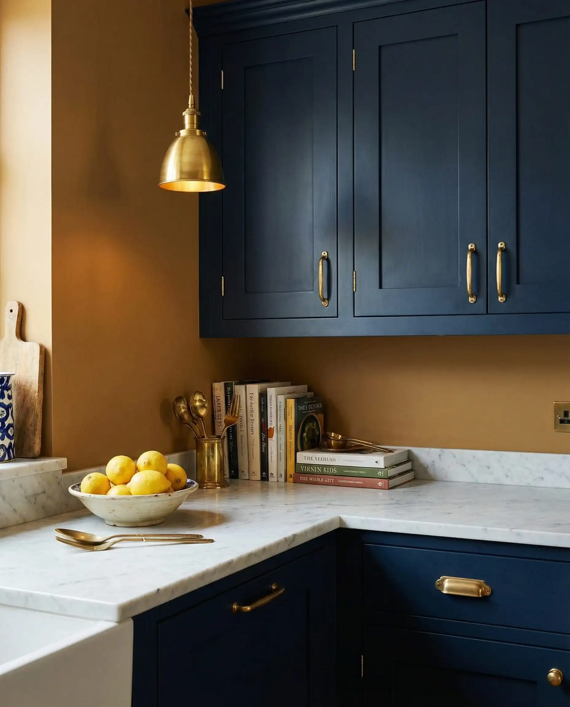
Your paint color needs to vibe with your pulls and knobs. Before finalizing your paint, hold the swatch up against your hardware. See our article on kitchen cabinet hardware trends for the latest metallic finishes to match.
🔩 Hardware Check
The Lighting Factor: Testing Your Paint
You cannot trust a paint chip in the hardware store. Kitchen lighting is complex because you often have a mix of natural light and artificial task lighting.
The “North-Facing” Warning:
If your kitchen faces North, the light will be cool and blueish.
The “South-Facing” Bonus:
If your kitchen faces South, you get warm, golden light.
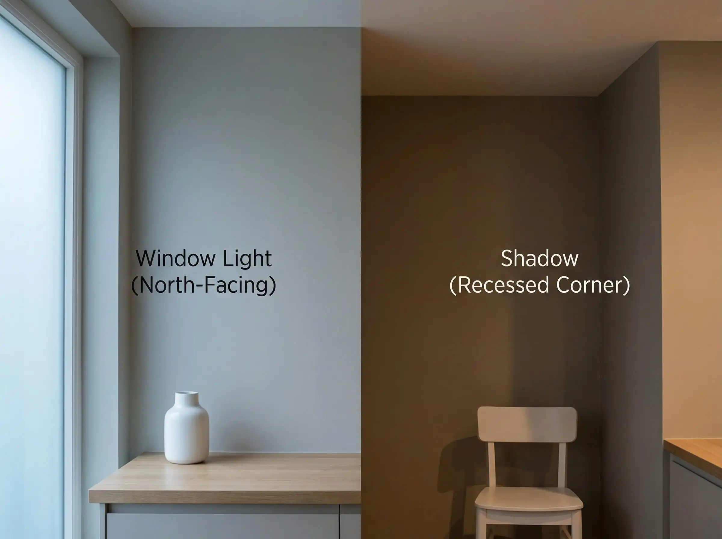
The “Artificial Light” Test:
Most of us use our kitchens at night. Paint a large sample board (A3 size) and look at it with your kitchen lights ON in the evening. LED bulbs vary wildly—make sure your bulbs are “Warm White” (2700K-3000K) to flatter these new 2026 colors.
FAQ: 2026 Kitchen Color Quick Answers
Yes, the “cool, steel gray” of the 2010s is fading out. However, gray isn’t disappearing—it’s just warming up. It is evolving into “Greige,” “Taupe,” and “Mushroom.” These warmer grays have brown or violet undertones that feel friendlier and more organic than the chilly grays of the past.
The consensus among designers is Mushroom (a warm taupe). It is versatile enough to work with the popular wood cabinet trend, yet distinct enough to feel fresh and modern. It is the “safe bet” that doesn’t look boring.
In 2026, the advice is shifting. While light colors (like Sandstone Beige) reflect light and open up a space, the trend of Color Drenching with a medium tone (like Olive) can actually make a small room feel limitless by blurring the corners. Don’t be afraid of medium-depth colors in small spaces!
Paint is the easiest fix! Painting your white walls a Sandstone or Chalky Cream will instantly soften the room. If you are brave, paint the island a contrasting color like Burgundy or Midnight Green to add a focal point without replacing cabinetry.
Conclusion: Making It Your Own
The kitchen trends of 2026 are inviting us to relax. They are asking us to stop worrying about what is “safe” and start focusing on what feels good. Whether you choose to wrap your room in a cozy Mushroom taupe, energize it with a splash of Terracotta, or ground it with a deep Forest Green, the goal is to create a space that nourishes you before you even take a bite of food.
Ready to start your project?
Before you buy your gallons, we recommend testing. Buy sample pots of your top 3 choices and paint large squares on different walls. Watch how they change from morning coffee to dinner prep.
If you are looking for more inspiration to complete your kitchen makeover, explore our deep dive into kitchen flooring trends to find the perfect foundation for your new wall color.
Key Takeaways for Your Renovation
Happy Painting!

The Aesthetics Desk curates the visual direction for Hackrea. Specializing in design history, global architectural movements, and interior styling, this desk focuses on the psychology of space and how to translate high-end, magazine-quality aesthetics into approachable residential design without falling into fleeting micro-trends.