A kitchen’s backsplash acts as the connective tissue of the entire room, bridging the critical vertical expanse between your countertops and upper cabinetry. We are moving past sterile, basic subway tiles toward the principle of architectural continuity—the concept that a backsplash shouldn’t be a decorative afterthought, but a deliberate, tactile extension of the room’s core materials.
By focusing on exact countertop pairings, scale, and material authenticity, you can transform a functional splash zone into a curated architectural feature.
From handcrafted zellige to sweeping marble slabs, here are 25 specific kitchen backsplash tile designs to build a cohesive, custom-curated space.
The Organic and Tactile Textures
Returning to handcrafted, imperfect materials introduces necessary warmth to rigid, modern cabinetry. By prioritizing tactile variation over pristine uniformity, the vertical transition feels lived-in, grounded, and structurally authentic.
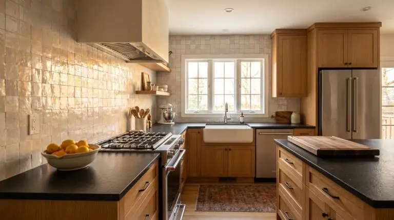
1. Glazed Moroccan Zellige in Pearlescent White
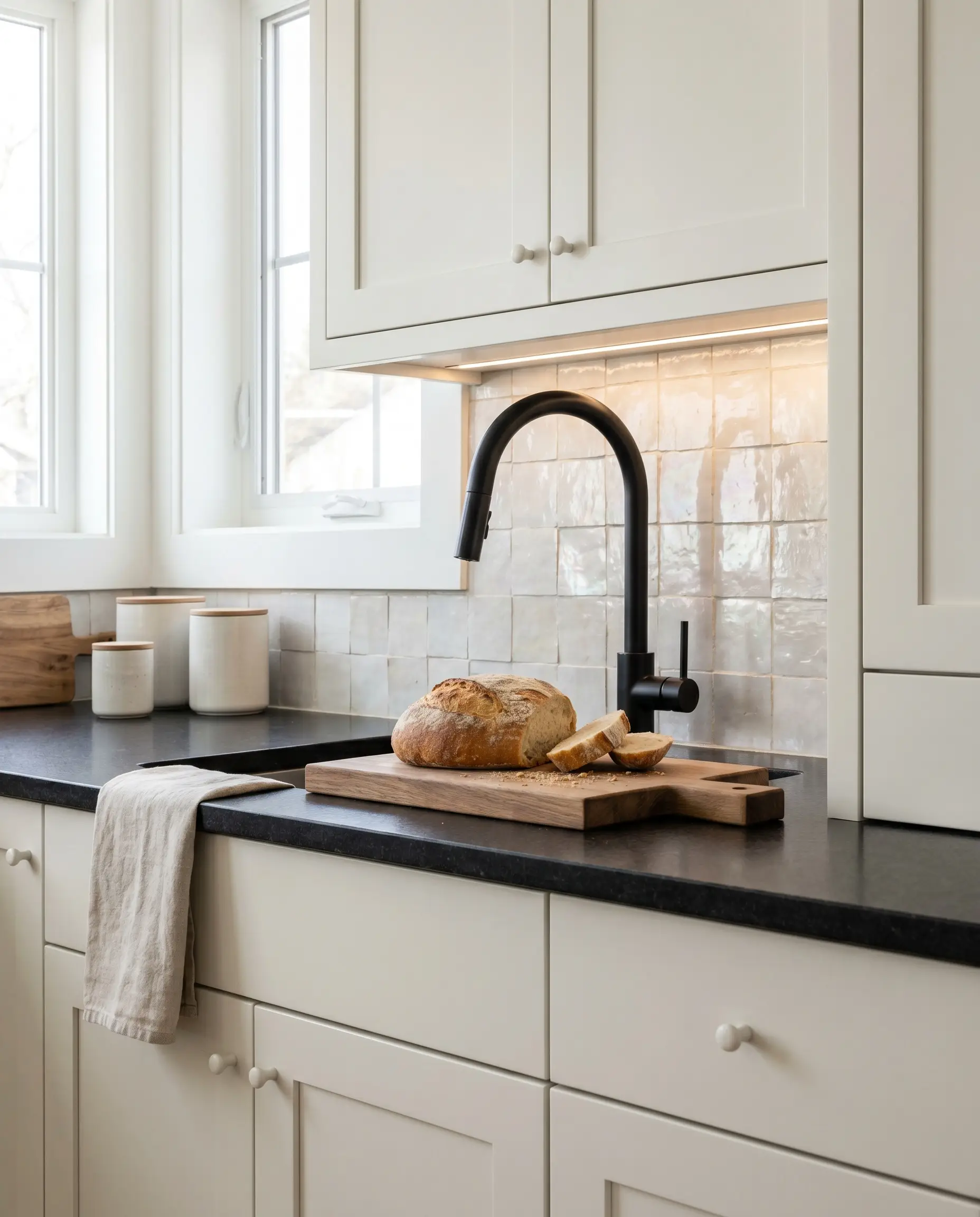
Authentic Zellige tiles feature a V4 color variation and irregular edges that bounce ambient light dynamically across the kitchen. This pearlescent glaze softens harsh under-cabinet lighting while establishing a premium, custom aesthetic that basic ceramics cannot replicate.
- Vibe: Organic Modern Luxury
- Key Material: 4×4-inch un-rectified Moroccan Zellige
- Paint Recommendation: Benjamin Moore White Dove
- Countertop Match: Honed Black Granite or Matte Quartz
Genuine Zellige tiles have no built-in spacers and require an artisan installer experienced in wedge-spacing to manage the undulating edges.
Hackrea Lead Designer’s Note
2. Matte Terra Cotta Squares for Warm Earthiness
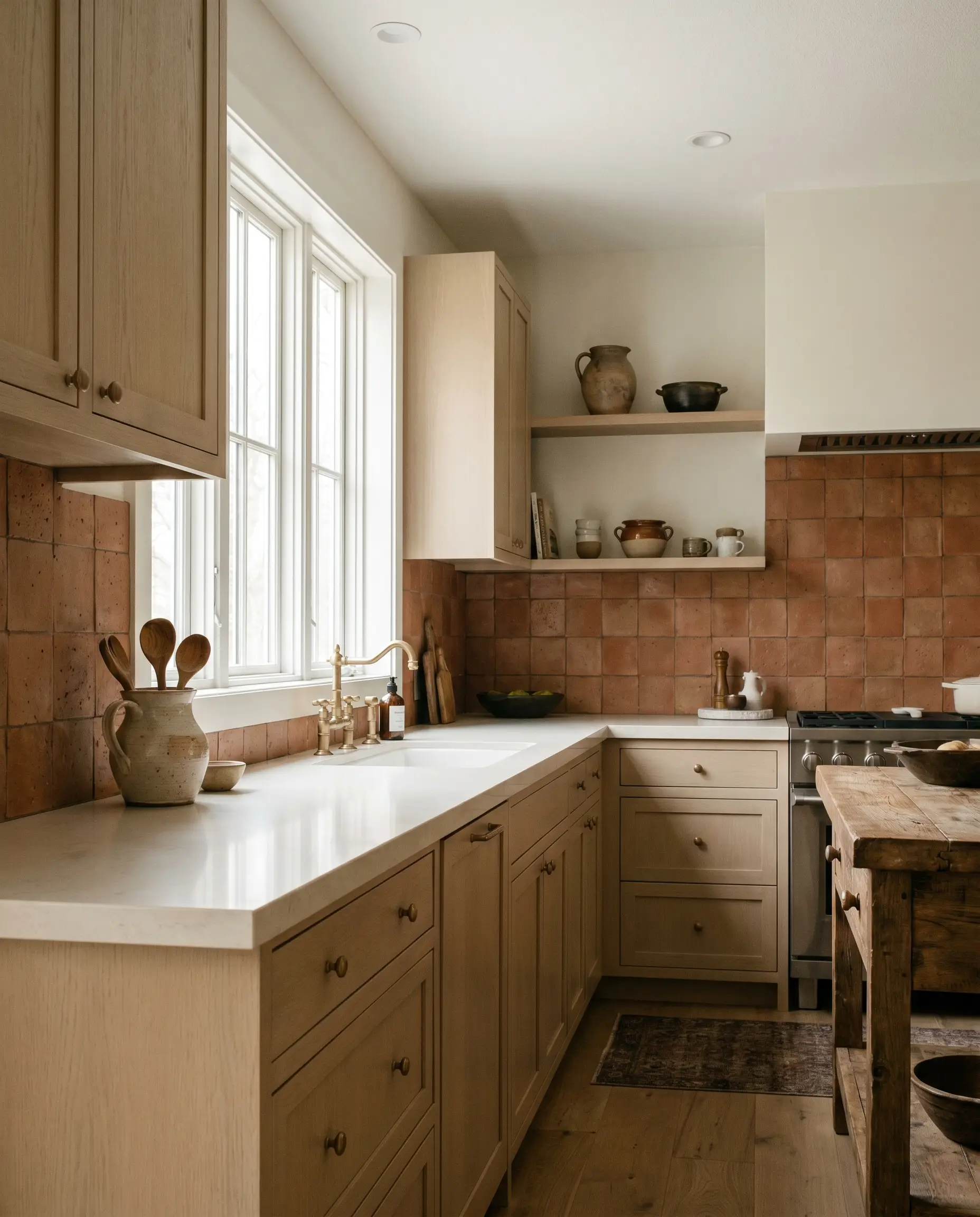
Matte, unglazed terra cotta introduces a deeply rooted, old-world warmth that pairs exquisitely with rift-sawn white oak cabinets. The porous, earthy nature of the baked clay demands attention, pulling the eye upward with a rich, historic texture.
- Vibe: Earthy Transitional
- Key Material: 6×6-inch sealed matte terra cotta squares
- Paint Recommendation: Farrow & Ball Joa’s White
- Countertop Match: Solid Cream Quartz or Soapstone
3. Tumbled Travertine Mosaics
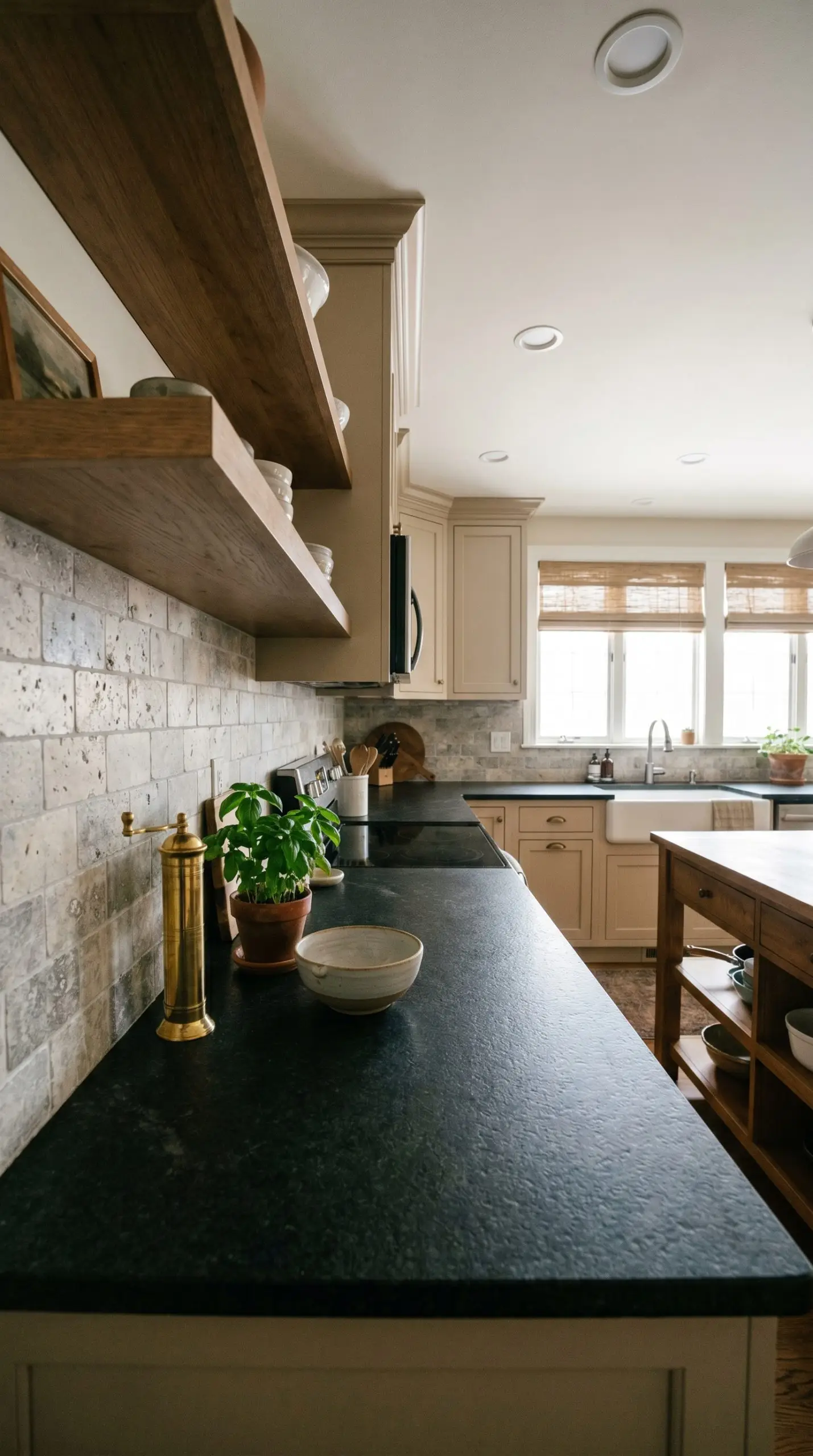
Tumbled travertine offers a pitted, honed finish that grounds a space without reflecting harsh overhead glare. This material provides a subtle, classic traditional texture, effortlessly bridging the gap between heavy countertops and upper shelving.
- Vibe: Classic Traditional
- Key Material: 2×4-inch tumbled silver travertine
- Paint Recommendation: Sherwin-Williams Accessible Beige
- Countertop Match: Dark Leathered Granite
4. Glazed Ceramic with Irregular Edges
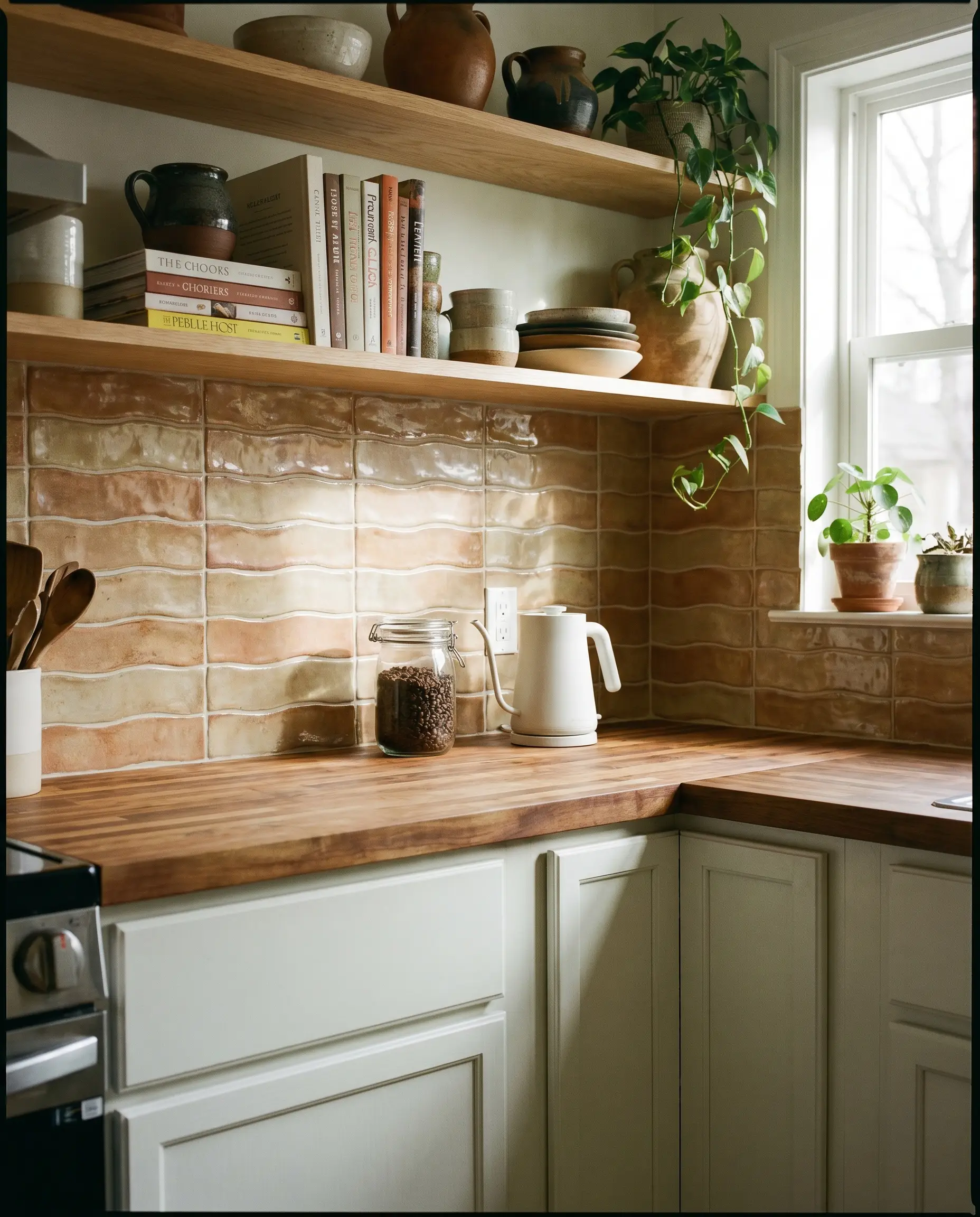
For a more accessible investment, machine-made glazed ceramic tiles with artificially undulating edges replicate the illusion of handcrafted clay. This format allows for standard grout joints and easier installation while still capturing the tactile light-play of authentic artisan tile.
- Vibe: Accessible Organic
- Key Material: 3×8-inch wavy-edge glazed ceramic
- Paint Recommendation: Benjamin Moore Chantilly Lace
- Countertop Match: Warm Butcher Block
5. Botanical Motif Encaustic Tiles
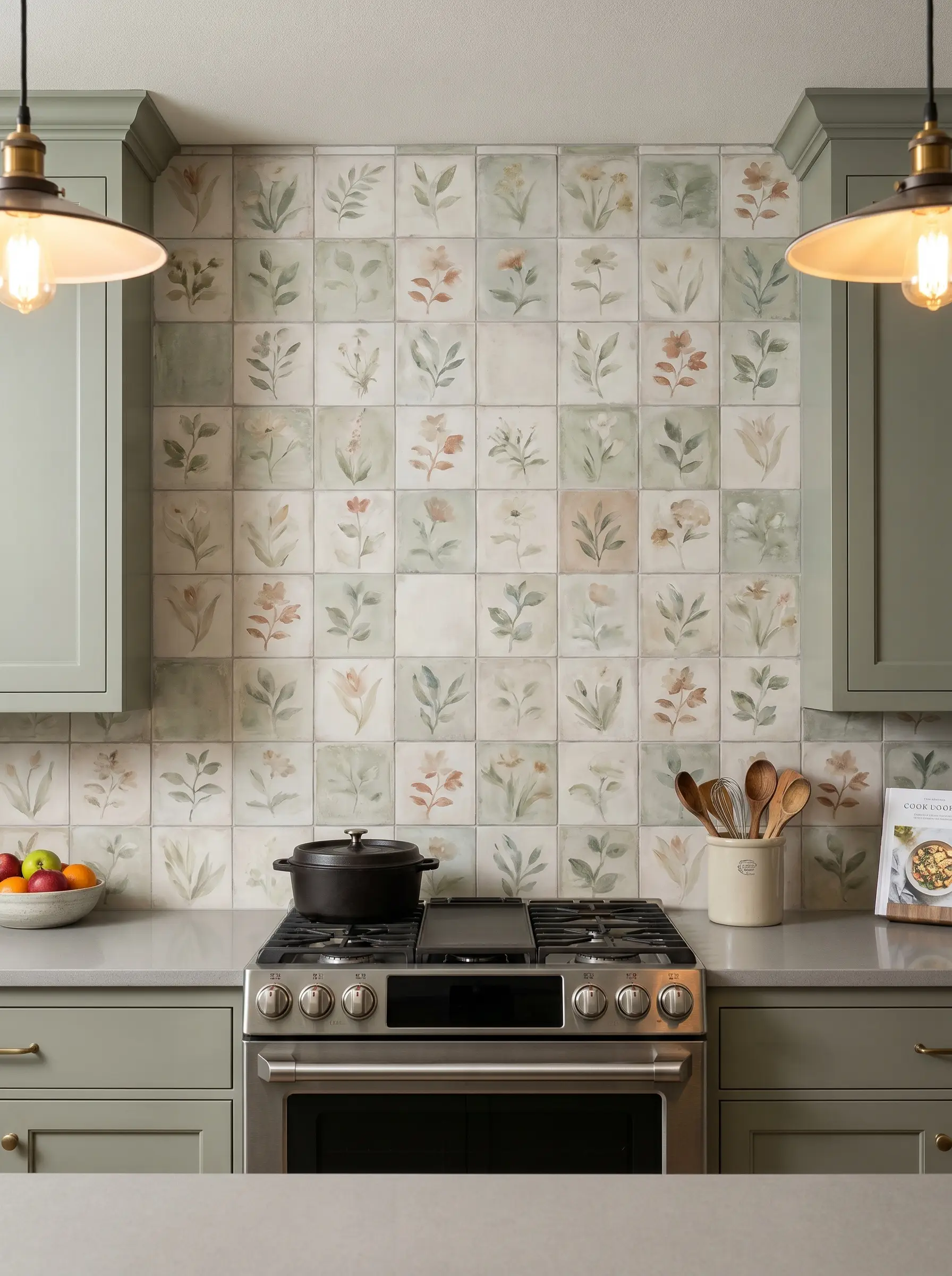
Embracing the shift toward painterly details, faded botanical motifs in cement or porcelain offer structured visual interest without chaotic, high-contrast geometry. These soft, repeating patterns act as a localized art installation behind a range or sink.
- Vibe: Curated Heritage
- Key Material: 8×8-inch matte porcelain encaustic tile
- Paint Recommendation: Farrow & Ball Pigeon
- Countertop Match: Solid Light Gray Quartz
6. Unglazed Brick Slips for Industrial Warmth
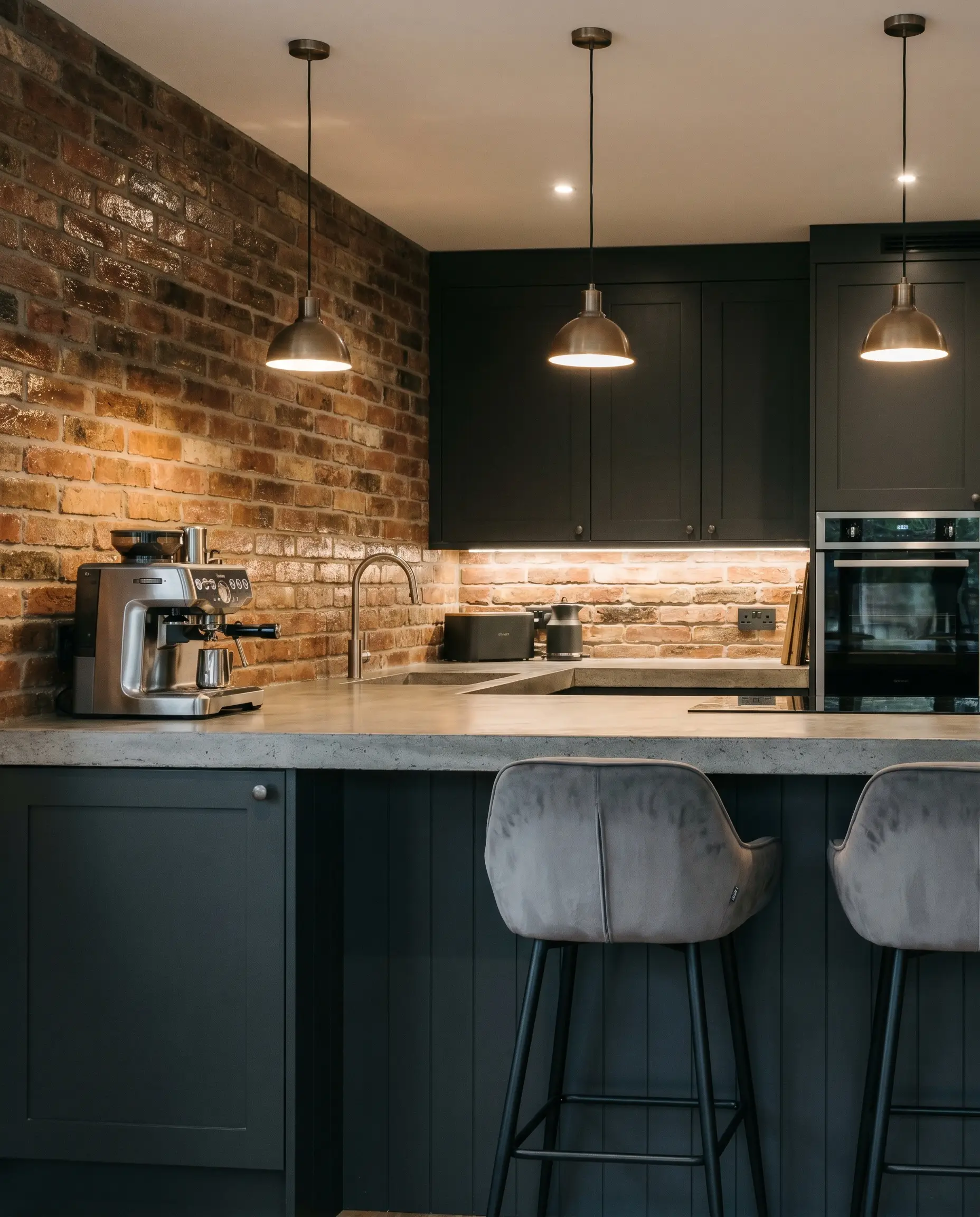
Slicing authentic, reclaimed brick into thin slips creates massive textural depth, perfectly suiting historic restorations or brutalist styling. The raw, rectilinear format of the brick absorbs light, turning the backsplash into an anchor of architectural continuity.
- Vibe: Refined Industrial
- Key Material: 1/2-inch thick reclaimed brick slips
- Paint Recommendation: Sherwin-Williams Iron Ore
- Countertop Match: Poured Concrete or Honed Slate
Strict Maintenance Warning: Unglazed brick is highly porous. You must apply a heavy masonry sealant, particularly behind a stove, to prevent cooking oils from permanently staining the clay.
Hackrea Lead Designer’s Note
Architectural Continuity and Slabs
The highest standard of seamless design involves skipping grout joints entirely and running solid stone straight up the wall. This structural approach transforms the vertical plane into an unbroken monolithic statement.
7. Bookmatched Calacatta Marble Slabs
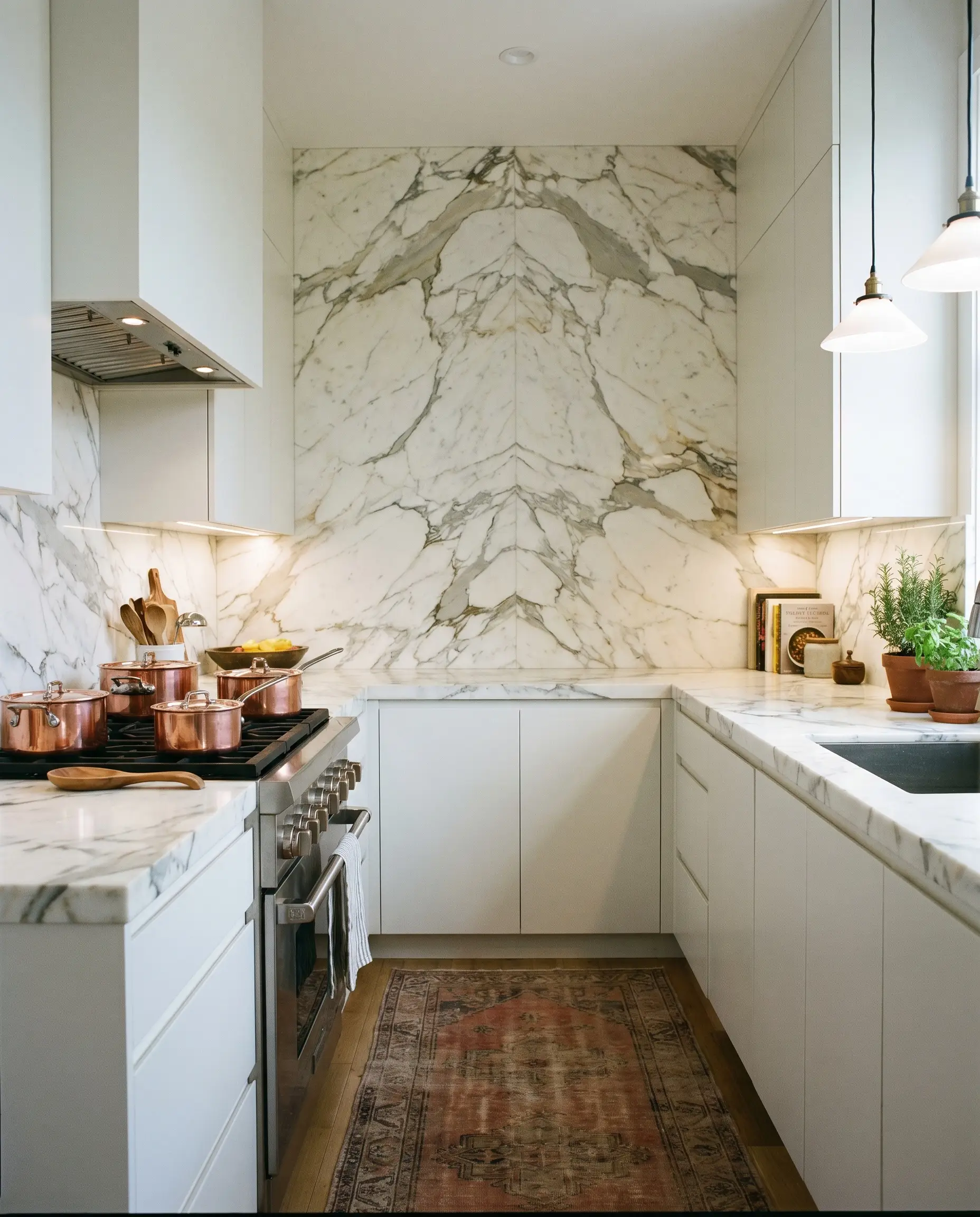
Bookmatching two Calacatta marble slabs behind a range mirrors the heavy veining, creating a massive, organic focal point. This bespoke application removes visual interruptions, turning the earth’s natural aggregate into a custom art piece.
- Vibe: Bespoke Luxury
- Key Material: 2cm polished Calacatta marble slab
- Cabinet Pairing: Flat-panel matte white
- Countertop Match: Matching Calacatta Marble
8. Honed Soapstone with a Built-In Ledge
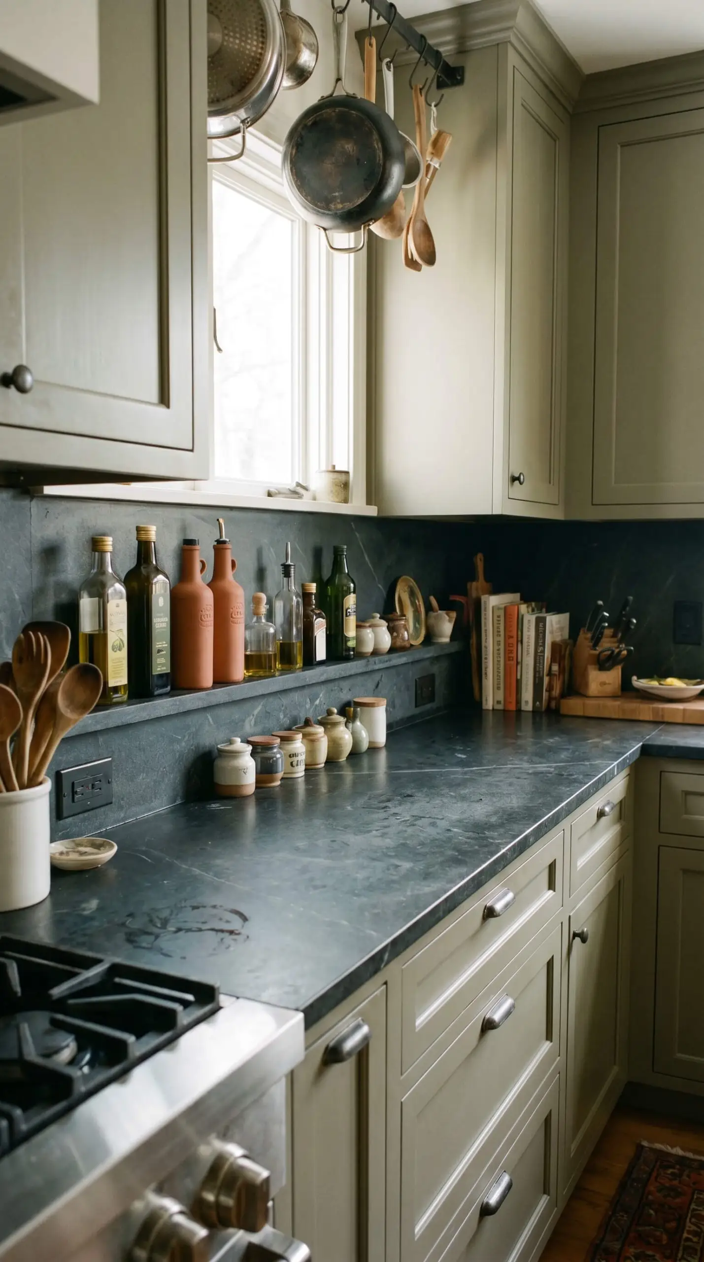
Fabricating a four-inch deep ledge out of the same honed soapstone as the backsplash merges stark aesthetics with architectural function. The seamless transition from counter to wall to shelf offers a highly intentional, built-in display for daily culinary oils.
- Vibe: Utilitarian Elegance
- Key Material: Honed charcoal soapstone
- Paint Recommendation: Farrow & Ball Treron
- Countertop Match: Matching Honed Soapstone
Ensure your cabinet maker accounts for the extra thickness of the slab run-up when calculating the depth of your upper cabinets to maintain standard clearances.
Hackrea Lead Designer’s Note
9. Vein-Matched Quartz Carrying Up the Wall
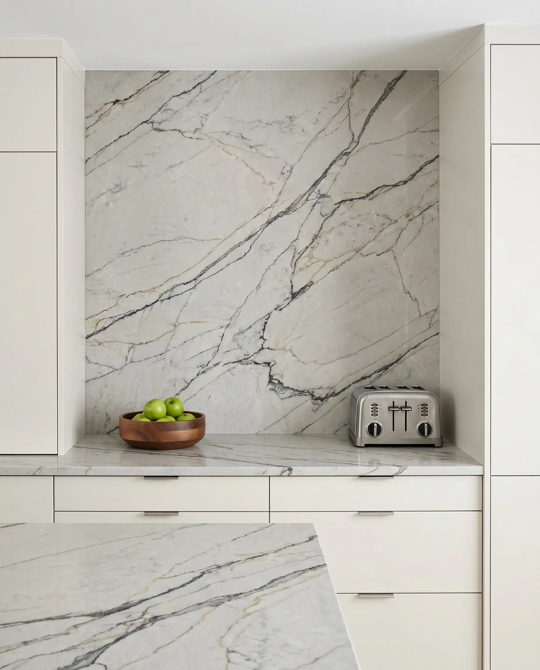
Utilizing modern, realistic quartz continuously from the work surface to the upper cabinets delivers a hyper-modern, low-maintenance aesthetic. Vein-matched quartz resists stains flawlessly while simulating the grandeur of natural stone without the sealing requirements.
- Vibe: Crisp Modernism
- Key Material: 2cm vein-matched engineered quartz
- Paint Recommendation: Sherwin-Williams Alabaster
- Countertop Match: Matching Quartz
10. Tumbled Marble Slabs with Scalloped Edges
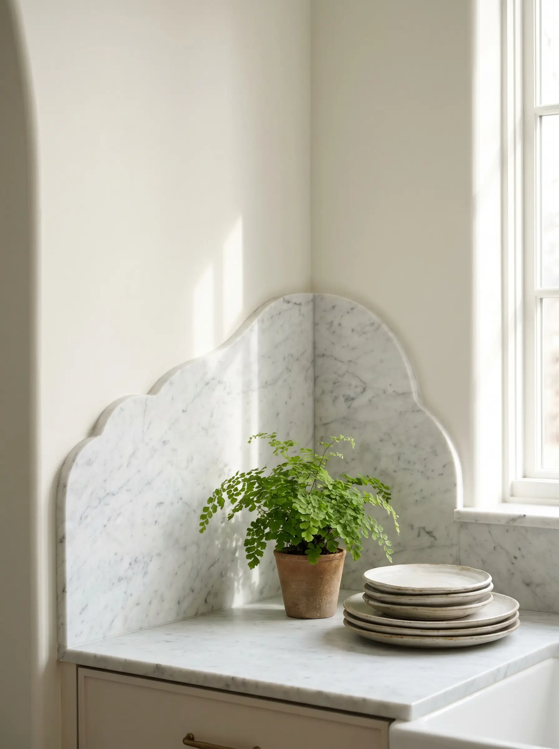
Where upper cabinets are absent, cutting a soft, sweeping scalloped curve into the top edge of a tumbled marble backsplash introduces a striking custom fabrication detail. This organic termination line softens the rigid geometry of standard kitchen architecture.
- Vibe: Sculptural Transitional
- Key Material: Tumbled Carrara marble slab (custom milled)
- Paint Recommendation: Benjamin Moore Swiss Coffee
- Countertop Match: Honed Carrara Marble
Geometric Layouts and Unexpected Scale
Altering the physical layout or standard dimensions of a tile fundamentally rewrites its stylistic impact. Strategic geometry can manipulate the perceived height and width of your entire kitchen.
11. The Vertical Straight Stack
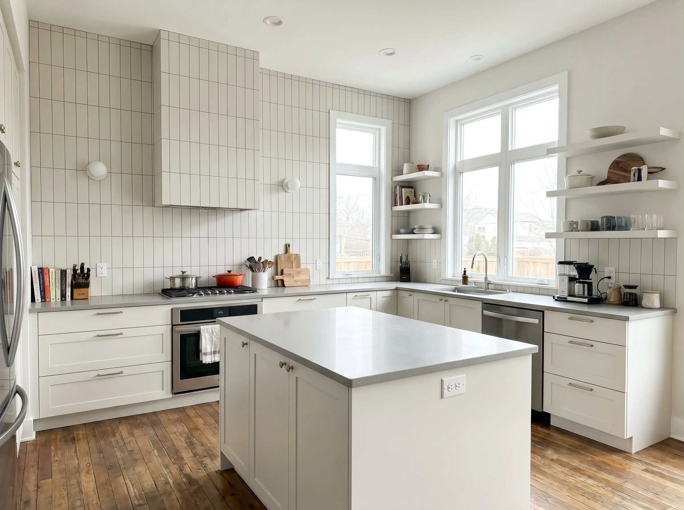
Stacking standard rectangular tiles vertically without staggering the grout joints draws the eye upward, immediately elongating the walls. This rectilinear format modernizes the traditional subway tile format, making standard ceiling heights feel significantly taller.
- Vibe: Tailored Modern
- Key Material: 2×8-inch matte ceramic tile
- Paint Recommendation: Sherwin-Williams Pure White
- Countertop Match: Light Gray Quartz
12. Oversized Fluted Plaster-Look Tiles
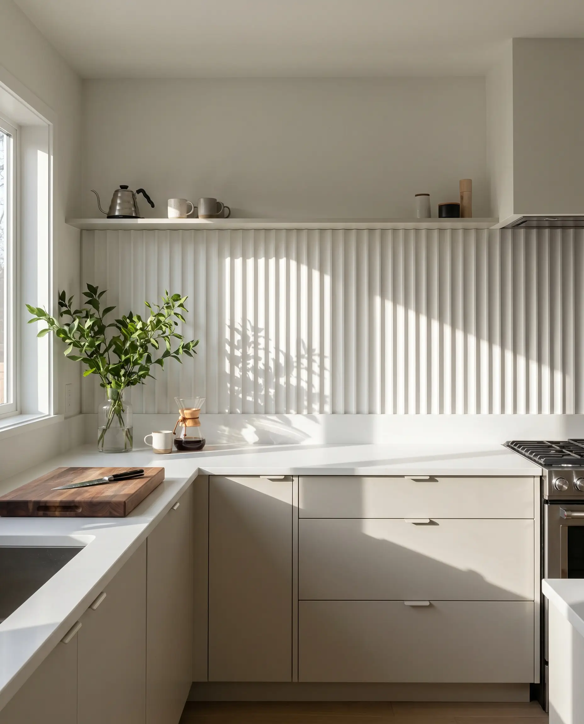
Large-format porcelain tiles featuring fluted or ribbed textures mimic custom plasterwork, bringing 3D architectural profiles to the backsplash. The deep vertical grooves create dynamic shadow play throughout the day, emphasizing a highly tactile environment.
- Vibe: Architectural Minimalism
- Key Material: 24×48-inch fluted porcelain panels
- Paint Recommendation: Benjamin Moore Pale Oak
- Countertop Match: Matte White Solid Surface
13. Micro-Mosaic Grids
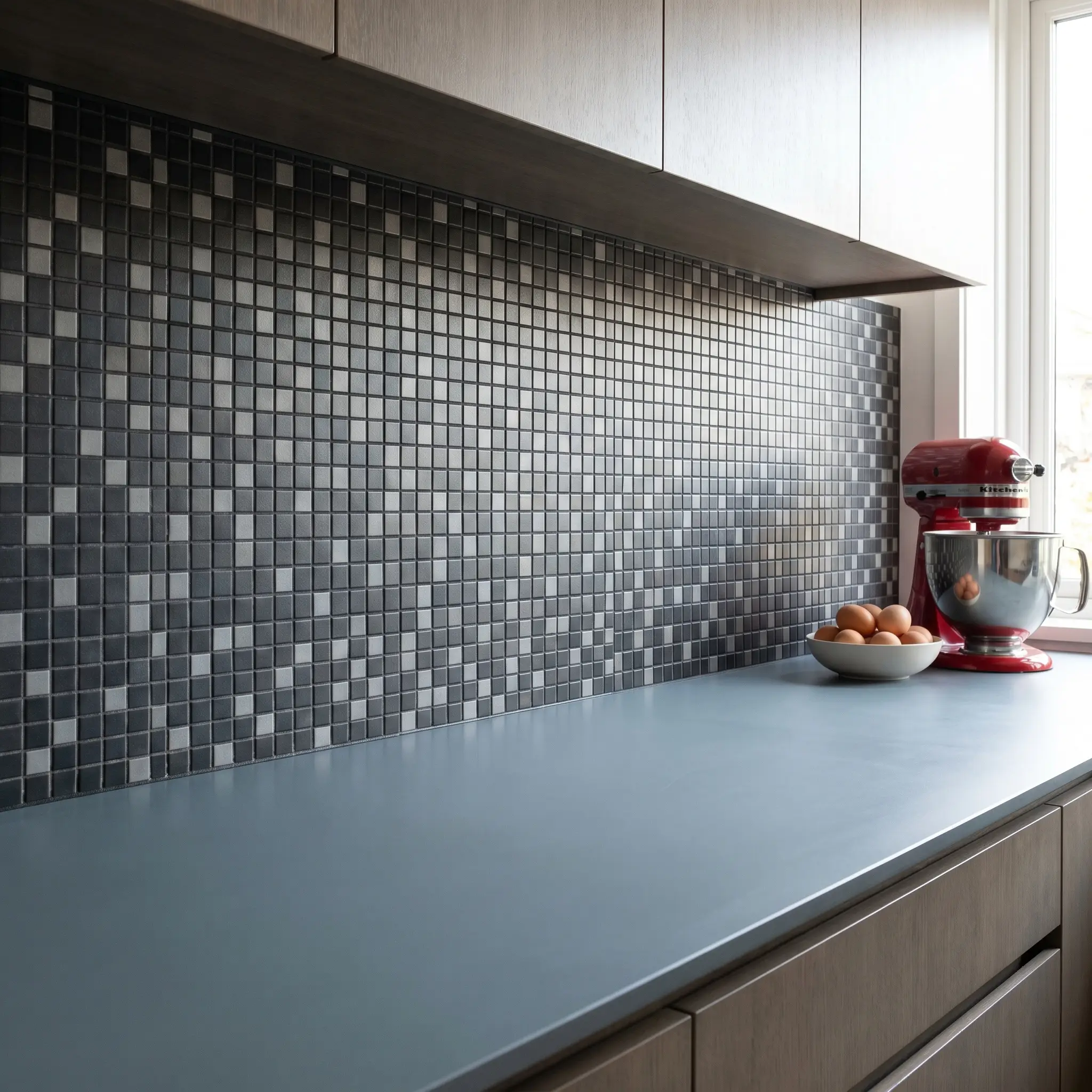
Utilizing 1×1-inch matte glass or ceramic squares with a highly contrasting grout joint delivers a rigid, postmodern aesthetic. This micro-grid approach creates a graphic, highly structured backdrop that plays beautifully against flat-panel cabinetry.
- Vibe: Postmodern Graphic
- Key Material: 1×1-inch matte ceramic mosaic sheets
- Grout Recommendation: Charcoal or Terracotta
- Countertop Match: Solid Color Corian or Quartz
Micro-mosaics mean high grout volume. Always use a premium epoxy grout in heavy splash zones to prevent rigorous scrubbing later.
Hackrea Lead Designer’s Note
14. The Double-Herringbone
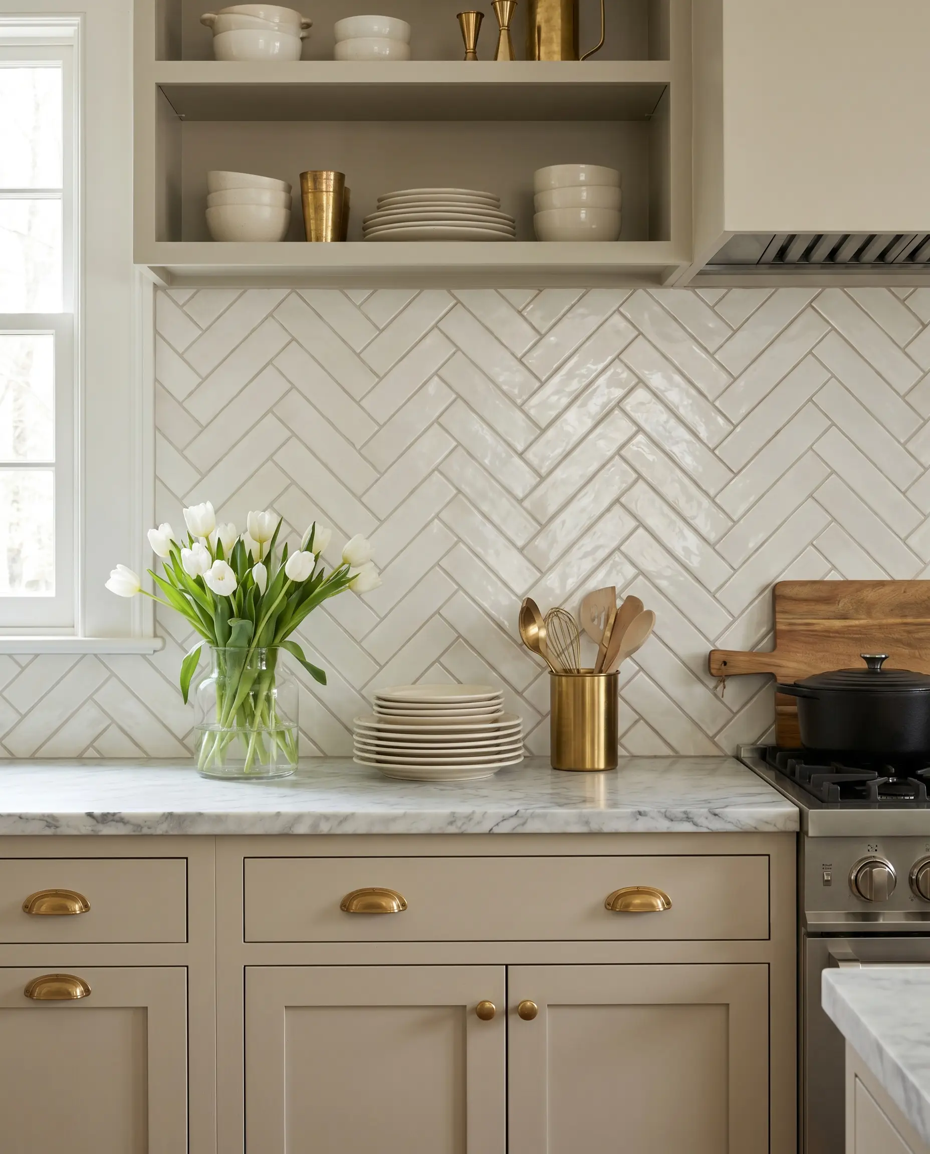
Doubling up standard rectangular tiles so that two pieces act as a single unit in a herringbone pattern aggressively modernizes a classic layout. This wider, chunkier zig-zag reduces visual clutter while maintaining a deeply structured, traditional rhythm.
- Vibe: Updated Classic
- Key Material: 3×6-inch glazed subway tile format
- Paint Recommendation: Farrow & Ball Shaded White
- Countertop Match: Veined Marble
15. Kitkat and Finger Tiles in Deep Greens
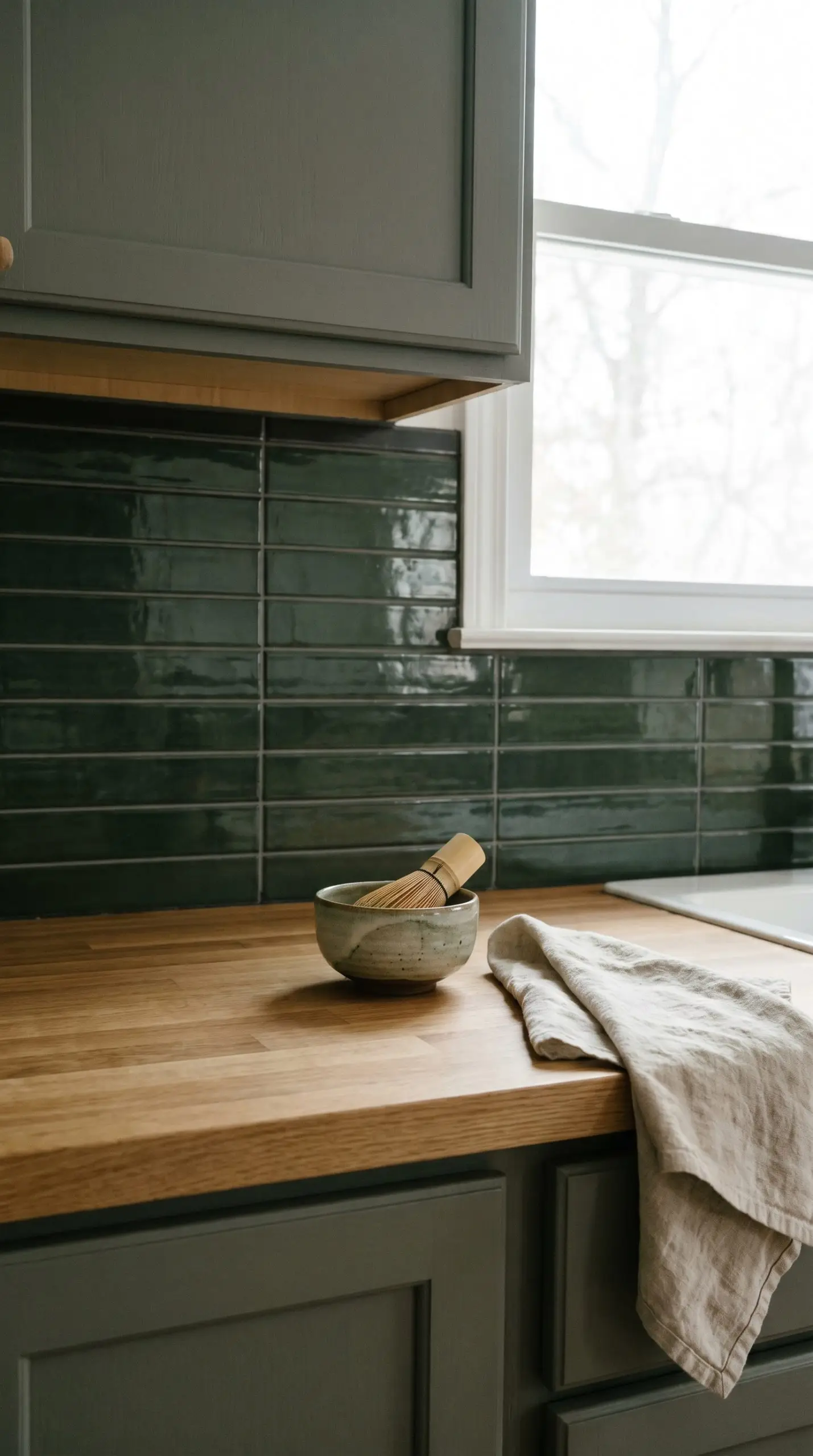
Slender, Japanese-style pencil tiles—often referred to as finger tiles—provide a delicate, linear dimension. Executed in restorative darks like deep tarragon or forest green, they bring gravity and sophisticated color into the vertical space without overwhelming the cabinetry.
- Vibe: Japandi / Organic Modern
- Key Material: 3/4×6-inch glazed porcelain finger tiles
- Paint Recommendation: Sherwin-Williams Pewter Green
- Countertop Match: Warm White Oak Butcher Block
16. Large-Format Terrazzo
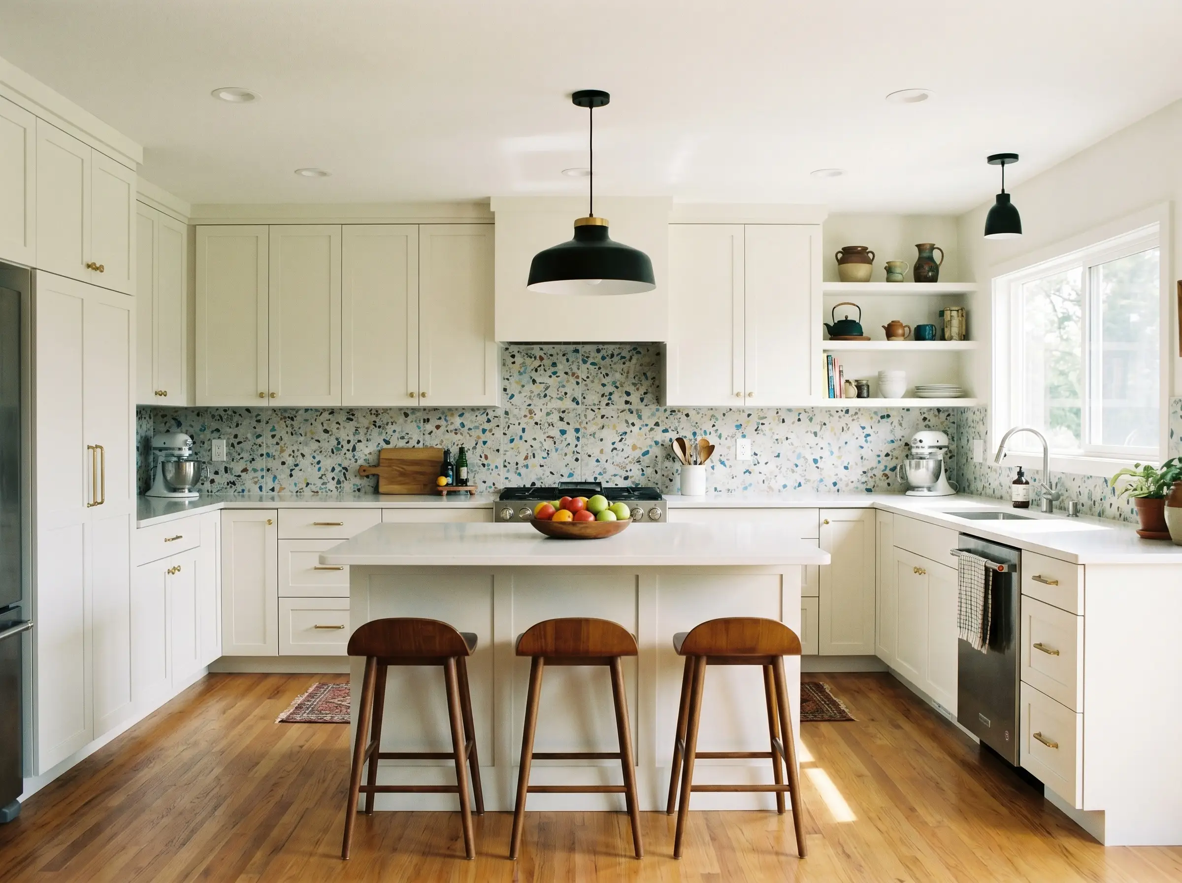
Oversized terrazzo tiles introduce a subtle, multi-colored aggregate that effortlessly ties together disparate cabinet hues and mixed metal hardware. This material avoids the chaotic look of tiny mosaics, offering a broad, smooth expanse of postmodern texture.
- Vibe: Mid-Century Revival
- Key Material: 24×24-inch authentic cement terrazzo
- Paint Recommendation: Benjamin Moore Super White
- Countertop Match: Solid White Quartz
Color and Contrast Strategies
The current palette for architectural finishes heavily favors moody tones and warm neutrals over stark, clinical whites. Strategic color contrast dictates the entire atmospheric weight of the kitchen.
17. Moody Black Slate Against Light Oak
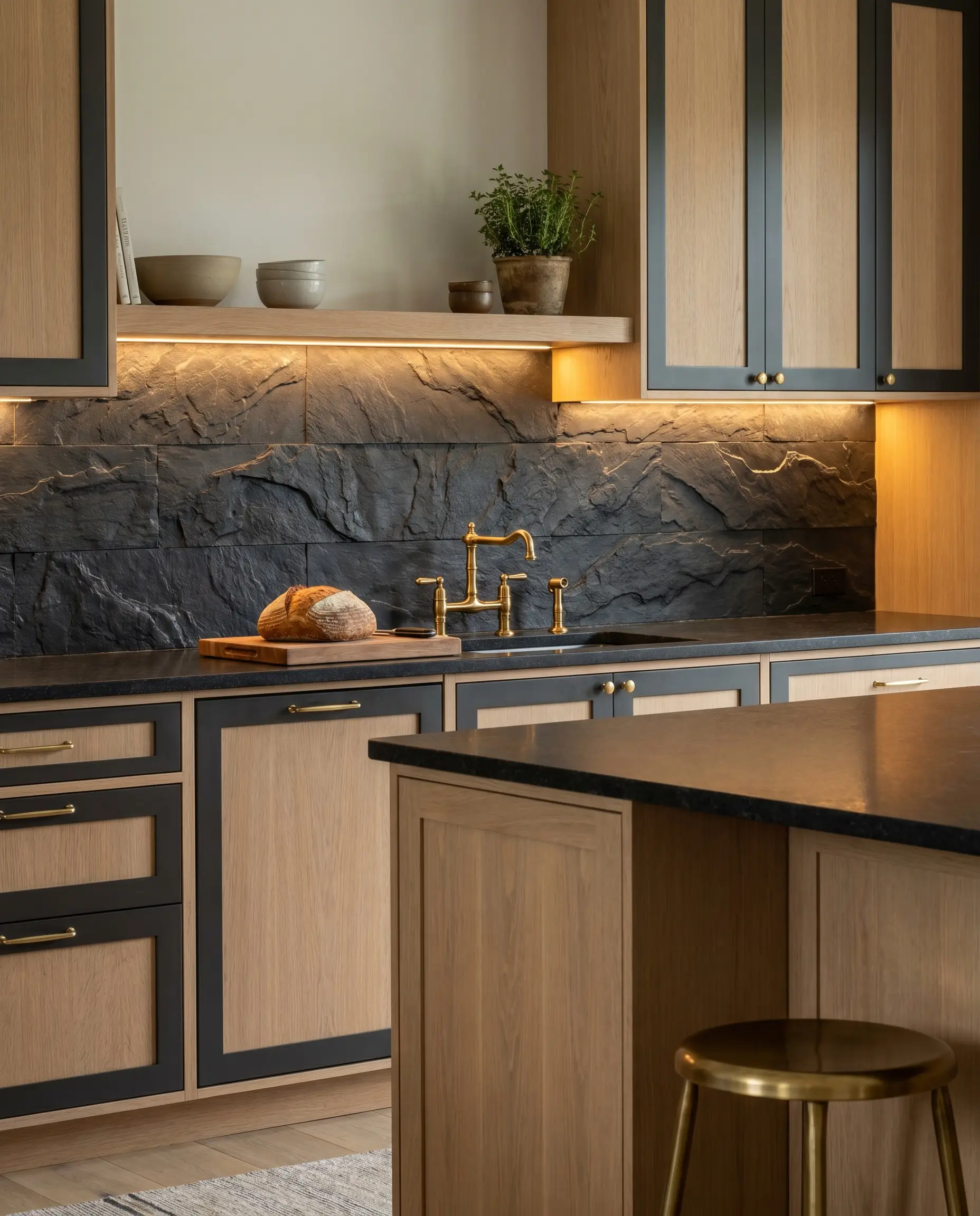
The rugged, cleft texture of black slate provides a high-contrast anchor that beautifully grounds the lightness of rift-sawn white oak cabinets. This dark, organic material absorbs light, creating a sophisticated, cavernous depth behind the prep areas.
- Vibe: High-Contrast Organic
- Key Material: 4×12-inch cleft black slate
- Paint Recommendation: Sherwin-Williams Tricorn Black (for accents)
- Countertop Match: Honed Black Granite
18. Soft Taupe and Cream Stone Tiles
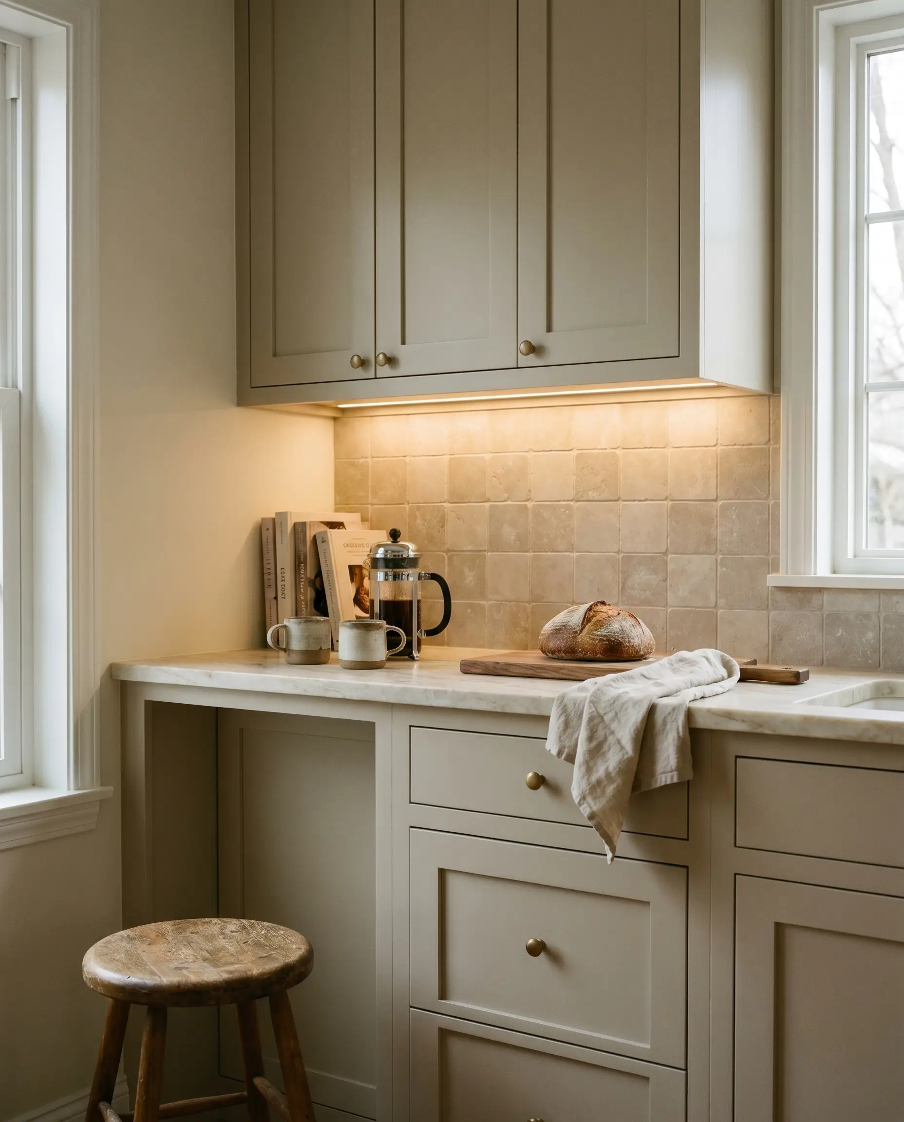
Moving away from stark white, warm taupes, mushrooms, and creamy limestones offer a gentle, glowing aesthetic under cabinet lighting. These soft tones execute the warm neutral trend perfectly, ensuring the transition from counter to wall feels highly organic.
- Vibe: Warm Minimalist
- Key Material: 4×4-inch honed limestone
- Paint Recommendation: Farrow & Ball Drop Cloth
- Countertop Match: Creamy Quartzite
19. High-Contrast Grout Outlines
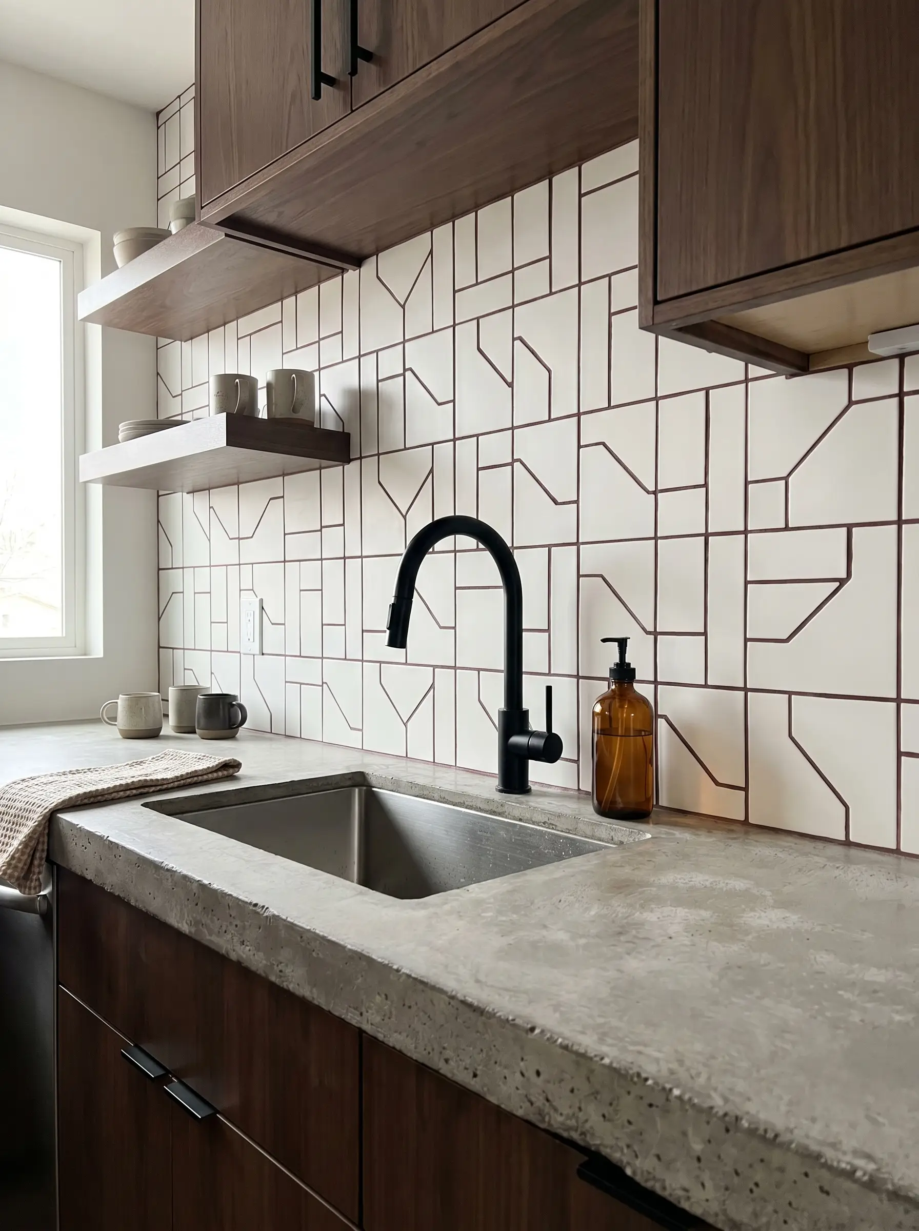
Turning the grout joint itself into the primary design feature transforms an inexpensive tile into a striking architectural element. Pairing a simple, matte white square tile with a dark charcoal or terra cotta-colored grout emphasizes strict geometric lines.
- Vibe: Graphic Industrial
- Key Material: 4×4-inch matte white ceramic
- Grout Recommendation: Mapei Charcoal or Terracotta
- Countertop Match: Poured Concrete
20. Restorative Darks: Plum Brown and Tarragon
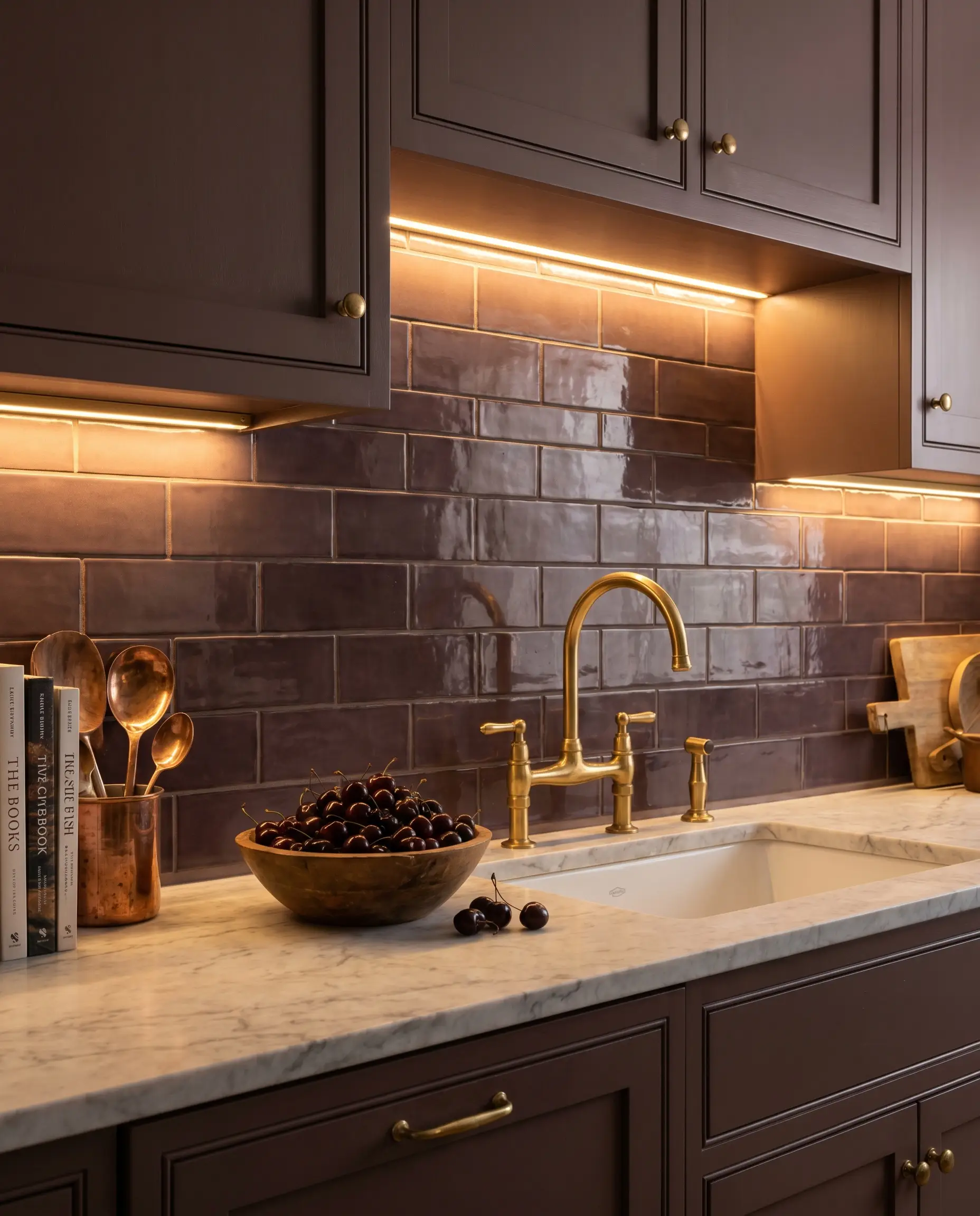
Deep, plush colors like plum brown or smoky blue-green convey immense gravity and sophistication without veering into gothic territory. These restorative darks create a highly intimate atmosphere, especially when paired with warm brass plumbing fixtures.
- Vibe: Moody Sophistication
- Key Material: 2×6-inch glazed ceramic in Plum
- Paint Recommendation: Sherwin-Williams Carnelian
- Countertop Match: Light Marble
21. Ceiling-Height Elongation
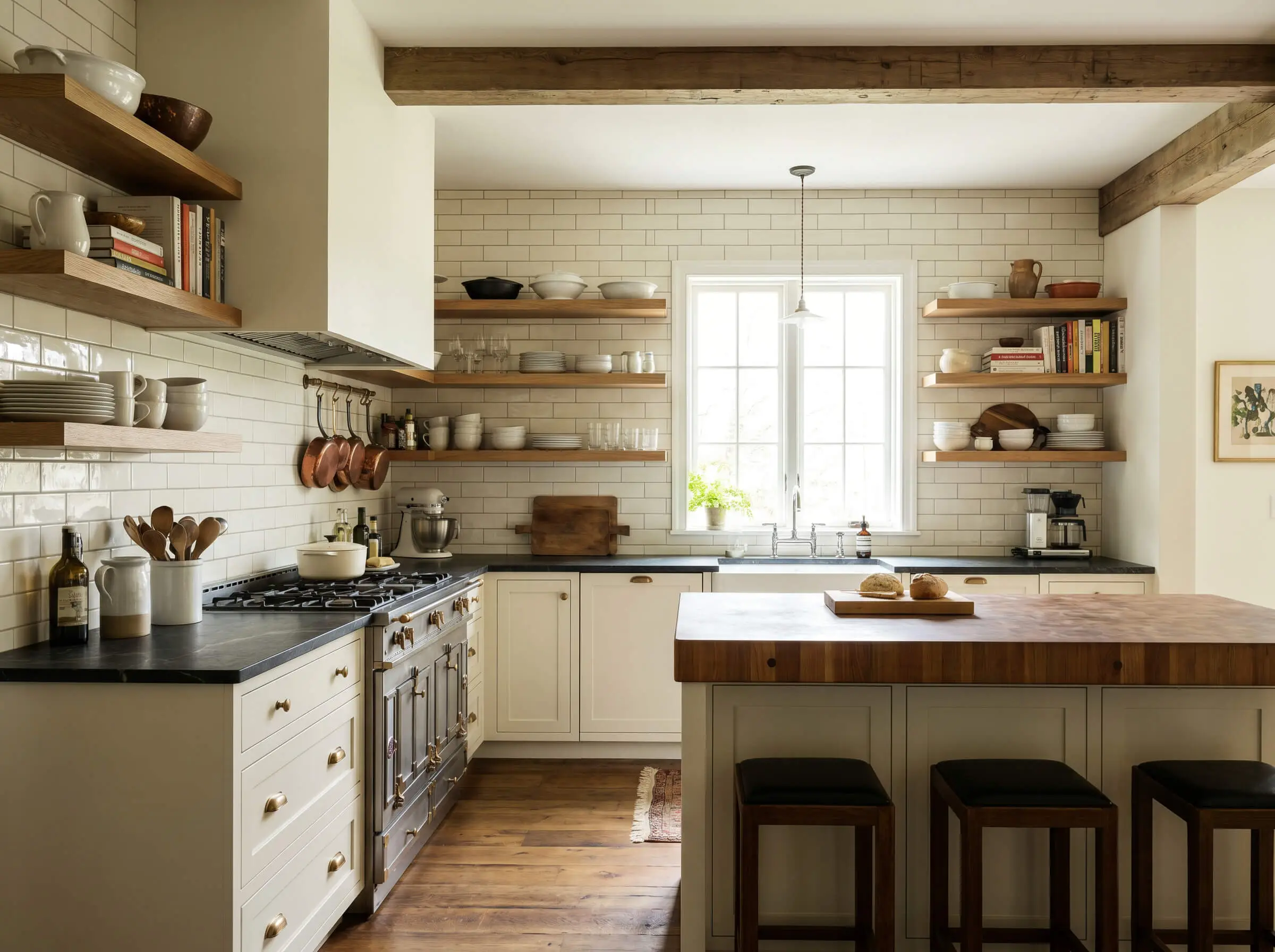
Taking the tile entirely past the floating shelves and running it all the way to the ceiling visually expands the room’s total volume. This installation strategy treats the wall as a cohesive architectural feature rather than just a functional splash guard.
- Vibe: European Bistro
- Key Material: 3×6-inch glazed subway tile
- Paint Recommendation: Benjamin Moore Simply White (for ceiling)
- Countertop Match: Soapstone
The Countertop and Tile Pairing Guide
The most common anxiety in kitchen design is pattern clashing. To achieve true architectural continuity, your backsplash material must mathematically and aesthetically respond to your specific countertop choice.
22. What to Pair with Heavily Veined Marble
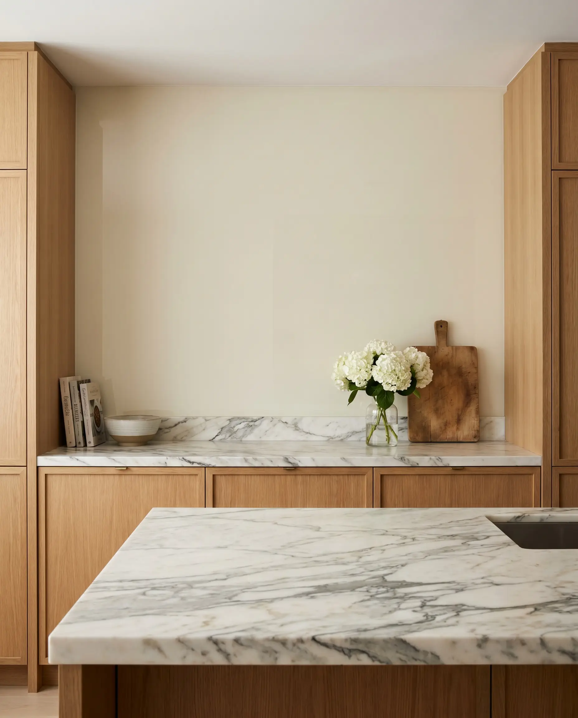
Busy marble or heavily veined quartzite strictly requires a quiet, low-texture backsplash to avoid visual chaos. Applying an aggressive pattern against an already loud stone creates a jarring, competitive environment rather than a cohesive design.
- Countertop Material: Heavily Veined Marble
- Exact Ideal Tile Match: Solid back-painted glass or large-format matte porcelain panels.
- Styling Pro-Tip: Color-match the solid tile to the lightest background tone of the marble to let the veining remain the focal point.
23. What to Pair with Solid White Quartz
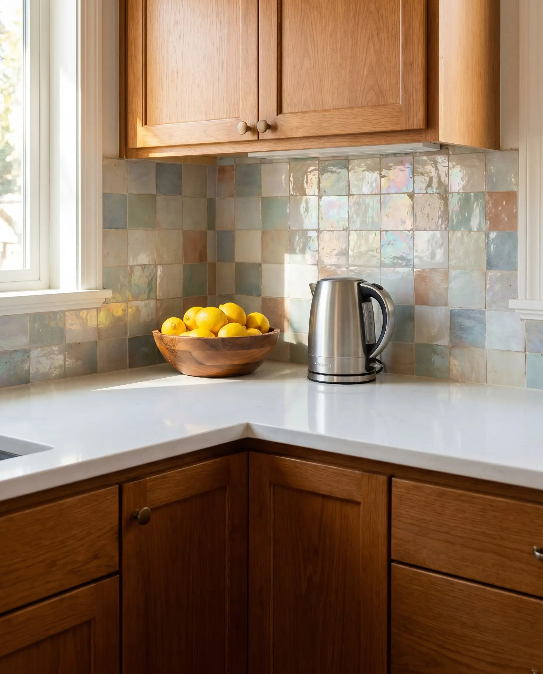
Solid white quartz demands a high-texture or high-variation backsplash to prevent the kitchen from feeling like a sterile laboratory. The absolute uniformity of the engineered counter requires the organic imperfection of handmade materials to inject soul into the space.
- Countertop Material: Solid White Quartz
- Exact Ideal Tile Match: V4 color variation Zellige or unglazed brick slips.
- Styling Pro-Tip: Use a slightly off-white or pearlescent glaze to bridge the stark white counter with warmer cabinetry.
24. What to Pair with Warm Butcher Block
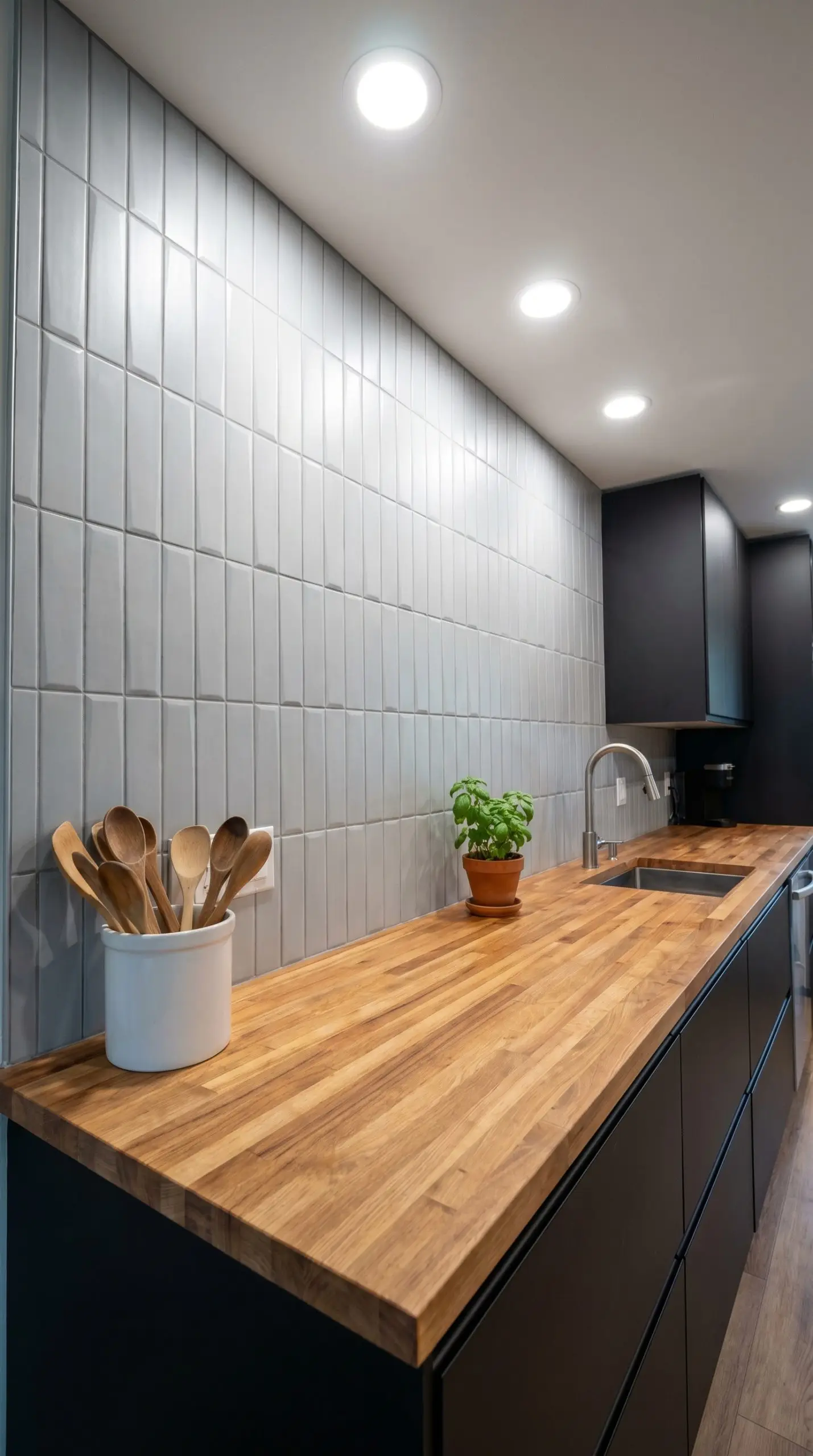
The deeply organic, porous nature of wood counters requires visual balance through cool, structured architectural materials. Pairing wood with overly rustic tiles can make a space feel dated, whereas crisp, rigid formats modernize the timber.
- Countertop Material: Warm Butcher Block
- Exact Ideal Tile Match: Matte geometric ceramics or honed soapstone slabs.
- Styling Pro-Tip: Utilize a vertical straight stack layout to contrast the horizontal grain of the butcher block.
25. What to Pair with Dark Soapstone or Granite
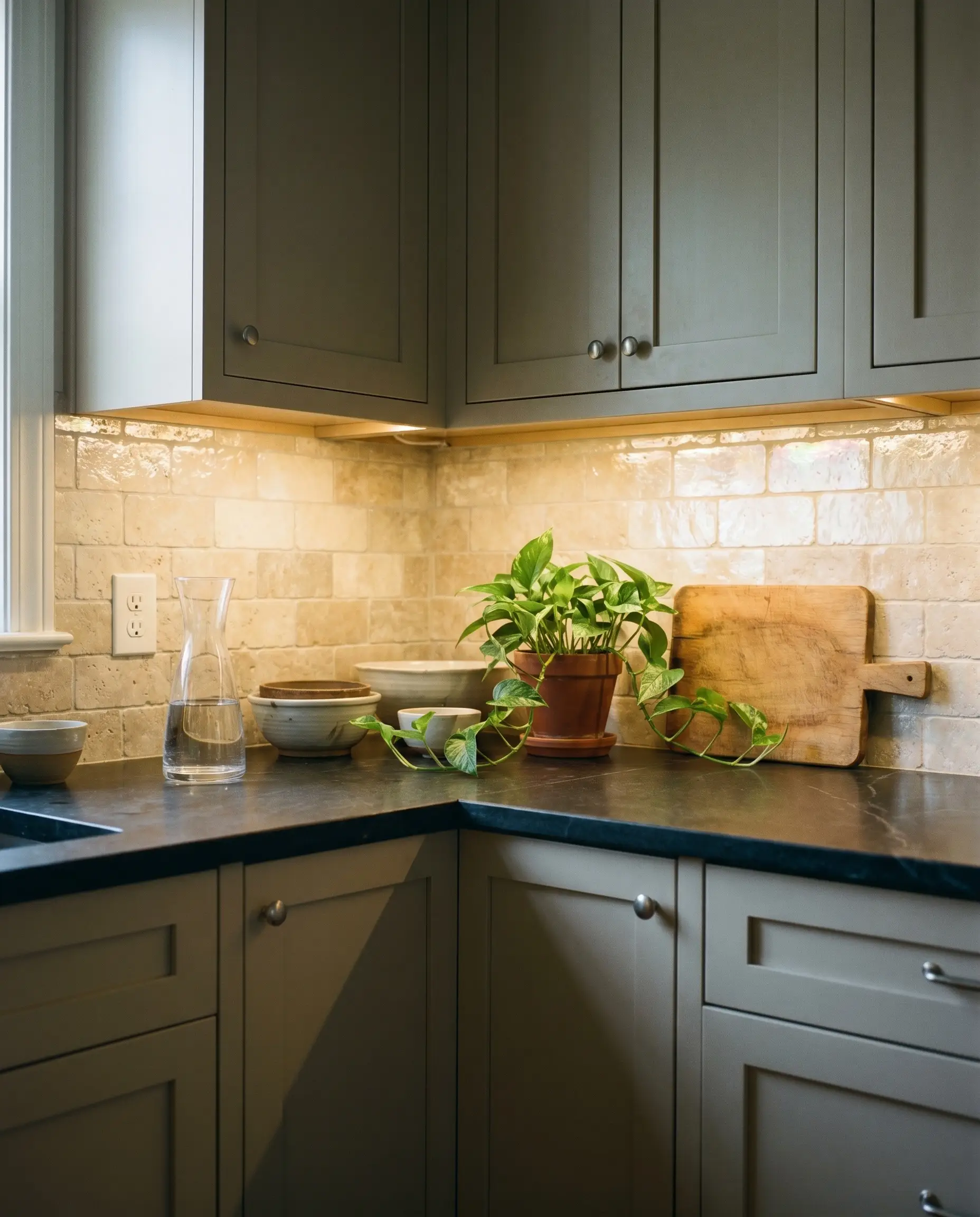
Dark stone counters absorb massive amounts of ambient light, requiring a backsplash strategy that aggressively reflects illumination back into the room. A matte, dark tile over a dark counter shrinks the perceived depth of the workspace.
- Countertop Material: Dark Soapstone or Granite
- Exact Ideal Tile Match: Pearlescent glazes or light-reflecting tumbled travertine.
- Styling Pro-Tip: Install under-cabinet lighting specifically calibrated to 3000K to highlight the reflective glaze of the backsplash.
Final Considerations for Your Kitchen Canvas
Finishing touches dictate the boundary between basic installations and accessible luxury. When terminating a backsplash on an open wall, you must choose a deliberate edge treatment—either a perfectly rounded bullnose tile edge or a crisp, metallic Schluter strip.
Furthermore, remember that thicker materials, like unglazed brick or heavily textured terra cotta, will require electrical outlet box extenders to ensure your switches sit flush with the new surface.
Never finalize your material schedule blindly; order physical samples, prop them against your exact countertops, and observe how the light interacts with the glaze throughout the day.

The Hackrea Style Desk treats interior decoration as an exact visual science. Rather than focusing on demolition or floor plans, this desk masters the art of color theory, undertone matching, material pairings, and spatial proportion. From balancing the visual weight of mixed metals to finding the perfect bridging tone between disparate wood species, this desk provides the rigorous aesthetic rules needed to achieve high-end, editorial-quality harmony in any space.