If the last few years were about finding our footing, 2026 is about planting roots.
For over a decade, the design world was dominated by cool grays and stark, gallery-white walls. But as we move into 2026, the pendulum has swung decisively in the other direction. We are entering an era of “New Neutrals,” deeply restorative earth tones, and moody, cinematic hues that prioritize comfort over minimalism.
The 2026 paint color trends aren’t just about aesthetics; they are a direct response to our collective craving for stability. We are seeing a shift away from fast-paced trends toward “Slow Living”—interiors that feel curated, grounded, and undeniably human. Whether you are planning a full renovation or just looking for a weekend DIY project, this year’s palette invites you to exhale.
Let’s dive into the definitive guide to the 2026 colors of the year, how to use them, and why your gray walls might finally be ready for retirement.
At a Glance: The 2026 Colors of the Year
Before we break down the psychology and application of each shade, here is your cheat sheet for the major industry players and their defining colors for 2026.
| Brand | Color Name | Color Family | The Vibe |
| Sherwin-Williams | Universal Khaki | Neutral | Grounded, organic, and versatile. |
| Benjamin Moore | Silhouette | Deep Red/Grey | Sultry, moody, and sophisticated. |
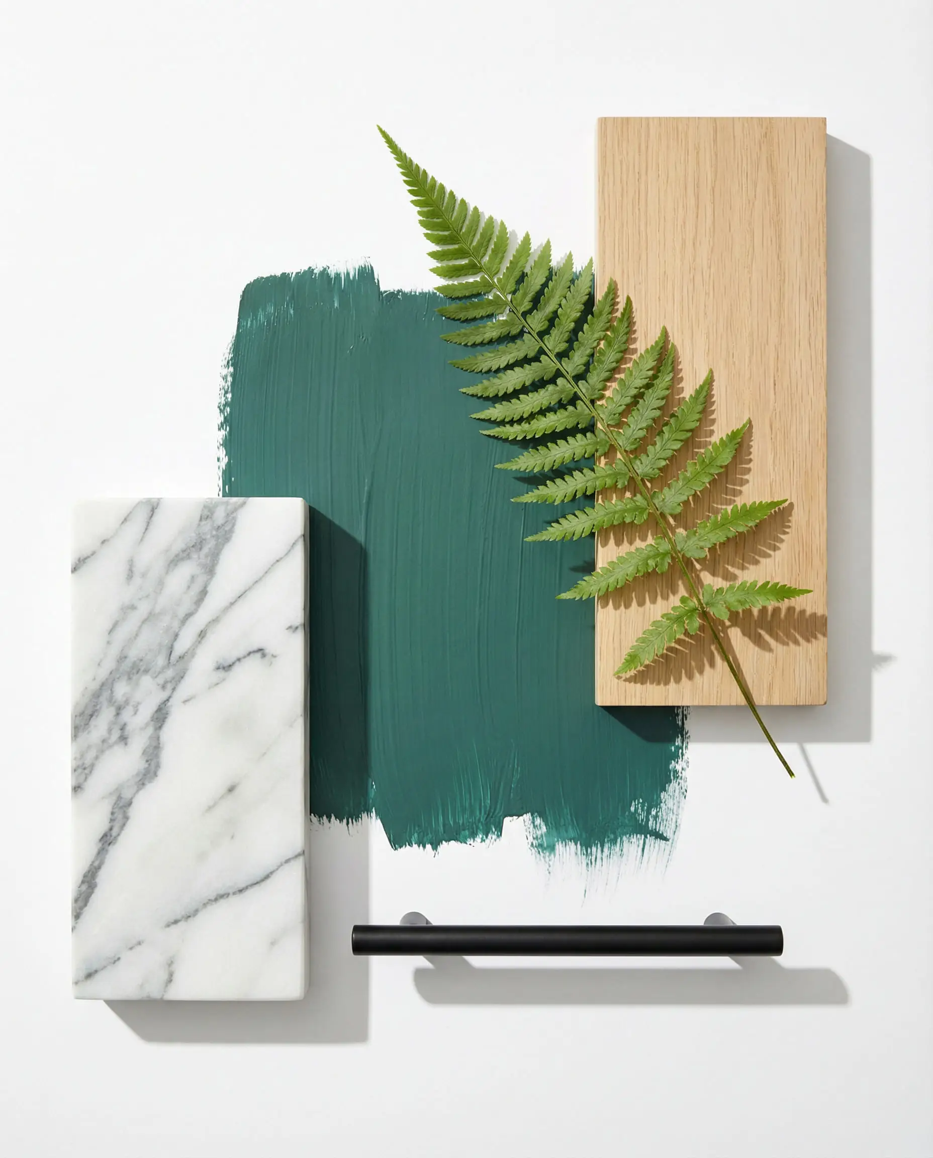
| Behr | Hidden Gem | Green/Teal | Jewel-toned luxury meets nature. |
| Valspar | Warm Eucalyptus | Soft Green | Restorative, spa-like, and calming. |
| Dunn-Edwards | Midnight Garden | Deep Green | The intersection of “Goth” and “Garden.” |
| Glidden / PPG | Warm Mahogany | Red/Brown | Earthy, historic, and welcoming. |
| Dutch Boy | Melodious Ivory | Warm White | Sunny, creamy, and optimistic. |
| Little Greene | Adventurer | Plum/Purple | The new alternative to navy blue. |
You can apply wallpapers, paints, etc. on walls and see how they look in various interiors.

Trend 1: The “New Neutrals” (Warmth & Stability)
If there is one headline for 2026, it is this: Cool Gray is officially hibernating.
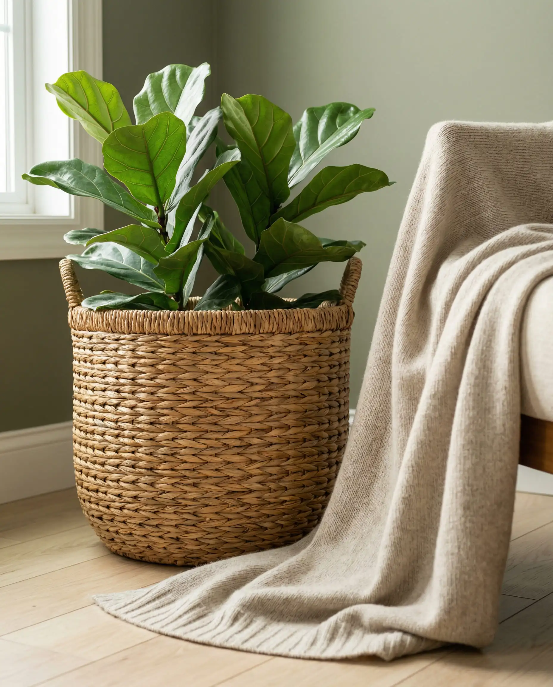
For years, “Agreeable Gray” was the safe choice. But in 2026, “safe” has been replaced by “snug.” The new neutrals are warmer, yellow-based, and texture-heavy. They are designed to wrap a room in a hug rather than make it feel expansive and airy. This trend aligns perfectly with the current living room trends, where soft curves and tactile fabrics are replacing sharp mid-century lines.
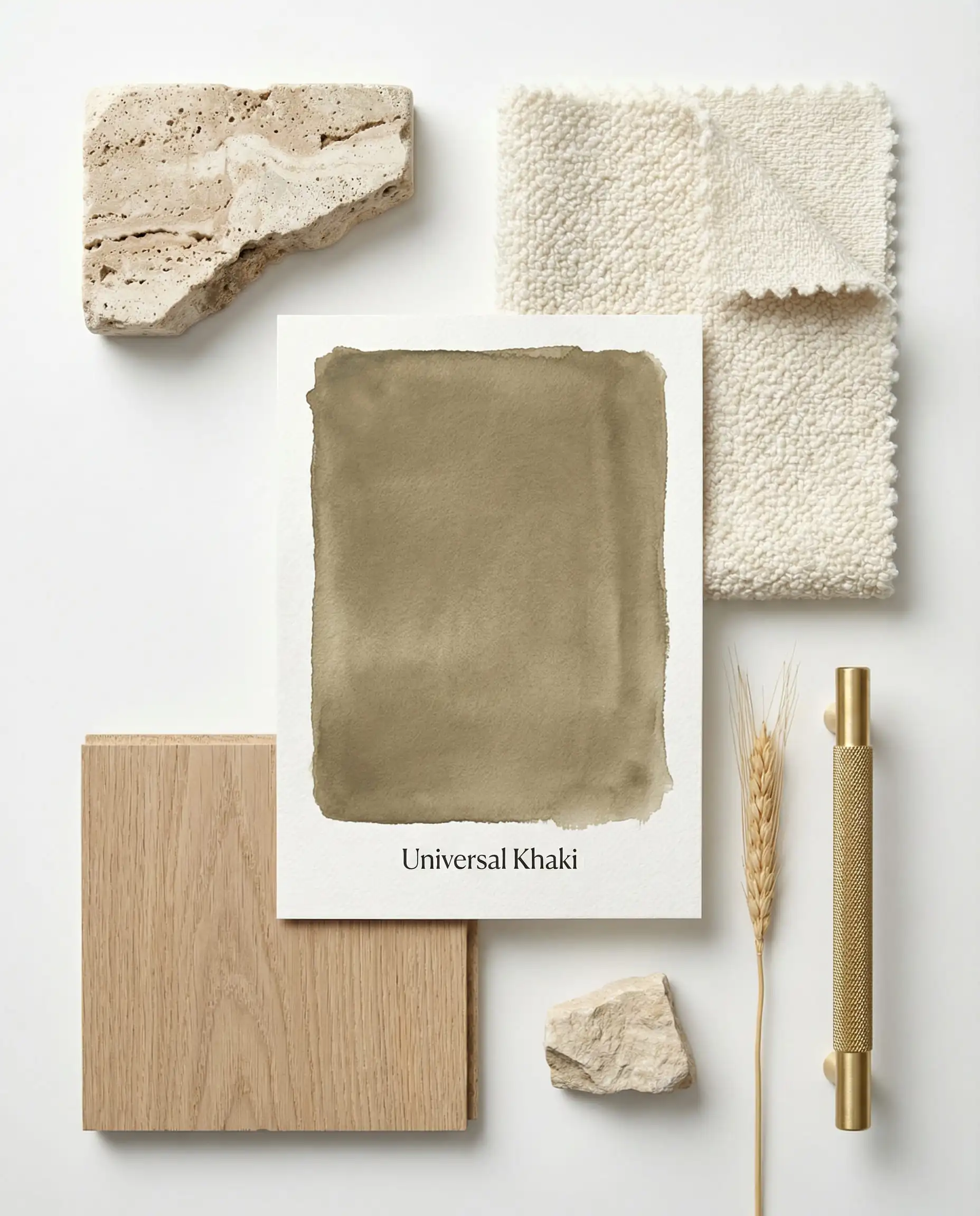
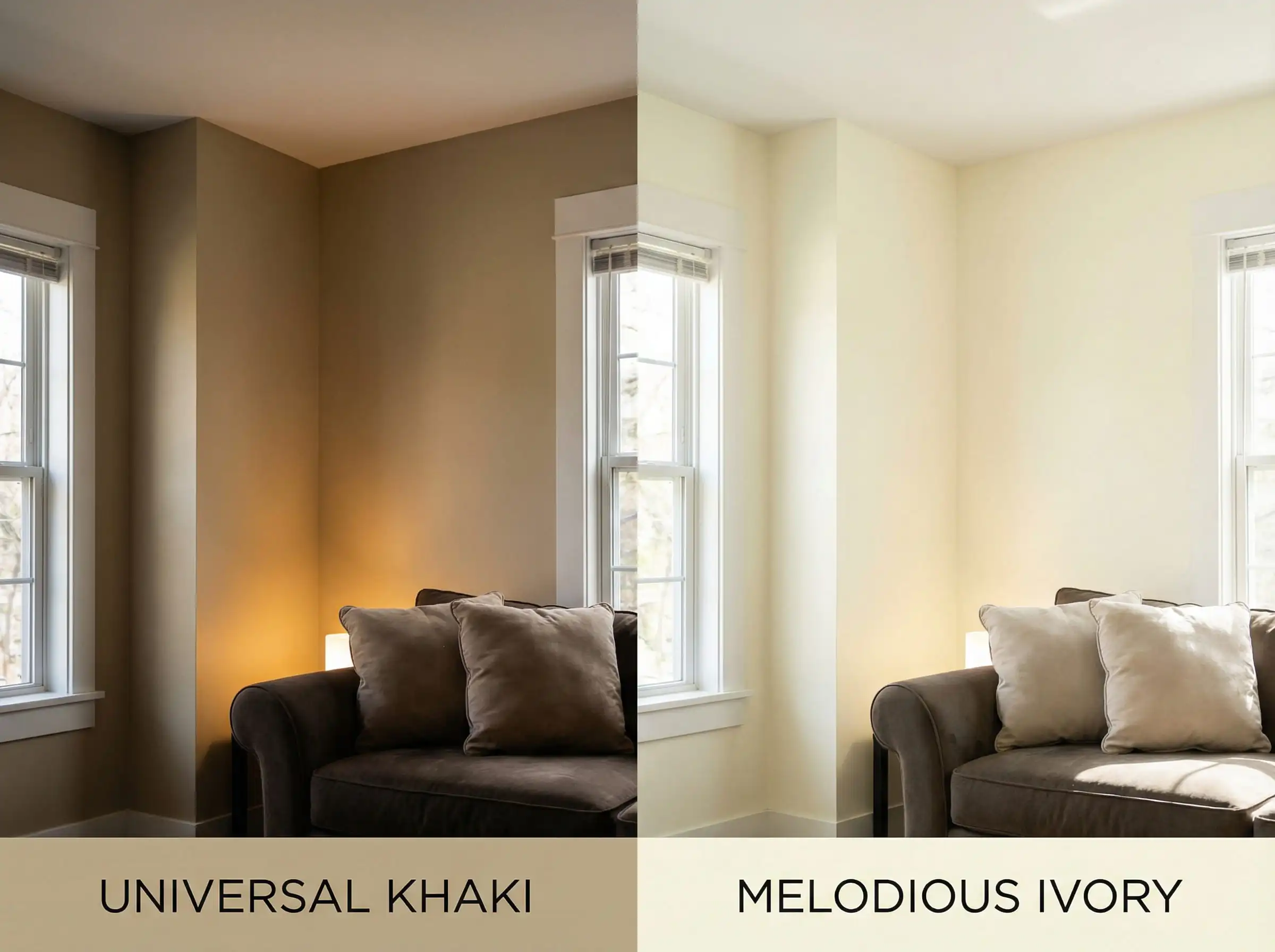
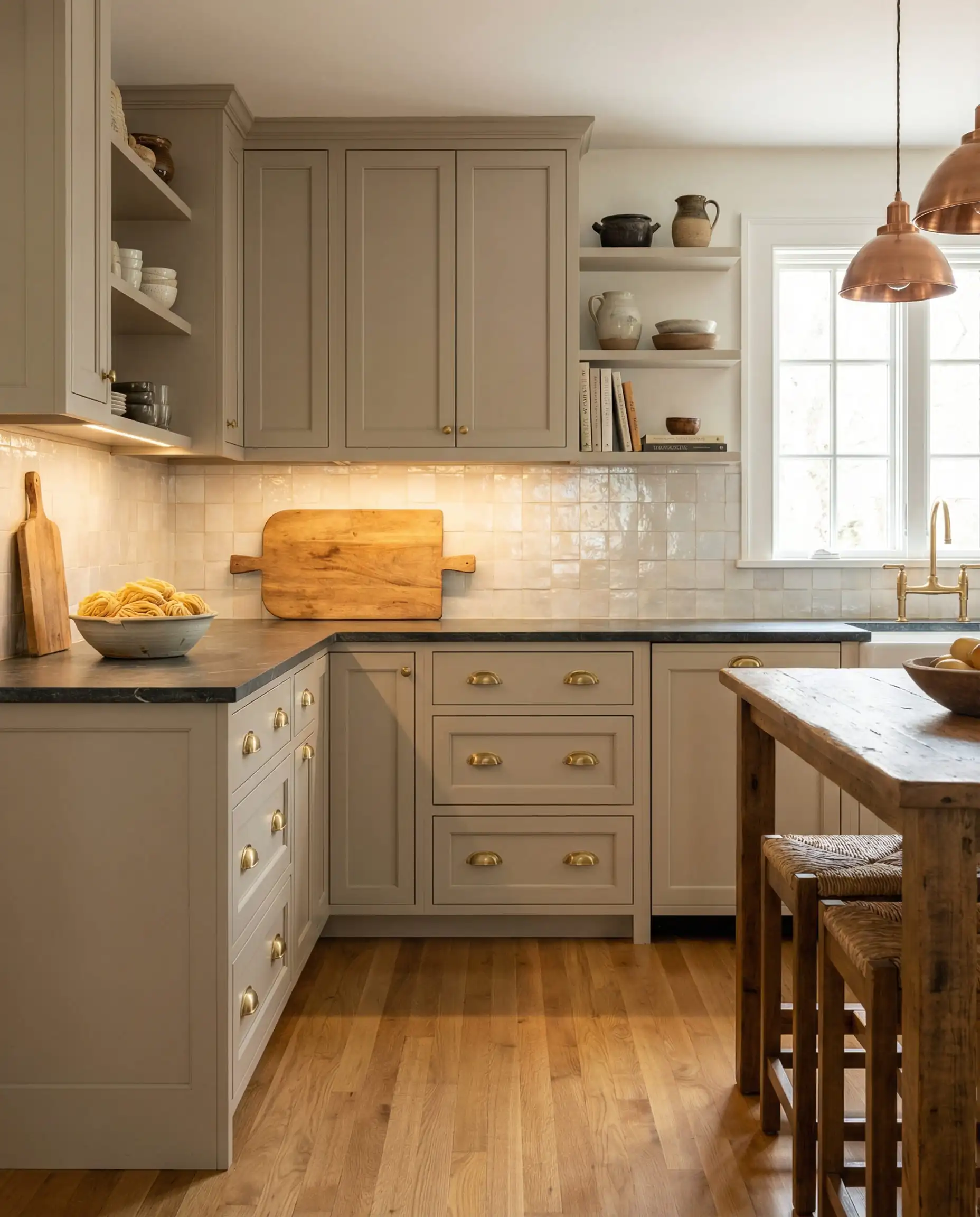
Sherwin-Williams: Universal Khaki (SW 6150)
Sherwin-Williams has crowned Universal Khaki as their star, and it is the perfect ambassador for this shift. This isn’t the drab builder-beige of the 1990s. It is a sophisticated, solid tan that bridges the gap between modern and classic.
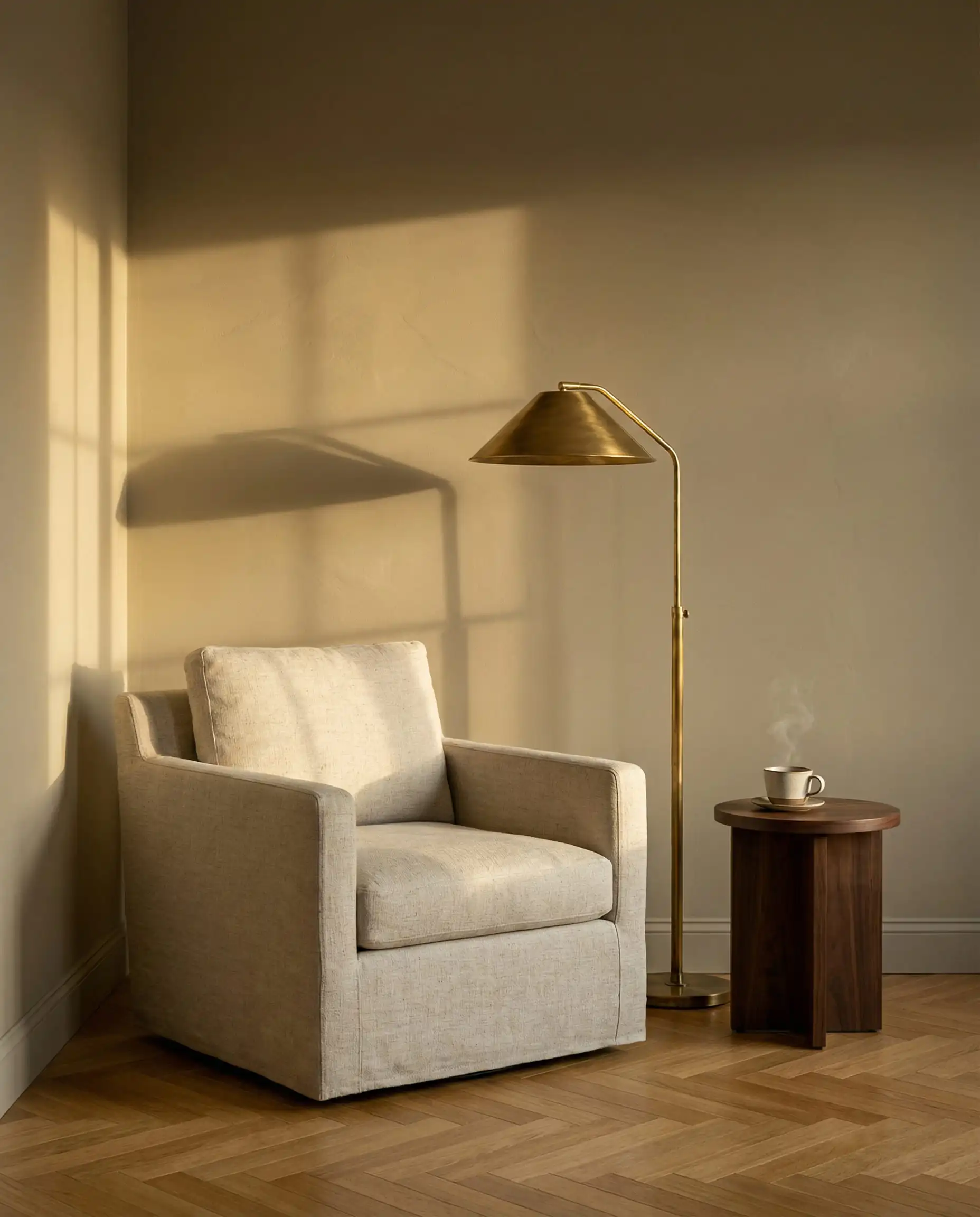
To prevent a monochromatic beige room from looking “flat,” you must vary your textures. Mix a flat/matte paint finish on the walls with high-contrast materials like a velvet sofa, a rough jute rug, and smooth ceramic lamps. The friction between textures creates the interest that color usually would!
💡 Designer Tip
Dutch Boy: Melodious Ivory
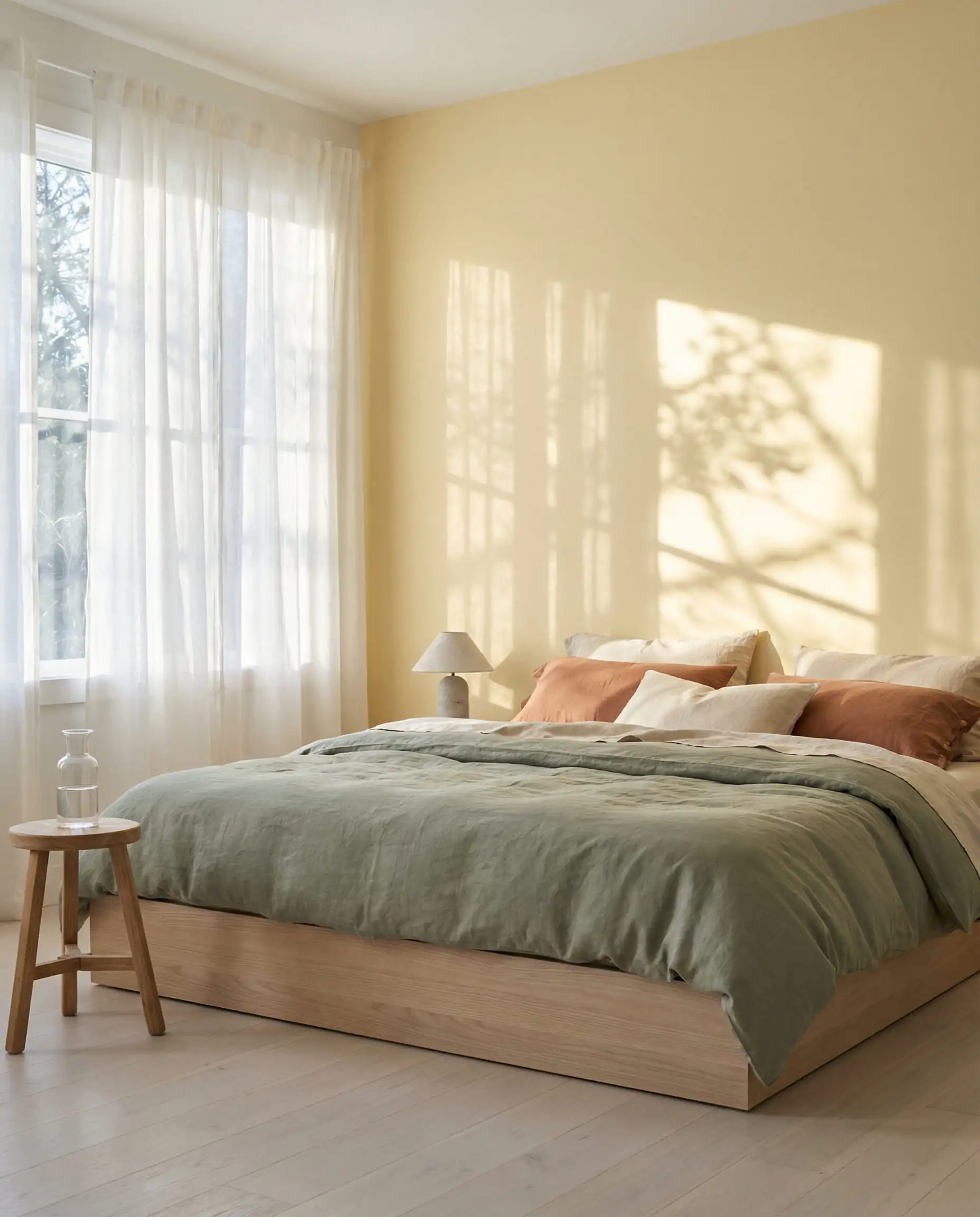
On the lighter end of the spectrum, Dutch Boy brings us Melodious Ivory. As we move away from stark whites, we are seeing a resurgence of “butter yellows” and creamy tones.
This color acts as a neutral but carries a distinct yellow undertone that mimics the glow of “Golden Hour” sunlight. It is an excellent choice for north-facing rooms that tend to feel cold and blueish. By painting your walls this shade, you artificially induce a sense of warmth and sunshine, making it a secret weapon for smaller, darker spaces.
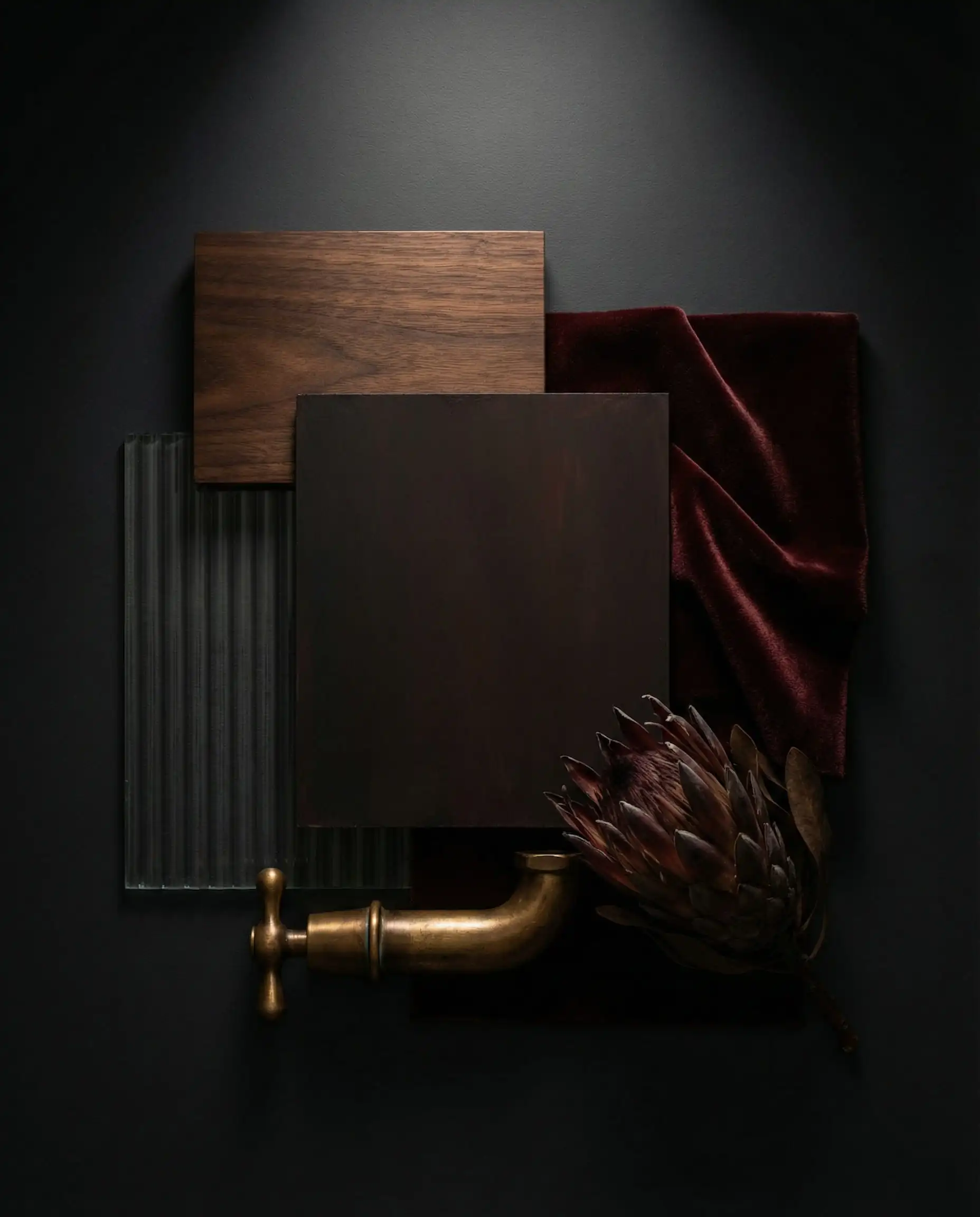
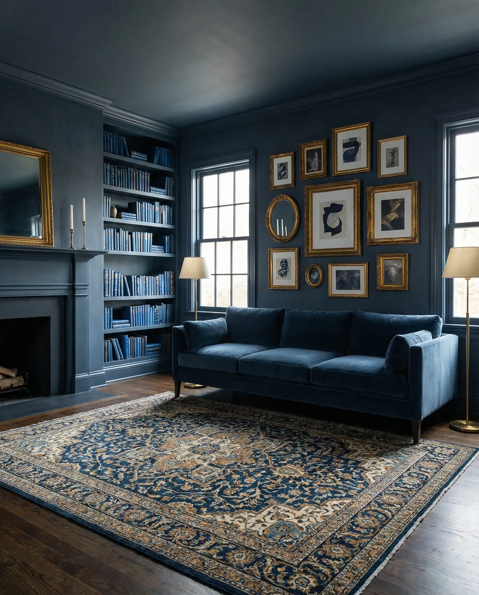
Trend 2: The Moody Renaissance (Dark & Dramatic)
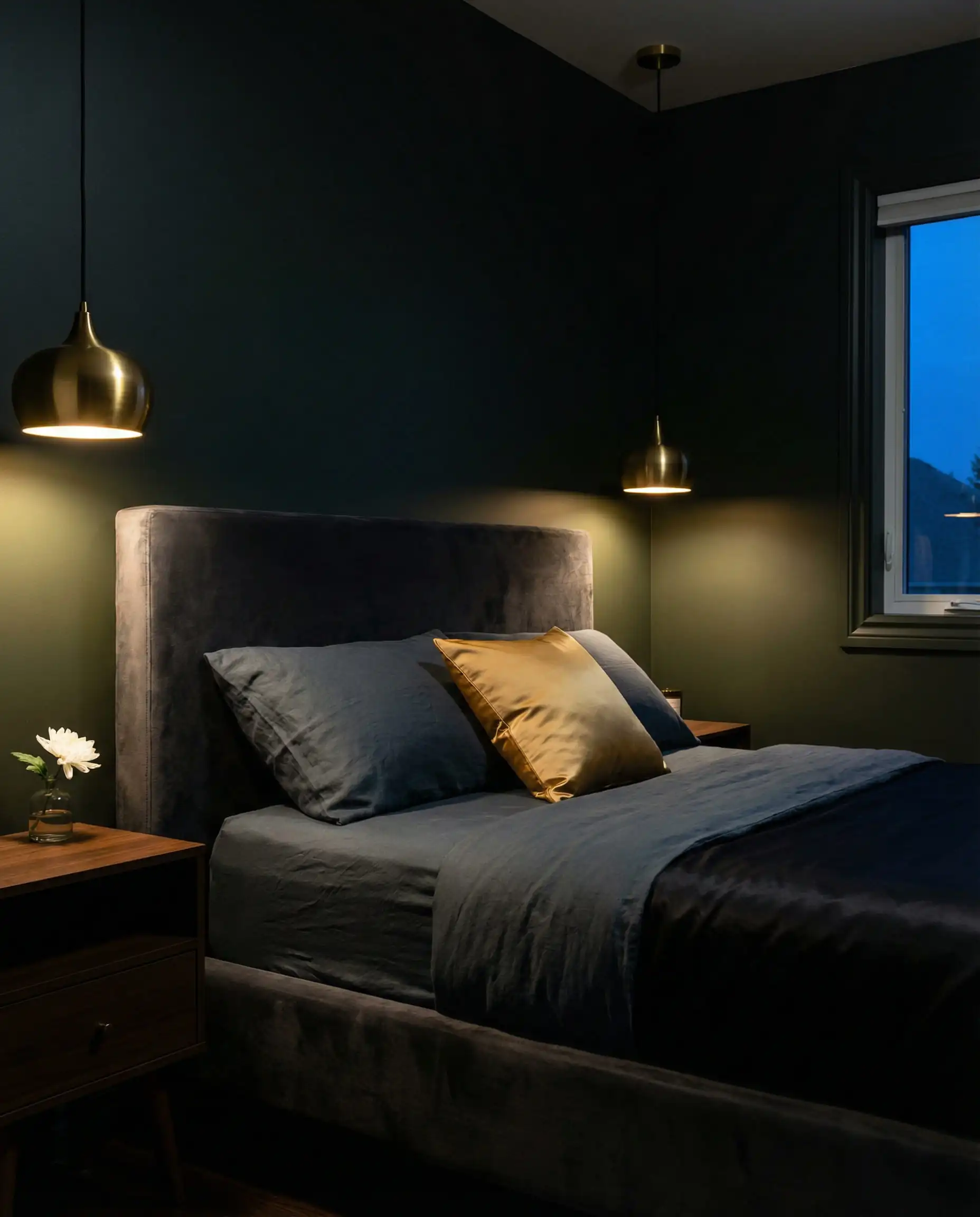
While neutrals are heating up, the darks are getting deeper, more complex, and significantly more dramatic. 2026 sees the rise of “Cocooning”—the design philosophy of creating safe, enclosed, intimate spaces that separate you from the outside world.
This is arguably the most exciting shift for bedroom paint colors, where the goal is to create a sleep sanctuary that feels distinct from the rest of the home.
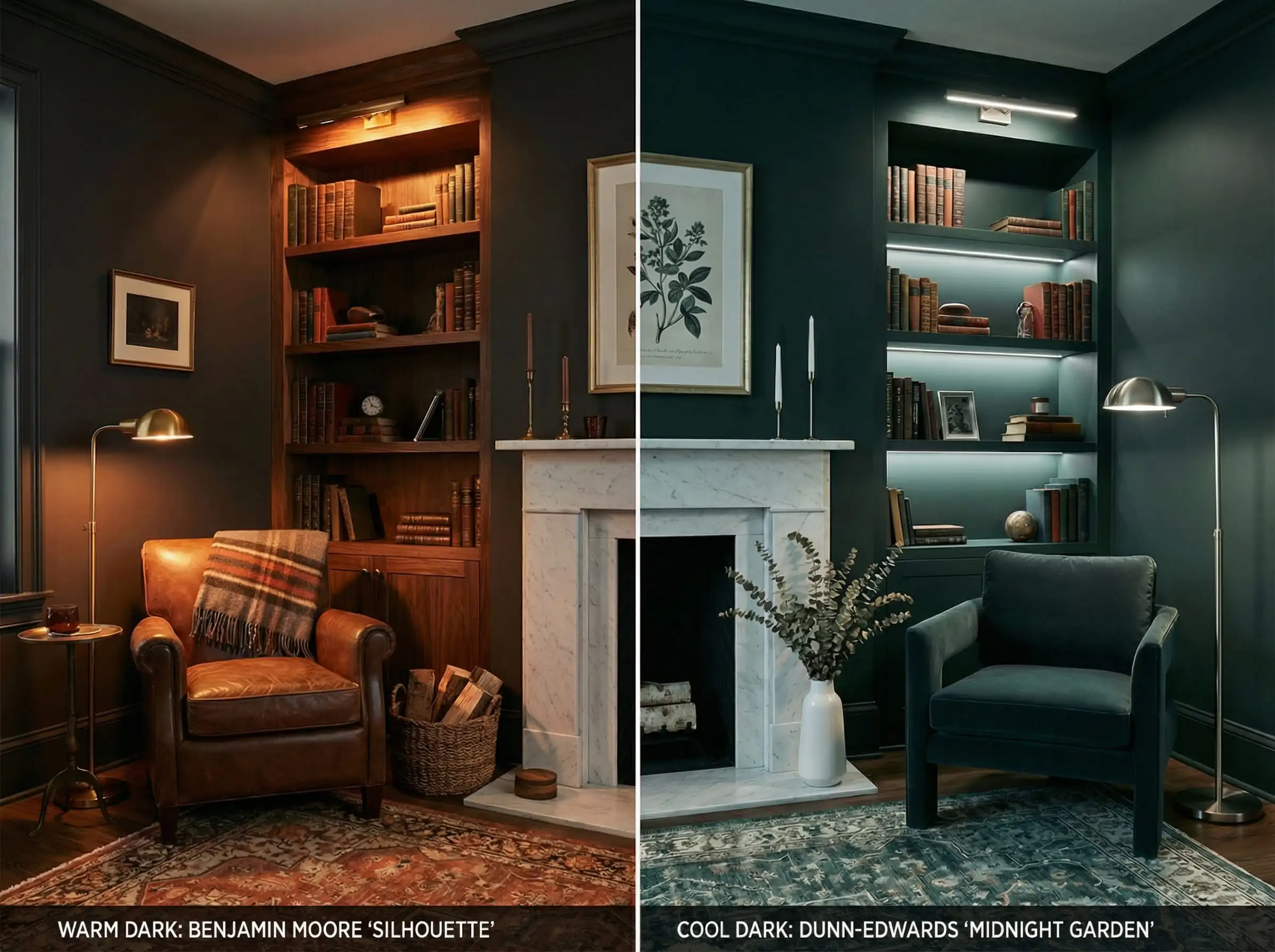
Benjamin Moore: Silhouette (AF-655)
Benjamin Moore’s selection, Silhouette, is a masterclass in ambiguity. Is it charcoal? Is it deep brown? Is it a very dark red? It is all of the above.
This sultry hue represents a move toward “unidentifiable” darks. It’s romantic and incredibly sophisticated. Unlike a flat black, Silhouette has chocolate and oxblood undertones that reflect light in a way that feels velvety rather than harsh.
Design Tip: Do not be afraid of the dark. The old myth that “dark colors make a room look small” is being debunked. Dark colors actually blur the edges of a room, creating an “infinity effect” where the walls seem to recede. It is perfect for a library, a media room, or a powder room where you want high impact.
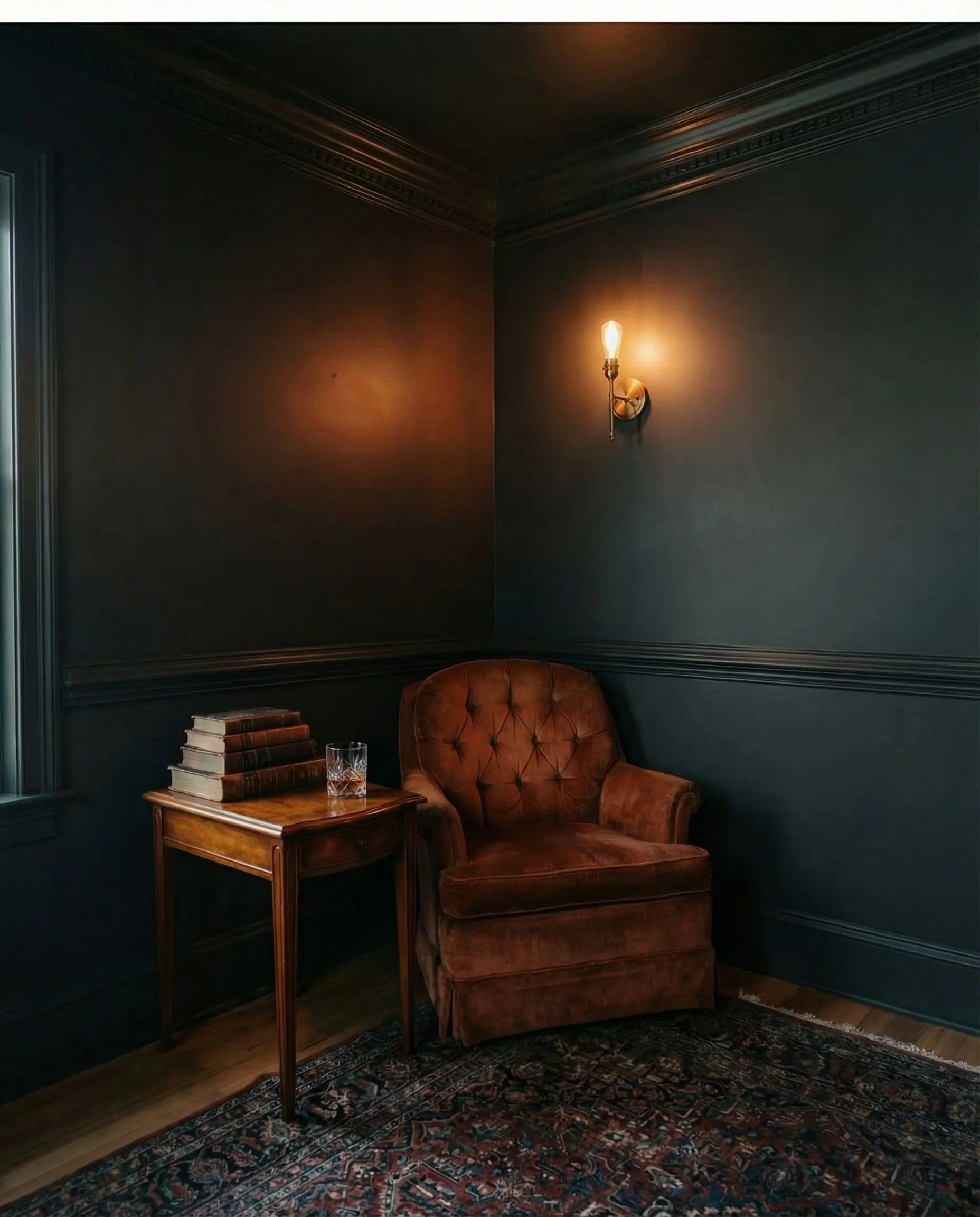
Dark colors absorb light, so lighting becomes crucial. Avoid a single overhead light, which can create harsh shadows. Instead, layer your lighting with warm-toned sconces and floor lamps. The warm light will pick up the chocolate undertones in Silhouette, making the room feel cozy rather than cave-like.
🔦 Styling Secret
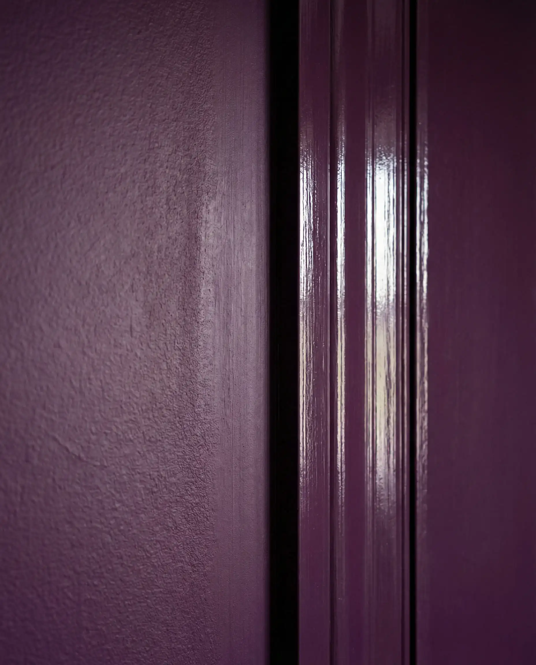
Little Greene: Adventurer
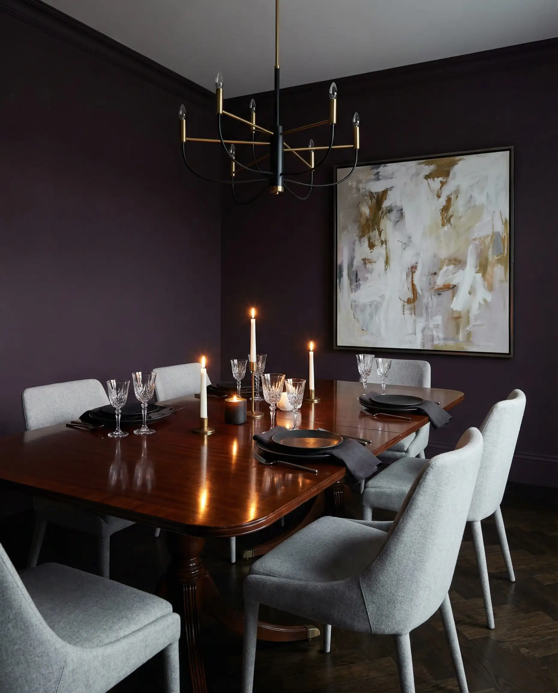
If you have been relying on Navy Blue (like Hale Navy) as your go-to dark color, 2026 invites you to try something new: Plum.
Little Greene’s Adventurer signals the return of purple, but in a very regal, grounded way. It is an aubergine shade that feels historic yet modern. It pairs beautifully with dark woods like walnut and mahogany, making it a strong contender for dining rooms or studies. It serves the same function as navy blue—grounding a space—but adds a layer of warmth that blue simply cannot provide.
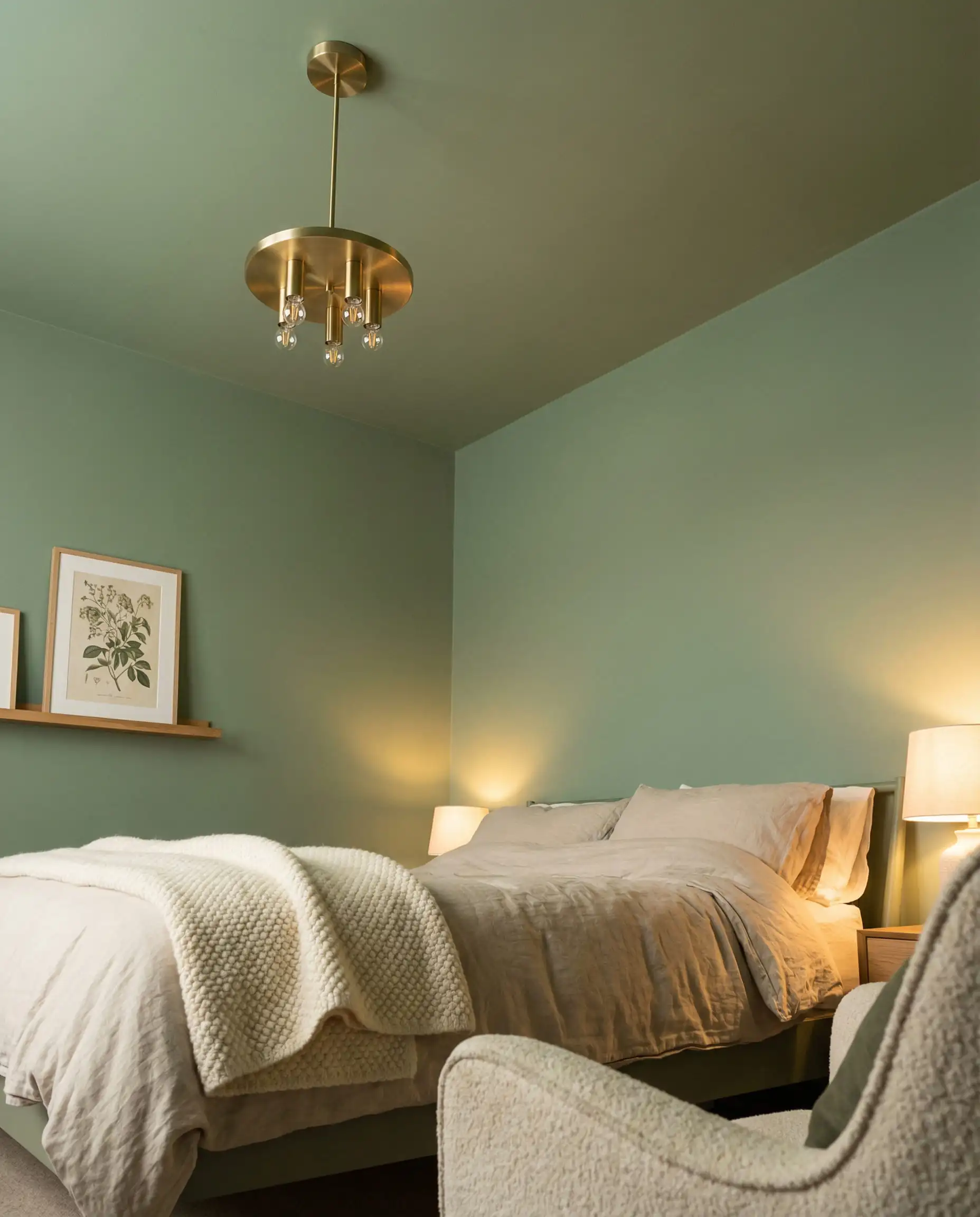
Trend 3: Biophilic Wellness (Restorative Greens)
Biophilic design—the concept of connecting interiors to nature—is no longer just a trend; it is a lifestyle standard. However, the greens of 2026 are shifting. We are moving away from the bright “houseplant green” toward shades that are either murkier and moodier, or softer and more therapeutic.
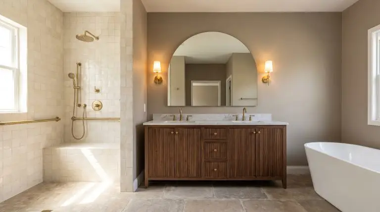
This palette is heavily influencing bathroom paint colors, transforming utilitarian spaces into home spas.
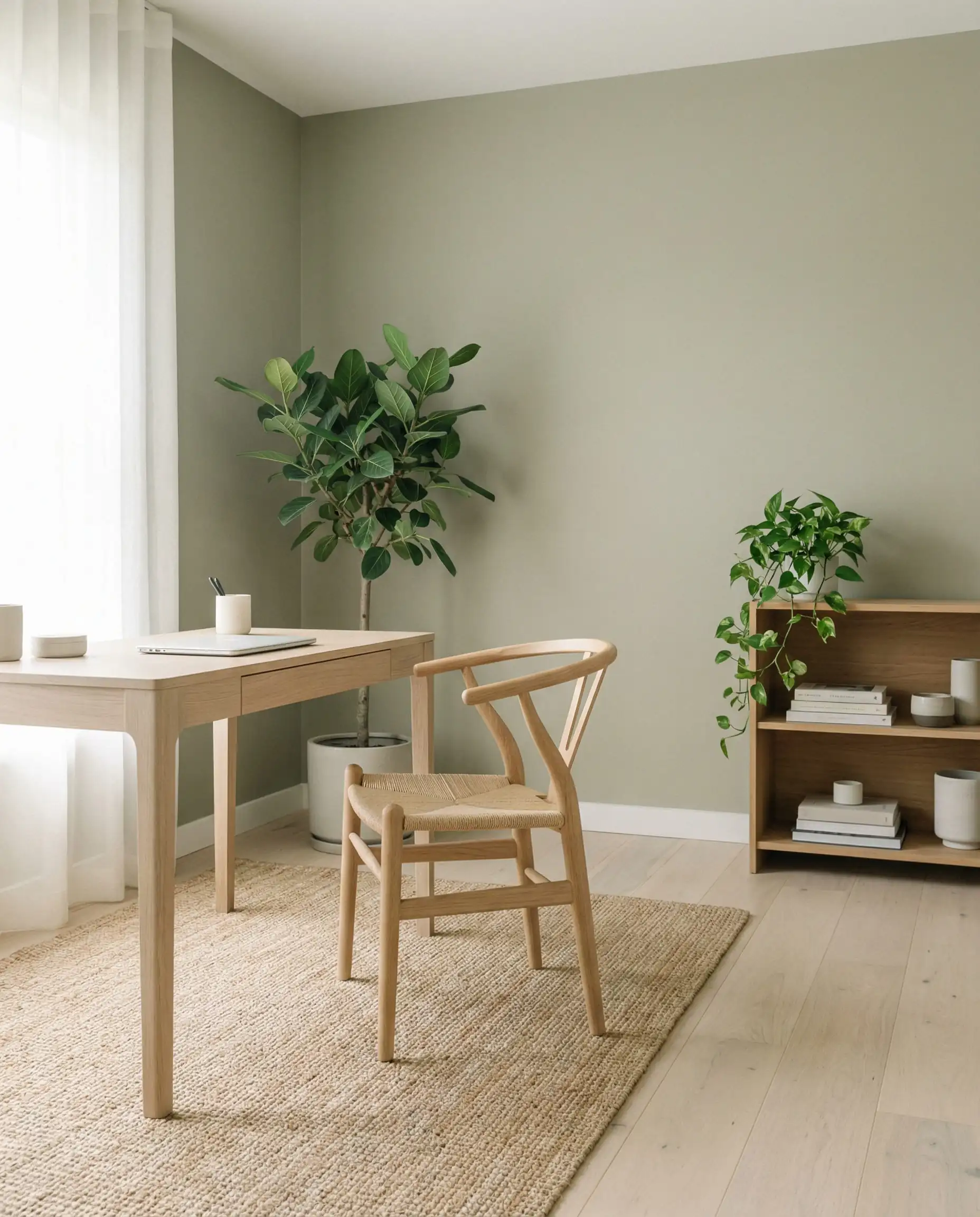
Valspar: Warm Eucalyptus (8004-28F)
Valspar’s color of the year is arguably the most relaxing shade on the 2026 roster. Warm Eucalyptus is a green that has been softened with a significant dose of yellow and gray.
It is designed specifically to lower cortisol levels. In a home office or a nursery, this color reduces eye strain and promotes focus without being boring. It pairs effortlessly with light oak flooring and rattan accessories, embodying the “Japandi” (Japan + Scandi) aesthetic that remains popular.
Behr: Hidden Gem (N430-6A)
For those who want nature with a bit more punch, Behr delivers Hidden Gem. This is a bold, jewel-tone jade. It feels like a canopy of deep rainforest leaves.
While Warm Eucalyptus is a background color, Hidden Gem is a protagonist. It is fantastic for cabinetry (think a bold kitchen island) or a feature wall behind a bed. It brings a sense of luxury to the biophilic trend, proving that “natural” doesn’t always have to mean “beige.”
Not ready to paint a whole room? Use Hidden Gem on your interior doors. Painting just the doors in a jewel tone while keeping the trim and walls neutral adds a sophisticated, custom architectural detail that elevates the entire hallway.
🚪 Pro Tip
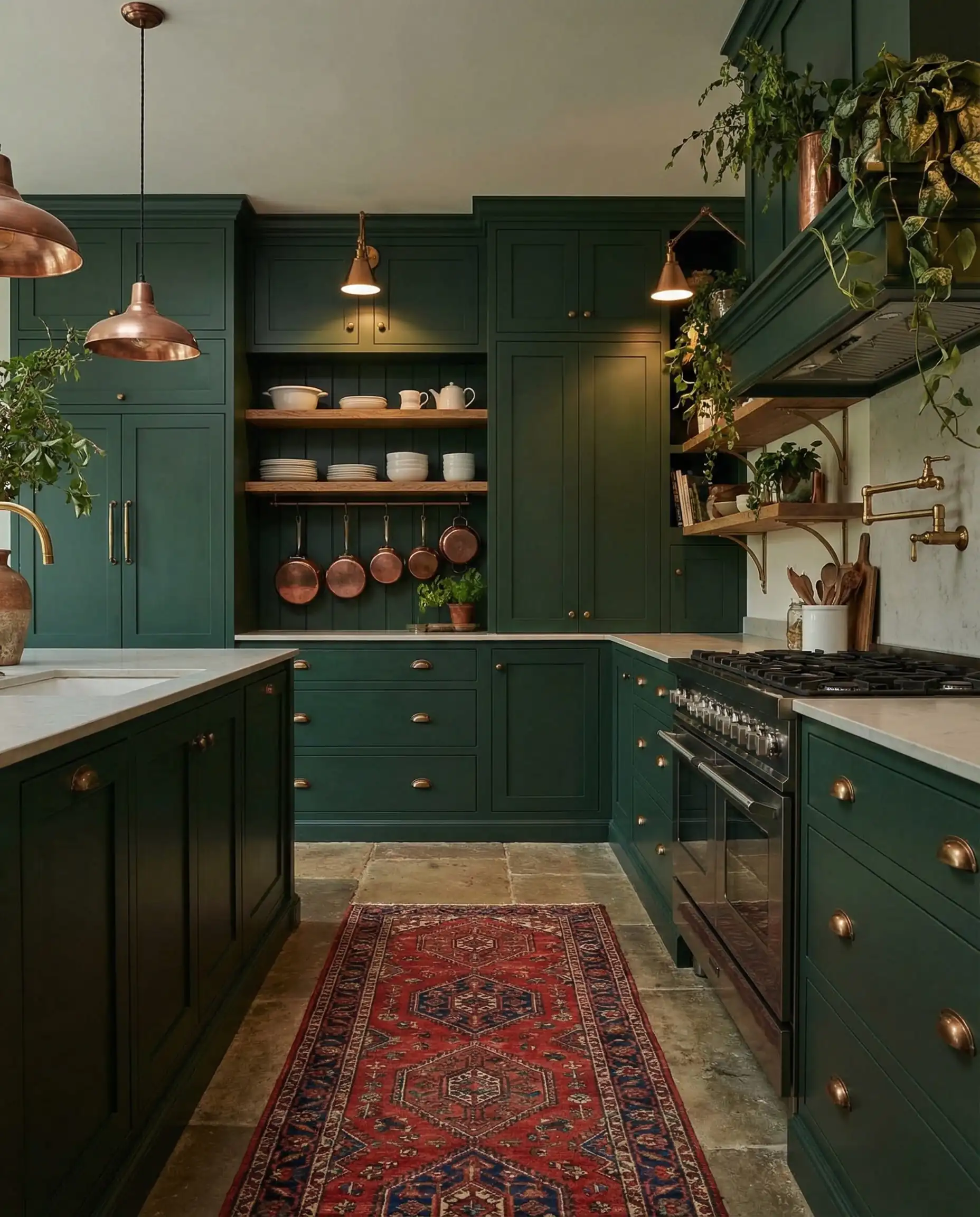
Dunn-Edwards: Midnight Garden (DE5657)
Dunn-Edwards bridges the gap between the “Moody” trend and the “Biophilic” trend. Midnight Garden is a green so dark it almost reads as black in low light. It creates a sense of immersion, like stepping into a dense forest at twilight. This is a high-drama color that works incredibly well with gold or brass light fixtures, which pop against the deep background.
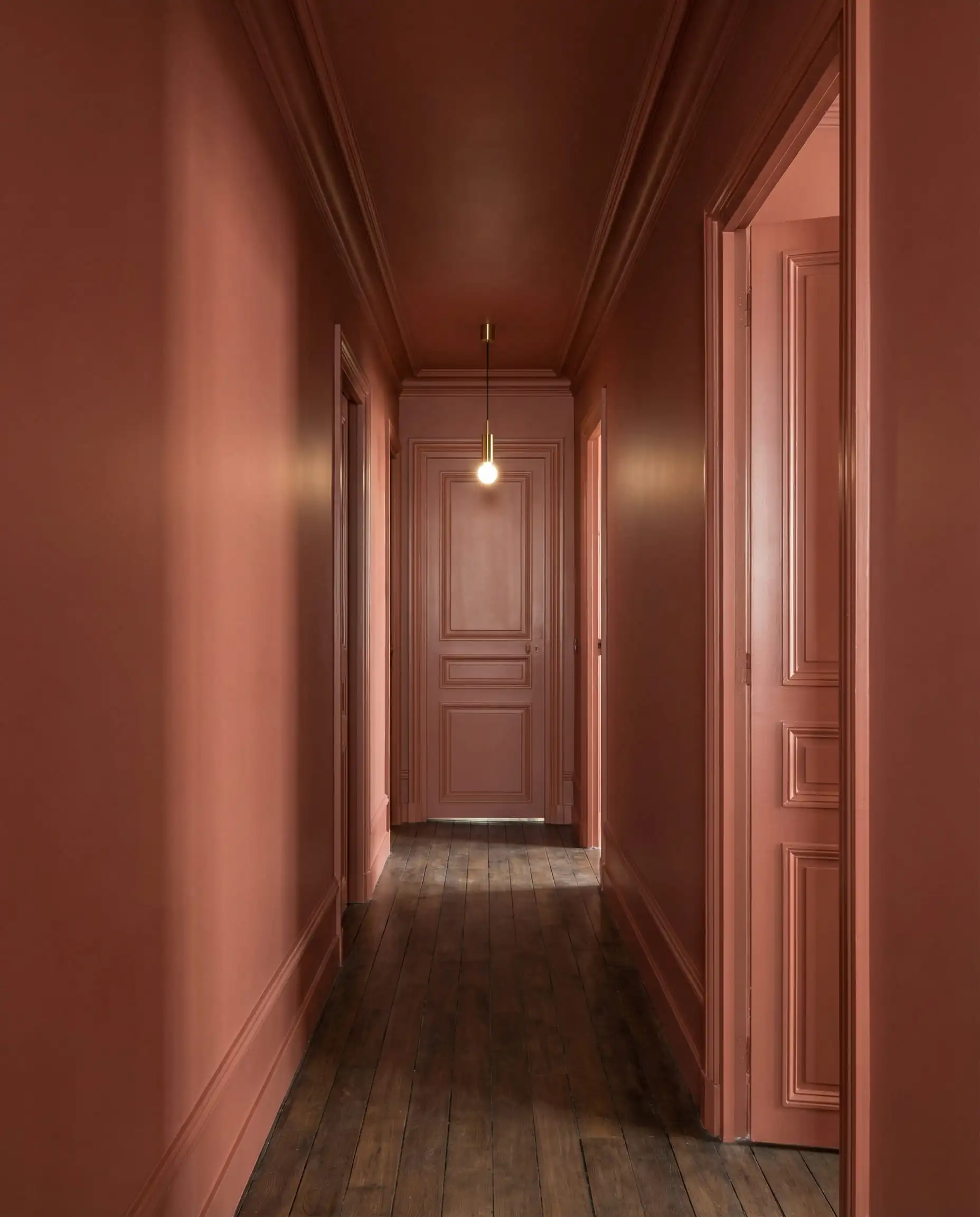
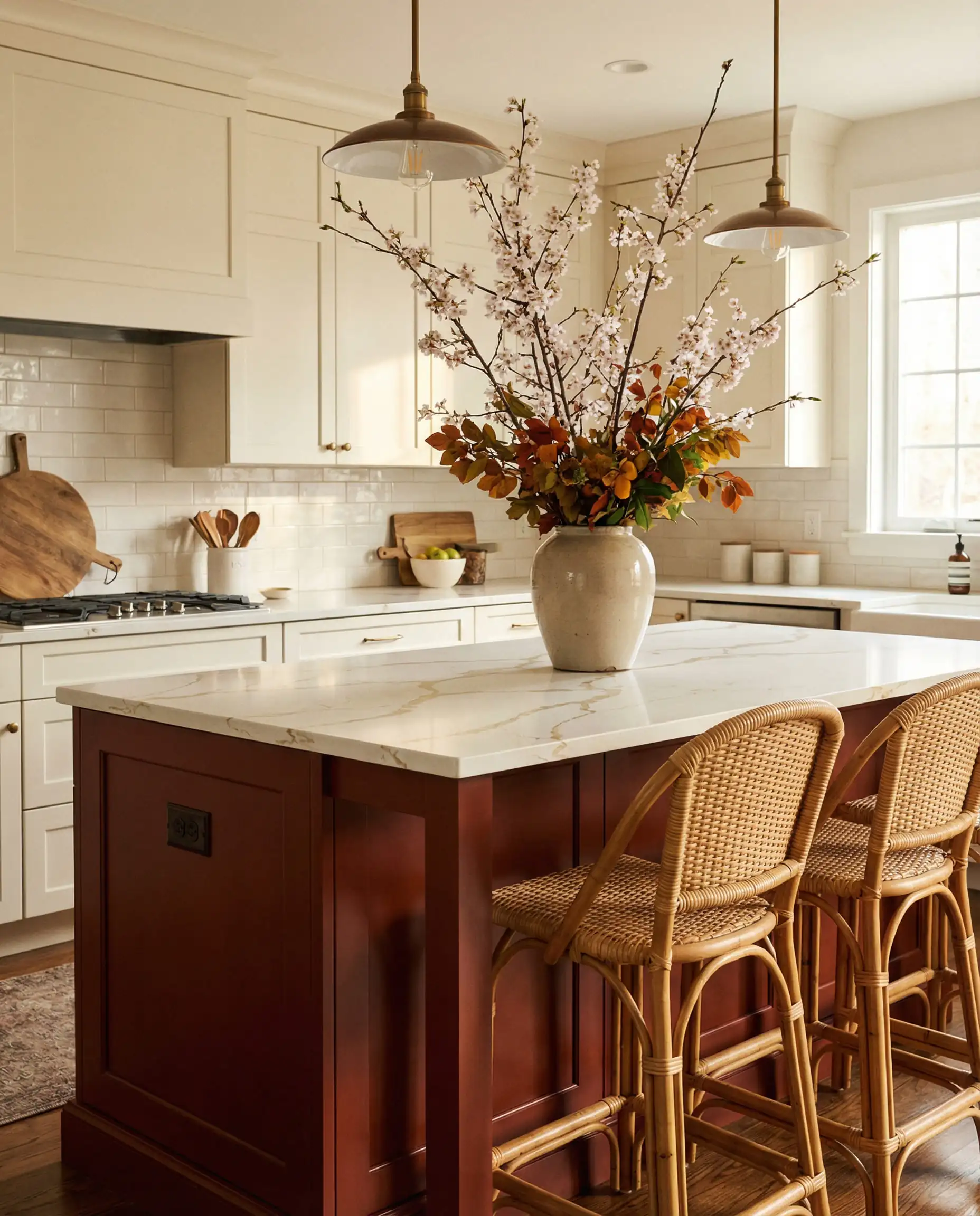
Trend 4: The Comeback of Red (Warm Mahogany)
Perhaps the most controversial trend for 2026 is the return of Red. For decades, red was banished from tasteful interiors, associated with dated 90s dining rooms.
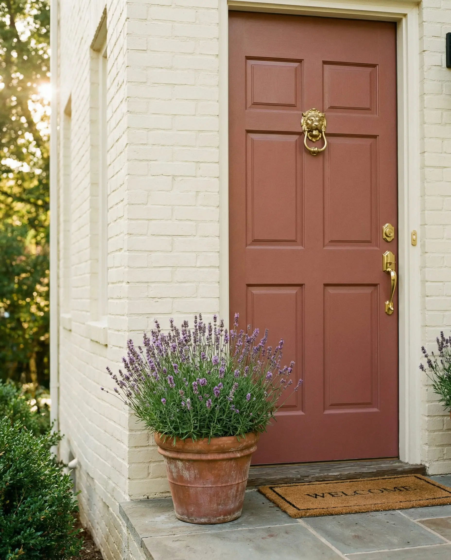
But the 2026 red is different. It isn’t a fire-engine primary color. It is brown-based, earthy, and reminiscent of clay, bricks, and fine wood.
Glidden / PPG: Warm Mahogany (PPG1060-7)
Warm Mahogany is the flag bearer for this movement. It is a deep, cherry-brown red that feels incredibly rich. It taps into the nostalgia trend, evoking the feeling of old libraries and Victorian parlors.
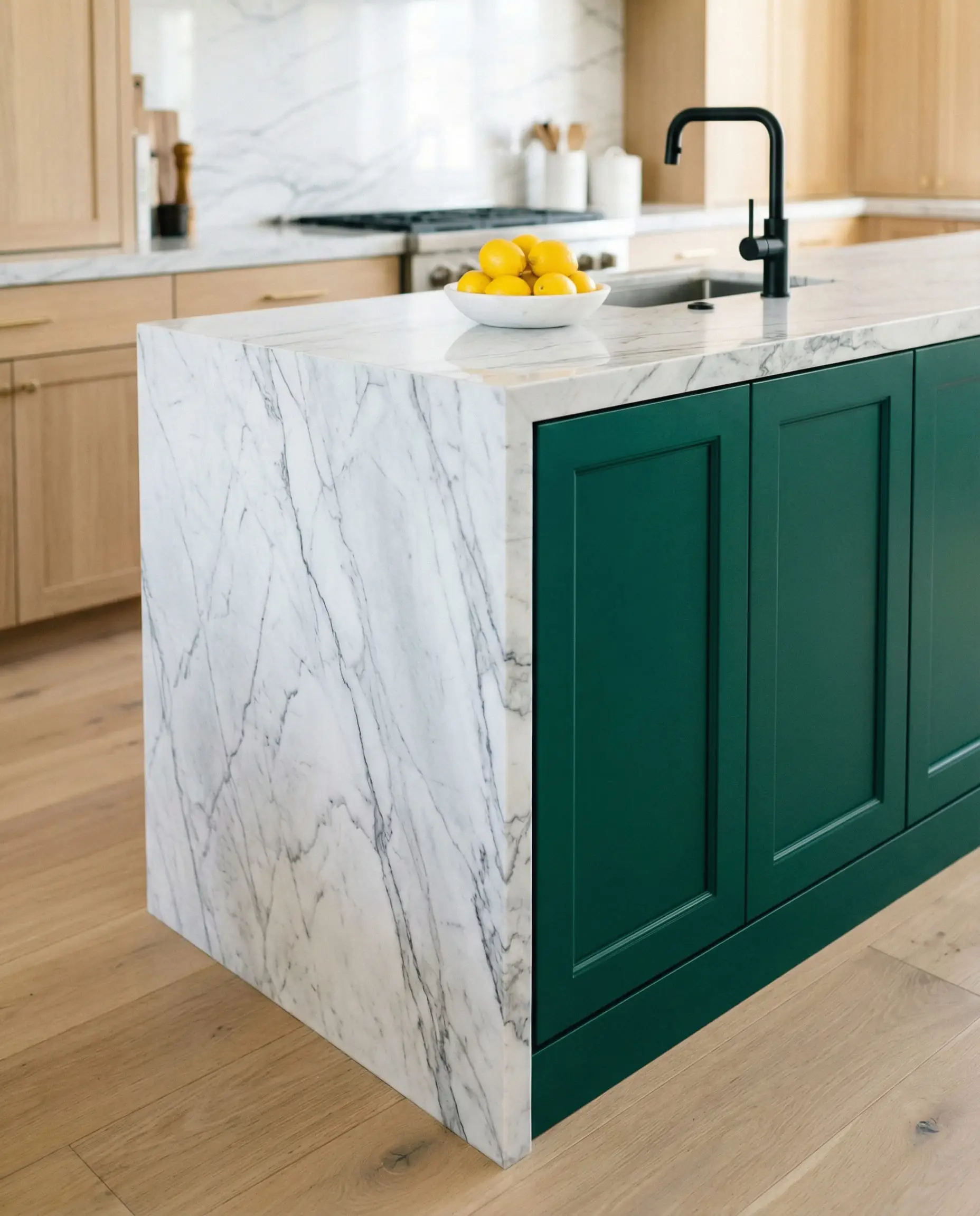
If you are looking to update your kitchen wall paint color trends, consider this shade for lower cabinets. When paired with a creamy marble countertop and brass hardware, it feels timeless rather than trendy. It adds instant “history” to a new-build home.
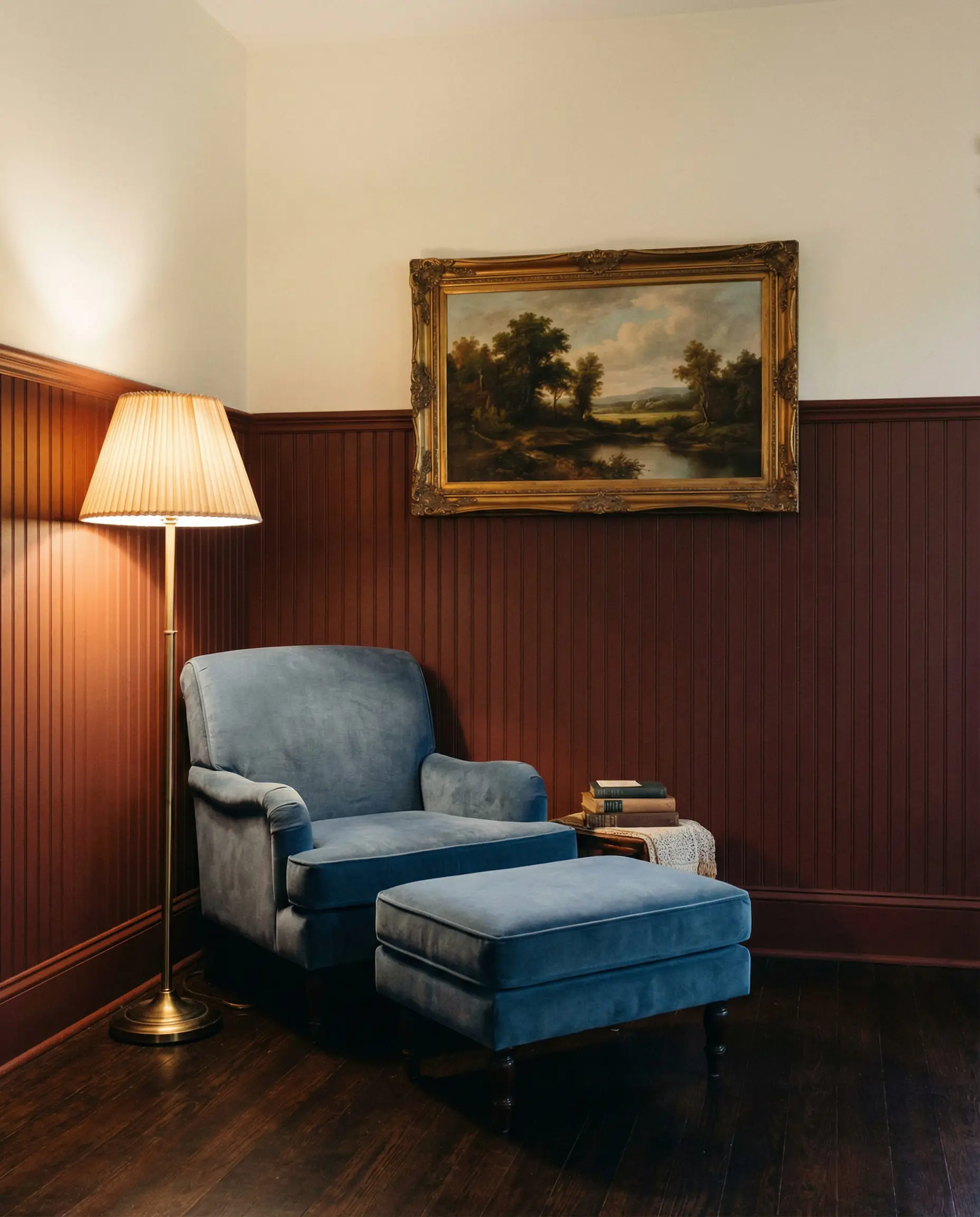
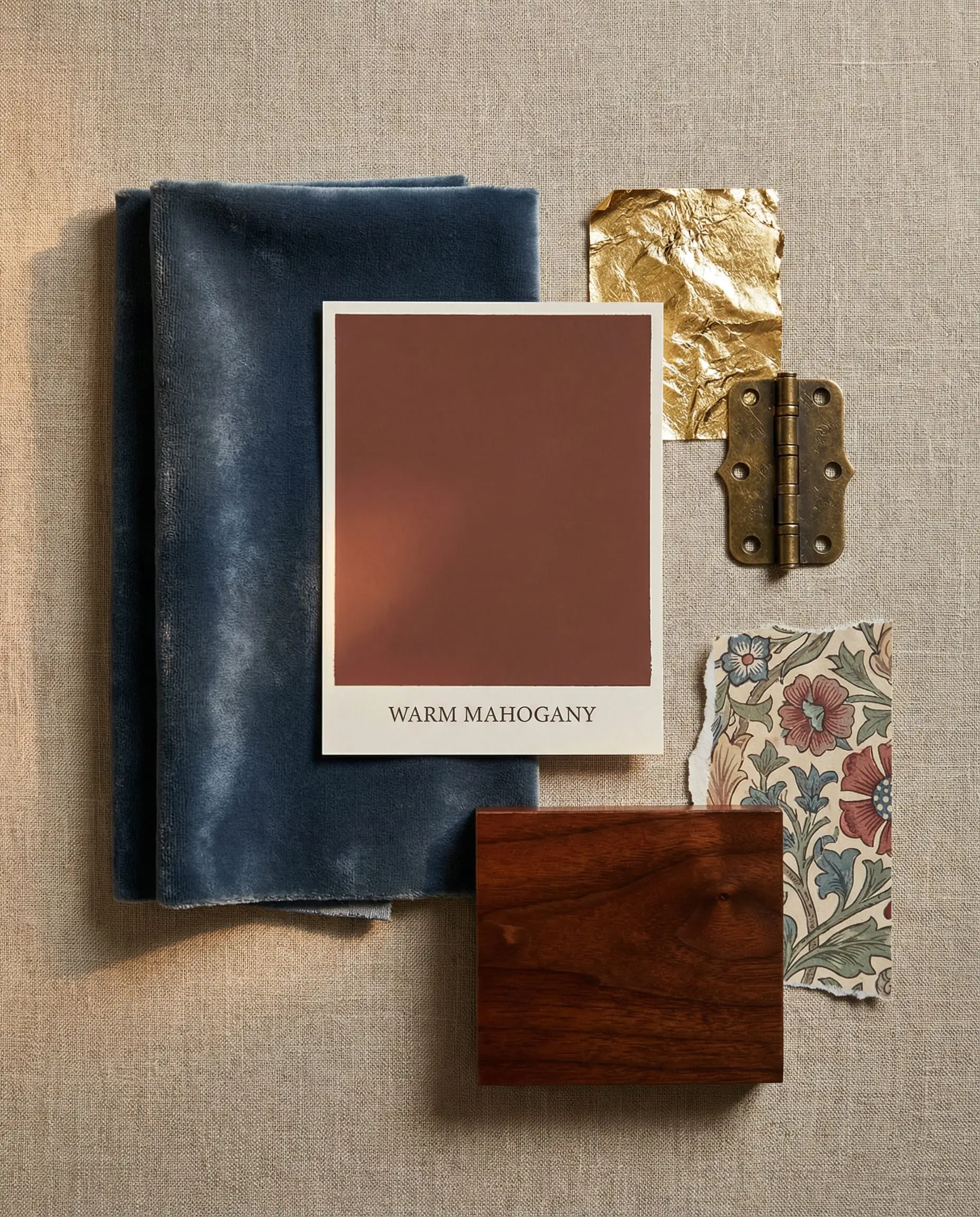
To modernize a red like Warm Mahogany, avoid pairing it with yellow or gold, which can look dated. Instead, pair it with cool contrasts like a slate blue throw or a teal ceramic vase. The cool tones balance the heat of the red, creating a curated, eclectic look.
🎨 Designer Tip
Comparative Analysis: Which 2026 Trend Fits Your Home?
With so many distinct directions—from light ivories to almost-black greens—it can be difficult to choose. Let’s compare the titans of 2026 to help you decide.
Universal Khaki (SW) vs. Melodious Ivory (Dutch Boy)
Both are “New Neutrals,” but they serve different lighting conditions.
Silhouette (Benjamin Moore) vs. Midnight Garden (Dunn-Edwards)
Both are deep, moody “almost-blacks.”
How to Apply These Trends: The 2026 Style Guide
Knowing the colors is only half the battle; knowing how to apply them is what separates a DIY job from a designer look.
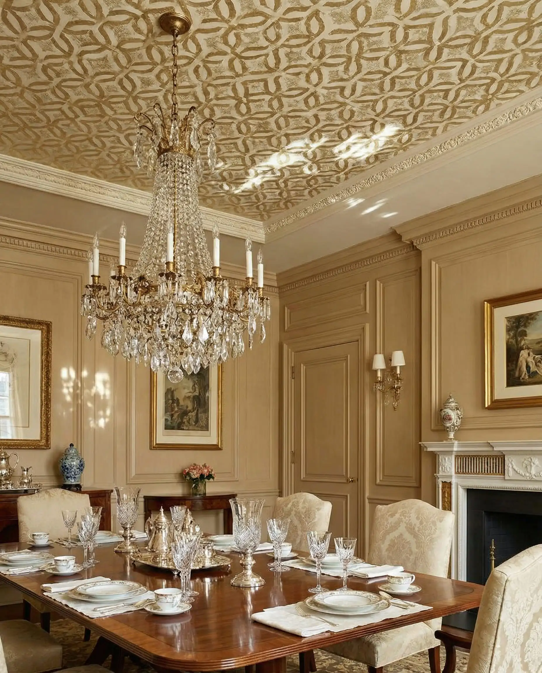
1. The Art of “Color Drenching”
In 2026, the white trim is disappearing. The biggest application trend is Color Drenching, where you paint the baseboards, the walls, the crown molding, and even the ceiling in the same color.
For the most professional finish when color drenching, use Flat for the ceiling, Eggshell/Matte for the walls, and Satin/Semi-Gloss for the trim. This subtle sheen difference highlights the architectural details without breaking the immersion of the color.
✨ Expert Advice
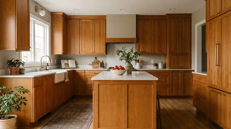
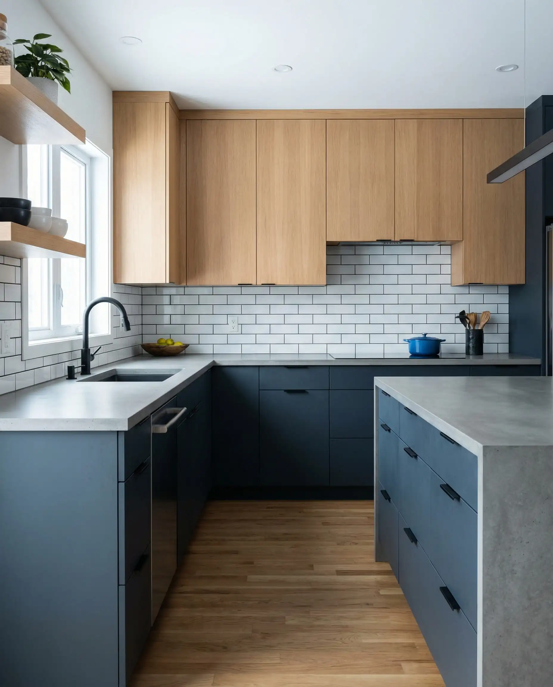
2. The “Un-White” Kitchen
The all-white kitchen is finally loosening its grip. Homeowners are realizing that white cabinets show every scuff and can feel sterile.
The 2026 Update: Use Universal Khaki or Warm Mahogany for cabinetry. If you aren’t ready to paint the cabinets, paint the walls a deep moody green (Hidden Gem) to make your existing white cabinets pop.
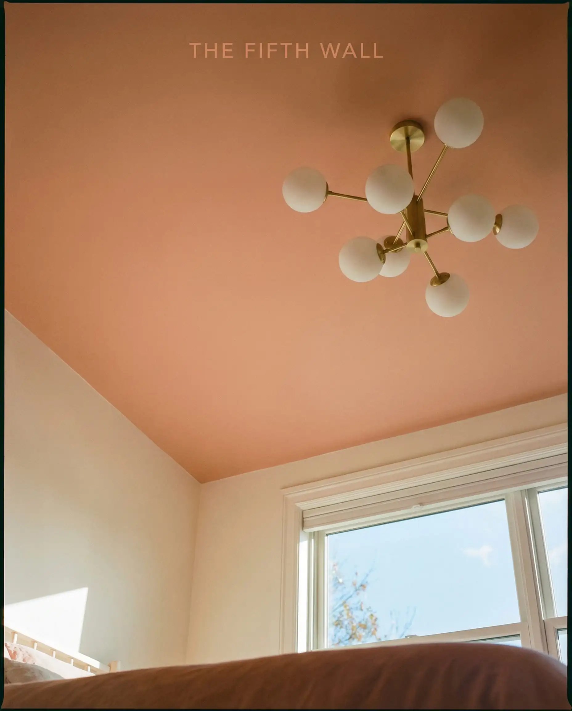
3. Don’t Forget the “Fifth Wall”
White ceilings are the default, but they are often a missed opportunity. 2026 is seeing a rise in ceiling paint color trends that involve carrying the wall color up.
For Low Ceilings: Paint the ceiling a shade 50% lighter than the wall color (ask the paint store to mix the formula at 50% strength). This gives you the color harmony without the heavy feeling.
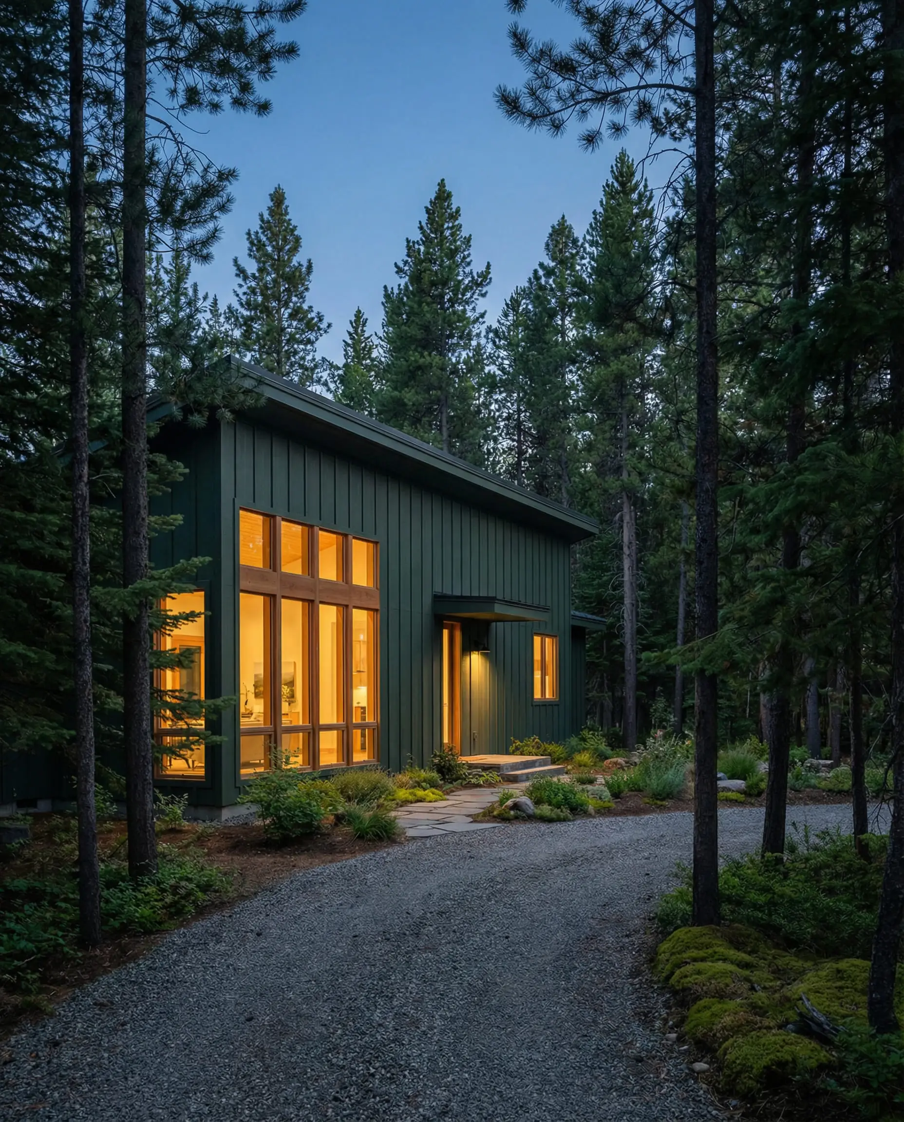
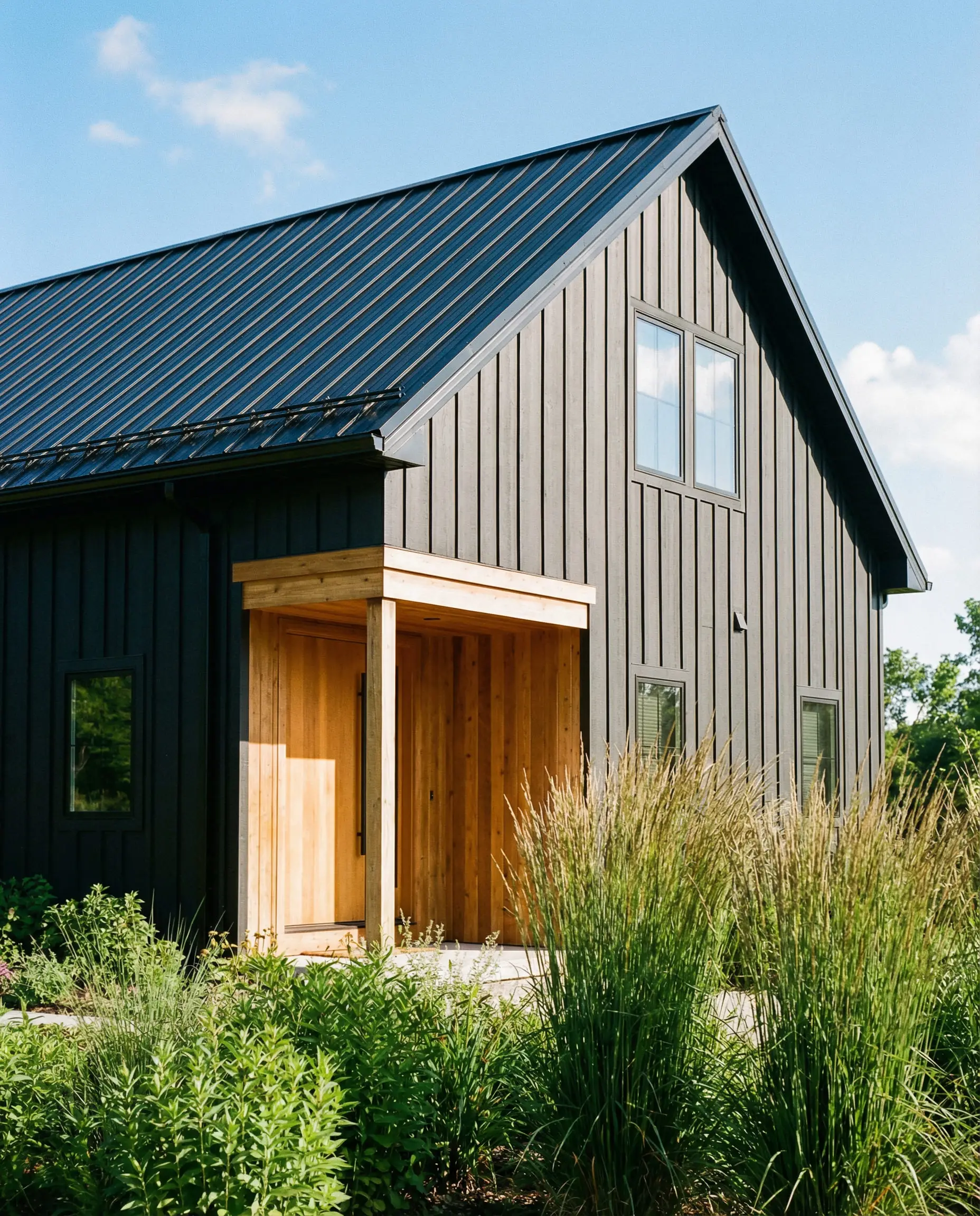
4. Exterior Shifts
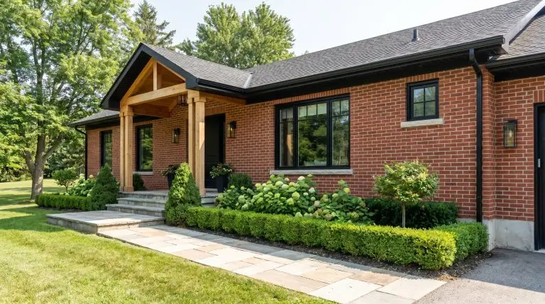
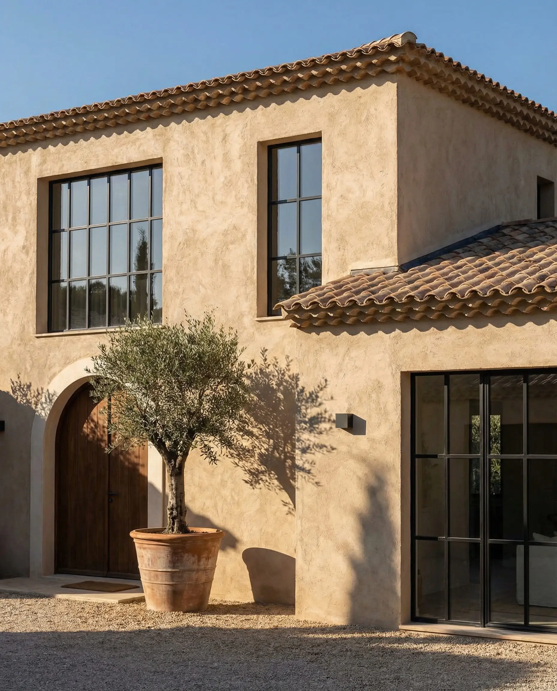
These trends don’t stop at the front door. We are seeing exterior house paint colors moving away from the “Modern Farmhouse White” toward the “Organic Modern” Khakis and dark, forest-green sidings that blend the house into the landscape rather than making it stand out against it.
Frequently Asked Questions
A: Cool, blue-based grays are definitely on the decline. However, “warm grays” or “greiges” (gray + beige) are still very relevant. If you love gray, try pivoting toward a taupe or a stone color like Universal Khaki, which offers the neutrality of gray but with the warmth that 2026 demands.
A: You have two options. The traditional route is a light, airy tone like Melodious Ivory, which reflects light. The “designer” route is to go dark (like Midnight Garden) and color-drench the room. This blurs the corners and shadows, making the room feel infinite and cozy rather than small and cramped.
A: Yes, but you need a bridge. Add accessories (throw pillows, rugs, art) that contain both the cool gray of your sofa and the warm terracotta or khaki of your new walls. Mixing metals—using both silver and unlacquered brass—also helps bridge the gap between cool and warm tones.
A: Never trust the paint chip in the store! Buy a sample pot and paint a large poster board. Move the board around the room at different times of the day (morning light, noon sun, evening lamp light). Colors like Silhouette can change drastically from red to black depending on the lighting.
Conclusion
The paint color trends of 2026 are an invitation to be bold, but also to be kind to yourself. Whether you are drawn to the restorative calm of Warm Eucalyptus or the moody embrace of Silhouette, the goal is the same: to create a home that feels like a sanctuary.
We are leaving behind the era of the “showroom home” and embracing the “lived-in home.” So, grab a roller, pick a shade that speaks to you, and don’t be afraid to paint outside the lines of what is traditional. After all, it’s only paint—if you don’t like it, you can always change it. But we have a feeling that once you try these new warm neutrals and moody hues, you won’t want to go back.
Ready to tackle the rest of your home? Explore our guide to wallpaper trends to add even more texture to your newly painted rooms.