Bedroom Paint Color Trends 2026: The Ultimate Guide to Warmth & Comfort
If the last few years were defined by a collective search for safety in cool grays and stark whites, 2026 is the year we finally exhale. The era of the sterile “showroom” bedroom is officially over. In its place, we are welcoming a design philosophy that experts are calling “Warm Essentialism” and “Moody Comfort.”
This year, your bedroom isn’t just a place to sleep—it’s a sanctuary designed to wrap you in a hug. We are seeing a seismic shift toward colors that feel grounded, earthy, and undeniably human. From the sandy, sun-baked warmth of the new “it” neutrals to the dramatic, cocoon-like embrace of deep plums and forest greens, the 2026 palette is all about emotional restoration.
Whether you are looking to refresh a guest room or completely overhaul your master suite, this guide will walk you through the top bedroom paint color trends for 2026, the specific shades dominating the market, and the new application techniques (hello, color drenching!) that will make your space look professionally designed.
📋 Quick Summary: The Top 2026 Bedroom Trends
(For those in a hurry: Here is what you need to know)
- The Main Theme: “Warm Essentialism.” A hard pivot away from cool grays toward sandy khakis, creams, and earthy mid-tones.
- Top 3 Colors of the Year:
- Universal Khaki (Sherwin-Williams): A grounded, warm neutral that replaces gray.
- Silhouette (Benjamin Moore): A moody, deep charcoal-plum for luxury vibes.
- Hidden Gem (Behr): A restorative, deep “smoky jade” teal.
- Key Application Trend: “Color Drenching”—painting walls, trim, baseboards, and ceilings the same color to create a cohesive, cocoon-like space.
- Best Finish: Matte/Flat for walls (to hide imperfections and soften light) paired with Satin trim for subtle contrast.
The “Colors of the Year” 2026: The Big Three
Every year, the major paint authorities release their predictions, and for 2026, the consensus is clear: warmth wins. These three shades are set to define the interior design landscape, offering a perfect starting point for your bedroom transformation.
1. The New Neutral: Universal Khaki (Sherwin-Williams)
Forget the cool “agreeable grays” of the 2010s. Sherwin-Williams has crowned Universal Khaki (SW 6150) as the shade of the year, and it is the perfect anchor for a modern bedroom. This isn’t the drab khaki of old office cubicles; it is a rich, sandy hue that bridges the gap between beige and tan.
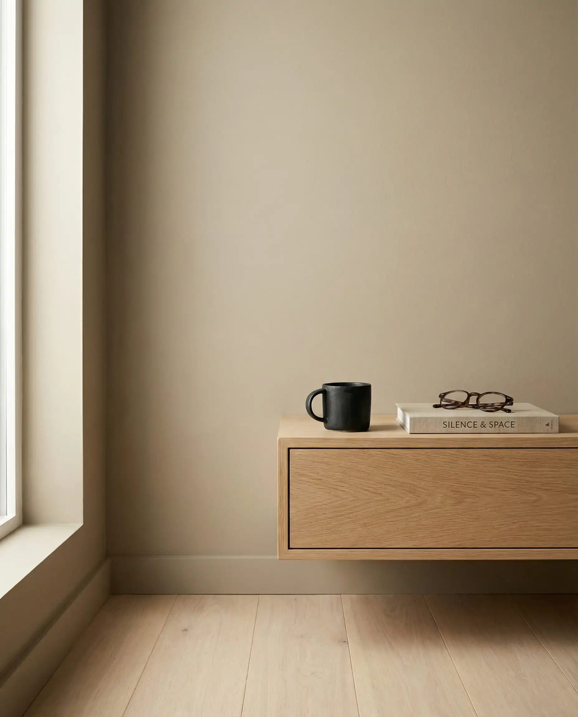
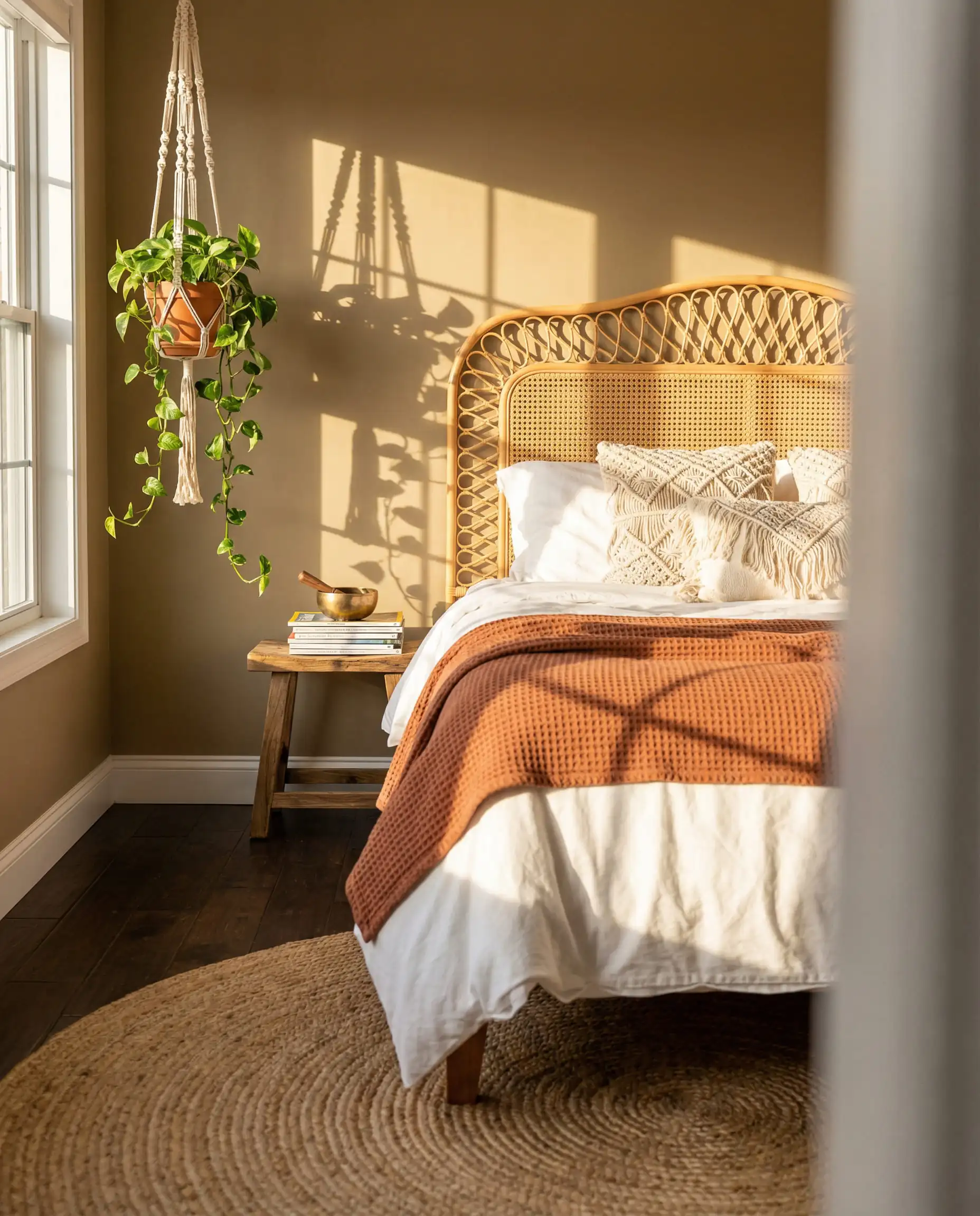
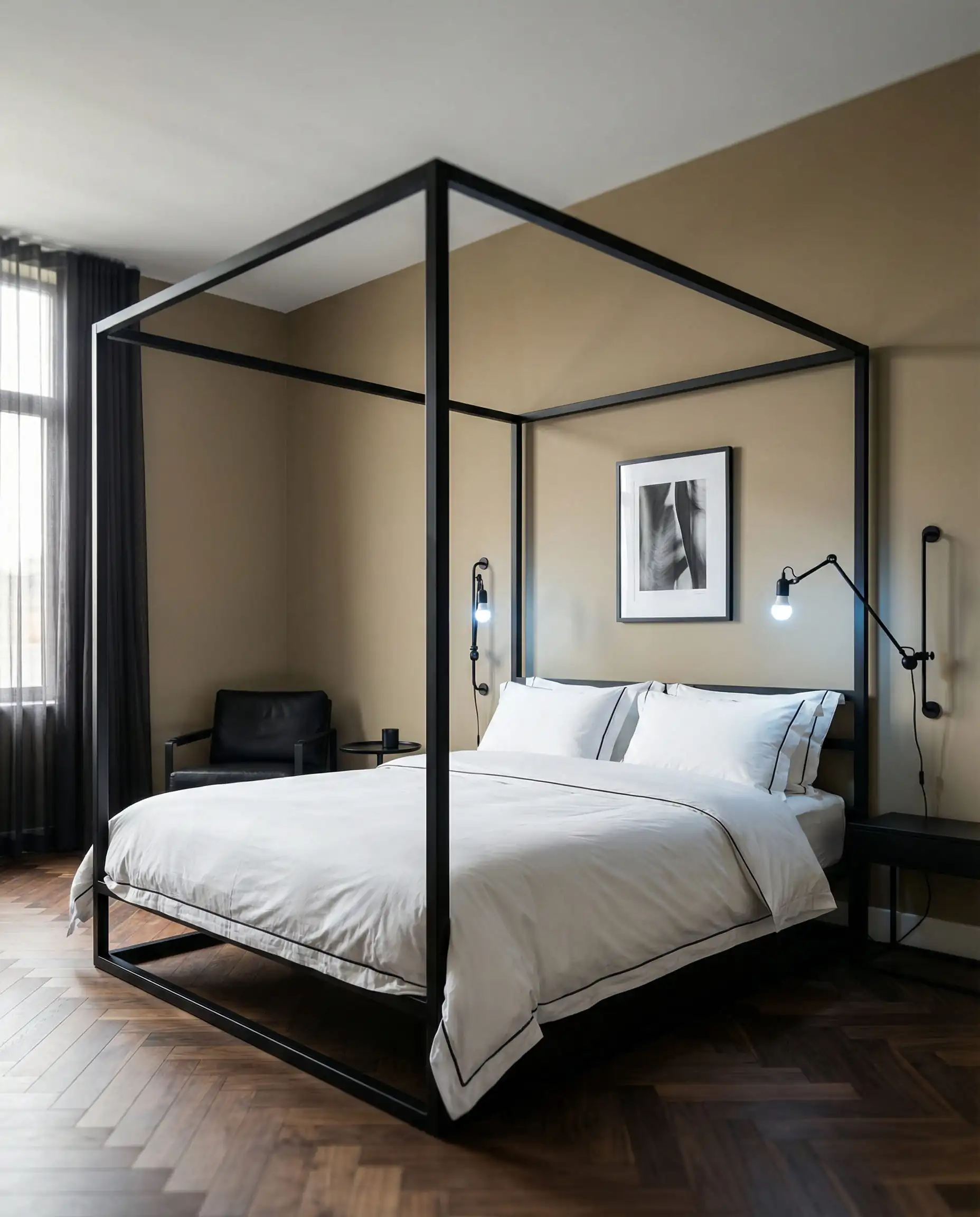
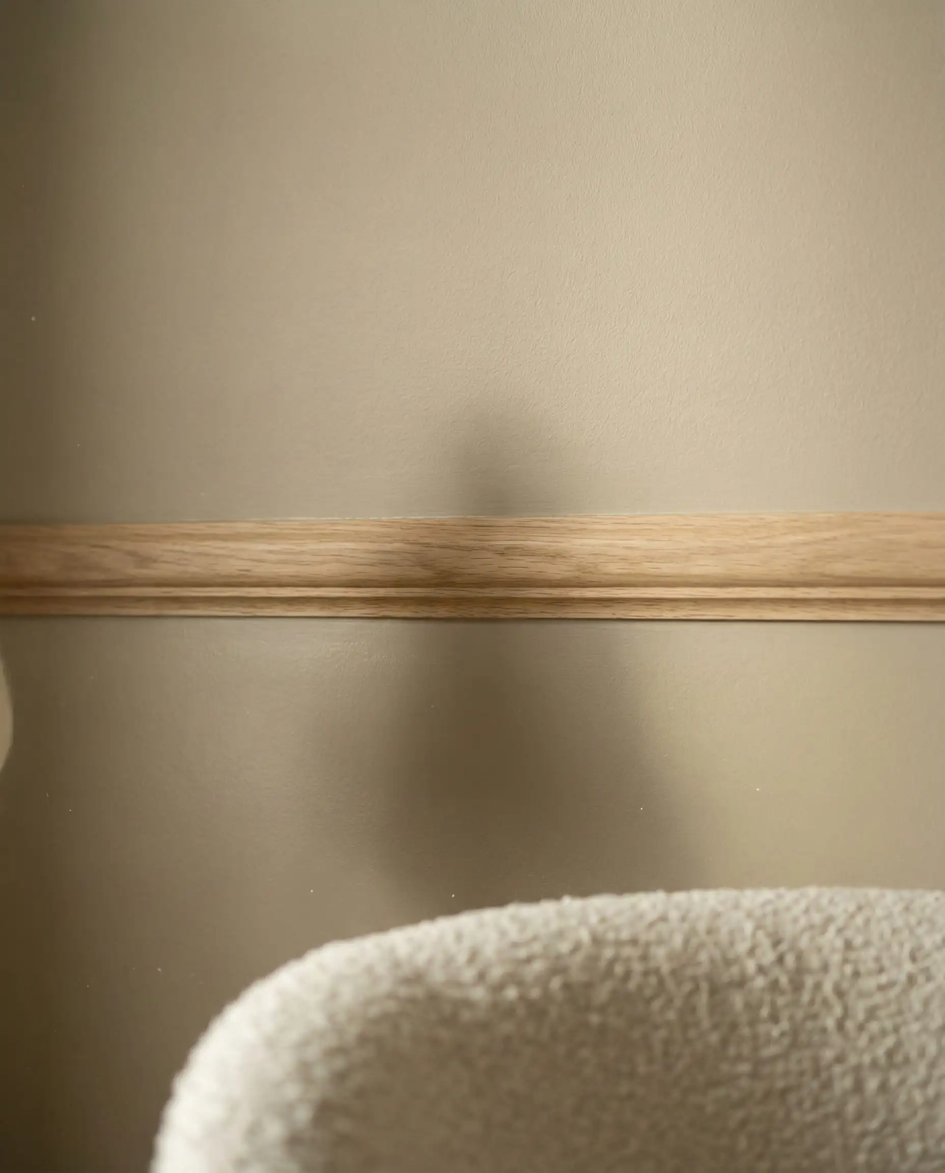
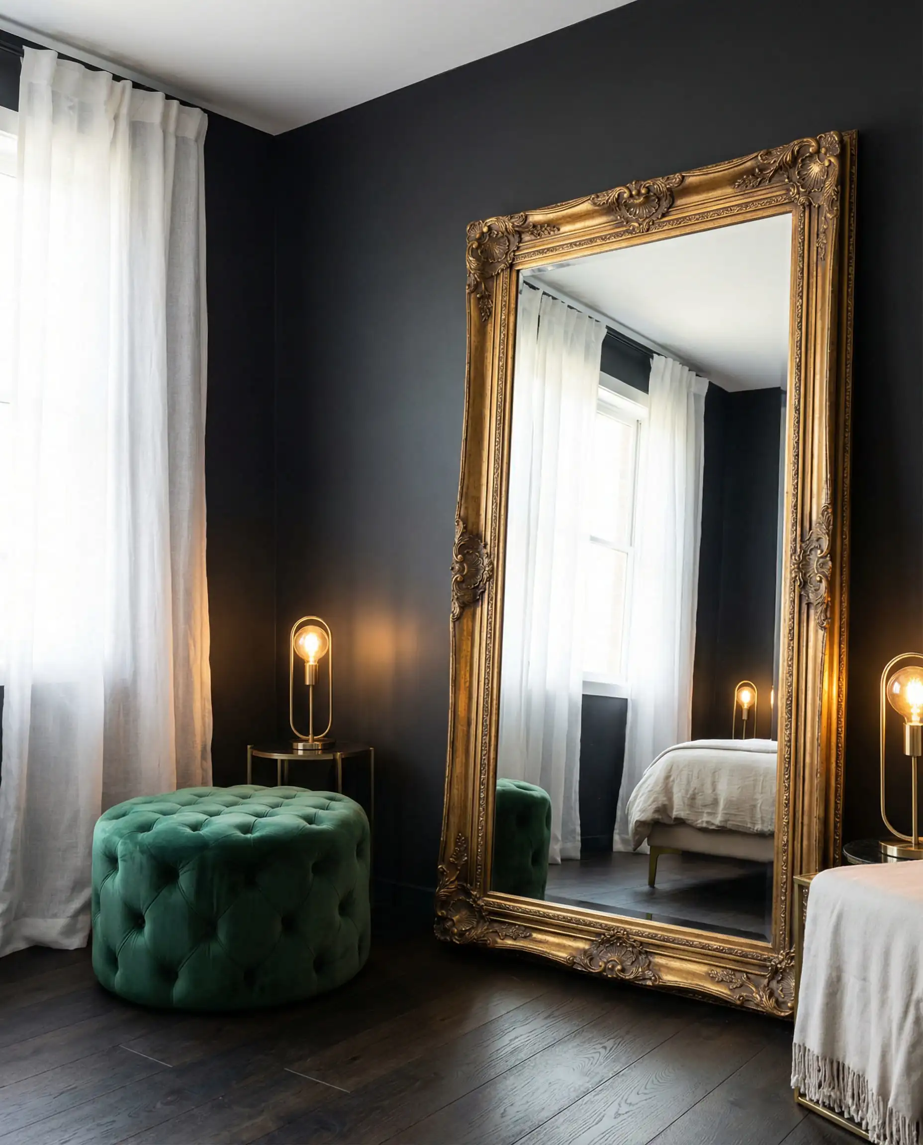
Don’t let the word “Khaki” scare you. Unlike the yellow-heavy beiges of the past, Universal Khaki has a subtle gray undertone that keeps it modern. To keep the room feeling fresh, pair it with crisp white bedding and black accents—it creates a sophisticated, high-contrast look that is very popular right now.
🎨 Designer’s Tip
2. The Moody Choice: Silhouette (Benjamin Moore)
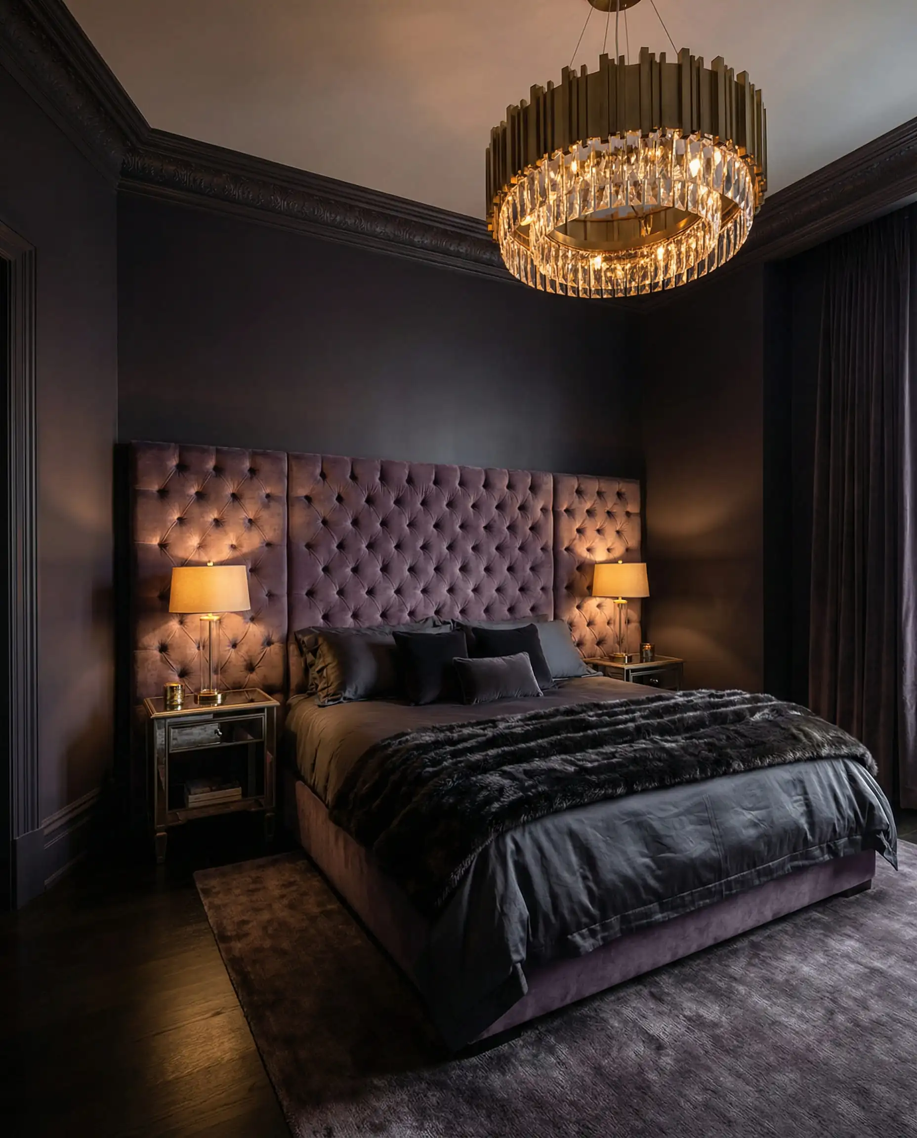
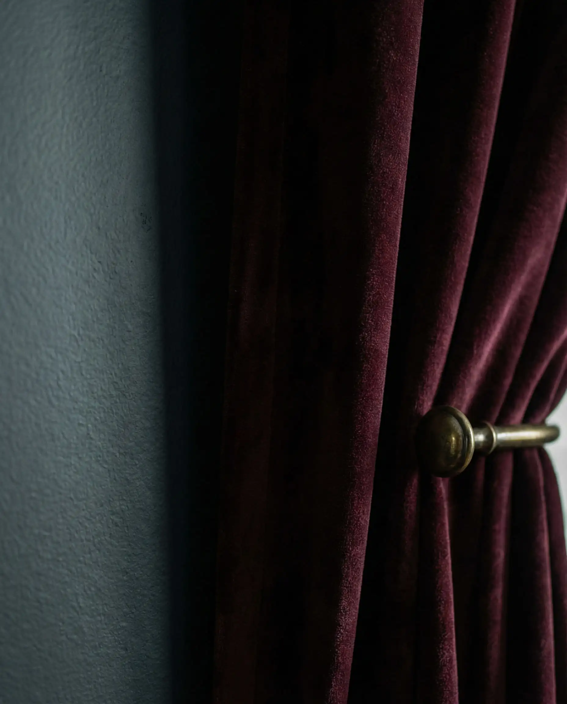
If you want your bedroom to feel like a boutique luxury hotel, look no further than Silhouette (AF-655). This is a sultry, deep charcoal with distinct red and plum undertones. It changes with the light—looking like a soft black in the evening and a rich aubergine during the day.
3. The Biophilic Gem: Hidden Gem (Behr)
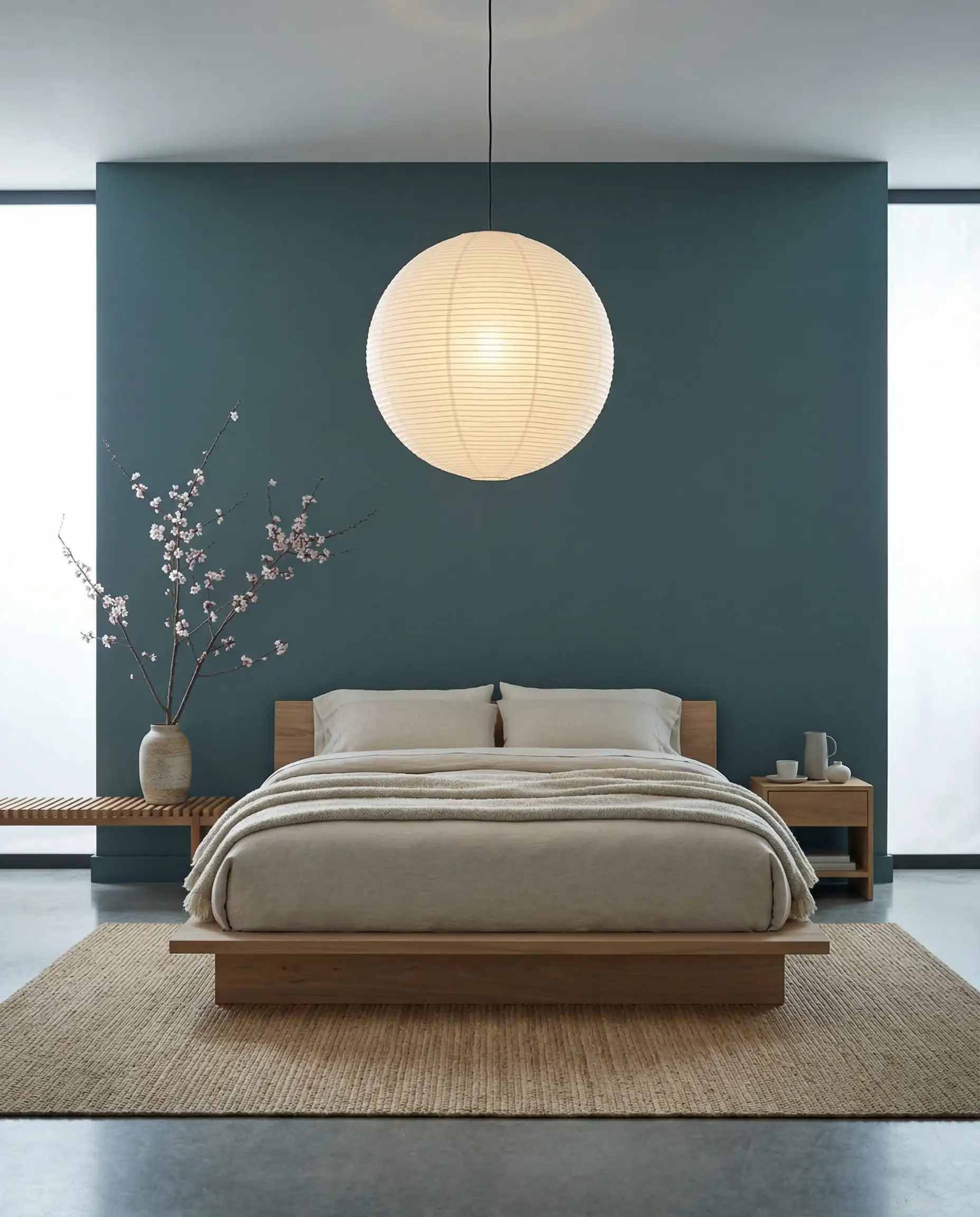
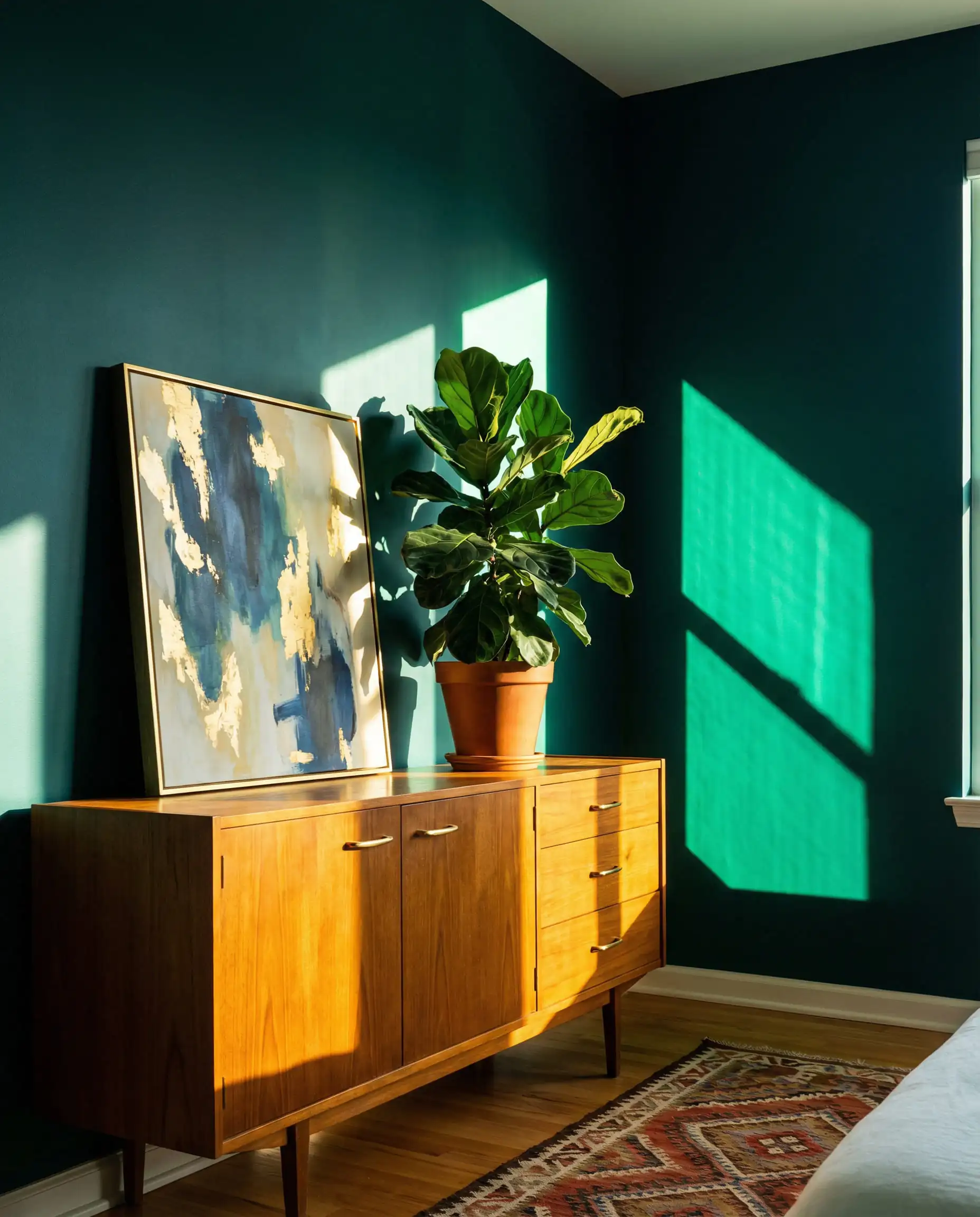
Behr’s Hidden Gem (N430-6A) is a fascinating shade that sits right on the border of jewel tone and earthy neutral. It’s a “smoky jade”—a deep teal that feels like it was pulled straight from a forest canopy.
Warm Essentialism: The Return of Beige & Cream
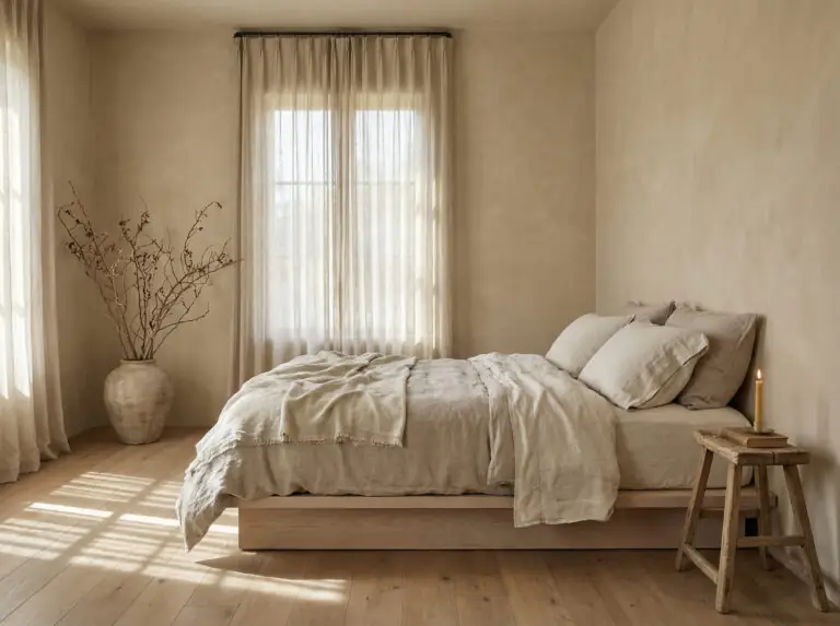
For a long time, beige was a dirty word in design. Not anymore. The 2026 interpretation of beige is less “builder grade” and more “cashmere sweater.” These shades are complex, layered, and designed to reflect light in a way that makes your skin look good and your mind feel at ease.
The “Un-Stark” Whites
Bright, brilliant white is taking a backseat to creamy, whipped-butter shades. Colors like Swiss Coffee (Benjamin Moore) or Cream in My Coffee (Valspar) offer the cleanliness of white without the clinical sharpness.
To add interest to a neutral room without using bold color, rely on texture. Consider pairing creamy walls with the heavily textured fabrics mentioned in our Curtain Trends 2026 article to create depth through shadow and light rather than pigment.
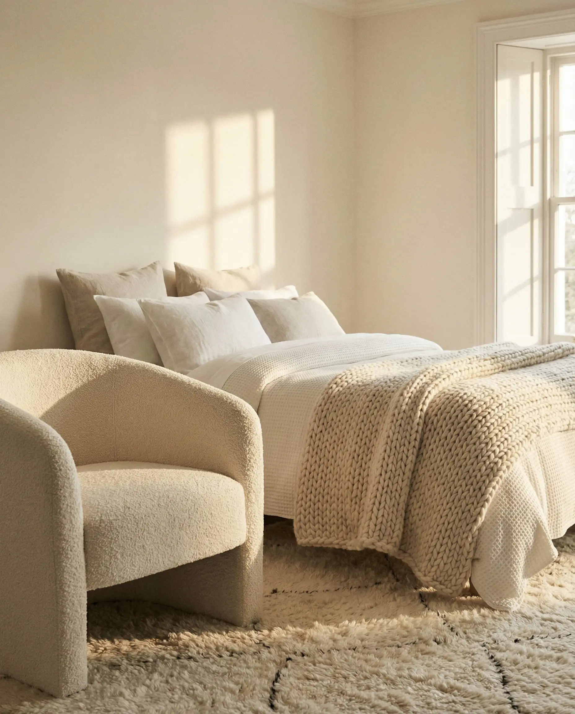
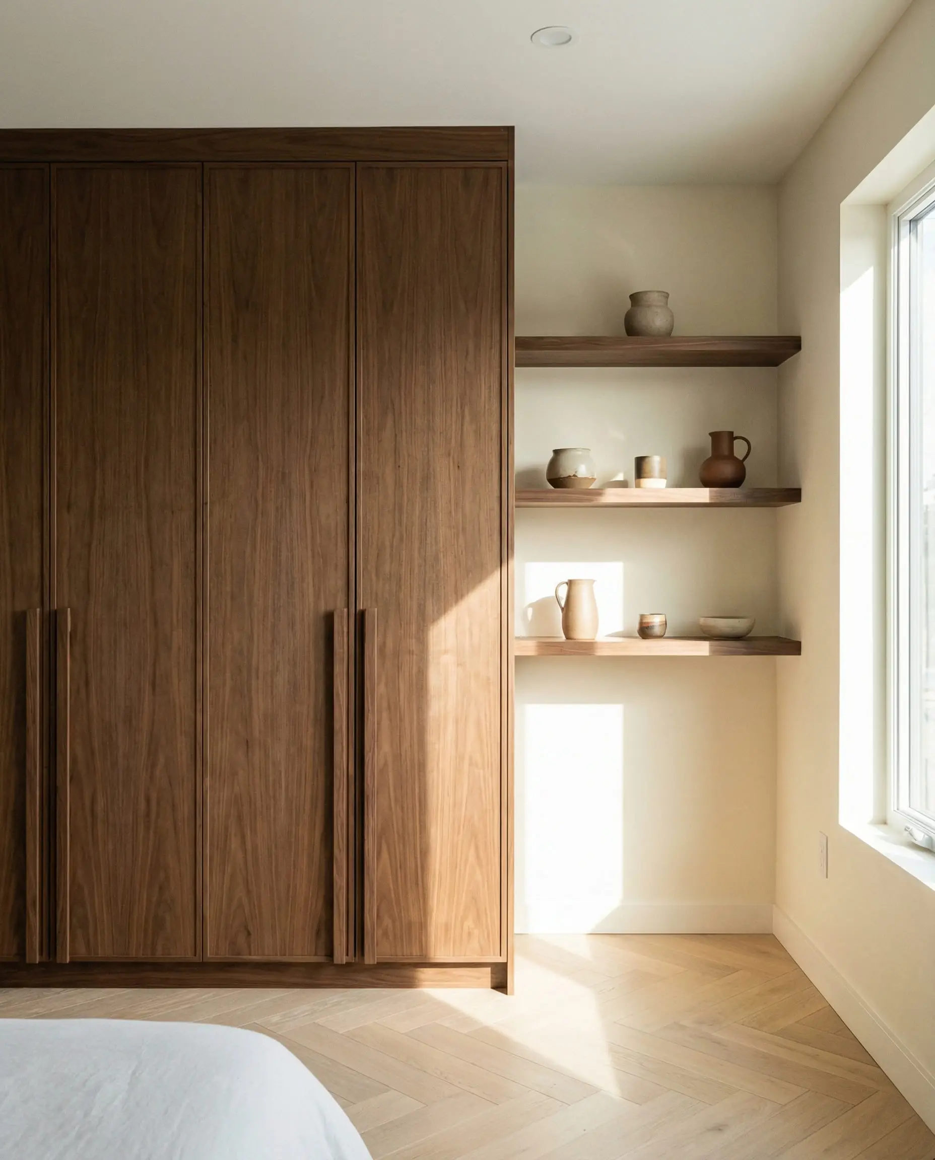
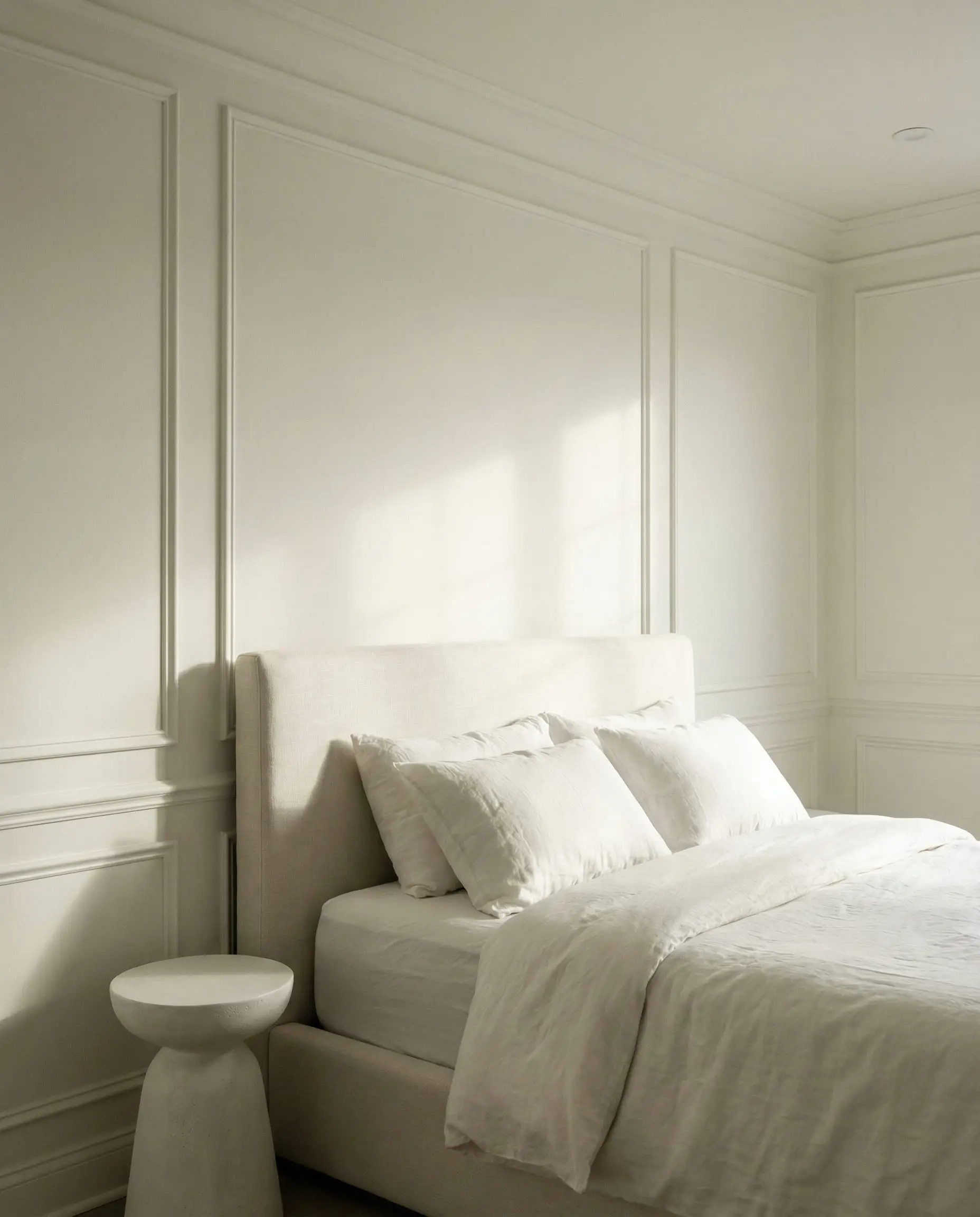
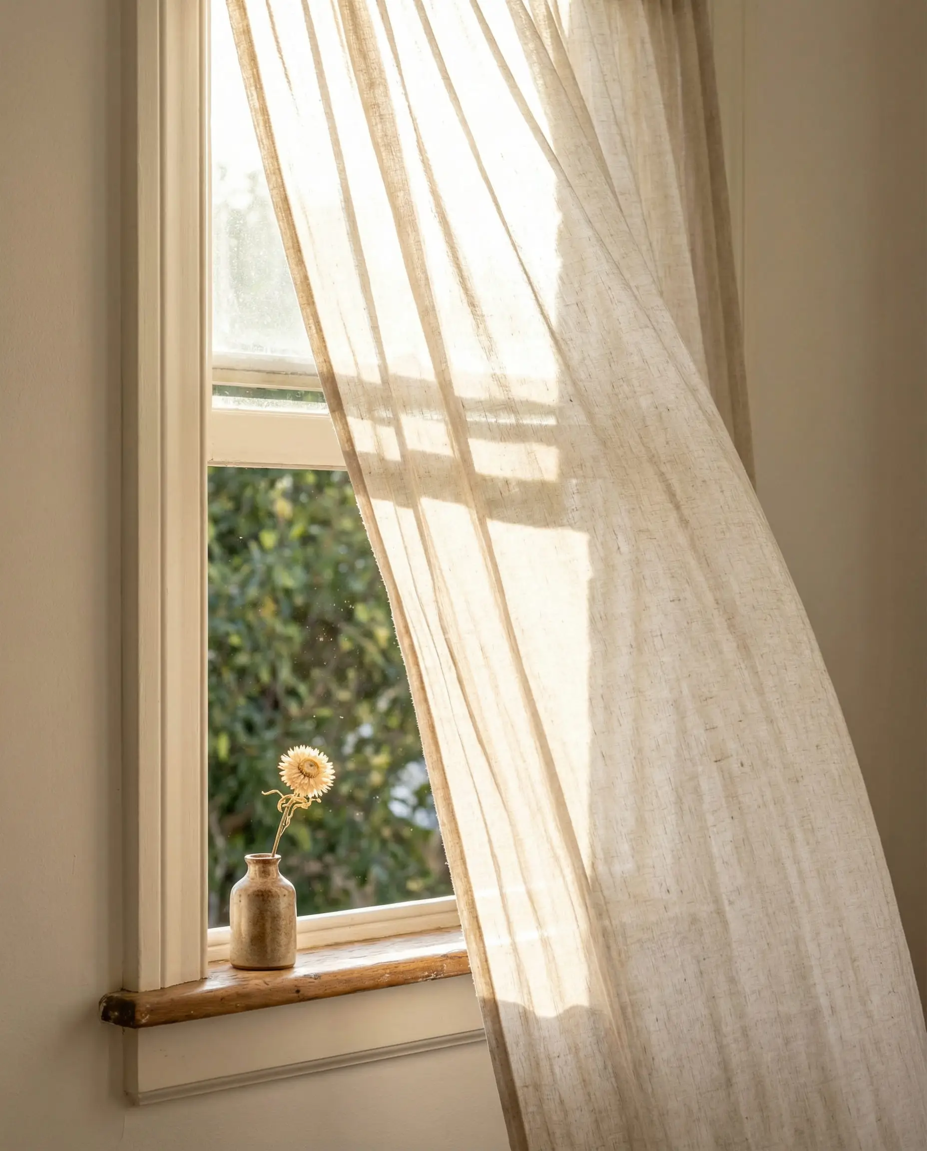
Lighting is critical here. When using creamy whites, avoid “cool” white LED bulbs (5000K) at all costs. They will turn your beautiful cream walls a sickly yellow-green. Stick to 2700K or 3000K bulbs to maintain that warm, inviting glow.
🎨 Designer’s Tip
Earthy Mid-Tones
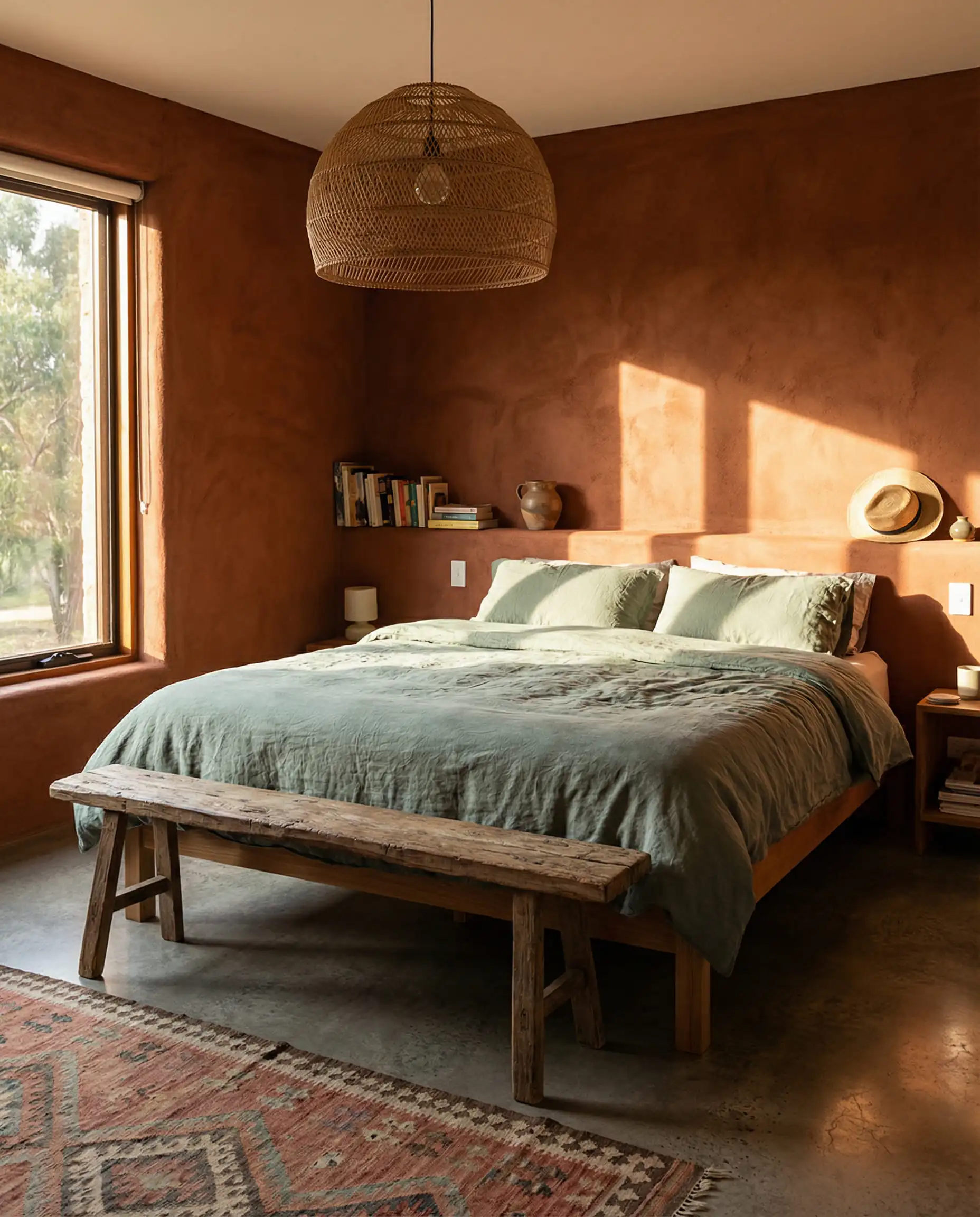
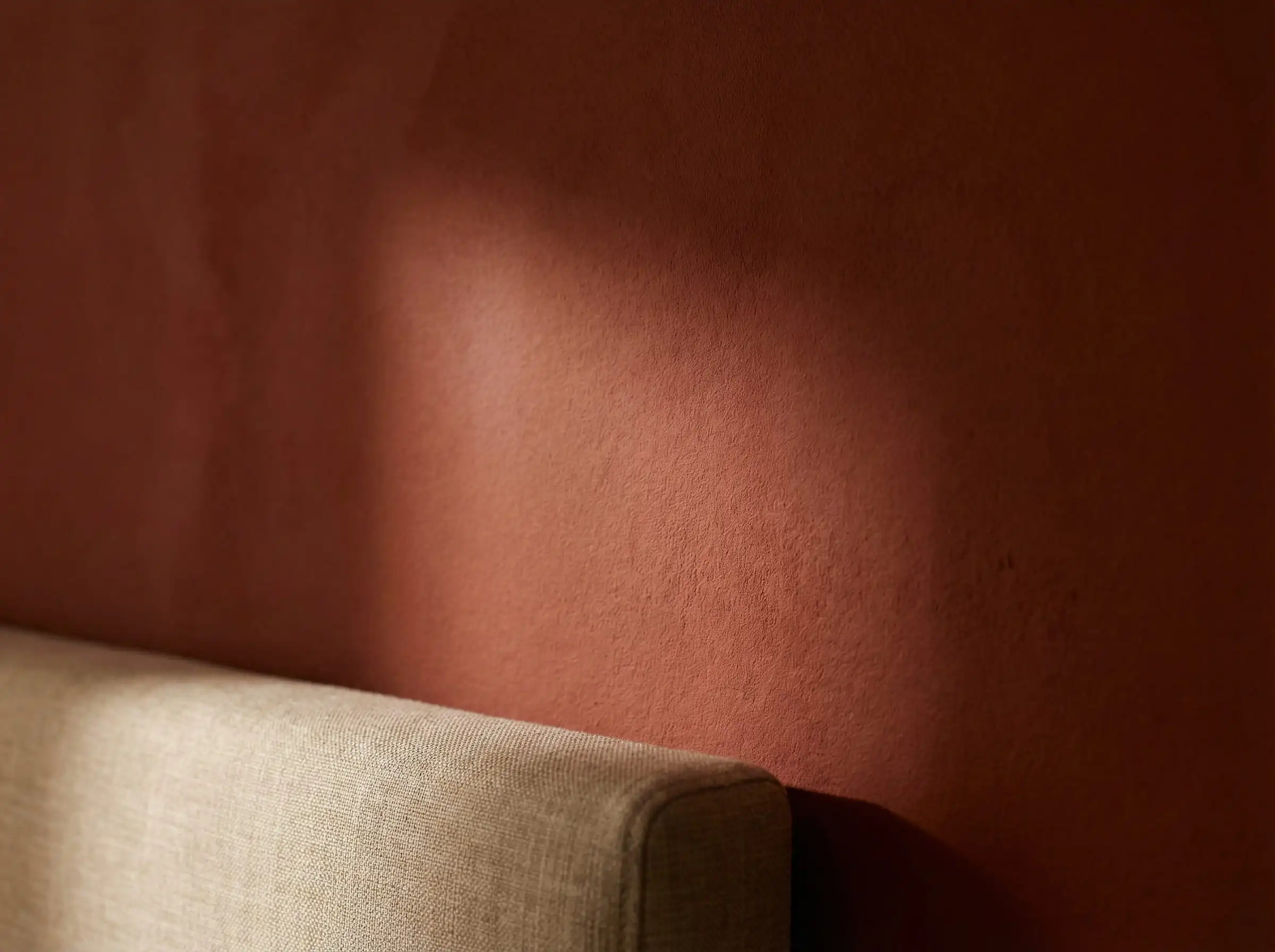
Moving slightly darker than cream, we find the “pottery” shades. Think terracotta, clay, and ochre. A shade like Southwest Pottery brings a sun-baked energy to the room. It’s a bold choice for a bedroom, but because it is an earth tone, it doesn’t overstimulate the brain like a bright red or orange would. It feels ancestral and grounded.
Moody Comfort: Why Dark Bedrooms Are Better for Sleep
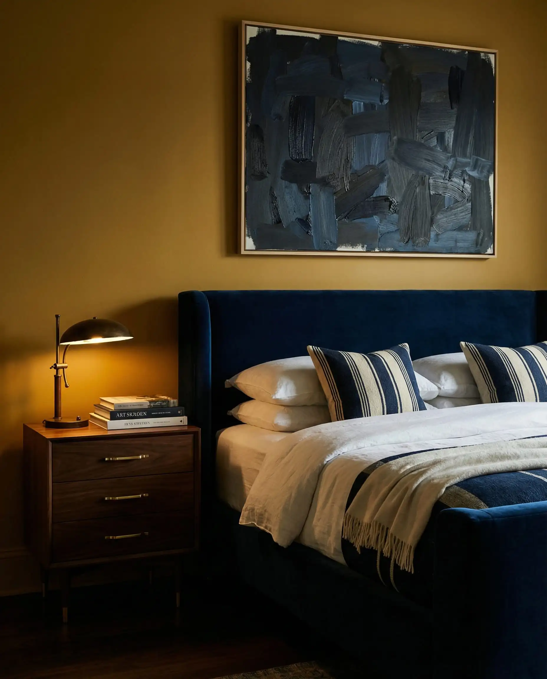
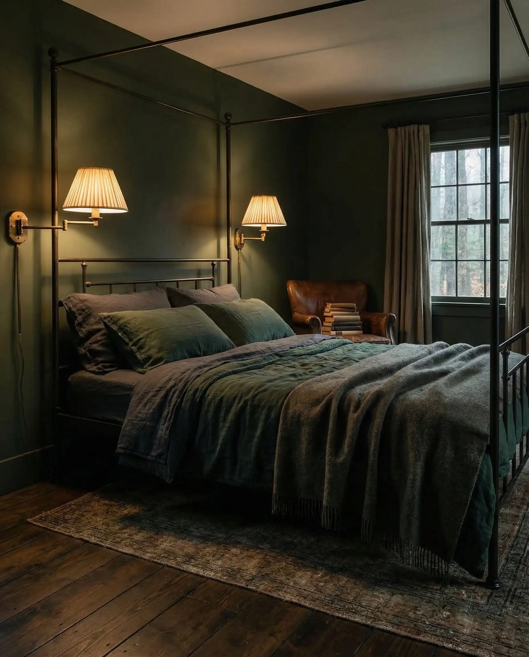
There is a growing movement in 2026 to treat the bedroom strictly as a place for sleep, separating it from the home office or entertainment areas. This shift supports the use of darker, moodier palettes that trigger the brain’s release of melatonin.
The New Black: Deep Plums & Chocolate Browns
Black paint is harsh; Chocolate Brown is a hug. We are seeing a massive resurgence of 1970s-inspired browns. A deep cocoa or espresso wall color creates a “den-like” atmosphere that feels incredibly safe.
Similarly, deep plums and wines (like the Silhouette shade mentioned earlier) are replacing navy blue as the go-to dark color. Navy can sometimes feel a bit nautical or preppy; deep plum feels sophisticated and rare.
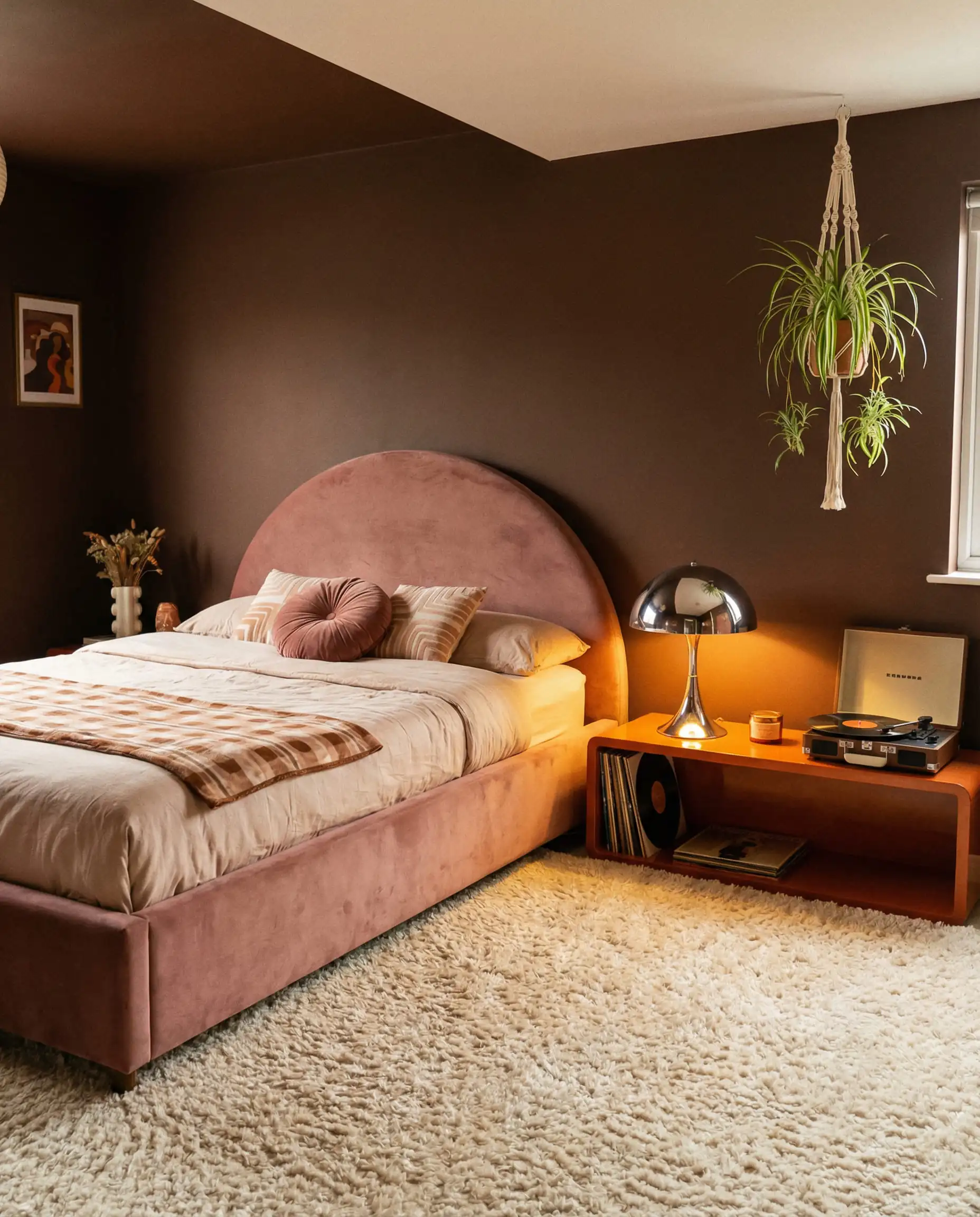
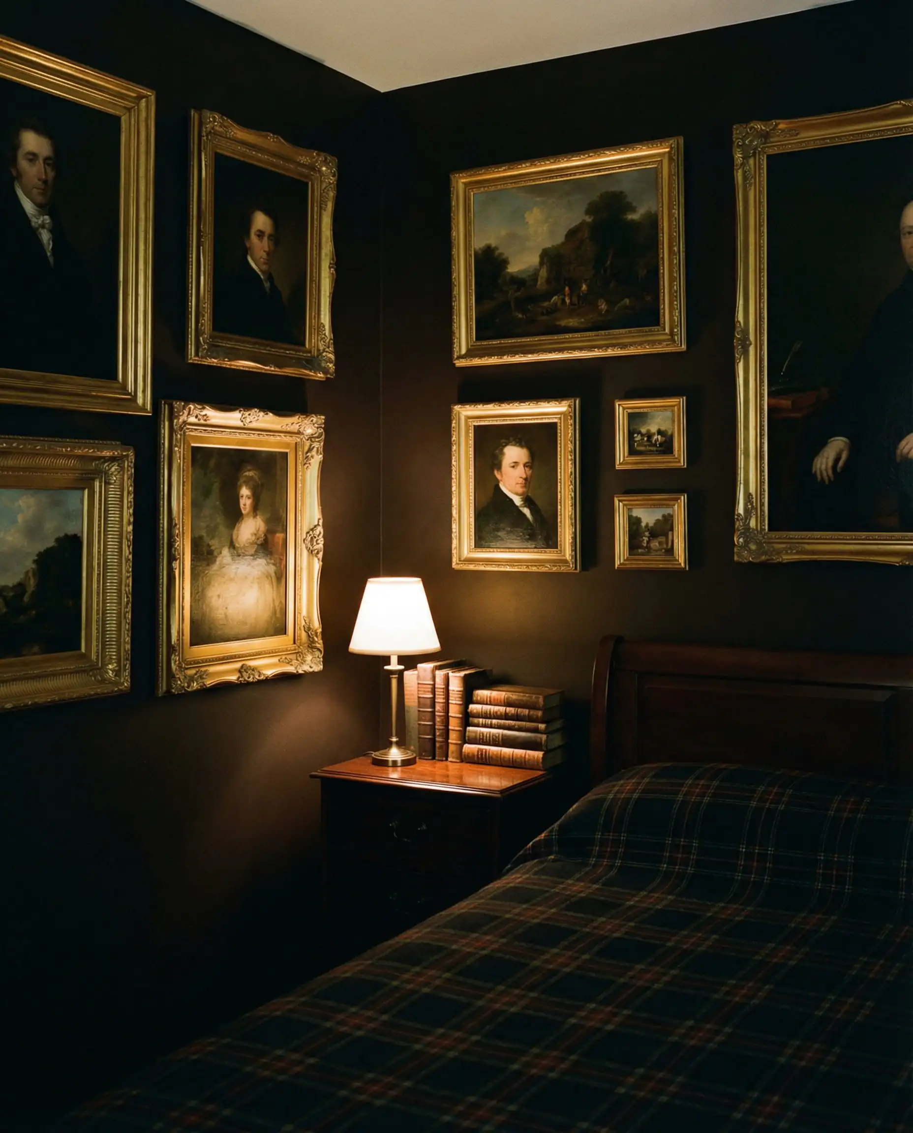
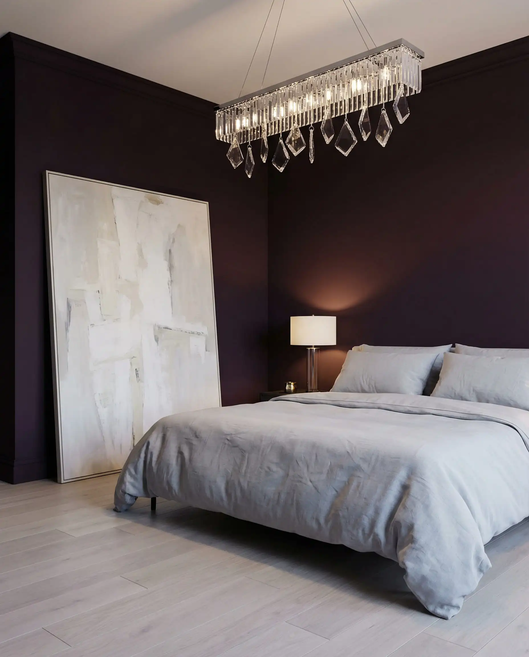
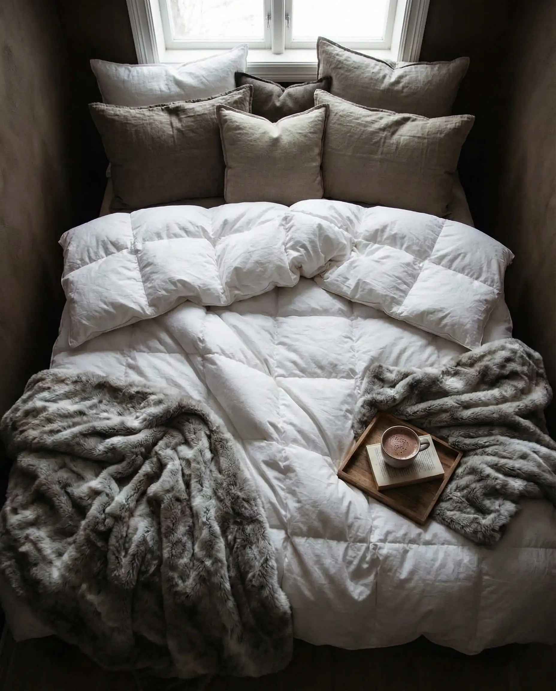
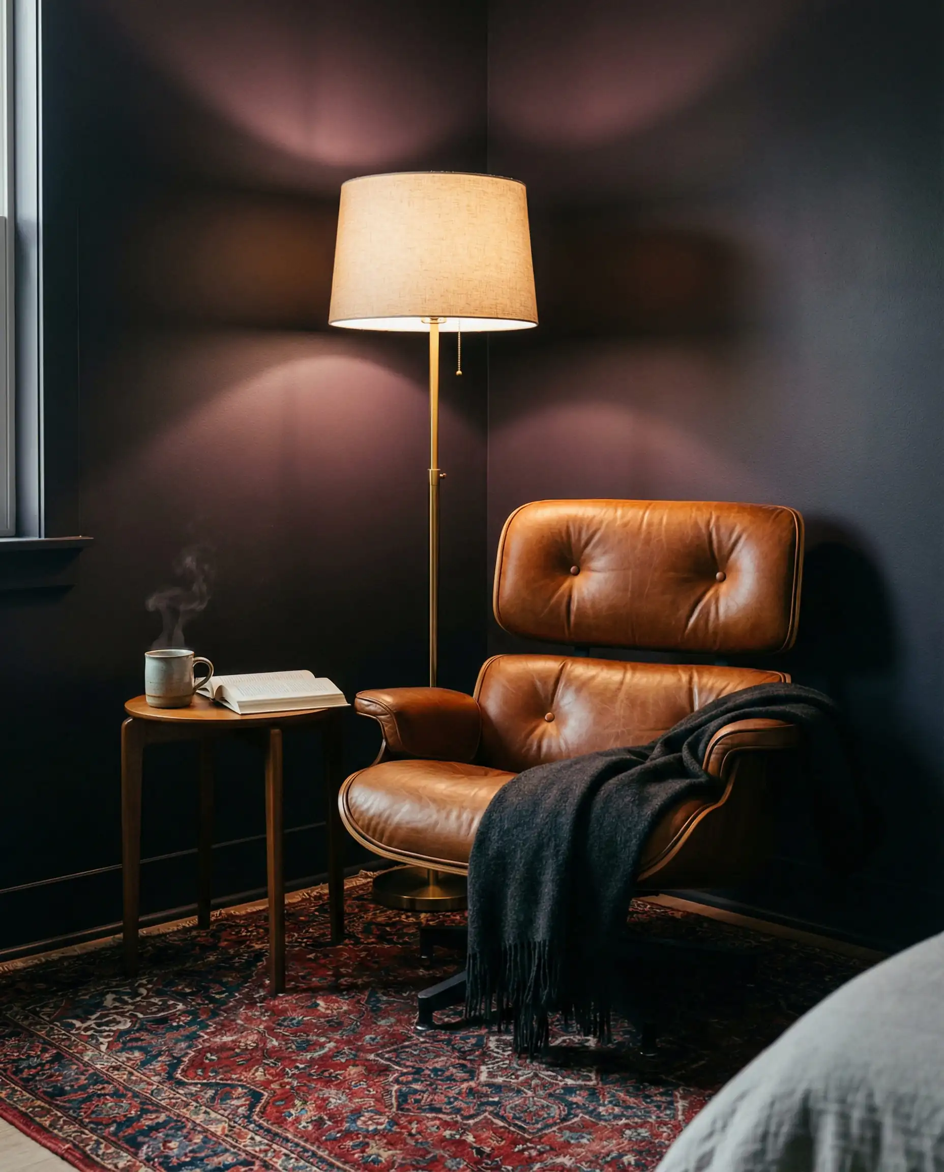
If you go dark on the walls, ensure your lighting is on point. You aren’t relying on the walls to bounce light anymore, so you need localized pools of light. Check out our Lighting Trends report for ideas on warm, ambient fixtures that glow rather than glare. A focused reading lamp creates a cozy “moment” against a dark wall.
🎨 Designer’s Tip
Biophilic Calm: Greens & Blues
Nature-inspired colors are evergreen (pun intended), but the specific shades shift from year to year. In 2026, we are moving away from the bright “nursery” pastels toward shades that feel dusty, hazy, and lived-in.
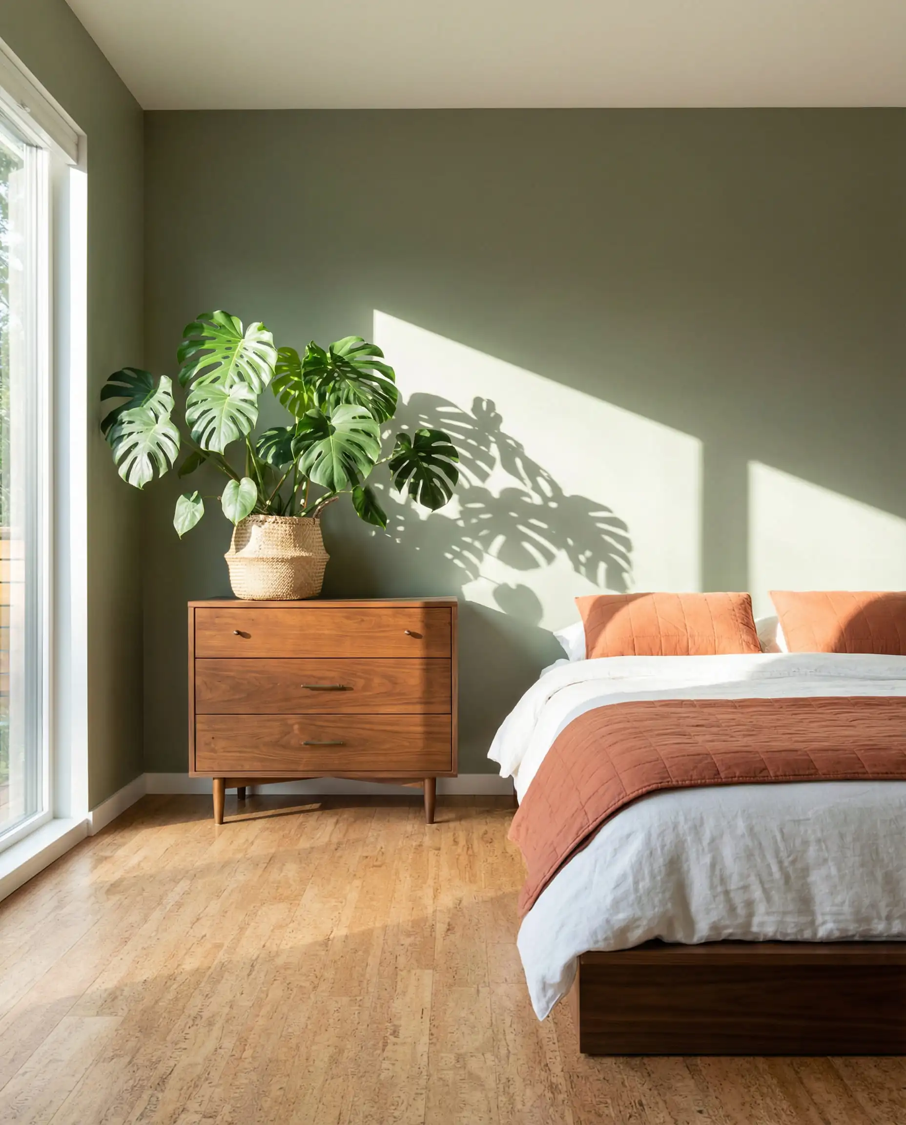
Warm Eucalyptus & Moss
Instead of crisp emeralds, look for greens that have a bit of yellow or brown in them. Valspar’s Warm Eucalyptus is a prime example. It feels like a walk in a dense forest. These greens pair exceptionally well with natural wood furniture, specifically walnut or stained oak.
Atmospheric Blues
Blue remains the most popular bedroom color globally, but the 2026 blues are “stormy.” Think of the color of the sky right before a summer rain. Shades like Raindance or Hazy Stratus have gray undertones that prevent them from looking childish. They are sophisticated enough for a master suite but relaxing enough for a nursery.
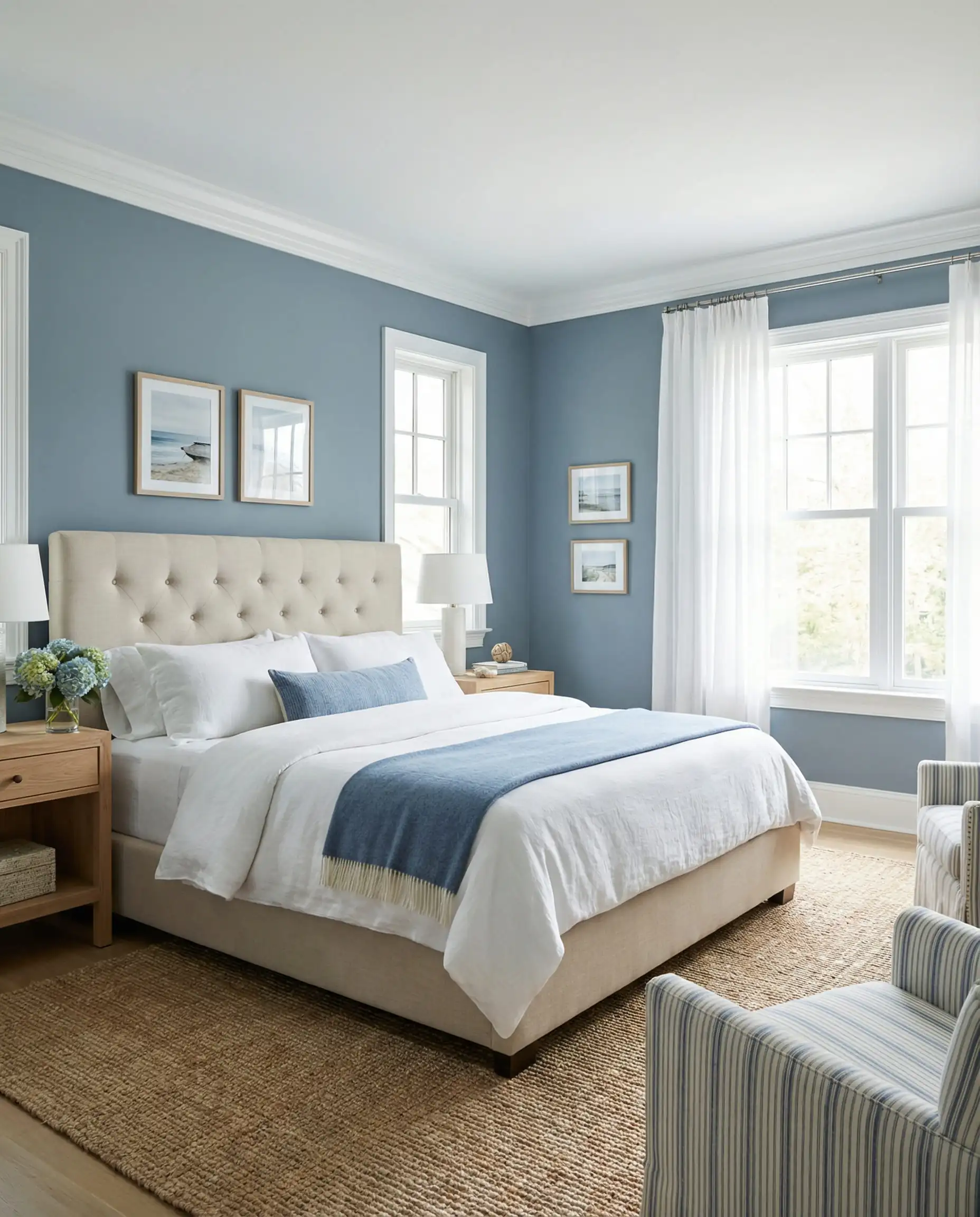
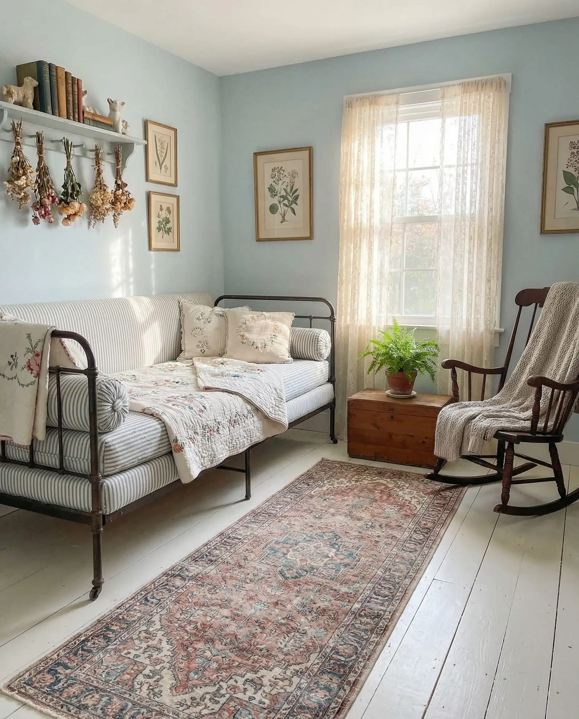
For a cohesive look, match these airy blues with soft, plush textiles underfoot. A neutral, high-pile rug can balance the cool tones of the walls—explore our 2026 Carpet & Rug Trends for the best material pairings.
2026 Application Trends: It’s Not Just What, But How
The biggest change in 2026 isn’t just the colors themselves, but how designers are applying them. The days of the “single accent wall” are fading. Today, we commit.
The Rise of “Color Drenching”
This is the single most important term to know for 2026. Color Drenching involves painting everything—walls, baseboards, window trim, crown molding, and sometimes even the ceiling—in the exact same color.
Why do this?
- It simplifies the visual field: Your eye doesn’t stop at the white trim line. This makes the ceilings feel higher and the room feel less cluttered.
- It’s modern: It instantly updates a space, even if you have traditional molding.
- It works for small spaces: In a small bedroom, breaking up the walls with white trim highlights the small footprint. Drenching blurs the edges of the room.
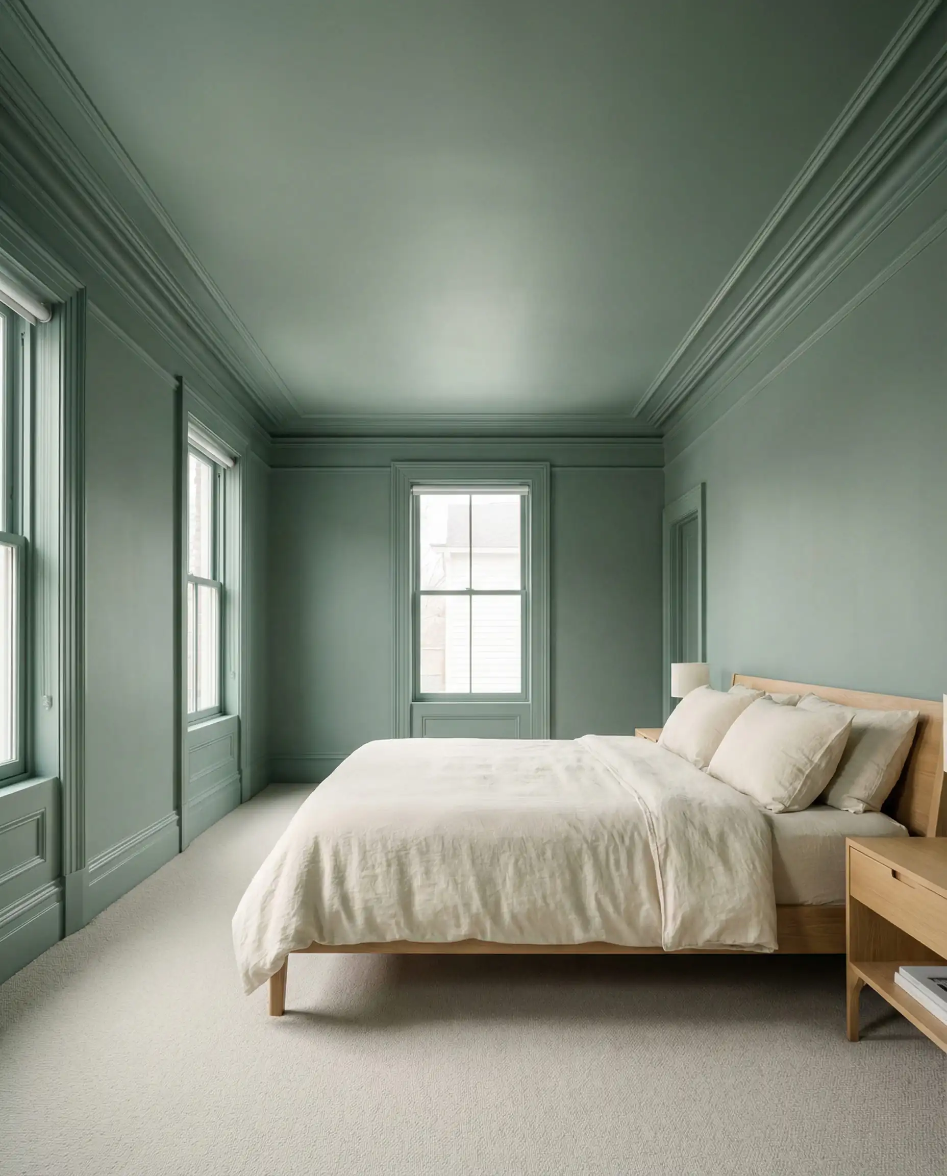
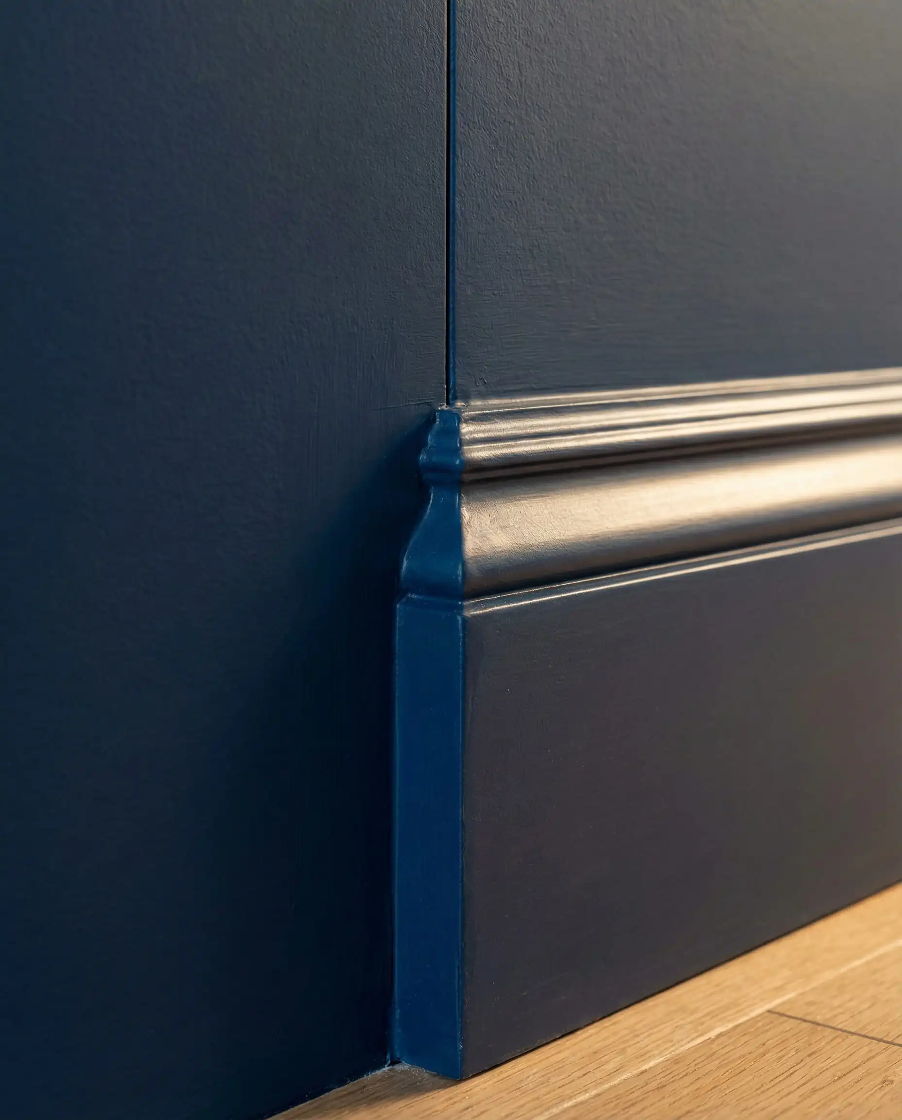
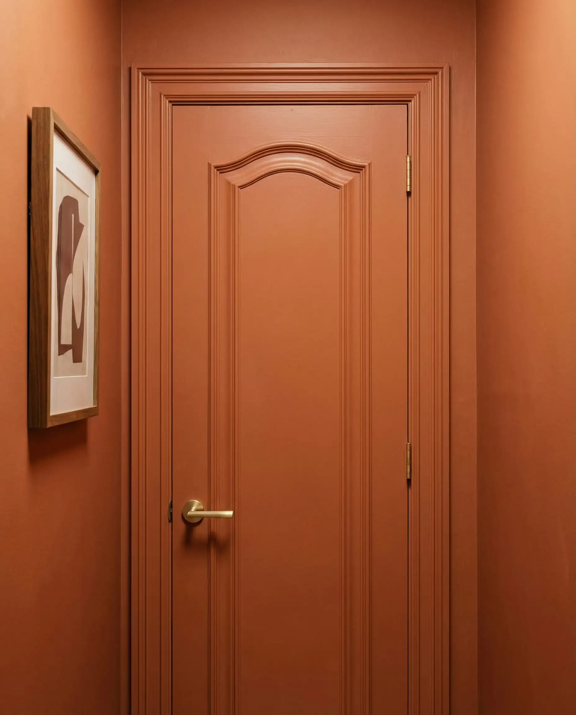
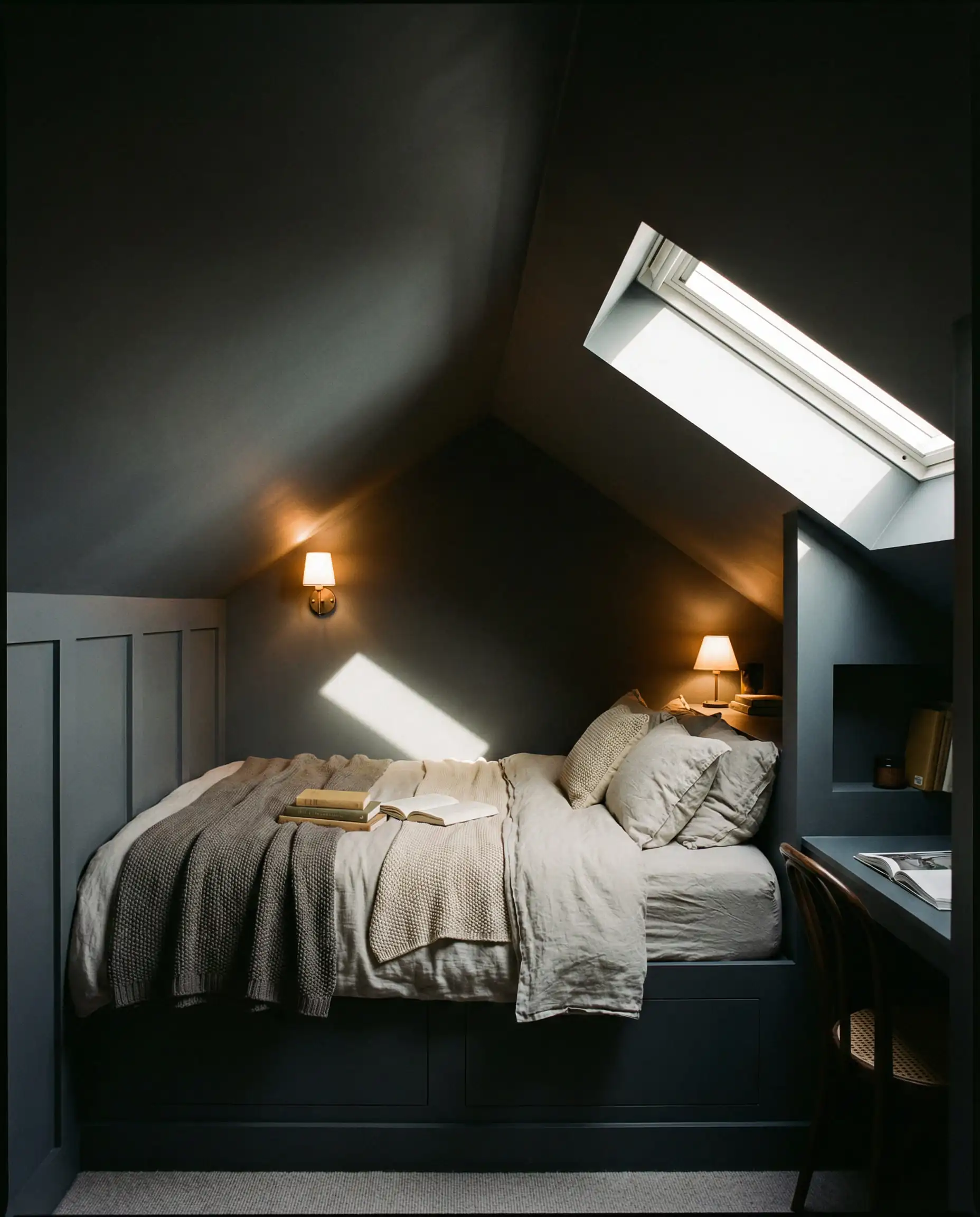
How do you pull off color drenching without it looking flat? Play with sheen. Use a Matte/Flat finish for the walls to create a velvety look, but switch to Satin or Semi-Gloss for the trim and doors in the exact same color. This subtle contrast catches the light differently and adds sophistication to the monochromatic look.
🎨 Designer’s Tip
The “Fifth Wall”
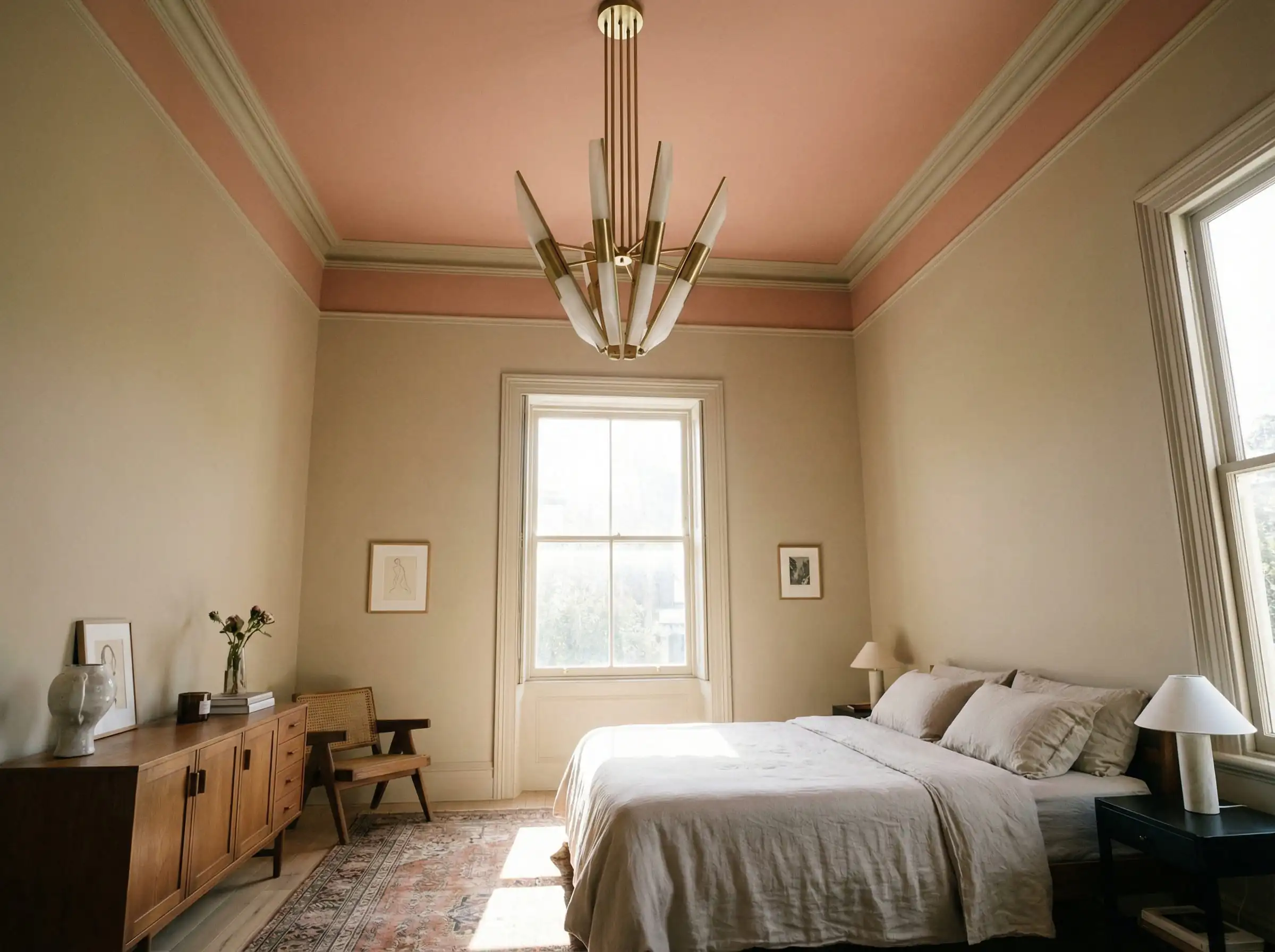
If color drenching feels too intense, consider the ceiling as a canvas. A major trend for 2026 is painting the ceiling a complementary color to the walls, or even wallpapering it.
For example, a room with Universal Khaki walls could feature a ceiling painted in a soft terracotta or a ceiling covered in a textured grasscloth wallpaper. This draws the eye upward and creates a cozy “lid” for the room. If you are adventurous, see our guide on Ceiling Paint Color Trends for specific color combinations that work.
Mastering Light: Direction & Bulbs
You have picked the perfect trendy color, but the way it looks on your walls will depend entirely on the light entering your room. Before you commit to a gallon, consider the direction your windows face.
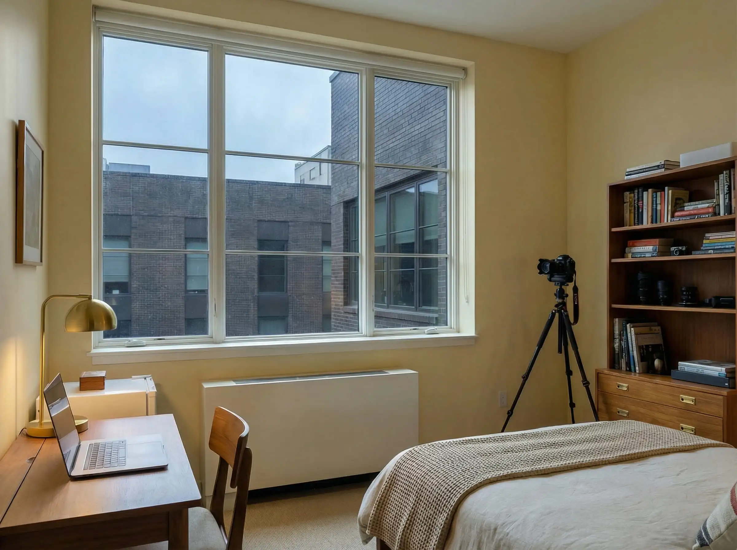
North-Facing Rooms (Cool Light)
North-facing light is weak, cool, and often casts a grayish-blue shadow.
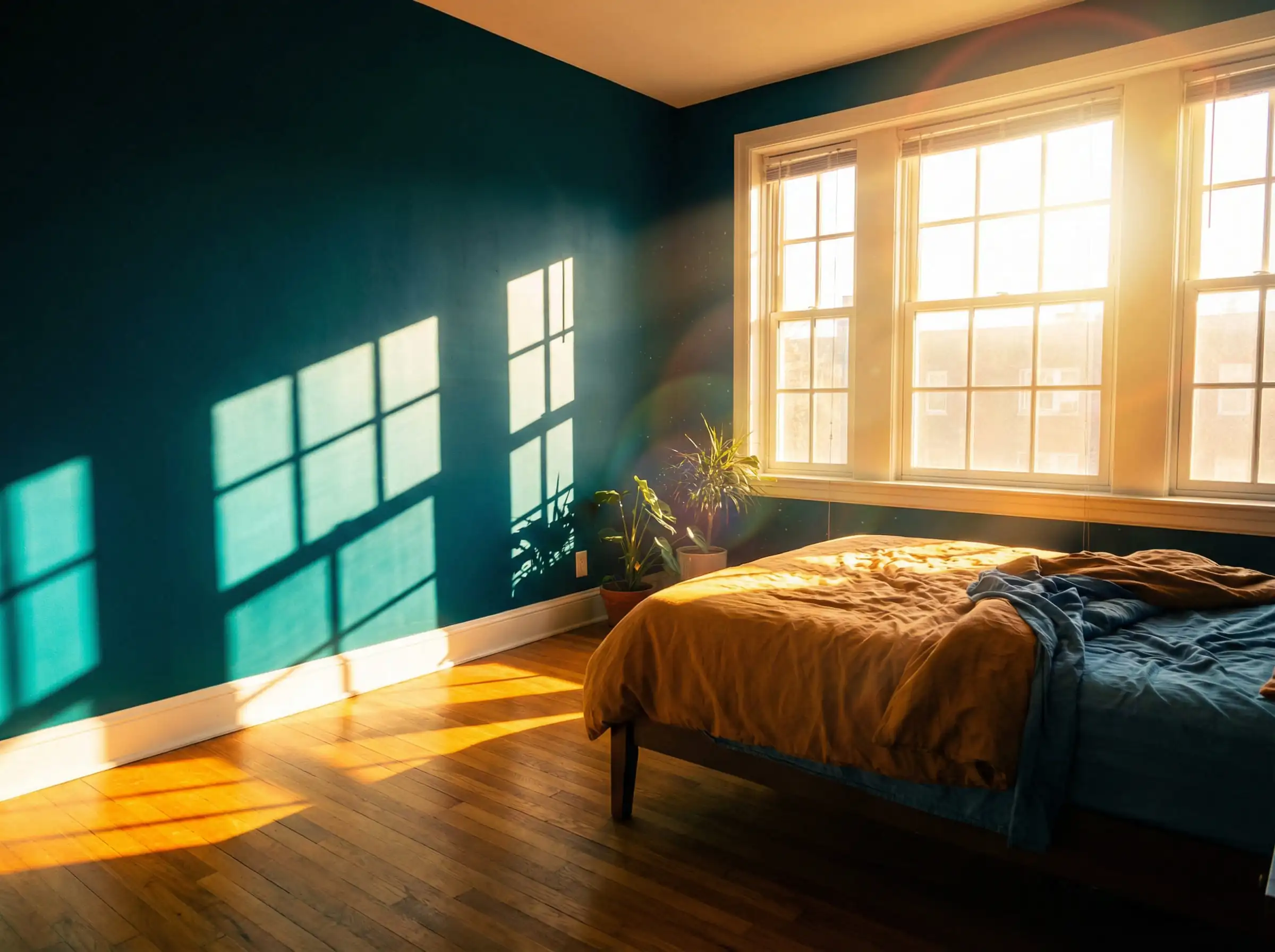
South-Facing Rooms (Warm Light)
South-facing rooms get intense, warm golden light for most of the day.
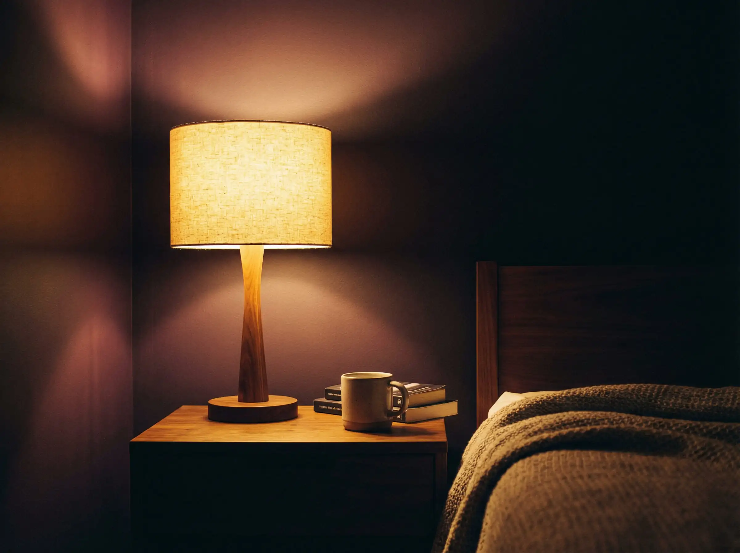
The “2700K Rule” (Artificial Lighting)
Once the sun goes down, your lightbulbs take over. The 2026 color palette is heavily reliant on warm undertones, and the wrong bulb can ruin the effect.
Finish Matters: Matte is King
For bedrooms in 2026, the finish is almost exclusively Matte or Flat. Matte paint absorbs light rather than reflecting it, which creates a velvety, soft texture that hides imperfections in the drywall. While matte paint used to be hard to clean, modern formulations (like Benjamin Moore’s Aura or Sherwin-Williams’ Emerald) are now scuff-resistant enough for daily life.
Frequently Asked Questions
While there are several contenders, Universal Khaki (Sherwin-Williams) and warm, earthy neutrals are taking the top spot. They offer a versatile backdrop that fits almost any design style, from modern farmhouse to boho.
Stark, clinical bright white is out. However, warm whites and creams (like Swiss Coffee) are very much in style. The goal is to avoid the sterile “hospital” look in favor of something softer and more inviting.
Color drenching is a painting technique where the walls, trim, baseboards, and often the ceiling are painted the same color. It is a major trend for 2026 because it makes rooms feel larger, more cohesive, and contemporary.
In a color-drenched room, yes! Painting the interior of your bedroom door the same color as the walls helps it disappear into the design. For more on how door designs are evolving, take a look at our Interior Door Trends 2026.
Cooler tones like soft blues and muted greens are traditionally best for sleep psychology. However, deep dark colors (like charcoal or dark brown) are trending for 2026 because they reduce light reflection, creating a darker environment that promotes melatonin production.
Summary: Which Vibe is For You?
As we move into 2026, the best bedroom paint color is the one that makes you feel the most at ease.
Don’t be afraid to test samples. Paint large swatches on different walls and watch how they change from morning to night. The trends of 2026 are all about personalization and comfort—so grab a brush and make the space yours.

The Aesthetics Desk curates the visual direction for Hackrea. Specializing in design history, global architectural movements, and interior styling, this desk focuses on the psychology of space and how to translate high-end, magazine-quality aesthetics into approachable residential design without falling into fleeting micro-trends.