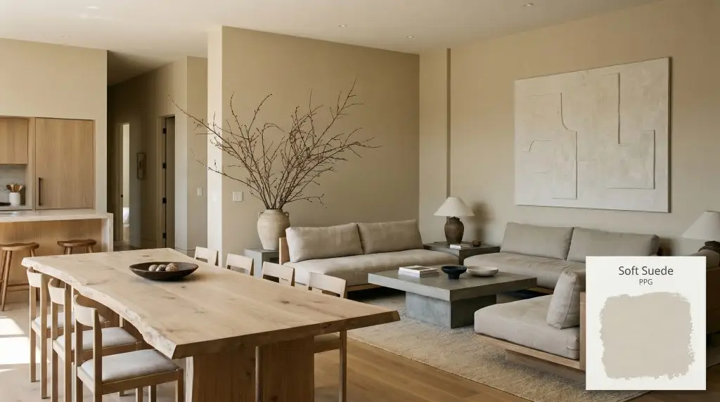
Soft Suede PPG1103-3
PPGPPG Soft Suede (PPG1103-3) is a warm, mid-tone beige with subtle khaki and green undertones. Boasting an LRV of 59, it acts as a deeply organic neutral that grounds spaces without feeling overly dark or heavy, making it highly versatile for both interiors and exteriors.
Paint Technical Profile
| Color ID / SKU | PPG1103-3 |
| HEX Code | #d8cbad |
| Light Reflectance (LRV) | 59 |
| Use | Interior, Exterior |
| Best Exposures | North, South |
| Best For | Living Rooms, Home Offices, Exterior Siding, Transitional Spaces |
Why PPG Soft Suede is the Ultimate Biophilic Neutral for Modern Living
For years, the design world treated beige as a safe, predictable backdrop that asked nothing of a room and offered very little in return. That era of flat, uninspired neutrals is officially over. Today, creating a truly elevated home requires colors that actively participate in the design, shifting and adapting as the light changes throughout the day.
PPG Soft Suede (PPG1103-3) steps into this role beautifully, offering a sophisticated alternative to stark whites and chilly grays. It brings a profound sense of organic warmth to modern interiors, bridging the gap between crisp architectural lines and the natural world. This isn’t just another beige; it is a complex, earthy neutral designed to make a space feel instantly lived-in and intentionally curated.
Undertones & LRV of PPG Soft Suede
If you are wondering whether this color leans warm or cool, the verdict is definitively warm. However, its true brilliance lies in a highly nuanced color structure that prevents it from ever feeling overly yellow or baked. By understanding the DNA of this shade, you can confidently pair it with the right materials to unlock its full potential.
With a Light Reflectance Value (LRV) of 59, this architectural finish sits perfectly in the mid-light range. It reflects enough natural daylight to keep standard-sized rooms feeling open and breathable, while absorbing just enough shadow to provide a distinct, tailored contrast against white trim. This specific light reflectance makes it incredibly forgiving on imperfect walls, helping to soften harsh architectural angles.
Lighting Effects & The Chameleon Factor
Because of its complex khaki undertone, Soft Suede is highly reactive to its environment. The direction of your windows and the temperature of your lightbulbs will dramatically alter how this color behaves on the wall.
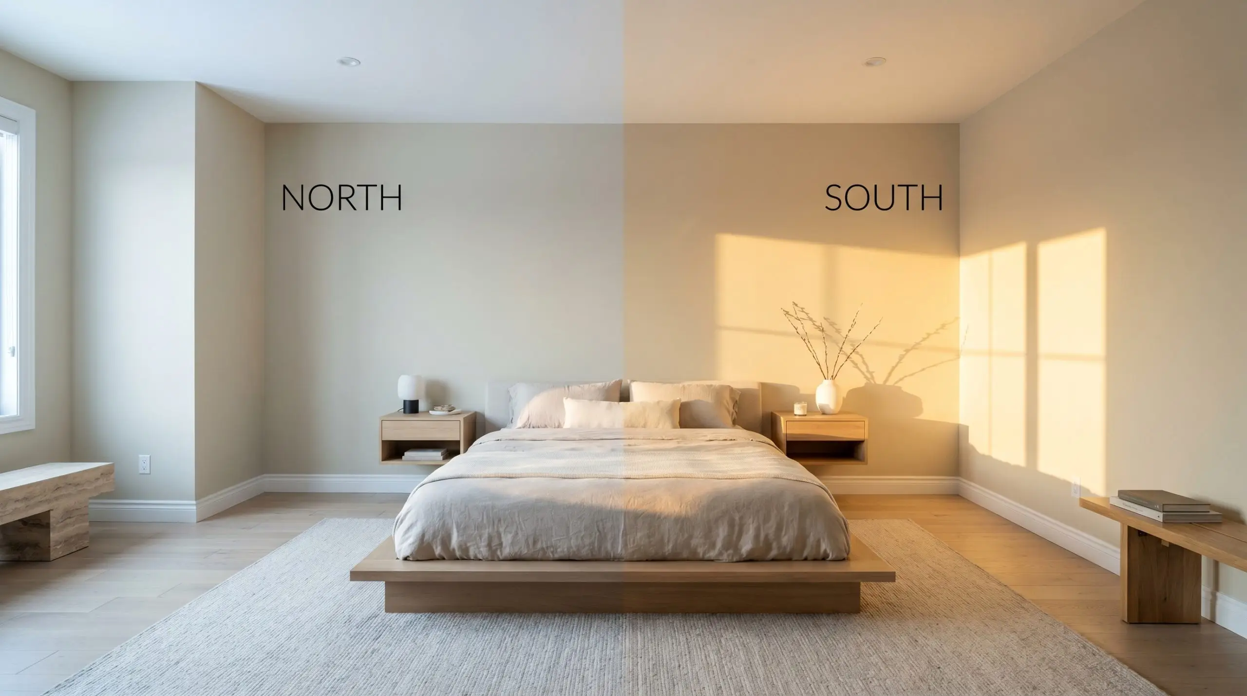
If you find the color pulling slightly too yellow in your specific room, immediately swap your lightbulbs to a crisper 3500K LED. This simple shift forces the cooler khaki undertones back to the surface, instantly modernizing the finish.
Hackrea Pro-Tip (The Bulb Strategy)
Popular Applications for This Earthy Neutral
The beauty of this earthy neutral lies in its ability to adapt to almost any architectural setting. By shifting your styling, hardware, and textiles, you can manipulate this color to suit a wide variety of design narratives.
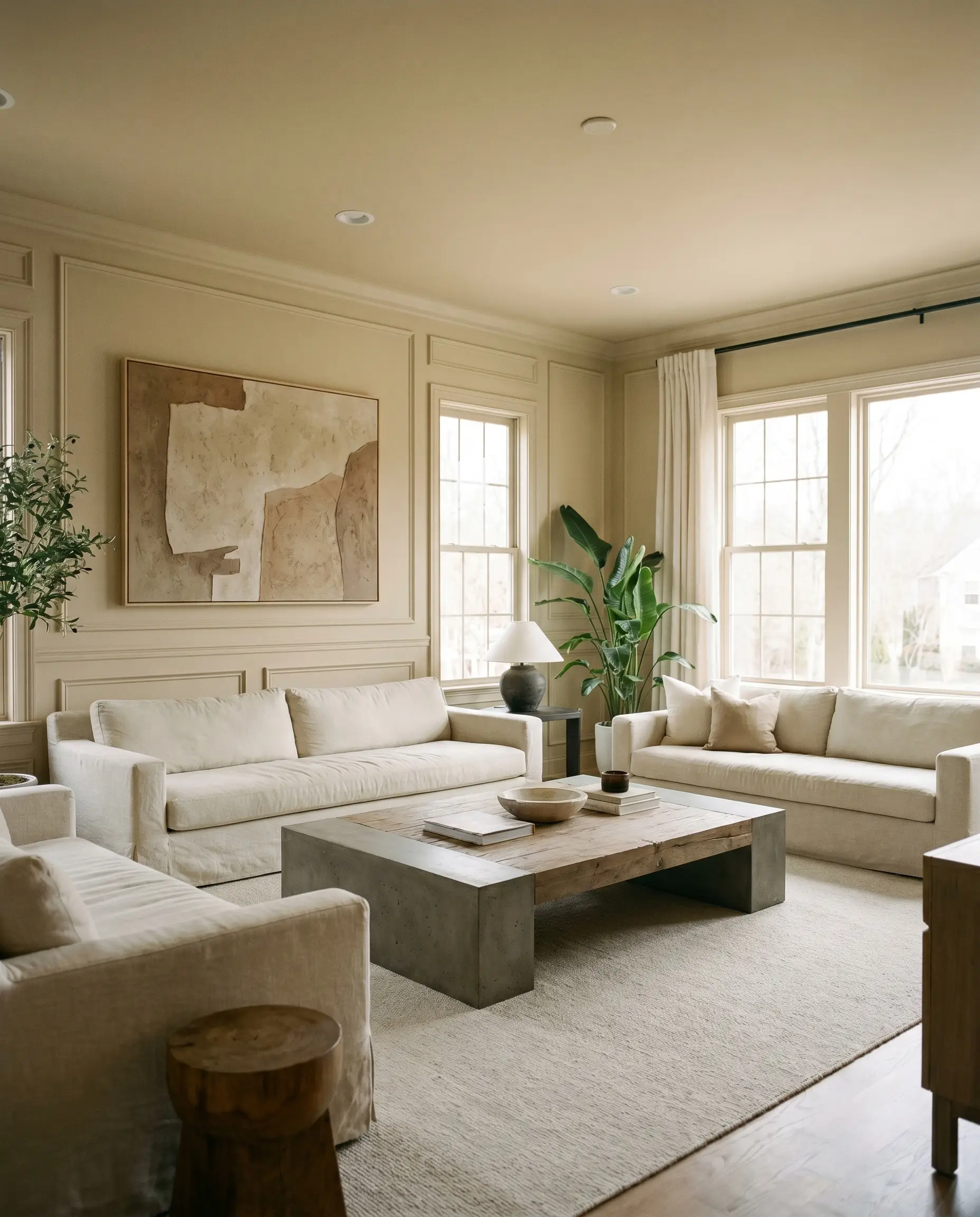
Living Rooms & Lounge Areas
In a living space, this color excels at establishing an Organic Modern aesthetic. Instead of standard drywall, consider applying it over subtle fluted wall panels or classic picture frame molding to enhance the ambient shadowing. Pair it with low-profile, slipcovered sofas in washed linen and a brutalist coffee table to create a room that feels both curated and effortlessly relaxed. The color’s inherent warmth provides a beautiful backdrop for oversized branches in ceramic vessels and abstract plaster art.
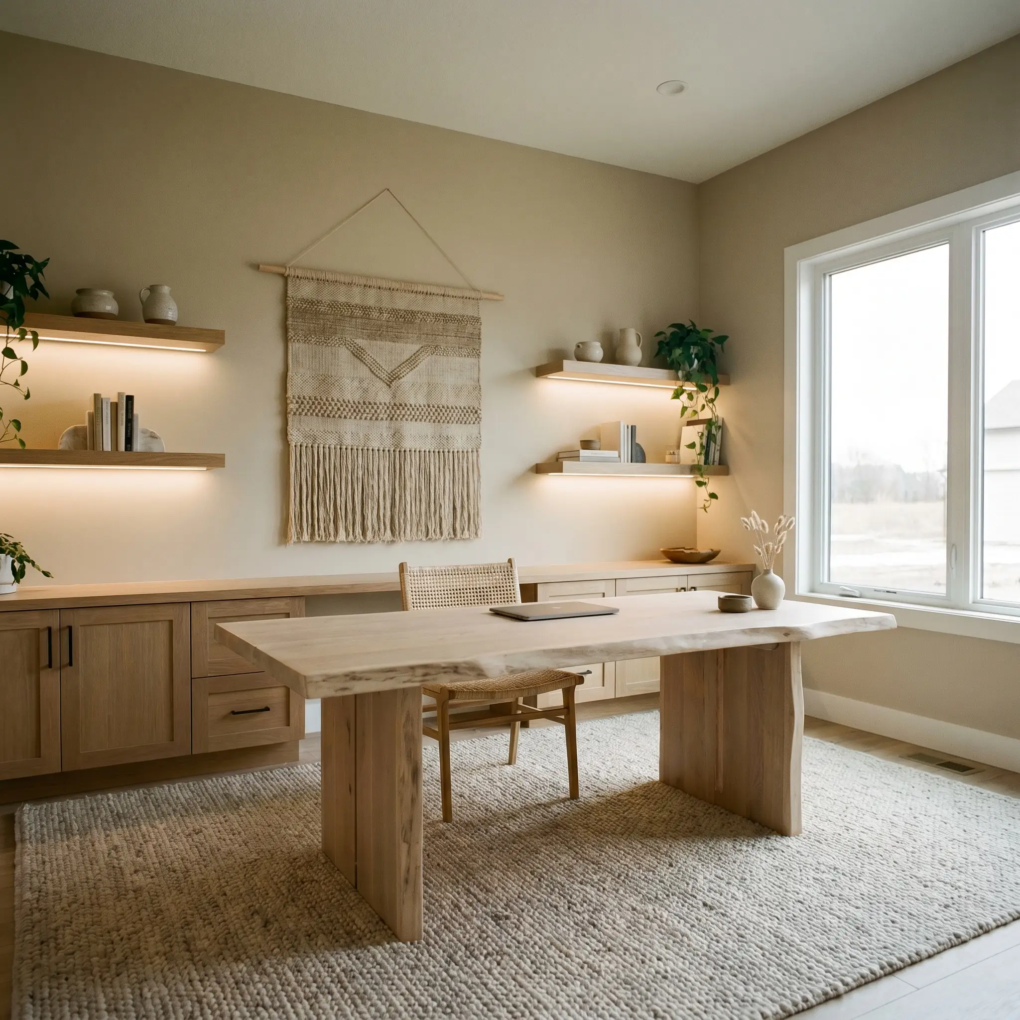
Home Offices & Studies
Move away from the predictable dark, moody office and use this shade to create a calming, Wabi-Sabi inspired retreat. The subtle green cast promotes focus and tranquility, especially when paired with a live-edge bleached oak desk and floating wall ledges. Introduce tactile elements like a nubby wool rug and woven wall hangings to soften the acoustics of the room. This approach turns a functional workspace into a serene, tactile environment.
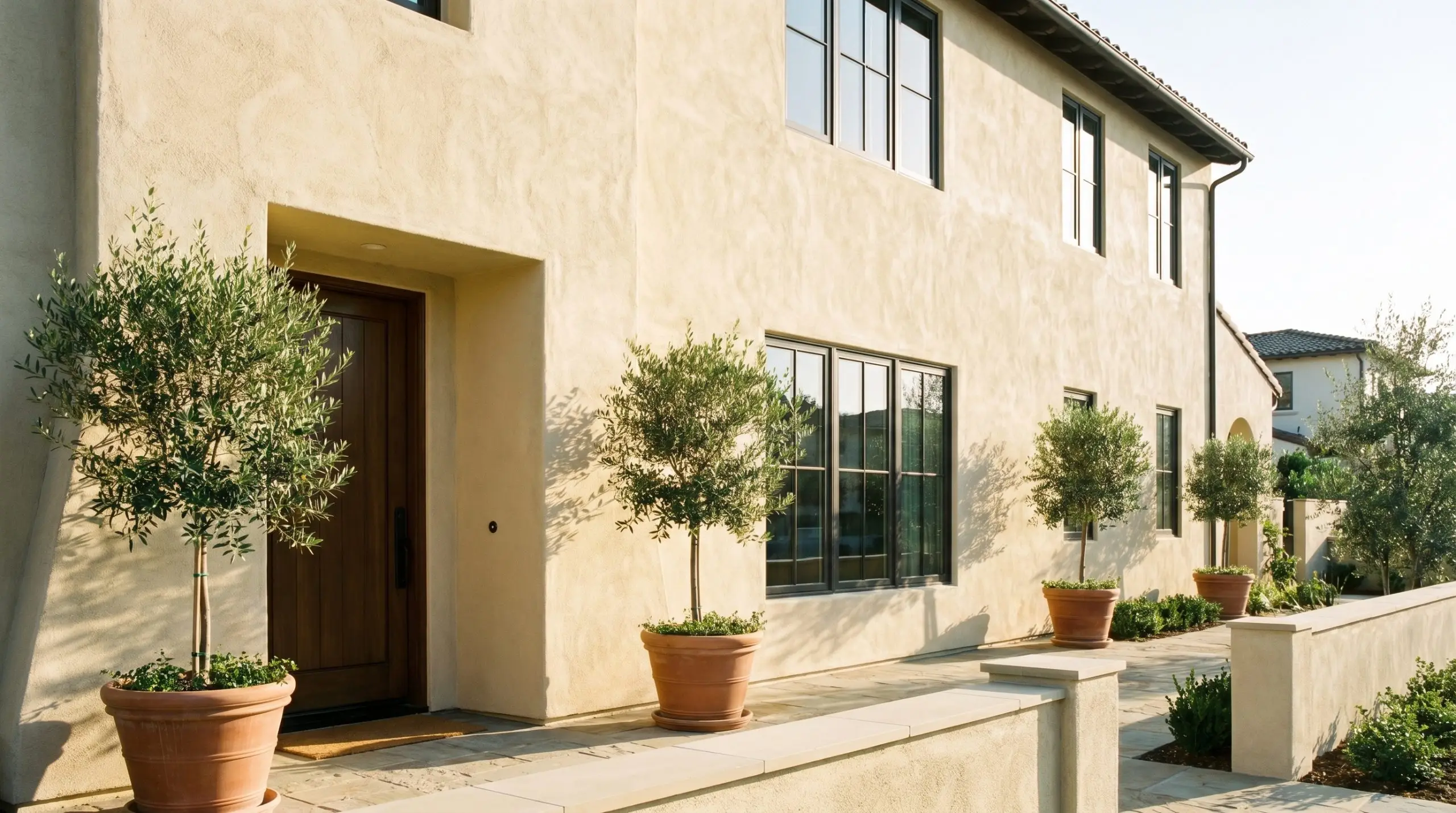
Exterior Siding & Stucco
On an exterior facade, full sunlight will wash out some of the color’s depth, making it read slightly lighter and warmer than it does indoors. It performs beautifully on heavily textured stucco or classic board and batten siding, offering a rich, sun-baked elegance. Contrast the main body color with dark, charcoal-bronze window casings and patinated copper exterior sconces for a striking, modern Mediterranean Revival look.
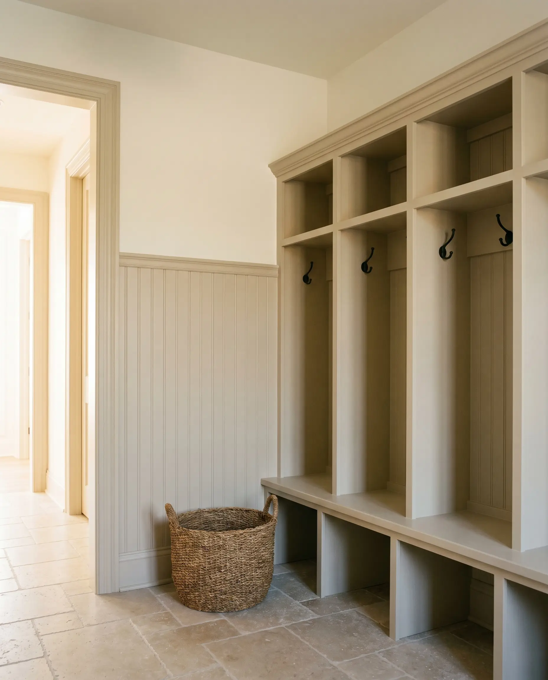
Mudrooms & Entryways
Entryways require a color that can handle daily wear while still offering a warm welcome. Apply this shade to beadboard wainscoting or built-in cubbies to establish a durable, inviting foundation. Pair it with tumbled limestone floors and matte black iron coat hooks for a beautifully rustic yet tailored aesthetic. The mid-light LRV is highly practical here, effortlessly hiding minor scuffs and fingerprints.
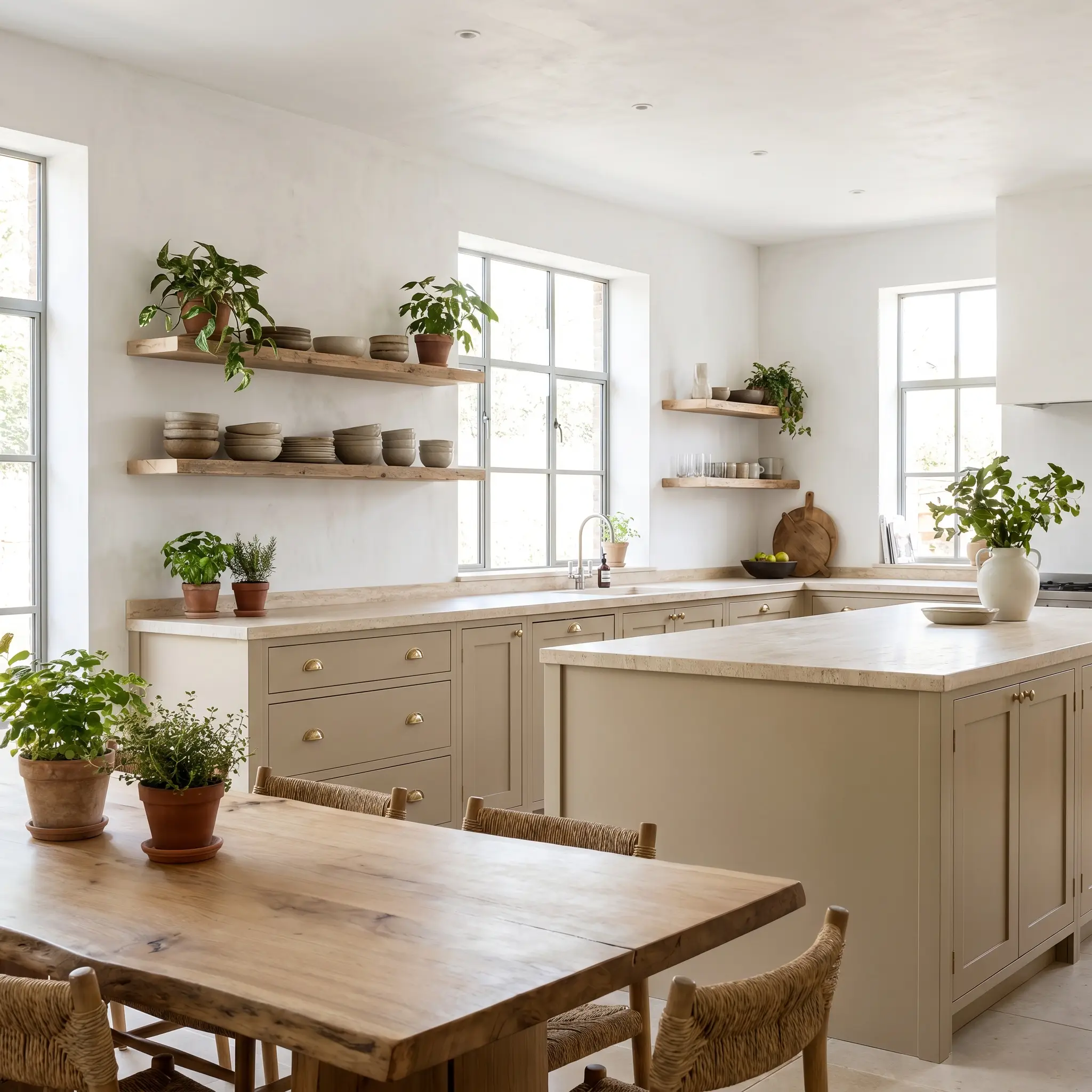
Kitchen Cabinetry & Millwork
If you are updating a kitchen but want to avoid the starkness of all-white cabinets, this color is a brilliant alternative for millwork. It brings a soft, rustic charm to lower cabinets or a central island, especially when topped with honed travertine counters. Finish the look with unlacquered brass cup pulls and floating raw wood shelves to emphasize the biophilic design elements.
Coordinating Colors & Best Pairings for Soft Suede
The secret to styling this specific shade lies in honoring its hidden green micro-nuance. It requires intentional pairings that either crisp up its boundaries or pull out its organic, earthy qualities.
Trim & Baseboards
To keep the room feeling fresh, you need a trim color that provides enough contrast without starkly clashing against the yellow-orange base.
Hardware, Wood & Material Pairings
The tactile materials you bring into the space will ultimately dictate how this paint is perceived.
Coordinating Paint Colors
When building a whole-home palette, lean into the subtle green cast to balance the warm base hue.
Designer Mood Boards
To help you visualize how these elements come together, here are three distinct stylistic pathways for integrating this color into your home.
Desert Canopy
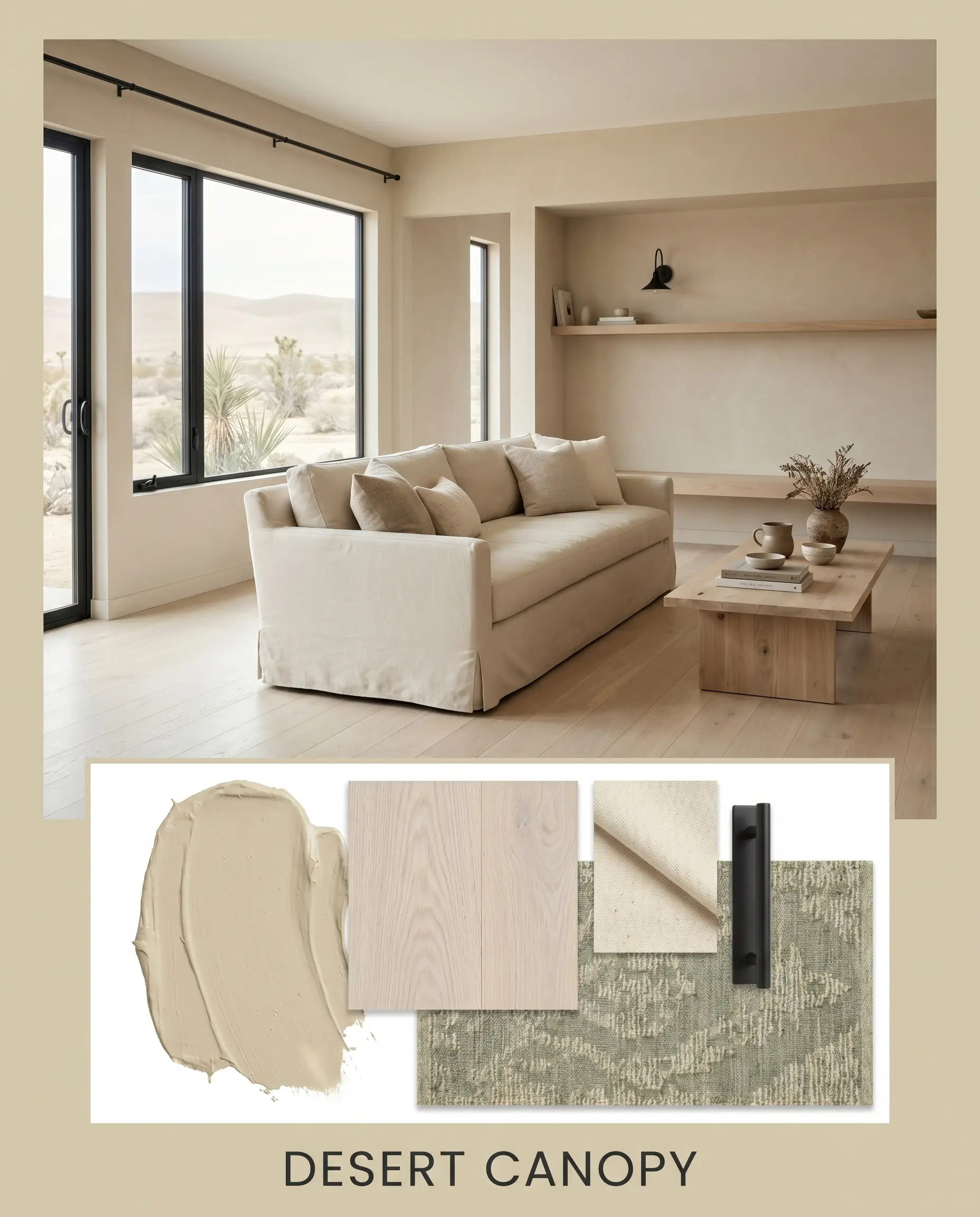
This palette leans heavily into the Organic Modern aesthetic, focusing on raw textures and relaxed silhouettes. The walls are paired with bleached oak flooring and large, slipcovered sofas in heavy cotton canvas. Matte black iron hardware and sculptural wood objects provide sharp visual punctuation, while a vintage rug in muted sage and oat ties the earthy tones together. The overall vibe is effortlessly serene, tactile, and deeply connected to nature.
Botanical Heritage
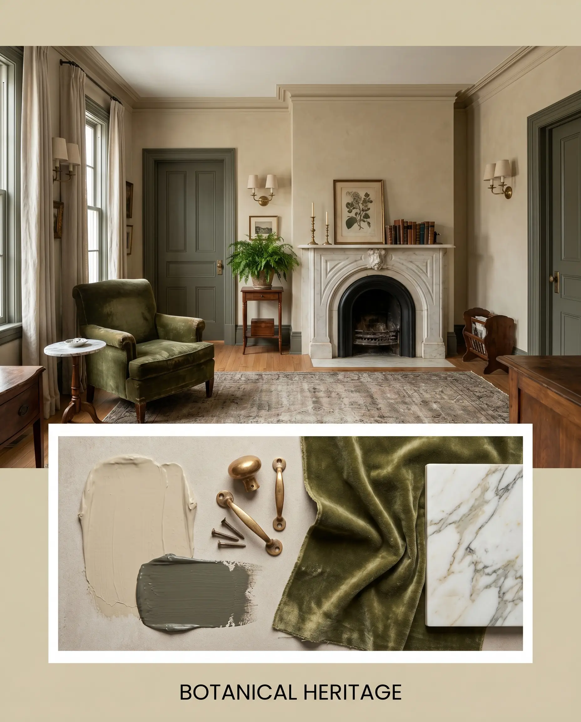
For a more traditional, curated atmosphere, this approach highlights the elegant contrast between the warm walls and deep, intense greens. Picture Benjamin Moore Dark Olive on the trim and interior doors, paired with unlacquered brass sconces and a statement piece of distressed velvet furniture. Framed botanical prints and statuary marble accents elevate the room, creating a mood that feels historic, tailored, and quietly luxurious.
Sundrenched Clay
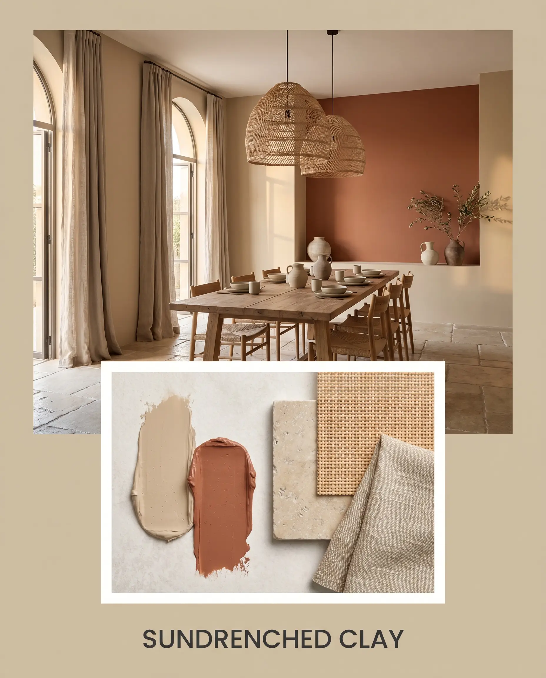
This warm, Mediterranean-inspired palette amplifies the golden-orange base of the paint. It incorporates Sherwin-Williams Cavern Clay as a bold accent, supported by tumbled limestone floors and woven rattan lighting fixtures. Terracotta stoneware bowls and slub linen curtains complete the look, resulting in a space that feels baked by the sun, vibrant, and incredibly welcoming.
PPG Soft Suede: Head-to-Head Comparisons
Sometimes, understanding what a color isn’t is the best way to determine if it’s right for your home. Here is how it stacks up against its closest competitors.
PPG Soft Suede vs. Sherwin-Williams Shiitake SW 9173
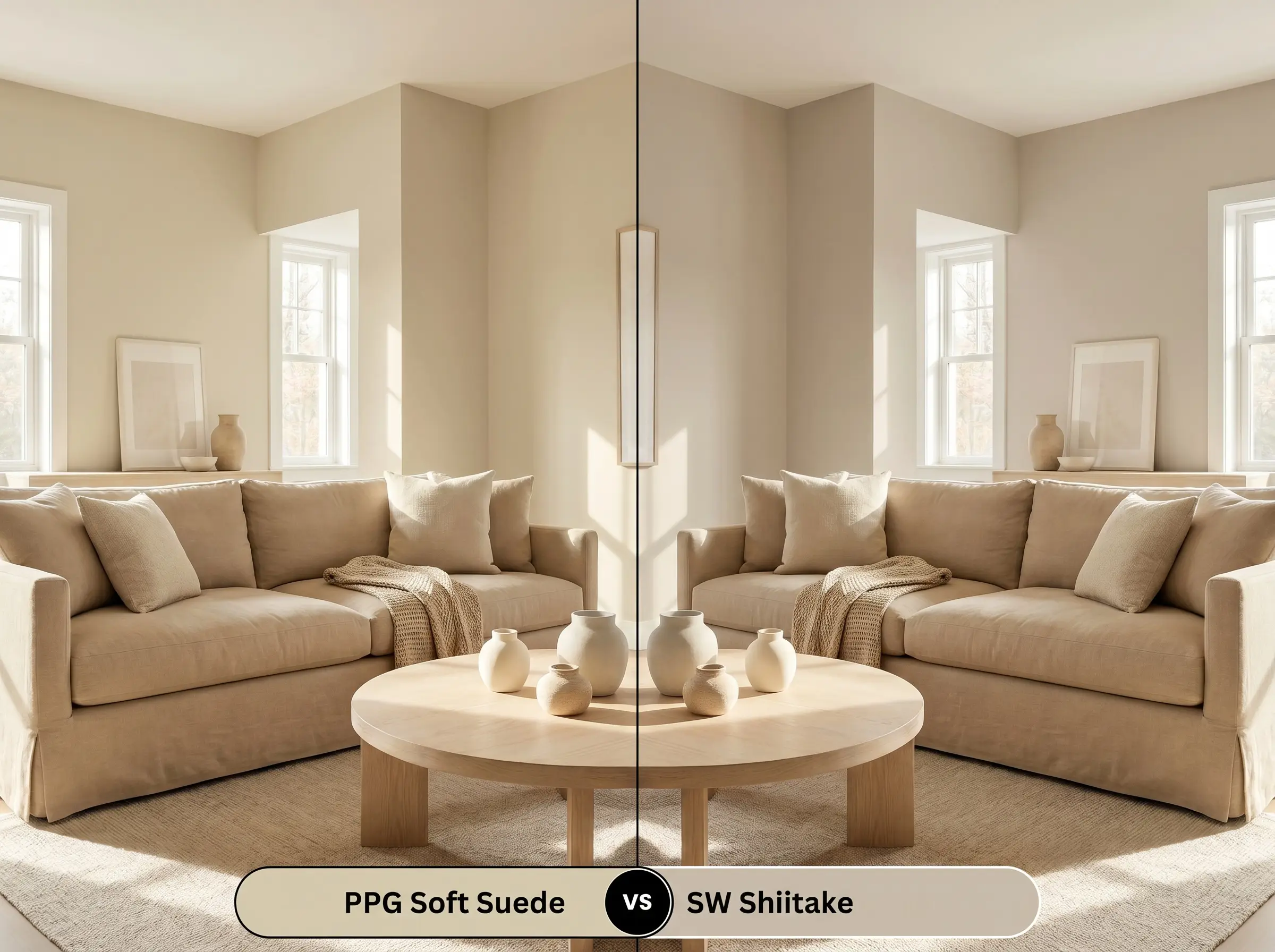
If your room receives heavy, warm southern light, you might find that the PPG option pulls slightly too yellow-orange for your taste. In this scenario, Shiitake is often the better choice. It is a cooler, more mushroom-toned greige that resists turning overly golden, maintaining a crisper, more modern profile in sun-drenched spaces.
PPG Soft Suede vs. Benjamin Moore Bleeker Beige HC-80
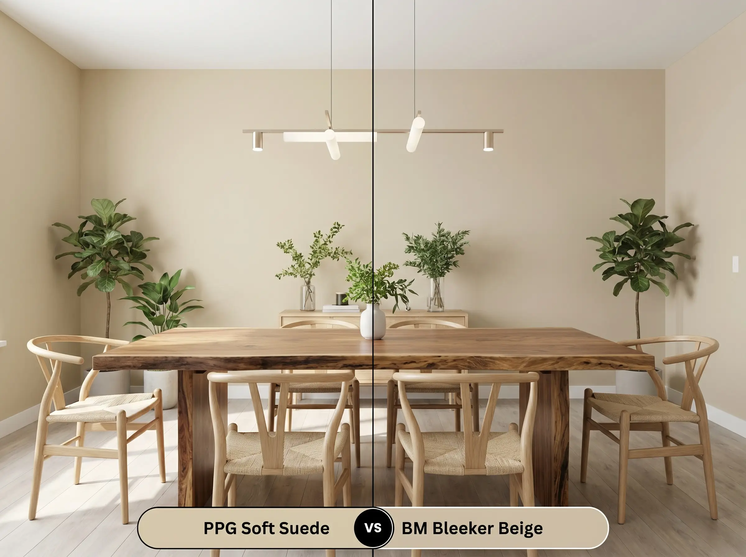
Bleeker Beige is a classic, but it carries a much more prominent, traditional yellow undertone. If you want to avoid that classic 1990s builder-beige look, the PPG formula is the superior option. Its hidden green and khaki notes provide a level of earthy complexity that Bleeker Beige simply lacks, making it far more suitable for contemporary, biophilic designs.
PPG Soft Suede vs. Farrow & Ball Stirabout No. 300
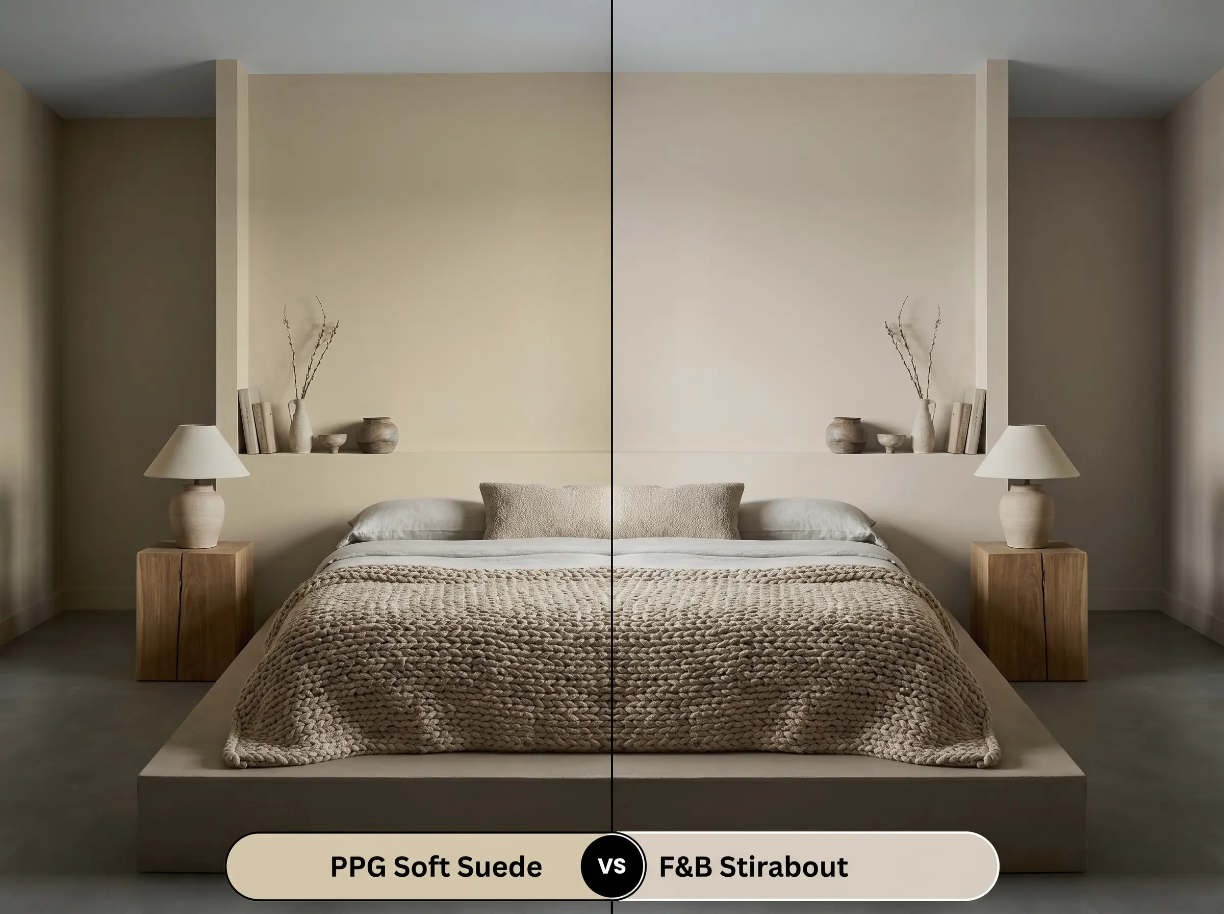
Stirabout is a beautiful, earthy neutral, but it leans slightly lighter and has a touch more gray in its base. If you are working with a dimly lit, north-facing room, Stirabout might feel a bit too cool or flat on the walls. The PPG shade, with its stronger yellow-orange base, will inject much more vital warmth into a shadow-heavy space.
Similar Colors & Brand Equivalents
If you love the chromatic profile of this paint but need to tweak the LRV or switch brands for local availability, consider these alternatives.
Same-Brand Alternatives
Cross-Brand Matches
Practical Application & DIY Advice
Transitioning from a paint swatch to a fully finished room requires an understanding of how the product actually behaves on the brush and on the wall.
Frequently Asked Questions
It performs exceptionally well. The intense, direct sunlight of an arid climate will naturally wash out some of the color’s depth, allowing the golden-orange base to shine through and create a beautiful, sun-baked aesthetic that perfectly complements textured stucco.
Absolutely. Because it lacks natural light, a windowless room relies entirely on artificial lighting. By pairing this color with warm 2700K LED bulbs, you can amplify its yellow-orange base, instantly transforming a sterile basement into a cozy, inviting retreat.
A high-gloss finish will bounce ambient light aggressively, which slightly deepens the perceived color and makes the subtle green and khaki undertones feel richer and more pronounced. It adds a stunning layer of architectural elegance to tight spaces.
Rather than clashing, the subtle green actually balances the red brick beautifully. Because red and green are complementary colors, the earthy khaki undertone in the paint helps to neutralize and modernize the harshness of the brick, creating a harmonious, rustic look.
Final Verdict on PPG1103-3
PPG Soft Suede is an incredibly sophisticated, biophilic neutral that proves beige doesn’t have to be boring. Its complex blend of a warm yellow-orange base and an earthy khaki undertone makes it the perfect foundation for Organic Modern, Transitional, and warm minimalist homes. It thrives in spaces where it can interact with natural light and tactile materials, bringing a profound sense of calm and intentionality to living rooms, exterior facades, and custom millwork.
While this paint is highly adaptable, it struggles when forced to compete with stark, icy blue-grays or brilliant, blue-toned LED lighting. Placing it next to distinctly cold, sterile elements will instantly drain its organic warmth, causing the yellow-orange base to look muddy rather than radiant. Keep your coordinating colors and materials rooted in earthy, natural tones to ensure this beautiful finish reaches its full potential.
Hackrea Design Secret (The Temperature Clash)
Closest Cross-Brand Equivalents
The absolute closest scientific color matches for Soft Suede across top paint brands.