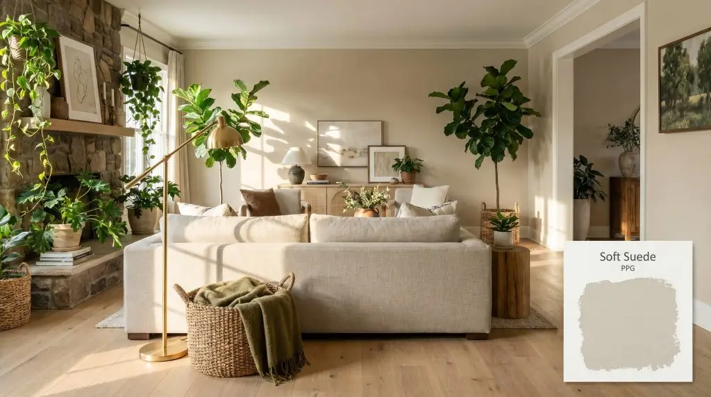
Soft Suede PPG1103-3
PPGPPG Soft Suede (PPG1103-3) is a warm, mid-toned beige with subtle khaki and yellow-green undertones. With an LRV of 59, it serves as a cozy, earthy neutral that brings organic warmth to interior spaces without feeling overly heavy or dark.
Paint Technical Profile
| Color ID / SKU | PPG1103-3 |
| HEX Code | #d8cbad |
| Light Reflectance (LRV) | 59 |
| Use | Interior, Exterior |
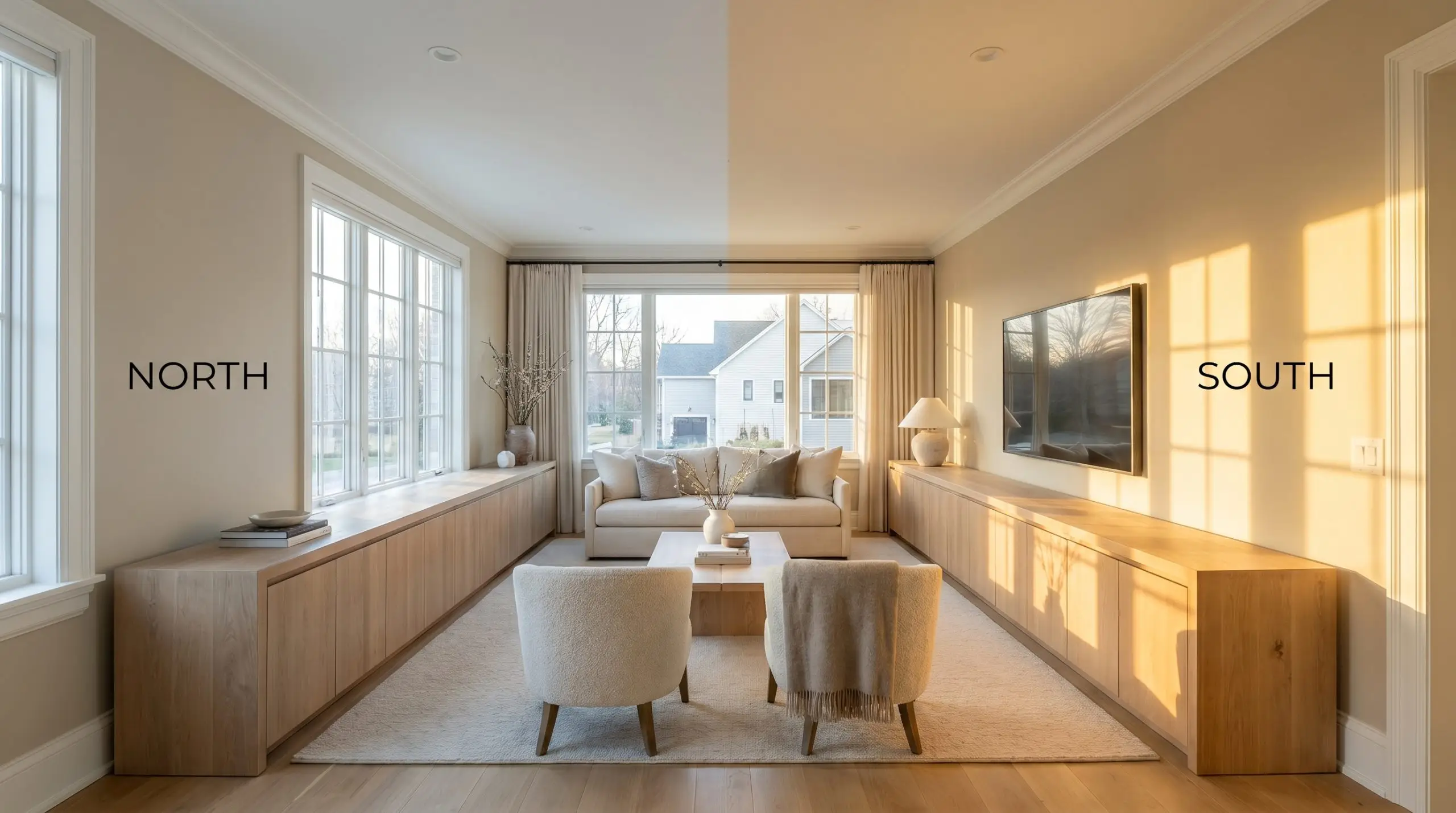
| Best Exposures | North, East |
| Best For | Living rooms, bedrooms, home offices, transitional spaces |
PPG Soft Suede: The Khaki-Infused Neutral Redefining Earthy Interiors
When a paint color successfully mimics the texture of nature, it fundamentally changes how a room feels. PPG Soft Suede (PPG1103-3) does exactly this, stepping away from the flat, predictable tans of the past to offer a deeply nuanced, organic warmth. It acts as a grounding force, pulling the subtle tones of the outdoors inside without overwhelming the architecture.
Finding a beige color palette that doesn’t skew overly yellow or muddy is a notorious challenge for interior styling. This specific shade solves that problem by relying on a highly complex chromatic profile. It wraps a space in a comforting, earthy neutral tone while maintaining enough crispness to feel incredibly current.
Whether you are layering a sun-drenched living room with textural fabrics or trying to warm up a chilly northern exposure, understanding how this pigment behaves is crucial. Let’s break down exactly how this mid-tone tan interacts with light, materials, and everyday living spaces.
PPG Soft Suede: Undertones & LRV
If you are wondering whether this color pulls warm or cool, PPG Soft Suede is a definitively warm neutral. However, its warmth is highly sophisticated, rooted in a precise balance of underlying pigments rather than a blunt, sunny yellow.
To truly understand how this architectural finish will behave on your walls, we have to look at its structural DNA:
With a Light Reflectance Value (LRV) of 59, this shade sits perfectly in the mid-tone range. It absorbs enough natural light to provide substantial depth and shadow play, yet it bounces enough illumination back into the room to prevent the space from feeling overly shadowed or heavy. It provides a beautiful, soft contrast when pushed up against a crisp white ceiling or trim.
Lighting Effects & The Chameleon Factor
Because of that hidden khaki-green influence, this color structure is highly reactive to its environment. If you purchase this paint expecting a straightforward, unwavering tan, the way it shifts throughout the day might catch you off guard.
Always test this mid-tone tan on the darkest wall in your room. In heavy shadows, the green-khaki undertone will aggressively step forward, completely changing the mood from a warm beige to an earthy mushroom.
Hackrea Pro-Tip (The Shadow Shift)
Here is exactly how shifting light dictates the final aesthetic:
Anchoring the Home with PPG1103-3
Rather than forcing a specific design style, this khaki-infused pigment acts as a highly adaptive architectural foundation. It quietly absorbs the energy of the materials placed around it, shifting its personality to support the broader aesthetic of the home.
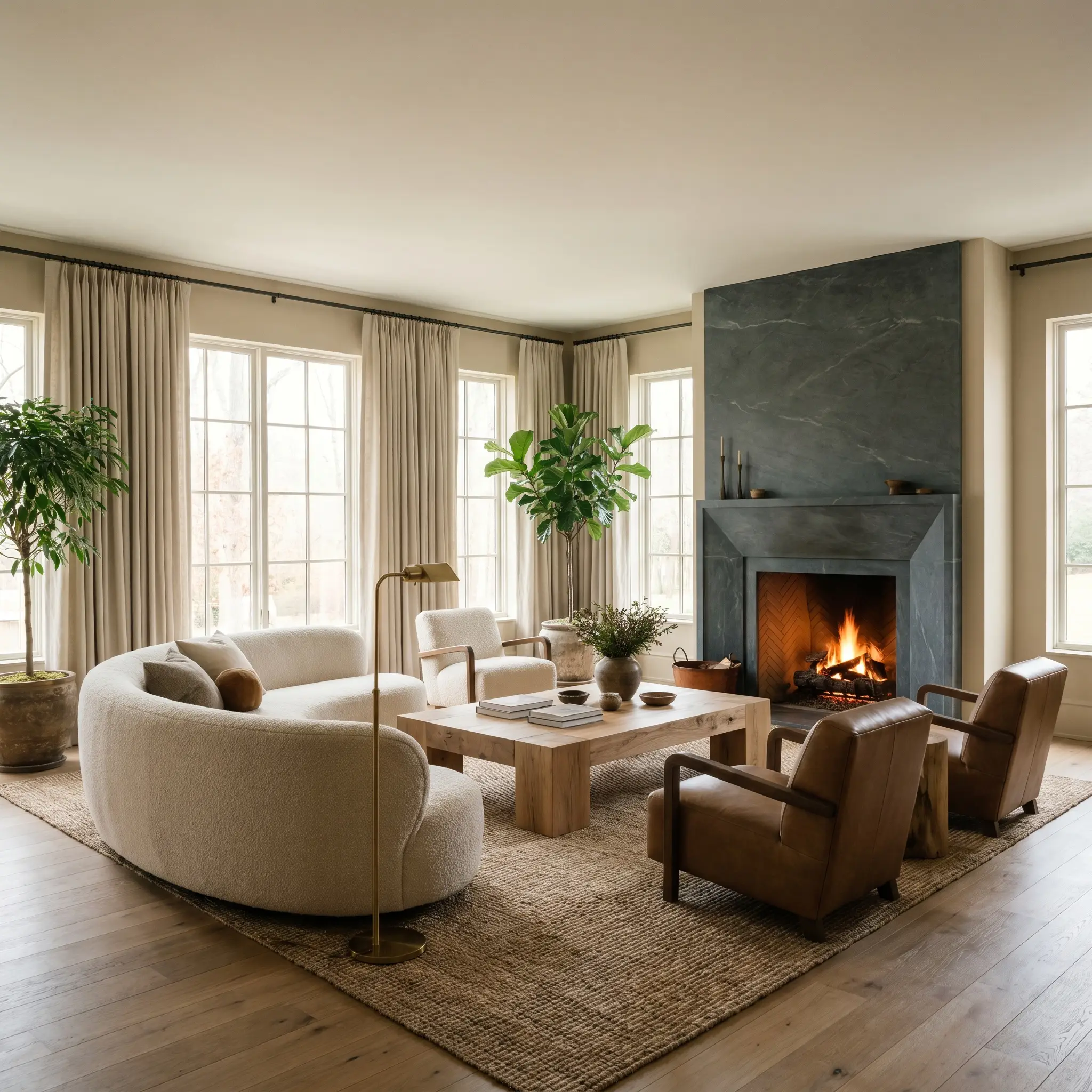
Living Rooms
In a main gathering space, this shade excels at creating a biophilic design atmosphere. Pair it with raw, wire-brushed oak flooring and heavy, oatmeal-colored linen drapery to emphasize its organic nature. To elevate the room, introduce one highly polished element, such as an unlacquered brass floor lamp or a honed soapstone fireplace surround, which provides a striking tactile contrast against the soft, muted walls.
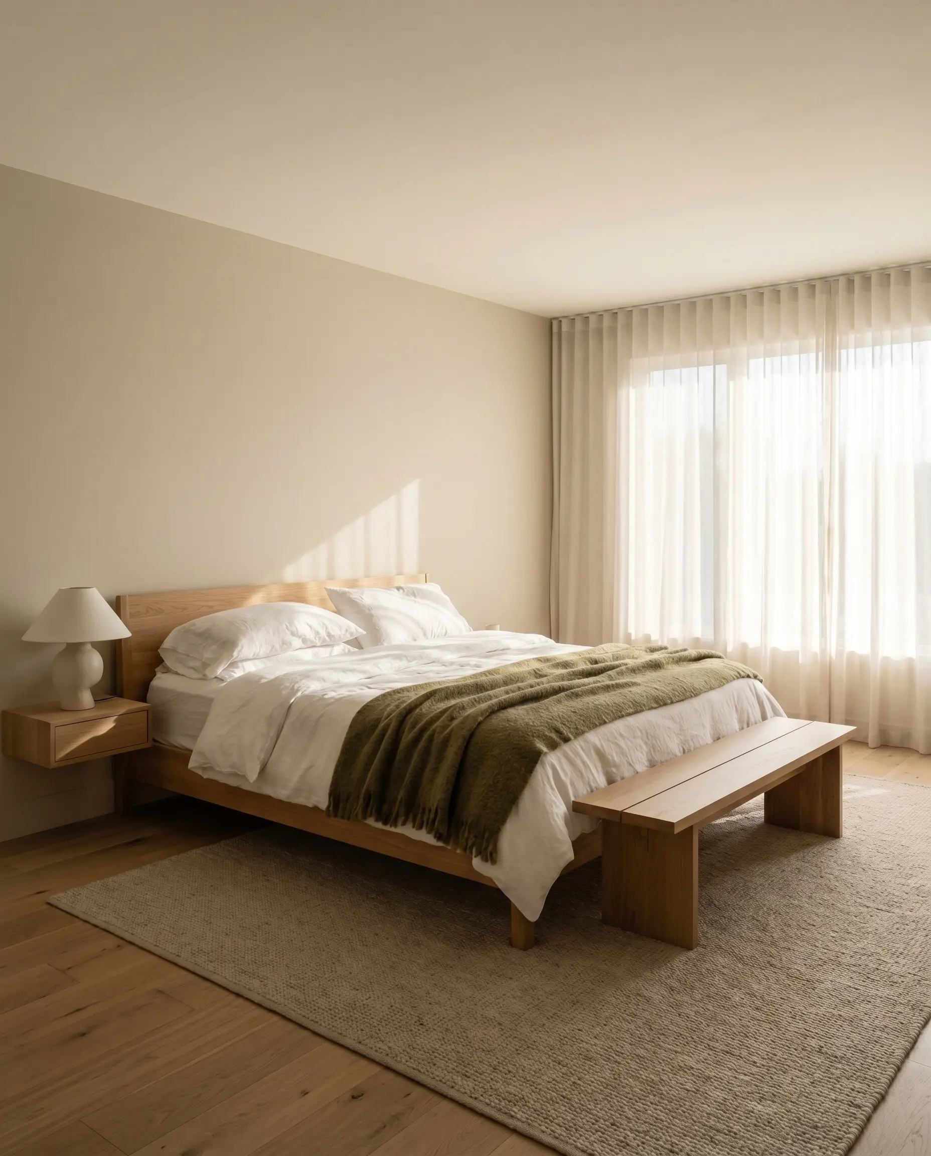
Bedrooms
This color wraps a bedroom in immediate, restful warmth. It provides a beautiful backdrop for layered, textural bedding—think washed cotton percale in soft whites mixed with heavy, olive-toned wool throws. If your bedroom receives harsh morning light, this mid-tone will absorb the glare, softening the visual boundaries of the room and making the ceiling feel slightly more intimate.
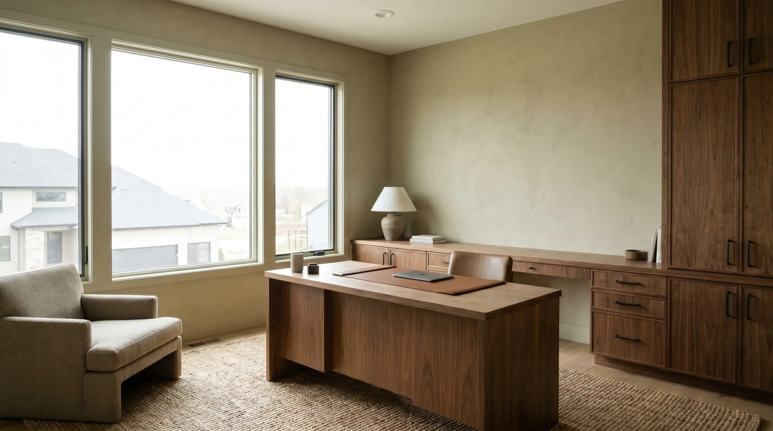
Home Offices
For a workspace, you want a color that reduces eye strain while maintaining a sense of focus. The subtle green micro-nuance in this paint creates a quiet, grounding energy perfectly suited for deep work. Contrast the earthy walls with warm walnut desk cabinetry and sleek, oil-rubbed bronze hardware for a tailored, handsome aesthetic.
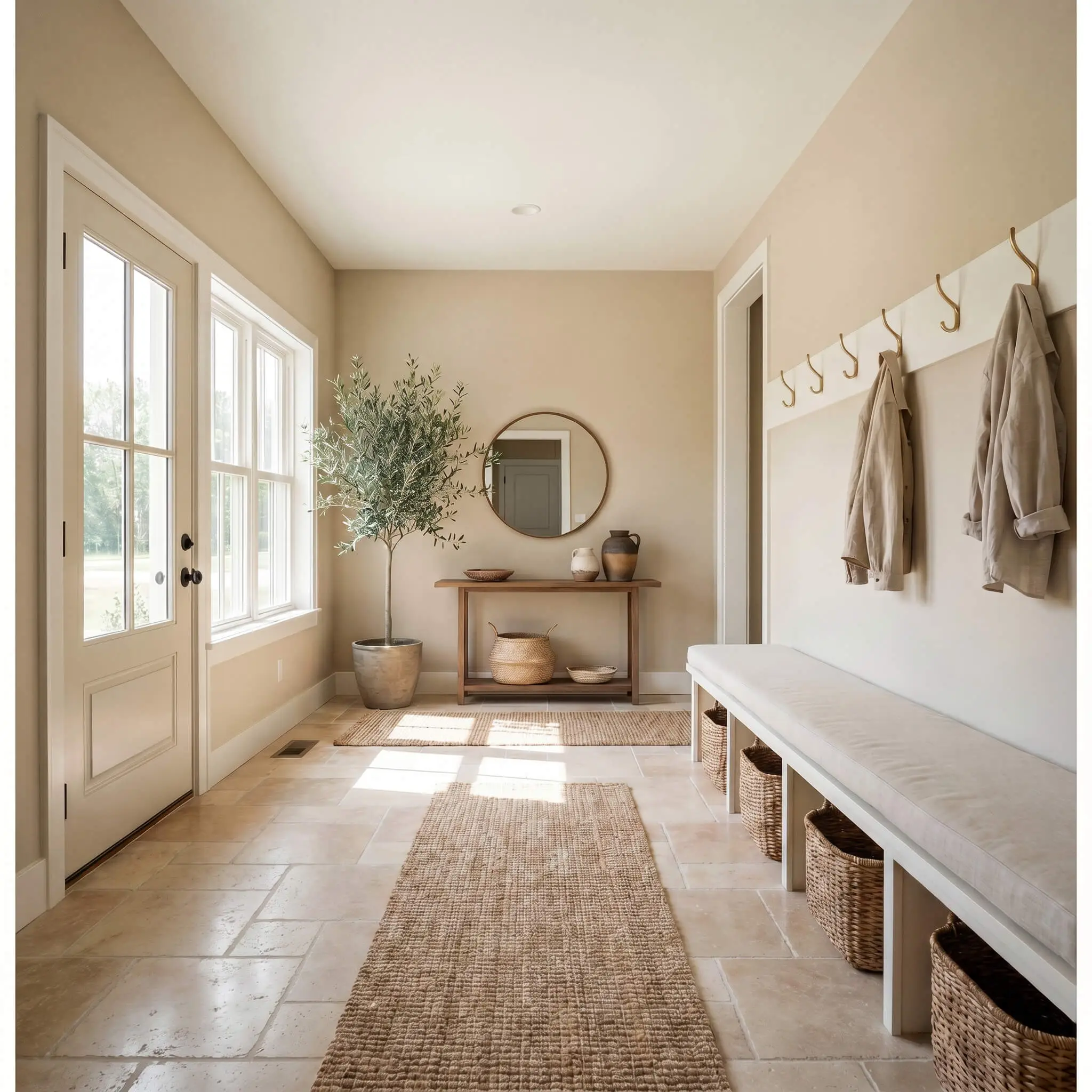
Mudrooms
Mudrooms require hardworking colors that can hide everyday scuffs while still feeling intentional. This mid-tone tan is brilliant here, masking the inevitable dust of daily life. Pair it with highly durable, tumbled travertine floor tile and warm off-white trim to create a welcoming, incredibly practical transition zone between the outdoors and the main house.
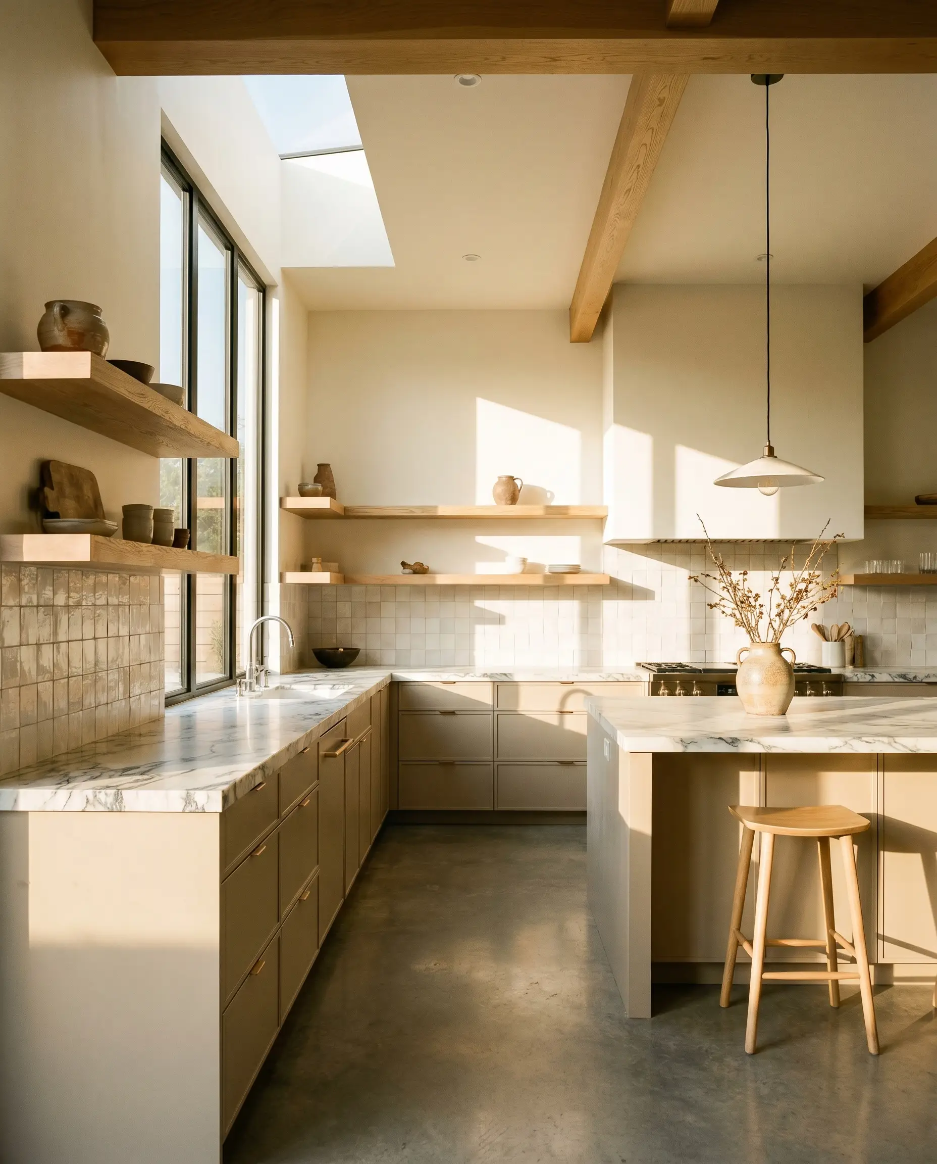
Kitchen Cabinetry
Using this shade on cabinetry instantly warms up a kitchen without defaulting to a stark white or a heavy wood tone. It pairs beautifully with heavily veined marble countertops and unglazed ceramic backsplashes. If you are painting your lower cabinets, ensure your kitchen receives enough warm natural light, or the khaki undertones may read slightly too heavy under the shadow of the countertops.
Shaping Architecture with PPG Soft Suede
When you stop treating paint as merely a backdrop and start using it as an active architectural material, a room’s entire geometry shifts. This specific pigment is brilliant at highlighting intentional craftsmanship and custom millwork.
The Desert Modernist Archway
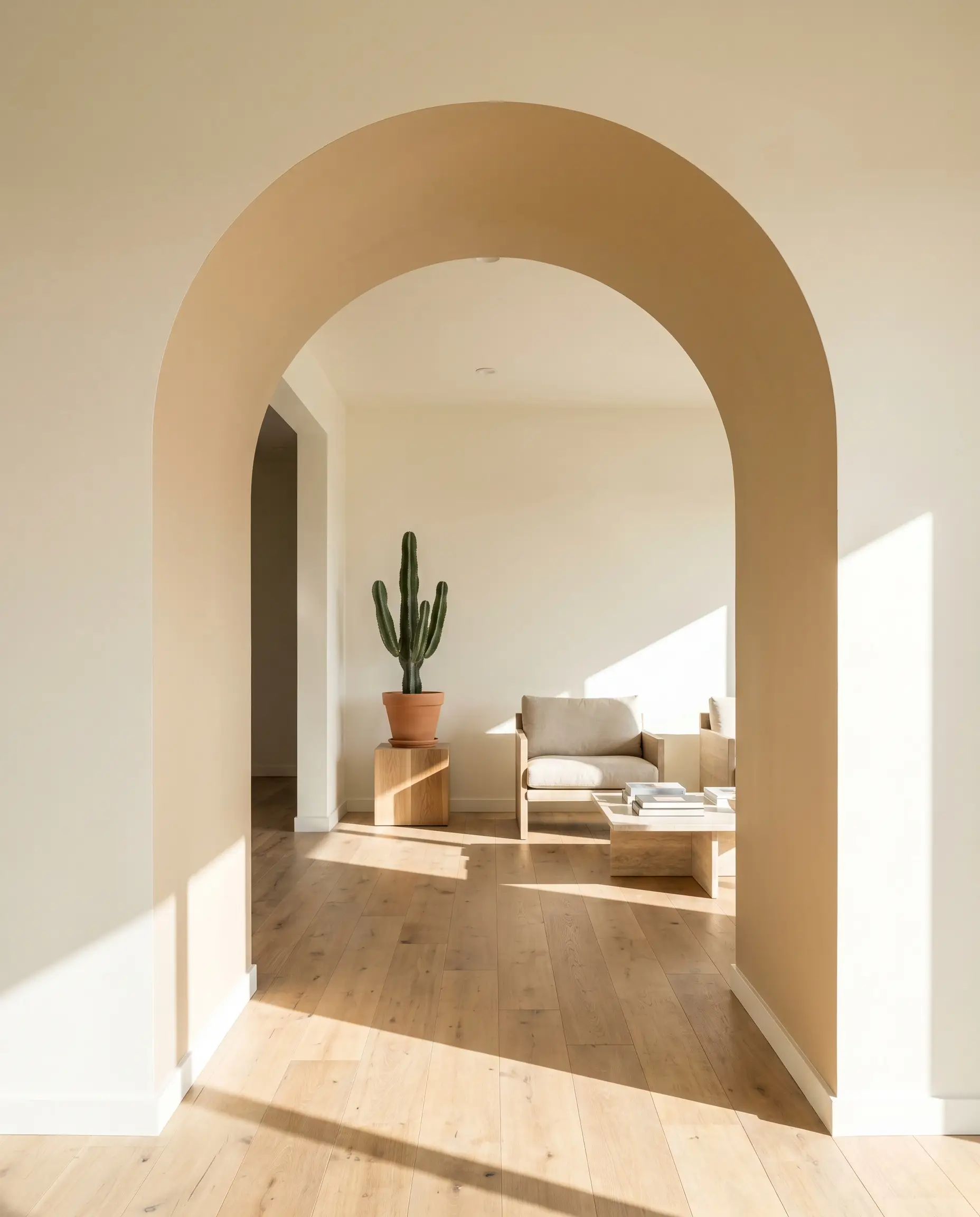
Applying this earthy neutral directly to the interior curve of a structural archway instantly emphasizes the sweeping lines of desert modernism. The pigment catches the light differently on the curve, highlighting the plaster-like warmth of the hue. It provides a stunning, sun-baked framing device for a minimalist, highly curated adjacent room.
The Boutique Hotel Headboard
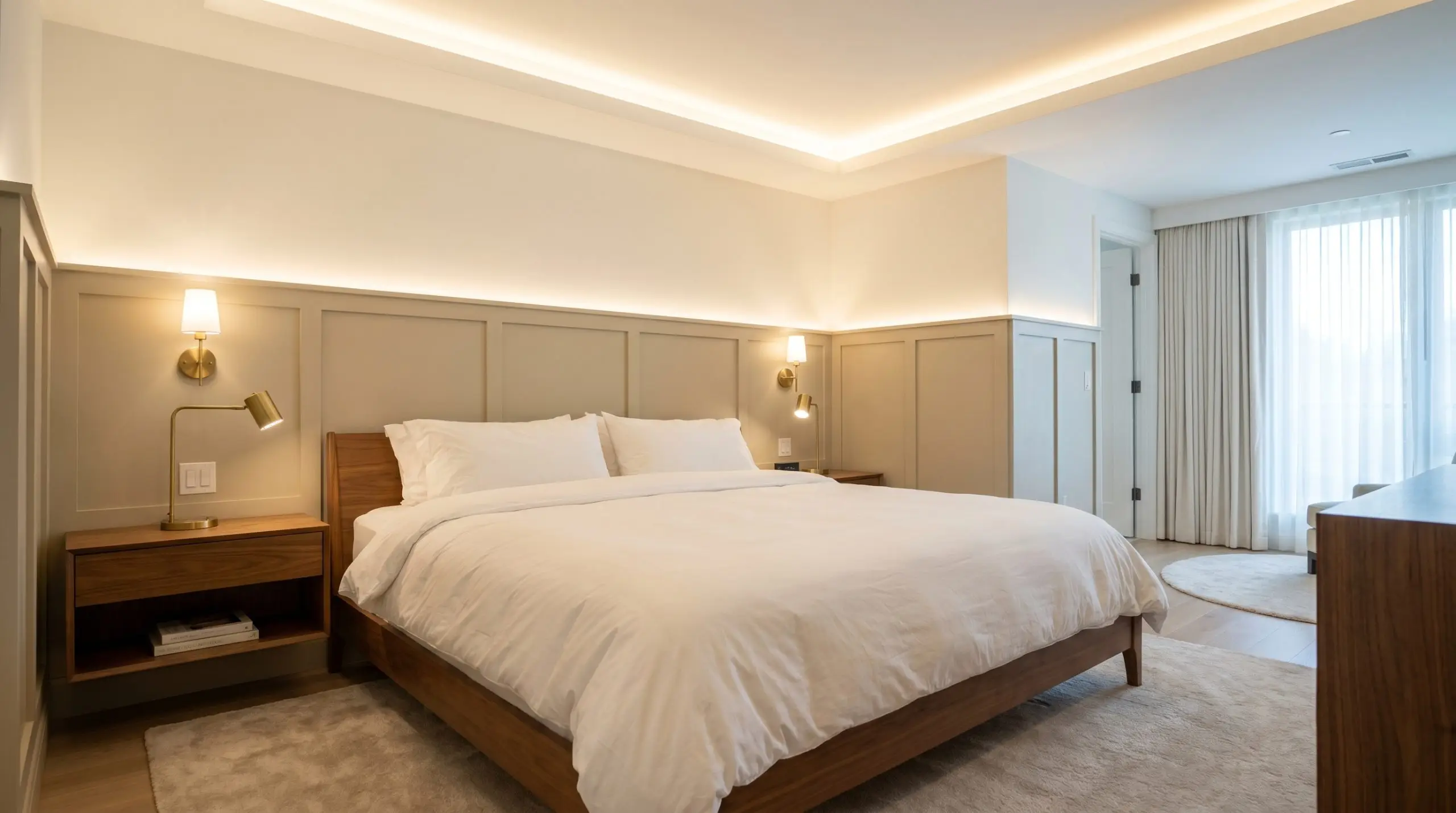
Drenching a custom, wall-to-wall millwork headboard in this shade immediately evokes the tailored intimacy of a luxury boutique hotel. The mid-tone depth grounds the bed frame, allowing crisp white hotel-style bedding to pop vibrantly against the wood. The subtle khaki undertone keeps the installation feeling modern and sophisticated rather than heavy or traditional.
The Sensory-Calm Wainscoting
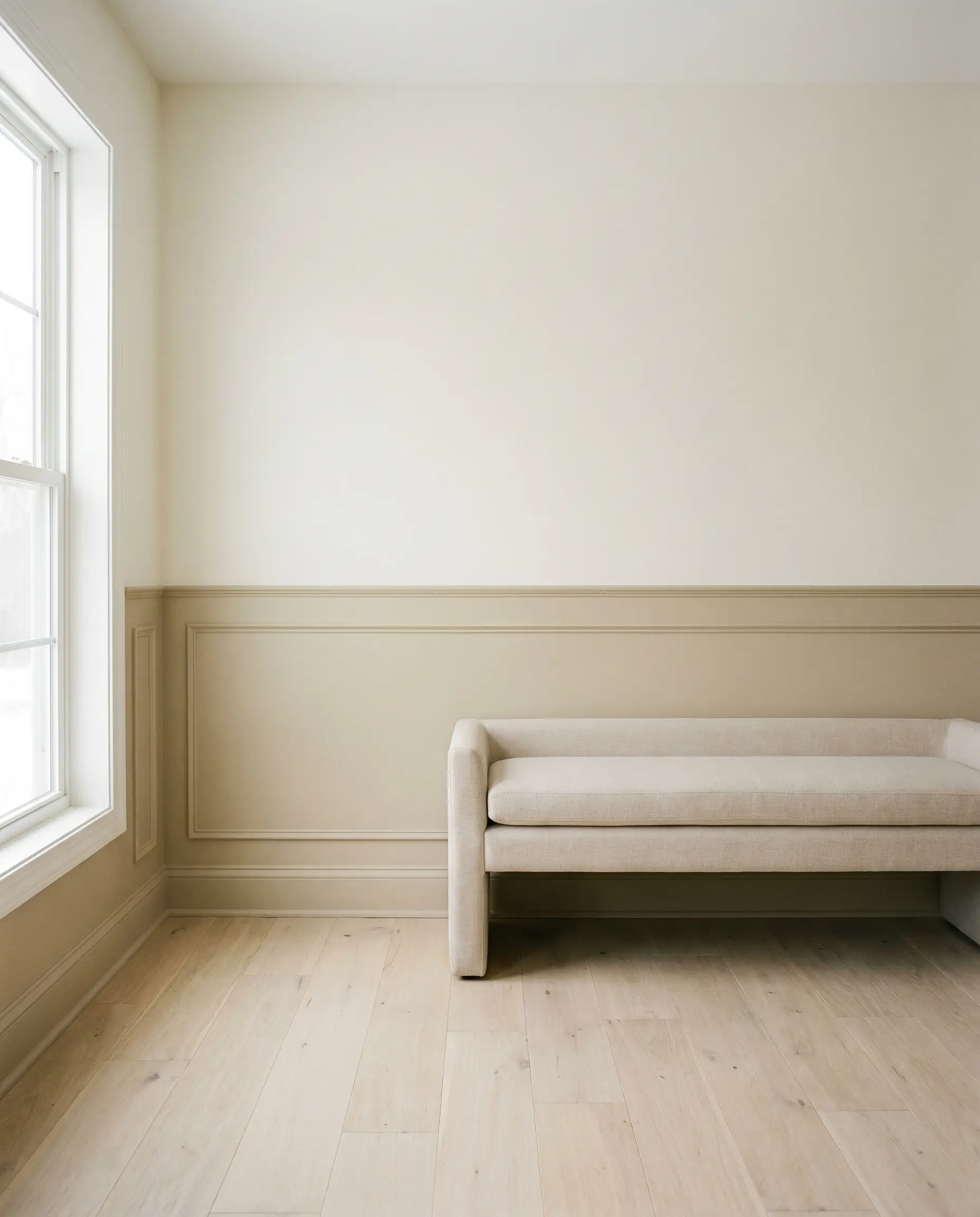
Utilizing this color on traditional bedroom wainscoting creates a quiet, grounding pause for anyone seeking a low-stimulation, restful retreat. By anchoring the lower half of the wall in this organic warmth, the room feels instantly heavier and more secure. It is a brilliant way to introduce color without overwhelming the visual field.
The Monochromatic Library
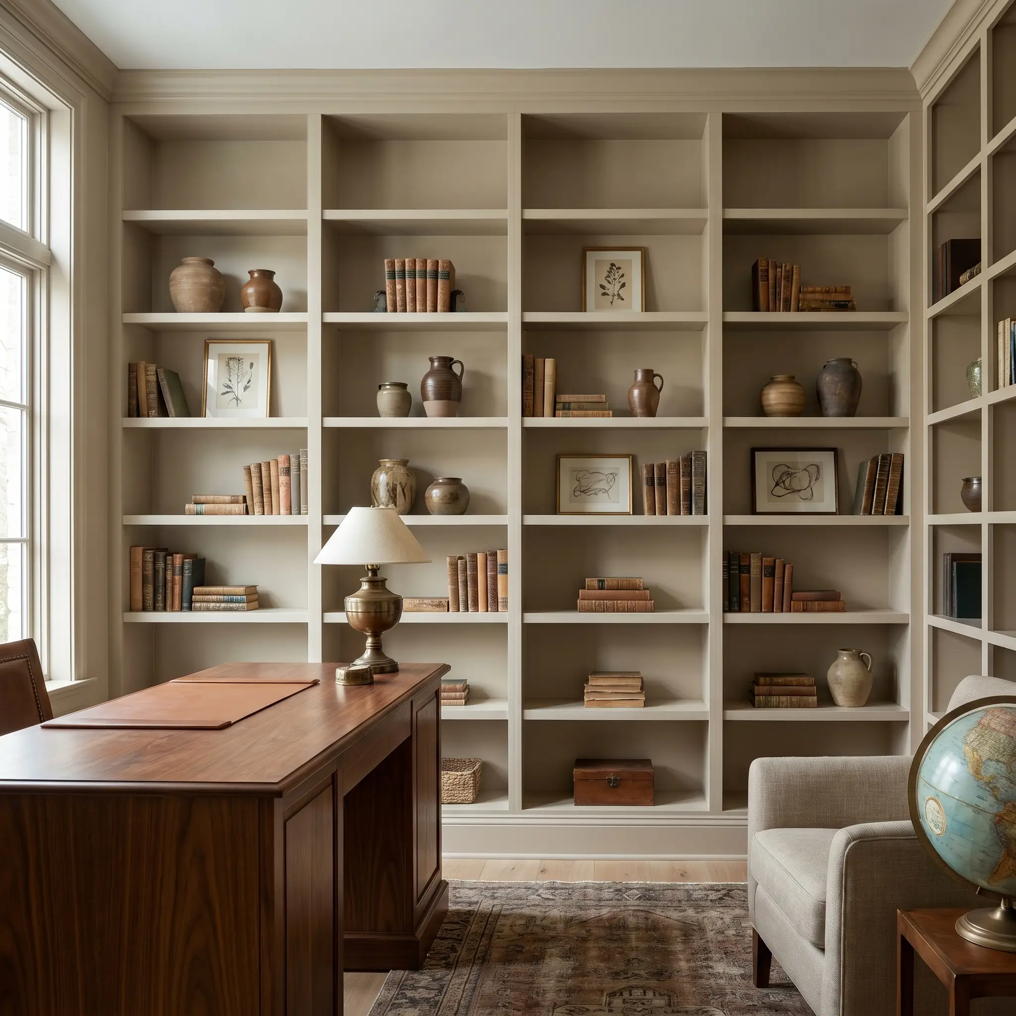
Painting floor-to-ceiling built-in bookshelves—including the backing, shelves, and trim—in this single shade creates a seamless, monochromatic layering effect. For a remote worker spending hours on video calls, this provides a deeply professional, distraction-free backdrop. The books and decorative objects become the sole focal points, framed perfectly by the earthy tan.
The Heritage Mullions
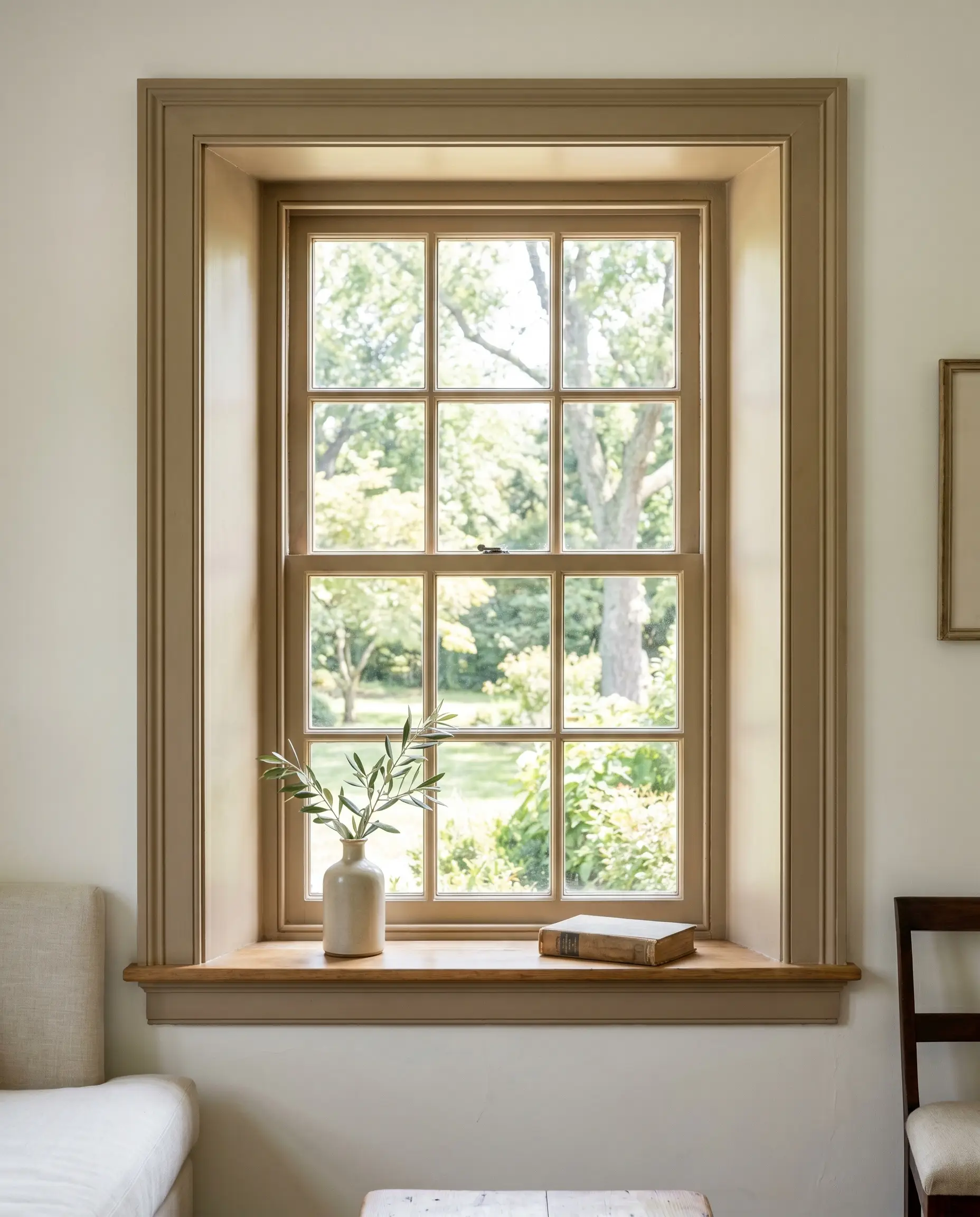
Coating interior window mullions in this nuanced tan is a beautiful way to honor historic preservation while softening the view outdoors. Instead of a stark black or white frame, the khaki-infused beige acts as a gentle transition between the interior room and the exterior landscape. It draws the eye outward, framing the natural light with organic warmth.
Material Pairings & Coordinating Colors for PPG Soft Suede
The true success of this paint relies entirely on the tactile elements you place next to it. Because of its complex yellow-orange and khaki base, it requires highly intentional material boundaries to hold its shape.
Trim & Baseboards
To keep this earthy neutral feeling fresh, you must pair it with a warm off-white trim. Sherwin-Williams Alabaster SW 7008 provides a soft, creamy boundary that harmonizes with the golden base without looking yellow. Alternatively, Benjamin Moore White Dove OC-17 offers a slightly crisper, yet still softly shaded, contrast that highlights the paint’s subtle green undertones beautifully.
Hardware, Wood & Material Pairings
To pull the absolute best out of this color structure, lean into materials that offer natural patina and varying light absorption.
Coordinating Colors
Building a cohesive palette around this shade requires colors that either share its earthy DNA or provide a sharp, cooling contrast.
Designer Mood Boards
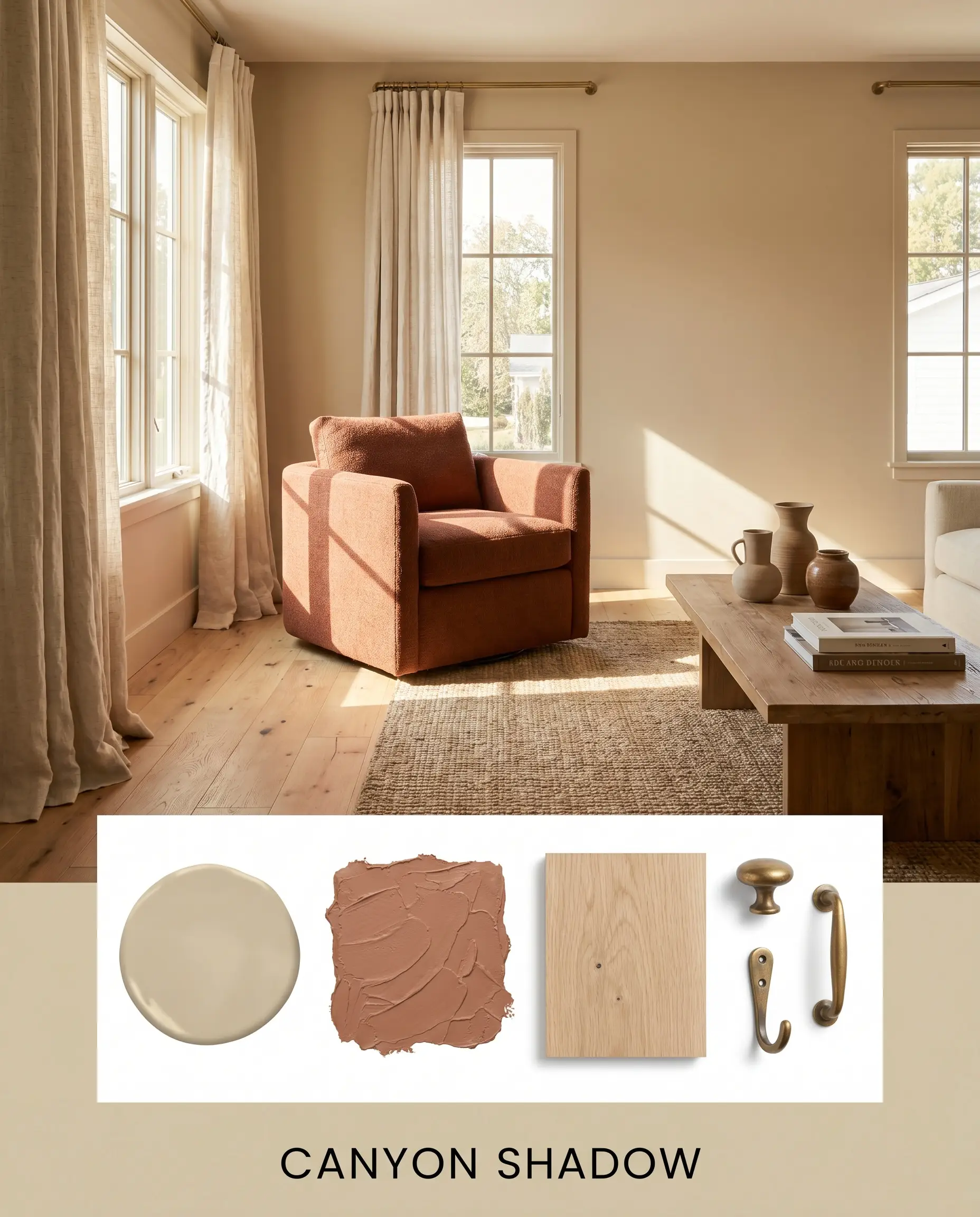
Canyon Shadow This palette leans heavily into the sun-baked warmth of the color’s core. Pair the mid-tone tan walls with a deep terracotta accent (like Cavern Clay), raw white oak flooring, and heavily textured linen drapery. Introduce unlacquered brass hardware to catch the light, creating a space that feels deeply resonant, warm, and effortlessly grounded.
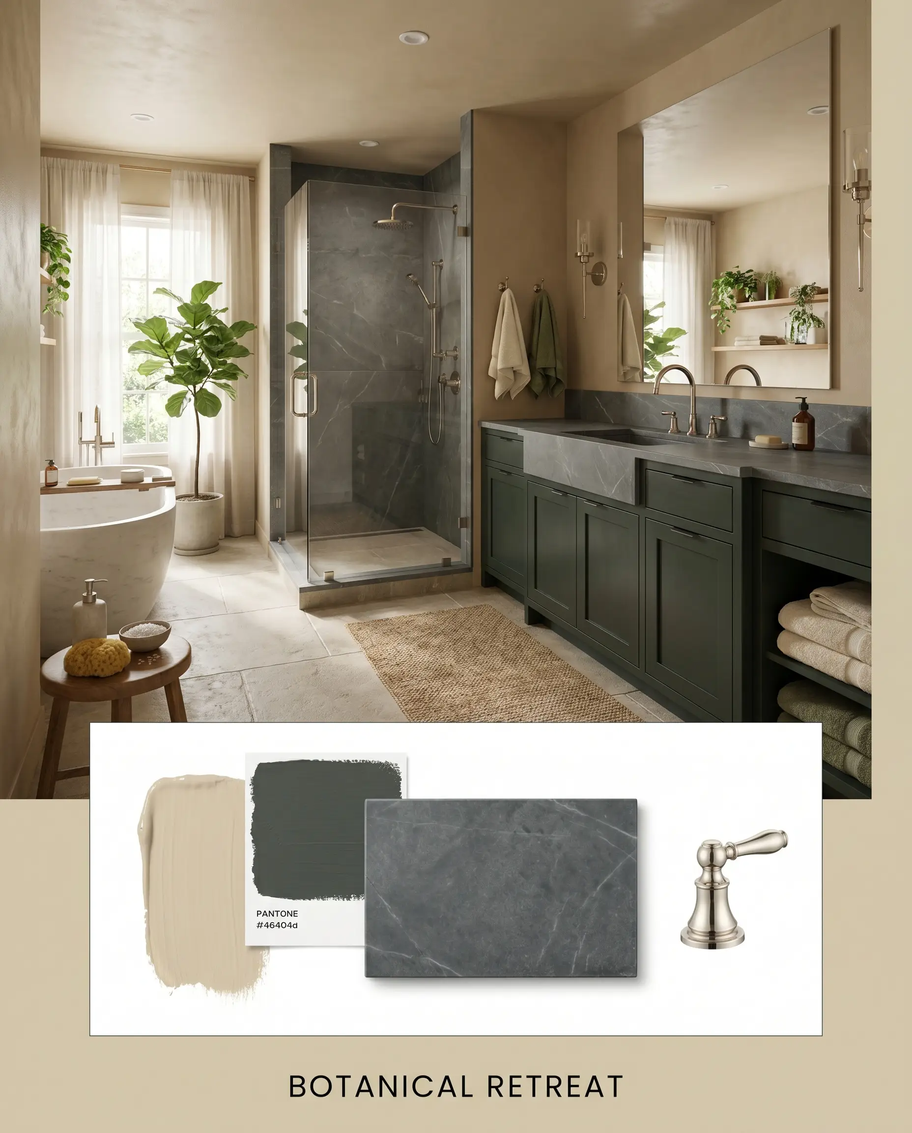
Botanical Retreat Focusing entirely on the hidden khaki and green micro-nuances, this approach cools the room down. Use a rich, blackened green on the cabinetry or interior doors, paired with honed soapstone surfaces and polished nickel plumbing fixtures. The interplay between the dark green and the earthy beige creates a highly sophisticated, restorative atmosphere that feels plucked straight from a shaded forest.
Head-to-Head Comparisons
When selecting a foundational neutral, the final decision often comes down to a matter of degrees. Understanding how this specific pigment performs against its closest rivals is essential.
PPG Soft Suede PPG1103-3 vs. Sherwin-Williams Accessible Beige SW 7036
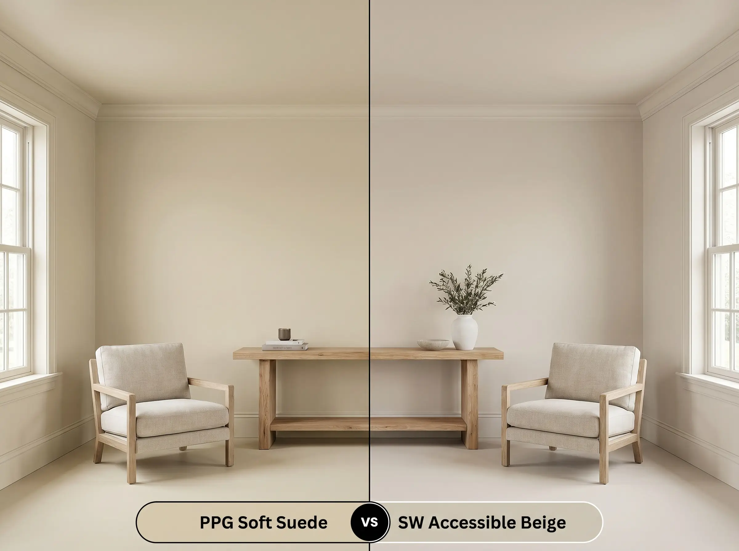
If you are struggling between these two, the decision comes down to your lighting and desired warmth. Accessible Beige has a slightly higher LRV and leans much heavier into a gray-taupe base, making it cooler and slightly more muted. If your room is north-facing and you want to avoid a chilly, grayed-out look, the richer yellow-orange core of the PPG option will perform significantly better.
PPG Soft Suede PPG1103-3 vs. Benjamin Moore Shaker Beige HC-45
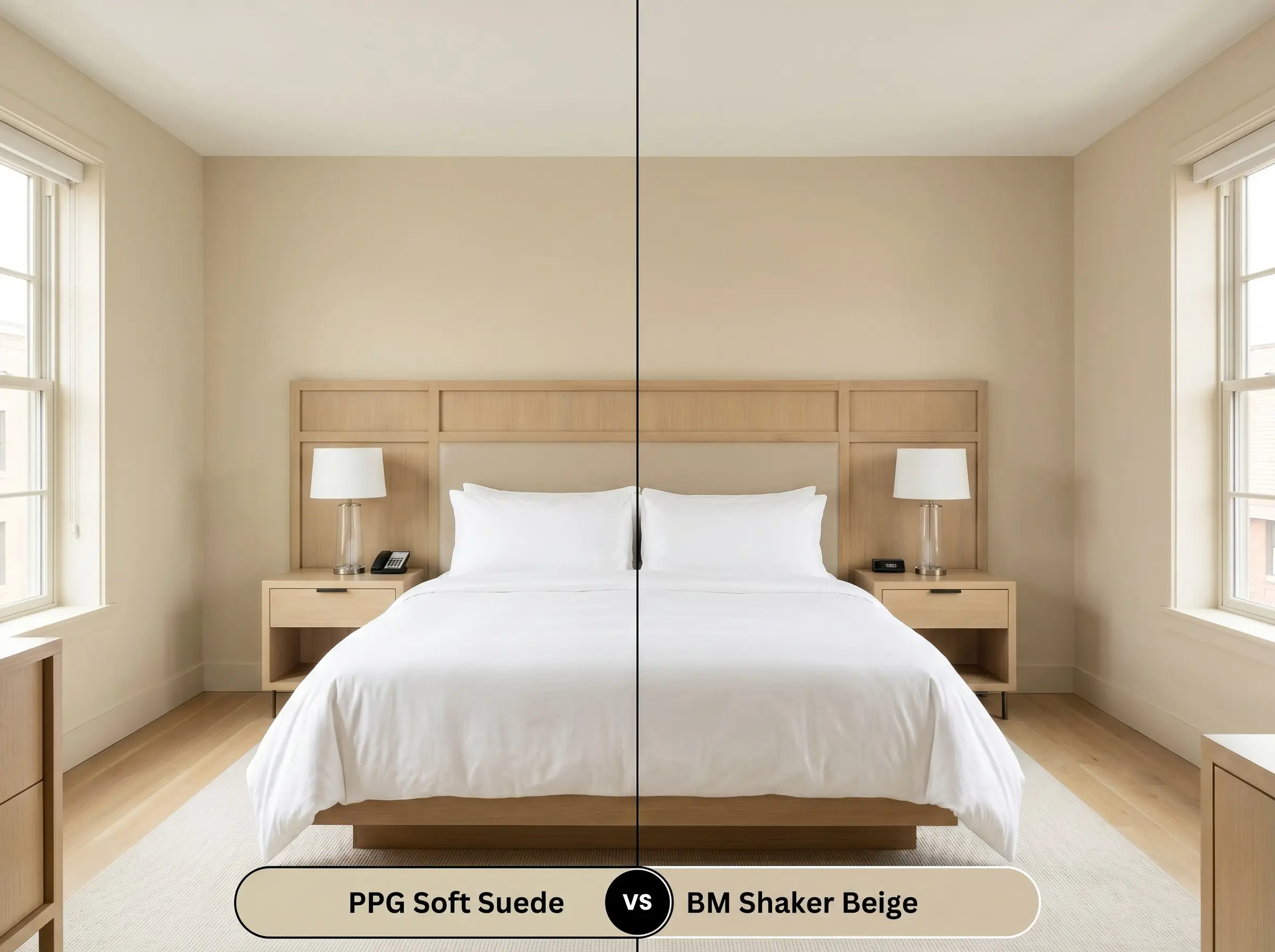
Shaker Beige is a classic, but it carries a much more pronounced, traditional yellow-tan undertone. The PPG shade, by contrast, utilizes that hidden khaki-green micro-nuance to cool itself down just enough to feel modern. If you are updating a home and want to completely avoid the heavy “yellow-beige” look of the early 2000s, PPG1103-3 is the far more sophisticated choice.
Alternative Options & Brand Matches
Sometimes a color is almost perfect, but you need a slight adjustment in depth, or you are restricted by the paint brands available in your local area.
Similar Colors (Same Brand)
Cross-Brand Equivalents
Practical Application Guide
Translating a color from a swatch to a physical wall requires careful planning. The depth and undertones of this specific paint demand the right finish to succeed.
The Dynamic Sheen Guide
Primer Strategy
Because this is a mid-tone shade with a complex base, a high-quality white primer is usually sufficient over standard drywall. However, if you are painting over a dark, cool-toned gray or blue wall, you must use a tinted primer to prevent the old color from absorbing the warmth of the new tan and making it look muddy.
Coverage & Success Tips
Expect to apply two full coats for true color accuracy. Because of its LRV of 59, the first coat will likely look patchy and overly yellow. Do not panic and stop painting. The true khaki-green complexity only reveals itself once the second coat is fully dry and the pigments are completely opaque.
Frequently Asked Questions
Yes, it absolutely can. Because north-facing light is cool and indirect, it strips away the warm yellow-orange base of the paint, allowing the hidden khaki-green micro-nuances to become much more prominent on the wall.
Unlike a true greige, which can quickly turn chilly or cement-like in spaces without natural light, this shade retains its earthy warmth. The yellow-orange core ensures the hallway feels cozy and grounded rather than stark.
Yes, but be prepared for it to lighten significantly. The intense, direct sunlight will wash out the subtle khaki undertones, making the paint appear as a much lighter, warmer, and creamier tan on an exterior facade.
Raw, wire-brushed white oak and mid-tone warm walnut are exceptional pairings. The white oak enhances the organic, biophilic nature of the paint, while the deeper walnut provides a handsome, grounding contrast against the subtle green cast.
Final Verdict & Clash Warnings
PPG Soft Suede (PPG1103-3) is a masterclass in nuanced, organic color design. It is the perfect foundational paint for homeowners who want to completely abandon the stark, sterile grays of the last decade but are terrified of reverting to a heavy, yellow-tinted beige. Its absolute best application is in spaces designed for rest and gathering—living rooms layered in natural textures, or bedrooms seeking a grounded, biophilic calm.
However, because of its highly specific yellow-orange and khaki structure, you must be incredibly careful with your fixed elements. This paint creates an immediate, uncomfortable visual friction when paired with cool-toned, ash-gray luxury vinyl plank flooring, which will make the walls look dirty and muddy by comparison. Similarly, avoid styling this room with stark, blue-white LED lighting or heavy, red-leaning cherry wood cabinets, as these elements will aggressively fight the subtle green undertones, leaving the space feeling entirely disjointed.
Stick to warm, natural materials, and this mid-tone tan will reward you with a beautifully curated, welcoming home.
Closest Cross-Brand Equivalents
The absolute closest scientific color matches for Soft Suede across top paint brands.