The 22 Best Benjamin Moore Cabinet Paint Colors: A Designer’s Guide to Flawless Millwork
Committing to a shade for your custom millwork carries enormous weight. The financial investment, the intense labor, and the sheer permanence of the application make swatch paralysis an entirely justified fear for any renovator.
To achieve a truly bespoke finish, you need the right formulation—specifically Benjamin Moore Advance in a Satin finish, which sets the industry standard for leveling into a flawless, factory-like surface. But a premium paint line means nothing if you ignore Light Reflectance Value (LRV) and hidden undertones, which dictate exactly how a shade reacts to the physical materials in your space.
We have decoded the best benjamin moore cabinet paint colors below, stripping away the guesswork to provide the exact hardware, stone, and lighting pairings required for a masterful architectural execution.
The Core Mechanics of Cabinet Paint: Finish and Lighting
Before analyzing specific shades, we must establish the physical realities of your space and your materials. Professional tradespeople consistently specify Benjamin Moore’s Advance line because it is a waterborne interior alkyd; it cures to a hard, durable shell that mimics a traditional oil rub without the harsh chemical off-gassing. You must always specify a Satin finish for cabinetry—it provides the soft, tactile sheen required for modern luxury interiors, completely avoiding the dated, plastic glare of semi-gloss.
Equally critical is understanding how directional light forces a color cast onto your millwork throughout the day:
- North-facing light casts a cool, blue-tinted shadow. It strips away warmth, making crisp whites feel sterile and pulling the gray forward in muted tones.
- South-facing light floods the room with warm, golden illumination. It intensifies yellow undertones, making creams look richer and warming up icy grays.
You can apply wallpapers, paints, etc. on walls and see how they look in various interiors.

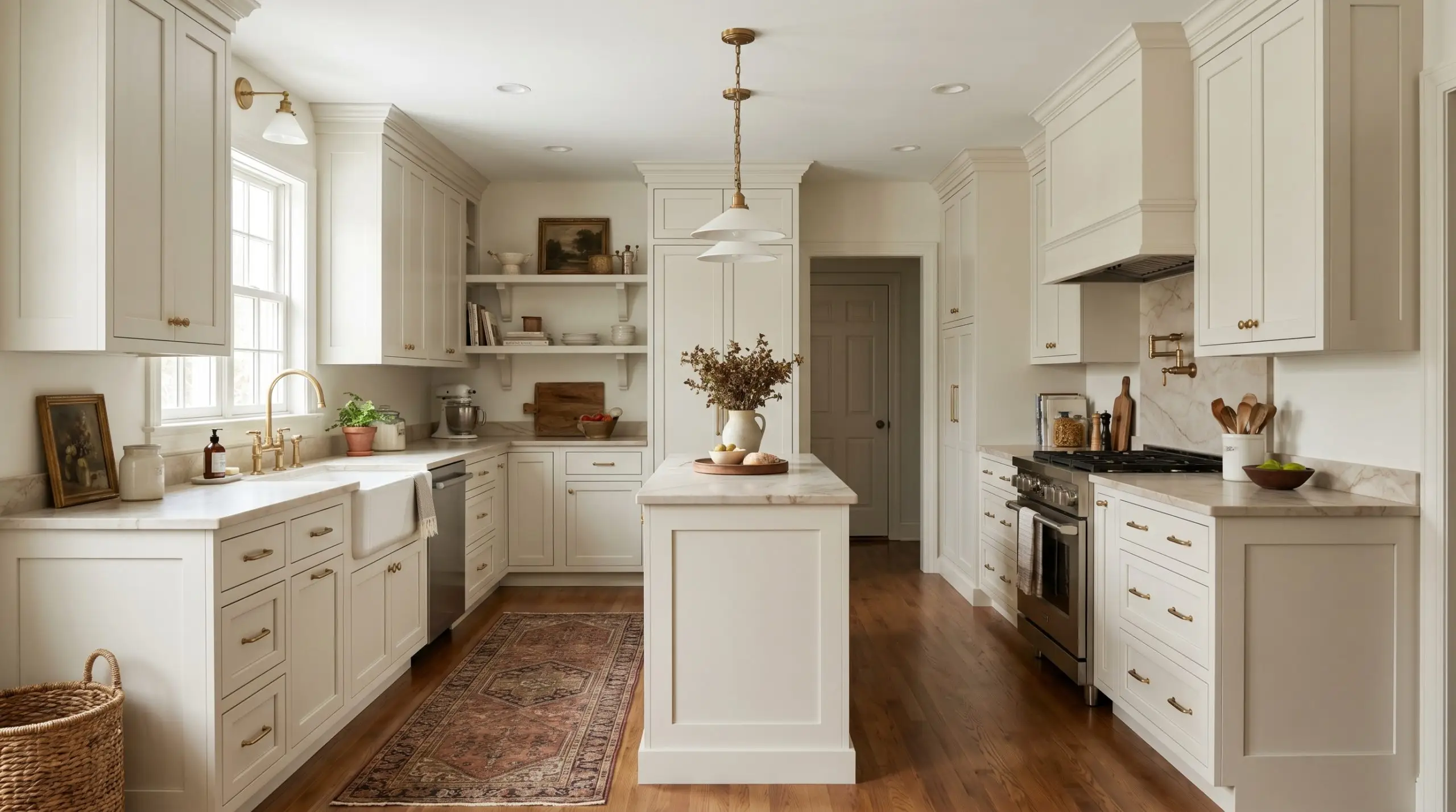
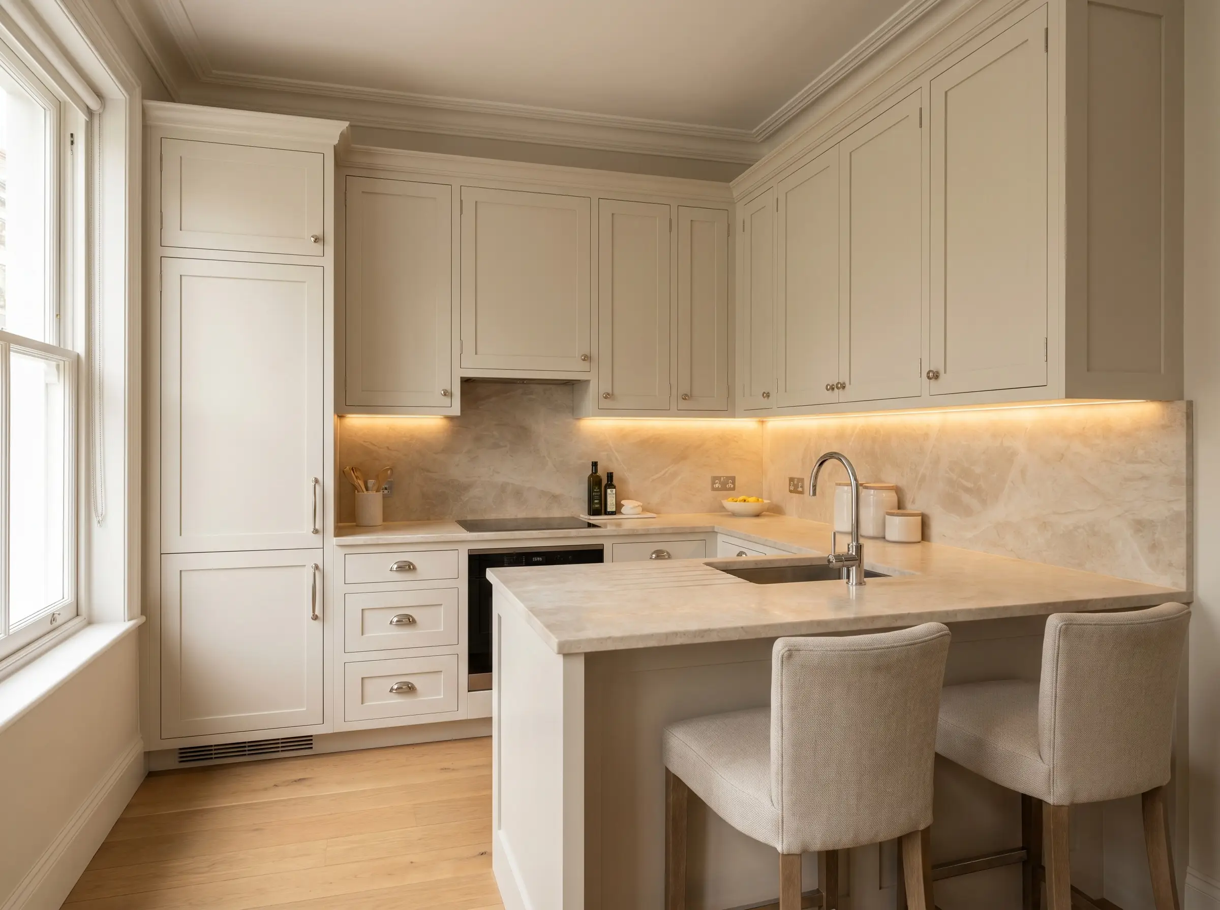
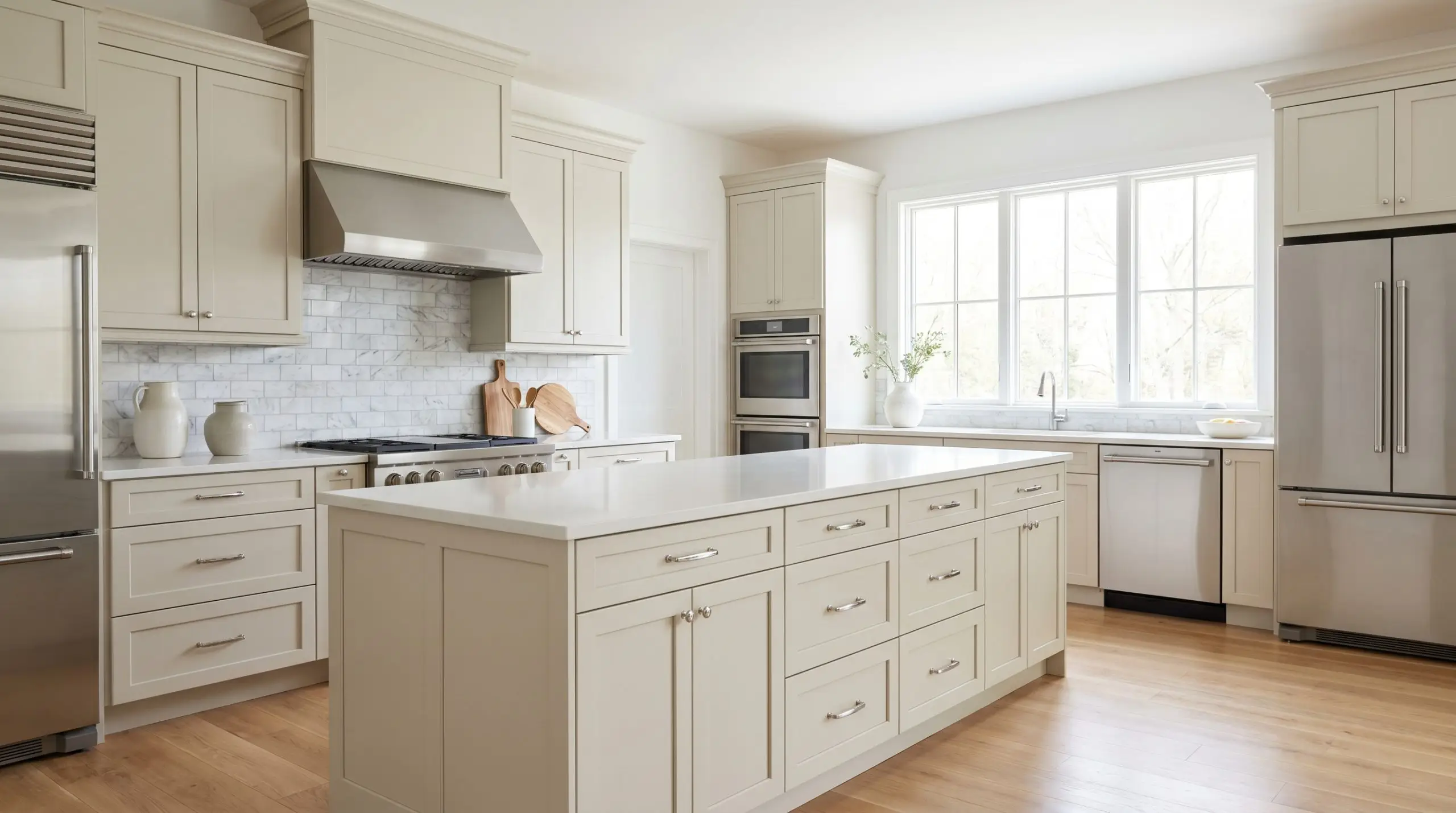
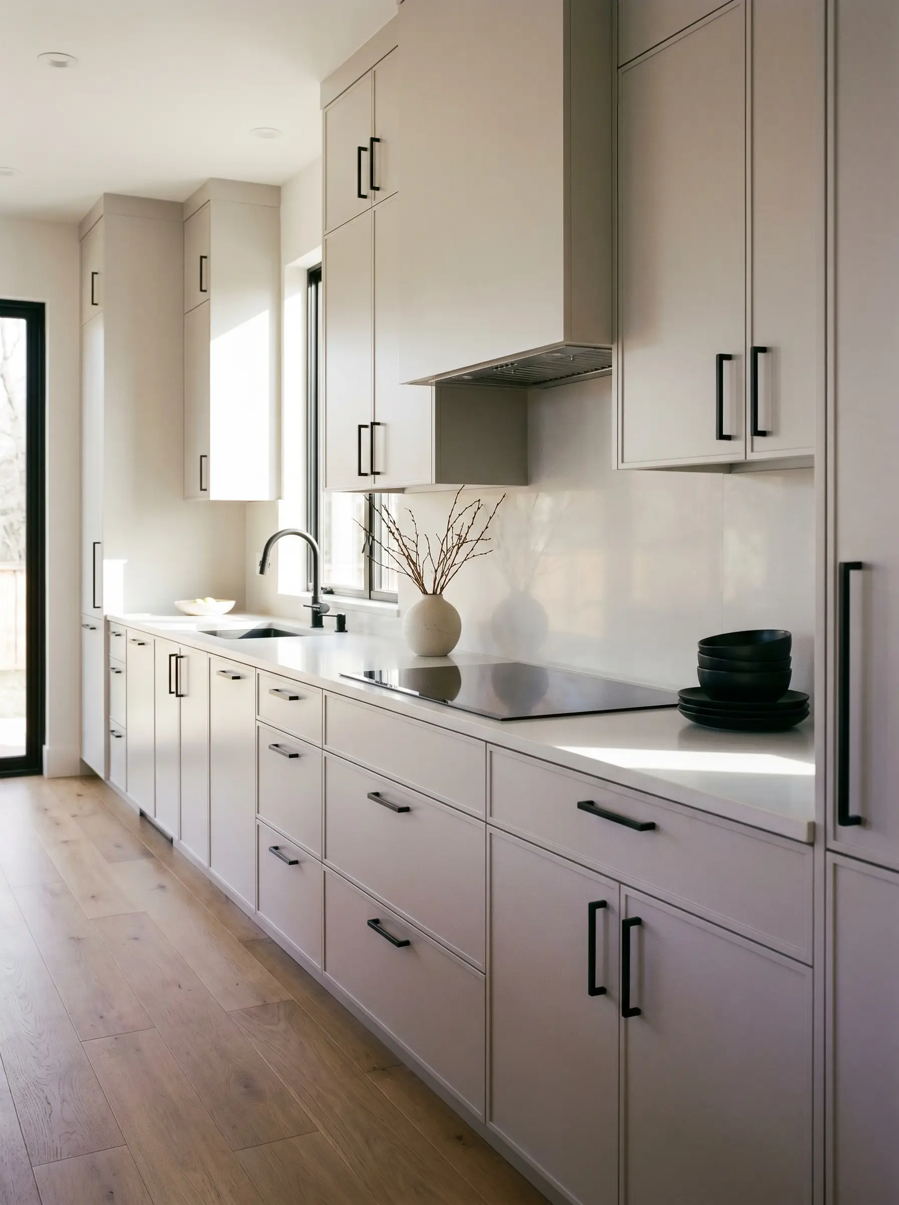
Crisp Whites and Creams for High-End Transitional Millwork
Selecting a white cabinet paint is notoriously difficult because pure, objective white rarely exists in architecture. Every shade harbors a hidden yellow, gray, or blue undertone that will violently clash if paired with the wrong stone countertop.
Chantilly Lace (OC-65)
This is the cleanest, most objective white in the Benjamin Moore catalog, offering a crisp, highly architectural look. It carries virtually zero undertones, making it a brilliant, sharp anchor for high-contrast spaces.
- LRV: 90.04
- The Undertone: Neutral/None
- The Pairing Mandate: Demands cool Carrara marble and polished nickel hardware; strictly avoid if your kitchen receives harsh, cold Northern light, as it will read entirely sterile.
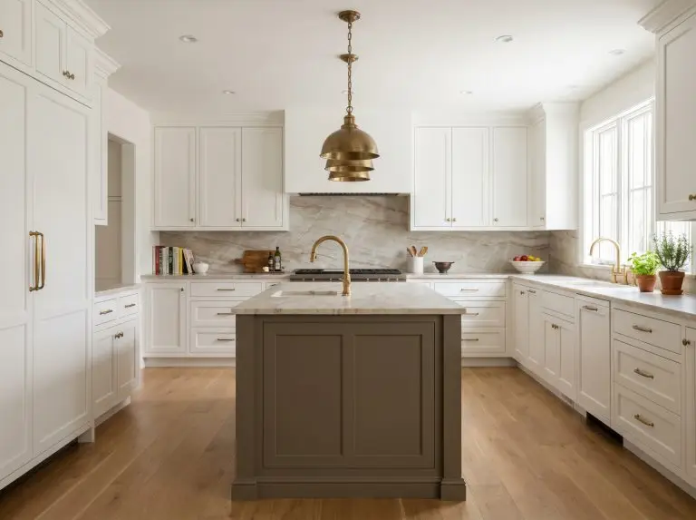
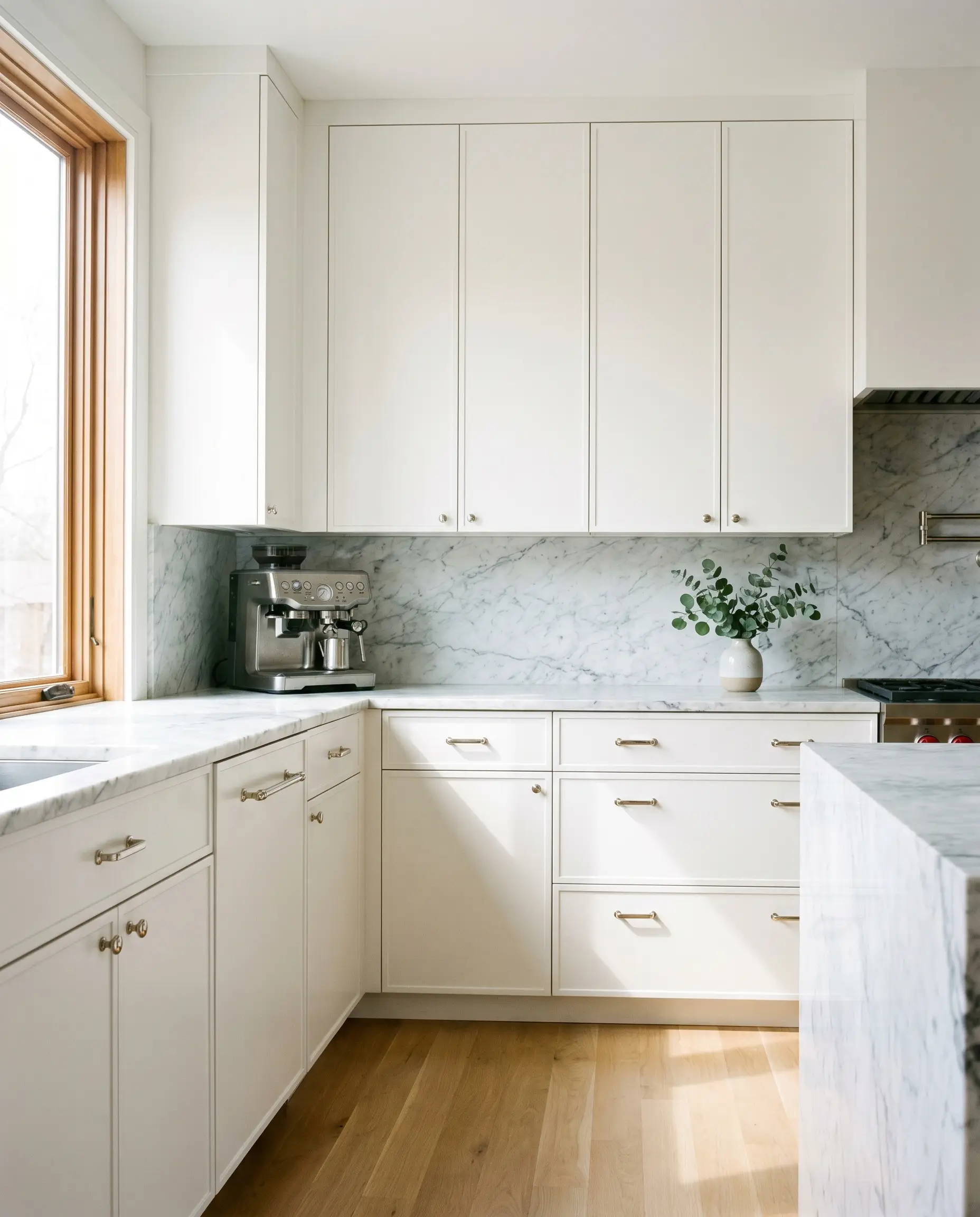
White Dove (OC-17)
The undisputed king of transitional kitchens, this shade carries a soft, warm greige shadow that prevents it from looking stark or blinding. It creates an incredibly inviting, lived-in softness on flat-panel or shaker doors alike.
- LRV: 83.16
- The Undertone: Warm Greige
- The Pairing Mandate: Pairs beautifully with warm, unlacquered brass hardware and warm-veined quartz countertops.
Swiss Coffee (OC-45)
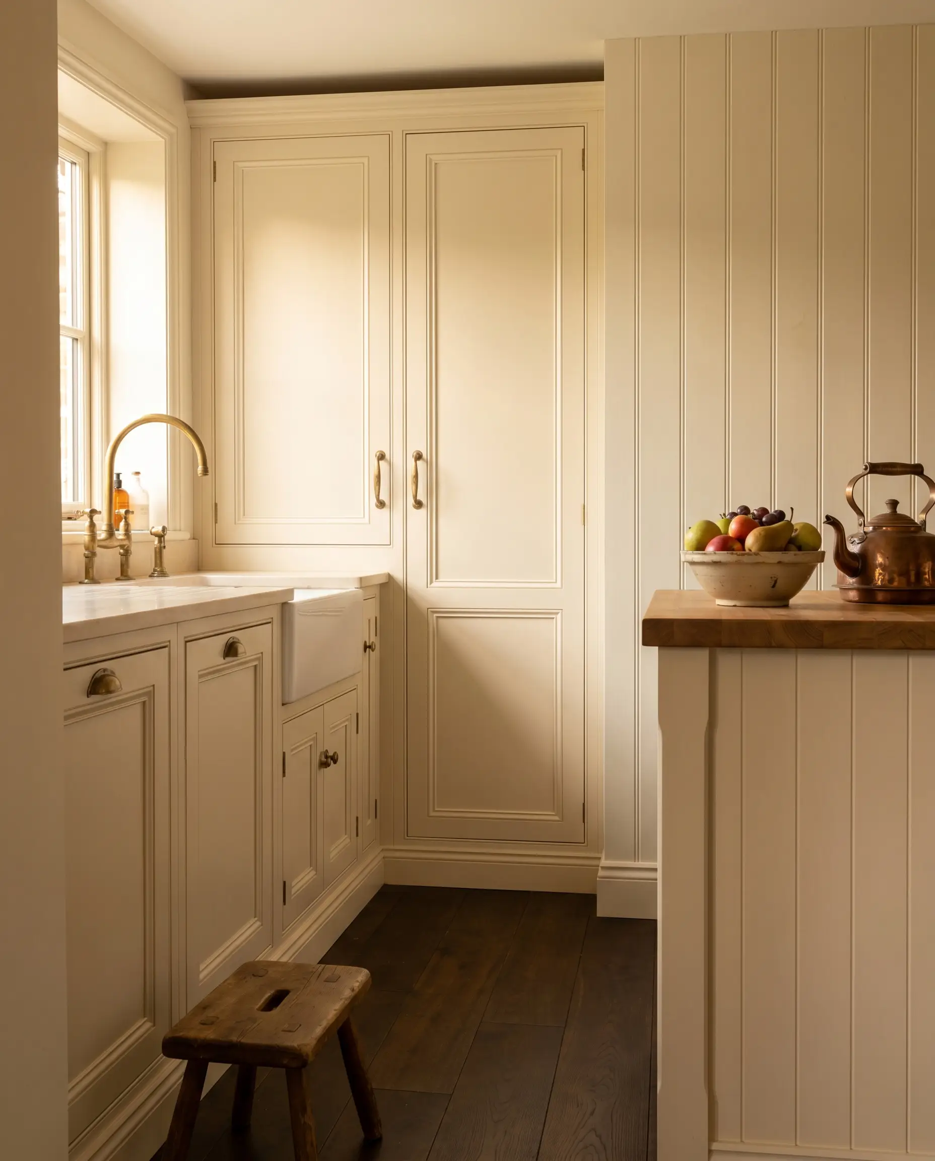
A deeply creamy, sophisticated off-white that leans heavily into a traditional or English Cottage aesthetic. It possesses a distinct, aged richness that grounds a room instantly.
- LRV: 81.91
- The Undertone: Cream/Yellow-Gray
- The Pairing Mandate: Best anchored by unlacquered brass fixtures and deeply stained dark wood floors to balance its creamy warmth.
Simply White (OC-117)
A remarkably bright white that maintains a distinct hint of yellow warmth, keeping spaces feeling sunlit and welcoming. It is an excellent problem-solver for modern farmhouses or interior kitchens severely lacking natural light.
- LRV: 89.52
- The Undertone: Warm Yellow
- The Pairing Mandate: Requires warm wood accents like white oak shelving and honed black soapstone to ground its brightness.
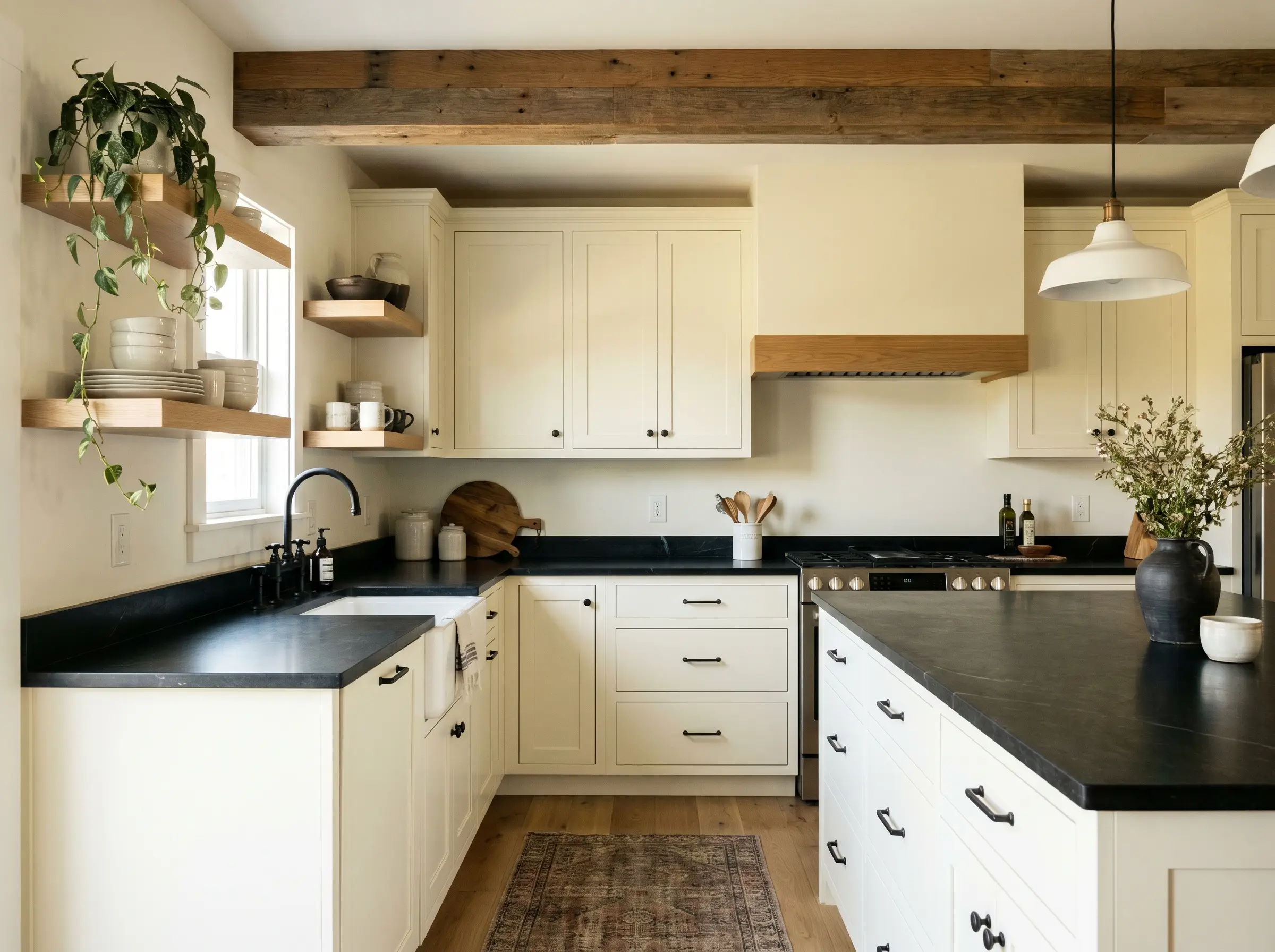
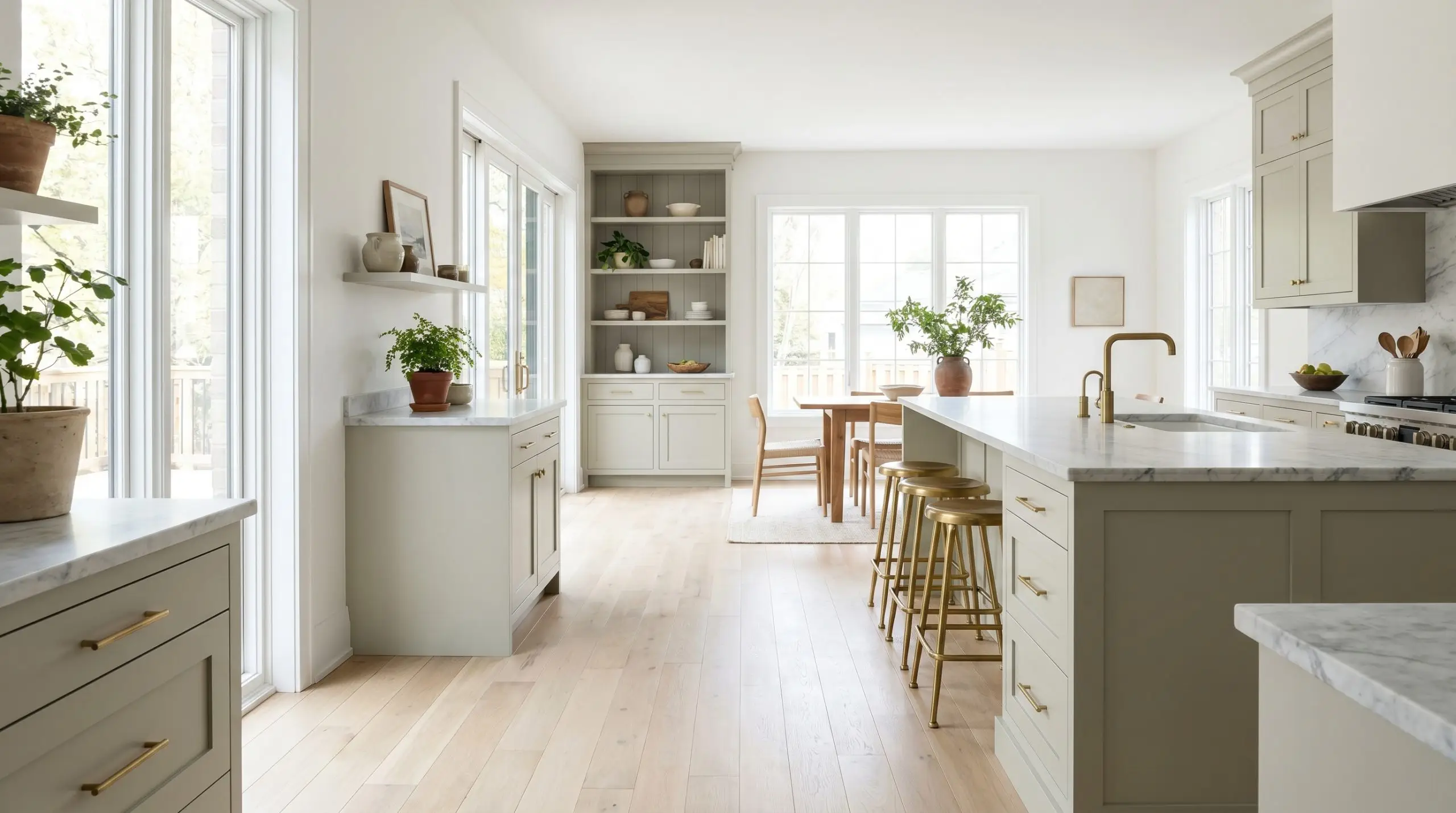
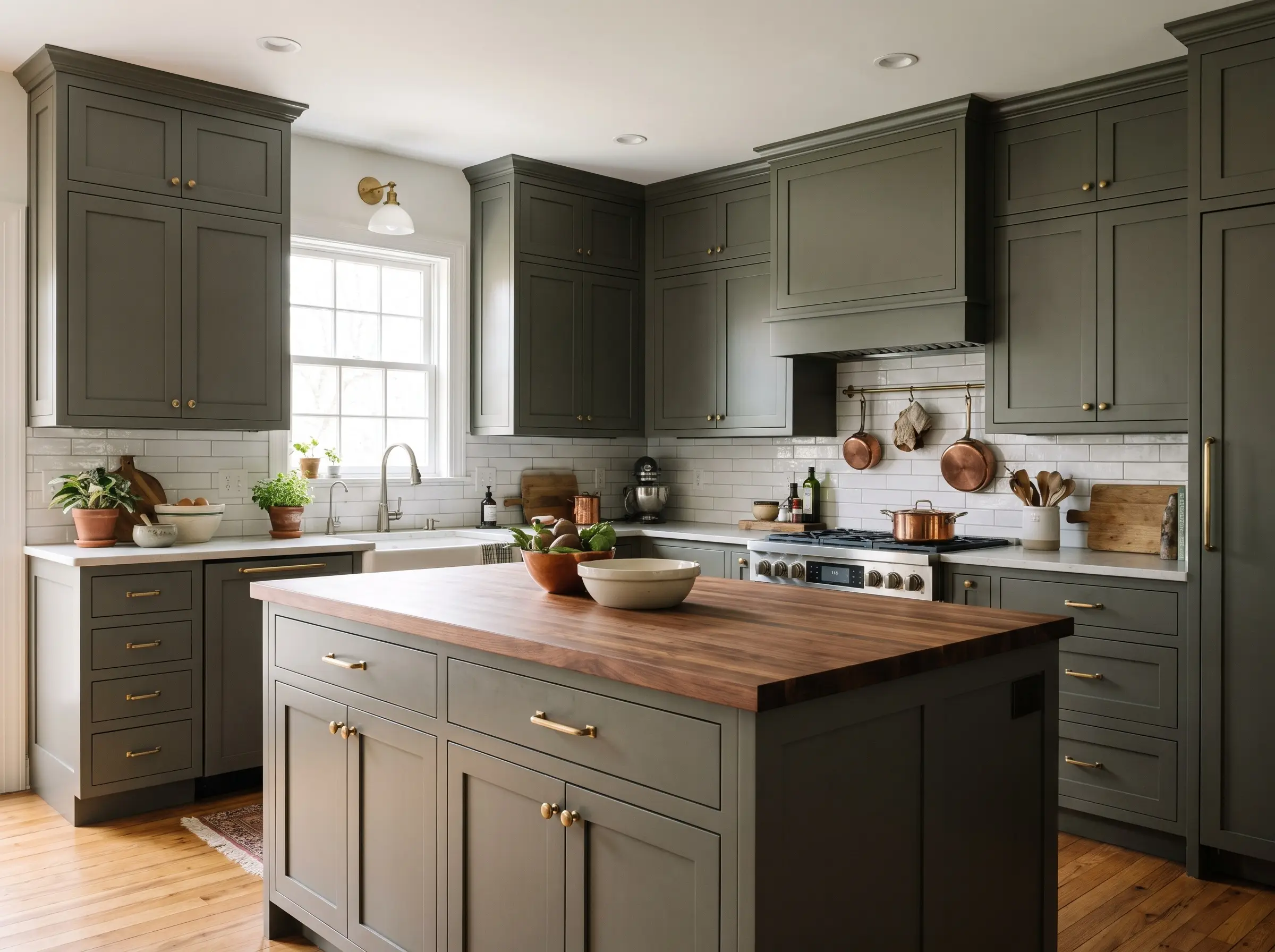
The Mushroom and Greige Palette for Earthy, Grounded Kitchens
High-end design has experienced a massive shift away from stark, clinical white kitchens toward deeply grounded “mushroom” and warm greige tones. This palette represents the absolute sweet spot for the Organic Modern aesthetic, offering nuance and depth for two-tone cabinetry plans.
Revere Pewter (HC-172)
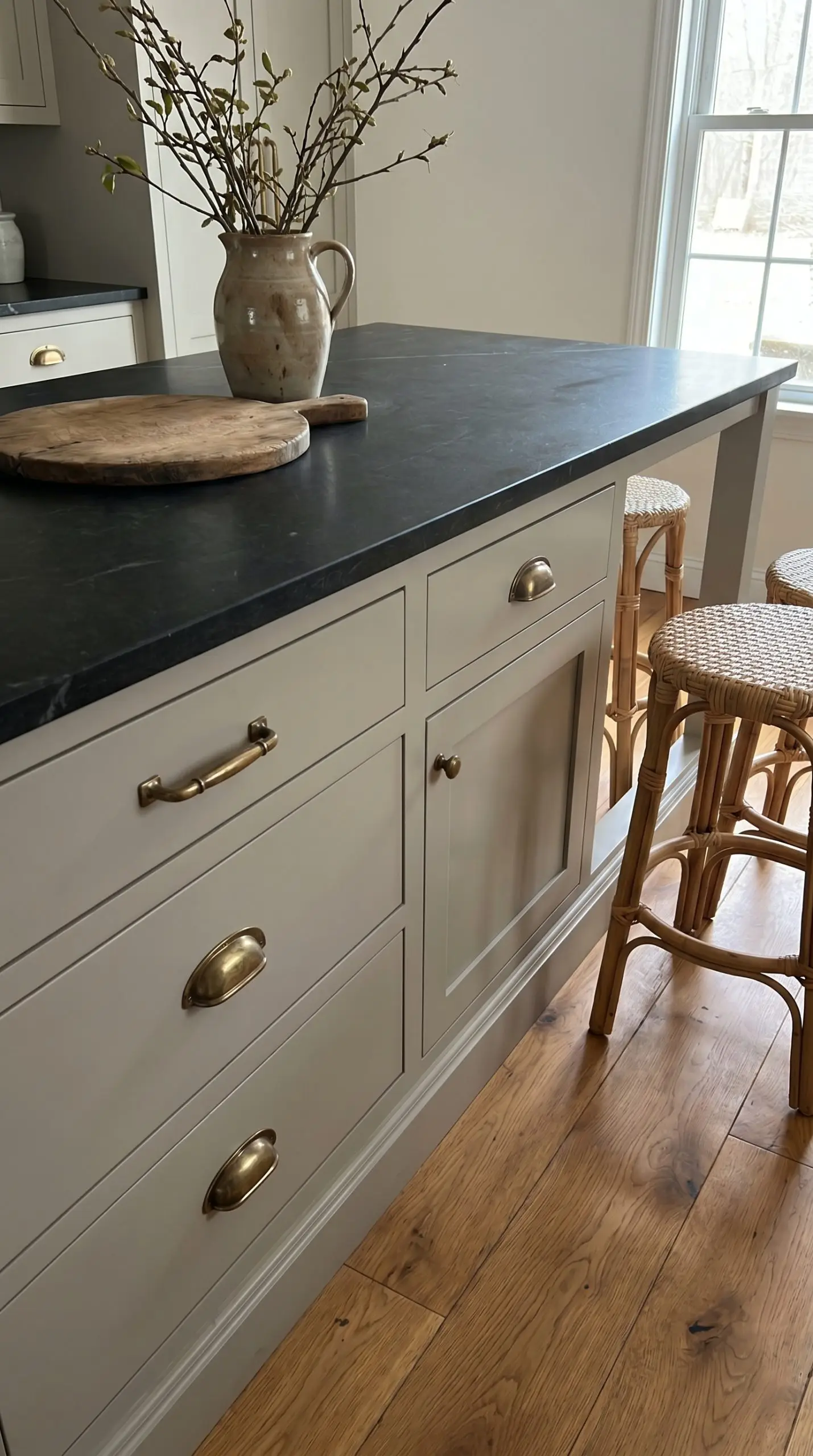
A classic, deeply nuanced warm gray that acts as a chameleon against different wood stains and natural light exposures. It carries an earthy green shadow that prevents it from feeling like cold cement, offering a highly bespoke finish.
- LRV: 55.05
- The Undertone: Earthy Green/Warm Gray
- The Pairing Mandate: Looks phenomenally bespoke when paired with honed black soapstone and aged brass hardware.
Edgecomb Gray (HC-173)
Sitting perfectly on the boundary between gray and beige, this shade is noticeably lighter than Revere Pewter. It is an excellent strategic choice for smaller, tighter kitchens that require warmth without absorbing too much natural light.
- LRV: 63.09
- The Undertone: Warm Beige/Gray
- The Pairing Mandate: Mandate pairing with honed Taj Mahal quartzite and polished nickel hardware for a seamless, tonal look.
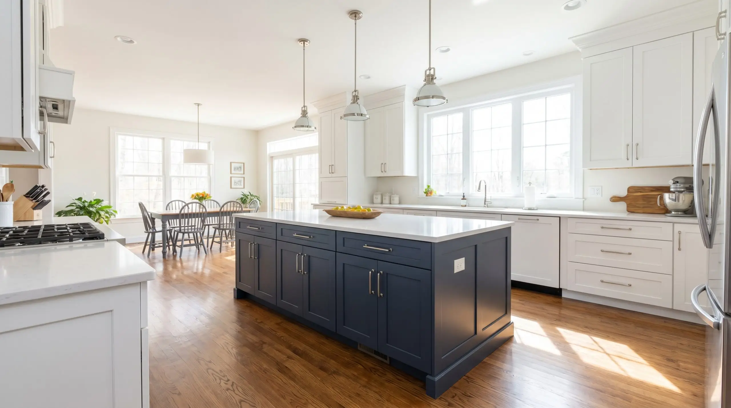
Pashmina (AF-100)
A deeply sophisticated, muddy greige that carries enough saturation to anchor a large room. It is the ideal candidate for lower base cabinets or a massive kitchen island in a two-tone cabinetry scheme.
- LRV: 44.2
- The Undertone: Muddy Brown/Gray
- The Pairing Mandate: Contrast with a crisp white upper cabinet (like Chantilly Lace) and heavily veined Calacatta marble.
Natural Cream (OC-14)
A flawless, airy light greige that effortlessly warms up cool-toned countertops without ever crossing the line into a yellow color cast. It provides a subtle, sophisticated contrast against pure white walls.
- LRV: 64.78
- The Undertone: Yellow-Gray
- The Pairing Mandate: Use alongside cool, crisp marble backsplashes to perfectly balance the warm and cool tones of the room.
Balboa Mist (OC-27)
A pale, ethereal gray that is highly reactive to the movement of the sun, shifting beautifully throughout the day. It carries a subtle warmth that prevents it from reading as industrial or flat.
- LRV: 65.53
- The Undertone: Violet/Warm Gray
- The Pairing Mandate: Pair with warm white oak floors and matte black hardware for a refined, modern edge.
Earthy Greens for Organic Modern and English Cottage Aesthetics
Green serves as the new grounding neutral for custom cabinetry. High-end architectural design heavily favors muted, muddy greens over bright, saturated jewel tones, bringing the outside in with sophisticated restraint.
Caldwell Green (HC-124)
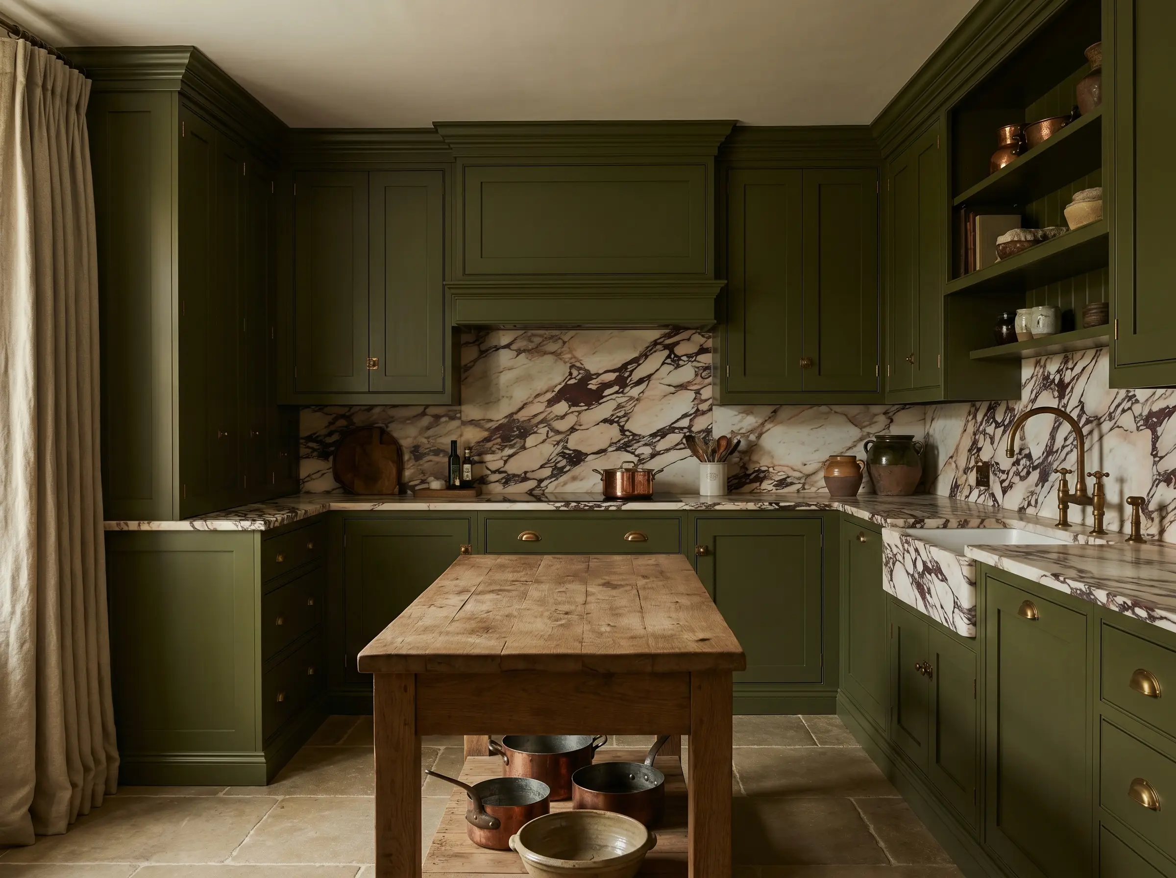
A rich, historic olive green that instantly evokes the feeling of a bespoke English kitchen. It carries immense depth and looks perfectly at home surrounded by heavy, natural textures.
- LRV: 15.65
- The Undertone: Brown/Olive
- The Pairing Mandate: Demands unlacquered brass cup pulls and heavily veined, dramatic marble to cut through its dark warmth.
Aegean Teal (2136-40)
A masterful, nuanced blend of blue, green, and gray that feels incredibly organic. It thrives in coastal transitional homes or as a distinct, calming presence in a laundry room cabinetry build.
- LRV: 23.96
- The Undertone: Blue-Gray
- The Pairing Mandate: Pair with light, natural white oak floors and polished chrome fixtures to enhance its watery depth.
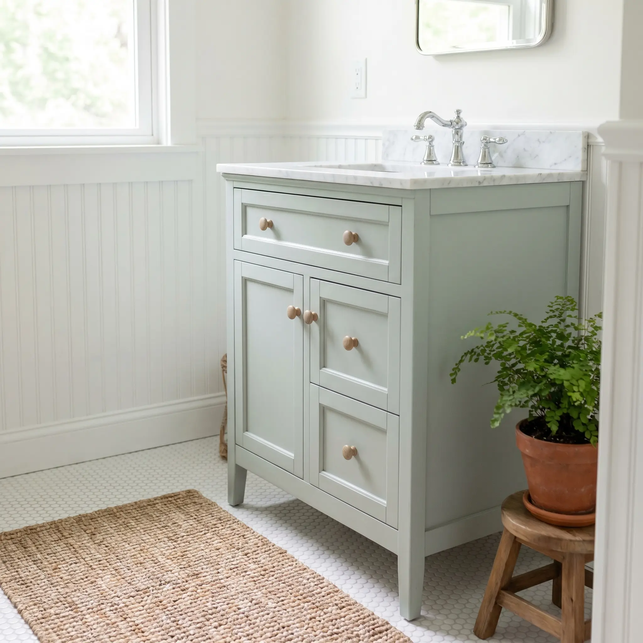
October Mist (1495)
A soft, silvery sage that acts as a remarkably gentle, versatile neutral. It provides just enough saturation to stand out from white walls while maintaining a serene, understated profile.
- LRV: 46.33
- The Undertone: Silver/Gray
- The Pairing Mandate: Pairs exceptionally well with light white oak floors and honed Danby marble countertops.
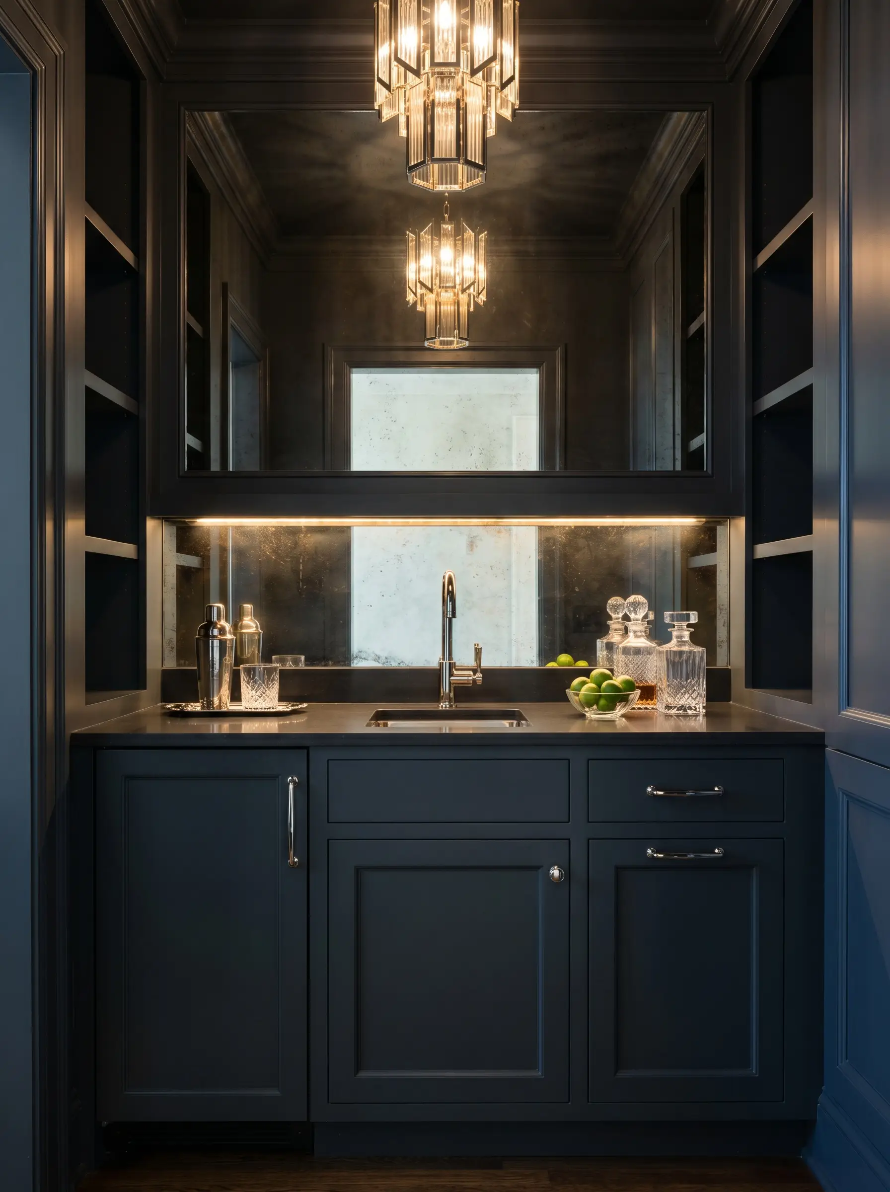
Essex Green (HC-188)
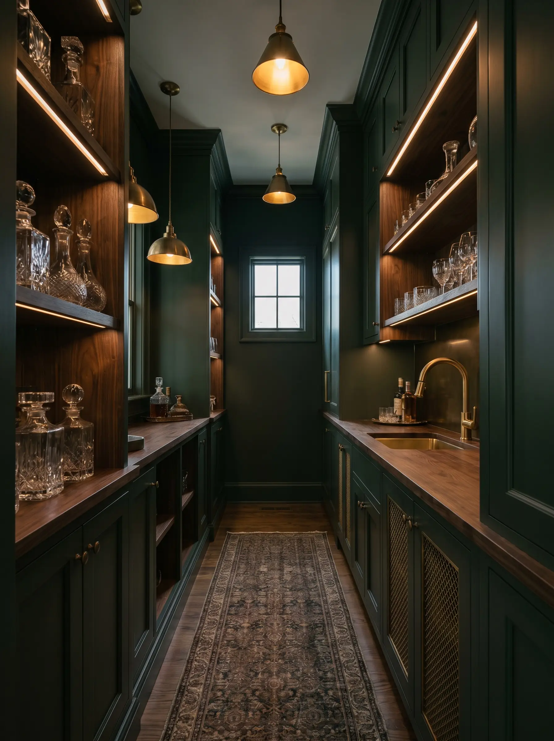
A near-black forest green that delivers unparalleled high drama and architectural intensity. It is a commanding shade best reserved for intimate spaces like a wet bar or a butler’s pantry.
- LRV: 9.15
- The Undertone: Black/Deep Forest
- The Pairing Mandate: Best contrasted with dark walnut wood accents and unlacquered brass wire mesh cabinet inserts.
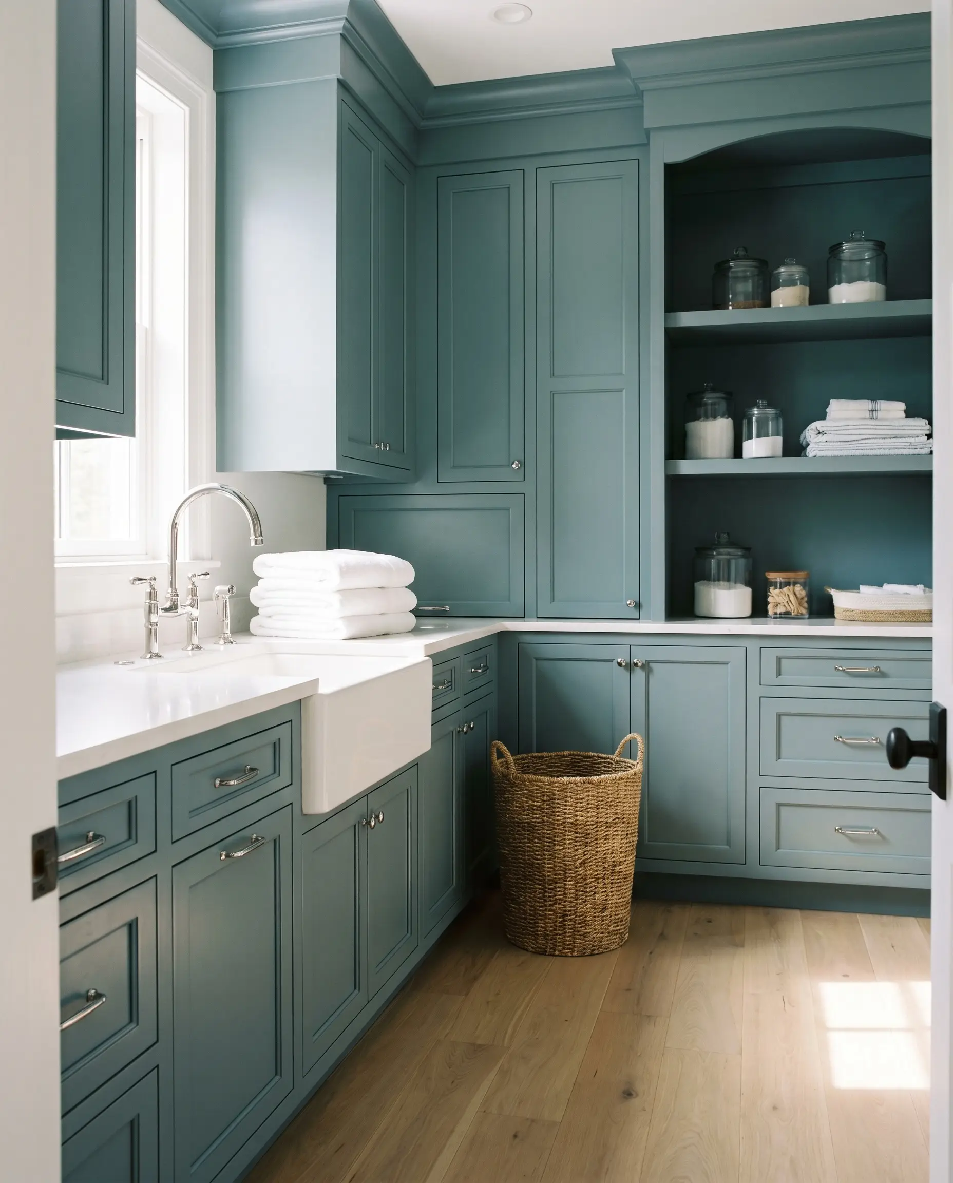
Statement Blues for Coastal and Historic Charm
Committing to blue cabinets requires immense caution, as the wrong shade can easily look juvenile or primary. The secret to a luxurious blue palette is selecting colors heavily grounded in gray.
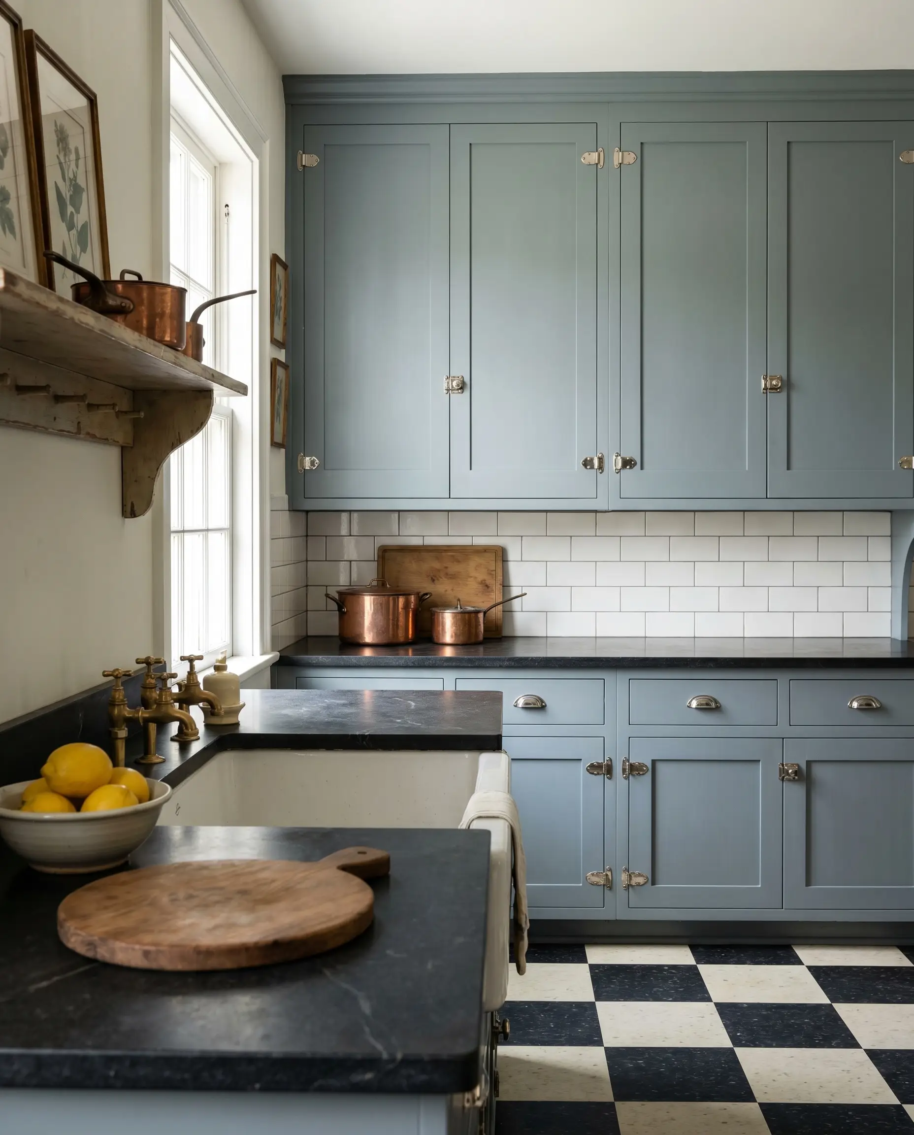
Hale Navy (HC-154)
The most famous, deeply saturated navy in the brand’s catalog, functioning as a true maritime blue with distinct charcoal undertones. It is flawless on large kitchen islands and possesses the rare ability to anchor a room without darkening it.
- LRV: 8.36
- The Undertone: Charcoal/Gray
- The Pairing Mandate: Pairs seamlessly with literally any metallic finish, from bright polished nickel to rich, aged brass.
Providence Blue (1636)
A deeply muted, teal-leaning navy that offers a slightly more eclectic, collected vibe than a standard maritime blue. It feels historic, moody, and intentionally aged.
- LRV: 12.65
- The Undertone: Teal/Green-Gray
- The Pairing Mandate: Mandate pairing with antiqued brass hardware and warm, medium-toned wood floors.
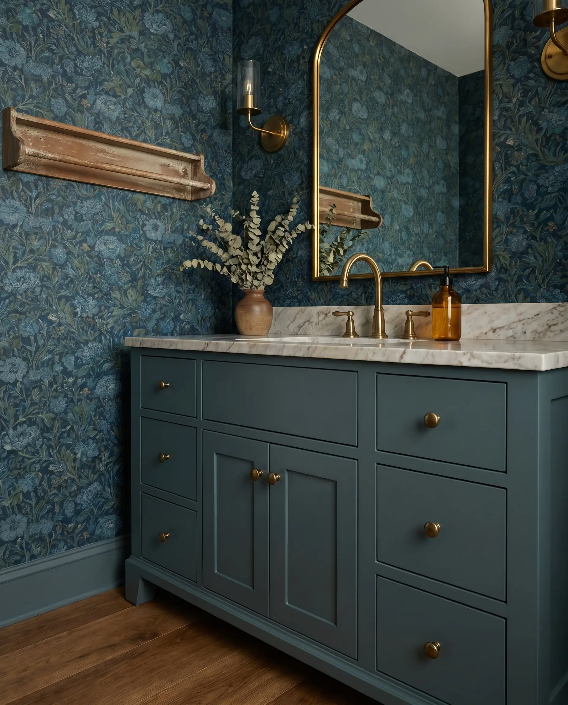
Boothbay Gray (HC-165)
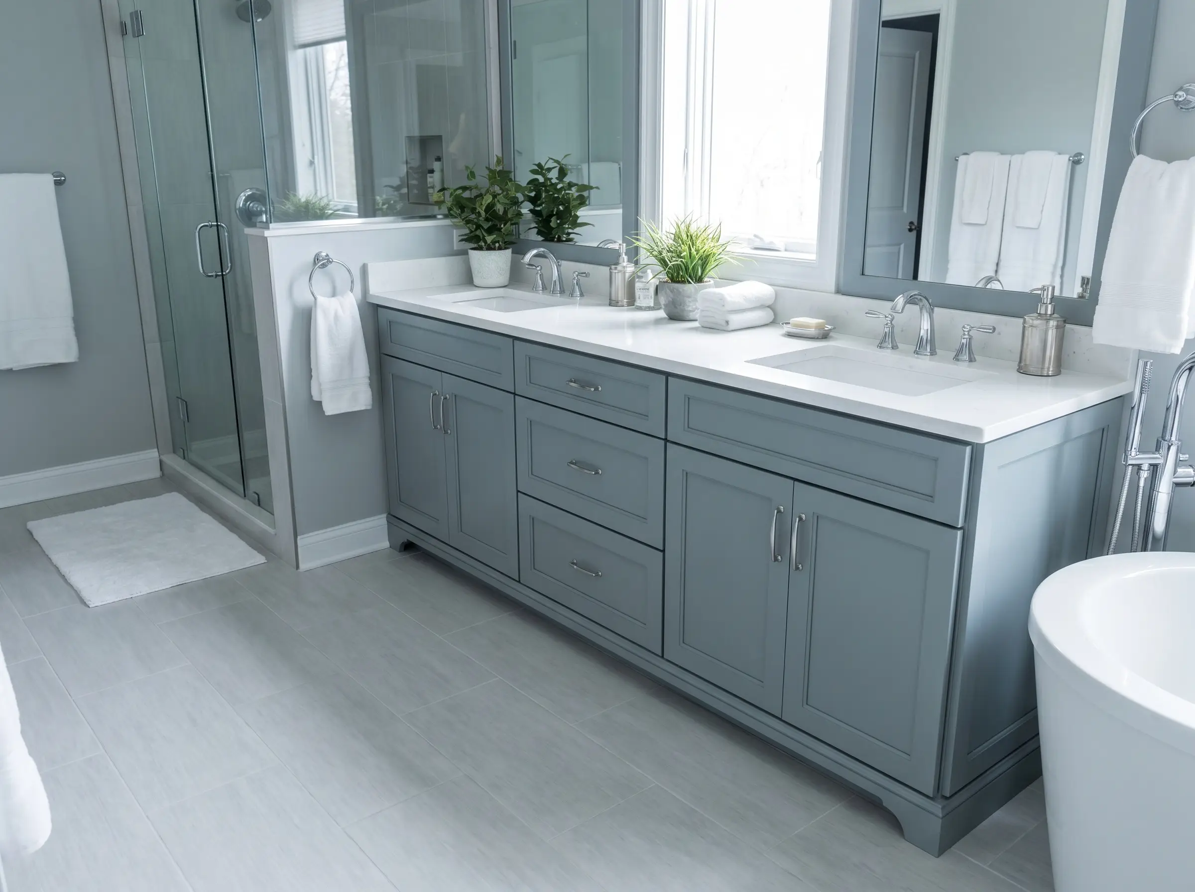
A steely, medium-toned blue-gray that feels incredibly serene and architectural. It is the perfect candidate for a sprawling bathroom vanity or a calming run of kitchen perimeter cabinets.
- LRV: 43.26
- The Undertone: Blue/Steel
- The Pairing Mandate: Pair with crisp white quartz and polished chrome plumbing fixtures for a clean, spa-like execution.
Normandy (2122-40)
A sophisticated, dusty blue that carries enough gray to feel completely mature and grounded. It perfectly captures the essence of a meticulously restored historic home.
- LRV: 23.64
- The Undertone: Dusty Gray
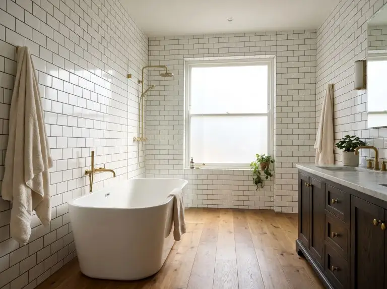
- The Pairing Mandate: Looks absolutely incredible with polished nickel latch hardware and classic white subway tile.
Woodlawn Blue (HC-147)
A soft, airy blue with just a touch of green to warm it up, reflecting light beautifully. It is an ideal, delicate choice for cottage-style bathroom vanities or laundry spaces.
- LRV: 60.59
- The Undertone: Green/Gray
- The Pairing Mandate: Anchor with honed Carrara marble and classic, round wooden cabinet knobs painted in the exact same shade.
Moody Darks and Soft Blacks for High-Contrast Architecture
Coating a large bank of cabinets in pure, unadulterated black can feel incredibly harsh and visually flat. The most luxurious dark millwork relies on deeply saturated charcoals and off-blacks that shift in the light.
Wrought Iron (2124-10)
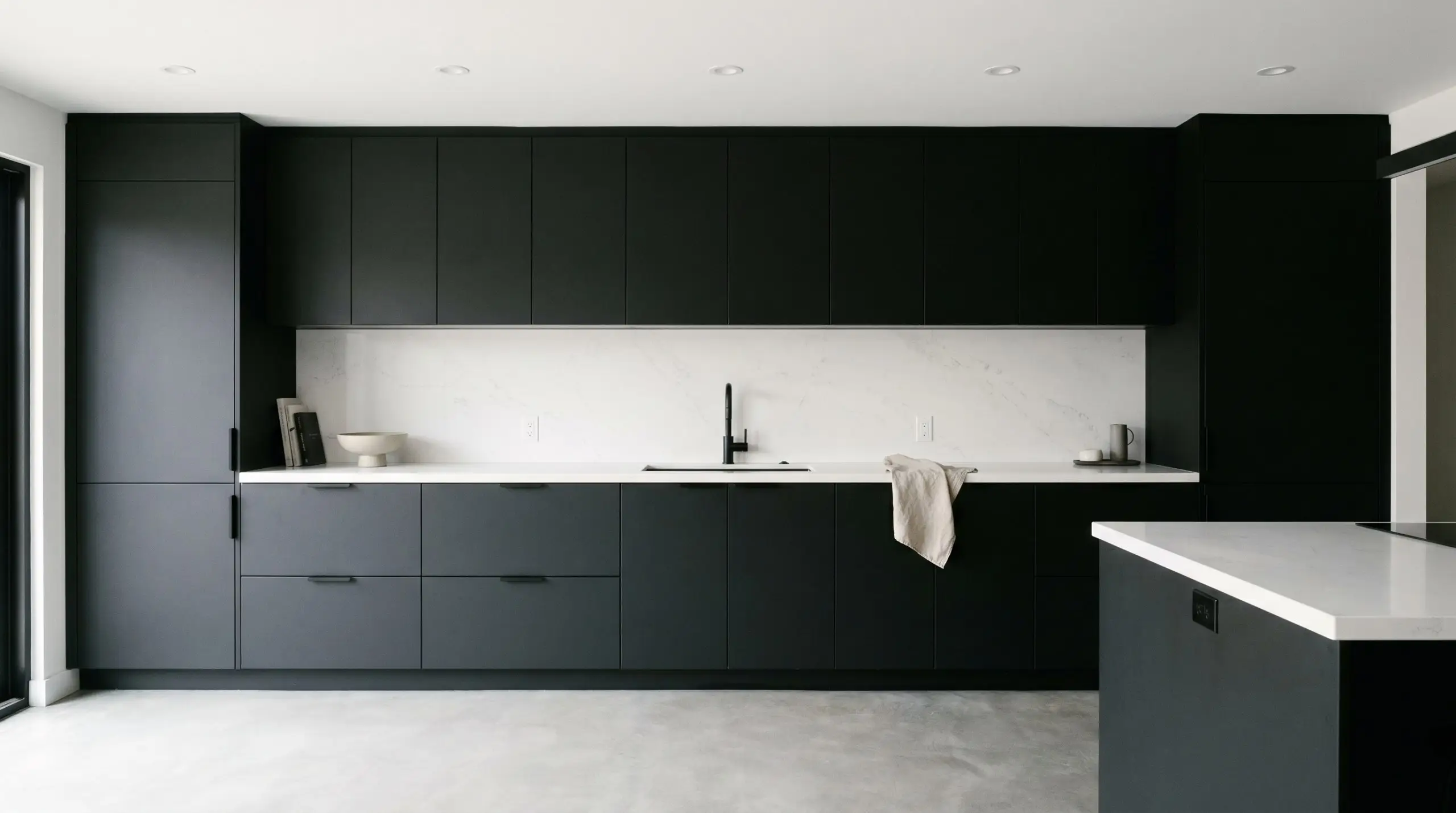
A soft, powdery black that absorbs light rather than reflecting it, creating a velvety, tactile finish. It is the absolute choice for modern minimalist kitchens wanting high contrast without the starkness of a true black.
- LRV: 6.16
- The Undertone: Dark Charcoal/Navy
- The Pairing Mandate: Pair with stark, vein-free white quartz and matte black hardware for a monolithic, modern aesthetic.
Cheating Heart (1617)
A deeply nuanced charcoal that plays tricks on the eye, reading as an extremely dark navy or a deep, muddy brown depending on the time of day. It offers masterful depth for bespoke built-ins.
- LRV: 6.89
- The Undertone: Navy/Brown
- The Pairing Mandate: Best executed alongside warm, amber-toned lighting and rich walnut interiors.
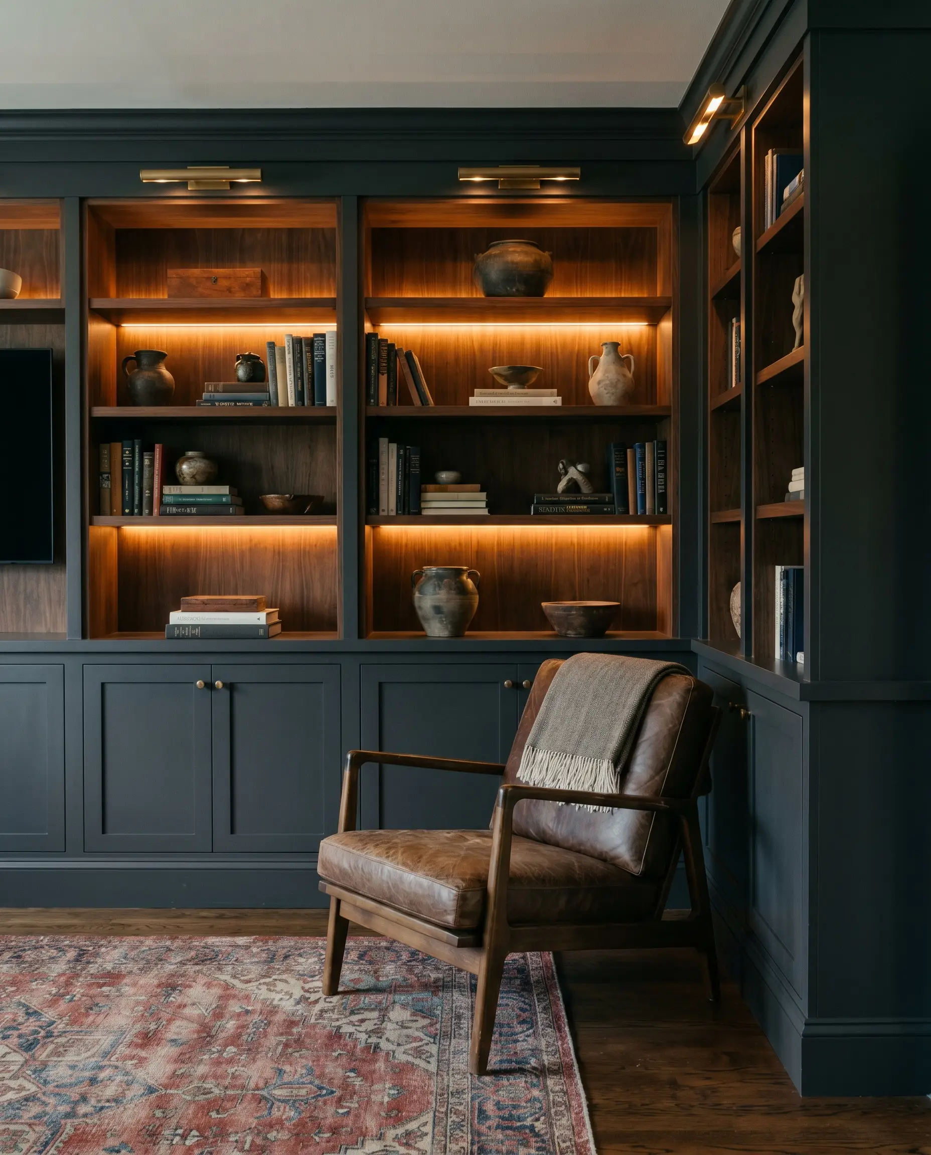
Kendall Charcoal (HC-166)
A warm, earthy dark gray that bridges the gap between modern contrast and traditional warmth. It is extremely forgiving in a variety of lighting situations and grounds a large kitchen effortlessly.
- LRV: 14.61
- The Undertone: Warm Brown/Green
- The Pairing Mandate: Pairs wonderfully with warm edge-grain butcher block countertops and brushed brass pulls.
Soot (2129-20)
A dramatic, inky black with a highly sophisticated, subtle blue shadow that gives the color life. It is best suited for high-end wet bars or floor-to-ceiling library built-ins.
- LRV: 4.11
- The Undertone: Cool Blue
- The Pairing Mandate: Demands high-shine polished nickel hardware to pierce through its deep, inky darkness.
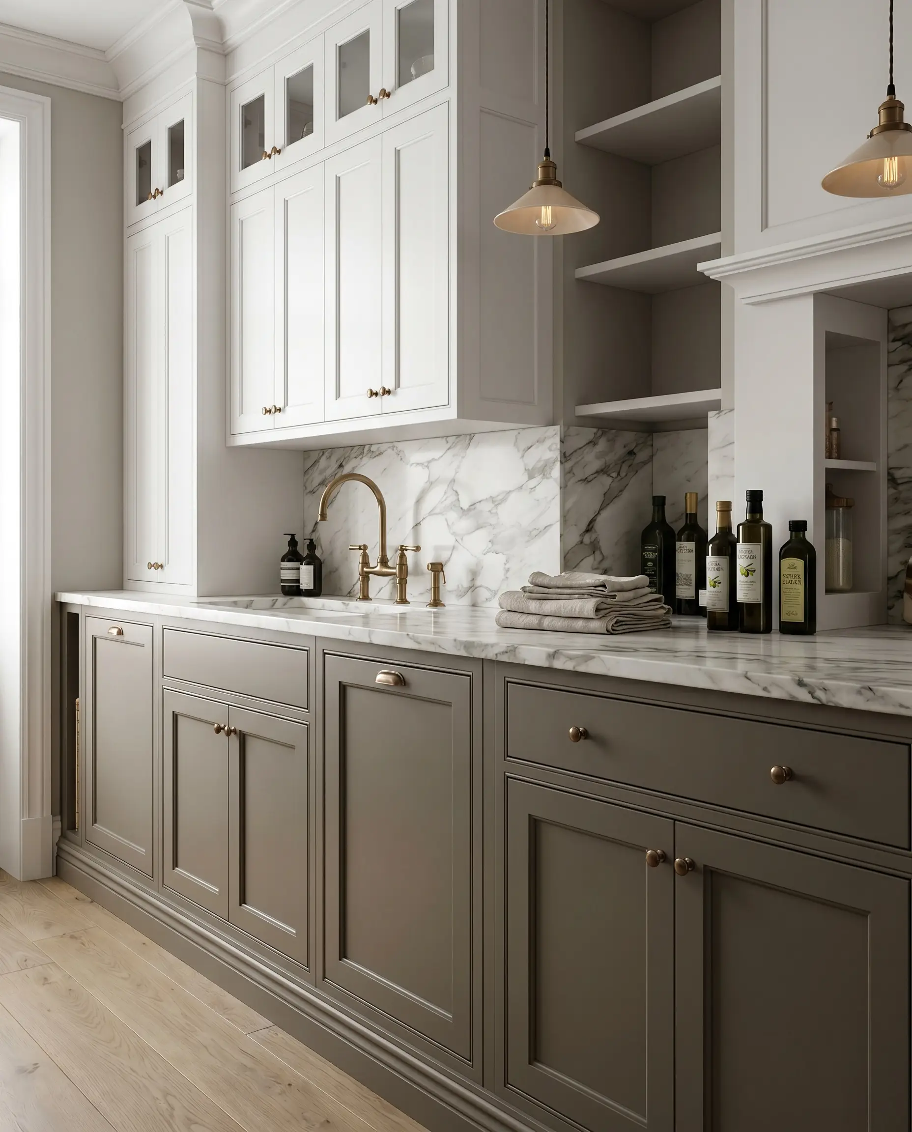
The Designer’s Hardware & Countertop Pairing Matrix
To prevent expensive missteps during your renovation, we have synthesized these distinct color families into a strict pairing matrix. Use this framework to align your millwork hue with the exact hardware finish and stone required to execute a cohesive, high-end design.
| Cabinet Color Family | Optimal Hardware Finish | Recommended Countertop Material |
|---|---|---|
| Whites & Creams | Unlacquered Brass / Polished Nickel | Calacatta Marble / Warm Quartz |
| Mushrooms & Greiges | Aged Brass / Matte Black | Honed Taj Mahal Quartzite / Black Soapstone |
| Earthy Greens | Unlacquered Brass / Polished Chrome | Danby Marble / White Oak Butcher Block |
| Statement Blues | Polished Nickel / Antiqued Brass | Crisp White Quartz / Carrara Marble |
| Moody Darks & Blacks | Brushed Brass / Matte Black | Stark White Quartz / Warm Walnut Butcher Block |
Always test physical hardware and stone samples directly against your painted swatches, as natural lighting will continuously alter their relationship.
Finalizing Your Bespoke Millwork Palette
Architectural color is a chameleon, and the absolute rule of painting custom cabinetry is that a tiny paper swatch is never enough to make a final decision. You must observe the physical LRV shift as the sun moves across your room. We mandate buying large peel-and-stick samples (like Samplize) or painting large foam boards with sample pots. Place these boards vertically against your existing cabinets, right next to your exact hardware and stone samples, to see how the lighting cast truly behaves before you commit to a full gallon.
When testing your vertical samples, do not lay them flat on a table. Light hits horizontal and vertical planes differently. Always tape your swatches to the actual cabinet door face to view the true color saturation.
Hackrea Styling Tip