Soot 2129-20
Benjamin MooreBenjamin Moore Soot 2129-20 is a deeply saturated, moody soft black with distinct cool blue-gray undertones. Rather than a flat, stark black, its charcoal DNA and 6.19 LRV create a rich, velvety depth that feels sophisticated and dramatic in well-lit spaces.
Paint Technical Profile
| Color ID / SKU | 2129-20 |
| HEX Code | #373C41 |
| Light Reflectance (LRV) | 6.19 |
| Use | Interior, Exterior |
| Best Exposures | South-Facing or Well-Lit Rooms |
| Best For | Accent Walls, Cabinetry, Moody Bedrooms, Modern Exteriors |
Benjamin Moore Soot: The Velvety Charcoal That Redefines High-Contrast Interiors
True black paint often acts like a visual void, stripping the energy from a room and leaving the walls feeling entirely flat. Benjamin Moore Soot 2129-20 offers a completely different, highly dimensional experience. This velvety charcoal operates as an architectural finish, wrapping your walls in a rich, moody aesthetic that responds beautifully to its surroundings.
By retaining a subtle chromatic profile, Soot brings a sophisticated softness to high-contrast design. It is the perfect stark black alternative for homeowners who want dramatic tension without the harshness of a true pitch black. We are going to explore exactly how this unique color structure behaves in your home.
Benjamin Moore Soot: Undertones & LRV
If you are wondering whether this popular shade reads warm or cool, Benjamin Moore Soot is definitively a cool-toned soft black. This temperature profile is entirely responsible for its sophisticated, tailored edge. Let’s look at the specific elements that build this color:
With a light reflectance value (LRV) of exactly 6.19, this shade absorbs a massive amount of light. However, because it sits just above an absolute zero-reflection black, it retains enough lightness to showcase its blue-gray identity. This means your walls will look like a deliberate, premium color choice rather than an empty shadow.
How Shifting Light Alters the Vibe of Soot
That hidden blue-gray cast turns this soft black into a responsive, shifting finish. The direction of your sunlight and the temperature of your bulbs will dramatically alter how this paint behaves.
Popular Applications for This Velvety Charcoal
Once you understand how this color structure interacts with light, you can use it to completely redefine the visual weight of your home. Rather than defaulting to safe neutrals, you can use this stark black alternative to create highly intentional, curated moments. Here is how we recommend utilizing it across different spaces.
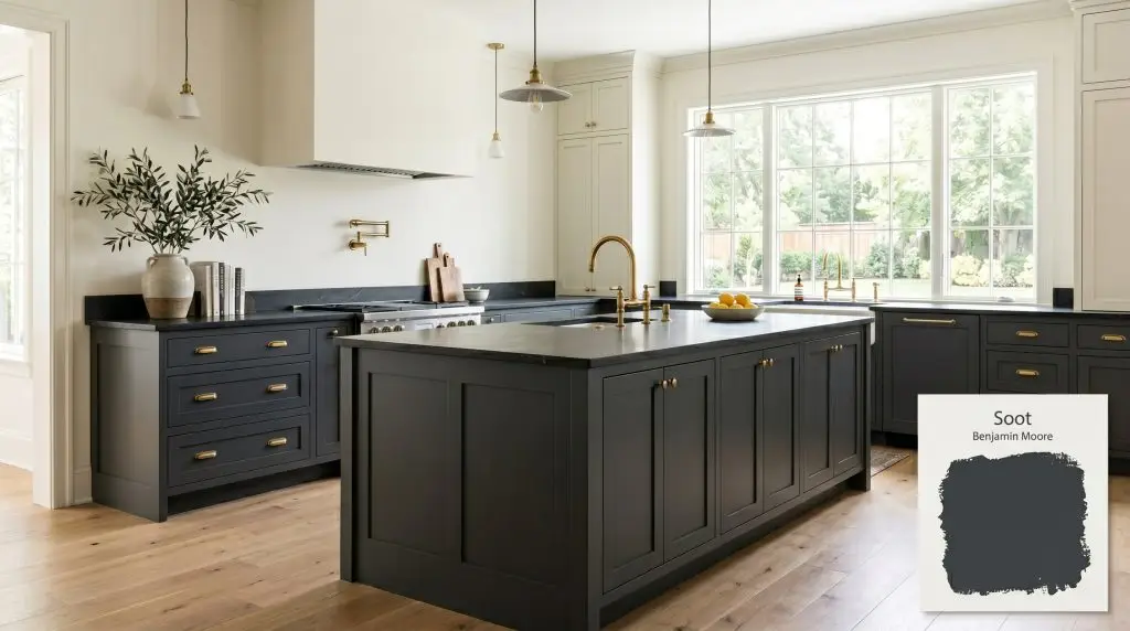
Kitchen Cabinetry and Islands
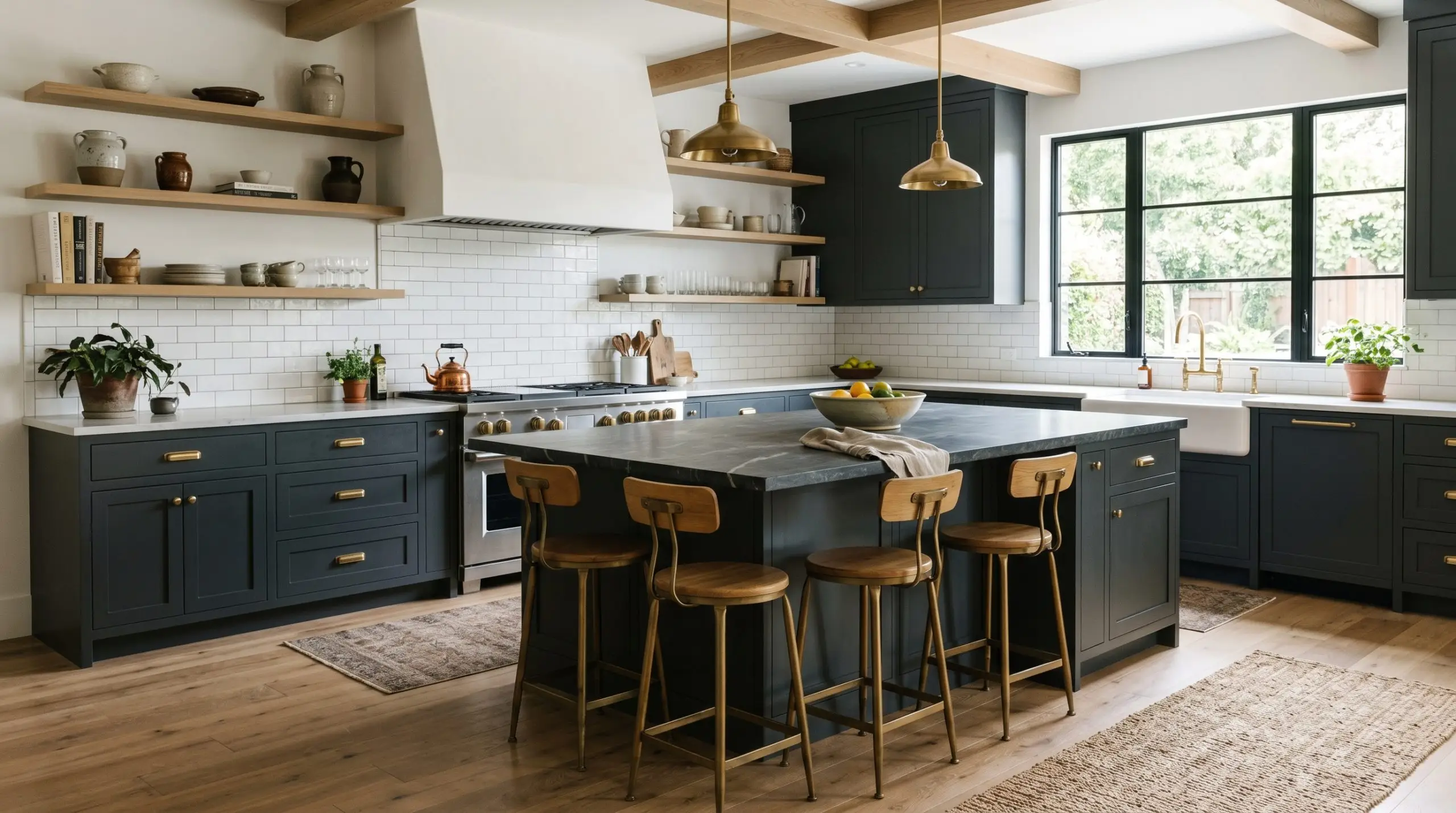
Painting your lower cabinets or a central island in BM 2129-20 is a brilliant way to establish a sophisticated culinary workspace. The low chroma of this shade pairs flawlessly with everyday materials like classic white subway tile, instantly elevating the entire room. To create a premium focal point, pair these dark cabinets with unlacquered brass hardware and a honed soapstone countertop.
When using a dark, cool-toned charcoal on cabinetry, always introduce a warm metallic element. The cool blue-gray cast of the paint will make brushed brass or polished copper pulls visually pop, creating a beautifully balanced, high-end finish.
Hackrea Pro-Tip (The Hardware Contrast)
This color also thrives in transitional kitchens that blend modern and traditional elements. If you have warm white oak flooring, the velvety charcoal provides a necessary visual boundary that keeps the wood tones from feeling washed out. For a busy household, this forgiving, dark shade on an island base hides scuffs while maintaining a sleek, tailored profile.
Moody Primary Bedrooms
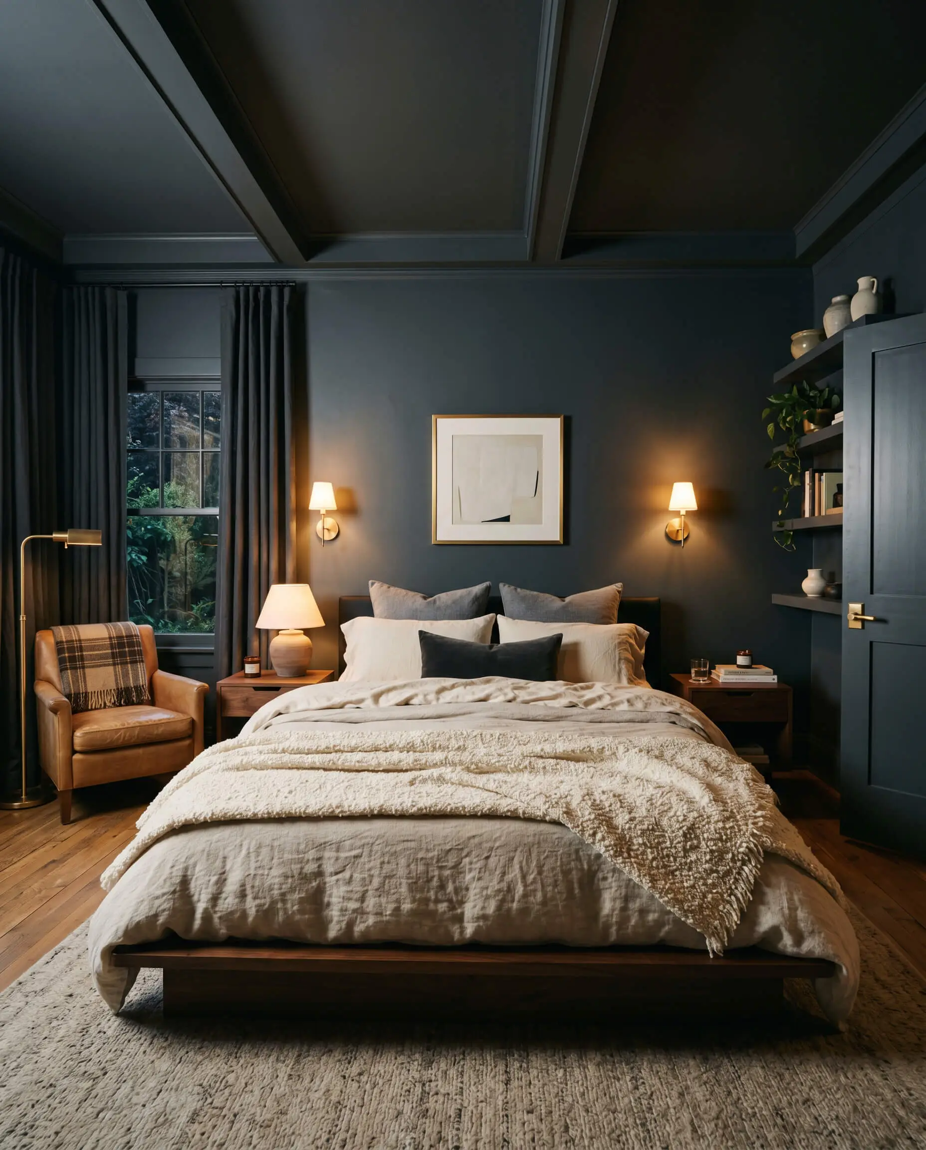
For homeowners seeking a restful, sensory-friendly escape, color drenching a bedroom in this shade creates an incredibly enveloping atmosphere. By painting the walls, trim, and doors in the same dark hue, you blur the hard architectural lines of the room. This technique makes the space feel larger and infinitely more intimate.
To prevent the room from feeling overly stark, introduce a heavy dose of tactile fabrics. Layer a platform bed with tumbled cotton sheets, a nubby linen duvet, and a highly textured bouclé throw. Incorporate warm, ambient lighting via brass wall sconces to soften the blue undertones during the evening.
If you prefer a lighter touch, use this shade exclusively on a channel-tufted headboard wall. This establishes a strong focal point while allowing the remaining walls to stay crisp and bright. Finish the styling with a vintage wool rug to introduce subtle, earthy colors like terracotta or olive green.
Home Theaters and Media Rooms
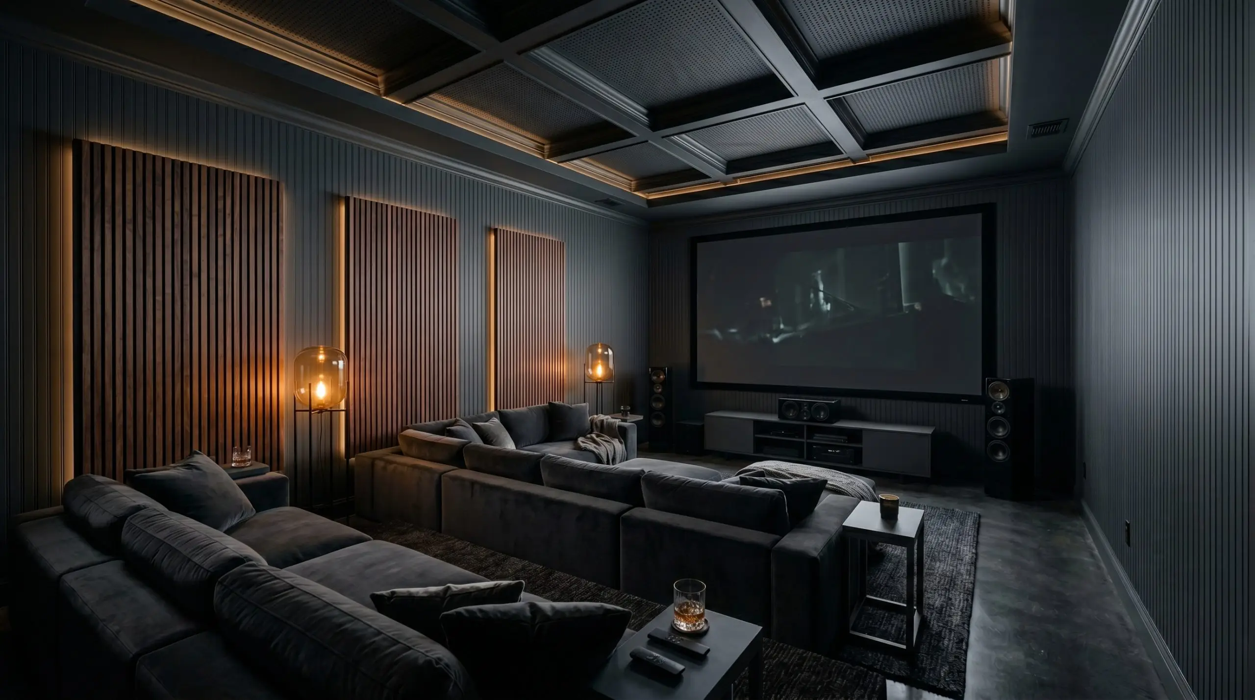
A dedicated entertainment space requires a paint that absorbs glare and minimizes visual distractions. With its extremely low light reflectance value, this soft black is the ultimate functional choice for a media room. It saturates the environment, allowing the screen to become the absolute center of attention.
For a truly cinematic experience, do not leave the ceiling stark white. Carry the charcoal paint all the way up and across the ceiling to completely eliminate light bounce and fully immerse the room in the viewing experience.
Hackrea Design Secret (The Ceiling Strategy):
To bring a sense of tailored luxury to the space, pair the dark walls with plush, performance velvet modular seating. Introduce subtle architectural details, like dark painted beadboard or acoustic wood slat panels, to add texture without reflecting light. A few strategically placed amber floor lamps will provide just enough glow for navigating the room without ruining the moody aesthetic.
Modern Exterior Siding and Trim
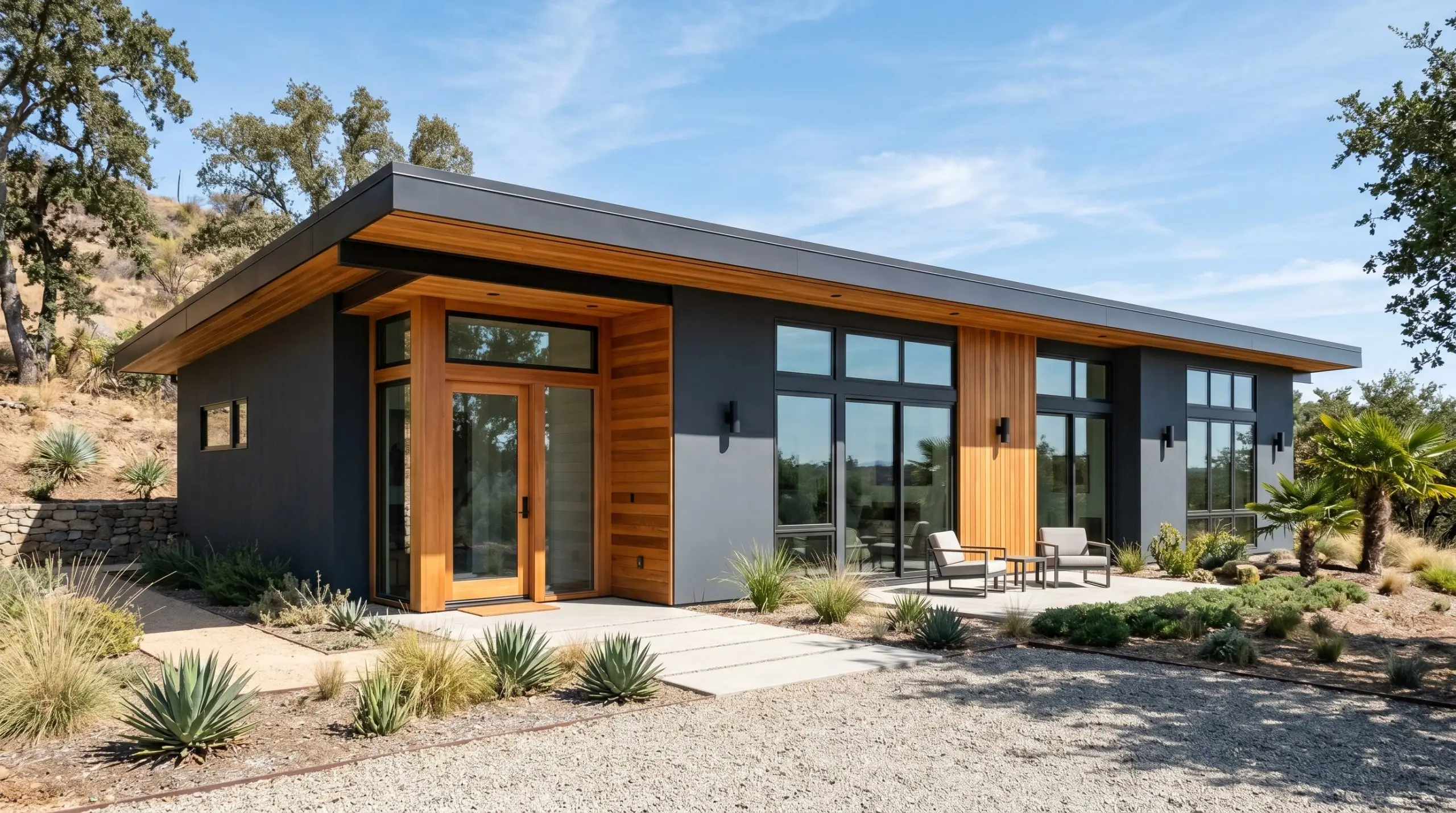
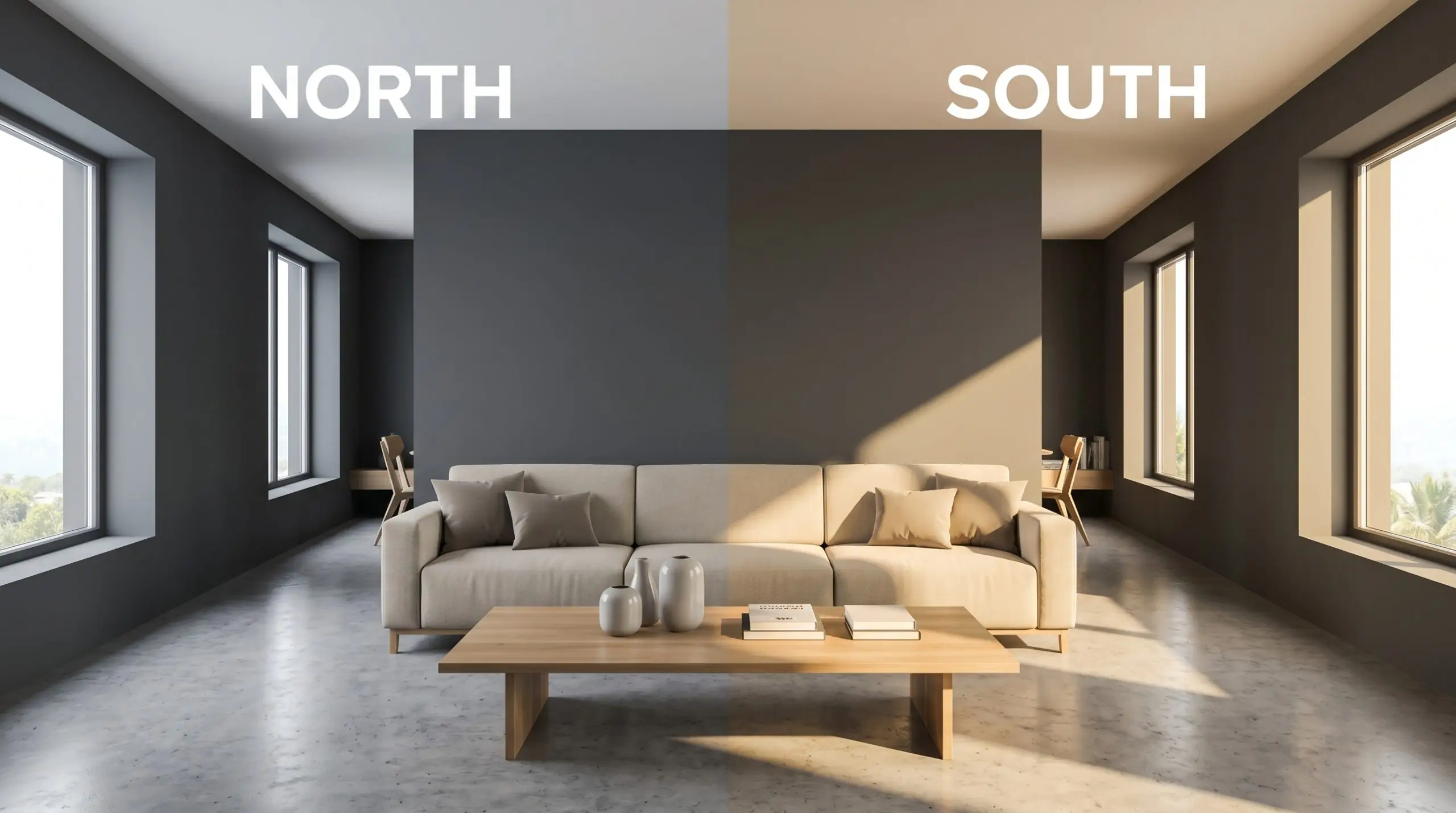
Taking this color outdoors completely transforms the curb appeal of a standard suburban home. When exposed to full, direct exterior sunlight, the harshness of a standard black is washed away, revealing the beautiful blue-gray cast. This makes it an exceptional choice for modernizing a dated mid-century facade or a traditional farmhouse exterior.
If you are updating your home’s exterior, use this velvety charcoal on the main siding and pair it with natural cedar accents. The warmth of the wood siding beautifully counteracts the cool temperature of the paint. Always test a large swatch on both the north and south sides of your house, as the shifting sunlight will dramatically alter the blue tones throughout the day.
For a more restrained approach, use this shade strictly for high-contrast trim and exterior doors against a stark white brick. This classic combination provides a crisp, tailored outline that highlights the architectural geometry of the house. Complete the look with oversized, matte black modern house numbers and sleek exterior sconces.
Powder Rooms
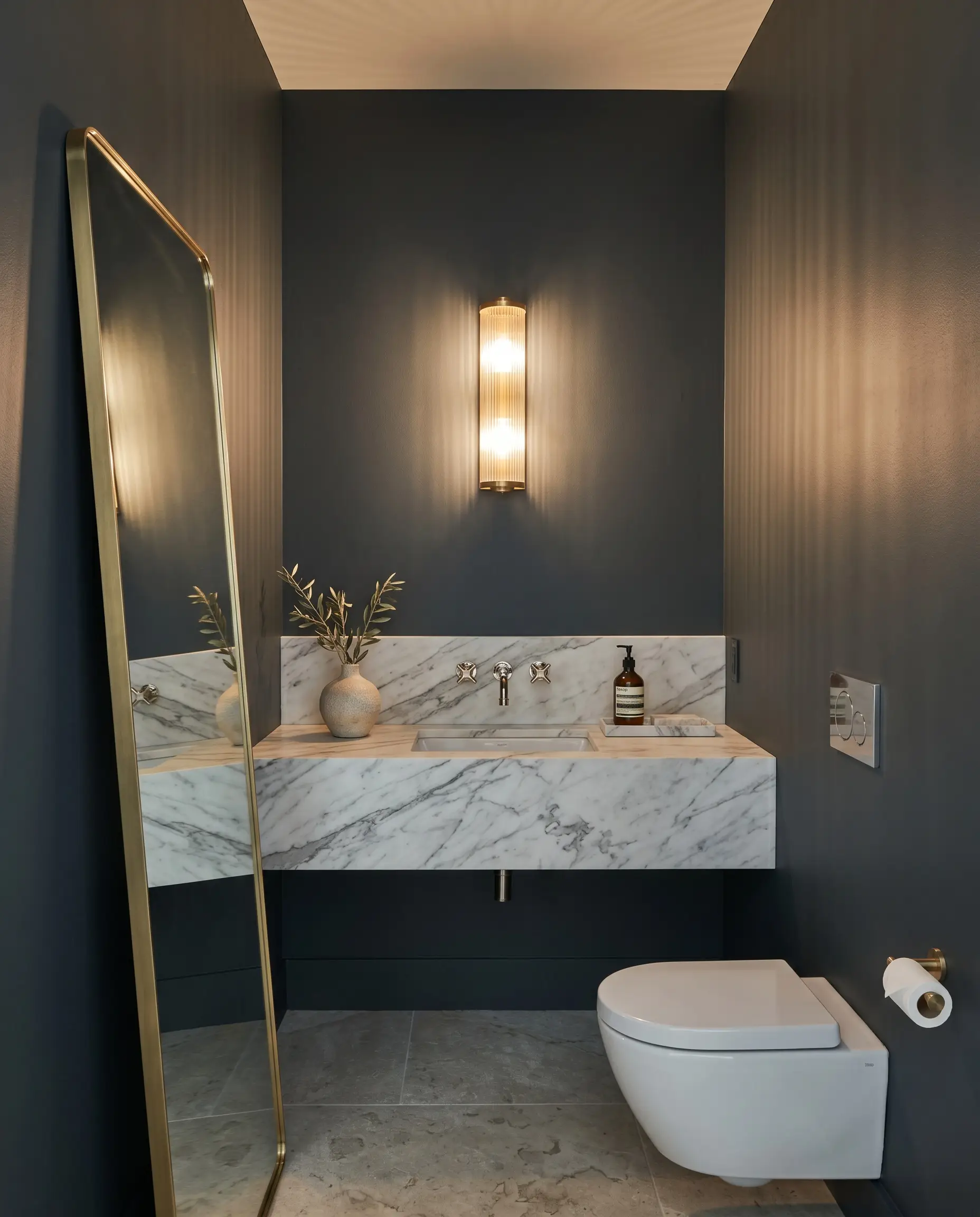
A small, windowless bathroom is the perfect environment to experiment with dramatic color structures. Because you spend very little time in a powder room, you can afford to make a bold, uncompromising design statement. Wrapping the entire space in this dark, moody hue instantly creates a highly curated, jewel-box effect.
Contrast is your best tool in these tight spaces. Pair the dark walls with a floating statuary marble vanity and a gleaming polished nickel faucet to create a brilliant clash of materials. Install a reeded glass light fixture to cast interesting, textured shadows across the velvety paint.
To push the design even further, consider applying the paint in a high-gloss finish on the ceiling or trim. The reflective sheen will bounce your artificial vanity lighting around the room, adding a layer of sophisticated glamour. Finish the vignette with an asymmetrical leaning mirror and a small, textured ceramic vase.
Curating Materials Around Benjamin Moore Soot
Because this specific charcoal carries a vivid coolness just beneath its surface, it requires surrounding materials to either sharply frame its borders or gently warm its overall temperature. It behaves beautifully when it has clear boundaries to hold its shape, rather than bleeding softly into other dark tones.
Establishing Crisp Boundaries with Trim
To push the tailored edge of this dark hue, you want a trim that provides a razor-sharp outline without introducing creamy yellow undertones. Benjamin Moore Chantilly Lace OC-65 is a brilliant choice because its stark lack of pigment creates a highly graphic, modern boundary. Pairing these two together immediately establishes a crisp, architectural look that highlights your millwork.
If you prefer an even brighter contrast, Sherwin-Williams High Reflective White SW 7757 bounces maximum light back into the room to keep the dark walls from feeling overly shaded. Alternatively, Farrow & Ball All White No. 2005 offers a slightly softer, pigment-rich edge that feels exceptionally elegant alongside the cool charcoal.
Hardware, Wood & Material Pairings
To truly make this stark black alternative feel intentional, you must introduce tactile materials that directly converse with its cool, shadowy profile. Unlacquered brass is an exceptional premium finish to pair with this paint. As the brass naturally patinas, its raw, golden warmth visually lifts the cool blue-gray cast hiding in the walls, creating a stunning, high-end tension.
For a more grounded, earthy approach, introduce unglazed terracotta elements through floor tiles or large, collected pottery. The baked, matte redness of the clay provides a beautiful, organic contrast that prevents the charcoal from reading too industrial. You can further soften the visual impact of the room by layering worsted wool textiles, which absorb light and make the dark walls feel remarkably cozy.
Finally, incorporate fluted glass in your lighting fixtures or cabinetry fronts. The ribbed texture catches ambient light and throws subtle, glowing reflections against the dark paint, adding incredible depth without requiring extra square footage.
Expanding the Palette
When building a cohesive home palette, the secondary colors you choose will dictate exactly how this velvety charcoal is perceived.
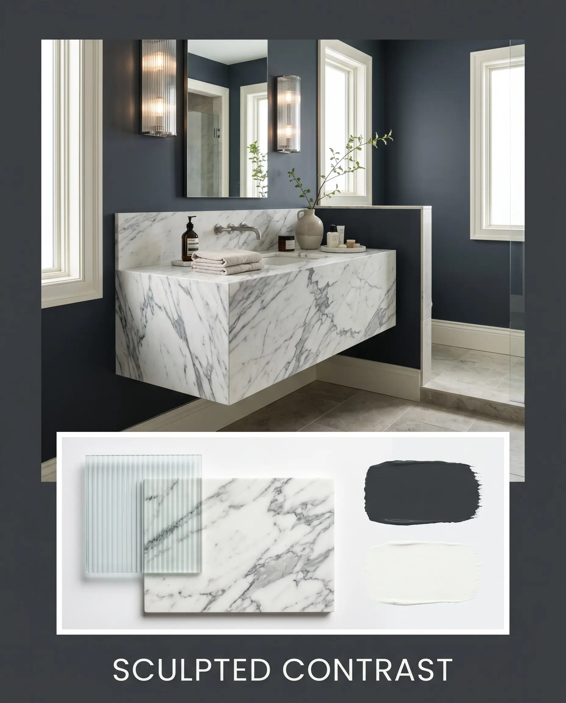
Designer Mood Boards
Sculpted Contrast This aesthetic relies on the sharp, graphic interplay between light and shadow. By pairing the velvety charcoal with the stark brightness of Chantilly Lace trim, you create a highly defined, architectural shell. Introduce sleek fluted glass lighting and a floating statuary marble surface to bounce light around the room. The resulting energy is razor-sharp, sophisticated, and distinctly modern.
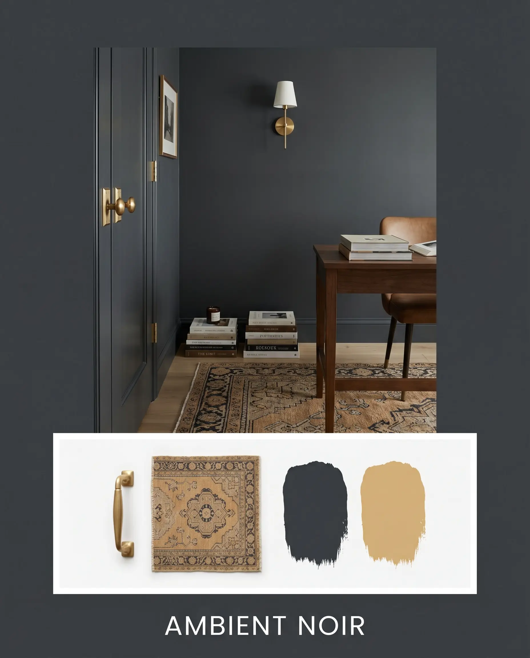
Ambient Noir If you want to lean into a deeply enveloping, transitional mood, this combination focuses entirely on warmth and reflection. The dark walls serve as a quiet backdrop for gleaming unlacquered brass hardware and a vintage rug featuring rich hits of Tarnished Trumpet. Layering in mixed metals and stacked art books gives the space a curated, collected energy that feels incredibly distinguished. It is the perfect balance of classic heritage and modern edge.
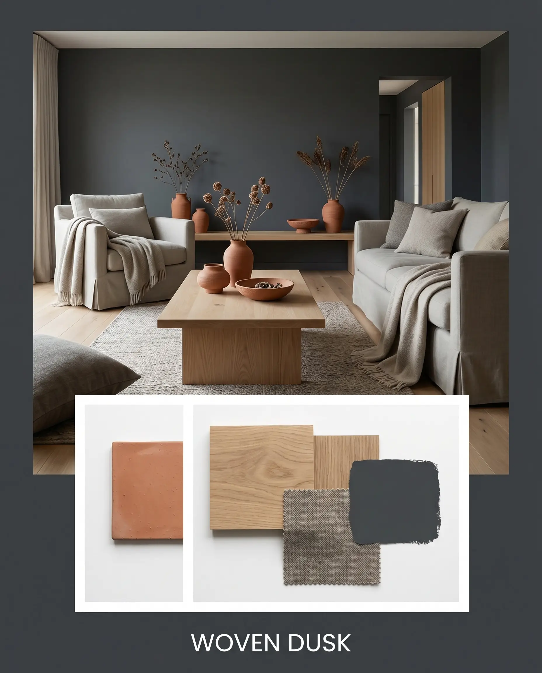
Woven Dusk To soften the inherent coolness of the paint, this approach grounds the room in earthy, organic textures. The introduction of raw terracotta ceramics and expansive white oak flooring immediately warms the visual temperature. Draping worsted wool textiles over slipcovered seating creates a relaxed, sensory-driven environment. The vibe is exceptionally calm, transforming a potentially stark color into a cozy, restorative retreat.
Comparing Benjamin Moore Soot to Rival Dark Tones
Choosing the exact right dark shade often comes down to the specific directional lighting in your home and how much color you actually want lingering in the shadows. If your room faces north or lacks natural light, you may need to pivot to a rival hue to maintain the exact atmosphere you are chasing.
Benjamin Moore Soot vs. Benjamin Moore Wrought Iron 2124-10
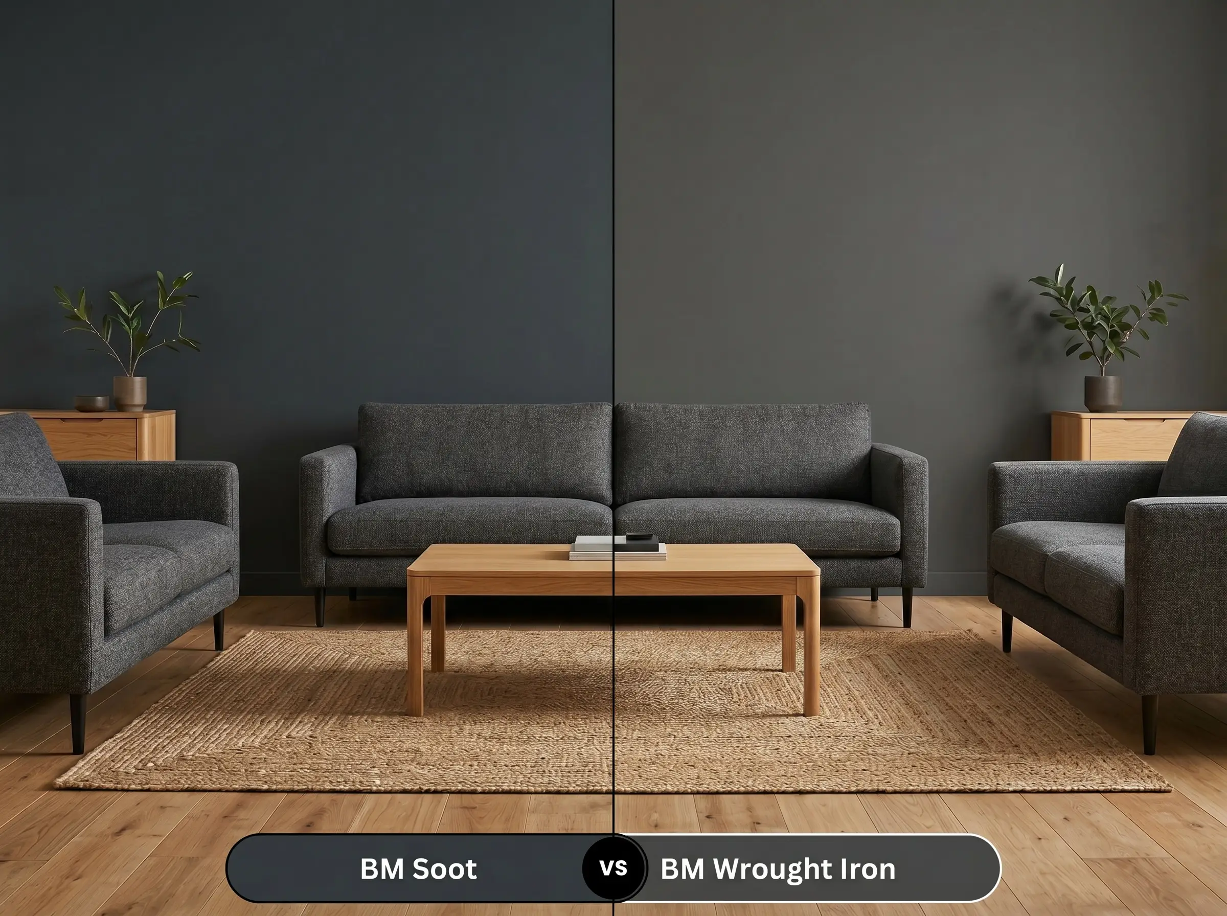
When deciding between these two popular shades, you are primarily choosing between a cool or warm profile. While Soot relies on a distinct blue-gray cast, Wrought Iron is formulated with a browner, slightly warmer base. If your room features a lot of warm natural wood tones and you want a softer, more weathered charcoal, Wrought Iron is typically the more forgiving choice.
Benjamin Moore Soot vs. Sherwin-Williams Cyberspace SW 7076
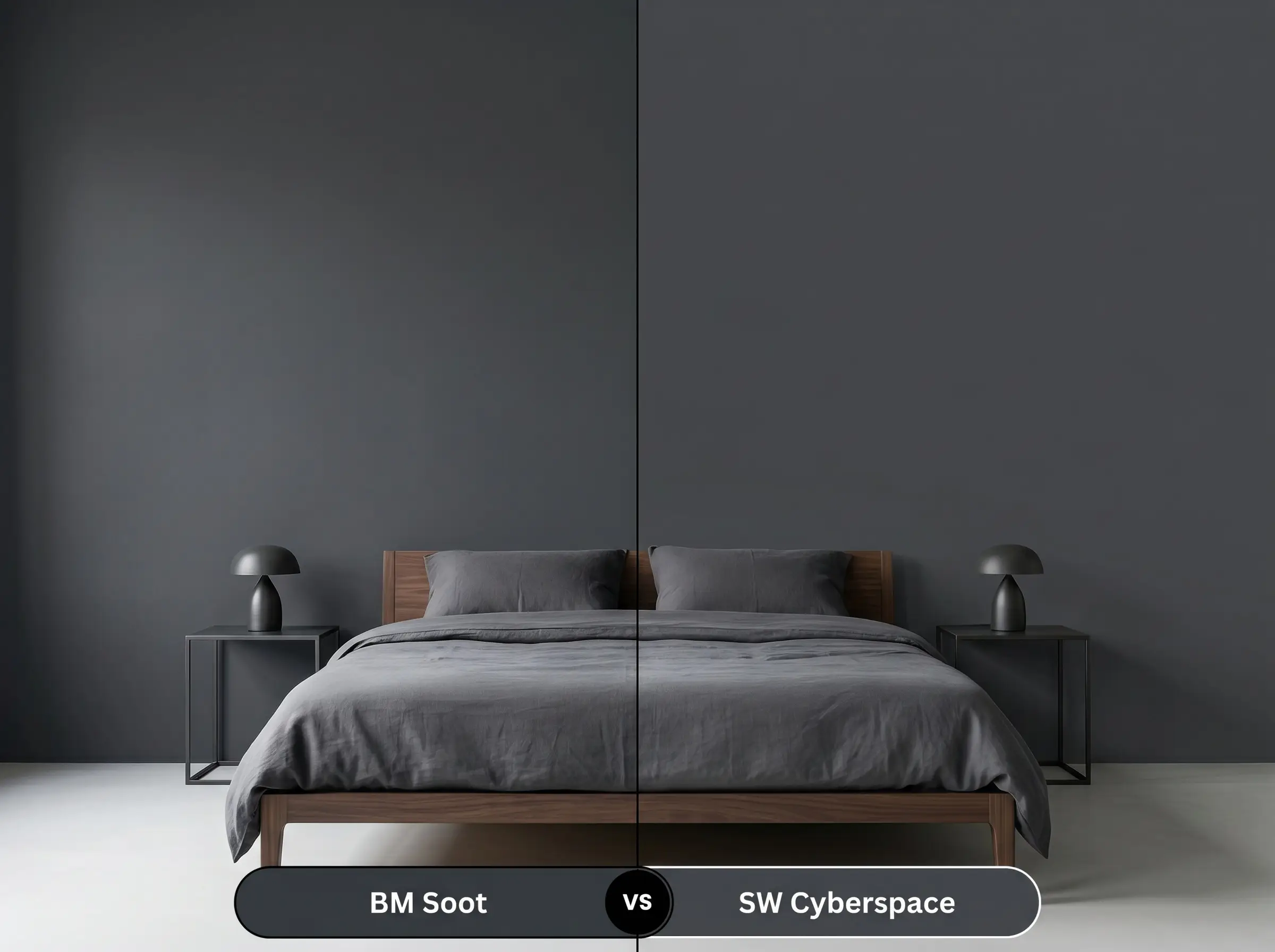
These two colors operate in a very similar depth, but they behave differently once applied to a large wall. Cyberspace leans much further into its navy identity, often reading as a deeply saturated blue rather than a true soft black. If you want the walls to definitively read as charcoal, stick with BM 2129-20; if you want a moody, undeniable blue, pivot to Cyberspace.
Benjamin Moore Soot vs. Benjamin Moore Hale Navy HC-154
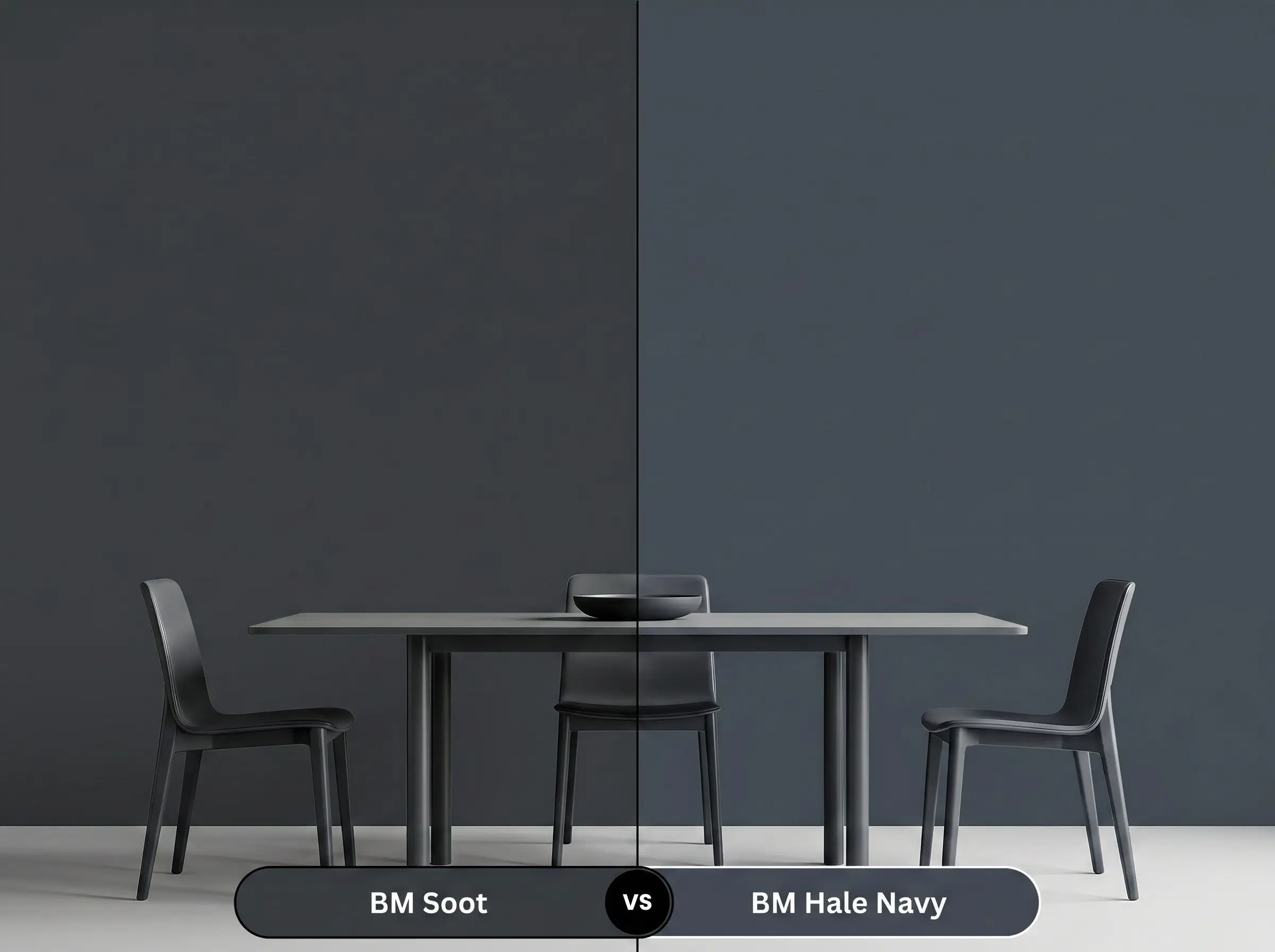
Hale Navy is an iconic, deeply traditional maritime blue, whereas our primary charcoal is a stark black alternative with merely a hint of blue. Hale Navy will always look like a blue paint, regardless of the lighting conditions. If you are aiming for a highly modern, graphic aesthetic, the charcoal provides a much sharper, more tailored finish.
Benjamin Moore Soot vs. Farrow & Ball Railings No. 31
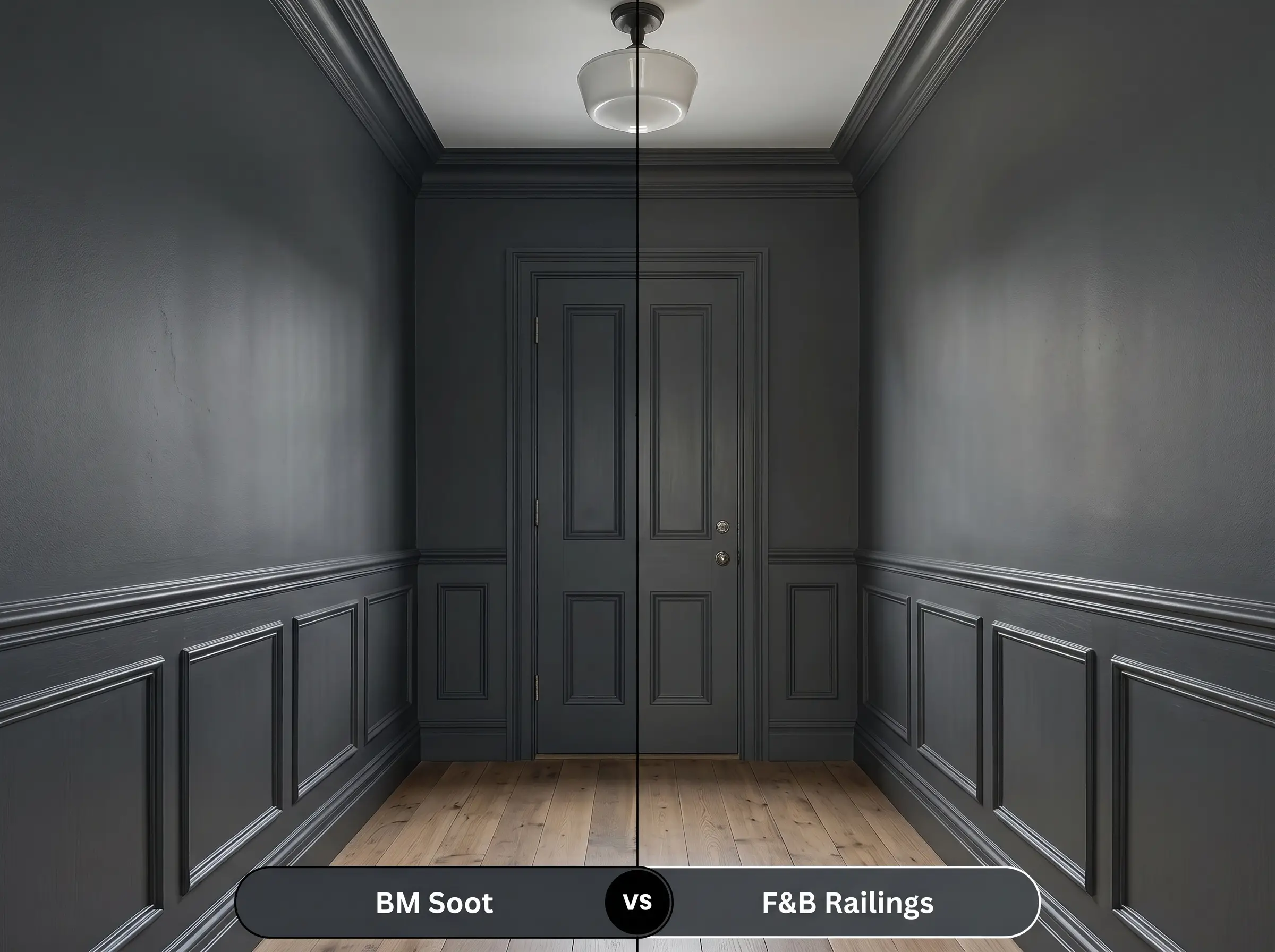
Railings is famous for its exceptionally soft, historical blue-black finish that feels almost powdery on the wall. While both colors share a cool undertone, Railings has a slightly more muted, aged quality that thrives in heritage homes. If you are working with sleek, modern architecture, the Benjamin Moore option delivers a crisper, more saturated punch.
Exploring Alternative Dark Tones
Sometimes a room demands a slightly different energy, whether that means pulling back on the blue cast entirely or dropping the light reflectance value even further to create a true shadow.
Same-Brand Alternatives
Cross-Brand Matches
Execution Strategy and Application
Transitioning from a tiny paper paint chip to a fully saturated room requires a specific technical approach. Dark colors demand perfect execution, as their low light reflectance value will mercilessly highlight any drywall imperfections or roller marks.
The Dynamic Sheen Guide
Priming and Coverage
You cannot successfully apply this depth of color over a standard white wall without the proper foundation. You must use a high-quality primer tinted to a deep gray base. This crucial step ensures the cool blue-gray cast develops accurately and prevents the old wall color from bleeding through and muddying the finish.
Even with a tinted primer, expect to roll at least two full coats for a professional, opaque result. Dark paints are notoriously prone to “flashing”—a frustrating visual failure where uneven roller pressure leaves visible, shiny streaks across the wall. To avoid this, maintain a wet edge while painting and resist the urge to touch up small spots as the paint is drying.
Frequently Asked Questions
Direct sunlight will absolutely strip away the darkness of the charcoal and amplify its cool undertones. On a bright afternoon, the brick will read as a deeply saturated, moody navy rather than a true black, which looks incredibly striking against crisp white exterior trim.
Applying a high-gloss sheen acts like a mirror for ambient light, which dramatically enhances the blue-gray cast. The glossy finish will make the cabinets look more like a rich, dimensional gemstone and less like a flat, shadowy charcoal.
Because this paint has an exceptionally low LRV, painting the ceiling actually blurs the hard architectural lines of the room, making the corners disappear. Rather than feeling claustrophobic, the ceiling will recede into the shadows, creating an expansive, cinematic atmosphere.
The contrast between the cool walls and the warm oak flooring is exactly what makes this pairing so successful. The natural, earthy warmth of the wood beautifully balances the steely edge of the paint, ensuring the room feels welcoming rather than sterile.
The Final Verdict on This Moody Charcoal
Benjamin Moore Soot is an exceptional design tool for homeowners who want to introduce dramatic tension into their spaces without resorting to a harsh, absolute black. Its brilliant cool-toned profile makes it the ultimate choice for sleek modern kitchens, deeply enveloping primary bedrooms, and striking exterior accents. It performs best when it is allowed to act as a definitive architectural boundary, grounding lighter colors and framing premium metallic finishes.
You must be highly strategic when pairing this specific charcoal with dominant, yellow-toned finishes like golden oak cabinetry or outdated beige carpets. Because the paint relies on a distinct, cool blue-gray base, placing it directly against strong, artificial yellows will cause a jarring temperature clash. The cool walls will make the yellow elements look overly brassy and dated, while the yellow will pull an unwanted, icy harshness out of the paint. If you are working around fixed, warm-toned elements, you are much better off pivoting to a warmer, browner soft black to maintain a cohesive, elegant flow.
Hackrea Design Secret (The Temperature Clash)
Closest Cross-Brand Equivalents
The absolute closest scientific color matches for Soot across top paint brands.