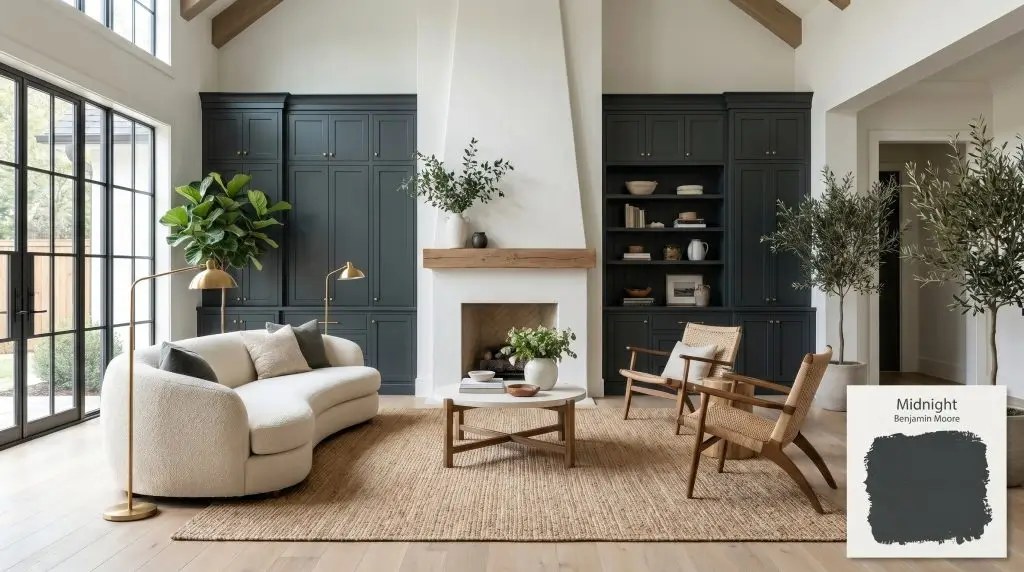
Benjamin Moore Midnight 2131-20 is a decadent, near-black charcoal with a distinct trace of cool blue. With an LRV of 6.2, it acts as a moody, sophisticated alternative to stark black, offering deep oceanic undertones that shift beautifully under different lighting conditions.
Will Midnight clash with your room?
Paint Technical Profile
| Color ID / SKU | 2131-20 |
| HEX Code | #373D3F |
| Light Reflectance (LRV) | 6.2 |
| Temperature | Cool |
| Primary Undertone | Blue |
| Hidden Undertones | Green, Charcoal |
| Use | Interior, Exterior |
| Best Exposures | South-Facing, West-Facing |
| Best For | Home theaters, kitchen islands, accent walls, exterior siding, interior doors |
Midnight Digital Design Concept Boards
Home Theaters and Media Rooms
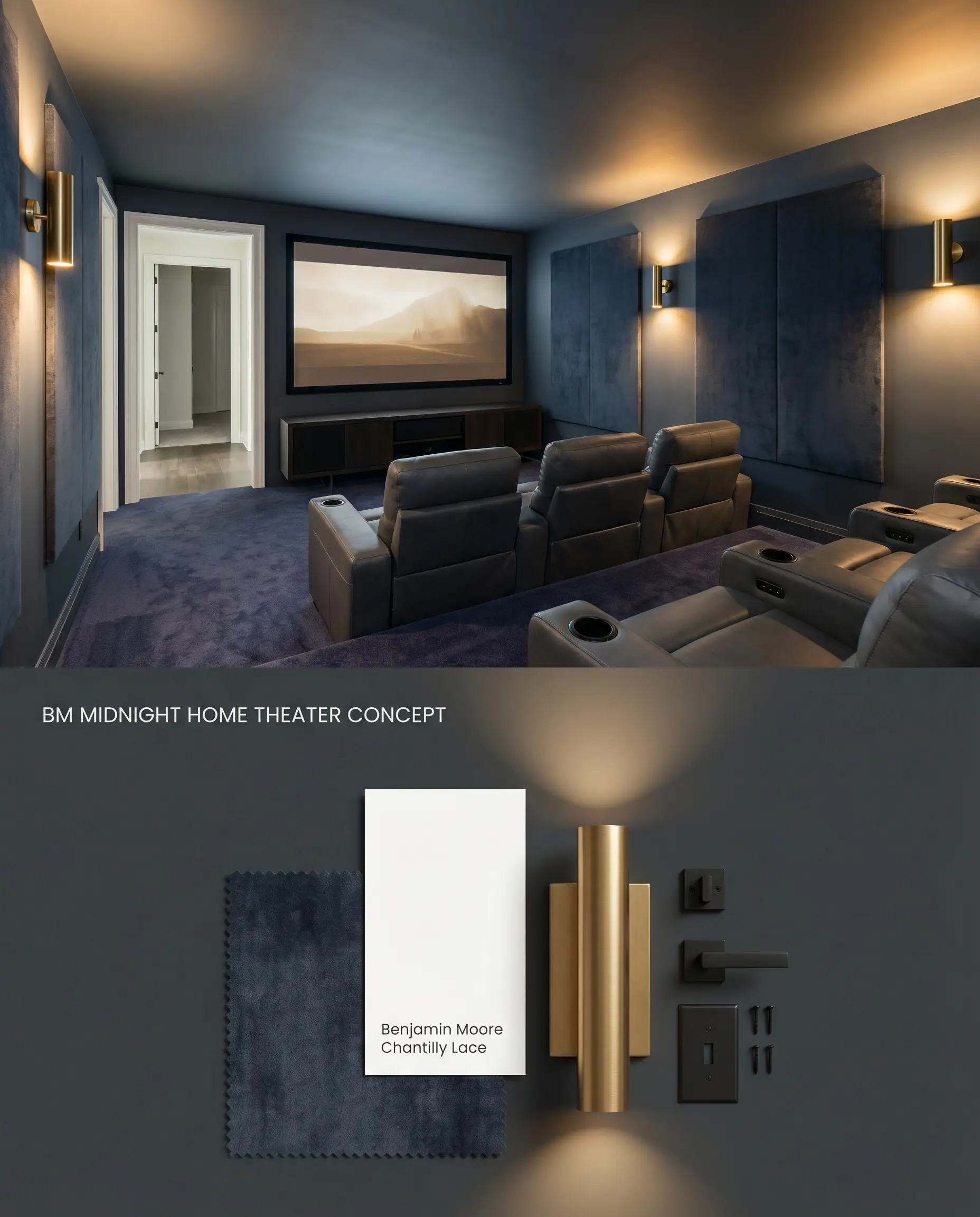
Benjamin Moore Midnight utilizes its low chroma charcoal base to excel in controlled lighting environments by eliminating screen glare and visual distractions. In windowless spaces, the absence of natural light prevents the oceanic undertones from surfacing, allowing the color to read as a dense, flat black. This creates a continuous, uninterrupted dark envelope that maximizes projector contrast and anchors the viewing area.
Kitchen Islands and Base Cabinets
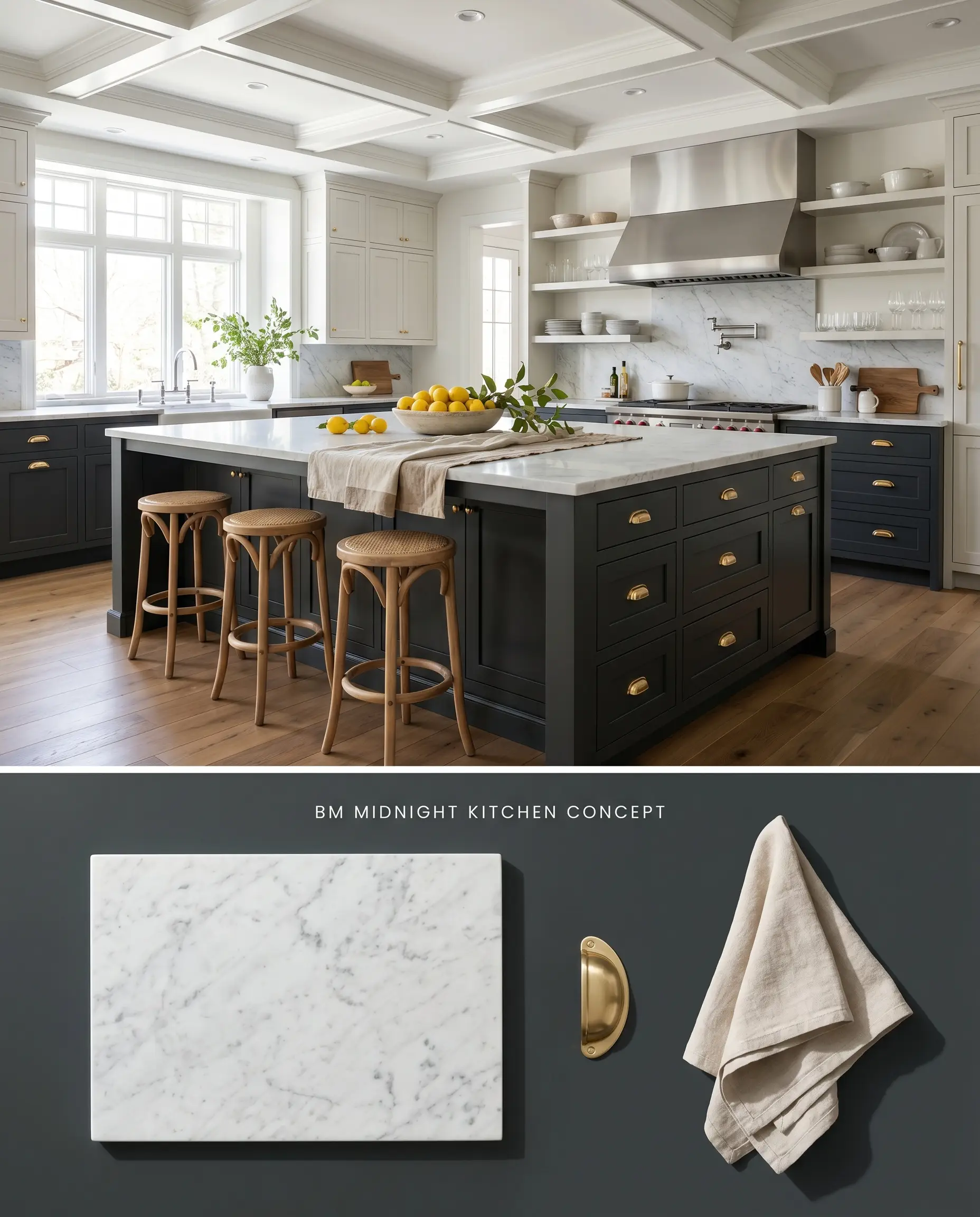
Grounding a kitchen with a dark base allows upper cabinetry and natural stone counters to feel remarkably lighter by structural contrast. Under bright overhead task lighting, Benjamin Moore Midnight reveals a subtle cool cast, shifting toward a moody teal that pairs beautifully with warm metallic fixtures. The deep value anchors the center of the room while hiding daily scuff marks near the floor line.
Exterior Siding and Shutters
Will Midnight work with your specific lighting, floor, or furniture?
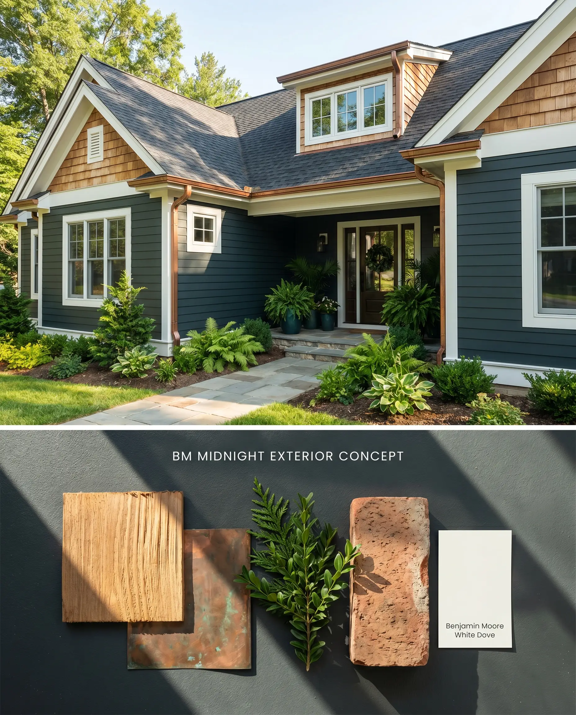
Full sun exposure strips away the perceived blackness of this shade, pulling its underlying blue and green pigments to the forefront. This transforms the exterior into a rich, atmospheric design that interacts dynamically with surrounding native landscaping. The low light reflectance value (LRV) creates a stark, high-contrast boundary against crisp white trim, aggressively sharpening exterior architectural lines.
Interior French Doors and Trim
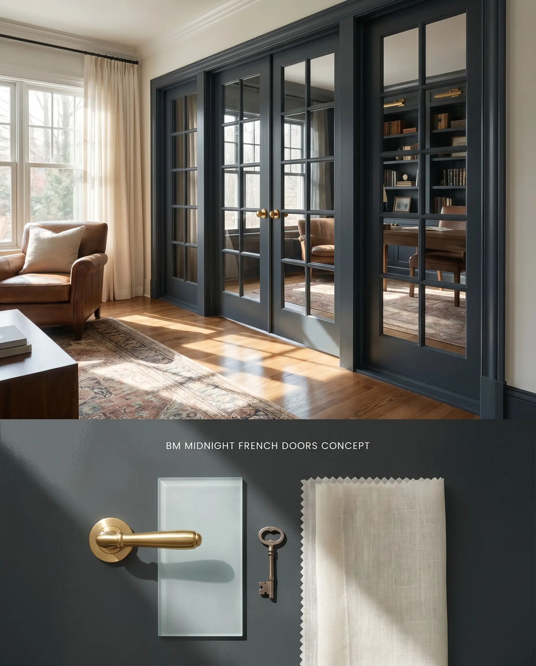
Will Midnight work with your specific lighting, floor, or furniture?
Coating interior mullions and casings in a decadent black frames adjoining rooms like a physical photograph, drawing the eye directly through the glass rather than stopping at the door. This dark architectural finish minimizes the visual bulk of the wood framing, making standard doors appear custom and highly tailored. This technique works exceptionally well when connecting a brightly lit living space to a darker, light-controlled study.
Dramatic Accent Walls
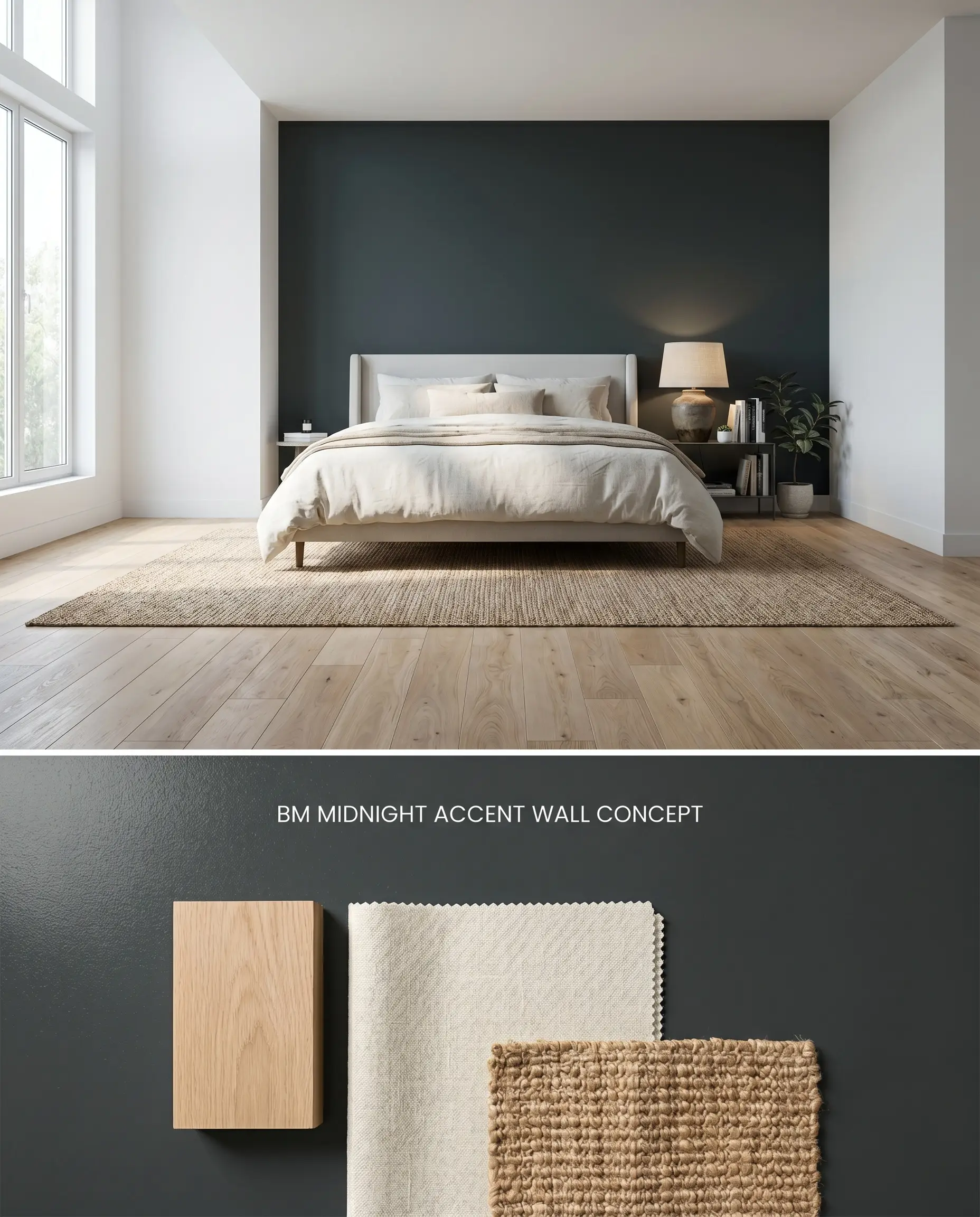
A single dark wall manipulation alters the perceived depth of a room, visually pushing the physical boundary backward to create the illusion of expanded space. When applied behind a bed or a fireplace, it acts as an anchoring focal point that absorbs ambient shadows. To prevent burnishing and flashing during touch-ups, selecting a finish with a slight sheen rather than a pure flat is critical for long-term maintenance.
Comparative Color Theory: Midnight vs. Rival Dark Tones
Benjamin Moore Midnight 2131-20 vs. Sherwin-Williams Iron Ore SW 7069
Sherwin-Williams Iron Ore SW 7069 (LRV 6.15) is a charcoal gray with a distinct brown and warm undertone, whereas Benjamin Moore Midnight 2131-20 leans firmly into a cool cast of blue and green. In a south-facing room, Iron Ore SW 7069 will warm up and read almost like a soft, dark taupe-charcoal. Midnight 2131-20, under the exact same southern exposure, will amplify its oceanic undertones and shift toward a dark navy. Specify Iron Ore SW 7069 when pairing with warm earth tones, natural terracotta, or red brick, and specify Midnight 2131-20 when working alongside cool marbles, stark whites, or brushed steel.
Benjamin Moore Midnight 2131-20 vs. Benjamin Moore Soot 2129-20
Will Midnight work with your specific lighting, floor, or furniture?
Benjamin Moore Soot 2129-20 (LRV 6.1) shares a nearly identical depth but lacks the pronounced green trace found in the color structure of Benjamin Moore Midnight 2131-20. Soot 2129-20 operates as a cleaner, cooler slate-black that shifts almost entirely blue in natural light. Midnight 2131-20 utilizes a complex blue-green base, making it slightly more versatile in transitional lighting by bridging the gap between navy and deep teal. For a pure, icy charcoal-blue effect, Soot 2129-20 is the correct specification; for an atmospheric, nuanced shade that adapts to surrounding exterior foliage or warm interior lighting, Midnight 2131-20 is the superior choice.
Benjamin Moore Midnight 2131-20 vs. Farrow & Ball Railings No. 31
Farrow & Ball Railings No. 31 is renowned for its soft, blue-black profile paired with a highly matte, chalky finish. While Benjamin Moore Midnight 2131-20 provides a very similar aesthetic, Benjamin Moore’s colorant system and resin technology offer higher durability in scrubbable finishes, which is vital since flat dark paints are prone to burnishing. Railings No. 31 delivers a softer, more historical, aged appearance due to its specific pigment mix. Specify Railings No. 31 for low-traffic historic restorations where absolute matte depth is required, but rely on Midnight 2131-20 for high-traffic modern applications like kitchen islands or family room built-ins where washability is paramount.
Technical Specifications & Application FAQs
North-facing light naturally casts a cool, bluish tint, which will pull forward the inherent blue and green undertones of Benjamin Moore Midnight. In these exposures, it rarely reads as a true black and will distinctly present as a dark navy or moody teal.
Professional matchers strictly recommend a high-quality, dark tinted primer to achieve an even film build. Applying Benjamin Moore Midnight directly over a light substrate without a tinted primer often results in uneven coverage and requires excessive topcoats.
In a completely windowless media room, Benjamin Moore Midnight functions flawlessly as a dense, flat black, absorbing projector scatter and eliminating glare. Because the lack of natural light suppresses its blue-green undertones, it performs functionally identical to a true black in this specific environment.
Room Compatibility & Clashes Diagnoses
Hackrea's reports evaluating the compatibility of Midnight in real rooms.No compatibility tests for Midnight yet.
Be the first to see how this color reacts to your space. Run a free architectural diagnostic now.
Paint Aesthetic & Practical Analysis
| Profile | Analysis | |
|---|---|---|
| Aesthetic | Midnight by Benjamin Moore is an incredibly sophisticated take on off-black. It avoids the harshness of a pure black by leaning heavily into its cool blue and green undertones, making it an exceptional choice for grounding a room without deadening the space. It is highly favored for media rooms and dramatic cabinetry. | |
| The Coverage Catch | Achieving an even film build is critical for this deep shade. Professional matchers note that thorough prep and a dark tinted primer are necessary to ensure full coverage over lighter substrates. | |
| The Lighting Shift | While it reads as a decadent black, a distinct trace of blue and green comes through. In well-lit spaces, it can lean toward a dark navy or moody teal rather than a true black. | |
| The Low Light Trap | In windowless media rooms or basements - a highly popular application for this specific shade - it absorbs light beautifully, acting as a heavy, flat black that eliminates screen glare. | |
| The Touch Up | The chosen sheen significantly changes how this color reads. Gloss makes surface marks highly visible, while flatter finishes soften the effect but are prone to burnishing and flashing during touch-ups. |
Closest Cross-Brand Equivalents
The absolute closest scientific color matches for Midnight across top paint brands.