Boothbay Gray HC-165
Benjamin MooreBenjamin Moore Boothbay Gray (HC-165) is a medium-toned, cool blue-gray paint color with an LRV of 43.26. Featuring subtle green undertones, it behaves like a versatile chameleon, shifting between a steely slate gray and a soft coastal blue depending on your room's lighting.
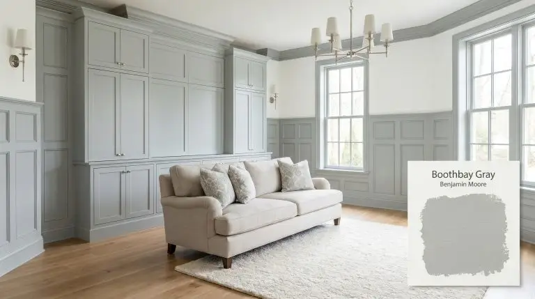
| Temperature | Cool |
|---|---|
| Primary Undertone | Blue |
| Hidden Undertones | Green and Slate |
| Best Exposures | South-facing or West-facing |
| Best For | Kitchen cabinets, bedroom walls, bathroom vanities, laundry rooms, coastal exteriors |
Hackrea Review
Boothbay Gray is one of those rare, moody blue-grays that doesn't feel overly heavy. We love it for kitchen islands and bathroom vanities, where its subtle green wink adds incredible depth without screaming 'blue'. It’s a sophisticated, coastal-leaning staple.Medium-Toned Architectural Finish Applications
Kitchen Cabinets & Islands
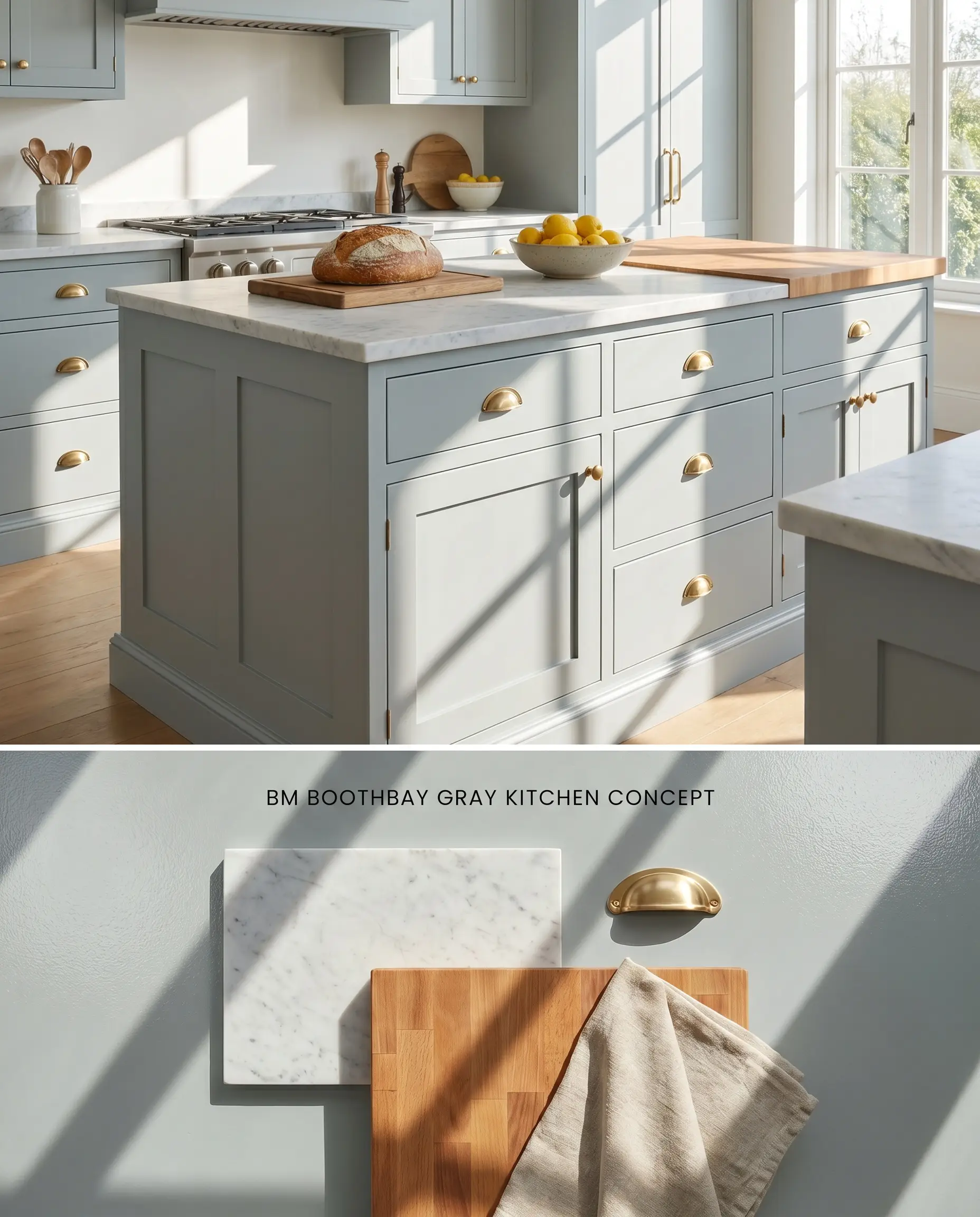
This medium-toned architectural finish grounds a kitchen when applied to lower cabinetry or center islands, physically absorbing the starkness of polished quartz countertops. The steely slate base prevents the blue from turning juvenile, while the 43.26 light reflectance value anchors the sightline below eye level.
Bedroom Walls
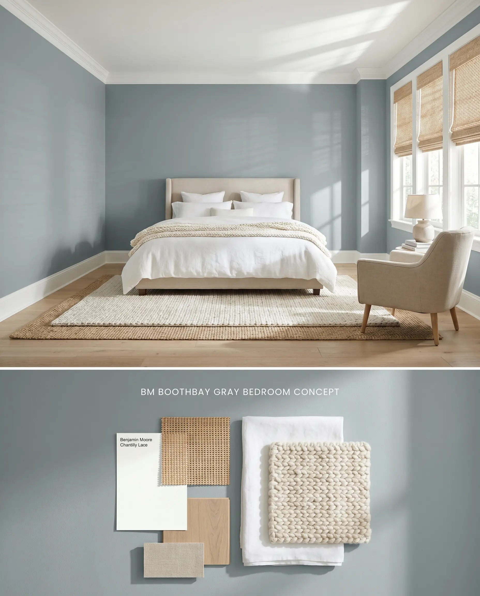
When wrapped around an entire primary suite, the coastal blue-gray pigment visually recedes, expanding the perceived footprint of the room. Crisp white linens and natural woven window treatments interrupt the color block, preventing the bounce effect from amplifying the blue cast on all four walls.
Bathroom Vanities
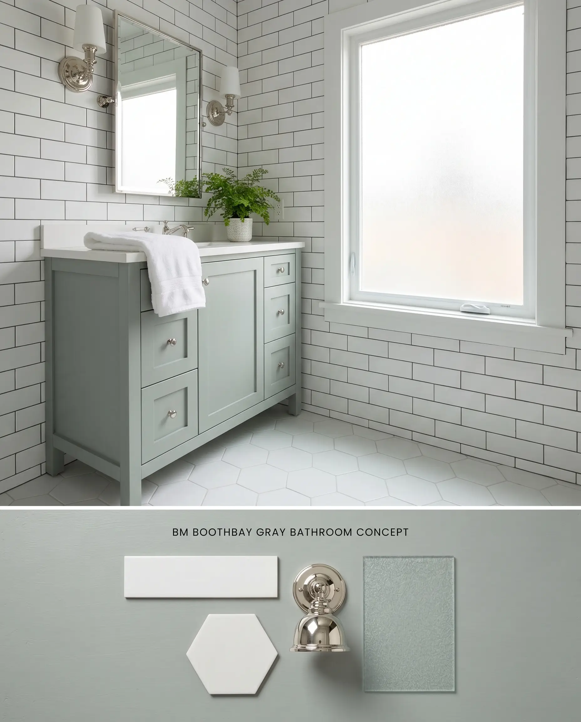
In a well-lit washroom featuring a prominent frosted window, Benjamin Moore Boothbay Gray HC-165 introduces a cool, structural focal point against white subway tile. Applying this shade strictly to the vanity limits its footprint, avoiding the low-light trap of windowless bathrooms where the pigment loses its dimension and falls flat.
Coastal Exterior Siding
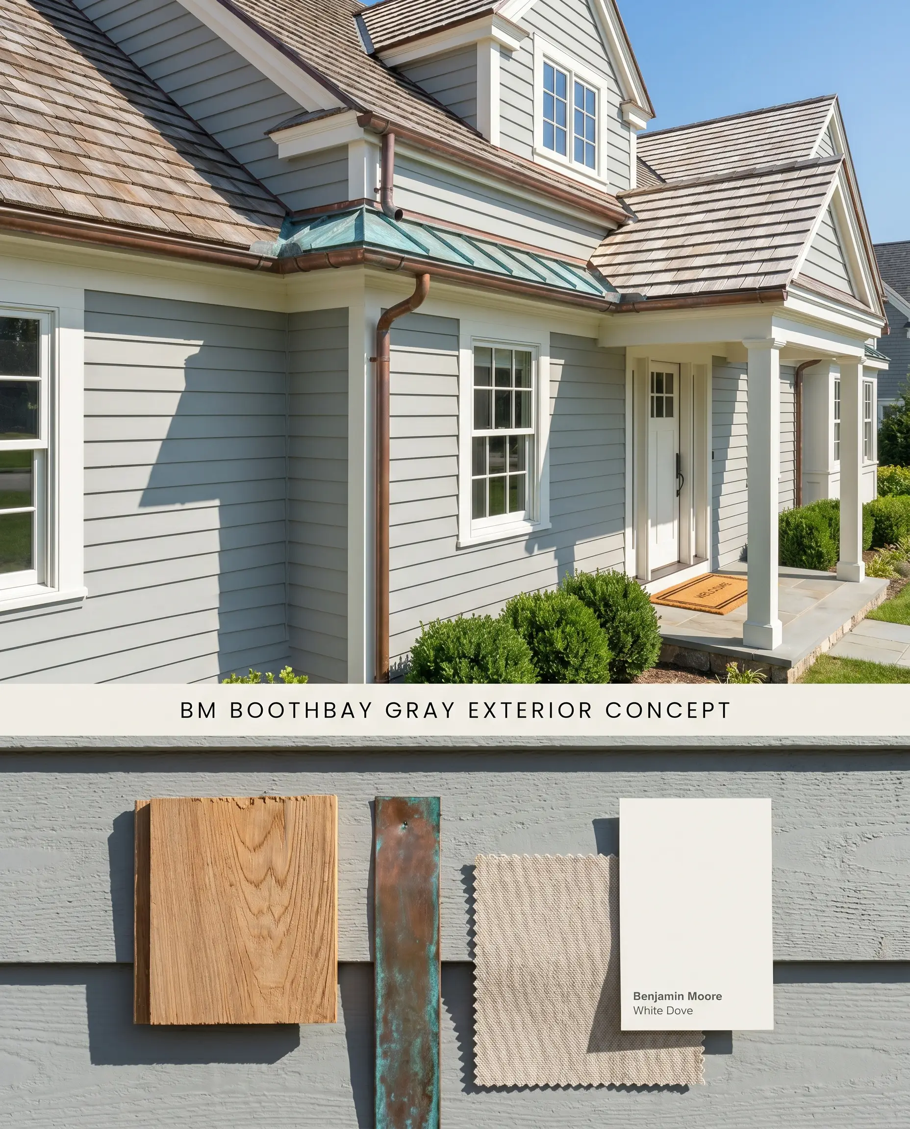
Stripping away the confines of interior walls, direct sunlight washes out the darker gray elements of this historical collection shade, rendering it a breezy coastal blue. Paired with cedar shake roofing, the natural wood tannins physically ground the vibrant color shift.
Laundry Room Millwork
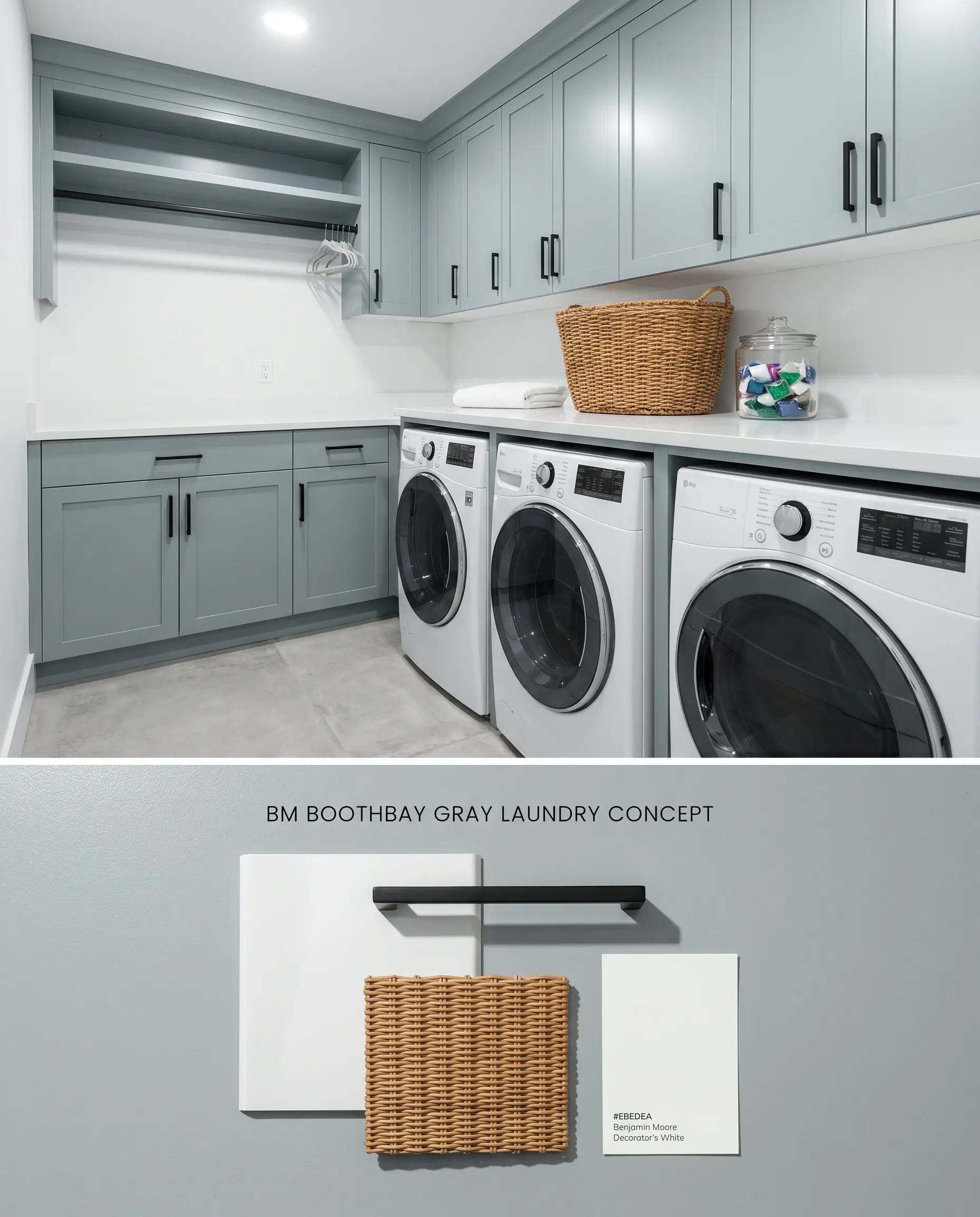
Utilizing this cool-toned cast on utility room cabinetry cuts through the harsh, artificial LED lighting typical of utility spaces, maintaining its structural gray identity without leaning purple. The rigid pigment provides a sharp visual boundary against high-gloss white appliances.
You can apply wallpapers, paints, etc. on walls and see how they look in various interiors.

Tonal Comparisons & Color Shift Dynamics
Benjamin Moore Boothbay Gray HC-165 vs. Benjamin Moore Gray Owl OC-52
Benjamin Moore Gray Owl OC-52 registers with a significantly higher LRV of 65.77, functioning as a true light gray with a green-yellow undertone, whereas Benjamin Moore Boothbay Gray HC-165 sits at 43.26. In south-facing light, Gray Owl reflects ambient rays to read as a warm, almost luminous neutral, while Boothbay Gray absorbs that same light to hold its ground as a definitive blue-gray. Use Gray Owl for expansive, open-concept walls needing maximum light reflection, and reserve Boothbay Gray for grounded focal points like wainscoting or built-in cabinetry.
Benjamin Moore Boothbay Gray HC-165 vs. Benjamin Moore Mount Saint Anne 1565
Benjamin Moore Mount Saint Anne 1565 leans directly into the blue-green hue family, presenting as a muted teal compared to the steely slate neutrality of Benjamin Moore Boothbay Gray HC-165. Both occupy a similar mid-tone LRV range, but Mount Saint Anne lacks the strict gray base that keeps Boothbay Gray restrained in shifting light. Select Mount Saint Anne for a distinct, historically inspired dining room, and choose Boothbay Gray when you need a cooler backdrop that avoids reading overtly pastel.
Benjamin Moore Boothbay Gray HC-165 vs. Sherwin-Williams Mineral Deposit SW 7652
Sherwin-Williams Mineral Deposit SW 7652 strips away the blue entirely, exposing a rigid, green-leaning gray that feels significantly colder and more industrial. Benjamin Moore Boothbay Gray HC-165 maintains a softer, coastal blue-gray edge that interacts favorably with warm wood tones. Specify Mineral Deposit for modern, concrete-dominant architectural spaces with stark northern light, and deploy Boothbay Gray in transitional homes where the blue cast bridges the gap between traditional millwork and modern fixtures.
Technical FAQs for Boothbay Gray
Yes, the cool, indirect light of a north-facing room causes the gray base to recede, amplifying the blue cast significantly. To counteract this, use warm 3000K artificial lighting or pair the paint with rich, warm-toned wood furnishings.
These two colors clash aggressively due to competing undertones. The green-yellow base of Agreeable Gray forces Boothbay Gray to look overly blue, while the cool slate base makes the greige appear muddy and dirty.
South-facing light physically warms the paint, pulling a subtle wink of green to the surface. This prevents the color from feeling icy and creates a balanced, steely slate appearance throughout peak daylight hours.
With an LRV of 43.26, this color traps shadows and falls flat in spaces lacking natural light. It must be strictly avoided in windowless bathrooms unless applied exclusively to a vanity and mitigated by intense, layered artificial lighting.
Similar Paint Colors
Same Brand
Cross-Brand Equivalents