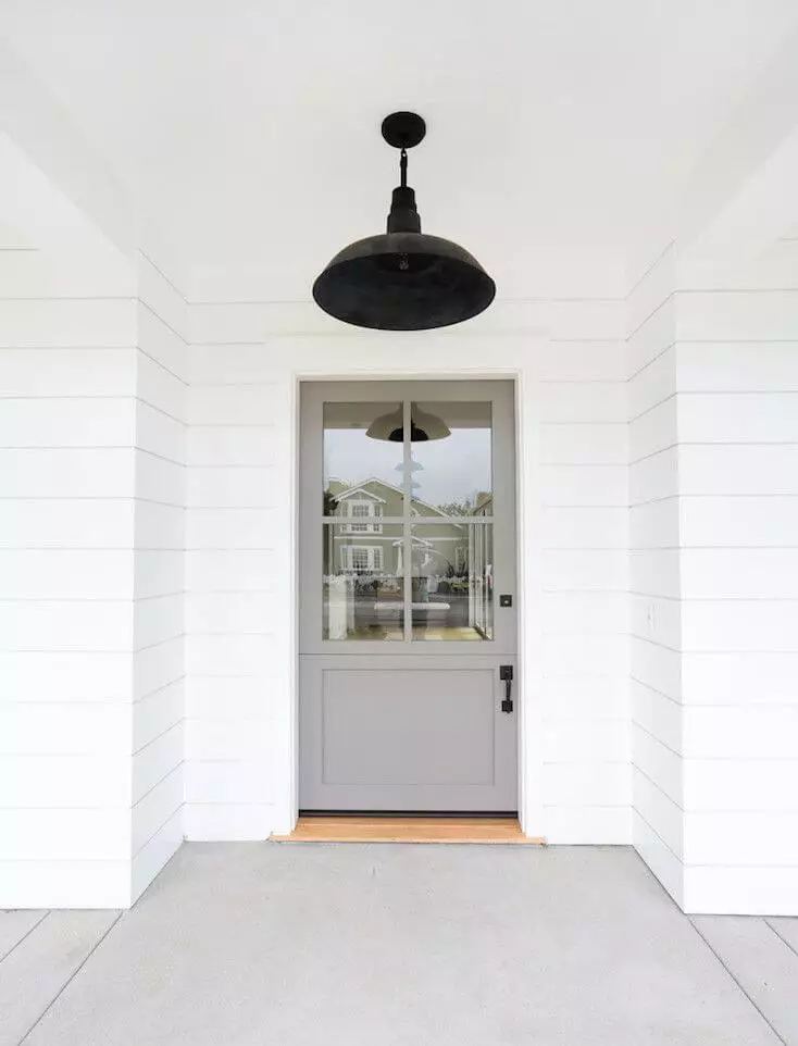
Gray Owl OC-52
Benjamin MooreA delightful shade of gray with a neutral-to-cool base and exceptionally slight blue-green undertones.
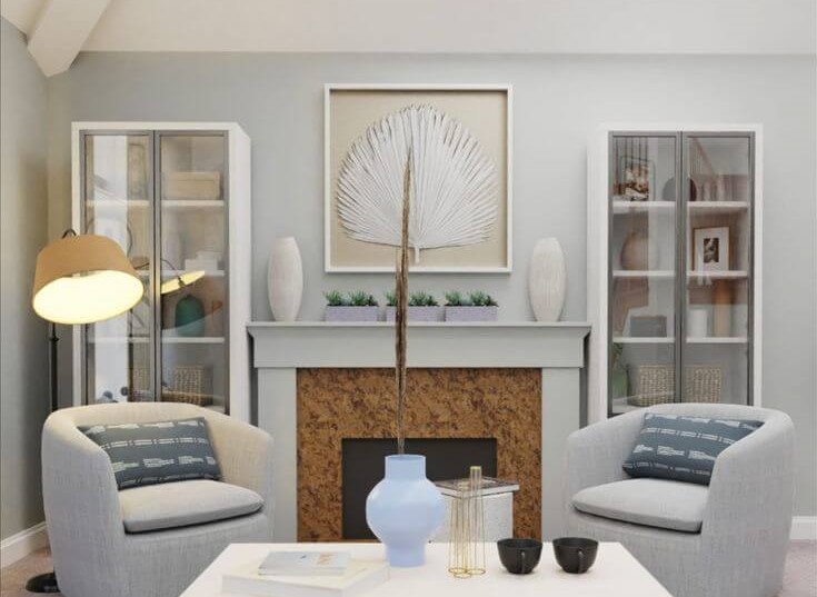
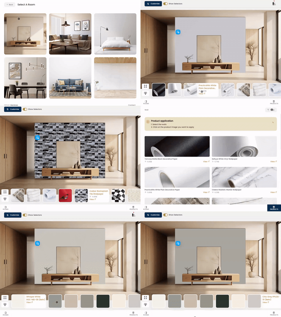
Try Gray Owl paint in a room with Hackrea Visualizer
Gray Owl OC-52 (Benjamin Moore): what color is, review, and use
Homeowners and designers have switched to rather warm colors and give preference to warm neutrals, particularly warm grays or shades of greige, which are a combination of gray and beige. It is a fact, and we cannot deny it as we cannot overlook the popularity of particular cool neutrals that still reign within the interior design. A significant representative of this kind is Gray Owl from Benjamin Moore.
Gray Owl OC-52, also known as 2137-60, is a delightful shade of gray with a neutral-to-cool base and exceptionally slight blue-green undertones. It is one of the most popular grays at Benjamin Moore, and the fact that it still prevails at times when warm shades are prioritized is a reliable reason to state that this color is indeed special. Let’s start with the basics! Gray Owl is part of the Color Preview collection, replicating a saturated shade that illuminates the space with its pure and clean features. If we were to refer to the name, we would immediately find the resemblance between this particular hue and the coloring of the Great Gray Owl. It seems that Benjamin Moore has indeed prepared a fascinating color, and we will dig deep into the science behind such a fabulous shade.
Gray Owl paint color features
The newly discovered shade, which has been popular for a long time, stands out in an era of warm and soft shades. Gray Owl is an exquisitely light gray that reads neutral to cool. Still, what makes it receive such a great amount of love? That is when we reveal one of the secrets. OC-52 is actually a perfect balance of cool and warm undertones that leads to a rather soft effect, although the color indeed leans towards the cool side. Depending on the light, it may put on different masks and appear whether too cool, slightly warmer, or penetrated by green/blue undertones. Either way, Gray Owl feels like a breath of an early morning air – fresh, invigorating, and impressive, which is a great complement to any contemporary setting.
You can apply wallpapers, paints, etc. on walls and see how they look in various interiors.
Gray Owl: is it warm or cold?
This is when things get confusing, but this is the price for an indeed perfect color, which we tend to believe doesn’t exist, although Gray Owl is very close to reaching this level. Some may see this color as cool, with blue notes trying to penetrate the surface. Others may see it rather warm, and neither would be wrong. This color reads differently in specific lighting conditions. This is why you should experiment with a sample in your interior and note what direction it takes. Still, in ideal conditions, it is a neutral-to-cool shade.
How does lighting affect Gray Owl?
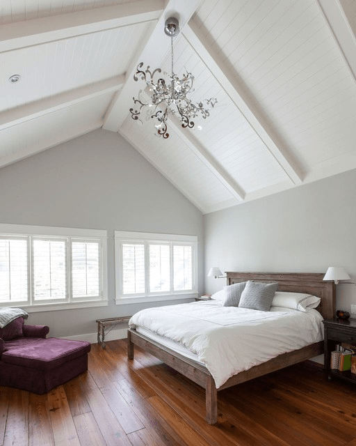
That is when everything gets clarified. Let’s analyze this aspect from all perspectives! Gray Owl is more intense and brings its entire range of notes to the surface in south-facing rooms, particularly the warm ones, adding a pleasant soft effect. On the opposite side, OC-52 comes off a bit cooler, penetrated by green/blue undertones, in north-facing rooms. The situation doesn’t stay the same in west-facing spaces, where this shade looks cooler in the morning and warmer in the evening, and quite the opposite for east-facing rooms. The same goes with artificial lighting when the cooler or warmer undertones bring similar notes on the surface of this color. It proves again that lighting is still the one to say the last word, regardless of what a color looks like on a sample.
Gray Owl LRV
Quick reminder: LRV (Light Reflectance Value) is used to determine how light or dark a color is on a scale from 0 to 100, where the former stands for a true black and the latter for the opposite. With a value of almost 66, Gray Owl shows impressive potential for reflecting the light within the room. It indeed brightens up the space and goes a bit beyond its borders. Still, there is a kind of mystery behind this light shade that makes it look intriguing. One should note that this shade is also influenced by the neighboring colors, which reduces a bit from its light character.
Gray Owl undertones
Gray Owl is diluted with a few notes of blue and green, which may appear separately or together under particular conditions. Nevertheless, such a variation of this shade is most common in north-facing rooms, where Gray Owl reveals its cool side. They are not always the same. Sometimes, the blue/green undertones show through very well; other times, they are slightly noticeable, depending on the amount of light.
Similar colors
Even though not that popular now, the list of cool grays would be long enough to cover an entire range of articles if we were to consider every undertone in part, and they all would have something in common with Gray Owl. Of course, we will refer to the most prominent examples from Benjamin Moore and other manufacturers. It is quite impressive to witness how each stands out, although similar to the other ones. Let’s discover them little by little!
Coordinating colors
One of the distinguishing features of this shade is versatility. It works perfectly with almost any contrastive color, being no less cooperative with neutrals, particularly shades of white and other variations of gray. Still, nothing compares with its pairing with bold accents, where Gray Owl serves as a canvas for any contrastive idea. Particularly well work shades of green and blue that go in harmony with the Gray Owl’s undertones. Let’s go through some of the best matching partners!
Use of Gray Owl in interior
Such a perfect shade of gray is a go-to color within any contemporary setting. It is irreplaceable for functional interiors and a true companion for real artists who like to integrate their own design ideas. The green and blue undertones work exceptionally well within coastal settings in combination with shades alike, although this is not the only option. Let’s tackle the most appropriate design solutions!
When Coastal meets Modern
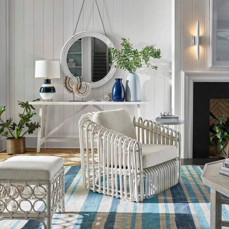
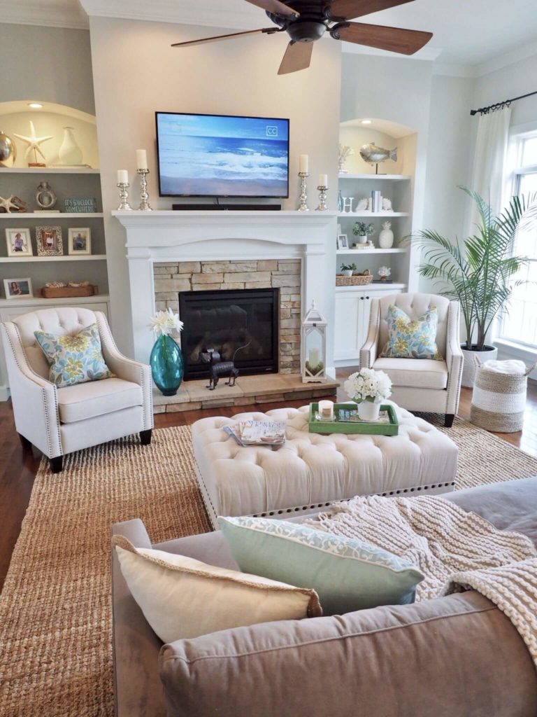
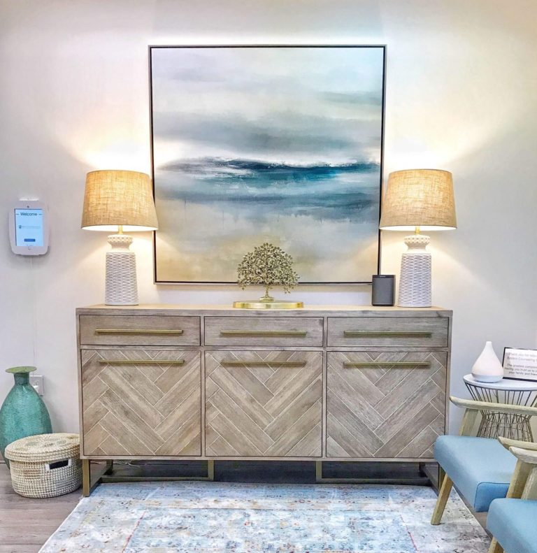
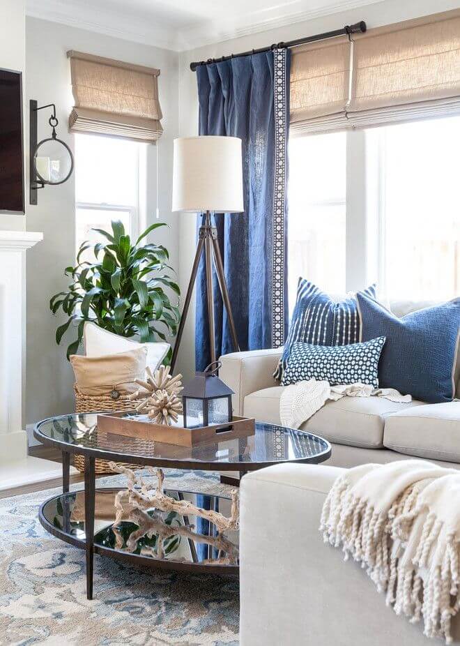
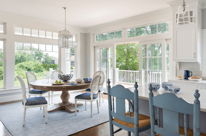
There is magic in the combination of Gray Owl with Coastal since the green and blue undertones lead to an outstanding beach vibe that feels like the ocean breeze and enriches the space with a fascinating sense of freedom and freshness. The traditional coastal with rather rich contrasts would look overwhelmed by walls painted in a shade with similar undertones, while a modern and rather neutral Coastal is the perfect setting for a splash of green and blue. Be it an all-white space with rattan units or a monochromatic room diluted with a few pieces of decor in blue or green. The intriguing shade from Benjamin Moore is the exact element that will ensure the connection between this space and the fresh coastal environment.
Neutral accent
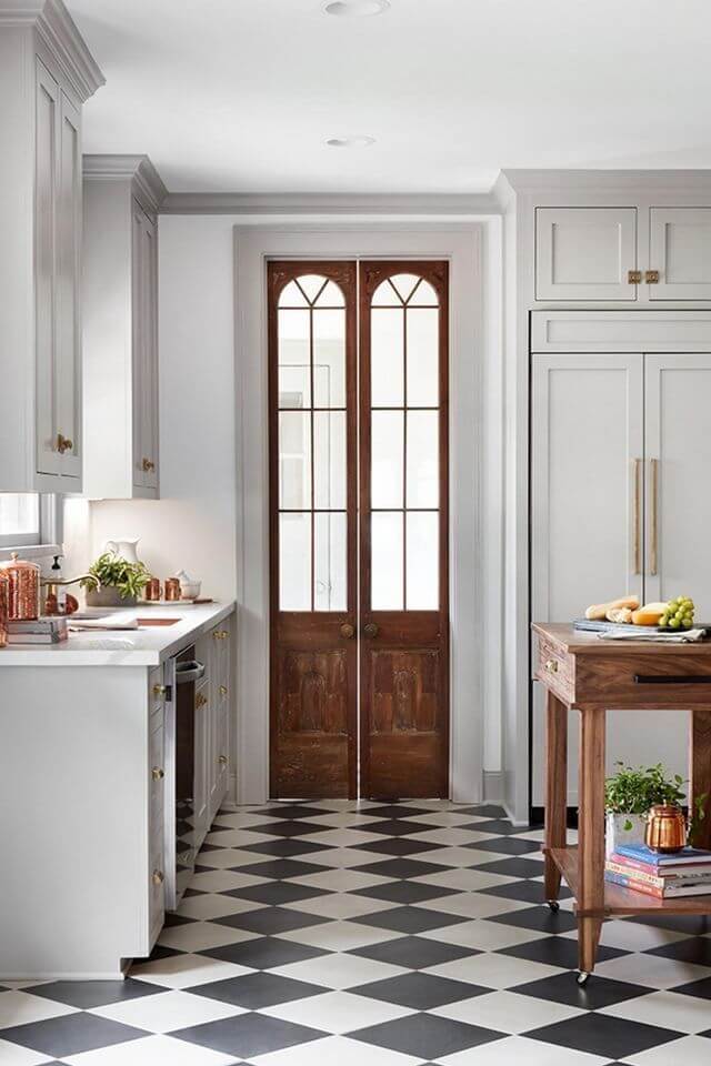
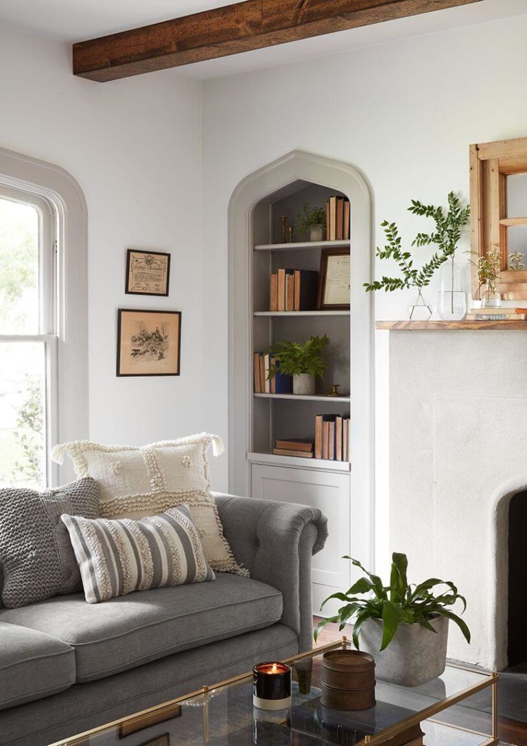
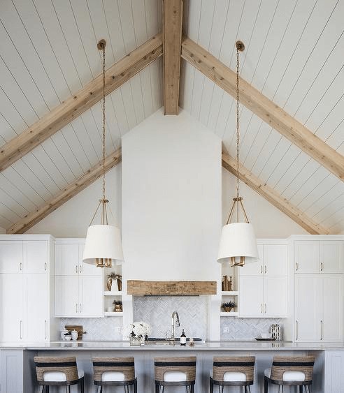
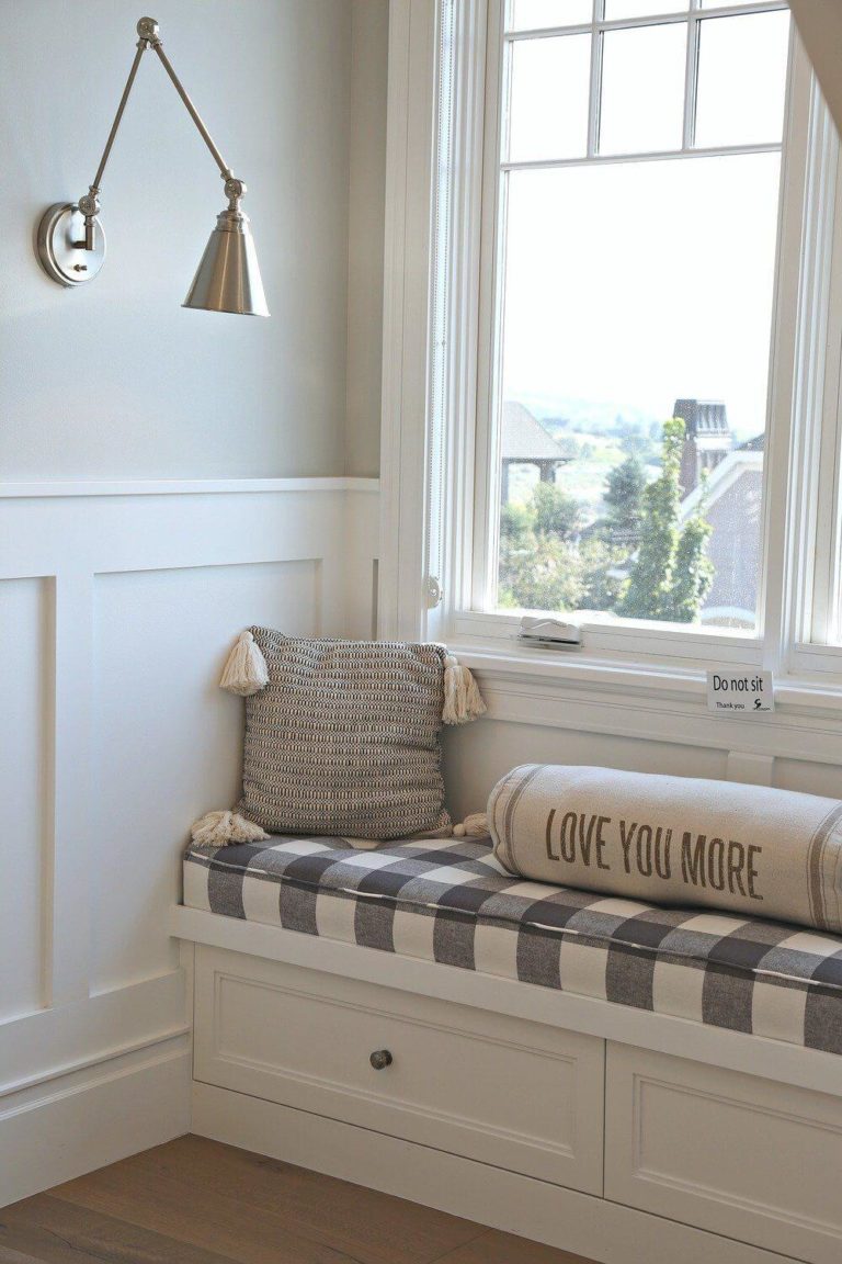
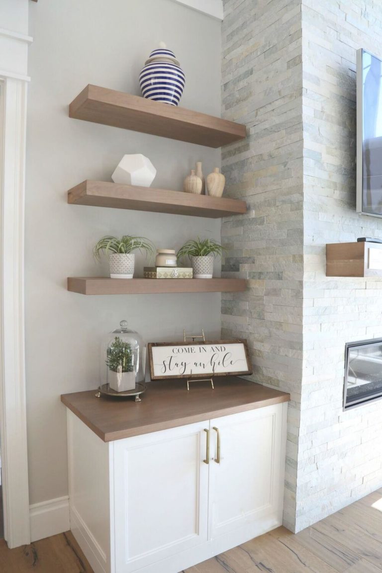
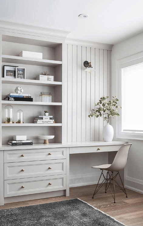
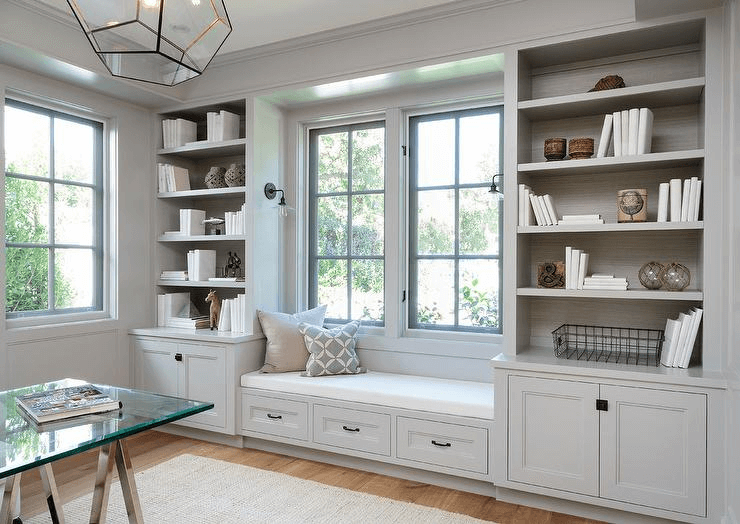
That’s right! Gray can serve as an accent on a white background. Be it the trim, a built-in bookcase in the living room, kitchen cabinetry, an interior door, or even the ceiling. Why this shade particularly? It is perfect for a modern accent variation that is neither too neutral nor too emphasized. It offers the room a bit of shape without diluting the contemporary monochromatic palette too much. This way, one emphasizes neutrality, impartiality, and sleek contemporary air within the interior. The furthest one can go in this sense is by adding natural texture, be it wood or indoor plants for a connection with nature.
Living room
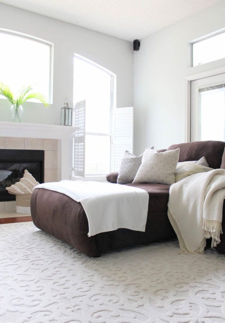
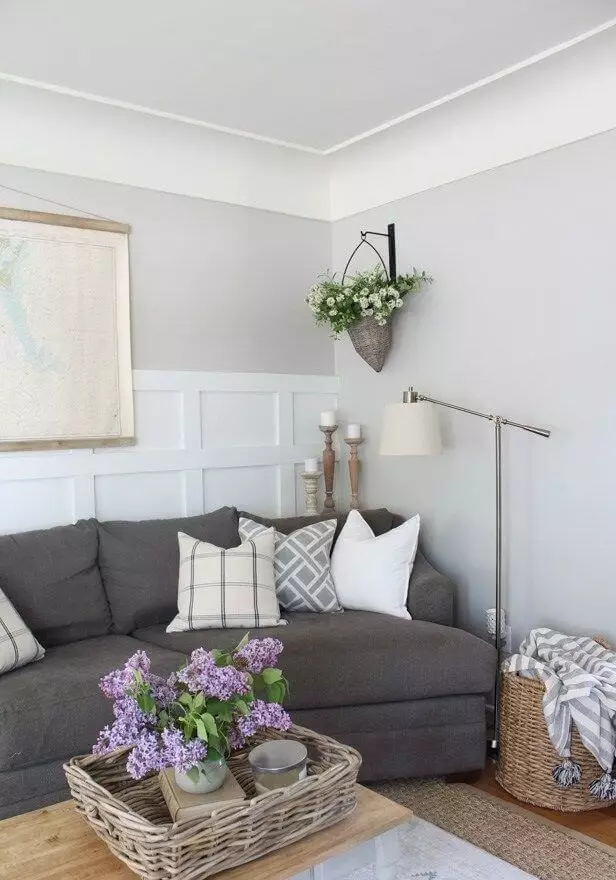
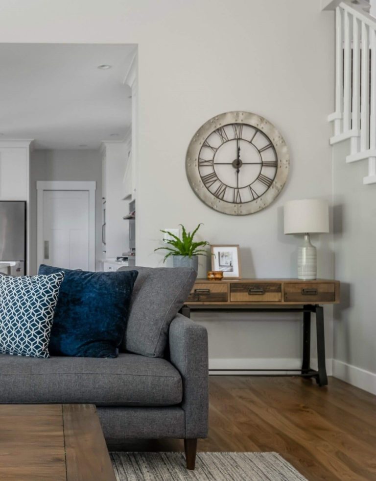
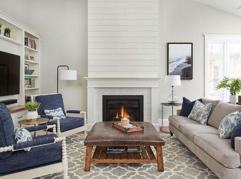
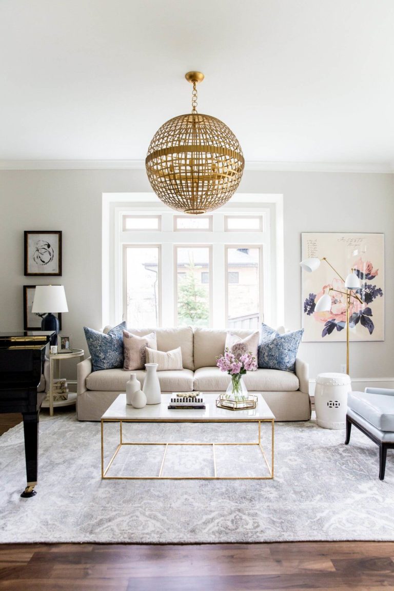
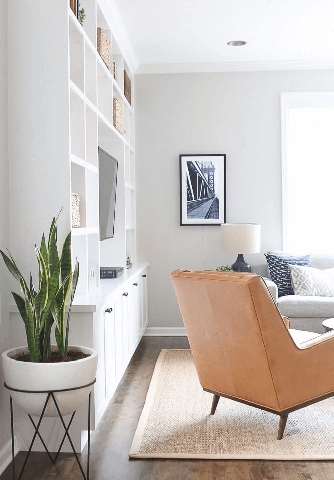
We know how much you want to use this neutral color as a background for splashes of bold colors. We are on the same side. Still, experts suggest keeping it low-key. No bright shades, no accents. Fine, maybe a few exceptions. Gray Owl works very well with green and blue. As regards the rest, consider this shade of gray for the walls and complement them with rather neutral shades for a contemporary approach to Coastal, Modern Farmhouse, Scandinavian, Rustic. One more time, don’t forget about the connection with nature, which can easily be ensured with natural wood and pots with plants.
Bedroom
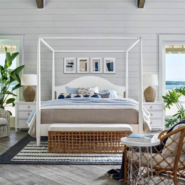
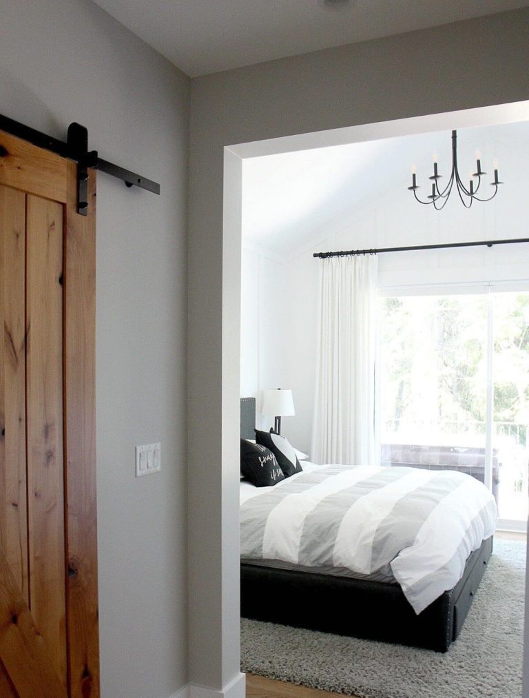
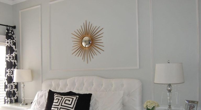
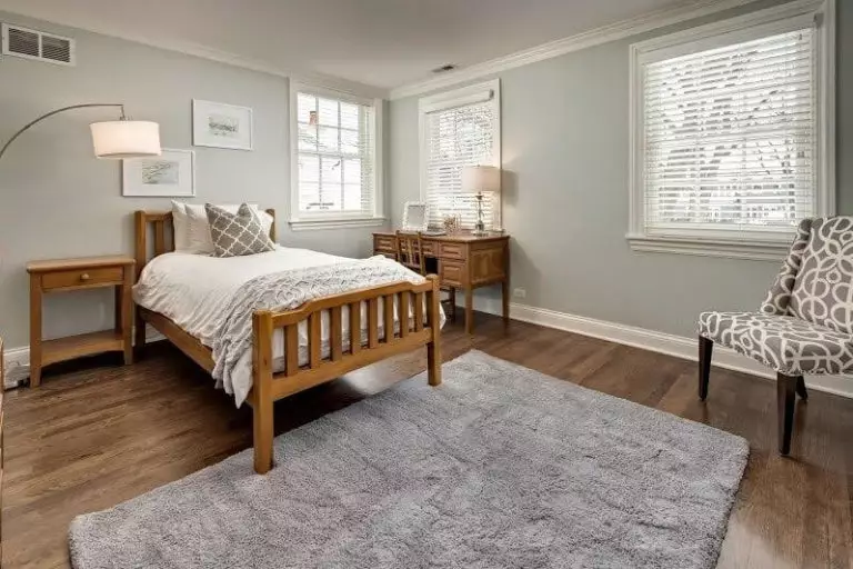
Well, you are not free to play with accents here either, but, believe us, these limits are only there to keep you on the safe side. You could go one of the following ways: an all-white-and-gray bedroom for a fully contemporary setting, gray walls and wood for a rather comfortable approach, or Gray Owl as a backdrop and units peculiar to a particular style for subtle reference to a specific direction. For instance, you can opt for an elegant Art Deco mirror to add a luxurious accent. This way, you preserve functionality and add a bit of intrigue.
Kitchen and dining room
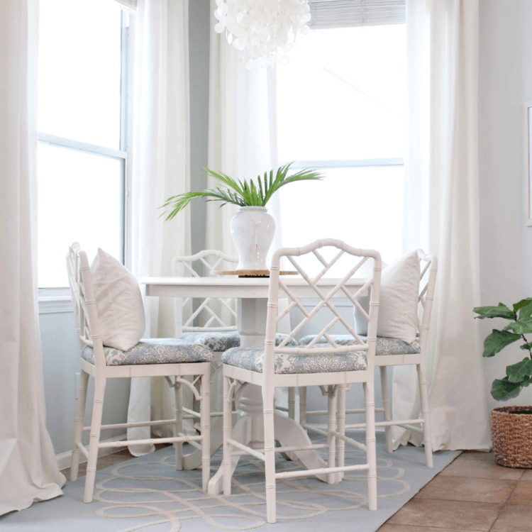
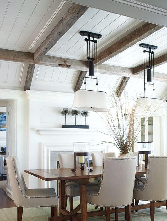
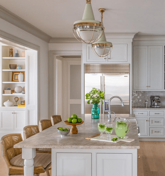
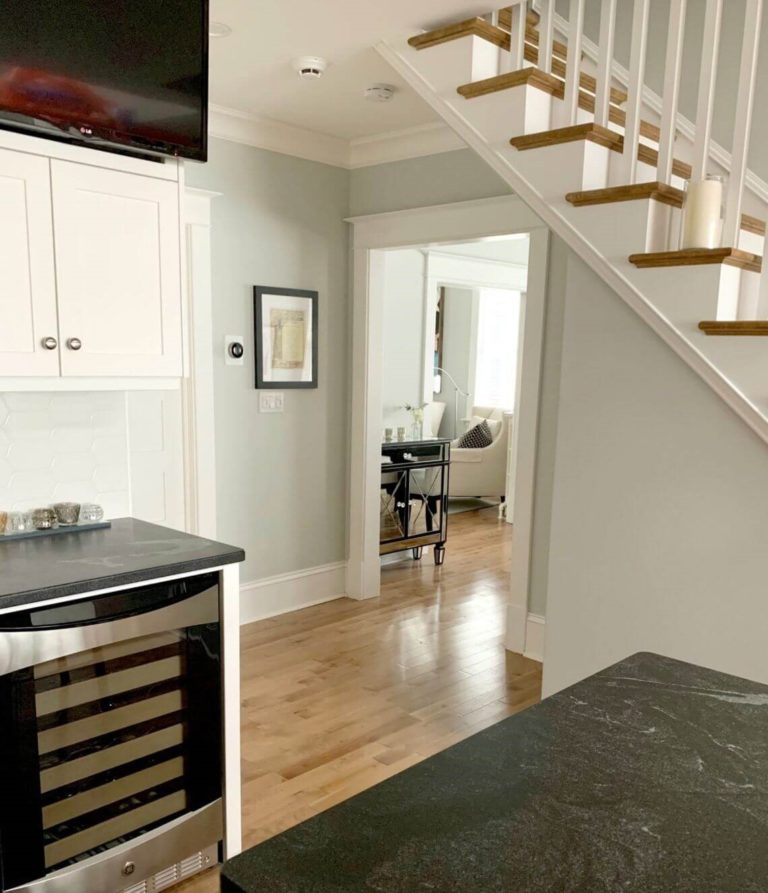
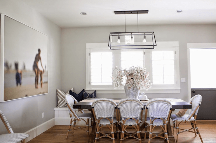
Gray walls? Yes! Gray cabinetry? Without any doubt! Both cases require white as a partner. This is when stainless steel, which usually is not suggested to be combined with gray, is the true companion of Gray Owl that can be applied to hardware. As we reach the dining area, there is no doubt that OC-52 goes for the walls accompanied by wood furniture with a sleek decor such as a vase with blooming flowers to enliven the space. For a bolder accent, consider painting the chairs in soothing blue that will go perfectly with the blue undertones that show through the surface of Gray Owl.
Home office
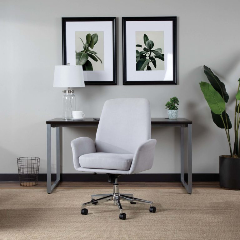
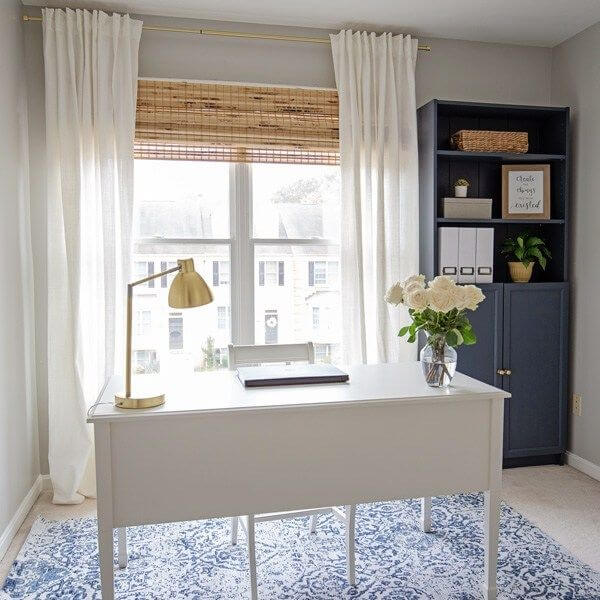
Peaceful, far from the outside world, inspiring, calming. Does it sound like a perfect environment for a workplace? Sure it does. Well, it is time for a makeover. Consider the neutral gray from Benjamin Moore as a background for your wildest design ideas. That’s right! You are finally free to use any accents you want as long as the contrast is balanced. Pick any style you want and enrich this space with an environment close to you. Is it the elegant Art Deco, comfy Farmhouse, formal Industrial, or timeless Classical? Gray Owl has no limits in this sense.
Bathroom
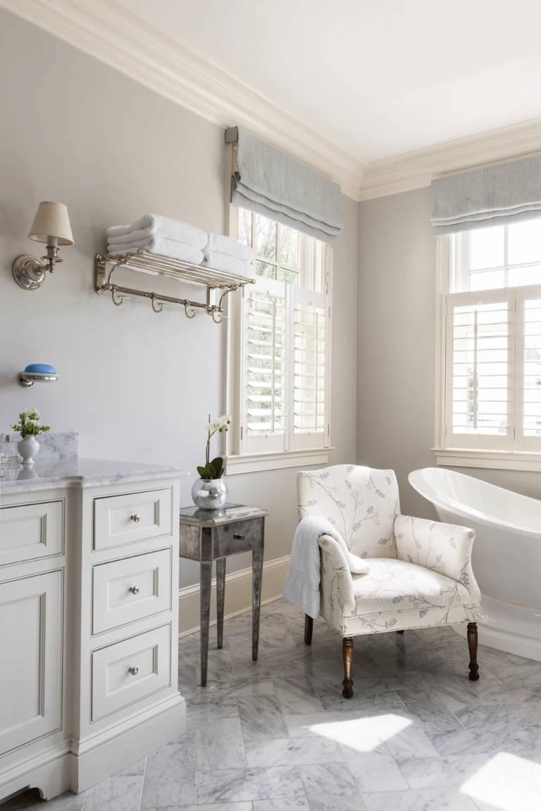
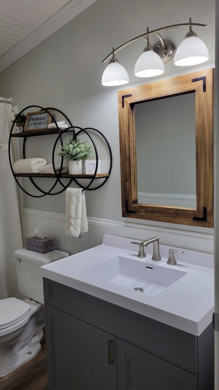
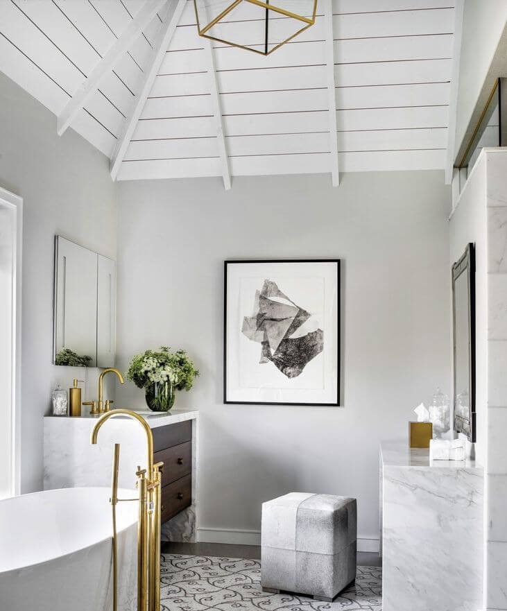
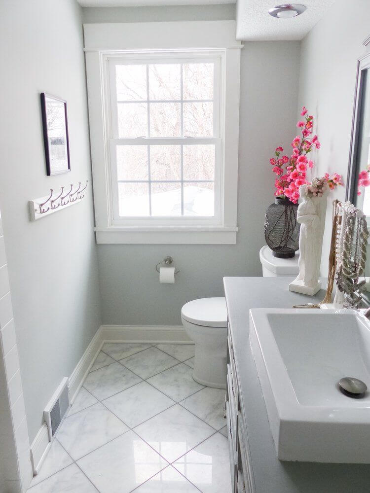
Usually, neutrals go for both the walls and cabinets. Still, this one works better for the walls. Consider a darker gray for the cabinetry and white for other details. The most interesting part is yet to come: add a vase with bright blooming flowers for a splash of energy. Would you like to deviate a bit from the sleek contemporary arrangement? Here is what you do: Gray Owl for the walls, a darker gray for the cabinets, and marble for any space it can be applied to. That’s not all! Add brass hardware and a few splashes of indoor plants; elegance, functionality, and freshness in the same place.
Use of Gray Owl for house exterior
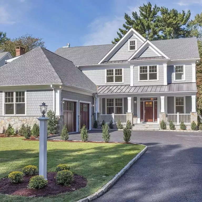
All we talked about till now is how contemporary Gray Owl is. Still, a traditional wood house is the right partner for this shade of gray when it comes to the house exterior. White paint color or wood for the trim and the stately sense of aristocracy is ensured. Furthermore, this shade doesn’t look faded in any weather due to its balance of cool and soft undertones.
When it comes to the front door, there is no better background for a unit of the kind painted in Gray Owl than white. This is the total opposite of a house painted this way since the result replicates contemporaneity at its finest.
The Gray Owl OC-52 paint color from Benjamin Moore is exactly what designers mean when referring to perfect gray; not too dark nor too light, a bit cool and a bit warm, gravitating between modern and traditional, impressively versatile, and no less confident. Furthermore, its long-lasting popularity is a safe reason to return to this shade again and again.

