Kakelugn No. 317
Farrow & BallFarrow & Ball Kakelugn No. 317 is a crisp, clean light blue with subtle gray and green undertones. Inspired by traditional Swedish tiled stoves, this sophisticated hue offers an LRV of 69.41, bringing an airy, tranquil atmosphere to well-lit interior spaces.
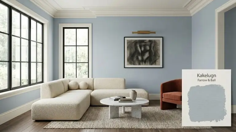
Farrow & Ball Kakelugn: The Cool, Desaturated Blue Shaping Premium Interiors
Few architectural elements command the quiet, radiant presence of a traditional ceramic heater, and that precise atmospheric chill is exactly what Farrow & Ball captures in Kakelugn. This is not a standard, breezy coastal blue. It is a highly deliberate, desaturated cyan-blue that wraps a room in a crisp, restorative serenity.
By pulling its inspiration from antique European ceramics, this color operates with a unique structural tension. Farrow & Ball Kakelugn (#c5d1d8) relies on a complex chromatic profile that feels simultaneously historic and fiercely contemporary.
When you apply this shade to your walls, you are establishing a sophisticated, cool color structure that instantly clarifies the surrounding architecture. It provides an ethereal, silvery blue cast that completely reimagines how natural light travels across a space.
Farrow & Ball Kakelugn: Undertones & LRV
The Definitive Temperature: Kakelugn is a distinctly cool paint color. It utilizes its crisp cyan base to lower the visual temperature of a room, creating an atmosphere that feels refreshing, tailored, and expansive.
To understand why this specific Farrow & Ball pigment feels so sophisticated on the wall, we have to look at its underlying construction:
The Light Reflectance Value (LRV): Kakelugn sits at an LRV of 69.41.
This places it firmly in the light-to-medium range, meaning it bounces a substantial amount of light back into the room without acting like a stark white. Because of this specific light reflectance value, the paint maintains its structural integrity in moderately lit spaces, though it will wash out slightly and lose some of its nuanced gray shadows when exposed to intense, direct exterior sunlight.
You can apply wallpapers, paints, etc. on walls and see how they look in various interiors.

How Light Manipulates This Desaturated Cyan-Blue
Lighting dictates everything about how this architectural finish behaves. Because of its complex undertones, Kakelugn shifts dramatically as the sun moves across your home.
If you want to preserve the crisp, silvery elegance of this paint in the evening, avoid overly amber bulbs. Opt for a neutral 3000K to 3500K lighting scheme to keep the blue tones clean without making the room feel like a sterile hospital corridor.
Hackrea Pro-Tip (The Artificial Light Strategy)
Where to Use This Silvery Blue Cast
Because this shade refuses to act like a flat, predictable blue, it demands thoughtful material pairings. The secret to maximizing its potential lies in how you contrast its cool temperature with rich textiles, varied architectural features, and intentional styling.
Tranquil Primary Bedrooms
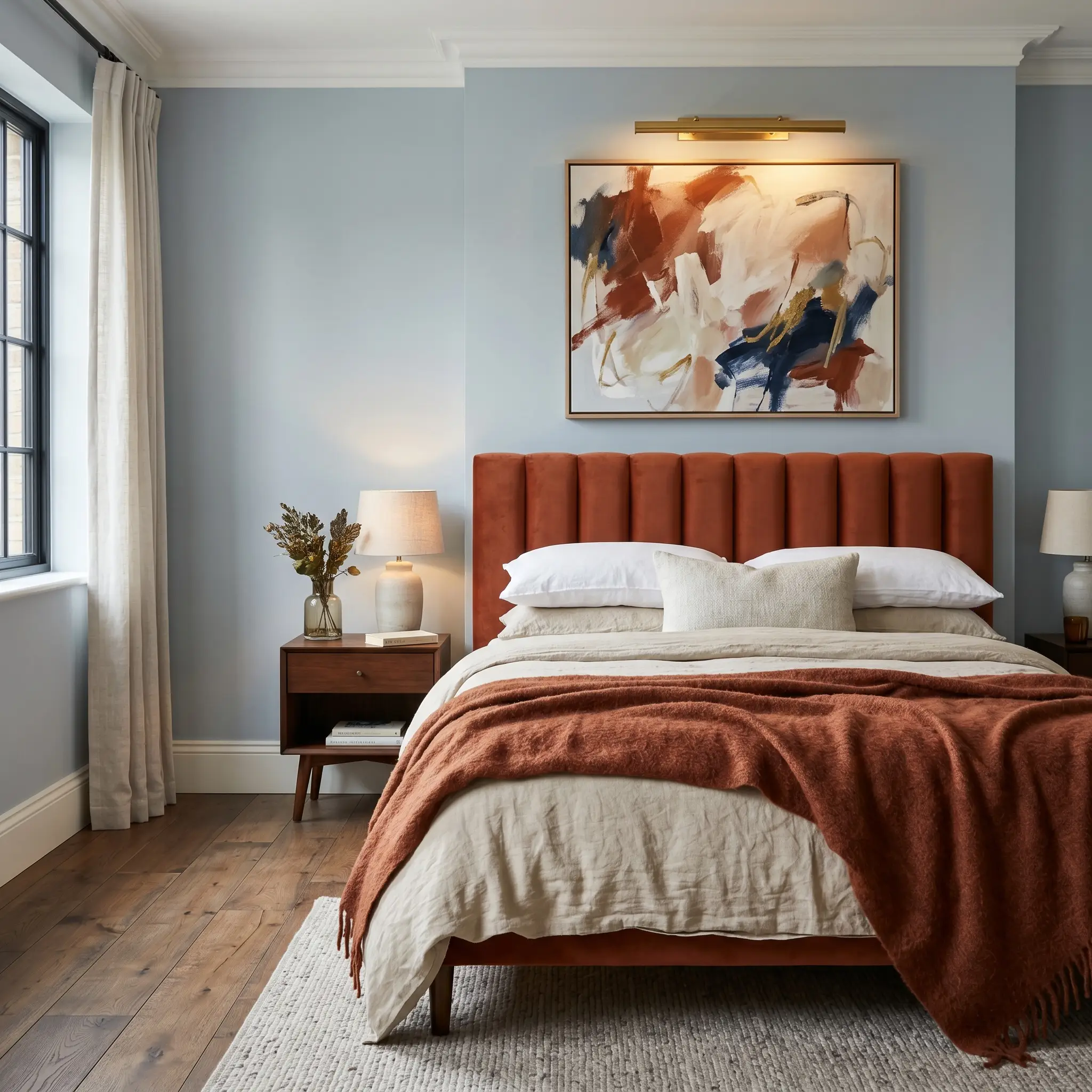
This color was engineered for spaces dedicated to rest, but you do not have to default to a predictable, traditional aesthetic. Push the room into a sleek, transitional style by pairing the cool walls with a channel-tufted headboard in a warm terracotta velvet.
The tension between the icy walls and the rich, tactile upholstery creates a profound sense of sophisticated comfort. Layer the bed with washed linen and a heavy alpaca throw to soften the crispness of the paint.
To establish a truly bespoke coordinating palette, introduce warm metallic accents. Brass picture lights mounted over modern abstract canvases will reflect a warm glow against the cool gray-blue, creating a beautifully balanced visual ecosystem.
Spa-Inspired Bathrooms
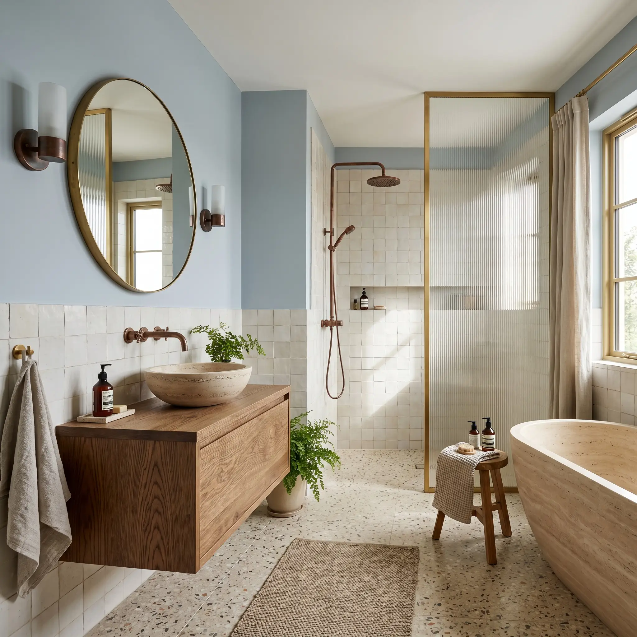
In a bathroom, this shade instantly mimics the restorative atmosphere of a high-end wellness retreat. Apply it to the upper half of the walls, stabilizing the lower half with a wainscoting of chalky, handmade zellige tiles.
Do not pair this paint with stark, brilliant white ceramic tiles or highly polished chrome fixtures. The combination will amplify the icy tones and make the bathroom feel clinically cold. Always introduce warmth through your hard finishes.
Clash Warning (The Cold Tile Trap)
Instead of cold metals, rely on unlacquered brass or oxidized copper fixtures to introduce an organic, living finish that warms up the room. Complete the space with a floating bleached oak vanity and fluted glass shower partitions to maintain a modern, airy aesthetic.
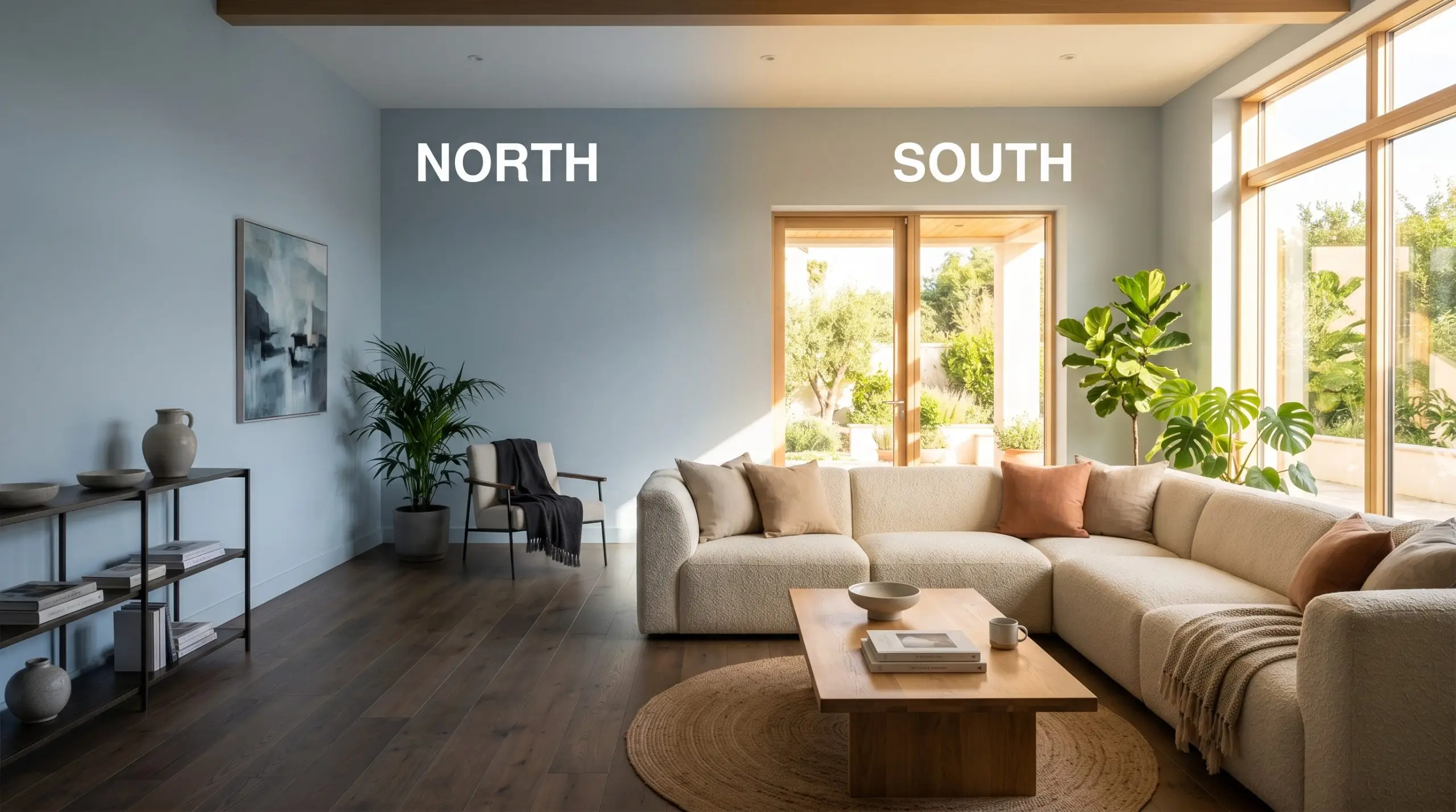
South-Facing Living Rooms
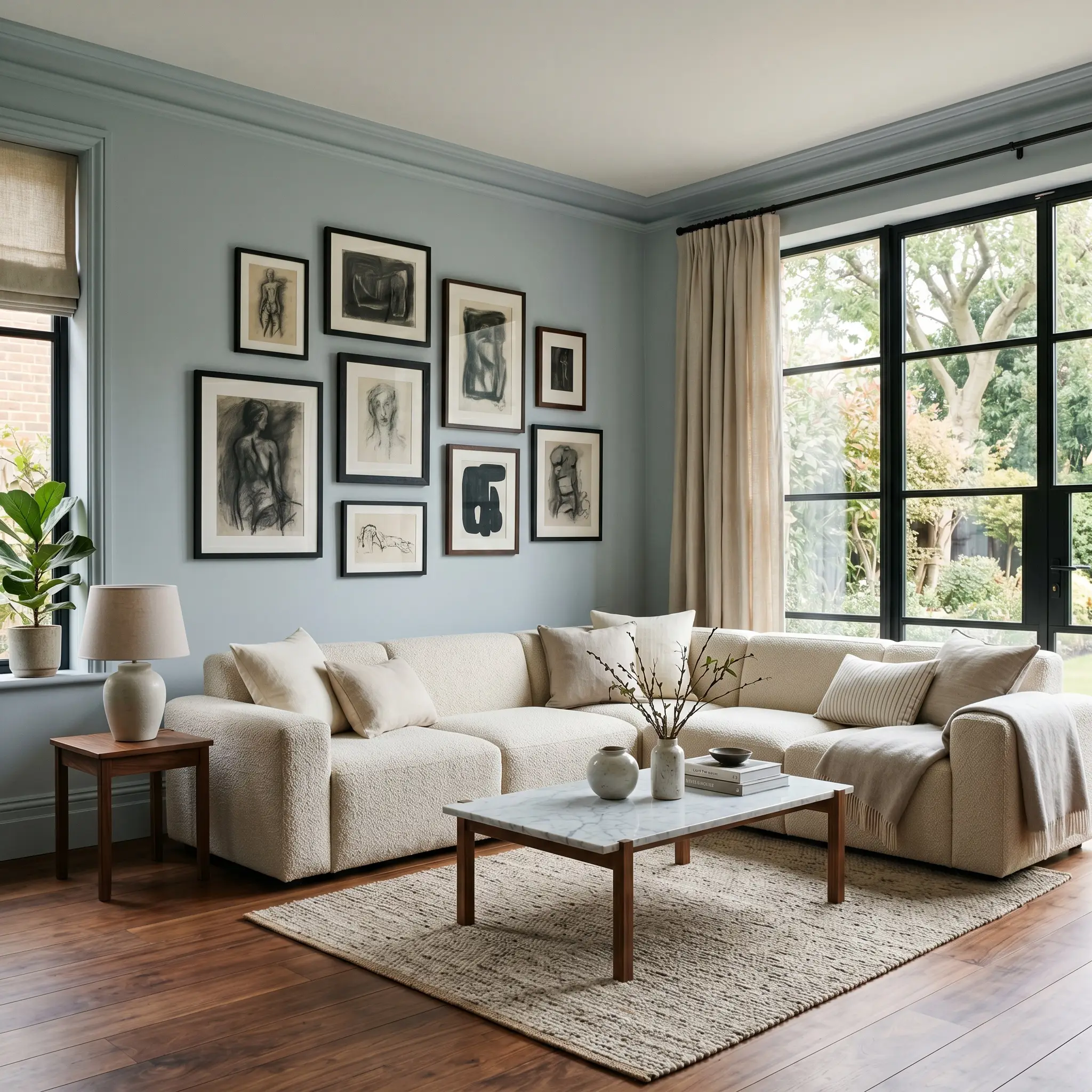
A south-facing living room is the perfect environment to experience the full spectrum of this paint. The warm, constant sunlight naturally softens the cyan base, pulling forward that faint Swedish green undertone.
Embrace a contemporary eclectic style by utilizing the technique of color drenching. Paint the walls, the crown molding, and the baseboards in the exact same finish to blur the architectural boundaries and make the room feel endlessly expansive.
Center the space with a low-profile modular sectional in a creamy bouclé. To prevent the room from feeling too airy, introduce intense visual weight through a honed Carrara marble coffee table and an asymmetrical gallery wall featuring dark, charcoal-sketched artwork.
Swedish-Style Kitchen Cabinetry
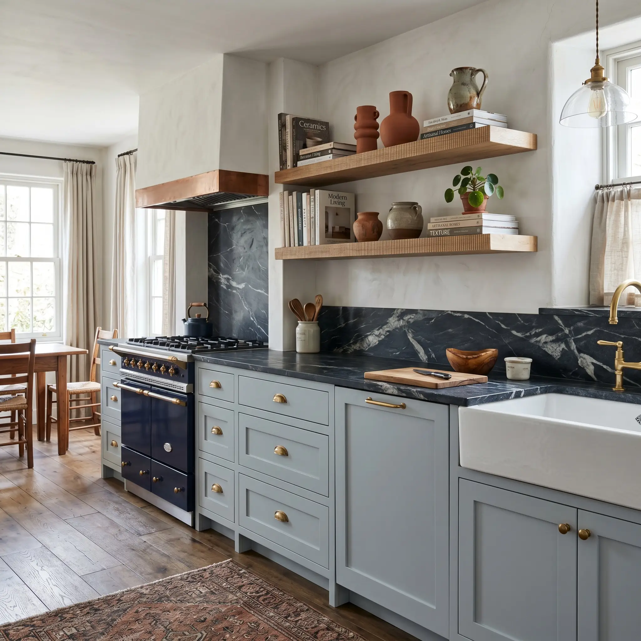
While the name explicitly nods to Swedish tiled stove inspiration, you can easily modernize this application. Using this color on kitchen cabinetry provides a stunning alternative to standard white or heavy navy kitchens.
It looks exceptionally tailored on flat-panel or subtle shaker doors, especially when paired with countertops that feature heavy, dramatic veining, like soapstone or heavily patterned marble.
To keep the kitchen feeling premium and collected, utilize open floating shelves made of raw, reeded wood rather than heavy upper cabinets. Style the shelves with stacked art books and sculptural ceramics to bring a warm, human element to the crisp cabinetry.
Sunrooms and Conservatories
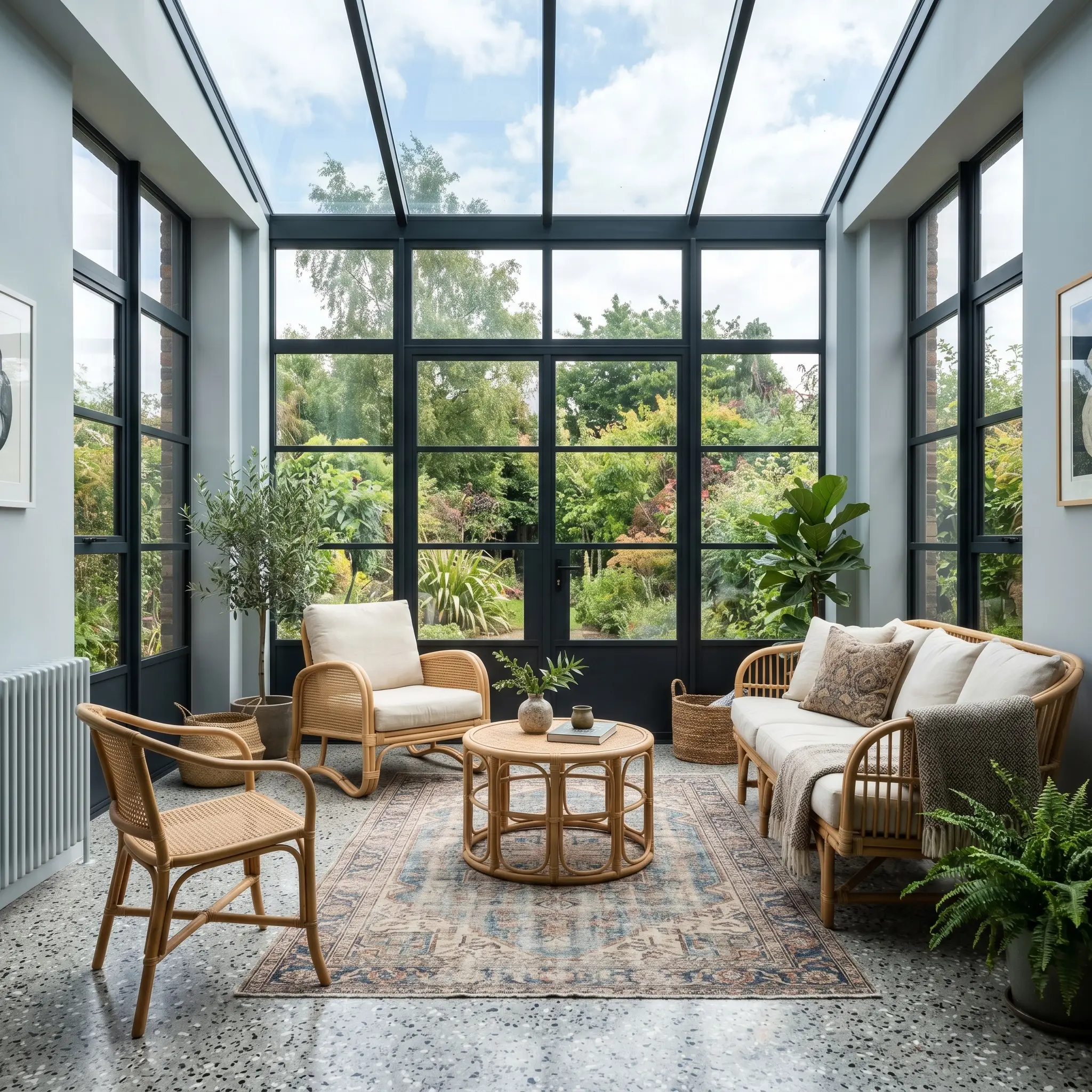
In spaces surrounded by glass, this paint acts as a seamless transition between the interior of the home and the sky outside. However, because of the high LRV, the color will wash out slightly during peak afternoon sunlight.
Counteract this fading effect by introducing high-contrast architectural elements. Frame the windows in blackened steel or paint the window sashes in a sharp, deep charcoal to secure the room’s visual boundaries.
Furnish the conservatory with natural cane or rattan seating, layering vintage, faded rugs over a durable terrazzo floor. The organic textures of the furniture will beautifully offset the brisk, silvery cast of the walls.
Coordinating Colors & Best Pairings for Kakelugn
This desaturated cyan-blue does not simply fade into the background. It actively demands a relational dialogue with the finishes placed around it, shifting its temperature based entirely on what it touches.
To prevent the color from feeling too icy, you must surround it with materials that either reflect warmth or provide a sharp, tailored boundary.
Framing the Walls: Trim & Baseboards
The exact shade of white you choose for your millwork will fundamentally alter how this Farrow & Ball pigment behaves. You must decide if you want a razor-sharp modern edge or a soft, atmospheric bleed.
Tactile Elements & Hardware Pairings
To truly elevate this cool color structure, you must introduce tactile finishes that challenge its crispness. The most successful spaces contrast the chilly walls with deeply organic, living materials.
The Bespoke Coordinating Palette
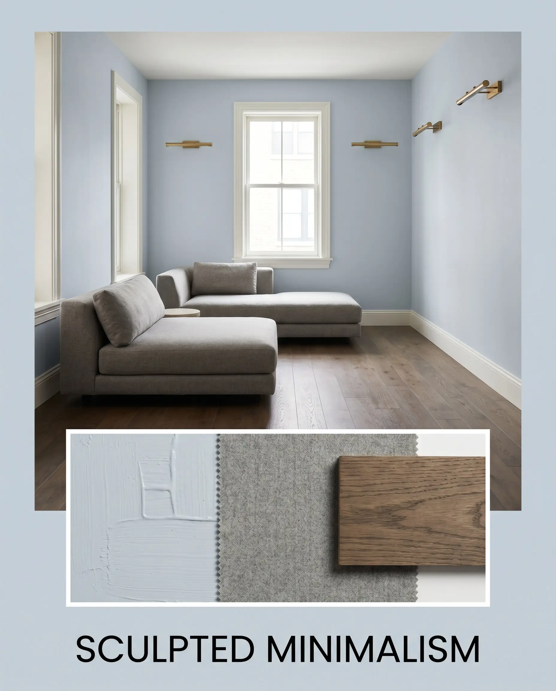
Curated Mood Boards
Sculpted Minimalism This aesthetic weaponizes the crisp, silvery blue cast to create a fiercely modern, uncluttered environment. The walls serve as a stark, tailored canvas, defined sharply by Farrow & Ball All White No. 2005 trim.
Introduce low-profile seating upholstered in dense worsted wool to provide tactile softness without disrupting the clean lines. Center the arrangement over smoked oak flooring, utilizing unlacquered brass picture lights to cast a highly intentional, warm glow against the cool walls.
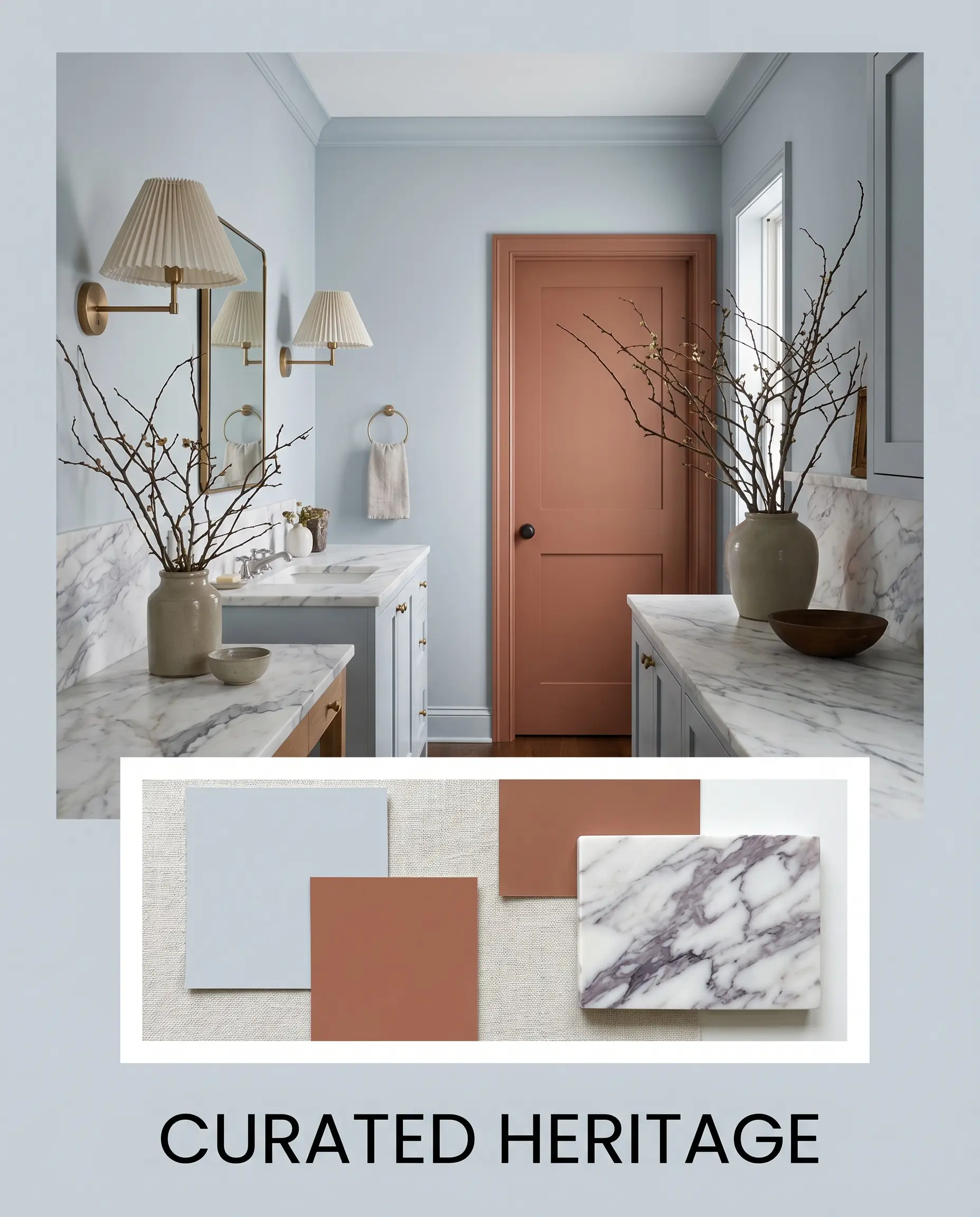
Curated Heritage Embrace a deeply collected, transitional energy by leaning into the paint’s historic roots while subverting expectations. Contrast the cool walls with dramatic, sweeping accents of Benjamin Moore Audubon Russet HC-51 on adjacent doors or built-in elements.
Anchor the space with a honed Calacatta Viola marble surface, allowing the burgundy veining to converse with the terracotta accents. Finish the styling with pleated lampshades, antique portraits, and oversized branches in stoneware to create a rich, enveloping atmosphere that feels both timeless and unexpectedly fresh.
Farrow & Ball Kakelugn vs. Rival Blues
When deciding on the perfect architectural finish, you must anticipate how the pigment will react to your specific lighting constraints. If your space lacks natural light or features challenging exposures, a direct comparison will reveal which shade truly belongs on your walls.
Farrow & Ball Kakelugn No. 317 vs. Farrow & Ball Borrowed Light No. 235
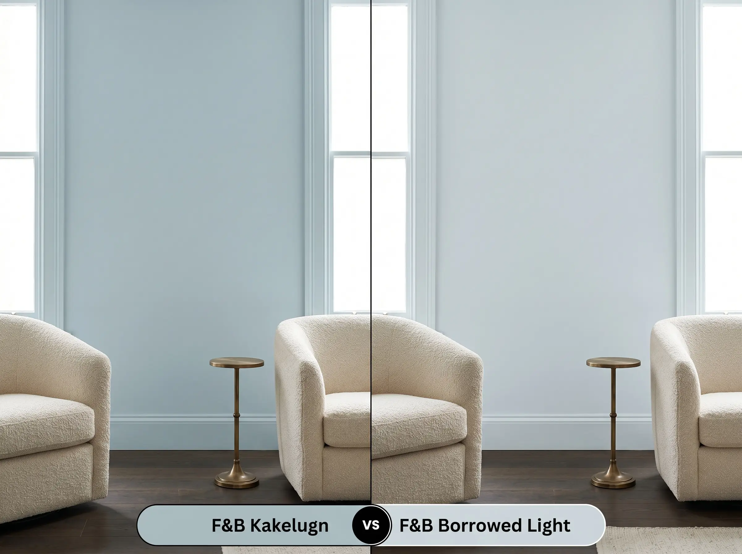
If you are struggling with a dimly lit, north-facing room, Borrowed Light is often the safer choice. It is a paler, more ethereal blue that lacks the complex gray shadows found in its rival.
While Kakelugn No. 317 maintains a sophisticated, moody edge, Borrowed Light actively fights against the shadows, keeping the room feeling airy and delicate. However, in a flood of south-facing sunlight, Borrowed Light can easily wash out into a generic pastel, whereas the desaturated cyan-blue holds its tailored shape beautifully.
Farrow & Ball Kakelugn No. 317 vs. Benjamin Moore Mt. Rainier Gray 2129-60
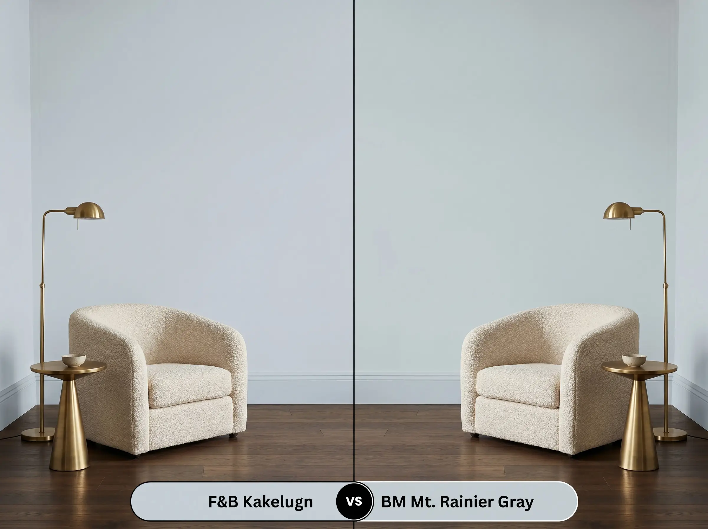
This comparison comes down to the presence of green. Benjamin Moore Mt. Rainier Gray is a crisper, more definitive blue-gray that completely abandons any earthy undertones.
If you are pairing the paint with extremely cool finishes like polished chrome or stark white marble, Mt. Rainier Gray provides a cleaner, more predictable result. If you want a color that shifts dynamically throughout the day and responds beautifully to warm woods, Farrow & Ball’s complex green whisper makes it the superior, more curated option.
Farrow & Ball Kakelugn No. 317 vs. Sherwin-Williams Upward SW 6239
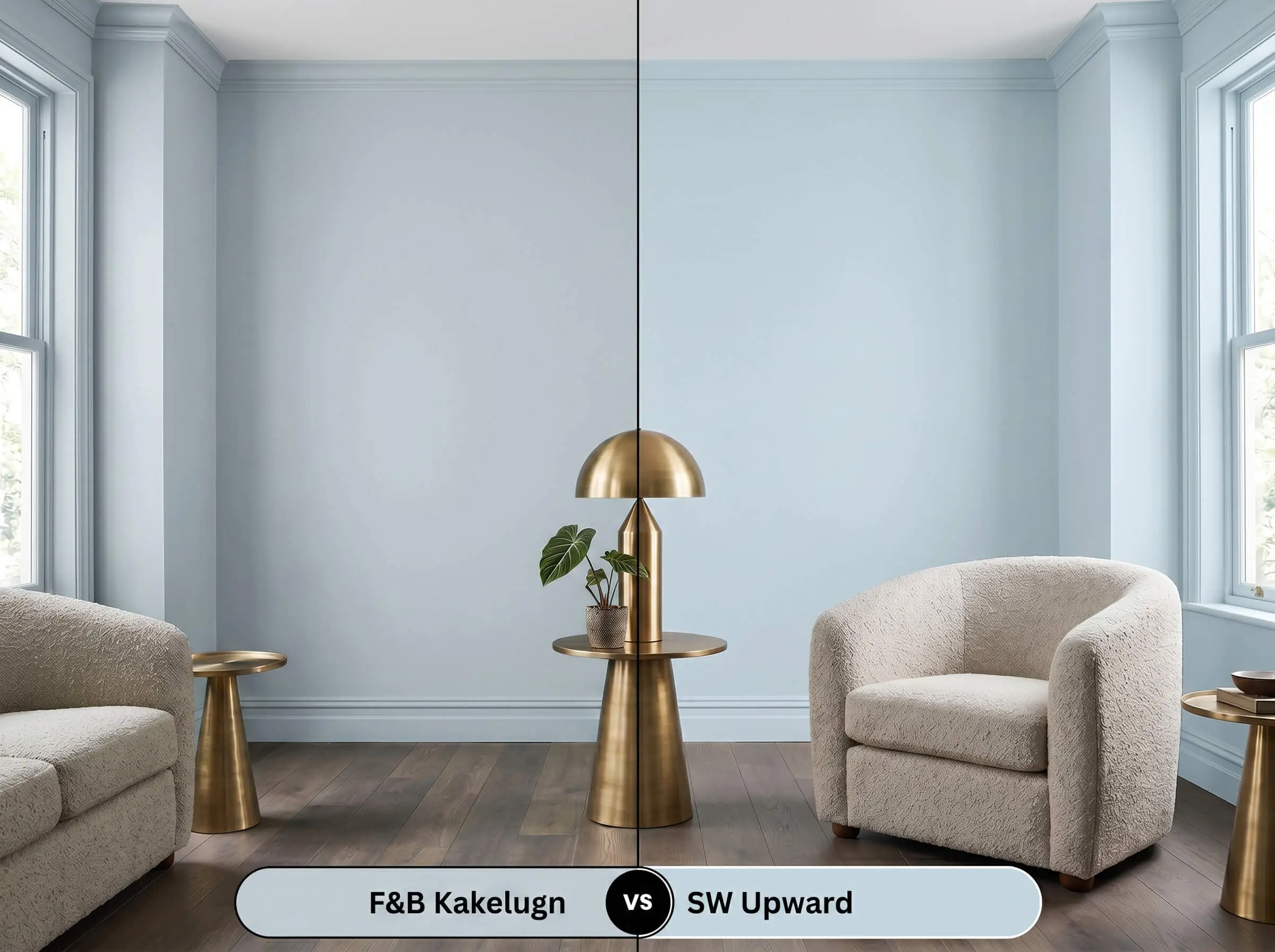
Sherwin-Williams Upward introduces a distinctly different color structure, leaning heavily into a soft, periwinkle-purple undertone. This makes Upward feel noticeably sweeter and more traditional on the wall.
If you are designing a sleek, transitional space that demands a sharp, tailored edge, Upward will feel too soft and romantic. You should rely on the F&B pigment when you need a brisk, sophisticated neutral that refuses to look like a nursery color.
Alternative Options & Brand Matches
Sometimes a specific color is nearly perfect, but you need a minor adjustment in depth or a practical match from a different manufacturer to satisfy a project’s logistical demands.
Farrow & Ball Alternatives
Cross-Brand Equivalents
Professional Application Guide for Kakelugn
Transitioning a premium color from a swatch to a flawless physical wall requires strategic planning. The sheen you select and the tools you use will dictate whether the final result feels curated or chaotic.
Primer Strategy: To achieve the true depth of this chromatic profile, you must use Farrow & Ball’s Mid Tones Primer & Undercoat. Applying this color directly over a stark white primer will cause the blue to read as thin and overly icy, robbing it of its sophisticated gray shadows.
Because of its specific light reflectance value, this paint is highly susceptible to “flashing”—visible roller marks or uneven streaks where the paint dries at different rates. You must maintain a wet edge while rolling and avoid aggressively touching up half-dry patches. Always apply two generous coats for a seamless, professional cure.
Hackrea Pro-Tip (The Flashing Warning)
Frequently Asked Questions
In heavy, cool shade, the crisp cyan base will amplify significantly, causing the exterior to read as a very brisk, icy gray-blue. To prevent the home from looking stark against the natural landscape, you must ground the siding with deep, warm architectural accents like rich stained wood doors or bronze exterior lighting.
The faint green undertone actually serves as a brilliant balancing agent against red oak. Because green and red are complementary, the paint acts as a cooling mechanism that neutralizes the aggressive orange tones in the wood, creating a beautifully balanced, sophisticated room.
It can look stunning on a ceiling, but without natural light, the gray shadows will dominate and feel quite chilly. You must combat this by utilizing warm 2700K to 3000K wall sconces and introducing highly reflective, warm metals like unlacquered brass to bounce a flattering glow upward.
A 4000K bulb emits a sharp, cool white light that will instantly strip away the subtle green and warm gray nuances. The paint will read as a very clean, vivid, and highly modern blue, which is perfect for a crisp, contemporary aesthetic but detrimental if you want a cozy atmosphere.
The Final Verdict on Farrow & Ball Kakelugn
Farrow & Ball Kakelugn is a masterfully engineered architectural finish designed for those who want the serenity of blue without the juvenile predictability of a standard pastel. Its absolute best application is in spaces that utilize a sophisticated “High/Low” mix of materials, where its crisp, silvery blue cast can interact dynamically with warm woods, living metals, and deeply textured textiles. It is the perfect foundational color for homeowners transitioning away from stark white walls, offering a refined, adaptable backdrop that beautifully elevates sleek transitional, contemporary eclectic, and modernized heritage interiors.
This paint fails when forced into a room dominated by stark, cool-toned gray luxury vinyl flooring or brilliant, blue-white LED lighting. Placing this desaturated cyan-blue next to flat, artificial grays strips away its complex organic undertones, leaving the space feeling like a sterile, unwelcoming commercial lobby. You must always anchor this color with authentic, warm-toned elements—like rich walnut, terracotta, or aged brass—to allow its sophisticated profile to truly breathe.
Hackrea Design Secret (The Temperature Clash)