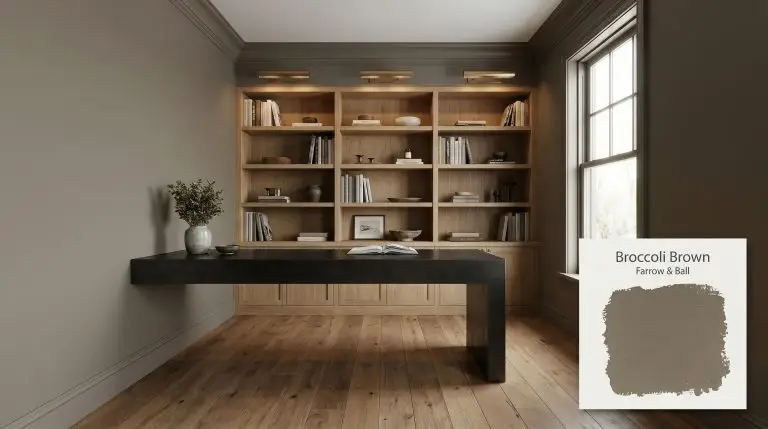
Broccoli Brown No. 198
Farrow & BallFarrow & Ball's Broccoli Brown is a muted, earthy dark stone brown with subtle green and taupe undertones. With an LRV of 18, it creates a moody, enveloping atmosphere, perfect for studies, cabinetry, or cozy dining spaces that embrace natural, organic warmth.
Farrow & Ball Broccoli Brown: The Muted Stone Hue Stabilizing Modern Interiors
Modern interiors are rapidly shifting away from predictable, sterile neutrals in favor of shades that feel dug directly from the earth. Farrow & Ball Broccoli Brown No. 198 answers this craving with an incredibly nuanced, muted stone hue that instantly stabilizes a room. Rather than simply coating a wall, this complex taupe-brown acts as a foundational architectural finish, transforming ordinary drywall into a rich, tactile surface.
This is not a flat, one-dimensional brown that fades into the background. It carries a subtle, hidden energy that shifts beautifully throughout the day, demanding intentional styling and thoughtful lighting. Whether you are wrapping a quiet study or elevating utilitarian cabinetry, this shade offers a profound sense of permanence and sophistication.
The Color DNA: Undertones & LRV of Broccoli Brown No. 198
When evaluating whether Farrow & Ball’s Broccoli Brown is warm or cool, the answer is a decisive, rooting warm. This organic warmth stems from its earthy foundation, yet it completely avoids the predictable orange or red flashes typical of standard browns. Instead, its true magic lies in a highly specific chromatic profile that adapts seamlessly to the materials placed next to it.
With a light reflectance value (LRV) of 18, this hue absorbs a significant amount of the sunlight that hits it. It is an intentionally moody choice, designed to create an enveloping atmosphere rather than artificially brighten a dim space. You must lean into this depth, using it to manipulate the boundaries of the room and cultivate a sense of quiet intimacy.
You can apply wallpapers, paints, etc. on walls and see how they look in various interiors.

The Chameleon Factor: Lighting Effects & Shifts
Because of its complex color structure, this shade refuses to look exactly the same in any two rooms. The constant interplay between the taupe base and the green tint means the time of day and the direction of your windows will completely alter your walls.
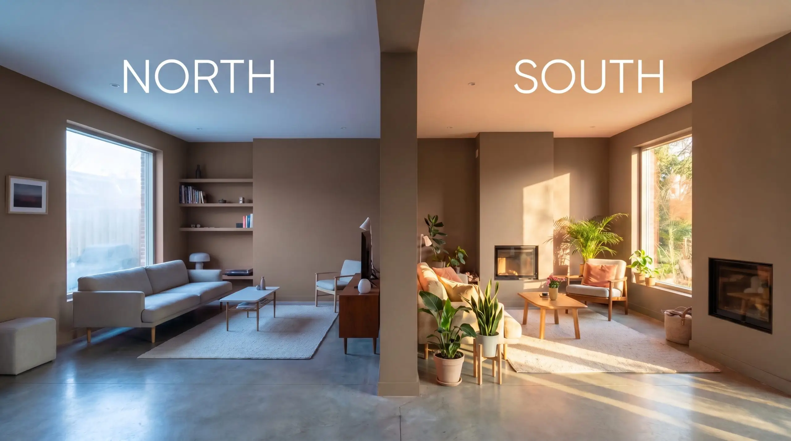
Never evaluate a complex taupe like this under bare contractor bulbs. Always test your swatches using the exact temperature of the LED bulbs you plan to live with, as the wrong lighting can accidentally erase the color’s beautiful olive nuances.
Hackrea Pro-Tip (The Bulb Strategy)
Popular Architectural Applications & Styling
A shade with this level of visual depth requires intentional placement and a thoughtful approach to styling. Here is how to leverage this earthy brown to elevate your most frequented spaces, letting its unique characteristics drive the design.
Studies and Home Offices
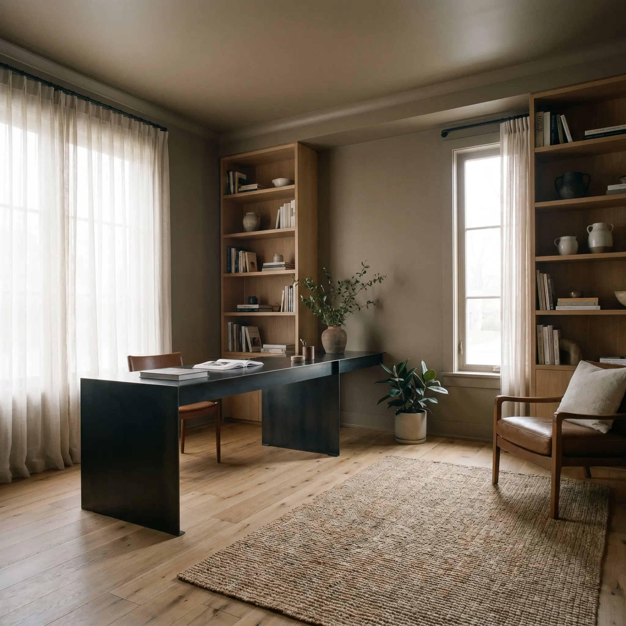
Instead of defaulting to standard heritage styling, treat this rich brown as a backdrop for modern contrast. Wrapping the walls, trim, and ceiling creates a tailored, distraction-free zone perfect for deep focus. Pair it with blackened steel floating desks and white oak shelving to pull the aesthetic into a clean, contemporary direction.
Kitchen Cabinetry and Islands
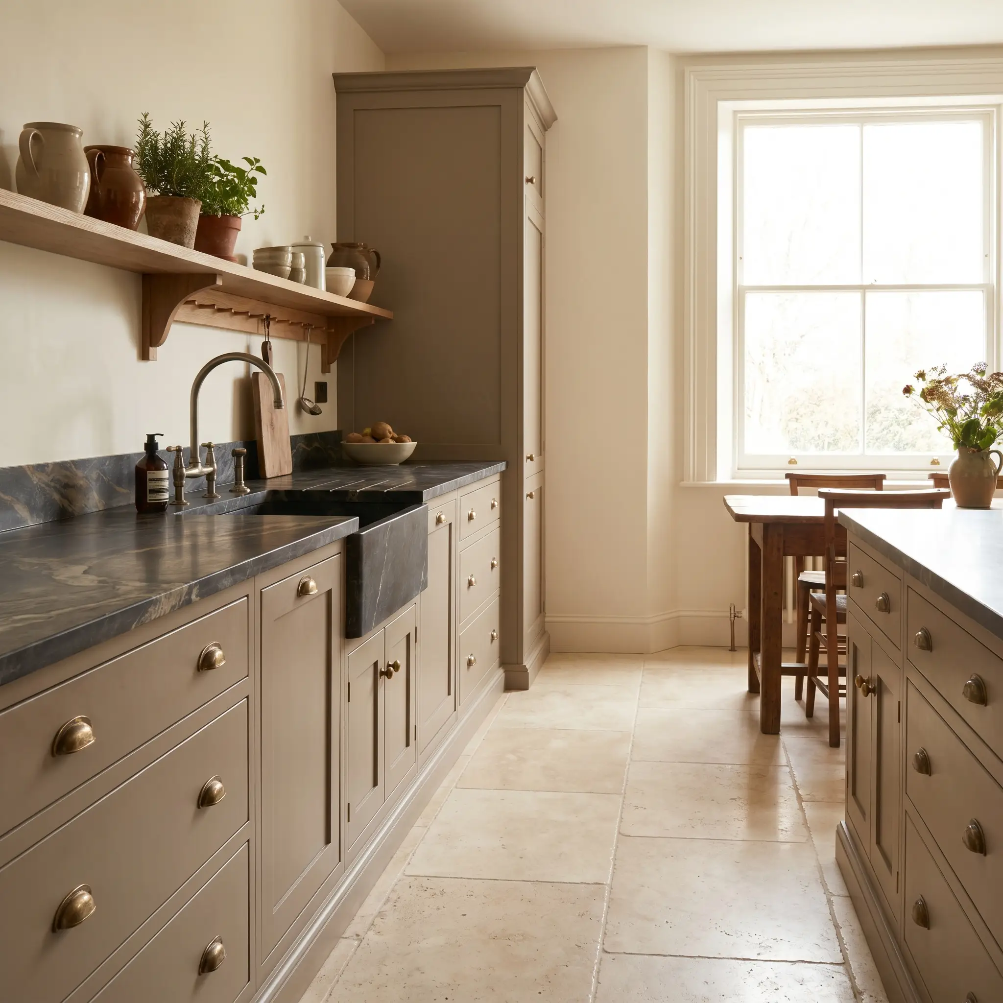
If you are tired of standard white kitchens, this organic brown offers a striking, sophisticated alternative for custom cabinetry. It pairs beautifully with prominently veined soapstone countertops and unlacquered brass hardware. The metallic accents pull out the olive-green cast, making the kitchen feel both curated and wonderfully inviting for morning coffee routines.
Be cautious when pairing this earthy brown with stark white marbles that feature icy, blue-gray veining. The cool undertones of the stone can clash with the organic warmth of the paint, making the cabinetry look slightly muddy. Instead, opt for creamy travertines or dark, moody soapstones for a seamless pairing.
Clash Warning (The Cool Carrara Conflict)
Mudrooms and Boot Rooms
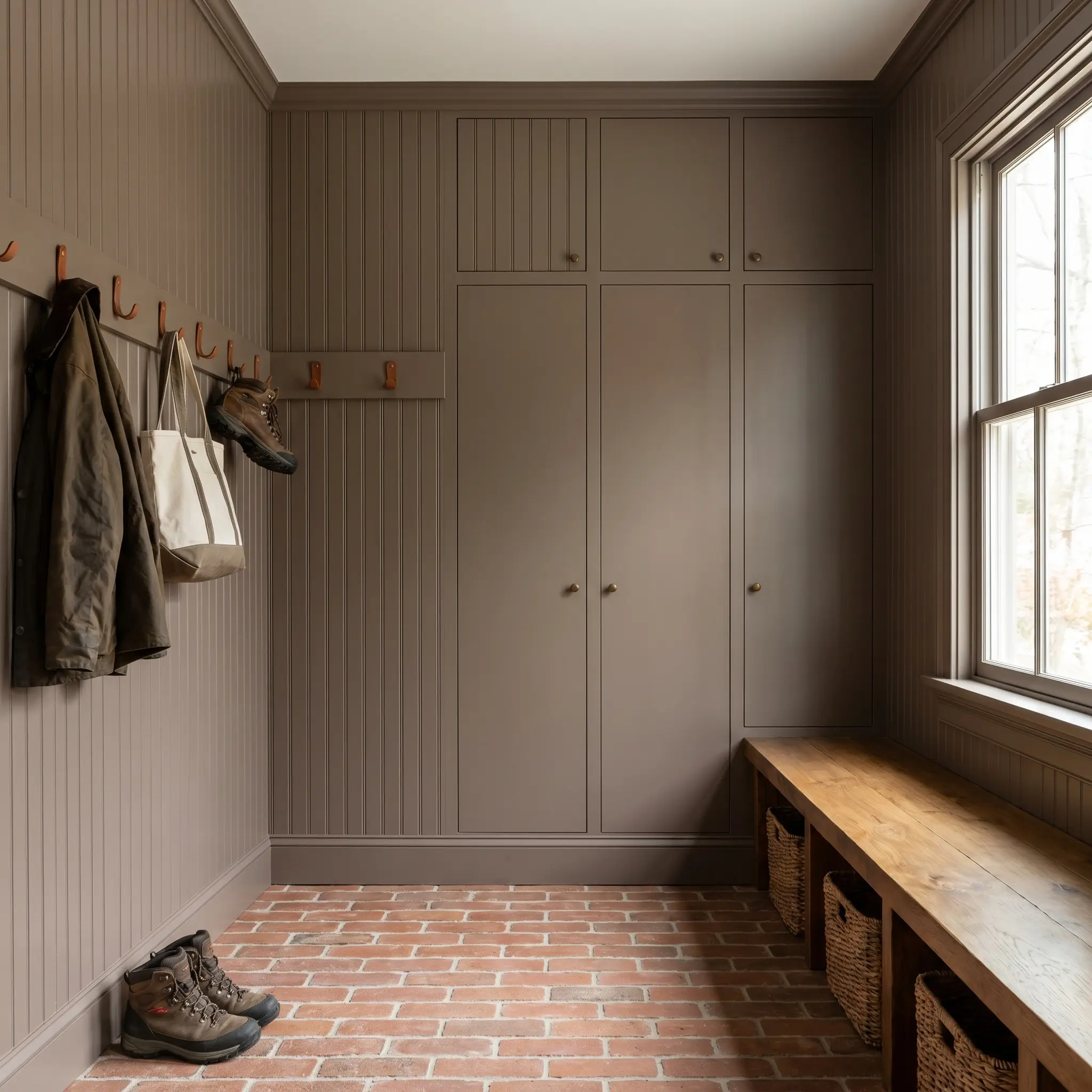
This hardworking space demands a color that can hide everyday wear while still feeling highly designed. Applying this hue across beadboard or flush-mount storage instantly elevates the utilitarian drop-zone. Pair it with raw terracotta brick floors and saddle leather hooks to emphasize the color’s connection to the outdoors.
When dealing with high-traffic areas, consider using Farrow & Ball’s Dead Flat finish. It provides an incredibly chic, non-reflective surface that still wipes clean, allowing the muted stone hue to remain rich and velvety without unwanted glare.
Hackrea Design Secret (The Matte Advantage)
Intimate Dining Rooms
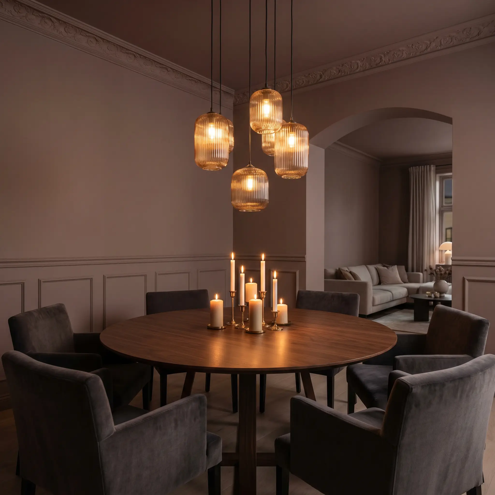
This shade is practically built for evening entertainment and long, candlelit dinners. By taking the color across the walls, baseboards, and crown molding, you eliminate contrasting lines and create a seamless, enveloping atmosphere. Introduce tactile contrast through mohair dining chairs and reeded glass fixtures to catch the ambient light beautifully.
Cozy, Enveloping Bedrooms
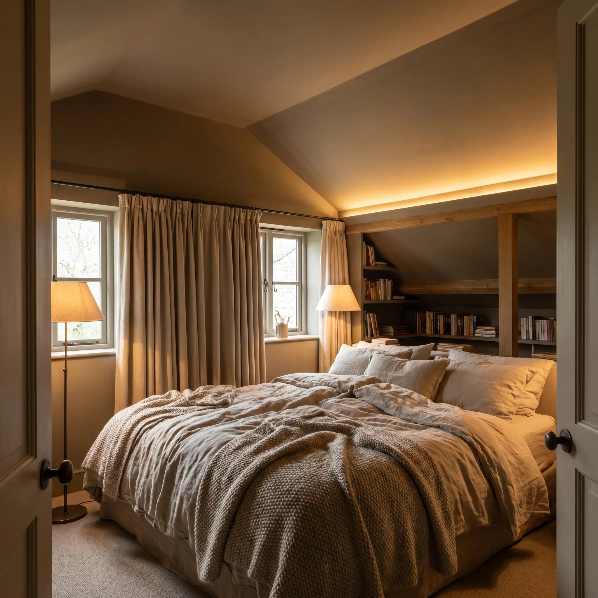
A bedroom should act as a sensory retreat, and this grounding taupe base provides the perfect psychological anchor. Carry the paint up onto the ceiling to lower the visual height of the room, making it feel like a protective cocoon. Layer the bed with thick linen sheets, worsted wool throws, and brushed canvas curtains to enhance the room’s innate warmth.
Curating a Palette Around Broccoli Brown
This rich taupe demands active participation from the surrounding elements, relying on tactile contrast to prevent the room from feeling flat. Because the pigment actively absorbs ambient light, it requires adjacent textures that either gently reflect a soft glow or provide a crisp, tailored boundary.
Tailored Trim and Baseboard Selections
When framing this earthy shade, avoid stark, hospital whites that will shock the eye and emphasize the paint’s muddy qualities. Instead, you need creamy, transitional whites that share a subtle undercurrent of warmth to create a soft, continuous visual flow.
Tactile Materials and Hardware Pairings
Because this color absorbs so much light, your material choices must actively introduce movement, reflection, or deep texture.
Secondary Accent Colors
Designer Mood Boards
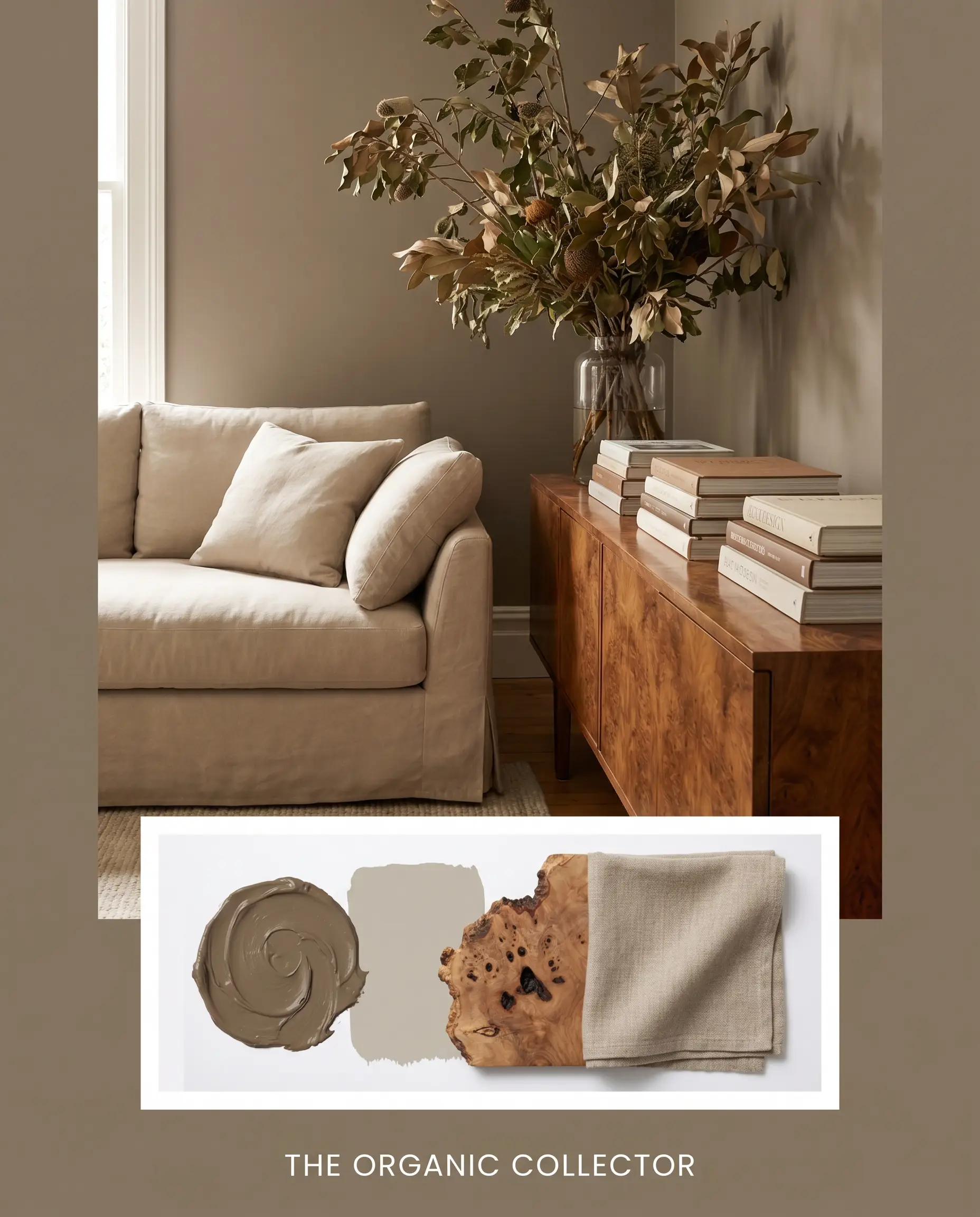
The Organic Collector This aesthetic leans deeply into the paint’s innate organic warmth, creating a space that feels gathered over decades. Anchor the room with a plush, slipcovered sofa in Farrow & Ball Drop Cloth to establish a soft, inviting core. Layer in a mid-century burl wood console, stacked art books, and oversized botanical branches to breathe life into the dark, enveloping walls.
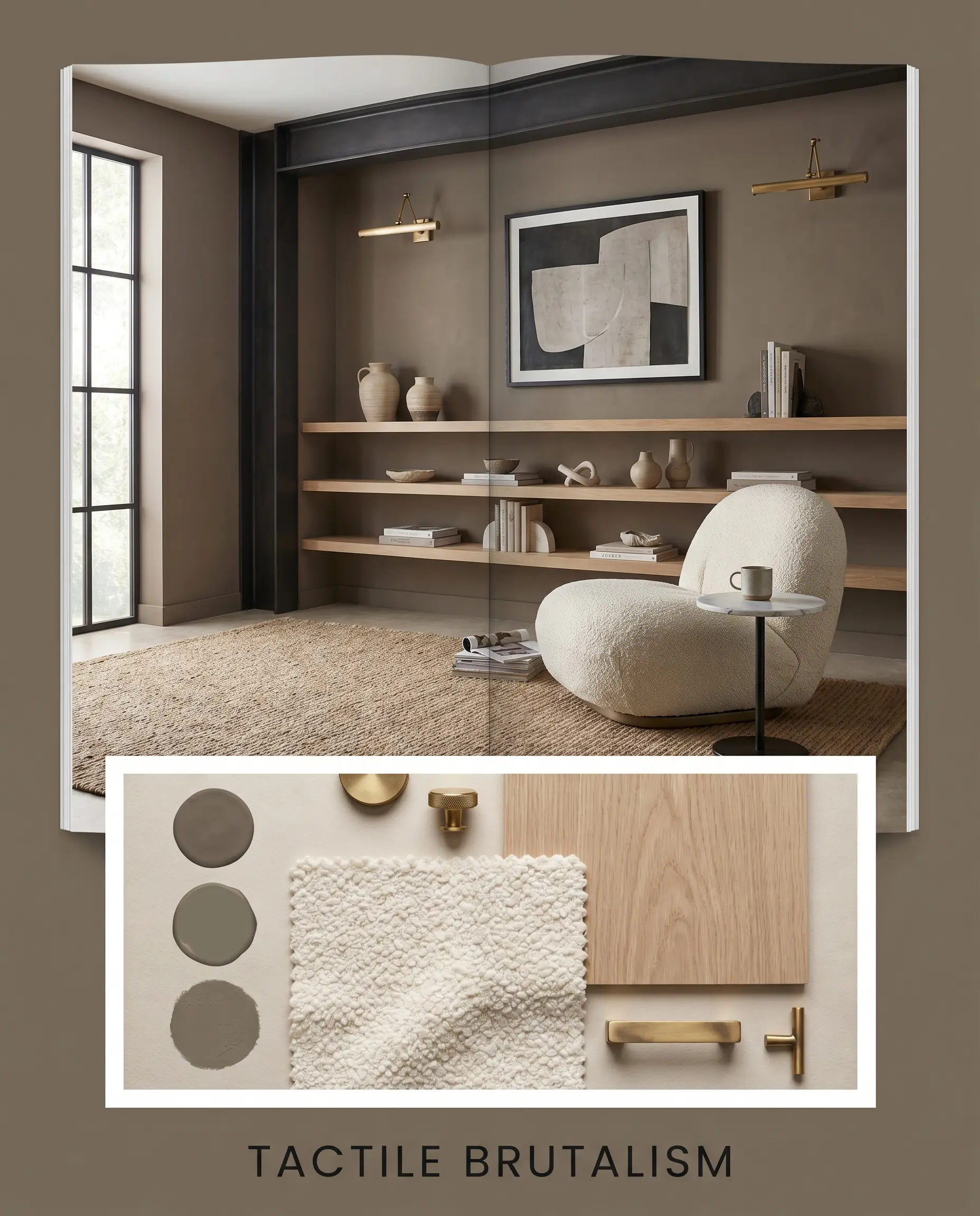
Tactile Brutalism Here, the brown acts as a stark, architectural finish that softens industrial edges. Pair the walls with blackened steel framing and floating white oak shelving to create sharp, intentional sightlines. Introduce a creamy, thick bouclé lounge chair and unlacquered brass picture lights to ensure the room feels sophisticated and layered rather than purely raw.
Head-to-Head Paint Comparisons
While this shade is undeniably beautiful, its specific light reflectance value and hidden undertones might not suit every architectural exposure. If your room lacks natural light or you need a slightly different chromatic profile to match existing hard finishes, exploring a direct rival is often the smartest path forward.
Farrow & Ball Broccoli Brown vs. Farrow & Ball Mouse’s Back
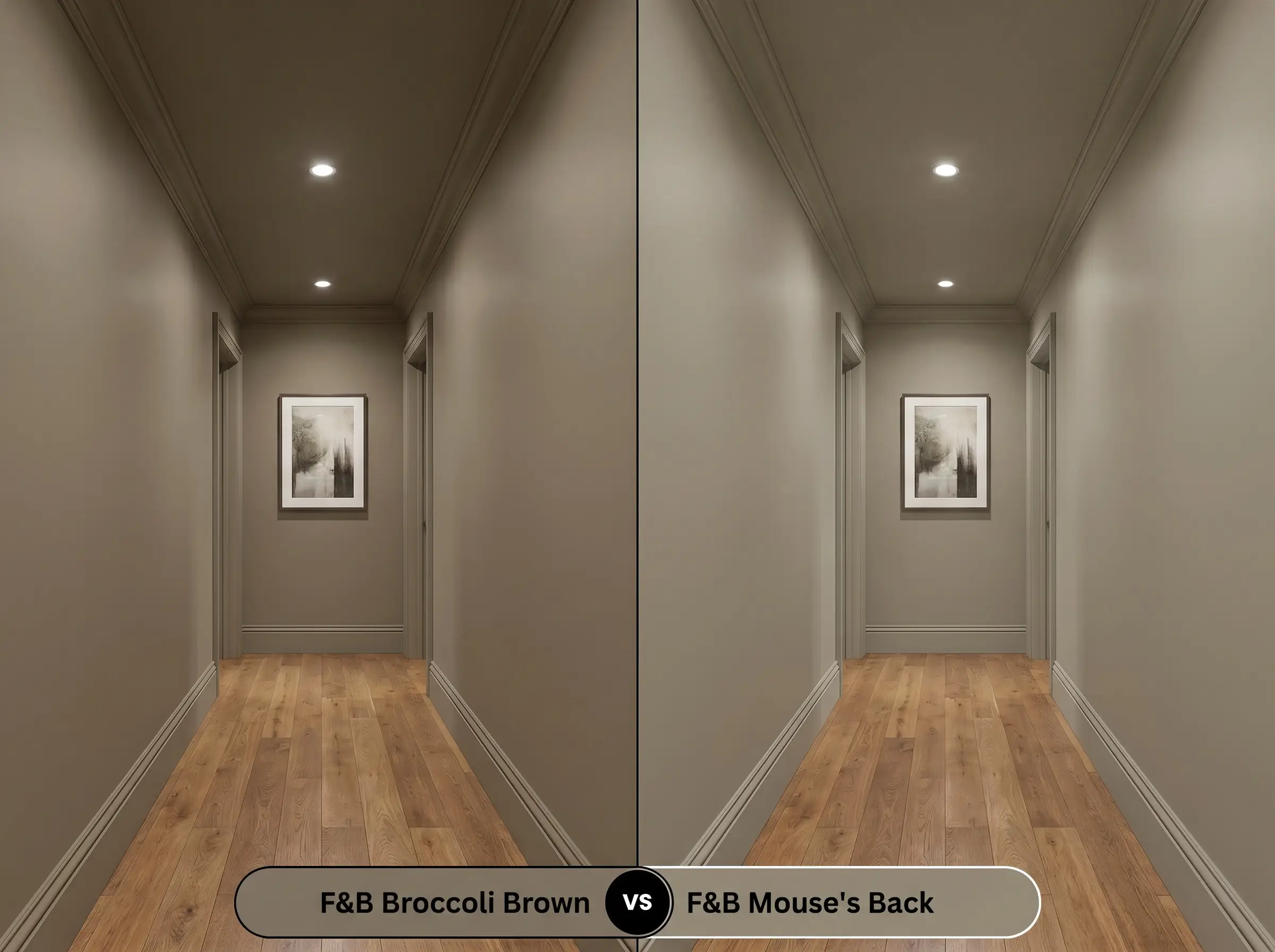
If you love the earthy quality but fear the room will feel too dark, Mouse’s Back offers a slightly lighter, more flexible alternative. Mouse’s Back carries a higher LRV and leans more toward a traditional gray-brown, making it a safer choice for dim hallways. Choose Broccoli Brown when you want a deeper, more pronounced olive-green cast that commands attention.
Farrow & Ball Broccoli Brown vs. Farrow & Ball London Clay
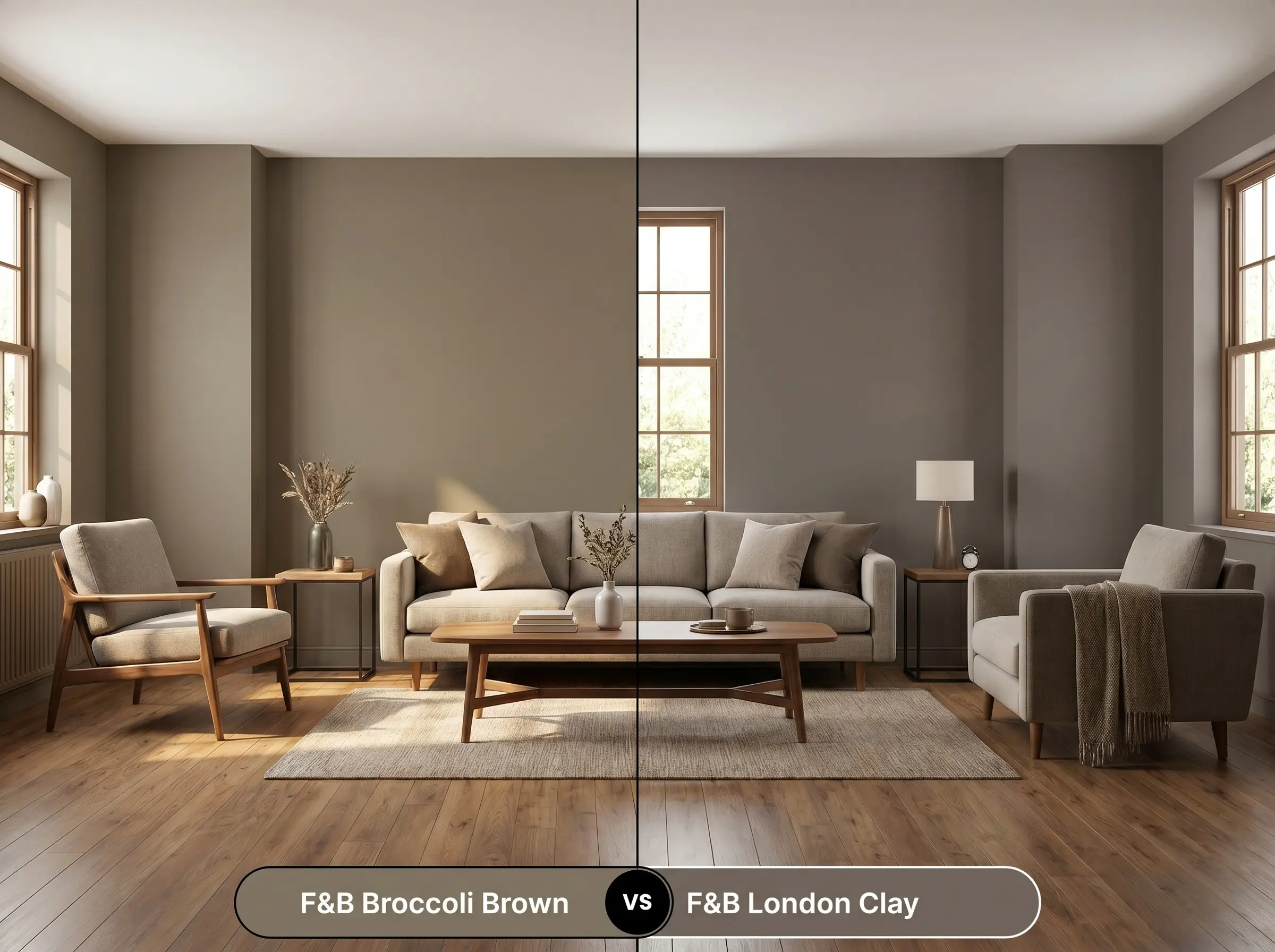
This comparison comes down to the underlying temperature you want to project into the space. London Clay is significantly warmer, driven by a strong dose of magenta pigment that gives it a rich, chocolatey, almost plum-like glow. If your room features cool northern light that might turn London Clay purple, the stabilizing green in No. 198 provides a much safer, grounded alternative.
Farrow & Ball Broccoli Brown vs. Benjamin Moore Rustic Taupe
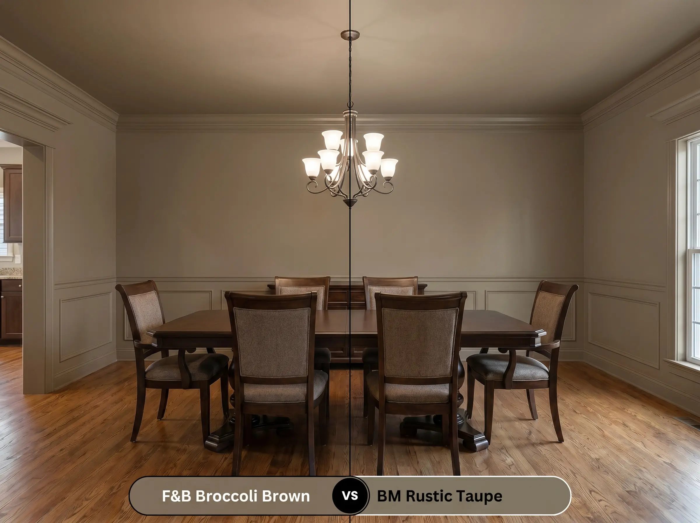
When comparing these two, you are choosing between organic movement and tailored consistency. Rustic Taupe is a highly predictable, beautifully balanced greige that holds its shape well across different lighting scenarios. If you prefer a color that shifts dynamically throughout the day and offers a more bespoke, moody atmosphere, the Farrow & Ball option is the clear winner.
Similar Colors and Brand Equivalents
Finding the exact right depth for your walls sometimes requires pivoting to a shade that offers just a touch more levity or warmth. Additionally, project timelines might require you to color-match using a different manufacturer entirely.
Same-Brand Alternatives
Cross-Brand Color Matches
Practical Application for This Muted Stone Hue
Executing a dark, complex color requires flawless technique to ensure the final result looks intentional rather than accidental. The right finish and prep work will dictate whether the walls feel like a premium architectural feature or a muddy mistake.
Ideal Sheen Selections
Primer and Coverage Strategy
Because of its dark LRV, this shade requires a tinted dark tones primer to establish a proper foundation. Skipping the tinted primer will force you to apply three or even four coats to achieve true opacity.
Darker, matte finishes are notorious for “flashing”—leaving visible, uneven roller marks where the paint dried too quickly before blending. Always maintain a wet edge while rolling and avoid overworking the paint once it is on the wall.
Hackrea Pro-Tip (The Flashing Prevention)
Frequently Asked Questions
Because north-facing light is naturally cooler and bluer, it will absolutely amplify the hidden olive-green cast in this paint. Rather than looking like a standard brown, it will read as a deeply sophisticated, muted green-taupe in these exposures.
The Dead Flat finish completely eliminates glare, which allows the pigment to absorb light rather than reflect it. This enhances the color’s richness and makes the walls look like a seamless, velvety expanse of stone.
Wrapping the ceiling in this dark hue is a brilliant architectural strategy for studies and offices. It visually lowers the ceiling height, creating a tailored, distraction-free cocoon that feels incredibly intentional and cozy.
A 3000K bulb provides a crisp, neutral-to-warm light that perfectly balances this complex color. It allows both the earthy taupe base and the subtle green undertone to remain visible without artificially turning the walls too yellow or too sterile.
Final Verdict on Farrow & Ball Broccoli Brown
This complex shade is the ultimate tool for homeowners looking to inject profound, organic permanence into their interiors. It performs best in dedicated spaces—like intimate dining rooms, quiet studies, or custom boot rooms—where its moody, light-absorbing qualities can be celebrated rather than fought. When paired with rich, tactile materials like unlacquered brass and heavily veined soapstone, it elevates ordinary rooms into highly curated, sensory experiences.
While this shade is incredibly sophisticated, it is rarely the right choice for wrapping an entire open-concept, builder-grade floor plan. If your home features vast expanses of drywall with minimal architectural breaks, this dark taupe can quickly turn the space into a gloomy, oppressive cave. Furthermore, pairing it with stark, cool-toned gray flooring or icy blue decor will immediately pull out its muddy qualities, creating an uncomfortable visual clash. Reserve this color for rooms with clear boundaries where you can strictly control the lighting and material pairings.
Hackrea Design Secret (The Open-Concept Caution)