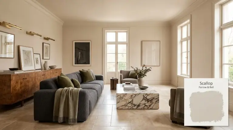
Scallop No. 311
Farrow & BallFarrow & Ball Scallop No. 311 is a warm, mid-light rosy neutral paint color. Serving as a lighter interpretation of the brand's classic Dead Salmon, it features a primary beige base with delicate pink and subtle peach undertones.
Farrow & Ball Scallop: The Rosy Neutral Rewriting the Rules of Warmth
Forget the standard beige box. Farrow & Ball Scallop steps into a room and instantly alters its temperature, wrapping the walls in a highly sophisticated, blush-toned embrace.
As a lighter, more delicate Dead Salmon interpretation, this earthy beige acts as a chameleon against high-end materials like honed travertine and unlacquered brass.
We rely on this specific chromatic profile when a space demands warmth but cannot sacrifice architectural rigor.
Temperature, Undertones & LRV of Farrow & Ball Scallop
If you are wondering whether this shade leans warm or cool, Scallop is decisively warm. The underlying color structure pushes past a standard builder-grade neutral, introducing a distinct thermal shift that completely changes the atmosphere.
With a mid-light reflectance value of 60, this paint sits in the perfect middle ground. It bounces enough ambient light to keep hallways and living areas feeling expansive, yet absorbs just enough to maintain a rich, cocooning depth.
You can apply wallpapers, paints, etc. on walls and see how they look in various interiors.

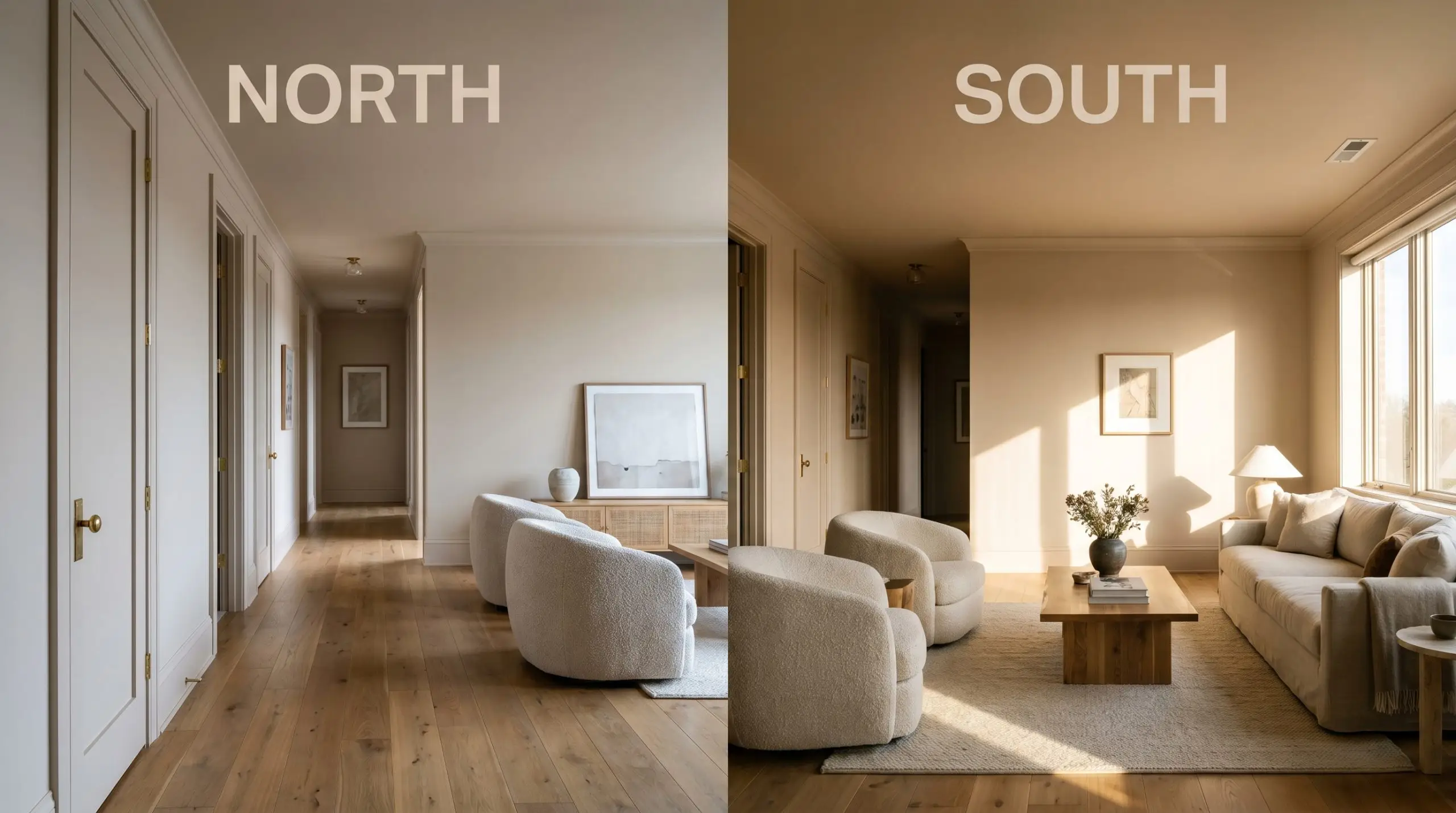
Lighting Effects: How the Rosy Neutral Shifts
This shade is highly reactive to its light source, shifting its visual weight as the sun moves across the sky.
Transforming Spaces with this Earthy Beige
The true value of this mid-light reflectance shade lies in its ability to adapt across entirely different architectural styles and daily functions.
Curating the Main Living Area
Instead of defaulting to a standard white box, wrapping your main gathering spaces in this warm taupe creates an immediate sense of intimacy. We highly recommend a full color-drenching approach here, carrying the earthy beige across the baseboards, picture molding, and ceiling to blur the room’s hard boundaries.
Pair this seamless application with low-profile modular seating, a richly veined marble plinth coffee table, and worsted wool textiles. The resulting aesthetic leans distinctly into European transitional design, balancing structured architecture with incredibly soft, tactile furnishings.
When saturating a room in a rosy neutral, avoid matching your upholstery to the walls. Instead, introduce contrasting textures like an olive green velvet or a charcoal bouclé to establish distinct visual layers and prevent the room from feeling flat.
Hackrea Pro-Tip (The Upholstery Rule)
Designing a Tactile Bedroom Retreat
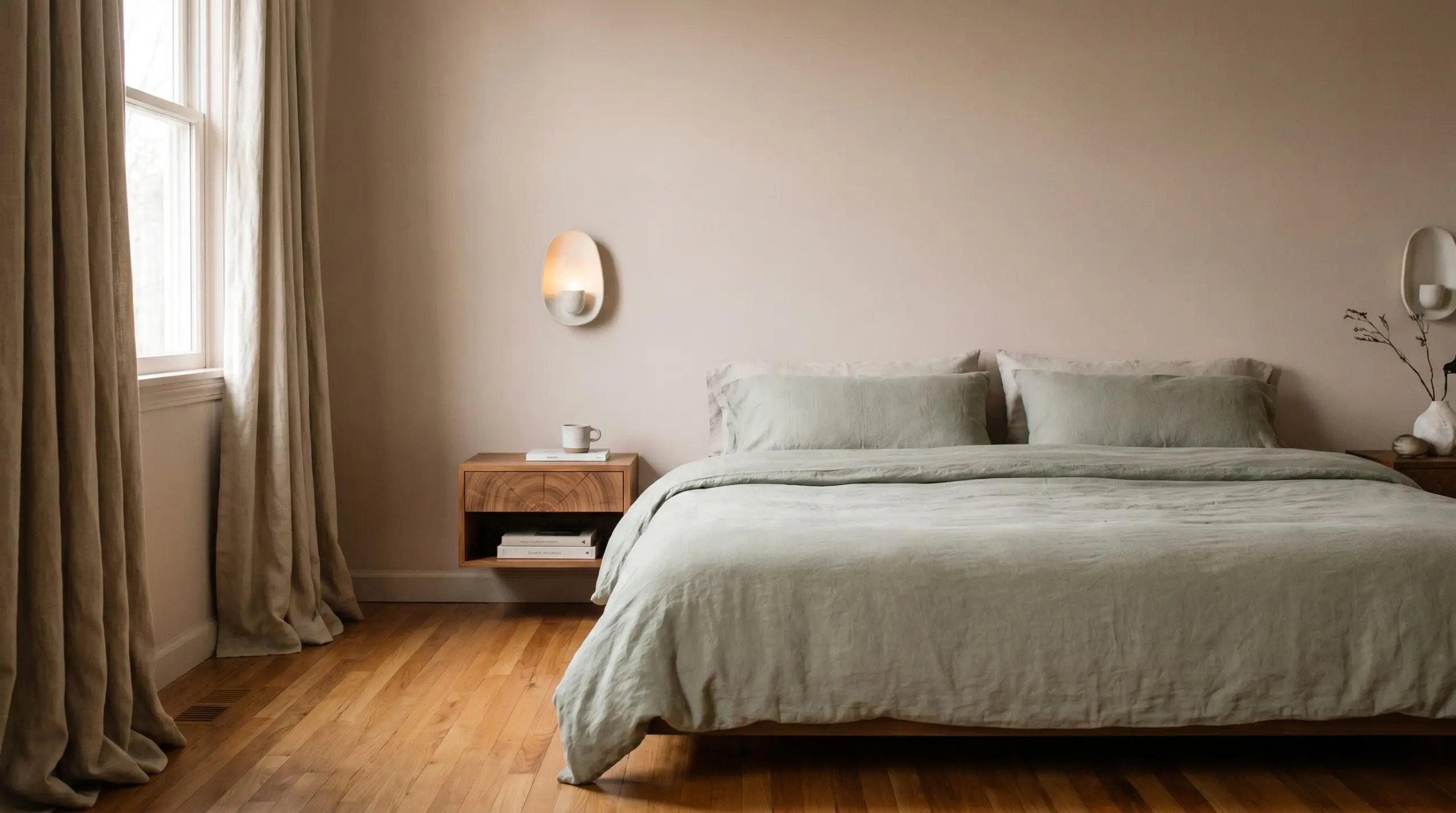
This shade excels in private quarters where sensory decompression is the primary goal. Apply it in a matte finish to absorb the morning light, allowing the subtle peachy undertones to gently warm the space without overwhelming the eye.
To push the design away from predictable romantic tropes, introduce wabi-sabi elements like floating end-grain wood nightstands, raw silk drapery, and asymmetrical ceramic sconces. This juxtaposition forces the blush-toned walls to act as a sophisticated, architectural backdrop rather than a delicate feature.
Elevating the Modern Nursery
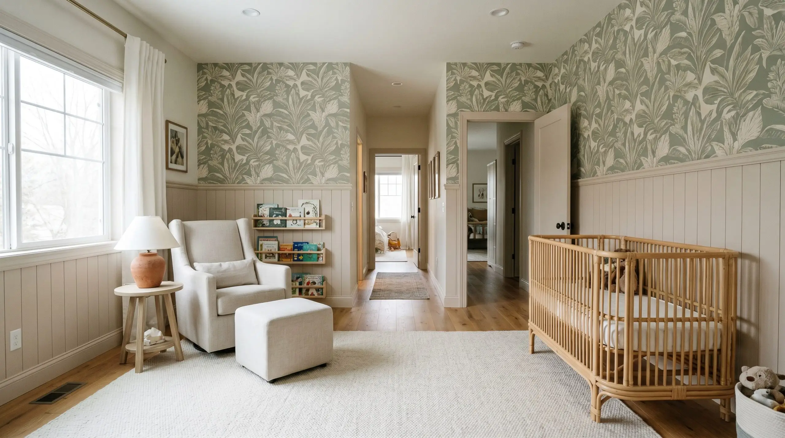
Parents frequently seek out this specific chromatic profile to build a room that outlives the toddler years. Install traditional beadboard halfway up the wall and coat it in a durable eggshell finish, leaving the upper half for a large-scale botanical or abstract geometric wallpaper.
The salmon micro-nuance pairs effortlessly with natural rattan cribs, washed linen gliders, and vintage terracotta table lamps.
Be highly intentional with your rug selection in this space. A rug with strong yellow undertones will compete directly with the pink base, muddying the room’s temperature. Stick to cool ivory, muted sage, or faded oxblood to keep the palette harmonious.
Hackrea Design Secret (The Floor Line Factor)
Customizing Kitchen Cabinetry
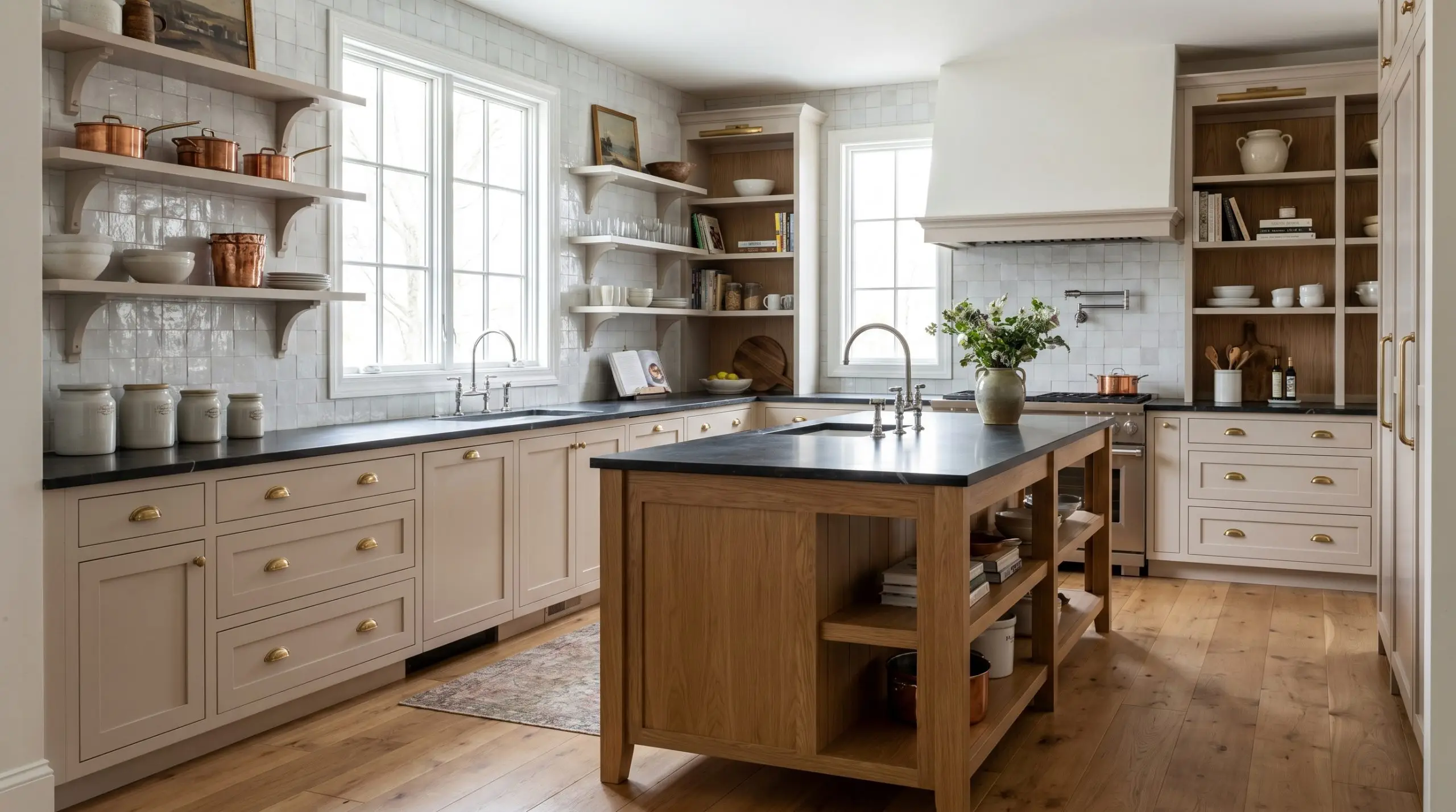
Moving away from stark white kitchens, applying this earthy beige to shaker cabinets instantly introduces a curated, English pantry aesthetic. The mid-light reflectance ensures the cabinetry feels substantial and custom-built without visually shrinking the footprint of the room.
Pair the painted millwork with dark, honed soapstone countertops, unlacquered brass cup pulls, and a highly textured zellige tile backsplash. The cooler, reflective surface of the tile balances the warmth of the wood and paint, resulting in a highly intentional, layered culinary space.
Building a Cohesive Palette Around Farrow & Ball Scallop
To successfully integrate this blush-toned hue, you must decide whether to frame it with sharp, high-contrast boundaries or let it bleed softly into tonal layers. This specific pigment responds beautifully to tonal immersion, where its peachy undertones can wrap a room without harsh visual interruptions.
Selecting the Right Architectural Trim
The trim color you select will dictate exactly how the walls are perceived, acting as the structural frame for the entire room.
Tactile Elements and Finishes
When sourcing hard finishes and textiles, you must balance the delicate nature of this warm taupe with materials that carry significant visual weight.
When pairing metals with a rosy neutral, avoid cool-toned polished chrome or nickel. The icy reflection of silver metals will clash against the salmon micro-nuance, making the paint look unintentionally muddy rather than intentionally warm.
Hackrea Pro-Tip (The Hardware Harmony)
Secondary Palette Additions
Introducing secondary colors requires a careful understanding of how competing pigments will push or pull the base undertones of your primary wall.
Curated Aesthetic Blueprints
To truly understand the versatility of this color structure, you must visualize how it interacts with furniture silhouettes, varied textiles, and intentional styling.
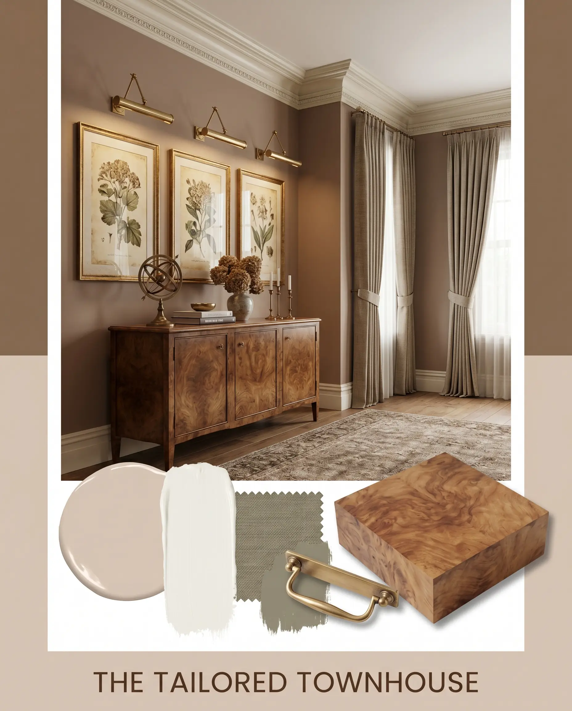
The Tailored Townhouse This palette relies on crisp architectural boundaries, utilizing White Dove OC-17 on heavy crown molding to frame the blush-toned walls. We center the room with a vintage burl wood credenza and unlacquered brass picture lights to emphasize a highly educated, traditional aesthetic. Subtle accents of Kingsport Gray HC-86 in the window treatments pull the earthy beige forward, resulting in a space that feels deeply established and refined.
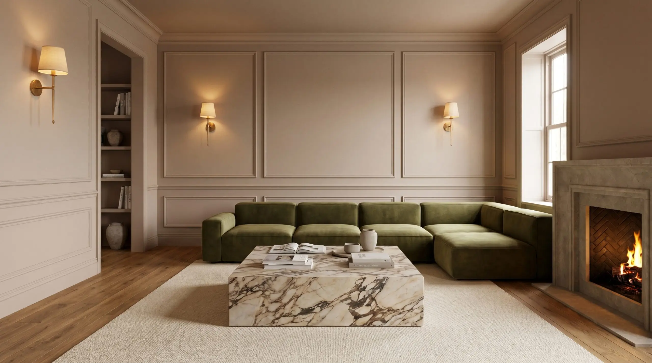
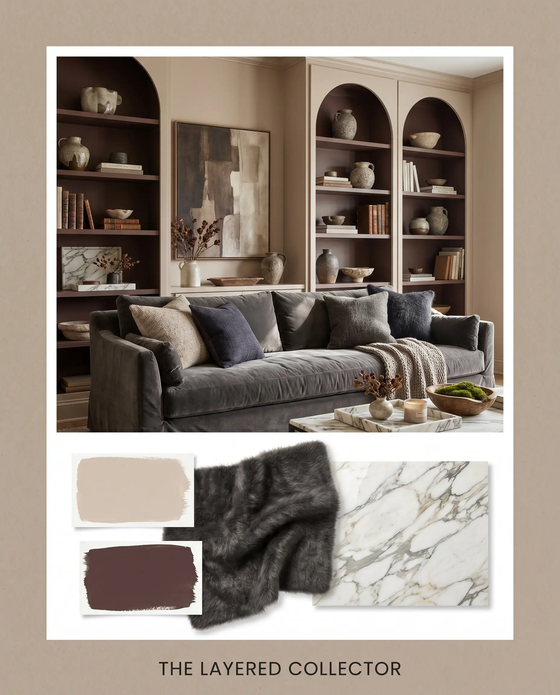
The Layered Collector Here, we lean into a moody, immersive energy by pairing the walls with a luxurious charcoal mohair slipcovered sofa. The introduction of Carnelian SW 7580 on the interior of built-in bookcases creates a rich, monochromatic depth that feels instantly enveloping. We style the surfaces with wabi-sabi ceramics and heavily veined Calacatta marble trays to provide cool, tactile relief against the warmth of the room.
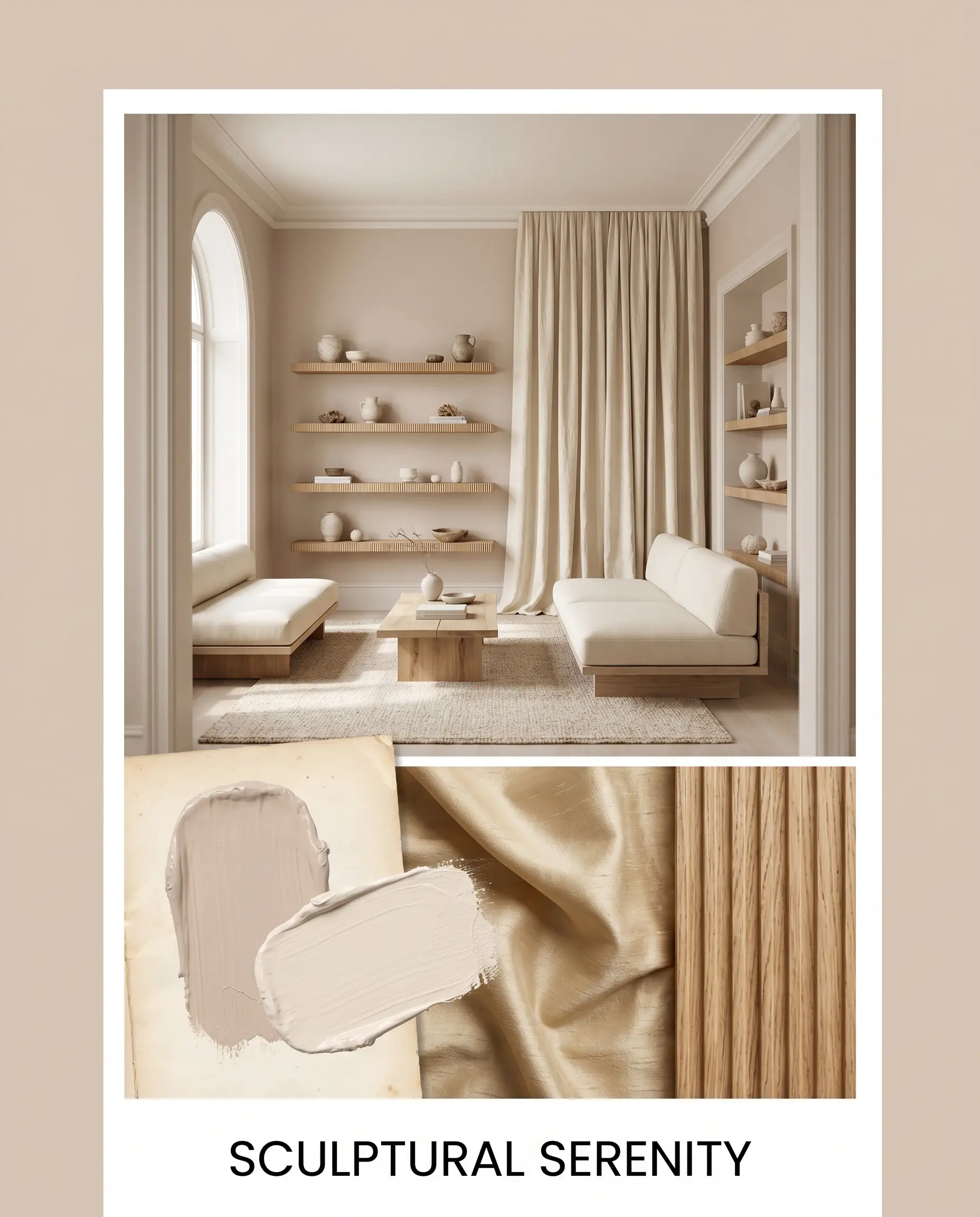
Sculptural Serenity For a softer, tonal approach, we blur the room’s hard edges by carrying Dimity No. 2008 across the trim and ceiling. The furnishings are kept distinctly low-profile, featuring raw silk drapery and floating fluted oak shelves that allow the mid-light reflectance of the walls to glow uninterrupted. This creates an incredibly serene, meditative atmosphere that prioritizes gentle light play over stark contrast.
Farrow & Ball Scallop vs. Rival Neutrals
Sometimes, the specific lighting exposure or surrounding hard finishes dictate a shift away from this peachy profile. If your room lacks natural light or features intensely cool-toned flooring, this shade might read too muddy, requiring a pivot to a more decisive pink or a strictly neutral beige.
Farrow & Ball Scallop vs. Farrow & Ball Setting Plaster No. 231
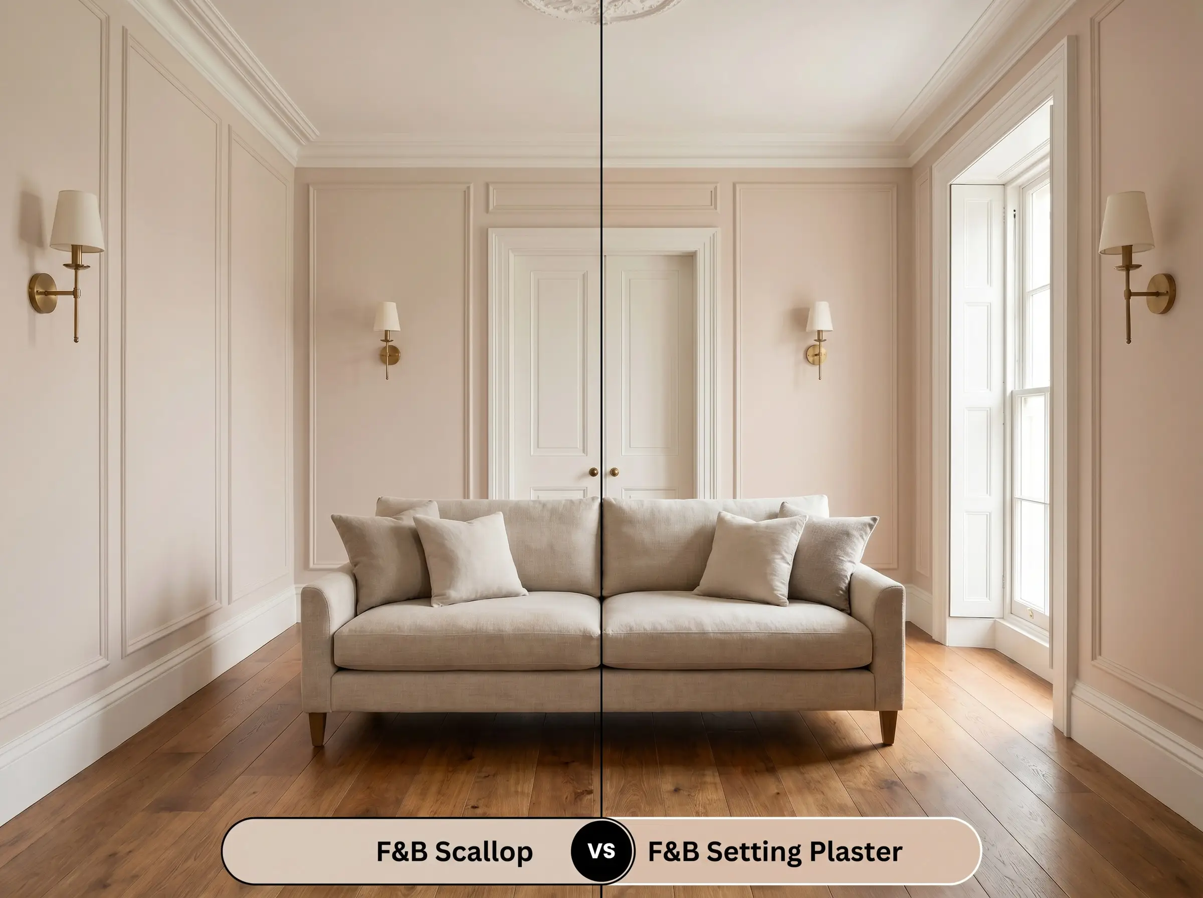
If you need a definitive pink presence that holds its color in low light, then Setting Plaster No. 231 is the superior choice. While Scallop leans heavily into its earthy beige foundation, Setting Plaster strips away the brown, delivering a clearer, more historic pink that resists turning muddy in north-facing rooms.
Farrow & Ball Scallop vs. Sherwin Williams Lightweight Beige SW 6092
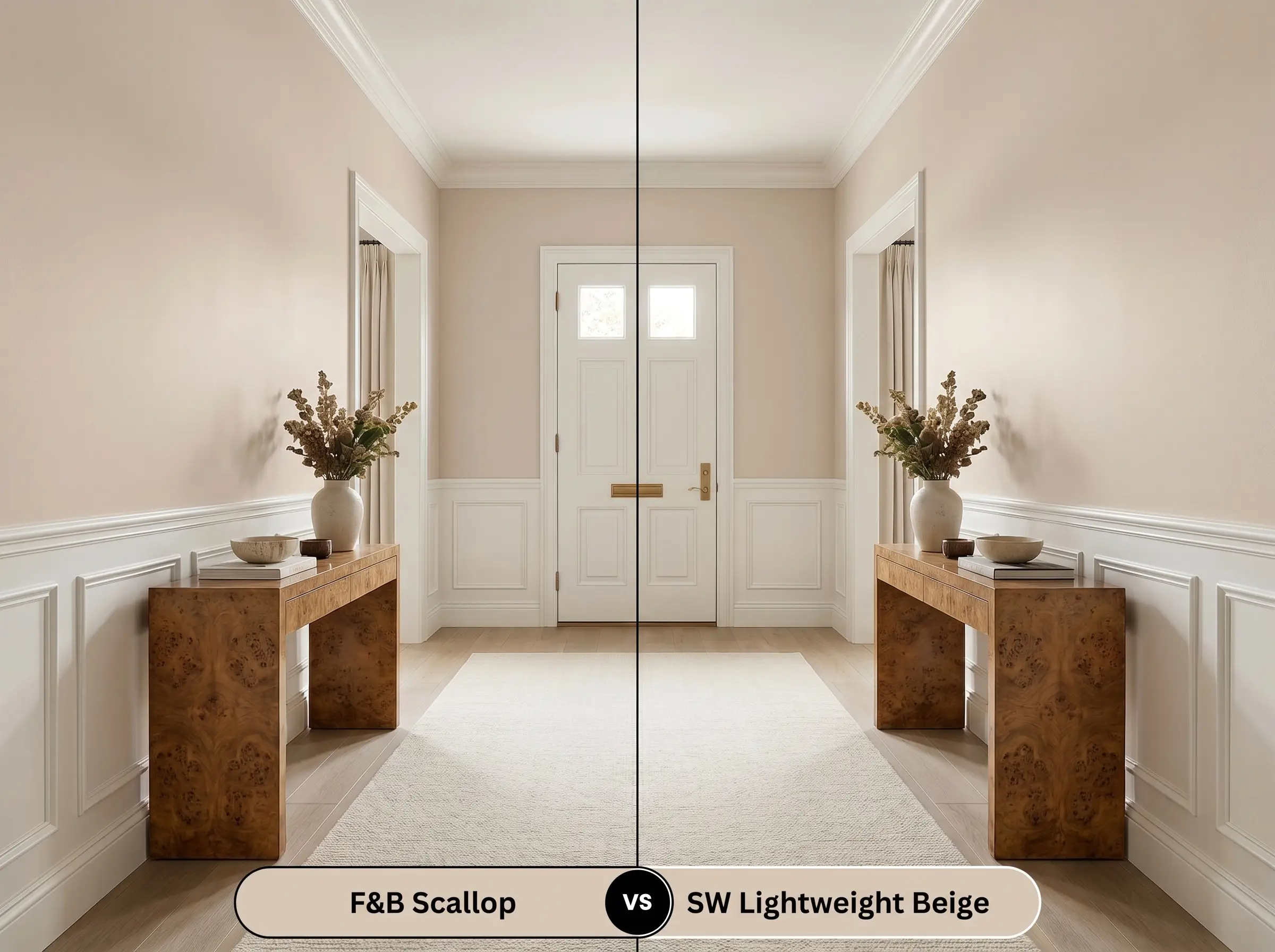
If your space features cool gray stone or stark white cabinetry, then Lightweight Beige SW 6092 provides a safer, less reactive backdrop. Lightweight Beige carries significantly less red pigment, functioning as a straightforward warm neutral, whereas the Farrow & Ball option will actively project its salmon micro-nuance against cool surfaces.
Alternative Blush-Toned Options
When the foundational vibe is correct but the exact depth or thermal shift needs a slight adjustment, these alternative shades provide excellent pivoting points.
Farrow & Ball Variations
Color Matches Across Manufacturers
Mastering the Application of Scallop
Transitioning this chromatic profile from a simple swatch to a flawless architectural finish requires strict adherence to proper preparation and sheen selection.
Selecting the Correct Finish
Foundation and Undercoats
Achieving a Flawless Surface
Frequently Asked Questions
Because green and pink sit opposite each other on the color wheel, vibrant exterior foliage will actively pull the hidden rosy notes forward. To neutralize this effect, use warm 2700K artificial lighting to bring back the earthy beige foundation.
The deep crevices of exterior stucco create thousands of tiny shadows, which significantly lowers the perceived light reflectance. On a textured exterior, this shade will lose its delicate blush quality and read as a much heavier, grounding taupe.
Warm colors naturally advance toward the eye, making this an excellent choice for visually lowering a soaring ceiling. Painting the ceiling in this shade creates a subtle, wrapping effect that immediately makes overly large spaces feel intimate.
The dead flat finish absorbs nearly all ambient light, completely eliminating the subtle sheen that highlights bumps and tape lines. It is the superior choice for older walls, providing a flawless, velvety surface that estate emulsion cannot match.
The Final Verdict on Farrow & Ball Scallop
Farrow & Ball Scallop is the ultimate transitional color for homeowners seeking a sophisticated, highly curated alternative to standard builder-grade neutrals. It excels in spaces designed for tactile layering, providing a warm, stabilizing backdrop that immediately elevates the perceived quality of the room’s furnishings. This paint is perfect for those who appreciate the historic pedigree of a blush-toned beige but demand the modern adaptability to pair it with everything from heavily veined marble to rich, saturated textiles.
This shade is explicitly not for homes dominated by stark, cool-toned gray flooring or icy white LED lighting. Placing this earthy beige next to severe, cool grays creates a harsh, clinical tension that immediately sours the peachy notes, making the walls read as dirty rather than intentionally warm. If your home’s hard finishes lean heavily toward blue-grays, you must pivot away from red-based neutrals to maintain a cohesive, elegant environment.
Hackrea Pro-Tip (The Cool Tone Clash)