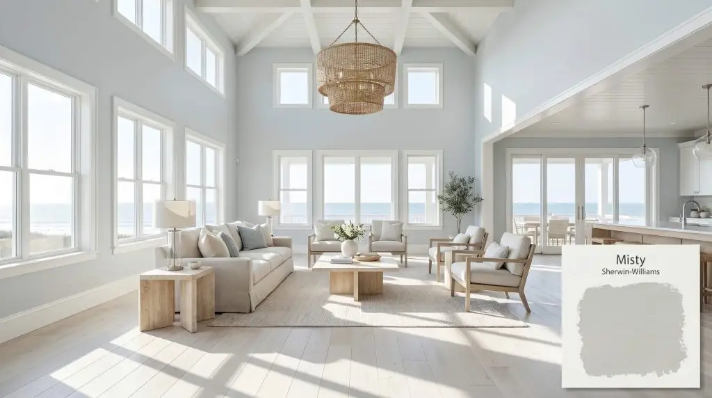
Sherwin-Williams Misty (SW 6232) is a soft, airy light blue-gray paint color. With its slate gray undertones, it maintains a cool, tranquil presence without feeling overly pastel. It is an excellent choice for creating a serene, coastal, or spa-like atmosphere in bedrooms and bathrooms.
Will Misty clash with your room?
Paint Technical Profile
| Color ID / SKU | SW 6232 |
| HEX Code | #CDD2D2 |
| Light Reflectance (LRV) | 64 |
| Temperature | Cool |
| Primary Undertone | Slate Gray |
| Hidden Undertones | Icy Blue, Subtle Green |
| Use | Interior, Exterior |
| Best Exposures | South-Facing, West-Facing |
| Best For | Master Bedrooms, Spa Bathrooms, Ceilings, Laundry Rooms, Coastal Living Spaces |
Misty Digital Design Concept Boards
Master Bedrooms
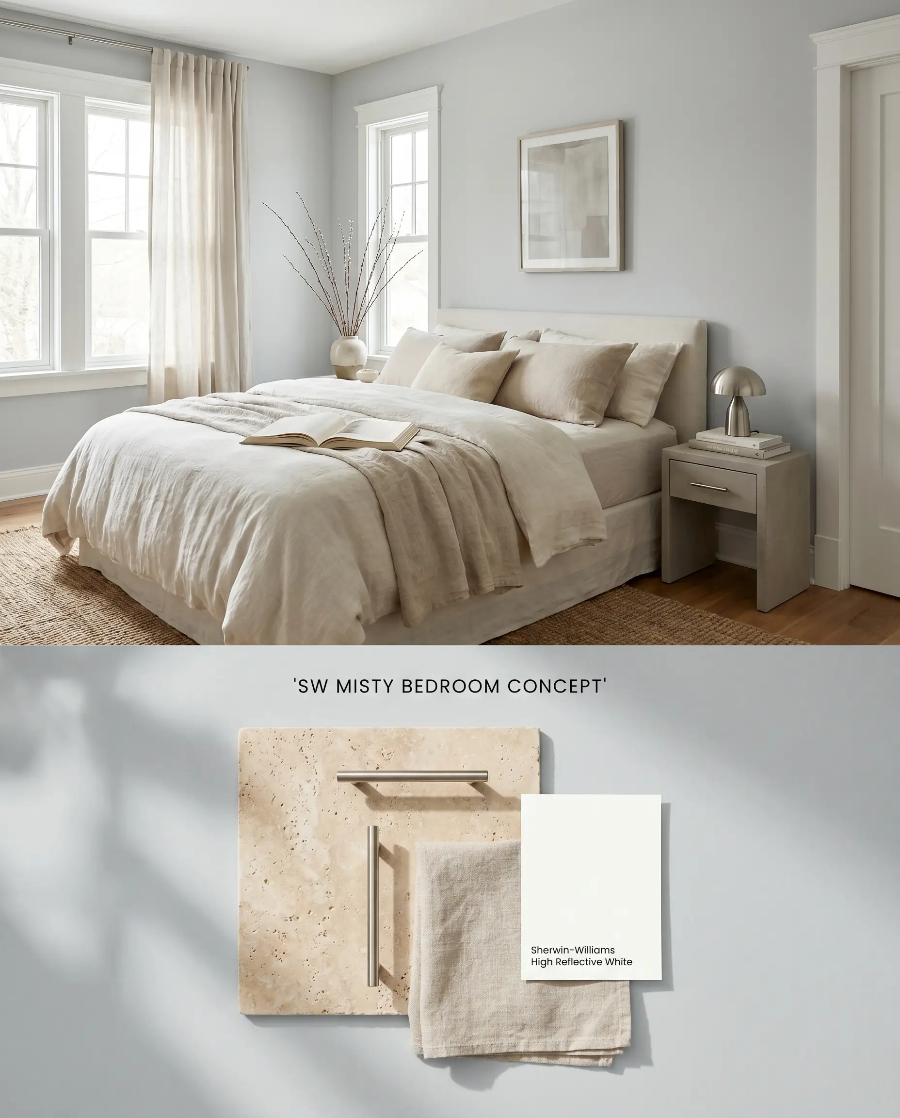
Sherwin-Williams Misty thrives in sleeping quarters where the slate gray undertones anchor the aquatic freshness. Layering raw linen textiles and matte stone finishes absorbs the icy cast, preventing the room from reading as stark or clinical. The cool architectural finish lowers the visual temperature of the room, requiring tactile, light-absorbing materials to ground the space.
Spa-Inspired Bathrooms
Will Misty work with your specific lighting, floor, or furniture?
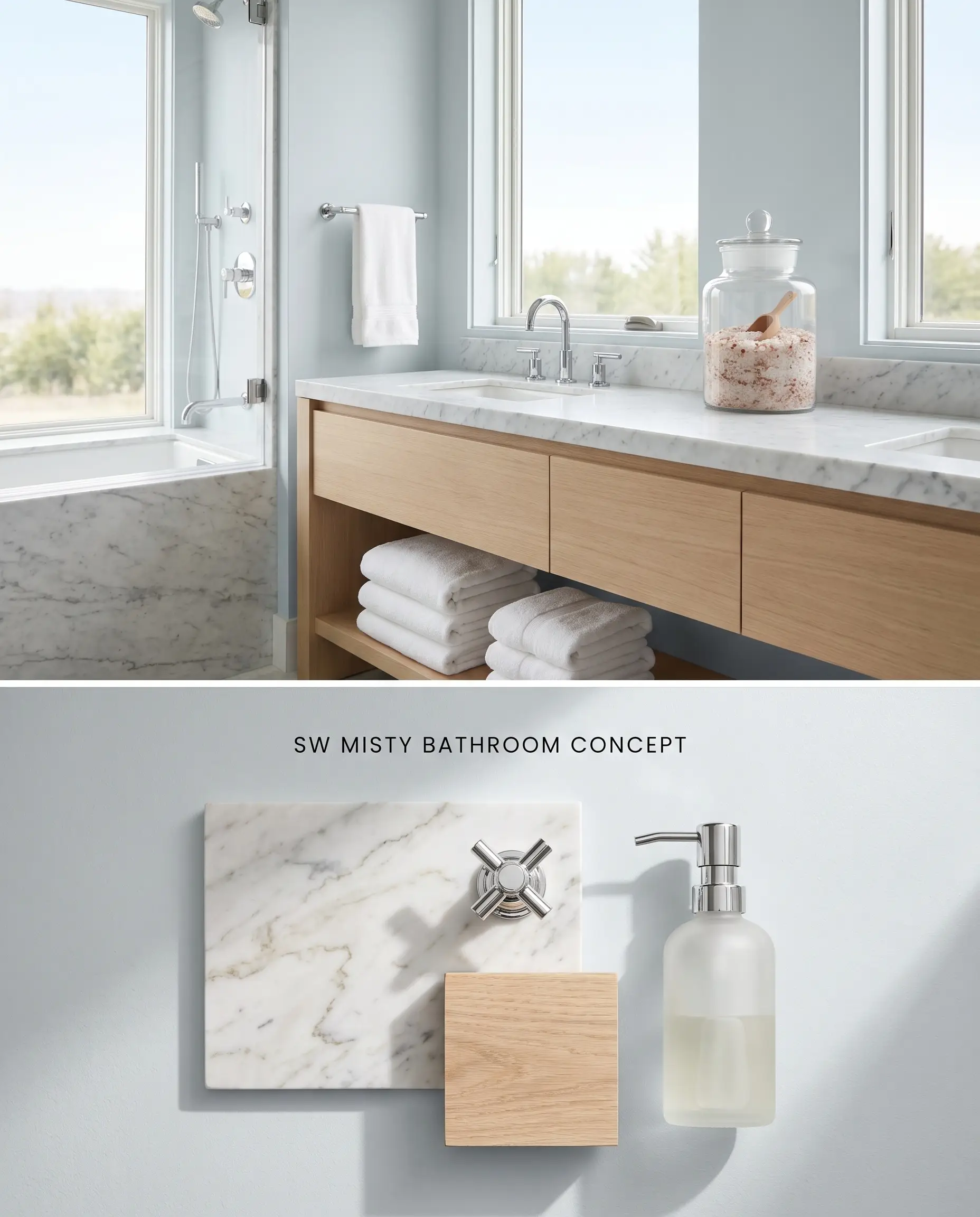
The blue-gray chromatic profile of Sherwin-Williams Misty naturally aligns with water-centric spaces, but requires abundant natural light to maintain its color structure. Pairing the walls with honed Carrara marble introduces organic veining that physically bridges the cool paint with the porous surface of the natural stone.
Beadboard and Wainscoting
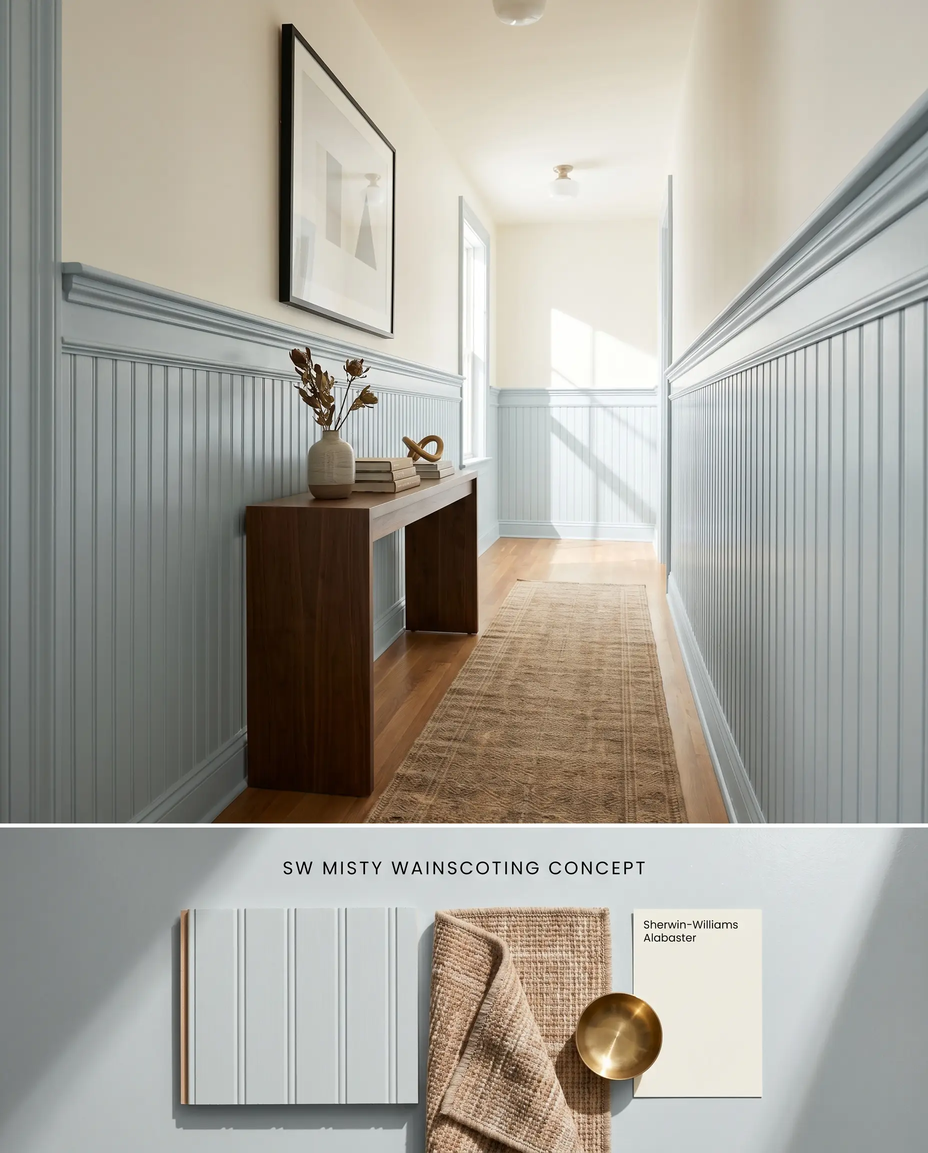
Applying Sherwin-Williams Misty to lower-wall millwork introduces a coastal palette without overwhelming the vertical visual plane. The rigid, parallel lines of beadboard catch the directional light, emphasizing the blue-gray structure and providing a grounding architectural base beneath lighter upper walls.
Open-Concept Coastal Living Spaces
Will Misty work with your specific lighting, floor, or furniture?
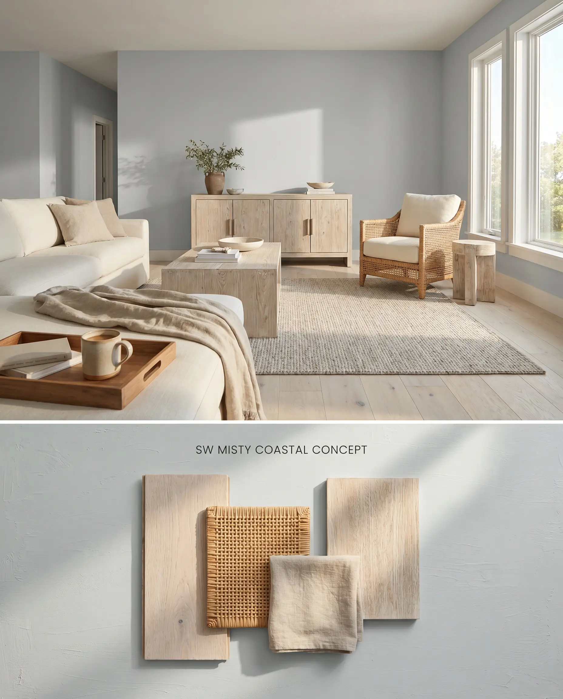
In expansive rooms, the light reflectance value of 64 allows Sherwin-Williams Misty to carry natural light deep into the interior footprint. To counter the inherent coolness of the paint, introduce highly textured, bleached woods and woven rattan that inject physical warmth by scattering light across their uneven surfaces, bypassing the need for clashing yellow tones.
Painted Ceilings (Haint Blue alternative)
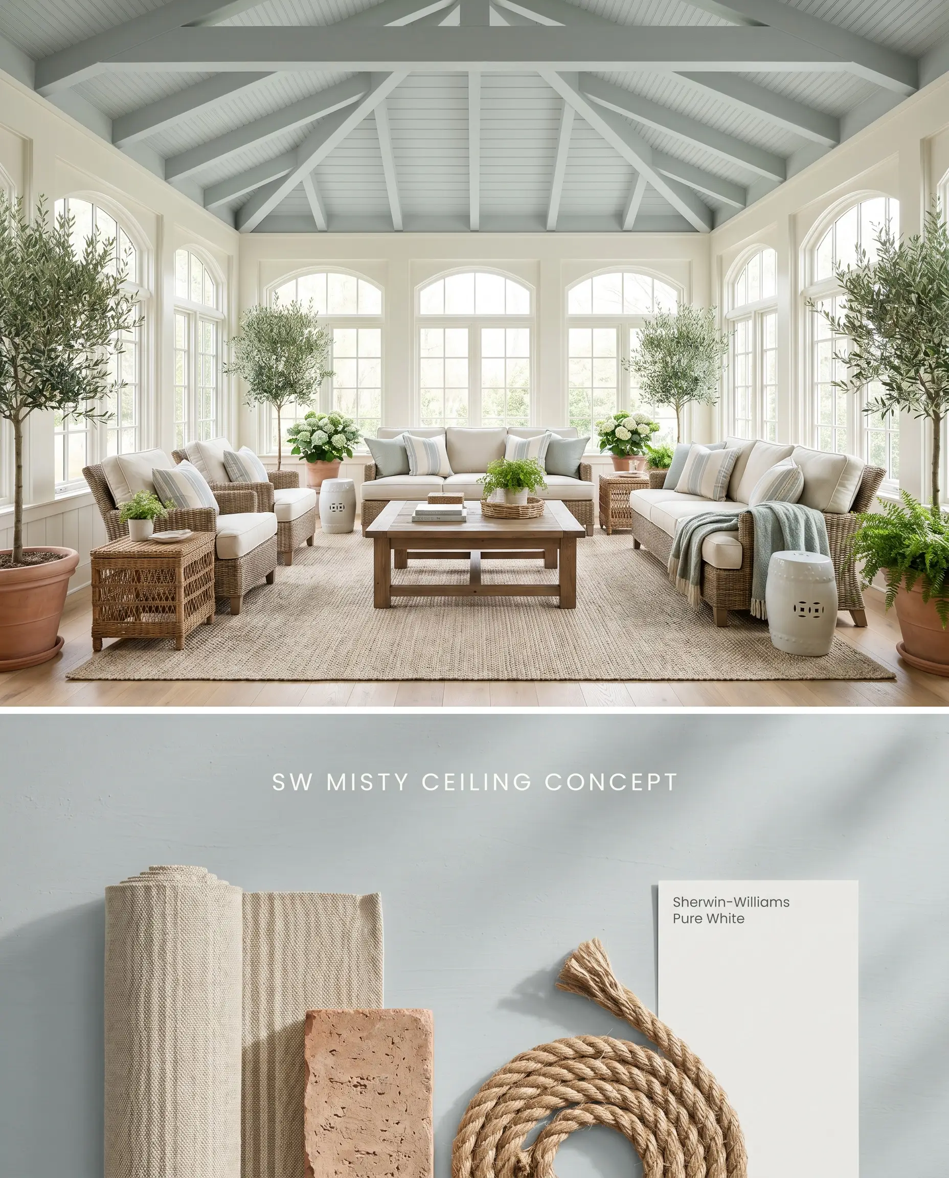
Utilizing Sherwin-Williams Misty overhead mimics the atmospheric depth of the sky, drawing the eye upward and physically expanding the perceived height of the room. The slate gray base prevents the ceiling from reading as a juvenile pastel, offering a muted, sophisticated alternative to traditional, highly saturated Haint Blue.
Comparative Color Theory and Undertone Analysis
Sherwin-Williams Misty vs. Sherwin-Williams Sea Salt SW 6204
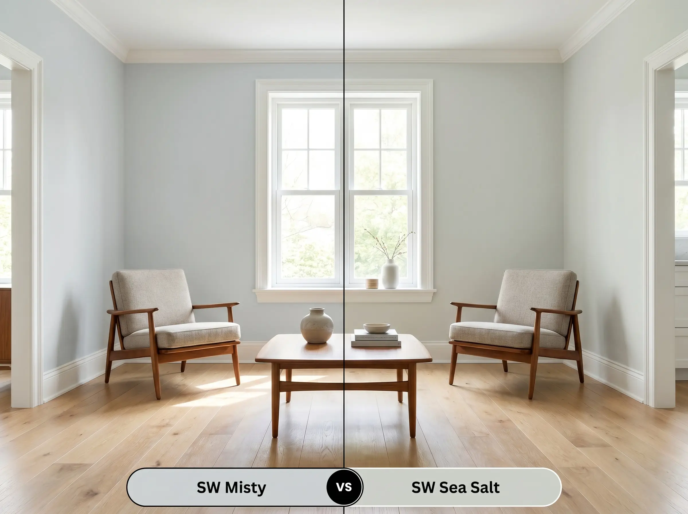
Sherwin-Williams Sea Salt SW 6204 leans strongly into green undertones, whereas Sherwin-Williams Misty relies on a strict slate gray and blue profile. In rooms with dense exterior foliage, Sea Salt SW 6204 will amplify the green bounce, while Misty will absorb it and shift away from its true blue-gray nature. Specify Sea Salt SW 6204 for spaces requiring an earthy, organic green lean, and reserve Misty for crisp, aquatic freshness.
Sherwin-Williams Misty vs. Sherwin-Williams Tradewind SW 6218
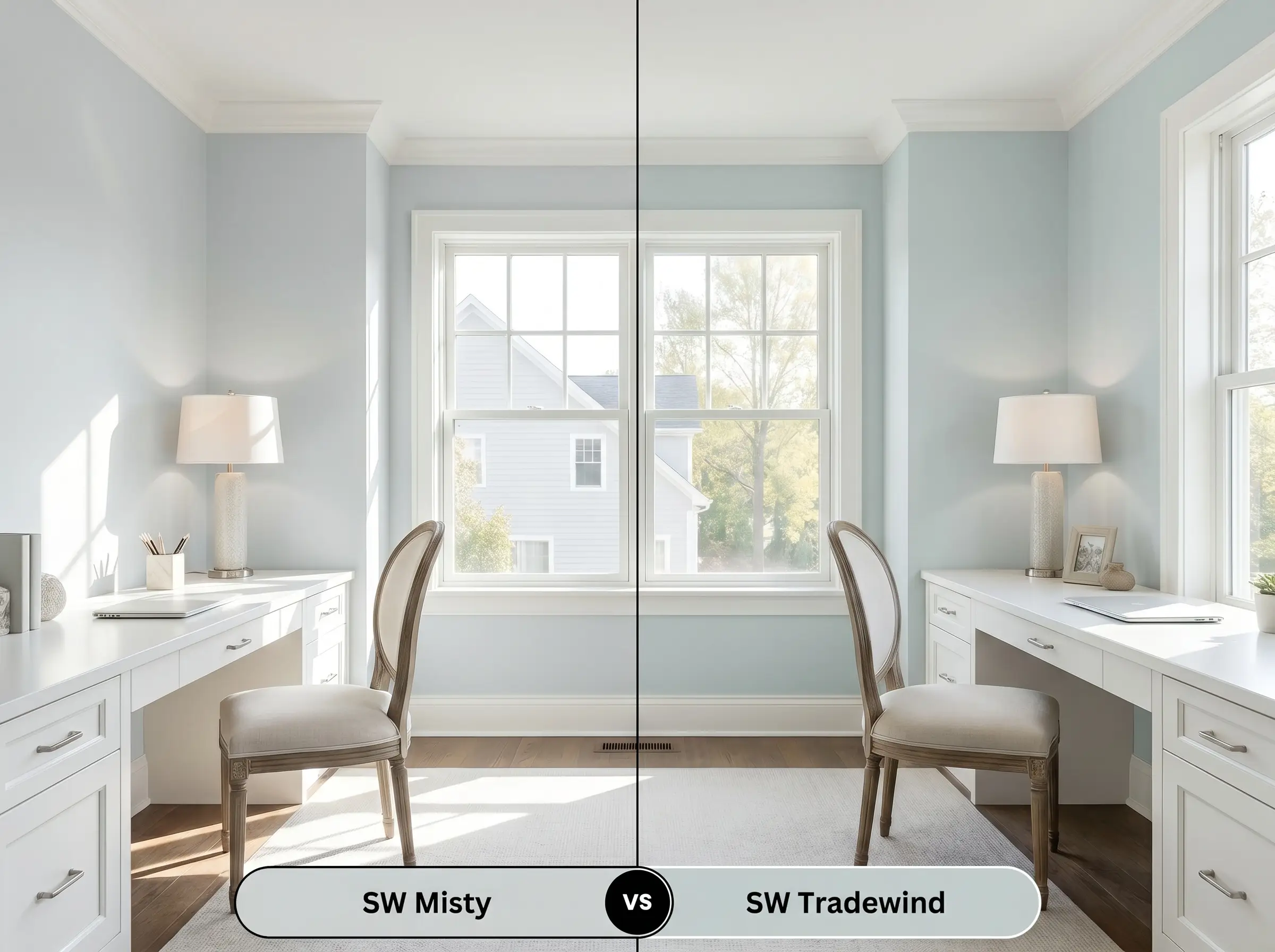
Sherwin-Williams Tradewind SW 6218 is a purer, more saturated light blue with less gray to anchor it, making it read brighter and more traditional on the wall. Misty’s prominent slate gray base mutes the blue, giving it a more sophisticated, architectural finish. If you are painting a South-facing room where intense light washes out subtle colors, Tradewind SW 6218 holds its blue identity, whereas Misty will neutralize into a soft gray.
Sherwin-Williams Misty vs. Benjamin Moore Silver Mist 1619
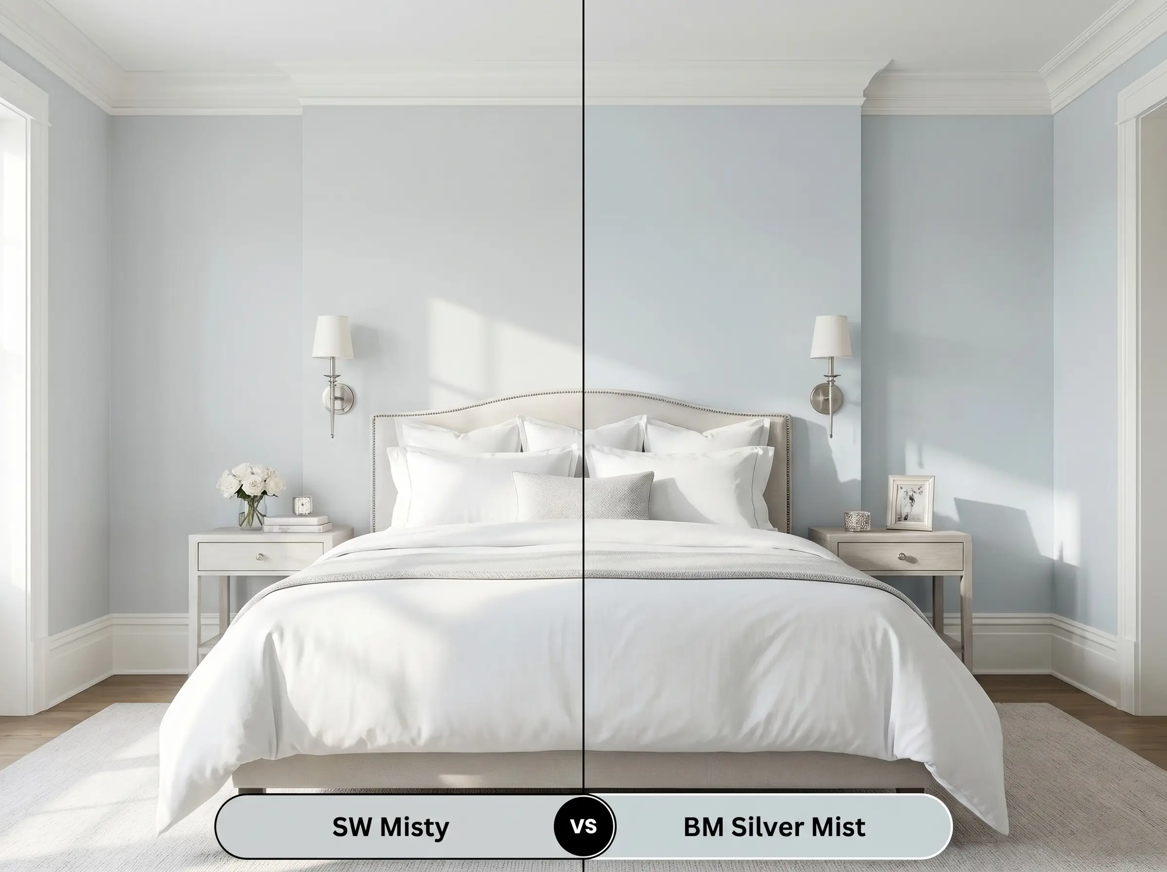
Will Misty work with your specific lighting, floor, or furniture?
Benjamin Moore Silver Mist 1619 carries slightly more cyan in its base compared to the straightforward icy cast of Sherwin-Williams Misty. While both operate in the exact same LRV range, Silver Mist 1619 transitions warmer in changing light. Specify Sherwin-Williams Misty when you need a rigid, cool architectural finish that resists shifting toward teal or green unless forced by exterior foliage reflections.
Technical FAQs and Application Constraints
Yes, in cool, North-facing light, the slate base recedes and the icy blue cast dominates, pushing the color closer to a baby blue. To avoid this, restrict this paint to South-facing rooms where the warm light balances it into a sophisticated gray.
The cool chromatic profile of this paint clashes severely with warm yellow or honey oak wood tones. This juxtaposition inadvertently emphasizes the blue in the paint and makes the wood look aggressively orange.
This color is highly susceptible to green reflection from the outdoors. If you have dense foliage outside the window, the hue will absorb the green bounce and lose its true blue-gray nature.
In spaces lacking natural light, this paint falls into a low-light trap where its color structure flattens completely. It will appear as a muddy, indistinct gray rather than an airy blue, making it entirely unsuitable for windowless basements or low-light bathrooms.
Room Compatibility & Clashes Diagnoses
Hackrea's reports evaluating the compatibility of Misty in real rooms.No compatibility tests for Misty yet.
Be the first to see how this color reacts to your space. Run a free architectural diagnostic now.
Paint Aesthetic & Practical Analysis
| Profile | Analysis | |
|---|---|---|
| Aesthetic | Misty is a reliable, sophisticated blue-gray that avoids the 'baby blue' trap thanks to its grounding slate undertones. It brings a crisp, aquatic freshness to a room, though it can lean slightly icy in north-facing light. It stands as a top contender for tranquil, spa-inspired spaces. | |
| The Coverage Catch | Misty offers standard coverage, but requires a high-quality primer over dark or heavily saturated walls to prevent the soft blue-gray from losing its crispness. | |
| The Lighting Shift | In cool, North-facing light, the slate base recedes and the icy blue cast dominates. In warm South-facing rooms, it reads as a much more balanced, sophisticated gray. | |
| The Clash Warning | The cool chromatic profile clashes heavily with warm yellow or honey oak wood tones, which can inadvertently emphasize the blue and make the wood look aggressively orange. | |
| The Bounce Effect | Highly susceptible to green reflection; if you have heavy foliage outside the window, this hue will absorb the green bounce and shift away from its true blue-gray nature. | |
| The Low Light Trap | In windowless bathrooms or basements, the lack of natural light can flatten the color structure, making it appear as a muddy, indistinct gray rather than an airy blue. | |
| The Touch Up | Generally forgiving for touch-ups due to its lighter LRV and stable base, provided the architectural finish and sheen match perfectly. |
Closest Cross-Brand Equivalents
The absolute closest scientific color matches for Misty across top paint brands.