Upward SW 6239
Sherwin-WilliamsThe color of the year 2024, a gorgeous gray-blue that marks the shift to light neutrals full of contentment, well-being, and optimism.
Upward (SW 6239): What Color Is, Review, and Use
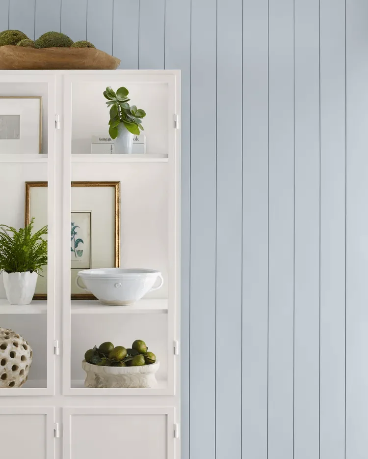
The Color of the Year 2024 at Sherwin-Williams marks the shift to lighter natural shades after several years of earthy colors. Upward SW 6239 emerged from Redend Point, a blush clay tone that renders a feel of home and connection, Sherwin-Williams’ color of the year 2023. Back to the star of this season, Sherwin-Williams’ Upward is a delightful green-blue with a grayish tint.
There is more to this blue. SW colorists created this breezy pastel tone to encourage us to take a second and meditate on the moment. Like a breath of fresh air, this blissful sky-blue color reminds us to slow down and clear our minds. No secret color plays an essential role in how we feel and see the world, and choosing a refreshing and calming blue like this in your home will surely bring a change to your well-being.
Upward Paint Color Features
The mid-tone neutral blue that took centerstage this season renders complete contentment, creativity, and freedom. The clear blue sky has always been there; you just have to look up and see the world from a new perspective.
“With this color, we invite our consumers to take a pause and infuse a new sense of ease and possibility into their spaces,” states Sue Wadden, director of color marketing at Sherwin-Williams. Moreover, the Sherwin-Williams team claims that this new-generation blue represents the shift from the long-lasting farmhouse interiors to the emerging coastal style, which is expected to become impressively popular. Upward is a promising light and airy blue that will bring change to the interior and exterior design.
You can apply wallpapers, paints, etc. on walls and see how they look in various interiors.

Upward: Is It Warm or Cold?
The first impression may lead to the idea that Sherwin-Williams’ Upward is a cool blue. Let’s check the facts. Colorists operate with such a term as RGB value, showing the amount of Red, Green, and Blue in a color. At SW 6239, the blue value prevails over red and green, making this paint color seem relatively cool. Yet, lighting is essential.
How Does Lighting Affect Upward?
An abundance of natural lighting brings an overly light effect to this gorgeous blue shade, drawing it closer to gray. On the other hand, the lack of natural light leads to a more intense blue. Some colorists even underline the presence of a subtle purple note under specific lighting conditions.
In this context, we mention the difference between exposures. For instance, expect Upward to look colder and more solid in a north-facing room. Simultaneously, the eastern, south-western, and primarily southern exposure makes this beloved blue appear softer and sun-kissed. The story changes at night when artificial lighting transforms this light blue into a deeper gray blue, yet the type of lighting source still plays an essential role (ambient or task lighting).
Upward LRV
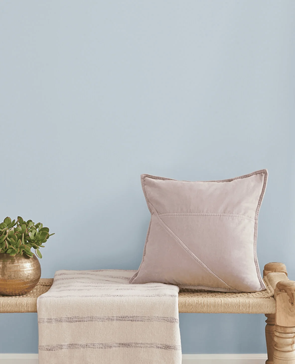
The Light Reflectance Value is a valuable figure that shows how much light a color can bounce back, revealing how light or dark this shade is. It’s essential to know the LRV to be aware of how a paint color will behave. Upward has an LRV of 57, which means a mid-tone blue. Therefore, it is pretty skillful at reflecting light and preserving the room well-lit and airy. Still, don’t hesitate to experiment with a color sample in your home before painting the walls or furniture.
Upward Undertones
This light denim blue proudly shows off a beautiful mix of green and gray undertones that take us to the stratosphere. This beautiful pairing of natural notes makes for an airy blue that feels as easy and relaxed as it looks.
Similar Colors
Blues have always been popular among paint brands. Undoubtedly, you’ll find lighter, darker, cooler, or softer blue variations of Upward. We’ve gathered the most prominent alternatives from Sherwin-Williams and other renowned manufacturers.
Coordinating Colors
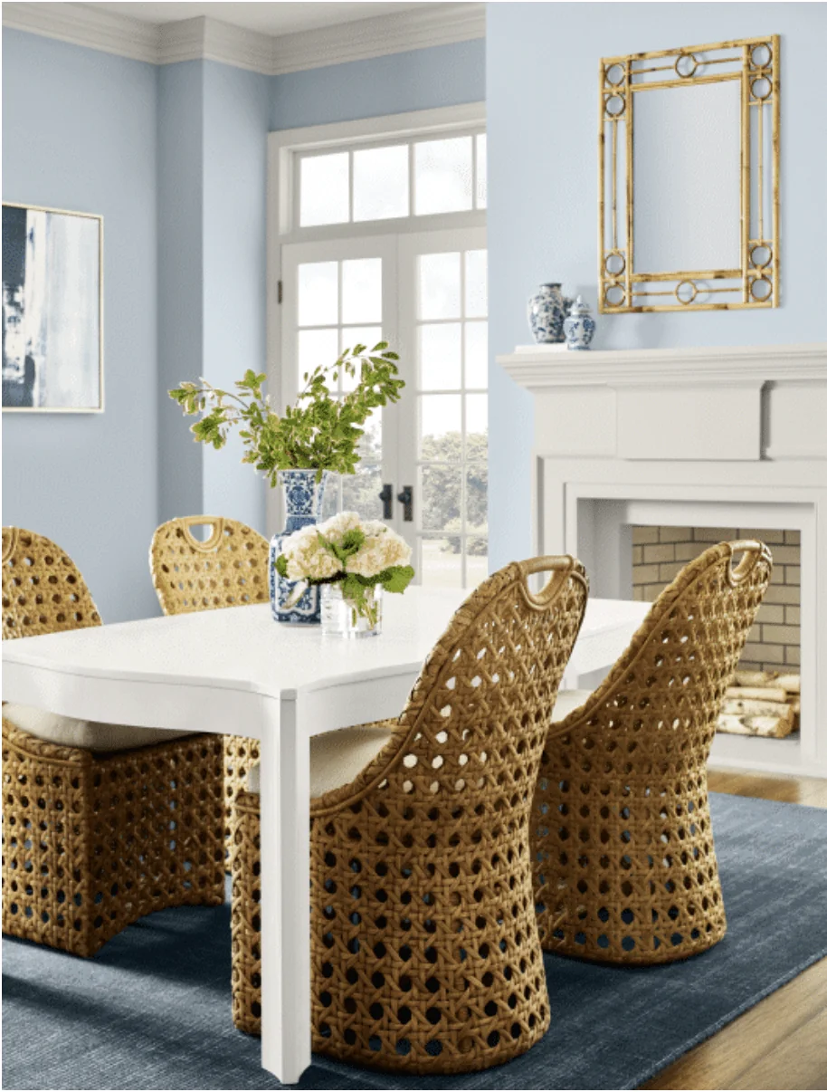
According to colorists, Upward pairs well with crisp whites, fresh greens, cool pastels, earthy brown shades, and accent dark colors. You should choose between a monochromatic color palette with SW 6239 or a color code of contrast. Here are a few of the best matching paint colors for Upward:
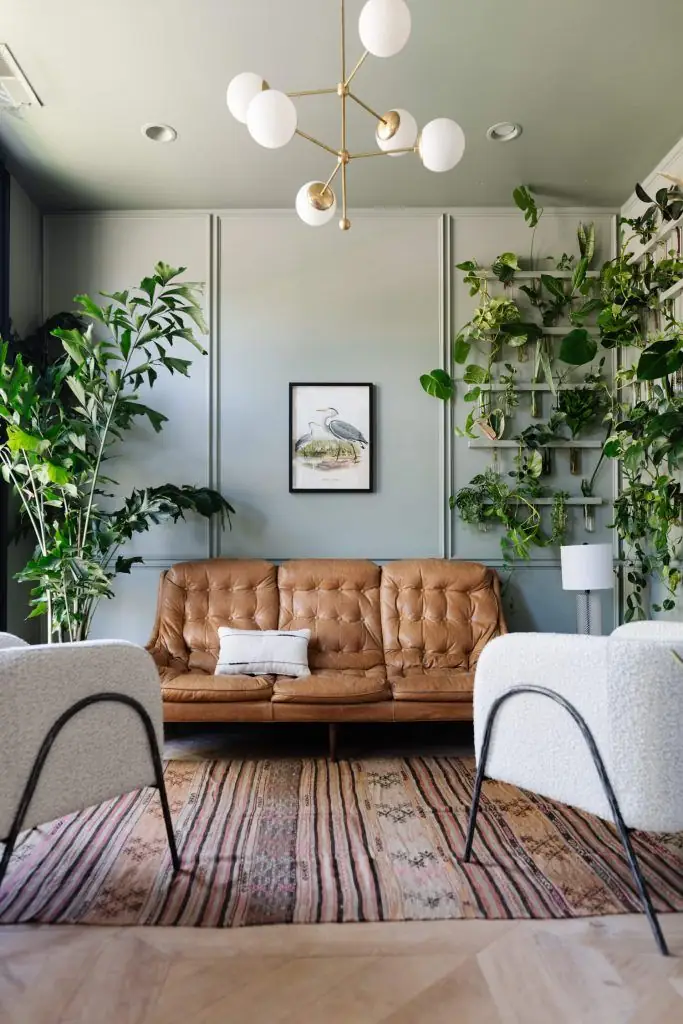
Use of Upward in the Interior
Sherwin-Williams’ team recommends using Upward in both modern and traditional design styles. Since designers predict Coastal to be favored, this gorgeous blue seems more than welcome. Decorate all walls, ceilings, or furniture with this calm and restorative shade of blue. Experts draw our attention to relaxation spaces, such as the bedroom, where Upward will thrive and help you ease your mind. The color marketing director from the brand says that Upward looks awe-inspiring on a bathroom vanity paired with marble or on kitchen cabinets. The choice is all yours, yet a splash of inspiration won’t hurt.
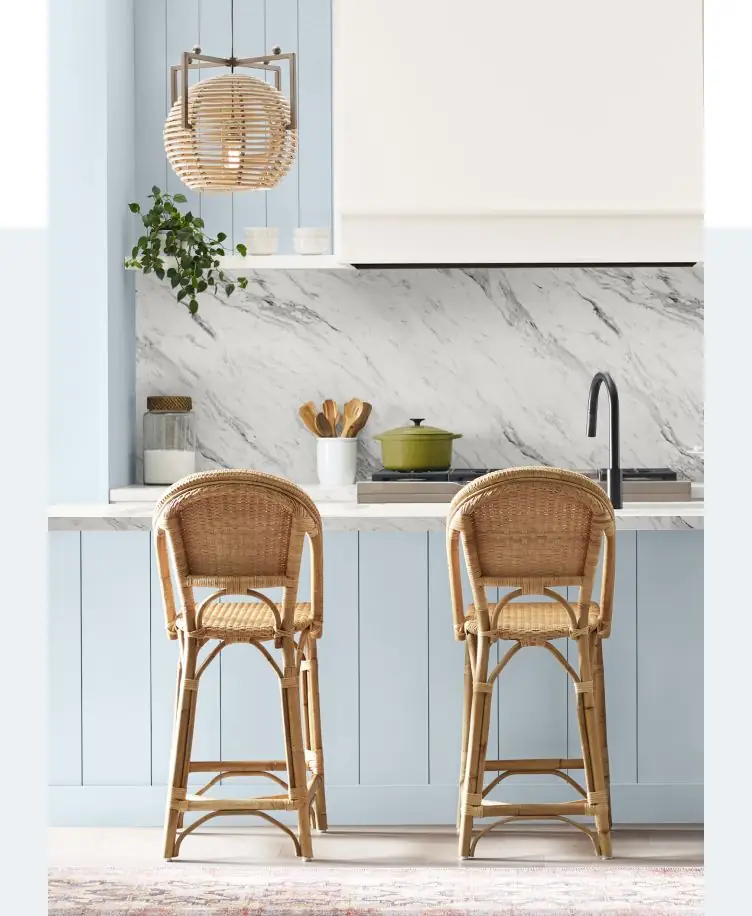
New Coastal
Feel the marine breeze in your home with a renewed Coastal style updated by the brand-new blue from Sherwin-Williams. Embrace the calm and free lifestyle by stylishly pairing walls painted in light blue, white trim, and wicker furniture. Keep worries at bay when surrounded by this most welcoming combination of colors and textures in any room of your home.
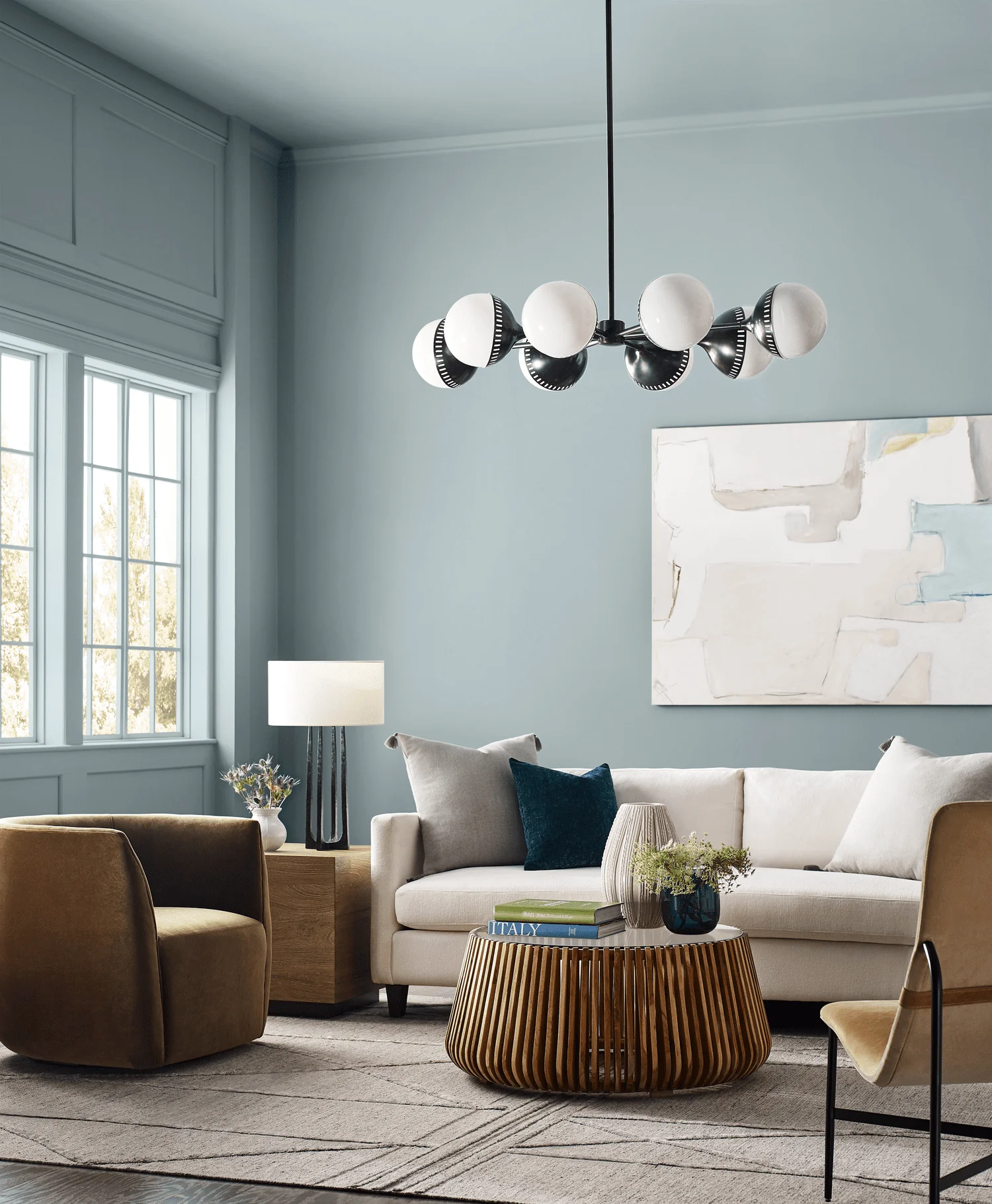
Modern Gray-Blue
It’s impressive how the same traditional blue transforms into a modern color with the right accents. If you feel closer to a contemporary look, use Upward in your home paired with light pastels and wooden furniture for a more relaxed ambiance. At the same time, we cannot help but admire the integration of this blissful blue in rich color palettes of vibrant or dark shades for a trendy, energetic vibe.
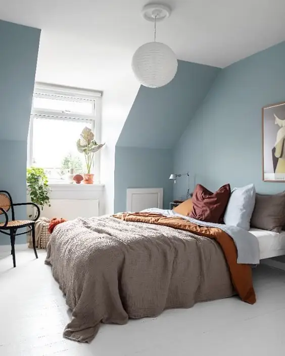
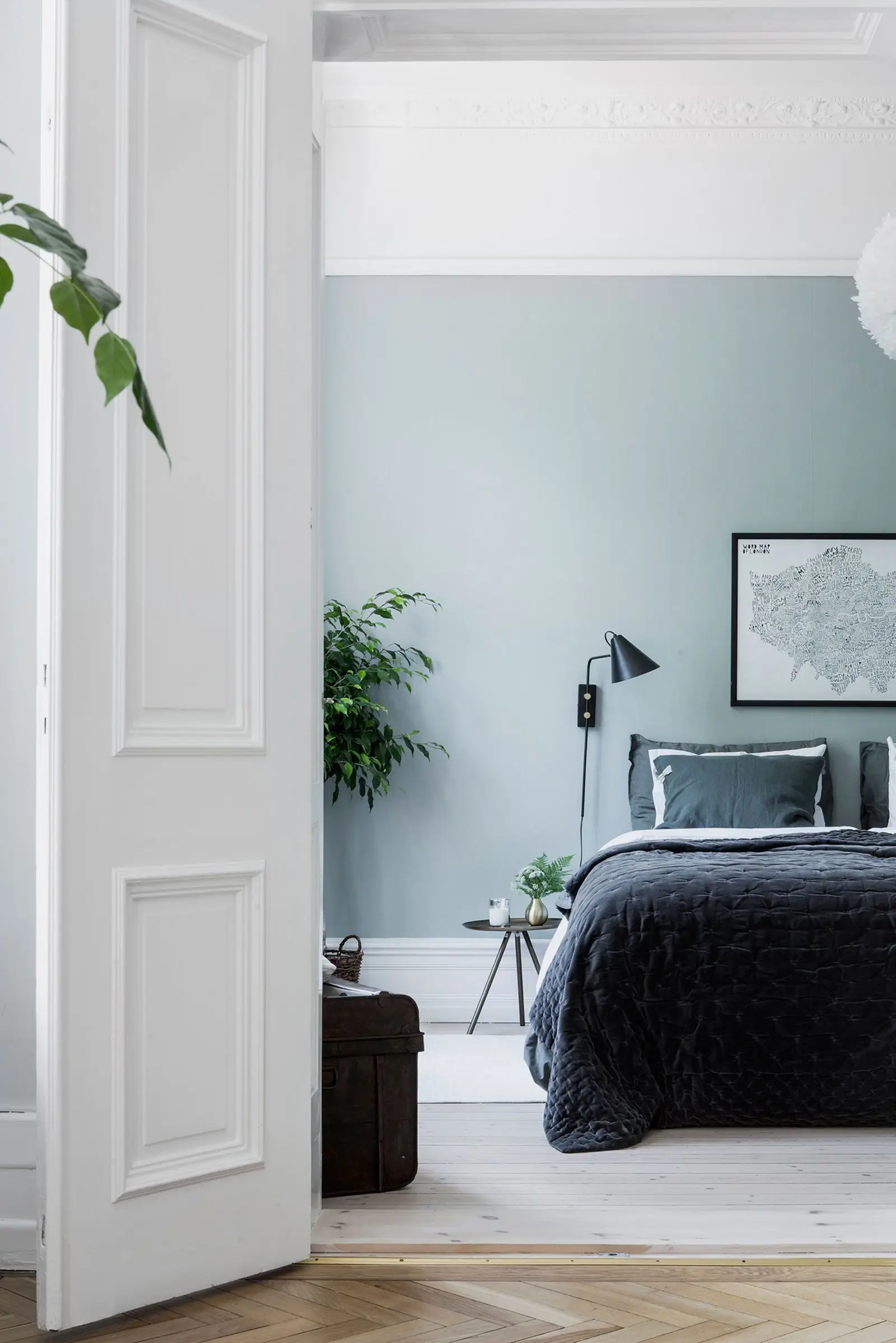
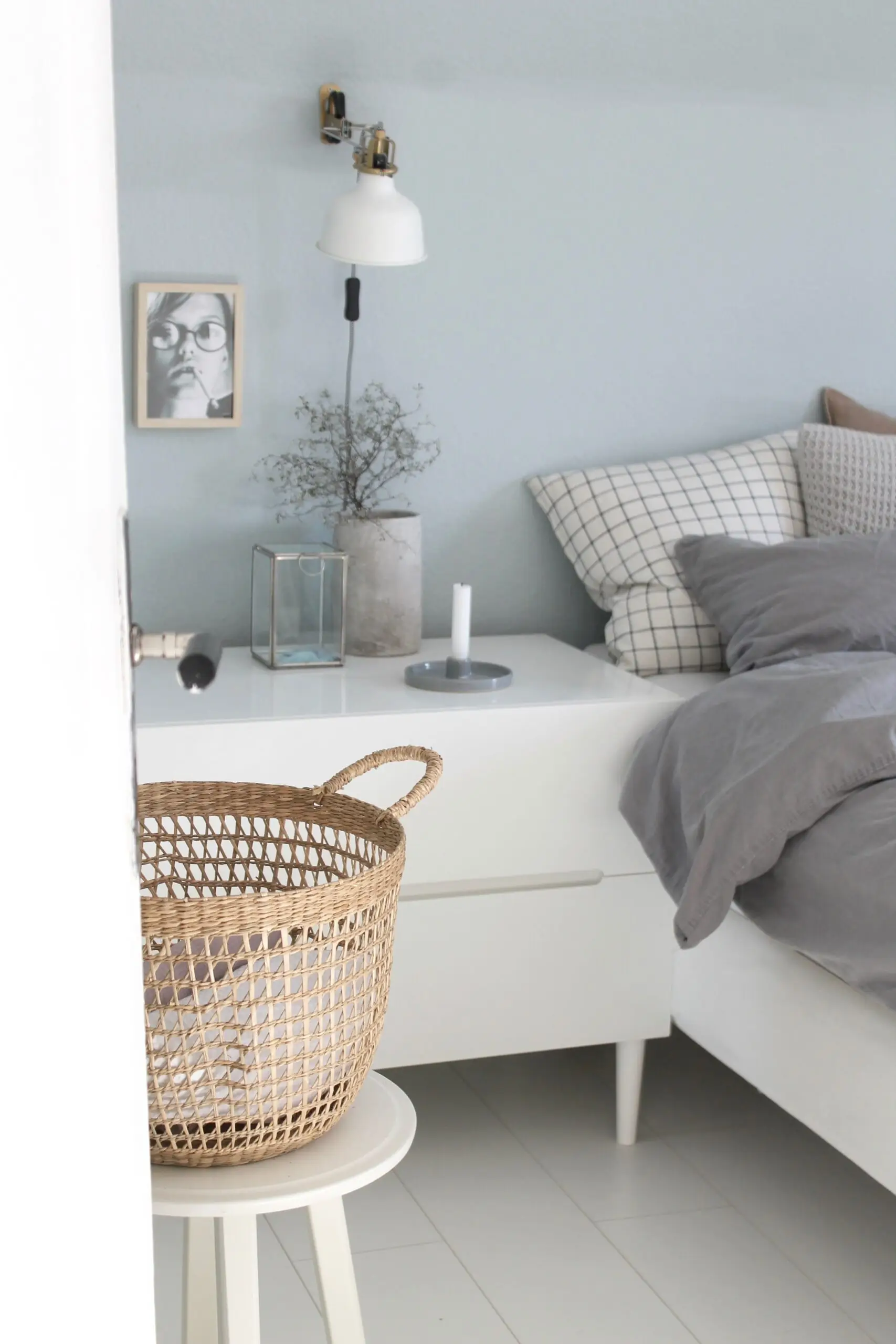
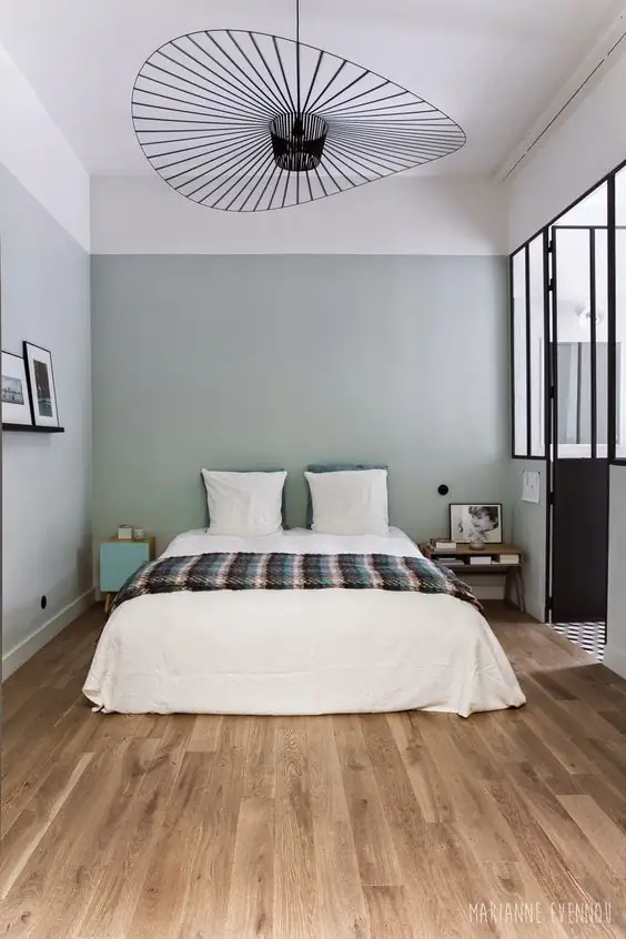
Bedroom
Upward is the right blue shade for a relaxing and carefree bedroom. To be precise, experts from Sherwin-Williams see it as one of the best paint colors for spaces where we expect to relax, forget about worries, and be one with our thoughts. Enhance the airy effect by pairing blue walls with white, or enjoy the contrast between Upward and earthy colors, which perfectly complete each other.
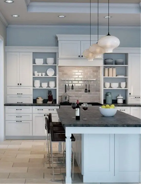
Kitchen
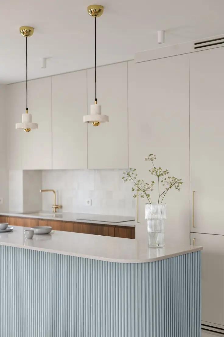
No doubt, Upward looks beautiful in any room, especially in a kitchen. Think traditional kitchen cabinets painted blue together with white or black accents. Or, consider a fully modern cooking space with stylish ribbed cabinets in blue and white or vividly colored walls.
Bathroom
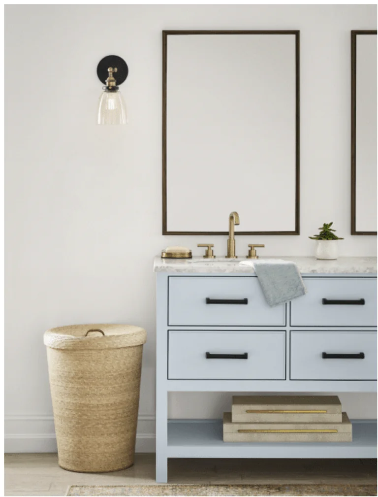
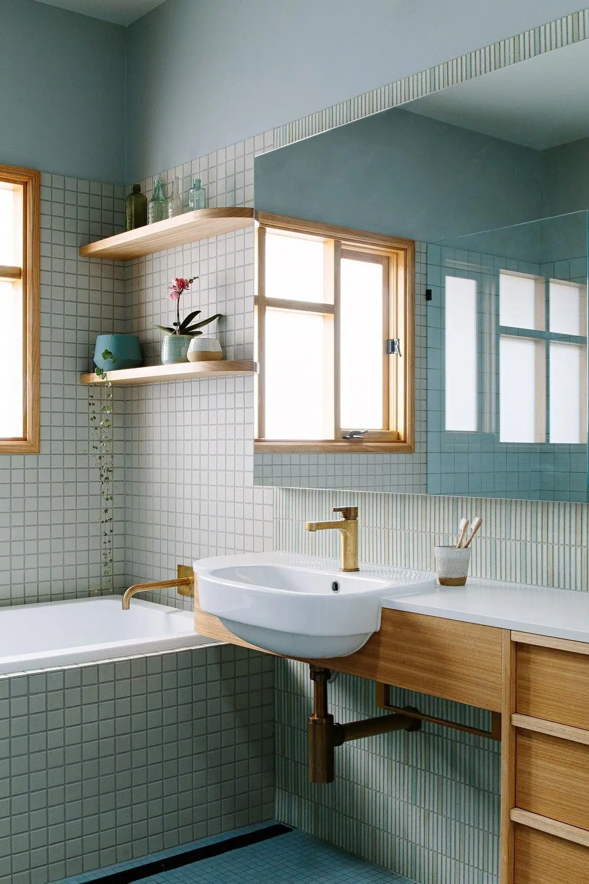
Blue will always look trendy in the bathroom, especially a breezy blue like SW 6239. As mentioned, a gray-blue vanity and a marble top will be mainstream. Still, this light and whimsical blue looks well on walls when paired with wooden furniture for a comfortable bathroom ambiance.
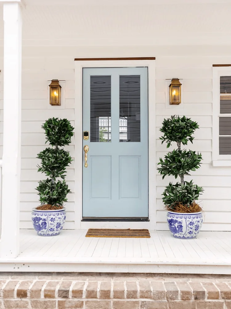
Use of Upward for the Exterior
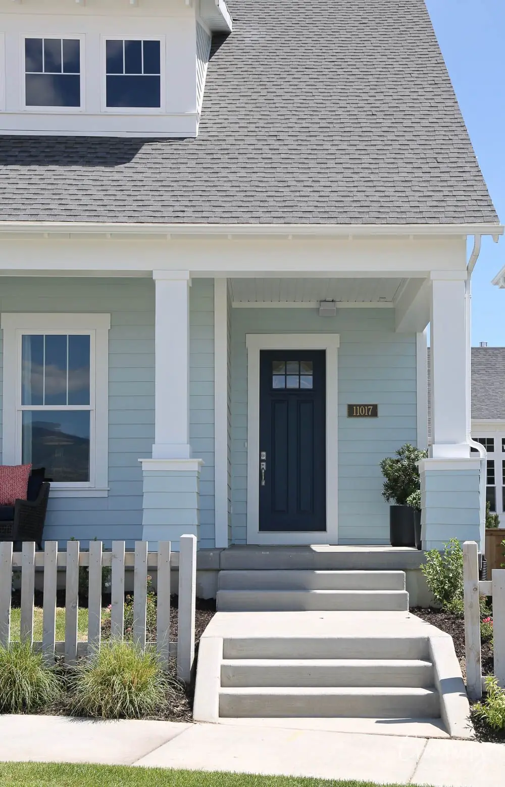
On Sherwin-Williams’ website, we can find that Upward is a pretty good paint color for the exterior house as well. Even more, colorists say it looks full of character both on the exterior walls and the front door. For the latter, consider white for walls. Still, the region plays an essential role in how natural lighting will affect this color. Are you looking for a cool or rather soft blue for your exterior? It is better to use a color sample beforehand. Nevertheless, we cannot deny that Upward is the “it” color in the world of emerging exterior paint colors.
The Upward SW 6239 paint color by Sherwin-Williams will restore well-being and make you feel content when arriving home. Embrace the new wave of light paint colors with the primary representant – the color of the year 2024.