The front door serves as the architectural handshake of your home, immediately telegraphing the precision and care put into the property. Selecting an exterior color carries significantly more weight than choosing interior paint, simply because direct natural sunlight aggressively washes out saturation and shifts undertones. Sherwin-Williams sets the industry standard for durable, pigment-rich exterior paints, but a beautiful color chip guarantees nothing if you fail to account for the surrounding facade.
This guide provides the exact color codes, exterior material pairings, and lighting considerations necessary to execute a flawless first impression. We strip away the guesswork, delivering precise Light Reflectance Value (LRV) data alongside the specific siding and hardware combinations required to ground these shades in physical space.
The Science of Exterior Paint: Lighting and LRV Explained
Before committing to a color, you must understand how outdoor exposure dictates its visual weight. Light Reflectance Value (LRV) measures how much light a paint reflects on a scale from 0 (absolute black) to 100 (pure white). Outdoors, direct sunlight amplifies lightness, meaning a mid-tone gray indoors will often read as stark white on a sun-drenched facade. Beyond LRV, the direction your home faces completely alters how the paint’s undertones behave throughout the day.
Directional Light Quick-Reference Checklist
- North-Facing Light: Casts a cool, blue-tinted glow. It intensifies gray and blue undertones, meaning warm colors might feel slightly muted or flattened, while dark blues and charcoals look exceptionally crisp.
- South-Facing Exposure: Delivers intense, direct, warm light all day. It washes out lighter colors and significantly amplifies warm undertones like yellow, red, and brown.
- East-Facing Light: Provides bright, warm morning light but turns shaded and cool by the afternoon. Colors must look intentional in both conditions.
- West-Facing Light: Casts shadows in the morning and bathes the facade in intense, golden-orange light in the late afternoon, making warm tones radiate and cool tones feel neutralized.
The Timeless Darks: Anchoring the Facade
Dark, moody paints remain a designer favorite for creating high-contrast curb appeal. They provide necessary visual weight, grounding lighter siding materials and pulling the overall architectural composition together.
Ground a White Board-and-Batten Exterior with Tricorn Black SW 6258
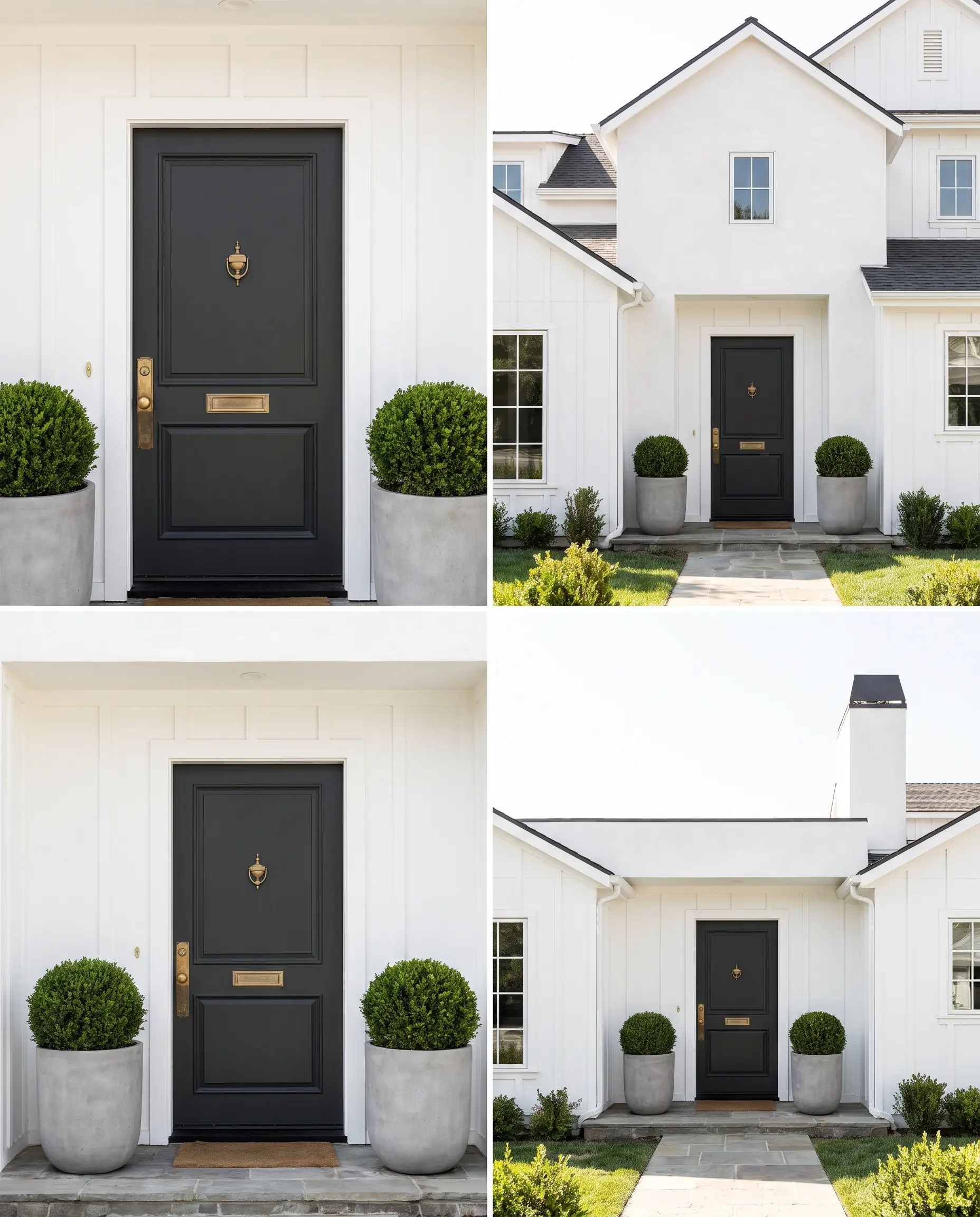
Tricorn Black stands as the definitive, undertone-free neutral dark for creating an uncompromising focal point. It avoids the common trap of shifting blue or brown in direct light, offering a stark, pure black that commands immediate attention against crisp modern farmhouse facades.
- LRV: 3
- Key Materials: Bright white board-and-batten siding.
- Hardware Match: Polished nickel or unlacquered brass.
- Designer Pairing: Flawless alongside stark white stucco, manicured boxwoods, and unlacquered brass hardware.
Because Tricorn Black is a true, absolute black, it requires high-contrast surroundings to prevent it from looking like a visual void. Never pair it with muddy or muted siding.
Hackrea Design Warning
Soften a Red Brick Facade with the Earthy Depth of Urbane Bronze SW 7048
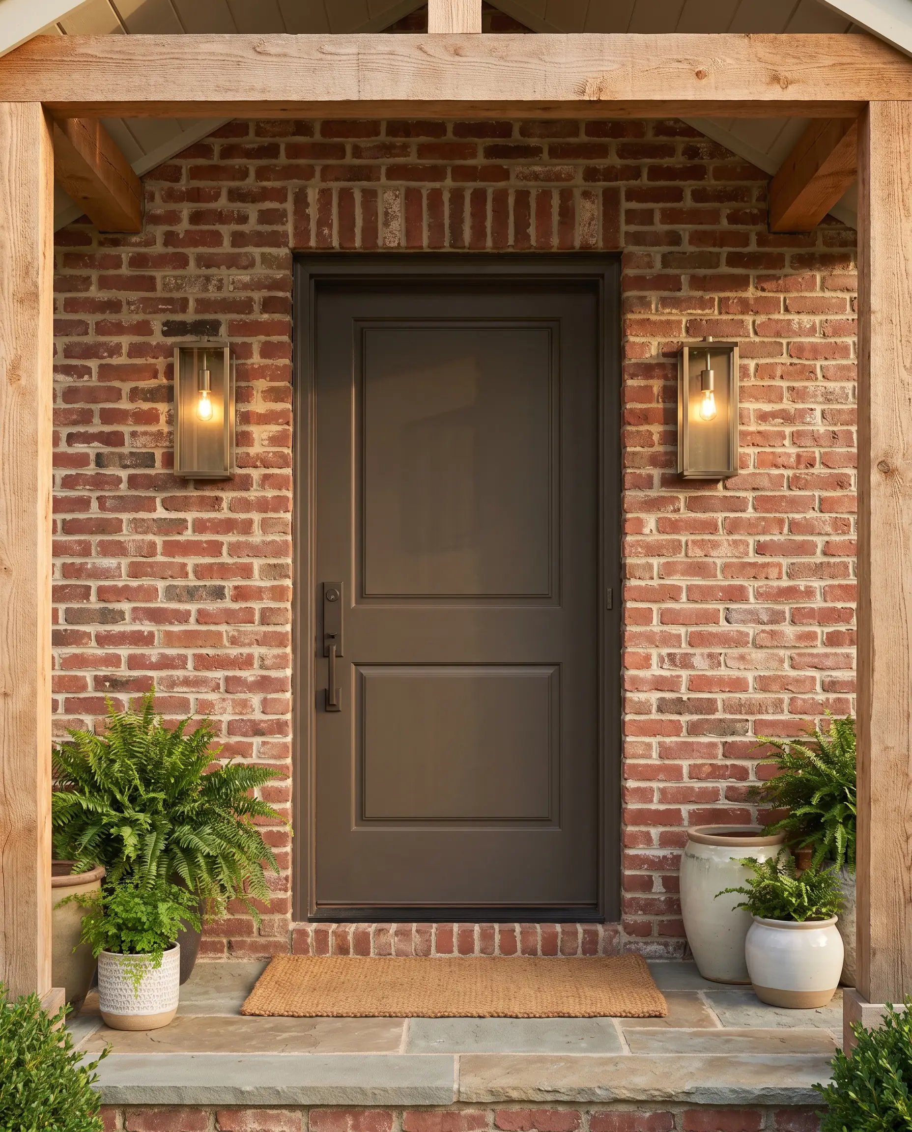
Urbane Bronze delivers a complex brownish-gray saturated with subtle green undertones, offering a much softer alternative to severe blacks. Its rich, earthy depth bridges the gap between modern contrast and natural warmth, making it the perfect complementary anchor for traditional red brick facades without causing a harsh color clash.
- LRV: 8
- Vibe: Grounded, earthy, and sophisticated.
- Key Materials: Traditional red brick or warm natural stone.
- Designer Pairing: Flawless alongside aged red brick, brushed bronze sconces, and natural cedar accents.
Anchor a Modern Stucco Build with Iron Ore SW 7069
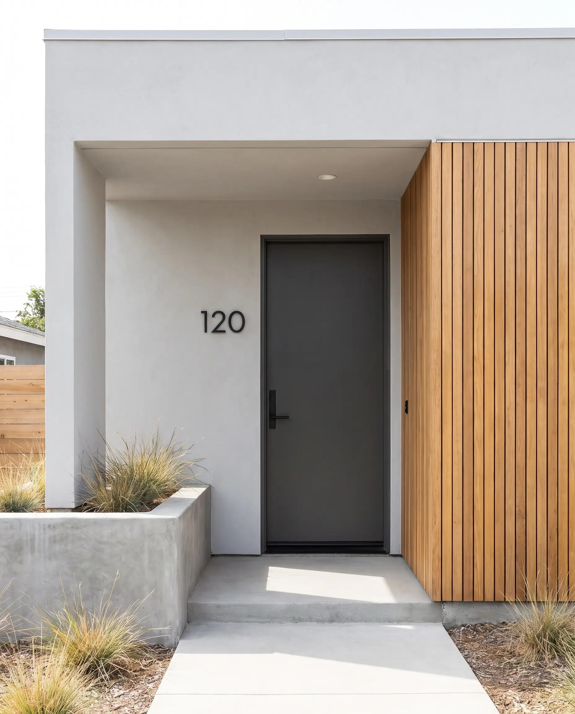
For contemporary builds where a true black feels too severe, Iron Ore steps in as the ideal soft charcoal. This nuanced shade provides necessary architectural definition while maintaining a modern, understated edge against smooth, minimalist surfaces.
- LRV: 14
- Key Materials: Smooth stucco exteriors or natural wood-slat siding.
- Hardware Match: Matte black hardware for a monochromatic look.
- Designer Pairing: Flawless alongside smooth gray stucco, matte black house numbers, and linear wood siding.
The Organic Greens: Blending with the Landscape
Green doors act as a seamless transitional hue, pulling the natural tones of the front yard landscaping directly onto the architecture of the house. This organic approach softens rigid exterior lines and roots the property in its environment.
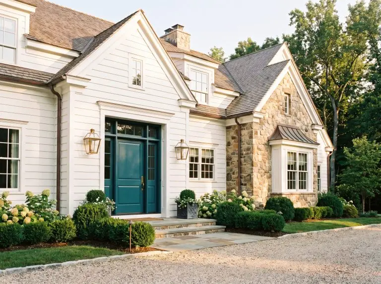
Bring Historic Charm to Stone Siding with Secret Garden SW 6181
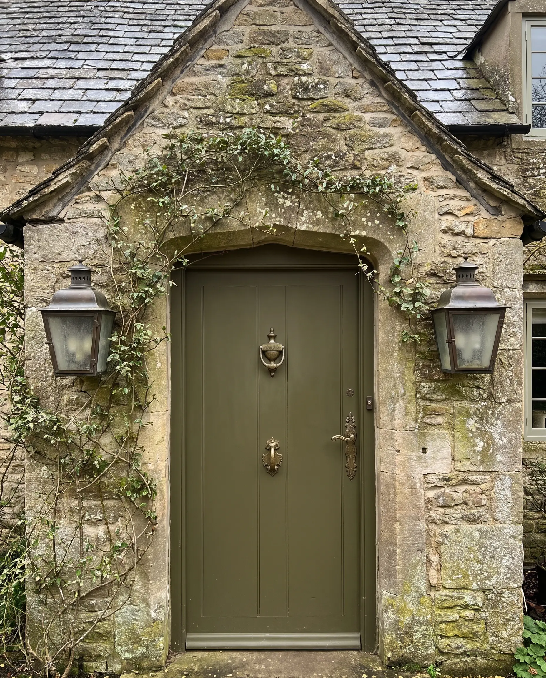
Secret Garden is a moody, highly saturated botanical green that feels exceptionally sophisticated and grounded. It leans into a rich, historical aesthetic, making it an incredibly natural fit for English cottages or heavy Tudor homes where the architecture demands a color with substantial visual weight.
- LRV: 8
- Siding: Natural, irregular stone facades.
- Hardware: Heavy cast iron or aged brass.
- Lighting: Aged bronze sconces with seeded glass.
- Designer Pairing: Flawless alongside rough-cut stone, climbing ivy, and aged bronze hardware.
Cultivate an Earthy Modern Aesthetic with Evergreen Fog SW 9130
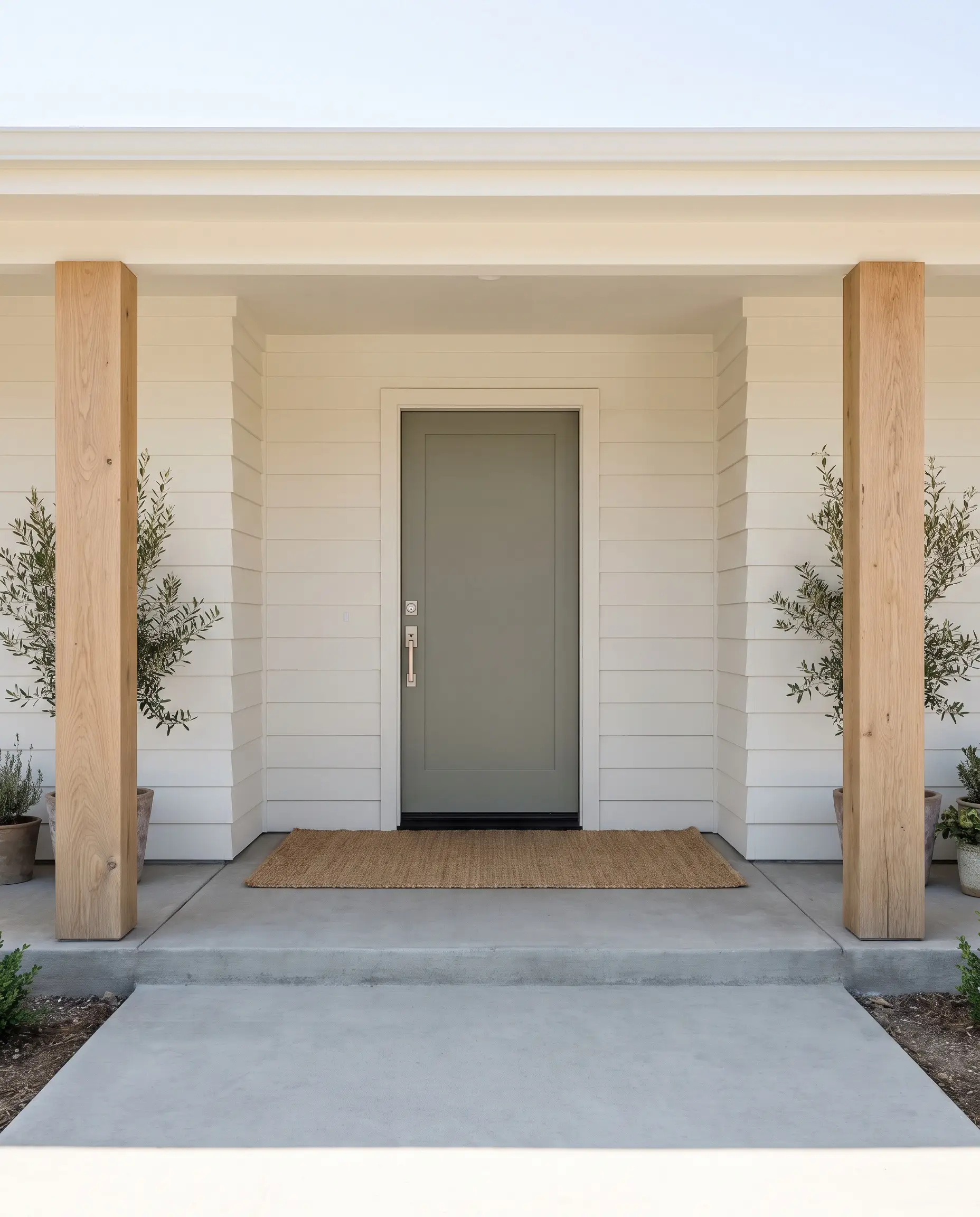
As a former Color of the Year, Evergreen Fog operates as a brilliant chameleon—a desaturated mix of green and gray with just a hint of blue. It provides a subtle, tonal contrast that feels incredibly current, especially when applied to homes aiming for a soft, organic modern aesthetic.
- LRV: 30
- Key Materials: Warm white or cream exterior siding.
- Siding Match: Alabaster SW 7008.
- Designer Pairing: Flawless alongside Alabaster SW 7008 siding, natural white oak pillars, and brushed nickel hardware.
The Coastal Blues & Slate Tones
Blue doors serve as a sophisticated, traditional staple, bringing a sense of heritage and calm to an entryway. However, exterior blue requires careful undertone management so the door does not read as a primary-colored toy block when hit by direct sunlight.
Contrast Traditional Brick with the Crisp Depth of Naval SW 6244
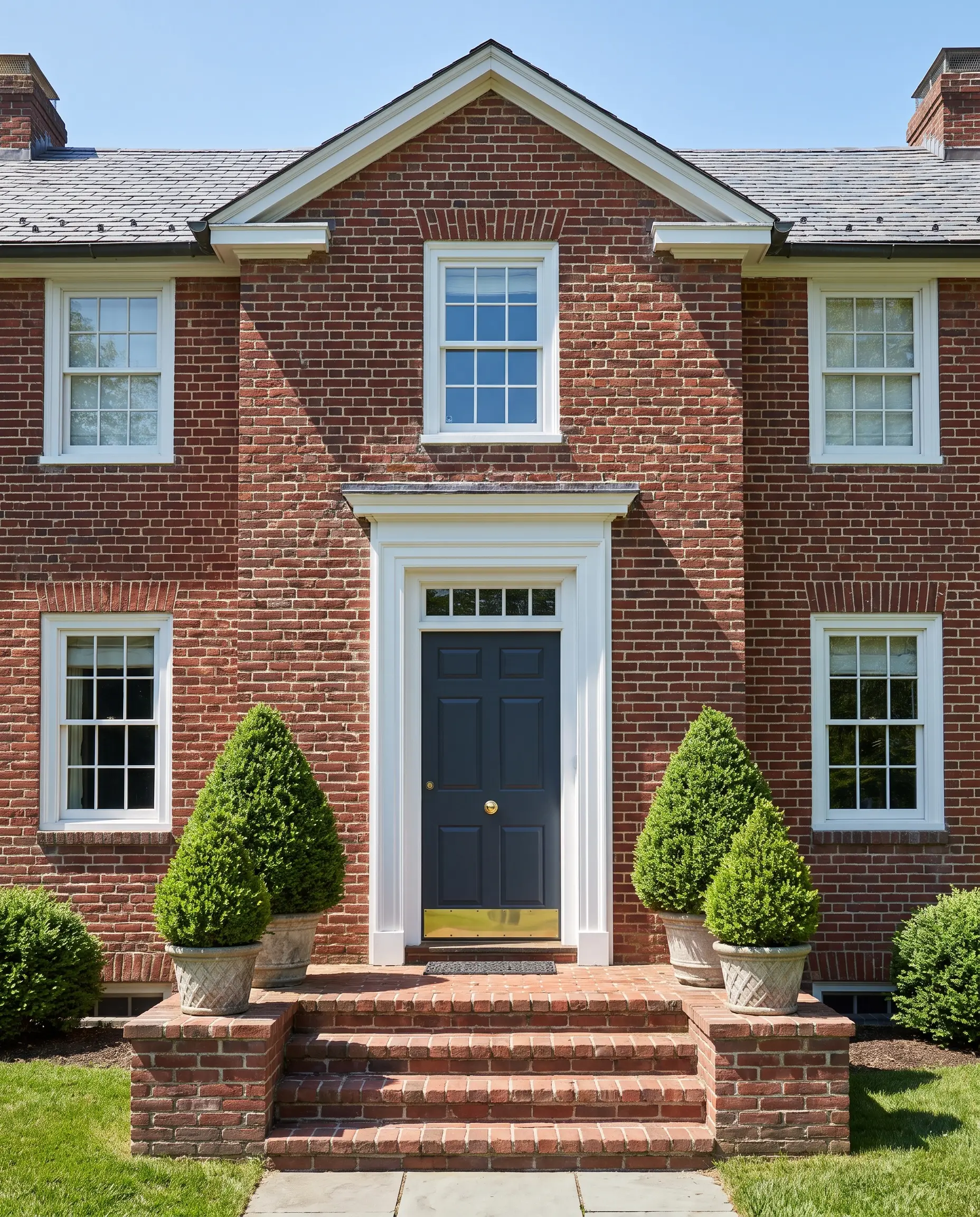
Naval is the undisputed champion of navy blues, delivering a deep, oceanic saturation that commands attention without shouting. It provides the absolute best choice for Colonial or Georgian homes, heavily anchoring the entryway while reflecting a stately, historical precision.
- LRV: 4
- Key Materials: Classic red brick or crisp white clapboard.
- Architectural Accents: Glossy white trim and symmetrical planters.
- Designer Pairing: Flawless alongside red brick facades, glossy white trim, and a heavy brass kickplate.
To maximize the traditional impact of Naval, flank the door with perfectly symmetrical topiary planters and insist on highly polished, unlacquered brass for the doorknob and kickplate.
Hackrea Styling Tip
Create a Southern Porch Vibe with Quietude SW 6212
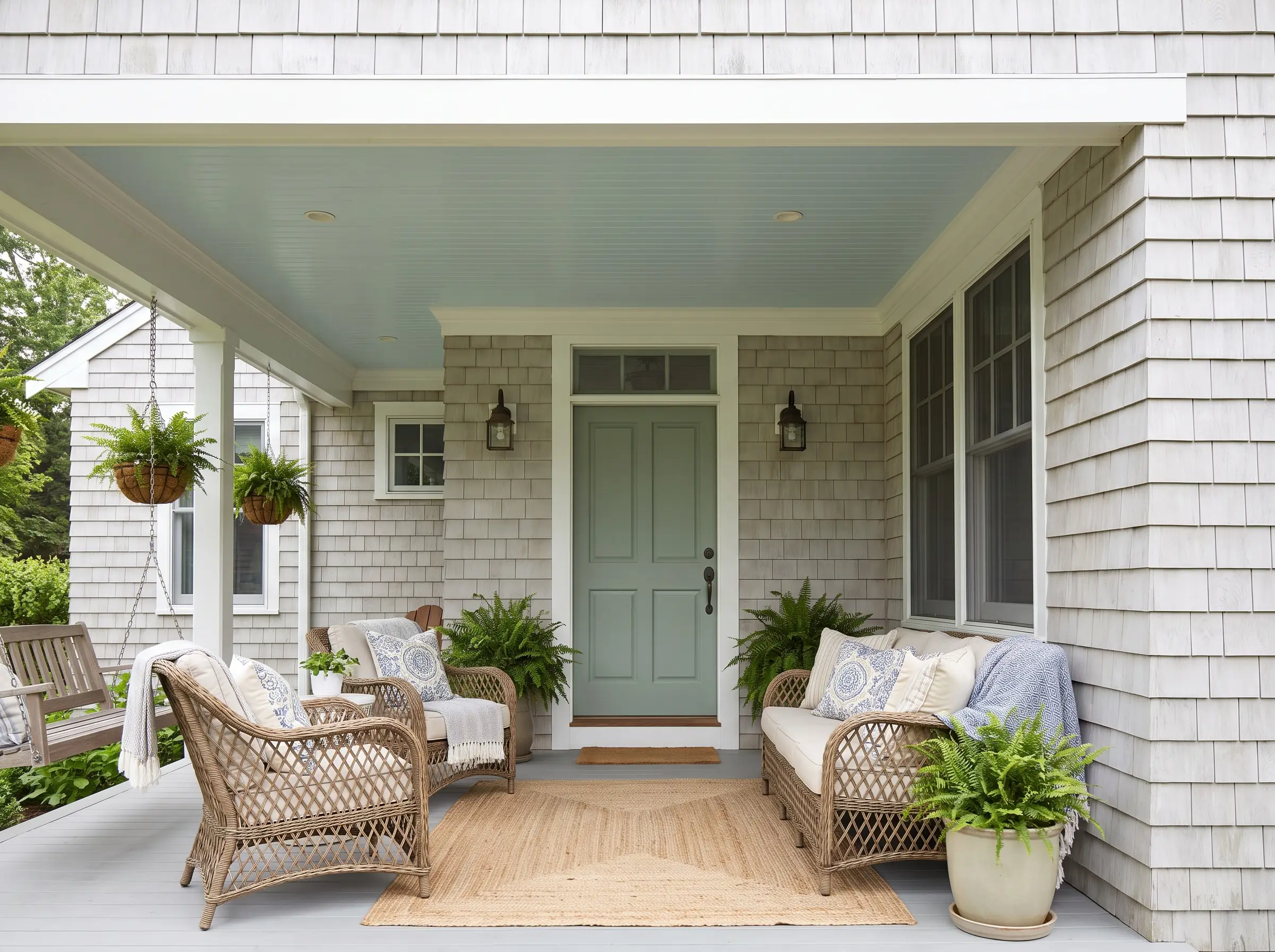
Quietude offers a soft, cooling blue-green that excels specifically in shaded environments where direct sunlight is blocked. It brings a relaxed, airy energy to deep, covered porches, instantly telegraphing a breezy, welcoming atmosphere.
- LRV: 48
- Vibe: Relaxed, coastal, and deeply inviting.
- Key Materials: Light gray shingles and natural rattan porch furniture.
- Designer Pairing: Flawless alongside light gray cedar shakes, a haint blue porch ceiling, and woven rattan seating.
The Welcoming Warms: Clays and Corals
Terracotta, red, and clay tones are leading a massive design resurgence, moving away from jarring primary colors toward baked, sophisticated hues. These warm tones create high-energy, deeply inviting entryways that radiate hospitality.
Revive a Mid-Century Entryway with Cavern Clay SW 7701
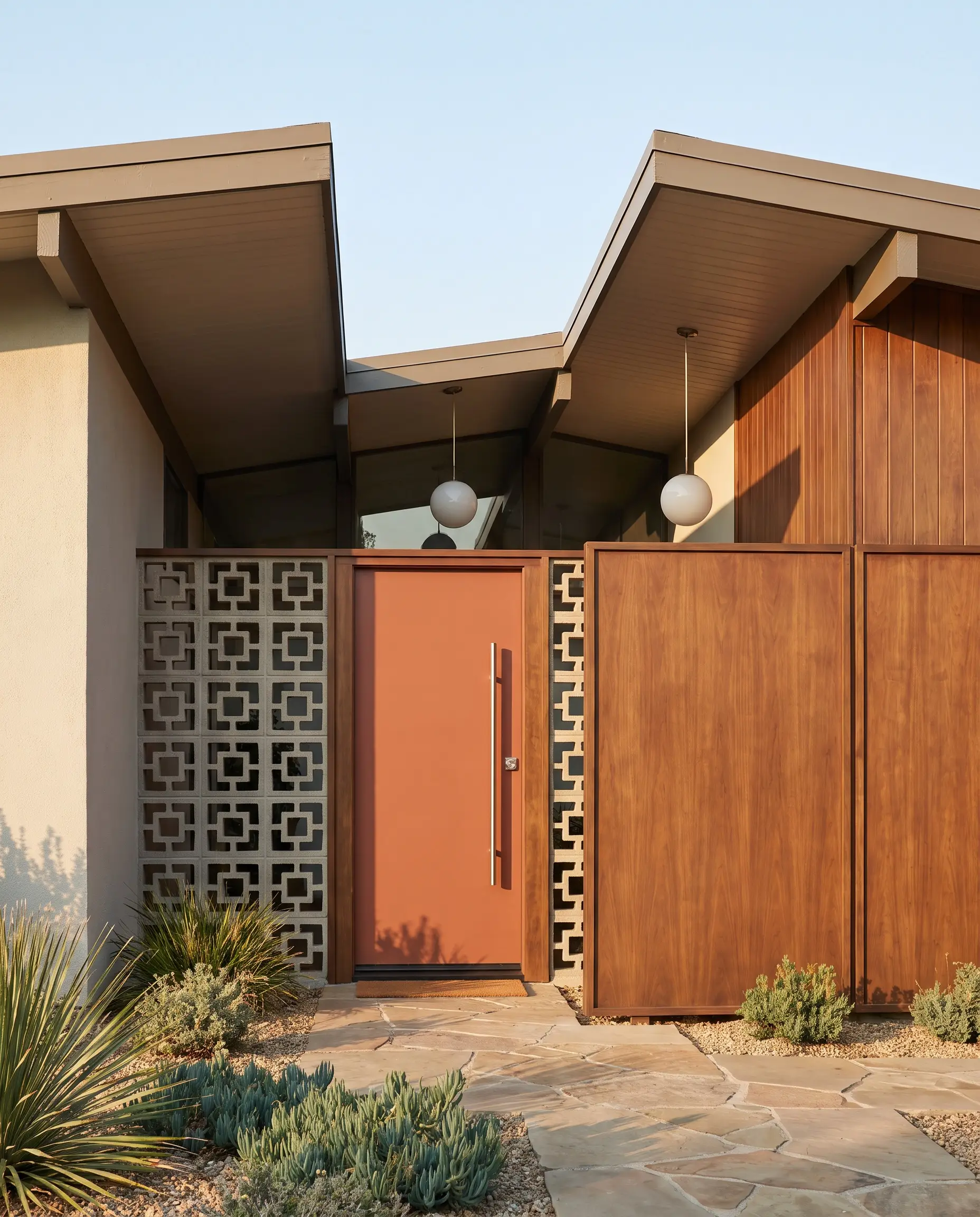
Cavern Clay is a definitive, desert-inspired baked terracotta that instantly revitalizes retro architecture. It brings incredible warmth and historical accuracy strictly to Mid-Century Modern homes, perfectly complementing angular rooflines and geometric details.
- LRV: 20
- Key Materials: Breeze-block walls and warm walnut wood accents.
- Hardware Match: Sleek, brushed stainless steel.
- Designer Pairing: Flawless alongside geometric breeze-blocks, flat-panel walnut accents, and brushed stainless steel hardware.
Introduce Sophisticated Warmth with Sun Dried Tomato SW 7585
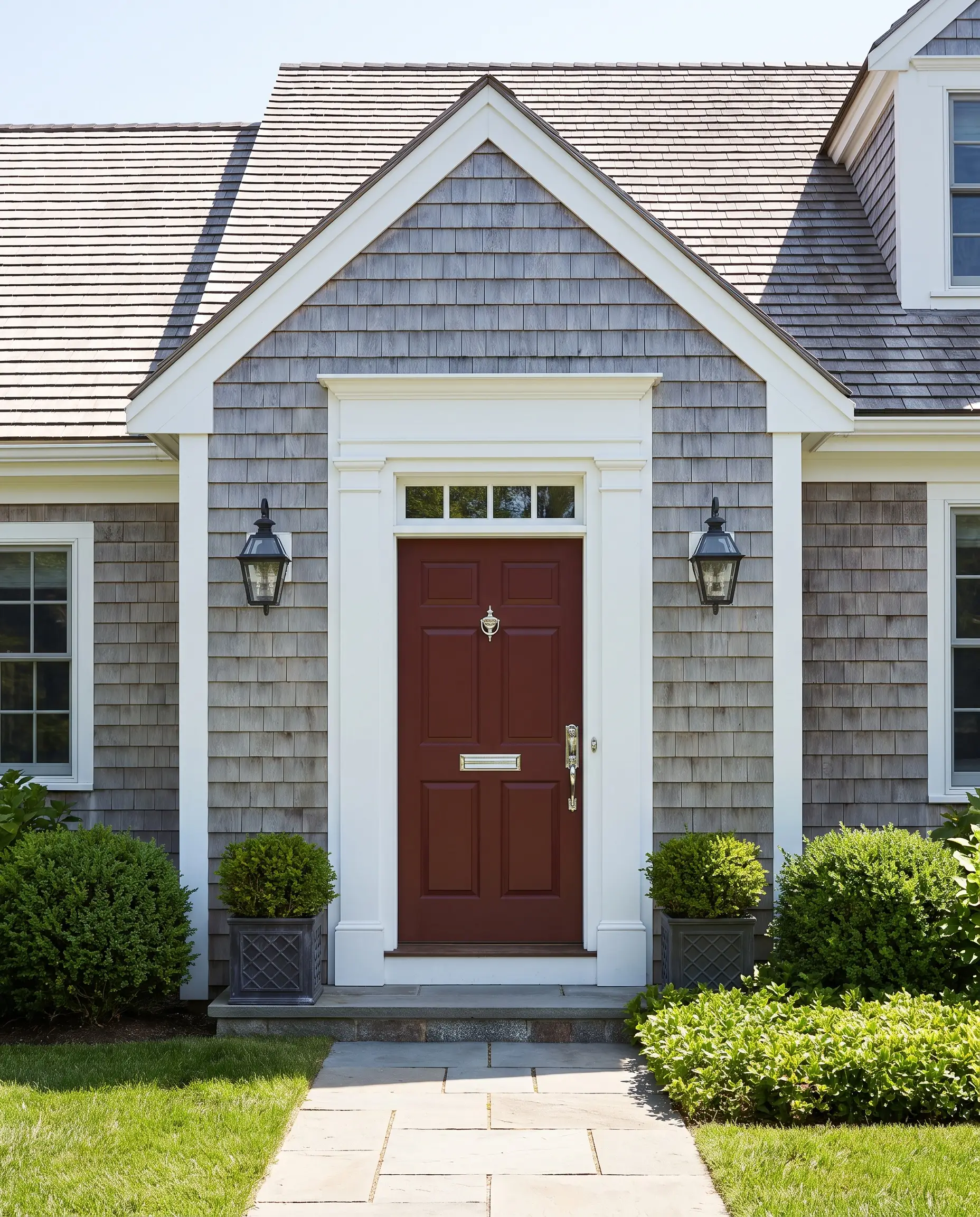
Bright, fire engine reds often look cheap and artificial outdoors, aggressively clashing with natural surroundings. Sun Dried Tomato solves this by offering a deep, muted burgundy-red that feels historically accurate, refined, and exceptionally inviting.
- LRV: 5
- Key Materials: Classic white colonials or gray-shingled cape cods.
- Vibe: Traditional, warm, and highly refined.
- Designer Pairing: Flawless alongside weathered gray shingles, bright white trim, and polished chrome hardware.
Execution Matters: Choosing the Right Exterior Sheen
A beautiful, designer-approved color will entirely fail if you specify the wrong paint finish. Matte finishes are terrible for front doors; they hold onto dirt, scuff instantly, and look lifeless under a porch roof. Choosing the correct sheen is a balance between the condition of your door and the level of maintenance you are willing to accept.
The Front Door Finish Matrix
| Finish | Durability | Surface Prep Required | Aesthetic Vibe |
|---|---|---|---|
| Satin | Moderate. Resists basic scuffing and cleans reasonably well. | Forgiving. Hides dents, dings, and older wood textures effectively. | Soft, understated, and highly practical. |
| Semi-Gloss | High. Excellent moisture resistance and very easy to wipe down. | Moderate. Requires sanding, as the slight shine highlights major surface flaws. | Classic, crisp, and standard for traditional millwork. |
| High-Gloss | Extreme. Provides a hard, marine-grade shell that repels water and dirt. | Rigorous. Requires a perfectly smooth, heavily sanded and primed surface. | Stunning, bespoke lacquer look that screams high-end execution. |
First Impressions Complete: Finalizing Your Exterior Palette
Your front door is merely one piece of the architectural puzzle—it must actively speak to your siding, your hardware, and your landscaping. Never buy a gallon of paint based solely on a digital screen. Always purchase peel-and-stick exterior samples or paint large physical swatches directly onto the door. You must observe how the color shifts in the cool light of 9 AM, the harsh glare of Noon, and the golden shadows of 5 PM before making a final commitment.
Once your color is locked in, the next crucial step is illuminating it properly. Check out Hackrea’s complete guide on exterior lighting to ensure your newly painted entryway looks just as intentional and inviting at midnight as it does at noon.