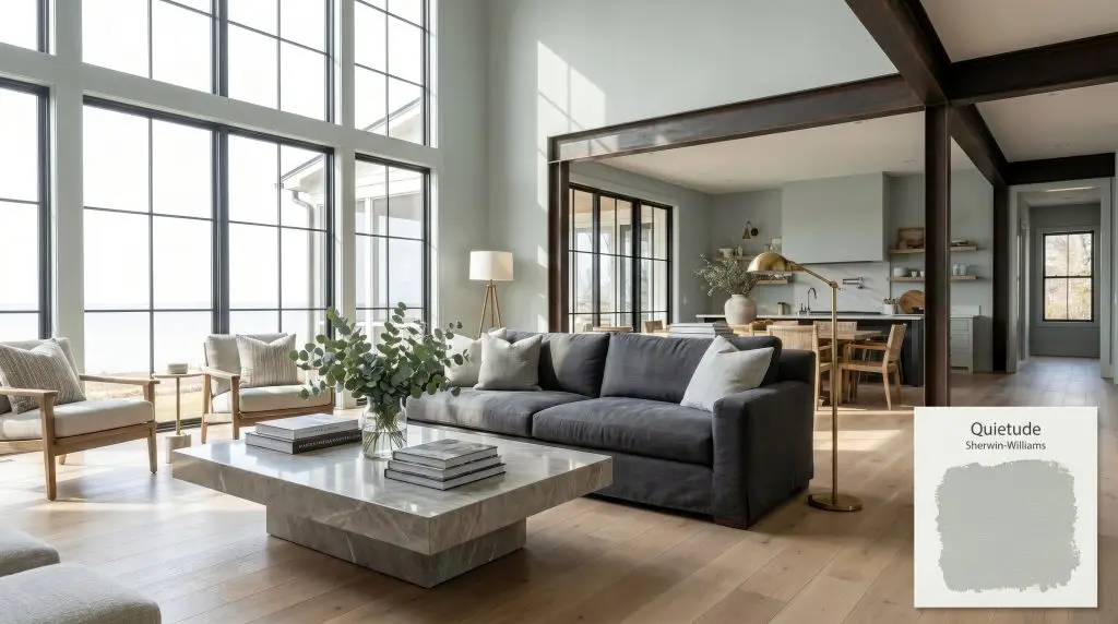
Sherwin-Williams Quietude (SW 6212) is a tranquil, mid-tone blue-green paint color with soft gray undertones. Boasting an LRV of 48, it strikes a perfect balance between sage and coastal teal, making it an ideal choice for serene bedrooms and spa-like bathrooms.
Will Quietude clash with your room?
Paint Technical Profile
| Color ID / SKU | SW 6212 |
| HEX Code | #ADBBB2 |
| Light Reflectance (LRV) | 48 |
| Temperature | Cool |
| Primary Undertone | Sage Green |
| Hidden Undertones | Blue And Soft Gray |
| Use | Interior, Exterior |
| Best Exposures | South, West |
| Best For | Spa bathrooms, serene bedrooms, coastal kitchen cabinets, exterior accents |
Quietude Digital Design Concept Boards
Spa-inspired Bathrooms
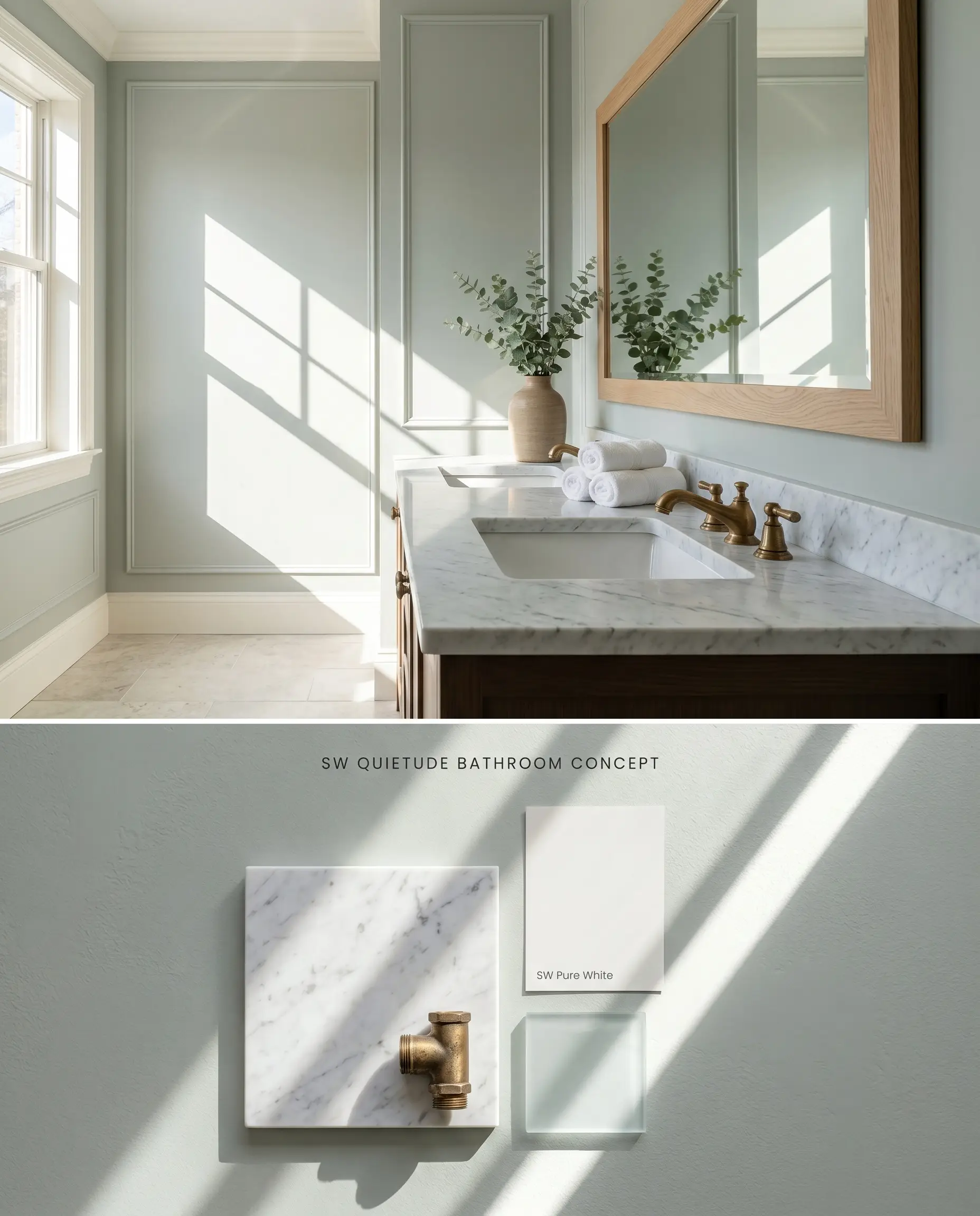
Will Quietude work with your specific lighting, floor, or furniture?
Quietude SW 6212 requires abundant natural light in washrooms to activate its sophisticated gray undertones and prevent the blue-green blend from flashing a flat, artificial mint under harsh LED bulbs. Pairing this muted pastel with honed Carrara marble grounds the color’s buoyancy through the stone’s porous, chalky texture.
Serene Primary Bedrooms
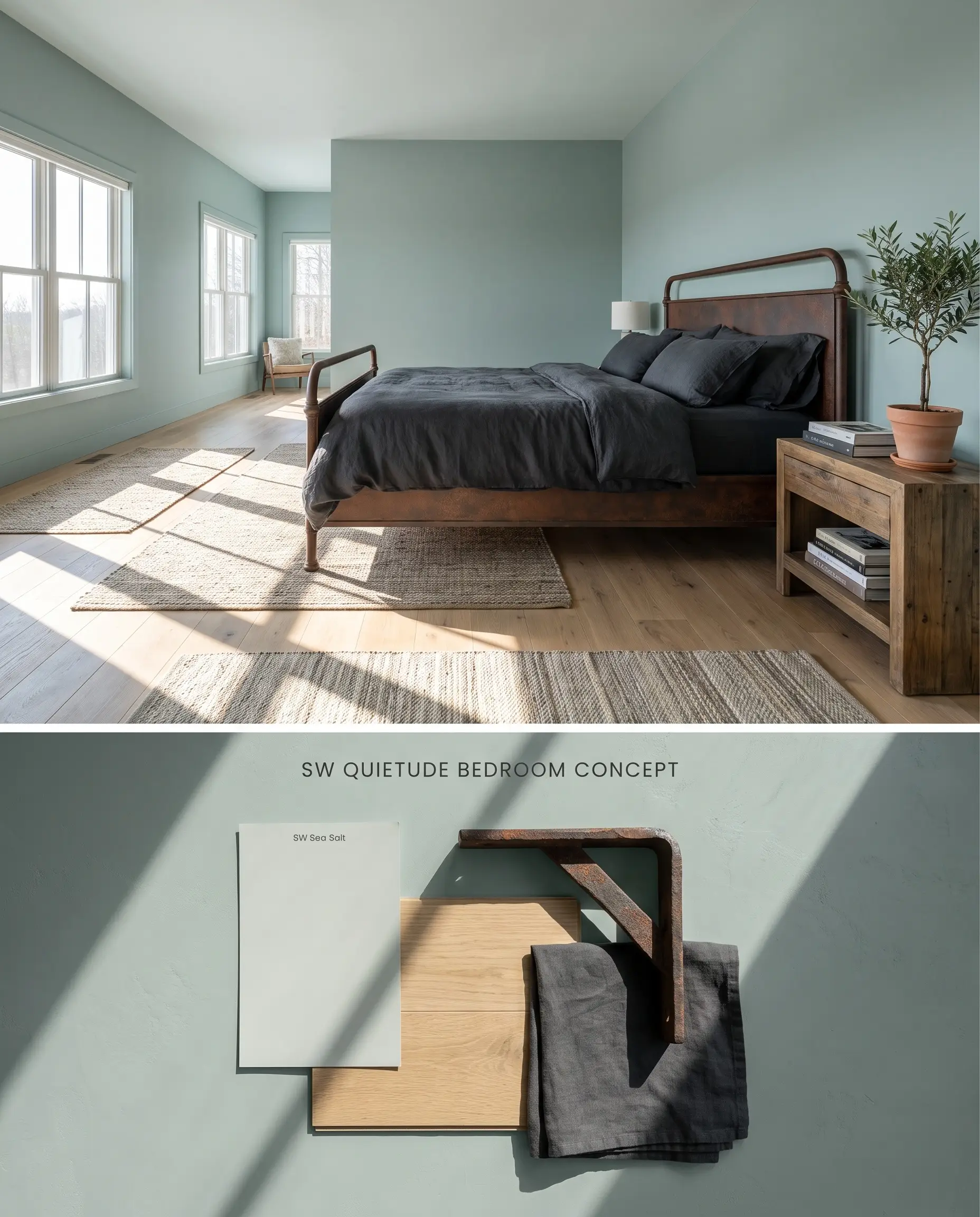
In expansive sleeping quarters, this LRV 48 shade absorbs morning light, establishing a grounded, spa-like atmosphere that recedes from the eye. To anchor the mid-tone wall color, integrate deeply saturated textiles like charcoal linen and structural elements in oxidized iron.
Coastal Kitchen Cabinets
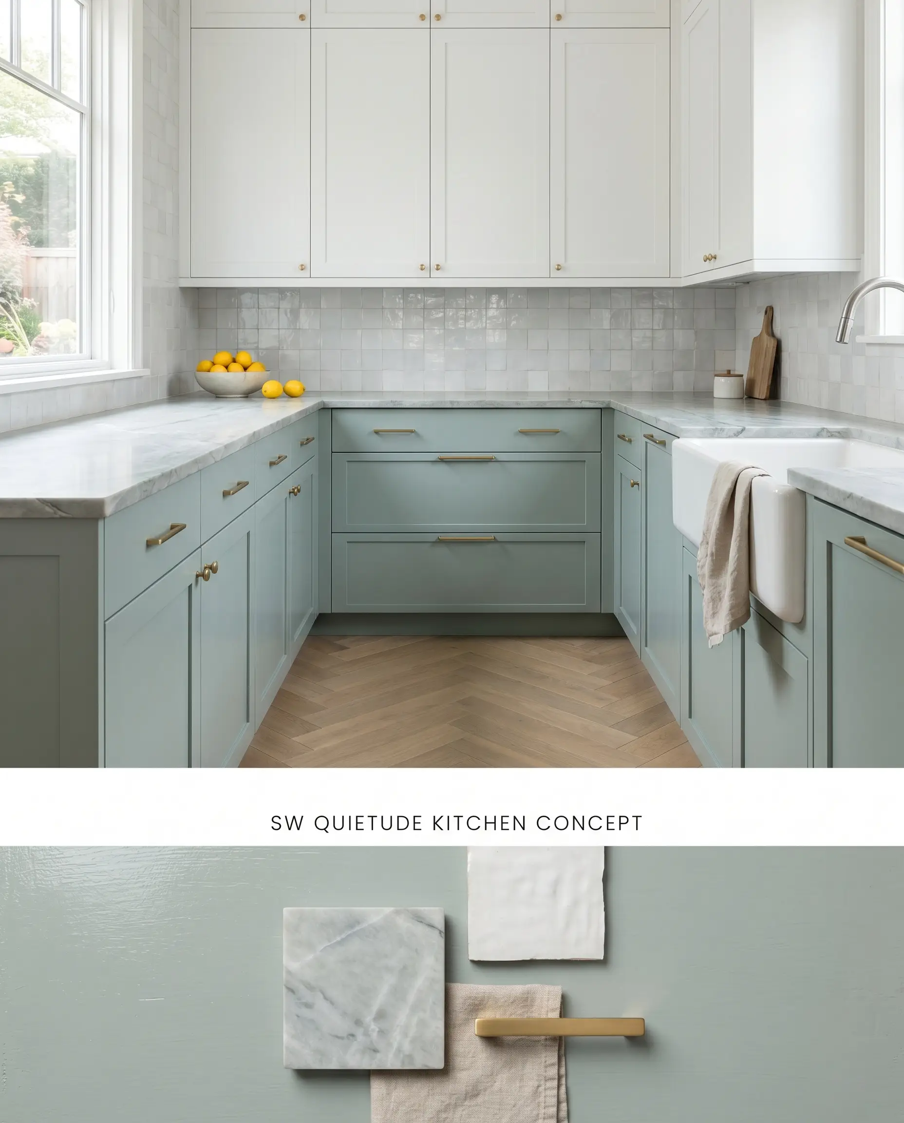
Deploying Quietude SW 6212 on lower cabinetry grounds a kitchen’s visual weight while maintaining a bright, reflective upper hemisphere when paired with stark white uppers. You must strictly avoid pairing these cabinets with warm maple islands or yellow pine ceilings, as the cool blue-green base will force those woods to read distinctly orange.
Exterior Shutters and Front Doors
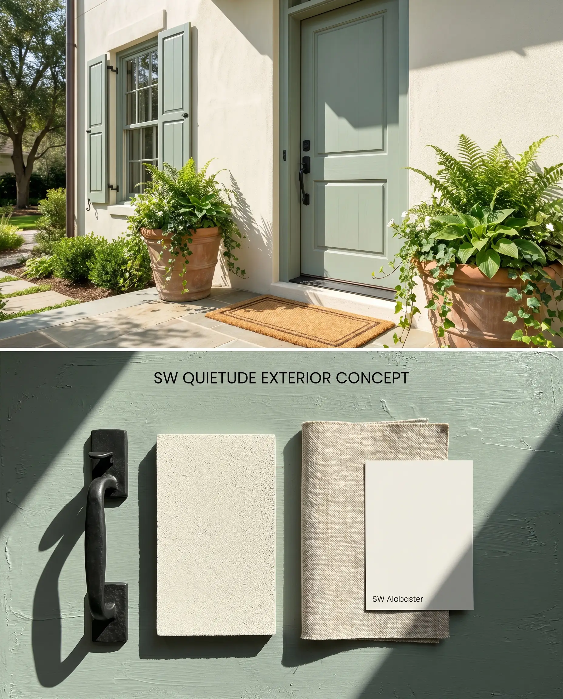
Against a stark white or pale gray stucco exterior, this shade acts as a soft architectural highlighter that bridges the gap between the hardscape and surrounding foliage. The inherent gray muting prevents the door from looking overly saturated under direct, intense UV exposure.
Welcoming Foyers
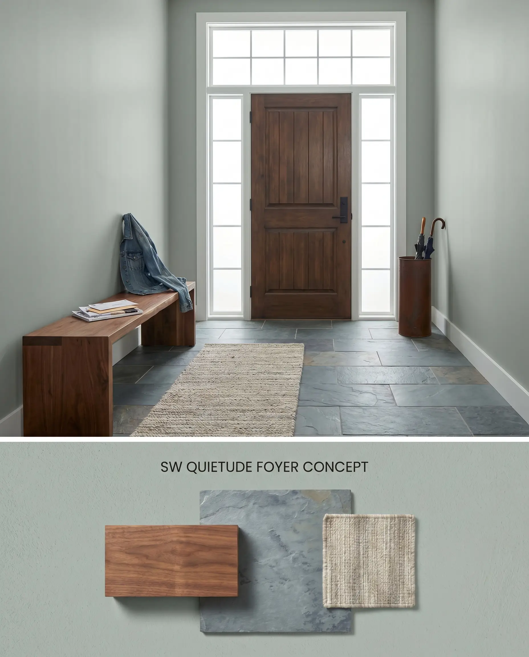
Will Quietude work with your specific lighting, floor, or furniture?
A well-lit entryway wrapped in this coastal teal immediately establishes a calming transition from the exterior, provided the space features sidelights or a transom window. In narrow, unlit hallways, the color traps shadows and flattens out, requiring strategic placement of 4000K artificial lighting to maintain its depth.
Color Theory Comparisons: Quietude SW 6212 vs. Rival Blue-Greens
Sherwin-Williams Quietude SW 6212 vs. Sherwin-Williams Halcyon Green SW 6213
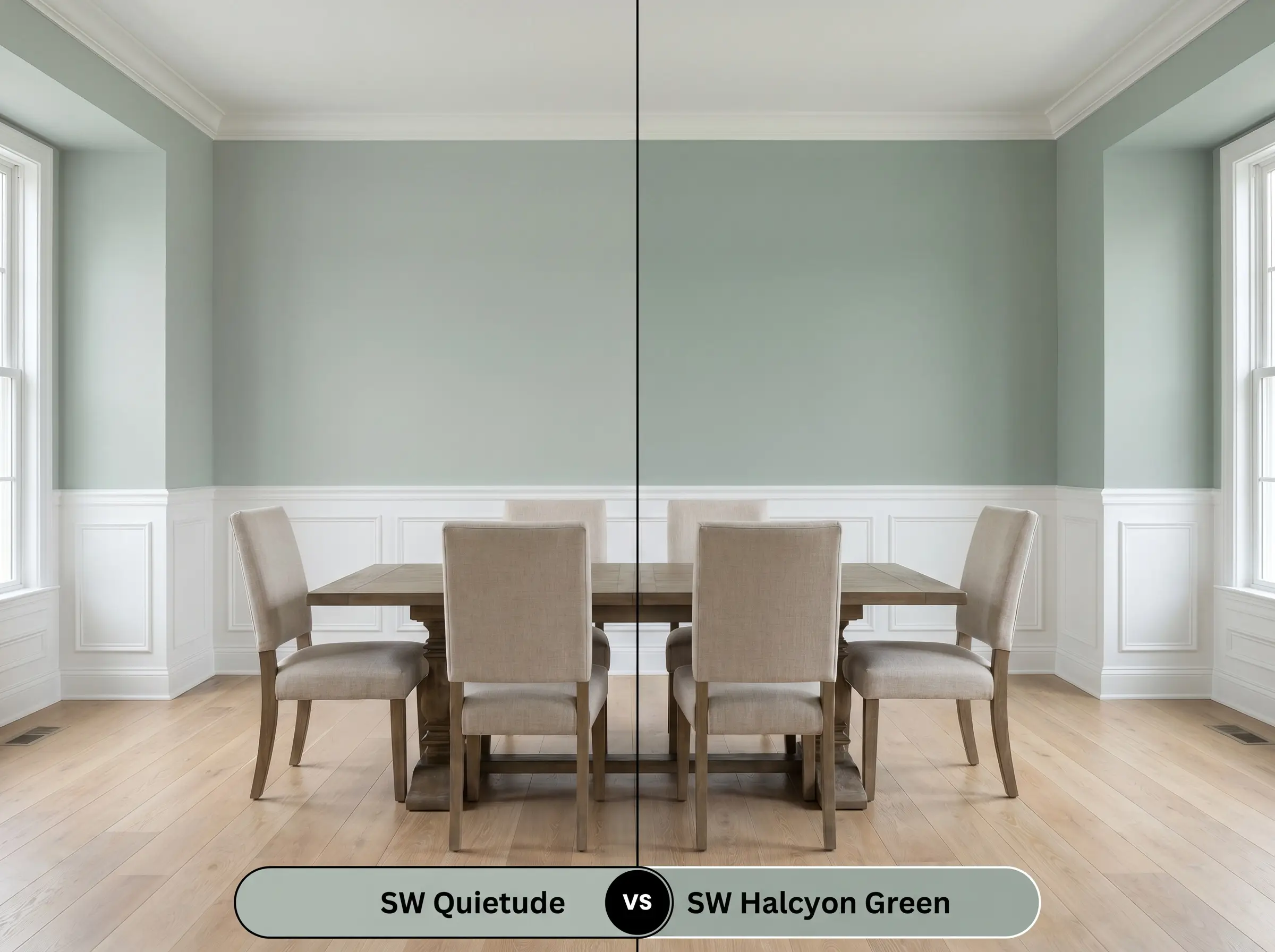
Halcyon Green SW 6213 sits one step darker on the same color strip, dropping the LRV to 39 and intensifying the gray-green presence. Choose Quietude SW 6212 for standard residential rooms where you need the walls to reflect ambient light, but specify Halcyon Green SW 6213 for studies, dining rooms, or spaces where a denser, more light-absorbing architectural presence is required.
Sherwin-Williams Quietude SW 6212 vs. Benjamin Moore Wythe Blue HC-143
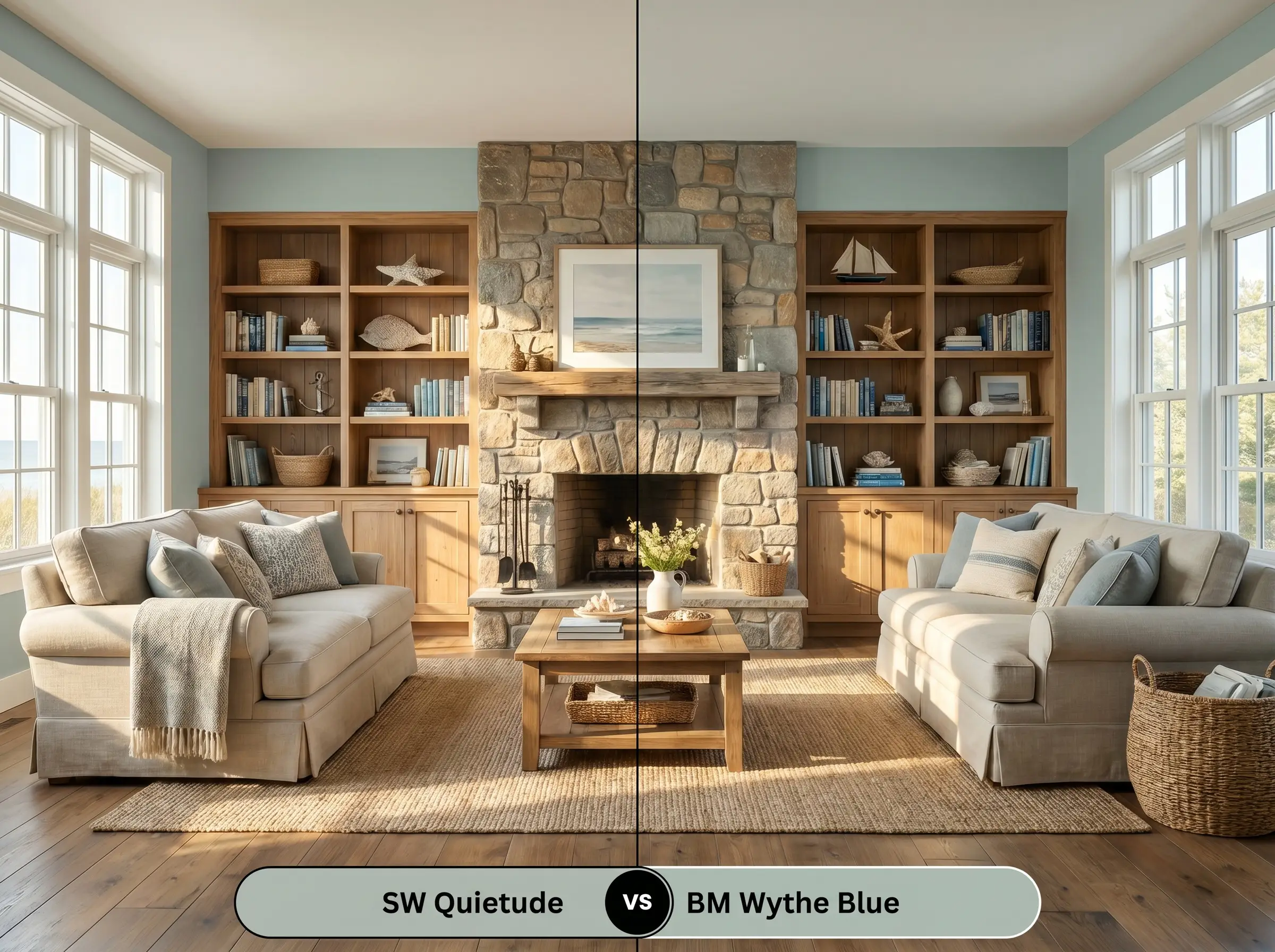
Benjamin Moore Wythe Blue HC-143 shares a nearly identical LRV (48.18) but carries a slightly warmer, more pronounced green base compared to Quietude’s cooler blue dominance. Specify Wythe Blue HC-143 in north-facing rooms where you need to counteract icy incoming light with a hint of warmth, and reserve Quietude SW 6212 for south-facing spaces where the sun’s natural yellow rays will balance its cooler profile and pull forward a sage green appearance.
Sherwin-Williams Quietude SW 6212 vs. Sherwin-Williams Rainwashed SW 6211
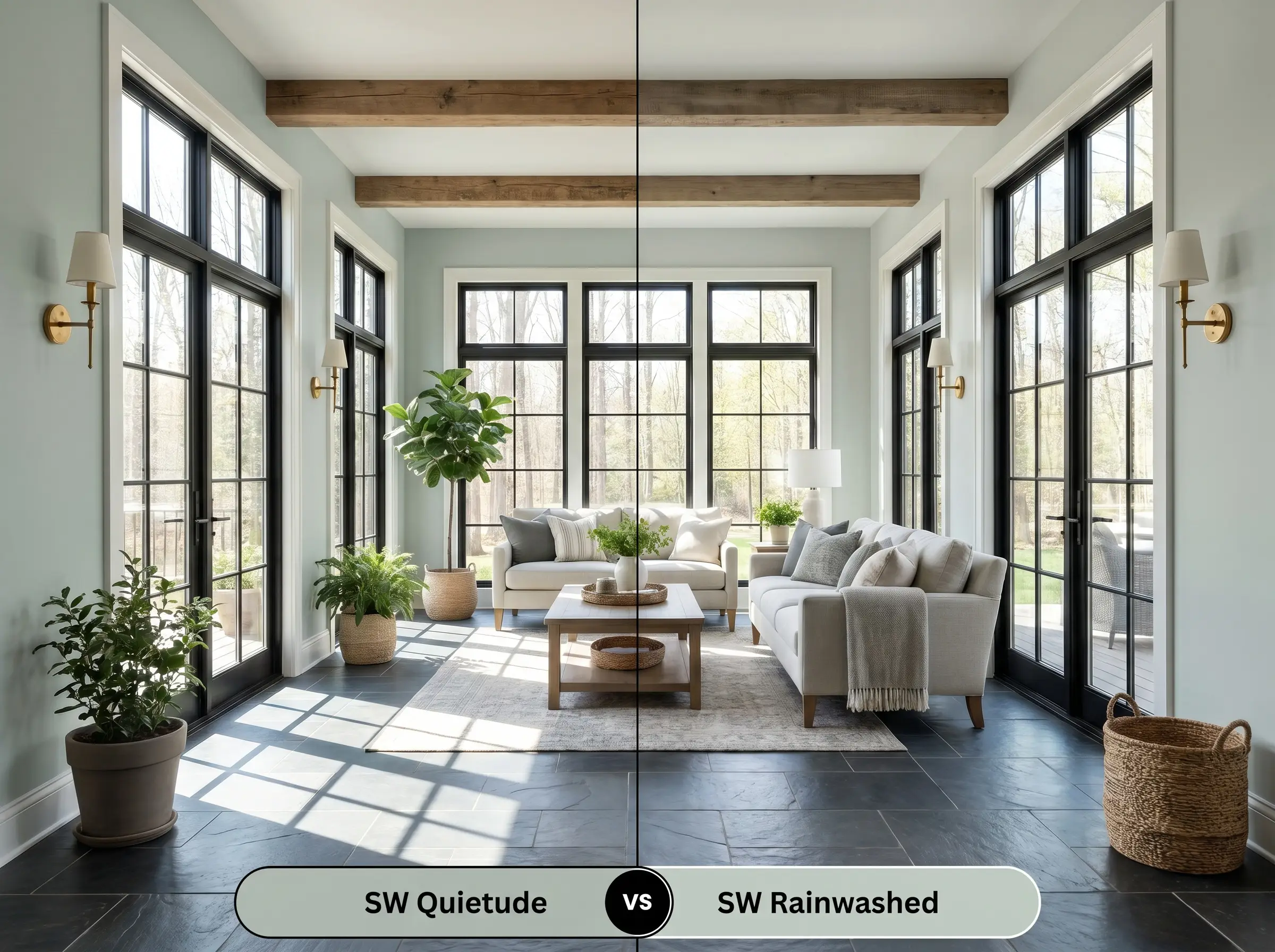
Will Quietude work with your specific lighting, floor, or furniture?
Rainwashed SW 6211 is the lighter sibling to Quietude SW 6212, possessing a higher LRV of 59 that firmly places it in the pastel category. Utilize Rainwashed SW 6211 in smaller, dimly lit spaces to maximize light reflection, while deploying Quietude SW 6212 in expansive, sun-drenched rooms where Rainwashed SW 6211 would wash out and lose its structural color identity.
Technical FAQs for Sherwin-Williams Quietude
Yes, in spaces lacking natural sunlight, the sophisticated gray muting disappears. Artificial LED lighting, particularly warmer 2700K bulbs, will amplify the green undertones, causing the paint to flash a flat, artificial mint.
The cool blue-green base of Quietude creates an aggressive color wheel contrast with yellow and orange-toned woods. This physical reaction forces yellow pine and warm maple to appear excessively orange, breaking the visual harmony of the space.
In north-facing rooms with indirect, cool light, the blue undertones dominate the finish. Conversely, south-facing rooms flood the space with warm, yellow light, which physically mixes with the blue base to pull forward a distinct sage green appearance.
The HGTV Home Color of the Year 2025 version sold at Lowe’s utilizes a different chemical base than the standard retail formula. Homeowners consistently document poorer hide and coverage with the Lowe’s version, often requiring additional coats to achieve an opaque finish.
Room Compatibility & Clashes Diagnoses
Hackrea's reports evaluating the compatibility of Quietude in real rooms.West-Facing Living Room
"The paint's green-blue undertones weave effortlessly into the blue armchairs and patterned rug, while the off-white baseboards keep the cool hues from conflicting with the warm carpeting."
Paint Aesthetic & Practical Analysis
| Profile | Analysis | |
|---|---|---|
| Aesthetic | Quietude is an effortlessly chic architectural finish that bridges the gap between coastal teal and earthy sage. It brings a sophisticated tranquility to a space without reading as a flat pastel, though it requires careful lighting to prevent it from flashing mint in windowless rooms. | |
| The Coverage Catch | The HGTV Home by Sherwin-Williams version sold at Lowe's has documented homeowner complaints regarding poorer hide and coverage compared to the standard Sherwin-Williams retail formula. | |
| The Lighting Shift | In north-facing rooms or low light, the blue undertones dominate, making it read cooler. In windowless bathrooms, artificial lighting can unexpectedly amplify the green, causing it to flash a bright 'mint'. | |
| The Clash Warning | The cool blue-green base can aggressively contrast with yellow-toned pine ceilings or warm maple cabinets, making the wood appear overly orange or yellow. | |
| The Low Light Trap | Can lose its sophisticated gray muting in spaces lacking natural light, occasionally reading as a flat, artificial pastel. |
Closest Cross-Brand Equivalents
The absolute closest scientific color matches for Quietude across top paint brands.