Green Blue 84
Farrow & BallFarrow & Ball Green Blue No. 84 is a perfectly balanced, muted aqua that acts as a true chameleon. Sitting at a 49 LRV, it shifts effortlessly between a soft, dusty blue and a warm, calming green depending on the light, making it ideal for relaxing spaces.
| Temperature | Neutral-to-Cool |
|---|---|
| Primary Undertone | Green and Blue |
| Hidden Undertones | Dusty Gray |
| Best Exposures | South-facing or West-facing |
| Best For | Bathrooms, Bedrooms, Kitchen Islands, Cabinetry, Front Doors |
Hackrea Review
Green Blue is a stunning example of Farrow & Ball's complex color structure. It avoids the saccharine sweetness of typical pastels by grounding its aquatic tones with a sophisticated gray dustiness. It is an incredibly versatile choice for historic and contemporary homes alike.Architectural Applications for Farrow & Ball Green Blue
Bathrooms
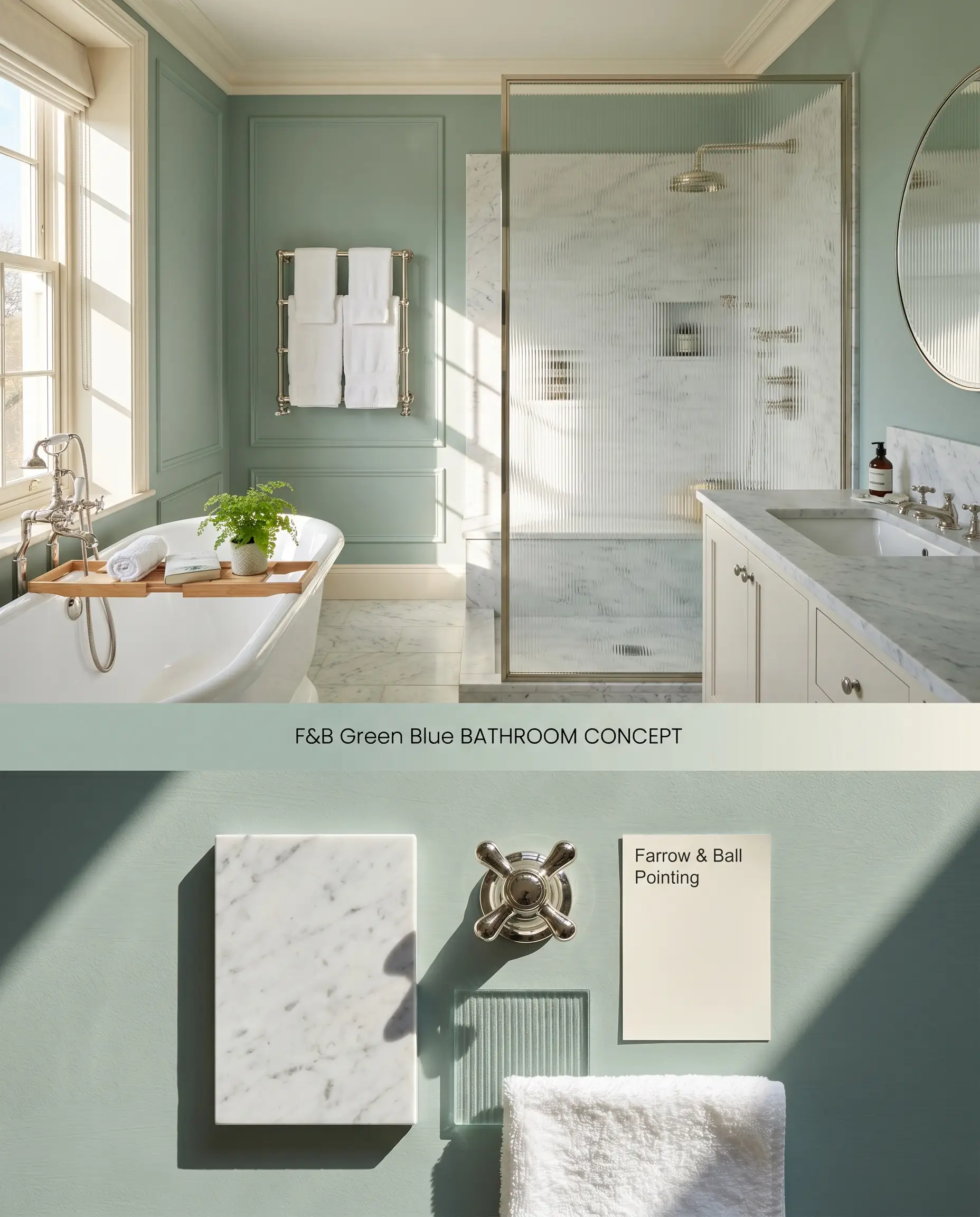
Green Blue’s aquatic tones excel in wet rooms by mirroring the reflective qualities of water and polished plumbing fixtures. The 49 light reflectance value anchors the space, preventing the walls from feeling icy against stark white porcelain. Pairing it with honed marble introduces a porous texture that softens the color shifting nature of this British paint.
Modern Emulsion ($$$$ (Boutique/Luxury Tier)). This specialized mold- and water-resistant formulation is non-negotiable for wet rooms, bringing highly pigmented color to the walls without sacrificing the luxurious matte aesthetic.
The Consultant’s Finish
Bedrooms
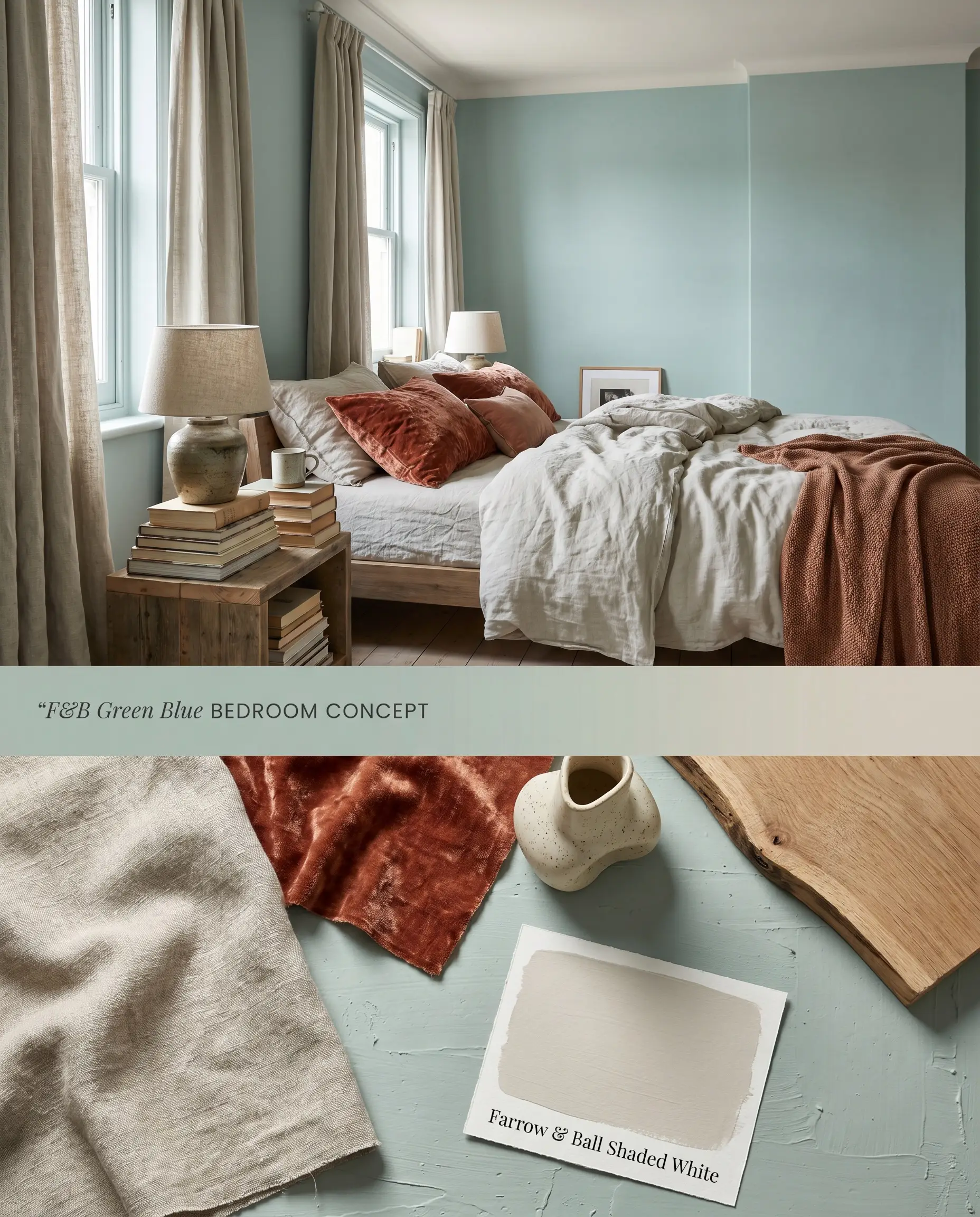
In sleeping quarters, this muted teal acts as a transitional anchor, absorbing morning light and deepening into a moody, restful hue by evening. The chromatic depth of the pigment responds beautifully to layered textiles, grounding airy linens and dense velvets alike. A tonal trim approach blurs the architectural boundaries, visually expanding the ceiling height.
Estate Emulsion ($$$$ (Boutique/Luxury Tier)). This signature formulation delivers a chalky matte finish with unparalleled depth of color, maximizing aesthetic impact in low-traffic sleeping quarters where physical scrubbing is unnecessary.
The Consultant’s Finish
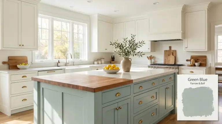
Kitchen Islands
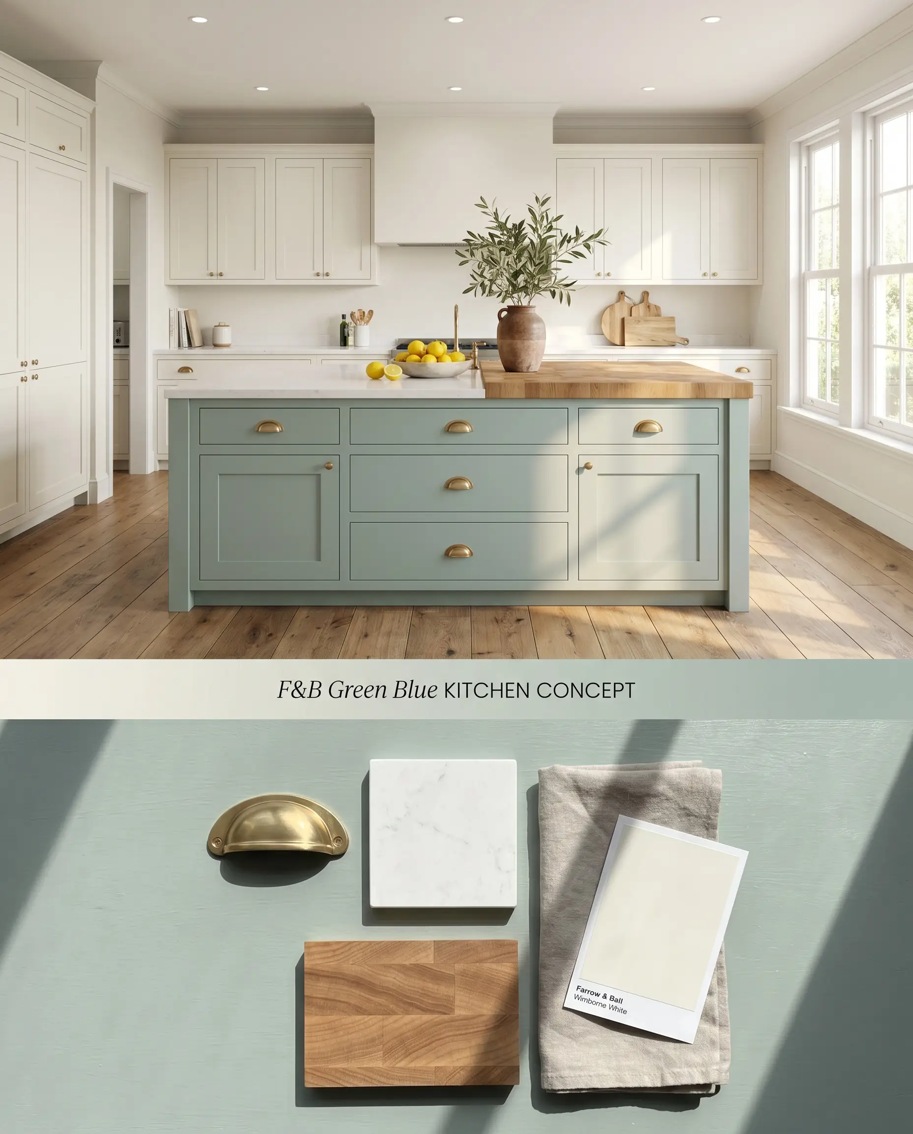
Applying this chameleon color to a central island breaks up the visual monotony of white perimeter cabinetry without darkening the entire floor plan. The green-blue pigment acts as a cool counterweight to the warm, reflective surface of polished quartz or the organic grain of butcher block countertops. Unlacquered brass hardware against this hue accelerates the patination process visually, marrying metallic warmth with the cool base.
Modern Eggshell ($$$$ (Boutique/Luxury Tier)). This exceptionally durable, mid-sheen waterborne finish withstands the constant physical contact and daily wear of central cabinetry, ensuring a flawless, long-lasting surface.
The Consultant’s Finish
Cabinetry
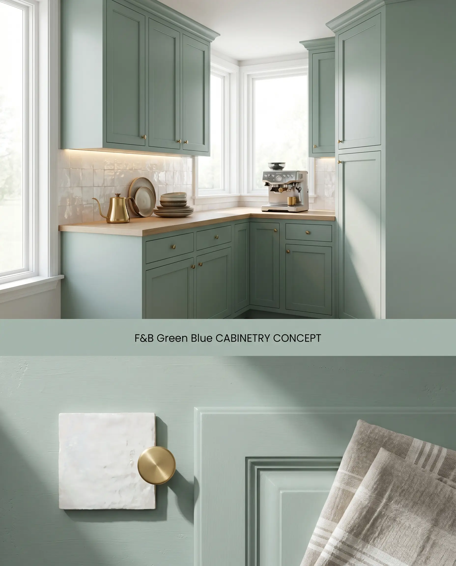
Full-scale cabinetry wrapped in this hue benefits from a mid tones primer to ensure the pigment achieves its full architectural weight. The resulting finish bridges the gap between traditional shaker profiles and modern flat-panel designs by emphasizing shadow lines rather than gloss. Contrast this dense color application with light, reflective backsplashes to maintain spatial buoyancy.
Modern Eggshell ($$$$ (Boutique/Luxury Tier)). Wrapping millwork requires an exceptionally durable, mid-sheen waterborne finish designed to withstand physical impact while maintaining a flawless, long-lasting surface.
The Consultant’s Finish
Front Doors
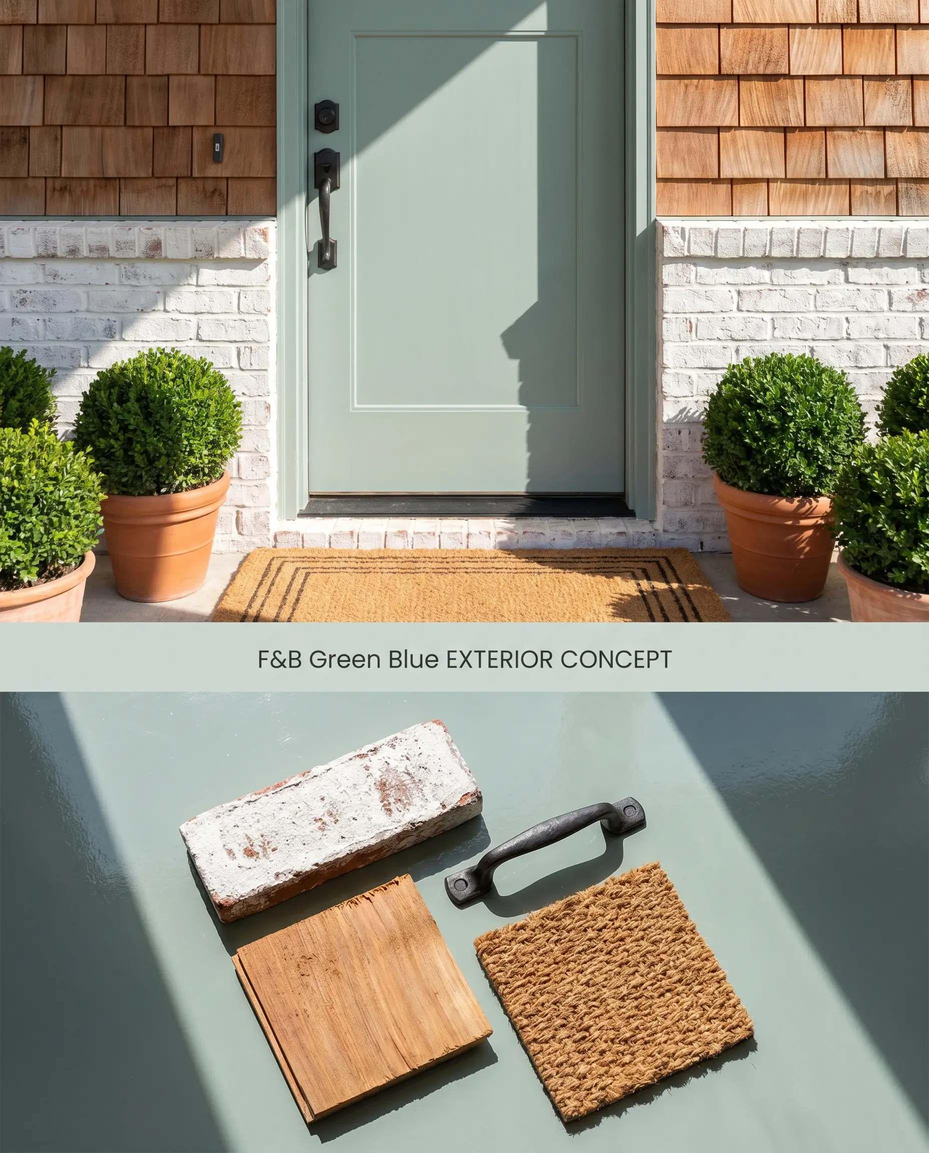
Exterior applications force the pigment to compete with natural foliage and harsh UV light, pulling the green forward while neutralizing the blue. The mid-range LRV ensures the door retains a distinct silhouette against both red brick and light stucco facades. High-gloss finishes amplify the color’s inherent vibrancy while providing a hardened shell against weather degradation.
Full Gloss ($$$$ (Boutique/Luxury Tier)). This striking, 95% sheen water-based finish reflects light beautifully, providing architectural drama while creating a hardened barrier against exterior elements.
The Consultant’s Finish
You can apply wallpapers, paints, etc. on walls and see how they look in various interiors.

Comparative Color Theory: Analyzing Aquatic Undertones
Farrow & Ball Green Blue 84 vs. Farrow & Ball Dix Blue 82
Green Blue leans strongly into its aquatic green base, whereas Dix Blue introduces a distinct dose of black pigment, resulting in a more aged, vintage teal. With an LRV of 49, Green Blue holds its saturation in bright spaces, while Dix Blue’s slightly darker, muddier profile excels in rooms where you want to absorb light rather than reflect it. Specify Green Blue for active, water-adjacent spaces like bathrooms, and reserve Dix Blue for cozy, low-light studies or libraries.
Farrow & Ball Green Blue 84 vs. Benjamin Moore Palladian Blue HC-144
Palladian Blue possesses a much higher LRV (60.4), making it noticeably lighter and more buoyant than the grounded, mid-tone profile of Green Blue. Palladian Blue reads as a soft, airy spa blue that requires ample natural light to avoid washing out, whereas Green Blue’s structural chromatic depth allows it to anchor a room even as shadows lengthen. Choose Palladian Blue for upper-level bedrooms seeking an ethereal lift, and deploy Green Blue on lower-level cabinetry where architectural weight is required.
Farrow & Ball Green Blue 84 vs. Sherwin-Williams Sea Salt SW 6204
Sea Salt is a highly muted, gray-green chameleon with a significantly higher LRV (63), causing it to read almost as a neutral off-white in direct sunlight. Green Blue commits firmly to its pigment, retaining a definitive dusty aqua presence regardless of the exposure intensity. Specify Sea Salt when you need a subtle, whispering backdrop for vibrant art or textiles, but rely on Green Blue when the paint itself must serve as the primary architectural focal point.
Technical Specifications & Application FAQs
In direct South-facing light, the warm yellow rays amplify the green undertones, occasionally pushing the color toward a vibrant mint. To counteract this, pair it with flat, light-absorbing finishes and ground the space with dark wood tones or unlacquered brass hardware.
The cool, aquatic tones of Green Blue create a high-contrast complementary reaction with the red and orange undertones found in cherry and warm oak. This forces both the wood and the paint to appear more intense, which works for highly dynamic spaces but should be avoided if you prefer a subtle, tone-on-tone aesthetic.
The ultra-matte, chalky surface of Estate Emulsion scatters light rather than reflecting it, which deepens the pigment and pulls forward the grayed-out, muted teal notes. This lack of sheen prevents harsh glare, allowing the color to transition smoothly from a crisp morning blue to a moody evening green.
Without natural daylight to activate the blue and green pigments, the color relies entirely on artificial lighting and will lean firmly into its gray base. To prevent the space from feeling muddy, utilize 3000K to 3500K LED lighting to accurately render the aquatic tones and specify a higher-sheen finish like Modern Emulsion to bounce available light.
Similar Paint Colors
Same Brand
Cross-Brand Equivalents