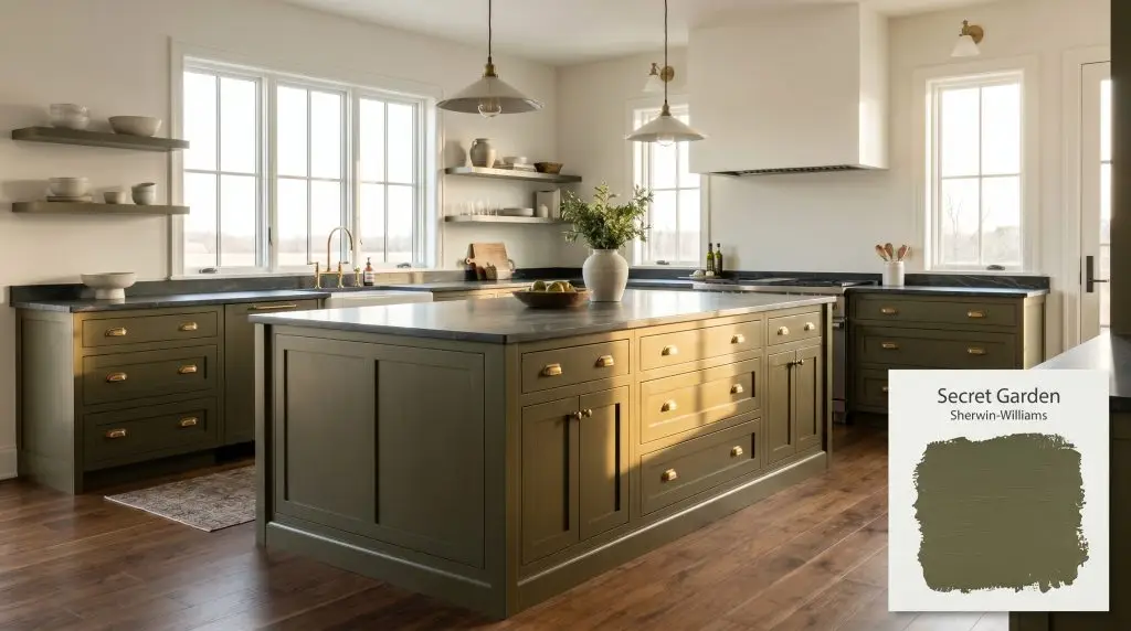
Secret Garden SW 6181
Sherwin-WilliamsSherwin-Williams Secret Garden (SW 6181) is a deep, warm olive green with pronounced yellow and bronze undertones. Boasting an LRV of 8, it absorbs significant light, creating a moody, botanical atmosphere ideal for cabinetry, sophisticated exteriors, and enveloping accent walls.
Paint Technical Profile
| Color ID / SKU | SW 6181 |
| HEX Code | #4F523A |
| Light Reflectance (LRV) | 8 |
| Use | Interior, Exterior |
| Best Exposures | South-Facing, East-Facing |
| Best For | Kitchen Cabinetry, Home Offices, Exteriors, Accent Walls |
Sherwin-Williams Secret Garden: A Grounding Anchor for Deep, Tactile Spaces
There is a distinct magic in taking an everyday architectural feature—like standard hallway wainscoting or basic builder-grade shelving—and wrapping it in a color so heavy and intentional that it instantly feels like premium custom millwork. Sherwin-Williams Secret Garden (SW 6181) is exactly that kind of transformative tool. It brings a deeply rooted, woodland aesthetic to ordinary spaces, proving that you do not need a massive renovation budget to create a highly curated atmosphere.
By leaning into its heavy, light-absorbing qualities, this desaturated olive green forces a room to feel intimate, deliberate, and endlessly cozy. It is a chameleon that bridges the gap between rugged, earthy charm and highly tailored sophistication.
Whether you are anchoring an airy, open-concept living room or creating a moody retreat in a windowless den, this paint demands attention. Let us break down exactly how to harness its unique color DNA to elevate your home.
Undertones & LRV of Sherwin-Williams Secret Garden
Is this paint warm or cool? Sherwin-Williams Secret Garden is undeniably warm. It thrives on a foundation of golden, earthy heat that radiates through its dark exterior, making spaces feel inviting rather than stark.
To understand how this color behaves on the wall, we have to look at its underlying structure. Sitting at a yellow-green hue angle, it completely avoids the icy, blue-leaning chill found in traditional emerald or hunter greens.
With an LRV (Light Reflectance Value) of 8, Secret Garden is a heavy light-absorber. It does not bounce ambient light around the room; instead, it visually advances toward the eye, pulling the walls inward to create a wrapped, protective energy. This low LRV color absorption is exactly what gives the paint its premium, velvet-like depth.
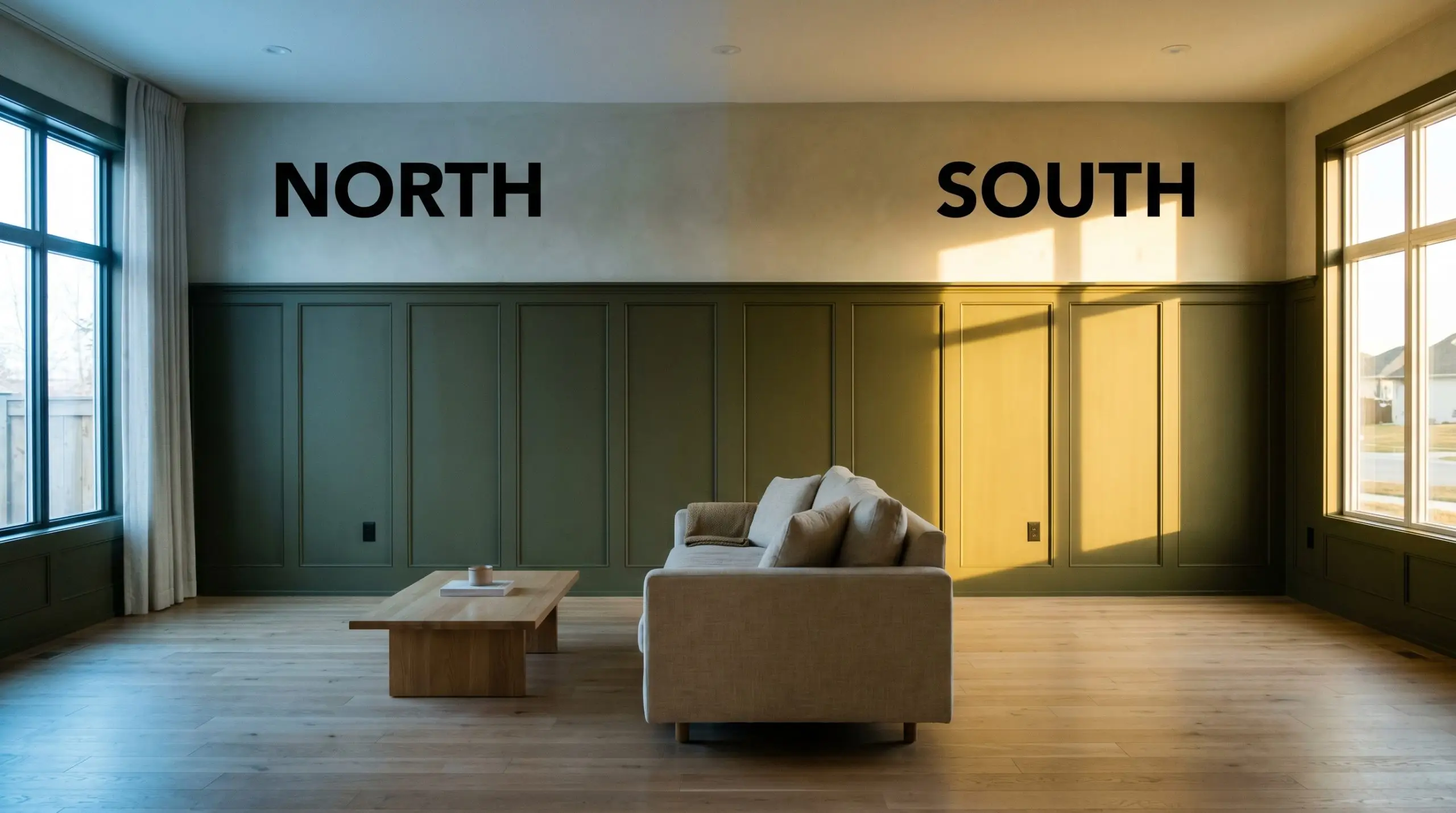
Lighting Effects & The Chameleon Factor
Because this paint relies so heavily on its hidden brown and bronze notes to create warmth, it is highly reactive to the temperature of your lighting. If you place this color in a room lit exclusively by vintage-style incandescent bulbs, it will completely lose its lush green identity and flatten into a muddy, heavy brown.
To avoid this failure state, you must be highly intentional about your bulb temperatures and window exposures. Always test a large painted swatch on multiple walls before committing.
Popular Room Applications for Secret Garden
This warm dark green brings a stabilizing, organic energy to a home, acting as a visual anchor that calms chaotic layouts. It demands to be paired with tactile, contrasting textures to truly shine.
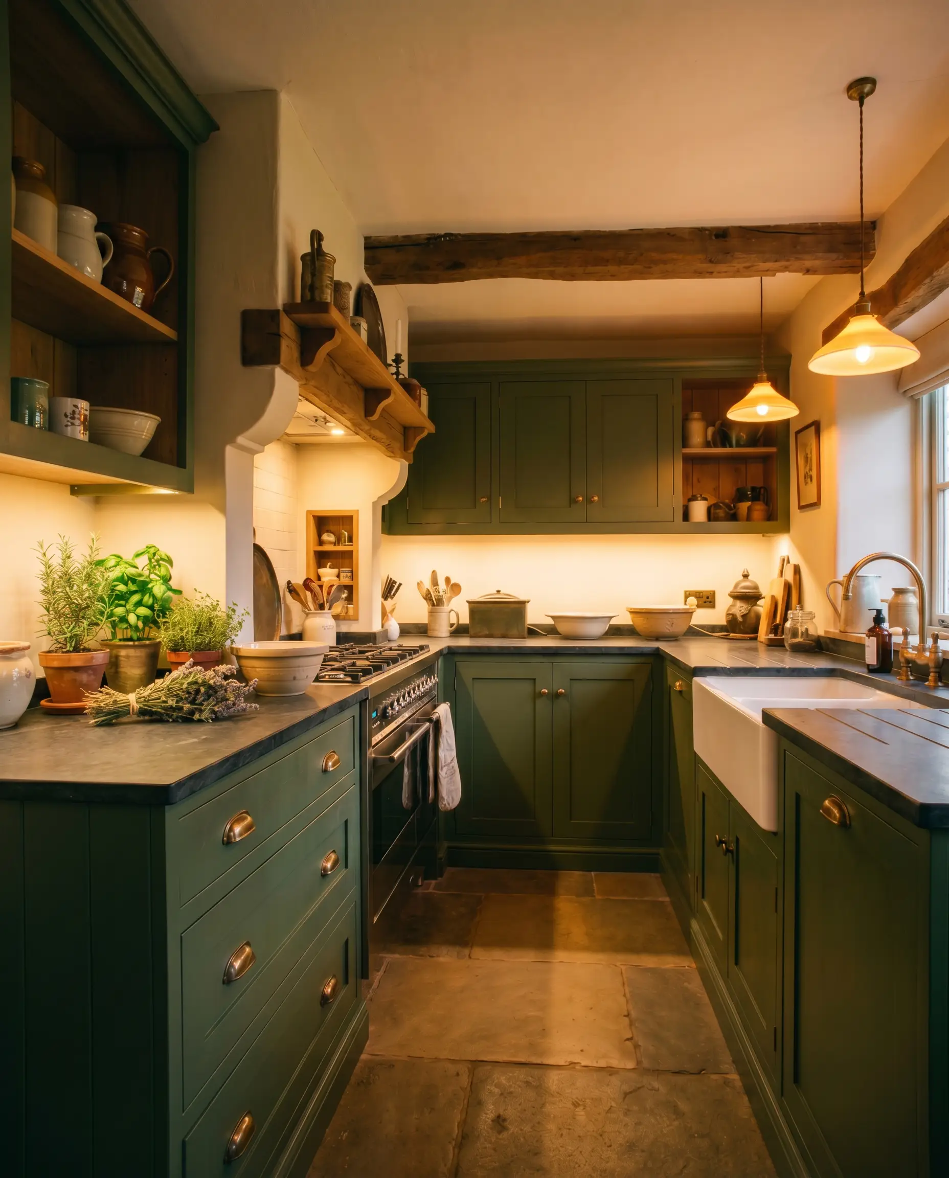
Kitchen Cabinetry
Using this deep olive as a cabinetry focal point instantly grounds a busy kitchen, especially when applied to lower cabinets or a central island. It serves as a brilliant foundation for a traditional English farmhouse aesthetic, pairing effortlessly with unlacquered brass bin pulls and honed soapstone counters. If you prefer a sleeker look, this paint also beautifully anchors modern flat-panel doors against crisp white walls. For more inspiration on balancing these rich tones with your hardware and lighting, exploring dark green kitchen cabinets can help you refine your material palette.
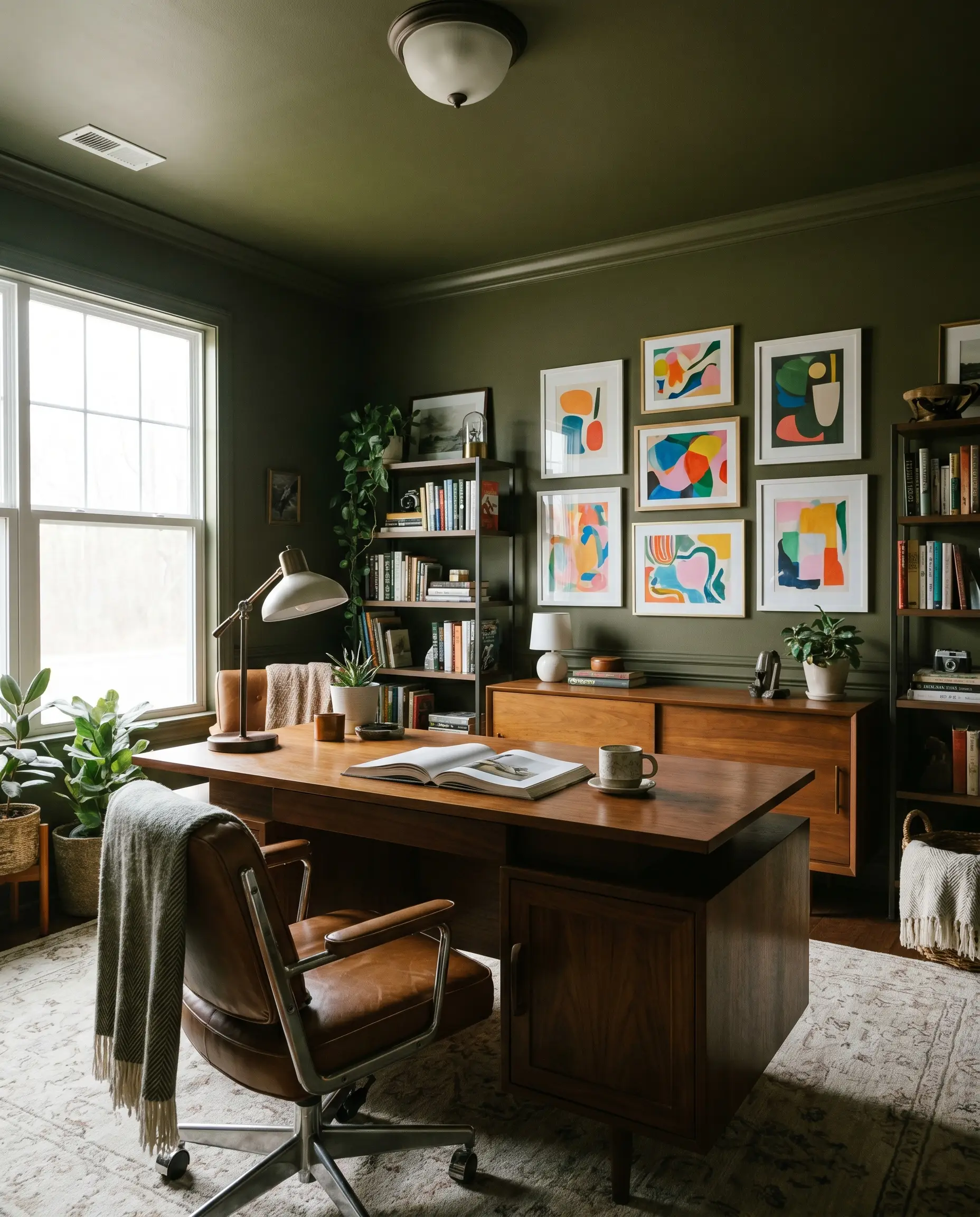
Home Offices & Libraries
The enveloping depth of this color is practically built for focused, quiet spaces. Wrapping an entire office—walls, trim, and ceiling—in this shade creates a sophisticated, distraction-free retreat. It highlights the rich grain of mid-century walnut desks and provides a stunning, high-contrast backdrop for a gallery wall of bright, modern art.
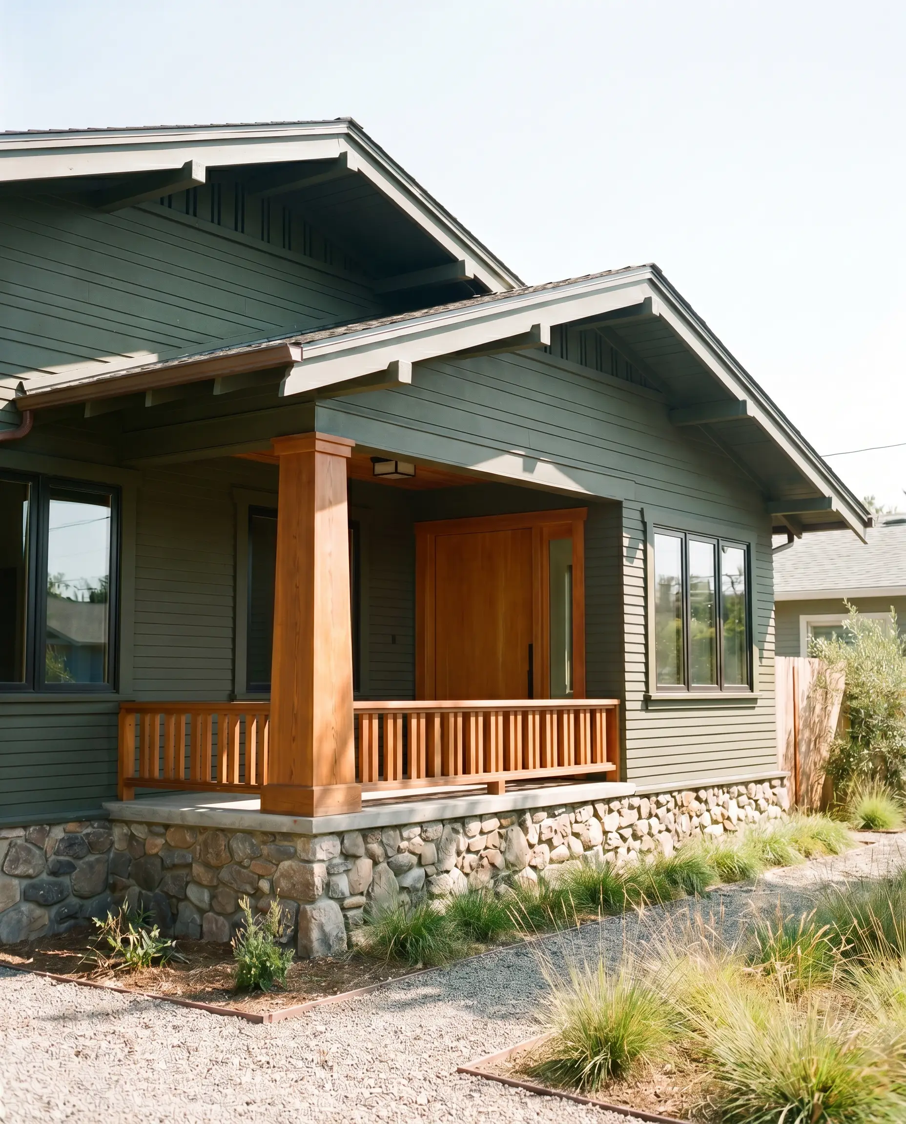
Exterior Siding & Shutters
On a facade, natural sunlight will wash out some of the color’s intensity, making it read slightly lighter and greener than it does indoors. It is a stunning choice for Craftsman bungalows or rustic contemporary homes, blending seamlessly with natural stone and cedar accents.
Dark, earth-toned paints absorb a tremendous amount of heat and UV radiation. When using this on your exterior siding or front door, insist on a premium, UV-resistant exterior formulation to prevent the bronze undertones from fading prematurely.
Hackrea Pro-Tip (Exterior Longevity)
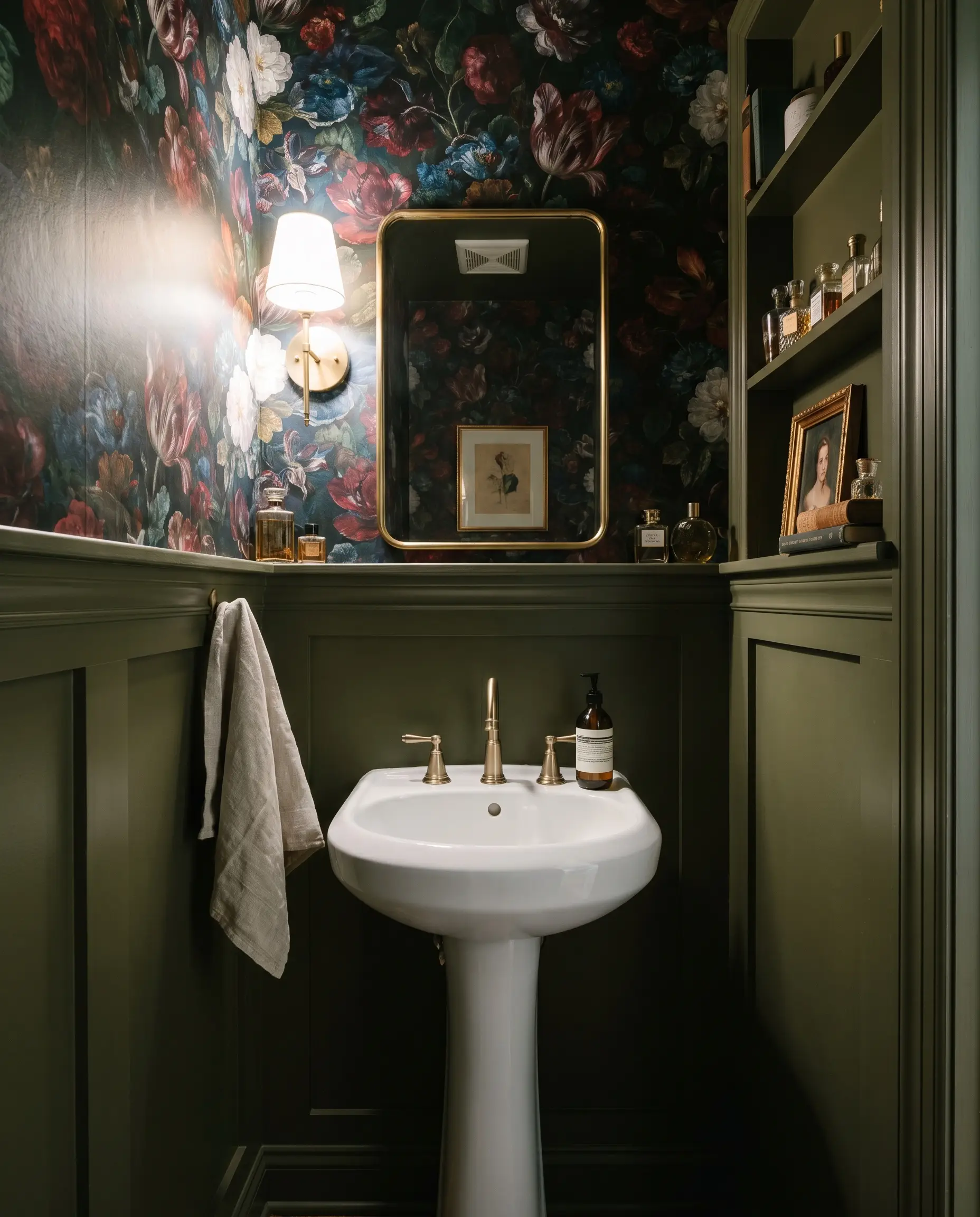
Powder Rooms
Small, windowless bathrooms are the perfect place to lean into heavy, dramatic color rather than fighting the lack of light. This earthy green creates a brilliant jewel-box effect when paired with a highly decorative, oversized floral wallpaper. Add a simple brass mirror and a standard pedestal sink to complete a highly curated, budget-friendly transformation.
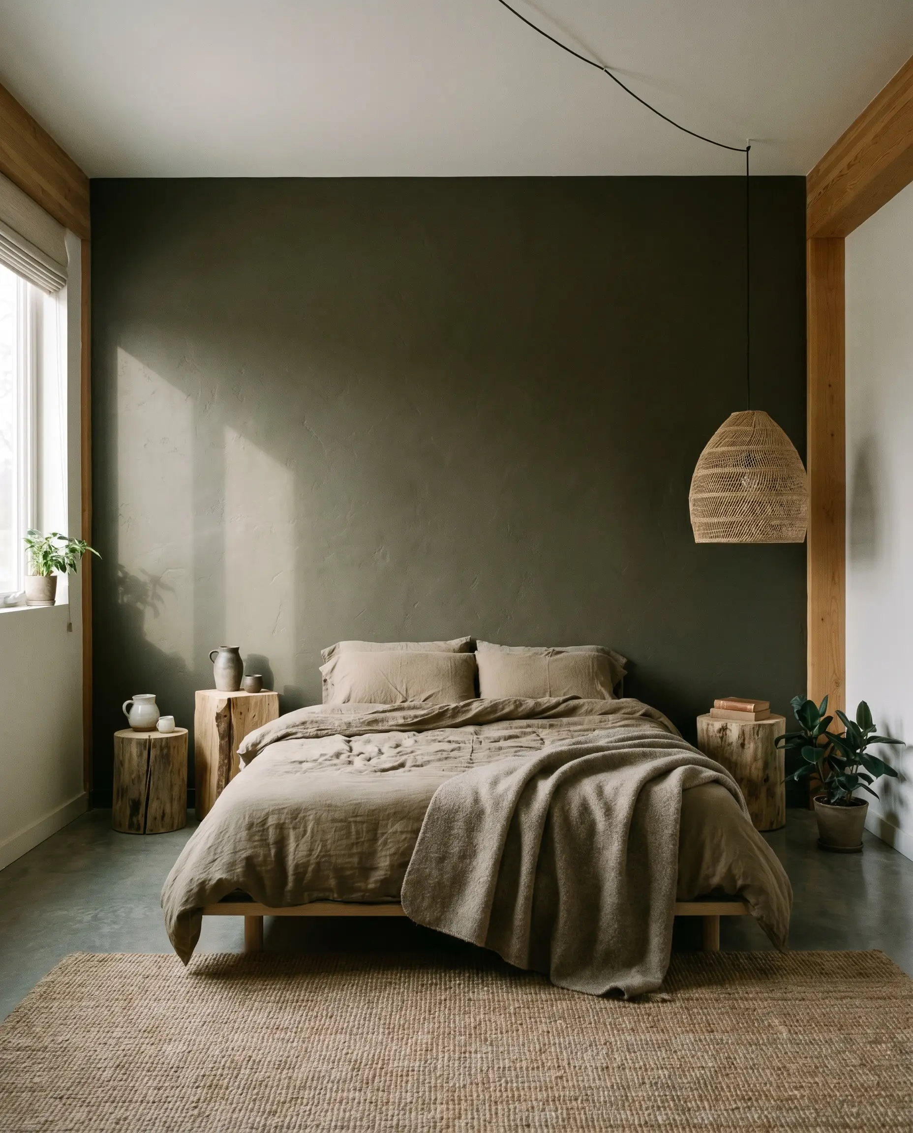
Bedroom Accents
While painting an entire bedroom this dark can feel heavy, using it as a structural accent behind the bed anchors the room beautifully. It lends itself perfectly to a relaxed, wabi-sabi minimalism when paired with rumpled linen sheets, raw wood nightstands, and soft, asymmetrical lighting. The color naturally promotes rest by visually quieting the environment.
Creative Ways to Use This Desaturated Olive Green
Beyond standard walls and siding, this adaptable shade is an incredible tool for highly specific, curated design moments.
The Vintage Credenza Upcycle
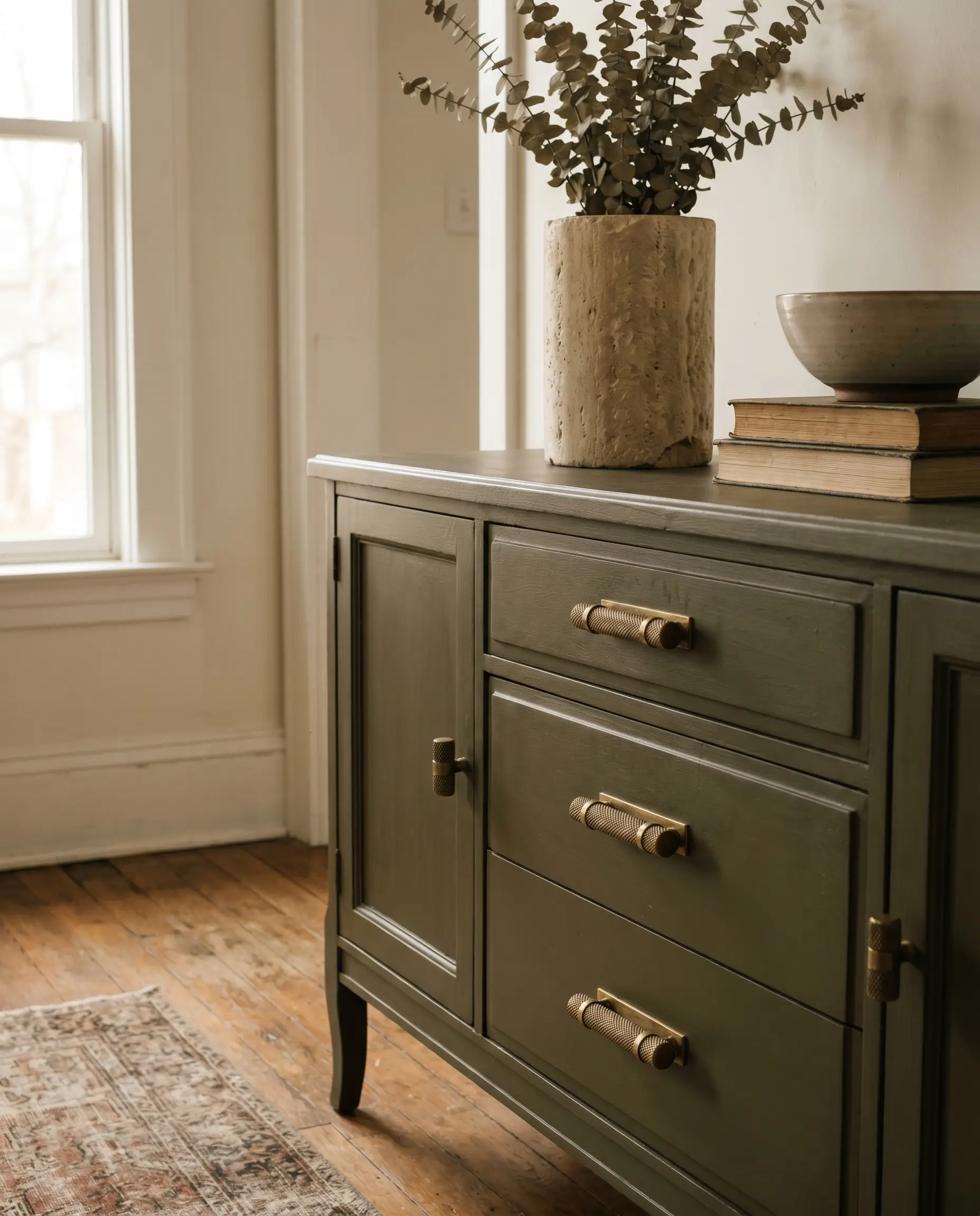
Transform a tired, thrifted dining room buffet by coating it in this rich olive. The earthy warmth of the paint completely modernizes dated wood silhouettes while maintaining a sense of heritage. Swap out the old hardware for heavy, knurled brass pulls to give an inexpensive piece of furniture a decidedly high-end, custom finish.
A Moody Mudroom Drop Zone
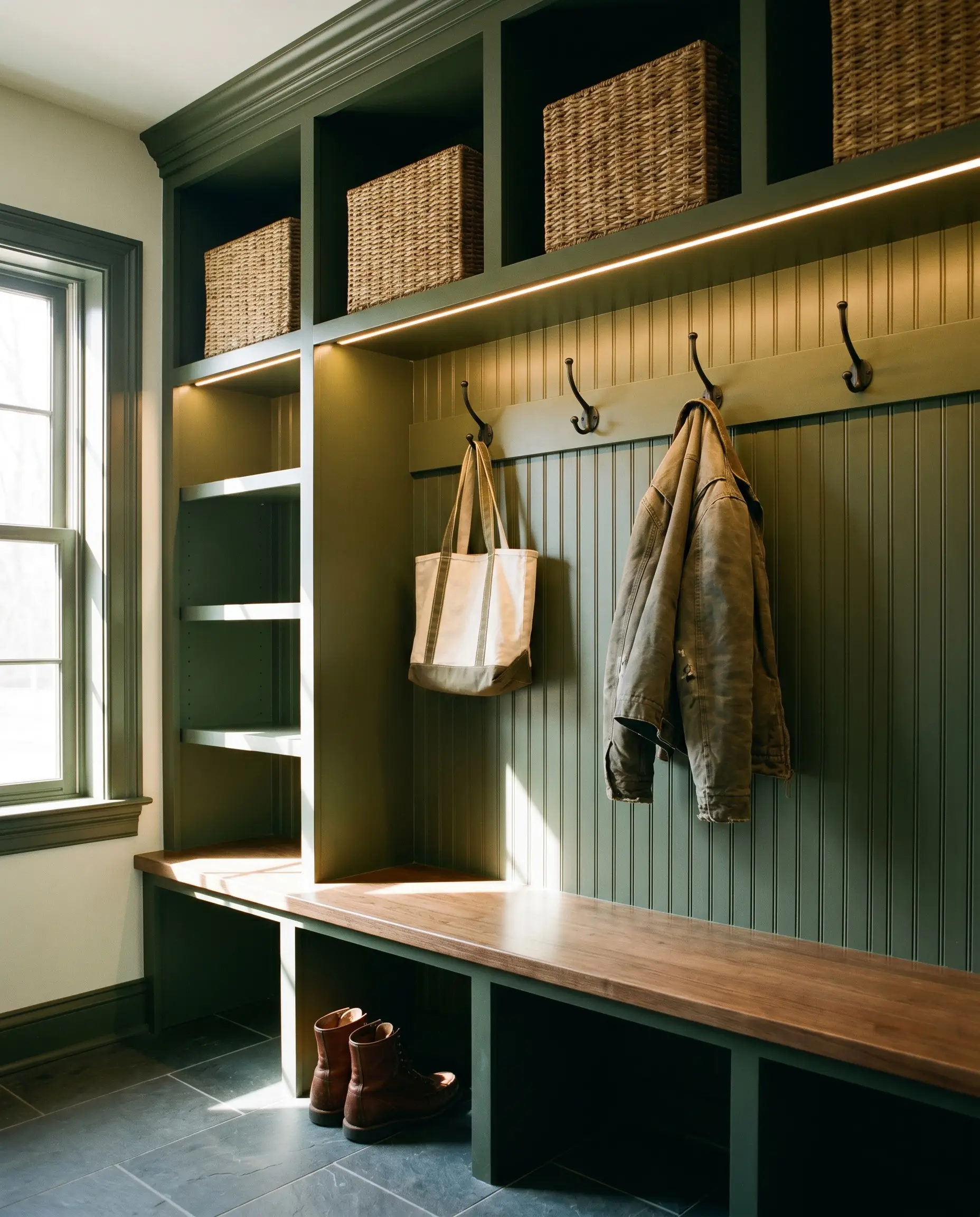
Mudrooms often become chaotic catch-alls, but anchoring the built-in cubbies and beadboard backing in this deep green establishes immediate visual order. The dark hue expertly hides everyday scuffs and dirt from shoes, while providing a handsome backdrop for woven wicker storage baskets and simple iron coat hooks.
The Enveloping Dining Room Ceiling
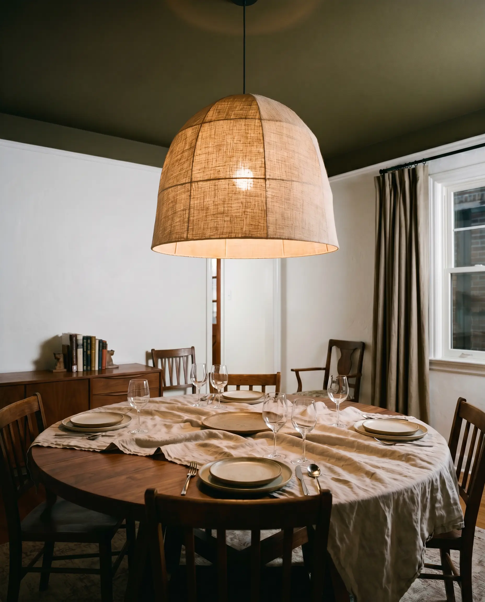
Instead of leaving your dining room ceiling a stark, forgotten white, pull this earthy green up overhead. Dropping a dark color onto the ceiling visually lowers the height of the room, creating an incredibly intimate, tented atmosphere for evening dinner parties. Pair it with a dramatic, oversized linen pendant light to bounce a soft glow against the dark canopy above.
A Rustic Modern Bunk Room
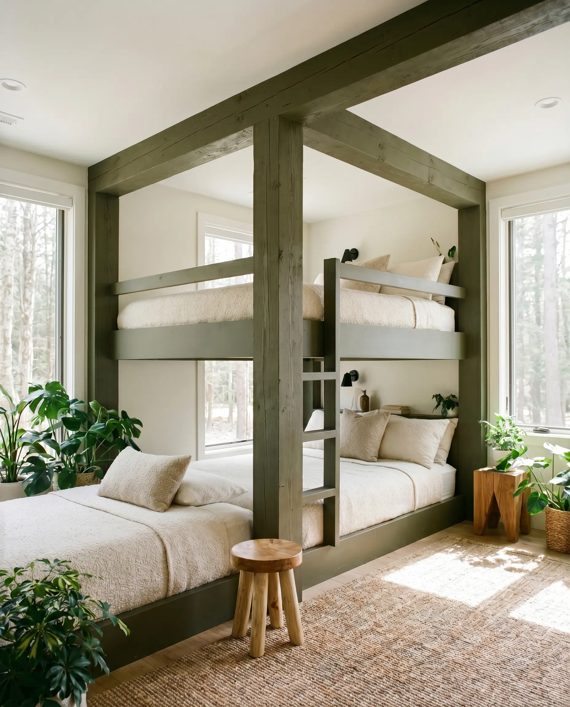
For a shared children’s space or a cabin guest room, paint the structural framing of built-in bunk beds in this grounding shade. It instantly elevates the room from a standard sleeping quarter into a playful, biophilic interior design trends inspired hideaway. Keep the surrounding walls a warm, creamy white to ensure the dark green framing pops sharply against the background.
Coordinating Colors & Hardware Pairings
The secret to styling this heavy, light-absorbing green is managing the visual tension between the paint and its surrounding materials. It needs thoughtful contrast to keep it from feeling overly heavy or flat.
Trim & Baseboards
Hardware, Wood & Material Pairings
Coordinating Colors
Designer Mood Boards
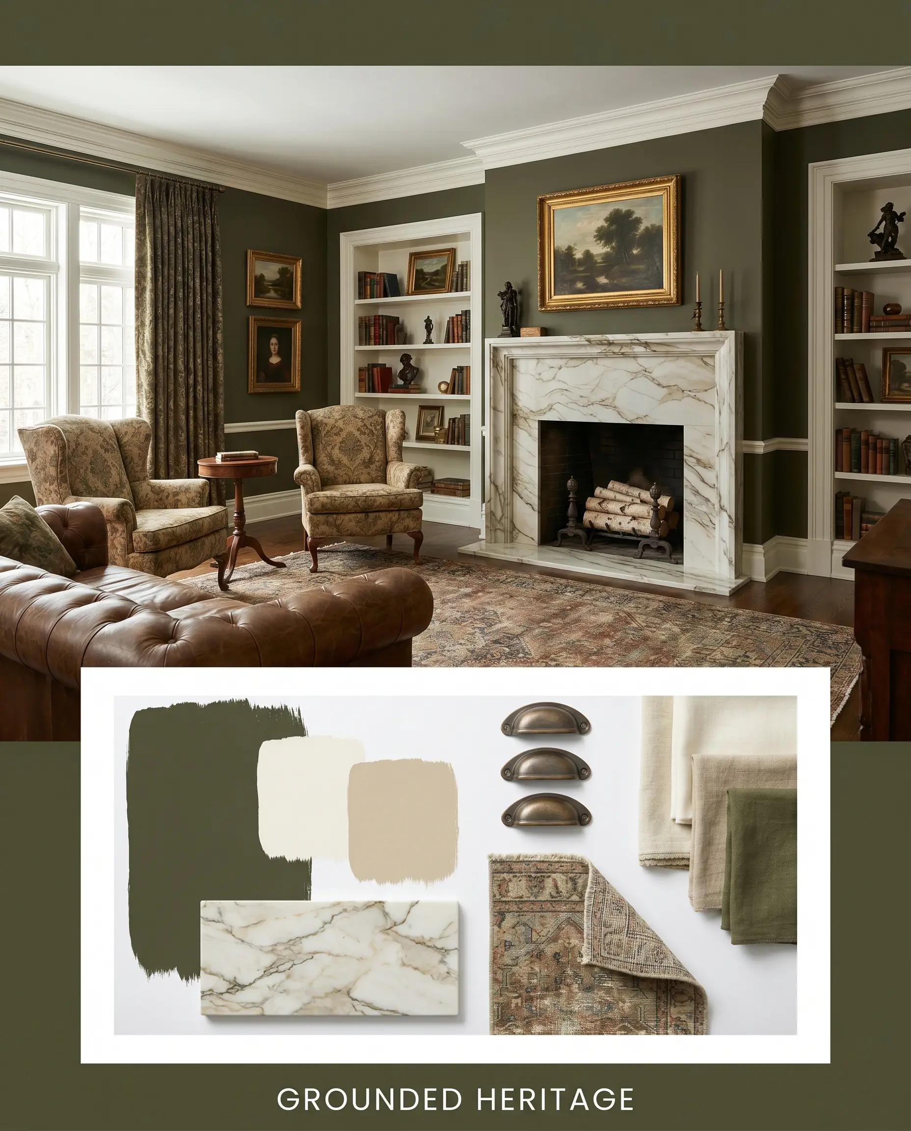
Grounded Heritage This palette leans into a classic, time-tested aesthetic by pairing the dark olive with crisp Sherwin-Williams Alabaster trim and accents of Benjamin Moore Shaker Beige. Add heavily veined, affordable faux-marble quartz countertops, aged bronze cup pulls, and a vintage-inspired distressed runner rug to create a space that feels deeply established and welcoming.
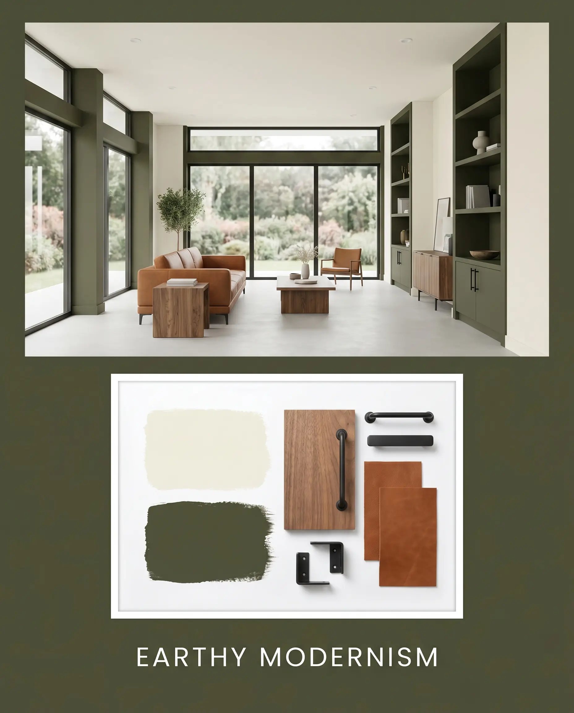
Earthy Modernism A sleek, highly tactile approach that uses Behr Blank Canvas as a bright, airy backdrop to let the dark green act as a sharp, structural accent. Introduce clean-lined walnut furniture, matte black iron light fixtures, and a statement cognac leather sling chair. The resulting energy is crisp, tailored, and effortlessly cool.
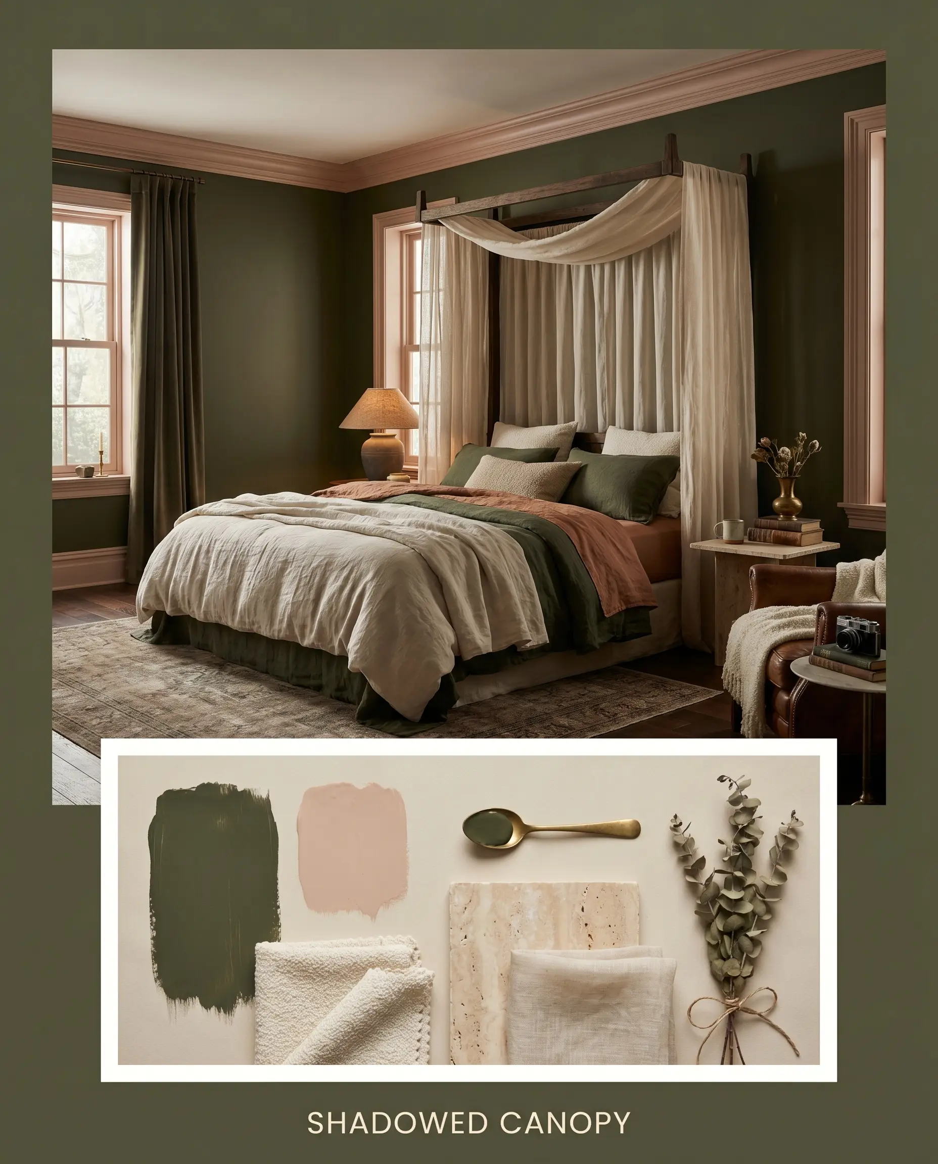
Shadowed Canopy A moody, enveloping concept that pairs the green with the soft, dusty warmth of Farrow & Ball Setting Plaster. Layer in tactile elements like nubby cream bouclé throw pillows, raw travertine coasters, and soft, sheer linen drapery. This combination softens the heavy architectural weight of the paint, creating a highly romantic, intimate atmosphere.
Sherwin-Williams Secret Garden Head-to-Head Comparisons
When selecting a dark green, the subtle shifts in undertone dictate the entire mood of the room. Here is how this earthy shade stacks up against its closest rivals.
Sherwin-Williams Secret Garden vs. Sherwin-Williams Ripe Olive SW 6209
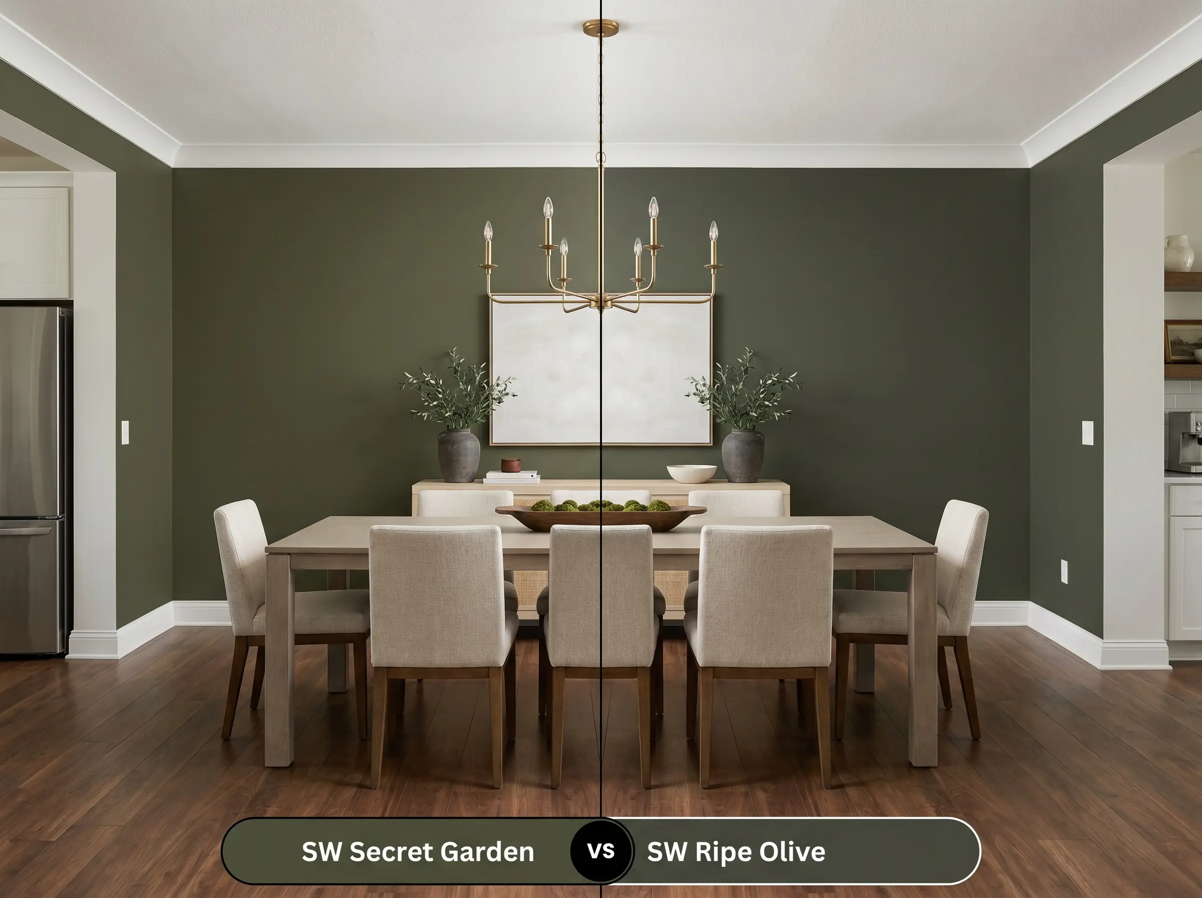
While both are incredibly deep greens, Ripe Olive leans noticeably cooler, featuring a slate-blue undertone that gives it a more formal, maritime energy. Secret Garden is significantly warmer and far more yellow-based. If your room features warm wood tones or brass, the olive will harmonize better, whereas Ripe Olive excels alongside cool marble and polished nickel.
Sherwin-Williams Secret Garden vs. Benjamin Moore Southern Vine 2138-10
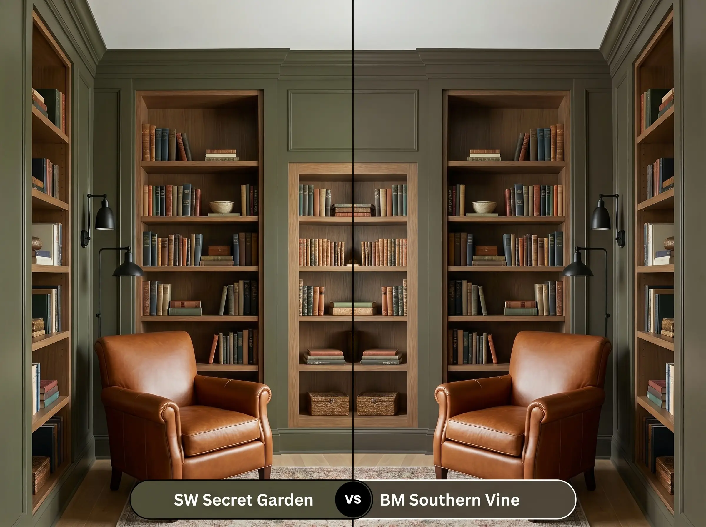
Southern Vine shares a very similar earthy, olive DNA, but it is slightly lighter and carries a touch more gray, making it a bit more muted on the wall. If you are worried about your space feeling too cavernous or heavy, Southern Vine offers a softer, slightly more forgiving approach, while Secret Garden delivers maximum, unapologetic drama.
Sherwin-Williams Secret Garden vs. Benjamin Moore Vintage Vogue 462
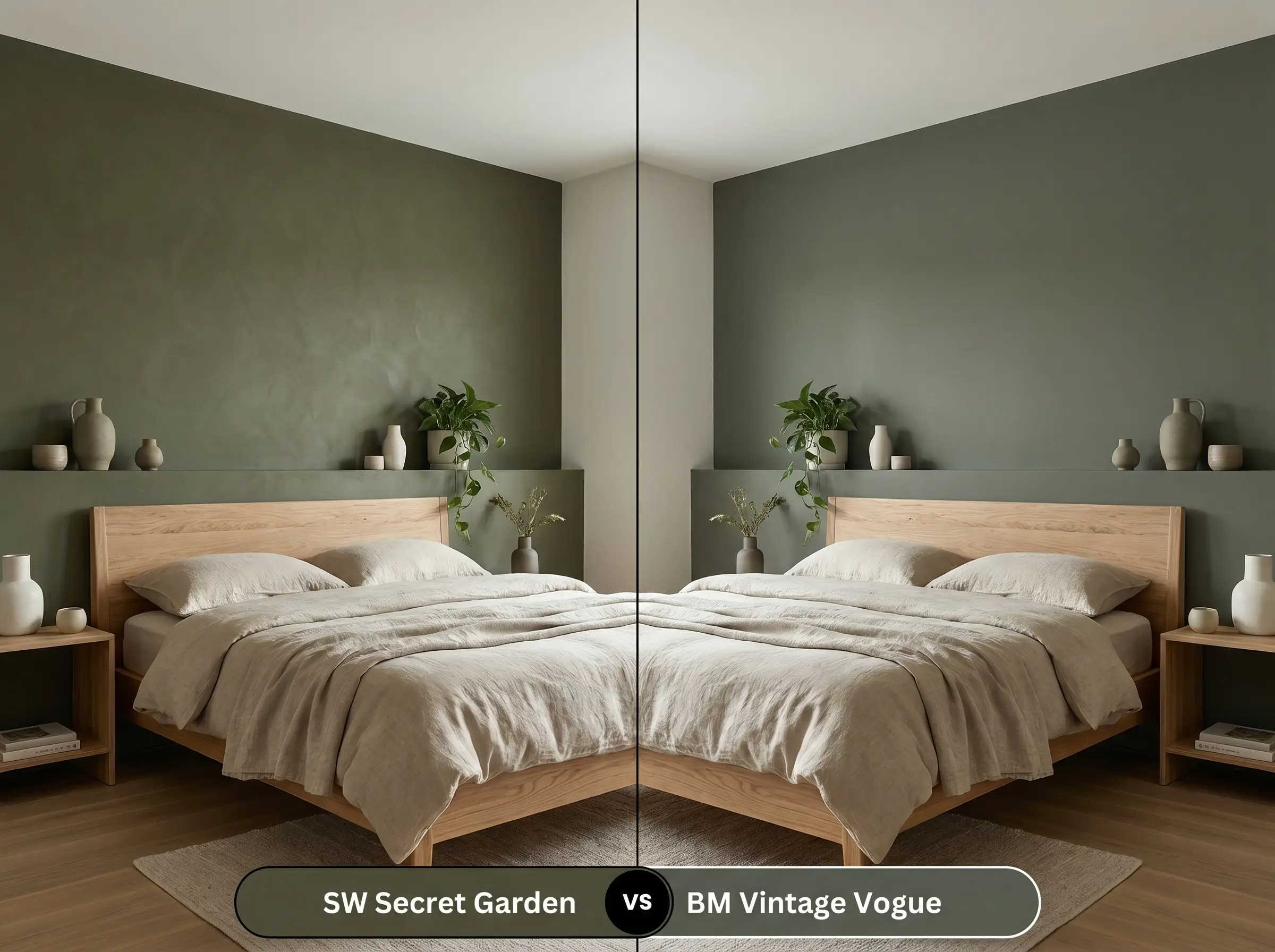
Vintage Vogue is a stunning, smoky green that carries a distinct brown-charcoal undertone, giving it a slightly more historic, faded quality. Secret Garden retains a bit more of its vibrant, yellow-green punch. Choose Vintage Vogue if you want a color that recedes quietly into the shadows, and choose the Sherwin-Williams option if you want the green pigment to remain the undeniable star of the room.
Similar Colors & Brand Equivalents
If the specific lighting in your home is pulling this color in the wrong direction, or if you simply need to shop across different paint manufacturers, these alternatives offer excellent flexibility.
Same-Brand Alternatives
Cross-Brand Matches
Practical Application & DIY Advice for SW 6181
Executing a flawless finish with a color this dark requires strict attention to the physical painting process. Deep bases are notoriously unforgiving of sloppy technique.
The Dynamic Sheen Guide
Primer Strategy
You cannot achieve the true, rich depth of this olive green by painting directly over a light wall or raw wood. You must use a high-quality primer tinted to a dark gray base. A tinted primer reduces the number of expensive topcoats required and prevents the old wall color from bleeding through and altering the final green hue.
Colors with this much dark pigment are incredibly prone to “flashing”—meaning if you try to touch up a scuff mark a month later, the new paint will dry with a slightly different sheen, leaving a visible patch. To fix a scuff on a dark wall, you often have to repaint the entire wall corner-to-corner to maintain a flawless finish.
Hackrea Design Secret (The Touch-Up Warning)
Coverage & Success Tips
Even with a tinted primer, expect to apply a minimum of two generous coats of the premium topcoat to achieve full, opaque coverage. When rolling, maintain a wet edge and work quickly from ceiling to floor to avoid visible roller lap marks. If you are painting cabinetry, using a high-density foam roller or an HVLP sprayer will ensure you do not leave distracting brush strokes in the final finish.
Frequently Asked Questions
Without natural light to activate its green pigments, the hidden bronze and khaki undertones will absolutely dominate. To keep it looking green in a windowless space, you must use crisp, artificial LED lighting (around 3500K to 4000K) to cut through the muddy warmth.
Dark, earthy colors absorb significant heat and are highly susceptible to UV fading over time. If using this on a sunny exterior, it is crucial to invest in a premium, fade-resistant exterior paint formula and understand that the color will naturally soften and lighten as it ages.
Painting a ceiling dark is a brilliant design trick to make a tall room feel more intimate, but applying a dark, light-absorbing color to a heavy texture (like popcorn) will drastically emphasize every shadow and bump. It is highly recommended to smooth the ceiling before applying such a deep shade.
Yes, the warm, golden-brown base of this olive green will actively fight against the icy, blue-purple undertones of a cool gray marble. For a much more cohesive look, pair this paint with warmer stones like soapstone, creamy travertine, or marbles featuring warm gold veining.
Final Verdict & Expert Warnings
Sherwin-Williams Secret Garden (SW 6181) is a brilliantly executed, light-absorbing olive green that instantly injects a sense of history, warmth, and tactile depth into a home. It is the perfect choice for homeowners looking to anchor a space with a moody, woodland aesthetic, whether that means transforming basic kitchen lowers into a sophisticated focal point or wrapping a quiet study in earthy comfort. When you need a color that feels both ruggedly natural and highly curated, this paint delivers uncompromising character. If you are considering expanding this cozy aesthetic to the outside of your home, exploring warm exterior paint colors will help you carry that welcoming energy outdoors.
However, you must respect the warm, golden-brown DNA of this color when building your material palette. Avoid pairing this earthy tone with icy, blue-based gray marble countertops, stark cool-white flooring, or silvery-blue textiles. The competing temperatures will instantly clash, making the olive feel muddy, disjointed, and visually confused. Surround it instead with warm woods, creamy whites, and aged metals, and it will reward you with a deeply inviting, beautifully grounded environment.