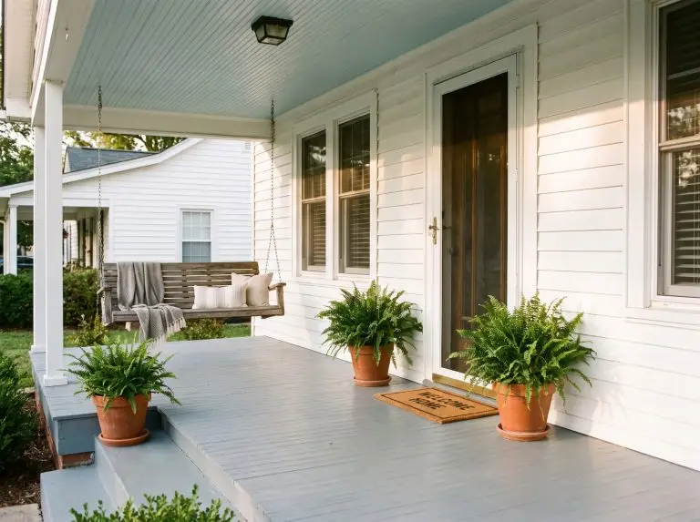
Your front porch is the architectural handshake of your home, setting the immediate tone for every guest who walks up the steps. Because it serves as both a highly visible design feature and a heavily trafficked utility space, selecting the best Sherwin-Williams front porch paint colors requires a balance of bespoke curation and rigorous durability. We rely on Sherwin-Williams as the premium standard for exterior applications because their formulations withstand the punishing realities of muddy boots, driving rain, and bright afternoon sun.
Choosing the right shade goes far beyond simply matching your siding complement. For porch treads and floors, success hinges on dirt concealment and understanding a color’s Light Reflectance Value (LRV), while ceiling selections rely on historical charm and precise undertone science. Instead of generic advice, we are breaking down exact Sherwin-Williams color codes engineered to pair flawlessly with your specific vernacular architecture, ensuring a polished, long-lasting entrance.
Dirt-Concealing Grays and Greiges for High-Traffic Floors
Gray remains the industry standard for porch floors because it naturally bridges the gap between masonry and exterior landscaping. The secret to a low-maintenance floor lies in its Light Reflectance Value (LRV)—a metric measuring how much light a color reflects. If a floor has a high LRV, it highlights dark footprints; a low LRV broadcasts pollen, making mid-tone grays the sweet spot.
SW 7651 Front Porch (The Namesake Neutral)
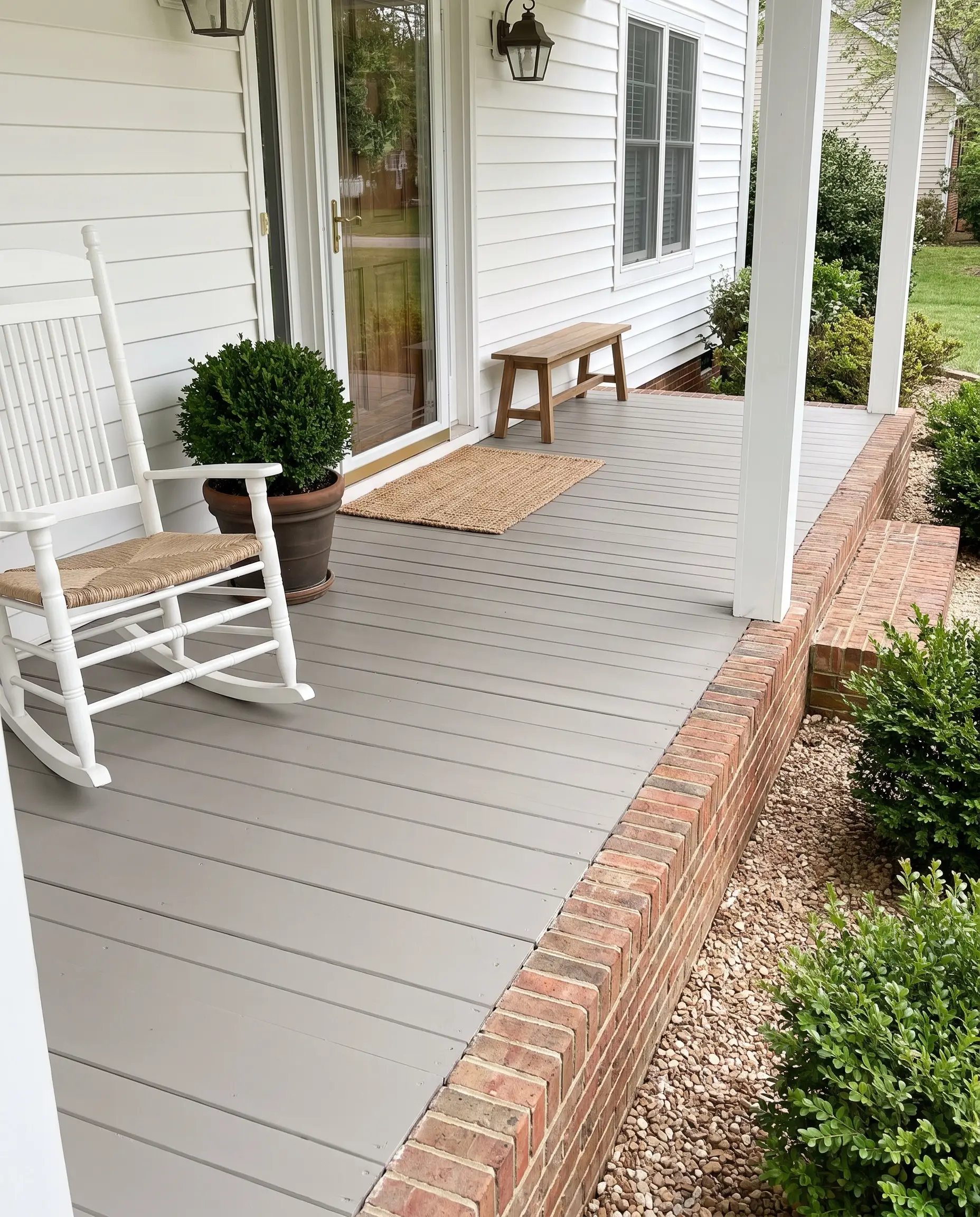
This soft, peaceful neutral mimics the look of freshly poured, clean concrete, acting as a subtle foundation that allows bolder exterior siding to take center stage. It strikes a perfect balance between cool and warm, ensuring your entryway feels welcoming rather than industrial.
- Vibe: Understated, classic, and clean.
- Architectural Match: Traditional, Colonial, and Transitional exteriors.
- Finish Recommendation: Satin enamel for optimal washability.
At an LRV of 60, SW Front Porch reflects enough light to keep a covered entryway feeling airy, but carries just enough depth to hide standard daily dust.
Designer’s LRV Note
SW 7674 Peppercorn (The Scuff-Concealing Charcoal)
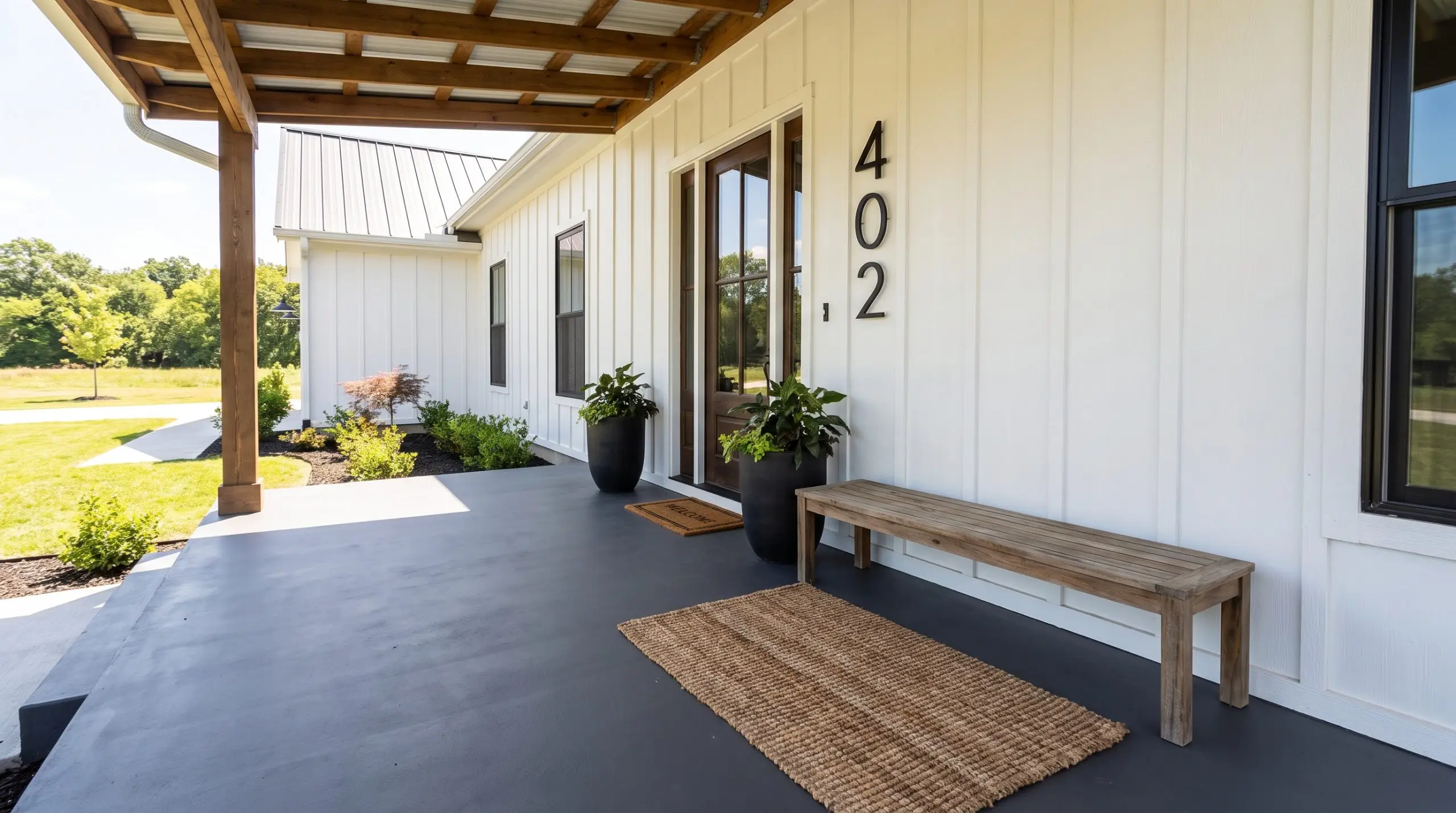
A true charcoal devoid of sneaky blue or brown undertones, Peppercorn anchors modern homes with a moody, sophisticated edge. Because of its visual weight, it excels at concealing heavy foot traffic, muddy paw prints, and standard exterior wear.
- Vibe: Moody, contemporary, and grounded.
- Architectural Match: Modern Farmhouse and contemporary brick homes.
- Pairing Profile: Contrast this deep charcoal floor against SW 7008 Alabaster or SW 7005 Pure White siding for a crisp, high-end architectural finish.
SW 7015 Repose Gray (The Warm Concrete Alternative)
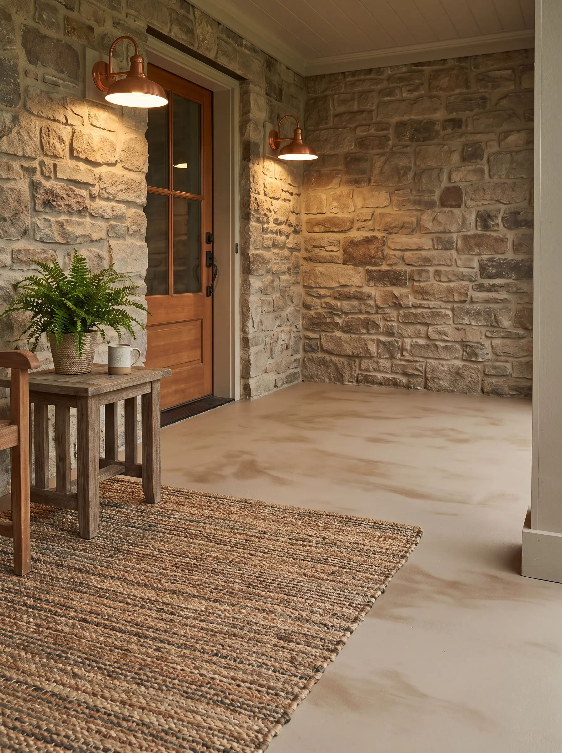
Repose Gray effortlessly bridges the gap between a sterile gray and a dated beige, offering a highly refined greige that warms up an exterior palette. It prevents shaded entryways from feeling cold, making it an incredibly welcoming base for homes with natural textures.
- Vibe: Organic, inviting, and soft.
- Architectural Match: Homes featuring natural stone facades, warm brick, or creamy stucco.
- Styling Pro-Tip: Pair with warm copper exterior sconces to highlight the subtle brown undertones in the paint.
SW 7029 Agreeable Gray (The Versatile Greige)
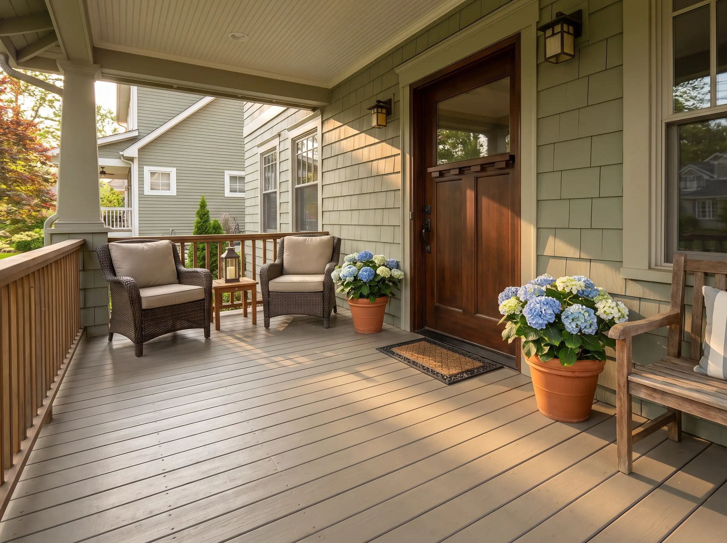
As one of the most universally appealing neutrals in the industry, Agreeable Gray is a safe, foolproof choice that performs beautifully on both traditional wooden decking and poured concrete slabs. Its subtle warmth adapts to shifting exterior sunlight, looking crisp in the morning and incredibly inviting by late afternoon.
- Vibe: Versatile, approachable, and timeless.
- Architectural Match: Craftsman, Bungalow, and Suburban Traditional.
- Maintenance Warning: Because it leans slightly lighter, a high-quality satin enamel finish is absolutely mandatory to ensure easy sweeping and mopping.
Authentic Haint Blue Paint Colors for Porch Ceilings
The Southern vernacular tradition of “Haint Blue” ceilings originated in the Lowcountry as a method to deter spirits and nesting wasps, but modern design embraces it for its spatial magic. By visually mimicking a clear sky, these specific blue undertones draw the eye upward, making low, heavy porch roofs feel expansive and bright.
SW 6211 Rainwashed (The Balanced Blue-Green)
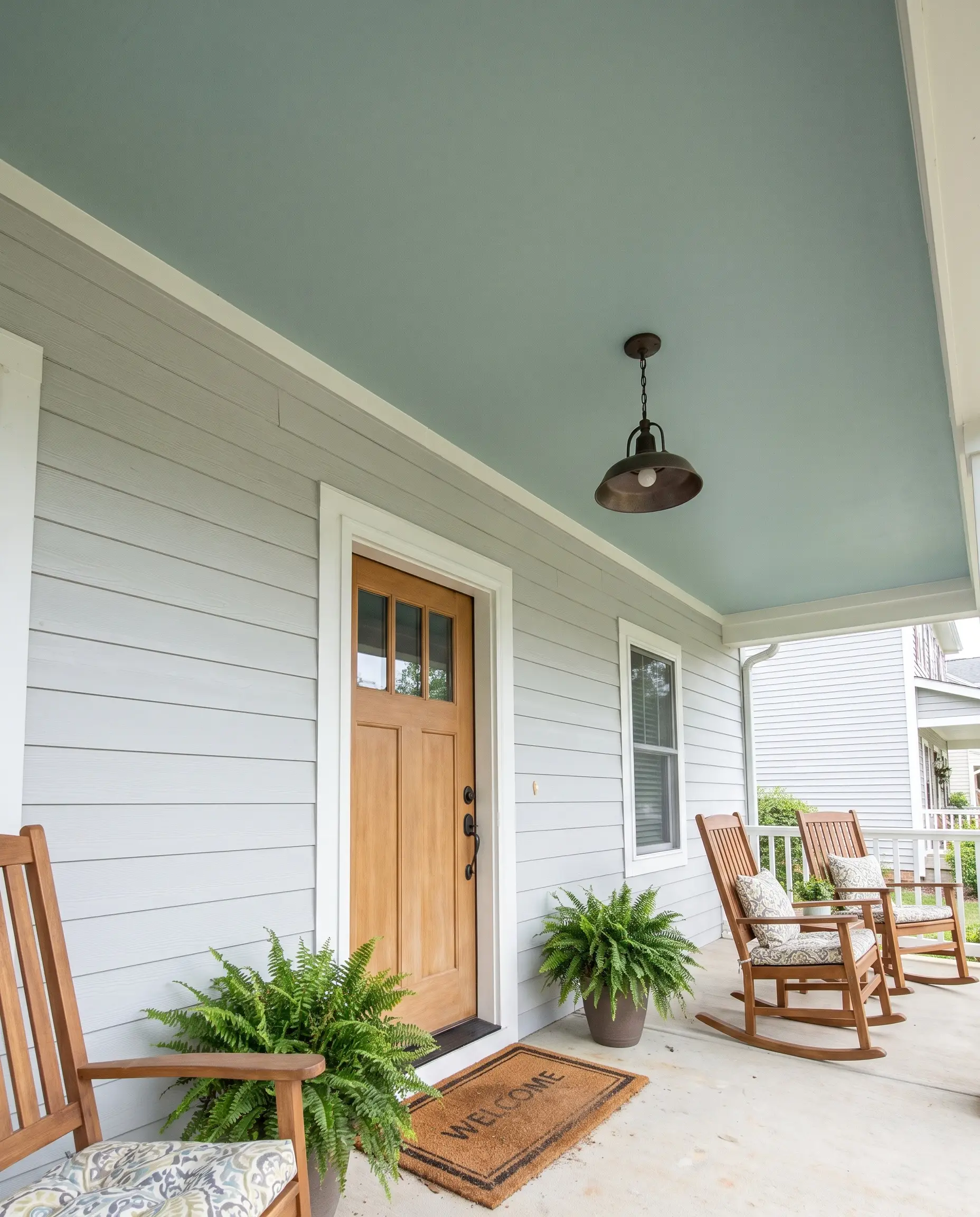
Rainwashed sits perfectly on the spectrum between blue and green, anchored by a crucial gray undertone that keeps the ceiling feeling sophisticated rather than resembling a bright nursery room. It is the safest, most balanced choice for beginners looking to execute a traditional ceiling color.
- Vibe: Serene, balanced, and restorative.
- Undertone Science: Heavy gray and green undertones mute the blue, preventing an artificial pastel look.
- Finish Recommendation: Flat or Satin finish to diffuse overhead glare.
SW 6505 Atmospheric (The Crisp, POA-Friendly Sky Blue)
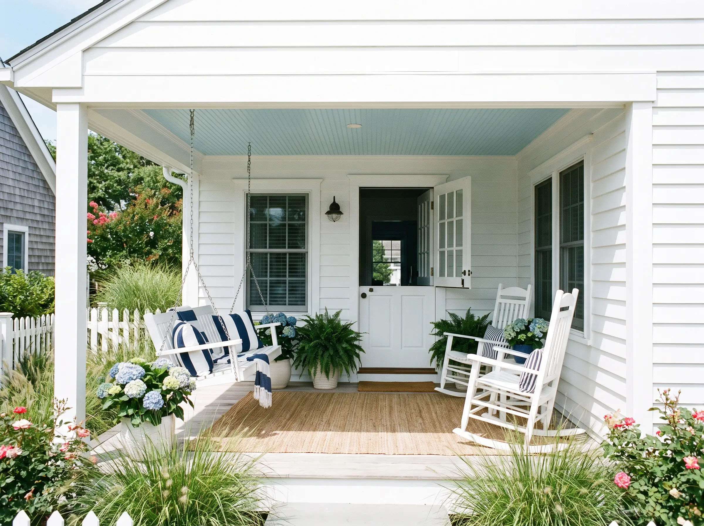
For a brighter, cleaner aesthetic that reflects light beautifully into heavily shaded porches, Atmospheric delivers a true, soft sky blue. It is a highly reliable, POA-approved choice in strict coastal communities that demand historical accuracy and curb appeal.
- Vibe: Crisp, classic, and cheerful.
- Architectural Match: Coastal Cottage and Federal-style exteriors.
- Pairing Profile: Frame this crisp ceiling with SW 7005 Pure White on the fascia and trim for a sharp, tailored contrast.
SW 6218 Tradewind (The Lowcountry Classic)
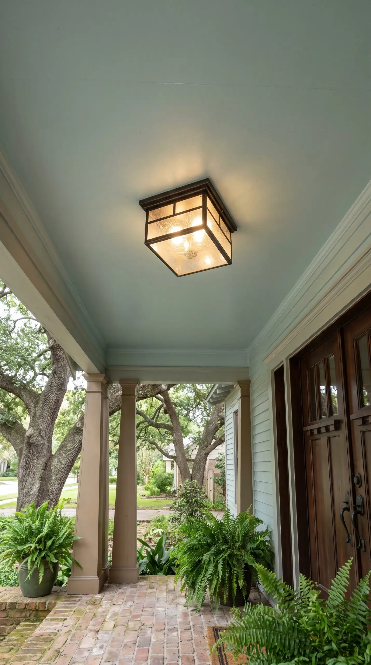
Tradewind carries distinct, soft green undertones that beautifully brighten up deep, cavernous porches shaded by mature trees. It feels slightly more historic and muted than a standard blue, wrapping the entryway in a quiet, Southern charm.
- Vibe: Historic, muted, and traditional.
- Architectural Match: Historic Craftsman and Victorian homes.
- Styling Pro-Tip: Enhance the historic feel by installing a flush-mount lantern with seeded glass and an oiled bronze finish.
SW 9063 Porch Ceiling (The Specialized Pastel)
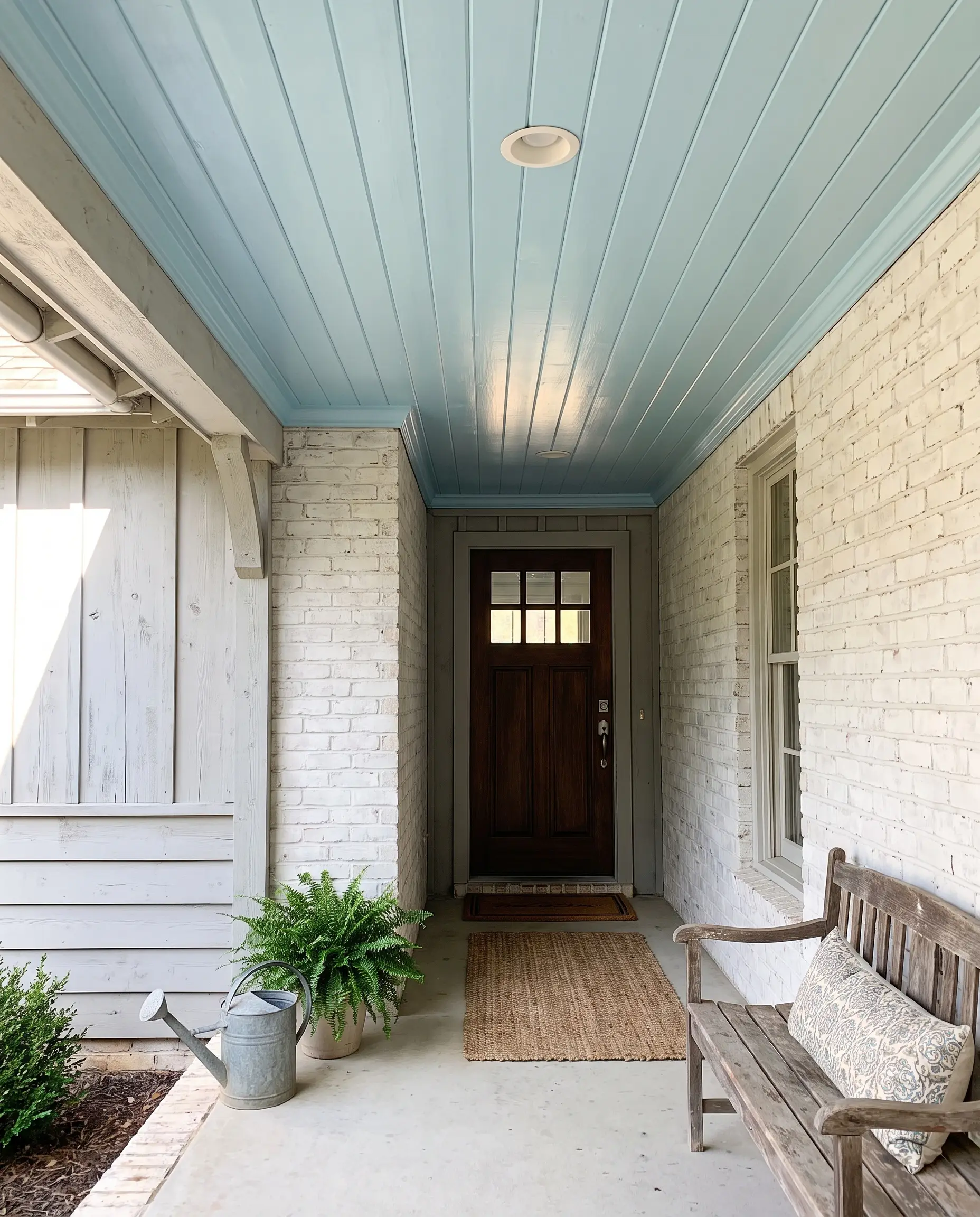
Sherwin-Williams engineered this namesake color to act as a literal breath of fresh air for low-clearance entryways. Leaning slightly cooler, it maximizes the psychological benefit of drawing the eye up to make a cramped porch roof feel instantly airy and expansive.
- Vibe: Airy, authentic, and refreshing.
- Architectural Match: Farmhouse and Southern Traditional.
- Color Match: Pairs beautifully with soft white brick or pale gray siding.
High-Contrast Darks for Modern and Historic Foundations
Dark colors are not exclusively reserved for modern, minimalist exteriors; they serve a vital architectural purpose by grounding the house to its landscaping. Deep hues provide dramatic, necessary contrast against lighter siding, creating a strong foundation for front doors, stair risers, and railing accents.
SW 7048 Urbane Bronze (The Earthy Black Alternative)
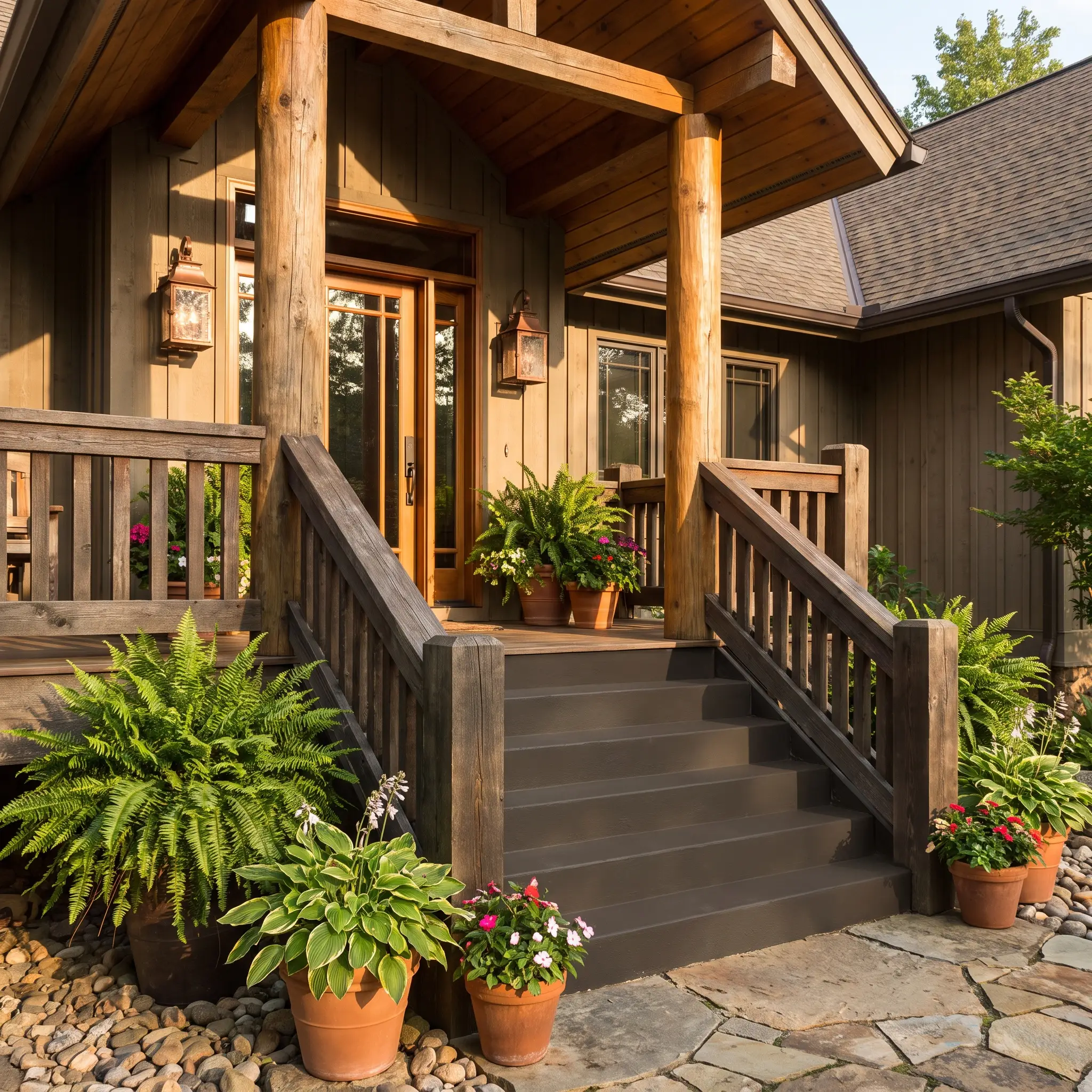
Urbane Bronze is a masterclass in nuance, offering a softer, richer alternative to stark black by utilizing deep brown and green undertones. It visually anchors the porch to the earth and pairs flawlessly with natural wood columns, copper lanterns, and lush green landscaping.
- Vibe: Earthy, rich, and grounding.
- Architectural Match: Mid-Century Modern and Mountain Rustic.
- Design Application: Excellent for floors, thick wooden railings, or solid concrete steps.
With an ultra-low LRV of 8, Urbane Bronze absorbs light rapidly, making it the ideal grounding color to cool down an overly bright, sun-drenched porch.
Designer’s LRV Note
SW 6258 Tricorn Black (The Crisp Farmhouse Anchor)
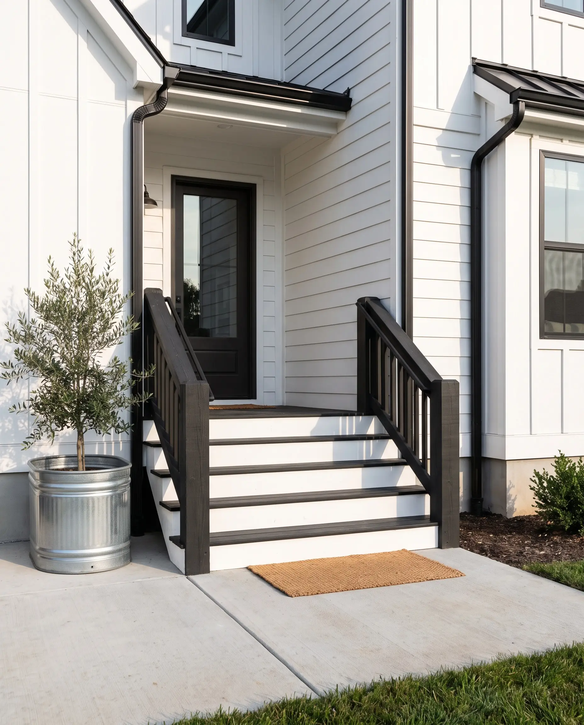
Tricorn Black is an absolute, neutral black devoid of any sneaky undertones, rendering it the standard for crisp, modern exteriors. It creates a stunning, razor-sharp contrast against white siding, giving architectural elements a tailored, high-end definition.
- Vibe: Sharp, absolute, and tailored.
- Architectural Match: Modern Farmhouse and Industrial.
- Maintenance Warning: Stark black horizontal surfaces will show yellow spring pollen instantly, so reserve this specifically for well-swept areas, stair risers, or thick railings.
SW 9177 Salty Dog (The Preppy Navy)
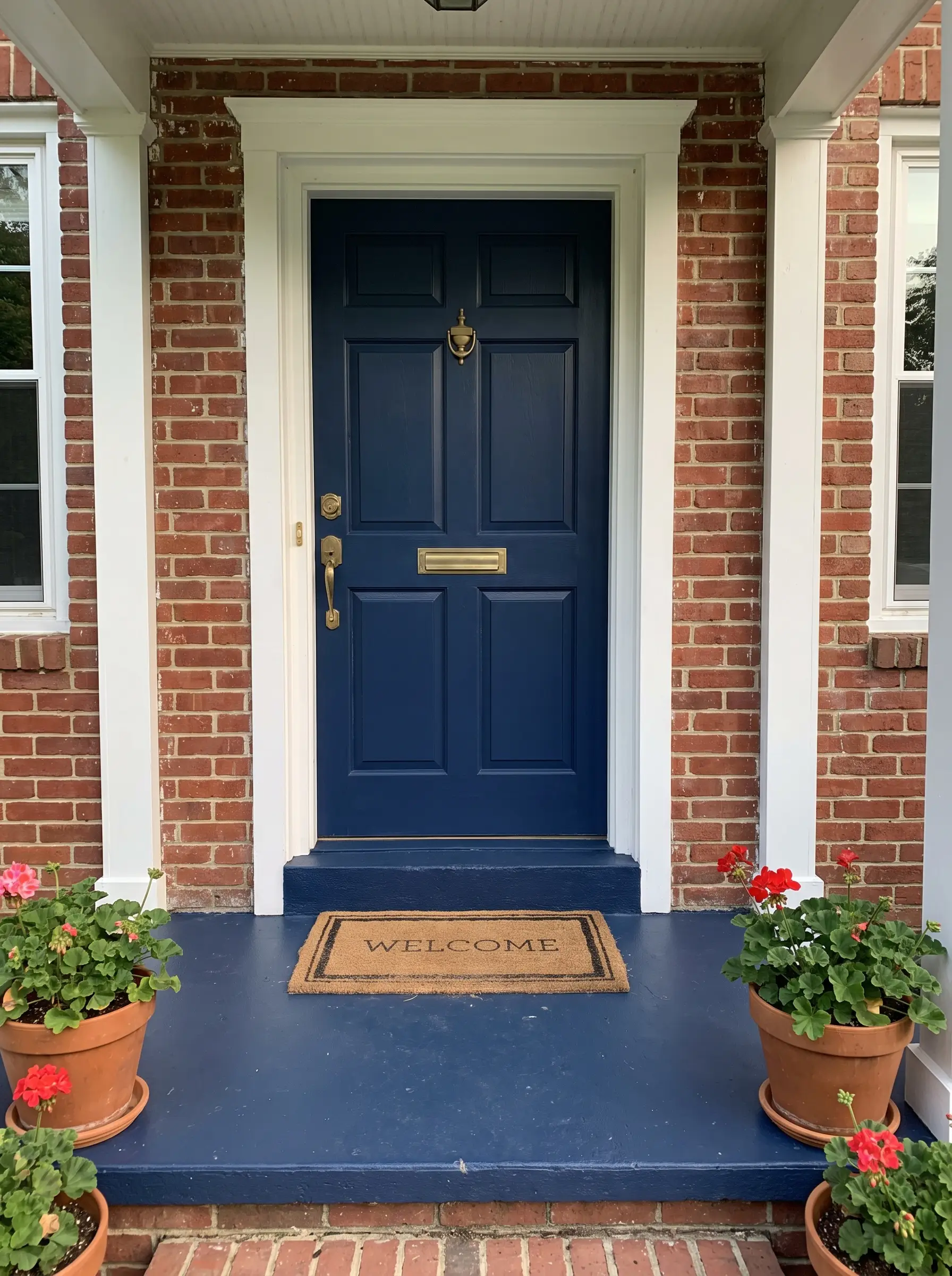
When black feels too heavy or severe against red brick, Salty Dog steps in as a deep, rich navy that evokes a preppy, classic Americana aesthetic. It functions as a brilliant floor or accent color that adds a layer of tailored sophistication without overwhelming the facade.
- Vibe: Preppy, nautical, and dignified.
- Architectural Match: Coastal, Colonial, and traditional brick homes.
- Styling Pro-Tip: Pair this rich navy with unlacquered brass hardware on your front door for a striking, high-end metallic contrast.
Warm Earth Tones for Seamless Landscape Integration
For homes nestled deeply in nature or featuring heavy masonry, cool grays and stark blacks can feel aggressively out of place. Warm earth tones prioritize exterior integration, blurring the visual boundary between the built environment of your porch and the organic textures of your yard.
SW 6065 Bona Fide Beige (The Soft Stucco Complement)
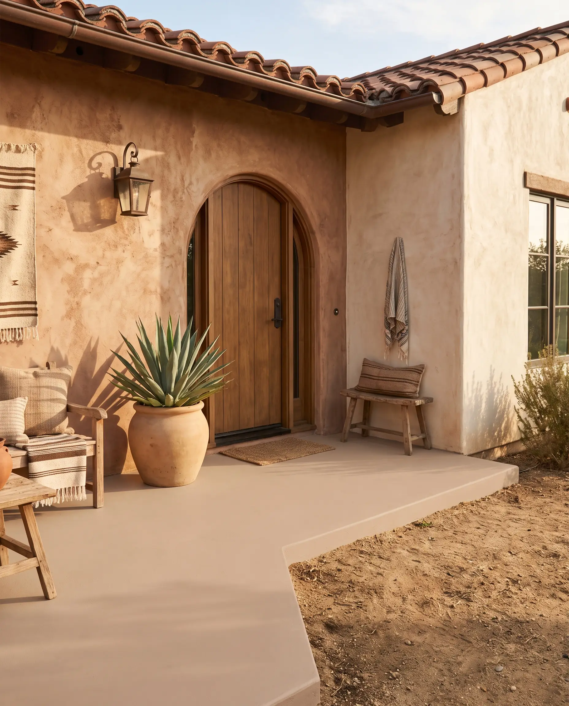
Bona Fide Beige is an incredibly reliable, approachable warm neutral that harmonizes perfectly with sun-baked architectural styles. It avoids the yellow pitfalls of older beiges, providing a soft, sandy foundation that looks highly intentional.
- Vibe: Warm, approachable, and sun-baked.
- Architectural Match: Mediterranean, Southwestern, and Spanish Revival.
- Material Match: Flawlessly complements rough-hewn stucco exteriors and terracotta roof tiles.
SW 2802 Rookwood Red (The Historic Brick Match)
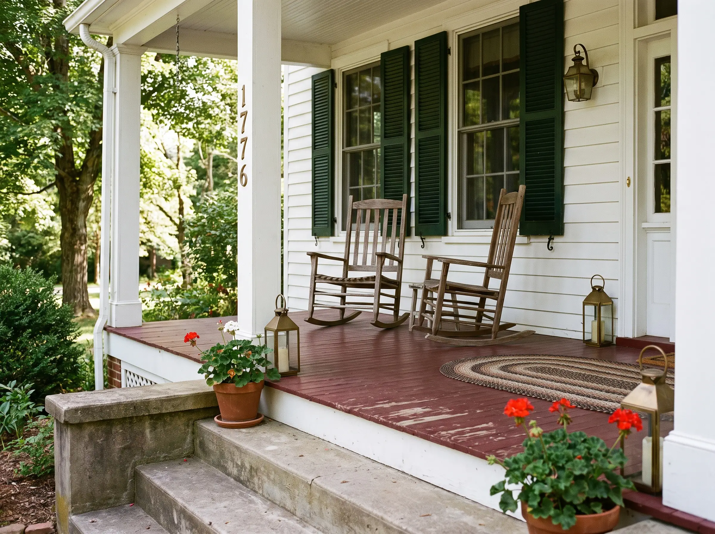
This deeply saturated, historic red is formulated to mimic the exact visual weight of traditional brick or clay tile. It is an exceptional solution for painted concrete steps or wooden floors that need to project a classic, established permanence.
- Vibe: Historic, permanent, and bold.
- Architectural Match: Classic Colonial and Victorian exteriors.
- Pairing Profile: Match this deep red floor with dark, forest green shutters (like SW 2808 Rookwood Dark Green) to complete the historic heritage palette.
SW 7740 Messenger Bag (The Natural Olive)
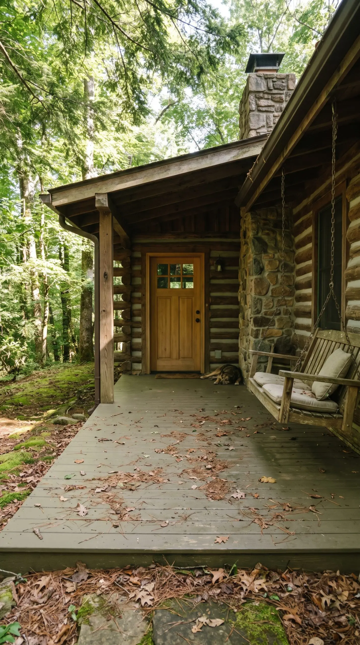
Messenger Bag is a deeply muted olive green that acts as a literal extension of the front lawn, bringing the surrounding foliage right up to the front door. Because it mirrors the natural environment, it hides dirt, dried leaves, and muddy boot prints exceptionally well.
- Vibe: Earthy, camouflaged, and organic.
- Architectural Match: Cabins, Bungalows, and heavily wooded lots.
- Styling Pro-Tip: Allow natural wood tones on the front door or porch swing to pop against this muted green base.
Essential Sherwin-Williams Exterior Paint Formulations and Finishes
Perfect color theory falls apart without the correct technical execution. You absolutely cannot apply a standard exterior acrylic to a horizontal floor tread—it will peel under the pressure of foot traffic and standing water. Understanding the distinction between vertical formulations and horizontal, scuff-resistant enamels is critical for a lasting finish.
| Product Line | Best For (Floor/Ceiling/Trim) | Durability | Finish Options |
|---|---|---|---|
| Porch & Floor Enamel | Covered floors, treads, and concrete steps. | Highly scuff-resistant, withstands heavy foot traffic and sweeping. | Satin (Highly recommended for washability). |
| SuperDeck Series | Exposed wooden decking facing severe weather. | Maximum UV and moisture protection for fully exposed wood. | Solid Color, Semi-Transparent, or Clear. |
| Standard Exterior Acrylic (Emerald/Duration) | Ceilings, fascia, and vertical trim. | Excellent fade resistance and flexibility for vertical surfaces only. | Flat (Ceilings), Satin (Trim), or Gloss. |
Your Next Steps for a Flawless Front Entrance
Never commit to a gallon of exterior paint based purely on a digital screen. Your immediate next step is to acquire peel-and-stick samples, like those from Samplize, or purchase sample quarts from your local Sherwin-Williams store. Apply them directly against your siding and monitor how the color behaves in the morning dew, the harsh afternoon sun, and the evening shadows.
Once you verify the undertones match your masonry and siding complement perfectly, purchase the correct architectural formulation, prep your surfaces meticulously, and start your weekend project.