The Architect’s Guide to Gray Exterior House Paint: Shades, Undertones, and Perfect Pairings
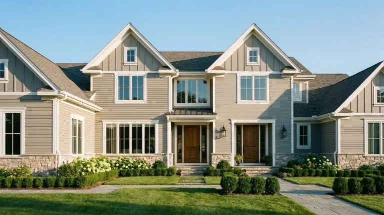
Committing to a gray exterior house paint is a massive financial and architectural decision. Choosing the wrong shade for a $15,000 exterior renovation does not just result in a minor aesthetic flaw; it dictates the entire curb appeal and perceived value of the property for a decade. The primary culprit behind costly facade mistakes is the Sunlight Washout Rule. Direct exterior light amplifies undertones and drastically alters color perception, meaning the deep, sophisticated swatch you selected inside a hardware store can easily read as a stark, icy blue or a muddy brown once applied to three thousand square feet of siding.
To navigate this high-stakes investment, you must master LRV (Light Reflectance Value) and the science of fixed architectural elements. Our analysis of exterior color performance proves that successful design relies entirely on how a shade interacts with immovable materials like roofing, stone masonry, and directional sunlight. This masterclass moves beyond basic swatches, providing the exact formulas required to ground your architecture and protect your investment.
The Science of Exterior Gray: LRV and The Undertone Trap
Before selecting a specific palette, you must understand the physics of exterior light. LRV measures how much light a paint color reflects on a scale of 0 (absolute black) to 100 (pure white). An LRV of 50 might perform as a perfectly balanced mid-tone gray inside a living room, but outside in direct sunlight, it will wash out and read almost entirely white. Furthermore, directional light aggressively manipulates undertones. North-facing light acts as a cool filter, pulling out latent blue and purple undertones, while South and West-facing light amplifies yellow and red, turning standard grays into warm greiges.
To prevent an undertone disaster, industry standards dictate rigorous on-site testing. Follow this protocol before clearing your contractor to begin:
The Exterior Swatch Protocol:
- The 3×3 Test: Never rely on a tiny paper card. Apply a 3×3-foot test square of actual paint (or a large peel-and-stick sample) to both the North and South sides of the home.
- The Time-Lapse Observation: Evaluate the swatch at 8:00 AM, 1:00 PM, and during the harsh golden hour of 5:00 PM to monitor how the shifting sun pulls out hidden undertones.
- The Fixed Element Isolation: Place your test swatch directly against your brick foundation, stone veneer, and roofline—never isolate it against the green grass, which falsely alters your perception of the color’s warmth.
You can apply wallpapers, paints, etc. on walls and see how they look in various interiors.

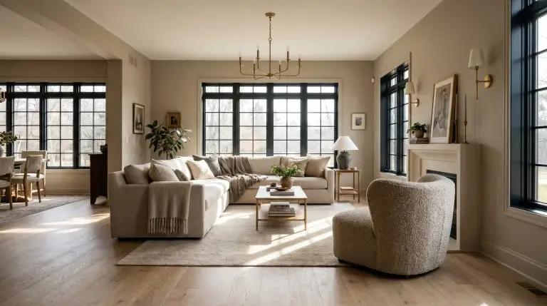
Warm & Welcoming: Greige and Light Gray Exterior Ideas
Greige operates as the ultimate architectural bridge, perfectly spanning the gap between traditional beige and stark modern gray. This tonal family is essential for transitional and classic homes, providing necessary warmth that prevents a large property from feeling sterile or unapproachable.
Ground a Stucco Facade with a Warm Mushroom Greige
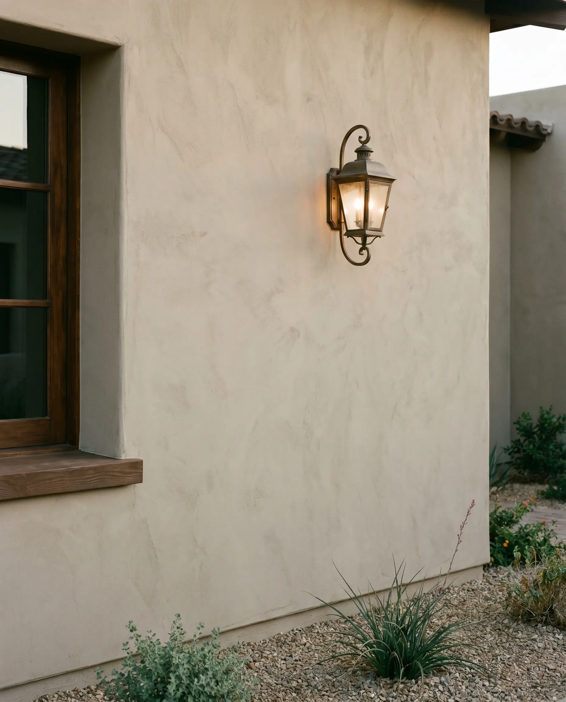
Large stucco facades demand a shade with enough visual weight to prevent the exterior from reading as an unfinished, stark monolith. A mushroom greige provides crucial architectural grounding, absorbing harsh sunlight rather than reflecting it aggressively.
On a heavily shaded, North-facing lot, mushroom greiges can lose their warmth and read as a flat, muddy cement.
The Undertone Warning
- Designer’s Match: Benjamin Moore Revere Pewter
- Material Pairing: Aged bronze lantern sconces
- Vibe: Grounded, earthy, transitional
- Styling Pro-Tip: Specify a flat finish on stucco to mask masonry imperfections and emphasize the dimensional texture of the surface.
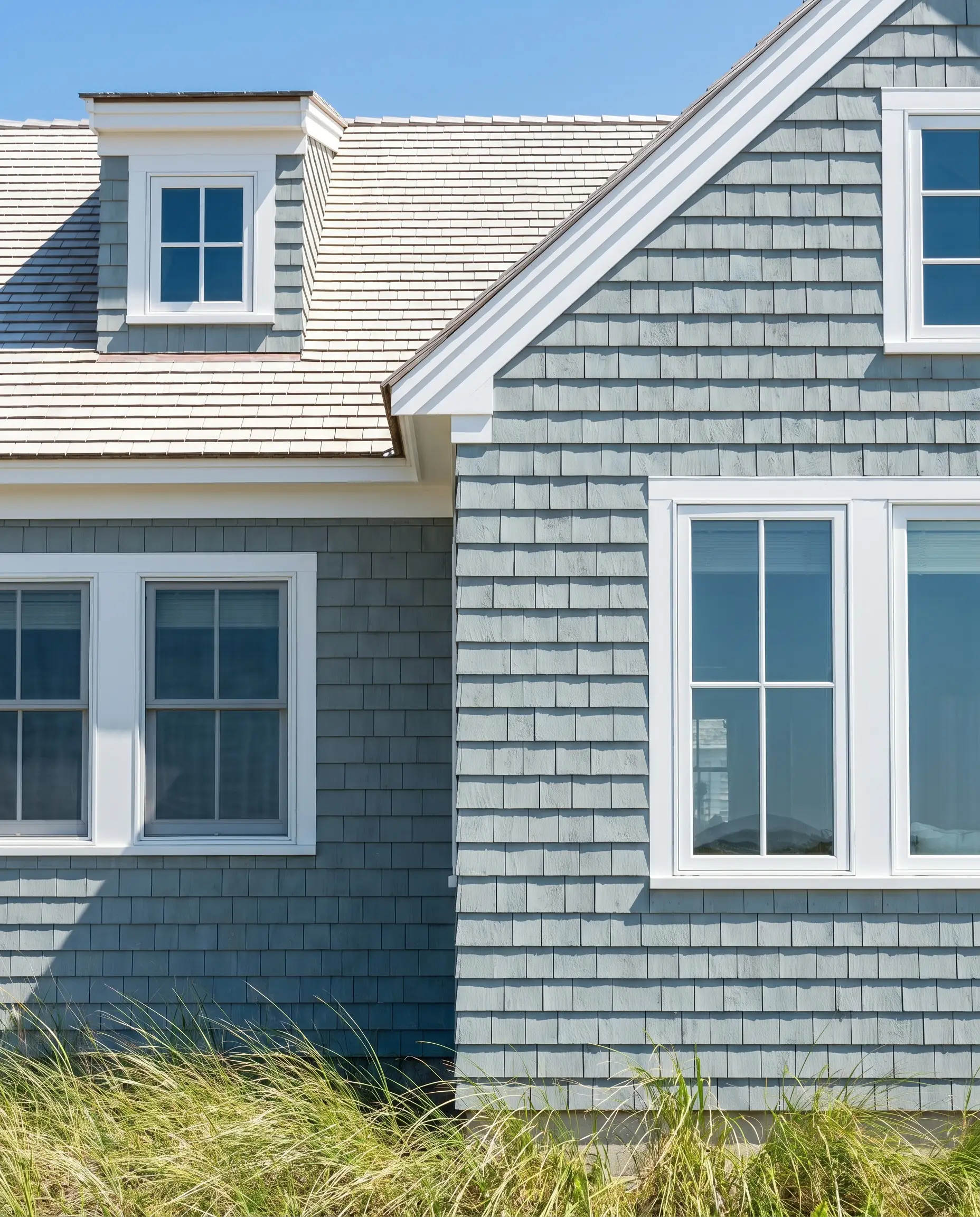
Highlight Traditional Clapboard with a Soft Silver-Gray
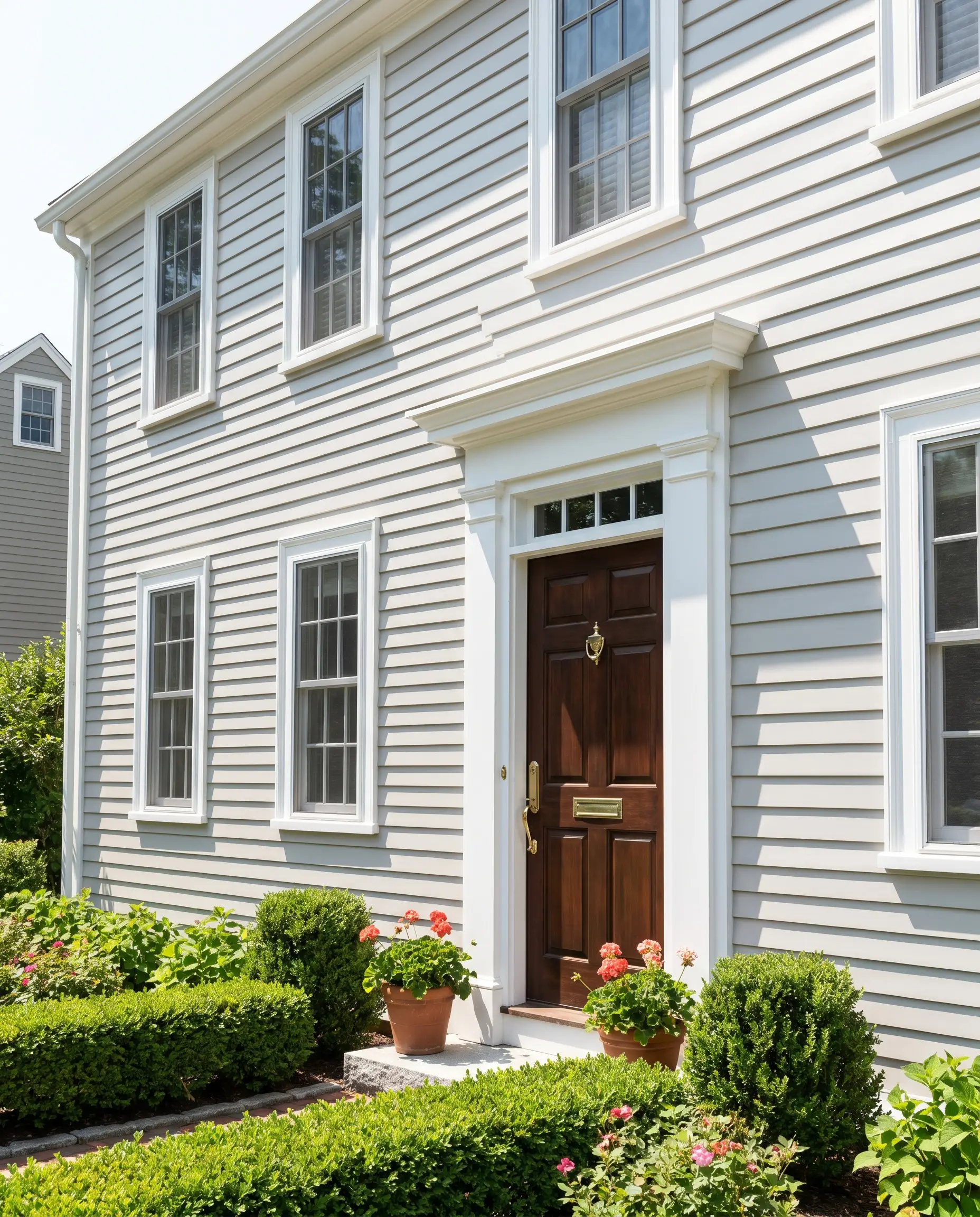
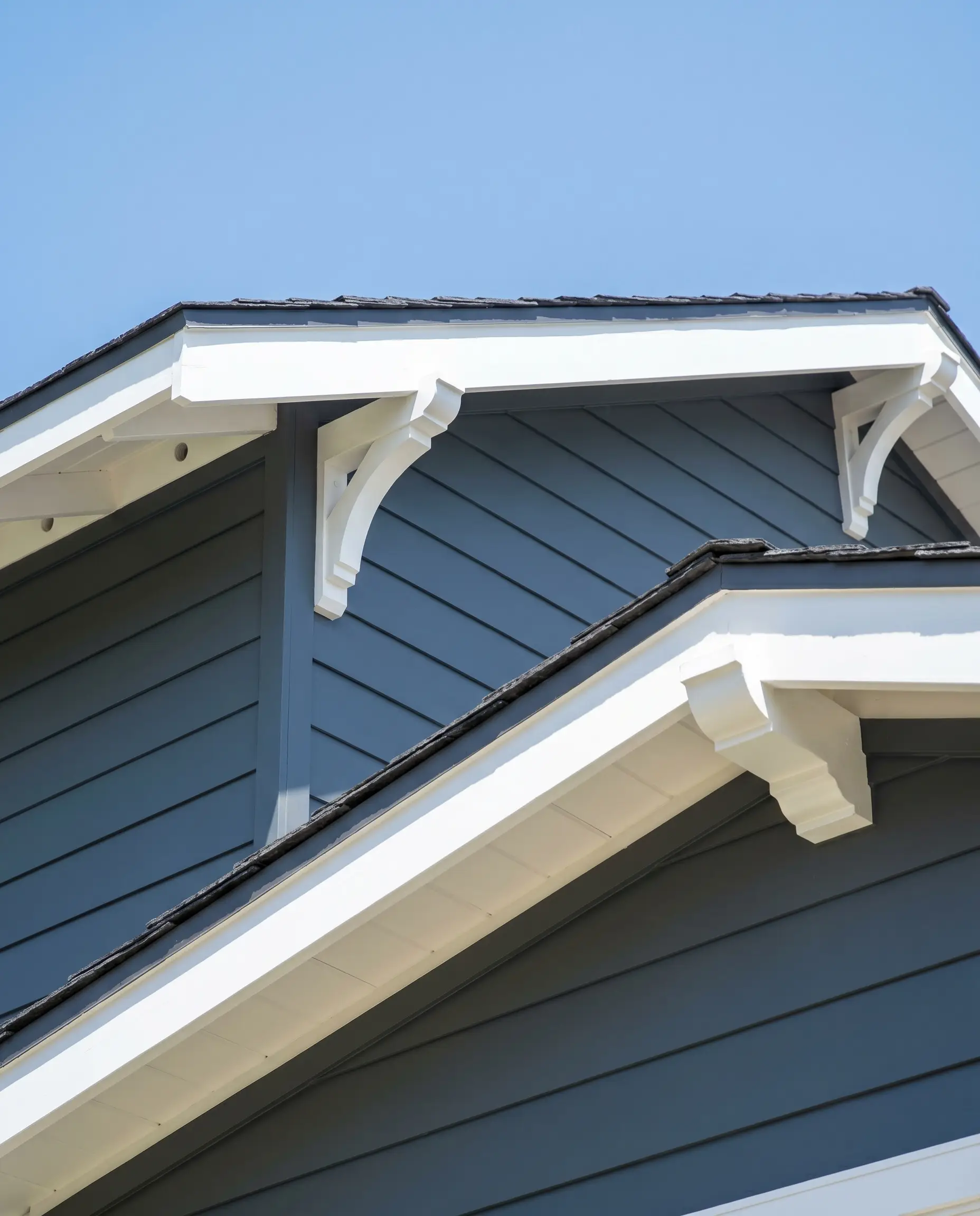
Historic and classic architectural styles benefit immensely from a highly luminous silver-gray that honors traditional profiles. The subtle reflectance highlights the overlapping shadow lines of clapboard siding without overwhelming the structural heritage.
- Designer’s Match: Sherwin-Williams Agreeable Gray
- Material Pairing: Polished brass door hardware
- Vibe: Historic, crisp, refined
- Styling Pro-Tip: Pair this luminous body color with a highly contrasting, pure white trim to sharply define the architectural boundaries of the home.
Pair Light Gray Board and Batten with Crisp White Trim
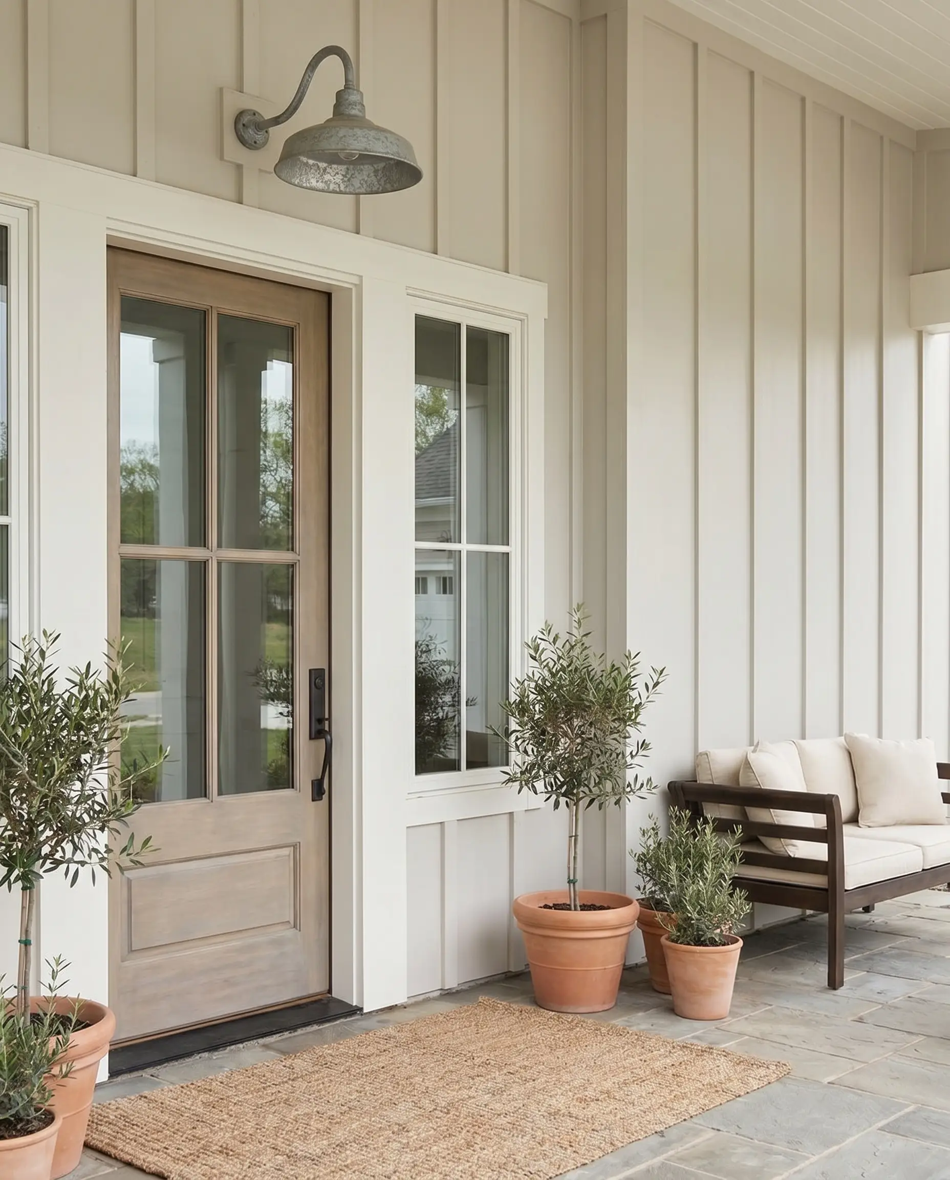
To execute a modern farmhouse aesthetic without resorting to clinical whites, deploy a pale, warm gray across the board and batten. This subtle contrast allows the crisp white trim to frame the home, providing depth and emphasizing the verticality of the siding.
- Designer’s Match: Benjamin Moore Balboa Mist
- Material Pairing: Galvanized steel gooseneck lighting
- Vibe: Tailored, bright, expansive
- Styling Pro-Tip: Ensure the trim paint has a lower LRV than a pure stark white to prevent the fascia from blindingly glaring in direct southern sun.
Use a Mid-Tone Greige to Complement a Brown Shingle Roof
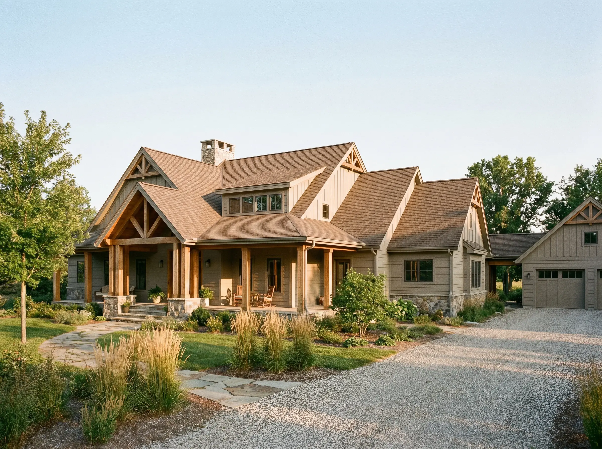
A warm brown architectural shingle roof is a dominant fixed element that actively fights against cool, blue-based grays. A mid-tone greige harmonizes perfectly with the roofline, locking the upper and lower halves of the home into a cohesive, earthy palette.
If your roof has heavy red or orange speckling, lean into a greige with a slightly stronger green undertone to neutralize the harsh roof warmth.
Hackrea Styling Tip
- Designer’s Match: Sherwin-Williams Mega Greige
- Material Pairing: Natural cedar structural posts
- Vibe: Cohesive, anchored, organic
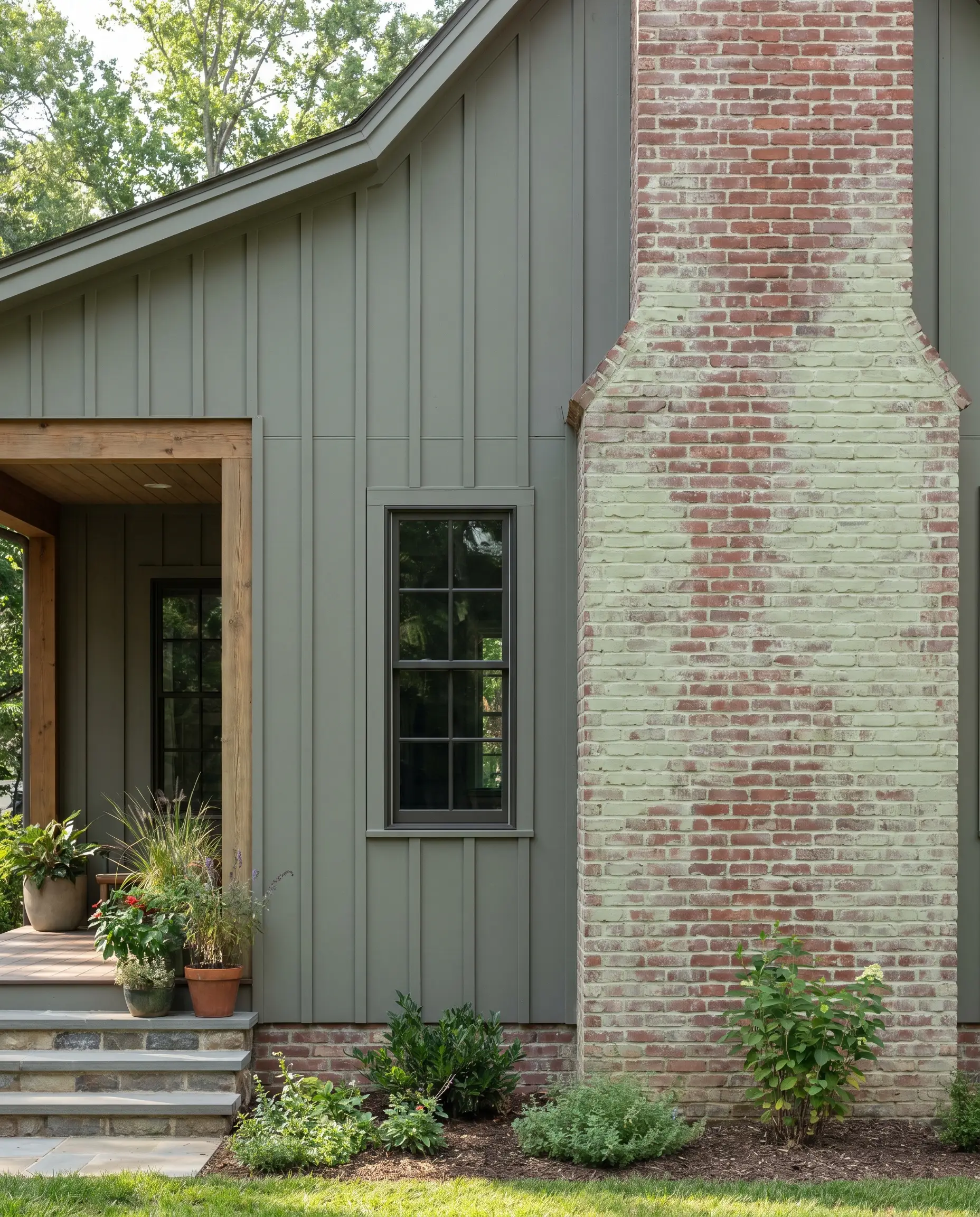
Soften a Red Brick Foundation with a Warm Putty Gray
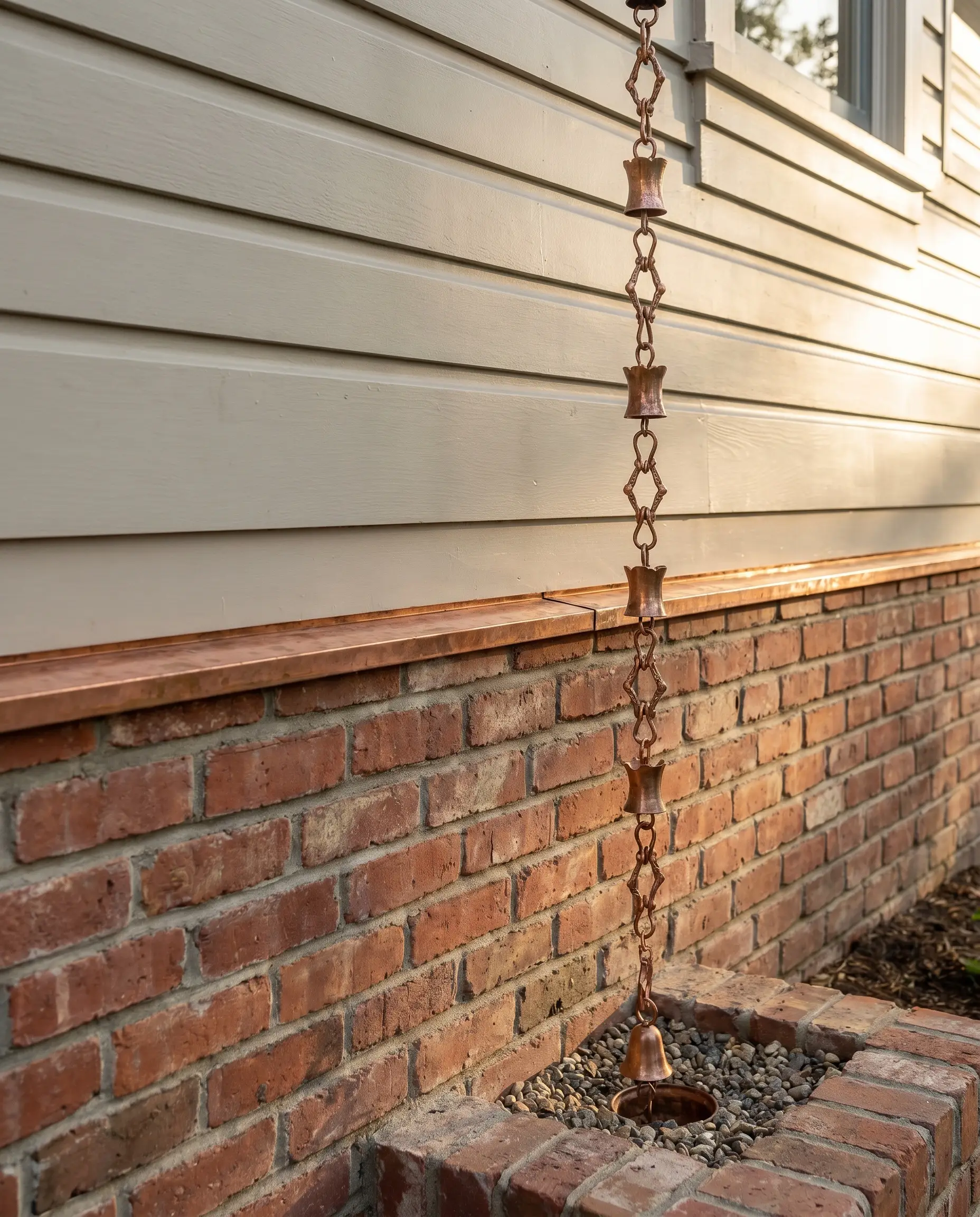
Homes featuring partial brick facades require a siding color that bridges the heavy visual weight of the masonry. A warm putty gray softens the harsh transition between the brick and the siding, creating a seamless, integrated exterior elevation.
- Designer’s Match: Benjamin Moore Pale Oak
- Material Pairing: Copper flashing and rain chains
- Vibe: Classic, integrated, balanced
- Styling Pro-Tip: Pull a specific mortar color from the brickwork and match your putty gray to that exact undertone for flawless continuity.
Apply a Luminous Pale Gray for Heavily Shaded Wooded Lots
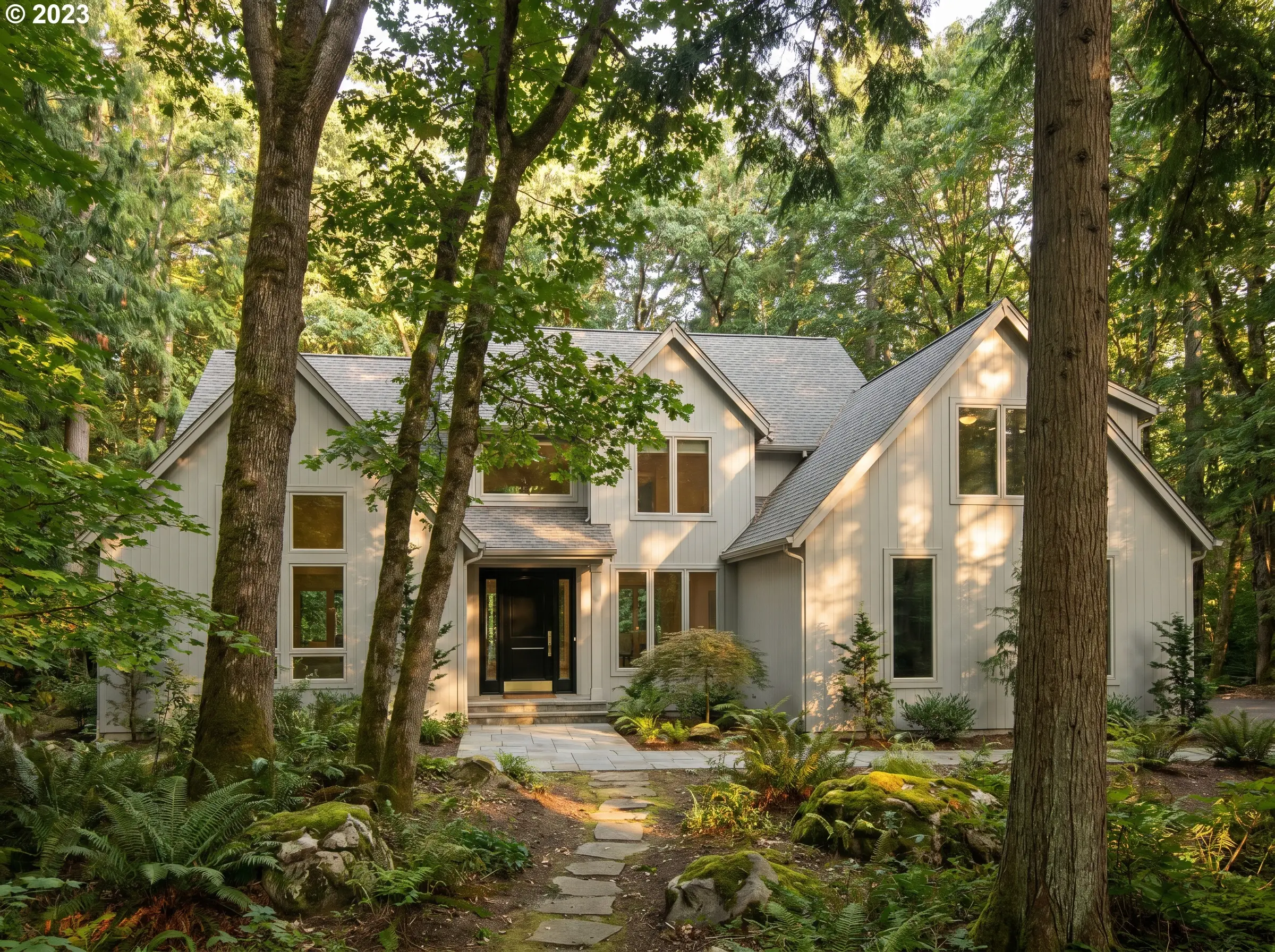
Properties set beneath dense tree canopies suffer from persistent shadows that make mid-tone grays look gloomy and oppressive. A luminous pale gray acts as a light-multiplier, pulling the structure out of the shadows and creating a striking, visible silhouette against the dark foliage.
- Designer’s Match: Sherwin-Williams Repose Gray
- Material Pairing: Glossy black fiberglass front door
- Vibe: Striking, visible, elegant
- Styling Pro-Tip: Avoid green-grays in this environment, as the reflection from the surrounding leaves will artificially tint the siding green.
Moody & Modern: Charcoal and Dark Gray Exterior Ideas
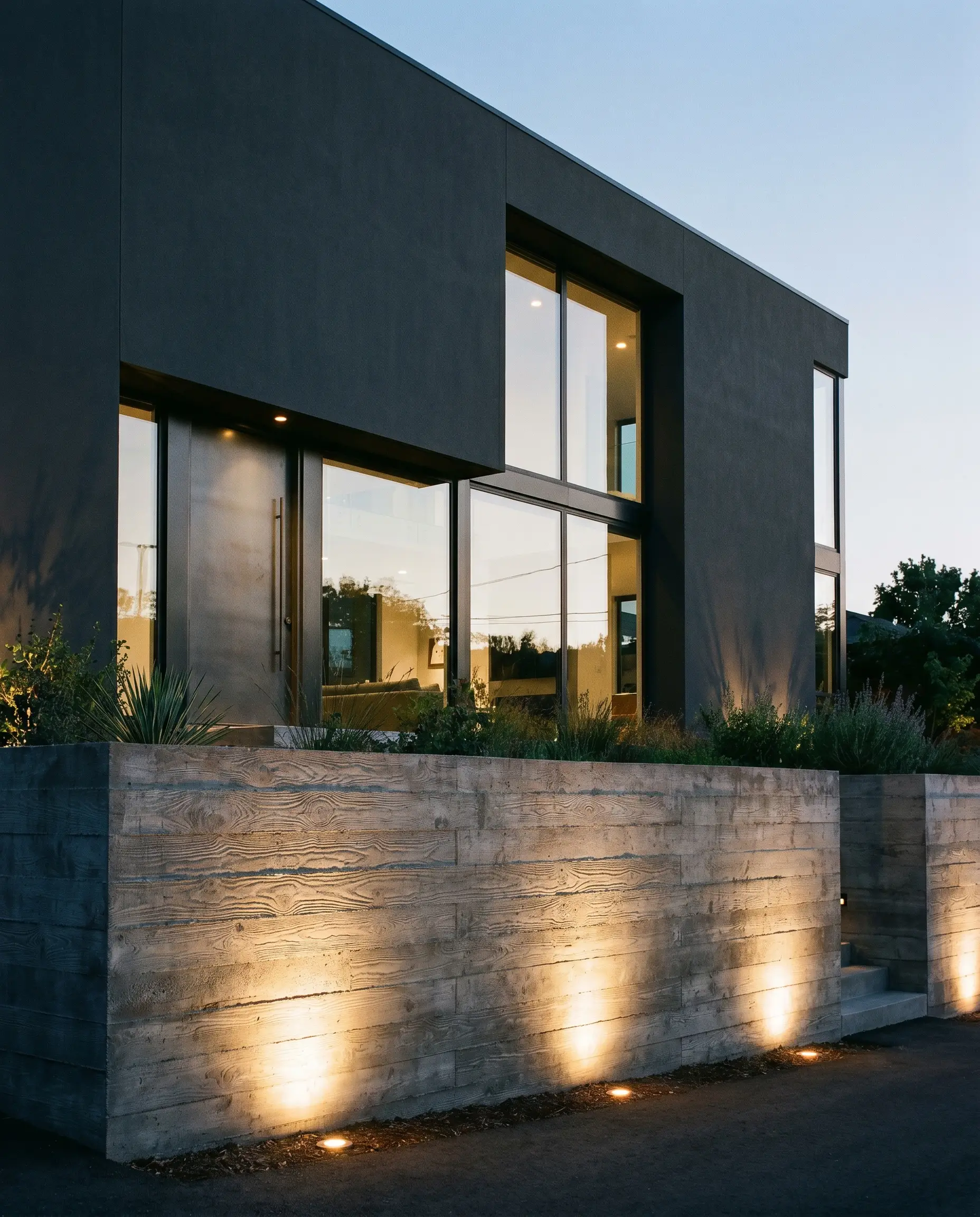
Dark grays are the ultimate tool for modernizing dated architecture or grounding massive, contemporary builds. By utilizing low-LRV shades, you force the physical bulk of a home to recede, allowing structural lines and organic material pairings to command attention. For all dark applications, industry standards mandate a flat or satin finish; a glossy sheen on dark siding creates a cheap, plastic-like glare under direct sun.
Modernize a Mid-Century Split-Level with Deep Charcoal
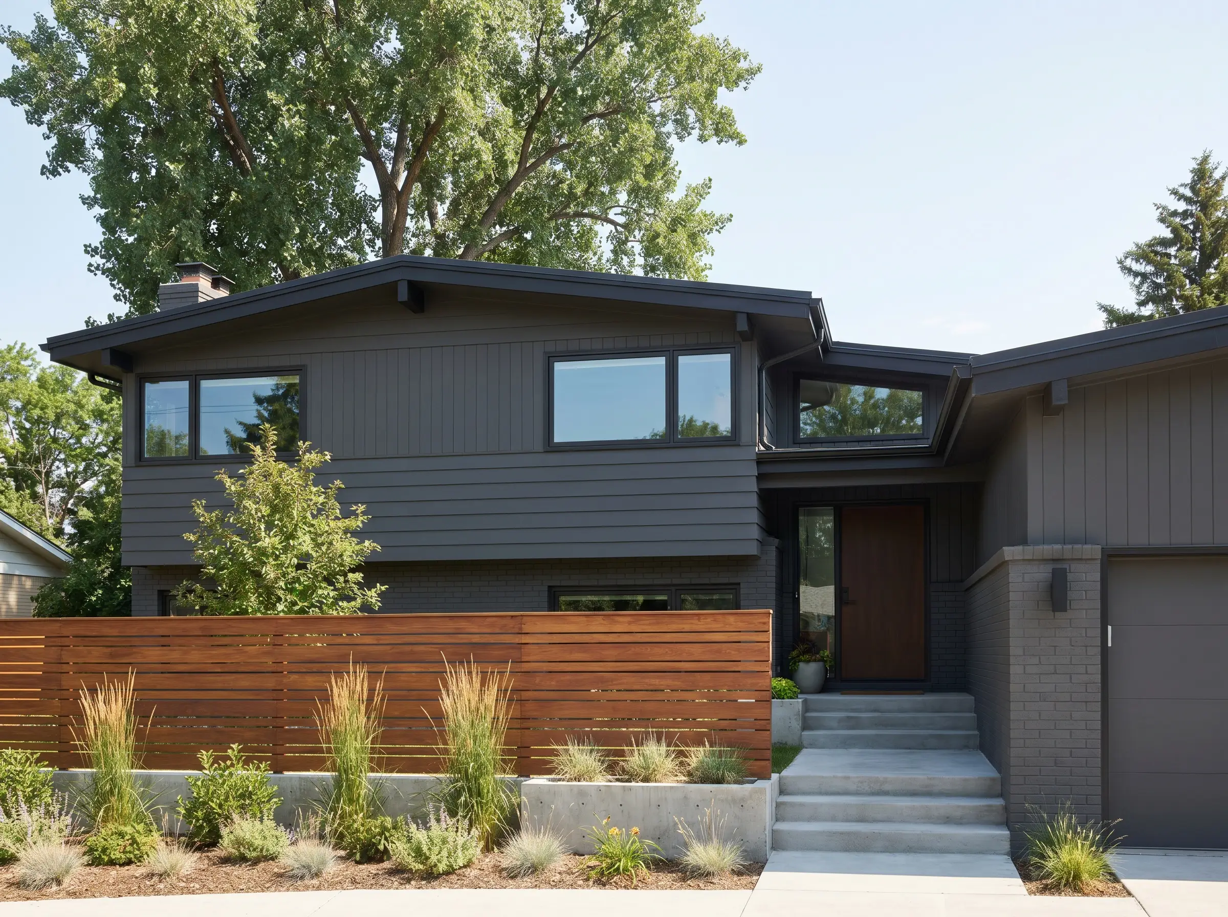
Mid-Century split-levels often suffer from disjointed vertical elevations. Wrapping the entire exterior in a deep charcoal unifies the disparate sections, heavily emphasizing the desirable horizontal planes and low-pitched rooflines characteristic of the era.
- Designer’s Match: Sherwin-Williams Peppercorn
- Material Pairing: Horizontally slatted ipe wood fencing
- Vibe: Mid-Century, sleek, unified
- Styling Pro-Tip: Keep the fascia boards dark to prevent a high-contrast stripe from interrupting the modernized, low-profile silhouette.
Create Monochromatic Drama with Dark Gray Siding and Matching Fascia
Painting the siding, trim, and fascia the exact same dark color is a high-end architectural tactic that eliminates visual clutter. This monochromatic application forces the eye to appreciate the sheer volume and texture of the home rather than getting distracted by outlined window frames.
Deep dark grays will drastically fade if exposed to harsh, unshaded Southern light over several years. Specify premium, UV-resistant exterior acrylics.
The Undertone Warning
- Designer’s Match: Benjamin Moore Kendall Charcoal
- Material Pairing: Oversized, frameless glass windows
- Vibe: Monolithic, dramatic, contemporary
Contrast True Charcoal Siding with Natural Cedar Soffits
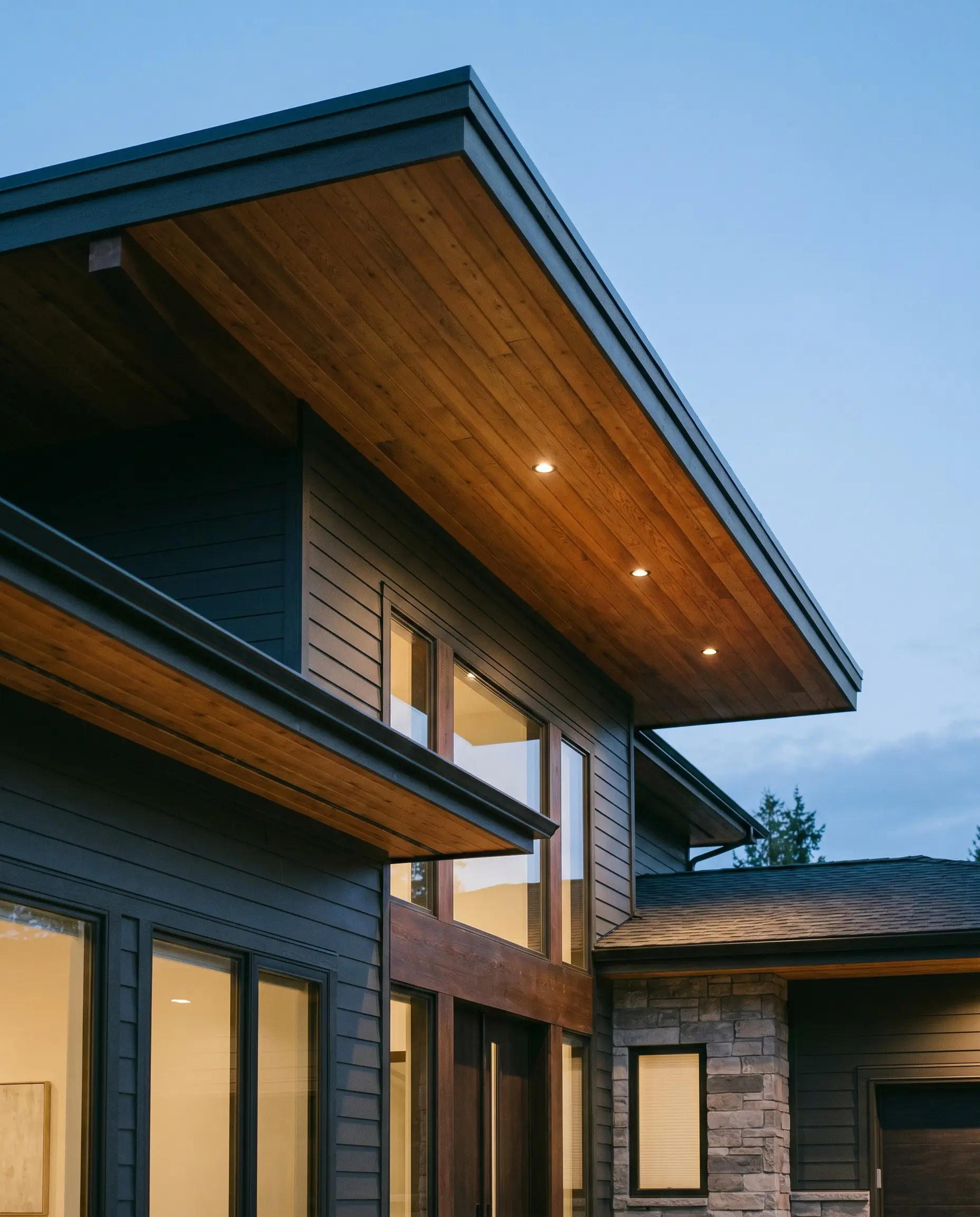
Cold, dark gray requires organic warmth to prevent the structure from feeling like a commercial bunker. Exposing and sealing natural cedar soffits provides a rich, glowing contrast against the charcoal, drawing the eye upward and highlighting the roof’s overhang.
- Designer’s Match: Sherwin-Williams Iron Ore
- Material Pairing: Clear-sealed tongue-and-groove cedar
- Vibe: Organic modern, sophisticated, balanced
- Styling Pro-Tip: Use recessed LED lighting within the cedar soffits to illuminate the wood grain against the dark siding at night.
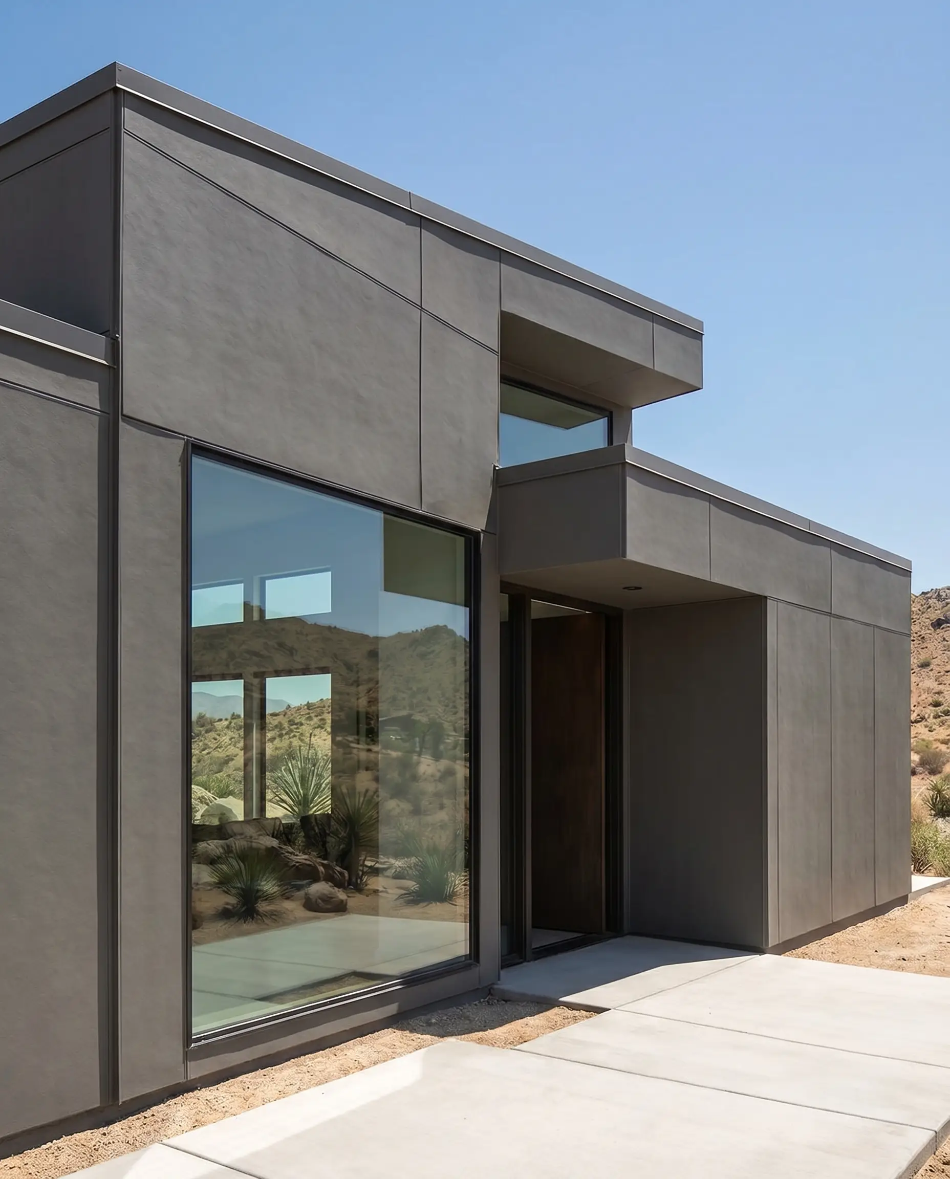
Anchor a Flat-Roof Contemporary Build with Iron Ore Gray
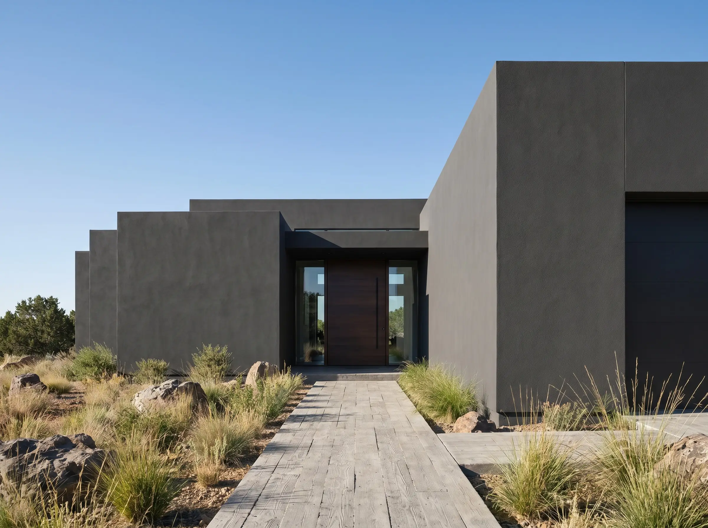
Flat-roof contemporary homes feature severe, geometric massing that demands an equally severe, grounding color. A near-black iron ore gray anchors the heavy structural blocks to the landscape, providing a sense of permanence and architectural gravity.
- Designer’s Match: Benjamin Moore Wrought Iron
- Material Pairing: Board-formed concrete pathway
- Vibe: Industrial, severe, grounded
- Styling Pro-Tip: Ensure the stucco or paneling is completely smooth; dark colors aggressively highlight structural bowing or poor installation seams.
Pair Deep Slate Gray with a Black Standing Seam Metal Roof
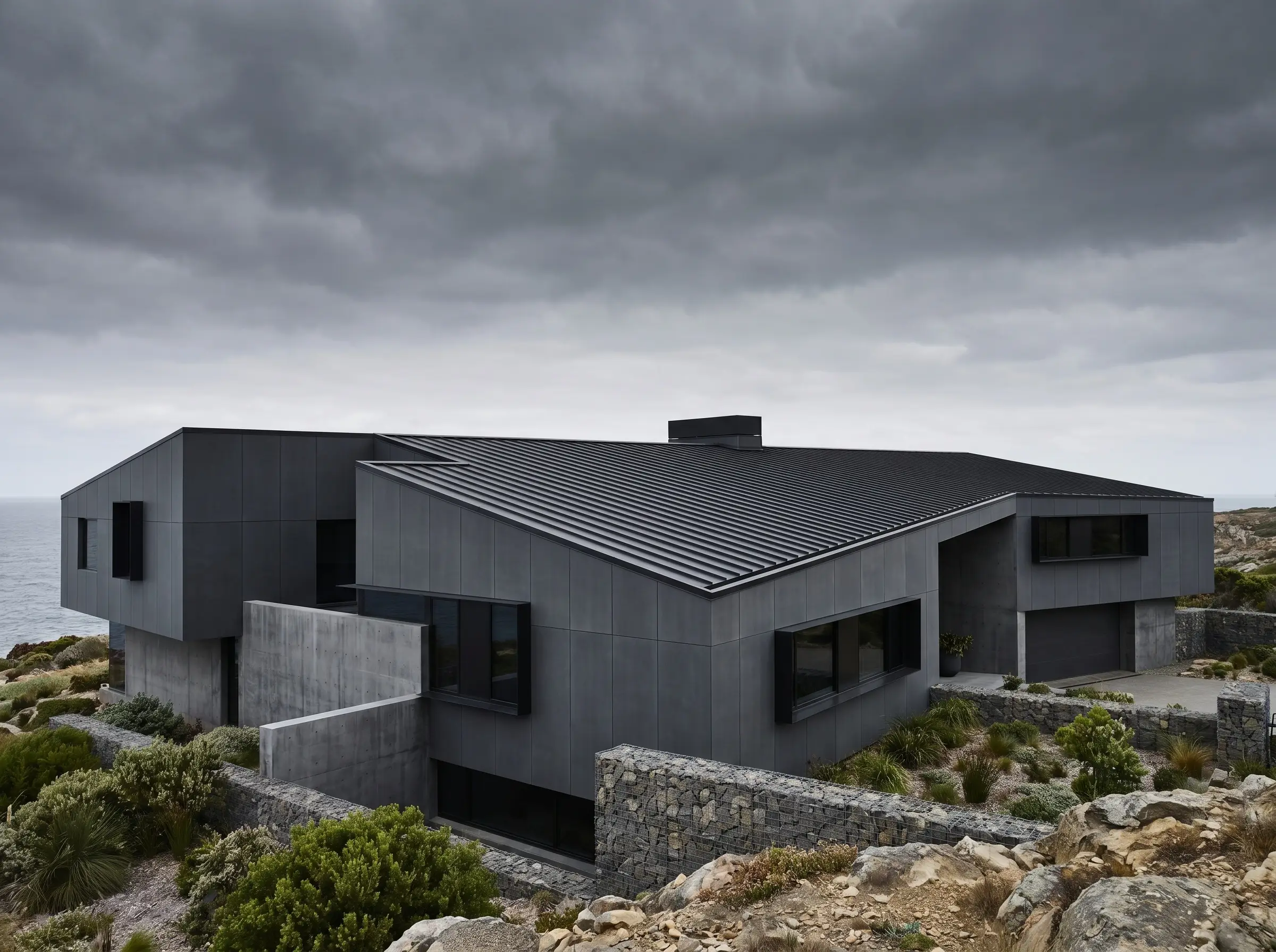
Matching dark siding to a modern standing seam metal roof creates a highly durable, fortress-like aesthetic. The slight blue-black undertone of a deep slate perfectly complements the matte sheen of the metal, resulting in a cohesive, storm-ready exterior.
- Designer’s Match: Sherwin-Williams Cyberspace
- Material Pairing: Black anodized aluminum window frames
- Vibe: Imposing, resilient, ultra-modern
- Styling Pro-Tip: Use concealed fastener metal roofing to maintain the sleek, uninterrupted lines required for this dark aesthetic.
Use Dark Gray to Camouflage Unsightly Garage Doors
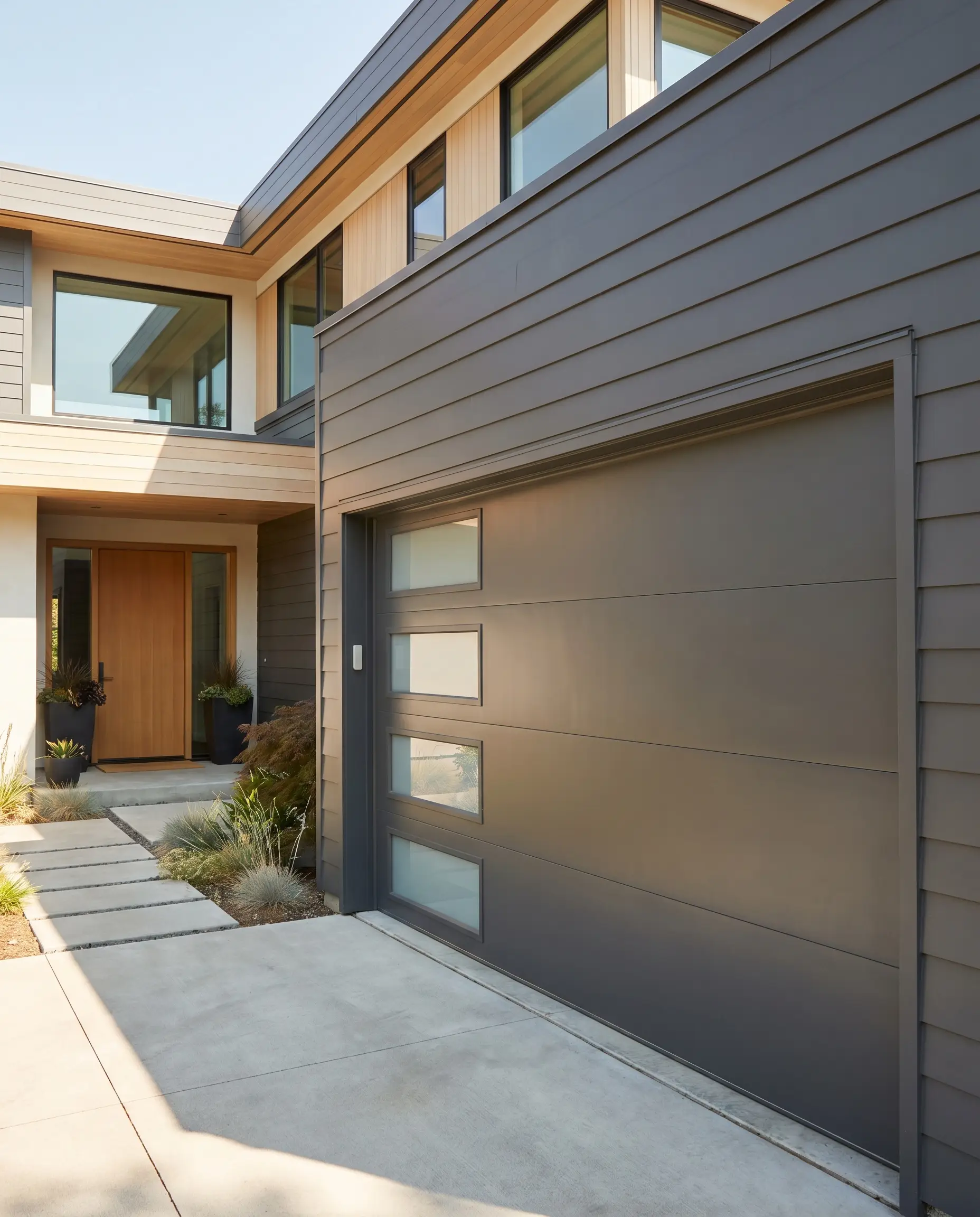
Front-loading garage doors often ruin a home’s curb appeal by dominating the visual hierarchy. Painting the garage doors the exact same dark gray as the surrounding siding forces the doors to recede visually, instantly shifting focus back to the front entry.
- Designer’s Match: Benjamin Moore Cheating Heart
- Material Pairing: Frosted glass garage door panels
- Vibe: Strategic, streamlined, focused
- Styling Pro-Tip: Use a high-quality, heat-reflective paint formulation for dark metal garage doors to prevent the panels from warping in intense summer heat.
The Complex Chameleons: Blue-Gray and Green-Gray Exterior Ideas
Blue and green-grays are notoriously tricky; they are chameleons that shift aggressively depending on the surrounding landscaping and time of day. These complex shades come alive outdoors, offering deep, sensory character for those willing to master their volatile undertones. Always evaluate these shades at dusk, when the cooling light forces blue and green pigments to their absolute peak visibility.
Channel Coastal Transitional Style with a Crisp Blue-Gray
Coastal properties require a palette that reflects the surrounding maritime environment without leaning into novelty nautical themes. A crisp, balanced blue-gray applied to cedar shakes provides a weathered, sophisticated look that feels native to the shoreline.
- Designer’s Match: Benjamin Moore Boothbay Gray
- Material Pairing: Bleached white cedar shingles
- Vibe: Maritime, breezy, transitional
- Styling Pro-Tip: Pair this with a high-hiding, brilliant white on the trim to sharply define the architecture against the soft coastal sky.
Blend into Wooded Surroundings with a Sage-Tinted Gray
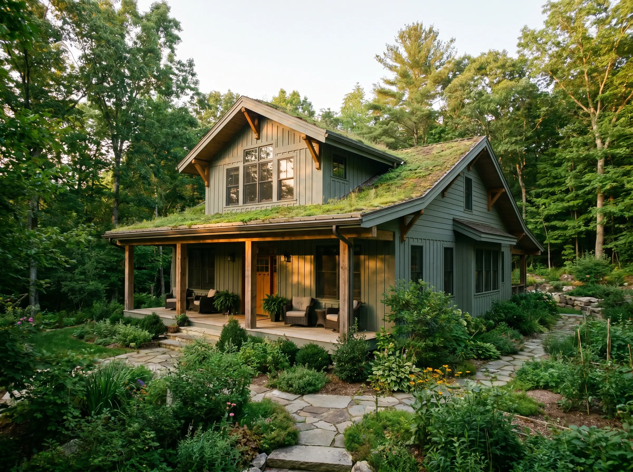
When a home is nestled into a lush, heavily planted lot, fighting the greenery with a stark neutral creates visual friction. A sage-tinted gray harmonizes perfectly with the environment, allowing the home to settle organically into the landscape.
In strong afternoon western light, this specific green-gray will lose its ashiness and read almost purely olive.
The Undertone Warning
- Designer’s Match: Benjamin Moore Night Train
- Material Pairing: Rough-sawn timber columns
- Vibe: Organic, settled, tranquil
Contrast a Cool Blue-Gray with Bright Copper Gutters
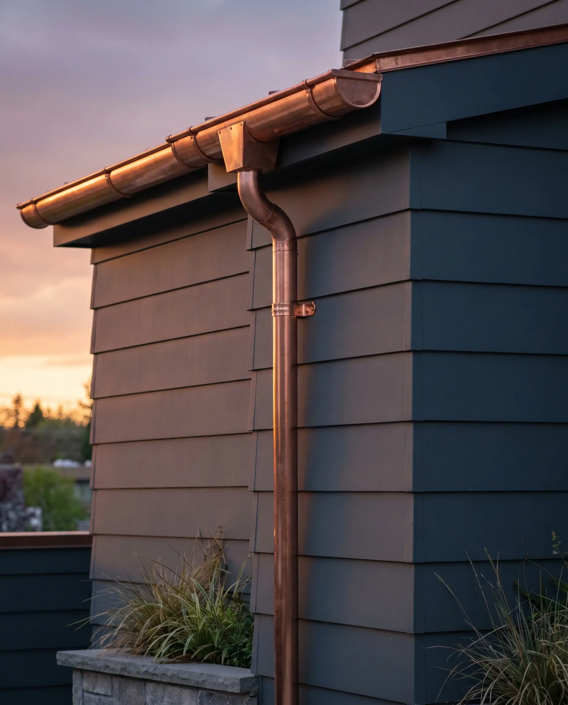
Deploying a cool, stormy exterior requires a strategic injection of warmth to achieve high-end architectural balance. The icy depth of a cool blue-gray acts as the perfect canvas to highlight the brilliant, metallic warmth of raw copper gutters and downspouts.
- Designer’s Match: Sherwin-Williams Mount Etna
- Material Pairing: Raw copper half-round gutters
- Vibe: Luxurious, contrasting, bespoke
- Styling Pro-Tip: Allow the copper to naturally patina over time; the resulting verdigris will beautifully echo the blue-green undertones of the siding.
Update a Classic Craftsman Home with a Deep Olive-Gray
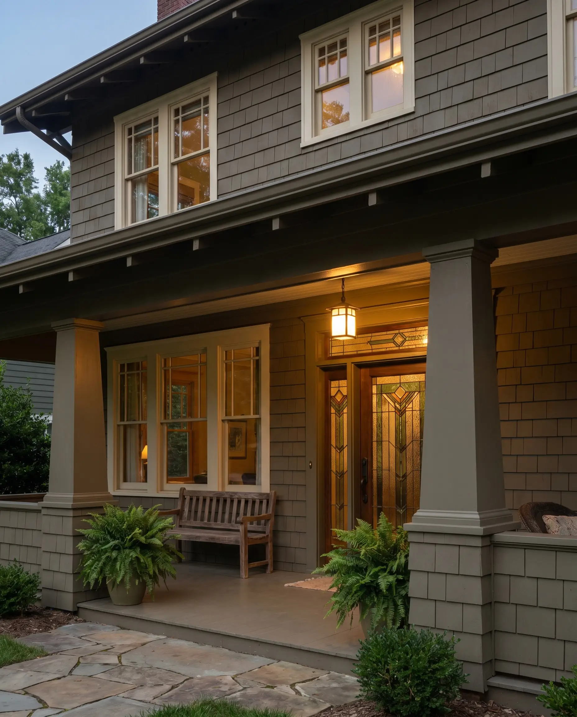
Classic Craftsman architecture relies on earthy, grounded palettes that emphasize heavy structural elements like tapered columns. A deep olive-gray honors the historical integrity of the style while providing a richer, more updated base than a traditional muddy brown.
- Designer’s Match: Sherwin-Williams Hardware
- Material Pairing: Craftsman-style stained glass entry door
- Vibe: Heritage, sturdy, rich
- Styling Pro-Tip: Highlight the intricate window mullions with a deep, contrasting cream rather than a stark white to maintain the era-appropriate warmth.
Pair a Stormy Blue-Gray with Crisp White Rafter Tails
Exposed structural elements deserve to be highlighted rather than hidden. A stormy, deeply saturated blue-gray on the main body of the house provides the necessary contrast to make freshly painted white rafter tails pop, celebrating the home’s structural skeleton.
- Designer’s Match: Benjamin Moore Normandy
- Material Pairing: Crisp white painted corbels
- Vibe: Architectural, dynamic, classic
- Styling Pro-Tip: Keep the roofline relatively simple to ensure the contrasting rafter tails remain the primary architectural focal point.
Use a Subtle Green-Gray to Cool Down a Red Brick Chimney
Harsh red brick chimneys can visually overwhelm an exterior if paired with the wrong siding. Utilizing basic color theory, a subtle green-gray directly complements and neutralizes the aggressive red tones, cooling down the masonry and restoring visual balance to the facade.
- Designer’s Match: Sherwin-Williams Thunderous
- Material Pairing: Antique red brick
- Vibe: Balanced, complementary, grounded
- Styling Pro-Tip: Wash the brick with a very light lime-wash if the red remains too dominant against the siding.
Architectural Pairings: Styling Gray with Raw Materials
Paint does not exist in a vacuum. It interacts constantly with the fixed materials surrounding it. Selecting a gray is only half the equation; the true mastery of exterior design lies in how you physically pair that paint with raw stone, wood, and metal.
To ensure flawless integration, consult this matrix before finalizing your palette:
The Fixed-Element Cheat Sheet
| Fixed Element | Best Gray Undertone to Match | Undertones to Strictly Avoid |
|---|---|---|
| Orange/Red Brick | Green-Gray or Warm Putty | Icy Blue or True Cool Gray |
| Brown Shingle Roof | Warm Greige or Mushroom | Silver-Gray or Stark Charcoal |
| Black Metal Roof | Deep Slate or Iron Ore | Muddy Beige or Yellow-Gray |
| Natural Cedar/Teak | Deep Charcoal or Navy-Gray | Light Greige (Lacks Contrast) |
Warm Up a Cool Gray Facade with a Mahogany Front Door
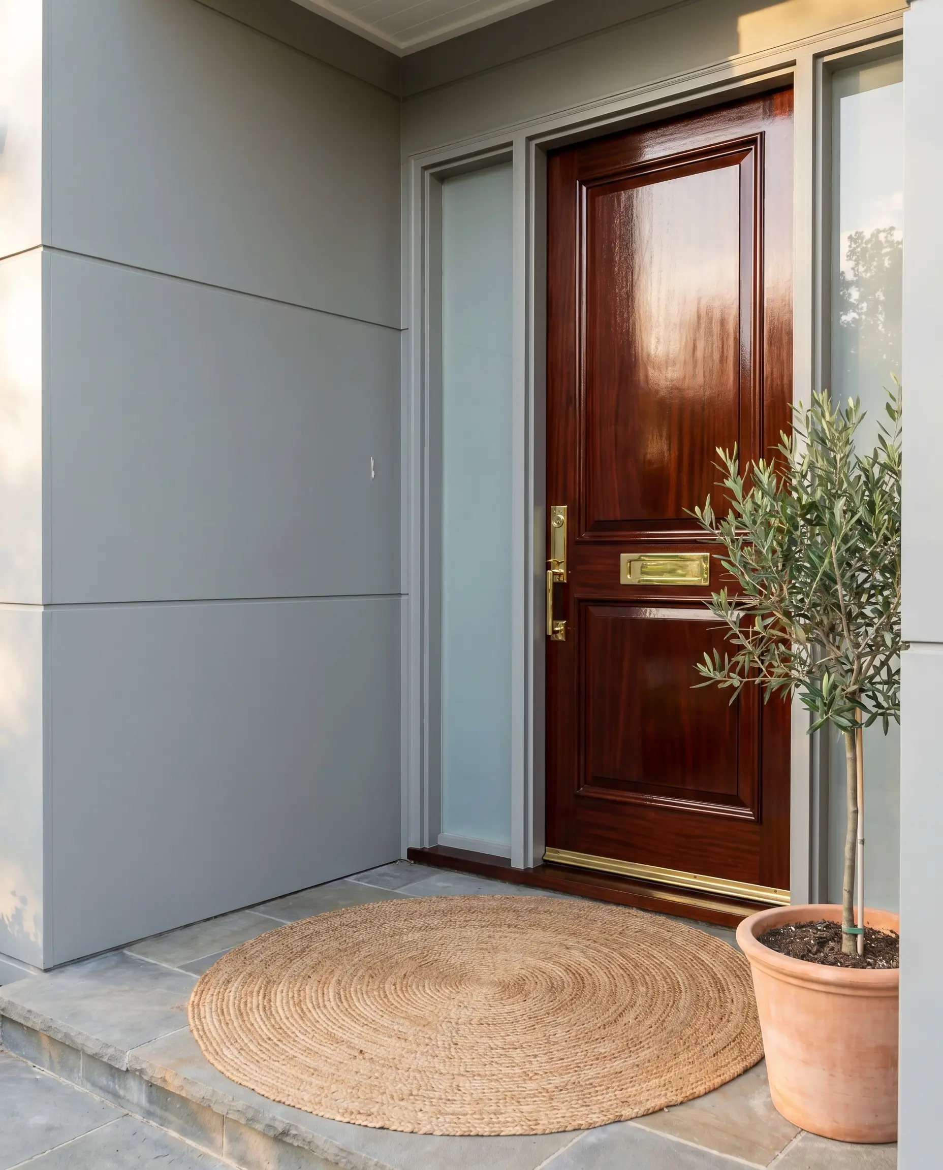
A strictly cool-toned exterior can quickly feel uninviting and sterile. Introducing a solid mahogany front door establishes a powerful, warm focal point, using the rich, natural wood grain to break up the flat, painted planes of the siding.
- Designer’s Match: Benjamin Moore Coventry Gray
- Material Pairing: Clear-sealed solid mahogany door
- Vibe: Welcoming, premium, balanced
- Styling Pro-Tip: Use a high-gloss marine spar varnish on the mahogany to protect the wood from UV degradation and emphasize the depth of the grain.
Pair Light Gray Siding with Heavy Natural Stone Veneers
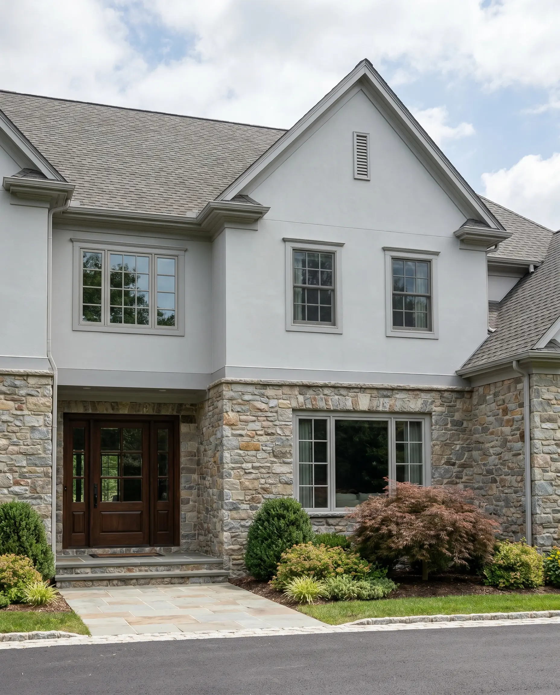
Heavy natural stone veneers carry massive visual weight that can easily drag a home down if the siding is too dark. A well-calibrated light gray lifts the upper elevation, balancing the heavy masonry base without competing for attention.
Pull the exact gray paint shade directly from the lightest fleck of stone in the veneer to guarantee absolute cohesion.
Hackrea Styling Tip
- Designer’s Match: Sherwin-Williams Mindful Gray
- Material Pairing: Dry-stacked fieldstone veneer
- Vibe: Stately, balanced, enduring
Contrast Dark Siding with Board-Formed Concrete Retaining Walls
For high-end modern industrial aesthetics, texture is just as critical as color. The smooth, monolithic application of dark siding contrasts brilliantly against the rugged, wood-grain texture of board-formed concrete retaining walls.
- Designer’s Match: Benjamin Moore Soot
- Material Pairing: Board-formed concrete
- Vibe: Industrial, textural, cutting-edge
- Styling Pro-Tip: Incorporate hidden landscape uplighting at the base of the concrete to highlight the board-formed texture against the dark home at night.
Complement a Gray Exterior with Matte Black Sconce Lighting
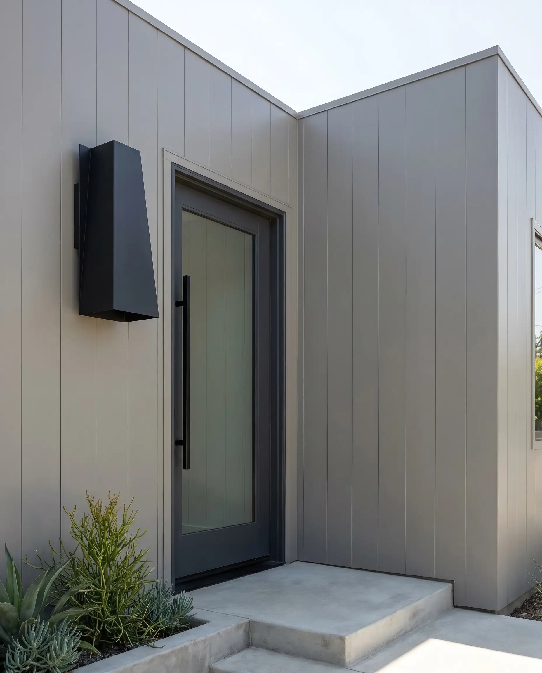
Hardware selection is the final layer of architectural styling. Matte black sconce lighting provides a sharp, graphic punch against mid-tone grays, outlining the entryways and garages with crisp, modern definition.
- Designer’s Match: Sherwin-Williams Dorian Gray
- Material Pairing: Matte black geometric sconces
- Vibe: Sharp, defined, contemporary
- Styling Pro-Tip: Size your sconces appropriately; exterior lighting should generally be one-quarter to one-third the height of the door it frames.
Frame a Gray House with Corten Steel Planters
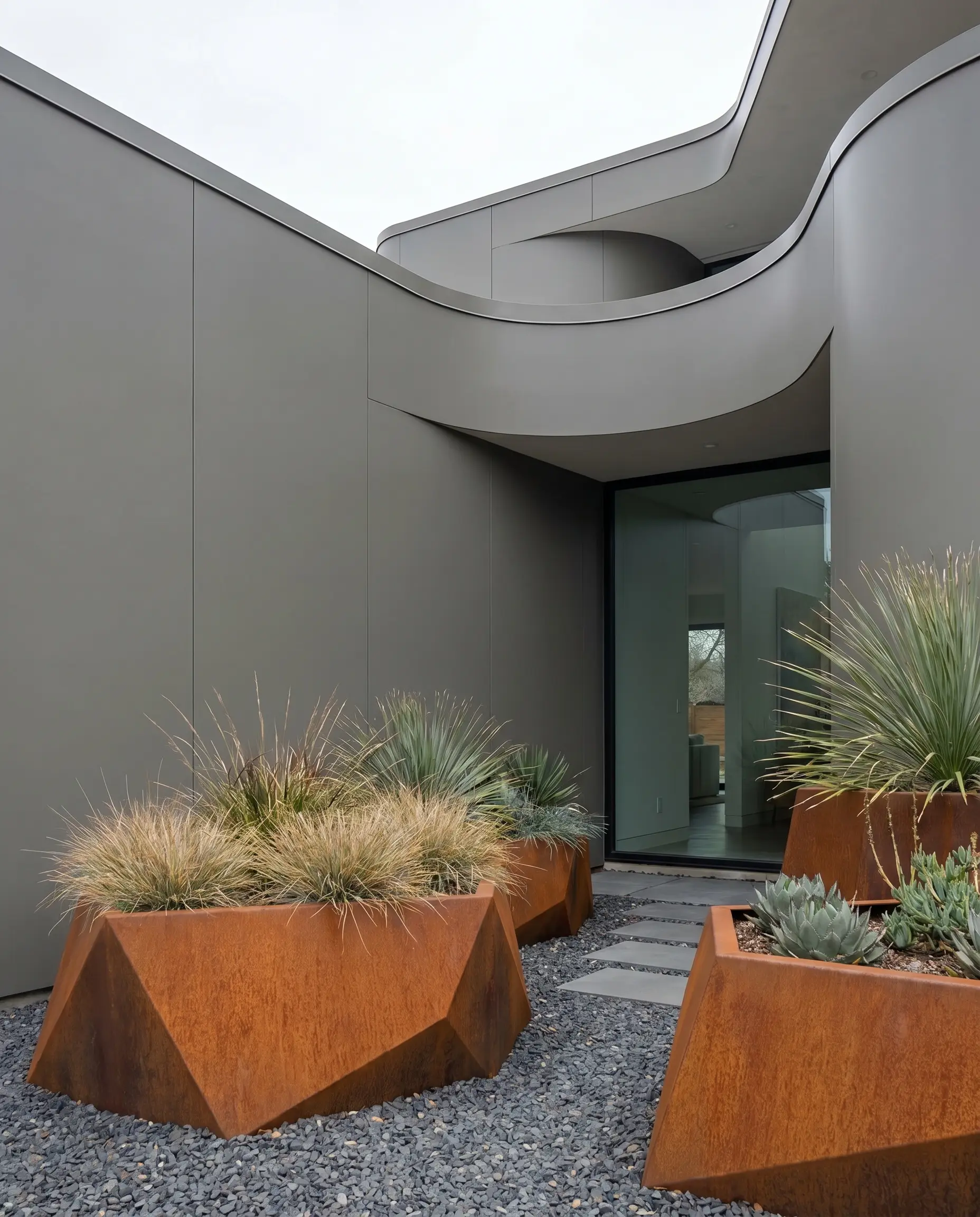
Integrating landscaping into your color palette elevates the entire property. The deep, oxidized rust of Corten steel planters provides a striking, earthy contrast to neutral gray siding, bridging the gap between the architecture and the garden.
- Designer’s Match: Benjamin Moore Amherst Gray
- Material Pairing: Weathered Corten steel
- Vibe: Sculptural, organic, modern
- Styling Pro-Tip: Ensure Corten steel is placed over gravel or concrete that can be easily cleaned, as the rust will bleed during heavy rain.
Soften a Monolithic Gray Build with Warm White Oak Accents
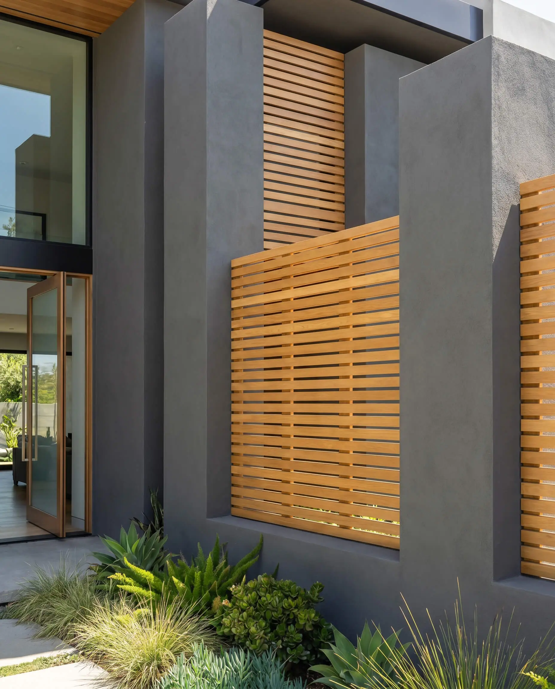
Massive, contemporary gray builds risk looking like commercial fortresses. Integrating warm white oak accents—whether on the soffits, entry ceiling, or privacy screens—instantly softens the severe architecture, introducing a highly sought-after organic modern luxury.
- Designer’s Match: Sherwin-Williams Cityscape
- Material Pairing: Slatted white oak privacy screens
- Vibe: Luxurious, organic modern, refined
- Styling Pro-Tip: Specify a UV-blocking clear coat for the exterior oak to prevent the wood from silvering out and losing its critical warmth.
The Final Verdict: How to Protect Your Exterior Paint Investment
Securing the perfect gray exterior house paint requires absolute discipline. You must reject the impulse to choose a color based solely on an interior swatch. Protect your investment by executing the Exterior Swatch Protocol on every side of your home, and rigorously evaluate how your chosen shade interacts with your fixed elements—your roof, your stonework, and your hardscaping. If you account for LRV washout and manage the undertones against directional sunlight, you will achieve a flawless, high-end facade. To finalize your exterior transformation and establish a striking focal point, study our analytical guide on Front Door Paint Color Ideas to Boost Curb Appeal.