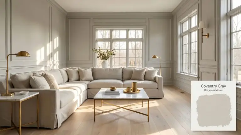
Coventry Gray HC-169
Benjamin MooreBenjamin Moore Coventry Gray (HC-169) is a steadfast, medium-depth stormy gray with subtle blue-green undertones. Sitting perfectly between warm and cool, this highly versatile neutral boasts an LRV of 48.18, making it an elegant choice for cabinetry, exteriors, and well-lit living spaces.
Benjamin Moore Coventry Gray: The Shape-Shifting Architectural Neutral
Despite its prestigious placement in Benjamin Moore’s Historical Collection, Coventry Gray HC-169 refuses to be trapped in the past. This specific pigment profile operates less like a traditional wall color and more like a tailored suit for your home’s interior architecture. It provides a highly sophisticated backdrop that makes the materials layered on top of it—from honed Carrara marble to unlacquered brass—instantly feel more expensive.
If you are navigating the often frustrating process of updating a 1990s suburban build or trying to inject character into a stark urban loft, finding the right mid-tone is critical. Go too light, and the walls feel unfinished; go too dark, and the room shrinks visually. This medium-depth neutral sits right in the sweet spot, establishing a substantial presence without overwhelming the floor plan.
What makes this stormy gray so incredibly popular among designers is its underlying chromatic profile. It possesses a subtle complexity that responds dynamically to shifting sunlight, allowing it to transition effortlessly from a crisp morning hue to a moody evening shadow.
Coventry Gray: Temperature, Undertones & LRV
If you are searching for the definitive answer to whether Benjamin Moore Coventry Gray is warm or cool, it is decidedly a cool-leaning neutral. However, its specific color structure prevents it from feeling like a sterile, icy concrete.
With a Light Reflectance Value (LRV) of 48.18, this architectural finish absorbs just over half the light it receives. Sitting squarely in the light-medium range, it provides significant visual weight and shadow definition without collapsing into total darkness.
You can apply wallpapers, paints, etc. on walls and see how they look in various interiors.

The Chameleon Factor: Lighting Effects on HC-169
Because of its complex blue-green undertone, Coventry Gray is highly reactive to the directional light pouring through your windows.
If you find the blue undertones pulling too strongly in a north-facing room after dark, swap your overhead lighting to 3000K bulbs. This temperature offers a clean, neutral glow that stabilizes the gray without casting a yellow, dingy film over the walls.
Hackrea Pro-Tip (The Bulb Strategy)
Popular Room Applications
Because of its balanced LRV, this versatile pigment excels as both a foundational wall color and a striking accent for custom millwork. Here is how to manipulate its characteristics across different spaces.
Transforming Kitchen and Bathroom Cabinetry
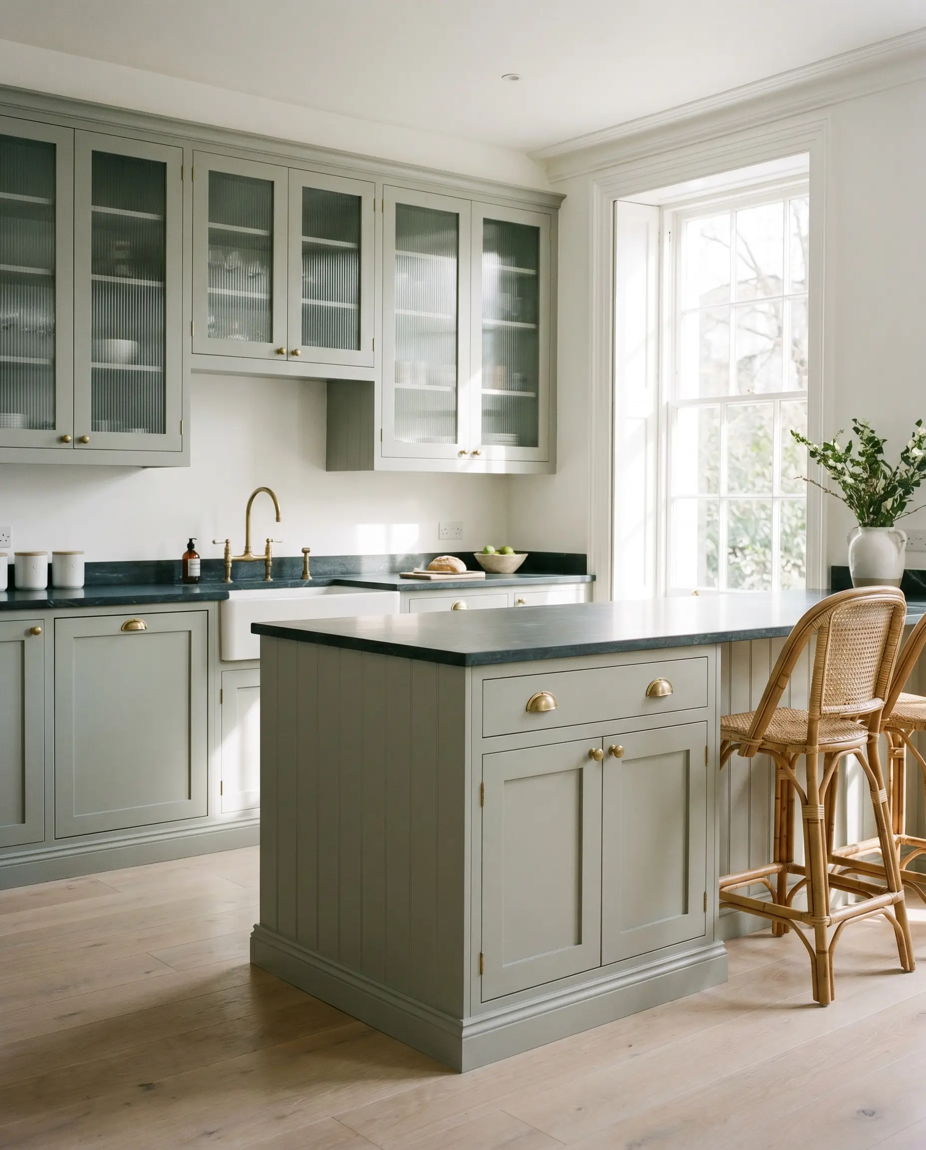
As a dedicated cabinetry paint, HC-169 provides a massive visual upgrade for homeowners looking to move away from predictable, stark white kitchens. Its mid-tone weight establishes a beautiful sense of gravity for lower cabinets or a central island. Pair it with honed soapstone counters and unlacquered brass cup pulls for a highly curated, classic English kitchen aesthetic.
In a primary bathroom, this color takes on a completely different personality when applied to a sleek, floating vanity. Surround it with zellige wall tile and polished nickel plumbing fixtures to pull forward its crisp, blue-green edge. The reflective surfaces of the tile and metal will bounce light around the room, keeping the gray feeling vibrant rather than heavy.
When applying this stormy gray to high-touch surfaces like cabinets, always opt for a satin or semi-gloss finish. The slight sheen not only protects the wood but also highlights the architectural details of shaker or reeded doors, catching the light perfectly on the raised edges.
Hackrea Design Secret (Sheen Selection)
Elevating South-Facing Living Spaces
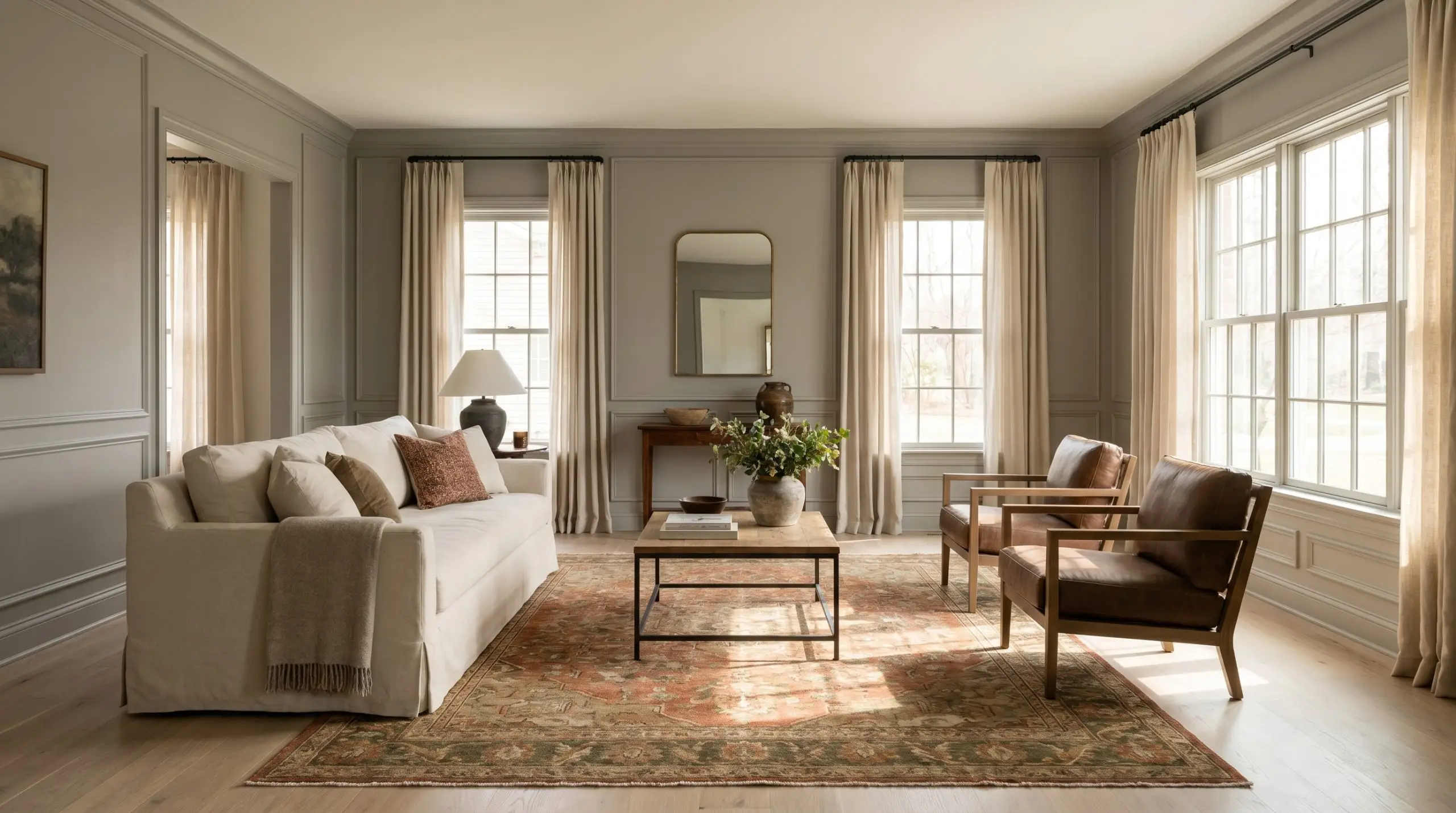
South-facing living rooms offer the ideal lighting environment to experience this paint as a pure, balanced neutral. The abundant, warm sunlight neutralizes the cooler undertones, creating a highly sophisticated backdrop for a transitional design style. Lean into this warmth by introducing bleached white oak flooring and a large, slipcovered sofa in heavy cotton canvas.
To prevent the room from feeling too monochromatic, introduce strategic contrast through your textiles and decor. Layer a vintage rug featuring subtle terracotta or olive green accents, and incorporate matte black iron curtain rods to frame the windows. If your living room features picture molding or wainscoting, painting the trim and walls in the same finish creates an incredibly seamless, high-end look.
Layering Texture in Primary Bedrooms
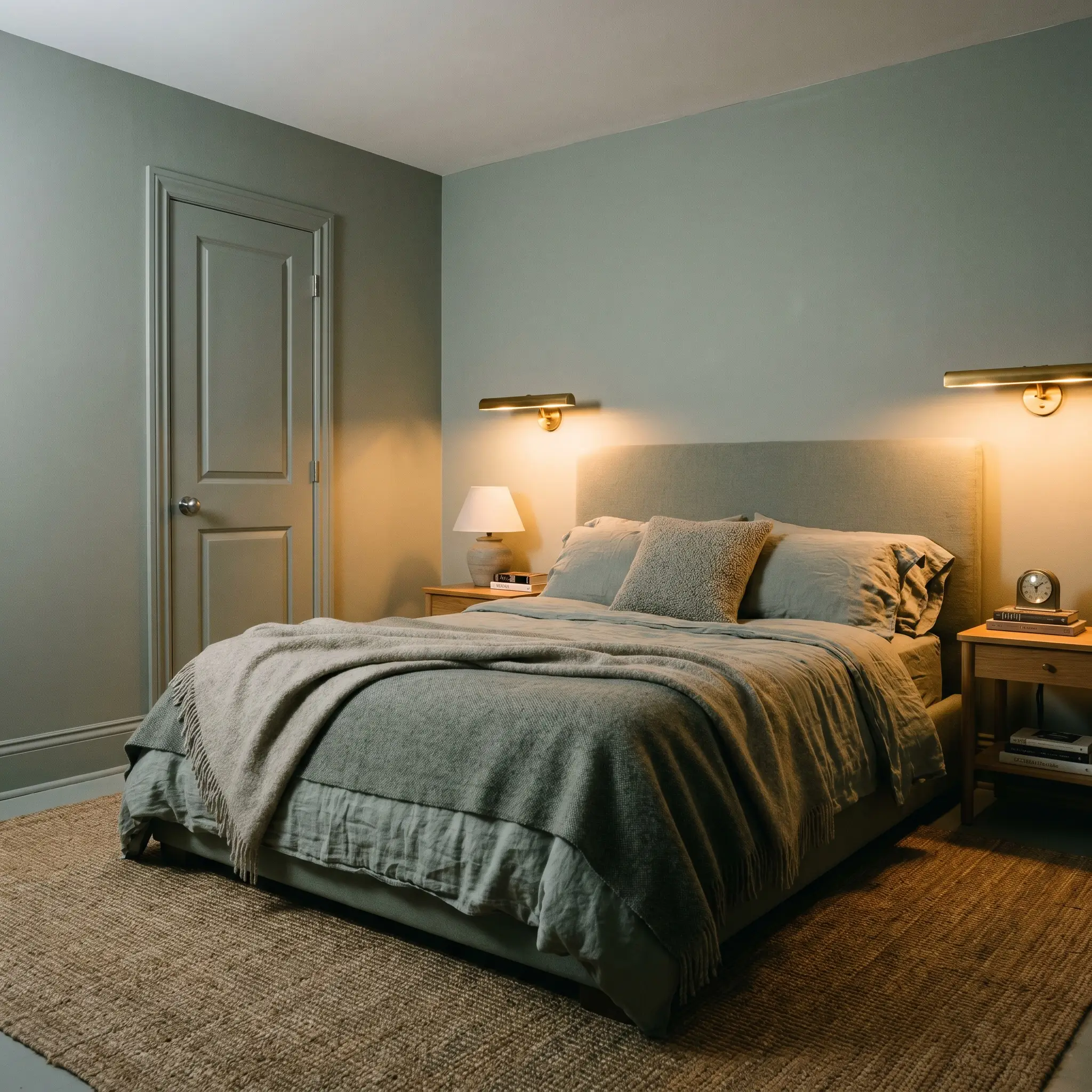
In a bedroom setting, the cool-leaning nature of this gray promotes a deeply restful, serene atmosphere. To soften the architectural presence of the walls, you must introduce a generous amount of tactile variety. Dress an upholstered headboard with washed linen sheets, a boucle throw pillow, and a heavy worsted wool blanket at the foot of the bed.
If you are updating a standard, boxy bedroom with minimal architectural interest, consider a color-drenching approach. Painting the walls, baseboards, and interior doors in this identical shade blurs the hard boundaries of the room. Offset this enveloping technique with warm, brass gallery lights mounted above the bedside tables to create a soft, inviting nighttime glow.
Redefining Exterior Siding and Trim
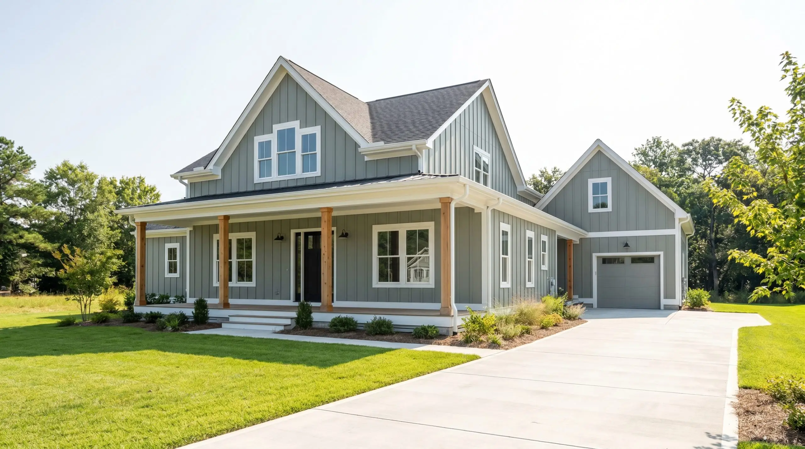
When taken outside, natural sunlight completely alters how we perceive paint depth, often washing out colors by up to two shades. Because this gray sits near an LRV of 48, it is saturated enough to hold its ground on exterior siding without blinding the neighborhood. It looks exceptionally tailored when applied to classic clapboard or modern board and batten siding.
For a sharp, contemporary facade, pair the gray siding with crisp white trim and a matte black front door. If you prefer a softer, more organic exterior, integrate natural cedar accents through porch columns or a wood-stained garage door. The warmth of the raw wood beautifully counteracts the cool, stormy presence of the gray, creating incredible curb appeal.
Coordinating Colors & Material Pairings
This specific stormy gray demands highly intentional relationships, requiring crisp, high-contrast boundaries to hold its structural shape rather than relying on soft, tonal bleeds. By manipulating what sits next to it, you can entirely change how the eye perceives its underlying temperature.
Tailored Trim & Baseboard Selections
Hardware, Wood, and Tactile Pairings
Strategic Color Palette Companions
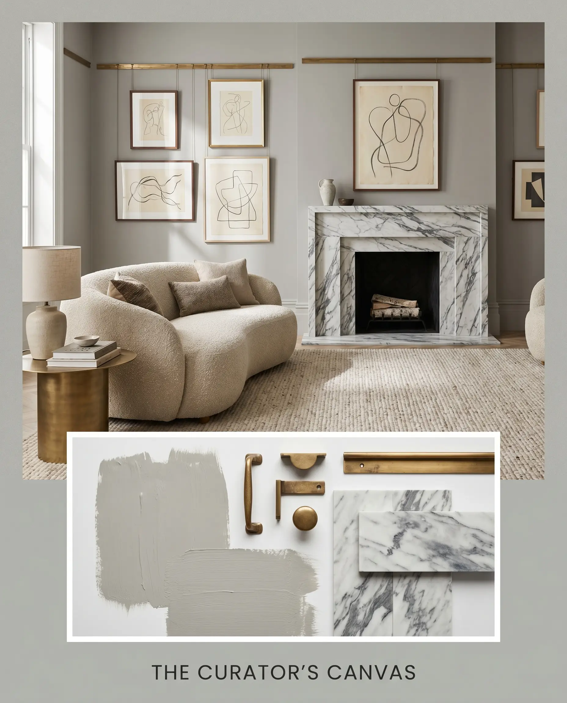
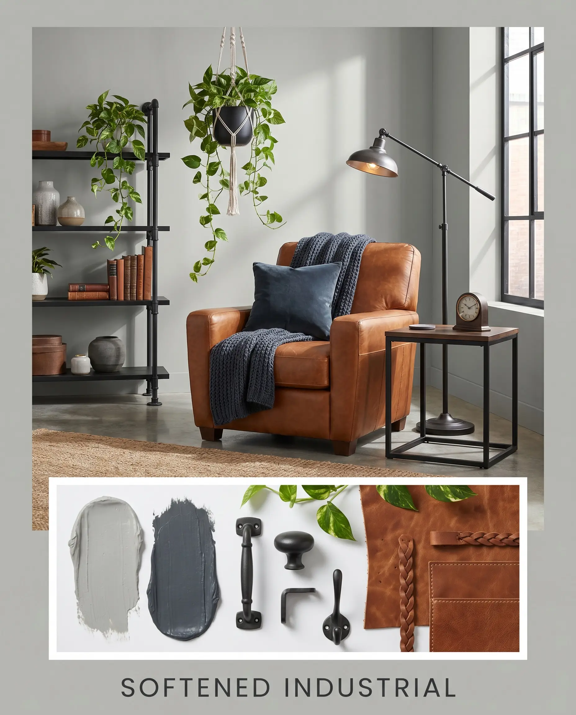
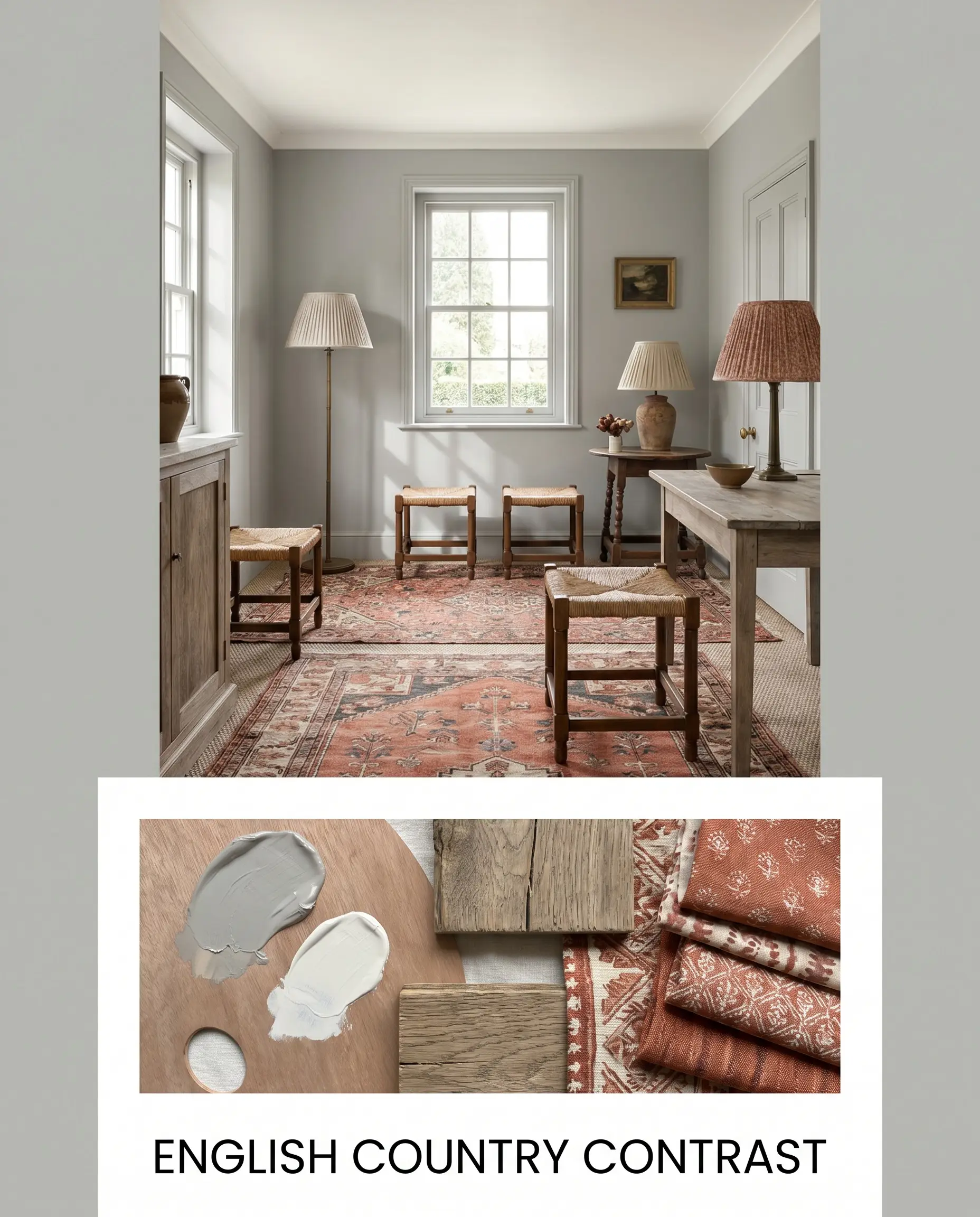
Curated Aesthetic Mood Boards
The Curator’s Canvas This aesthetic relies on the paint acting as a sophisticated, gallery-like backdrop for sculptural, high-contrast styling. Weave in unlacquered brass picture rails and prominently veined Carrara marble to establish a premium, classic foundation. Layer the space with minimalist line art, asymmetrical mirrors, and a structural boucle sofa to inject a modern, tactile tension that feels both intellectual and deeply relaxing.
Softened Industrial To harness the stormy, urban energy of this gray, lean into raw materials while deliberately softening their edges. Anchor the palette with Hale Navy accents and matte black iron hardware, creating a moody, substantial framework. Introduce warmth and approachability through cognac saddle leather upholstery, trailing pothos plants, and stacked art books, resulting in an atmosphere that is undeniably cool but never cold.
English Country Contrast This mood board completely subverts the modern tendencies of the paint by surrounding it with rich, heritage-inspired layering. Introduce White Dove on the ceiling to reflect soft light, and ground the floor plan with layered vintage rugs featuring subtle terracotta motifs. Incorporate pleated lampshades, rush-seat stools, and weathered oak textures to pull out a surprisingly charming, historic coziness from this otherwise crisp hue.
Head-to-Head: Comparing Coventry Gray to Top Rivals
When testing medium-depth neutrals, the final decision rarely comes down to a simple preference for one shade over another. It requires analyzing your specific directional lighting and architectural style to determine which pigment structure will actually survive your home’s unique environment. If your room lacks natural light or features intensely warm hard finishes, this stormy gray might pull too chilly, guiding you toward a more suitable rival hue.
Benjamin Moore Coventry Gray vs. Benjamin Moore Stonington Gray
If you are designing a space with limited square footage, Stonington Gray offers a slightly higher light reflectance, making the room feel noticeably more expansive. While both share a cool, architectural profile, Stonington carries a crisper, more straightforward blue undertone. Choose Coventry Gray when you need the visual weight to anchor large, airy rooms, but pivot to Stonington if you are battling shadows in a narrow hallway.
Benjamin Moore Coventry Gray vs. Sherwin-Williams Mindful Gray
This comparison is a master lesson in temperature control. If your home features intensely yellow-toned wood floors or earthy brick fireplaces, Mindful Gray introduces a crucial dose of warmth, leaning much closer to a true greige. Coventry Gray will actively fight against those warm, rustic elements, whereas Mindful Gray acts as a diplomatic bridge, harmonizing with earthy tones while still providing a tailored, modern finish.
Exploring Alternative Color Profiles
Even when a color looks flawless on a swatch, getting it onto your walls might reveal that you need just a fraction more warmth or a slightly lighter footprint to achieve your vision.
Same-Brand Variations
Cross-Brand Matches
Benjamin Moore Coventry Gray: Application Strategies & DIY Guidance
Transitioning this sophisticated color from a tiny paper swatch to a massive architectural surface requires precise execution and the right foundational materials.
Optimal Sheen Selection
Foundation and Primer Requirements
Because this pigment sits right in the middle of the light reflectance scale, it requires a high-quality, white acrylic primer to ensure the blue-green nuances render accurately. Applying this directly over a dark, existing wall color without a primer will cause the gray to look muddy and absorb the previous color’s warmth.
Coat Coverage and Flashing Prevention
Achieving the true, opaque depth of Benjamin Moore HC-169 strictly requires two full, even coats of premium paint, regardless of what the can promises. To avoid flashing—those frustrating, shiny roller marks visible when light hits the wall at an angle—you must maintain a wet edge and avoid over-rolling the paint as it begins to tack up.
When working with a medium-depth color like this, always use a high-quality 3/8-inch nap microfiber roller. Cheaper synthetic covers will leave behind a stippled texture that catches shadows, making the final gray wall look uneven and gritty rather than perfectly smooth.
Hackrea Pro-Tip (The Roller Rule)
Frequently Asked Questions
Because red and green sit opposite each other on the color wheel, the subtle green undertones in this gray will naturally amplify the rich, fiery tones of red brick. This creates a highly traditional, beautifully contrasting exterior palette that feels intentionally curated rather than dull.
Yes, it often struggles in this specific environment. The lack of natural light amplifies the cool, stormy qualities of the paint, which visually fights against the strong yellow-orange tones of honey oak, creating an uncomfortable, disjointed energy in tight spaces.
A high-gloss finish acts like a mirror, bouncing light aggressively and making the blue-green edge of the gray appear significantly sharper and more vibrant. Conversely, a matte wall finish absorbs the light, softening the color into a deeper, more velvety and muted neutral.
Absolutely. Because it carries a medium visual weight, painting a soaring ceiling in this shade creates a beautiful canopy effect. It visually pulls the ceiling down to a more human scale, making an intimidating, oversized room feel instantly grounded and intimate.
The Final Verdict on This Architectural Neutral
Benjamin Moore Coventry Gray is an exceptionally tailored, highly structured neutral designed for homeowners who want their walls to possess genuine architectural presence. Its absolute best application is in south-facing living spaces or applied as a sleek, satin finish on custom cabinetry, where its blue-green complexity can interact playfully with natural light. It is the perfect choice for executing a soft modern or transitional aesthetic, providing a crisp, premium backdrop that elevates every piece of furniture, stone, and metal placed against it.
While incredibly versatile, this cool-leaning pigment will actively fight against intensely bossy, yellow-toned finishes like 1990s honey oak floors or Tuscan-style travertine tile. When placed directly next to these strong, warm elements, the gray loses its sophisticated edge and instantly reads as a chilly, uninviting concrete. If your home is dominated by these earthy, orange-leaning hard finishes, you must pivot to a warmer greige to maintain a cohesive, inviting flow throughout the house.
Clash Warning (The Temperature Trap)