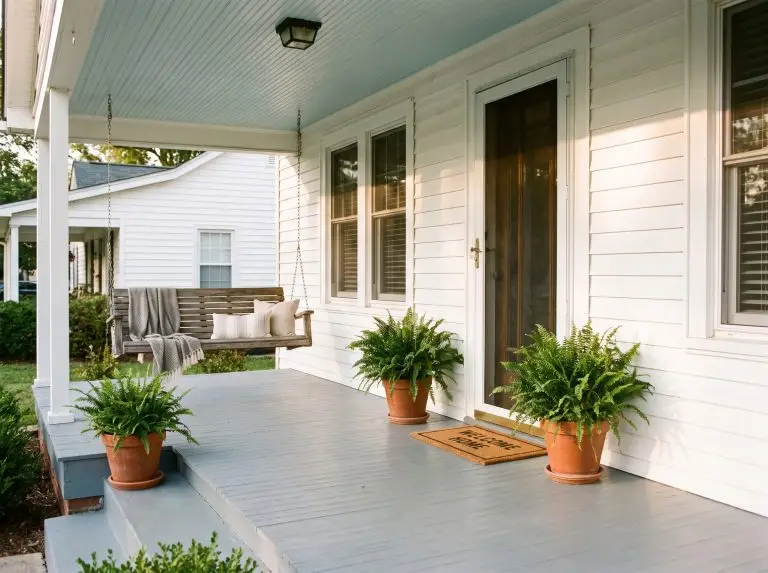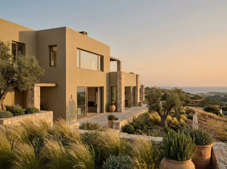
If you are planning to paint your home’s exterior in 2026, you are arriving at a pivotal moment in design history. For the last decade, our streets have been a sea of cool grays and stark, crisp whites. But as we move further into the late 20s, the “gray era” is officially fading in the rearview mirror.
2026 is the year of “Honest Essentials.”
According to the latest design forecasts, including insights from the Sherwin-Williams Colormix Forecast, homeowners are craving warmth, stability, and a deep connection to the earth. We are seeing a massive pivot toward organic neutrals—think warm khakis, sandy beiges, sun-baked terracottas, and moodier, complex greens. The goal is no longer to make a house look “new” and “sharp,” but to make it look “established” and “welcoming.”
Whether you are updating a mid-century ranch, a Victorian classic, or a modern farmhouse, choosing an exterior color is high-stakes. The sun changes colors dramatically, and a swatch that looks perfect in the store can look completely different on your siding.
In this guide, we have curated the definitive list of the best Sherwin-Williams exterior paint colors for 2026. We cover the new trendsetters, the unshakeable classics, technical specs like LRV, and our unfiltered verdicts on each shade.
Featured Snippet (For those in a hurry):
What are the best Sherwin-Williams exterior paint colors for 2026? The top trends for 2026 are shifting away from cool grays toward “Honest Essentials”—warm, earthy neutrals and rich, nature-inspired accents.
How to Choose Exterior Paint: The Technical Guide
Before we dive into the specific swatches, we need to cover two non-negotiable technical factors. Skipping this section is the number one reason homeowners end up hating their expensive paint job.
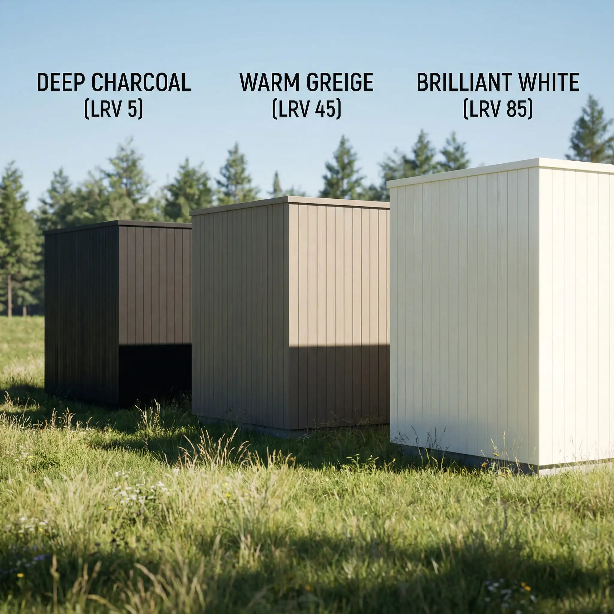
1. Understanding Light Reflectance Value (LRV)
You will see “LRV” mentioned under every color in this guide. LRV stands for Light Reflectance Value, a scale from 0 (pure black) to 100 (pure white).
2. The Sunlight Direction Factor
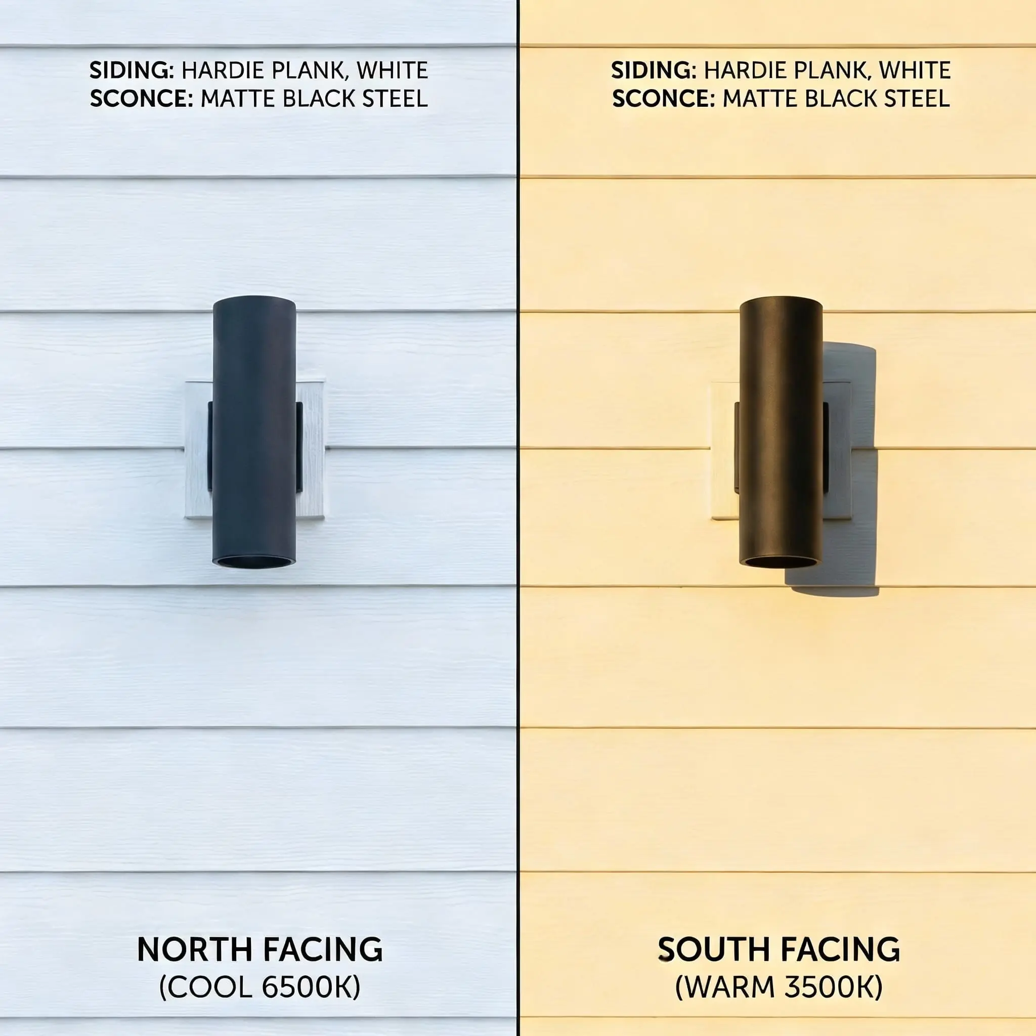
Your home’s orientation dictates how the paint behaves.
2026 Headline Trend: Warm Earthiness (The “New Neutrals”)
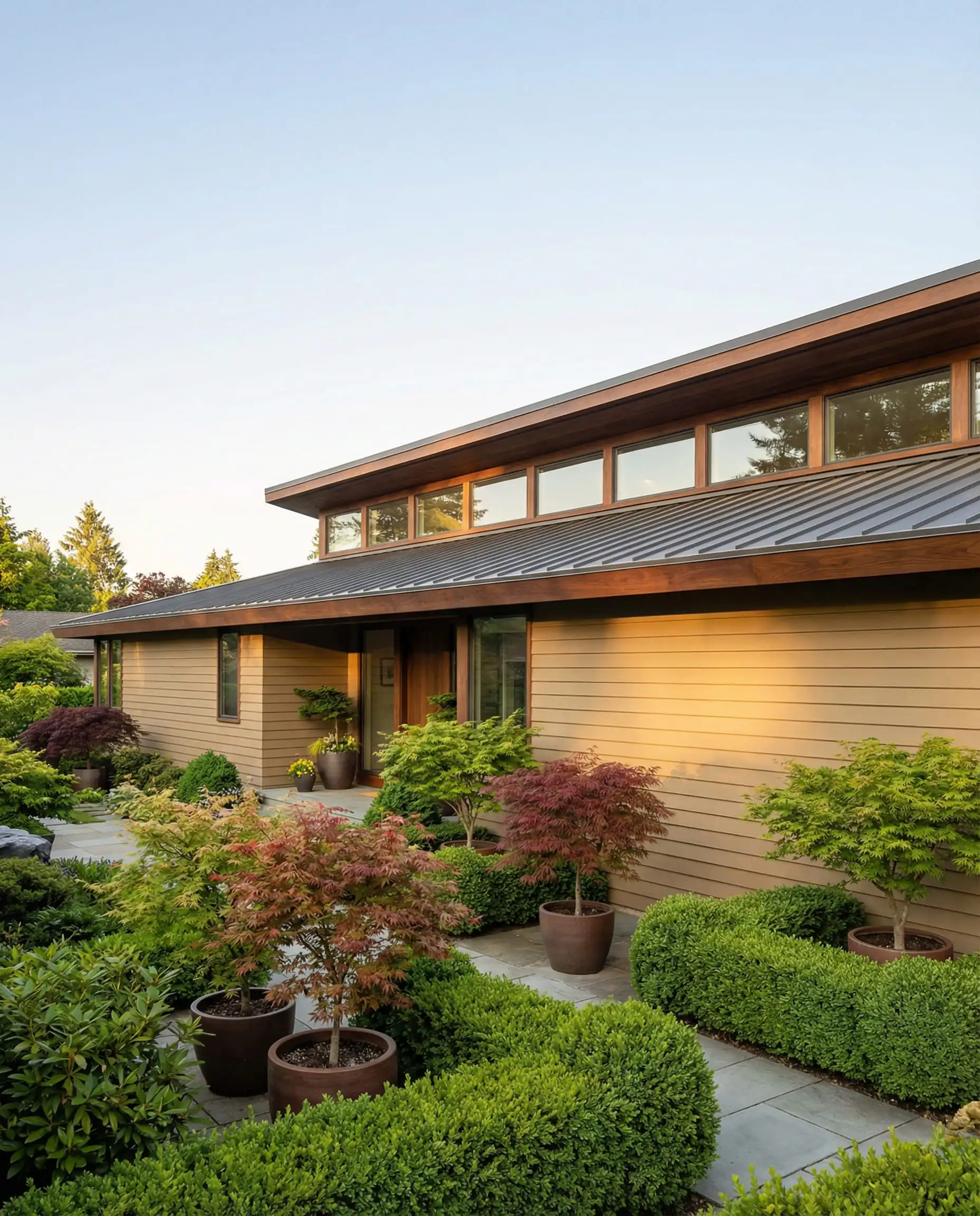
The biggest story for 2026 is the return of beige—but not the boring “builder beige” of the early 2000s. The new neutrals are complex, earthy, and rooted in nature. They bridge the gap between gray and brown, offering a sophisticated warmth that feels incredibly welcoming.
Universal Khaki (SW 6150)
LRV: 40 | Family: Warm Neutral
If there is one color that defines the shift for 2026, it is Universal Khaki. As cool grays retreat, this rich, organic tan is taking center stage. It is significantly deeper than the beiges of the past, offering a grounded, solid look that pairs exceptionally well with natural stone and wood beams.
Unlike lighter tans that can wash out, Universal Khaki holds its saturation well. It has a subtle green undertone that prevents it from looking “fleshy” or pink. It is the perfect choice for Craftsman homes or ranchers where you want the house to feel like an extension of the landscape.
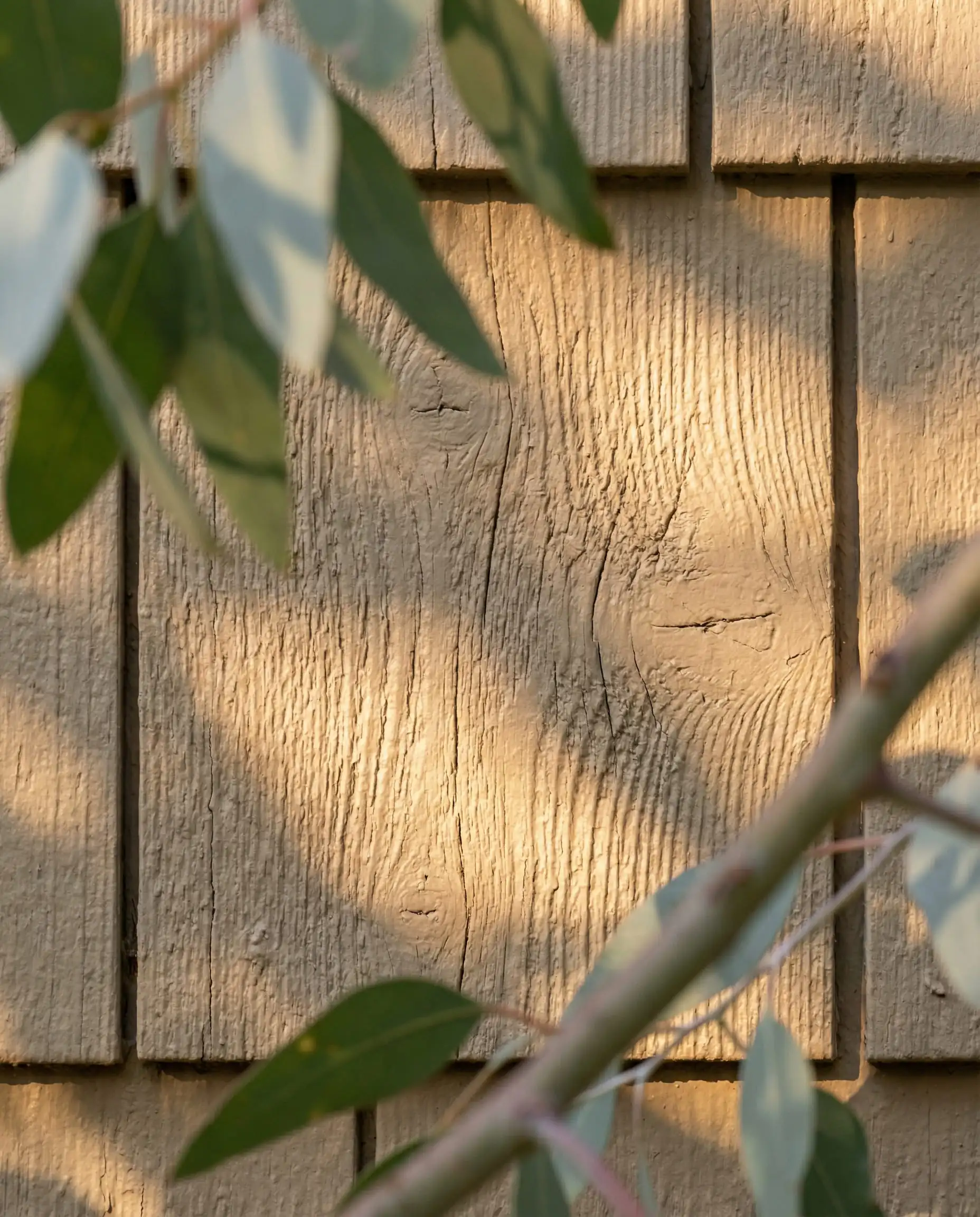
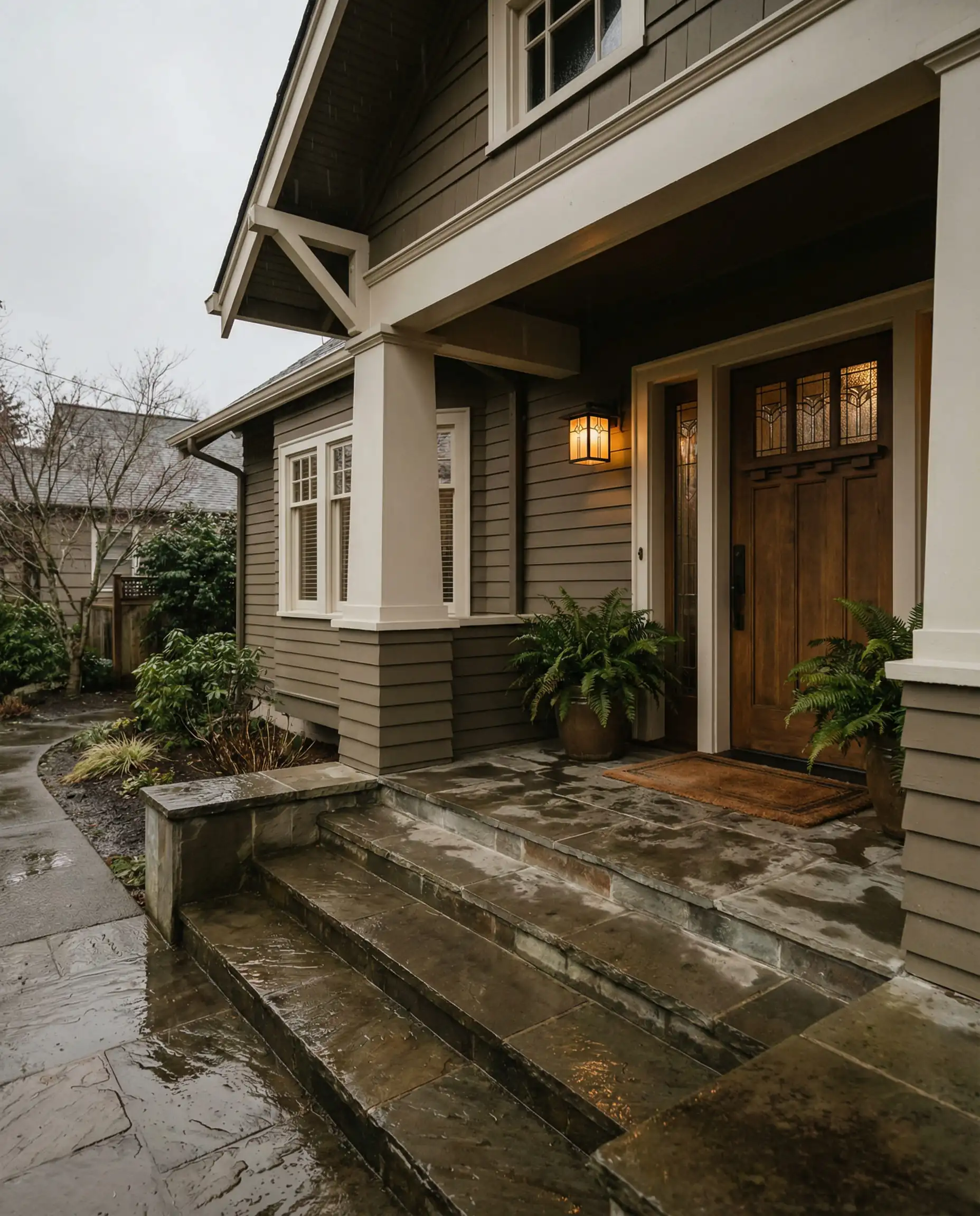
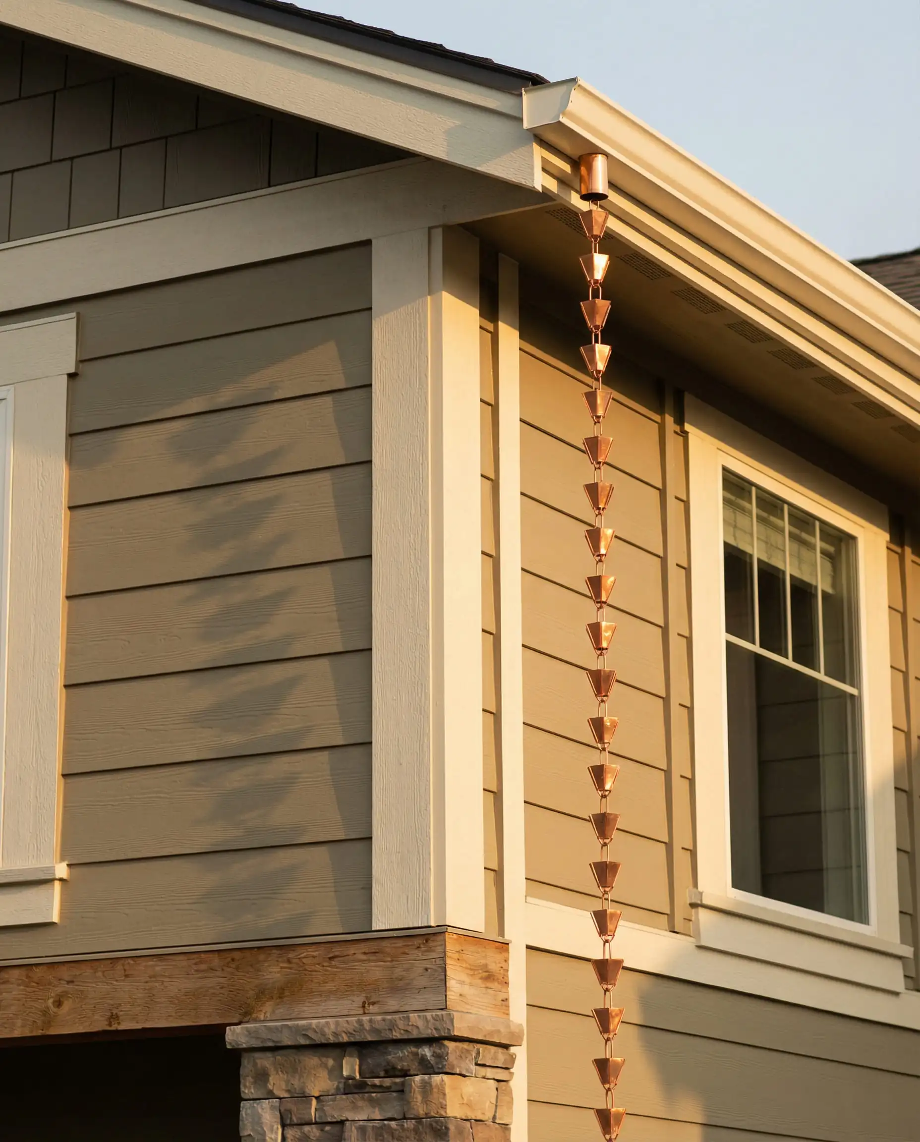
This is the brave new face of neutrals. If you want your home to look current in 2026, stop looking at gray and start looking here. It pairs perfectly with Creamy or Shoji White trim for a soft, low-contrast look.
Hackrea Verdict
Natural Linen (SW 9109)
LRV: 66 | Family: Beige/Warm Neutral
Natural Linen is exactly what it sounds like—a clean, breezy beige that feels organic and light without skewing yellow. It effectively replaces the “greige” trend with something undeniably warmer. It works exceptionally well on stucco, stone, and traditional siding, providing a soft backdrop that makes landscaping pop.
Unlike older beiges, Natural Linen has a “dry” quality to it. It doesn’t look buttery or oily; it looks like woven fabric. It pairs beautifully with dark bronze windows or natural wood columns, bridging the gap between modern minimalism and rustic charm.
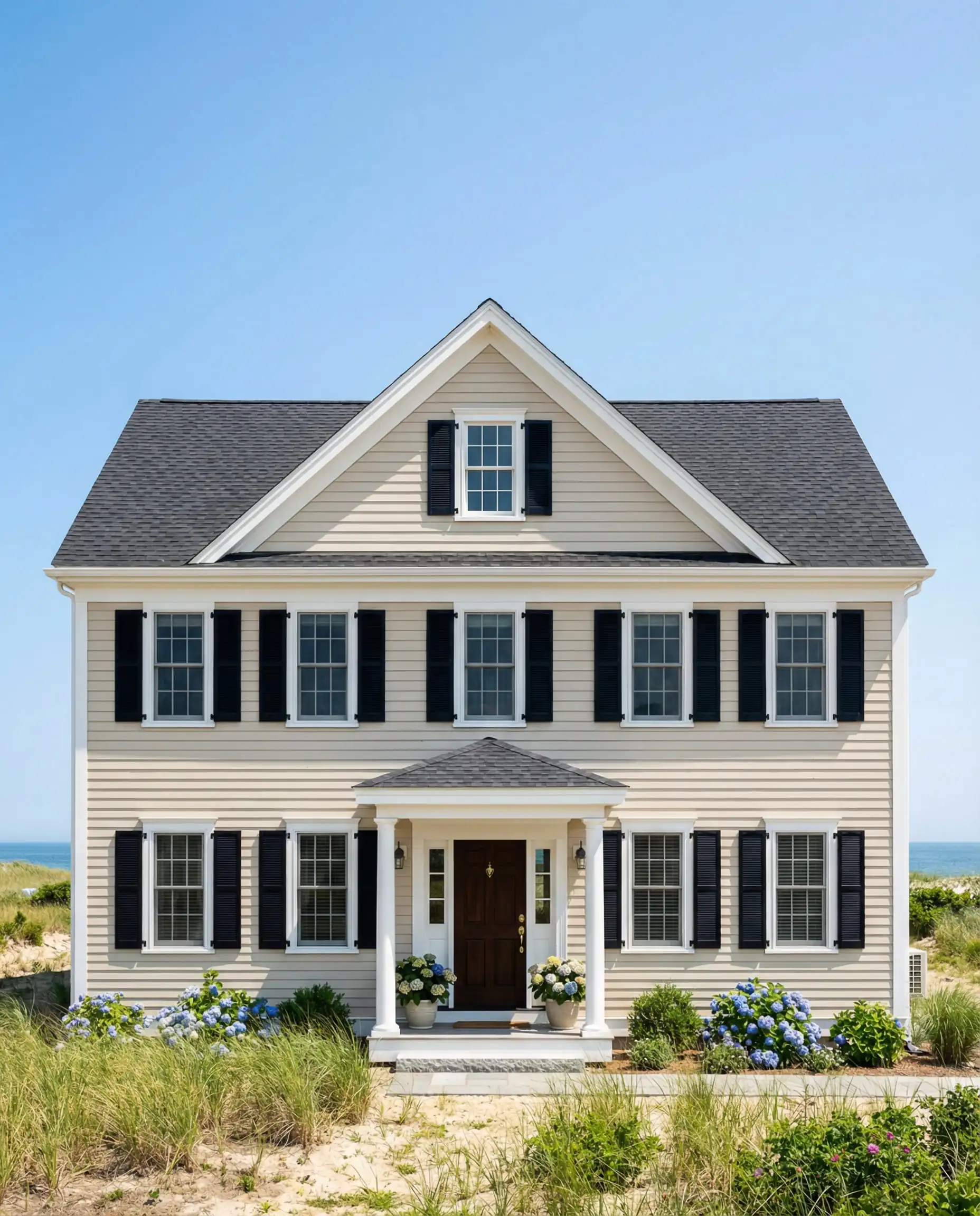
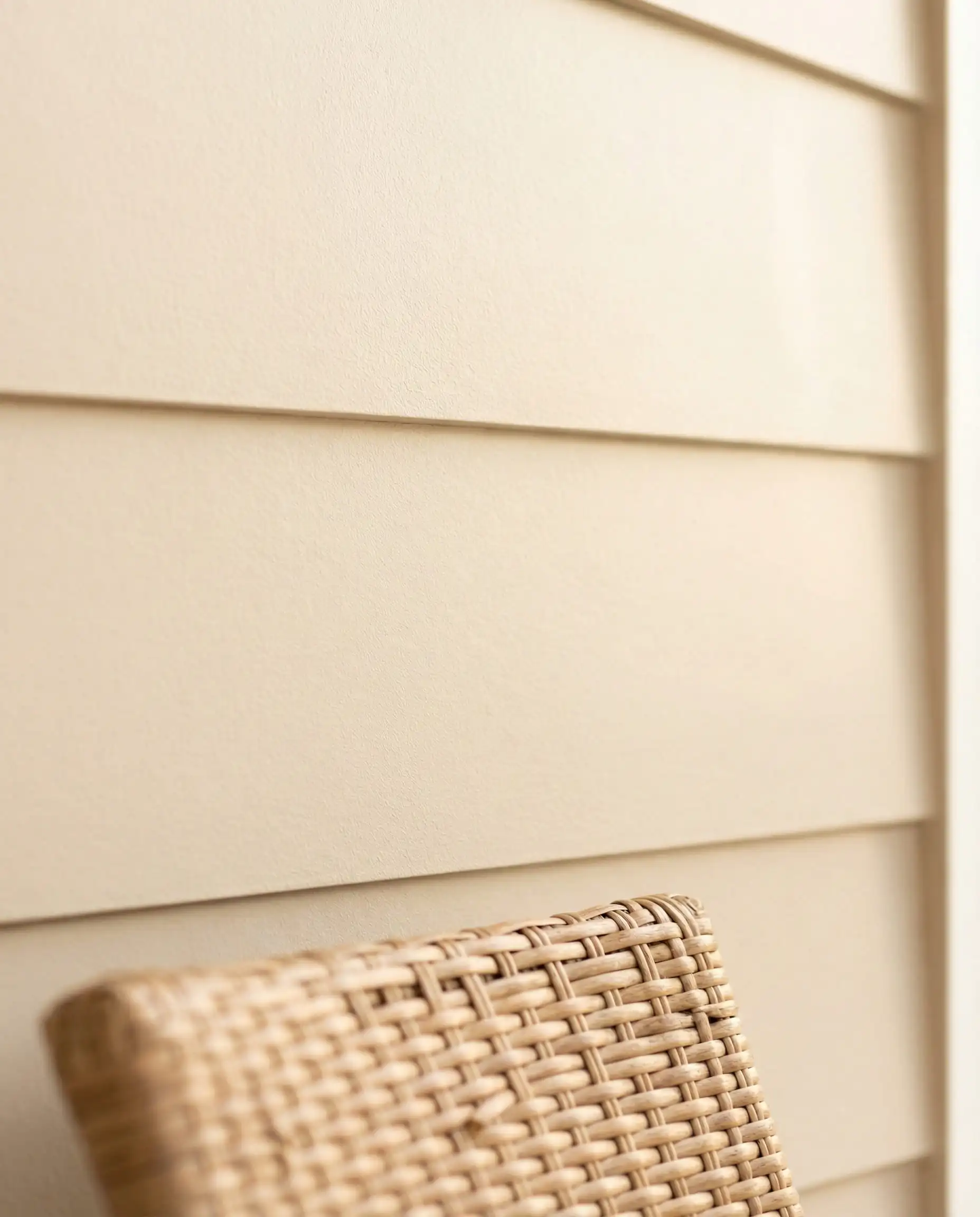
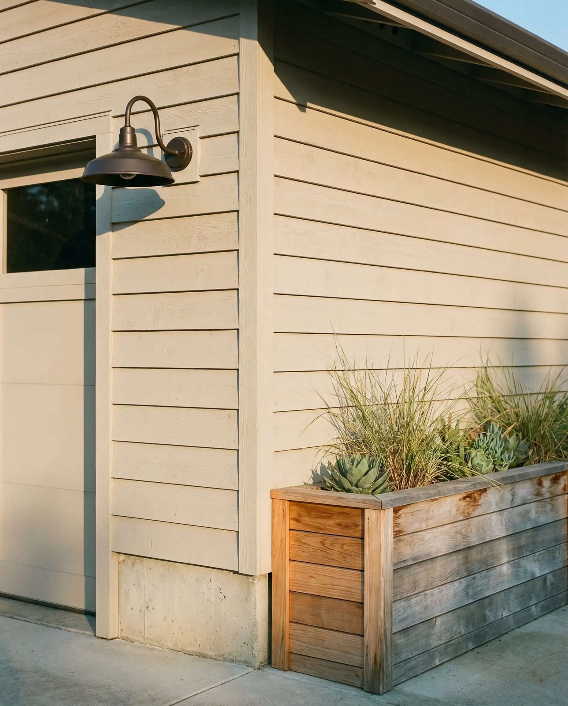
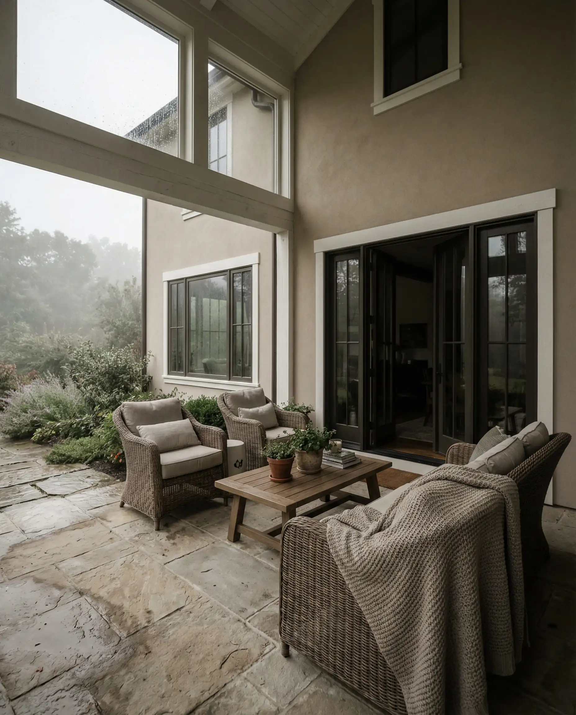
This is the safest and most sophisticated update for a home currently painted in cool gray. It instantly warms up the curb appeal without feeling yellow. Ideally suited for North-facing homes that need that extra touch of warmth.
Hackrea Verdict
Accessible Beige (SW 7036)
LRV: 58 | Family: Greige
A titan in the Sherwin-Williams catalog, Accessible Beige remains a powerhouse for 2026 because of its versatility. It is technically a greige (gray + beige), but it leans heavily into the beige side. On an exterior, it reads as a sophisticated, soft stone color.
It is darker than Natural Linen, giving it more presence. If you have white vinyl windows, Accessible Beige provides enough contrast to make the trim pop, whereas lighter whites might blend in too much. It is particularly effective on brick homes where you want to neutralize the red tones of the masonry.
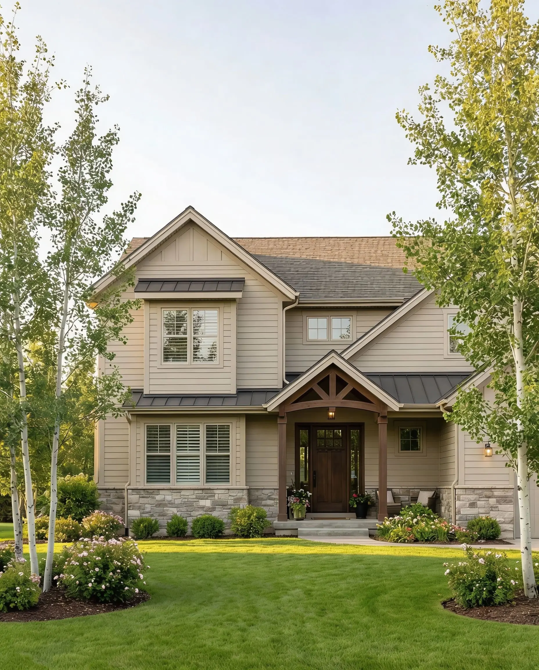
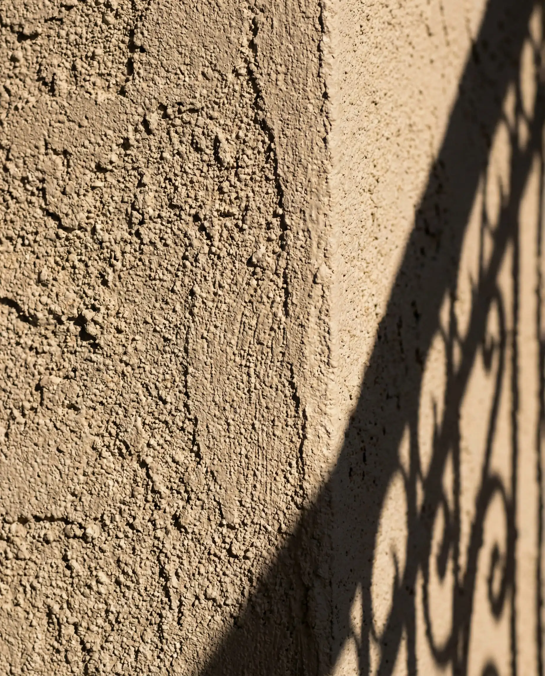
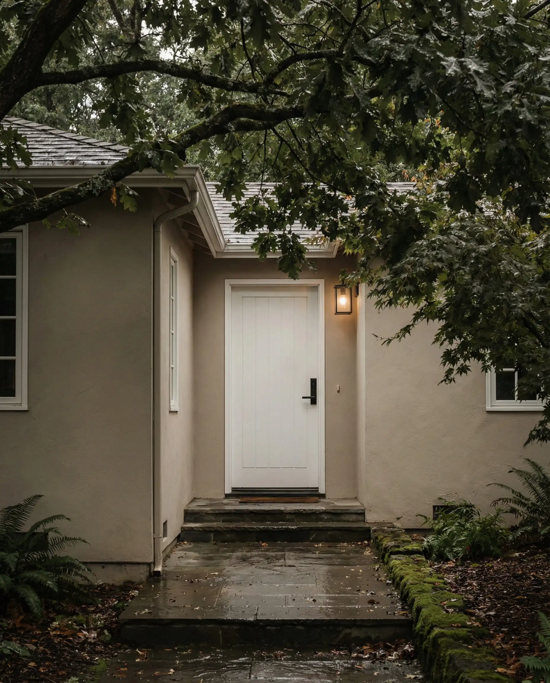
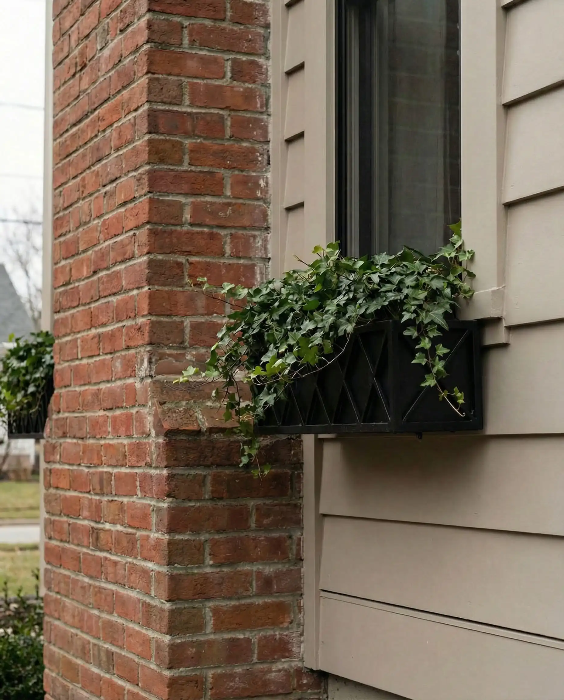
Don’t let the word ‘Beige’ scare you. On an exterior, this color strips away the yellow and reads as a warm, inviting neutral. However, avoid it if you have pinkish brick, as the undertones can sometimes clash.
Hackrea Verdict
Redend Point (SW 9081)
LRV: 30 | Family: Red/Brown/Earth
As homeowners embrace “Southwest Modern” and Mediterranean influences, Redend Point offers a soulful, blushing clay tone. It is not quite brown, not quite pink. It captures the essence of desert sand at sunset. This color reflects the 2026 desire for “spicy” neutrals that feel travelled and global.
Used as a main body color, it makes a bold statement on contemporary box-style homes or Spanish revivals. Used as an accent (on a front door or shutters), it pairs magically with warm creamy whites like Greek Villa.
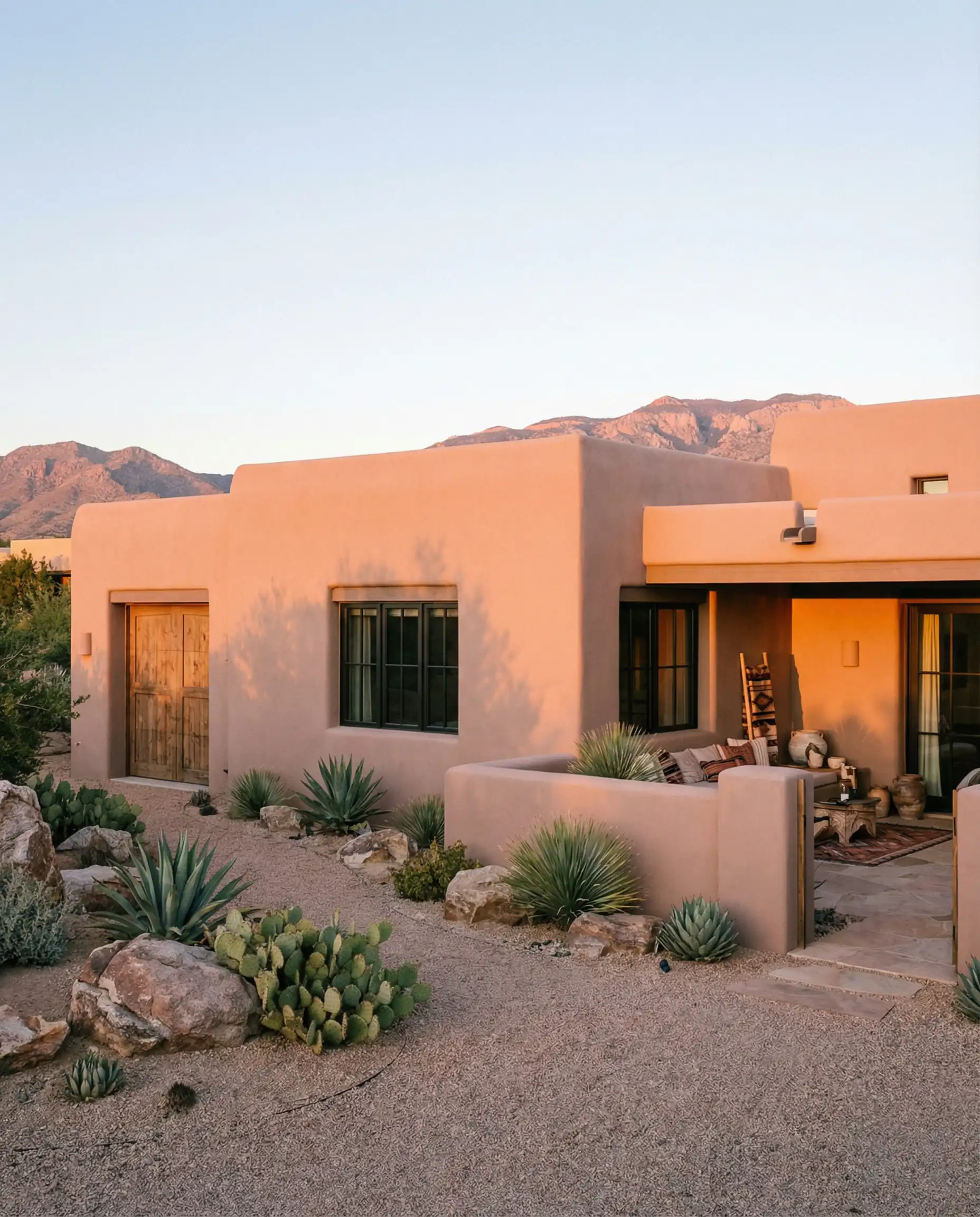
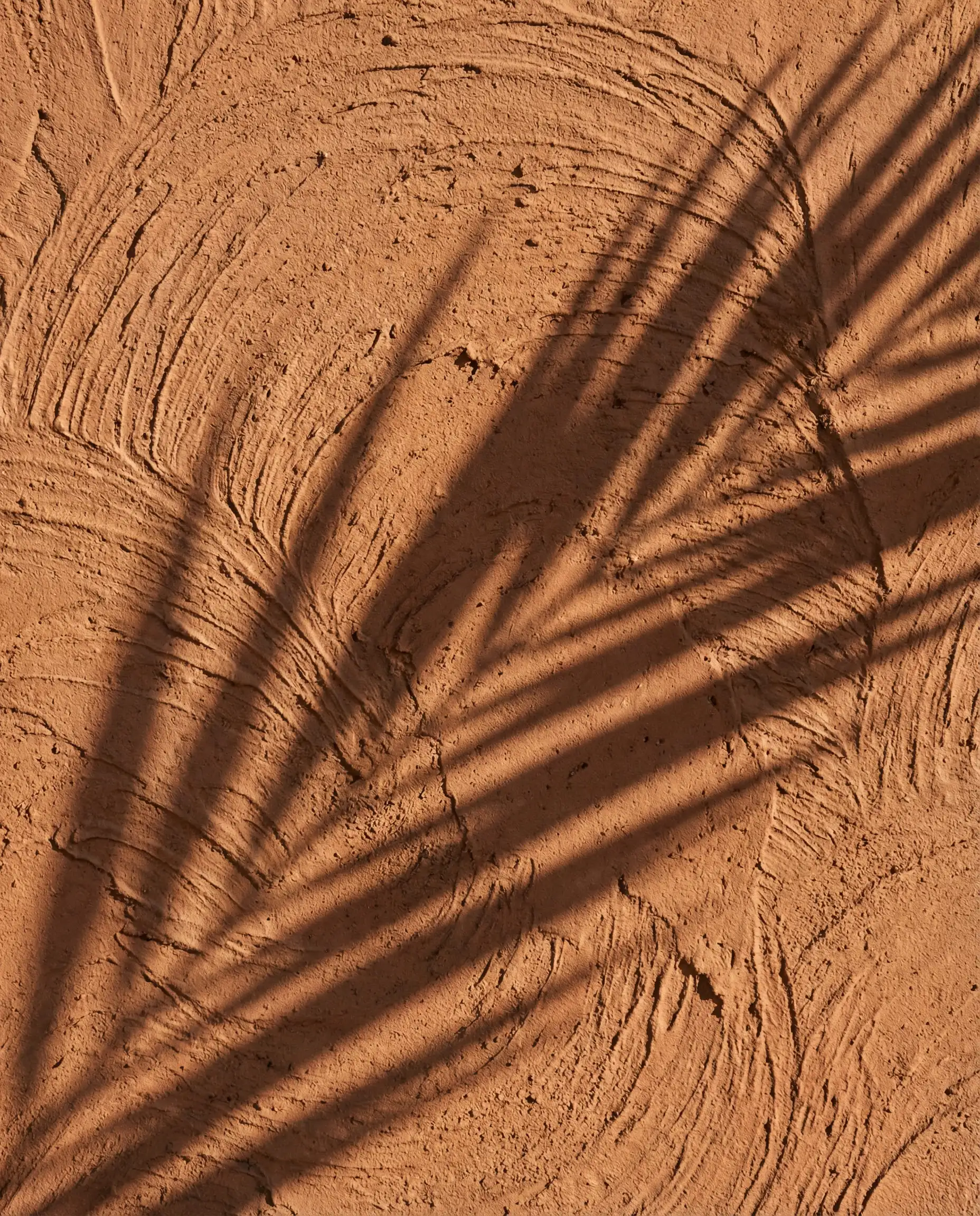
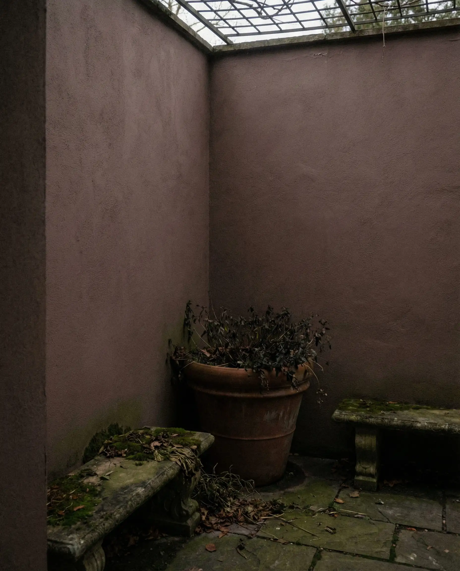
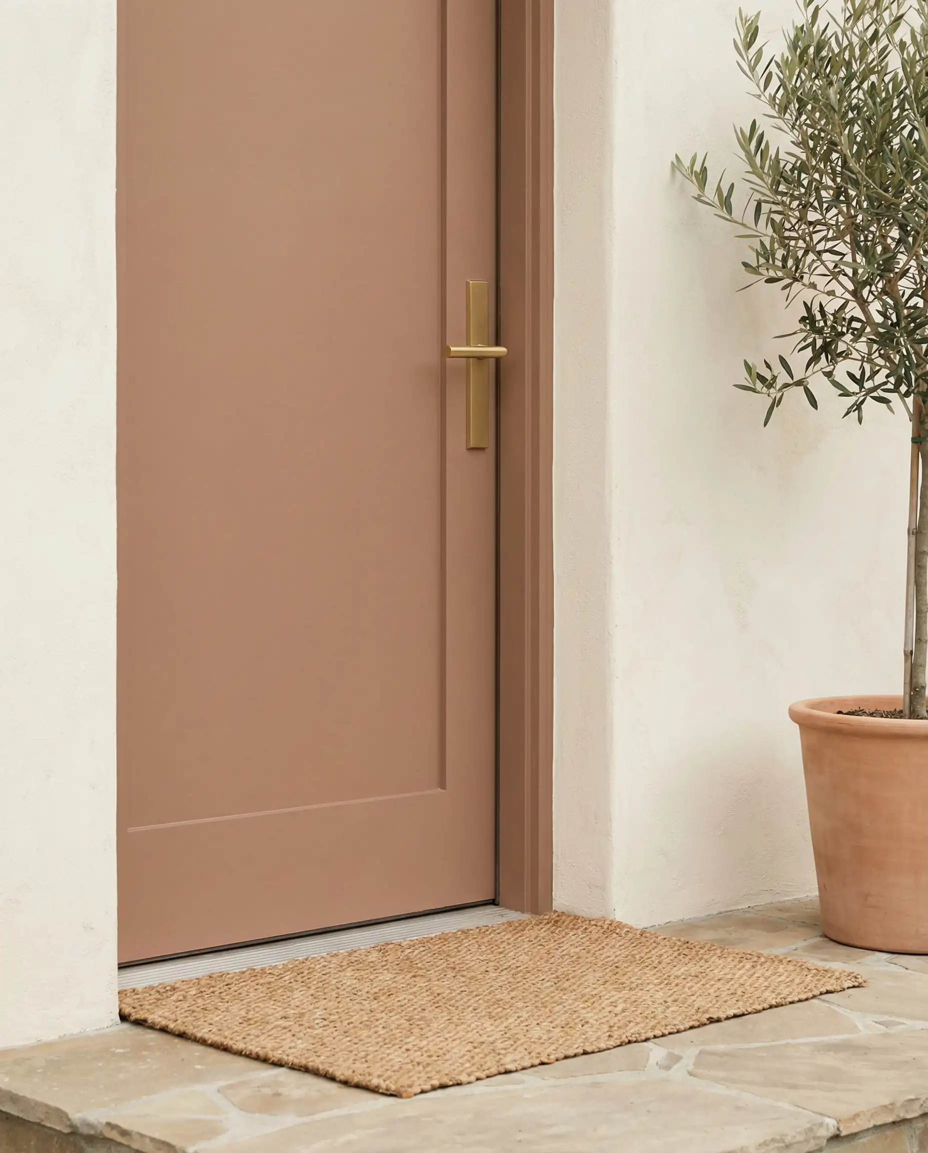
This is a trend-setter choice. Use this if you want your home to stand out for its warmth. It looks absolutely stunning paired with terracotta pots and copper light fixtures.
Hackrea Verdict
Reddened Earth (SW 6053)
LRV: 20 | Family: Terra Cotta
For those willing to go deeper than Redend Point, Reddened Earth is a rich, robust terra cotta that feels historic and grounded. In 2026, we are seeing this used heavily on front doors and even as a whole-house color for smaller cottages or bungalows. It brings a deep, clay-like warmth that feels incredibly cozy.
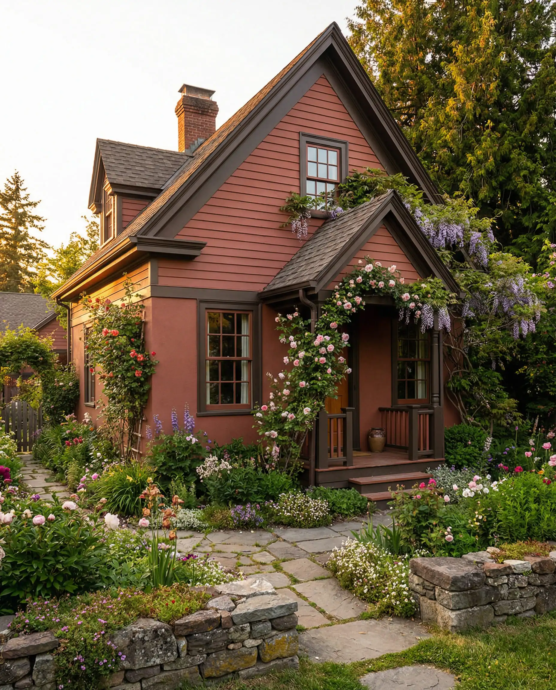
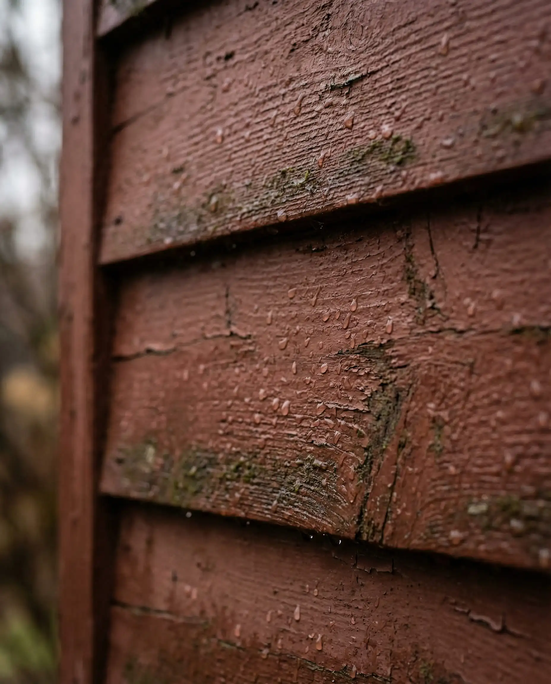
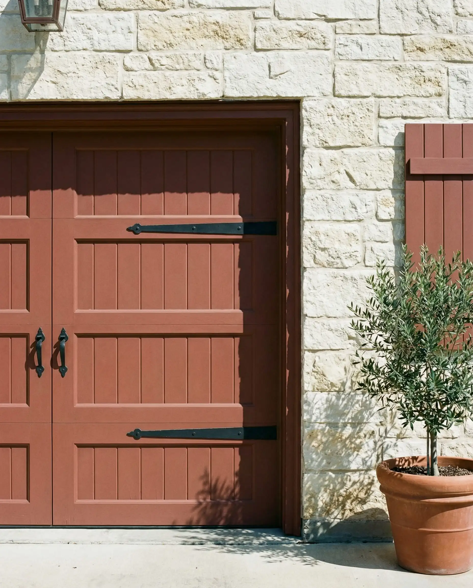
A bold move that pays off. It creates an instant ‘vacation vibe.’ Pair it with a dark brown or bronze trim to keep it sophisticated, rather than white, which can make it look too much like a barn.
Hackrea Verdict
Top Rated Whites & Off-Whites (The Safe Best-Sellers)
White exteriors are timeless, but in 2026, we are moving away from the “hospital stark white” toward creamy, softer whites that feel aged and established. The blinding whites of 2020 are out; soft, “lived-in” whites are in.
Alabaster (SW 7008)
LRV: 82 | Family: Off-White
Alabaster is legendary for a reason. It is the go-to choice for the modern farmhouse look. It is creamy enough not to look harsh, but bright enough to read as “white” on the exterior. It has a subtle yellow undertone that keeps it soft, preventing it from looking blue or cold in the shade.
If you have a red brick chimney or dark roof shingles, Alabaster provides a high-contrast, clean look that feels historic yet fresh. It is one of the few whites that works well in almost any light condition.
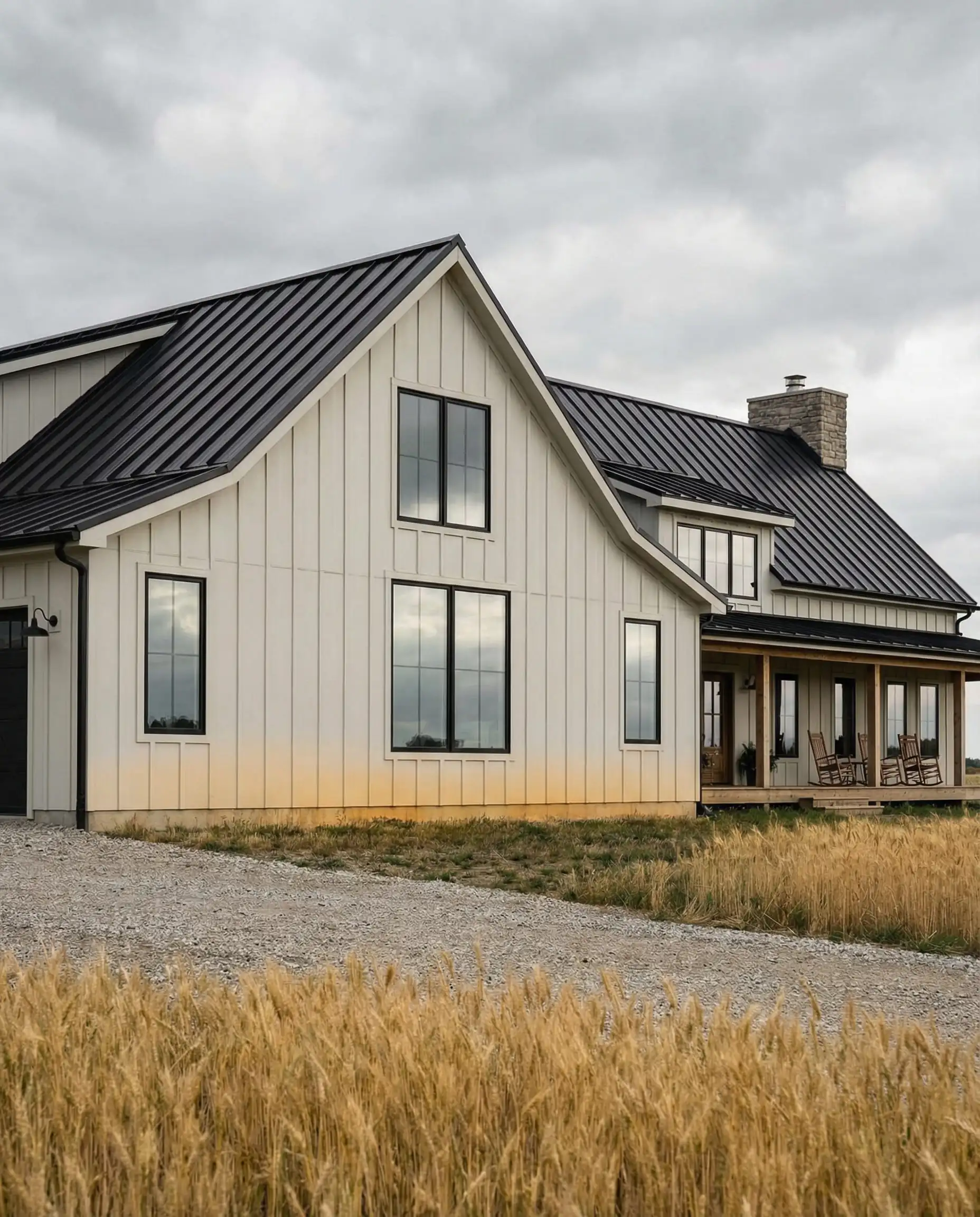
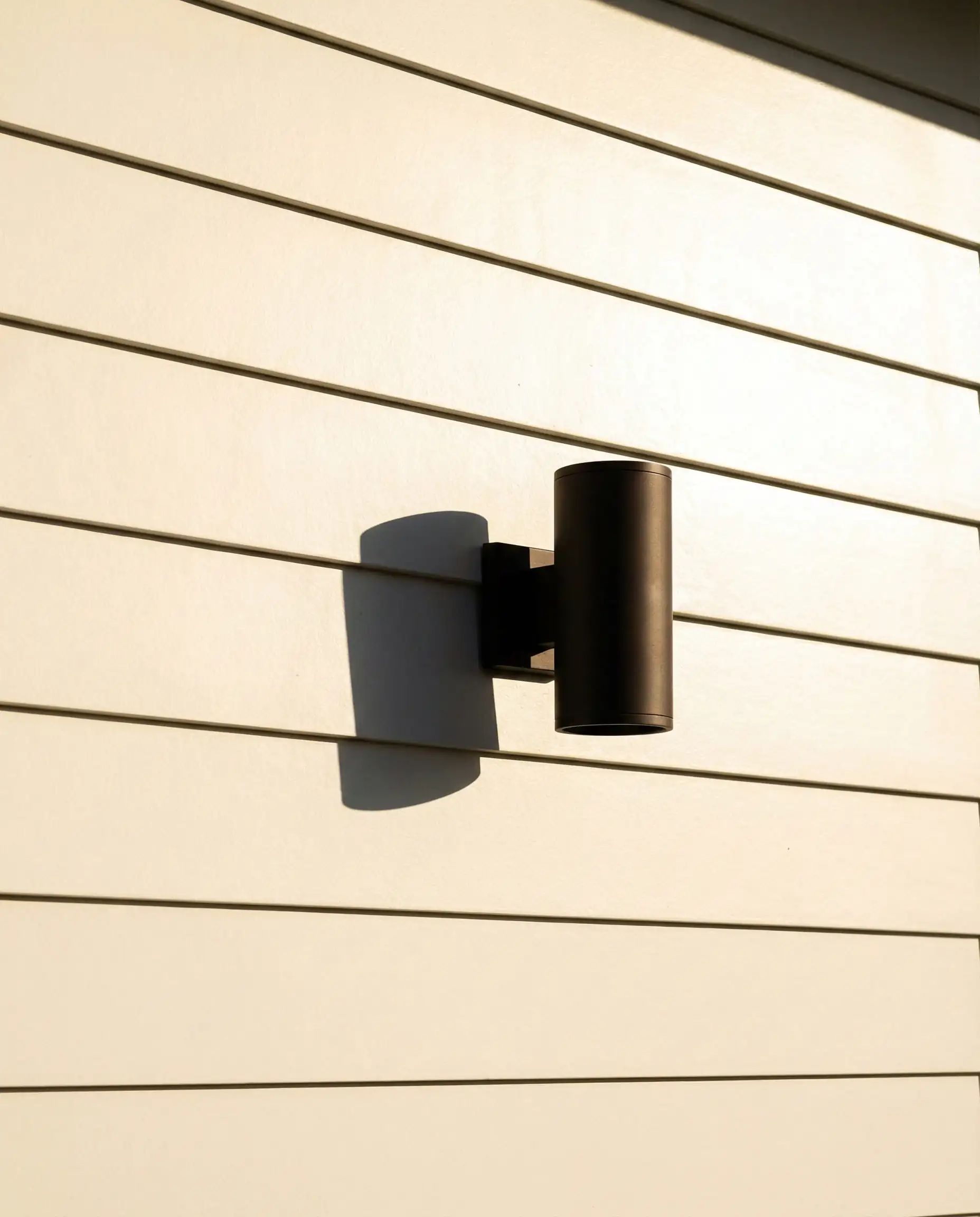
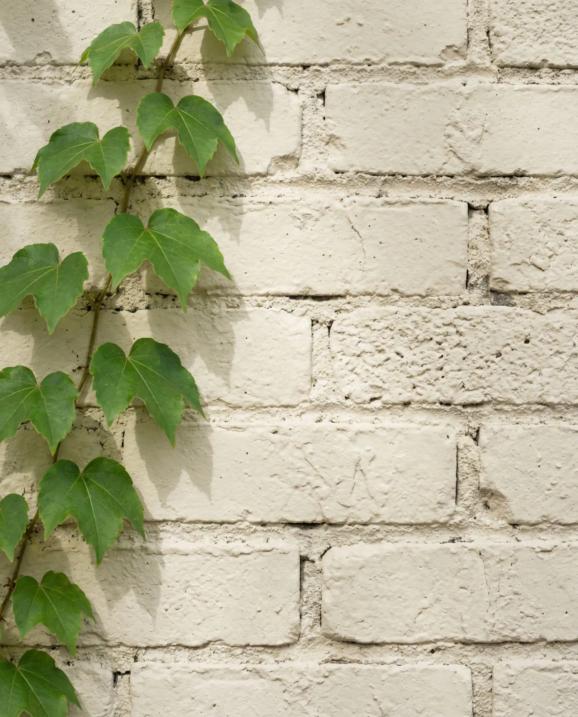
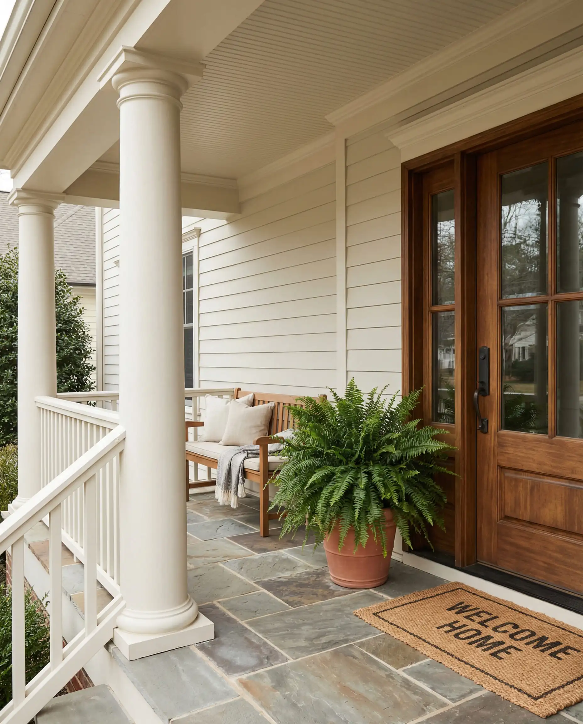
If you are paralyzed by choice, pick Alabaster. It is the ‘Goldilocks’ of white paint—not too cold, not too yellow. Just be careful in snowy climates; on a cloudy winter day, it can blend a little too much with the surroundings.
Hackrea Verdict
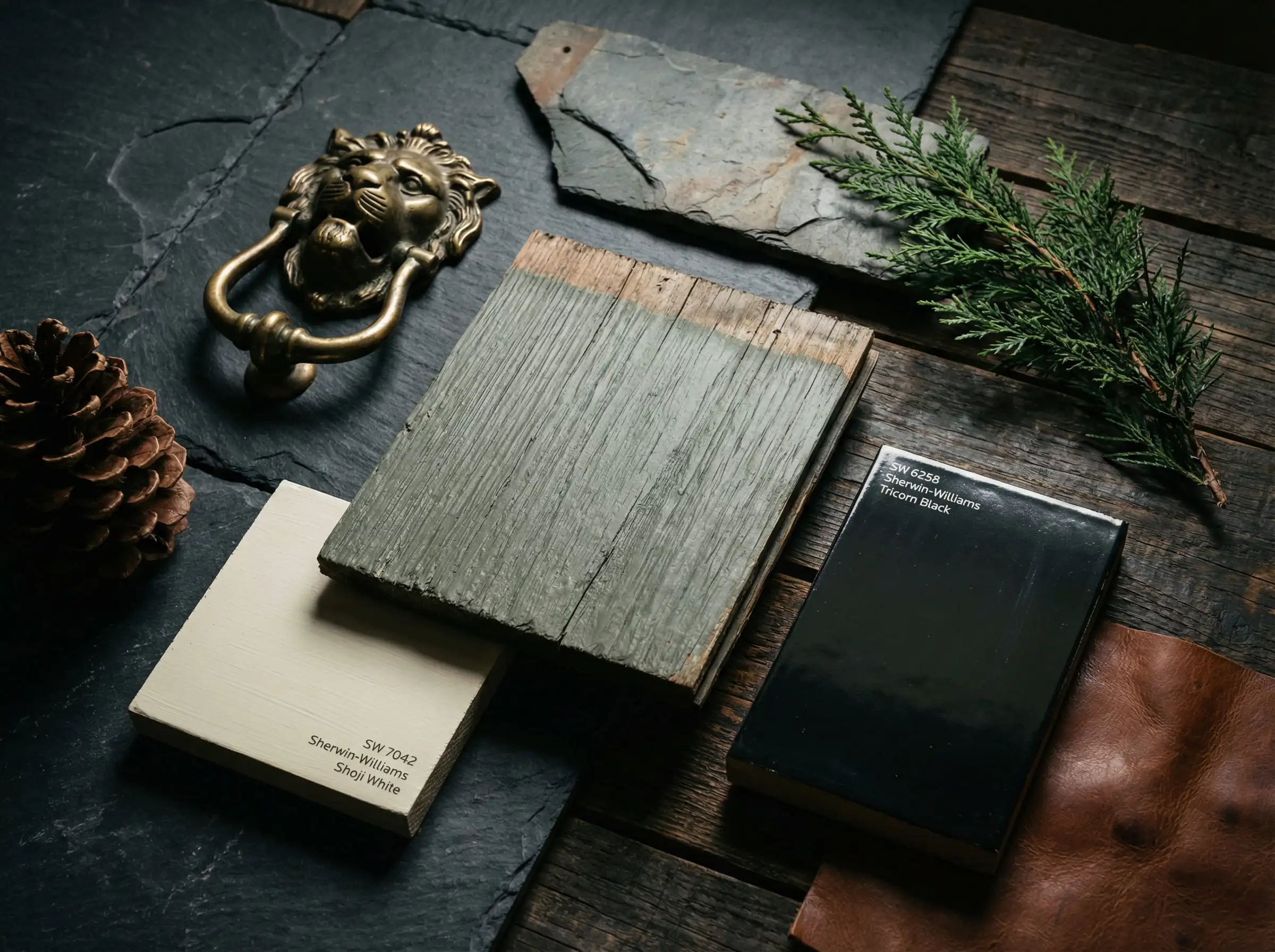
Shoji White (SW 7042)
LRV: 74 | Family: White/Greige
Shoji White is quickly becoming a favorite for 2026 because it has more “body” than Alabaster. It sits right on the border between off-white and very pale greige. In bright sunlight, it will look like a soft white, but on a cloudy day, you will see its warm, creamy depth.
This is the ultimate solution for homeowners who want the look of a white house but don’t want the glare that comes with high-LRV paints. It pairs incredibly well with dark trims like Urbane Bronze.
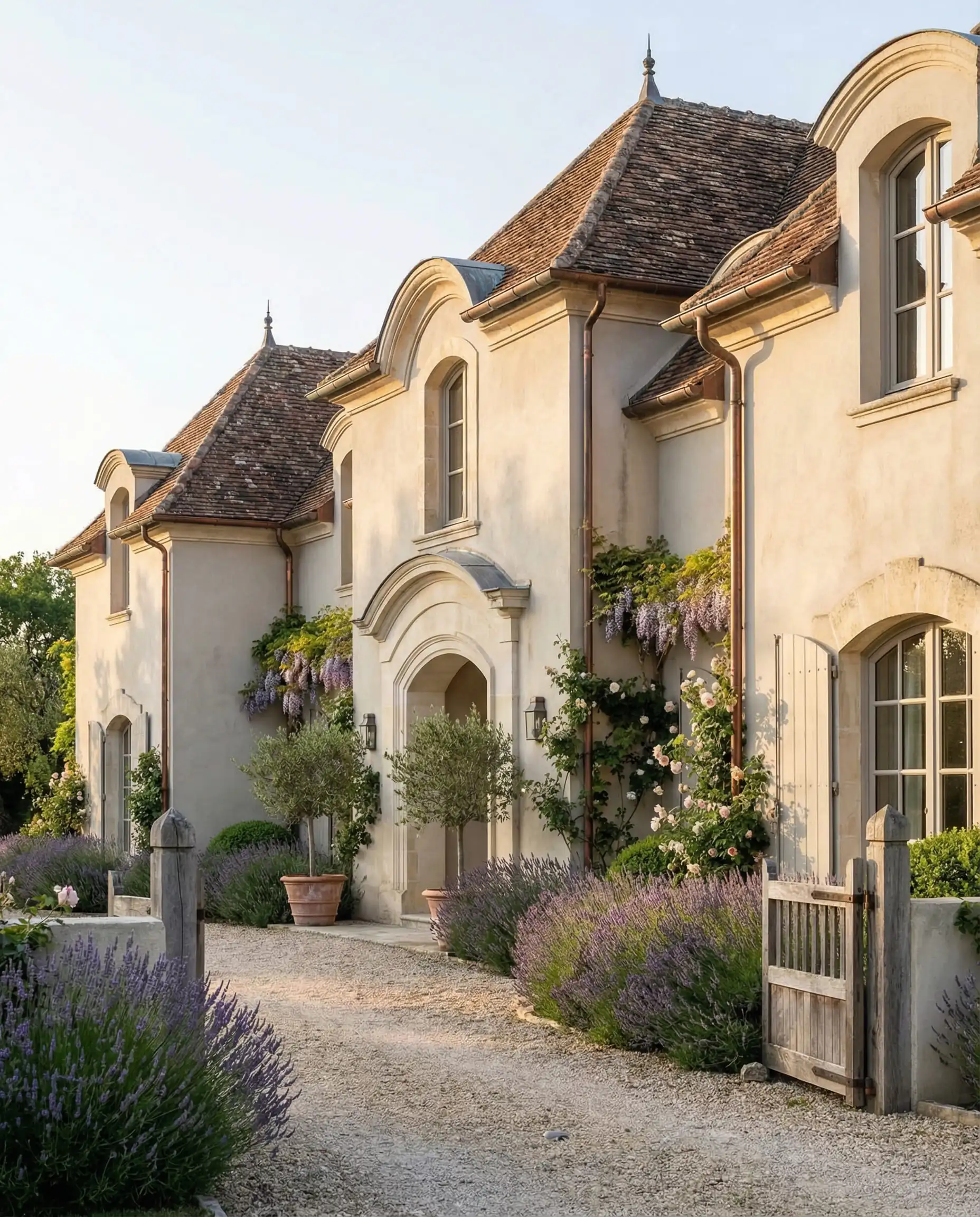
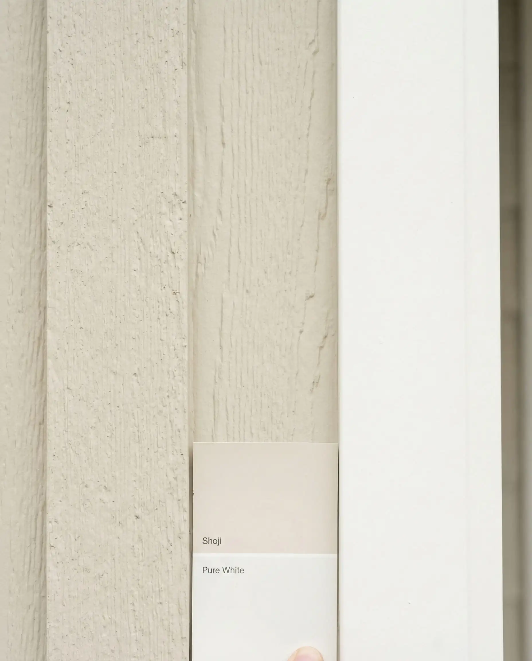
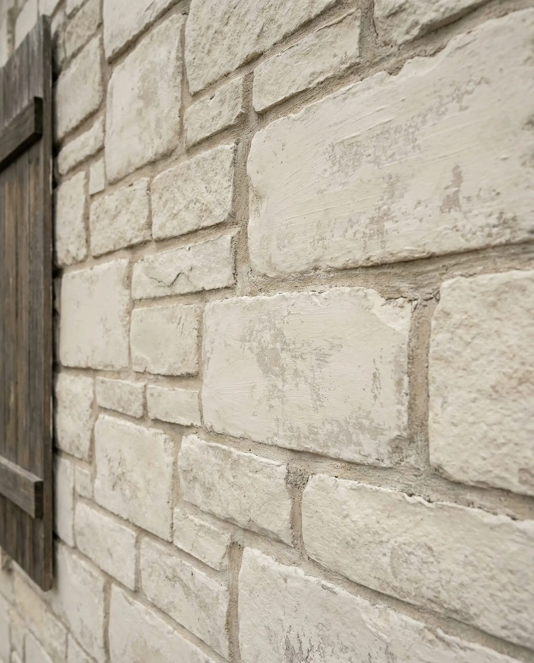
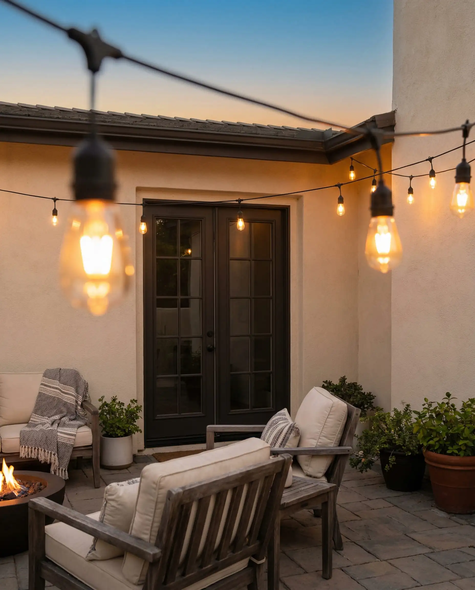
If you are afraid of your house looking too ‘yellow’ in the sun, skip the Creamy (SW 7012) and stick to Shoji White—it stays neutral even in the harsh noon sun while hiding dust better than pure whites.
Hackrea Verdict
Greek Villa (SW 7551)
LRV: 84 | Family: Warm White
Greek Villa is slightly brighter than Alabaster but holds a distinct warmth. It evokes the feeling of Mediterranean plaster. It is an excellent choice for stucco homes or exteriors where you want a sunny, optimistic feel. It pairs beautifully with light blue shutters or natural wood doors.
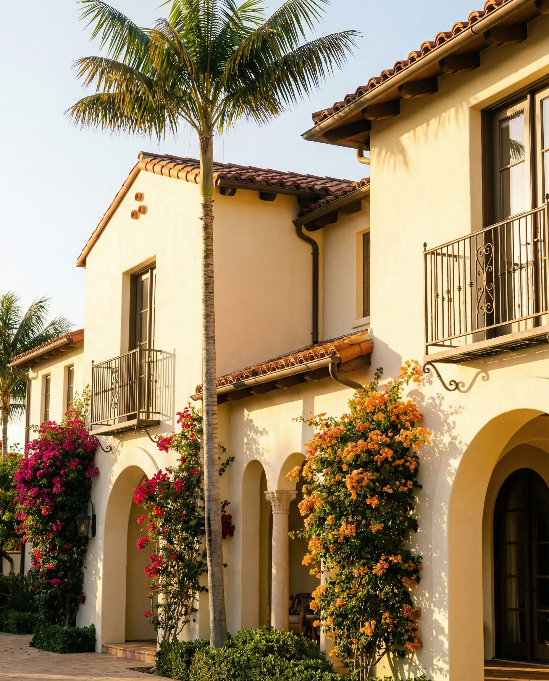
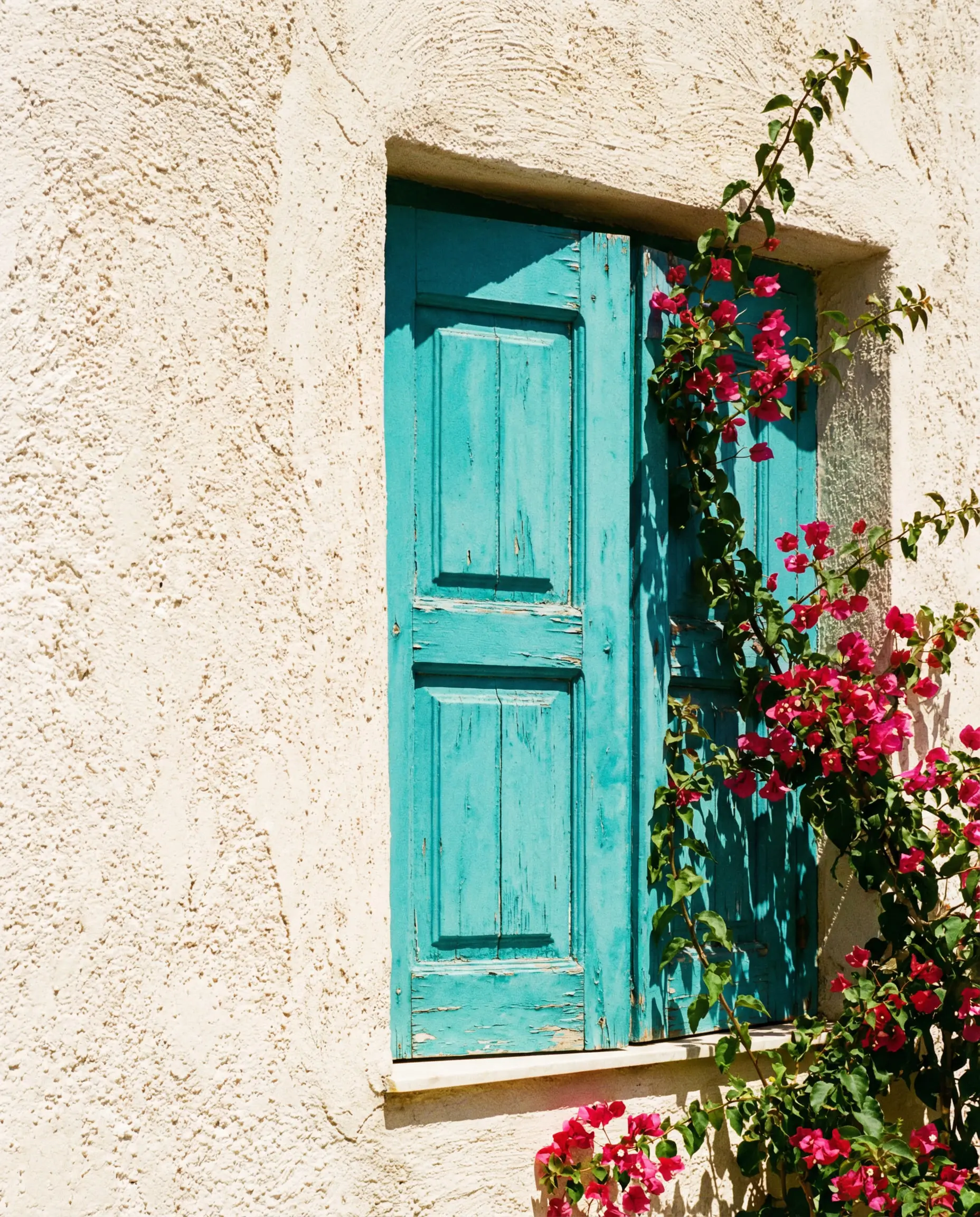
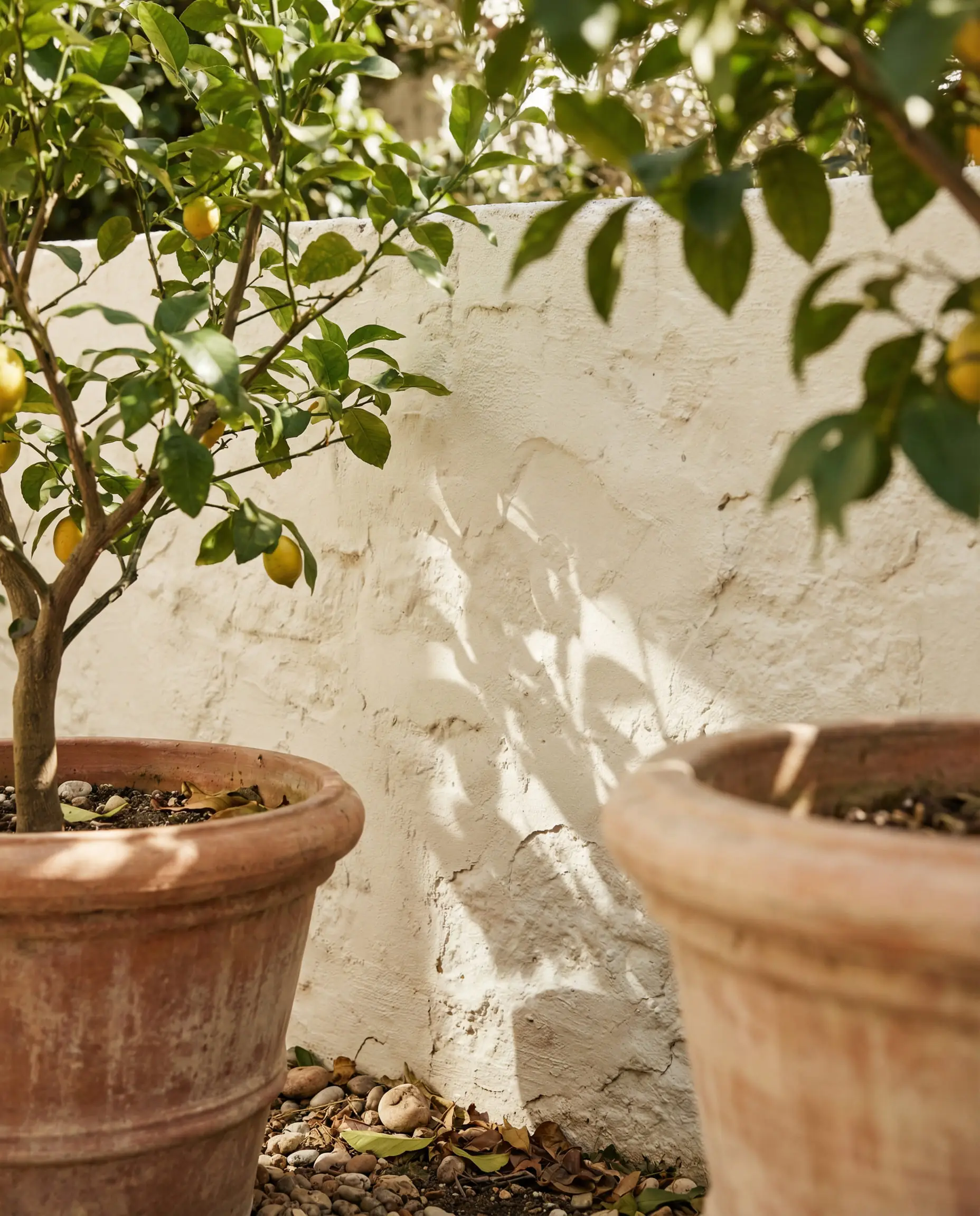
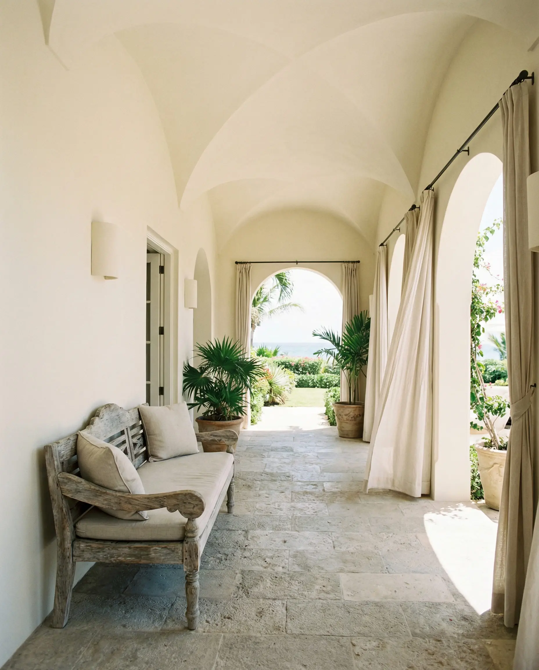
A sunny delight. It’s perfect for south-facing homes where you want to reflect heat but keep the vibe soft. Avoid it if you want a crisp, modern ‘art gallery’ white—this is definitely a cozy white.
Hackrea Verdict
Snowbound (SW 7004)
LRV: 83 | Family: Cool White
For those who dislike yellow undertones, Snowbound is the answer. It has a slight gray/pink undertone, which makes it read as a crisp, cool white. It is excellent for modern coastal homes or contemporary builds where you want a clean, sharp aesthetic.
However, because of that cool undertone, it can sometimes clash with very creamy trims or warm stone. It works best with black or charcoal accents.
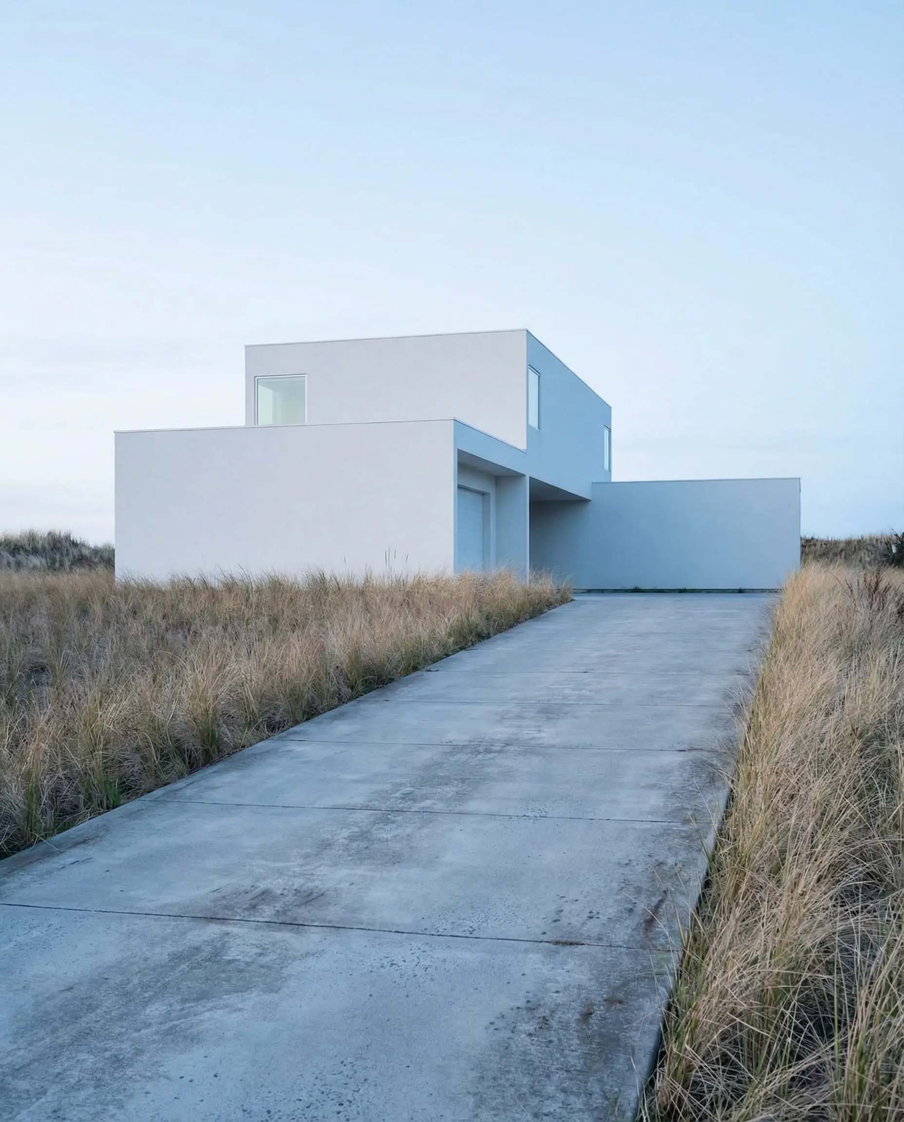
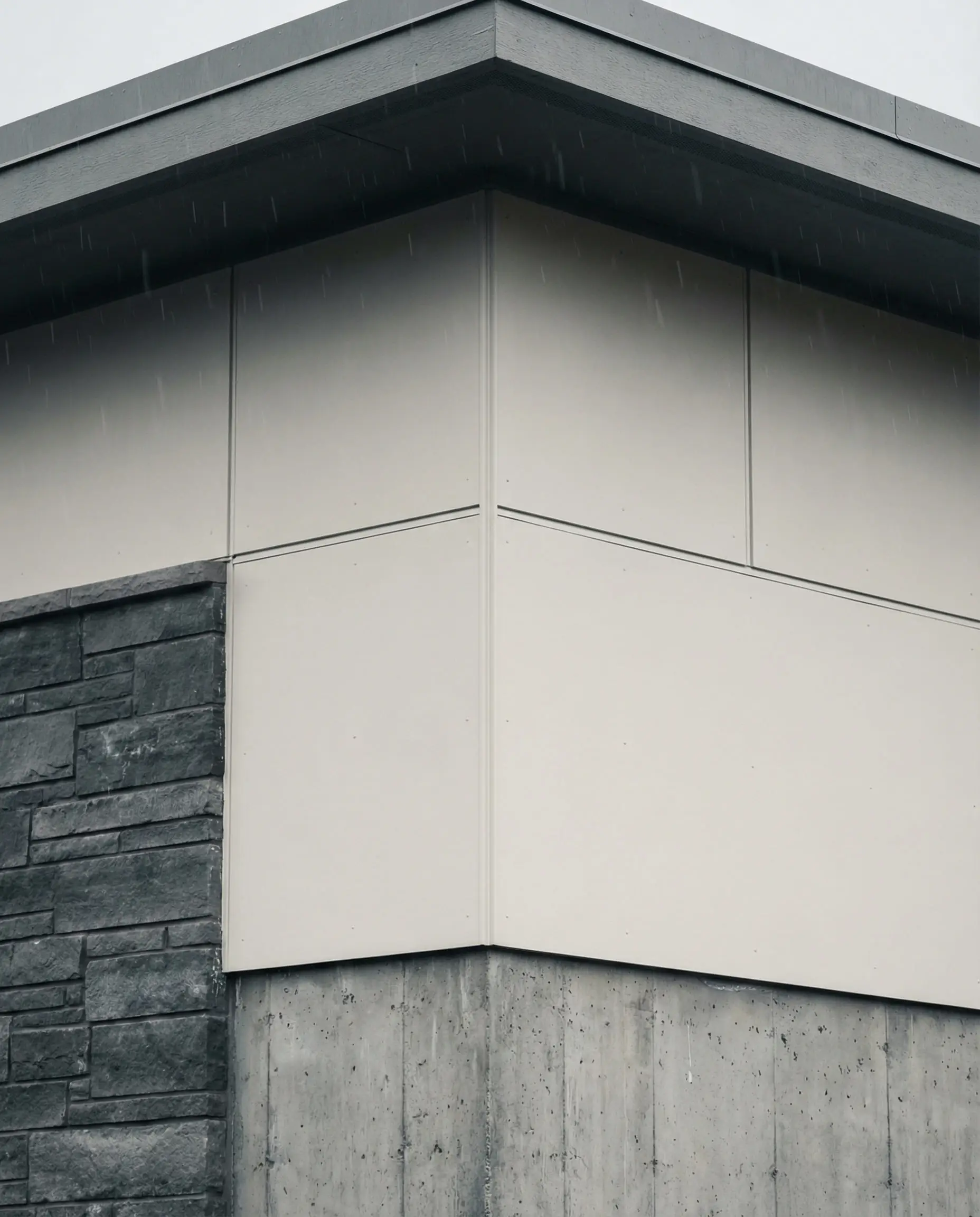
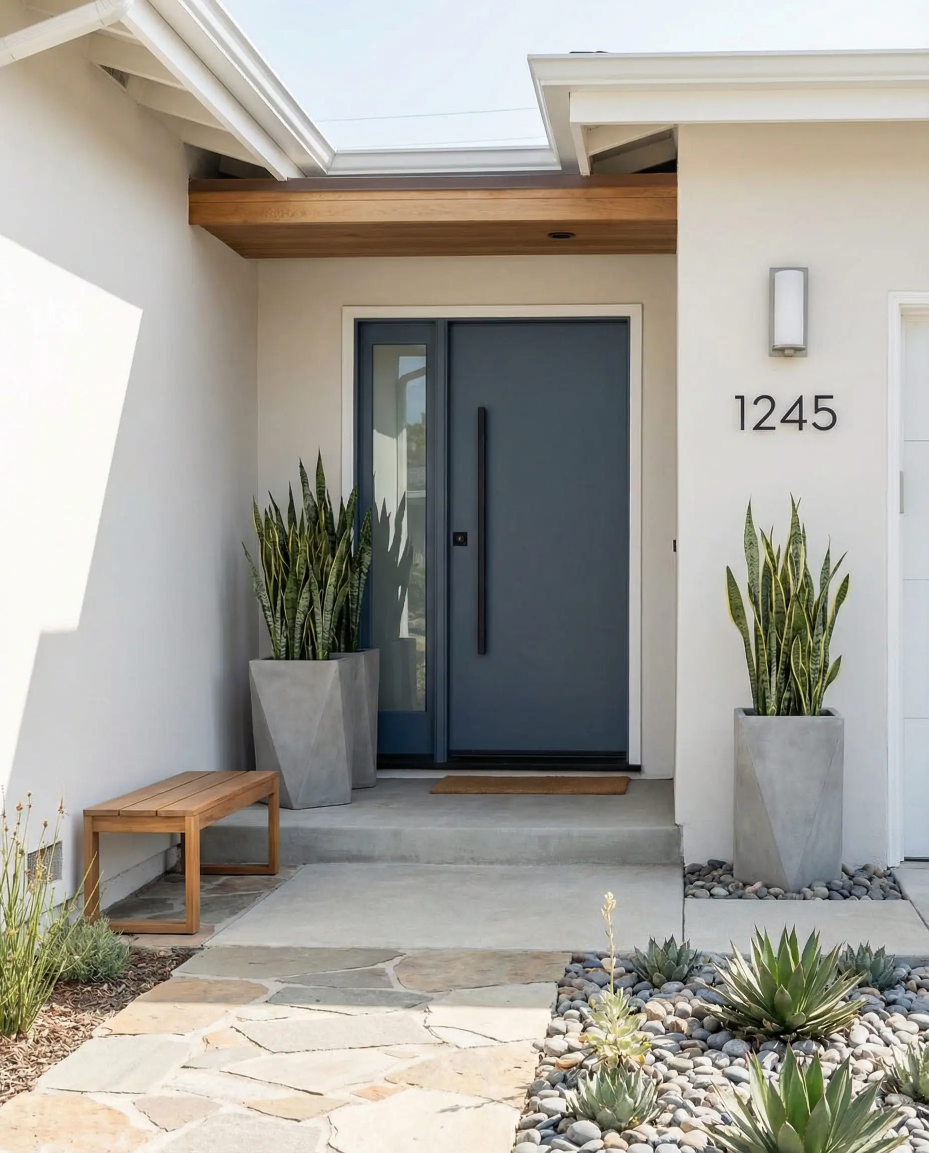
Use Snowbound if you are pairing it with cool gray stone or a black roof. If you have brown earthy stone, this color might look a bit too stark and disconnected.
Hackrea Verdict
Pure White (SW 7005)
LRV: 84 | Family: White
As the name implies, this is a neutral, clean white. It has very little undertone, making it the safest choice for trim, soffits, and fascia boards. While some use it for the main body, it can be very bright. We usually recommend it as the supporting actor to a body color like Natural Linen or Repose Gray.
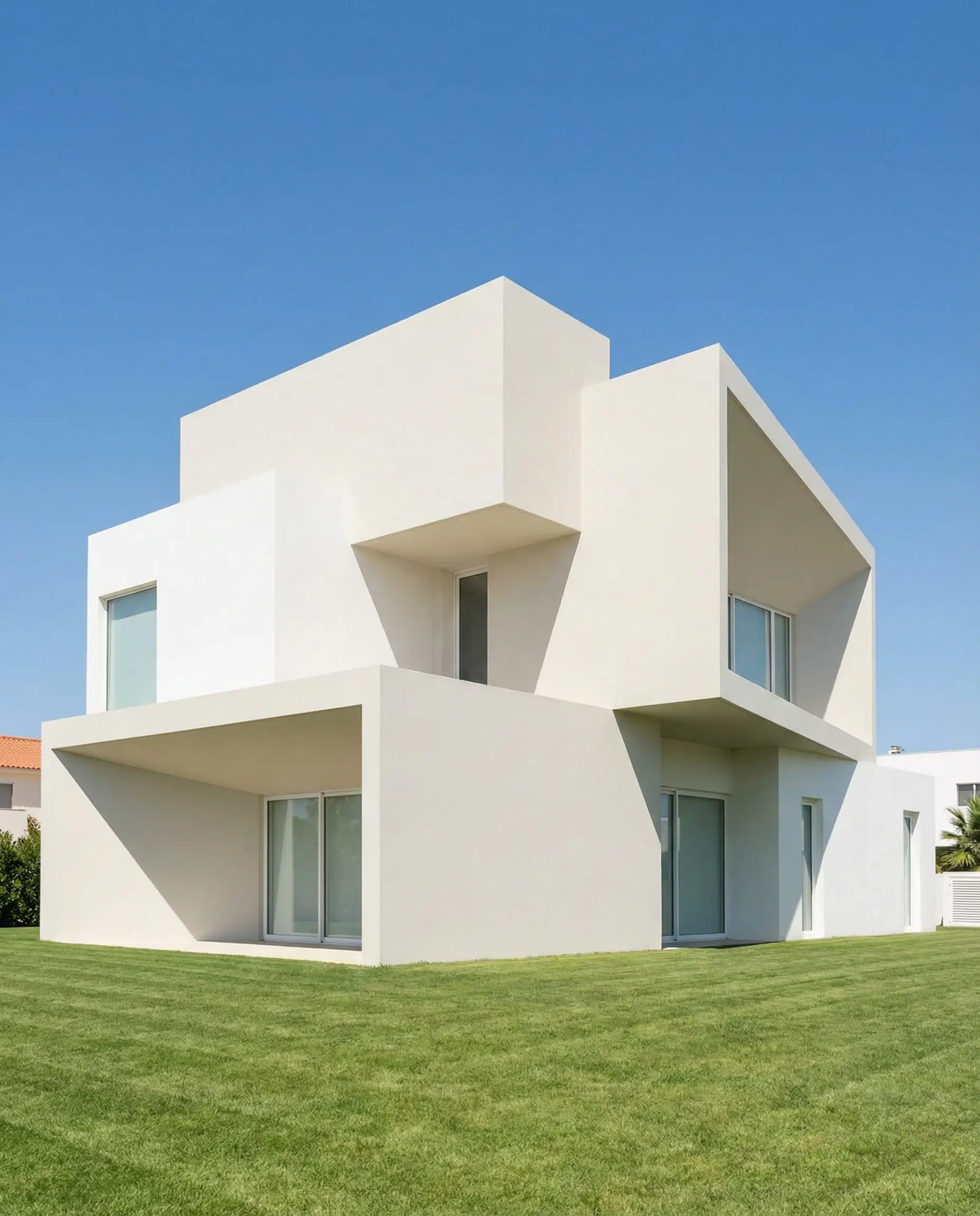
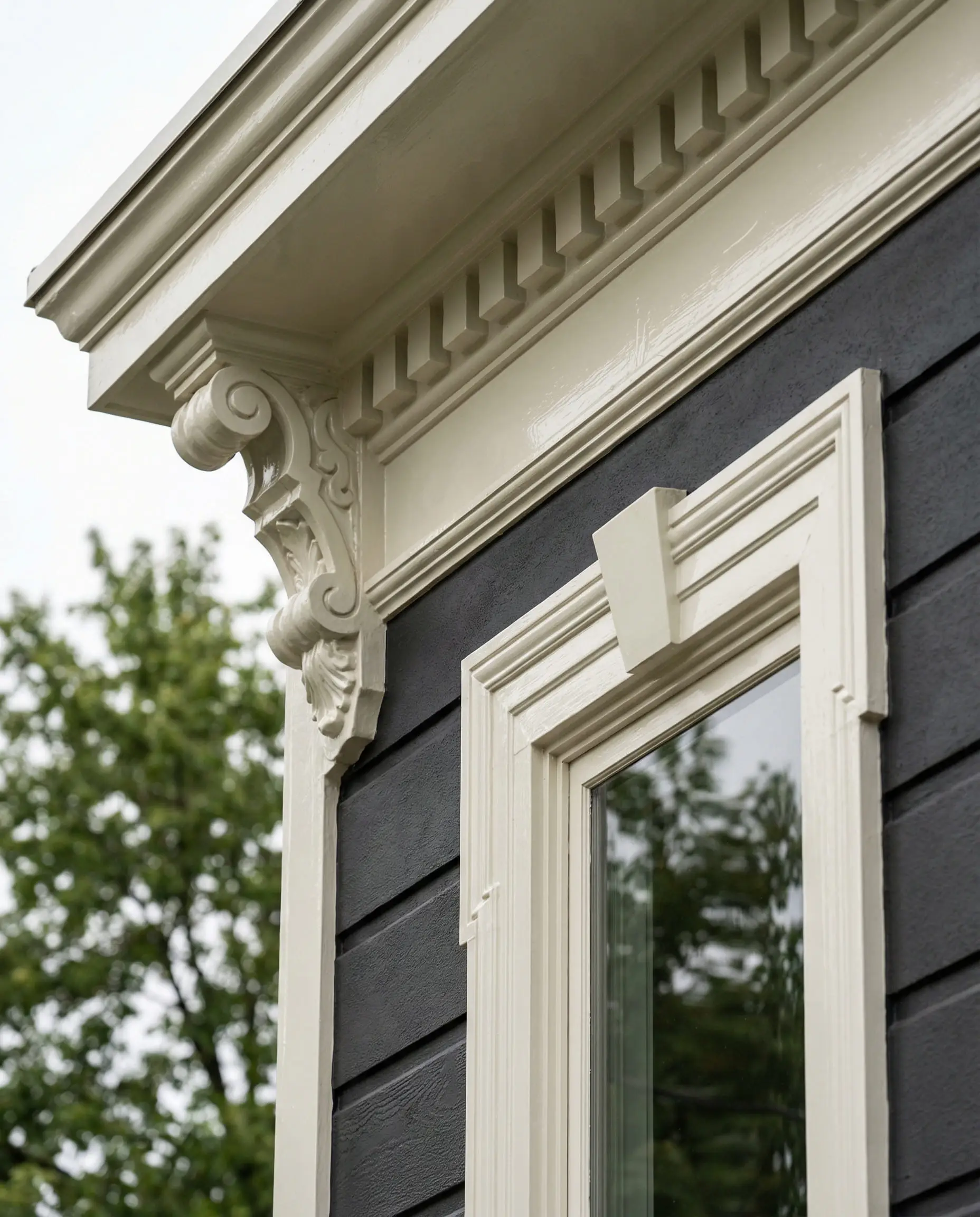
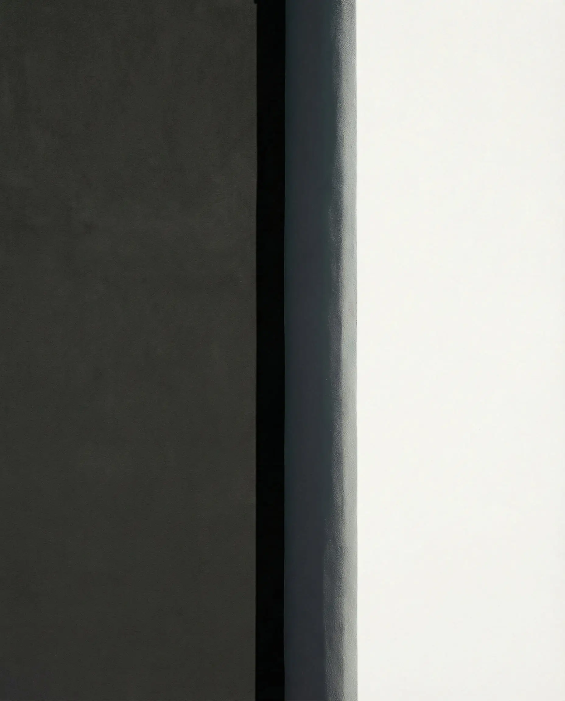
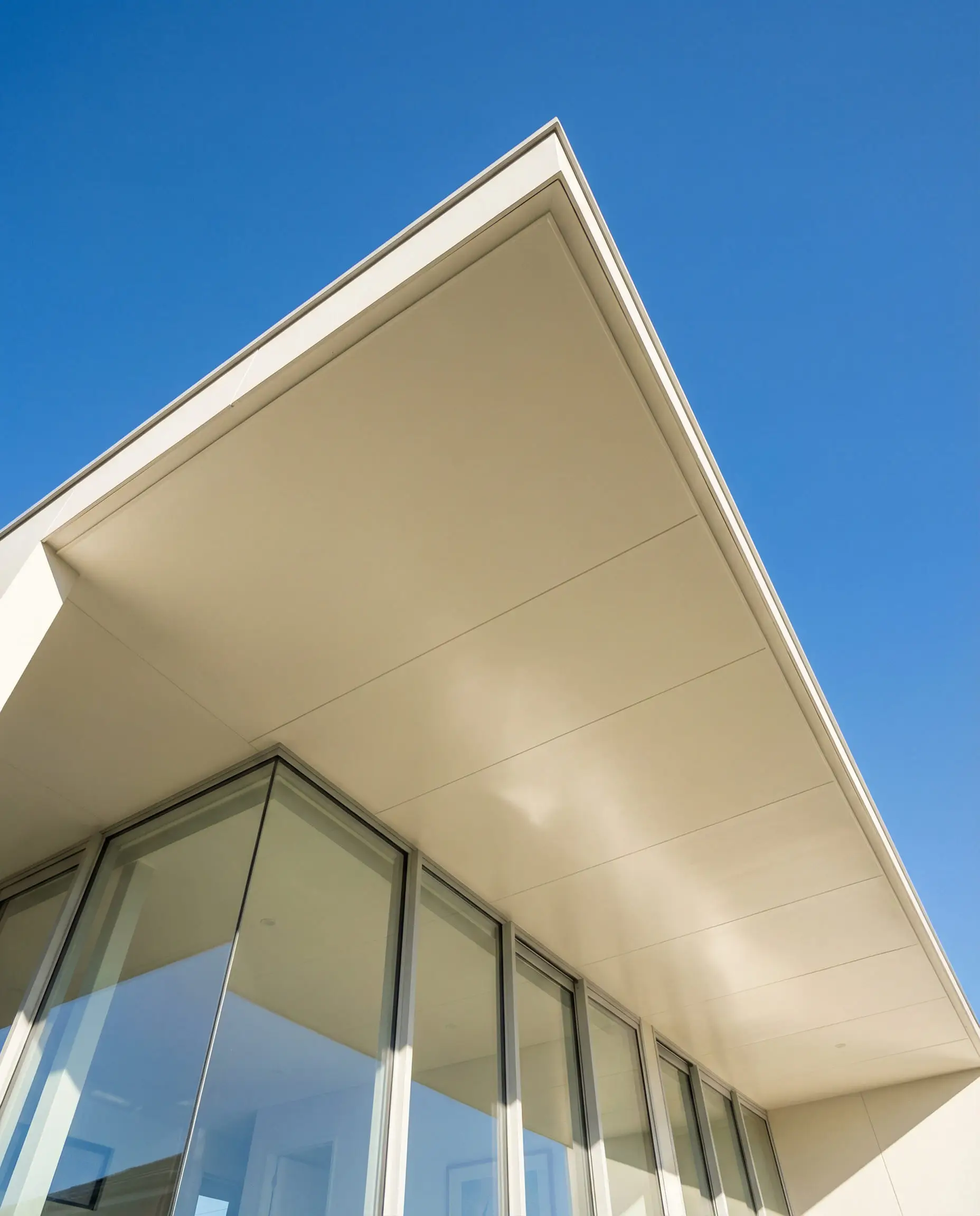
The perfect trim color. If you are painting your siding a color and don’t know which white to use for the trim, pick Pure White. It goes with literally everything.
Hackrea Verdict
Dover White (SW 6385)
LRV: 83 | Family: Warm White
Dover White is a sunnier, more traditional option. It has a distinct yellow-creamy base. It is the color of old-world charm, making it perfect for Colonial, Victorian, or Craftsman homes where you want that “lived-in” historic feel.
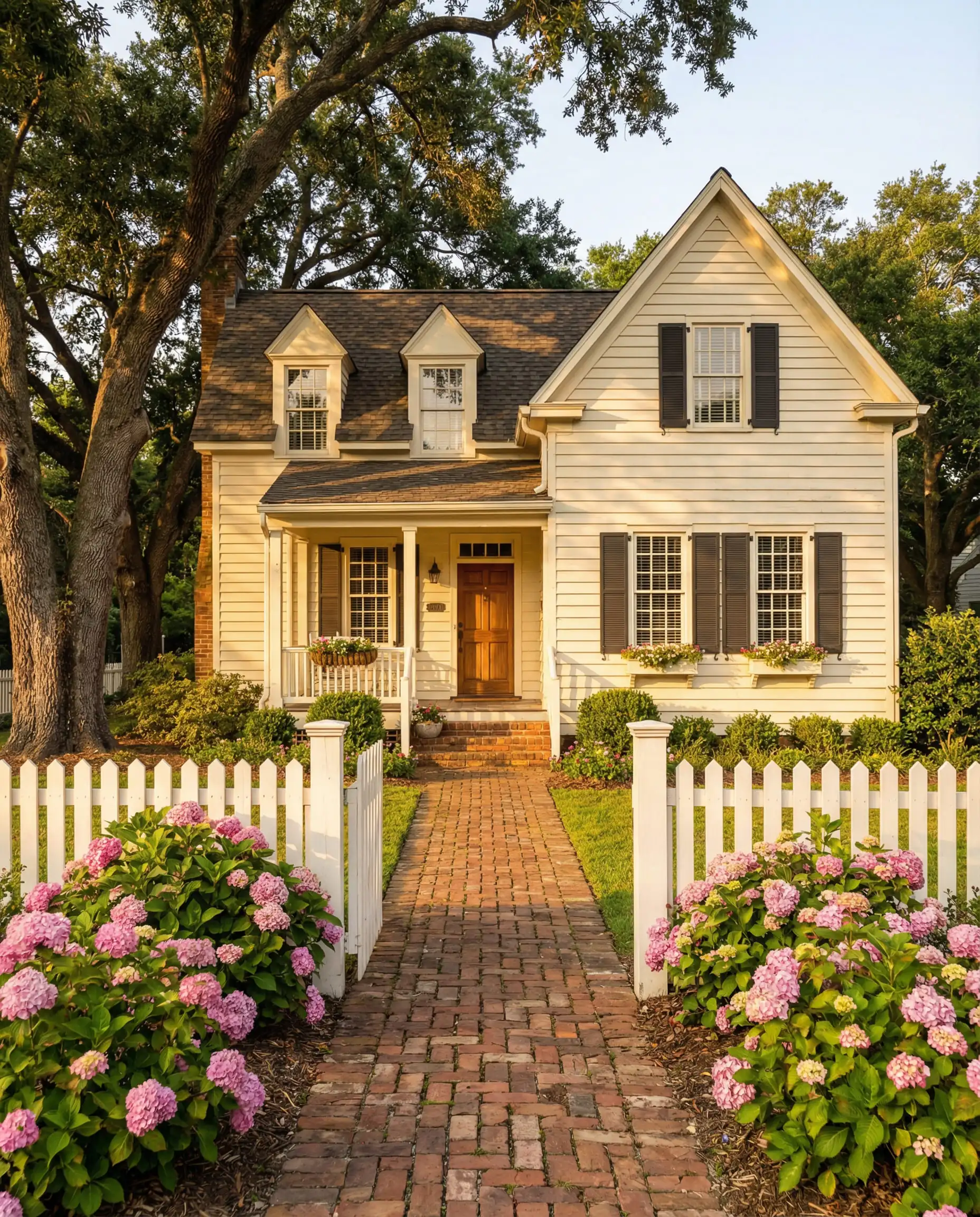
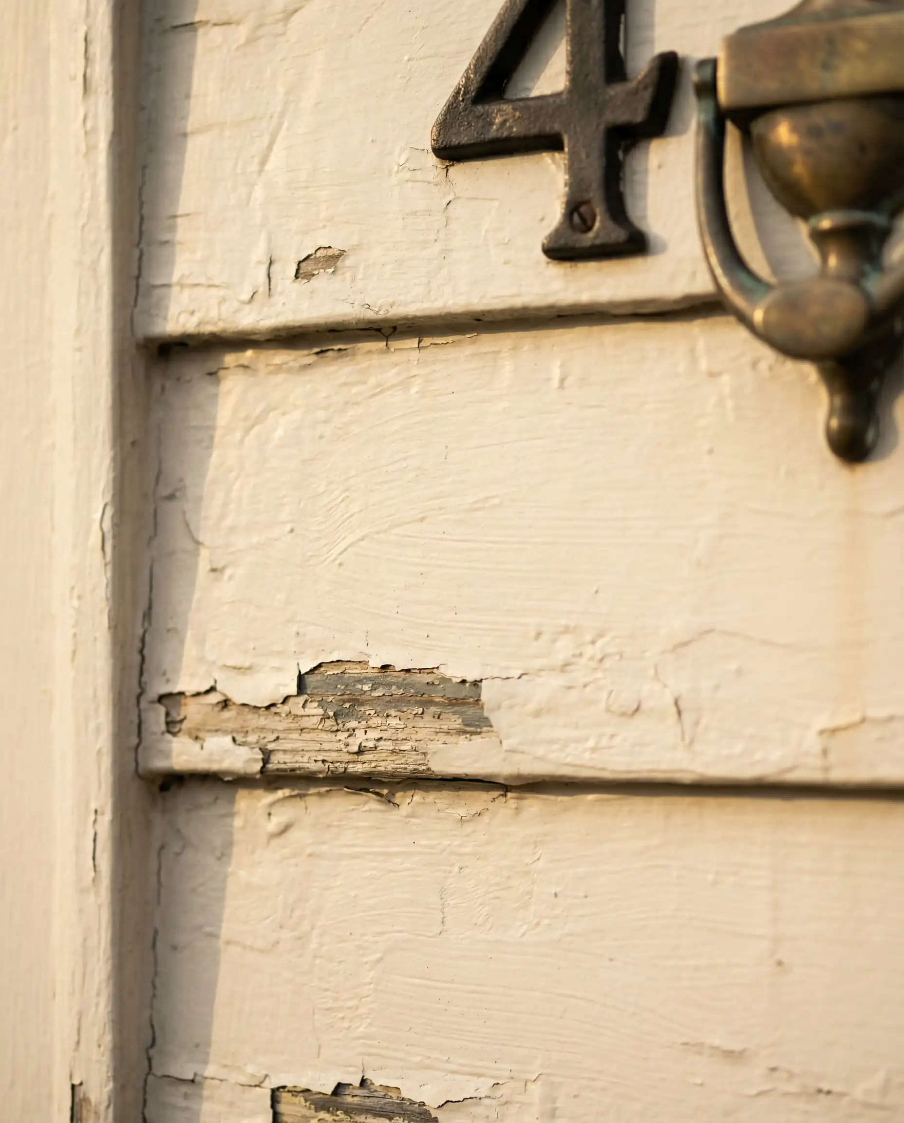
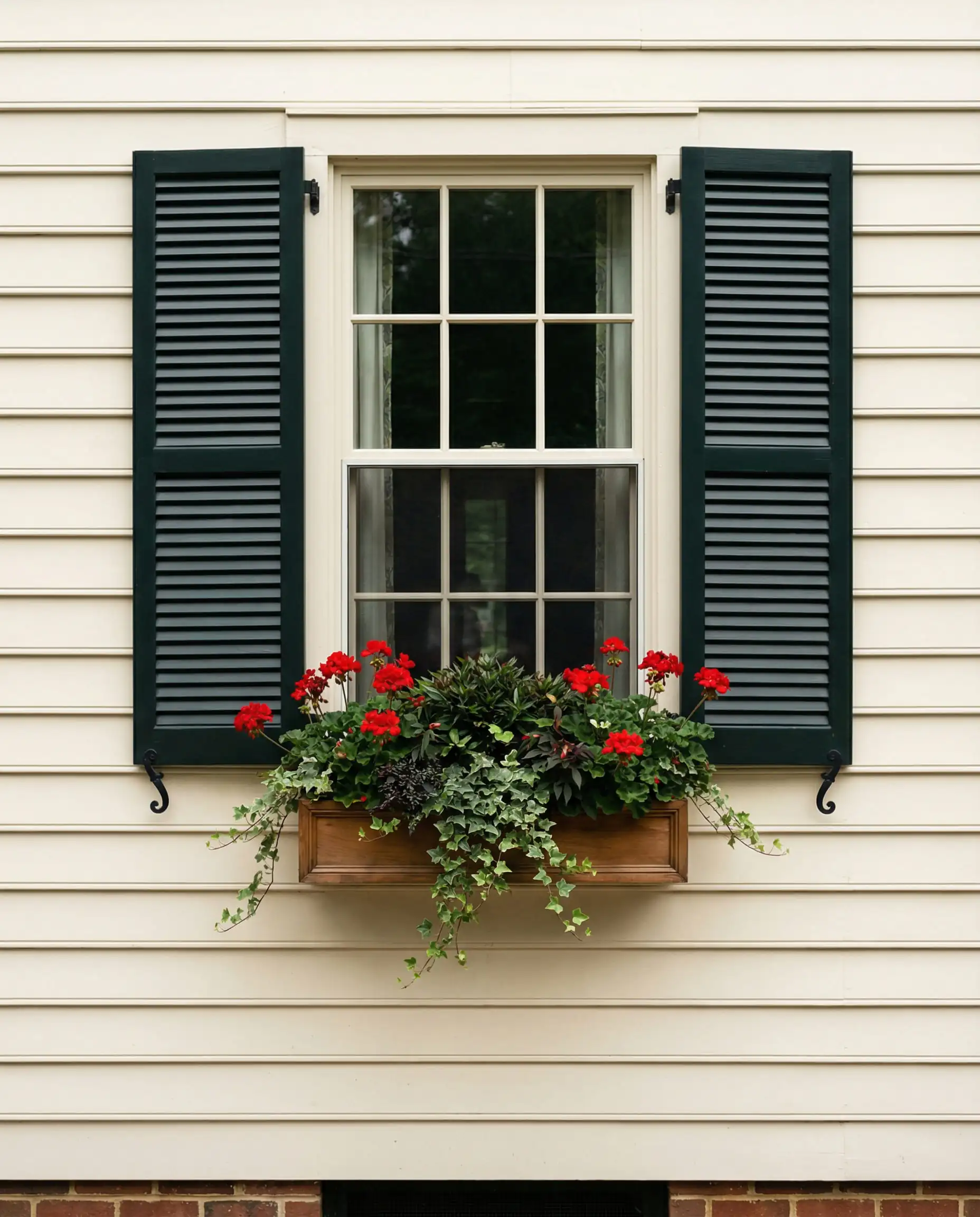
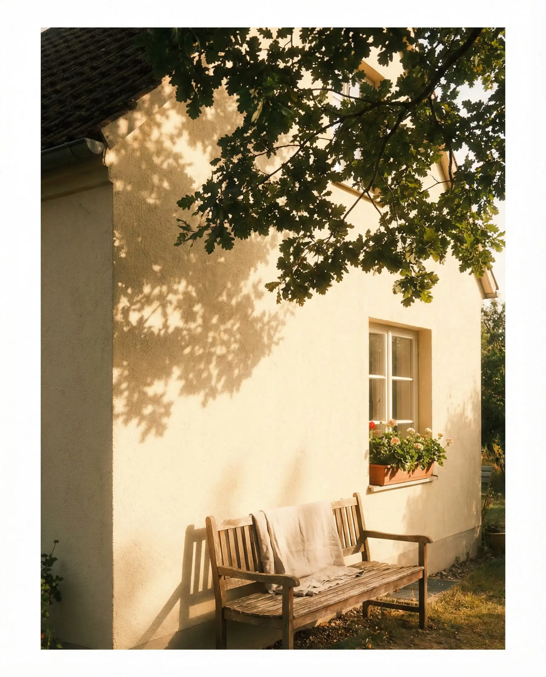
Proceed with caution on modern homes—it can look dated. But on a historic renovation with green shutters? It’s absolute magic.
Hackrea Verdict
Dark & Moody Neutrals (For High Contrast)
The “Modern Cottage” and “Urban Industrial” styles are fueling a massive surge in dark exteriors. A dark house recedes into the landscape, looking smaller but much more expensive and custom. It is a bold move that requires confidence, but the payoff is immense.
Urbane Bronze (SW 7048)
LRV: 8 | Family: Brown/Gray
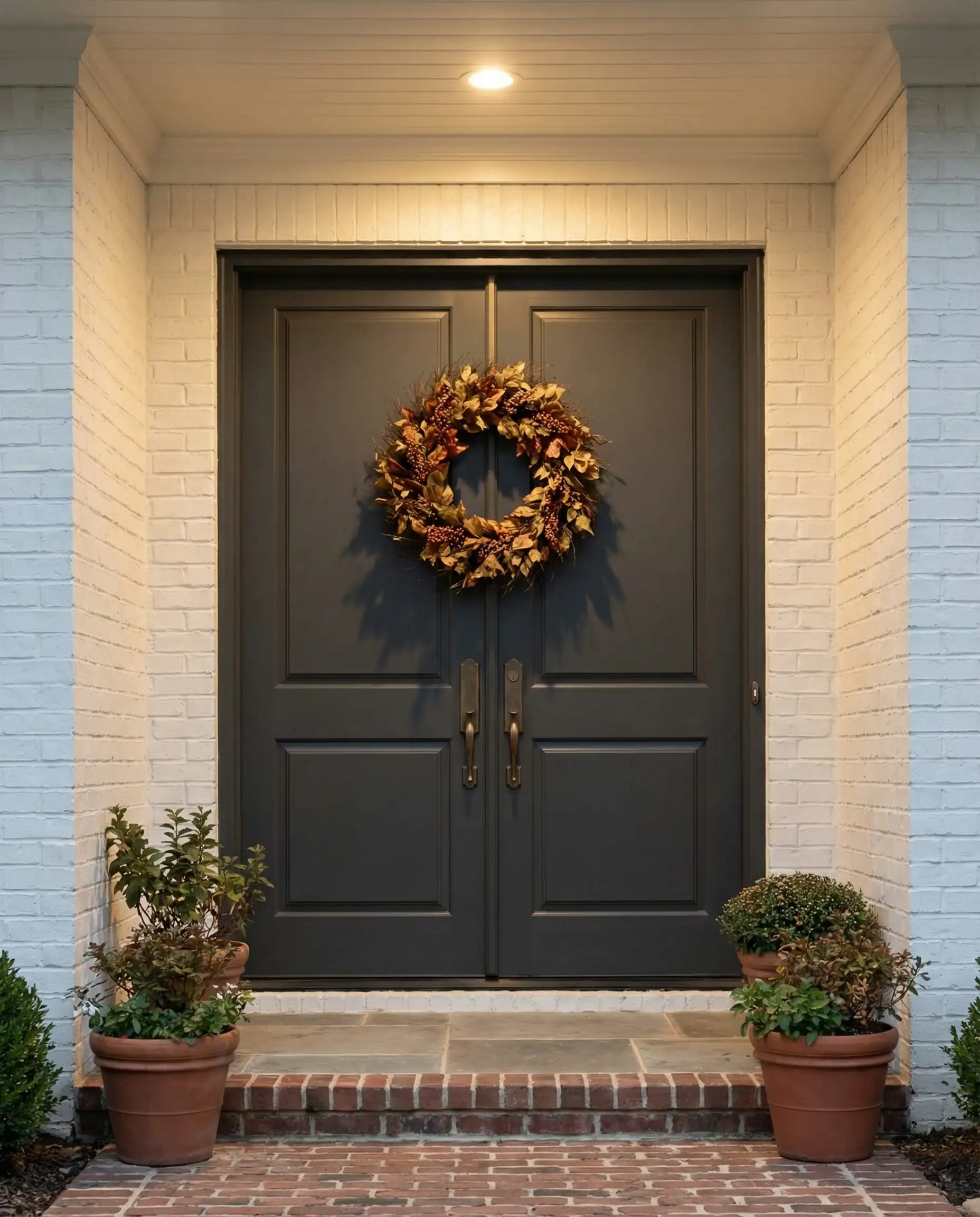
A former Color of the Year that has cemented its status as a classic. Urbane Bronze is not gray, and it is not brown—it is a rich, metallic-feeling fusion of both. In the sun, the warm bronze tones come alive, making it feel grounded and earthy.
It is arguably the most sophisticated color Sherwin-Williams produces for exteriors. It works beautifully as a main body color for a moody cabin look, or as a trim color to ground a lighter house.
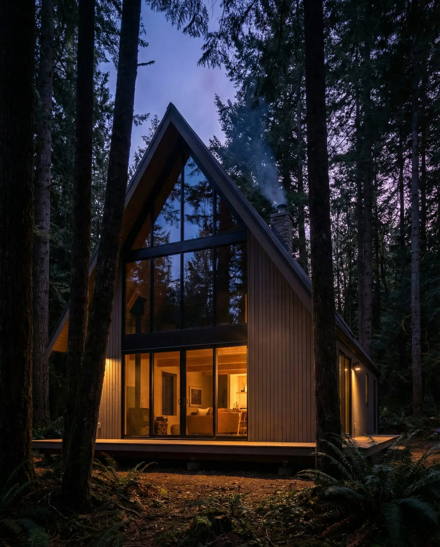
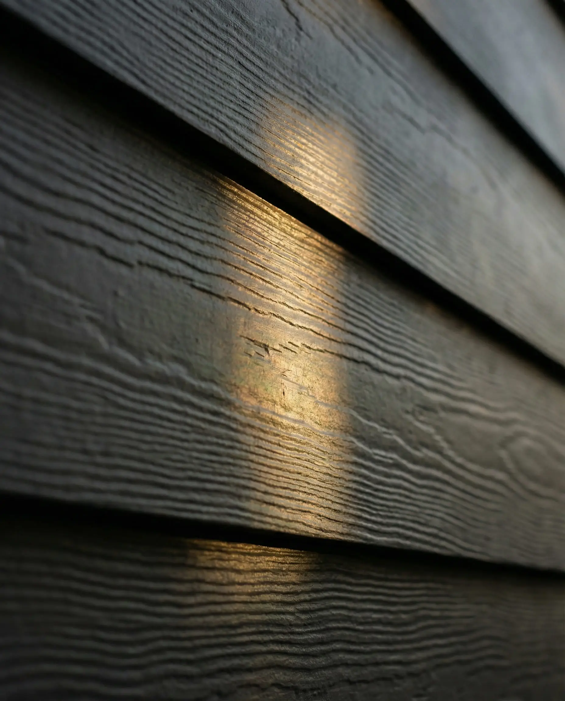
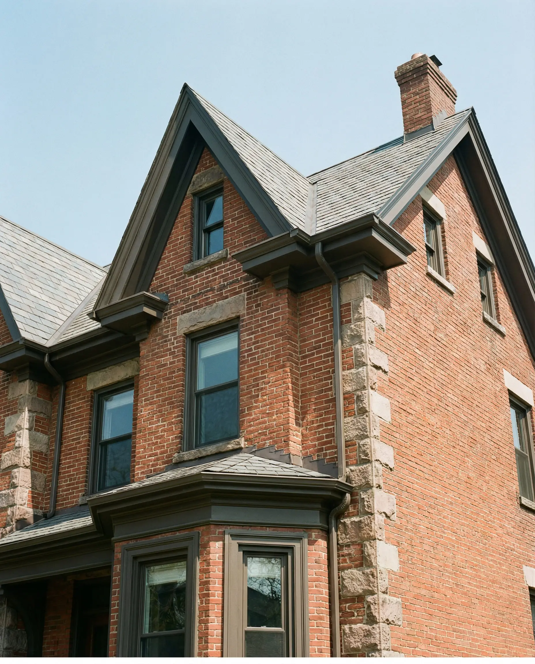
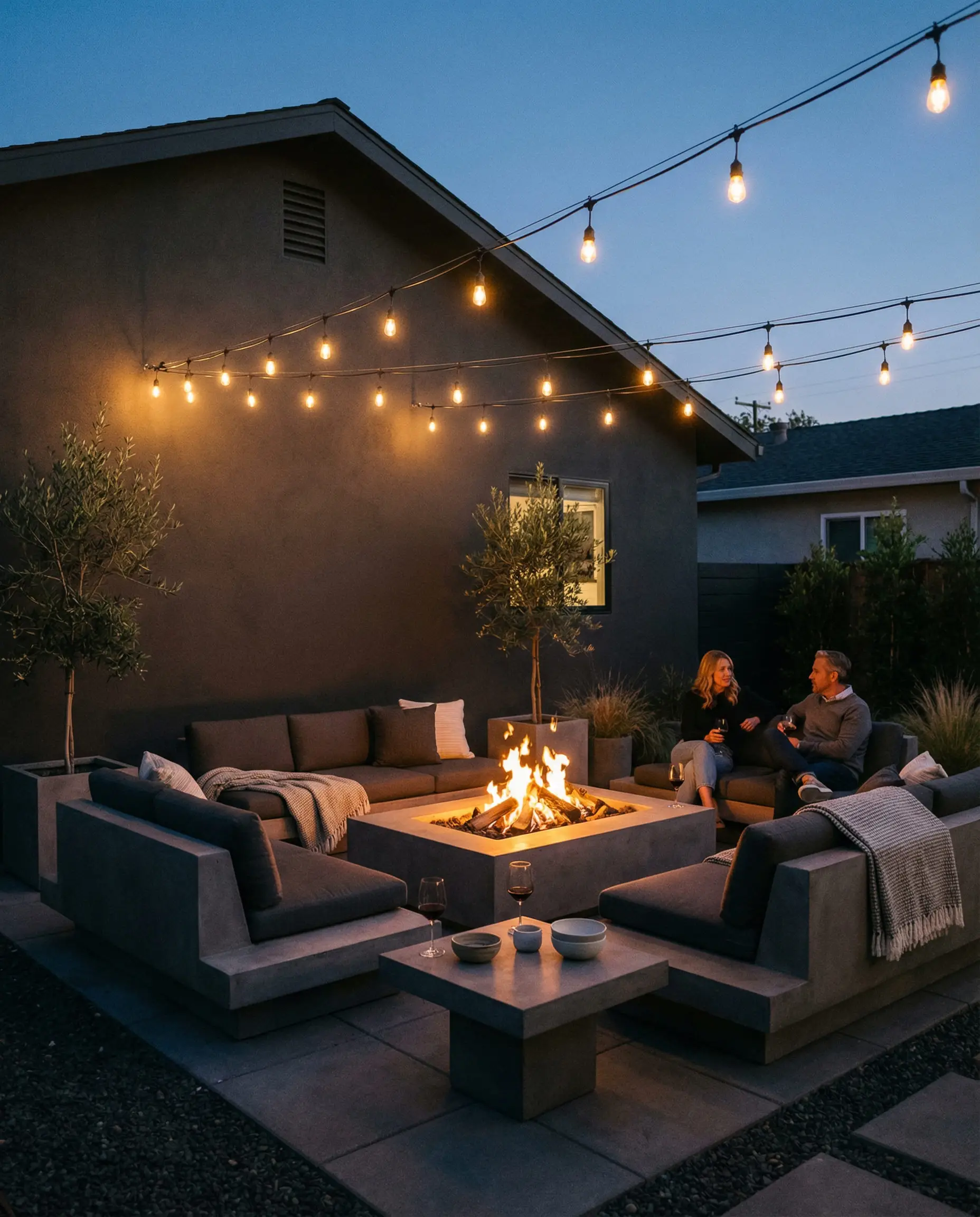
The ultimate trim color for brick homes. If you have orange or red brick, black trim can look too harsh. Urbane Bronze softens that contrast while still looking dark and modern.
Hackrea Verdict
Iron Ore (SW 7069)
LRV: 6 | Family: Soft Black/Charcoal
If Tricorn Black feels too intense for you, Iron Ore is the solution. It is a very dark charcoal that reads as black on the exterior but lacks the sharp bite of a true black. It has a soft, velvety appearance.
This is the number one choice for “Barndominiums” and modern farmhouses that want to invert the color scheme (black house, wood accents). It is soft enough to not look like a “haunted house” while still delivering high drama.
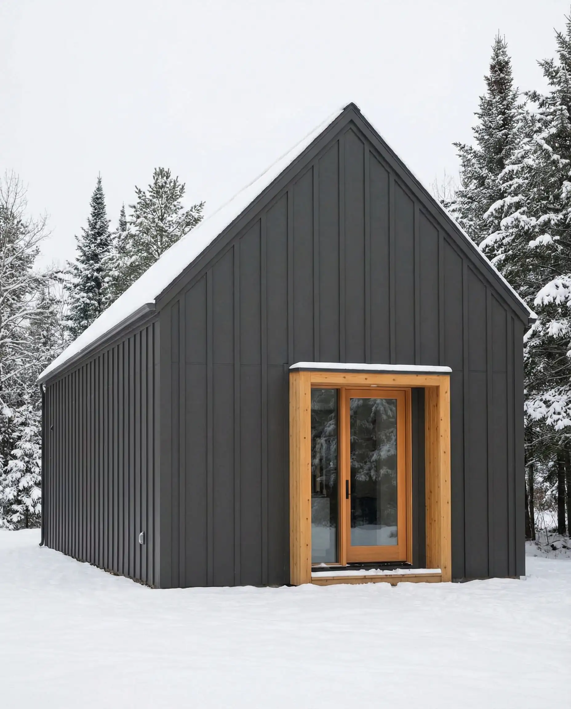
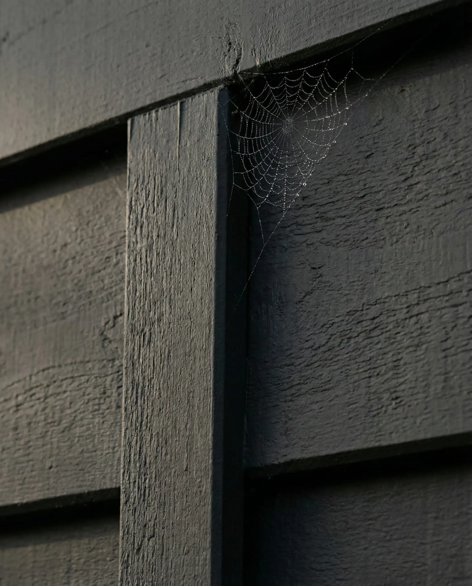
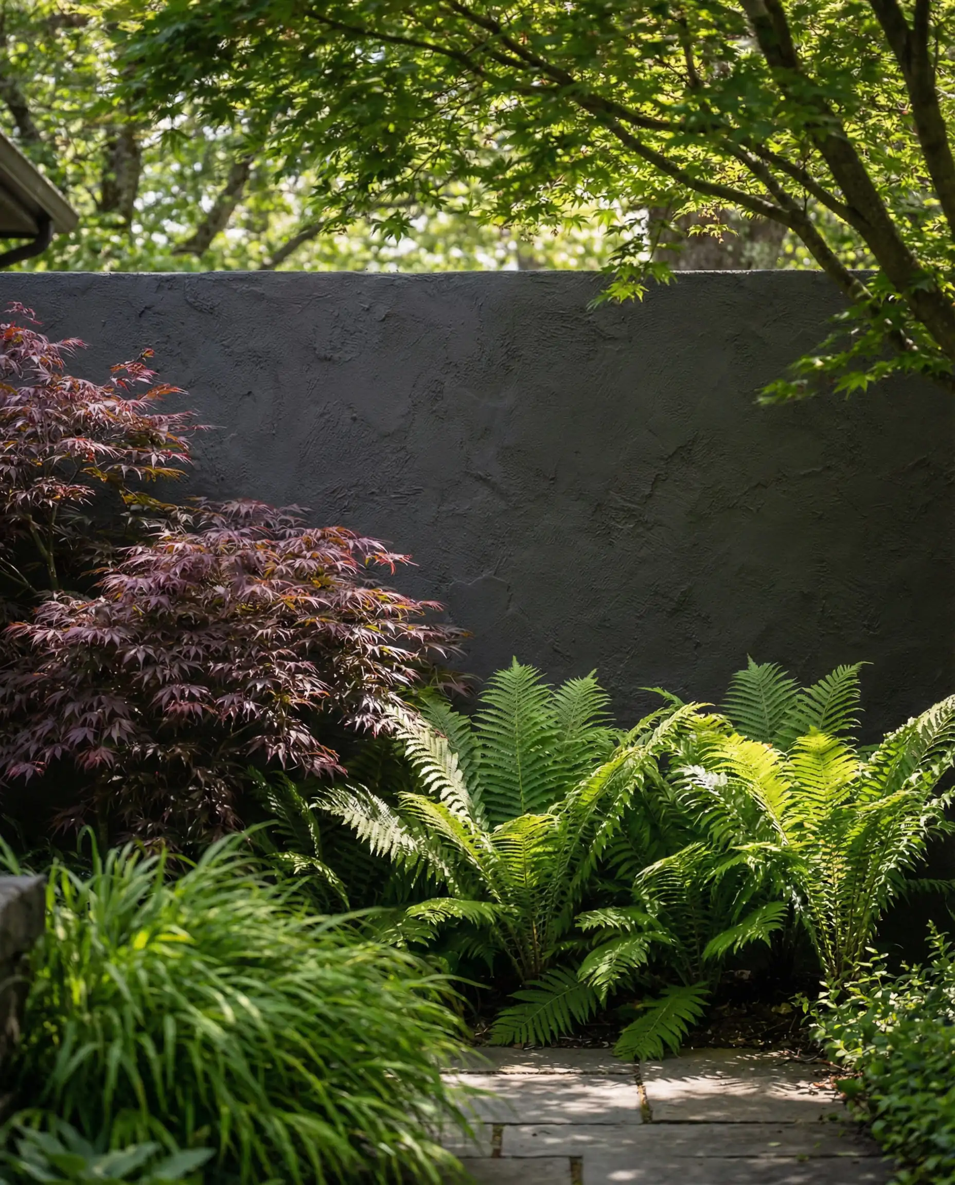
Iron Ore is forgiving. Because it’s a charcoal, it hides dust and pollen slightly better than a true black. It gives you the drama without the severity.
Hackrea Verdict
Tricorn Black (SW 6258)
LRV: 3 | Family: True Black
There are no undertones here. Tricorn Black is the truest black in the SW deck. It creates a stunning silhouette. In 2026, we are seeing this used heavily on front doors, shutters, and window mullions.
It creates a graphic, high-definition look. When used on window trim, it makes the glass disappear, giving the illusion of larger windows.
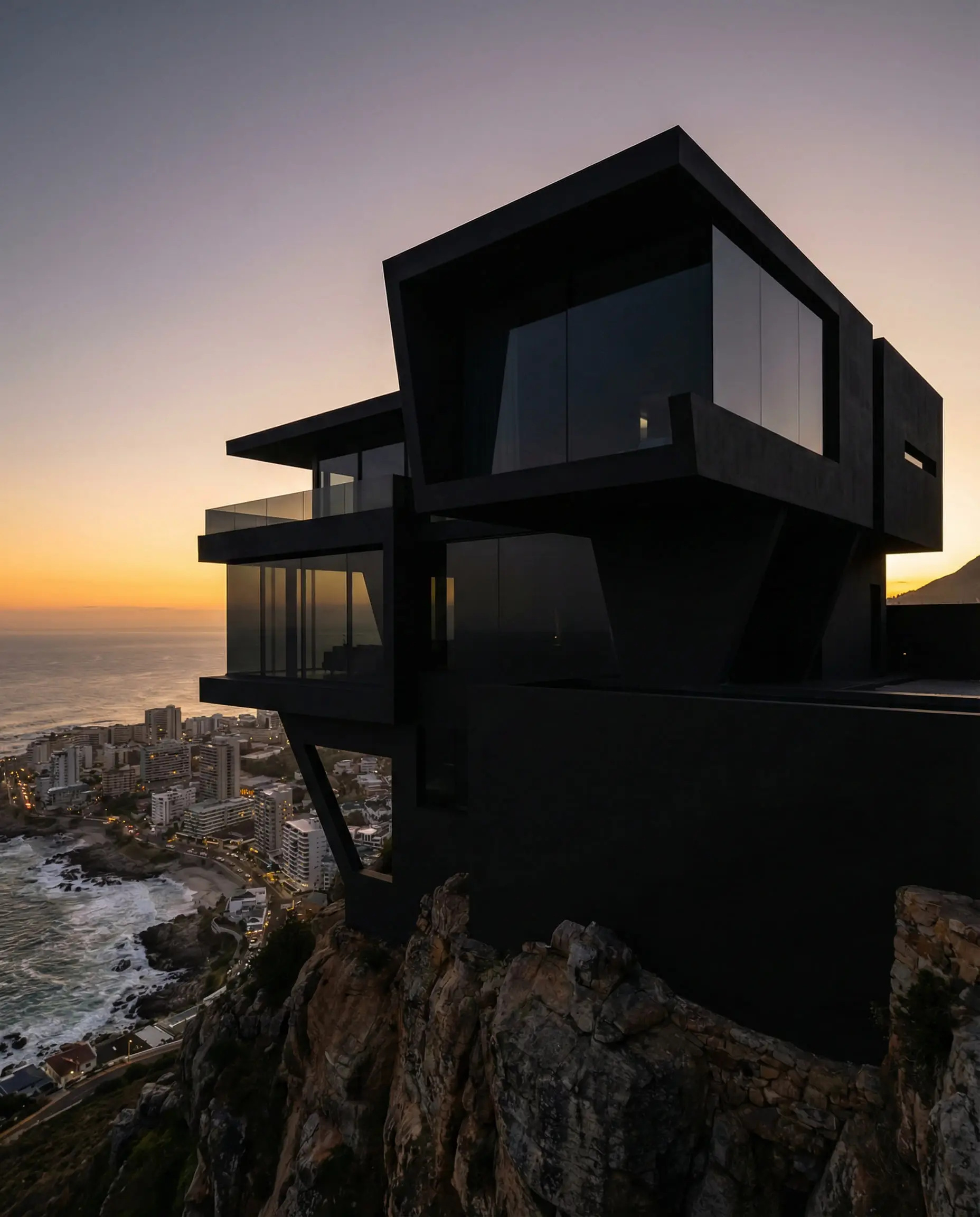
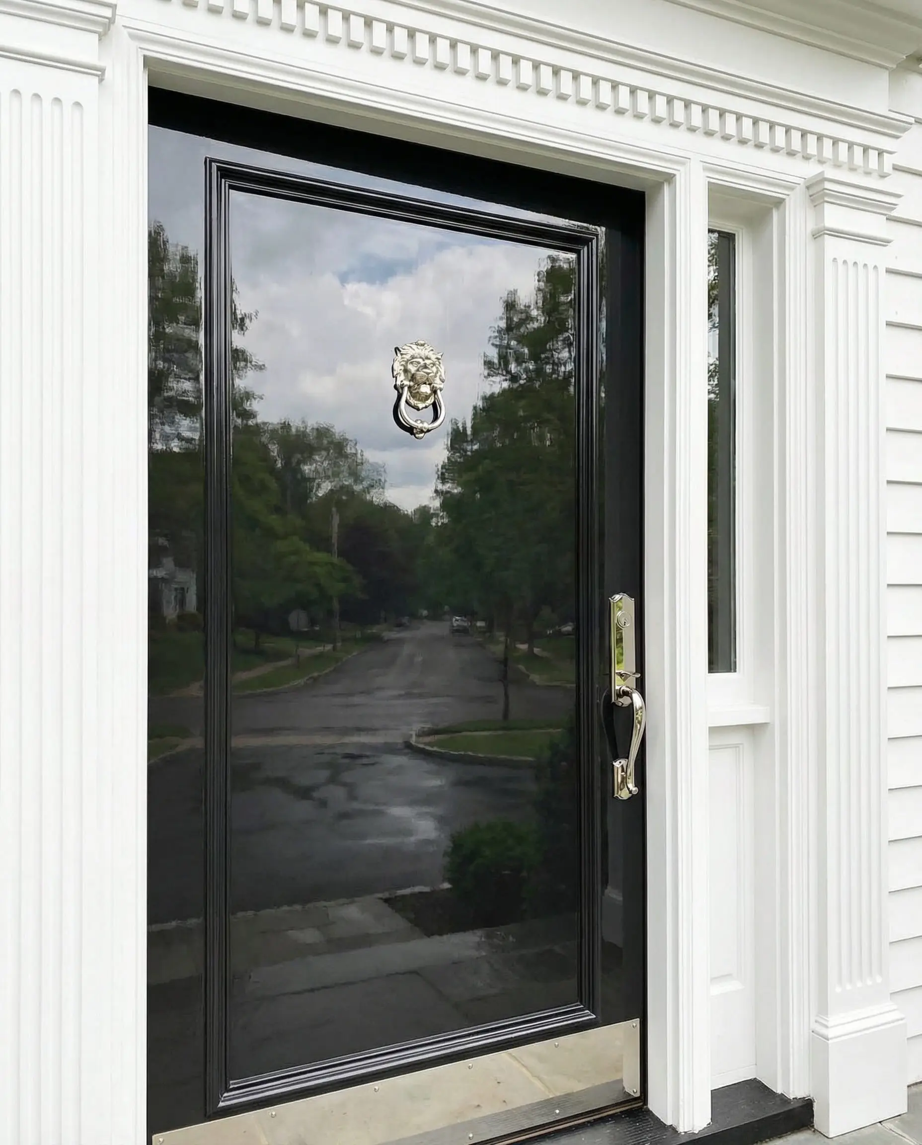
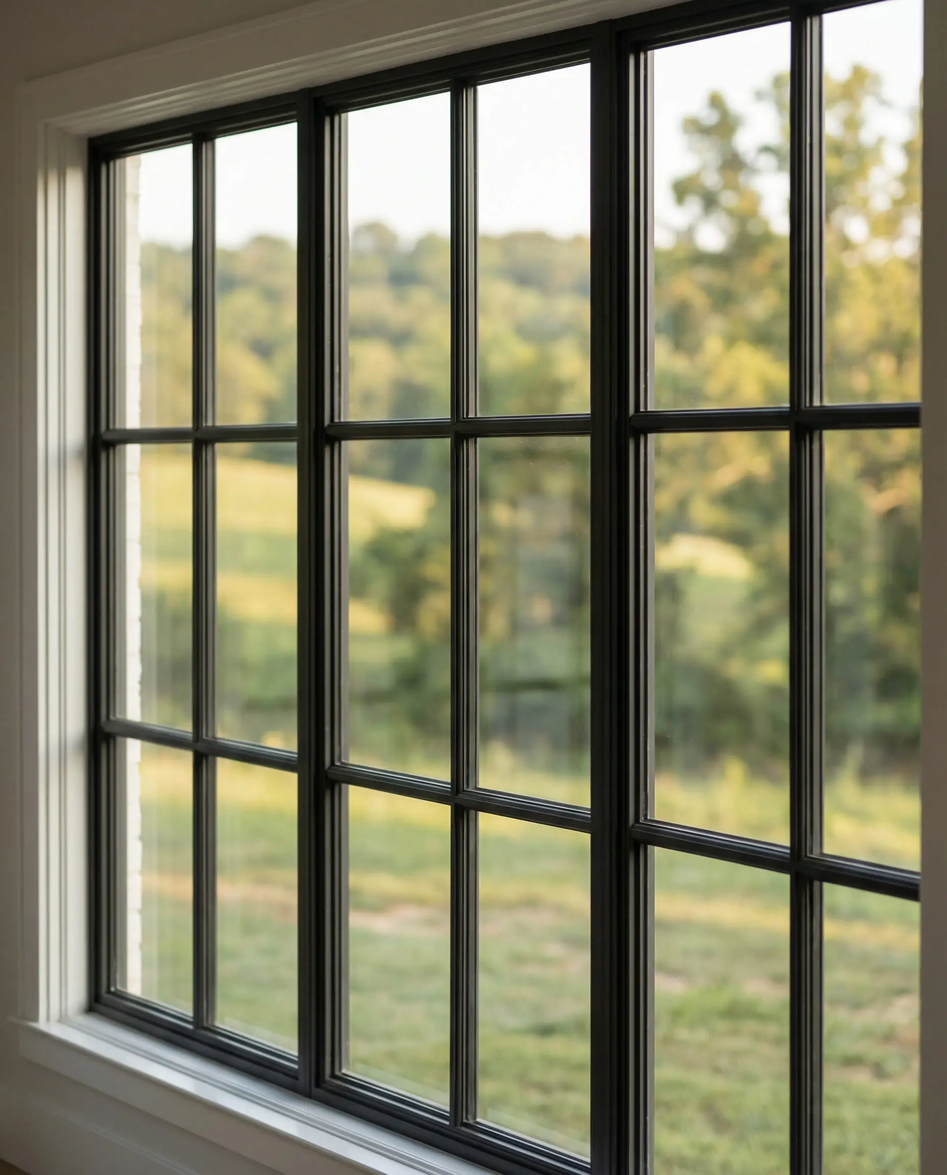
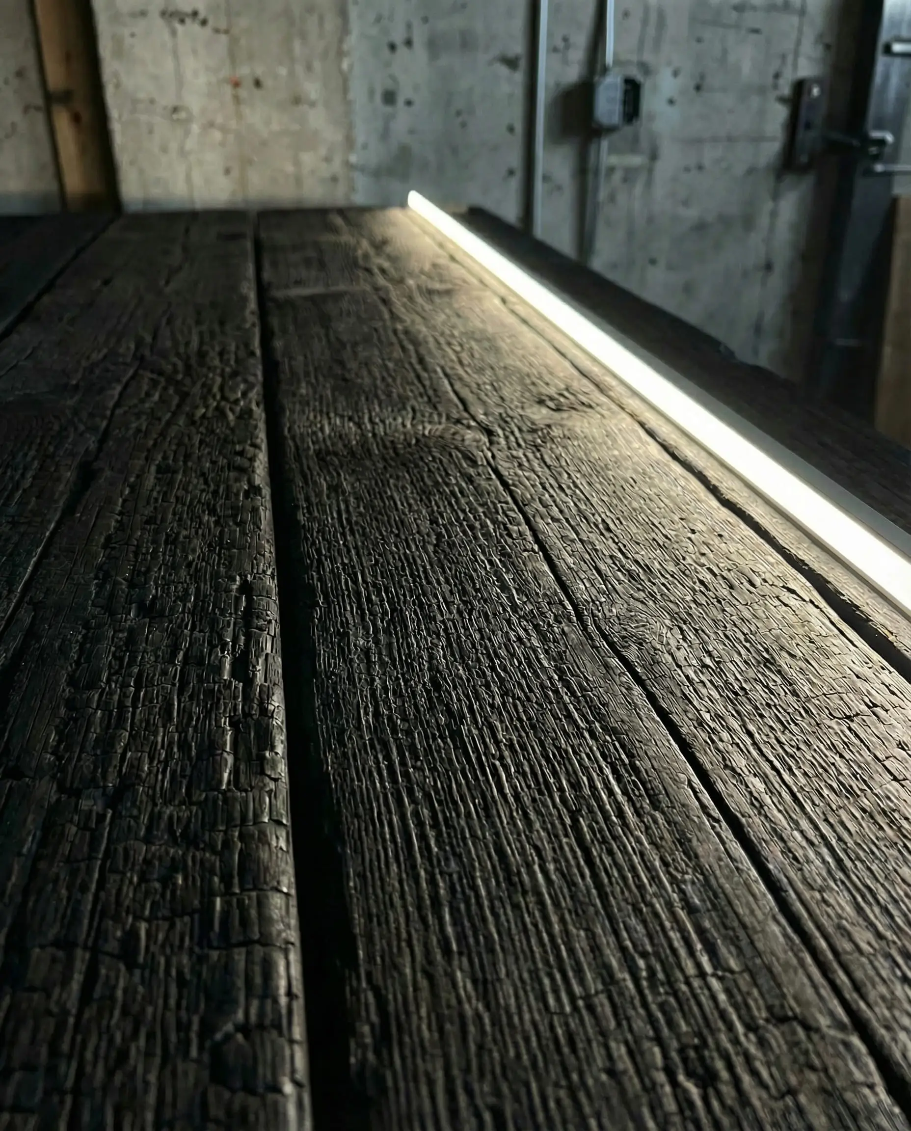
Use high-gloss Tricorn Black on your front door for an instant injection of luxury. But avoid painting your whole house this color unless you have excellent insulation—it absorbs a massive amount of heat.
Hackrea Verdict
Peppercorn (SW 7674)
LRV: 10 | Family: True Gray
If you want dark but don’t want brown (Urbane Bronze) or black (Iron Ore), Peppercorn is your true dark gray. It is evenly balanced and pairs exceptionally well with white trim and red brick. It’s a “stormy” color that feels powerful and classic.
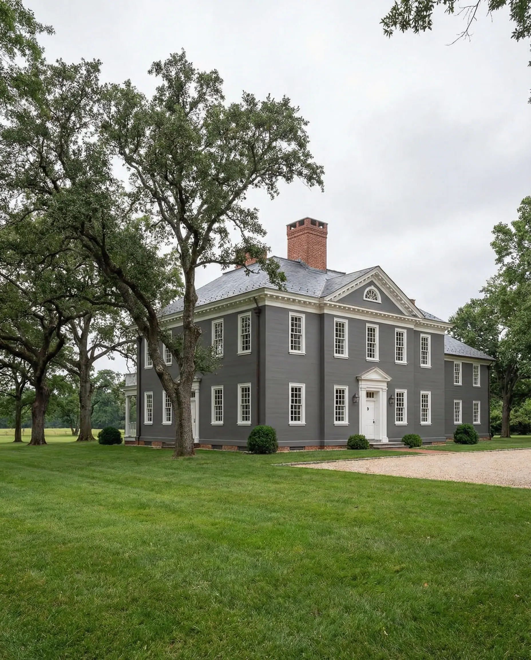
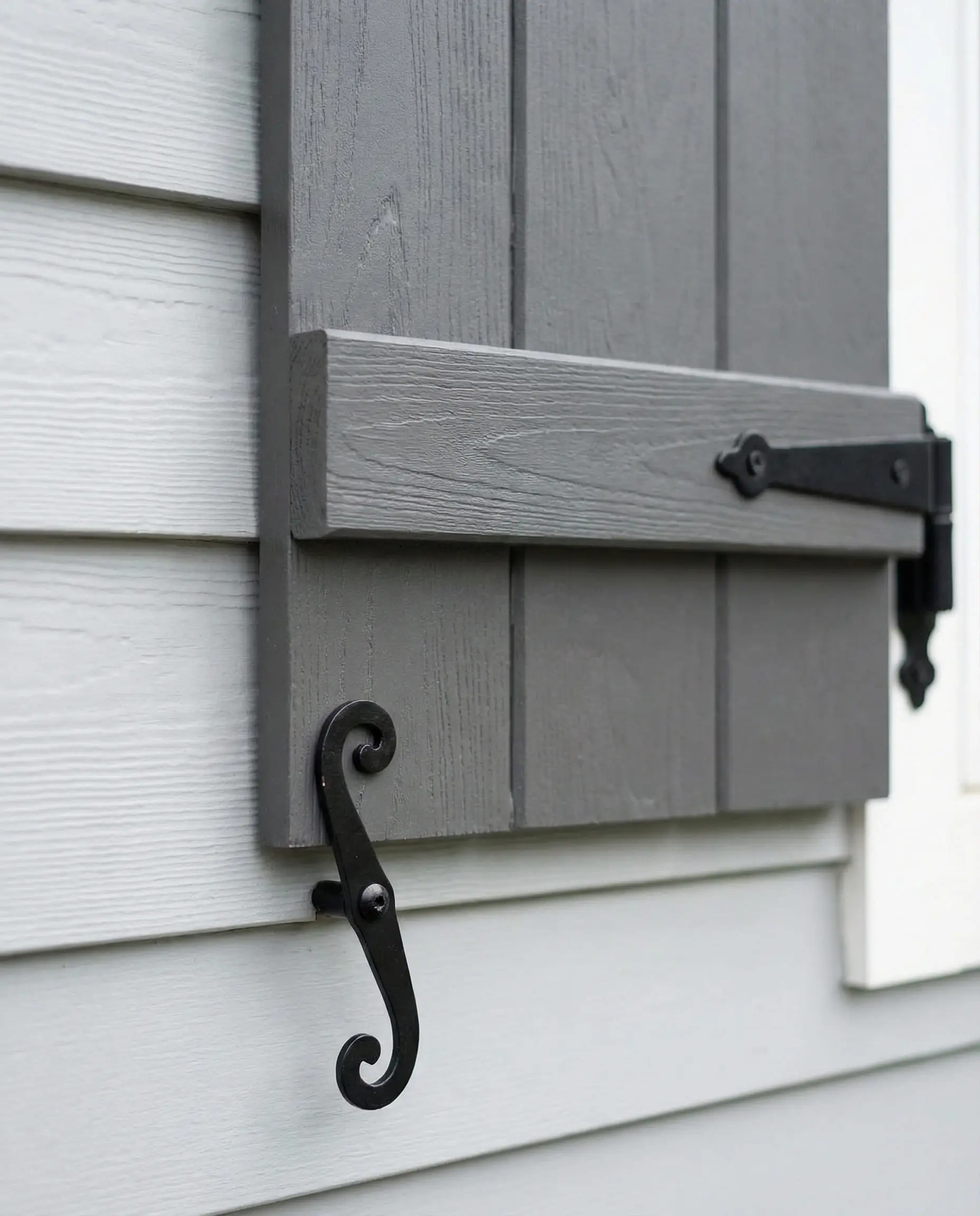
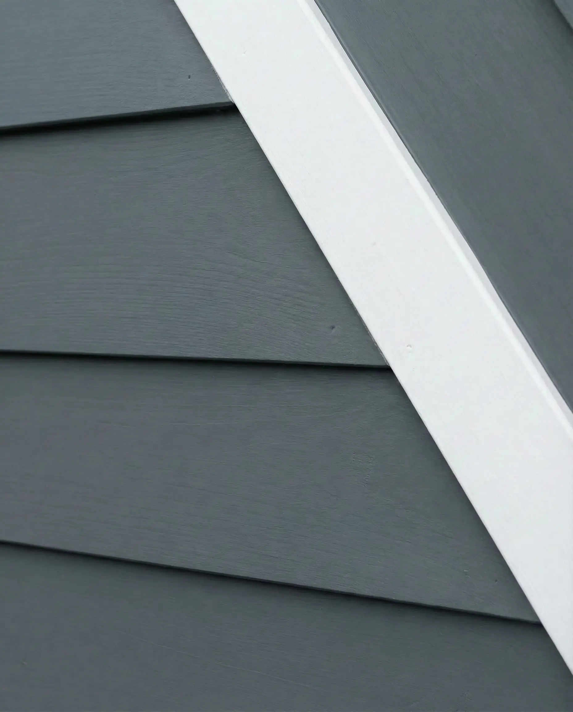
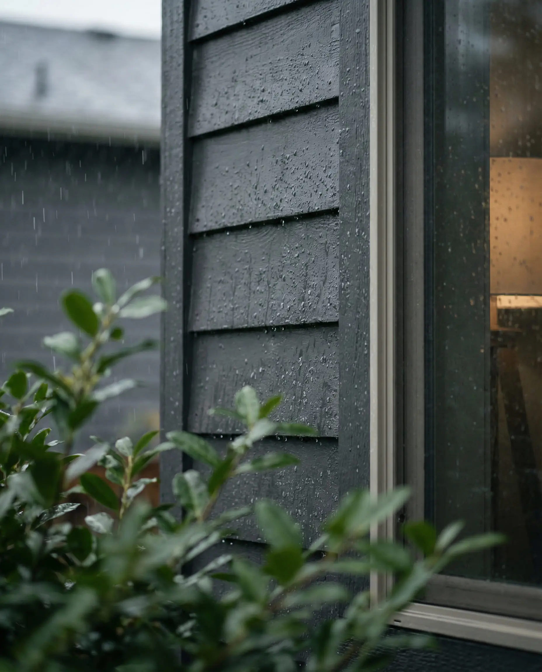
The best choice for a ‘classic’ dark house. It feels traditional yet bold. It looks incredible with a bright red or yellow front door.
Hackrea Verdict
Nature-Inspired Accents (Greens & Blues)
Biophilic design (design that connects us to nature) is moving from the living room to the curb. We are seeing a move away from bright blues toward muddy, complex greens and deep ocean tones. These colors act as neutrals in a garden setting, blending seamlessly with trees and shrubs.
Evergreen Fog (SW 9130)
LRV: 30 | Family: Green-Gray
The 2022 Color of the Year has proven its staying power. Evergreen Fog is a chameleon. It is a versatile “greige-green” that works beautifully as a main body color. It is subtle enough to satisfy HOAs that ban bright colors, but colorful enough to give your home character. It pairs effortlessly with natural wood columns and stone veneer.
It’s the perfect color for a “sanctuary” home—it feels quiet, restful, and organic.
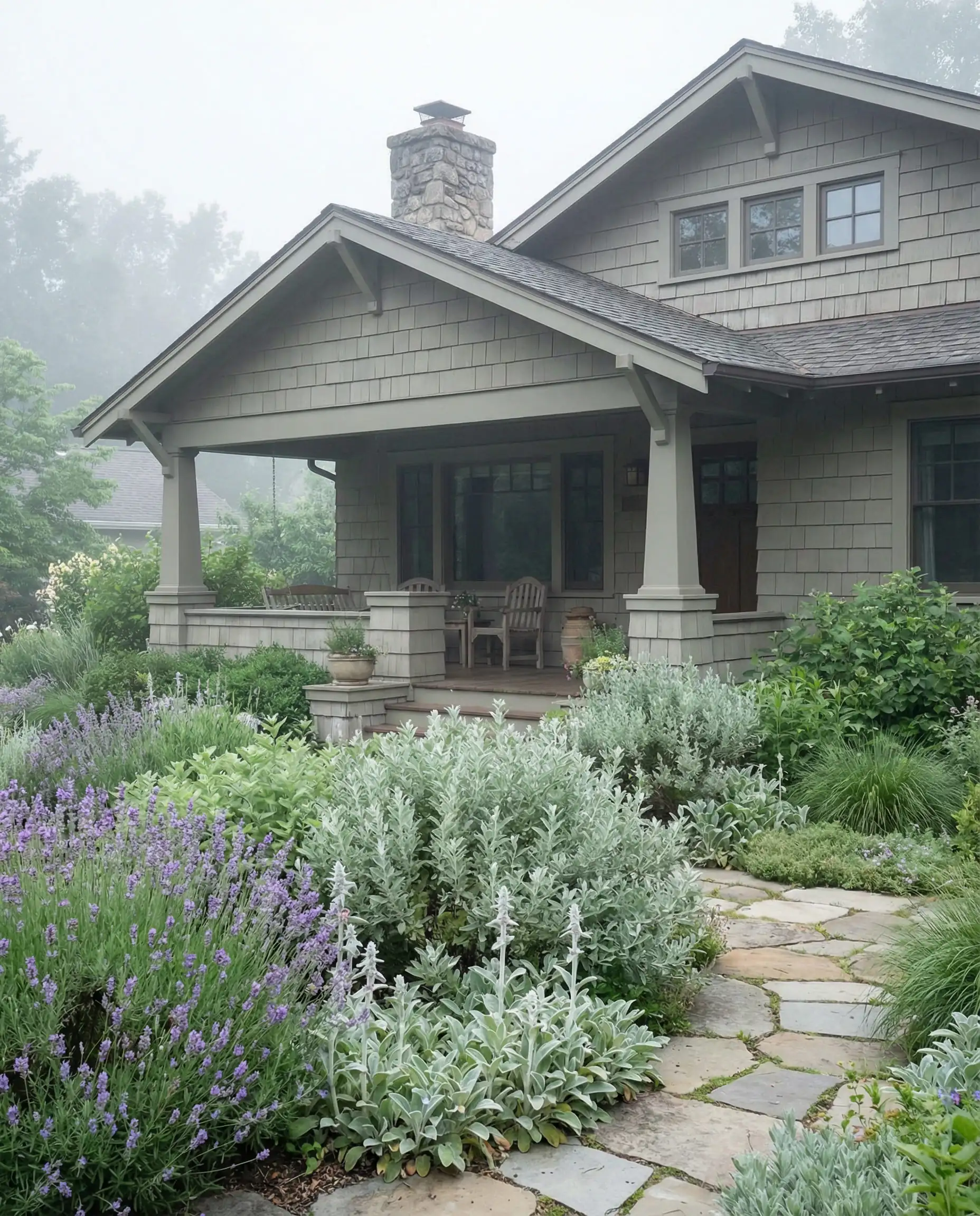
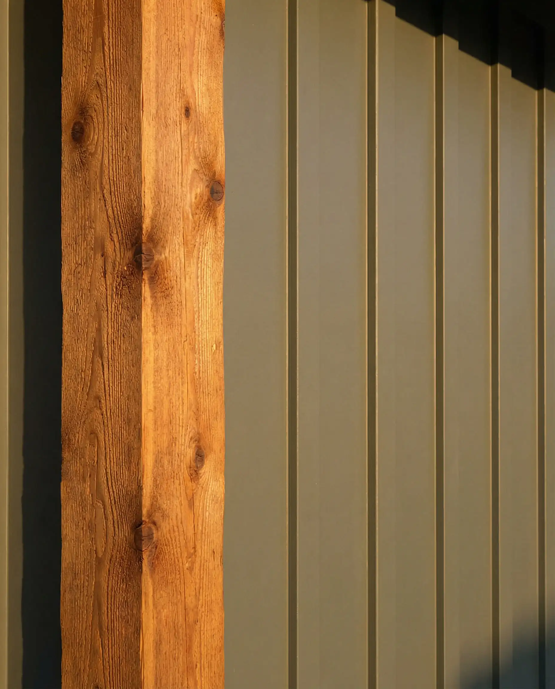
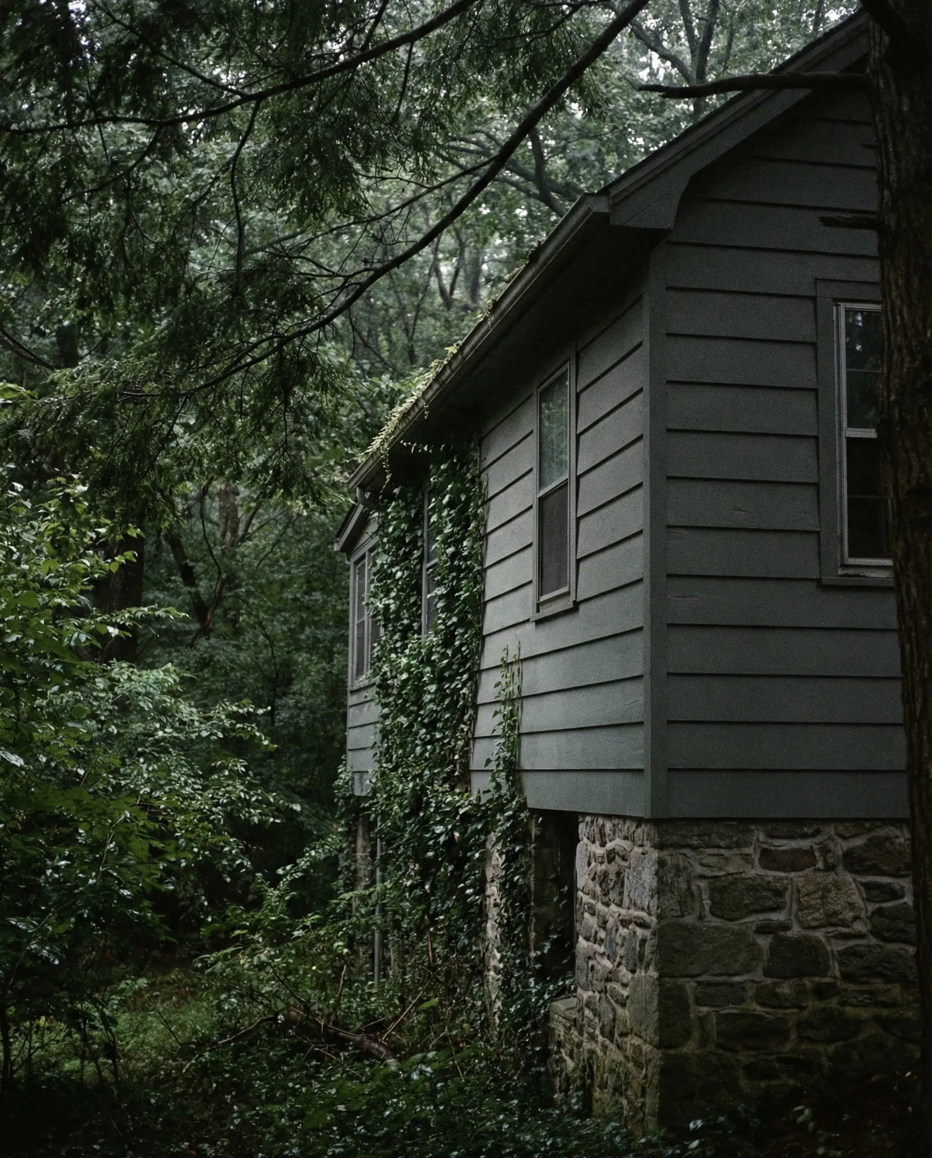
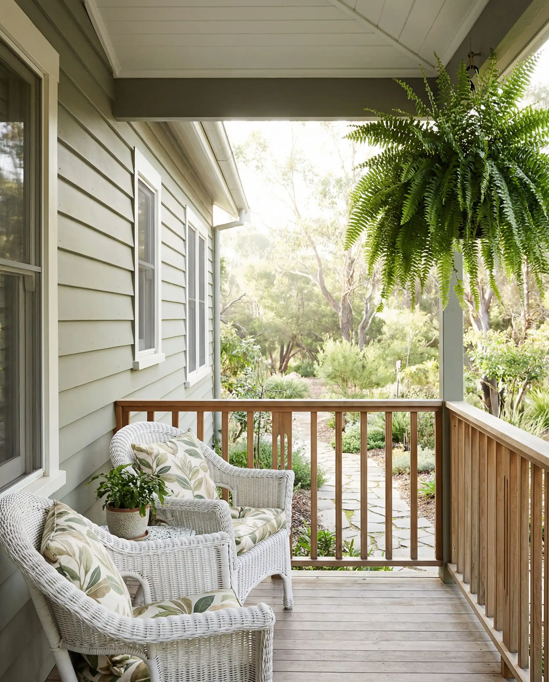
This color is pure sophistication. It works on almost any architectural style, from Craftsman bungalows to modern ranches. It signals ‘calm’ and ‘sanctuary’.
Hackrea Verdict
Pewter Green (SW 6208)
LRV: 12 | Family: Dark Green
Darker and moodier than Evergreen Fog, Pewter Green is a cold, steel-toned green. It looks incredible in wooded settings or on lake houses. In the shade, it can look almost charcoal, but when the sun hits it, the rich pine tones emerge.
It works fantastically well with cedar shakes or copper accents. It’s a very “Northwest” color that feels rugged and expensive.
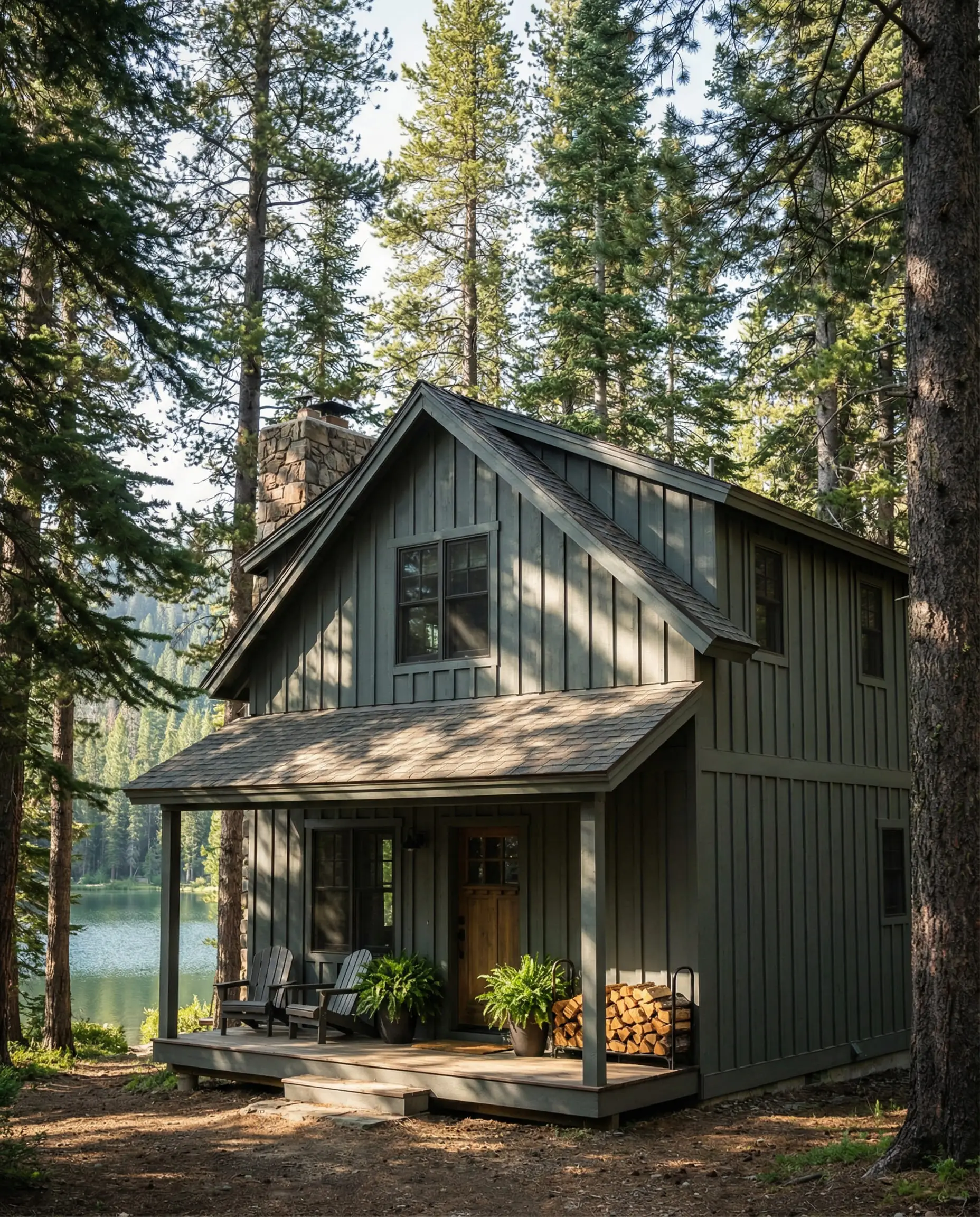
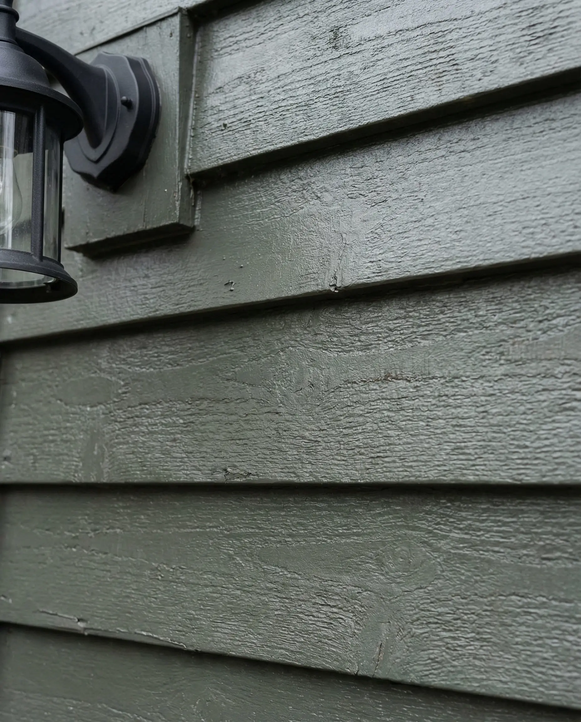
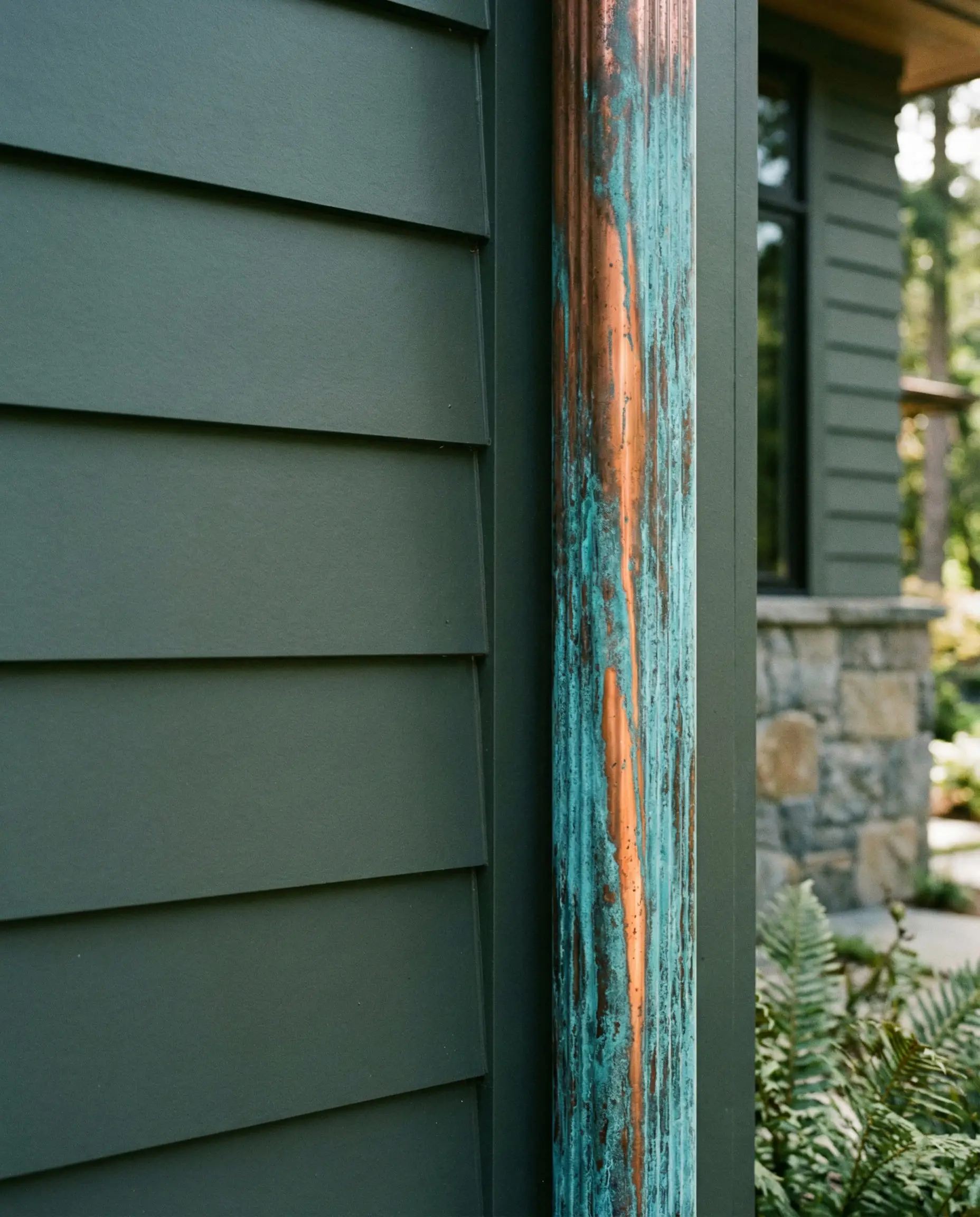
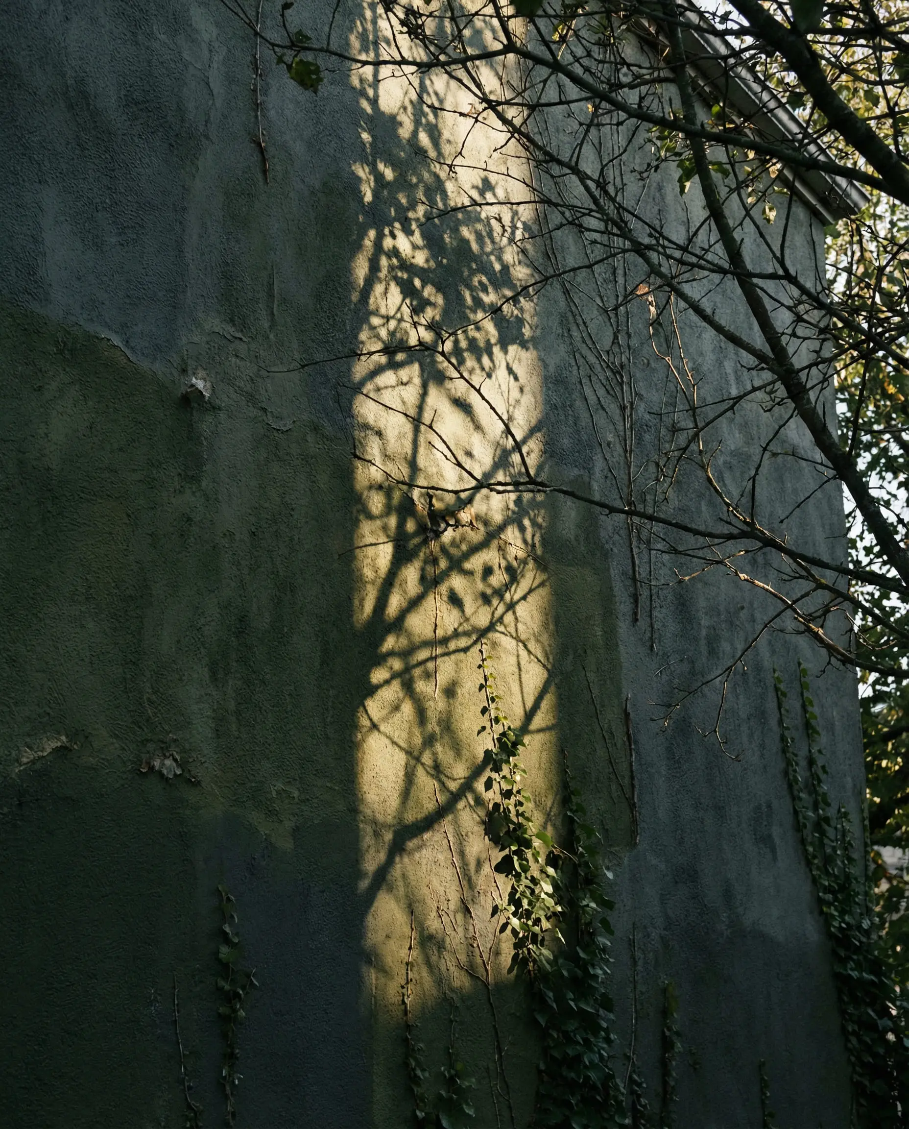
A fantastic alternative to Navy Blue. If you want a dark house that isn’t gray or black, this is the winner. It blends seamlessly with surrounding trees.
Hackrea Verdict
Naval (SW 6244)
LRV: 4 | Family: Navy Blue
Naval is a classic. It is a confident, deep navy that brings a nautical, crisp feel to a home. It is widely used for coastal properties (Hampton style) paired with brilliant white trim (like Extra White). It commands attention and feels very regal.
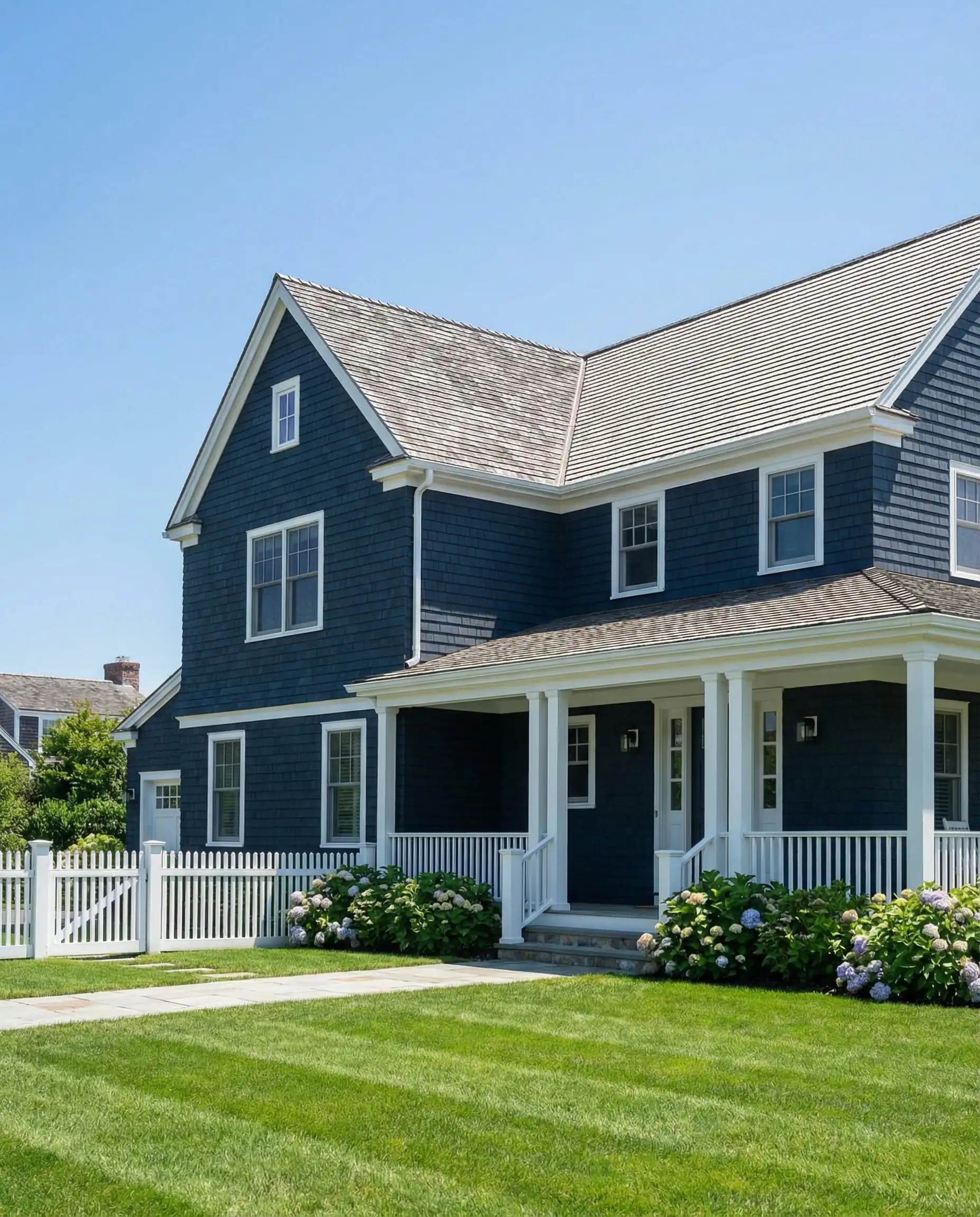
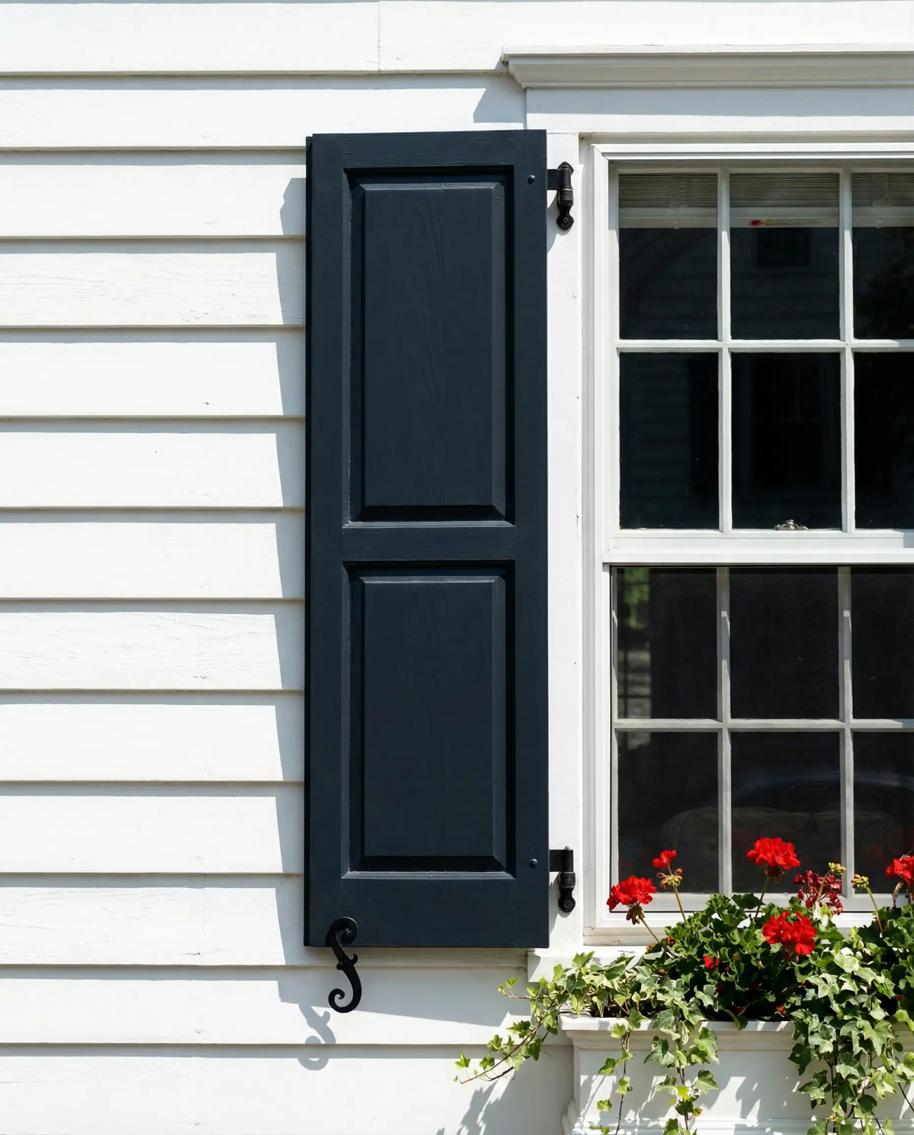
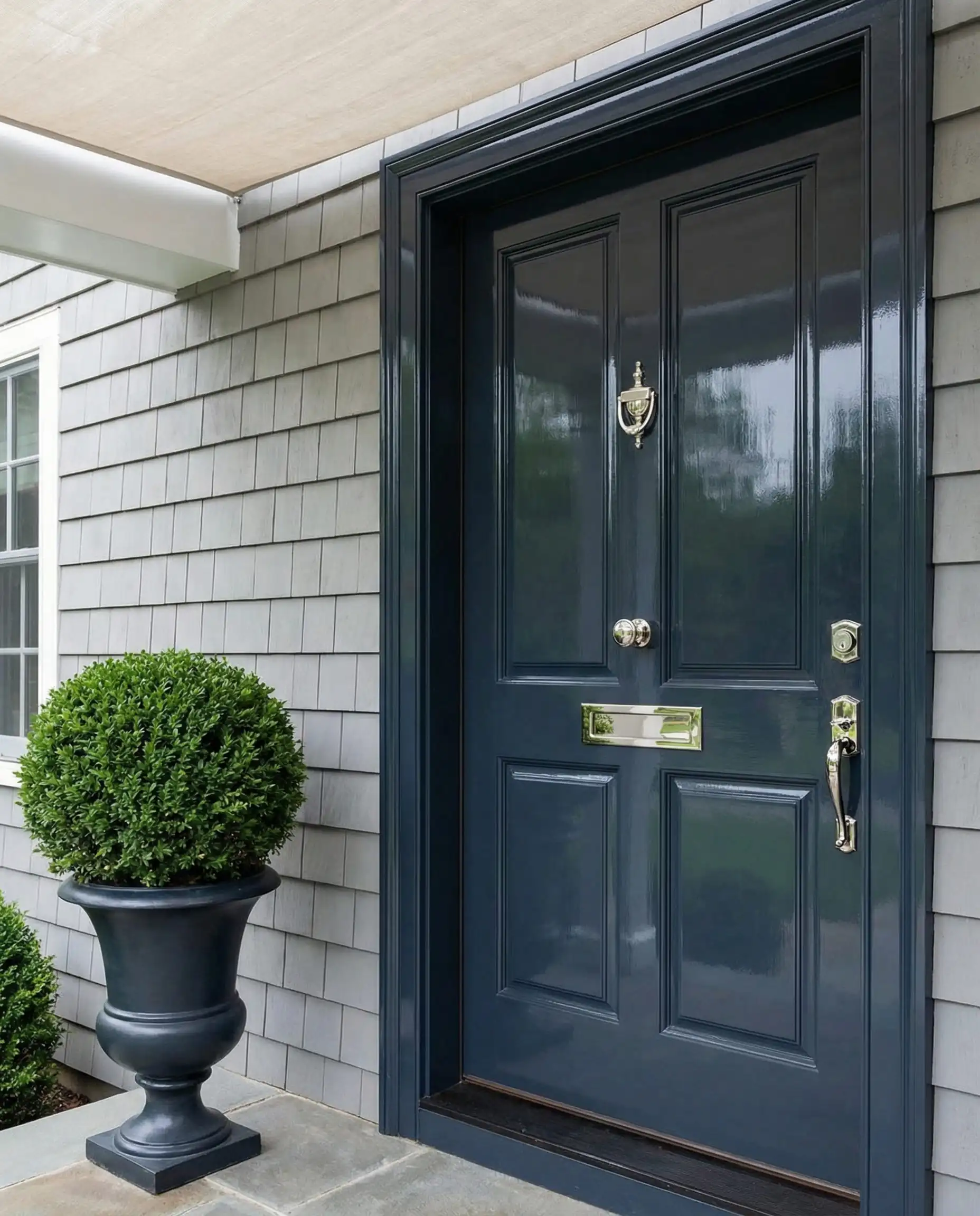
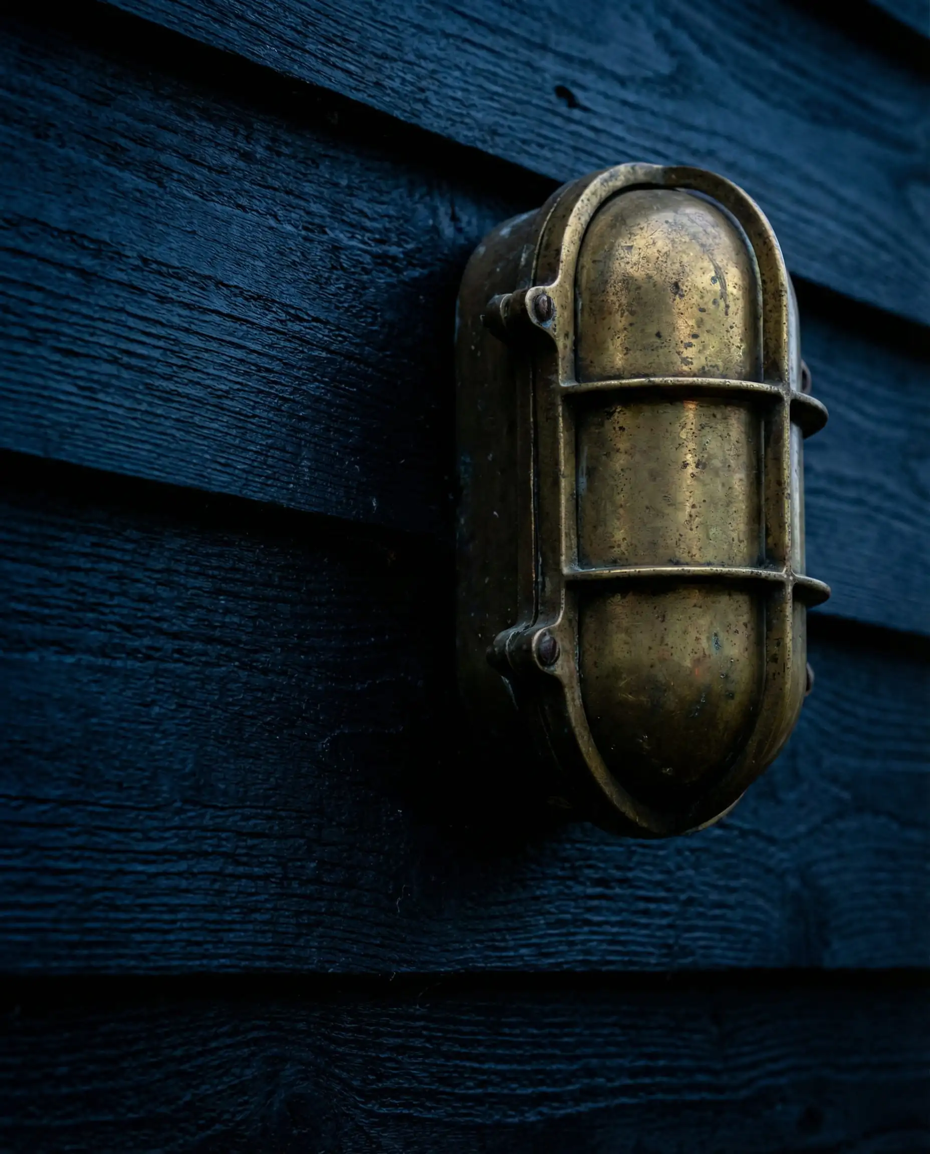
Beware of fading. Blue pigments are notorious for fading faster in UV light than neutrals. If you choose Naval for a south-facing wall, ensure you use Sherwin-Williams’ high-grade exterior line like Emerald Rain Refresh to protect the color.
Hackrea Verdict
Silver Strand (SW 7057)
LRV: 59 | Family: Blue-Green-Gray
For a lighter touch, Silver Strand offers a breezy, ethereal vibe. It is technically a gray, but it has strong blue-green undertones. It’s perfect for coastal cottages or homes where you want a light, airy feel that isn’t just white. It reflects the sky, changing mood as the clouds pass.
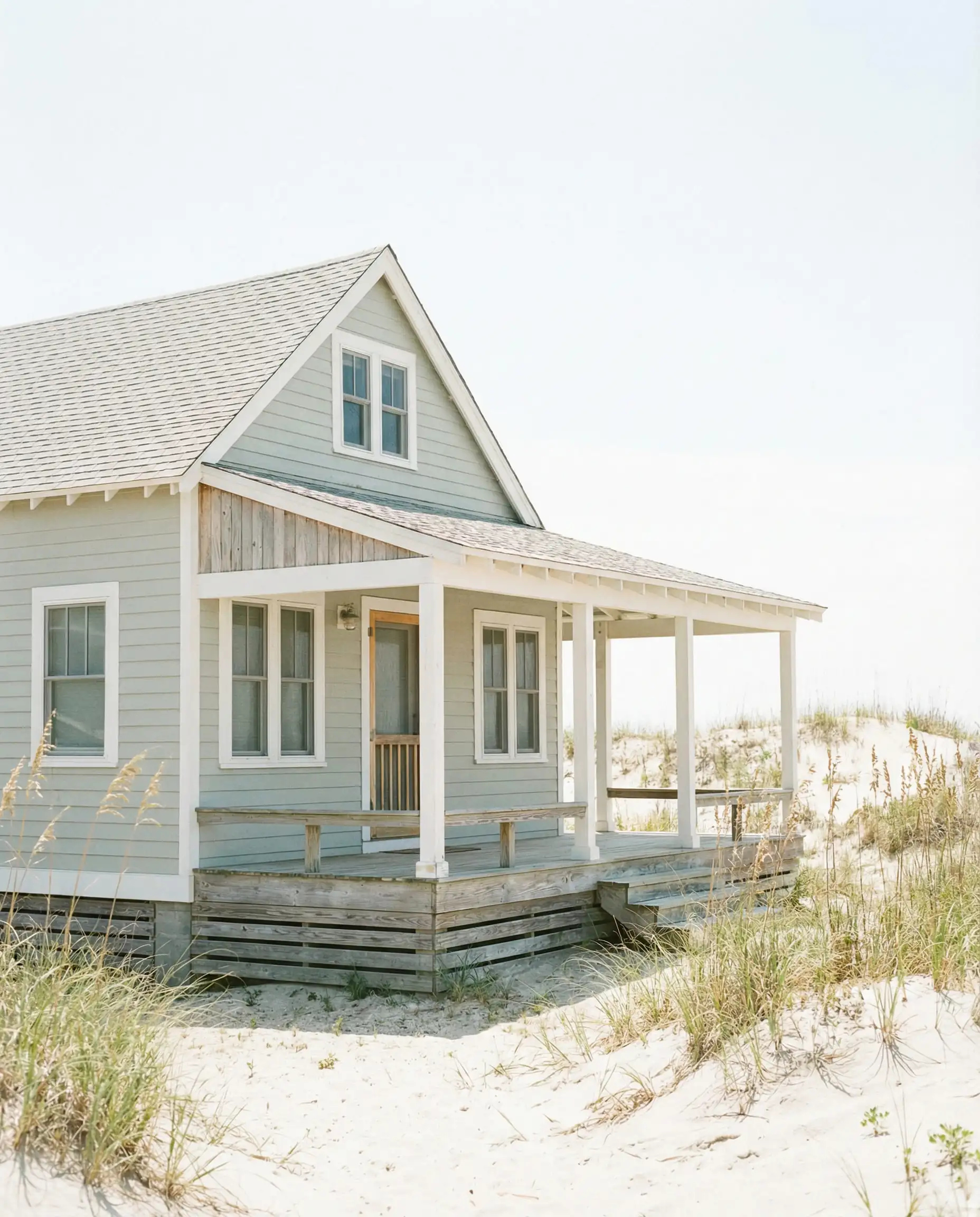
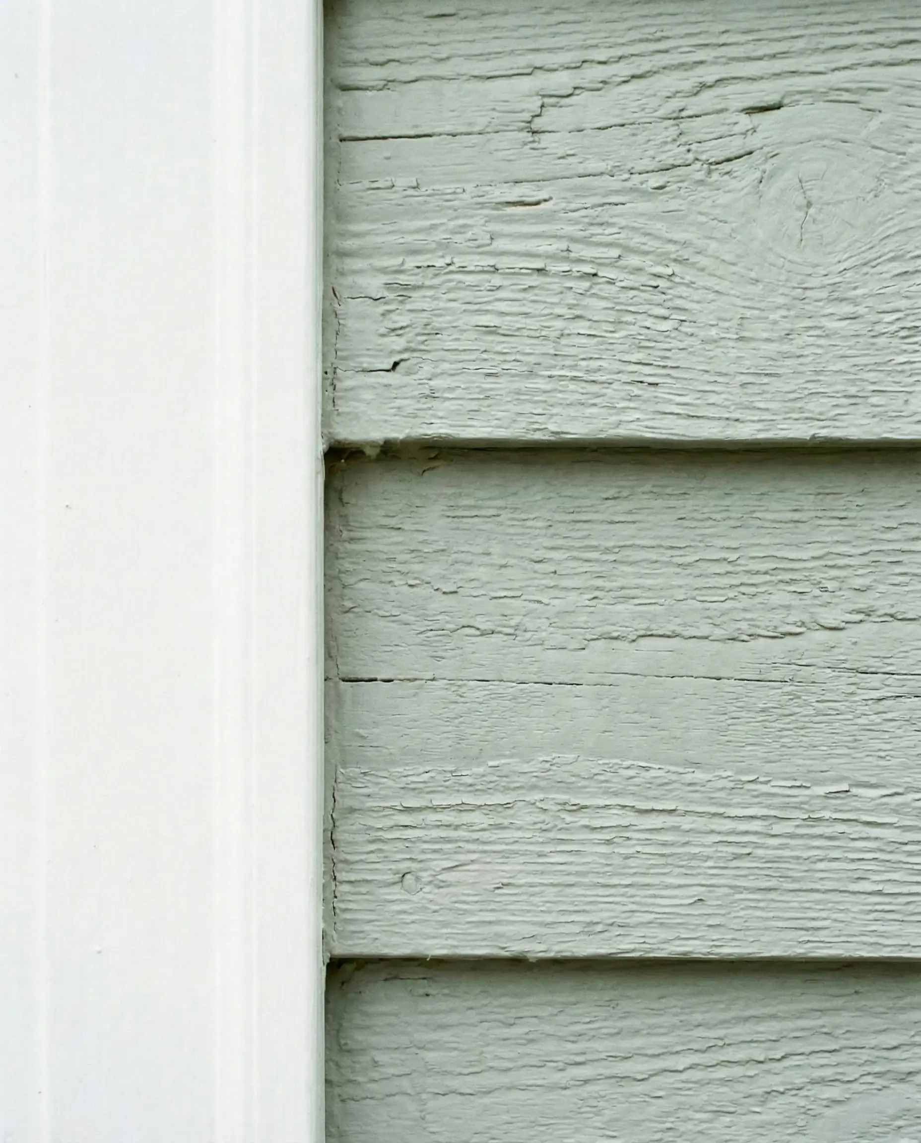
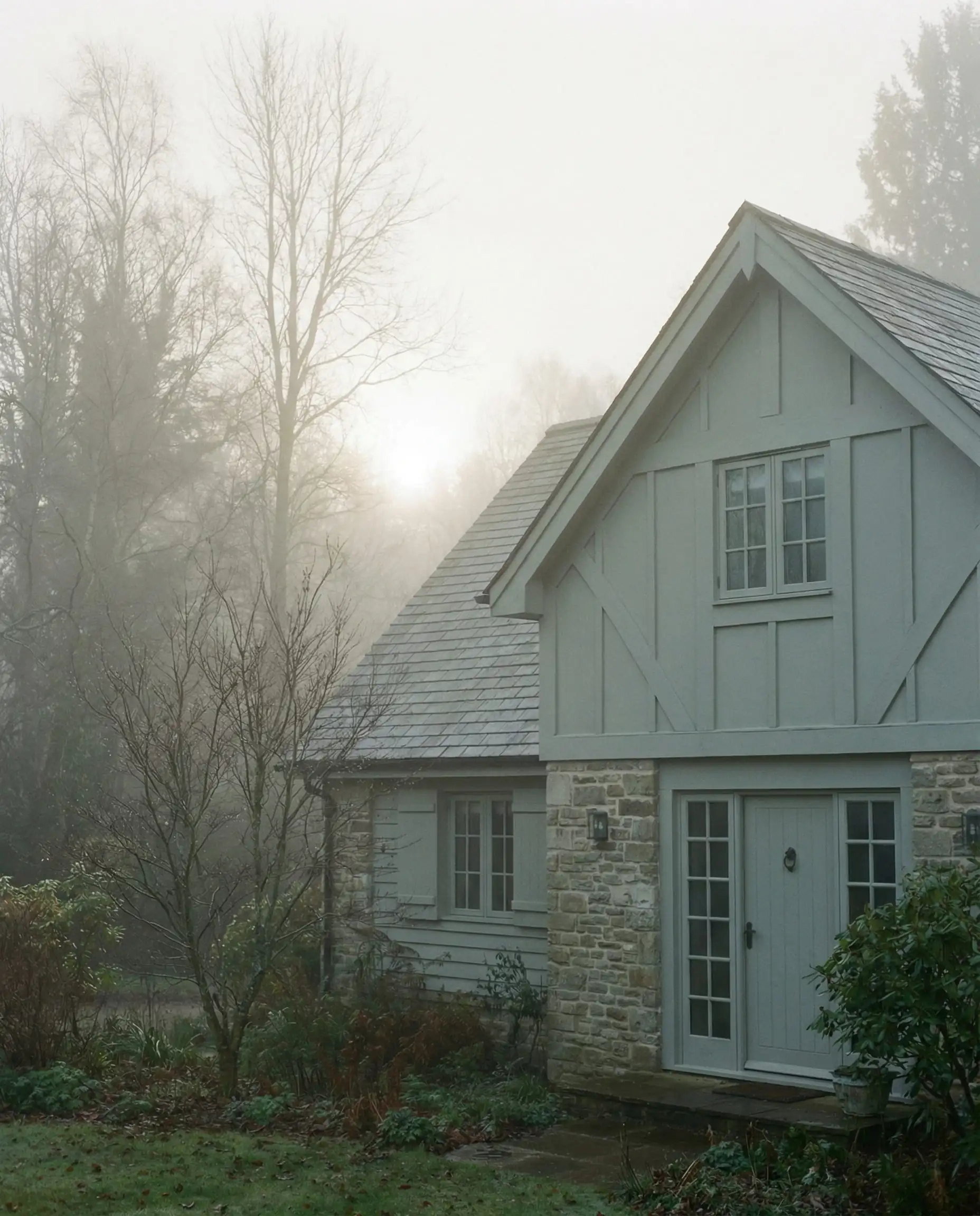
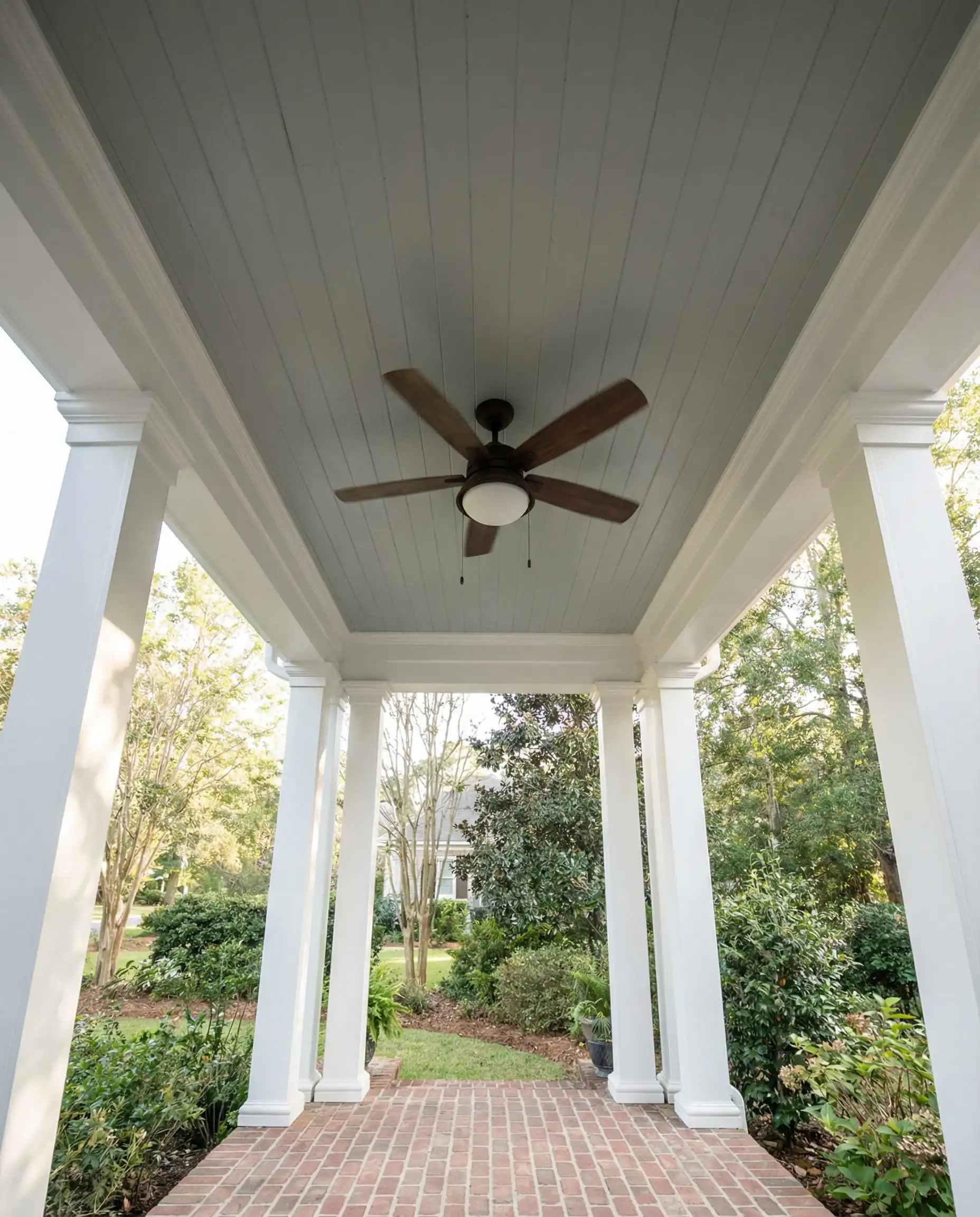
This color shifts wildly. In the morning it might look minty; in the evening it might look gray. Test a large swatch before committing!
Hackrea Verdict
3 Curated Color Palettes for 2026
Struggling to put it all together? Here are three “cheat sheet” palettes guaranteed to look cohesive.
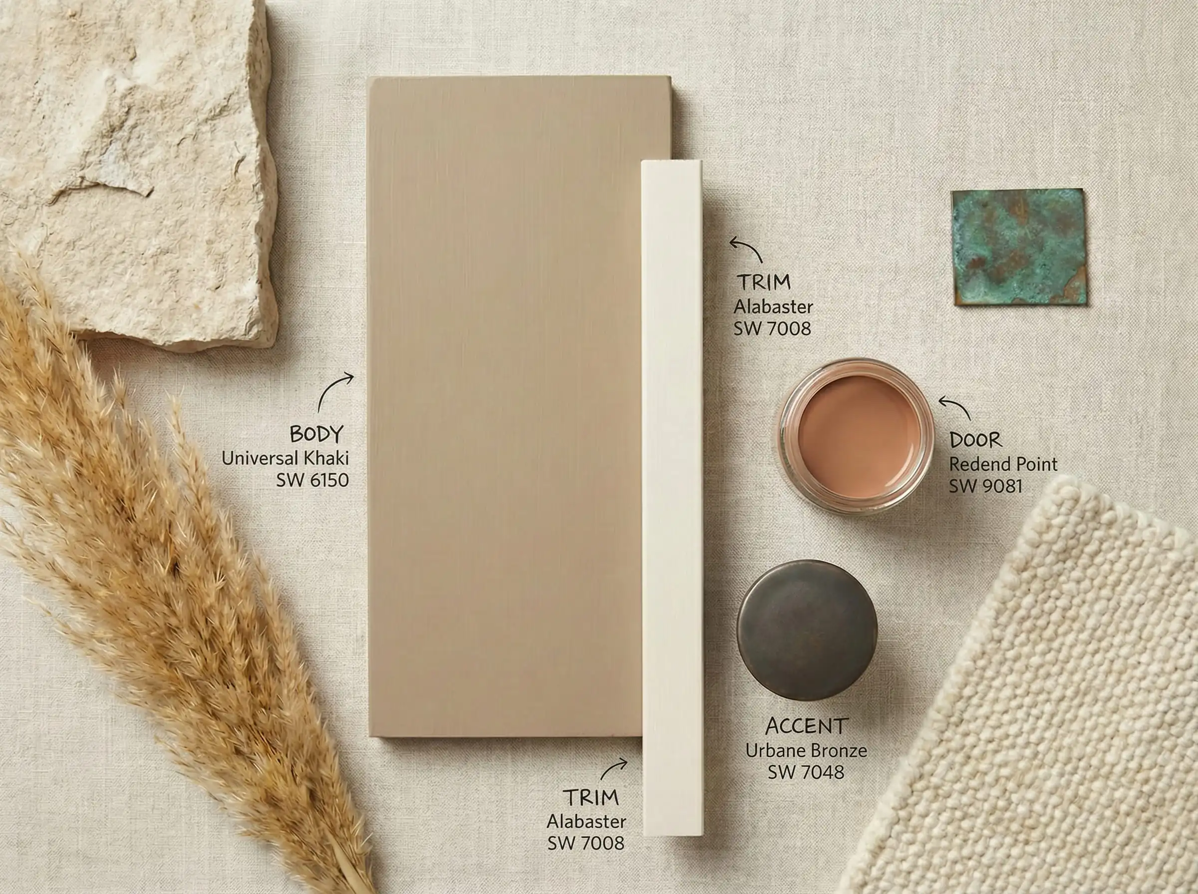
Palette 1: The “Organic Modern” (Warm & Earthy)
This palette embraces the 2026 trend of warmth and texture.
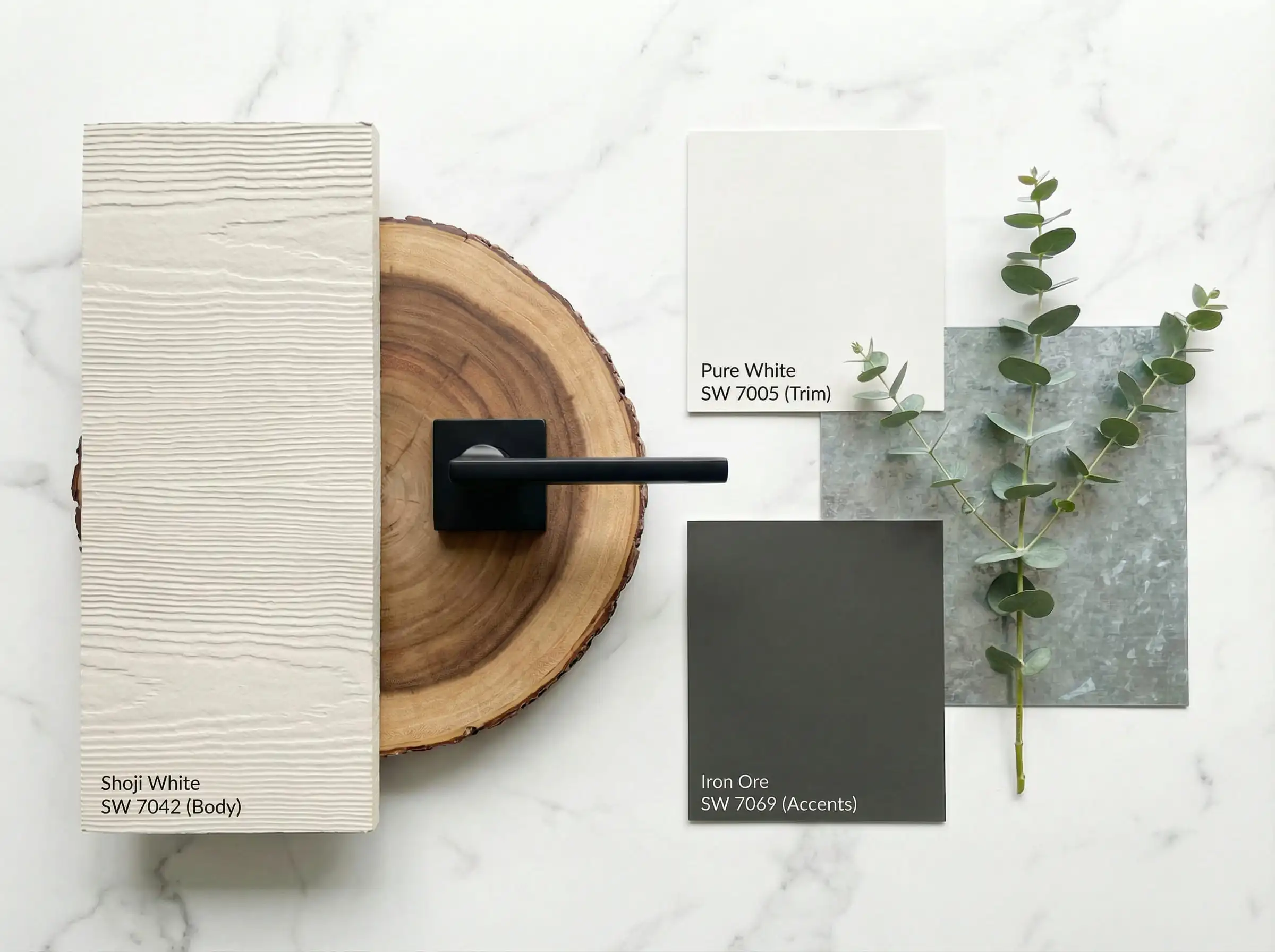
Palette 2: The “Modern Farmhouse 2.0” (Soft & High Contrast)
An update to the stark white farmhouse, using softer tones.
Palette 3: The “Moody Cottage” (Dark & Deep)
For those ready to embrace the dark exterior trend.
Frequently Asked Questions (FAQ)
A: While Alabaster remains the volume leader, Universal Khaki and Shoji White are the trending stars for 2026 as homeowners shift toward warmer, earthier tones.
A: The “Rule of Three” is standard: one color for the body (siding/brick), one for the trim (eaves, window casings), and one for accents (shutters, front door). Using more than three can make the home look cluttered; using fewer than two can make it look flat.
A: Exterior paint generally looks lighter once it dries and is exposed to natural daylight. The immense amount of light outdoors washes out pigment. Always choose a color that is slightly darker/grayer on the swatch than what you think you want.
A:
Satin/Low Lustre: Best for the main body (siding). It sheds water but hides imperfections.
Semi-Gloss/Gloss: Best for trim, doors, and shutters. It highlights architectural details and is durable against scrubbing.
Flat: Generally avoid for exteriors unless painting masonry/brick, as it is harder to clean.
Final Thoughts
Painting your home’s exterior is an investment in your property’s value and your own joy. The trends for 2026 are inviting us to step away from the cold, industrial grays and embrace a home that feels like a sanctuary—warm, grounded, and connected to nature.
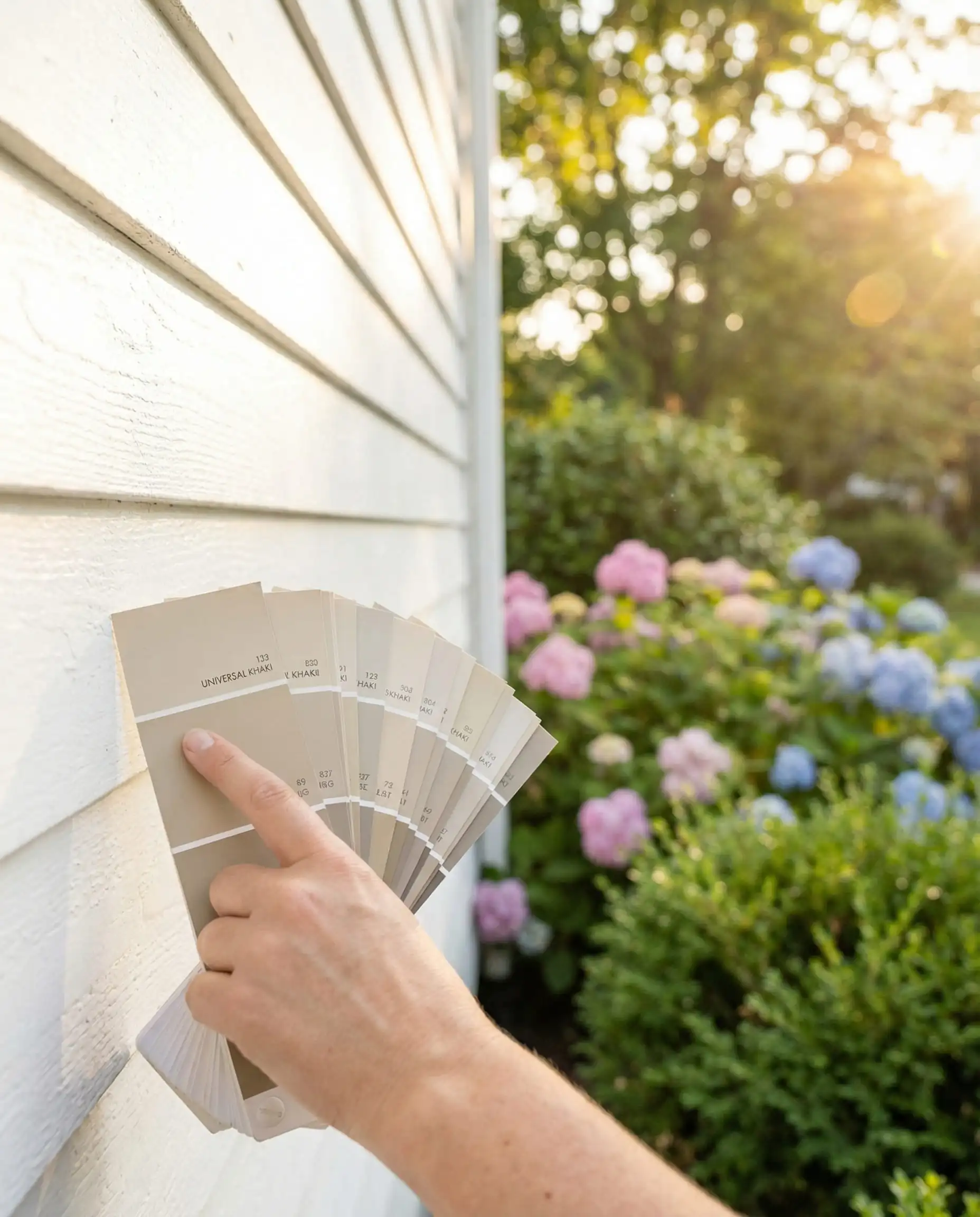
Whether you choose the safety of Alabaster, the warmth of Natural Linen, or the drama of Iron Ore, the most important step is testing. Never rely on a digital screen. Buy a sample pot, paint a large poster board, and move it around your house at different times of the day.
Ready to start?
Check out our guides on Interior Paint Trends to coordinate your indoor vibe with your new curb appeal, or explore our full library of paint reviews to find your perfect match.