The Designer’s Guide to Pairing Wall Colors with Light Oak Flooring
Light oak flooring is the undeniable cornerstone of modern custom residential design, but it is notoriously unforgiving when the paint brushes come out. Pair an ashen European white oak with a cool, builder-grade gray, and the entire room immediately feels sterile and unfinished. Conversely, if you match clear red oak with a yellow-based cream, those beautiful hardwood planks suddenly look like a 1990s basketball court.
As architectural color consultants, our collective curatorial eye never selects a wall color simply because a swatch looks appealing in isolation. We analyze its Light Reflectance Value (LRV) and exact pigment composition. The goal is to manipulate how light bounces off the wood grain, ensuring the walls and floors speak the same high-end design language.
We are bypassing generic color families altogether to focus on bespoke architectural finishes, intentional contrast, and specific undertone pairings that actively solve spatial geometry problems.
Mastering Light Oak Undertones Before You Paint
Before opening a single can of paint, you must identify the inherent pigment of your specific floorboards. Your wall color must either heavily contrast these natural wood undertones to ground the room or intentionally match them to neutralize the space and create seamless visual flow.
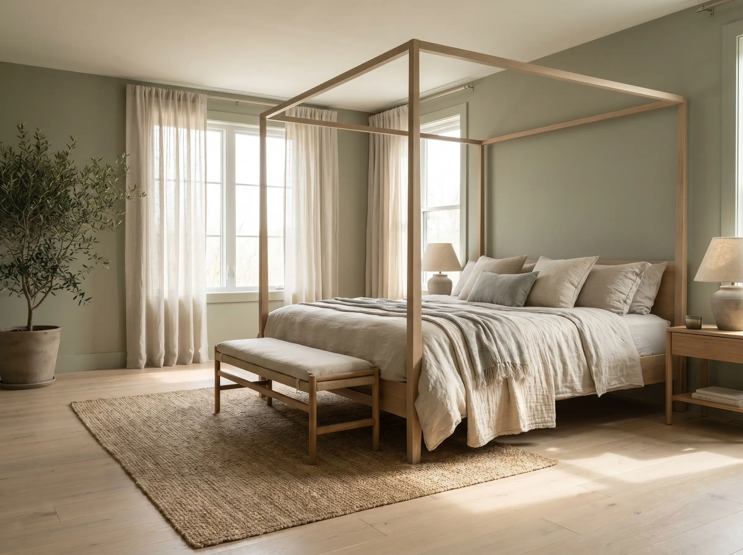
- European White Oak: Pulls green, ash, and subtle brown undertones. Requires highly intentional warmth or stark, moody contrast to avoid looking washed out.
- Traditional Red Oak: Pulls prominent pink, wheat, and amber undertones. Demands careful color-correction using green or purple undertones to neutralize the inherent redness.
If you ignore the specific undertone of your oak, your entire design scheme will actively fight against the architecture of the room.
You can apply wallpapers, paints, etc. on walls and see how they look in various interiors.

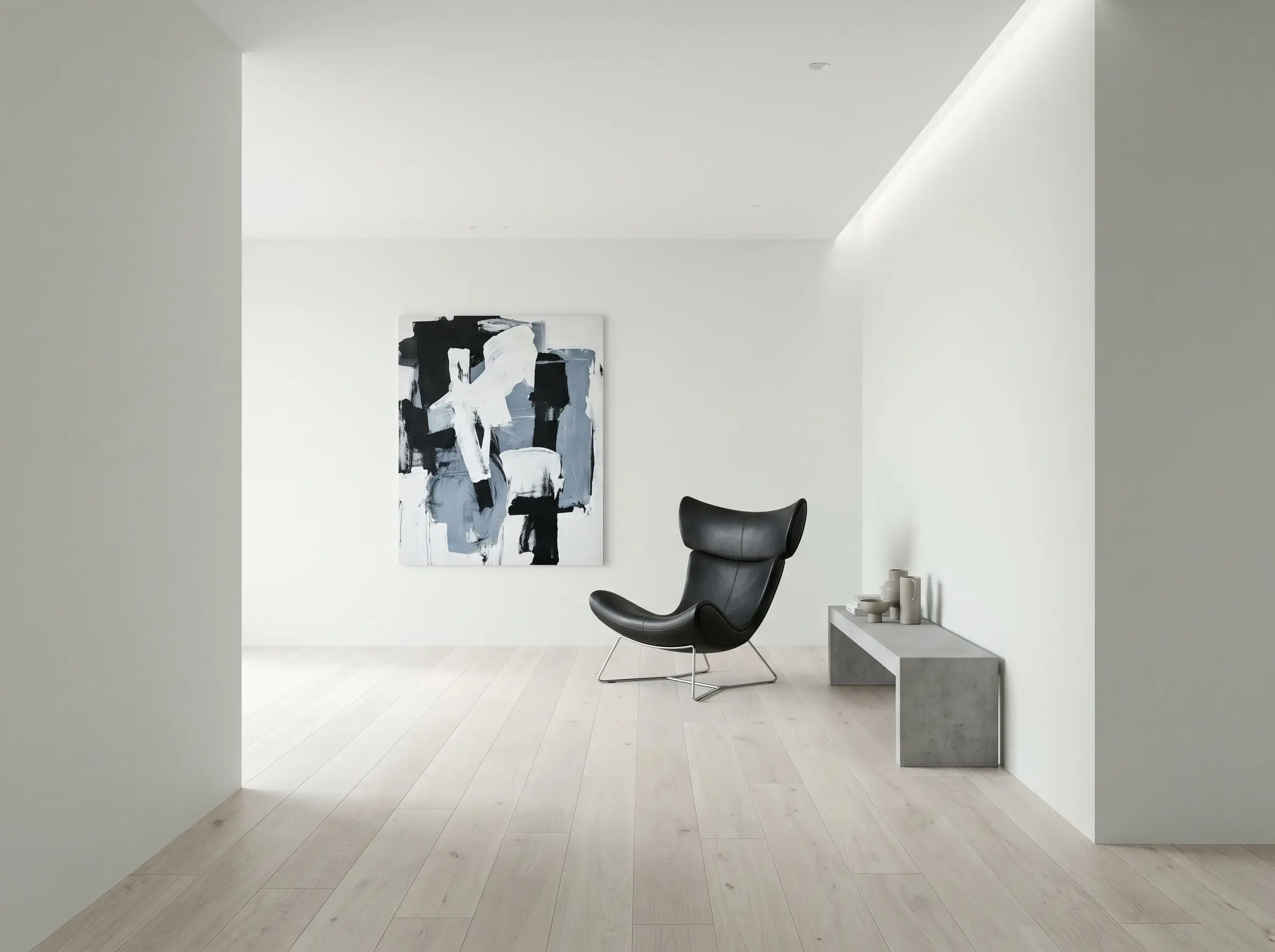
High-Contrast Darks for Dramatic Grounding
Pairing dark, moody walls with raw, light oak creates immediate architectural tension that makes a space feel incredibly bespoke. The light floor acts as a massive reflector, bouncing illumination back up and keeping these deeply saturated walls from feeling cavernous.
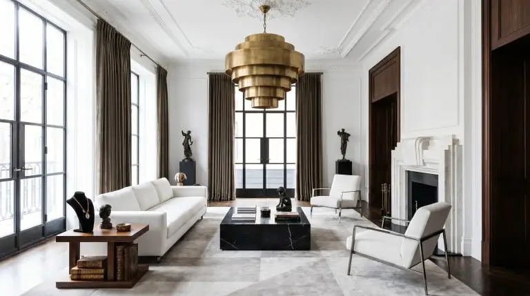
Charcoal Black in Matte Formulations
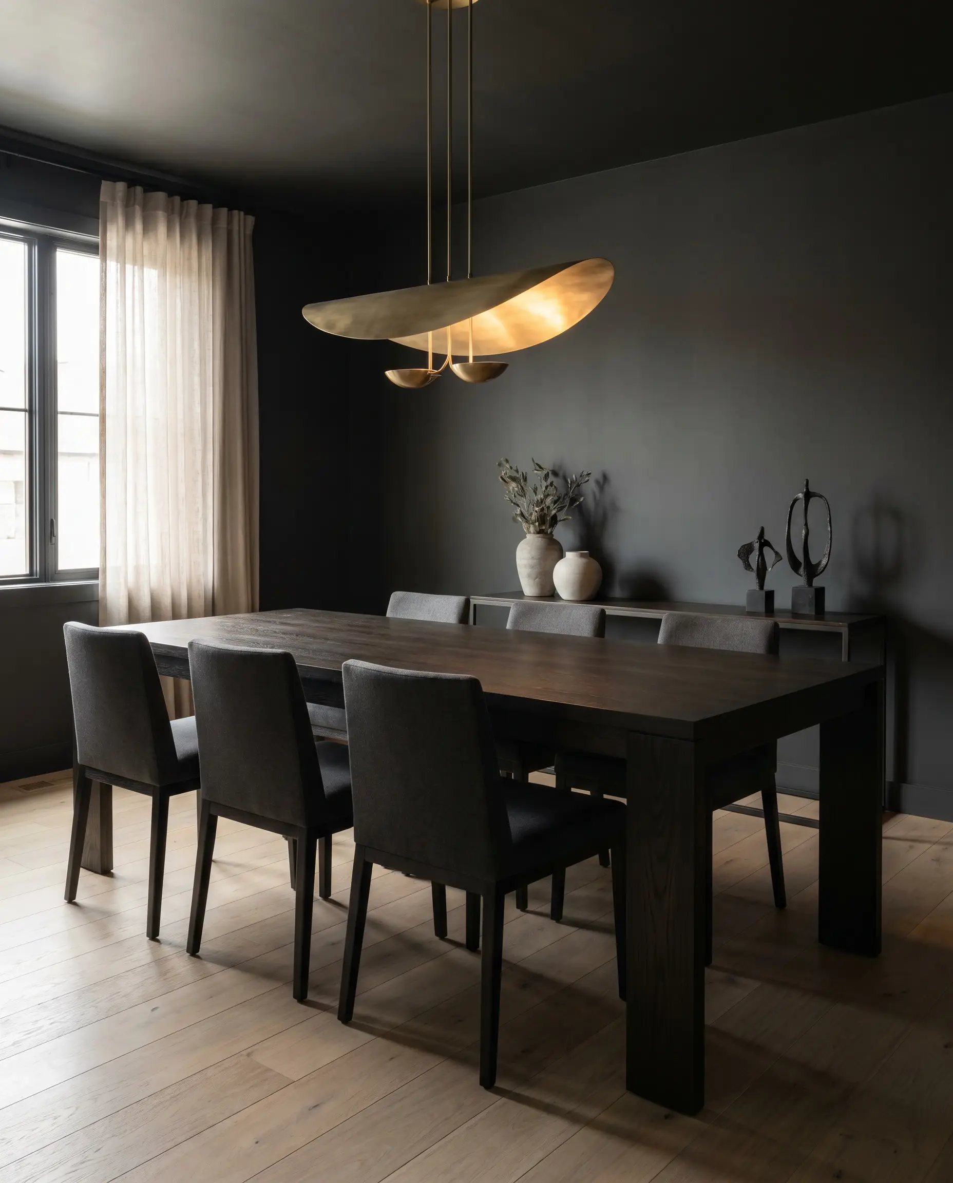
Glossy black walls easily look cheap, but an ultra-matte charcoal absorbs light, allowing the organic wood grain of your pale oak floors to pop beautifully. This flat finish acts as a grounding void, drawing the eye down to the natural texture of the wood rather than reflecting glare.
- Vibe: Sophisticated, moody, and deeply grounding.
- Key Finish: Ultra-matte or flat paint.
- Paint Recommendation: Benjamin Moore Wrought Iron.
- Undertone Match: Cool charcoal perfectly balances the warmth of clear oak.
Restrict this ultra-matte application to dining rooms or media rooms where you want to control the light and create a deeply intimate, enveloping atmosphere.
Designer Secret
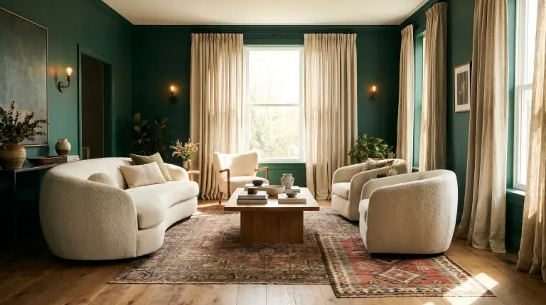
Deep Forest Green for Heritage Appeal
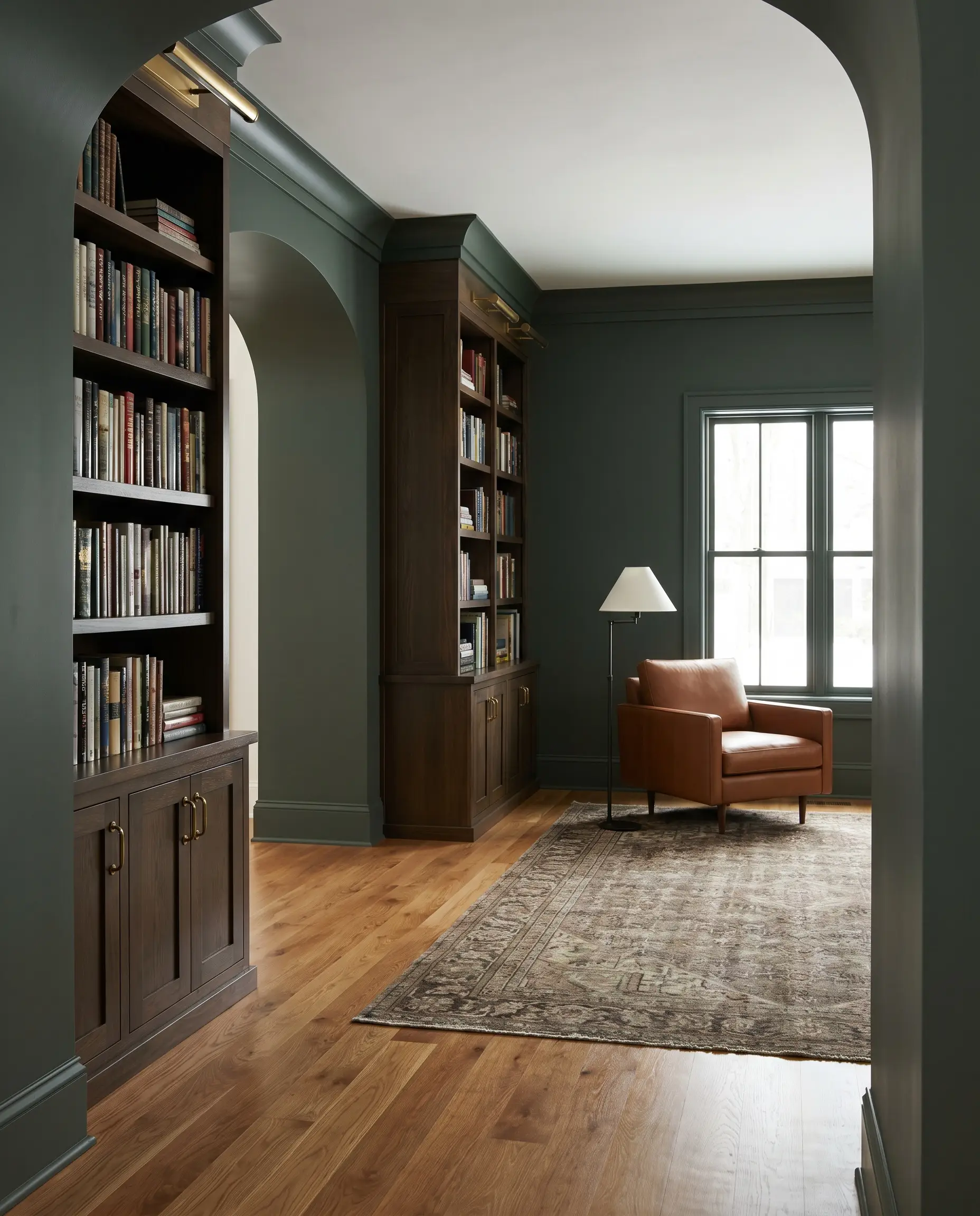
A nod to traditional English interiors, a deeply saturated forest green provides an incredibly rich backdrop that neutralizes the subtle red undertones found in honey-toned or red oak. The green pigment actively cools down the pink flash of the wood, creating a balanced, highly curated environment.
- Vibe: Transitional Heritage and refined library chic.
- Key Finish: Eggshell for subtle durability.
- Paint Recommendation: Sherwin-Williams Pewter Green.
- Styling Pro-Tip: Pair with heavy unlacquered brass hardware to bridge the green walls and light oak floors.
Ink Blue Color Drenching
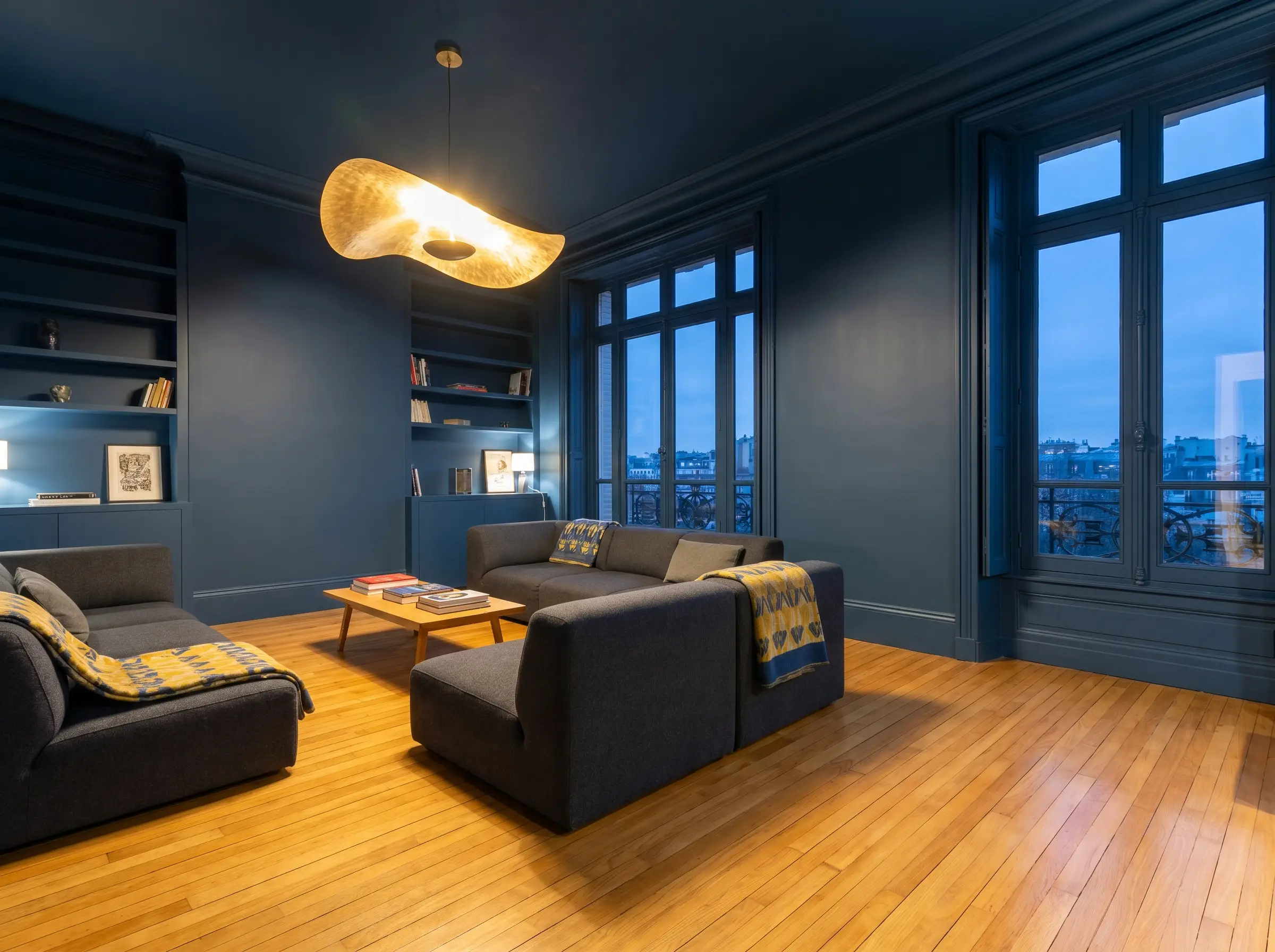
Color drenching—the practice of painting the walls, trim, baseboards, and ceiling the exact same hue—modernizes a room instantly. When enveloped in a saturated ink blue, the light oak floor becomes the sole source of brightness in the room, acting as a brilliant visual anchor.
- Vibe: Modern, enveloping, and highly architectural.
- Key Technique: Full-room color drenching.
- Paint Recommendation: Farrow & Ball Hague Blue.
- Undertone Match: Deep blue heavily contrasts yellow oak, making the wood look brighter and more intentional.
Aubergine for Postmodern Richness
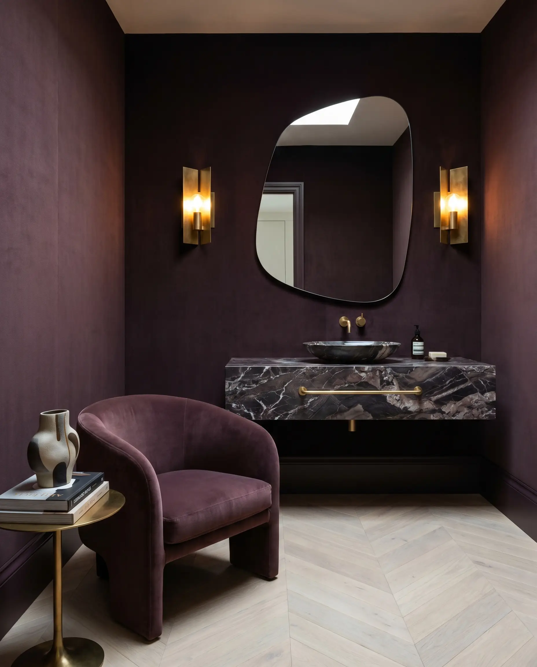
This is a daring, bespoke choice that exudes boutique-hotel luxury. Deep purple-browns pair flawlessly with pale, bleached Scandinavian oak, providing a high-fashion contrast that feels both unexpected and deeply sophisticated.
- Vibe: Postmodern Maximalism and opulent warmth.
- Key Finish: Velvet or flat matte.
- Paint Recommendation: Farrow & Ball Brinjal.
- Styling Pro-Tip: Best deployed in powder rooms or private studies where you want maximum dramatic impact.
Warm Espresso Brown for 70s Revival
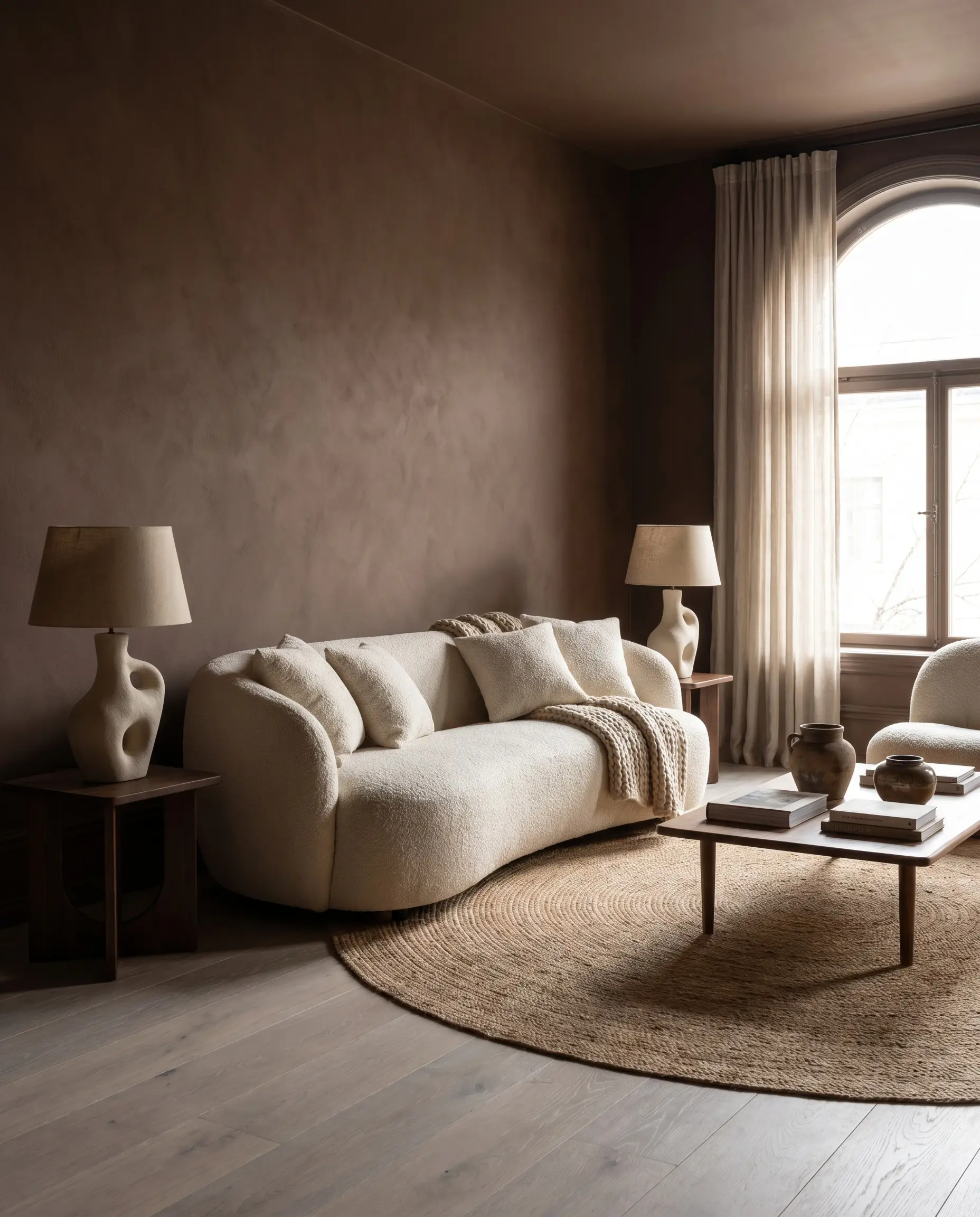
Rich, chocolate browns are rapidly replacing cool grays in high-end design. When paired with wide-plank white oak, an enveloping espresso brown creates a retro-yet-modern warmth that feels highly tactile and grounding.
- Vibe: 70s Revival and organic luxury.
- Key Finish: Washable matte.
- Paint Recommendation: Benjamin Moore Barista.
- Undertone Match: Complements the subtle ash and brown notes in European white oak.
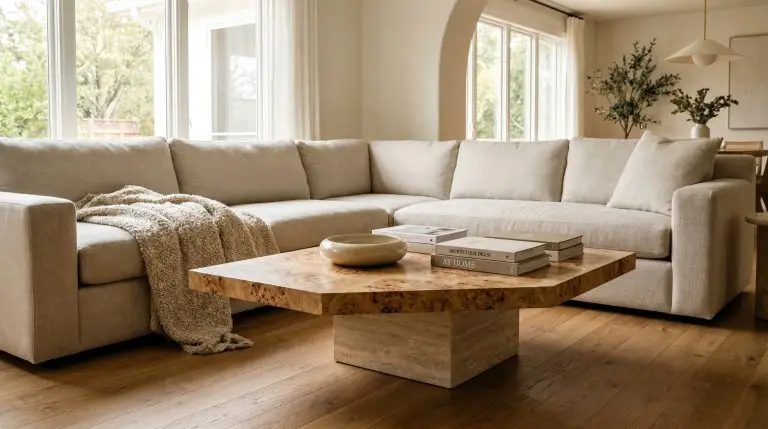
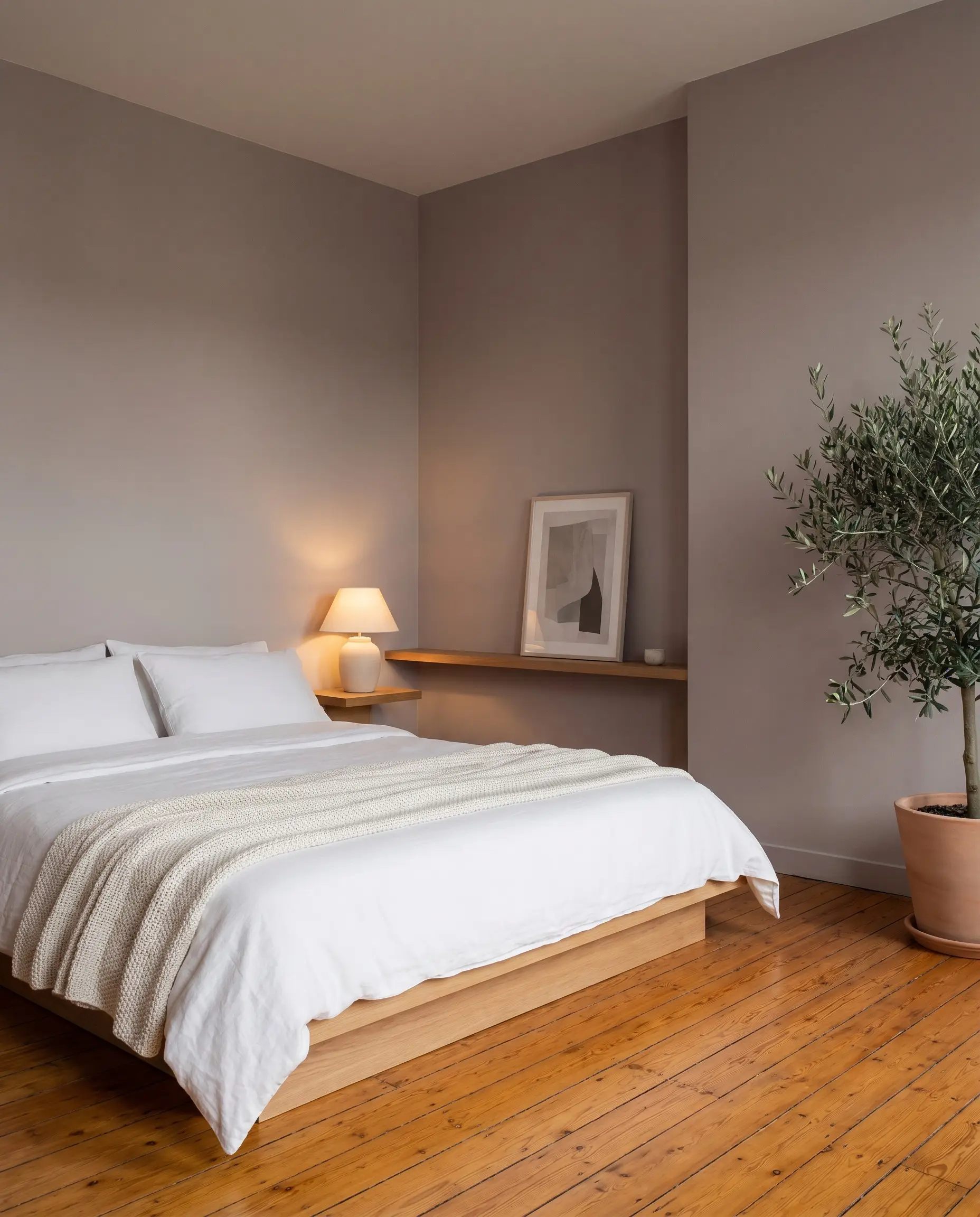
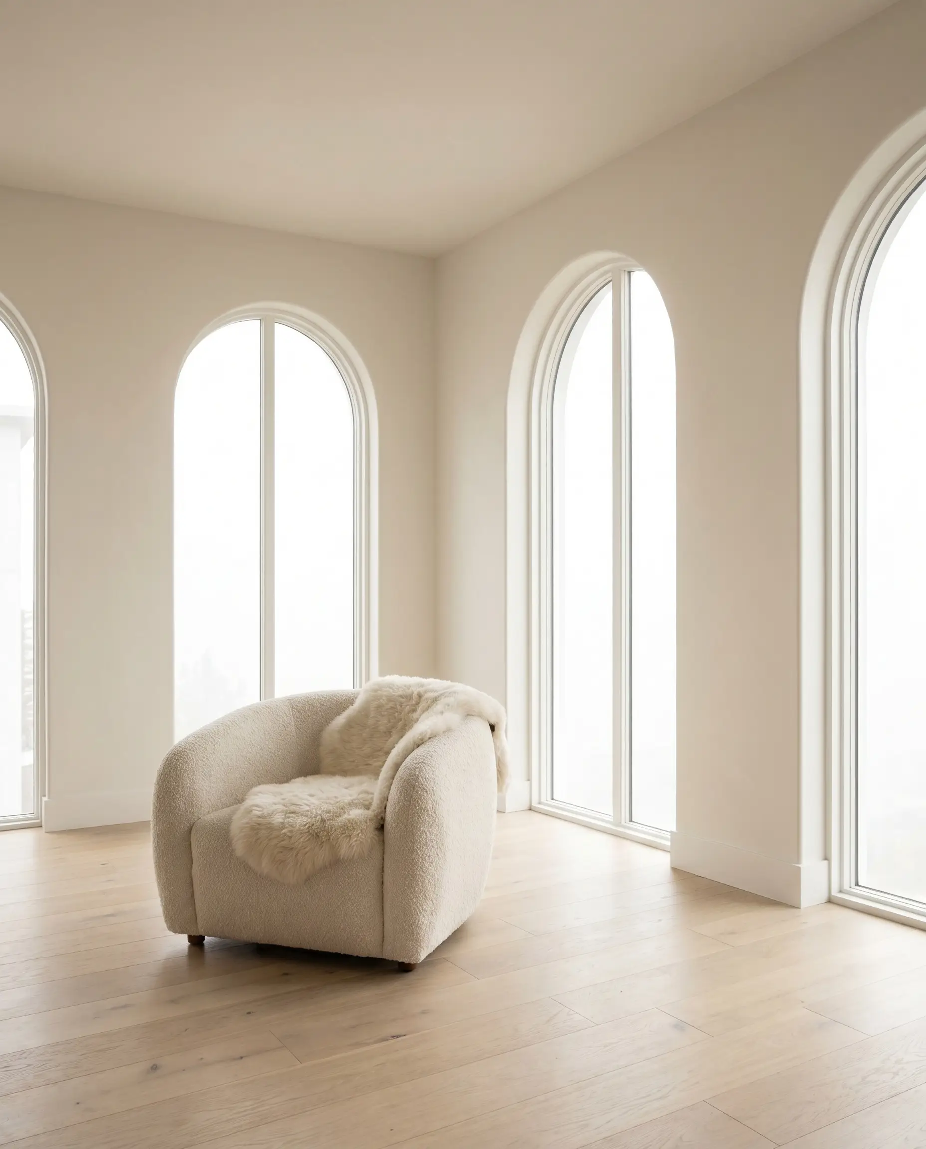
Textural Neutrals for Organic Modern Interiors
Stop relying on standard eggshell paint for neutral rooms; flat beige is fundamentally boring and leaves light floors looking washed out. To make neutral walls work with neutral light floors, you must introduce physical, calcified texture that prevents the room from looking like a flat, lifeless box.
Beige Roman Clay for Tactile Warmth

Roman clay offers a subtle, suede-like finish that catches the light beautifully across the day. When paired with light oak flooring, it creates a seamless, sun-baked California aesthetic that feels highly intentional and incredibly tactile.
- Vibe: Organic Modern and sun-drenched coastal.
- Key Material: Authentic Roman clay plaster.
- Brand Recommendation: Portola Paints Roman Clay in ‘Antigua’.
- Styling Pro-Tip: Apply with a putty knife in sweeping, organic arcs to maximize the suede effect.
Mushroom Gray to Cool Down Yellow Oak
For older light oak floors that have ambered over time, standard gray will clash horribly. Instead, a mushroom gray—a greige heavily leaning on purple and brown undertones—actively cools down the yellow in the wood without creating a jarring, sterile contrast.
- Vibe: Restorative, calm, and balanced.
- Key Finish: Flat or matte.
- Paint Recommendation: Farrow & Ball Skimming Stone.
- Color Theory Mechanic: The subtle purple undertone cancels out the harsh yellow reflection from the ambered oak.
Plaster-Effect Greige for Japandi Styling
Mimicking traditional Japanese wabi-sabi interiors, this technique introduces slight mottling to the walls. The textured depth of plaster-effect greige adds necessary visual weight to minimalist rooms anchored by stark, bleached oak planks.
- Vibe: Serene, architectural, and minimalist.
- Key Technique: Faux-plaster application or mineral paint.
- Paint Recommendation: Romabio Classico Wash in ‘Celtic Stone’.
- Styling Pro-Tip: Keep baseboards minimal or flush to the wall to maintain the architectural purity.
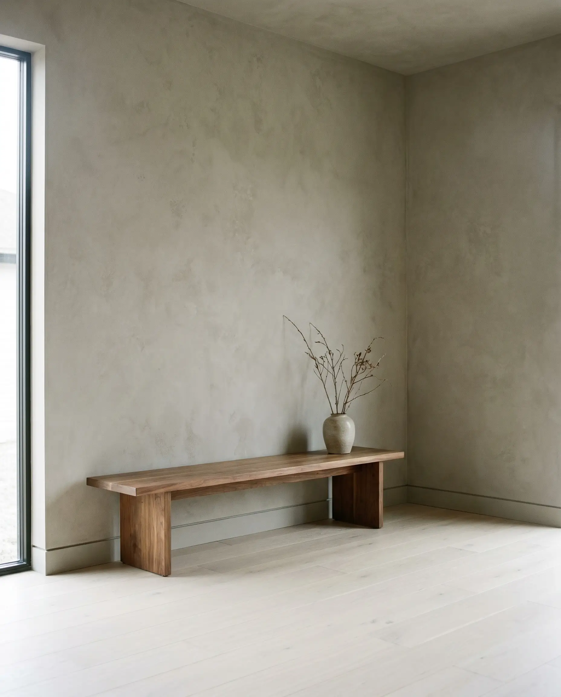
Pale Taupe Limewash
Limewash calcifies directly onto the wall, creating a chalky, breathable finish that feels ancient and bespoke. A pale taupe limewash expertly bridges the gap between warm white oak floors and crisp white ceilings, adding nuanced movement.
- Vibe: Old-world European meets modern simplicity.
- Key Material: Authentic slaked limewash.
- Paint Recommendation: Color Atelier Limewash in ‘Cheval’.
Limewash requires abundant natural light to truly showcase its mottled, cloudy texture. Reserve this calcified finish for your brightest, south-facing rooms to maximize the visual impact.
Designer Secret
Soft Clay for Mediterranean Warmth
A sandy, muted clay tone pairs flawlessly with wide-plank European oak to emulate the high-end warmth of a Mallorcan villa. It embraces the warmth of the wood rather than fighting it, creating a heavily saturated, earthy envelope.
- Vibe: Mediterranean luxury and relaxed warmth.
- Key Finish: Matte or Roman Clay.
- Paint Recommendation: Sherwin-Williams Cavern Clay.
- Styling Pro-Tip: Pair this wall treatment heavily with matte black hardware for sharp, modern contrast.
Saturated Earth Tones for Natural Depth
Earth tones perfectly bridge the gap between light and dark, pulling the outdoors in to satisfy the principles of biophilic design. These mid-tone pigments highlight the organic nature of the wood grain, making the oak feel like a living material rather than just a building supply.
Ochre for Tonality
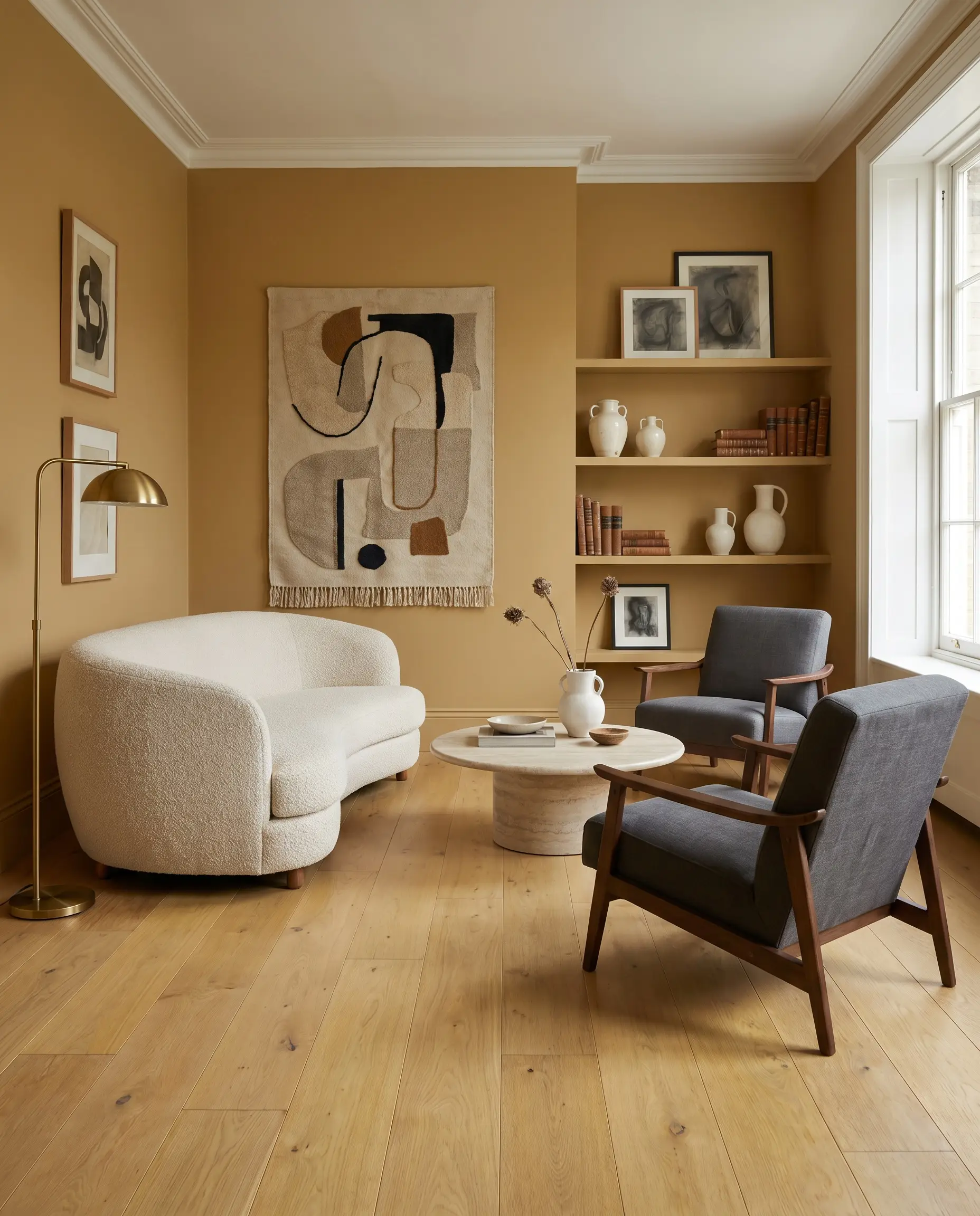
A muted mustard or ochre creates a stunning monochromatic look when paired with yellow-leaning oak floors. This tonal approach results in a highly stylized, intentional space that feels incredibly warm and curated.
- Vibe: Vintage-inspired and deeply tonal.
- Key Finish: Flat or eggshell.
- Paint Recommendation: Farrow & Ball India Yellow.
- Styling Pro-Tip: Keep your large upholstery and furnishings strictly neutral (creams and charcoals) so the ochre doesn’t overwhelm the visual field.
Dusty Olive as a New Neutral
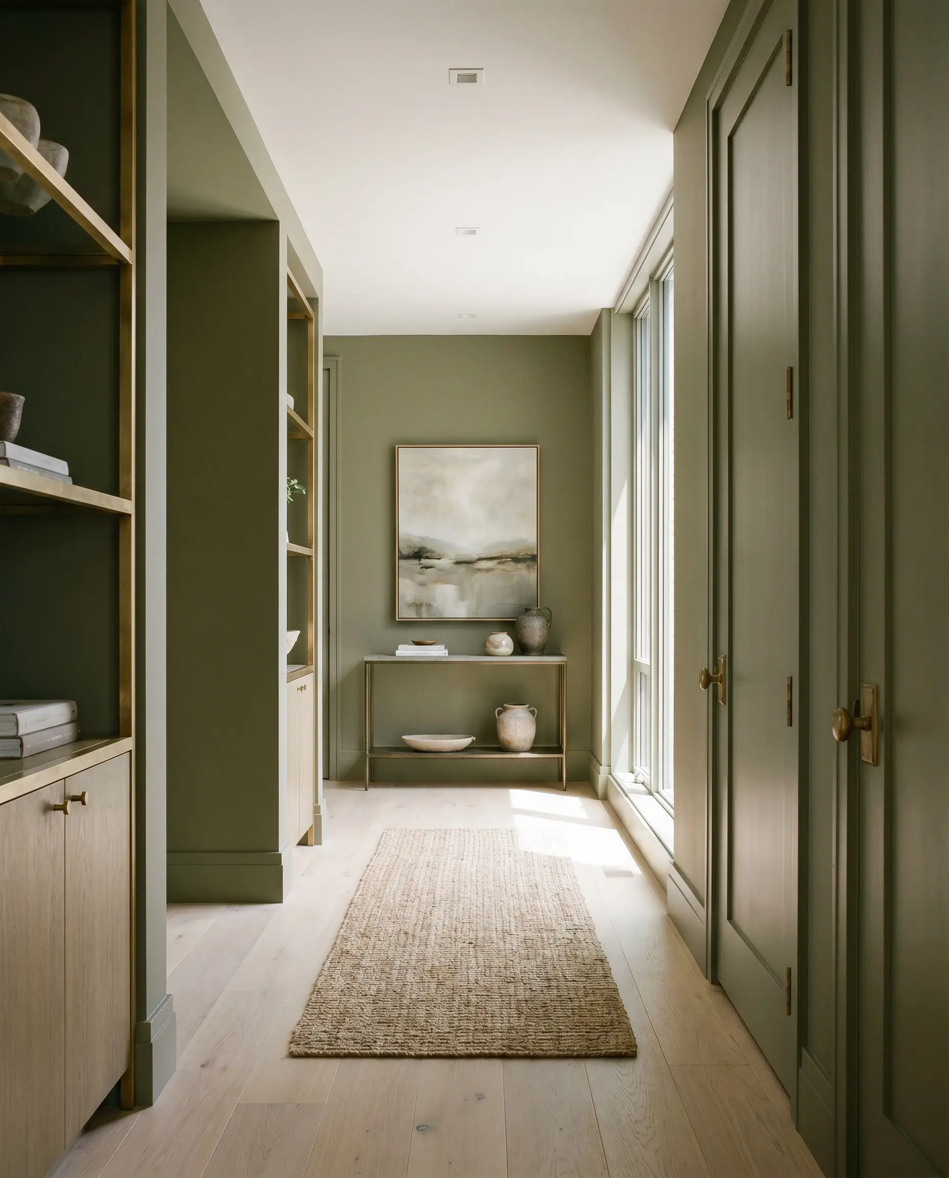
Olive green has firmly established itself as a modern neutral. It softens the harshness of pale wood, providing a grounding pigment that feels rich but never overpowering.
- Vibe: Transitional, earthy, and sophisticated.
- Key Finish: Washable matte.
- Paint Recommendation: Benjamin Moore Tate Olive.
- Material Match: Unlacquered brass millwork and hardware sing beautifully against dusty olive.
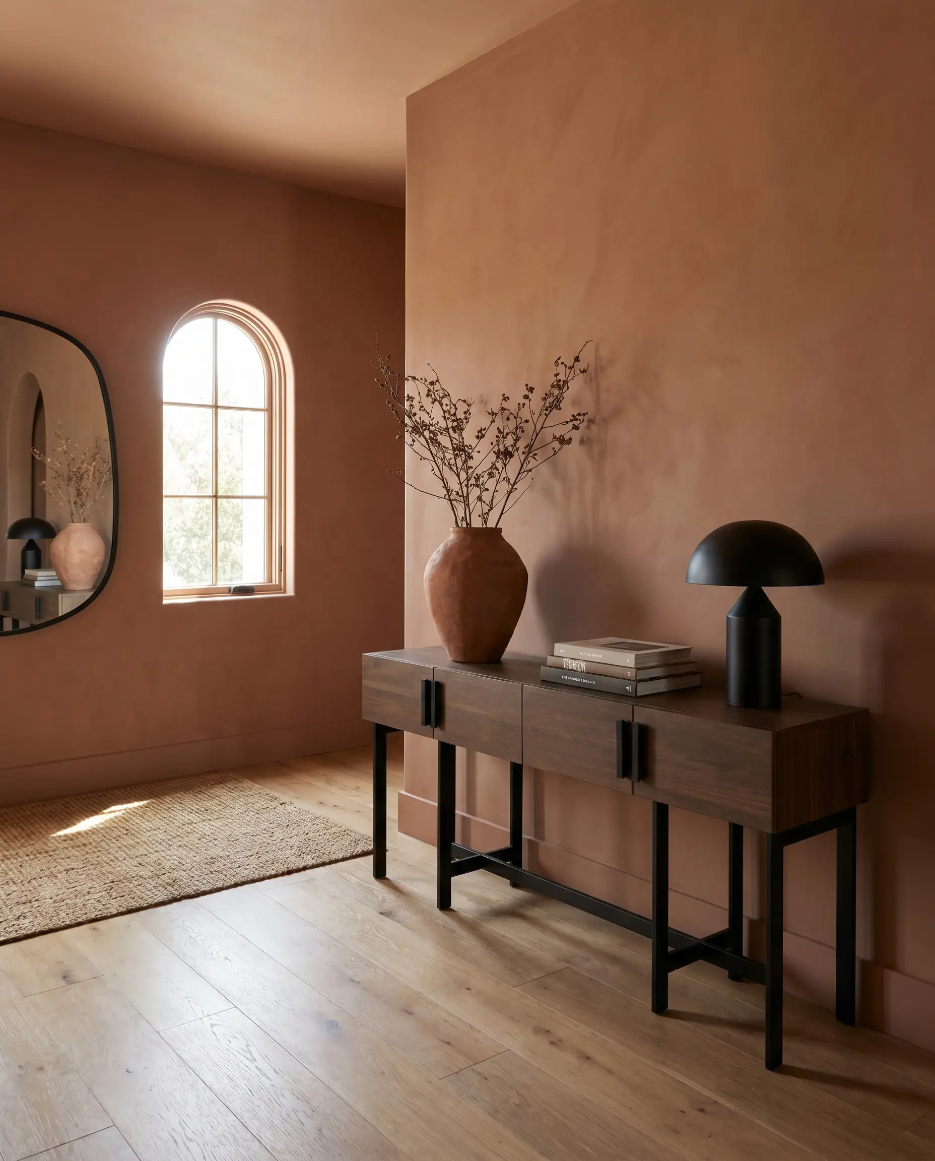
Baked Rust for High-Energy Zones
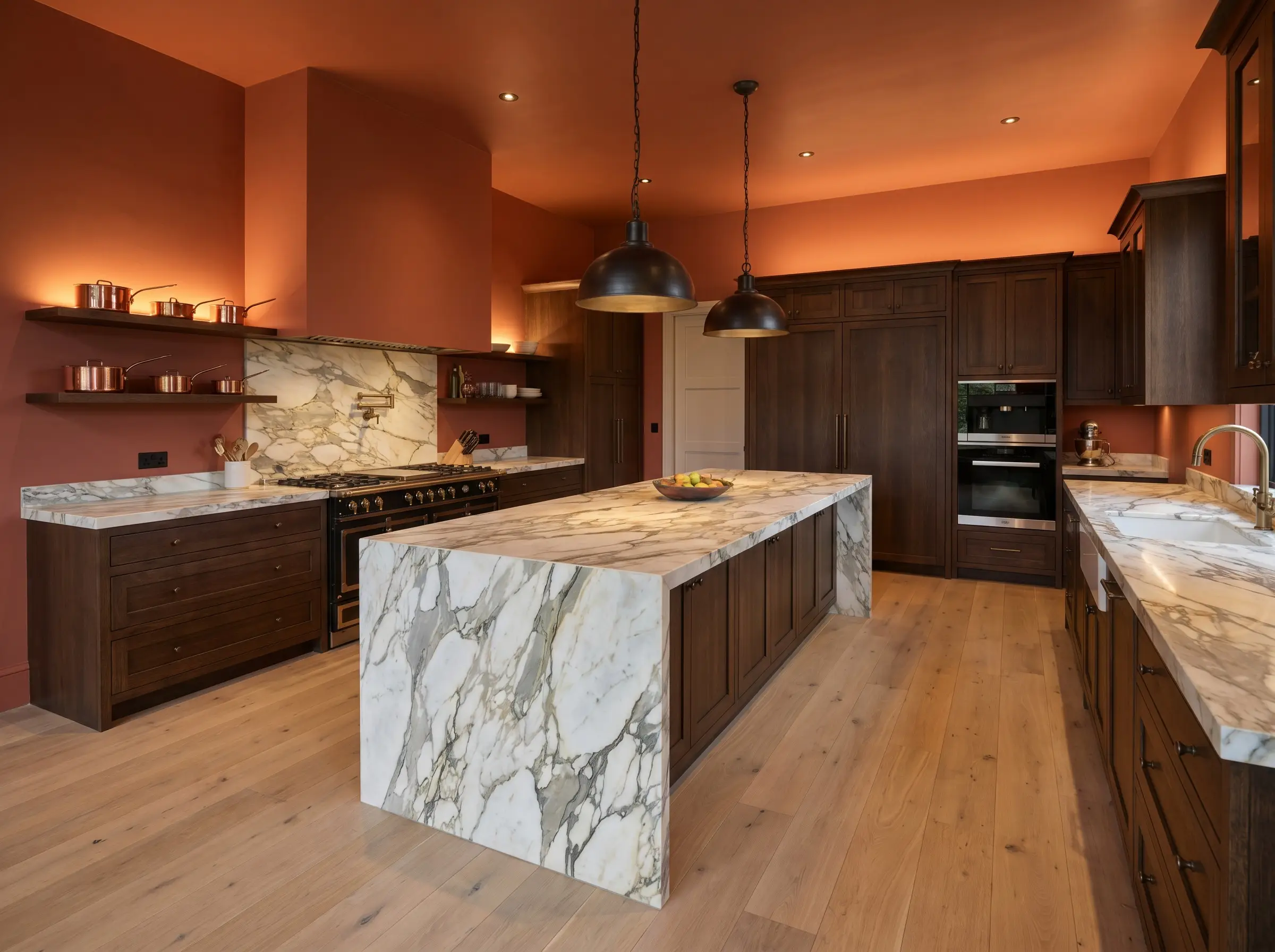
A muted terracotta or baked rust injects massive warmth and energy into spaces like kitchens or dining areas that feature white oak floors. It stands as a robust, high-end alternative to the stark, clinical white kitchens of the past decade.
- Vibe: Energetic, culinary, and rich.
- Key Finish: Satin for washability in kitchens.
- Paint Recommendation: Farrow & Ball Red Earth.
- Styling Pro-Tip: Pair with heavily veined marble countertops to cut through the warmth.
Muted Sage for Calming Bedrooms
Sage green possesses a high Light Reflectance Value, meaning it bounces natural light beautifully while still offering distinct color. This creates a deeply restorative, light-filled environment perfect for primary bedrooms with pale oak flooring.
- Vibe: Restorative, airy, and calming.
- Key Finish: Matte.
- Paint Recommendation: Sherwin-Williams Clary Sage.
- Styling Pro-Tip: Layer with natural linen textiles to enhance the organic, breathable feel of the room.
Faded Terracotta for Sun-Drenched Rooms
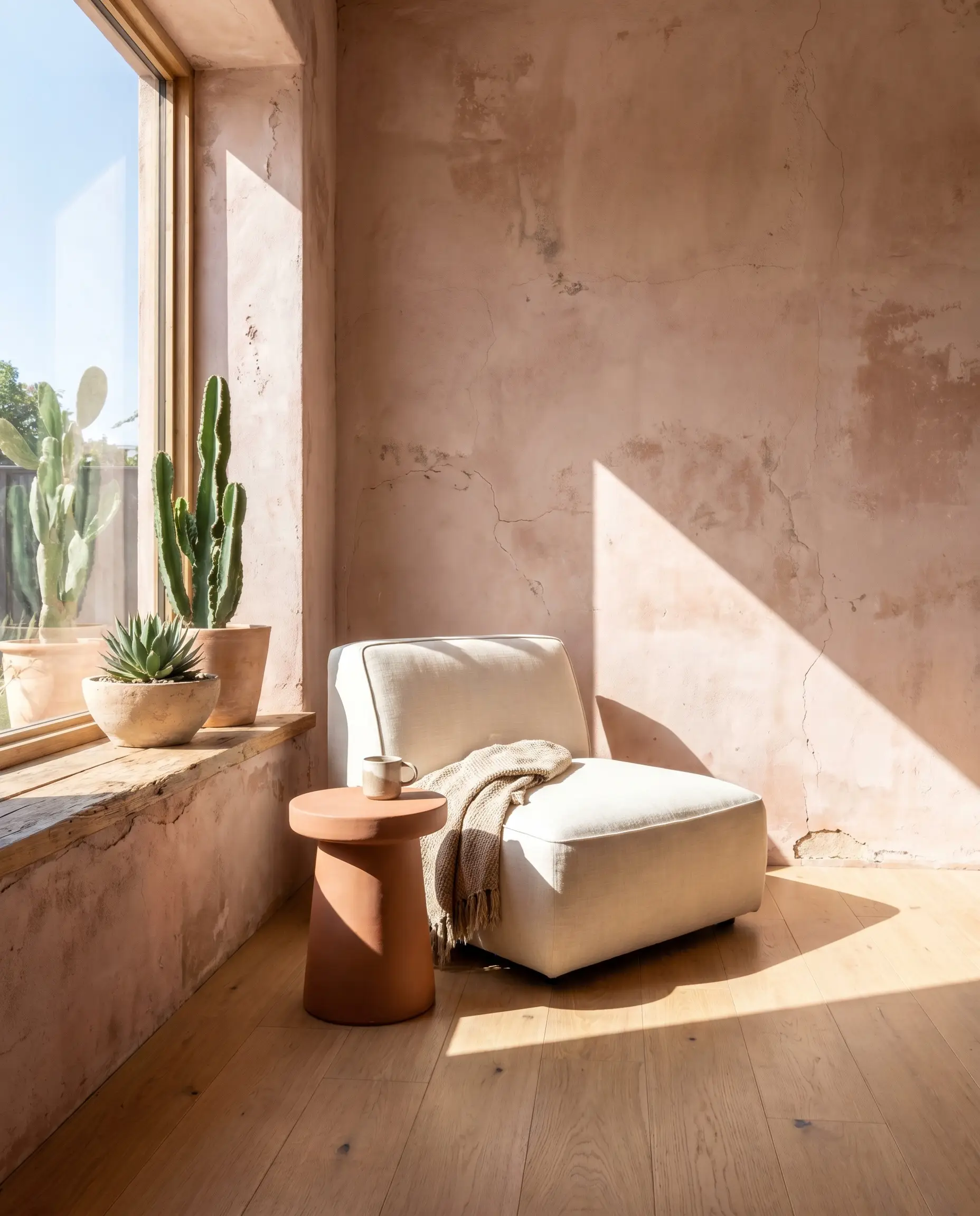
A washed-out, pinkish terracotta beautifully mimics the look of raw, aged plaster. It gracefully complements the inherent warmth of natural oak, especially when bathed in harsh, direct sunlight.
- Vibe: Sun-baked, earthy, and architectural.
- Key Finish: Limewash or flat paint.
- Paint Recommendation: Portola Paints Roman Clay in ‘Terra’.
- Directional Match: Specifically highly recommended for south-facing rooms where the sun will amplify the pink undertones.
Pale Camel for Minimalist Warmth
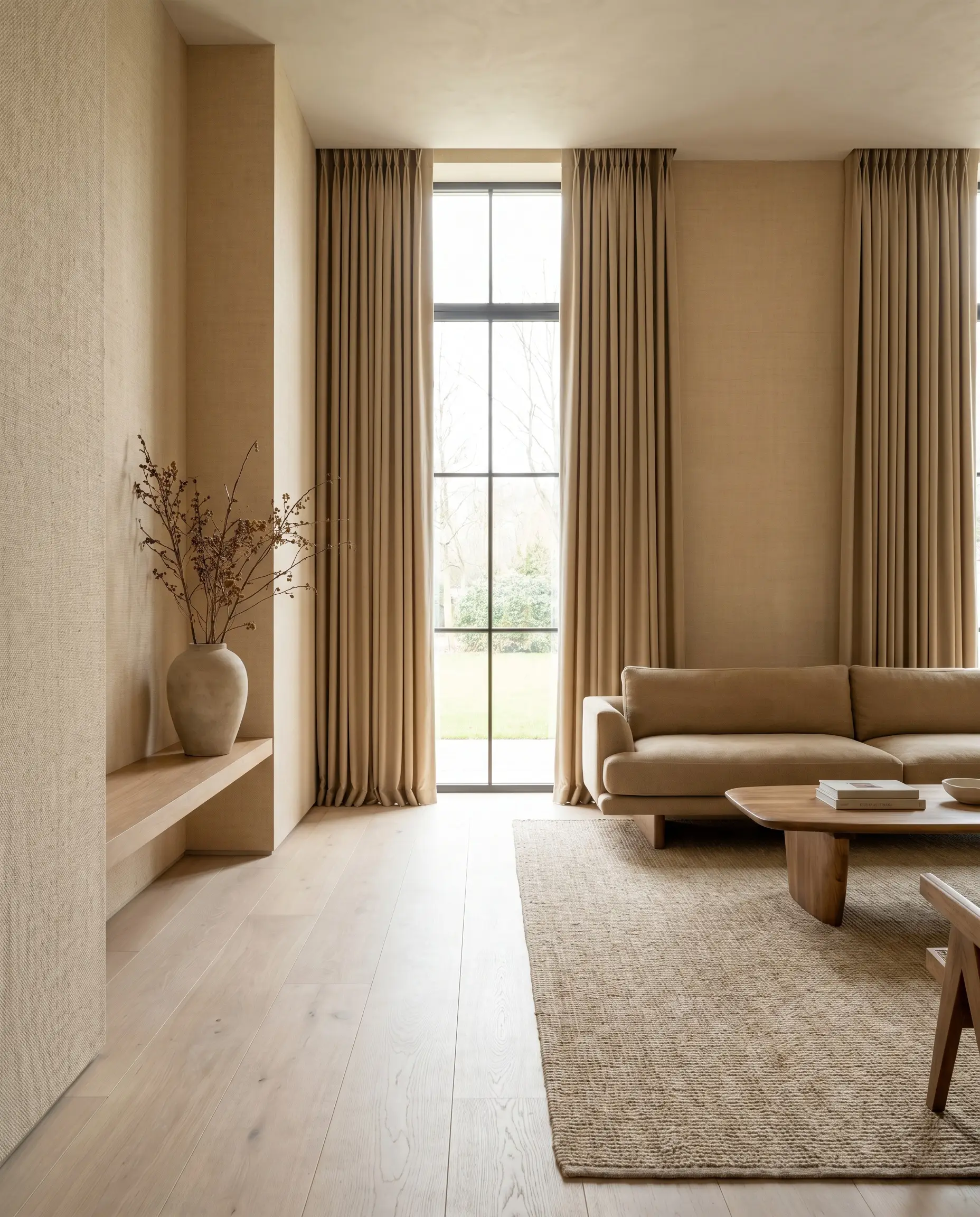
A deliberate step deeper than standard beige, pale camel provides just enough contrast against bleached floors to look architectural and intentional, never accidental. It mimics the tactile look of raw linen stretched across the walls.
- Vibe: Minimalist warmth and tailored luxury.
- Key Finish: Flat or matte.
- Paint Recommendation: Benjamin Moore Manchester Tan.
- Styling Pro-Tip: Use tone-on-tone camel drapery to heighten the bespoke, tailored aesthetic.
Architectural Whites for Clean Expansion
White is historically the hardest color to get right alongside light wood. A stark, blue-based white will instantly make light oak look cheap and unfinished. Pure, untinted white straight from the manufacturer’s can is strictly forbidden; you must select architectural whites with specific undertones formulated to flatter the wood grain.
Warm Cream to Enhance European Oak
A heavy, saturated cream draws out the subtle golden knots in raw European oak without pushing the room into yellow territory. It provides a soft, glowing envelope that feels distinctly high-end.
- Vibe: Warm, expansive, and highly curated.
- Key Finish: Flat for walls, eggshell for trim.
- Paint Recommendation: Farrow & Ball Pointing.
Paint your baseboards and crown molding the exact same warm cream as the walls to visually extend the height of the room and avoid harsh, choppy visual lines.
Designer Secret
Crisp Gallery White for Bleached Woods
For stark, Scandinavian bleached floors, you need a crisp white with a rigid gray undertone. This combination creates a pure, art-gallery effect that allows architectural furniture to take center stage.
- Vibe: Crisp, contemporary, and stark.
- Key Finish: Matte.
- Paint Recommendation: Benjamin Moore Chantilly Lace.
- Undertone Match: The gray undertone prevents the white from looking creamy against the bleached, icy wood.
Soft Chalk White to Reduce Glare
In ultra-bright rooms with large windows, glossy white walls create immense eye fatigue. A chalky, ultra-matte white absorbs that harsh glare, keeping the room feeling expansive but soft to the touch.
- Vibe: Soft, ethereal, and tactile.
- Key Finish: Dead flat or chalk paint.
- Paint Recommendation: Farrow & Ball School House White.
- Styling Pro-Tip: Lean into the tactile nature of this finish by adding bouclé or shearling furniture.
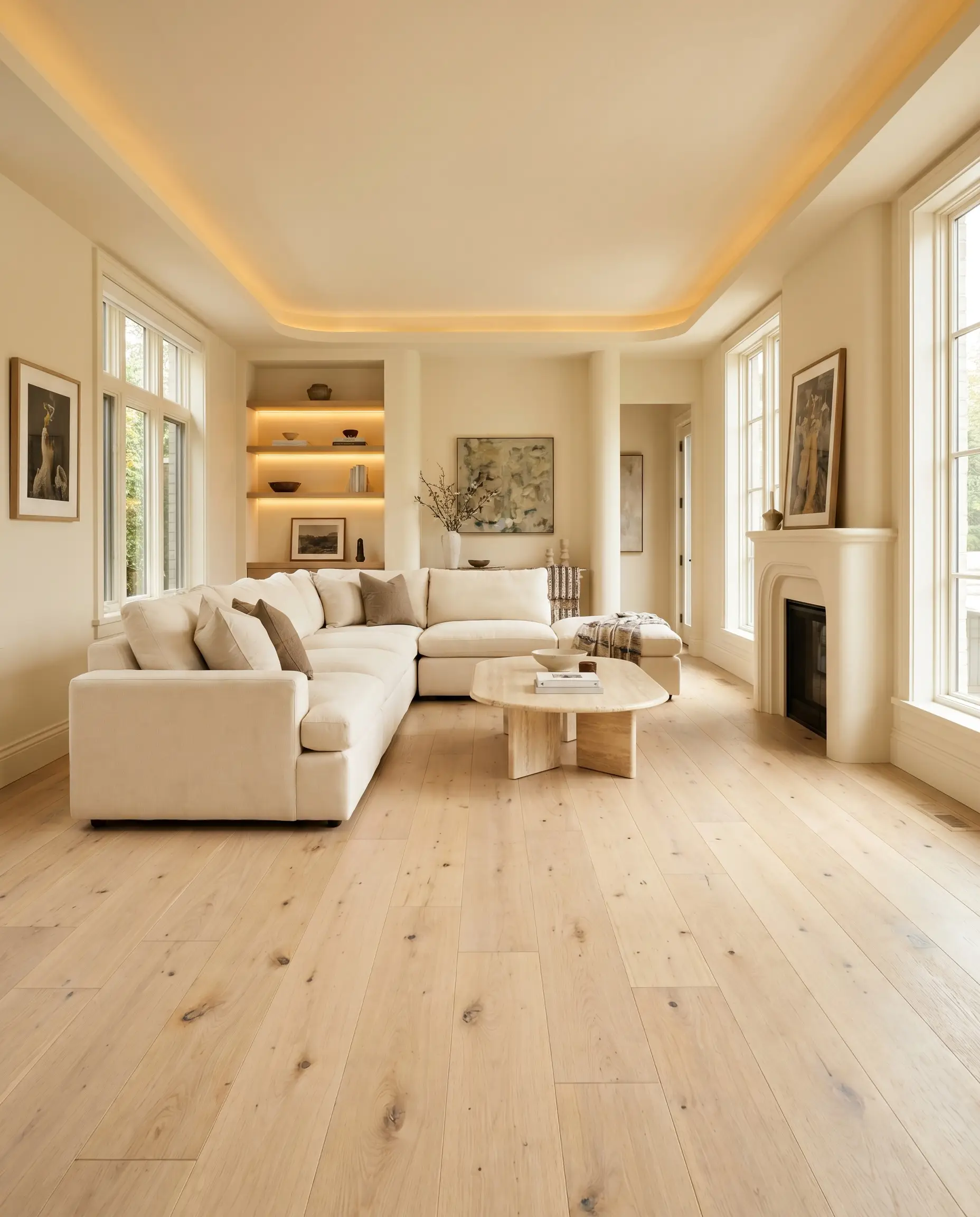
Alabaster for Low-Light Rooms
North-facing rooms lack direct, warm sunlight, which can make pale floors look dingy. An alabaster white with a warm, creamy base prevents the space from feeling cold, expertly bridging the gap to the oak floors.
- Vibe: Luminous, classic, and inviting.
- Key Finish: Flat or eggshell.
- Paint Recommendation: Sherwin-Williams Alabaster.
- Directional Match: Essential for north-facing rooms to counteract the cool, blue-tinted natural light.
Ivory with Yellow Undertones for Red Oak Contrast
If you are working with pink-leaning red oak floors, an ivory carrying a drop of yellow or green will actively neutralize the pink in the wood. This color-correction secret makes legacy red oak look significantly more expensive and modern.
- Vibe: Refined, corrected, and elegant.
- Key Finish: Matte.
- Paint Recommendation: Benjamin Moore White Dove.
- Color Theory Mechanic: The yellow-green pigment visually pushes the pink tones in the floor into the background, balancing the visual field.
The Undertone Compatibility Guide
To ensure your paint selection actively flatters your specific flooring, reference this quick-reference compatibility guide. Always identify your oak’s dominant hue before committing to a wall color.
| Oak Type (White, Red, Ambered) | Colors to Avoid | Optimal Paint Undertones | Designer Vibe |
|---|---|---|---|
| European White Oak (Ash/Brown) | Icy blues, cool grays | Warm creams, deep browns, earthy greens | Organic Modern, Minimalist Luxury |
| Traditional Red Oak (Pink/Wheat) | Peachy pinks, yellow-creams | Greens, purples, yellow-green ivories | Transitional Heritage, Refined Classic |
| Ambered Oak (Yellow/Orange) | Cool stark whites, standard grays | Purple-based greige, deep navy, ochre | 70s Revival, Moody Postmodern |
Securing the Right Finish and Lighting
Because paint sits vertically on your walls and your oak sits horizontally on the floor, light hits them at entirely different angles. You must paint large, two-foot swatches directly on the wall right above the baseboard. Observe these swatches at 10 AM in the bright morning sun, at 2 PM during peak daylight, and at 8 PM under your artificial lighting. This rigorous testing ensures the undertones of the paint and the oak never suddenly clash when the sun goes down.
For more architectural design guides, bespoke material sourcing, and expert color theory breakdowns, subscribe to the Hackrea newsletter and join our community of design-forward renovators.