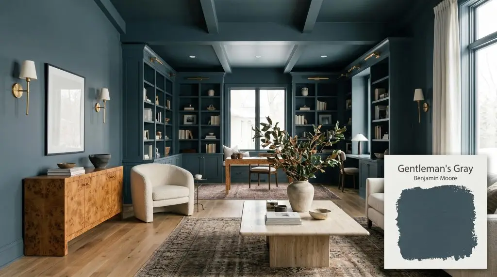
Gentleman's Gray 2062-20
Benjamin MooreGentleman's Gray by Benjamin Moore is a deeply saturated, blackened teal blue. Despite its name, it is a rich navy alternative with distinct green undertones, offering a formal, tailored aesthetic perfect for moody interiors, cabinetry, and striking exterior accents.
Paint Technical Profile
| Color ID / SKU | 2062-20 |
| HEX Code | #304656 |
| Light Reflectance (LRV) | 5.37 |
| Use | Interior, Exterior |
| Best Exposures | South-Facing, West-Facing |
| Best For | Cabinets, Accent Walls, Libraries, Dining Rooms, Exterior Doors |
Benjamin Moore Gentleman’s Gray: The Tailored Navy Alternative Redefining Dark Interiors
The name is a brilliant piece of design misdirection. When you open a can of Gentleman’s Gray 2062-20, you are not met with a predictable, stormy neutral. Instead, you uncover a rich, tailored aesthetic that completely rewrites the rules for moody interiors.
This Benjamin Moore favorite operates as a sophisticated navy alternative, trading standard nautical tones for a complex, blackened teal. It acts as a stunning architectural finish, wrapping a room in profound visual depth without making the space feel enclosed.
Whether you are updating a suburban builder-grade home or refining an urban townhouse, this color requires intentional execution. We are going to explore exactly how this pigment manipulates light, interacts with everyday materials, and transforms ordinary rooms into highly curated environments.
Gentleman’s Gray 2062-20: Undertones & LRV Explained
Is this paint warm or cool? Gentleman’s Gray leans decidedly cool, but it is far from a frigid, icy blue. Its temperature is tempered by a rich, organic green cast that gives the pigment a soft, lived-in quality.
With a light reflectance value (LRV) of 5.37, this chromatic structure absorbs a tremendous amount of light. In practical terms, this means the paint will read as a near-blackened navy in unlit corners, demanding strategic ambient lighting to reveal its subtle green nuance.
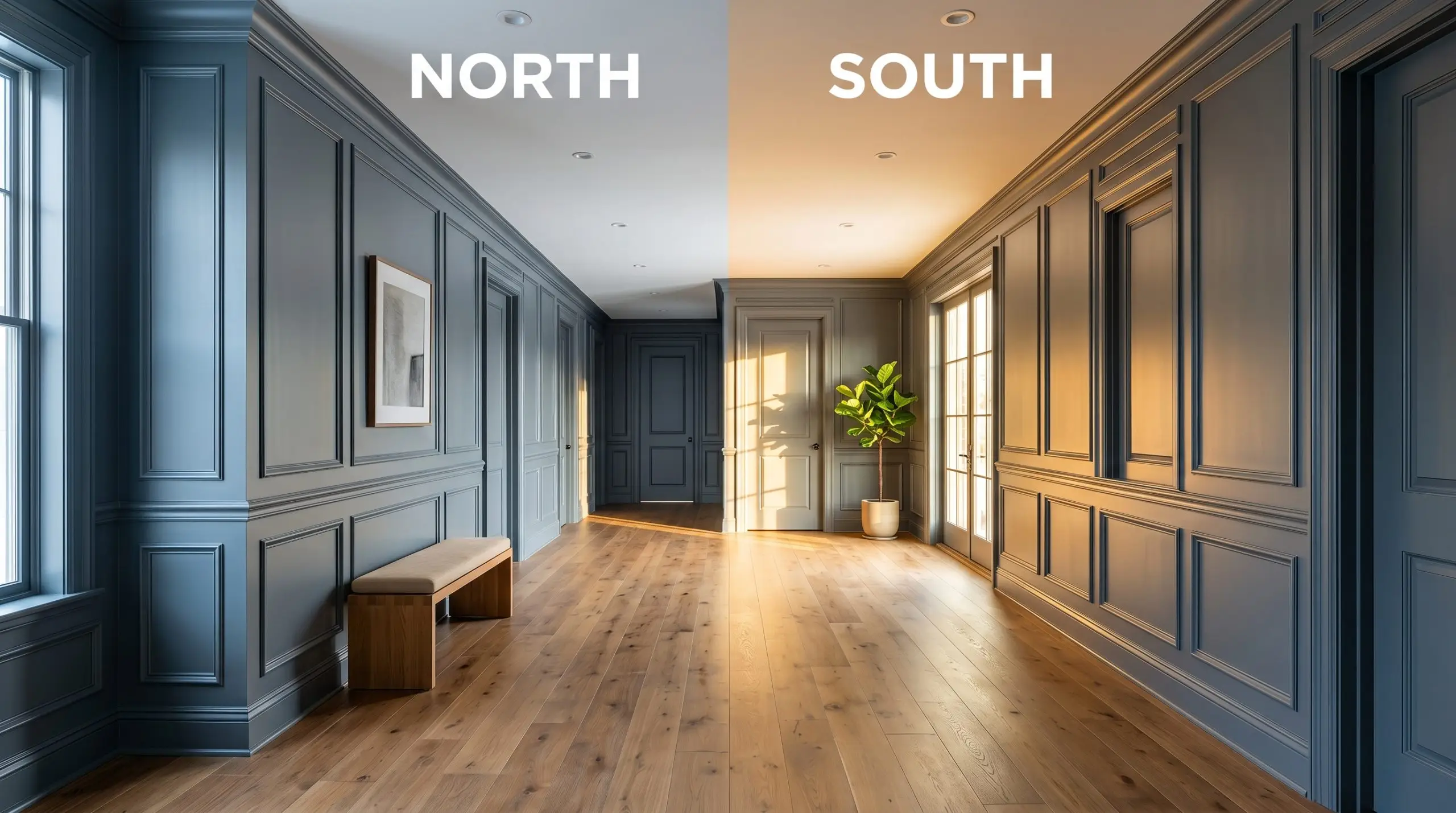
Lighting Effects & The Chameleon Factor
Dark, complex colors are notoriously reactive to their environment, and this blackened teal is no exception. Because its color structure balances blue, green, and charcoal, the shifting sun will drastically alter its personality throughout the day.
Popular Applications for This Blackened Teal
Moving beyond standard accent walls requires treating this rich pigment as a foundational material. When applied thoughtfully, this navy alternative can completely redefine the architectural boundaries of your home, adapting to a wide range of styling choices.
Home Libraries and Studies
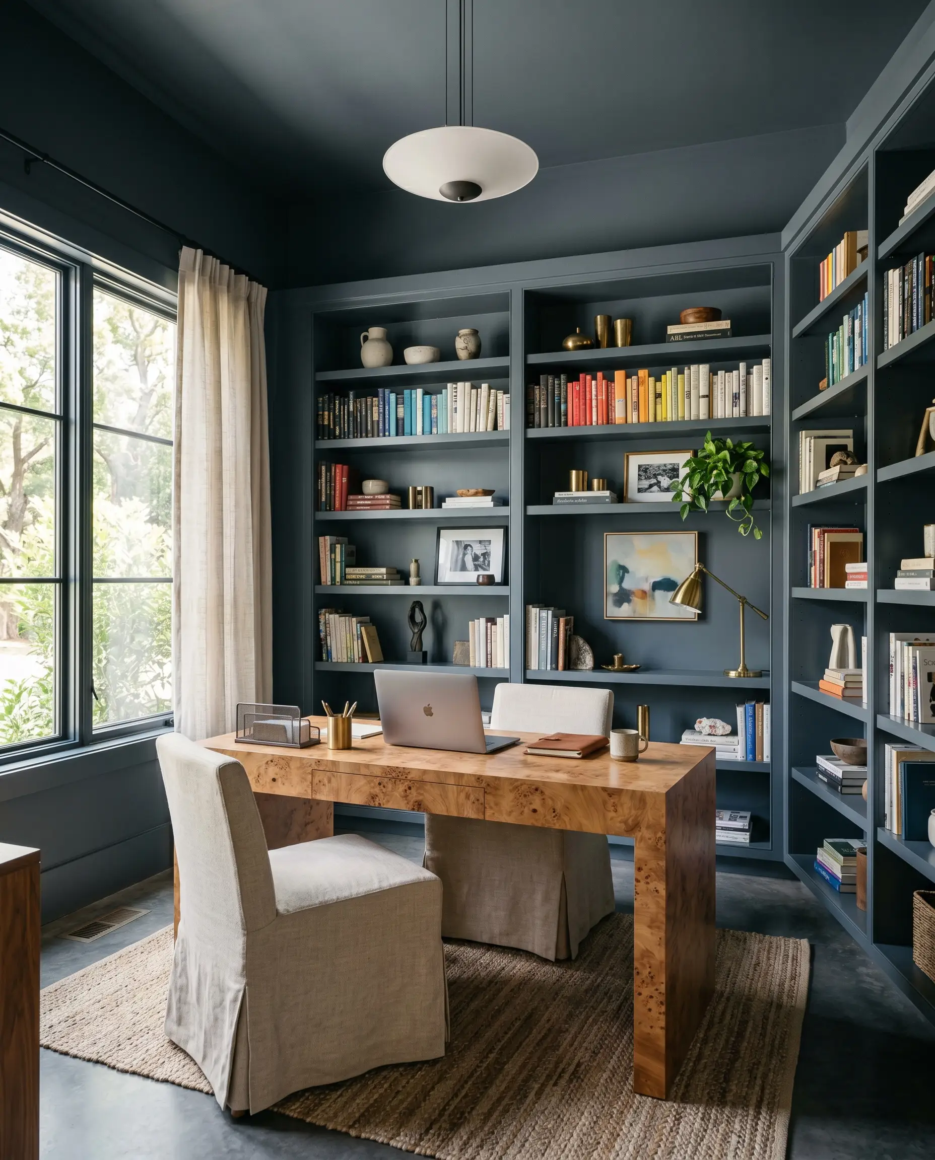
Instead of defaulting to a predictable, dusty “historic” library, use this color to create a sleek, modern workspace for remote creatives. Color-drenching the walls, ceiling, and built-in bookcases in a matte finish creates a seamless, distraction-free envelope. Pair it with a warm burl wood desk and a slipcovered linen chair to soften the intensity of the dark walls.
When painting built-ins, use a satin or semi-gloss finish on the shelving while keeping the walls matte. This subtle sheen variation reflects ambient lighting and prevents the dark color from feeling flat.
Hackrea Design Secret (The Finish Contrast)
Kitchen and Butler’s Pantry Cabinetry
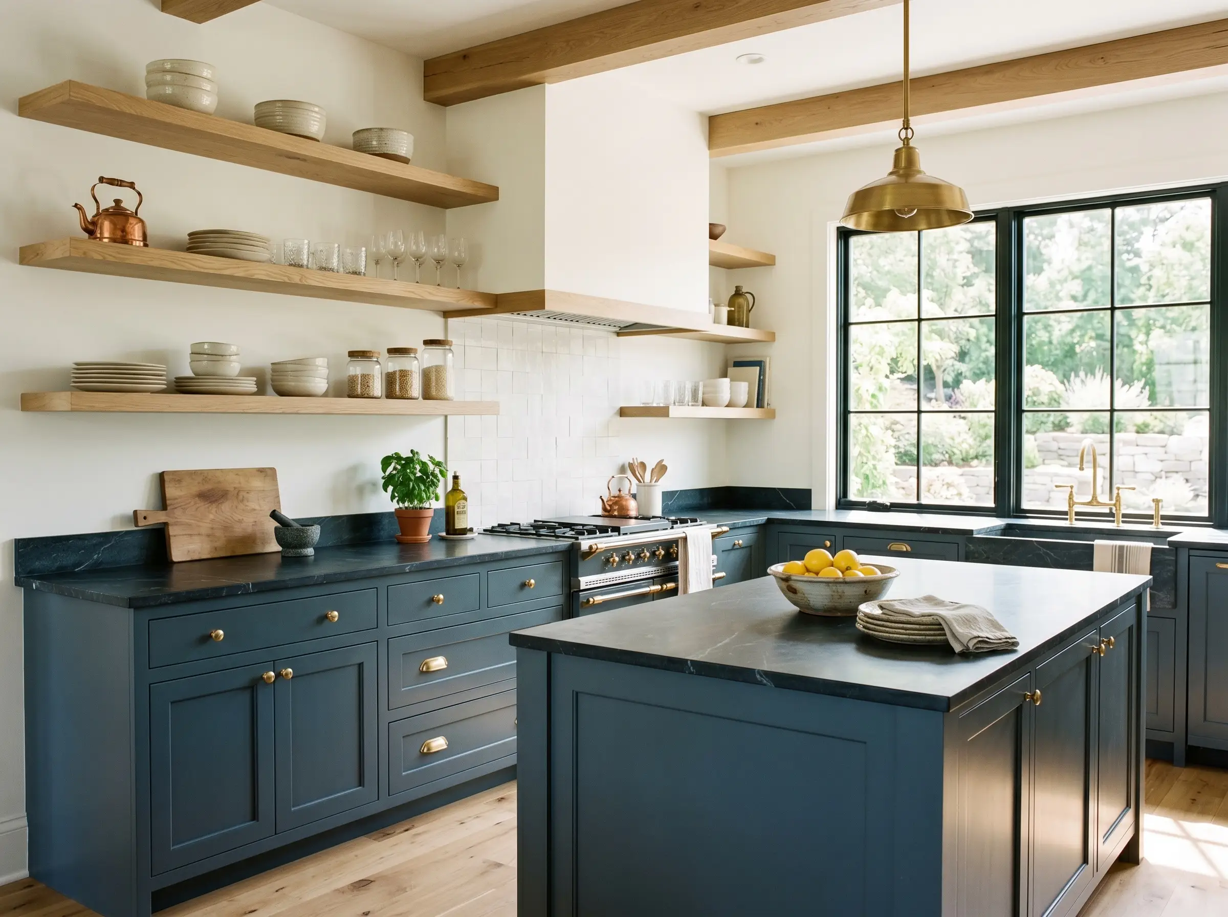
This shade is a magnificent cabinetry finish for homeowners who want color without the visual fatigue of a bright primary hue. Apply it to lower cabinets or a central island, pairing it with honed soapstone countertops and unlacquered brass hardware. The metallic warmth of the brass cuts through the cool teal, while white oak open shelving keeps the upper half of the kitchen feeling expansive and airy.
Formal Dining Rooms
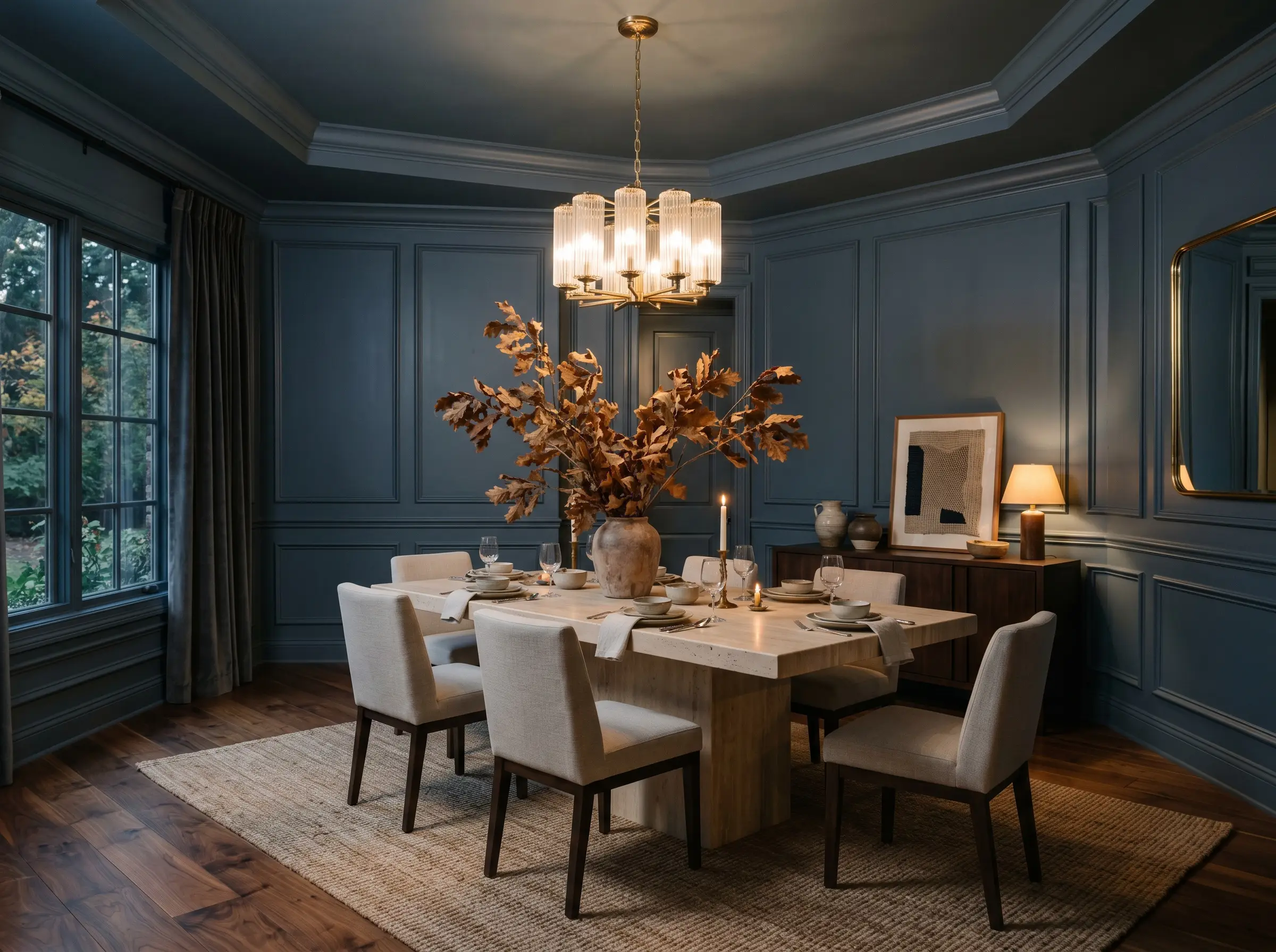
Dining spaces thrive on intimacy, and wrapping the room in this saturated tone instantly drops the visual ceiling, creating a cozy, curated atmosphere for evening entertaining. Install picture frame molding and paint the entire wall—trim included—in Gentleman’s Gray to establish a tailored, custom-built look. Offset the dark walls with a textured sisal rug, a light travertine dining table, and oversized branches in a raw ceramic vase to introduce an organic modern edge.
Exterior Front Doors and Shutters
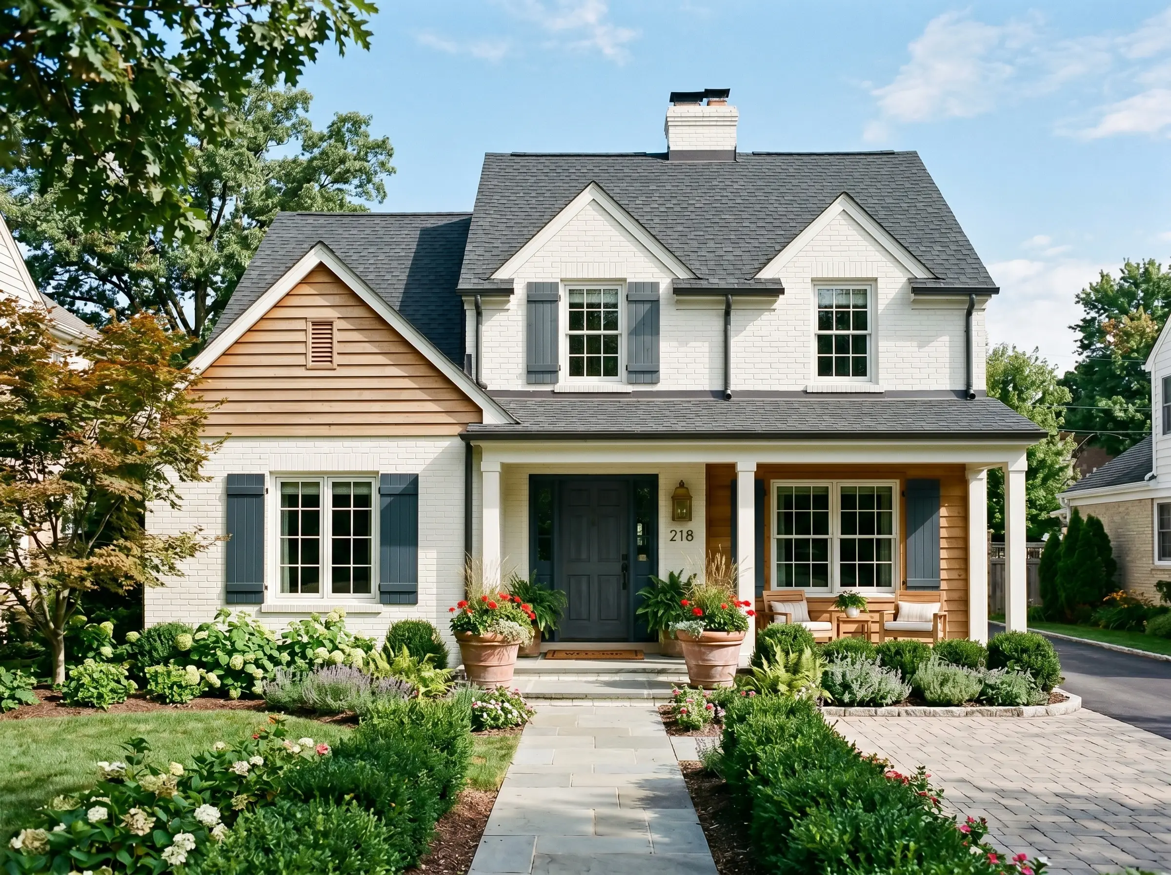
On an exterior facade, full sunlight will wash out subtle nuances, making this color read much bluer and brighter than it does indoors. It serves as a brilliant, high-contrast accent against warm white painted brick or natural cedar siding. Flank the front door with oversized terracotta planters to introduce a complementary, earthy warmth that balances the cool exterior palette.
Be highly strategic when pairing this specific blue-green with heavily orange-toned red brick facades. The contrasting colors can vibrate intensely in direct sunlight; test a large swatch to ensure the teal undertones do not aggressively clash with your masonry.
Clash Warning (The Red Brick Rule)
Powder Rooms
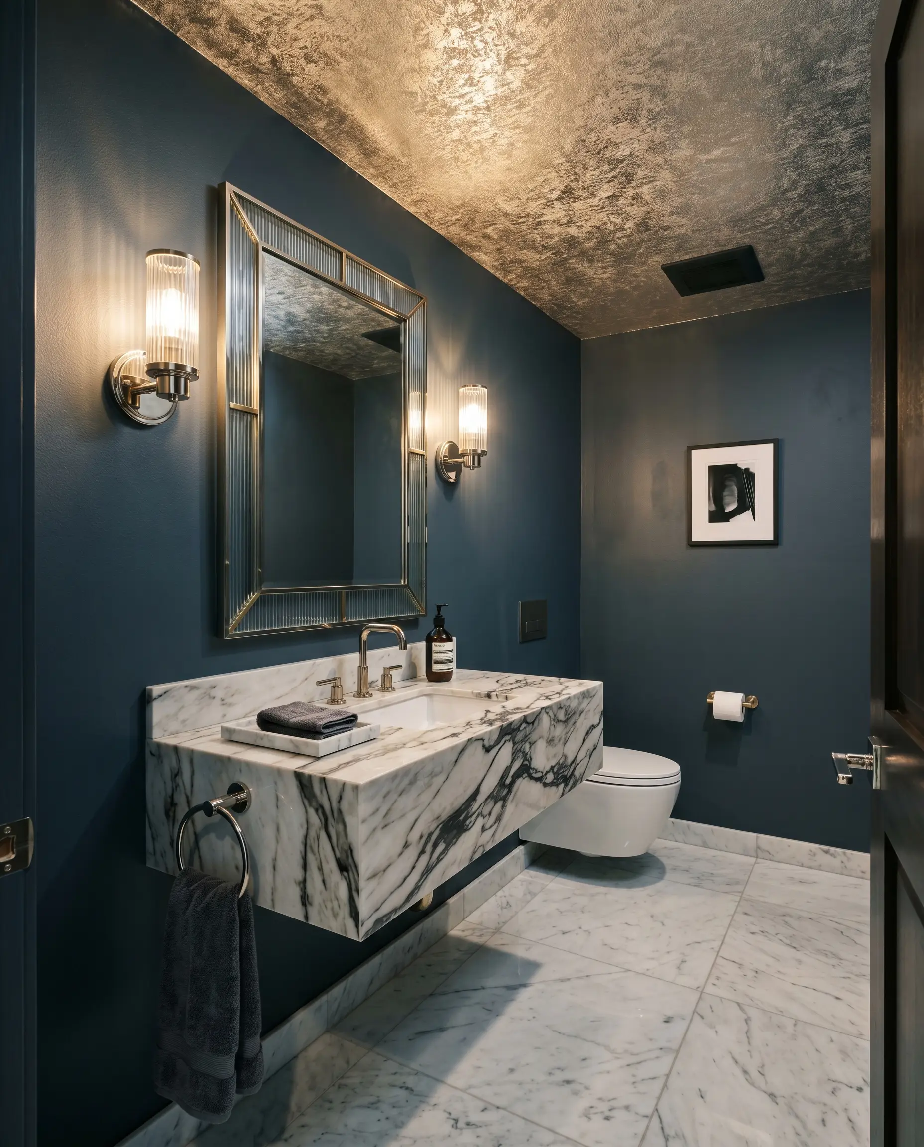
A windowless powder room is the perfect canvas to fully embrace the light-absorbing nature of this pigment. Instead of fighting the lack of natural light, lean into the moodiness by pairing the painted walls with a metallic foil wallpaper on the ceiling. Add a floating marble vanity and polished nickel sconces to bounce artificial light around the small footprint, creating a luxurious, jewel-box experience for guests.
Curating a Palette Around Benjamin Moore Gentleman’s Gray
Instead of standing alone, this saturated pigment requires intentional contrast to maintain its shape and prevent the room from feeling like a shadowed enclosure. It thrives when pushed against crisp, highly reflective boundaries or warmed up by earthy, tactile textiles.
Crisp Boundaries and Architectural Trim
To keep this dark navy from bleeding into the shadows, you must establish a sharp, tailored boundary. Benjamin Moore Chantilly Lace 2121-70 and Sherwin-Williams High Reflective White SW 7757 both offer a stark, un-tinted crispness that forces the teal undertones to snap into focus. For a slightly softer transition that still maintains a clean edge, Farrow & Ball All White 2005 provides a beautifully pure contrast without feeling blindingly sterile.
Tactile Elements and Hardware Finishes
Secondary Tones and Accent Hues
Curated Room Concepts
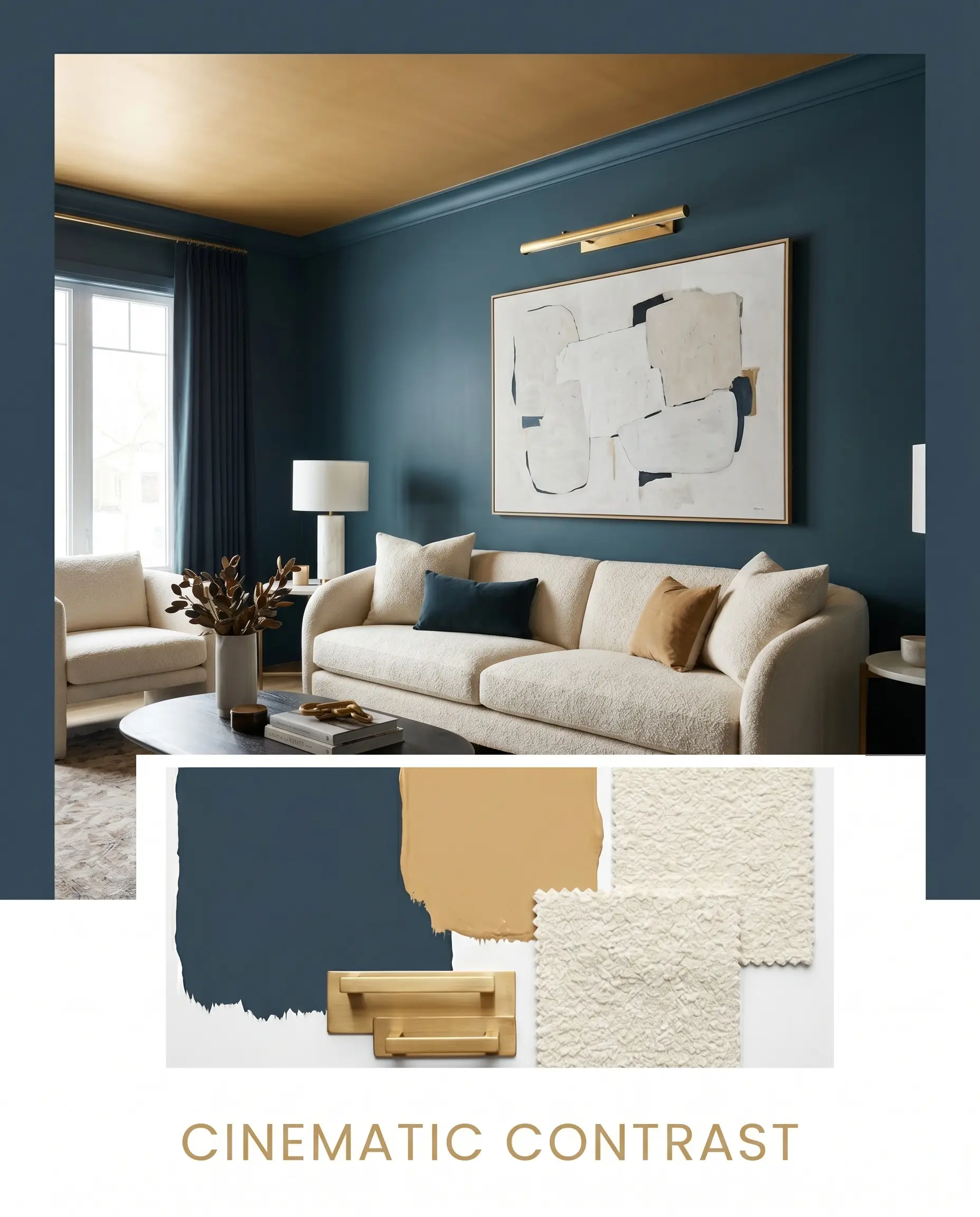
Cinematic Contrast This concept leans into high-drama modernism by pairing the blackened teal walls with the glowing warmth of Sherwin-Williams Tarnished Trumpet on the ceiling. Incorporate an unlacquered brass picture light and an oversized abstract canvas to break up the dark envelope. A plush, cream bouclé sofa anchors the center, providing a soft, tactile relief against the saturated architectural shell.
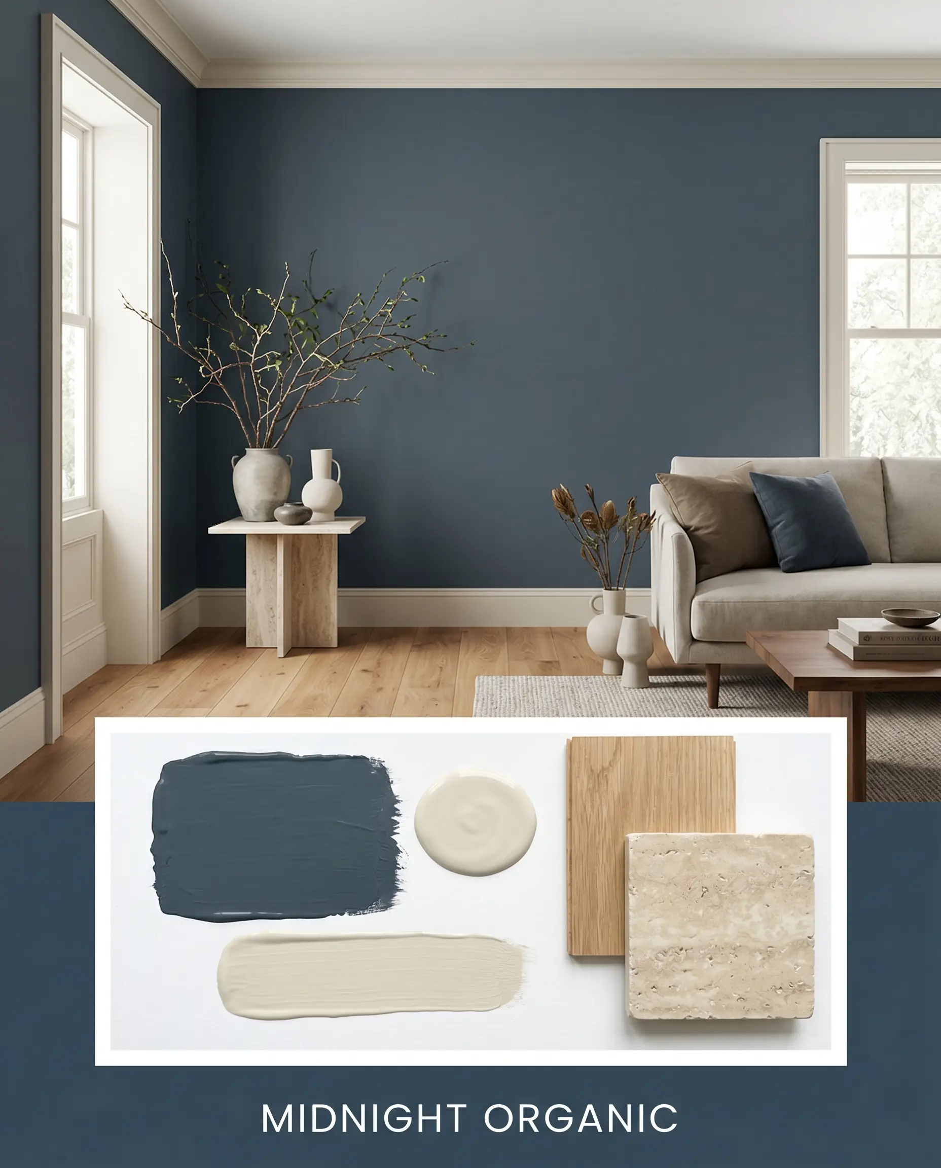
Midnight Organic To soften the inherent formality of this color, we introduce the quiet, earthy nature of honed travertine and raw white oak. Paint the surrounding trim in Benjamin Moore Pale Oak to create a gentle, low-contrast transition that feels deeply calming. Finish the styling with asymmetrical ceramics and oversized branches to bring a sweeping, natural energy into the structured palette.
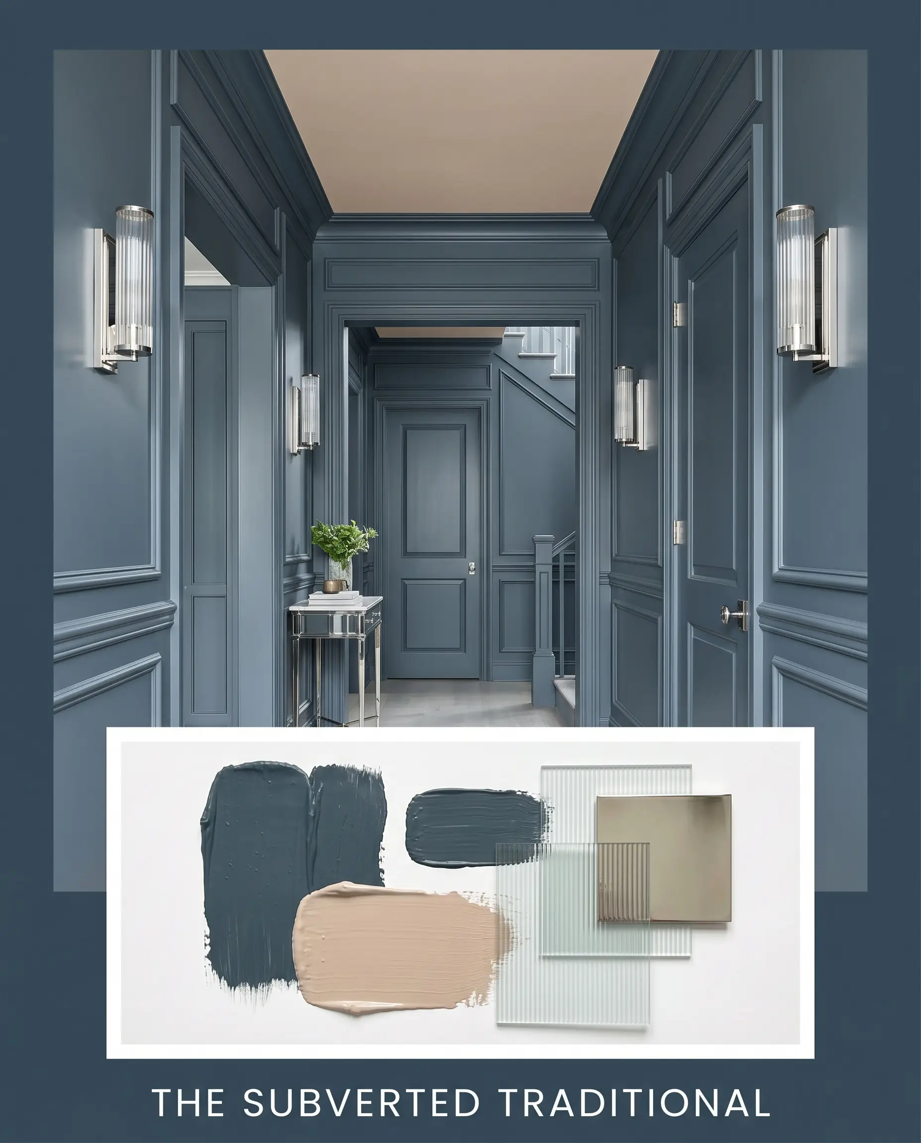
The Subverted Traditional This approach takes classic wainscoting and flips the expectation by color-drenching the entire wall and trim in the dark navy. Introduce Farrow & Ball Setting Plaster on the ceiling or adjoining walls to inject a surprising, dusty pink warmth. Add fluted glass accents and polished nickel hardware to bounce ambient light and keep the aesthetic feeling fresh and beautifully updated.
Gentleman’s Gray vs. Competing Dark Blues
Choosing the exact right dark tone often comes down to how much natural light your specific layout receives and how much green you actually want to see. When placed in shadowy corridors or paired with competing cool tones, a different shade might perform better.
Benjamin Moore Gentleman’s Gray vs. Benjamin Moore Hale Navy
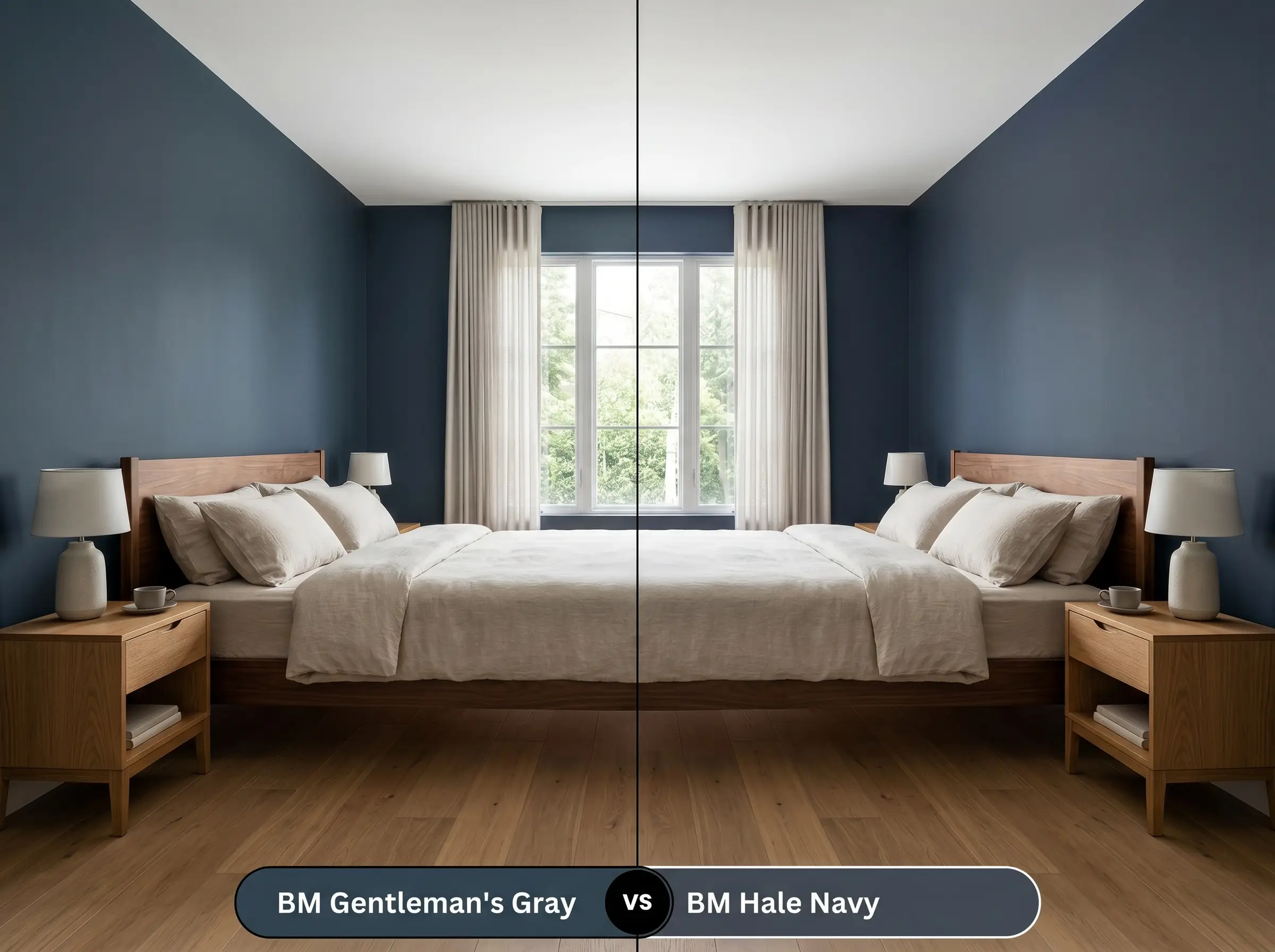
Hale Navy is a steadfast, traditional charcoal-blue with almost no green in its DNA. If your room lacks natural light and you fear the teal pulling too aggressively, Hale Navy offers a much more predictable anchor. It delivers that coveted dark intensity without the shifting chameleon effect.
Benjamin Moore Gentleman’s Gray vs. Sherwin-Williams Naval
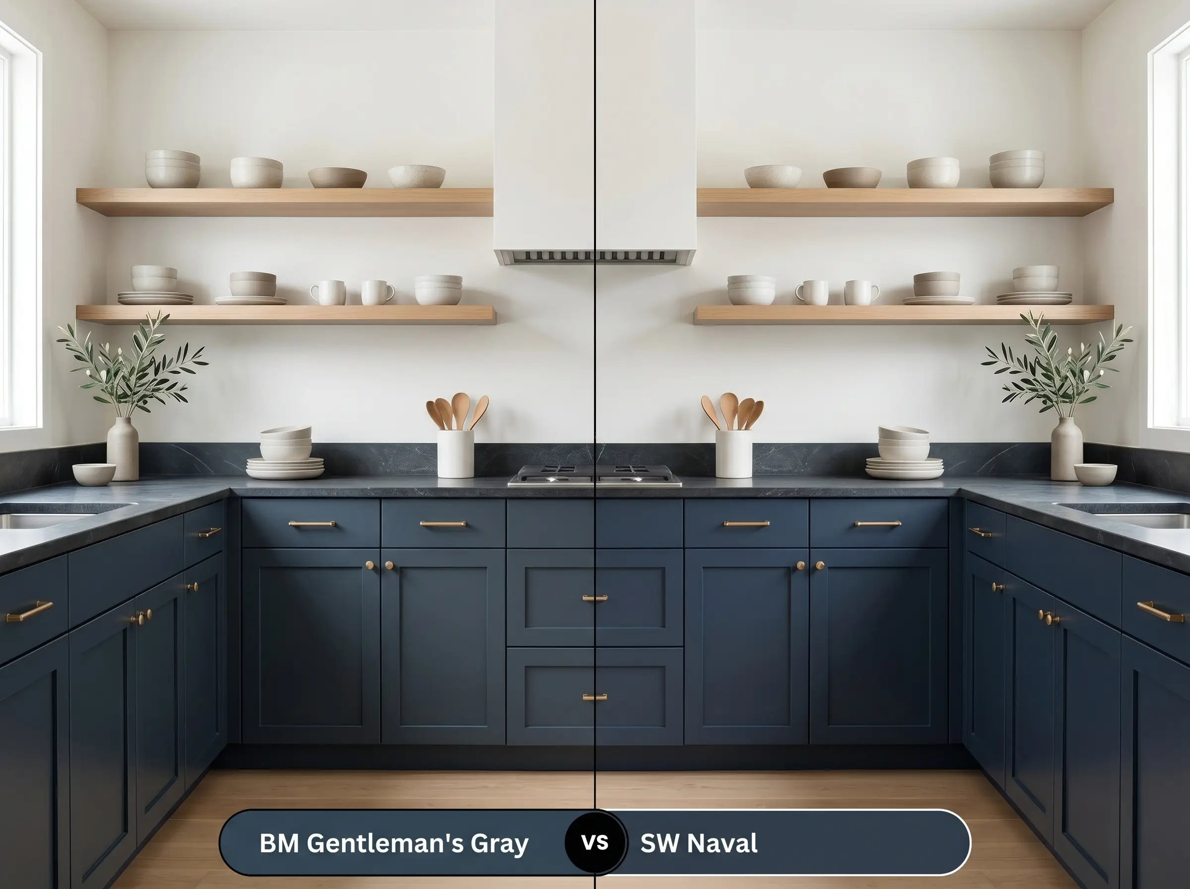
Naval is a brilliant, classic nautical blue with a slightly higher light reflectance and zero green undertones. If you want a crisp, traditional maritime energy rather than a moody, evolving color, Naval is the superior option. It holds its pure blue shape beautifully, even in challenging lighting conditions.
Benjamin Moore Gentleman’s Gray vs. Farrow & Ball Hague Blue
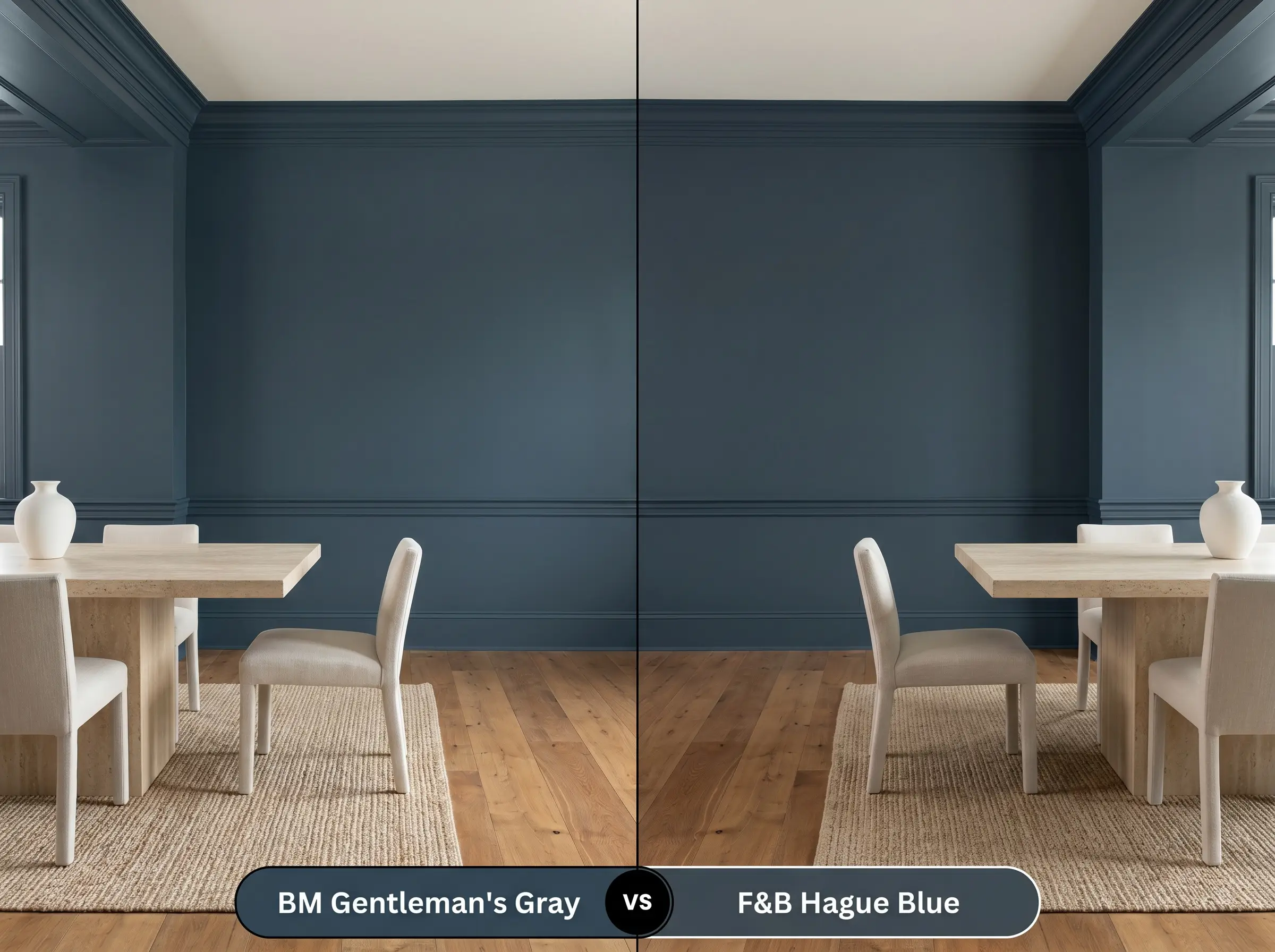
Hague Blue is the ultimate green-dominant chameleon, pushing much further into rich emerald territory than our Benjamin Moore subject. If your goal is a highly saturated, historic teal that completely dictates the room’s palette, Hague Blue delivers that dramatic intensity. However, if you prefer a blue foundation with just a hint of green, stick with 2062-20.
Alternative Shades and Brand Matches
Sometimes a room demands a slight pivot—perhaps a touch more charcoal to mute the vibrancy, or a slightly lighter base to prevent a windowless space from feeling enclosed.
Same-Brand Variations
Rival Paint Matches
Executing This Blackened Teal Flawlessly
Transitioning this complex pigment from a tiny paper swatch to a fully cured wall requires exact planning. Because dark colors show imperfections easily, your application strategy is just as important as your color choice.
The Dynamic Sheen Guide
Primer Strategy
Because this pigment absorbs so much light, a standard white primer will struggle to hide beneath the dense color. You must use a high-quality, deep gray-tinted primer to establish a solid foundation. Skipping this step guarantees you will be rolling three or four frustrating coats just to achieve an opaque finish.
Coverage and Success Tips
Expect to apply a minimum of two generous coats to achieve the true, opaque depth of this shade. When rolling, maintain a wet edge to prevent “flashing”—those frustrating, shiny roller streaks that become glaringly obvious on dark walls.
Never attempt to spot-touch a dark matte wall months after painting, as the new paint will dry slightly differently and leave a visible mark. If a wall gets scuffed, you will typically need to repaint that entire wall from corner to corner to maintain a flawless finish.
Hackrea Pro-Tip (The Touch-Up Rule)
Common Questions About This Dark Navy
Because direct sunlight strips away the darker charcoal shadows, this pigment will read significantly greener and brighter outdoors. It pairs beautifully with warm white masonry, but you should test a large swatch first to ensure the teal does not clash with orange-toned brick.
Without natural light to activate the green undertones, it will read as a very dark, formal charcoal-navy. You can lean into this dramatic depth by adding polished metallic sconces and a glowing vanity mirror to bounce artificial light around the small space.
A satin finish is the absolute best choice for high-traffic cabinetry. It provides a durable, wipeable surface that resists daily smudges while offering just enough gloss to highlight the beautiful teal nuances.
This is actually one of the most stunning combinations you can create. The earthy, orange-red warmth of the terracotta directly complements the cool blue-green base, resulting in a perfectly balanced, highly curated aesthetic.
The Final Verdict on Benjamin Moore Gentleman’s Gray
This remarkable shade is the ultimate solution for homeowners who want the grounding stability of a dark neutral, but crave the sophisticated nuance of a true color. It performs best in spaces where its shifting teal and charcoal undertones can be manipulated by layered lighting and tactile materials. Whether you are wrapping a modern study in matte walls or updating kitchen cabinetry with a satin finish, this paint acts as a brilliant, structural foundation that elevates everyday furnishings into a highly intentional design.
While this Benjamin Moore favorite is undeniably versatile, it actively fights against stark, ash-toned gray flooring and icy white furnishings. Placing this organic, green-leaning pigment next to a flat, cool gray surface strips away its warmth, leaving the walls looking muddy and unresolved.
Always ground this rich color with warm wood tones, natural stones, or earthy textiles to support its complex undertones.