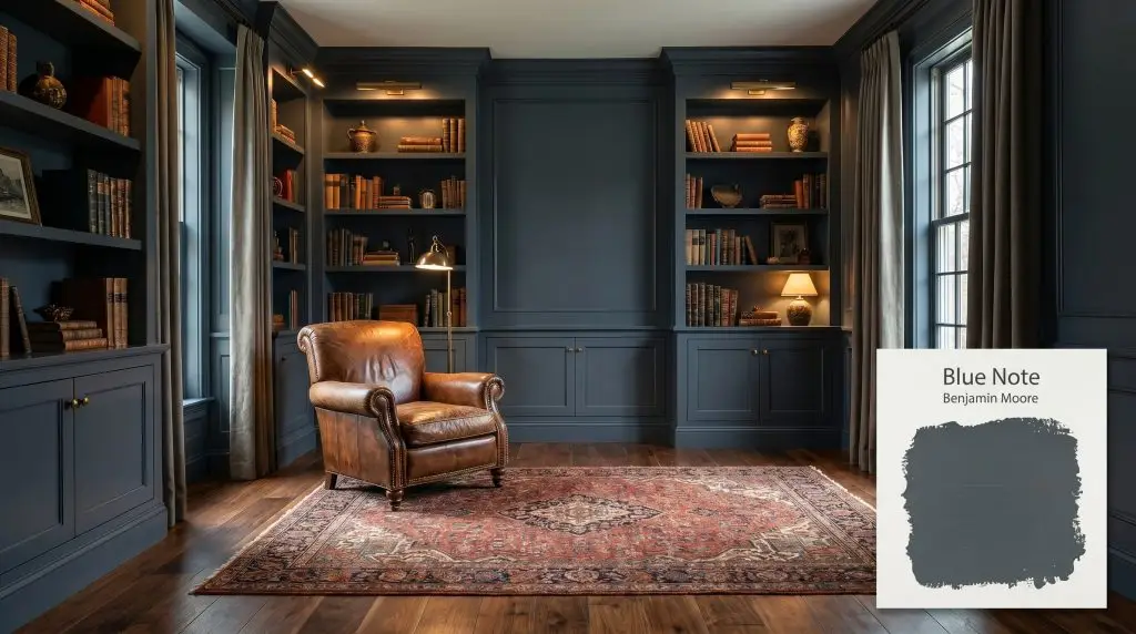
Benjamin Moore Blue Note is a deep, moody navy blue paint color. Grounded by strong dark gray and black undertones, it acts as a dramatic, slate-like blue that delivers rich sophistication without feeling overly bright or nautical.
Will Blue Note clash with your room?
Paint Technical Profile
| Color ID / SKU | 2129-30 |
| HEX Code | #404B54 |
| Light Reflectance (LRV) | 9.02 |
| Temperature | Cool |
| Primary Undertone | Navy Blue |
| Hidden Undertones | Gray, Black |
| Use | Interior |
| Best Exposures | South, West |
| Best For | Accent walls, cabinetry, bedrooms, moody studies |
Digital Visualizations & Applications Explore curated design concepts and coordinating palettes.
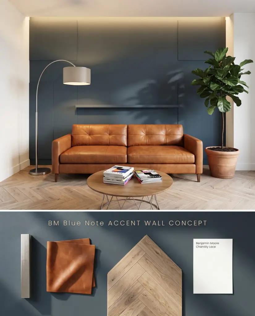
Digital interior mockup: A rich, dark blue architectural feature wall contrasted against herringbone white oak and cognac leather.
Design Specifications
- Lighting Exposure:Indirect ambient lighting
- Adjacent Walls:Benjamin Moore Chantilly Lace OC-65
- Flooring:Herringbone white oak
- Furniture:Cognac leather sofa
- Metals:Brushed nickel
Complementary Paint Colors
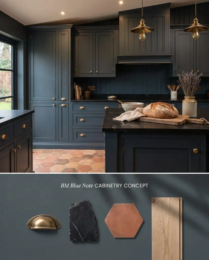
Material study: Visualizing this deep slate blue on floor-to-ceiling cabinetry with warm recessed lighting and aged brass hardware.
Design Specifications
- Lighting Exposure:Warm recessed lighting and pendant glow
- Hardware Finishes:Aged brass
- Countertops:Black soapstone
- Backsplash:Vertical tongue and groove
- Flooring:Terracotta hex tiles
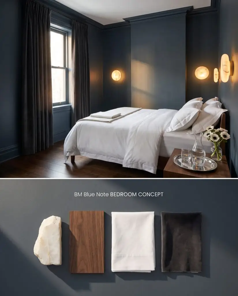
Digital lighting test: Observing a moody slate hue applied to walls and trim under soft morning light.
Design Specifications
- Lighting Exposure:Soft morning light
- Bedding:Crisp white percale
- Window Treatments:Charcoal velvet drapes
- Lighting Fixture:Alabaster sconces
- Accents:Dark walnut
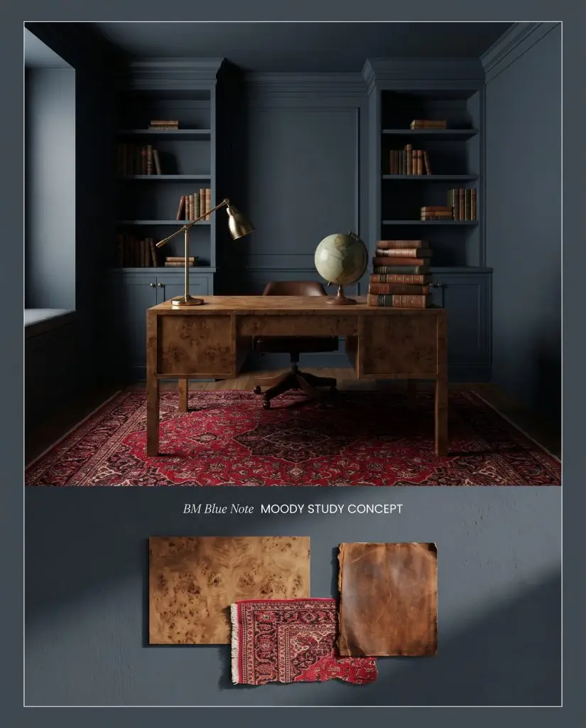
Concept board: A heavily color-drenched study showcasing how low directional light interacts with this dramatic dark hue.
Design Specifications
- Lighting Exposure:Low directional reading light
- Trim Recommendation:Color-drenched matching trim
- Materials:Burl wood desk
- Rug:Persian crimson rug
- Styling:Vintage globes and stacked books
Room Compatibility & Clashes Diagnoses
Hackrea's reports evaluating the compatibility of Blue Note in real rooms.No compatibility tests for Blue Note yet.
Be the first to see how this color reacts to your space. Run a free architectural diagnostic now.
Closest Cross-Brand Equivalents
The absolute closest scientific color matches for Blue Note across top paint brands.